

Dark coral brings the warmth of terracotta with a slightly deeper, more modern edge. It’s expressive without becoming neon, so it works across branding, UI accents, packaging, and print.
Below are 20 curated dark coral color palette ideas with HEX codes, plus pairing tips and AI prompts you can reuse to generate matching visuals.
In this article
- Why Dark Coral Palettes Work So Well
-
- coastal terracotta
- blush sandstone
- sunset brunch
- desert botanica
- copper dusk
- coral noir
- vintage postcard
- seaside cottage
- modern mediterranean
- apricot atelier
- berry clay
- canyon minimal
- autumn market
- spa eucalyptus
- rosewood library
- festive papaya
- soft linen
- tropical clay
- gallery editorial
- nightfall ember
- What Colors Go Well with Dark Coral?
- How to Use a Dark Coral Color Palette in Real Designs
- Create Dark Coral Palette Visuals with AI
Why Dark Coral Palettes Work So Well
Dark coral sits in a sweet spot between energetic coral and grounded terracotta, so it feels inviting while still looking mature. That balance makes it a dependable “hero accent” in both digital and print design.
It also plays well with temperature contrast: cool teals and blues make it pop, while warm beiges, browns, and off-whites make it feel elevated and editorial. You can push it fresh and coastal, or moody and cinematic, without changing the core hue.
Because dark coral carries natural warmth, it’s especially effective for brands that want friendliness (food, lifestyle, wellness) without sacrificing clarity and legibility. Used strategically, it guides attention to calls-to-action, prices, or key highlights.
20+ Dark Coral Color Palette Ideas (with HEX Codes)
1) Coastal Terracotta

HEX: #CD5B45 #F2D6C9 #2F5D62 #E8B07A #1C2321
Mood: sun-warmed, breezy, grounded
Best for: brand moodboards for lifestyle and home goods
Sun-baked clay and sea air come through with a warm coral core and a cool coastal teal. It works beautifully for lifestyle branding, lookbooks, and storefront signage where you want friendly energy without looking loud. Pair the teal as the main contrast and let the cream act as breathing room for type. Tip: use the deep charcoal-green for logos and outlines to keep the palette feeling premium.
Image example of coastal terracotta generated using media.io
Media.io is an online AI studio for creating and editing video, image, and audio in your browser.

2) Blush Sandstone
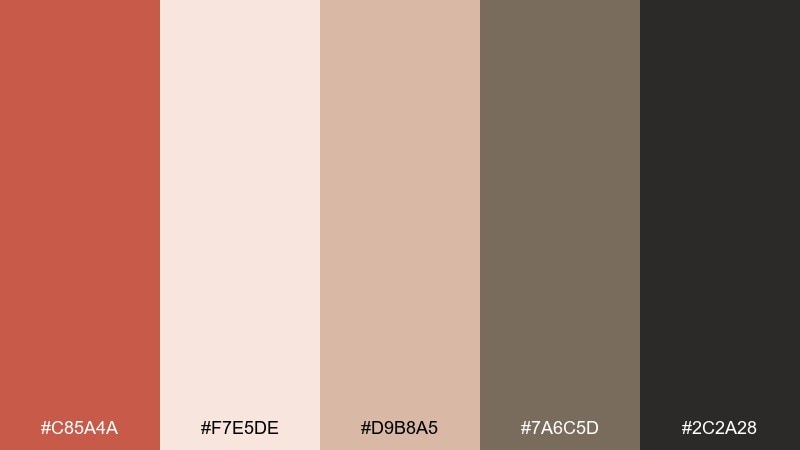
HEX: #C85A4A #F7E5DE #D9B8A5 #7A6C5D #2C2A28
Mood: soft, refined, welcoming
Best for: wedding stationery and minimalist invitations
Powdery blush and sandstone neutrals give this mix a quiet, romantic glow. It suits invitations, RSVP cards, and event programs where readability and elegance matter. Keep the coral as a headline accent and let taupe carry body text for a calmer hierarchy. Tip: print on uncoated paper to make the warm tones feel more tactile and natural.
Image example of blush sandstone generated using media.io
3) Sunset Brunch
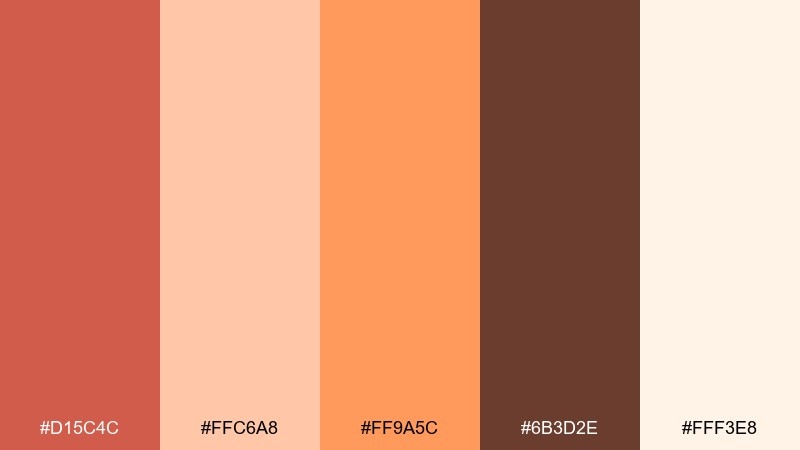
HEX: #D15C4C #FFC6A8 #FF9A5C #6B3D2E #FFF3E8
Mood: playful, juicy, optimistic
Best for: cafe menus and food social posts
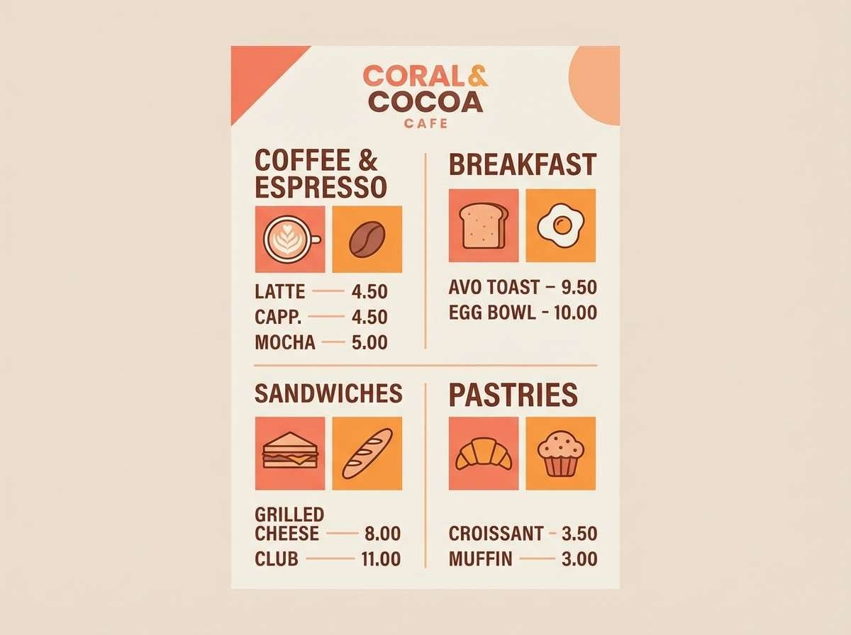
Zesty citrus tones meet a cozy cocoa brown, like sunlight hitting pastries in a window display. These dark coral color combinations shine on menus, promo flyers, and Instagram templates where you want instant appetite appeal. Let the peach and cream handle backgrounds, then pop buttons or prices with the richer coral and brown. Tip: limit the orange to small highlights so the composition stays fresh, not chaotic.
Image example of sunset brunch generated using media.io
4) Desert Botanica
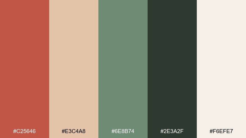
HEX: #C25646 #E3C4A8 #6E8B74 #2E3A2F #F6EFE7
Mood: earthy, calm, nature-led
Best for: watercolor botanical posters and nursery art
A cactus-green base and dusty clay accents feel like a quiet desert garden after rain. It is a great fit for botanical prints, nursery art, and seasonal poster drops with an organic tone. Balance the darker greens with lots of off-white space to avoid a heavy look. Tip: use the warm beige for paper texture overlays to make the art feel hand-made.
Image example of desert botanica generated using media.io
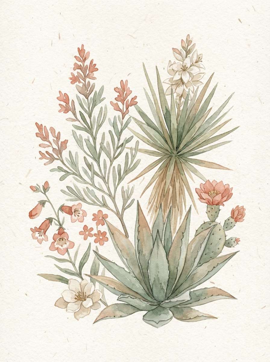
5) Copper Dusk
HEX: #B94F40 #E6A57E #8C6A4A #2B2D2F #F3ECE4
Mood: moody, upscale, cinematic
Best for: whiskey labels and craft packaging
Smoky charcoal and copper warmth read like evening light on metal. This set feels premium on labels, boxes, and product tags for craft goods where you want depth and heritage. Use the near-black for typography and reserve the copper-peach for seals or foil-style accents. Tip: add subtle grain to backgrounds to amplify the dusk-like mood without clutter.
Image example of copper dusk generated using media.io
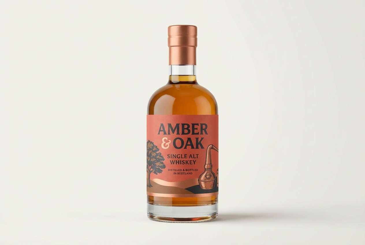
6) Coral Noir
HEX: #CD5B45 #111111 #3A3A3A #F0E0D6 #B7A49B
Mood: bold, modern, high-contrast
Best for: fashion lookbooks and luxury landing pages
Inky blacks and soft stone neutrals make the coral feel sharper and more editorial. It is ideal for lookbooks, hero sections, and campaign pages where contrast sells the message fast. Keep backgrounds light and let black handle navigation and type for clarity. Tip: use coral sparingly as the call-to-action color so clicks go exactly where you want them.
Image example of coral noir generated using media.io
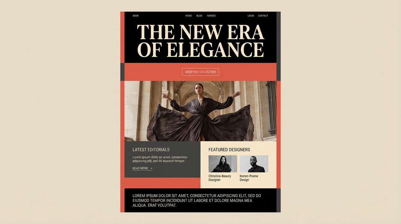
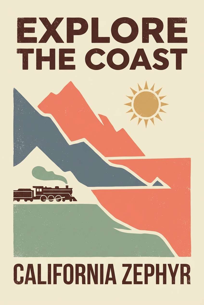
7) Vintage Postcard
HEX: #C95D4F #F1E2C9 #A8B5A2 #6F7E87 #3E2F2B
Mood: nostalgic, muted, travel-inspired
Best for: retro posters and travel blog headers
Faded paper, coastal air, and a hint of ink give this palette a collected, story-first feeling. It works well for retro poster series, travel blog headers, and scrapbook-style social graphics. Pair the coral with the slate blue-gray for a classic vintage contrast. Tip: use the cream as the main background to mimic aged cardstock and keep text easy to read.
Image example of vintage postcard generated using media.io
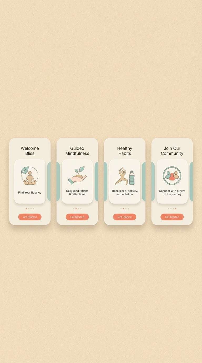
8) Seaside Cottage
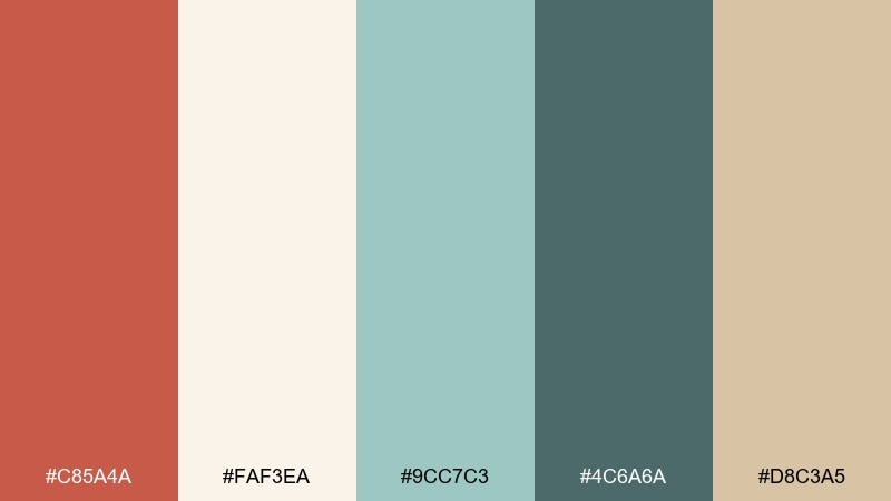
HEX: #C85A4A #FAF3EA #9CC7C3 #4C6A6A #D8C3A5
Mood: airy, clean, comforting
Best for: wellness apps and onboarding screens
Creamy light tones and gentle sea-glass teal create a calm, trustworthy dark coral color scheme. It is a solid pick for wellness UI, onboarding flows, and feature highlights where you want warmth without pressure. Use teal for secondary actions and reserve coral for primary buttons or key icons. Tip: keep corner radii soft and spacing generous to match the relaxed vibe.
Image example of seaside cottage generated using media.io
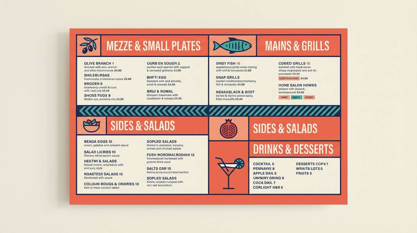
9) Modern Mediterranean
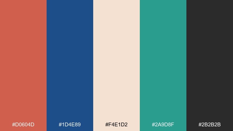
HEX: #D0604D #1D4E89 #F4E1D2 #2A9D8F #2B2B2B
Mood: confident, coastal, contemporary
Best for: restaurant branding and menu boards
A crisp ocean blue and fresh teal bring a modern coastal punch to the warm coral base. It is perfect for restaurant branding, menu boards, and signage that needs to feel both sunny and sharp. Keep the blue for headers and let coral handle highlights like specials or promo badges. Tip: use the near-black for legibility so the bright accents never fight the copy.
Image example of modern mediterranean generated using media.io
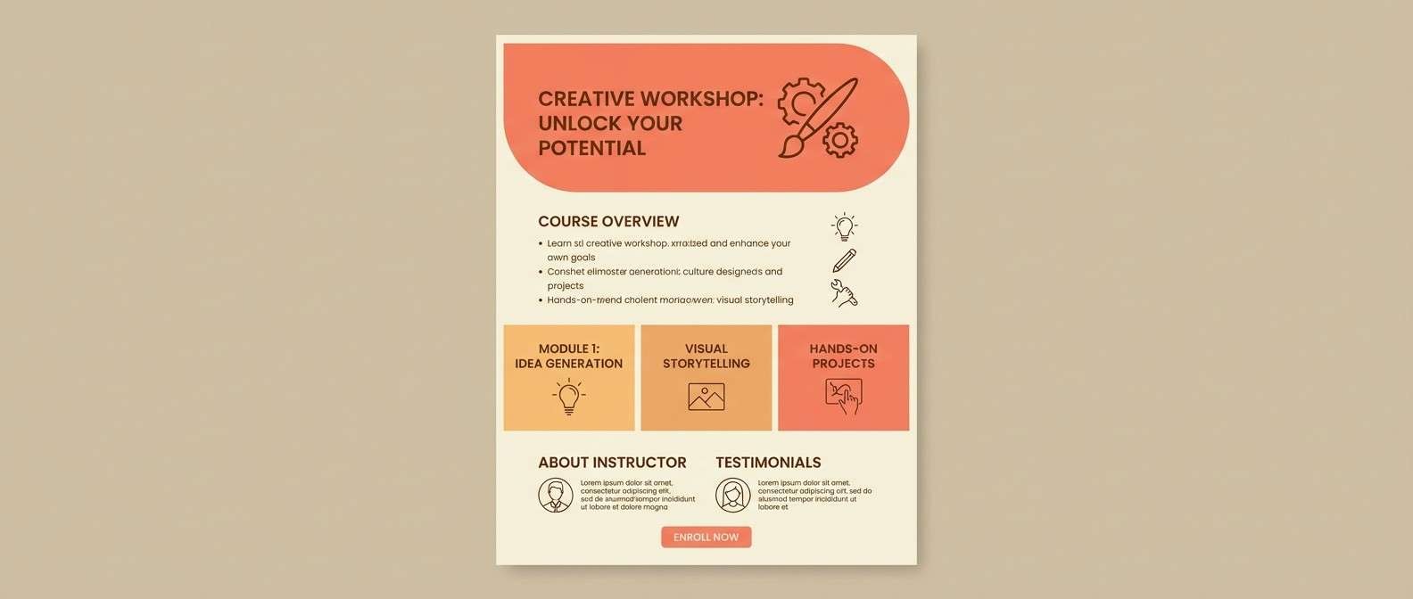
10) Apricot Atelier
HEX: #CF5F4B #FFD9C2 #F7B267 #6C4F3D #F9F2EA
Mood: creative, friendly, handcrafted
Best for: creator portfolios and course landing pages
Apricot and warm coral feel like paint on a sunlit studio wall. This mix suits creator portfolios, course pages, and small business sites that lean personal and handmade. Pair the brown for headings with peach backgrounds to keep the interface warm but organized. Tip: add simple line illustrations in the darker tones to reinforce a crafted, boutique look.
Image example of apricot atelier generated using media.io
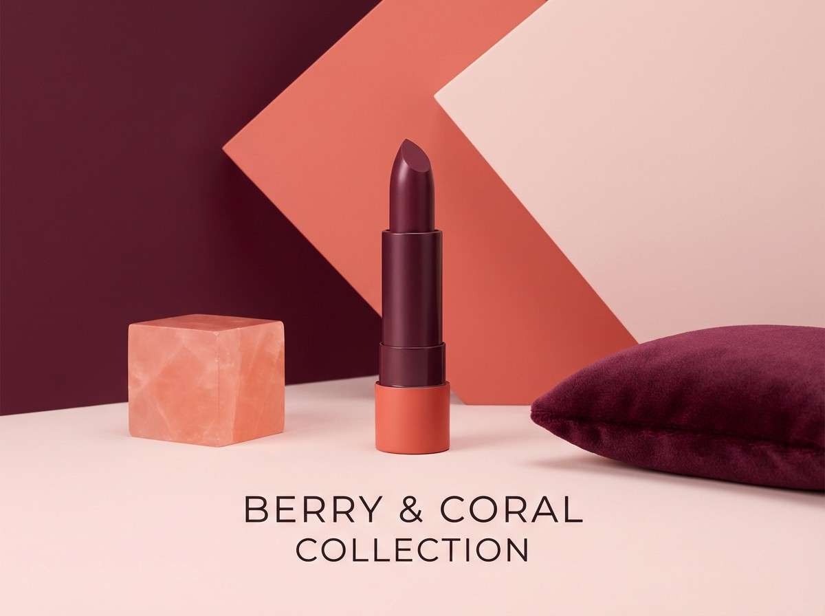
11) Berry Clay
HEX: #B84E4A #EED2D1 #6A1E3A #B07A7A #2A2024
Mood: romantic, rich, dramatic
Best for: beauty branding and lipstick ads
Deep berry shadows give the coral a sultry, evening-ready edge. It is a natural fit for beauty branding, product launches, and campaign visuals where you want romance with confidence. Use the berry for headlines and the pale blush for negative space to keep layouts crisp. Tip: keep gradients subtle and let solid blocks do the heavy lifting for a premium finish.
Image example of berry clay generated using media.io
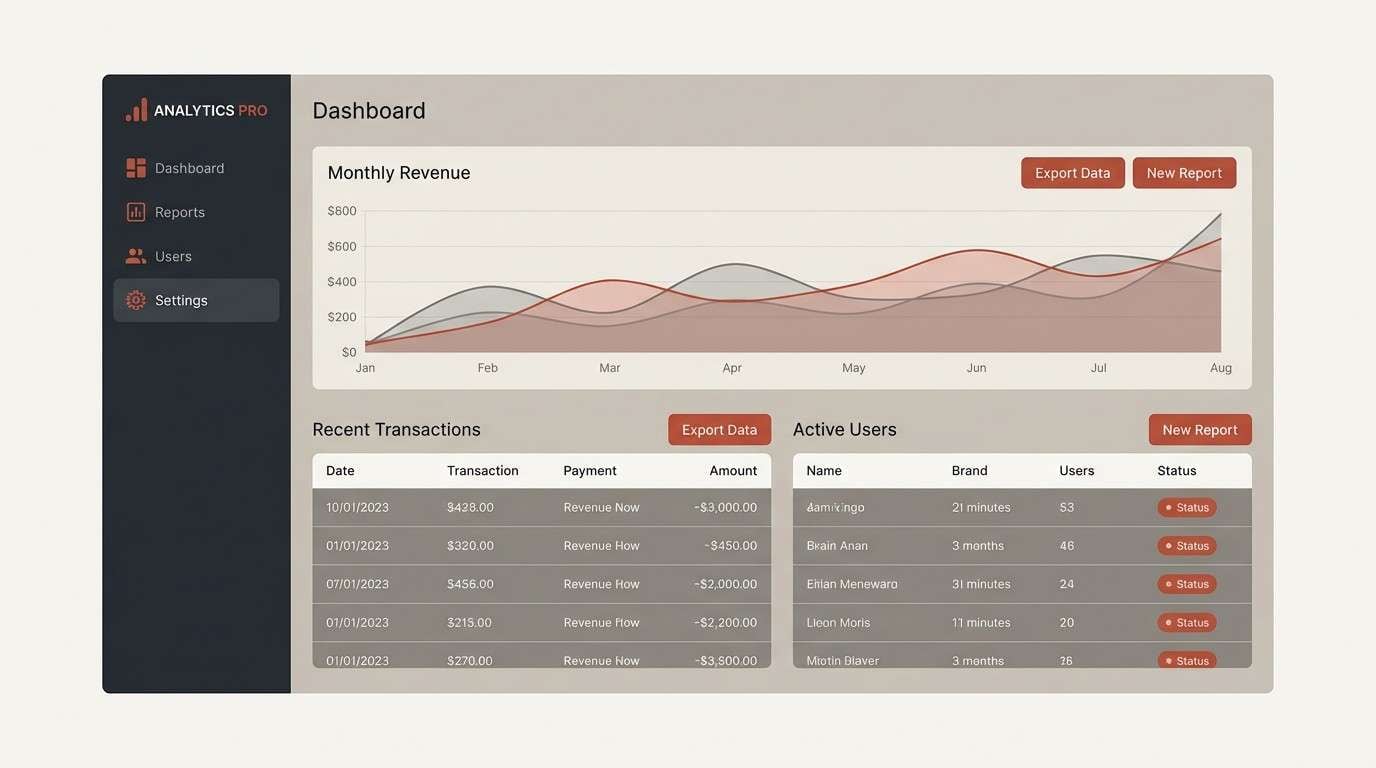
12) Canyon Minimal
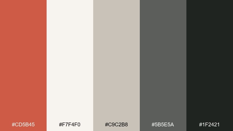
HEX: #CD5B45 #F7F4F0 #C9C2B8 #5B5E5A #1F2421
Mood: minimal, architectural, steady
Best for: SaaS dashboards and data-heavy UI
Clean canyon neutrals make the accent color feel intentional and modern. As a dark coral color palette, it is especially effective for dashboards where you need one clear highlight without distracting from charts and tables. Use off-white for surfaces, gray for dividers, and keep coral for alerts or primary actions only. Tip: apply the darkest tone to navigation so the interface stays anchored even with lots of data.
Image example of canyon minimal generated using media.io
13) Autumn Market
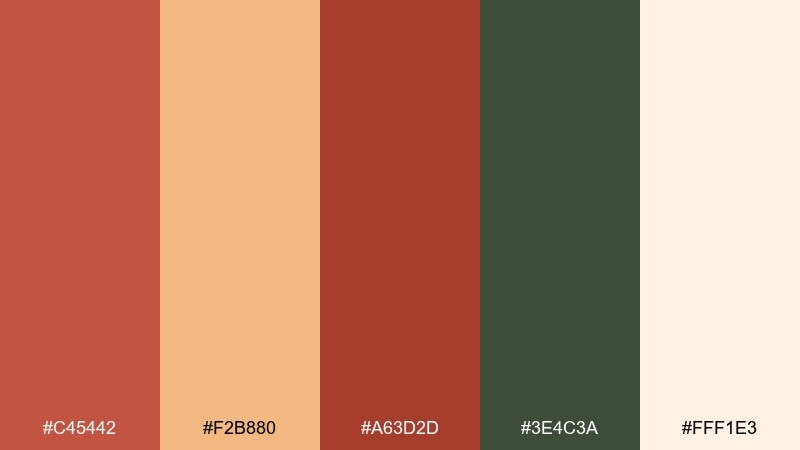
HEX: #C45442 #F2B880 #A63D2D #3E4C3A #FFF1E3
Mood: rustic, energetic, seasonal
Best for: farmers market flyers and event posters
Rusty reds and pumpkin warmth feel like crates of produce and hand-lettered chalk signs. This palette is great for seasonal promos, weekend event posters, and local market flyers. Let the cream carry most of the page, then use the greens for supporting blocks and the deeper red for emphasis. Tip: pair bold sans typography with a subtle paper texture to keep the vibe authentic.
Image example of autumn market generated using media.io

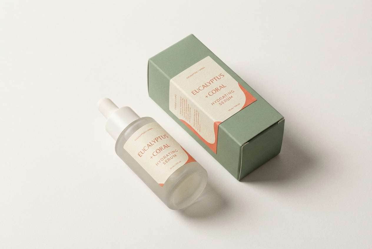
14) Spa Eucalyptus
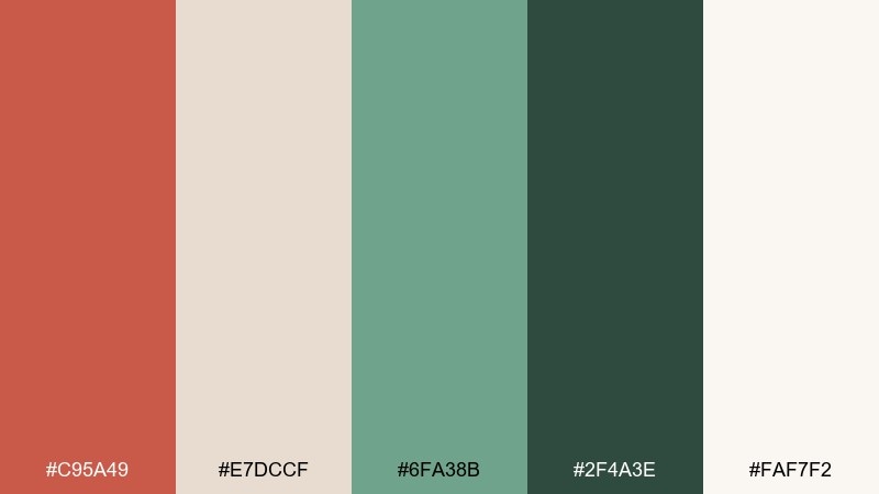
HEX: #C95A49 #E7DCCF #6FA38B #2F4A3E #FAF7F2
Mood: fresh, restorative, natural
Best for: skincare packaging and apothecary labels
Eucalyptus green cools the warmth, like a spa robe against sun-kissed skin. It fits skincare packaging, wellness labels, and calm ecommerce pages that need a gentle, trustworthy look. Use the deep green for ingredient text and icons, and keep coral as a soft brand accent. Tip: choose matte finishes and thin lines to maintain that clean apothecary feel.
Image example of spa eucalyptus generated using media.io
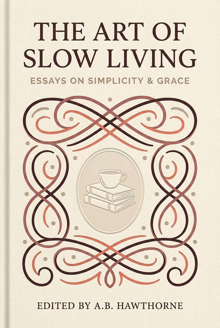
15) Rosewood Library
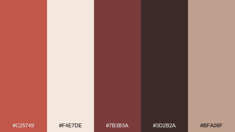
HEX: #C25749 #F4E7DE #7B3B3A #3D2B2A #BFA08F
Mood: classic, intimate, literary
Best for: book covers and boutique editorial layouts
Rosewood browns and creamy pages create a warm, storybook atmosphere. These dark coral color combinations work well on book covers, chapter openers, and boutique editorial spreads with a timeless tone. Let the darkest brown handle titles, and use coral for small ornaments or pull-quote marks. Tip: stick to one serif family and vary weight for hierarchy instead of adding extra colors.
Image example of rosewood library generated using media.io
16) Festive Papaya
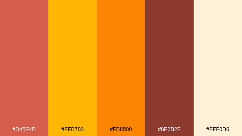
HEX: #D45E4B #FFB703 #FB8500 #8E3B2F #FFF0D6
Mood: bright, celebratory, upbeat
Best for: sale banners and holiday promo graphics
Papaya orange and golden yellow make the coral feel like confetti in warm sunlight. It is a strong pick for sales, seasonal campaigns, and bold social banners that need instant attention. Use the yellow for badges and pricing, then ground the layout with the deeper red-brown for text. Tip: keep backgrounds creamy to prevent the brights from overpowering the message.
Image example of festive papaya generated using media.io

17) Soft Linen
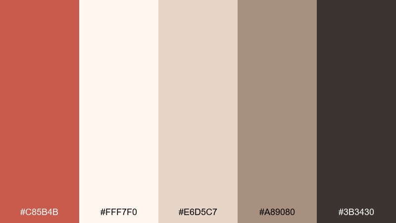
HEX: #C85B4B #FFF7F0 #E6D5C7 #A89080 #3B3430
Mood: cozy, neutral, understated
Best for: home decor shops and minimalist ecommerce
Warm linen neutrals wrap the coral in a calm, lived-in softness. This set is ideal for home decor brands, product grids, and minimalist ecommerce where photos need to stay in focus. Use the dark brown for text and icons, and keep coral for subtle micro-interactions like hover states. Tip: choose plenty of whitespace so the palette feels breathable and premium.
Image example of soft linen generated using media.io
18) Tropical Clay
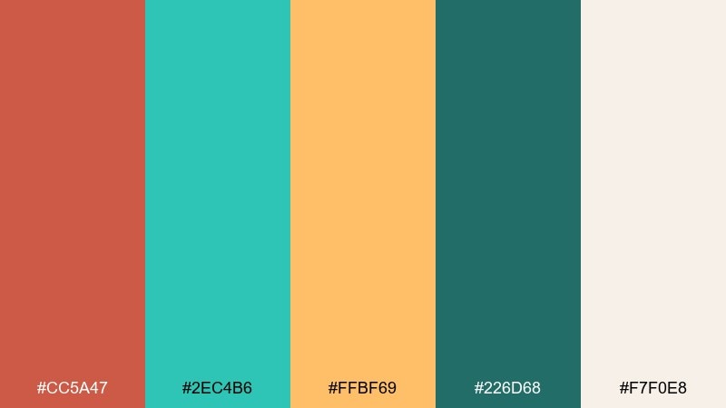
HEX: #CC5A47 #2EC4B6 #FFBF69 #226D68 #F7F0E8
Mood: fresh, lively, summer-ready
Best for: travel ads and summer campaign posts
Aqua and warm clay feel like pool tiles beside sunlit terracotta. It is perfect for travel ads, summer campaigns, and playful social templates that need energy without neon. Use aqua for big background shapes and let coral highlight key actions or dates. Tip: keep the cream as a buffer around text so bright accents stay readable on small screens.
Image example of tropical clay generated using media.io

19) Gallery Editorial
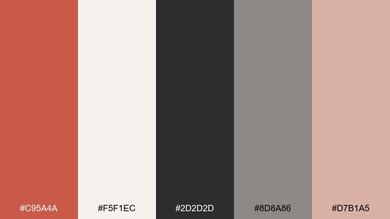
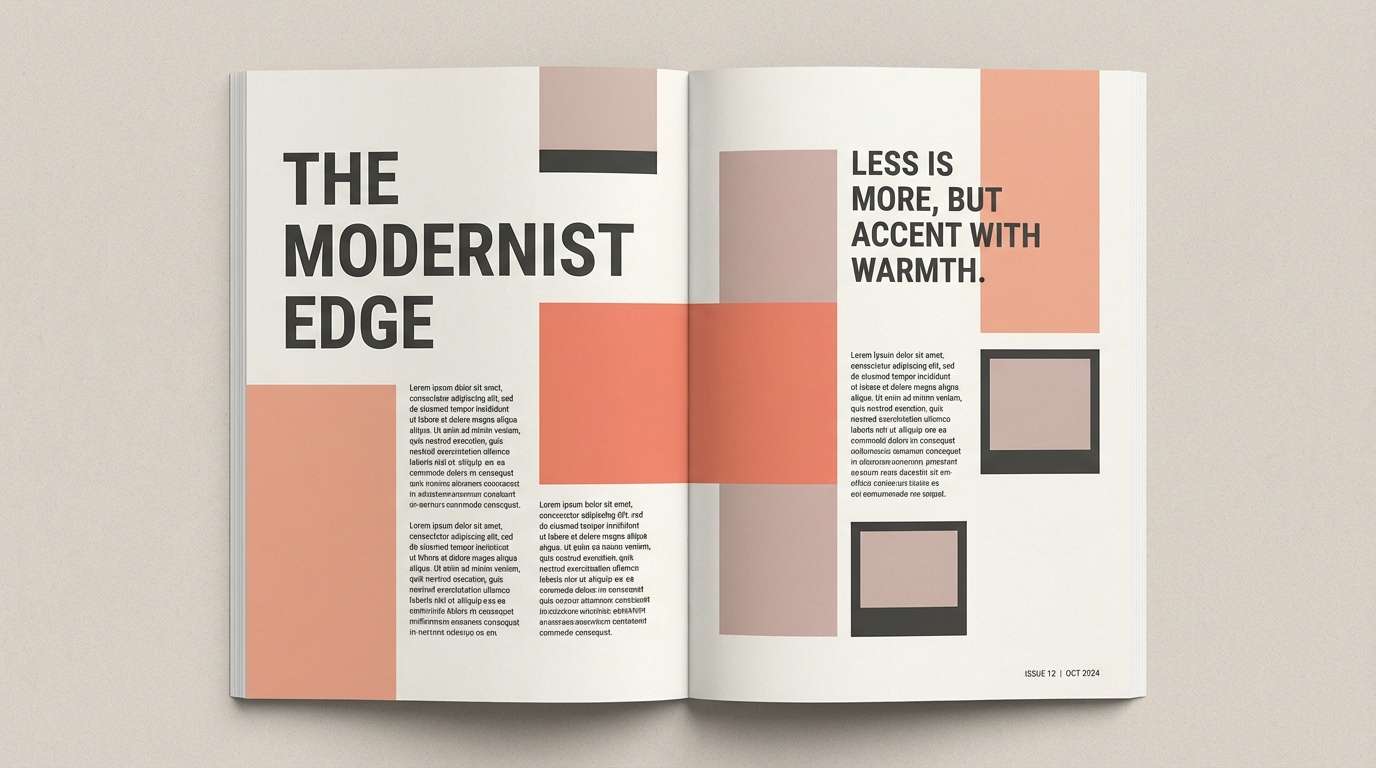
HEX: #C95A4A #F5F1EC #2D2D2D #8D8A86 #D7B1A5
Mood: editorial, curated, contemporary
Best for: magazine spreads and portfolio case studies
Soft gallery whites and charcoal typography make the coral feel like a curated accent in a clean space. It works for magazine layouts, portfolio case studies, and brand guidelines that rely on structure and restraint. Use coral for pull quotes or section tabs, and keep most elements grayscale for a modern rhythm. Tip: align everything to a strict grid so the warm accent looks intentional, not decorative.
Image example of gallery editorial generated using media.io
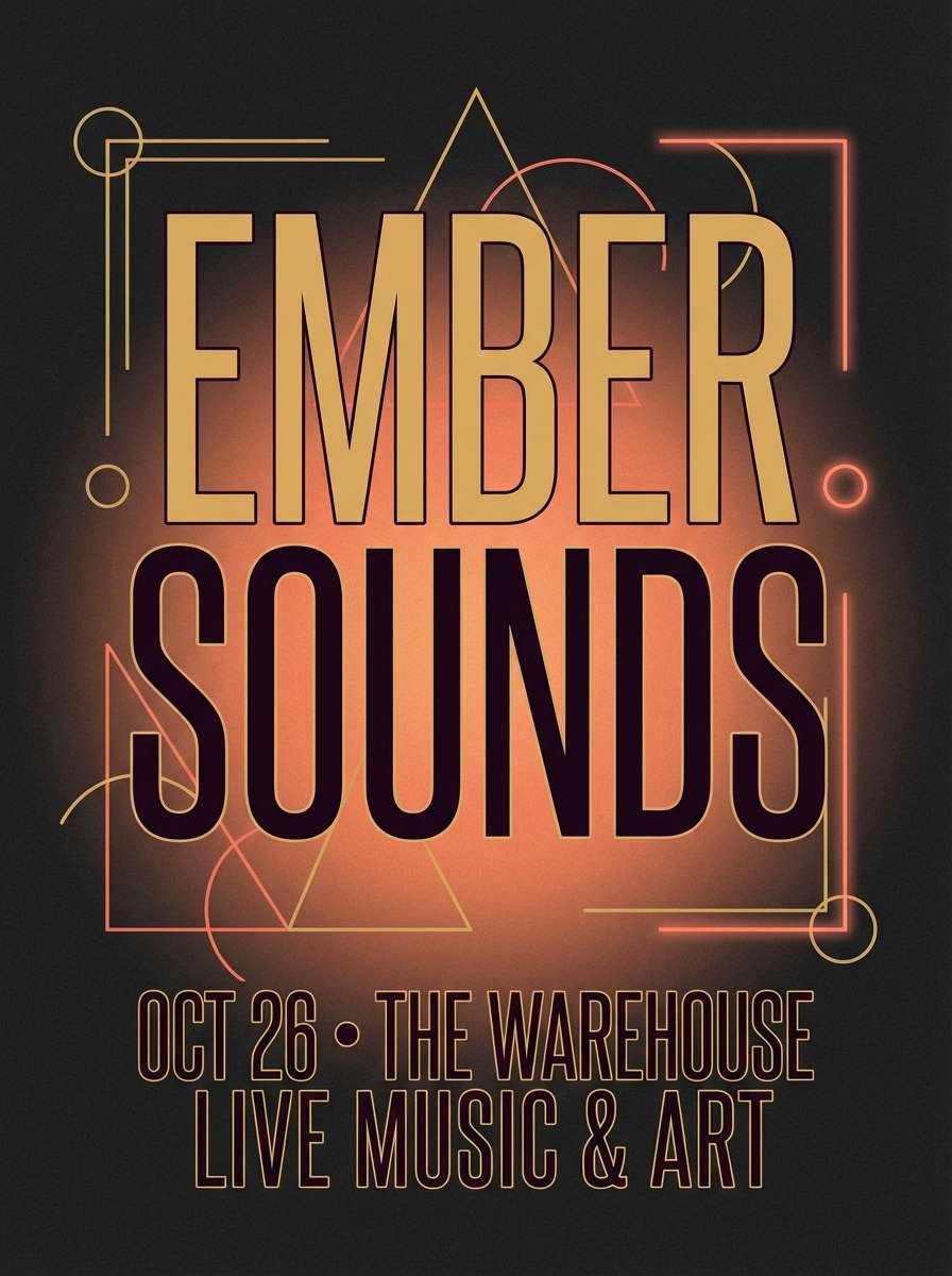
20) Nightfall Ember
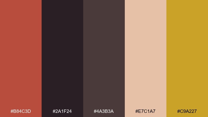
HEX: #B84C3D #2A1F24 #4A3B3A #E7C1A7 #C9A227
Mood: dramatic, warm, luxurious
Best for: music posters and nightlife event flyers
Ember coral against deep plum-black feels like neon glow without the harshness. It is suited to music posters, nightlife flyers, and moody announcements where you want warmth and drama together. Use the gold as a sparing highlight for dates or VIP tags, and keep the darkest tones for backgrounds. Tip: add a soft spotlight gradient behind the headline to boost readability while staying cinematic.
Image example of nightfall ember generated using media.io
What Colors Go Well with Dark Coral?
Dark coral pairs beautifully with warm neutrals like cream, linen, taupe, and cocoa brown when you want a calm, premium look. These softer backdrops also keep typography readable and reduce visual noise in layouts.
For crisp contrast, add cool companions like teal, sea-glass, navy, or slate blue-gray. Blue-green hues sharpen dark coral and make buttons, badges, or headlines feel more modern.
If you want a richer, more dramatic direction, combine dark coral with charcoal, near-black, and metallic-style accents (copper or gold). This works especially well for packaging, nightlife posters, and luxury landing pages.
How to Use a Dark Coral Color Palette in Real Designs
Use dark coral as an accent first: CTAs, icons, highlights, or small shapes. Then build your base with off-whites and grays so your UI or print layout stays clean and scannable.
Keep contrast intentional by assigning roles: a dark neutral for text, a light neutral for backgrounds, and one cool tone (teal/blue) for secondary actions. This prevents coral from “overheating” the composition.
In branding, dark coral works best when it’s supported by texture cues—paper grain, matte finishes, subtle gradients, or warm photography. That combination makes the color feel tactile and modern rather than flat.
Create Dark Coral Palette Visuals with AI
If you already have HEX codes, you can quickly generate matching mockups—menus, posters, onboarding screens, packaging, and more—by describing the layout and naming your colors in the prompt.
To keep results consistent, reuse a single prompt structure and only swap the subject (e.g., “whiskey label mockup” vs. “wedding invitation”), while keeping the color list and styling notes the same.
Media.io makes it easy to turn your dark coral color scheme into on-brand images you can use in moodboards, presentations, and content planning.
Dark Coral Color Palette FAQs
-
What HEX code is considered “dark coral”?
A common dark coral anchor is #CD5B45, which sits between coral and terracotta. Similar options in this article include #C85A4A, #C25646, and #B94F40. -
Is dark coral warm or cool?
Dark coral is primarily warm (red-orange). You can make it feel fresher by pairing it with teal/blue, or more vintage by pairing it with beige, taupe, and brown. -
What’s the best neutral background for dark coral?
Soft off-whites and creams (like #F7F4F0 or #FFF7F0) are the safest choice for readability. They keep dark coral saturated without making the page feel heavy. -
What colors complement dark coral for strong contrast?
Teal, navy, and blue-gray provide clean contrast (for example #2F5D62 or #1D4E89). Charcoal and near-black also create a bold editorial look for headlines and navigation. -
Can I use dark coral for UI buttons?
Yes—dark coral is excellent for primary CTAs if your background is light and your button text meets contrast requirements. Keep coral limited to key actions so it remains attention-grabbing. -
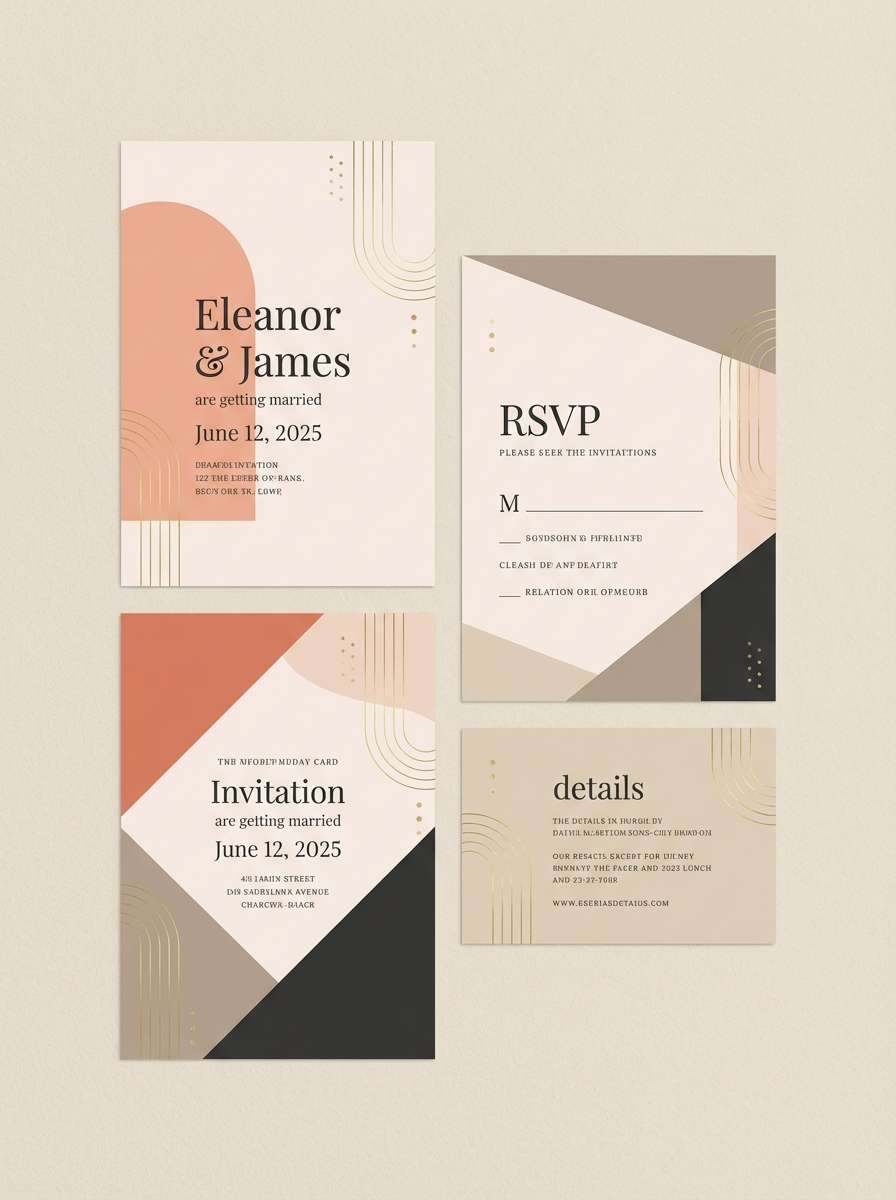
Does dark coral work for wedding invitations?
It works especially well with blush, sandstone, and warm taupe for a refined, romantic feel. Use coral as an accent for headings or monograms, and keep body text in a darker neutral. -
How do I generate consistent dark coral visuals with AI?
Use a repeatable prompt template (subject + layout + styling notes) and explicitly list your palette colors each time. With Media.io text-to-image, you can iterate quickly while keeping the same “brand” mood.


