

Bisque is a warm, creamy neutral that instantly makes palettes feel welcoming, natural, and easy to live with. It works as a soft base for interiors, UI surfaces, and printed stationery.
Below are 20 bisque color palette ideas with HEX codes, plus quick guidance for choosing accents and keeping contrast balanced.
In this article
- Why Bisque Palettes Work So Well
-
- warm linen morning
- desert apricot glow
- vintage tea room
- coastal sand and seafoam
- terracotta biscotti
- blush champagne
- sage kitchen calm
- midnight cocoa contrast
- sunlit minimal ui
- autumn market
- scandinavian cream
- peach sorbet pop
- olive and oat
- art deco gold dust
- soft nursery hush
- rustic bakery
- modern editorial neutral
- festival poster warmth
- botanical watercolor spring
- luxury skincare packaging
- What Colors Go Well with Bisque?
- How to Use a Bisque Color Palette in Real Designs
- Create Bisque Palette Visuals with AI
Why Bisque Palettes Work So Well
Bisque (#FFE4C4) sits in that sweet spot between cream and light peach, so it reads warm without feeling heavy. It’s an easy “background neutral” that still adds personality.
Because it’s soft and light, bisque makes other colors look more intentional—whether you’re pairing it with earthy browns for depth or cool greens to calm the warmth.
It also supports readability: you can keep layouts bright and open, then use darker accents (charcoal, cocoa, deep green) to create strong contrast for text and UI elements.
20+ Bisque Color Palette Ideas (with HEX Codes)
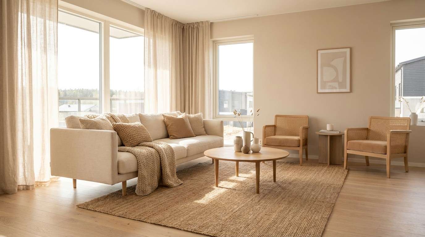
1) Warm Linen Morning
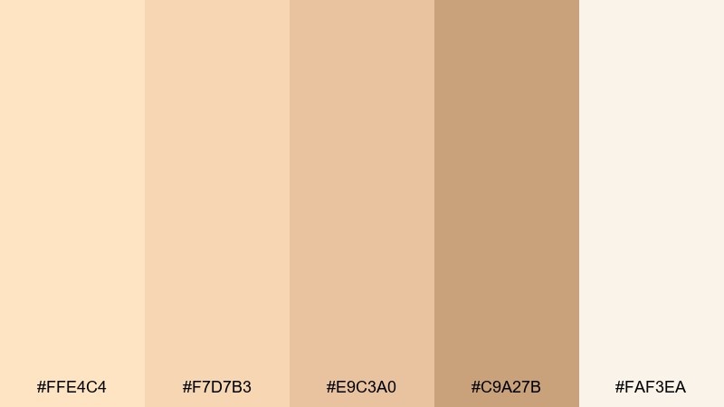
HEX: #ffe4c4 #f7d7b3 #e9c3a0 #c9a27b #faf3ea
Mood: airy, cozy, sunlit
Best for: minimal living room interiors
Airy and comforting, like fresh linen warmed by early sunlight. These creamy neutrals work beautifully on walls, textiles, and natural wood finishes without feeling flat. Pair the lightest tones with caramel accents for depth, and keep patterns subtle to maintain the calm. Usage tip: repeat the deepest shade in small touches like frames or lamp bases to anchor the room.
Image example of warm linen morning generated using media.io
Media.io is an online AI studio for creating and editing video, image, and audio in your browser.

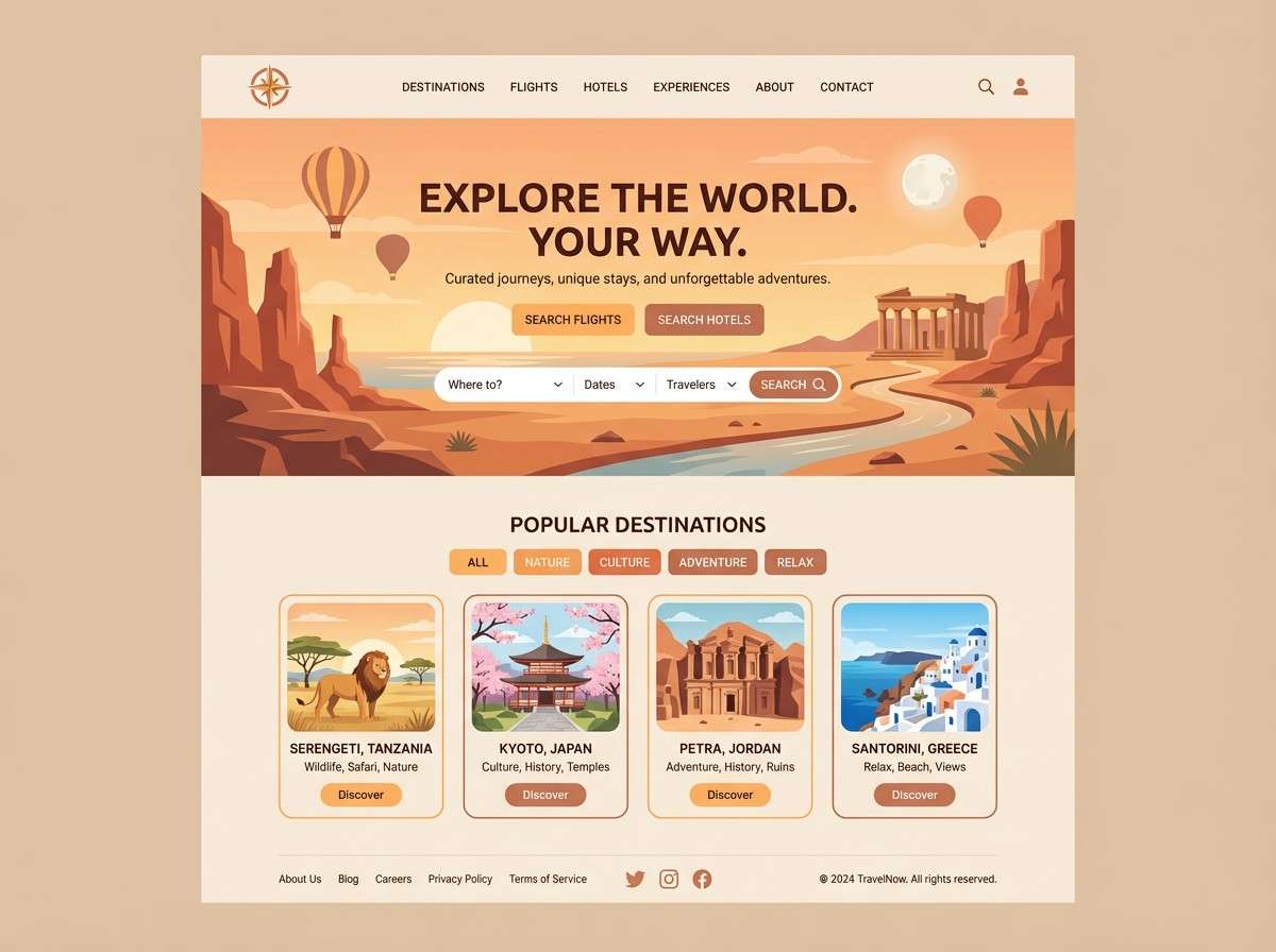
2) Desert Apricot Glow
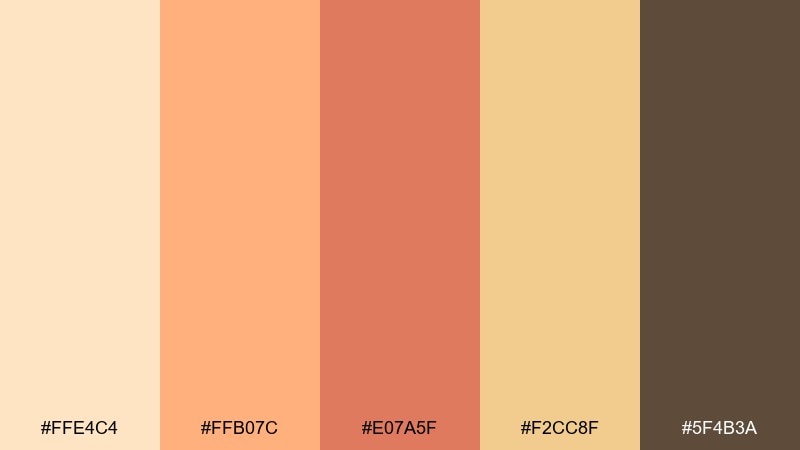
HEX: #ffe4c4 #ffb07c #e07a5f #f2cc8f #5f4b3a
Mood: warm, adventurous, optimistic
Best for: travel brand landing pages
Warm and radiant, like sandstone cliffs at golden hour. A bisque color combination like this shines when you need friendly energy without neon intensity. Use the apricot and clay shades for buttons and highlights, then let the deep brown carry headings for readability. Usage tip: reserve the strongest orange for one primary call to action per screen.
Image example of desert apricot glow generated using media.io
3) Vintage Tea Room
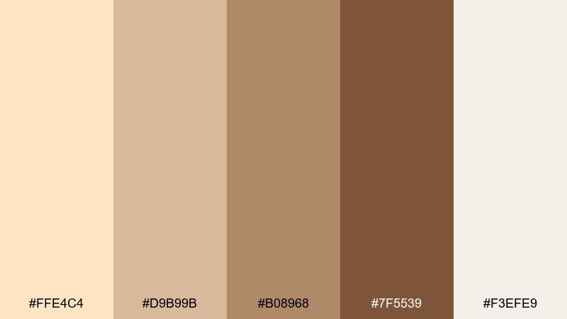
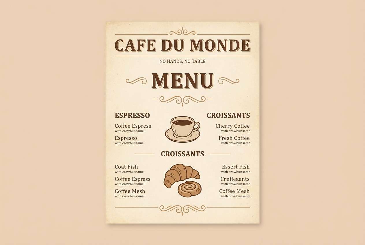
HEX: #ffe4c4 #d9b99b #b08968 #7f5539 #f3efe9
Mood: nostalgic, calm, artisanal
Best for: cafe menus and signage
Nostalgic and inviting, like a quiet tea room with worn wood and soft steam in the air. The mid browns make type feel grounded, while the creamy notes keep the layout light and readable. Pair with classic serif typography and simple line icons for a crafted look. Usage tip: print on uncoated stock to amplify the vintage warmth.
Image example of vintage tea room generated using media.io
4) Coastal Sand and Seafoam
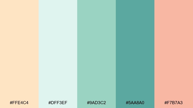
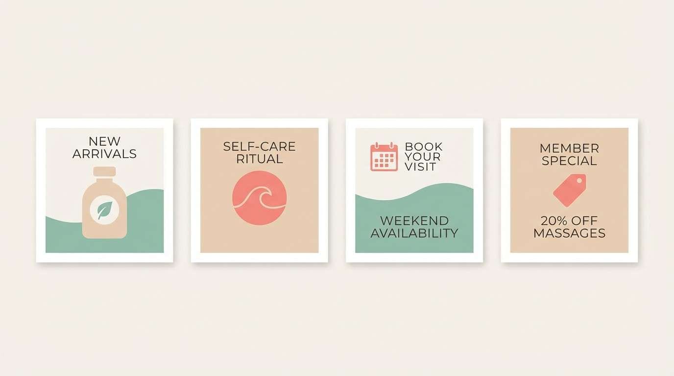
HEX: #ffe4c4 #dff3ef #9ad3c2 #5aa8a0 #f7b7a3
Mood: fresh, breezy, uplifting
Best for: spa branding and wellness posts
Fresh and breezy, like a shoreline walk with foam on the tide. The cool greens calm the warmth, while the soft coral adds a friendly human touch. Keep the seafoam shades dominant for a clean wellness feel, and use coral sparingly for icons or small highlights. Usage tip: set plenty of whitespace to let the airy tones do the work.
Image example of coastal sand and seafoam generated using media.io
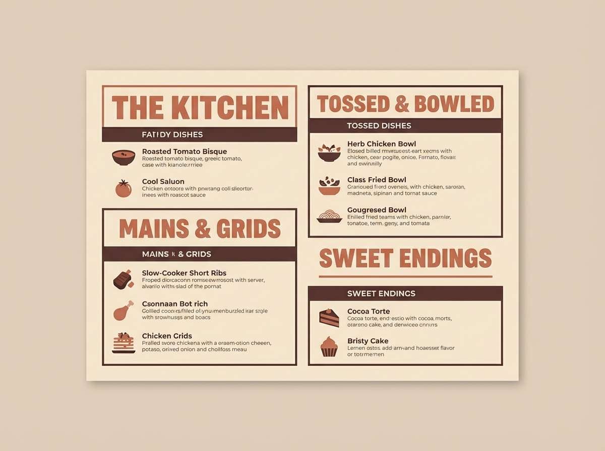
5) Terracotta Biscotti
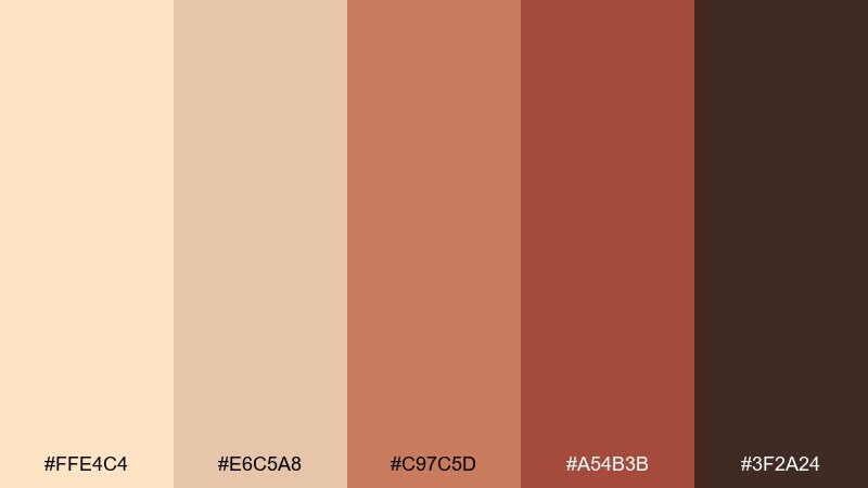
HEX: #ffe4c4 #e6c5a8 #c97c5d #a54b3b #3f2a24
Mood: earthy, rustic, confident
Best for: restaurant interiors and menus
Earthy and rustic, like terracotta pots and toasted biscotti on a wooden counter. The deeper reds bring appetite and drama, while the creamy base keeps it welcoming. Pair with black or espresso text for strong contrast, and use the terracotta for headings or section dividers. Usage tip: add matte textures to reinforce the handmade vibe.
Image example of terracotta biscotti generated using media.io
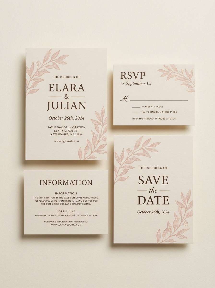
6) Blush Champagne
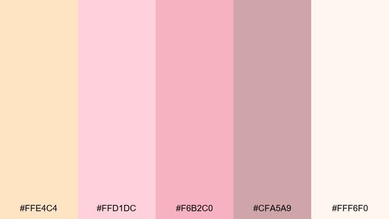
HEX: #ffe4c4 #ffd1dc #f6b2c0 #cfa5a9 #fff6f0
Mood: romantic, soft, celebratory
Best for: wedding invitations
Romantic and delicate, like champagne bubbles and blush petals. The pinks feel modern when balanced with creamy neutrals and lots of breathing room. Pair with gold foil or warm metallic details, and keep typography elegant and slightly spaced out. Usage tip: use the deepest mauve only for names and key dates to keep everything airy.
Image example of blush champagne generated using media.io
7) Sage Kitchen Calm
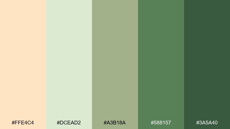
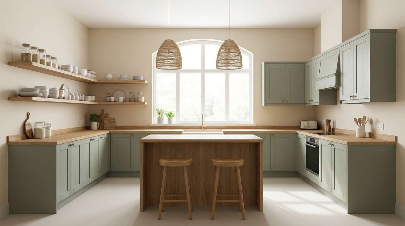
HEX: #ffe4c4 #dcead2 #a3b18a #588157 #3a5a40
Mood: grounded, clean, wholesome
Best for: kitchen cabinet colors and decor
Grounded and wholesome, like herbs on a sunlit countertop. This bisque color scheme pairs warm cabinetry tones with sage greens that feel clean and timeless. Use the lightest shades for walls and backsplash ideas, then bring in the darker greens through hardware, stools, or plants. Usage tip: keep countertops simple and low-contrast so the greens stay soothing.
Image example of sage kitchen calm generated using media.io
8) Midnight Cocoa Contrast
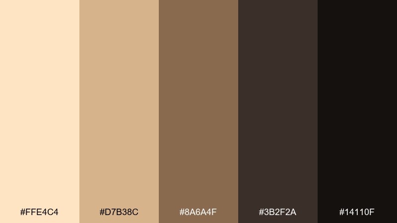
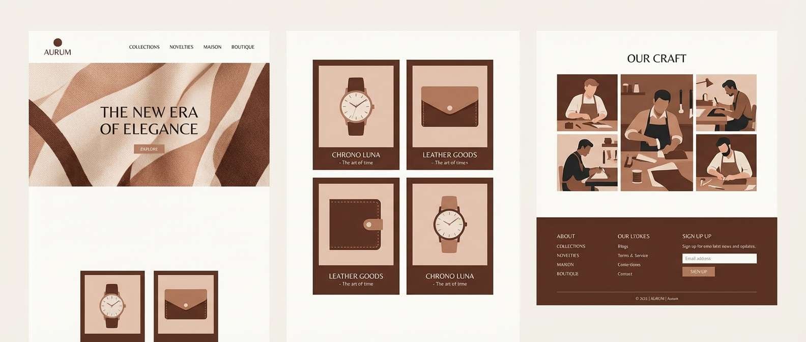
HEX: #ffe4c4 #d7b38c #8a6a4f #3b2f2a #14110f
Mood: moody, elegant, dramatic
Best for: luxury brand websites
Moody and elegant, like cocoa, candlelight, and velvet shadows. The dark anchors create premium contrast while the warm creams keep it approachable. Pair with high-quality product photography and restrained typography for a polished feel. Usage tip: use the near-black only for headers and nav so content remains readable.
Image example of midnight cocoa contrast generated using media.io
9) Sunlit Minimal UI
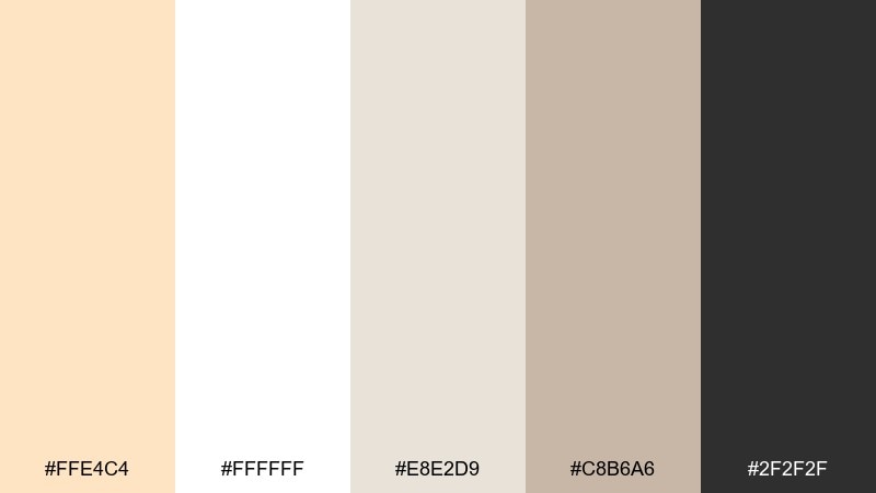
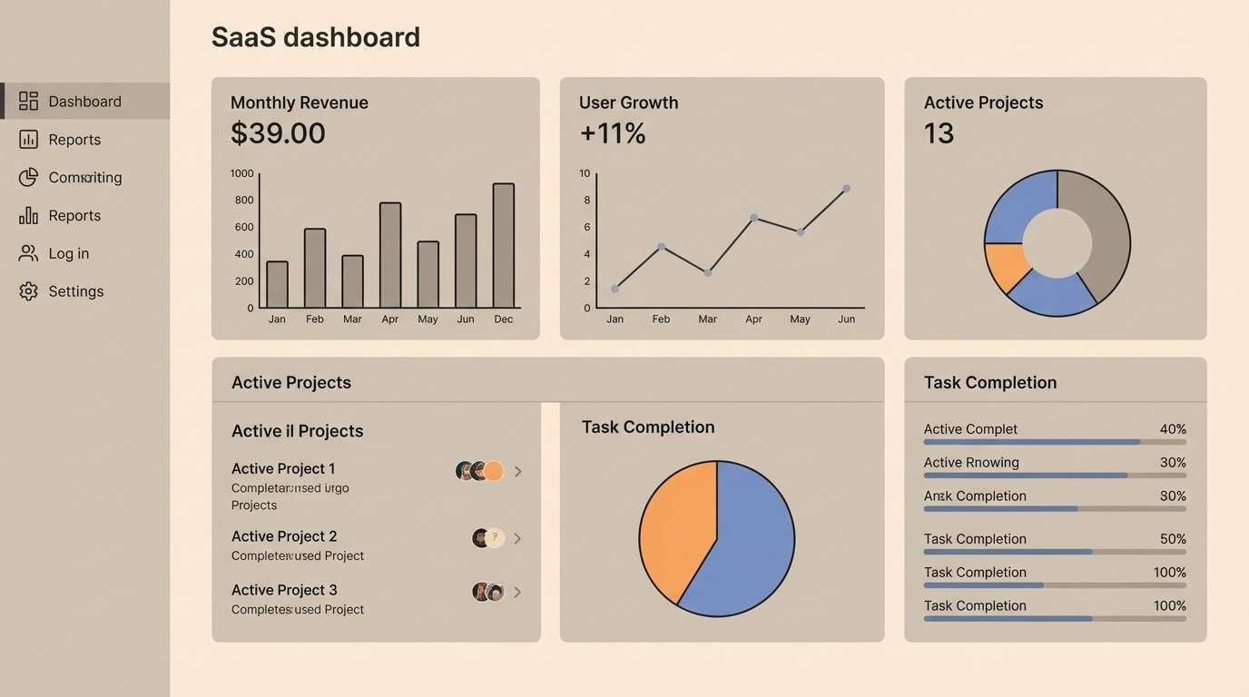
HEX: #ffe4c4 #ffffff #e8e2d9 #c8b6a6 #2f2f2f
Mood: clean, modern, friendly
Best for: saas dashboard UI
Clean and modern, like a bright desk with soft shadows. The warm neutrals prevent the interface from feeling sterile, while charcoal keeps contrast sharp. Add bisque as a subtle surface color for cards and modals, and rely on the darker tones for key data labels. Usage tip: keep borders light and use spacing, not lines, to separate sections.
Image example of sunlit minimal ui generated using media.io
10) Autumn Market
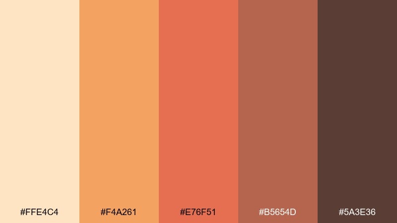
HEX: #ffe4c4 #f4a261 #e76f51 #b5654d #5a3e36
Mood: cozy, lively, seasonal
Best for: fall campaign banners
Cozy and lively, like an autumn market with spices and warm pastries. The oranges add instant seasonal energy, while the deeper browns keep it grounded. Pair with bold display fonts and simple shapes for quick readability in ads. Usage tip: let bisque be the background so the oranges pop without overwhelming the layout.
Image example of autumn market generated using media.io

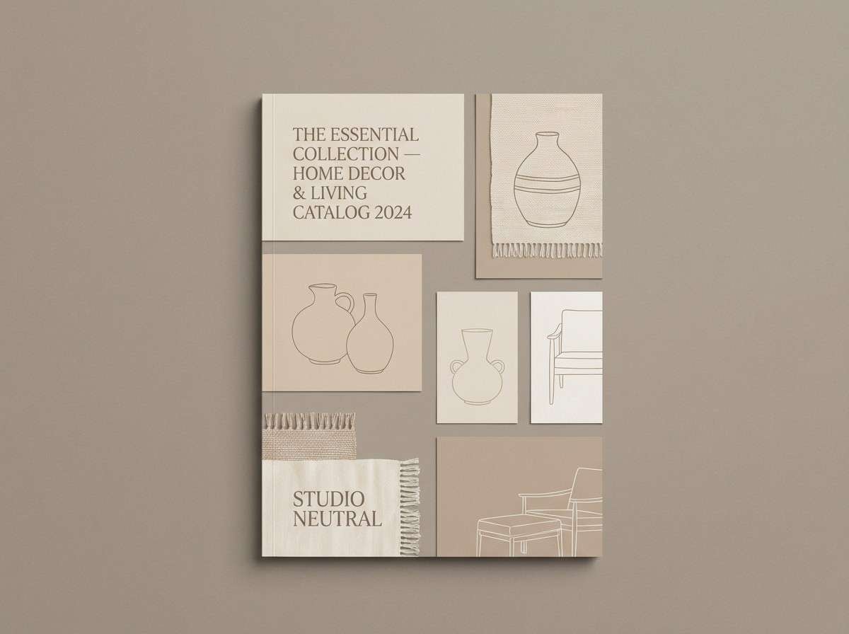
11) Scandinavian Cream
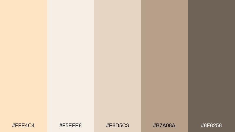
HEX: #ffe4c4 #f5efe6 #e6d5c3 #b7a08a #6f6256
Mood: simple, calm, timeless
Best for: home decor branding
Simple and timeless, like Scandinavian textiles and pale wood floors. The neutral ladder of tones makes layouts feel organized and premium without looking cold. This bisque color palette is ideal for catalog pages, lookbooks, and product listings where the imagery needs to lead. Usage tip: apply the darker taupe to labels and microcopy for consistent hierarchy.
Image example of scandinavian cream generated using media.io
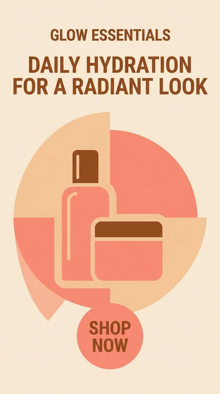
12) Peach Sorbet Pop
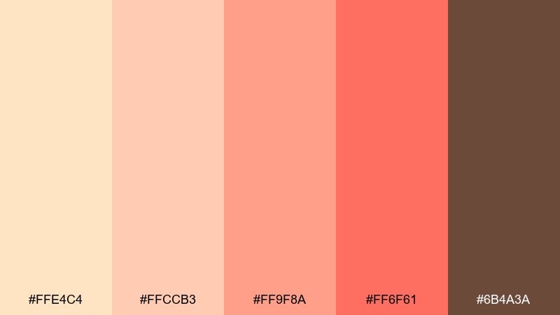
HEX: #ffe4c4 #ffccb3 #ff9f8a #ff6f61 #6b4a3a
Mood: playful, bright, youthful
Best for: beauty social ads
Playful and sweet, like peach sorbet melting in the sun. The coral-red accent brings punch, while the warm brown keeps the palette from becoming candy-like. Pair with rounded shapes and short headlines for fast-scrolling platforms. Usage tip: use the strongest coral for one focal element, like a price tag or product name.
Image example of peach sorbet pop generated using media.io
13) Olive and Oat
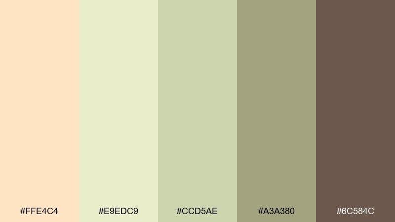
HEX: #ffe4c4 #e9edc9 #ccd5ae #a3a380 #6c584c
Mood: natural, balanced, earthy
Best for: eco packaging labels
Natural and balanced, like oat milk and olive branches. The muted greens read sustainable and modern when paired with warm paper-like neutrals. Keep the label background light, then use olive for badges and certification marks. Usage tip: choose a slightly textured stock to make the greens feel even more organic.
Image example of olive and oat generated using media.io
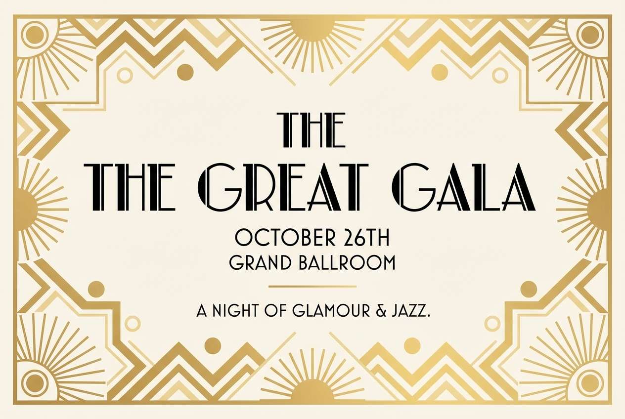
14) Art Deco Gold Dust
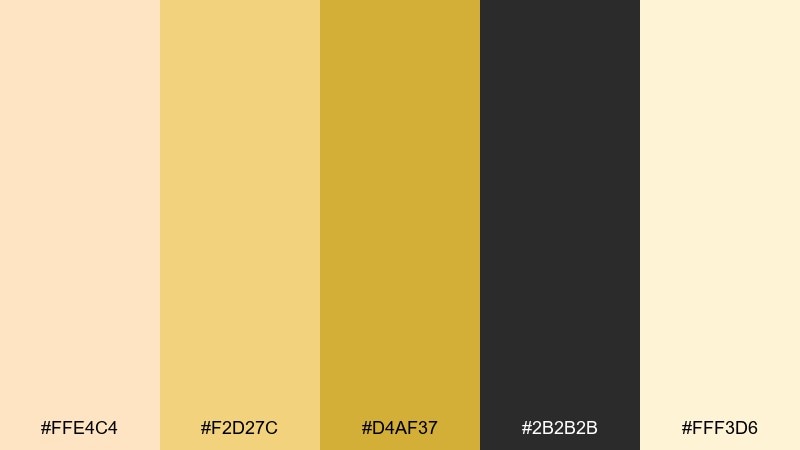
HEX: #ffe4c4 #f2d27c #d4af37 #2b2b2b #fff3d6
Mood: glamorous, bold, refined
Best for: event poster design
Glamorous and bold, like gold dust over a dark jazz club backdrop. These bisque color combinations work best when the black is dominant and the gold is treated as a spotlight. Pair with geometric lines and high-contrast type to lean into the Art Deco mood. Usage tip: keep gold elements thick and simple so they print cleanly.
Image example of art deco gold dust generated using media.io
15) Soft Nursery Hush
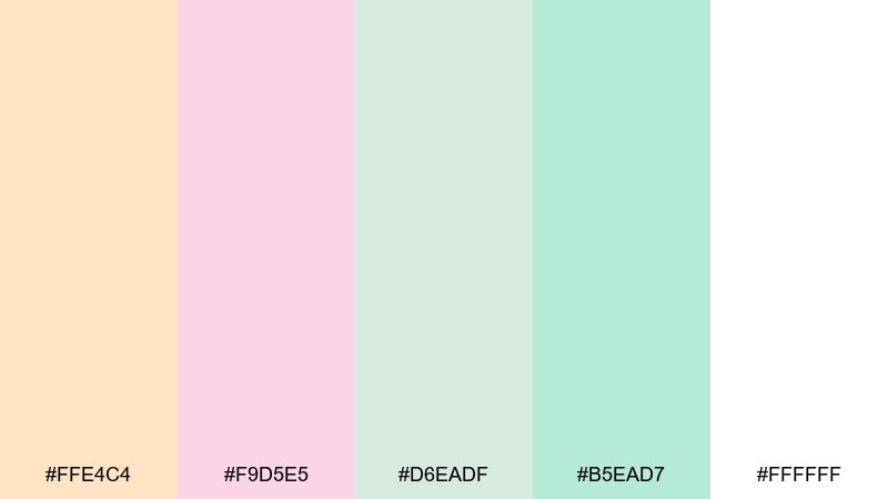
HEX: #ffe4c4 #f9d5e5 #d6eadf #b5ead7 #ffffff
Mood: gentle, soothing, tender
Best for: baby shower invites
Gentle and soothing, like a quiet nursery with cotton blankets and pastel toys. The mix of blush and mint keeps the warmth light and airy. Pair with hand-drawn icons and rounded typography for a friendly look. Usage tip: let white space do the heavy lifting so the pastels stay calm, not busy.
Image example of soft nursery hush generated using media.io

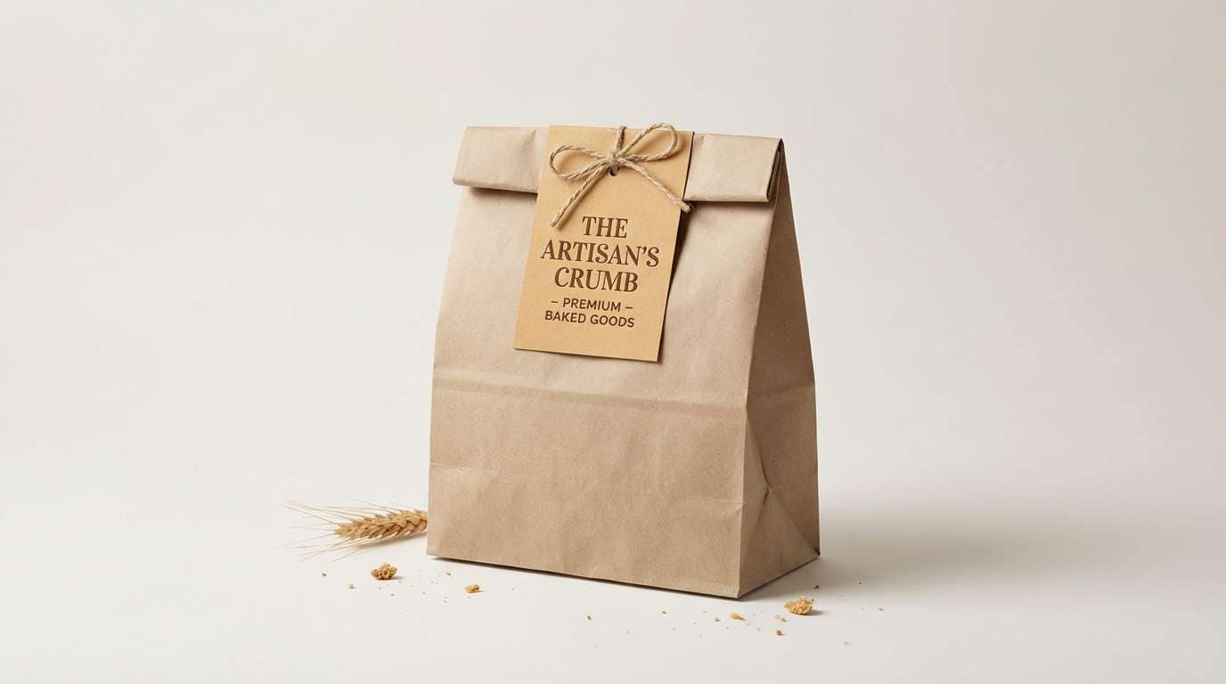
16) Rustic Bakery
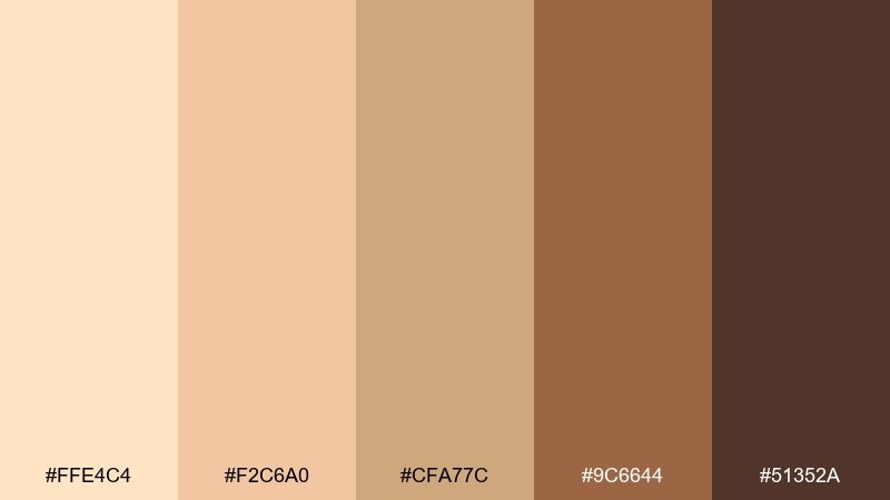
HEX: #ffe4c4 #f2c6a0 #cfa77c #9c6644 #51352a
Mood: warm, handmade, appetizing
Best for: bakery packaging and labels
Warm and handmade, like crusty bread and cinnamon on a wooden board. The browns feel delicious and dependable, while the creamy base keeps the label readable. Pair with stamped-style logos and simple ingredient callouts for a craft look. Usage tip: use the darkest brown for small text so it stays sharp on printed kraft paper.
Image example of rustic bakery generated using media.io
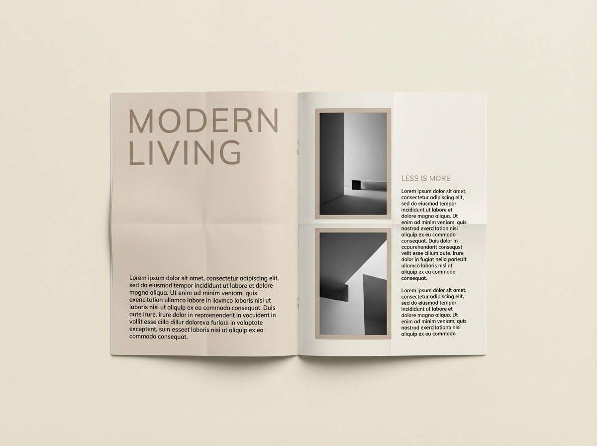
17) Modern Editorial Neutral
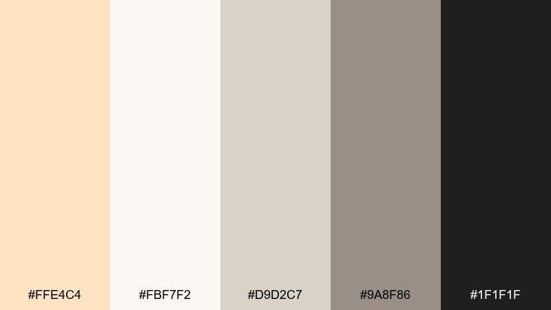
HEX: #ffe4c4 #fbf7f2 #d9d2c7 #9a8f86 #1f1f1f
Mood: editorial, polished, minimal
Best for: magazine layouts
Polished and editorial, like a modern magazine spread on matte paper. The grayscale neutrals add structure, while the warm cream keeps it inviting. Use the light tones for backgrounds and pull quotes, then lean on the near-black for headlines and captions. Usage tip: keep accent blocks small so the layout stays refined and airy.
Image example of modern editorial neutral generated using media.io
18) Festival Poster Warmth
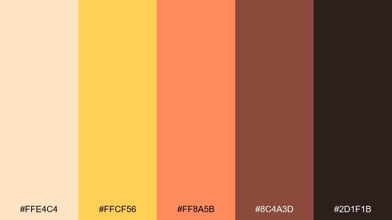
HEX: #ffe4c4 #ffcf56 #ff8a5b #8c4a3d #2d1f1b
Mood: energetic, sunny, bold
Best for: music festival posters
Energetic and sunny, like stage lights at sunset. The yellow and coral bring instant excitement, while the deep brown-black makes typography punchy from a distance. Pair with oversized type and simple geometric gradients for impact. Usage tip: keep the darkest shade for text only, so the poster stays bright and readable.
Image example of festival poster warmth generated using media.io

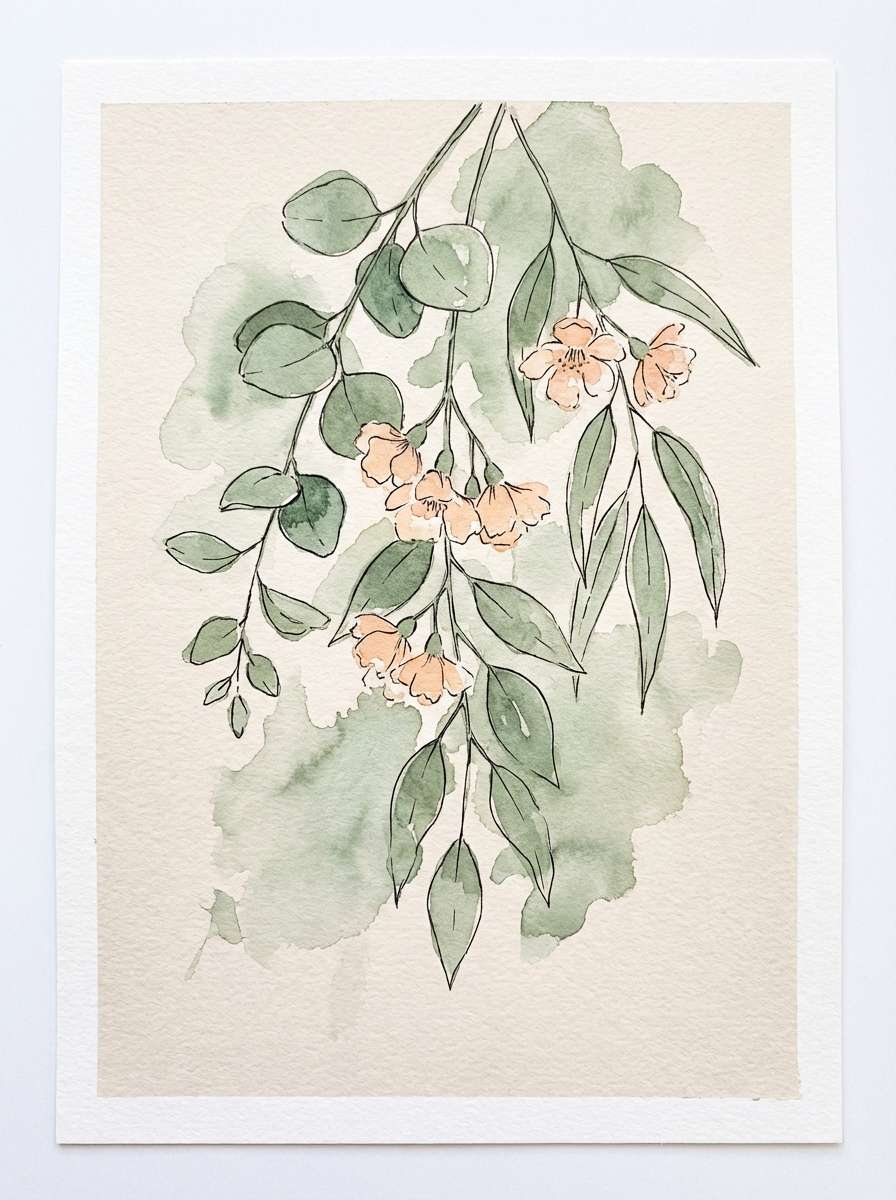
19) Botanical Watercolor Spring
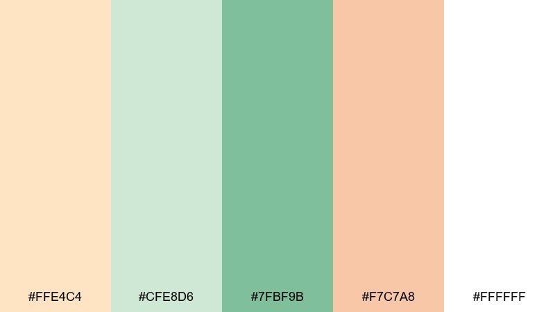
HEX: #ffe4c4 #cfe8d6 #7fbf9b #f7c7a8 #ffffff
Mood: fresh, delicate, hopeful
Best for: botanical illustrations
Fresh and delicate, like new leaves and soft blossoms after rain. The greens feel light and botanical, while the peachy tint keeps the look friendly and warm. Pair with fine ink outlines or gentle wash textures for a handmade finish. Usage tip: let the bisque-like paper tone show through as negative space for an authentic watercolor feel.
Image example of botanical watercolor spring generated using media.io
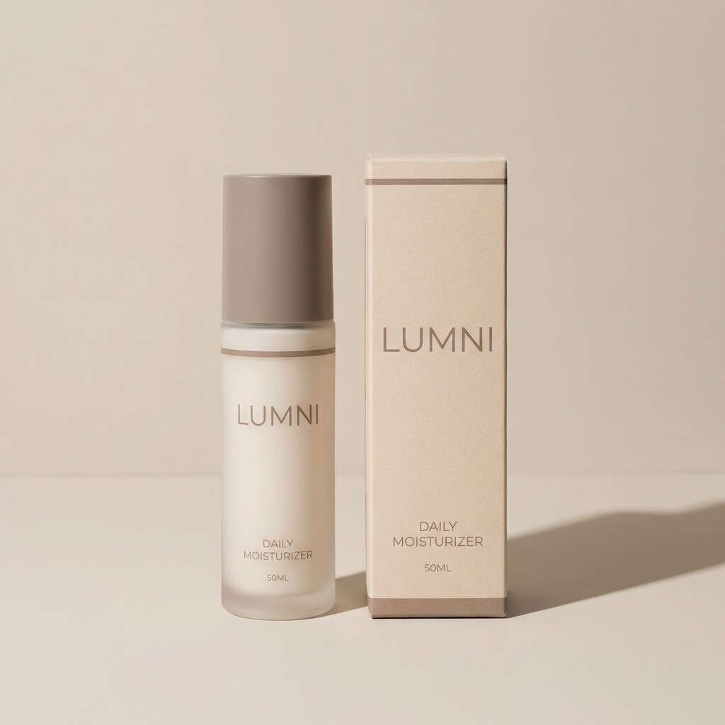
20) Luxury Skincare Packaging
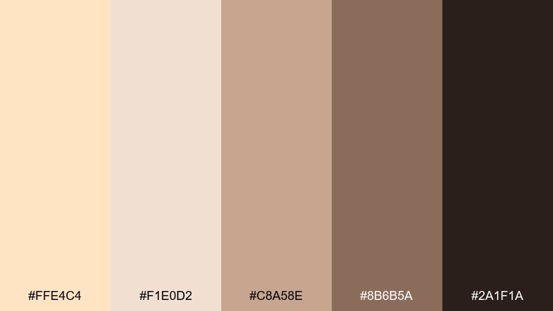
HEX: #ffe4c4 #f1e0d2 #c8a58e #8b6b5a #2a1f1a
Mood: premium, warm, understated
Best for: skincare product packaging
Premium and understated, like a quiet spa shelf with soft lighting. The warm neutrals create a refined look that feels natural, not clinical. This bisque color palette pairs beautifully with minimalist typography and subtle embossing or foil. Usage tip: keep the darkest tone to small elements like ingredient text and caps for a high-end finish.
Image example of luxury skincare packaging generated using media.io
What Colors Go Well with Bisque?
Bisque pairs beautifully with grounded browns (cocoa, espresso, walnut) when you want depth and a cozy, premium feel. This combination is especially strong for typography, packaging, and warm interior accents.
To cool bisque down, use seafoam, sage, olive, or muted teal. These greens create a clean, wellness-forward look while keeping the palette soft rather than stark.
For brighter energy, add apricot, coral, or golden yellow as small accents. Bisque keeps these warmer hues friendly and wearable, so the result feels sunny instead of loud.
How to Use a Bisque Color Palette in Real Designs
Use bisque as your “canvas” color: backgrounds, cards, hero sections, or wall paint. Then build hierarchy with a darker neutral for text (charcoal or deep brown) to keep readability strong.
Limit bold accents to one role per screen or page—CTA buttons, icons, or section headers—so the warmth stays calm. Repeating one deep anchor color in small details (frames, dividers, nav) also helps the design feel intentional.
In print, bisque works well with uncoated or lightly textured stock, which enhances the creamy warmth. For digital, increase contrast slightly compared to what you’d pick for print, especially for small UI text.
Create Bisque Palette Visuals with AI
If you already have HEX codes, you can turn them into realistic room scenes, brand mockups, posters, or UI concepts in minutes. Start with a clear subject (e.g., “modern kitchen,” “wedding invite,” “saas dashboard”) and describe how each color should be used.
For the most natural results, mention lighting (sunlit, studio softbox, golden hour), materials (linen, wood, matte paper), and where bisque appears (background, walls, packaging base). Then iterate with small prompt changes rather than swapping the whole idea.
Use Media.io to generate quick visual directions before you commit to final comps.
Bisque Color Palette FAQs
-
What is the HEX code for bisque?
The standard web HEX for bisque is #FFE4C4, a warm cream with a soft peach undertone. -
Is bisque closer to beige or peach?
Bisque sits between both: it reads like a light beige in neutral contexts, but the subtle peach tint becomes more noticeable next to pure white or cool grays. -
What color text works best on bisque backgrounds?
For readable UI and print, use deep neutrals like charcoal, espresso, or near-black. Very light gray text can look washed out on bisque. -
What are the best accent colors for a bisque palette?
Muted greens (sage/olive), warm browns, coral/apricot, and soft gold all pair well. Choose one accent family and keep it consistent for a cohesive look. -
Does bisque work for modern UI design?
Yes—bisque is great for warm, friendly interfaces. Use it for surfaces (cards/modals) and rely on strong dark typography plus plenty of whitespace to keep the UI crisp. -
How do I keep a bisque color scheme from looking flat?
Add depth with one darker anchor (cocoa, taupe, charcoal) and one subtle highlight (white or pale cream). Texture (linen, paper, matte finishes) also helps a lot. -
Is bisque a good choice for wedding invitations?
Bisque is a popular wedding neutral because it feels romantic and timeless. Pair it with blush, champagne tones, or warm metallics for an elegant invitation suite.
Next: Lime Color Palette


