

Chocolate brown is a reliable “anchor” color: it feels warm, natural, and premium without being loud. In branding, interiors, and UI, it adds depth while keeping layouts calm and readable.
Below you’ll find 20+ chocolate brown color palettes with HEX codes, plus pairing tips and AI prompts you can use to generate matching visuals in minutes.
In this article
- Why Chocolate Brown Palettes Work So Well
-
- cocoa and cream
- espresso night
- autumn truffle
- caramel latte
- woodland cabin
- mocha rose
- desert clay
- copper maple
- cinnamon oat
- vintage leather
- smoked walnut
- brown sugar pop
- rustic farmhouse
- café noir
- hazelnut sage
- chocolate mint
- berry ganache
- terracotta cocoa
- sandstone chocolate
- midnight cacao
- gilded cocoa
- cocoa and cornflower
- What Colors Go Well with Chocolate Brown?
- How to Use a Chocolate Brown Color Palette in Real Designs
- Create Chocolate Brown Palette Visuals with AI
Why Chocolate Brown Palettes Work So Well
Chocolate brown sits in a sweet spot between neutral and expressive. It’s darker than tan and beige (so it provides structure) but warmer than black or gray (so it feels inviting).
It also pairs easily across styles: cozy café aesthetics, rustic outdoors branding, luxury editorial layouts, and modern apps can all use brown as a grounded base color.
Most importantly, chocolate brown supports readability when you balance it with light creams and soft neutrals—giving you contrast for type and enough negative space to keep designs feeling airy.
20+ Chocolate Brown Color Palette Ideas (with HEX Codes)
1) Cocoa and Cream
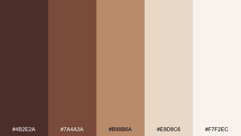
HEX: #4B2E2A #7A4A3A #B98B6A #E9D8C6 #F7F2EC
Mood: warm, cozy, inviting
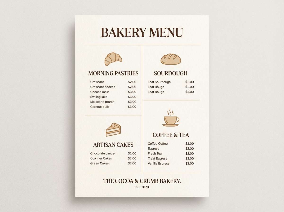
Best for: bakery branding and menu design
Cozy café warmth comes through like fresh cocoa and whipped cream. This chocolate brown color palette shines on menus, loyalty cards, and storefront signage where legibility matters. Pair the darker browns with cream backgrounds for contrast, then use the tan as a friendly highlight. Tip: reserve the deepest brown for headings to keep the layout feeling light.
Image example of cocoa and cream generated using media.io
Media.io is an online AI studio for creating and editing video, image, and audio in your browser.

2) Espresso Night
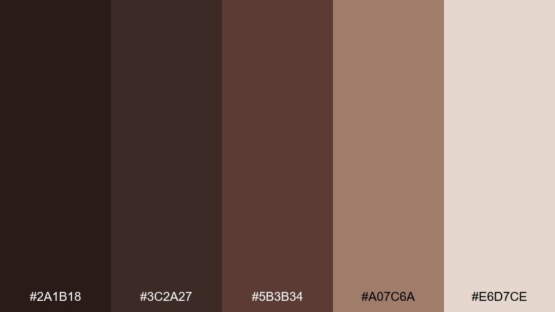
HEX: #2A1B18 #3C2A27 #5B3B34 #A07C6A #E6D7CE
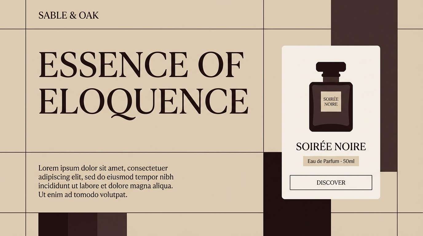
Mood: moody, premium, dramatic
Best for: luxury product landing pages
Moody nighttime espresso vibes give this set a polished, high-end feel. It works well for hero sections, product detail pages, and premium typography-forward layouts. Balance the dark base with the pale blush-beige for breathing room, and keep the mid browns for cards and dividers. Tip: add subtle gradients between the first two browns for depth without visual noise.
Image example of espresso night generated using media.io
3) Autumn Truffle
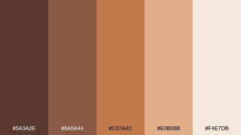
HEX: #5A3A2E #8A5A44 #C07A4C #E0B08B #F4E7DB
Mood: earthy, seasonal, welcoming
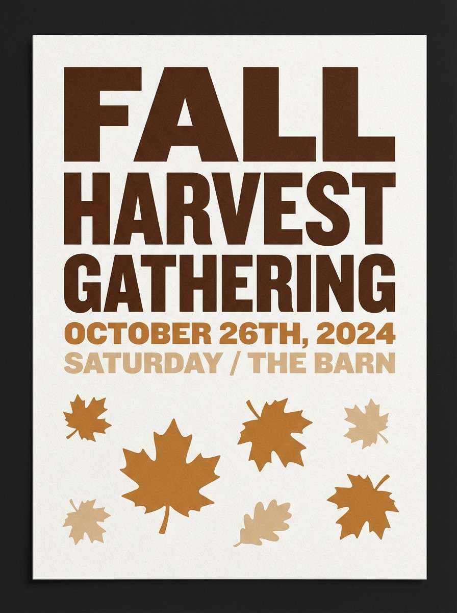
Best for: fall event posters
Earthy truffle tones evoke crisp air, leaves, and warm spices. These colors are ideal for seasonal posters, community events, and farmers market promotions. Let the caramel orange act as your attention color, while cocoa and tan keep type readable. Tip: use the lightest shade as negative space to avoid an overly heavy look.
Image example of autumn truffle generated using media.io
4) Caramel Latte
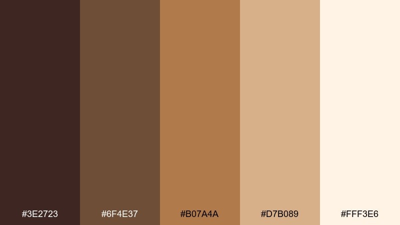
HEX: #3E2723 #6F4E37 #B07A4A #D7B089 #FFF3E6
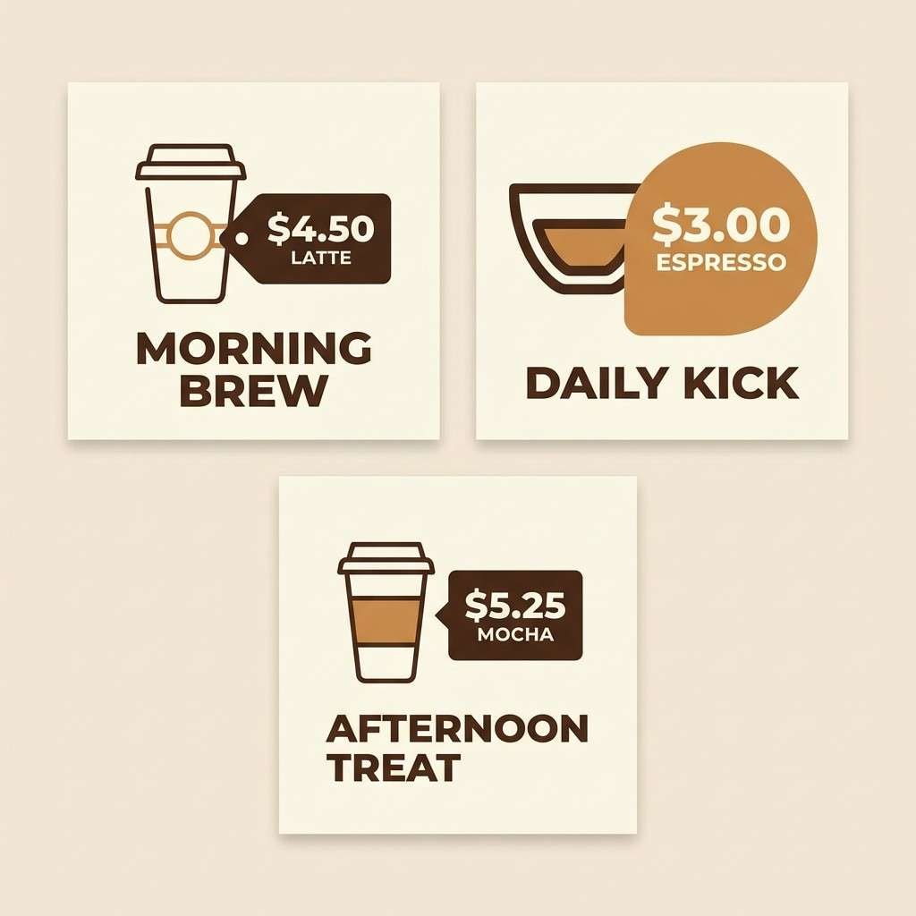
Mood: smooth, friendly, approachable
Best for: coffee shop social templates
Smooth latte tones feel familiar and approachable, like a favorite morning routine. They translate well to social templates, highlight covers, and promo graphics where warmth sells the message. Use the dark roast shade for text, caramel for callouts, and the soft cream for backgrounds. Tip: keep accents to one warm highlight per tile for a consistent feed.
Image example of caramel latte generated using media.io
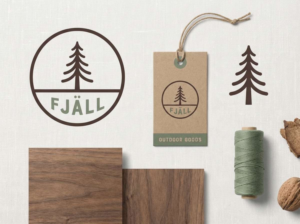
5) Woodland Cabin
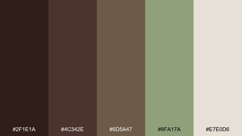
HEX: #2F1E1A #4C342E #6D5A47 #8FA17A #E7E0D6
Mood: rustic, grounded, outdoorsy
Best for: outdoor brand identity
Rustic cabin energy meets soft forest greens for a grounded, outdoors-first feel. These chocolate brown color combinations are great for logos, hangtags, and brand systems that need both warmth and nature cues. Let green stay secondary so the browns remain the anchor, and use the pale linen tone for backgrounds. Tip: test your logo in one-color brown first, then add green only as an accent.
Image example of woodland cabin generated using media.io
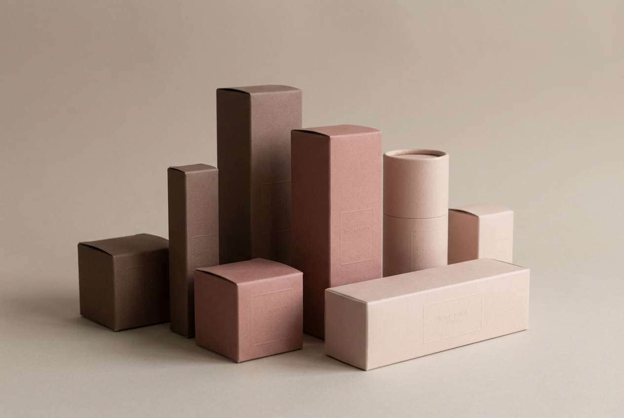
6) Mocha Rose
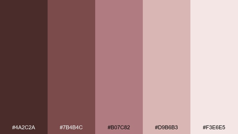
HEX: #4A2C2A #7B4B4C #B07C82 #D9B6B3 #F3E6E5
Mood: romantic, soft, modern
Best for: beauty packaging
Romantic mocha mixed with dusty rose creates a soft, modern beauty mood. It suits cosmetics labels, skincare cartons, and minimalist product ads where warmth should feel refined. Use the deeper mocha for typography and the blush tones for panels and pattern work. Tip: finish with a matte look so the palette stays understated.
Image example of mocha rose generated using media.io
7) Desert Clay
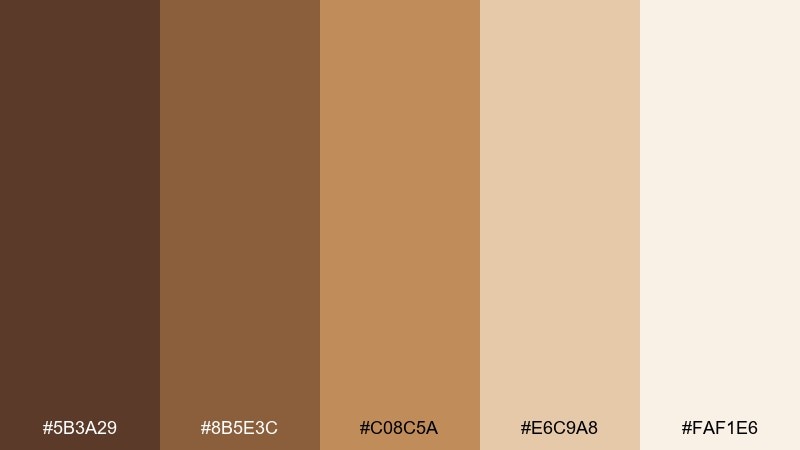
HEX: #5B3A29 #8B5E3C #C08C5A #E6C9A8 #FAF1E6
Mood: sunbaked, natural, relaxed
Best for: interior mood boards
Sunbaked clay and sandy neutrals make the room feel calm and lived-in. These tones are ideal for interior mood boards, material selections, and real estate staging graphics. Pair the mid clay shades with creamy backdrops, and use the deepest brown for small contrast touches like trim or text. Tip: add natural textures such as linen or raw wood to amplify the warmth.
Image example of desert clay generated using media.io
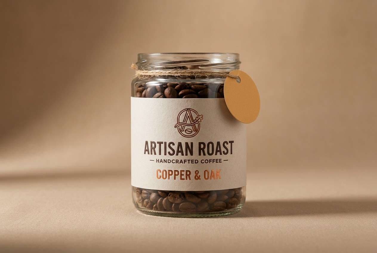
8) Copper Maple
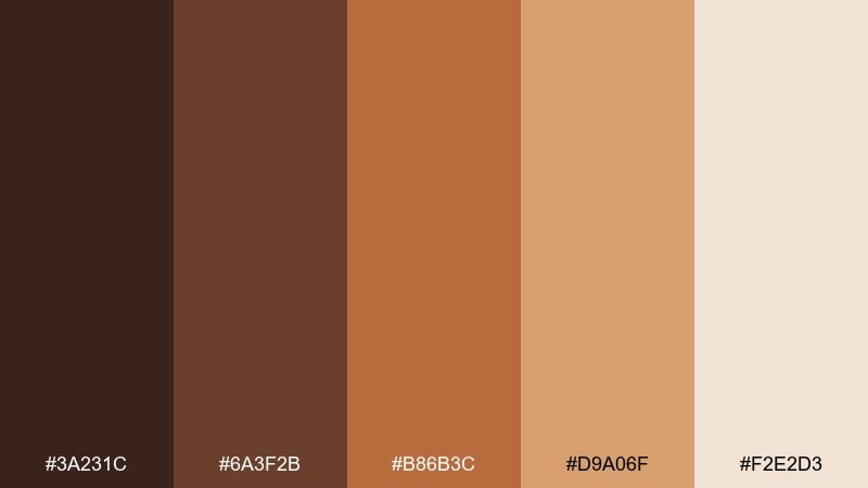
HEX: #3A231C #6A3F2B #B86B3C #D9A06F #F2E2D3
Mood: rich, energetic, artisanal
Best for: craft product labels
Rich copper warmth feels artisanal, like maple syrup and hand-finished wood. It works beautifully for craft labels, jar stickers, and boutique product cards. Keep copper as the hero on headlines or seals, supported by dark brown for structure. Tip: use subtle halftone or stamp textures to reinforce the handmade vibe.
Image example of copper maple generated using media.io
9) Cinnamon Oat
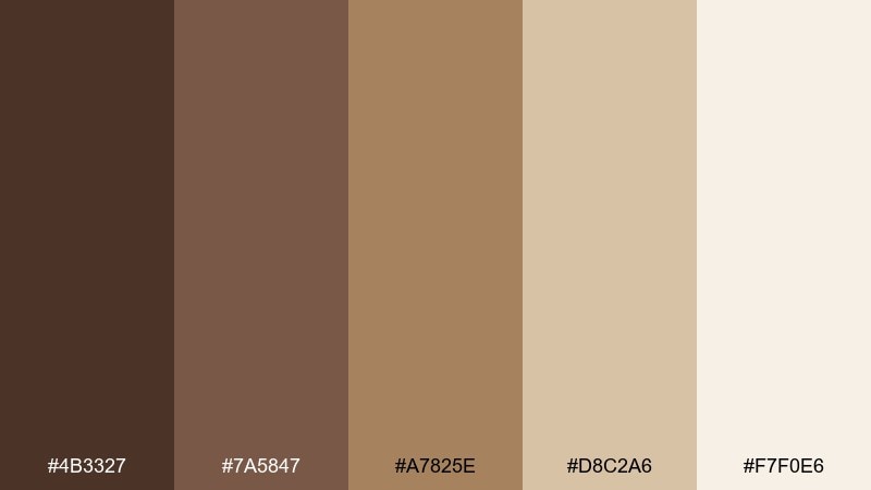
HEX: #4B3327 #7A5847 #A7825E #D8C2A6 #F7F0E6
Mood: calm, wholesome, airy
Best for: wellness newsletter layouts
Wholesome cinnamon-and-oat softness keeps the page feeling calm and breathable. These shades fit wellness newsletters, recipe PDFs, and blog graphics where readability comes first. Use the cream for generous margins and the medium browns for section headers and icons. Tip: limit body text to the two darkest shades to avoid low contrast.
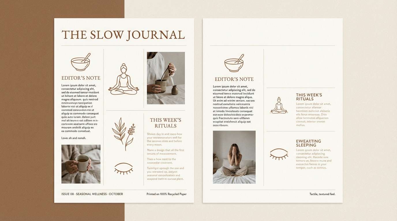
Image example of cinnamon oat generated using media.io
10) Vintage Leather
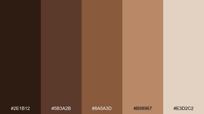
HEX: #2E1B12 #5B3A2B #8A5A3D #B98967 #E3D2C2
Mood: classic, masculine, heritage
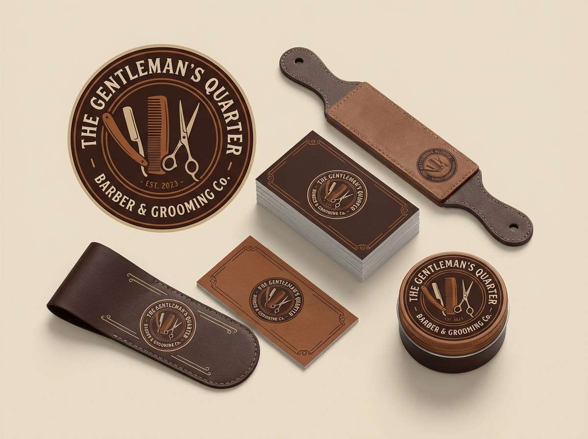
Best for: barber shop branding
Heritage leather tones bring a classic, well-worn charm. They are strong for barber shop branding, signage, and business cards that need authority without looking harsh. Pair the darkest shade with the pale beige for crisp contrast, then use the warm mid browns for secondary elements. Tip: a single vintage ornament line in the tan can elevate the whole system.
Image example of vintage leather generated using media.io
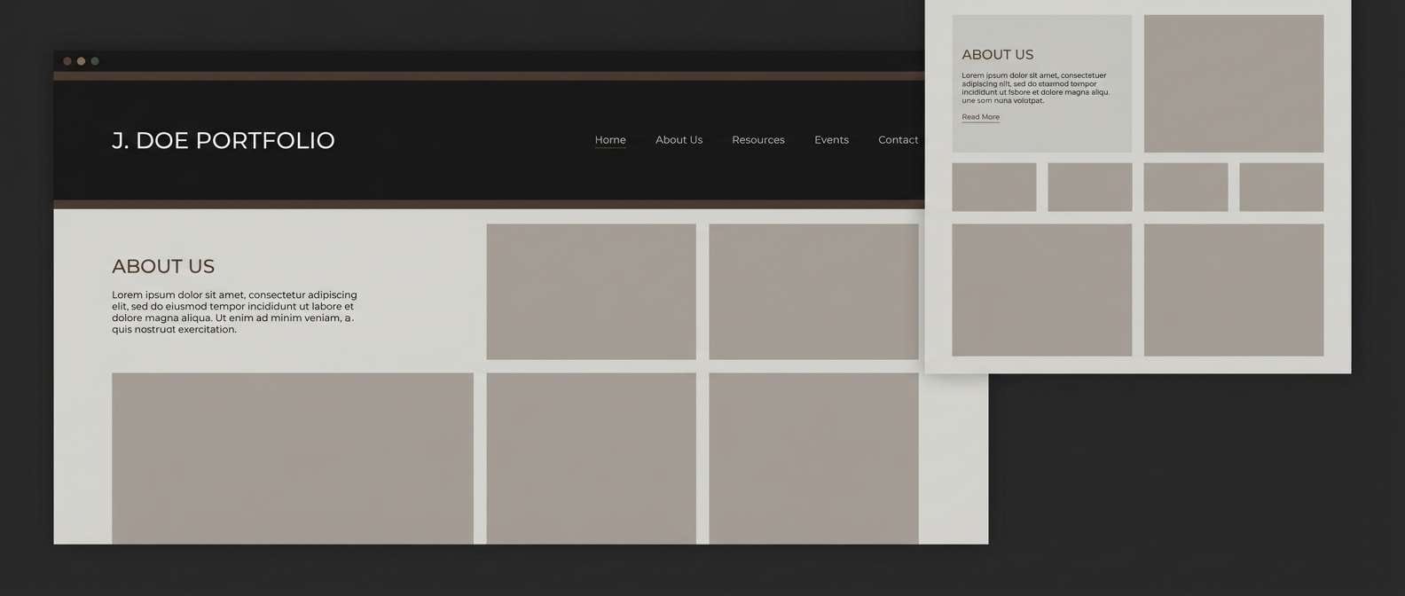
11) Smoked Walnut
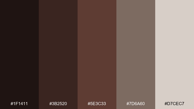
HEX: #1F1411 #3B2520 #5E3C33 #7D6A60 #D7CEC7
Mood: sophisticated, smoky, quiet
Best for: portfolio websites
Smoky walnut neutrals feel quiet, confident, and editorial. They fit portfolio websites where photography needs a dark frame and typography should look intentional. Use the near-black brown for navigation and footers, with the pale gray-beige for content areas. Tip: keep buttons in the mid walnut shade so CTAs stand out without turning loud.
Image example of smoked walnut generated using media.io
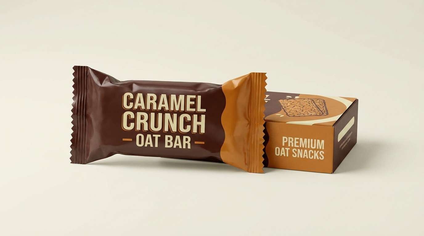
12) Brown Sugar Pop
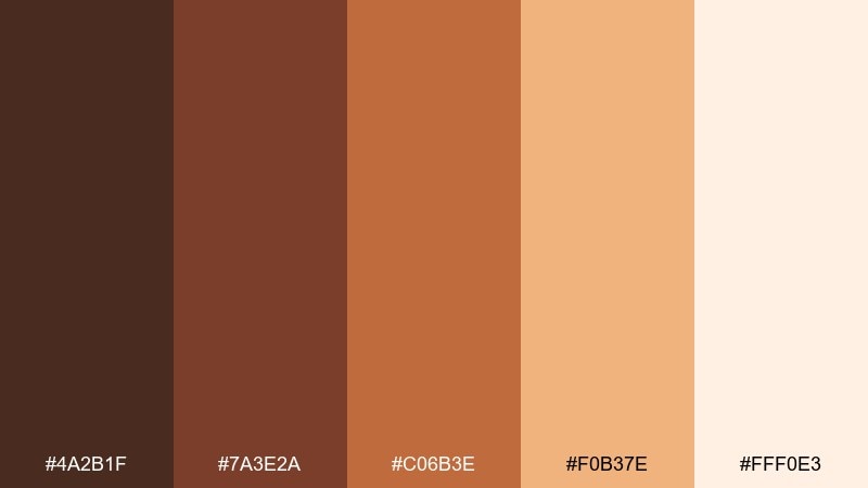
HEX: #4A2B1F #7A3E2A #C06B3E #F0B37E #FFF0E3
Mood: playful, warm, energetic
Best for: snack product ads
Playful brown-sugar warmth adds energy without losing the cozy feel. It is great for snack ads, promo banners, and punchy headlines where you want appetizing color. Let the bright caramel act as the spotlight, with dark cocoa for text and structure. Tip: keep backgrounds light so the orange-brown pops cleanly.
Image example of brown sugar pop generated using media.io
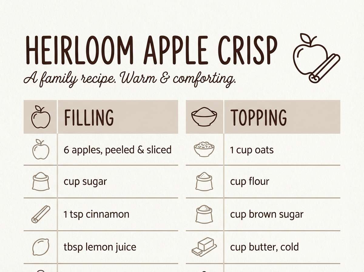
13) Rustic Farmhouse
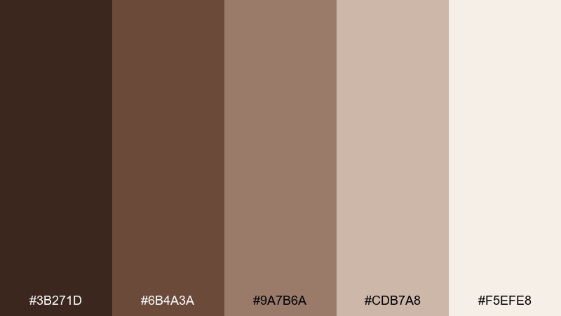
HEX: #3B271D #6B4A3A #9A7B6A #CDB7A8 #F5EFE8
Mood: homey, simple, comforting
Best for: recipe blog headers
Homey farmhouse neutrals feel simple, comforting, and easy to read. These shades work well for recipe blog headers, Pinterest pins, and printable cooking cards. Use the darkest brown for titles, then layer warm taupes for section labels and borders. Tip: add a subtle paper texture behind the cream to avoid a flat look.
Image example of rustic farmhouse generated using media.io
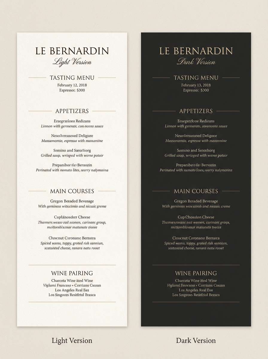
14) Café Noir
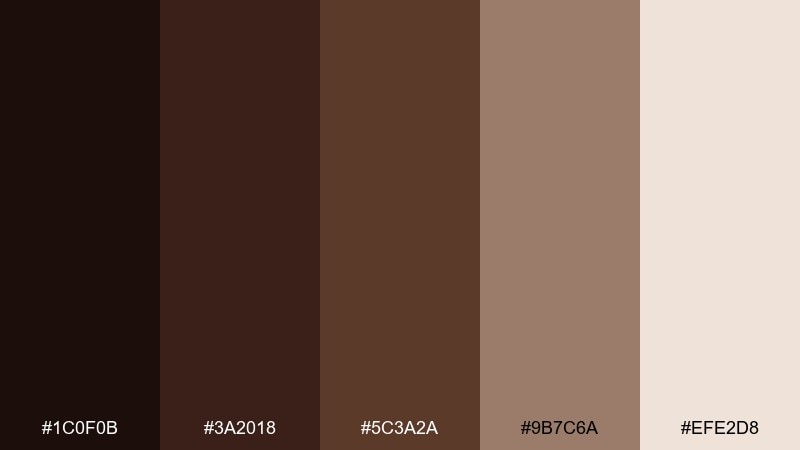
HEX: #1C0F0B #3A2018 #5C3A2A #9B7C6A #EFE2D8
Mood: bold, elegant, nocturnal
Best for: restaurant menu redesign
Bold café noir tones feel elegant and nocturnal, like a late-night bistro. They are excellent for menu redesigns, table tents, and refined typographic hierarchies. Use the near-black as a backdrop, then lift details with the warm beige so the layout stays readable. Tip: keep spacing generous and avoid heavy borders to maintain a premium feel.
Image example of café noir generated using media.io
15) Hazelnut Sage
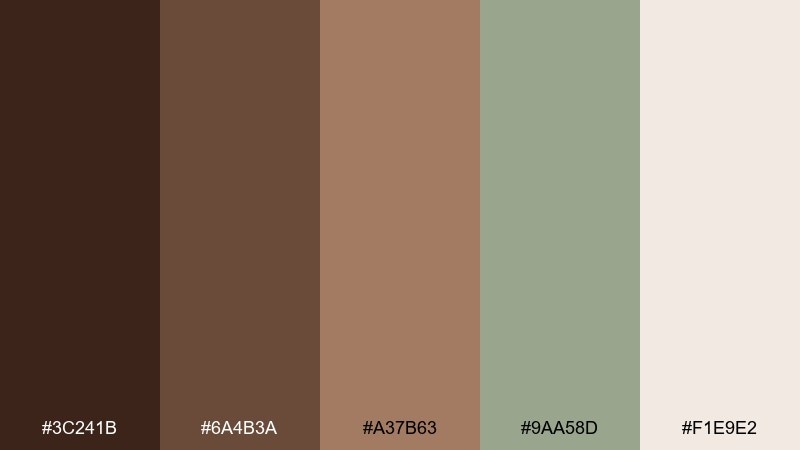
HEX: #3C241B #6A4B3A #A37B63 #9AA58D #F1E9E2
Mood: fresh, organic, balanced
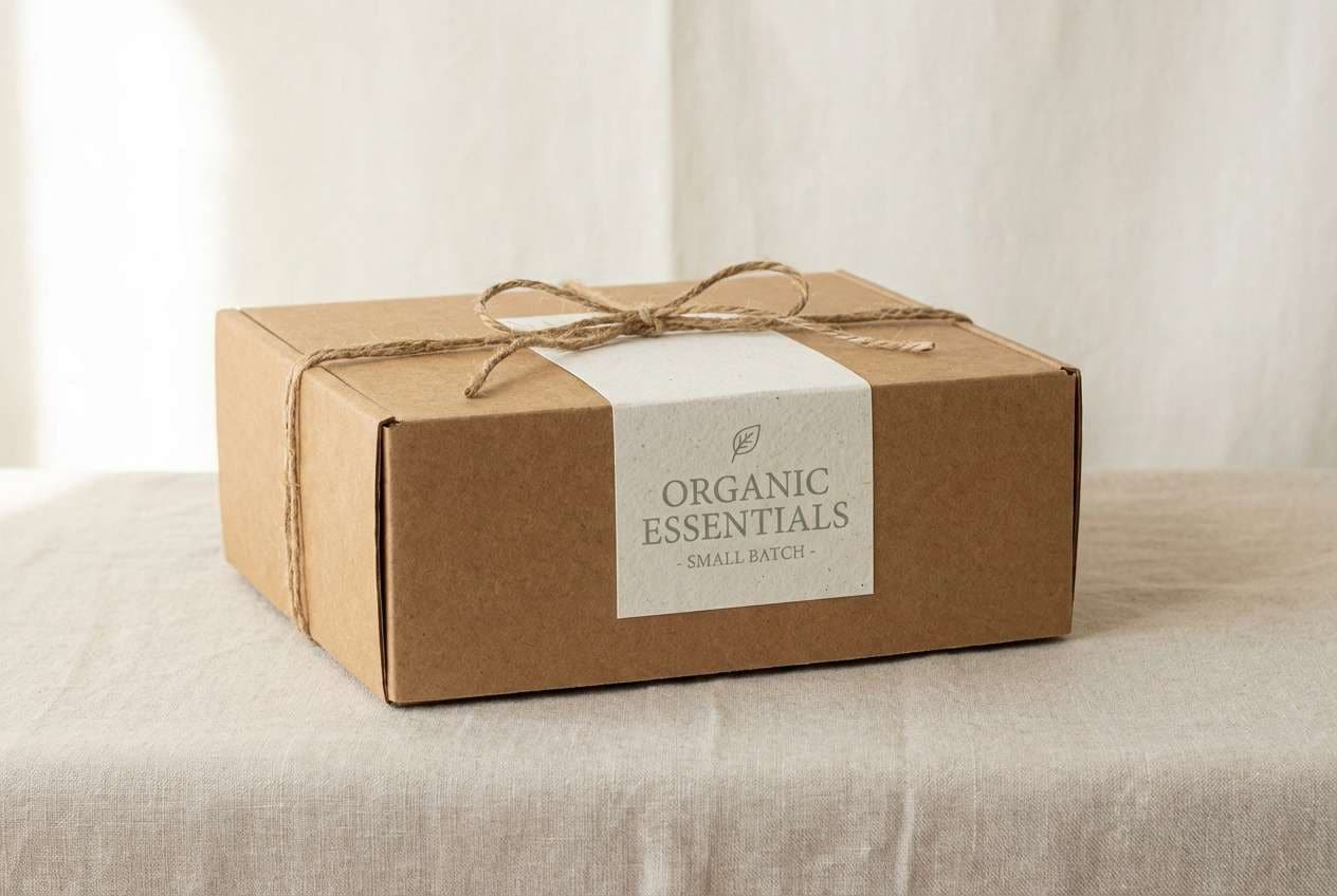
Best for: eco-friendly packaging
Organic hazelnut browns paired with soft sage feel fresh and balanced. The mix suits eco-friendly packaging, sustainable product pages, and natural skincare storytelling. Keep the browns dominant for warmth, and bring in sage for badges, icons, or ingredient cues. Tip: use uncoated paper textures to match the earthy direction.
Image example of hazelnut sage generated using media.io
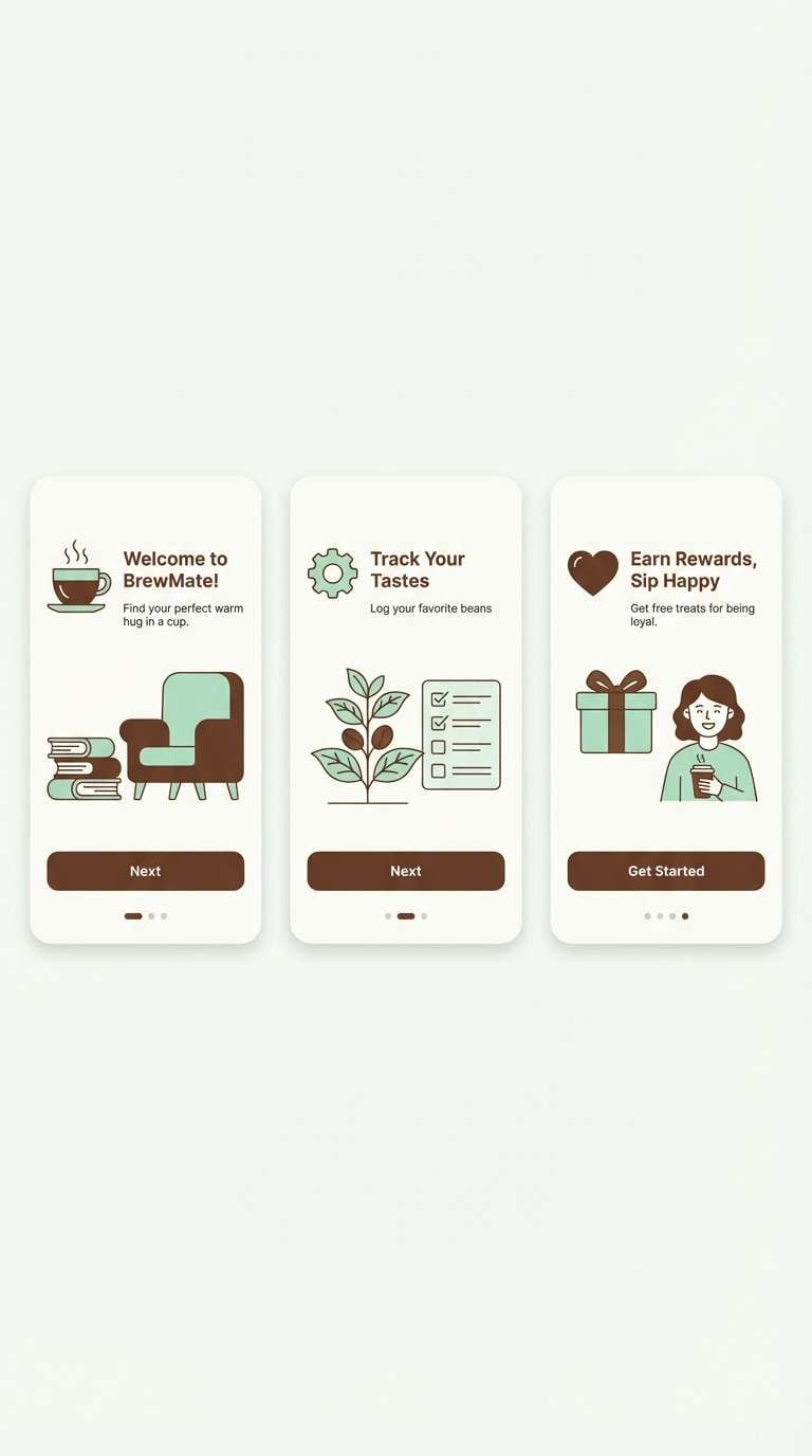
16) Chocolate Mint
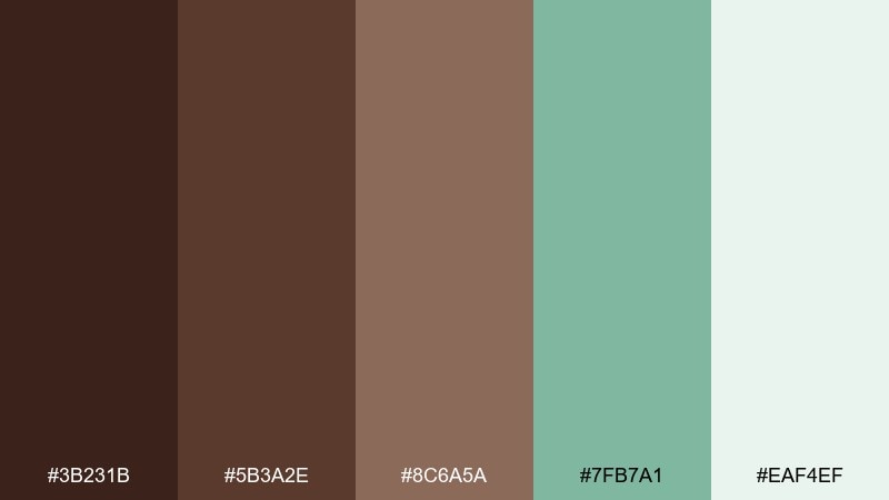
HEX: #3B231B #5B3A2E #8C6A5A #7FB7A1 #EAF4EF
Mood: cool, modern, refreshing
Best for: app onboarding screens
Cool mint against warm brown feels modern and refreshing, like a classic dessert twist. This chocolate brown color palette works well for onboarding screens, feature highlights, and friendly dashboards. Use the mint as the interaction color for buttons and toggles, while browns handle structure and text. Tip: keep the background very light so the mint reads as crisp, not pastel-muddy.
Image example of chocolate mint generated using media.io
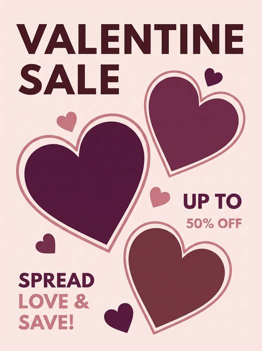
17) Berry Ganache
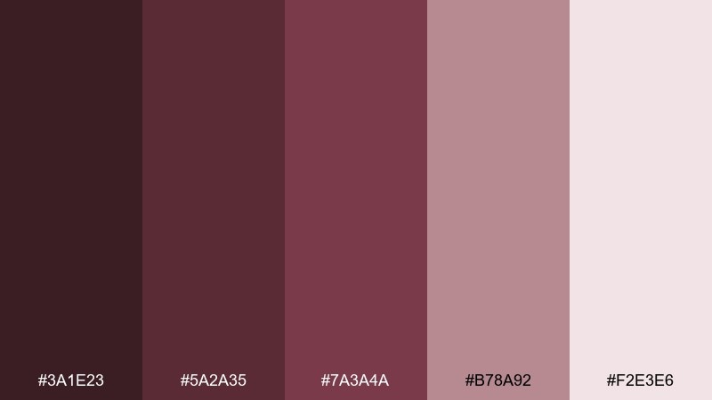
HEX: #3A1E23 #5A2A35 #7A3A4A #B78A92 #F2E3E6
Mood: luxurious, indulgent, romantic
Best for: valentine campaign graphics
Berry ganache tones feel indulgent and romantic, with a grown-up edge. They are perfect for Valentine campaign graphics, boutique promos, and elegant story templates. Keep the darkest berry-brown for type and use the dusty pink for supporting shapes or gradients. Tip: try metallic foil effects sparingly to maintain sophistication.
Image example of berry ganache generated using media.io
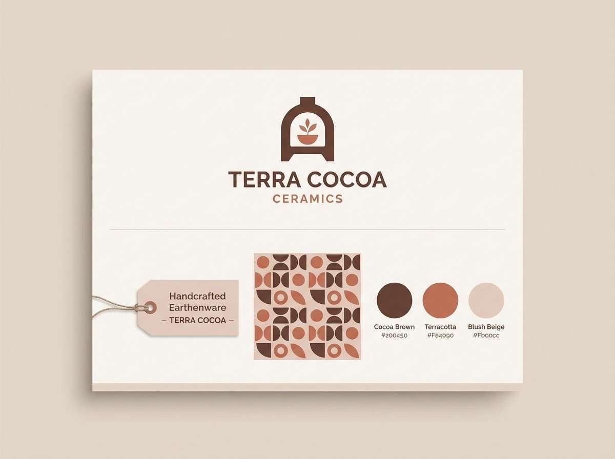
18) Terracotta Cocoa
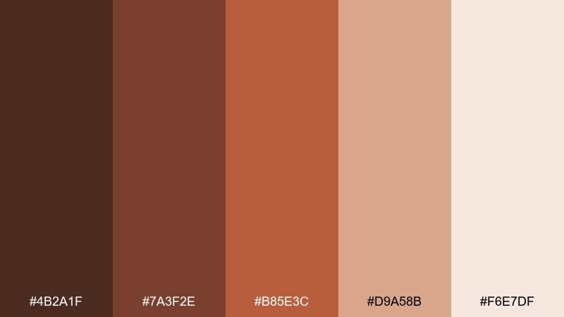
HEX: #4B2A1F #7A3F2E #B85E3C #D9A58B #F6E7DF
Mood: artsy, warm, Mediterranean
Best for: ceramic shop branding
Artsy terracotta warmth meets cocoa depth, evoking sunlit studios and handmade ceramics. It fits pottery shop branding, craft fair signage, and product tags that need personality. Use terracotta for feature blocks and the darkest cocoa for crisp lettering. Tip: combine with simple geometric patterns to echo tilework without clutter.
Image example of terracotta cocoa generated using media.io
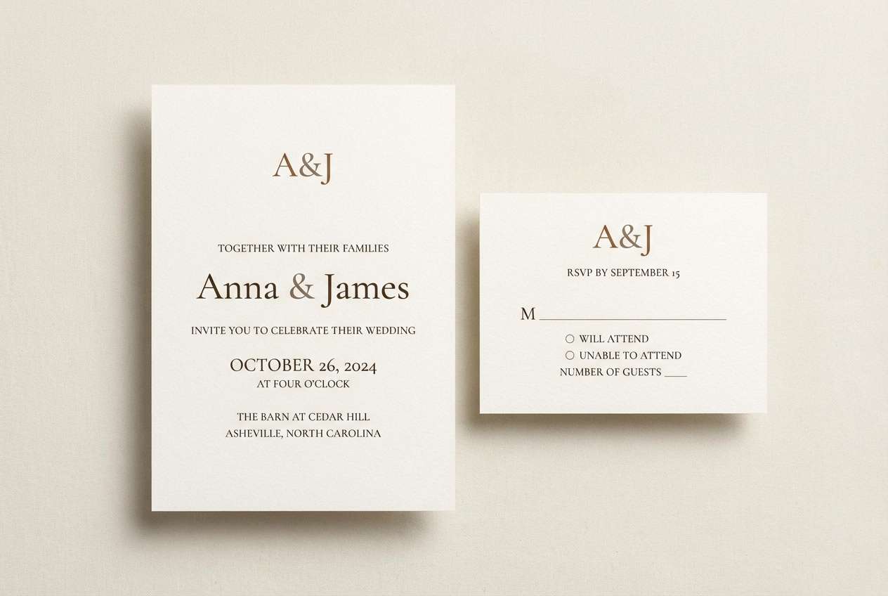
19) Sandstone Chocolate
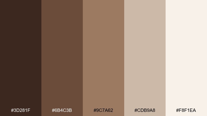
HEX: #3D281F #6B4C3B #9C7A62 #CDB9A8 #F8F1EA
Mood: neutral, calm, timeless
Best for: wedding invitation suites
Timeless sandstone neutrals feel calm and quietly romantic. This set is a great fit for invitation suites, place cards, and minimalist wedding signage. Keep the light cream as the paper color and use the mid browns for typography and monograms. Tip: emboss the darkest brown elements for a subtle premium finish.
Image example of sandstone chocolate generated using media.io
20) Midnight Cacao
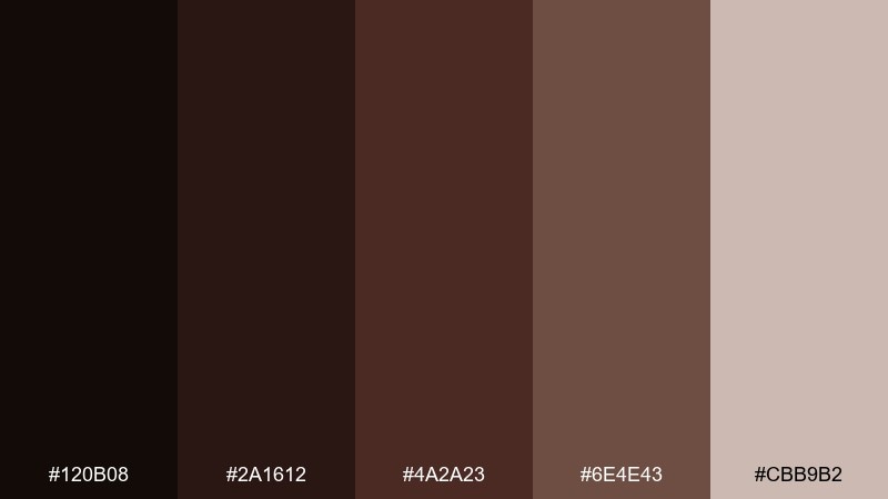
HEX: #120B08 #2A1612 #4A2A23 #6E4E43 #CBB9B2
Mood: mysterious, bold, cinematic
Best for: music album cover art
Cinematic midnight cacao feels mysterious and bold, like a dim stage spotlight. These chocolate brown color combinations suit album cover art, podcast thumbnails, and moody promotional banners. Use the near-black for the backdrop, then lift key text with the warm taupe so it stays readable at small sizes. Tip: add a soft grain overlay to push the cinematic mood.
Image example of midnight cacao generated using media.io

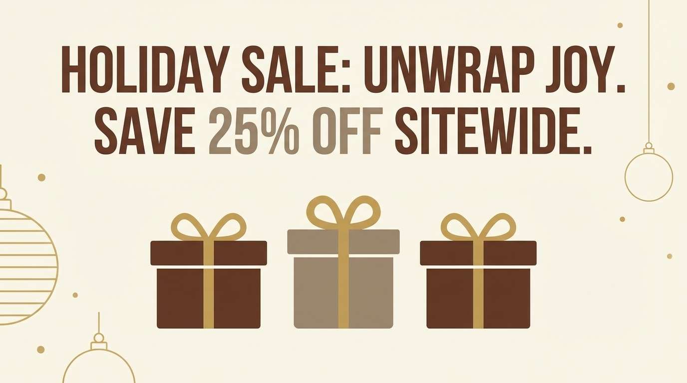
21) Gilded Cocoa
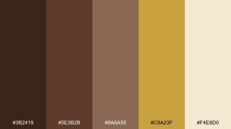
HEX: #3B2419 #5E3B2B #8A6A55 #C9A23F #F4E8D0
Mood: opulent, warm, celebratory
Best for: holiday promo banners
Opulent cocoa with a touch of gold feels celebratory and premium. This chocolate brown color palette is ideal for holiday promo banners, gift guides, and special-edition drops. Keep gold for small accents like price badges and dividers, letting the browns do the heavy lifting. Tip: avoid large gold fills and use it as a highlight so it stays classy, not flashy.
Image example of gilded cocoa generated using media.io
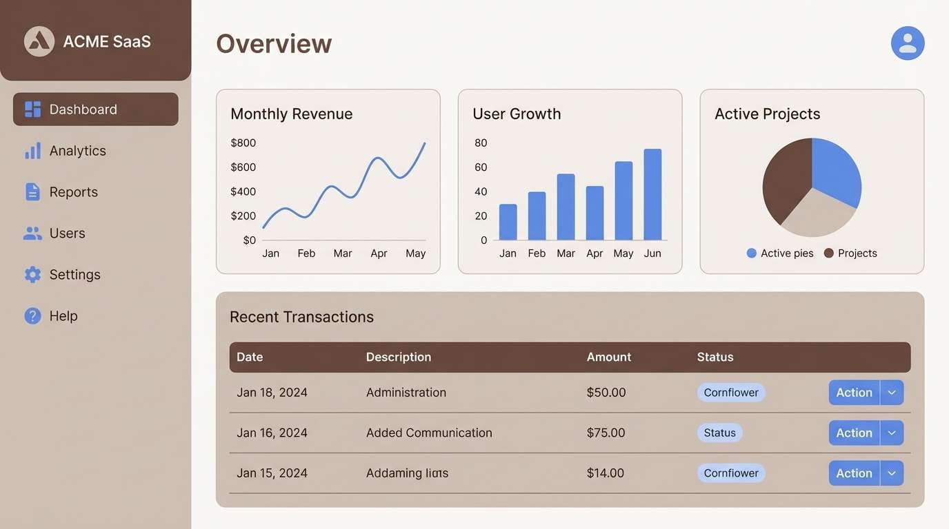
22) Cocoa and Cornflower
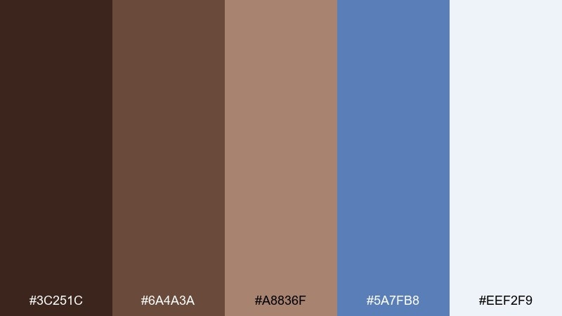
HEX: #3C251C #6A4A3A #A8836F #5A7FB8 #EEF2F9
Mood: modern, confident, balanced
Best for: SaaS dashboard UI
Confident cocoa browns with a clean cornflower blue feel modern and balanced. These chocolate brown color combinations work especially well in dashboards where you need a calm base plus a clear action color. Use blue for links, charts, and primary buttons, while browns handle navigation and text. Tip: keep charts mostly neutral and reserve blue for the key metric line.
Image example of cocoa and cornflower generated using media.io
What Colors Go Well with Chocolate Brown?
Chocolate brown pairs best with warm light neutrals like cream, ivory, oatmeal, and beige—these keep the look bright while letting brown provide structure and comfort.
For modern contrast, add cool accents like cornflower blue, mint, or muted sage. For a richer, more premium direction, introduce metallic-like hues (gold) or dusty rose and berry tones.
If you need a quick rule: use brown as your base, a light neutral as your background, and one accent (blue/green/gold/rose) for highlights and CTAs.
How to Use a Chocolate Brown Color Palette in Real Designs
In branding, use the darkest chocolate brown for logos and headings, then rely on creams and soft tans for packaging space, labels, and readable body text. This keeps the system warm without feeling heavy.
In web/UI, treat brown like a refined “dark mode” neutral: apply it to navigation, footers, and typography, then use a pale background for content areas. Keep one accent color for buttons so interactions are clear.
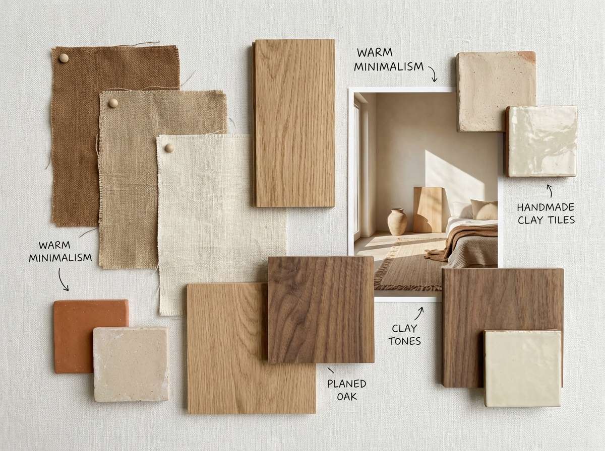
For interiors and print, lean on texture—linen, kraft paper, raw wood, and matte finishes make chocolate browns feel intentional and elevated rather than flat.
Create Chocolate Brown Palette Visuals with AI
If you want to see these palettes in action, generate quick mockups (menus, posters, dashboards, packaging) with AI using the prompts above. It’s a fast way to test mood, contrast, and layout before committing to final design files.
Start with one palette, keep the background light for readability, and iterate by swapping only the accent color (mint/blue/gold/rose) to find the best fit for your brand or project.
Chocolate Brown Color Palette FAQs
-
What HEX code is closest to “chocolate brown”?
A commonly used chocolate brown is #4B2E2A, but “chocolate brown” can range from near-black cacao tones to warmer mocha shades depending on lighting and context. -
Is chocolate brown a warm or cool color?
Chocolate brown is usually warm because it often contains red/orange undertones. It can feel cooler when paired with gray-beige neutrals or accents like blue and mint. -
What colors pair best with chocolate brown for websites?
Light neutrals (cream, ivory, beige) for backgrounds plus one cool accent (cornflower blue or mint) for links and buttons tends to look modern and readable. -
How do I keep brown palettes from looking too dark?
Increase the amount of light space: use cream as the primary background, keep dark browns for headings/navigation, and use mid browns for cards/dividers instead of full-page fills. -
Does chocolate brown work for luxury branding?
Yes—deep espresso or near-black cacao paired with soft beige and restrained gold accents can look premium, especially with strong typography and minimal layouts. -
What’s a good accent color for chocolate brown packaging?
Muted sage is a popular choice for eco/natural products, while dusty rose or berry tones suit beauty and gifting. Gold works best as a small highlight rather than a large fill. -
How can I generate chocolate brown palette mockups quickly?
Use Media.io’s text-to-image tool with a clear prompt (design type + style + “dominant colors chocolate brown + accent”), then iterate by changing only the accent and background tone.


