

Classic color palettes never look out of place. They balance deep inks, warm neutrals, and refined accents that feel familiar across web, print, and branding.
Below are 20 timeless classic color combinations with HEX codes, plus AI image prompts you can reuse to visualize each look fast.
In this article
- Why Classic Palettes Work So Well
-
- heritage navy
- ivory & charcoal
- library burgundy
- tweed olive
- porcelain blue
- sepia leather
- cambridge green
- regal plum
- brass & ink
- stonewashed denim
- vintage rosewood
- linen & sage
- old money taupe
- midnight espresso
- chalkboard mint
- gilded walnut
- coastal sandstone
- opera red
- smoke & steel
- autumn herringbone
- What Colors Go Well with Classic?
- How to Use a Classic Color Palette in Real Designs
- Create Classic Palette Visuals with AI
Why Classic Palettes Work So Well
A classic color scheme relies on proven contrast and comfortable neutrals, so it stays readable in everything from editorial spreads to UI components. These palettes feel “designed” even with simple typography and minimal layout.
Classic color palettes also age well because they avoid trend-heavy saturation and novelty hues. Deep navies, charcoals, creams, and warm metallic accents keep the mood refined without feeling dated.
Most importantly, timeless color palettes make hierarchy easy: one anchor dark, one light base, and one restrained accent. That structure translates cleanly across print stocks, screens, and different lighting conditions.
20+ Classic Color Palette Ideas (with HEX Codes)
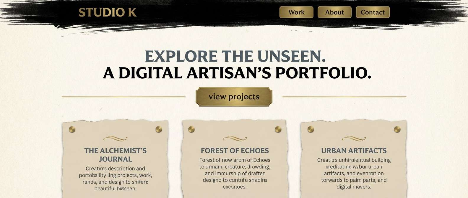
1) Heritage Navy
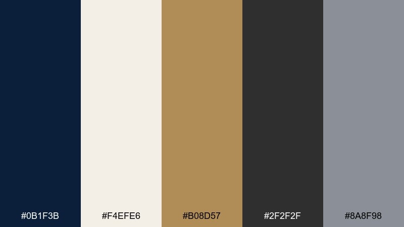
HEX: #0b1f3b #f4efe6 #b08d57 #2f2f2f #8a8f98
Mood: timeless, confident, refined
Best for: brand identity and stationery
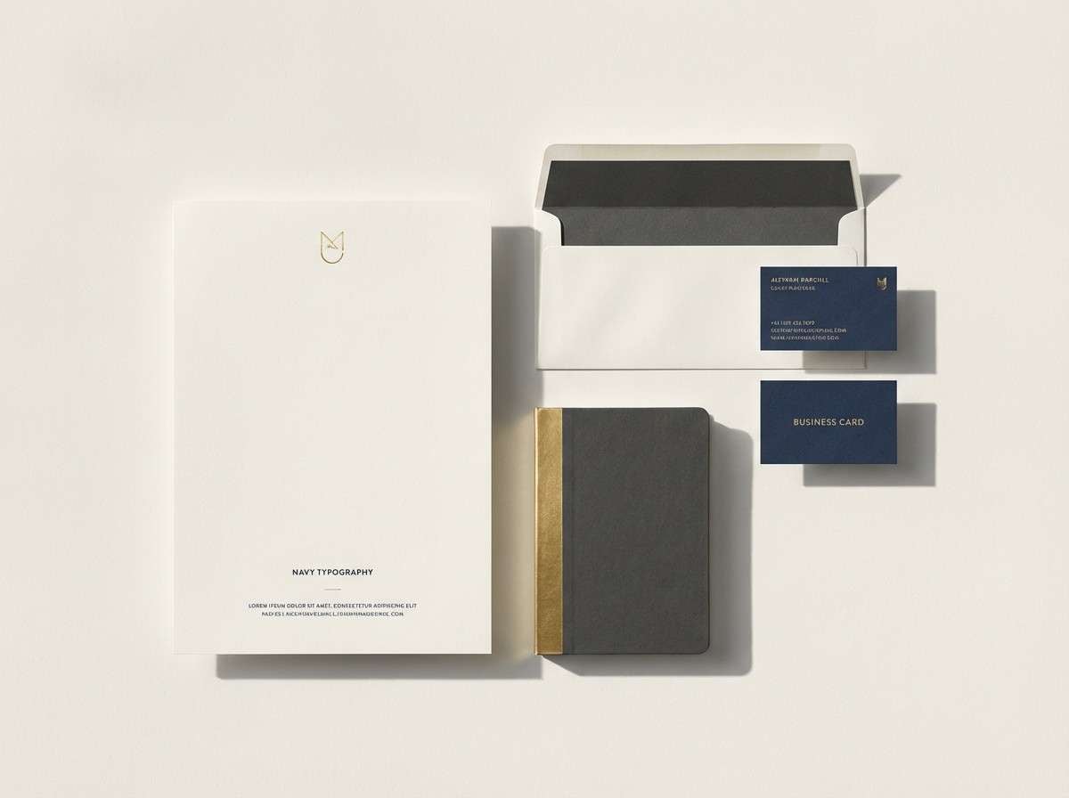
Confident and tailored, this mix feels like navy blazers, cream paper, and a warm brass pen. It reads premium without trying too hard, especially for heritage or professional brands. Use the navy for headlines, keep the cream as breathing room, and reserve the gold tone for logos or seals. For a balanced classic color palette, pair it with plenty of negative space and one strong type family.
Image example of heritage navy generated using media.io
Media.io is an online AI studio for creating and editing video, image, and audio in your browser.

2) Ivory & Charcoal
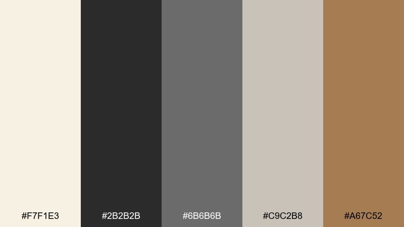
HEX: #f7f1e3 #2b2b2b #6b6b6b #c9c2b8 #a67c52
Mood: minimal, elegant, editorial
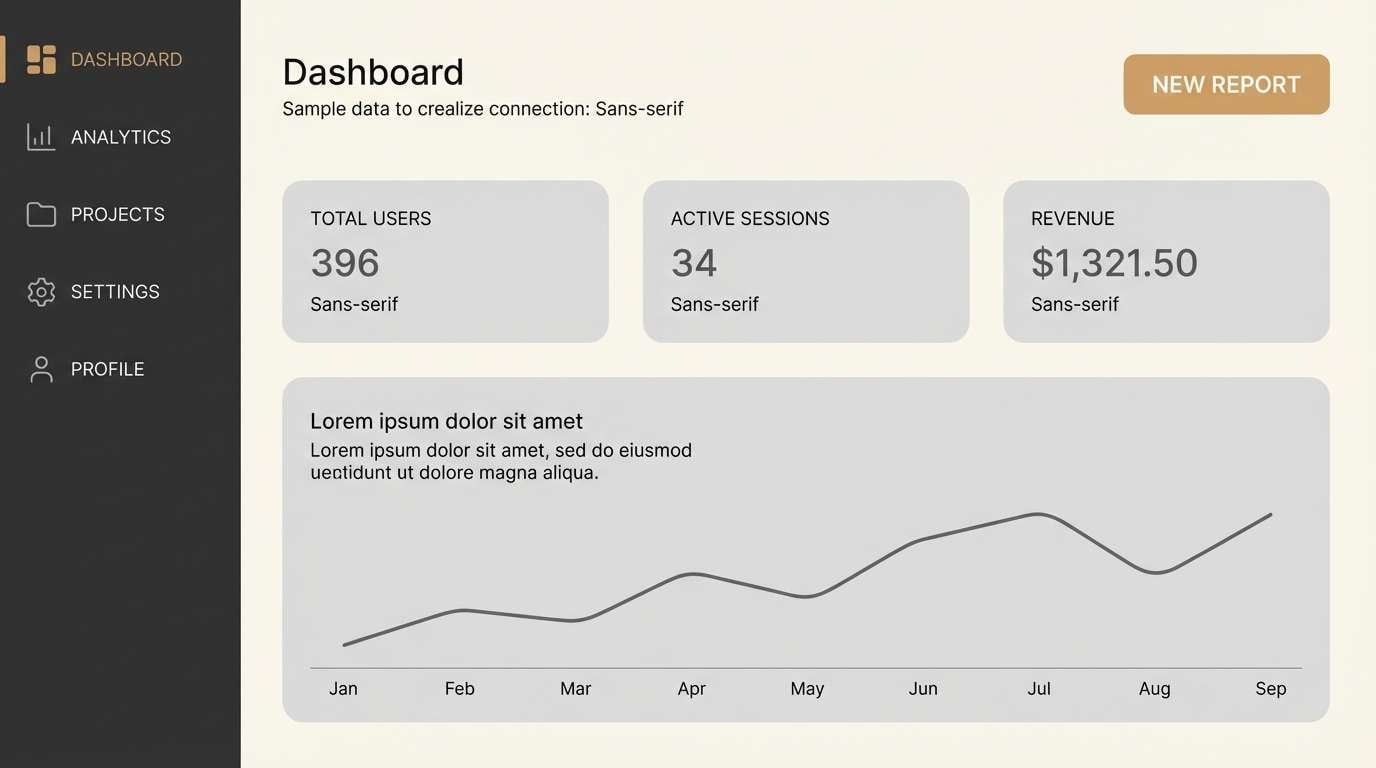
Best for: web UI and dashboards
Quiet and polished, these tones evoke matte paper, soft shadows, and clean grid layouts. The high contrast makes interfaces readable while still feeling warm and human. Let charcoal carry typography, keep ivory for panels, and use the tan accent for active states or key metrics. A subtle mid-gray helps separate sections without adding visual noise.
Image example of ivory & charcoal generated using media.io
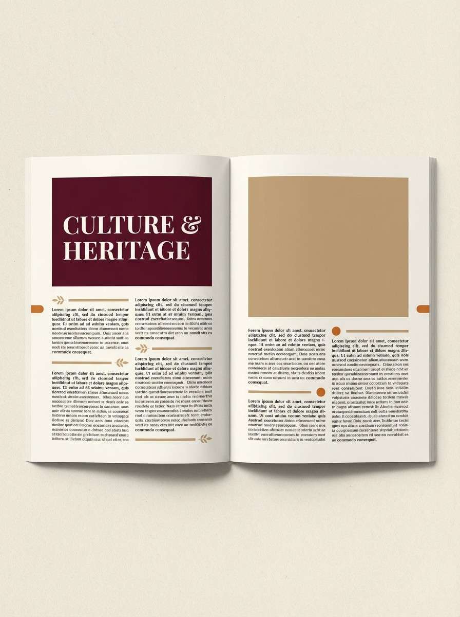
3) Library Burgundy
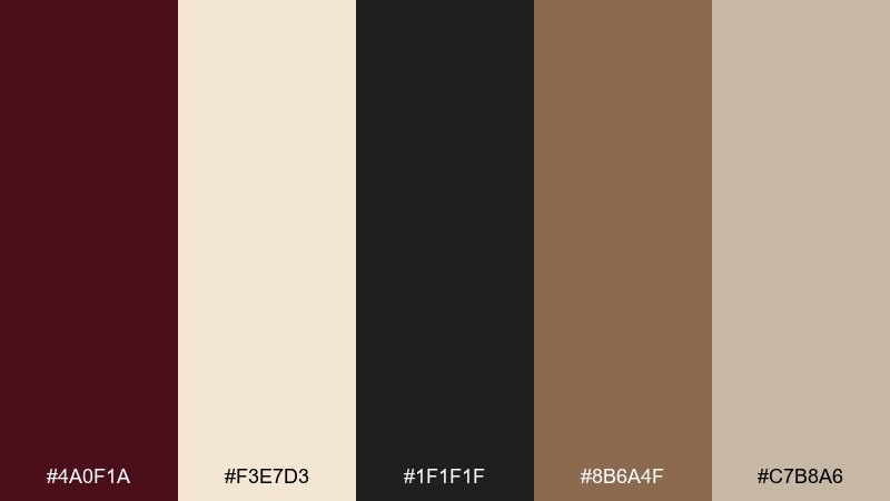
HEX: #4a0f1a #f3e7d3 #1f1f1f #8b6a4f #c7b8a6
Mood: scholarly, warm, sophisticated
Best for: book covers and editorial layouts
Moody and literary, it brings to mind leather spines, aged paper, and quiet reading rooms. Burgundy works best as a bold block color, while the parchment tones keep the layout inviting. Pair black with the warm tan for captions and dividers to maintain structure. Keep burgundy to 10 to 20 percent of the page for an expensive, restrained look.
Image example of library burgundy generated using media.io
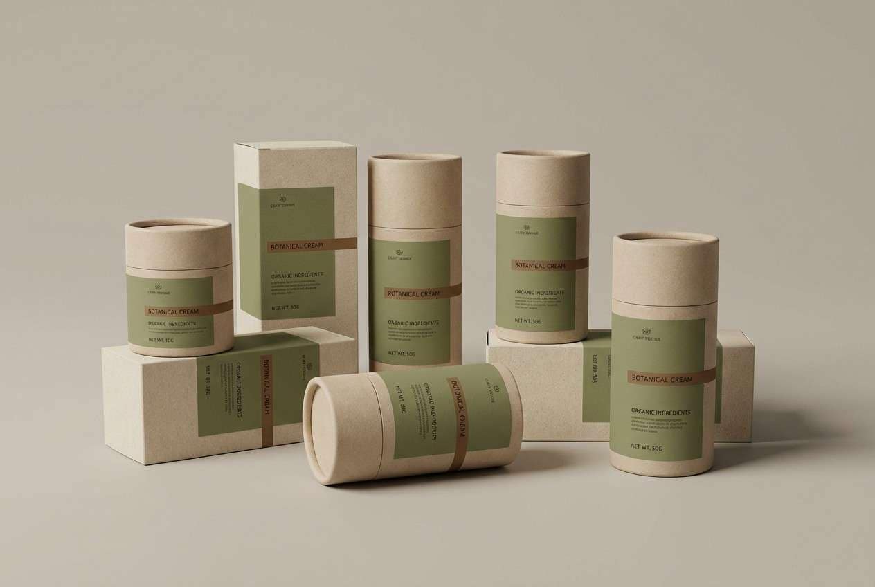
4) Tweed Olive
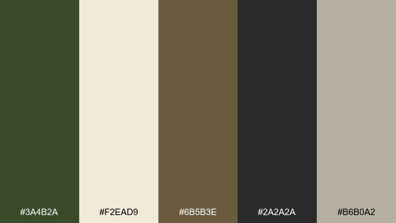
HEX: #3a4b2a #f2ead9 #6b5b3e #2a2a2a #b6b0a2
Mood: earthy, grounded, outdoorsy
Best for: packaging for natural products
Earth-first and reassuring, it feels like tweed jackets, field journals, and forest walks. The olive and brown read organic, while the creamy neutral keeps labels clean and legible. Use charcoal for ingredient text and let olive lead the brand mark. Add the warm gray as a background tint to avoid stark white and keep it artisanal.
Image example of tweed olive generated using media.io
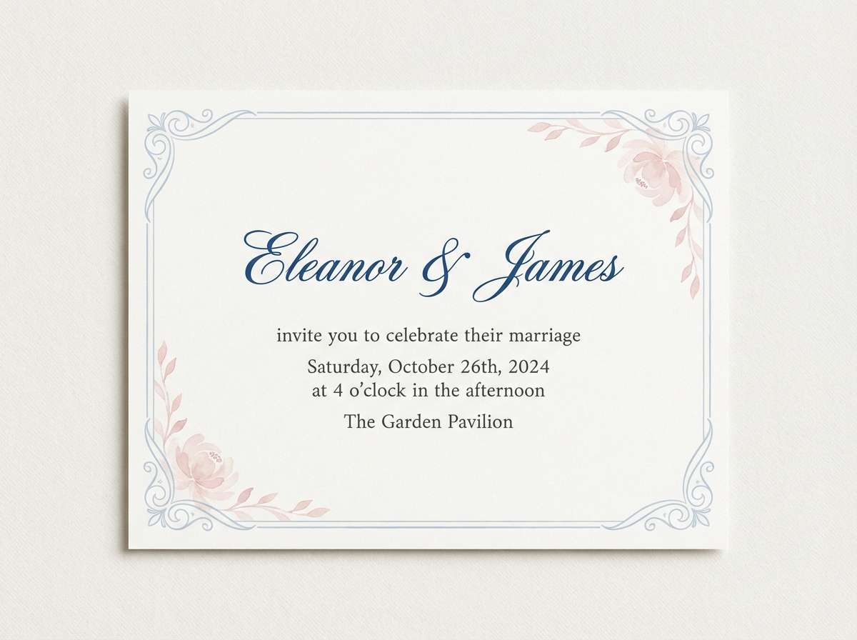
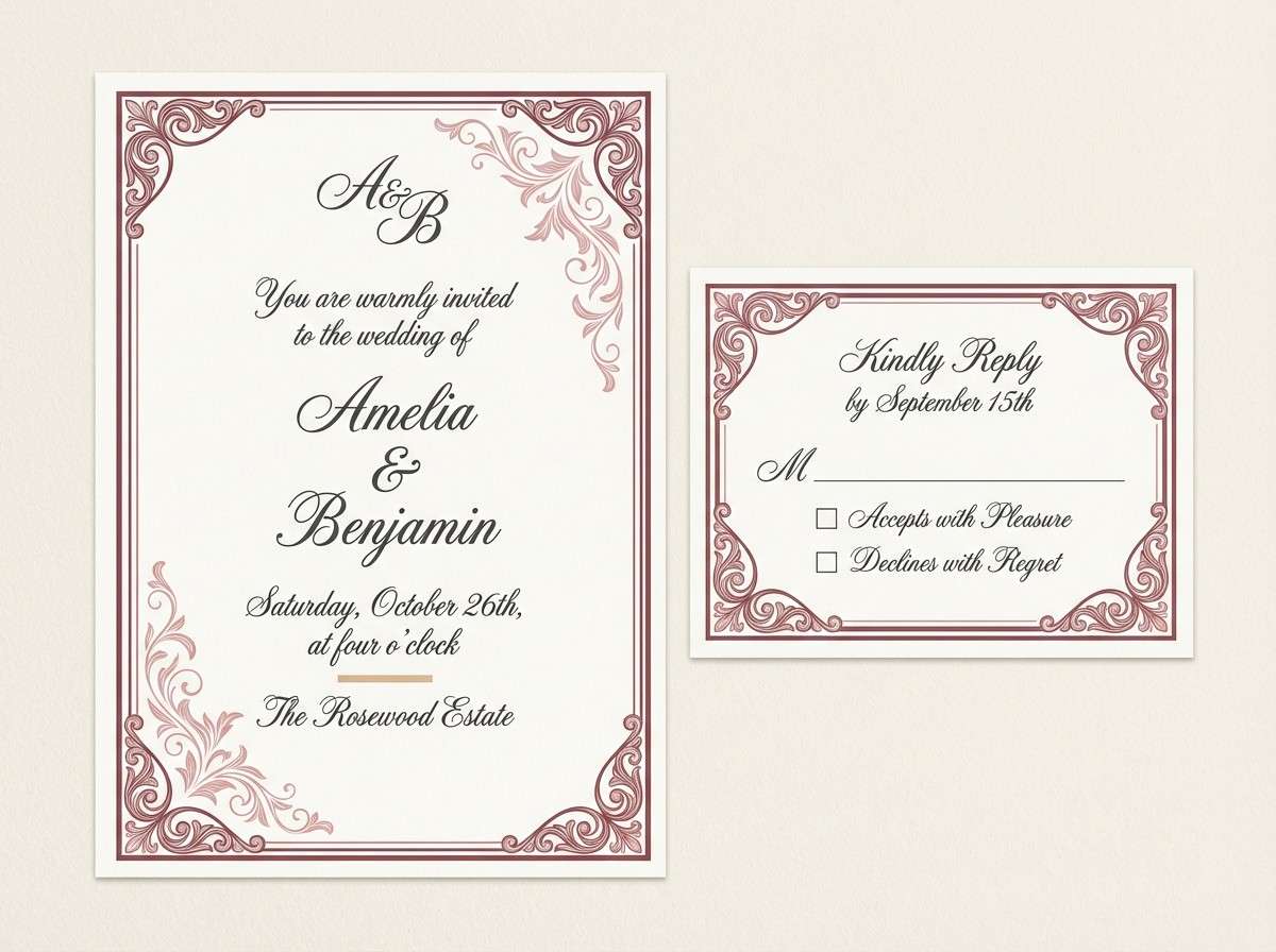
5) Porcelain Blue
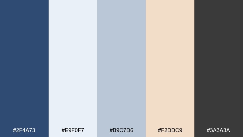
HEX: #2f4a73 #e9f0f7 #b9c7d6 #f2ddc9 #3a3a3a
Mood: calm, airy, refined
Best for: wedding invitations and stationery
Light and graceful, it recalls porcelain glaze, soft mornings, and handwritten notes. The pale blues make a serene base, while the peachy blush adds warmth without turning sugary. Use the deep blue for names and headings, and keep charcoal for tiny details like dates and RSVP lines. A deckled paper texture pairs beautifully with these tones.
Image example of porcelain blue generated using media.io
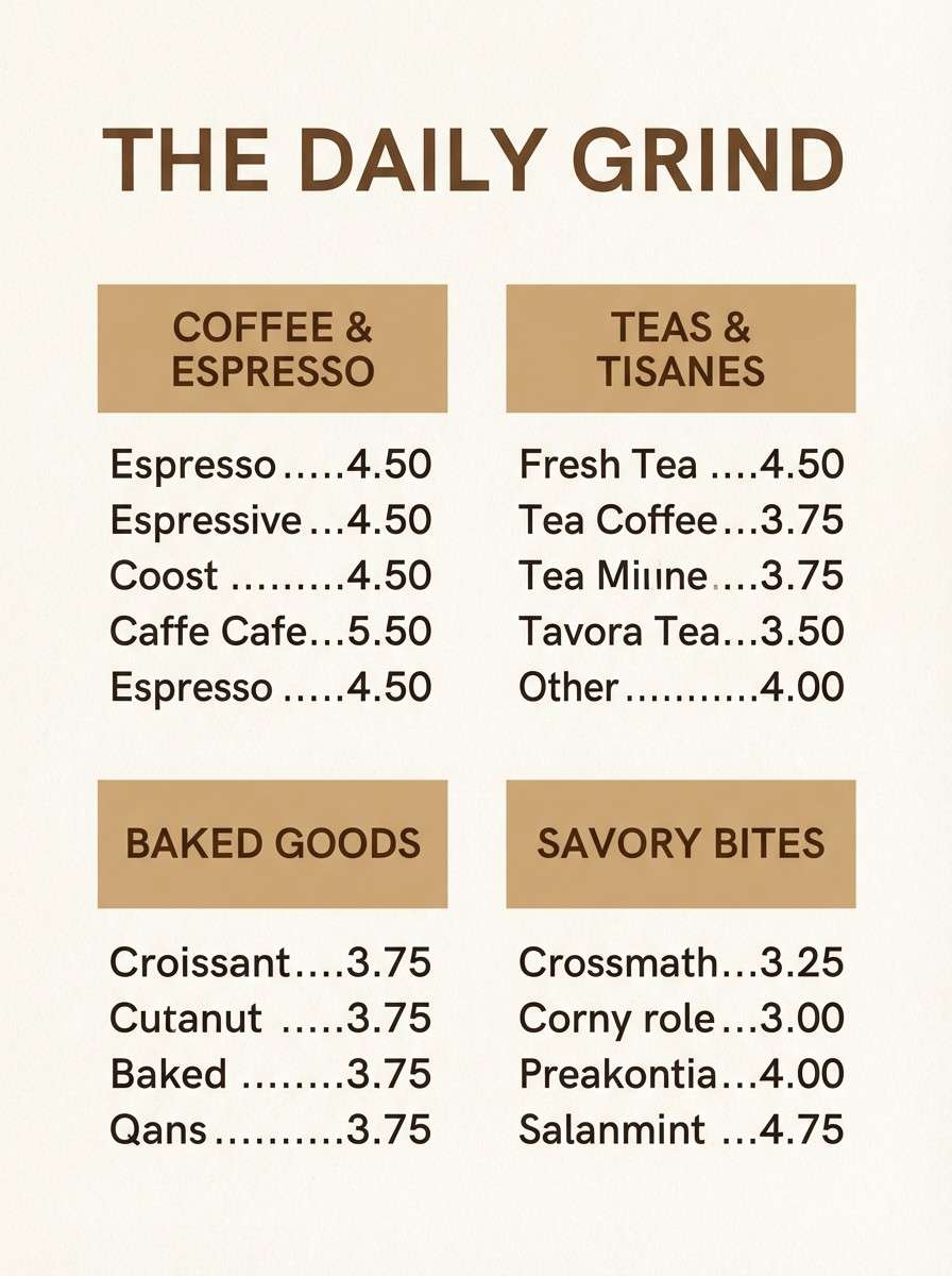
6) Sepia Leather
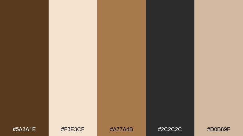
HEX: #5a3a1e #f3e3cf #a77a4b #2c2c2c #d0b89f
Mood: vintage, cozy, handcrafted
Best for: coffee labels and cafe menus
Warm and nostalgic, these tones suggest worn leather, sepia photos, and fresh-ground coffee. The browns are strong enough for bold headings, while the creamy neutrals keep menus easy to scan. For classic color combinations that feel authentic, lean on texture like kraft paper and subtle grain. Use the darkest shade sparingly for pricing and icons to keep the layout friendly.
Image example of sepia leather generated using media.io
7) Cambridge Green
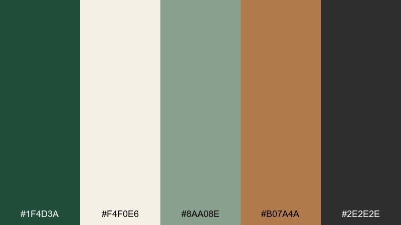
HEX: #1f4d3a #f4f0e6 #8aa08e #b07a4a #2e2e2e
Mood: fresh, academic, poised
Best for: university club posters
Crisp and respectable, it feels like ivy halls, fountain pens, and announcement boards. The green brings authority without heaviness, and the cream keeps everything readable from a distance. Use the copper accent for dates or callouts so the hierarchy stays clear. Stick to one or two bold shapes and let typography do the talking.
Image example of cambridge green generated using media.io

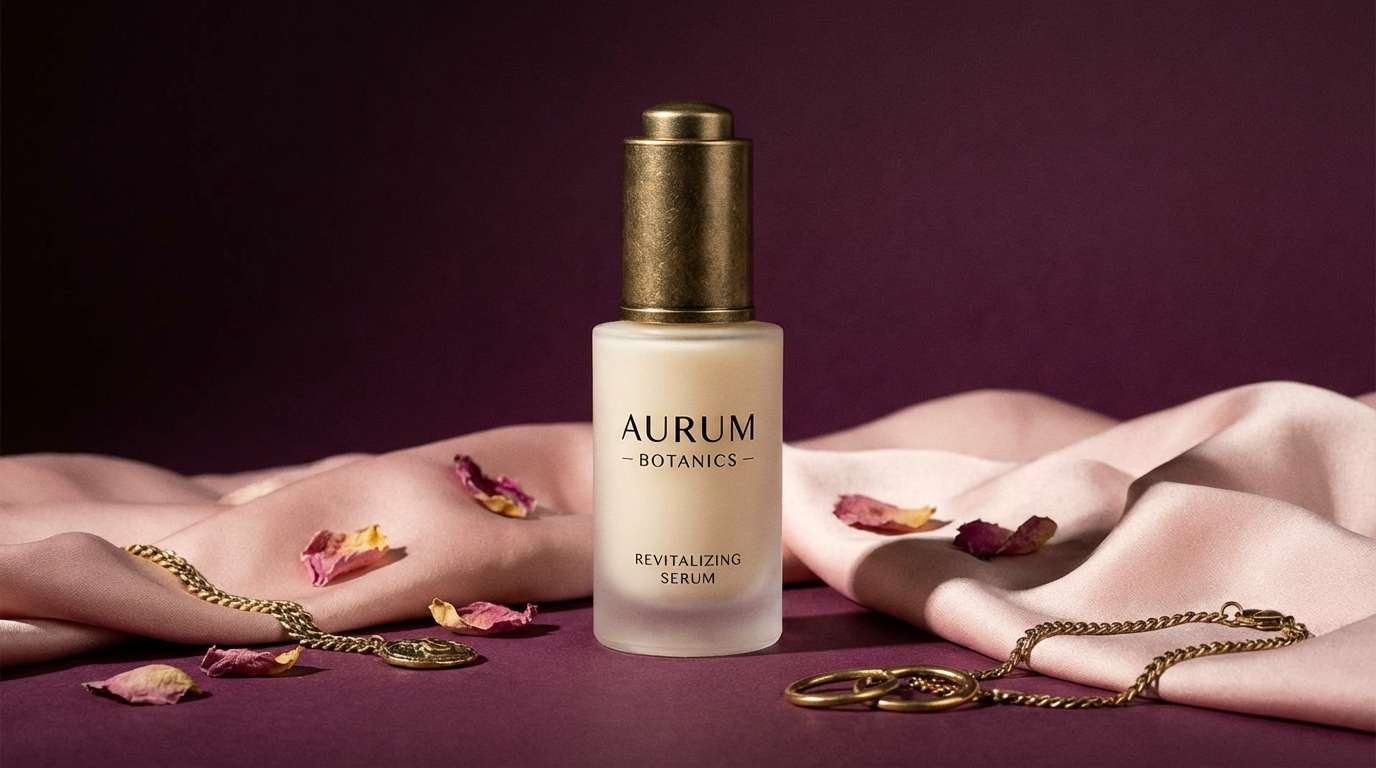
8) Regal Plum
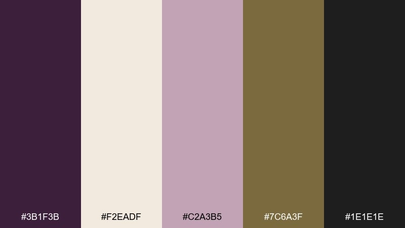
HEX: #3b1f3b #f2eadf #c2a3b5 #7c6a3f #1e1e1e
Mood: dramatic, romantic, luxe
Best for: beauty product ads
Velvety and theatrical, it evokes plum velvet, candlelit evenings, and heirloom jewelry. The soft blush lifts the mood so the dark purple never feels harsh. Use black for typography, keep cream for negative space, and let the gold-brown accent signal premium details. A single plum gradient in the background can elevate the whole ad.
Image example of regal plum generated using media.io
9) Brass & Ink
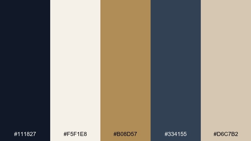
HEX: #111827 #f5f1e8 #b08d57 #334155 #d6c7b2
Mood: sleek, classic, high-contrast
Best for: portfolio websites
Sharp and elegant, it feels like black ink on thick cream stock with a brass clip. The near-black anchors UI elements, while warm neutrals prevent it from becoming cold or techy. Use the brass tone for hover states and key links, then pull in slate for secondary navigation. Keep body copy slightly softened with slate for better long-read comfort.
Image example of brass & ink generated using media.io
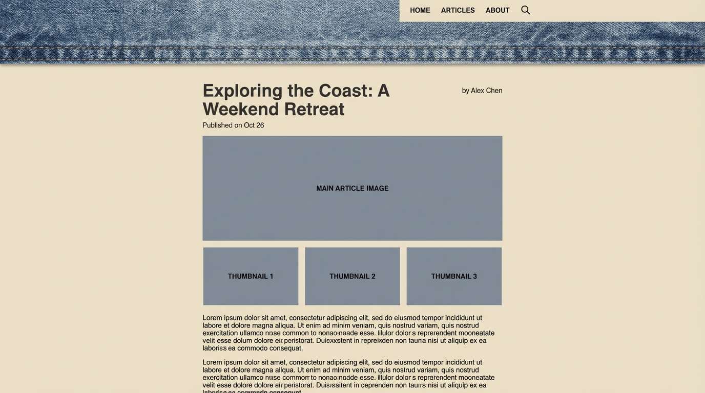
10) Stonewashed Denim
HEX: #2d4a5a #e8e1d6 #a7b3b6 #7a6a58 #1f2933
Mood: relaxed, dependable, understated
Best for: lifestyle blog headers
Easygoing and familiar, these tones resemble worn denim, driftwood, and soft overcast skies. The muted blue-green makes a strong header color without shouting. Pair it with warm beige backgrounds and keep the darkest shade for titles and navigation. Add the dusty gray as a subtle overlay to unify photos across the page.
Image example of stonewashed denim generated using media.io
11) Vintage Rosewood
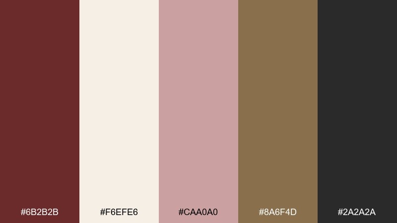
HEX: #6b2b2b #f6efe6 #caa0a0 #8a6f4d #2a2a2a
Mood: romantic, antique, inviting
Best for: event invitations and RSVP cards
Softly romantic, it brings to mind rosewood boxes, dried petals, and candle wax seals. The dusty pink keeps the red-brown from feeling heavy, especially on creamy paper. Use rosewood for monograms or borders, then keep charcoal for readable body text. A touch of warm tan in the envelope liner ties the set together.
Image example of vintage rosewood generated using media.io
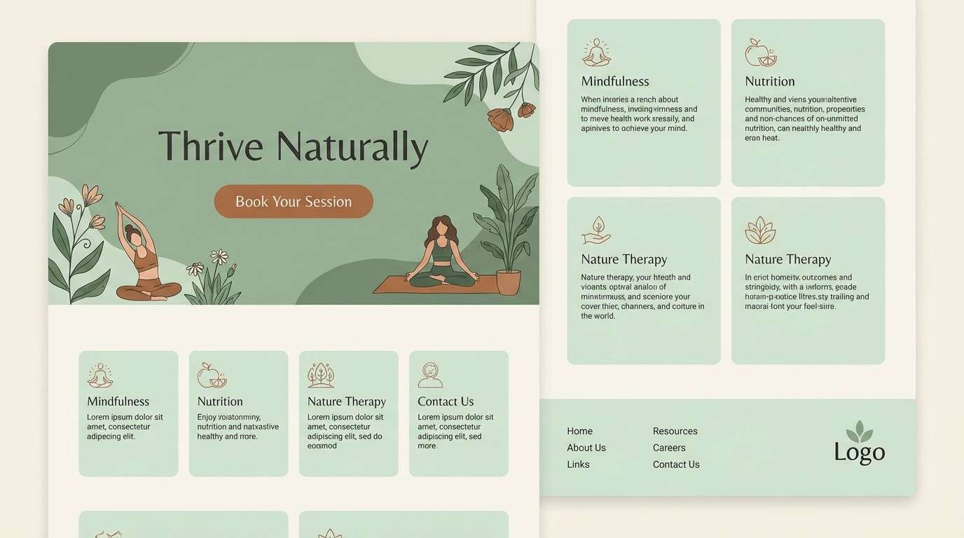
12) Linen & Sage
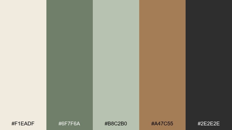
HEX: #f1eadf #6f7f6a #b8c2b0 #a47c55 #2e2e2e
Mood: soft, natural, calming
Best for: wellness landing pages
Gentle and restorative, it feels like linen curtains, herbal tea, and quiet mornings. Sage leads as a calming brand color, while the creamy base keeps layouts bright and approachable. Use the copper-brown accent for primary buttons and focus states to guide the eye. Keep text in the deep neutral so the page stays readable on long scrolls.
Image example of linen & sage generated using media.io
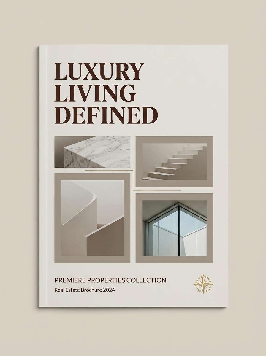
13) Old Money Taupe
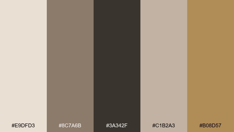
HEX: #e9dfd3 #8c7a6b #3a342f #c1b2a3 #b08d57
Mood: quiet luxury, warm, composed
Best for: real estate brochures
Muted and confident, it suggests limestone facades, tailored suits, and sunlit interiors. Taupe and beige create a calm canvas for property photography and floor plans. Use deep brown for headings, keep mid taupe for captions, and add the gold tone as a small premium cue. A consistent margin grid will make the whole brochure feel more expensive.
Image example of old money taupe generated using media.io
14) Midnight Espresso
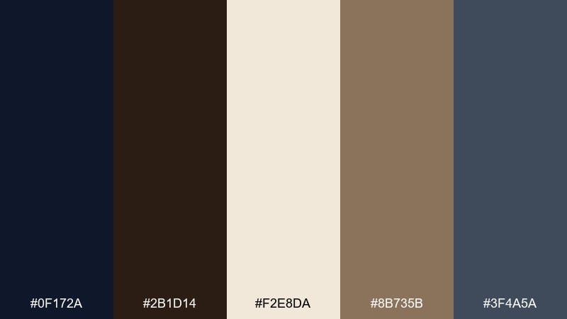
HEX: #0f172a #2b1d14 #f2e8da #8b735b #3f4a5a
Mood: moody, intimate, cinematic
Best for: restaurant menus and signage
Dark and atmospheric, it feels like espresso crema under low light and late-night jazz. The creamy neutral keeps the design legible and prevents the deep tones from collapsing. Use midnight blue as the background, espresso brown for section headers, and the tan for item separators. This classic color palette looks best with serif type and generous line spacing.
Image example of midnight espresso generated using media.io
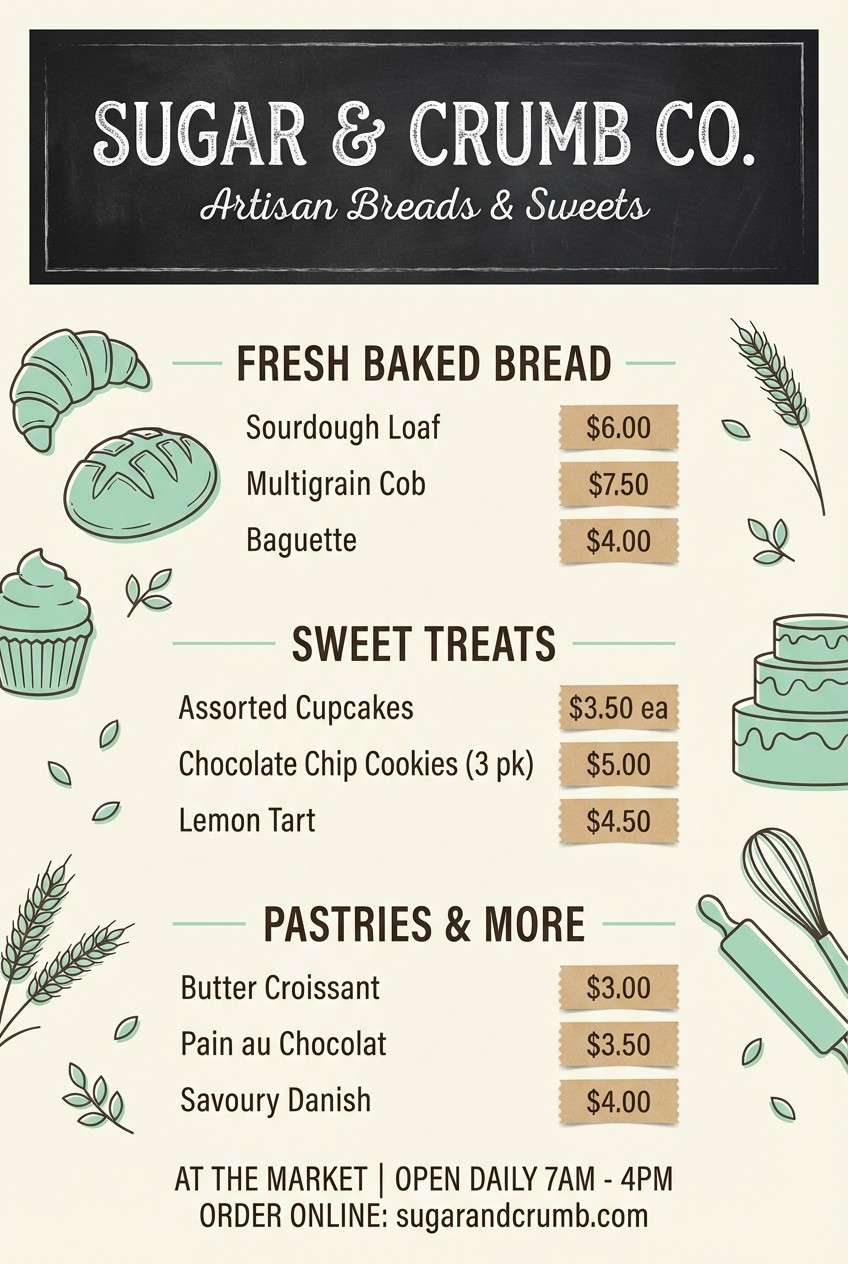
15) Chalkboard Mint
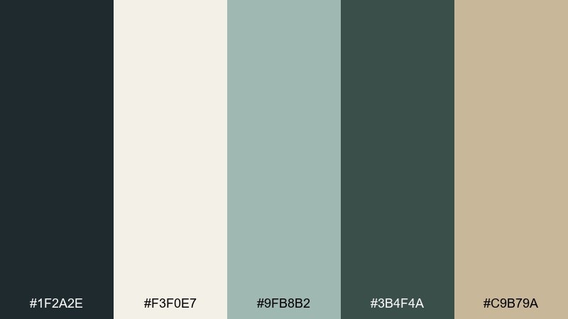
HEX: #1f2a2e #f3f0e7 #9fb8b2 #3b4f4a #c9b79a
Mood: fresh, nostalgic, friendly
Best for: bakery flyers and price lists
Playful and cozy, it recalls chalkboard signs, mint tea, and handwritten specials. The deep green-black works as a strong base, while mint softens the vibe for friendly small-business branding. Use cream for large text areas and the warm beige as tiny highlights for prices or stamps. Keep the layout simple so the mint accents feel intentional, not decorative clutter.
Image example of chalkboard mint generated using media.io
16) Gilded Walnut
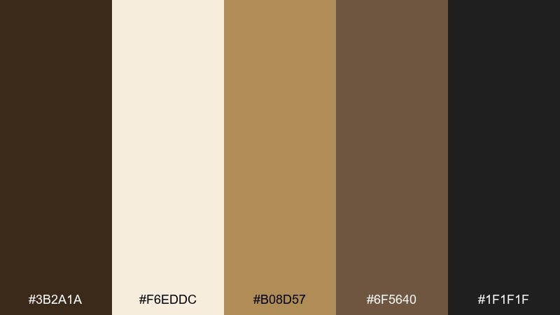
HEX: #3b2a1a #f6eddc #b08d57 #6f5640 #1f1f1f
Mood: rich, traditional, premium
Best for: luxury packaging and tags
Rich and polished, it evokes walnut wood, warm lamplight, and subtle gilding. The gold tone reads upscale when it is used as a thin line, foil stamp, or small emblem. Let cream handle negative space and product details so the deep browns stay intentional. Add matte textures to keep the look refined rather than flashy.
Image example of gilded walnut generated using media.io
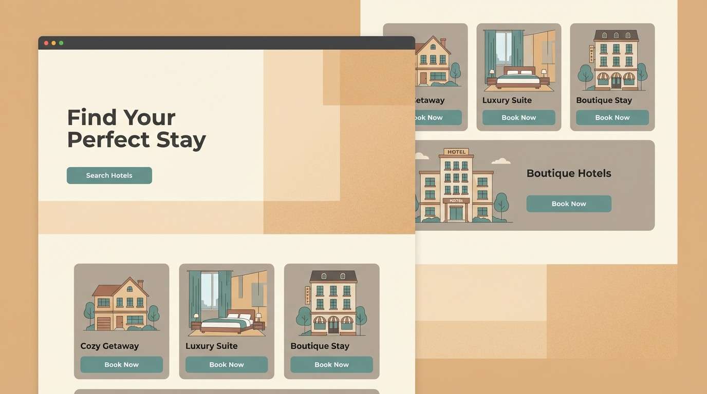
17) Coastal Sandstone
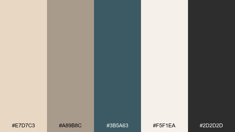
HEX: #e7d7c3 #a89b8c #3b5a63 #f5f1ea #2d2d2d
Mood: breezy, mature, travel-ready
Best for: hotel landing pages
Breezy yet grounded, it feels like sandstone walls, sea glass, and linen bedding. The teal brings a coastal note without turning tropical, and the neutrals keep it upscale. Use teal for key links and buttons, then keep sandstone for section backgrounds and cards. A little charcoal in icons and microcopy helps the page stay crisp on bright screens.
Image example of coastal sandstone generated using media.io
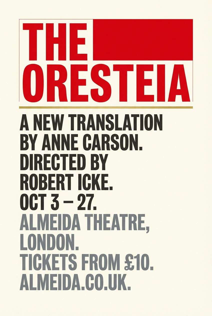
18) Opera Red
HEX: #8c1d2c #f4eadf #1f1f1f #b08d57 #6b6f76
Mood: bold, formal, celebratory
Best for: theater posters and tickets
Dramatic and ceremonial, it brings velvet curtains, spotlight glow, and crisp printed tickets to mind. Red makes instant impact, while cream and charcoal keep the typography controlled. For classic color combinations with a modern edge, use gold only as a thin accent line or small emblem. Keep the layout poster-like with strong hierarchy and one standout headline.
Image example of opera red generated using media.io
19) Smoke & Steel
HEX: #e6e2dd #9aa3ad #2b2f36 #5c6773 #c1a27a
Mood: cool, urban, professional
Best for: SaaS product pages
Cool and structured, it feels like brushed steel, soft fog, and city architecture. The layered grays build depth for sections, charts, and feature blocks without relying on loud color. Use the near-black for headings, keep the light gray as your base, and add the warm tan as a restrained highlight for conversion points. This set works especially well with simple icons and lots of spacing.
Image example of smoke & steel generated using media.io
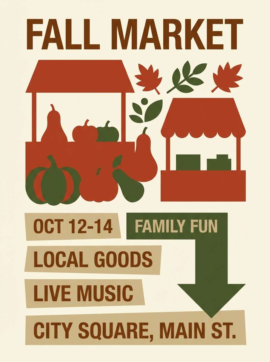
20) Autumn Herringbone
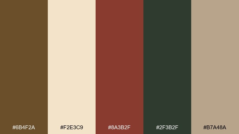
HEX: #6b4f2a #f2e3c9 #8a3b2f #2f3b2f #b7a48a
Mood: seasonal, rustic, welcoming
Best for: fall market posters
Warm and textured, it suggests herringbone coats, dried leaves, and weekend markets. The earthy green balances the rust-red so the palette stays grounded instead of overly festive. Use cream as the base, then build big shapes with brown and green for strong readability outdoors. Add the muted tan for secondary info like time, address, and vendor list.
Image example of autumn herringbone generated using media.io
What Colors Go Well with Classic?
Classic palettes pair best with trustworthy neutrals: ivory, cream, parchment, taupe, and warm gray. These shades keep layouts calm and make accent colors look more intentional.
For contrast, lean on deep anchors like navy, ink black, espresso brown, or charcoal. They add structure for headings and navigation while maintaining a timeless, editorial feel.
To modernize a classic color scheme, add one restrained accent (brass, copper, muted teal, dusty rose) and repeat it consistently. Keeping accents small helps the design stay premium rather than busy.
How to Use a Classic Color Palette in Real Designs
Start with a simple ratio: one light base for background, one dark for text and key UI elements, and one accent for calls to action. This mirrors traditional print design hierarchy and translates well to screens.
Texture matters with timeless color palettes. Subtle paper grain, matte shadows, and soft overlays can make neutrals feel rich without adding more colors.
In branding, keep the accent color reserved for high-value moments (logos, seals, links, hover states). That restraint is what makes classic color combinations feel confident.
Create Classic Palette Visuals with AI
If you want to see a classic palette in context, generate quick mockups (posters, packaging, invitations, UI) using the prompts above. It’s a fast way to test mood, contrast, and readability before committing to a full design.
With Media.io, you can turn a palette idea into cohesive visuals in minutes, then iterate by changing lighting, materials, or layout style while keeping the same color story.
Use your favorite palette’s HEX codes for brand consistency, then generate multiple variations for ads, landing pages, and social graphics.
Classic Color Palette FAQs
-
What is a classic color palette?
A classic color palette is a timeless set of colors built around reliable neutrals (cream, taupe, gray) and deep anchors (navy, charcoal, espresso), usually finished with a restrained accent like brass, tan, or muted red. -
What is the best classic color scheme for branding?
For most brands, navy/charcoal + cream/ivory + a warm metallic or tan accent is a safe classic color scheme. It feels premium, stays readable, and works across print stationery and digital UI. -
How do I keep a classic palette from looking boring?
Use texture and contrast: pair matte neutrals with a strong dark anchor, then repeat one accent color in small, consistent places (buttons, dividers, icons). Typography and spacing also add “interest” without adding extra colors. -
Do classic color combinations work for modern websites?
Yes. Classic color combinations are common in portfolio sites, SaaS pages, and editorial layouts because they’re easy on the eyes and support clear hierarchy. Add modern polish with clean grids, subtle shadows, and a single accent for interaction states. -
What are good classic accent colors?
Brass/gold-brown, copper, muted teal, dusty rose, and warm tan are all strong choices. They complement neutral color schemes without overpowering the design. -
How many colors should a classic palette include?
Five is a practical number: a light base, a dark anchor, two supporting neutrals, and one accent. This gives flexibility for headings, body text, backgrounds, and highlights while staying cohesive. -
Can I generate classic palette mockups with AI?
Yes. You can use Media.io’s text-to-image tool with prompts like “stationery set,” “brochure cover,” or “dashboard UI” and then refine materials (paper, foil, wood) to match a classic, premium feel.
Next: Art Deco Color Palette


