Umber is a deep, earthy brown that instantly adds warmth, weight, and credibility to a design. It’s a go-to for brands that want to feel grounded—without looking dated.
Below are modern umber color palette ideas (with HEX codes) for packaging, UI, interiors, and illustration—plus ready-to-use AI prompts to generate matching visuals.
In this article
Why Umber Palettes Work So Well
Umber sits in the “warm neutral” zone—strong enough to feel intentional, but calm enough to support typography, photography, and product details. It’s especially effective when you need a premium, tactile, or heritage vibe.
Because umber has natural depth, it creates contrast without relying on pure black. Pair it with creams and soft grays for readability, or add terracotta/copper accents to introduce energy while staying grounded.
In digital design, umber palettes also reduce glare compared to bright whites and high-saturation hues, helping interfaces feel softer and more human—ideal for wellness, food, and lifestyle brands.
20+ Umber Color Palette Ideas (with HEX Codes)
1) Cedar Hearth
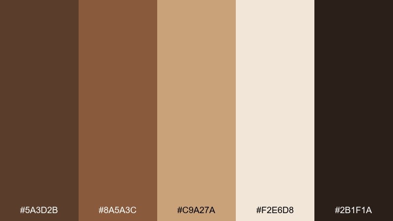
HEX: #5a3d2b #8a5a3c #c9a27a #f2e6d8 #2b1f1a
Mood: cozy, rustic, grounded
Best for: coffee packaging
Cozy and woodsmoked, these tones evoke cedar beams, roasted beans, and warm café lighting. The deep brown and near-black anchor labels, while the tan and cream keep typography readable. Pair with uncoated paper textures and simple serif type for a premium feel. Usage tip: use the cream as the main background and reserve the darkest shade for logos and key claims.
Image example of cedar hearth generated using media.io
Media.io is an online AI studio for creating and editing video, image, and audio in your browser.

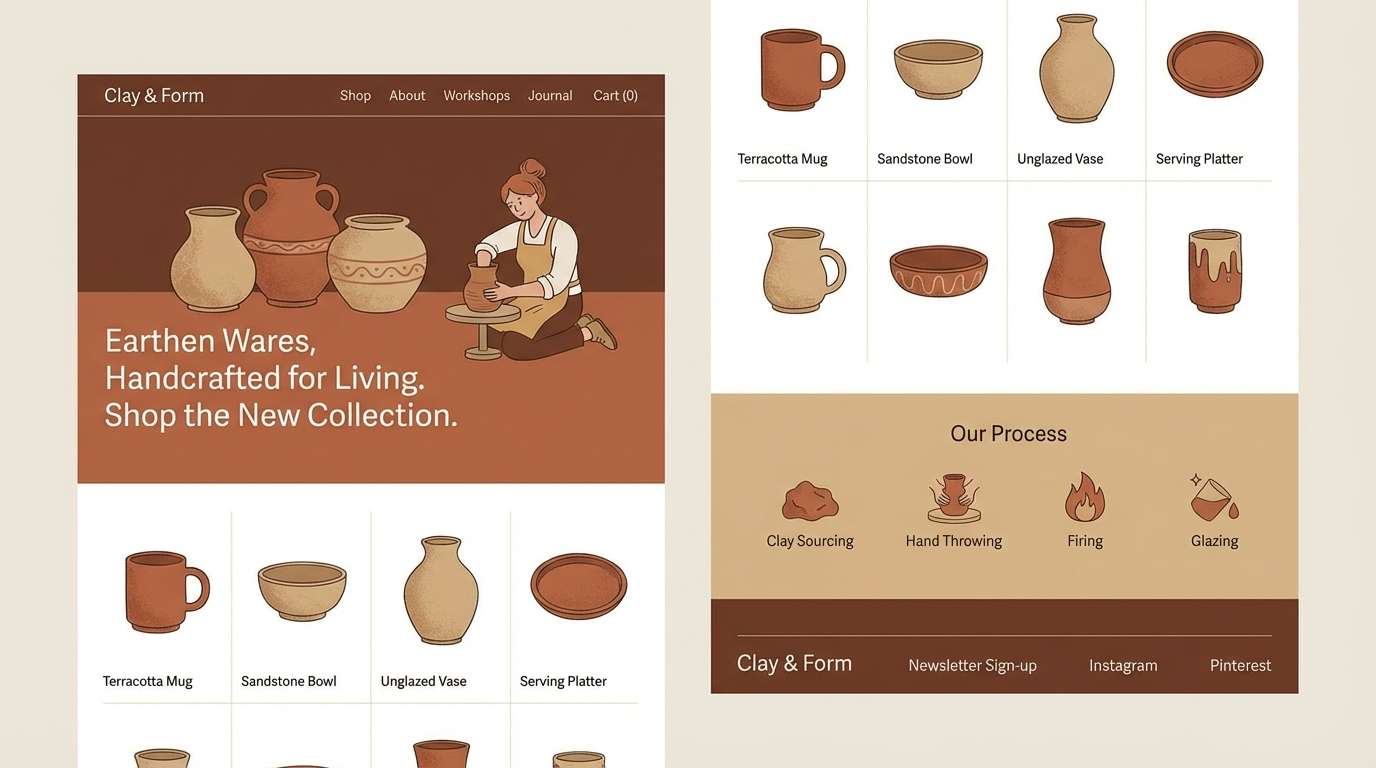
2) Desert Clay
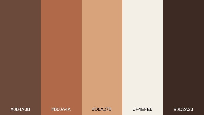
HEX: #6b4a3b #b06a4a #d8a27b #f4efe6 #3d2a23
Mood: sunbaked, artisanal, warm
Best for: ceramics brand landing page UI
Sunbaked and tactile, this set feels like hand-thrown clay, desert light, and dusty trails. The muted terracotta brings friendly energy without shouting, balanced by soft sand neutrals. It works beautifully for lifestyle UI where photography needs a calm frame and buttons still stand out. Usage tip: keep CTAs in the terracotta and let the darker brown carry headers for contrast.
Image example of desert clay generated using media.io
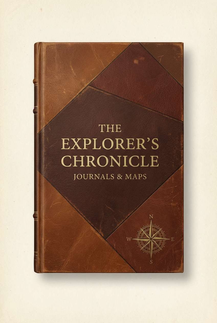
3) Antique Leather
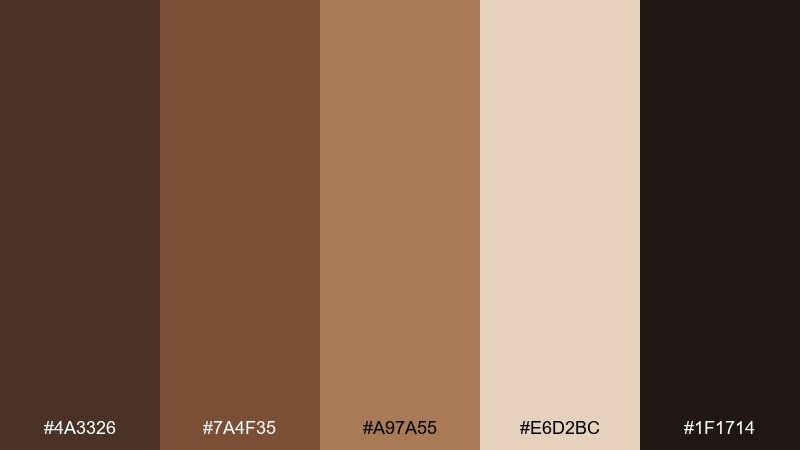
HEX: #4a3326 #7a4f35 #a97a55 #e6d2bc #1f1714
Mood: heritage, refined, classic
Best for: book cover design
Heritage and refined, these shades evoke worn leather, gilt edges, and quiet libraries. The mid browns read as trustworthy and timeless, while the pale parchment keeps titles crisp. This mix suits historical fiction, memoirs, and premium notebooks where warmth matters more than bright color. Usage tip: emboss the title in the lightest tone and frame it with the deepest brown for a classic contrast.
Image example of antique leather generated using media.io
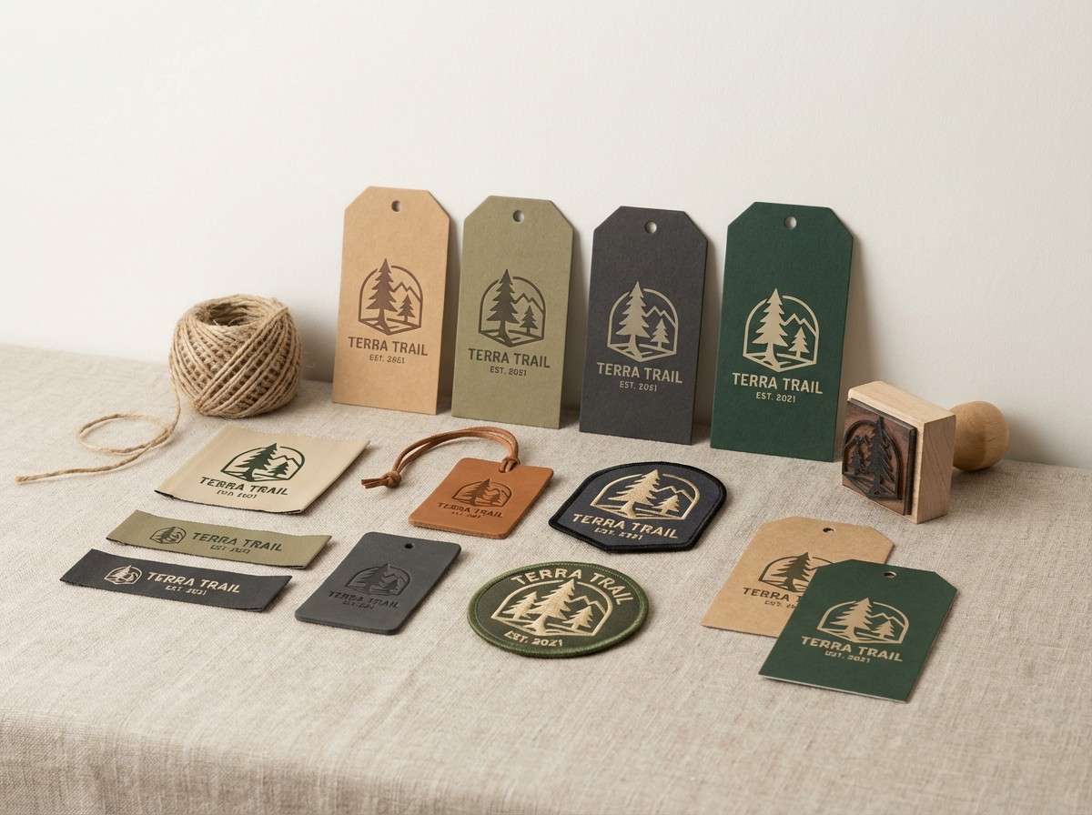
4) Forest Umber
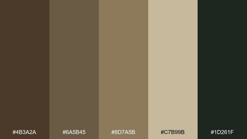
HEX: #4b3a2a #6a5b45 #8d7a5b #c7b99b #1d261f
Mood: earthy, quiet, natural
Best for: outdoor gear branding
Earthy and quiet, these tones suggest forest soil, bark, and shaded trails. The green-black adds a rugged edge that keeps the browns from feeling overly cozy. As umber color combinations go, this one is especially strong for logos, hangtags, and patch labels. Usage tip: put the darkest green-black behind small white type and use the lighter khaki for secondary panels.
Image example of forest umber generated using media.io
5) Mocha Linen
HEX: #5c4538 #8b6a58 #bda089 #f2eadf #3a2a24
Mood: soft, minimal, comforting
Best for: skincare packaging
Soft and minimal, this palette feels like warm mocha, linen fabric, and gentle morning light. The creamy base keeps the look clean, while the cocoa tones add depth for product names and ingredient callouts. It suits wellness and skincare where calm trust is the goal. Usage tip: keep most surfaces in the cream and use the mid mocha for icons to avoid a heavy, muddy look.
Image example of mocha linen generated using media.io
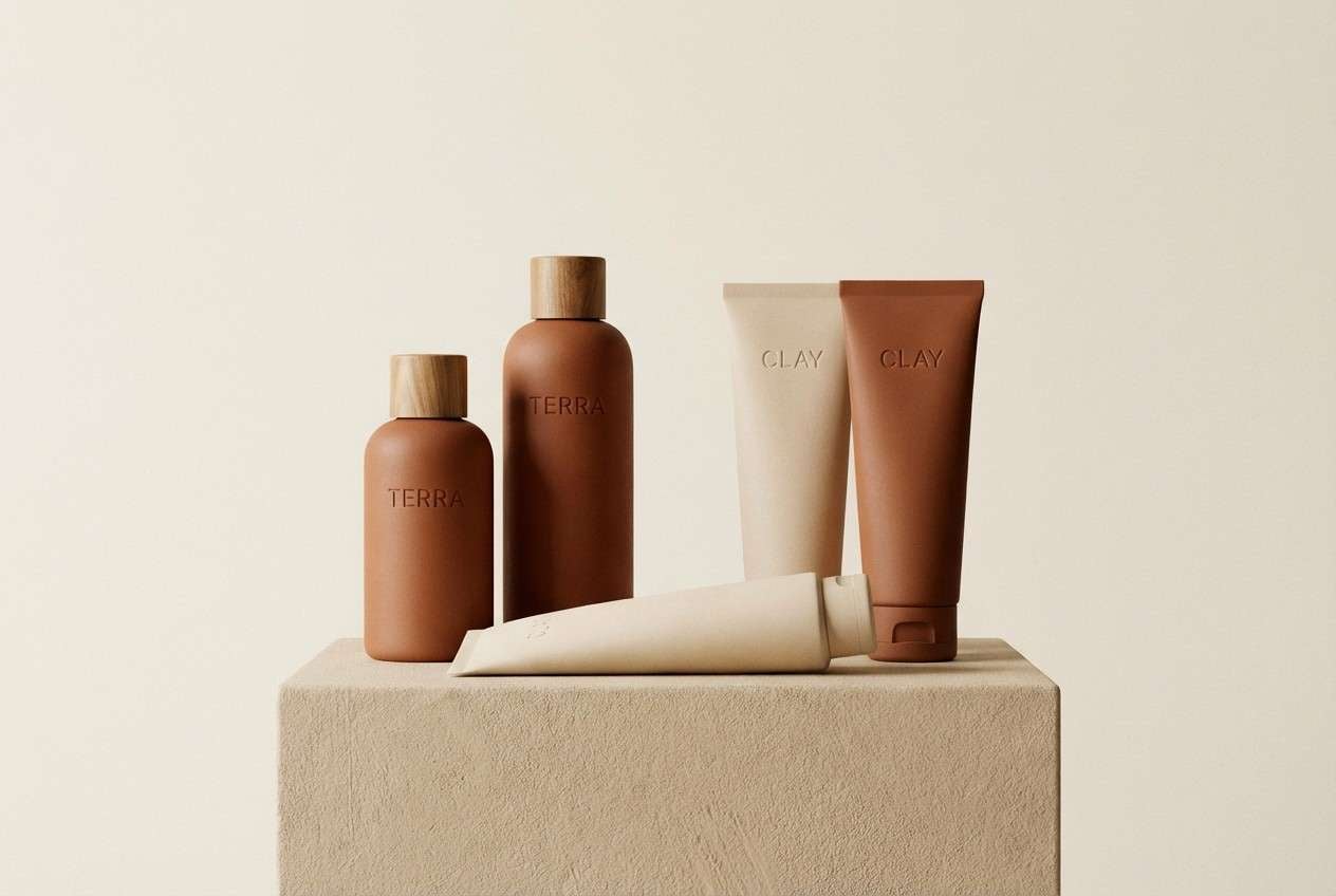
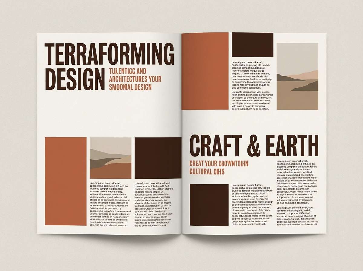
6) Terracotta Ink
HEX: #5a3b2f #9b4f3c #d8a18a #f6f1ea #231a1a
Mood: bold, editorial, expressive
Best for: magazine editorial layout
Bold and editorial, these hues evoke clay pigment, inked headlines, and modern art prints. The near-black gives crisp structure, while the terracotta adds heat to pull readers through the page. Use it for spreads that need personality without going neon. Usage tip: reserve terracotta for pull quotes and section headers, keeping body text in the darkest shade for clarity.
Image example of terracotta ink generated using media.io
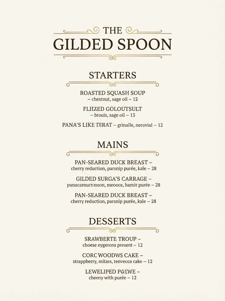
7) Brasswood
HEX: #4f3727 #7b5b3a #b08a4f #e7d8b8 #2a201a
Mood: vintage, polished, confident
Best for: restaurant menu design
Vintage yet polished, this mix calls to mind brass fixtures, dark wood bars, and candlelit tables. The golden tone adds a subtle luxe highlight without stepping into bright yellow. It works well for menus, wine lists, and hospitality print where readability matters. Usage tip: use the brass shade for dividers and icons, and keep headings in the darkest brown for a crisp hierarchy.
Image example of brasswood generated using media.io
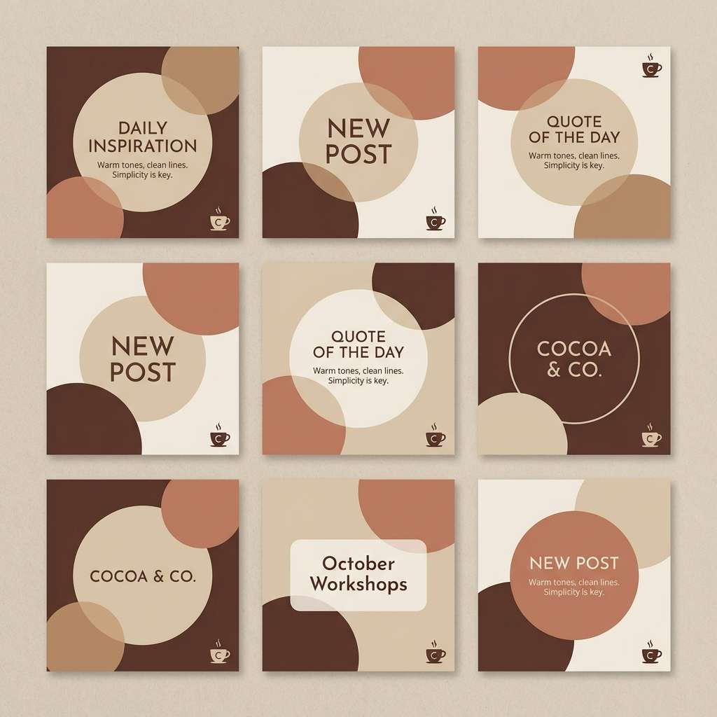
8) Cocoa Sand
HEX: #5b4030 #7d5b45 #a9876d #d7c2a6 #f3eadf
Mood: friendly, warm, approachable
Best for: social media post templates
Friendly and warm, these tones suggest cocoa dust, beach sand, and soft shadows. The gradient from deep brown to cream makes layouts feel layered without needing extra graphics. It is ideal for quote cards, promos, and carousel templates where consistent branding helps. Usage tip: keep text on the cream or pale sand, and use the darkest brown only for emphasis lines and small badges.
Image example of cocoa sand generated using media.io
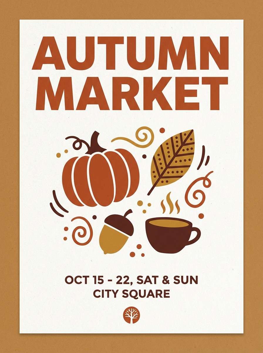
9) Harvest Spice
HEX: #5a3523 #8f4f2f #c57d4a #e6b58a #f6eadc
Mood: autumnal, energetic, welcoming
Best for: seasonal promotional poster
Autumnal and energetic, this set evokes roasted squash, cinnamon, and late-afternoon sunlight. The orange-brown spice tones are lively, while the pale cream keeps the design from feeling too heavy. These umber color combinations are great for seasonal promos, farmers markets, and café specials. Usage tip: place big headlines in the darker browns and use the spice hue as a strong callout sticker color.
Image example of harvest spice generated using media.io
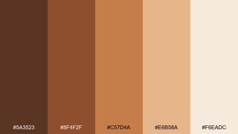
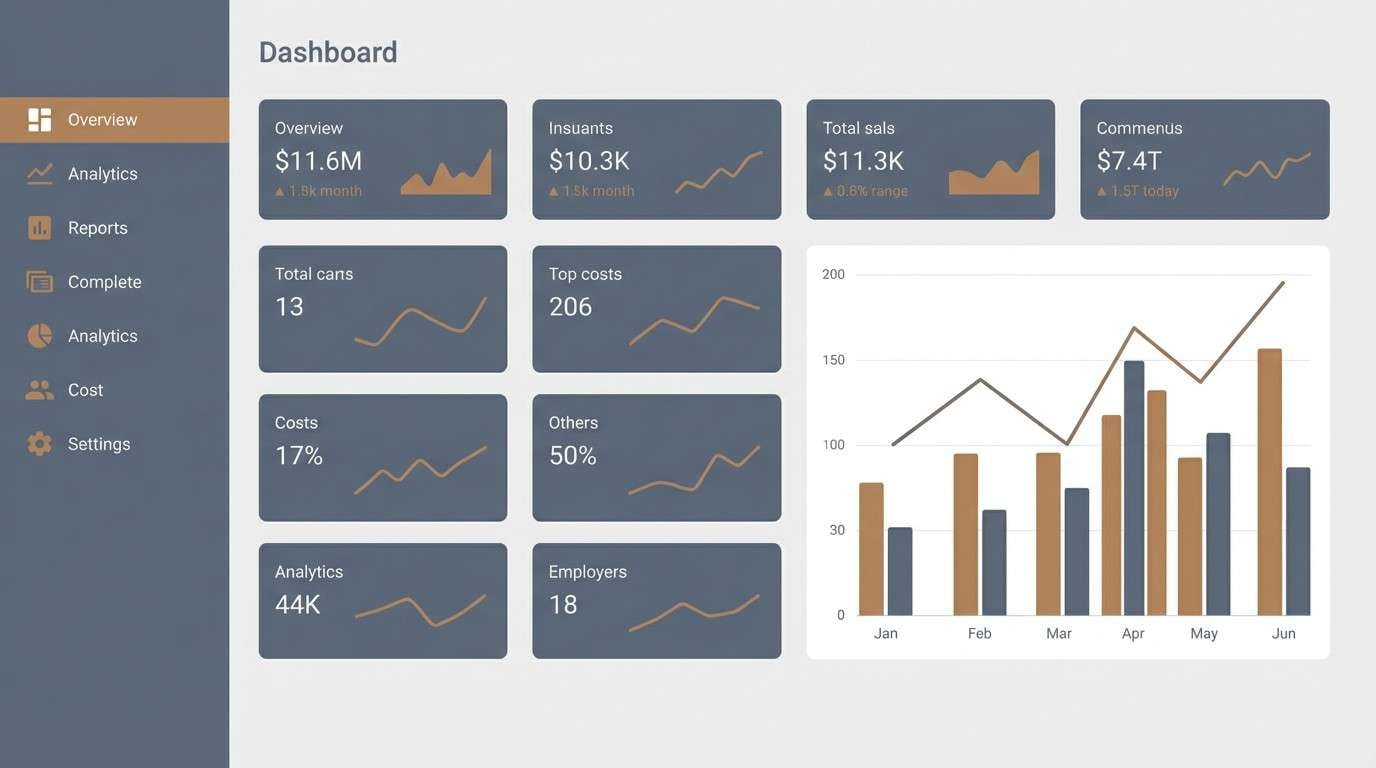
10) Sienna Slate
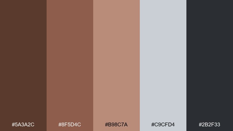
HEX: #5a3a2c #8f5d4c #b98c7a #c9cfd4 #2b2f33
Mood: modern, balanced, slightly cool
Best for: dashboard UI
Modern and balanced, these tones blend warm sienna with cool slate for a composed, professional vibe. The grays give breathing room and keep the browns looking contemporary rather than rustic. Use it for analytics dashboards where charts and cards need subtle contrast. Usage tip: reserve the darkest slate for navigation and the sienna for active states so users can scan quickly.
Image example of sienna slate generated using media.io
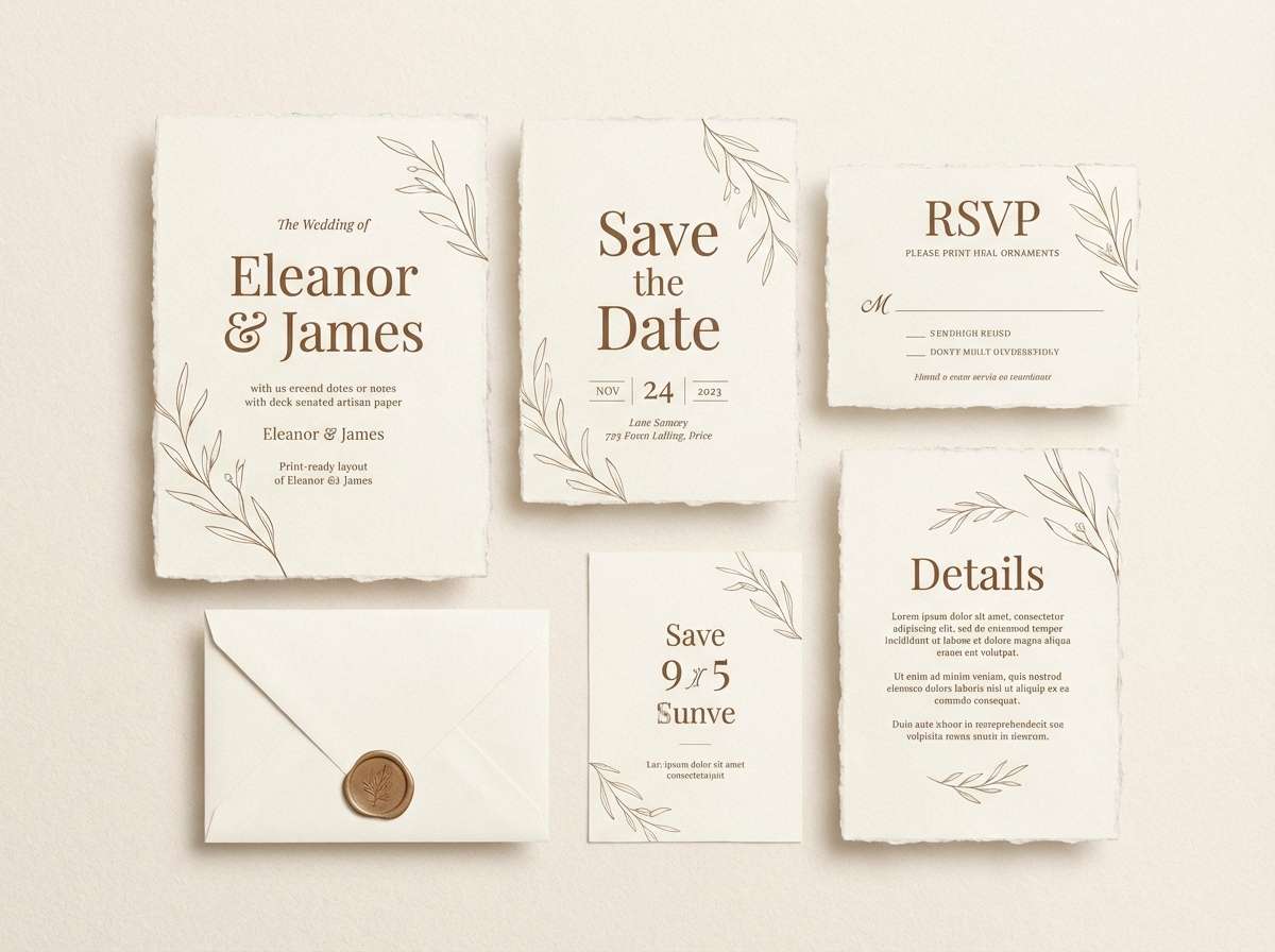
11) Pecan Cream
HEX: #614434 #8e6a55 #b9967f #e5d3c3 #fbf6ee
Mood: gentle, airy, comforting
Best for: wedding invitation suite
Gentle and airy, these shades feel like pecan shells, whipped cream, and soft paper stock. The light neutrals make it perfect for delicate typography, while the deeper browns add just enough structure for monograms. It suits rustic-elegant weddings and minimal stationery alike. Usage tip: print the main text in the darkest brown and keep borders and ornaments in the mid pecan for a softer finish.
Image example of pecan cream generated using media.io
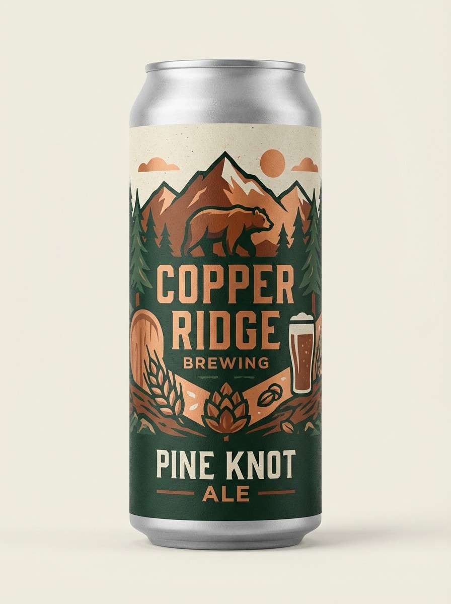
12) Copper Pine
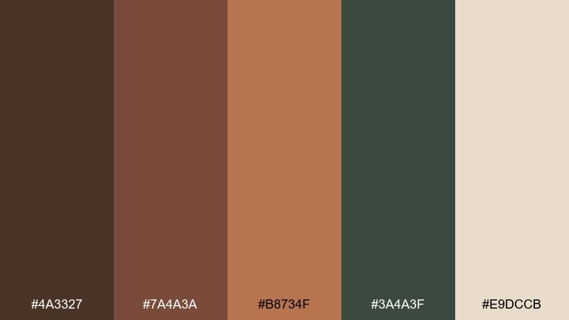
HEX: #4a3327 #7a4a3a #b8734f #3a4a3f #e9dccb
Mood: adventurous, artisanal, outdoorsy
Best for: craft beer label
Adventurous and artisanal, this mix suggests copper kettles, pine needles, and creamy foam. The green adds a crisp, outdoorsy counterpoint that keeps the browns from blending together. It works for labels and cans where you want both warmth and freshness. Usage tip: use copper for the focal emblem, then ground the text block with the darkest brown for legibility.
Image example of copper pine generated using media.io
13) Walnut Fog
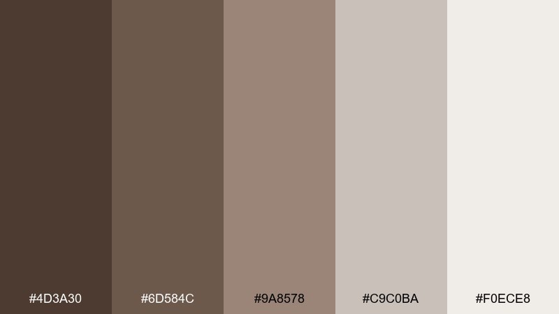
HEX: #4d3a30 #6d584c #9a8578 #c9c0ba #f0ece8
Mood: quiet, contemporary, neutral
Best for: interior design moodboard
Quiet and contemporary, these walnut-and-fog neutrals evoke soft textiles, matte ceramics, and overcast window light. The taupe and warm gray bridge the browns, making the whole set feel modern and flexible. It is an easy umber color scheme for interiors, lookbooks, and brand decks that need calm cohesion. Usage tip: let the pale fog tone dominate, then layer walnut accents in small, repeatable touches for rhythm.
Image example of walnut fog generated using media.io
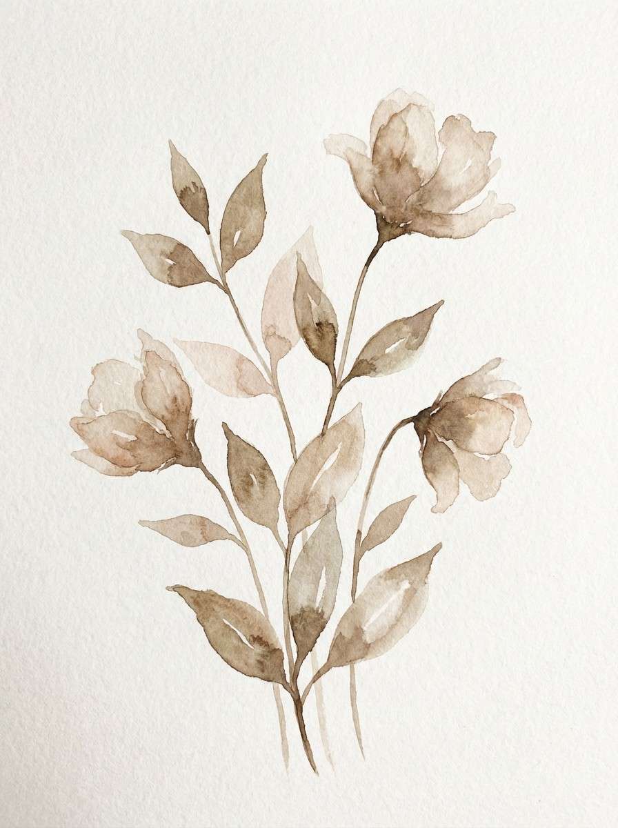
14) Sepia Bloom
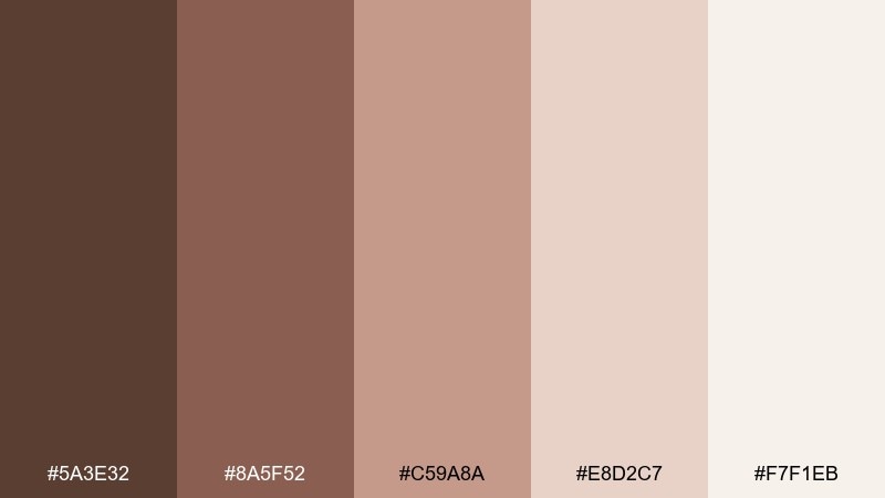
HEX: #5a3e32 #8a5f52 #c59a8a #e8d2c7 #f7f1eb
Mood: romantic, nostalgic, soft
Best for: botanical watercolor illustration
Romantic and nostalgic, these sepia tones feel like pressed petals, old photographs, and watercolor washes. The blush-brown midtones add warmth without turning pink, keeping florals sophisticated. Use it for botanical prints, journaling pages, and gentle brand art direction. Usage tip: paint larger areas in the lightest wash first, then build depth with the deeper sepia for stems and shadows.
Image example of sepia bloom generated using media.io
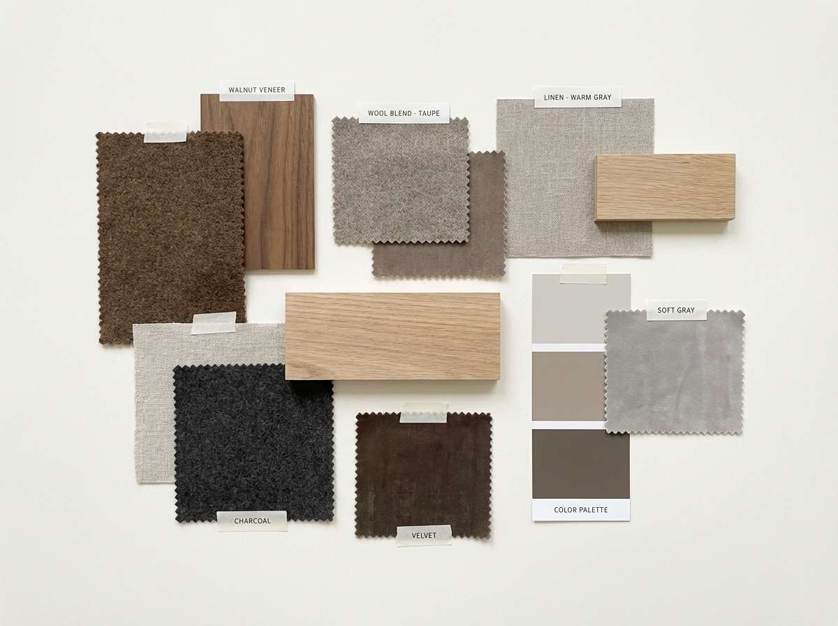
15) Claystone Modern
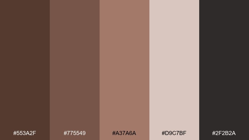
HEX: #553a2f #775549 #a37a6a #d9c7bf #2f2b2a
Mood: architectural, modern, grounded
Best for: brand style guide
Architectural and grounded, these colors evoke clay plaster, stone counters, and charcoal detailing. The darker neutral keeps layouts sharp, while the muted clay midtones stay elegant in large blocks. It is a smart umber color palette choice for style guides that need to look confident and current. Usage tip: assign one midtone as the brand primary and use the lightest shade for spacious page backgrounds.
Image example of claystone modern generated using media.io
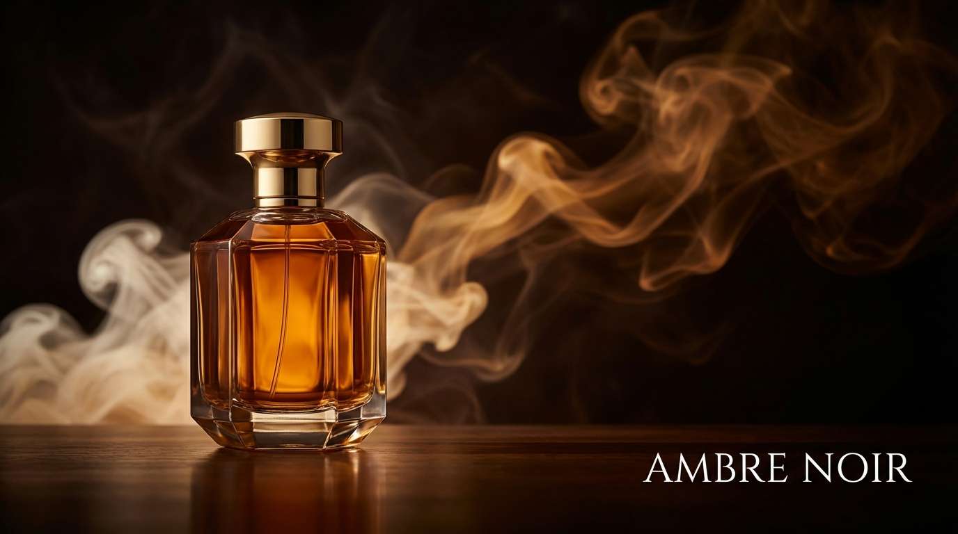
16) Toffee Noir
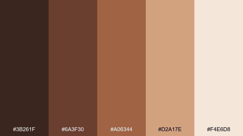
HEX: #3b261f #6a3f30 #a06344 #d2a17e #f4e6d8
Mood: moody, luxurious, high-contrast
Best for: perfume product ad
Moody and luxurious, this set reads like dark chocolate, toffee glaze, and velvet shadows. The high contrast between noir and cream makes product messaging feel premium and decisive. Use it for glossy ads, hero banners, and packaging where drama helps the product stand out. Usage tip: keep backgrounds deep and let the cream highlight the bottle silhouette and key text.
Image example of toffee noir generated using media.io
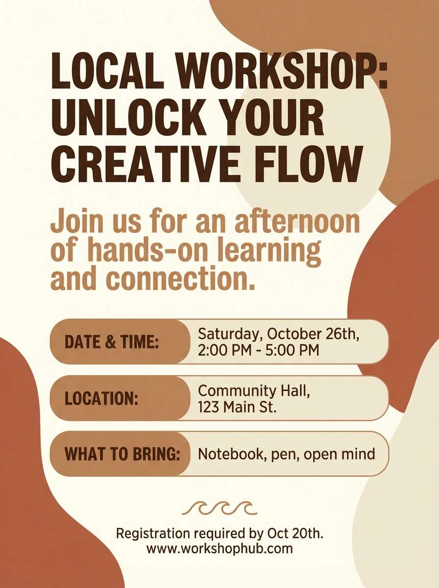
17) Canyon Paper
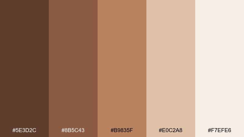
HEX: #5e3d2c #8b5c43 #b9835f #e0c2a8 #f7efe6
Mood: sunlit, natural, handcrafted
Best for: flyer design
Sunlit and handcrafted, these canyon shades feel like handmade paper, sandstone, and warm dust. The midtones are strong enough for bold headers, while the pale base keeps the overall look light. Great for community flyers, workshops, and local events where you want approachable warmth. Usage tip: use the darkest brown for body text and the terracotta midtone for date and location highlights.
Image example of canyon paper generated using media.io
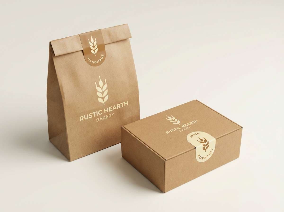
18) Bark and Butter
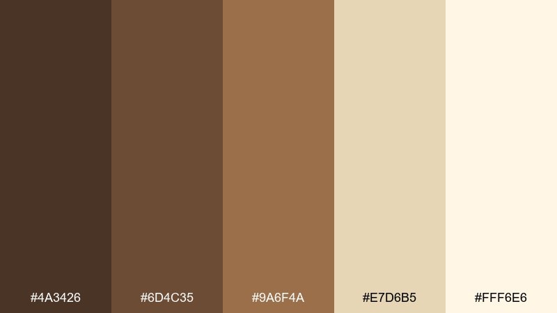
HEX: #4a3426 #6d4c35 #9a6f4a #e7d6b5 #fff6e6
Mood: wholesome, cozy, inviting
Best for: bakery logo and packaging
Wholesome and cozy, these colors evoke toasted crust, browned butter, and kraft paper bags. The buttery light tones brighten the set so it stays friendly rather than heavy. It is ideal for bakery marks, sticker seals, and small-box packaging. Usage tip: set the logo in the darkest bark tone and use butter as negative space to keep the mark crisp at small sizes.
Image example of bark and butter generated using media.io
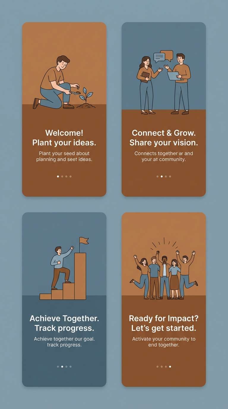
19) Umber Glacier
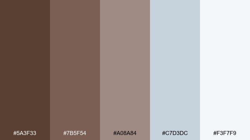
HEX: #5a3f33 #7b5f54 #a08a84 #c7d3dc #f3f7f9
Mood: fresh, restrained, contemporary
Best for: app onboarding screens
Fresh and restrained, this pairing feels like warm stone against icy morning air. The cool blue-grays keep the browns feeling crisp, which helps digital designs look modern and clean. For umber color combinations in apps, this one is great when you want warmth without a heavy, vintage vibe. Usage tip: place illustrations in the soft blue-gray range and reserve the darkest brown for key actions and step titles.
Image example of umber glacier generated using media.io
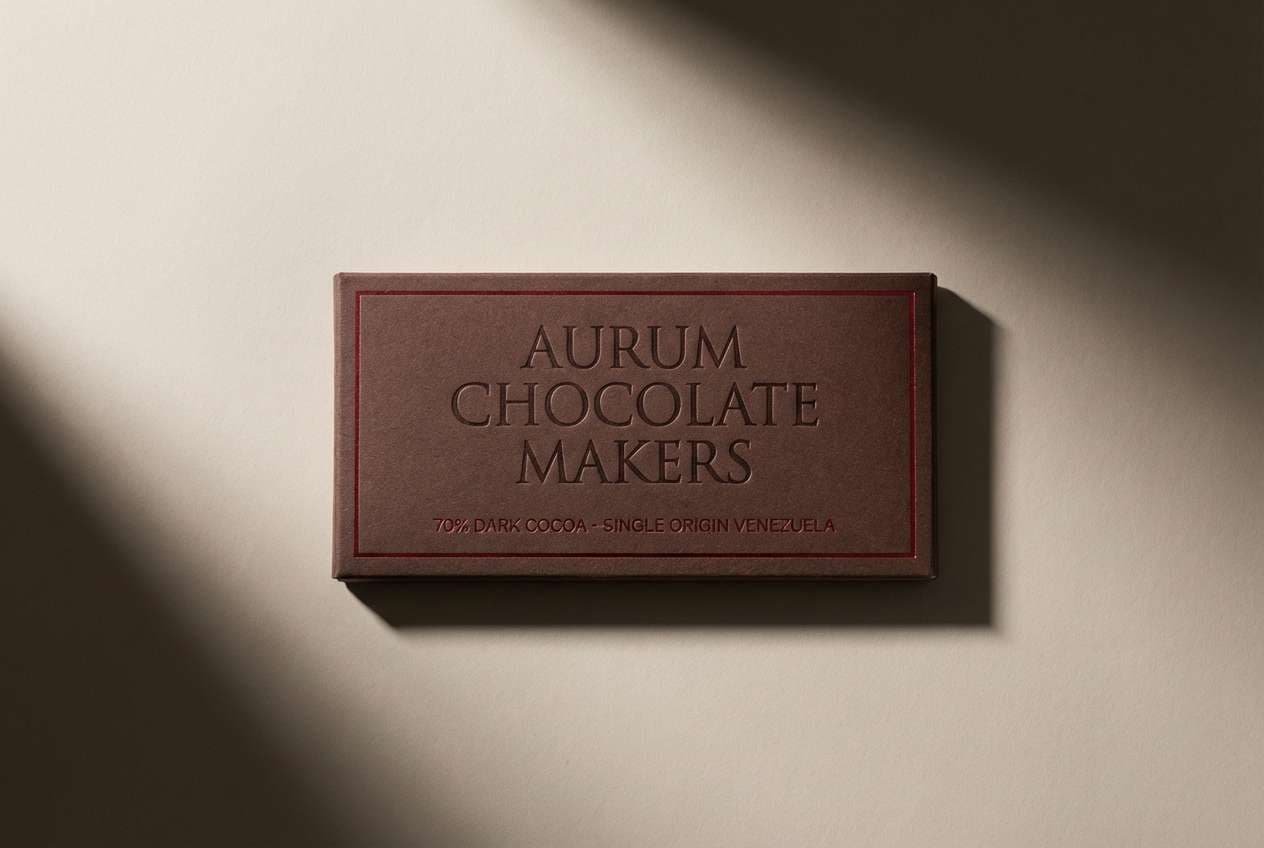
20) Cacao Cherry
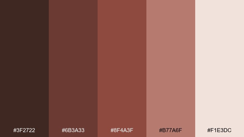
HEX: #3f2722 #6b3a33 #8f4a3f #b77a6f #f1e3dc
Mood: rich, romantic, dramatic
Best for: artisan chocolate bar packaging
Rich and romantic, this mix suggests cacao nibs, cherry notes, and dark glossy wrappers. The rosy brown adds a sensual accent that keeps the set from feeling purely neutral. It is a strong umber color palette direction for gourmet food packaging that needs warmth and appetite appeal. Usage tip: make the darkest tone the wrapper base and use the pale cream for ingredient panels and barcode areas.
Image example of cacao cherry generated using media.io
21) Museum Earth
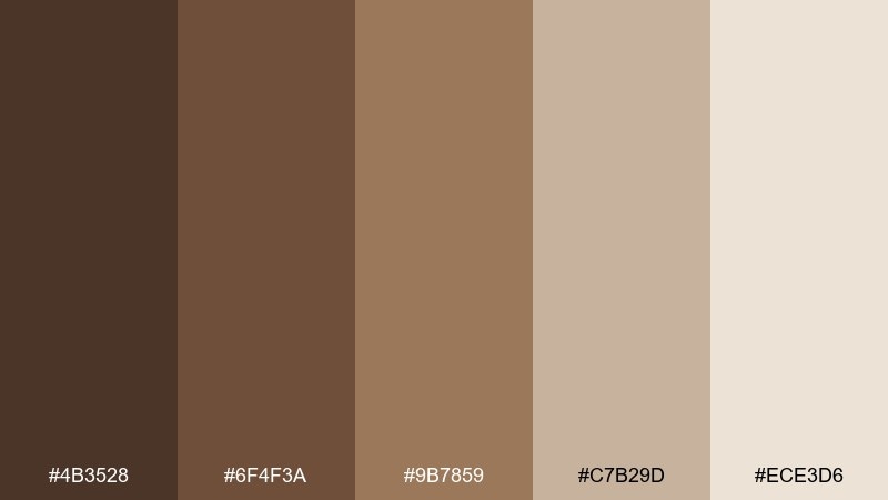
HEX: #4b3528 #6f4f3a #9b7859 #c7b29d #ece3d6
Mood: curated, intellectual, timeless
Best for: museum exhibition poster
Curated and timeless, these earth tones recall archival prints, carved wood frames, and gallery walls. The restrained progression from dark to light makes typography and artwork captions feel considered. Use it for cultural posters, talk series, and identity systems where sophistication matters. Usage tip: keep imagery framed by the lightest neutral and use the mid brown for section bands to guide the eye.
Image example of museum earth generated using media.io
What Colors Go Well with Umber?
Umber pairs beautifully with creamy whites, parchment, and warm grays—these keep layouts airy while letting the brown read as rich instead of heavy. This is the safest direction for branding and packaging that needs clarity.
For more contrast, add cool slate, blue-gray, or green-black tones to modernize the palette. If you want warmth and appetite appeal, bring in terracotta, copper, or muted spice oranges as accents.
Umber also works with soft blush-browns and dusty rose tints for romantic, editorial looks—especially in illustration, stationery, and lifestyle photography treatments.
How to Use a Umber Color Palette in Real Designs
Start with a light neutral as your main background (cream, fog, parchment), then use umber for headers, frames, and key UI components. This avoids the “muddy” effect that can happen when mid-browns dominate every surface.
Choose one accent color (terracotta, brass-gold, slate, or pine) and reserve it for CTAs, icons, or section markers. Keeping the accent consistent makes the overall umber color scheme feel intentional and scalable across formats.
For print, umber shines on textured stocks like kraft or uncoated paper; for digital, increase contrast slightly (darker text, lighter backgrounds) to maintain accessibility and crisp readability.
Create Umber Palette Visuals with AI
If you already have HEX codes, you can turn them into cohesive mockups by describing the product or layout (packaging, UI, poster, etc.) and calling out the mood—cozy, modern, editorial, or outdoorsy.
Use the prompts included under each palette as a starting point, then swap the subject (e.g., “coffee bag” to “candle label”) while keeping lighting and composition notes for consistent results.
Generate multiple variations, pick the strongest composition, and reuse the same palette across assets to keep your brand system visually unified.
Umber Color Palette FAQs
-
What is umber (as a color)?
Umber is a natural earth-brown pigment color, typically a deep brown with warm, slightly yellow or reddish undertones. In design, “umber” often refers to grounded, cocoa-to-wood brown shades used as warm neutrals. -
Is umber warm or cool?
Most umbers are warm (especially when they lean toward terracotta or golden brown), but some feel cooler when mixed with gray or green-black undertones. Pairing umber with slate or blue-gray will make it read more contemporary and cool. -
What colors complement umber best?
Cream, parchment, sand, warm gray, and taupe are the easiest complements. For stronger contrast, use charcoal, green-black, slate, or soft blue-gray; for accents, terracotta, copper, and brass-gold work especially well. -
How do I keep an umber palette from looking muddy?
Let a light neutral dominate (backgrounds and large areas), and use mid-browns more sparingly for secondary surfaces. Add one cooler neutral (slate/gray) or one brightened highlight (cream) to keep separation between layers. -
What’s the best text color on an umber background?
For dark umber backgrounds, use warm off-white or cream for headings and UI labels. For light umber/tan backgrounds, use deep brown or charcoal; always check contrast to keep body text easy to read. -
Are umber color schemes good for modern UI?
Yes—especially when paired with slate, fog gray, or cool blue-gray. This combination keeps the warmth of umber while giving interfaces a clean, contemporary structure. -
Can I use umber for branding across multiple industries?
Umber is versatile: it’s common in coffee/food, wellness, interiors, outdoors, heritage goods, and cultural institutions. The key is choosing the right accent (spice for energetic brands, slate for tech, cream for minimal luxury).
Next: Library Color Palette
