

Chocolate tones are a design shortcut to warmth, comfort, and trust. From cocoa-dark anchors to creamy neutrals, a chocolate color palette makes layouts feel grounded and premium without trying too hard.
Below are 20 curated chocolate color combinations with HEX codes, plus practical tips and AI prompts you can use to generate on-brand visuals fast.
In this article
- Why Chocolate Color Combinations Work So Well
-
- cocoa cream
- mocha marble
- truffle rose
- caramel latte
- espresso noir
- hazelnut linen
- cinnamon cocoa
- chocolate mint
- toasted almond
- brown sugar blush
- dark chocolate gold
- cocoa sage
- walnut copper
- velvet plum cocoa
- cocoa denim
- gingerbread olive
- smoky cocoa gray
- cocoa citrus pop
- cocoa sea salt
- cherry cordial
- What Colors Go Well with Chocolate?
- How to Use a Chocolate Color Palette in Real Designs
- Create Chocolate Palette Visuals with AI
Why Chocolate Color Combinations Work So Well
Chocolate browns sit in a “safe” visual zone: they feel natural, familiar, and stable. That makes them ideal for brands that want to communicate craftsmanship, comfort, and reliability.
These palettes also handle contrast gracefully. A deep cocoa can anchor typography and UI elements, while creamy off-whites and sands create breathable space for readability.
Finally, chocolate plays well with accent colors. Add gold for luxury, sage for eco-friendly calm, denim for modern contrast, or orange for high-energy calls to action.
20+ Chocolate Color Palette Ideas (with HEX Codes)
1) Cocoa Cream
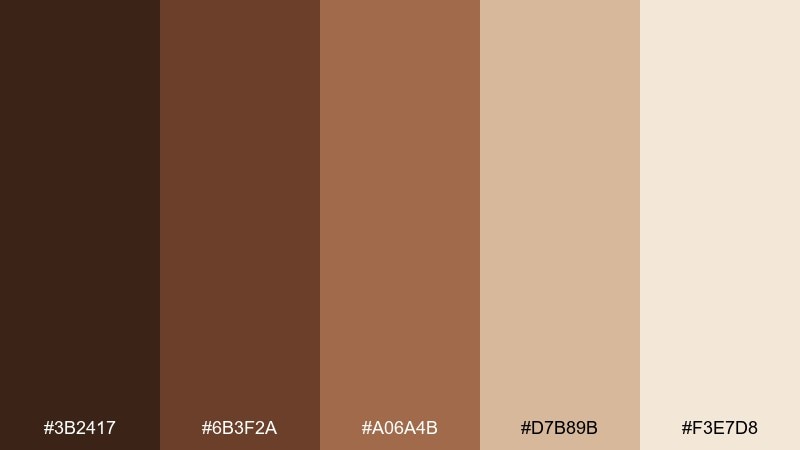
HEX: #3b2417 #6b3f2a #a06a4b #d7b89b #f3e7d8
Mood: cozy and inviting
Best for: social posts, artisan brands, and warm lifestyle graphics
Cozy and inviting, this chocolate brown color combination feels like hot cocoa with a swirl of cream on a cold day. The deep brown anchors layouts while the beige and soft ivory keep everything airy and readable. Pair it with subtle paper textures, simple serif headlines, and rounded icons for a friendly tone. Usage tip: reserve the darkest shade for type and use the lightest tone as the primary background for clean contrast.
Image example of cocoa cream generated using media.io
Media.io is an online AI studio for creating and editing video, image, and audio in your browser.

2) Mocha Marble
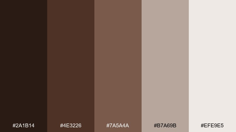
HEX: #2a1b14 #4e3226 #7a5a4a #b7a69b #efe9e5
Mood: polished and modern
Best for: website hero sections and editorial-style landing pages
Polished and modern, this chocolate color palette evokes marbled stone, espresso foam, and clean architecture. The dark espresso base gives strong hierarchy, while the taupes soften edges and create calm spacing. It works beautifully with grid-based layouts, thin dividers, and high-resolution product imagery. Usage tip: use the light gray-beige as negative space and keep accent elements in the mid mocha to avoid a muddy look.
Image example of mocha marble generated using media.io
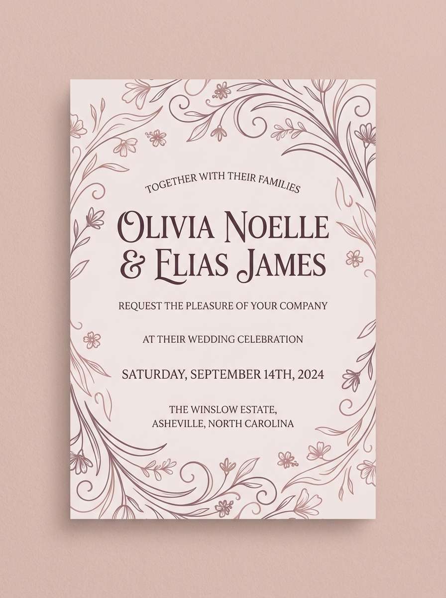
3) Truffle Rose
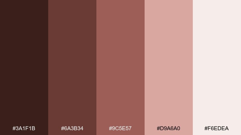
HEX: #3a1f1b #6a3b34 #9c5e57 #d9a6a0 #f6edea
Mood: romantic and handcrafted
Best for: wedding invitations, boutique stationery, and candle labels
Romantic and handcrafted, it brings to mind truffles dusted with cocoa beside soft rose petals. The plum-brown foundation keeps it grounded, while the blush tones add warmth without turning overly sweet. Pair it with letterpress textures, delicate line art, and gold foil accents for a premium finish. Usage tip: keep blush as a highlight color for names or seals and let the deeper tones carry body text.
Image example of truffle rose generated using media.io
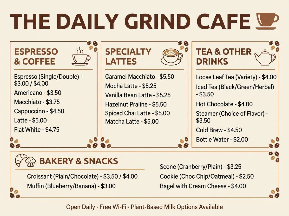
4) Caramel Latte
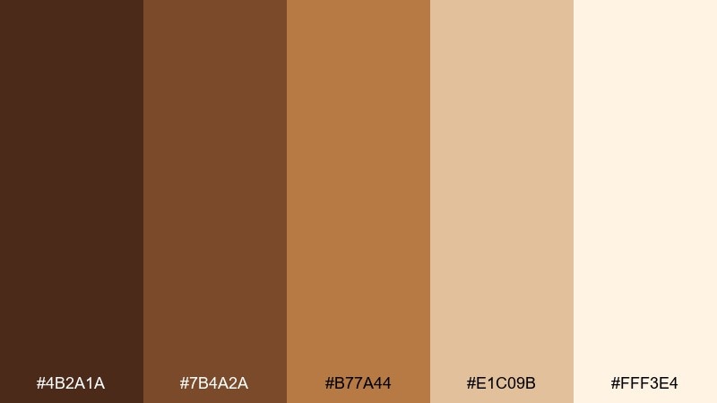
HEX: #4b2a1a #7b4a2a #b77a44 #e1c09b #fff3e4
Mood: warm and approachable
Best for: cafe menus, bakery flyers, and food packaging inserts
Warm and approachable, it feels like caramel drizzle over a creamy latte. These chocolate tones are a go-to chocolate color palette when you want comfort without looking heavy or dated. Pair it with handwritten-style headings, simple food icons, and lots of breathing room to keep it fresh. Usage tip: use the caramel shade for calls to action and keep the pale cream as the menu background for easy scanning.
Image example of caramel latte generated using media.io
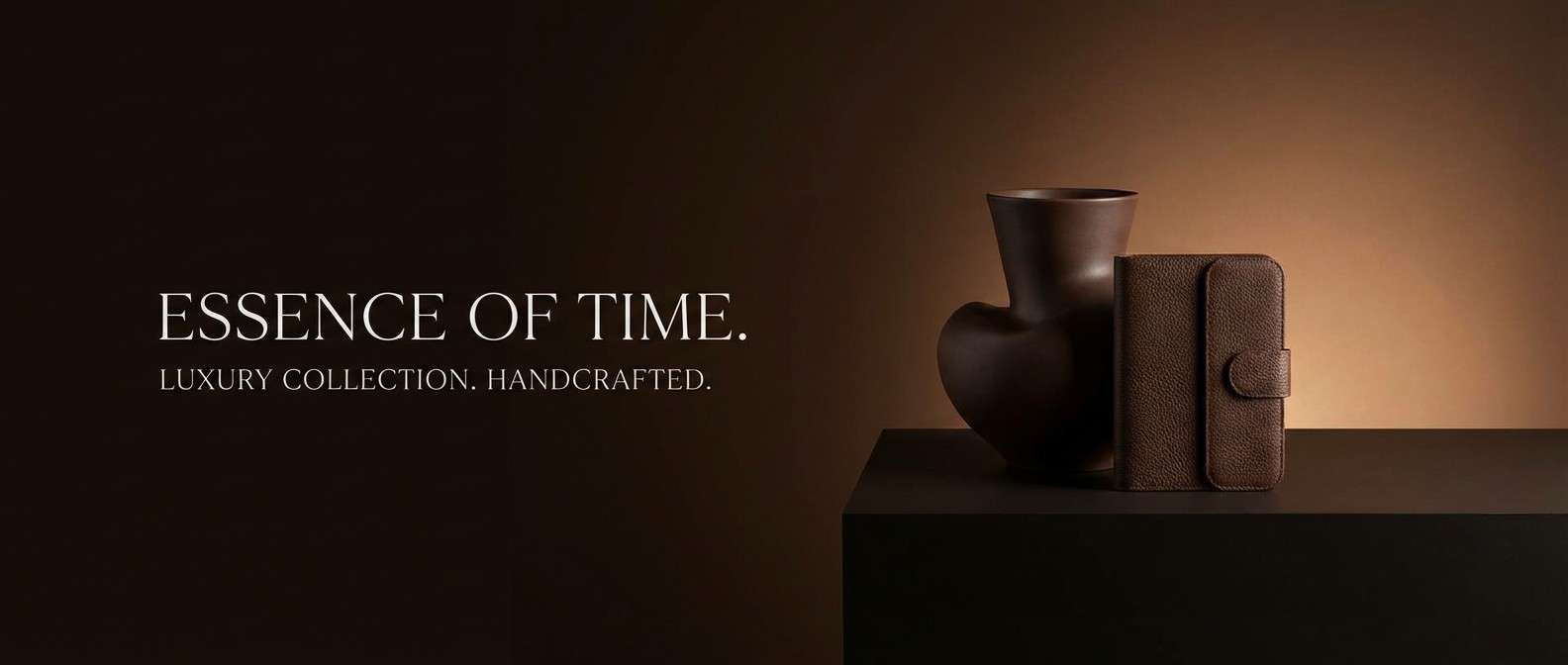
5) Espresso Noir
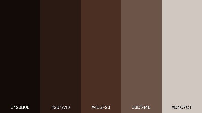
HEX: #120b08 #2b1a13 #4b2f23 #6d5448 #d1c7c1
Mood: dramatic and premium
Best for: luxury ads, high-end packaging, and cinematic banners
Dramatic and premium, this chocolate color scheme recalls a glossy espresso shot against dark wood and soft linen. The near-black shade creates instant sophistication, while the warm browns keep it from feeling cold. Pair it with metallic finishes, minimal typography, and plenty of shadow depth for a luxe look. Usage tip: keep the light gray-beige only for small highlights so the overall design stays rich and moody.
Image example of espresso noir generated using media.io
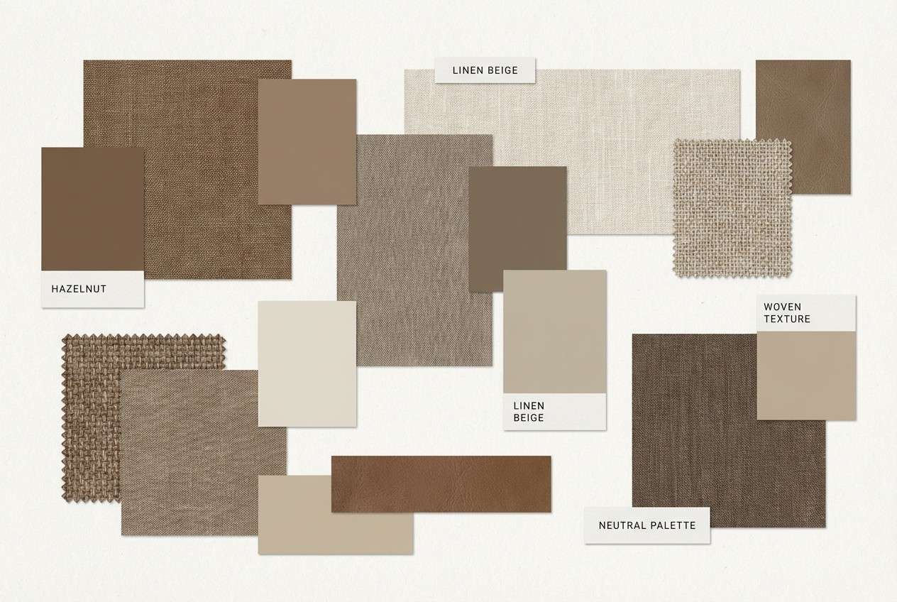
6) Hazelnut Linen
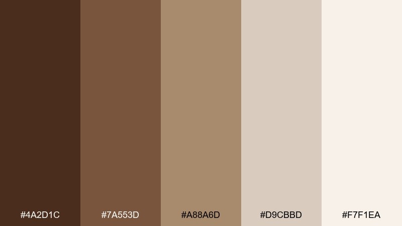
HEX: #4a2d1c #7a553d #a88a6d #d9cbbd #f7f1ea
Mood: natural and airy
Best for: interior moodboards, wellness brands, and minimal packaging
Natural and airy, it evokes toasted hazelnuts, linen fabric, and sunlit neutrals. The mid browns bring warmth while the light sands make layouts feel spacious and calm. Pair it with organic shapes, soft shadows, and matte paper textures for a grounded aesthetic. Usage tip: use the linen tone as your base and add contrast with the darkest brown only in headers and key icons.
Image example of hazelnut linen generated using media.io
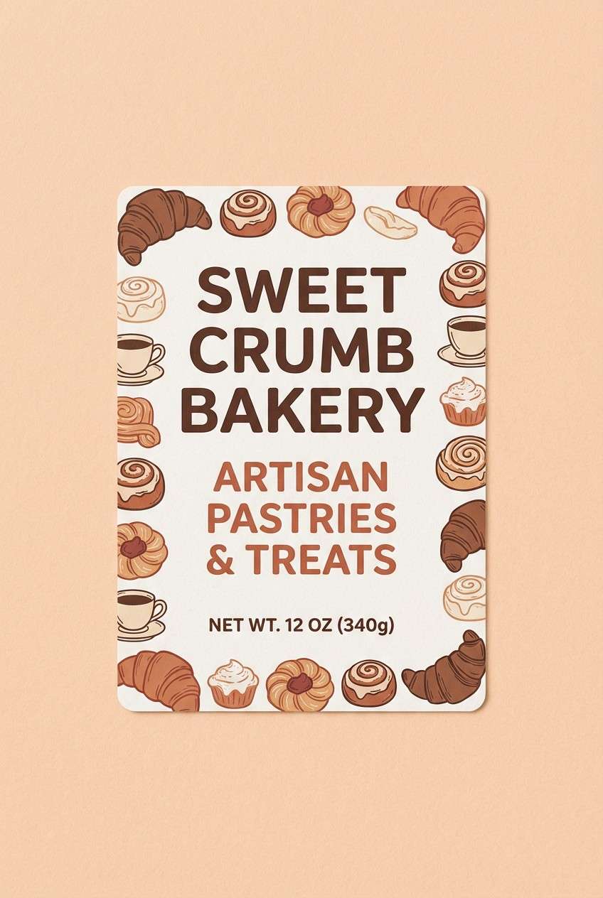
7) Cinnamon Cocoa
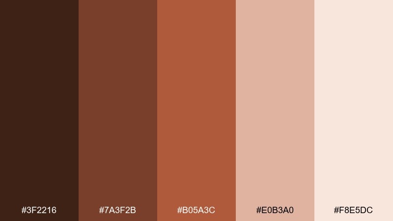
HEX: #3f2216 #7a3f2b #b05a3c #e0b3a0 #f8e5dc
Mood: spiced and lively
Best for: bakery packaging, seasonal promos, and recipe graphics
Spiced and lively, this color combination for chocolate brown feels like cinnamon dust over cocoa with a soft peachy glow. The warm terracotta notes brighten the brown base and add an energetic, friendly voice. Pair it with playful illustrations, stamped patterns, and chunky sans-serif type for a modern rustic vibe. Usage tip: keep the peach tones for highlights and let the deeper browns support readability in text-heavy designs.
Image example of cinnamon cocoa generated using media.io
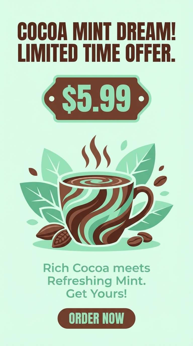
8) Chocolate Mint
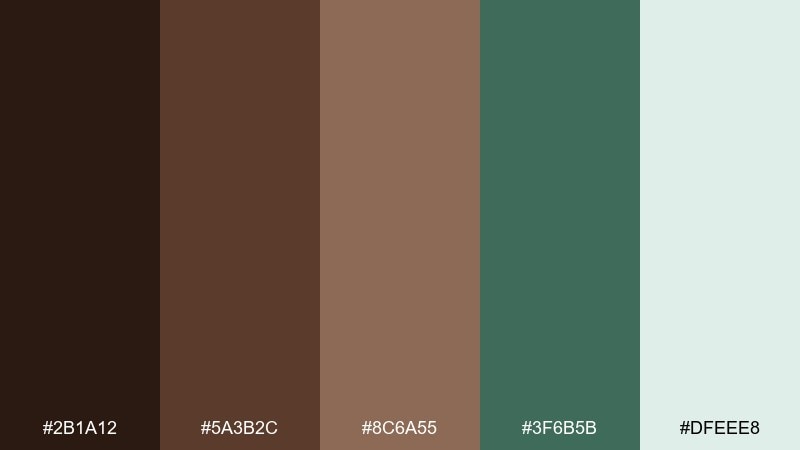
HEX: #2b1a12 #5a3b2c #8c6a55 #3f6b5b #dfeee8
Mood: fresh and cozy
Best for: drink promos, dessert branding, and modern cafe stories
Fresh and cozy, it brings the vibe of a mint truffle on a warm wooden table. These chocolate color combinations work best when the green stays as a crisp accent against the softer browns. Pair it with minimal icons, airy spacing, and one strong hero element like a badge or price sticker. Usage tip: use the mint tone for buttons or highlights, and keep the pale mint as a clean backdrop to avoid visual clutter.
Image example of chocolate mint generated using media.io
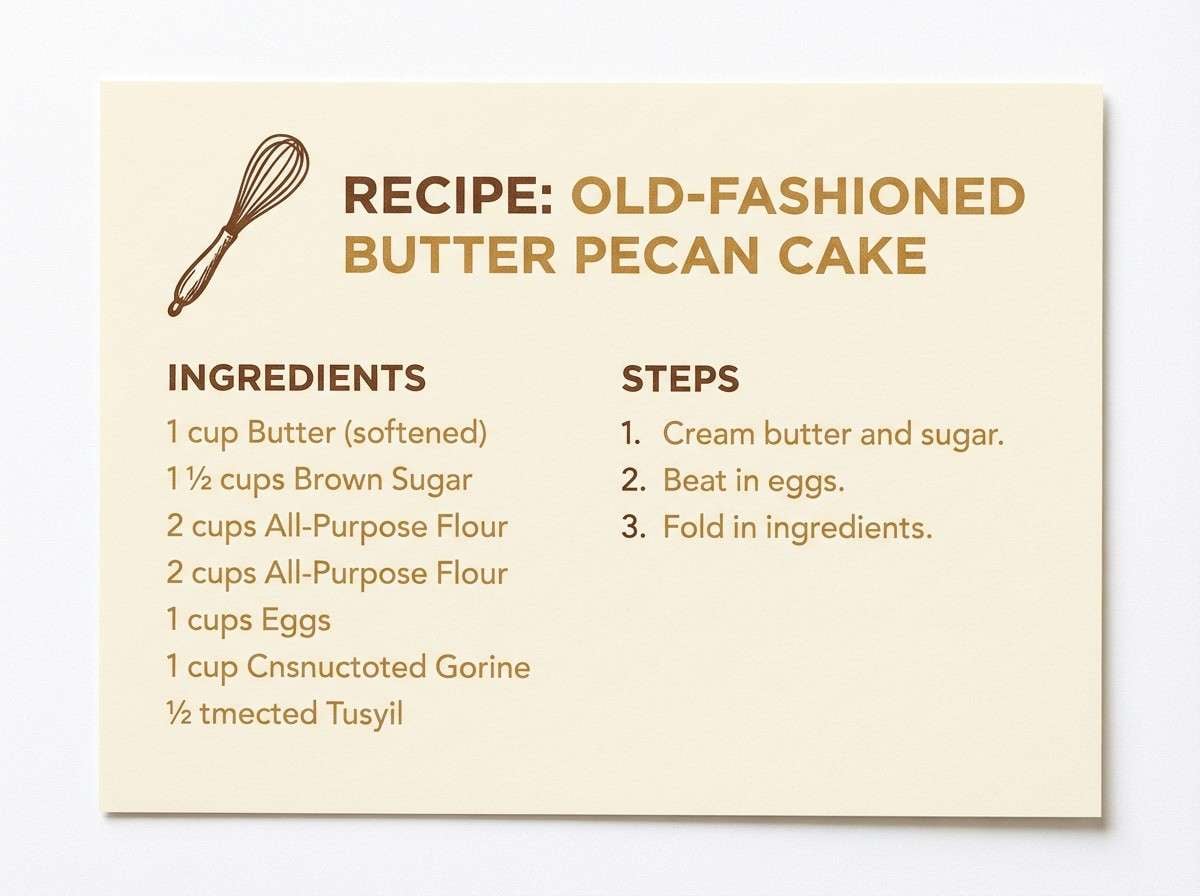
9) Toasted Almond
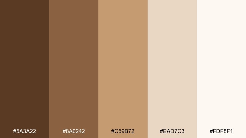
HEX: #5a3a22 #8a6242 #c59b72 #ead7c3 #fdf8f1
Mood: soft and wholesome
Best for: recipe cards, food blogs, and kitchen printables
Soft and wholesome, it feels like toasted almonds and warm shortbread crumbs. The golden tan adds delicious warmth while the cream tones keep text legible and clean. Pair it with simple photography frames, serif headings, and subtle dotted dividers for a homey look. Usage tip: let the pale cream dominate and use the deeper brown only for titles and key measurements.
Image example of toasted almond generated using media.io
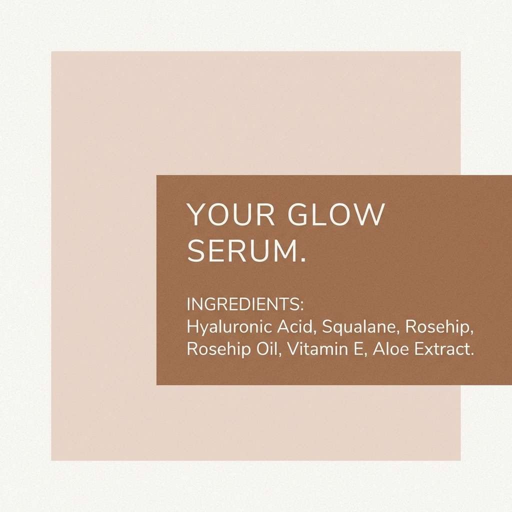
10) Brown Sugar Blush
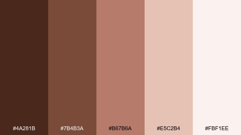
HEX: #4a281b #7b4b3a #b67b6a #e5c2b4 #fbf1ee
Mood: gentle and flattering
Best for: beauty branding, skincare brochures, and soft lifestyle ads
Gentle and flattering, it evokes brown sugar warmth with a hint of rosy skin tone. The muted blushes soften the darker brown so designs feel calm, not heavy. Pair it with clean sans-serif type, subtle gradients, and close-up product textures like matte paper or frosted glass. Usage tip: keep blush in large areas and use the darkest brown sparingly for contrast and premium detail.
Image example of brown sugar blush generated using media.io
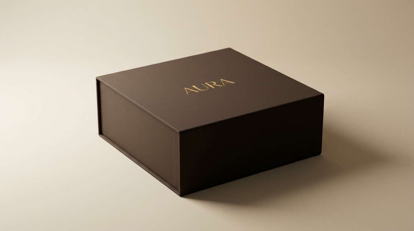
11) Dark Chocolate Gold
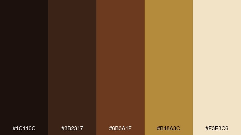
HEX: #1c110c #3b2317 #6b3a1f #b48a3c #f3e3c6
Mood: opulent and confident
Best for: premium gift boxes, luxury packaging, and high-end banners
Opulent and confident, it conjures dark ganache with a gleam of brushed gold. As a chocolate color palette, it shines when you keep the gold as a controlled accent rather than a full wash. Pair it with sharp typography, embossed details, and deep shadows to reinforce the luxury feel. Usage tip: apply the gold tone to borders, icons, or foil-like highlights and let the near-black carry the brand name.
Image example of dark chocolate gold generated using media.io
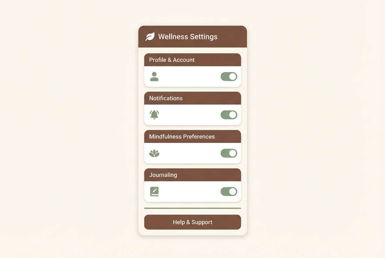
12) Cocoa Sage
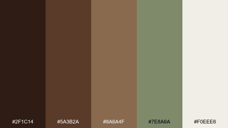
HEX: #2f1c14 #5a3b2a #8a6a4f #7e8a6a #f0eee6
Mood: calm and grounded
Best for: wellness branding, eco packaging, and earthy UI themes
Calm and grounded, it feels like cocoa powder beside dried herbs and soft stone. This chocolate color scheme balances warmth with a muted sage that reads clean and modern. Pair it with recycled-paper textures, simple leaf motifs, and minimal iconography for an eco-forward look. Usage tip: use sage for secondary buttons and badges, and keep the warm off-white for generous padding and readability.
Image example of cocoa sage generated using media.io
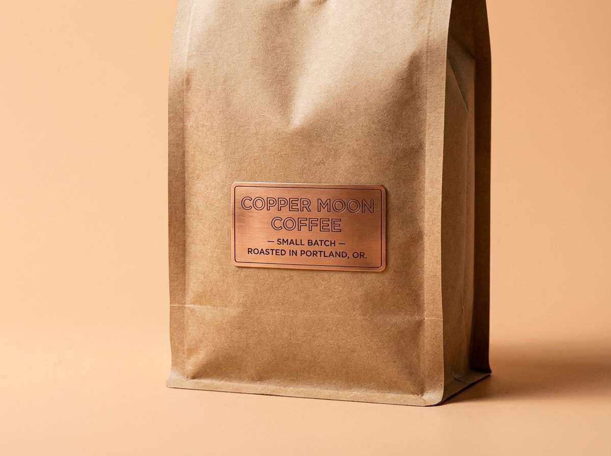
13) Walnut Copper
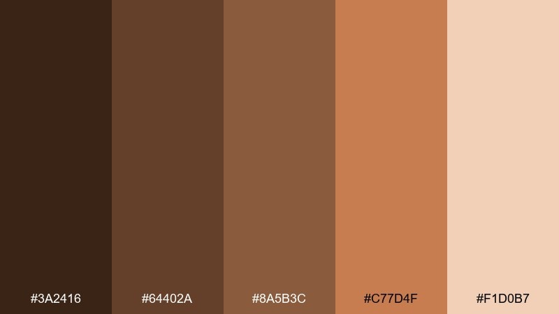
HEX: #3a2416 #64402a #8a5b3c #c77d4f #f1d0b7
Mood: rustic and energetic
Best for: craft packaging, coffee labels, and workshop posters
Rustic and energetic, it suggests walnut shells, copper cookware, and a crackle of warm light. The copper-orange adds punch without pulling the palette into neon territory. Pair it with bold badges, textured backgrounds, and stamped-style logos for a handmade feel. Usage tip: keep copper for emphasis areas like prices or seals, and let the mid browns handle most surfaces.
Image example of walnut copper generated using media.io
14) Velvet Plum Cocoa
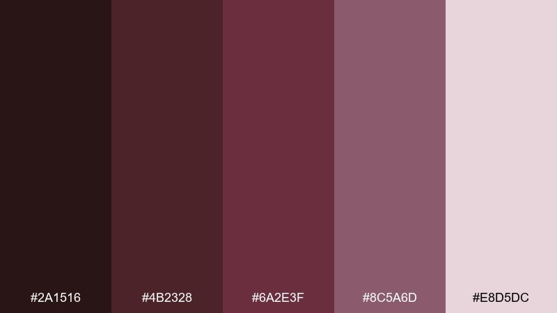
HEX: #2a1516 #4b2328 #6a2e3f #8c5a6d #e8d5dc
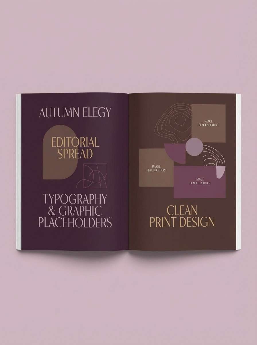
Mood: moody and artistic
Best for: editorial layouts, book covers, and boutique branding
Moody and artistic, it feels like velvet curtains, plum jam, and deep cocoa. The wine tones add sophistication and make headlines feel intentional and dramatic. Pair it with elegant serif fonts, high-contrast photography, and minimal line separators. Usage tip: use the light mauve as breathing room so the darker plum shades do not overpower the page.
Image example of velvet plum cocoa generated using media.io
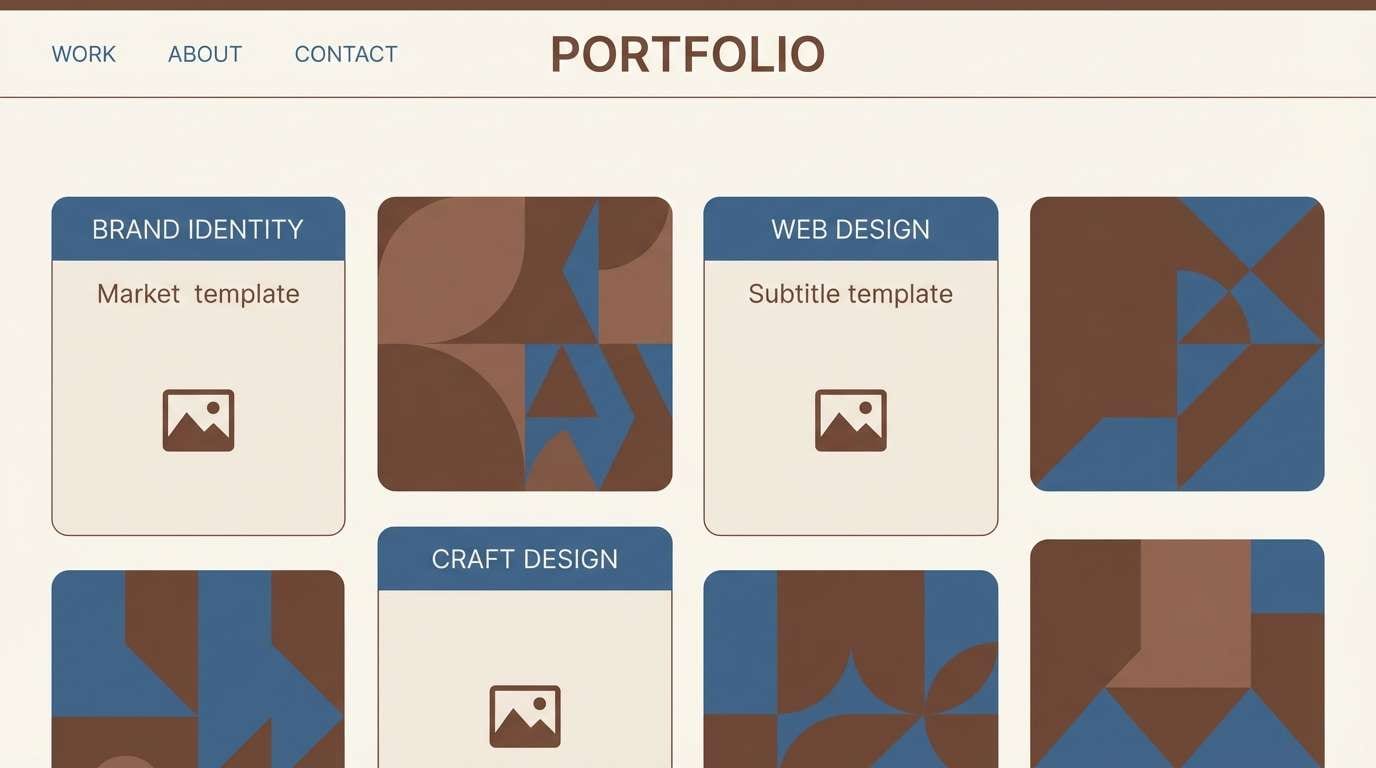
15) Cocoa Denim
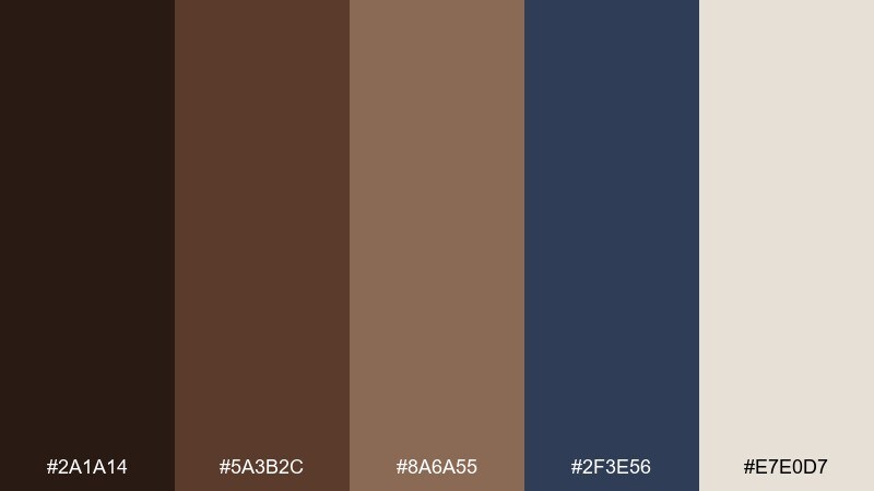
HEX: #2a1a14 #5a3b2c #8a6a55 #2f3e56 #e7e0d7
Mood: cool and contemporary
Best for: portfolio sites, tech branding, and minimalist UI
Cool and contemporary, this chocolate color combination mixes cocoa warmth with a denim-blue depth that feels quietly confident. The blue works best as a supporting contrast, letting the browns stay in charge of the overall tone. Pair it with clean components, thin outlines, and generous spacing for a modern interface. Usage tip: keep denim for headers, links, or charts and use the off-white for primary canvas areas.
Image example of cocoa denim generated using media.io
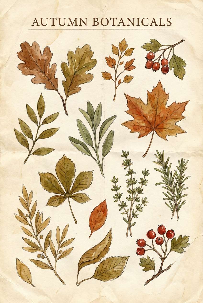
16) Gingerbread Olive
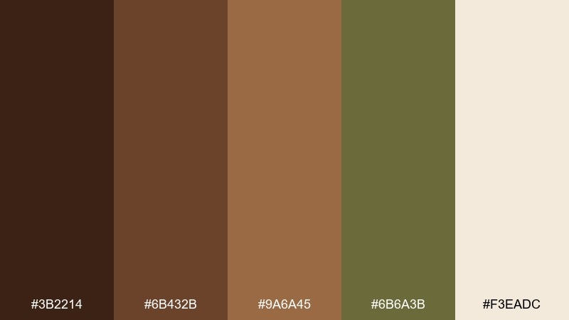
HEX: #3b2214 #6b432b #9a6a45 #6b6a3b #f3eadc
Mood: earthy and seasonal
Best for: autumn posters, farmers market signs, and botanical prints
Earthy and seasonal, it evokes gingerbread spice with an olive-green twist. The green adds a natural note that feels outdoorsy and grounded rather than festive-only. Pair it with illustrated leaves, kraft-paper textures, and bold display type for market-ready signage. Usage tip: use olive for secondary headings and icons, and keep the light cream as the poster base for maximum legibility.
Image example of gingerbread olive generated using media.io
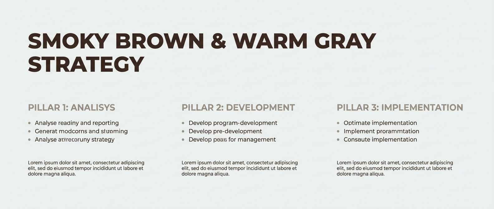
17) Smoky Cocoa Gray
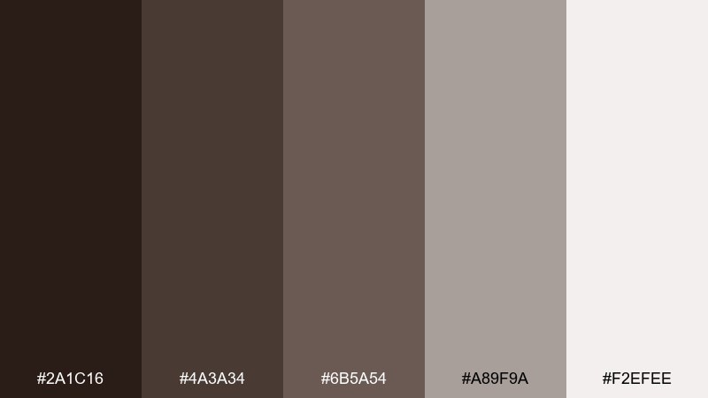
HEX: #2a1c16 #4a3a34 #6b5a54 #a89f9a #f2efee
Mood: minimal and understated
Best for: professional decks, neutral UI themes, and typography-led designs
Minimal and understated, it feels like cocoa stirred into soft smoke and stone. The grays make the browns look more mature, perfect for clean presentations and calm interfaces. Pair it with monochrome photography, thin rules, and crisp type scales. Usage tip: keep the darkest shade for headings and use the lightest gray as a consistent background to maintain a refined rhythm.
Image example of smoky cocoa gray generated using media.io
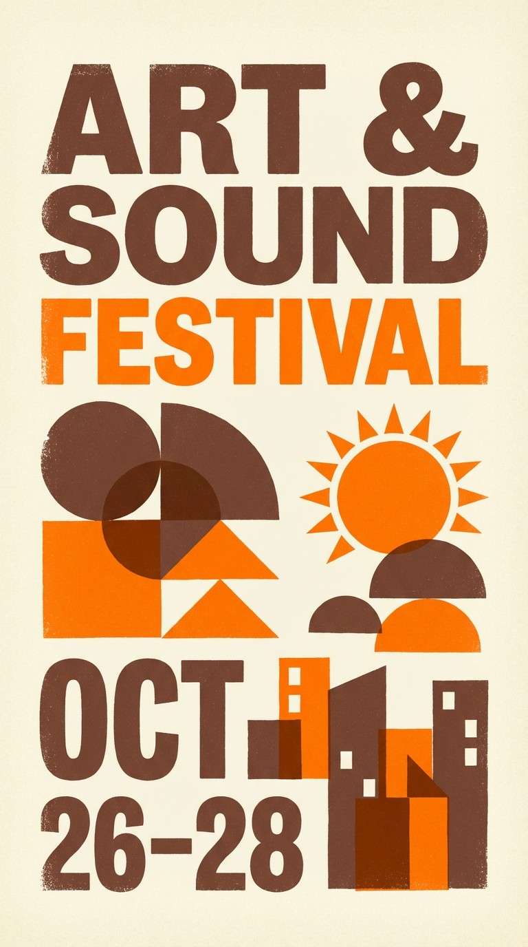
18) Cocoa Citrus Pop
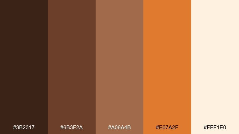
HEX: #3b2317 #6b3f2a #a06a4b #e07a2f #fff1e0
Mood: bright and appetizing
Best for: event posters, snack ads, and punchy call-to-action layouts
Bright and appetizing, it feels like cocoa brownies paired with a hit of orange zest. These chocolate color combinations are great when you want warmth plus a clear attention color for buttons, stickers, or headlines. Pair it with bold sans-serif type, simple shapes, and high-contrast spacing so the orange does not overwhelm. Usage tip: keep orange to under 10 percent of the layout and let the creamy background do the heavy lifting.
Image example of cocoa citrus pop generated using media.io
19) Cocoa Sea Salt
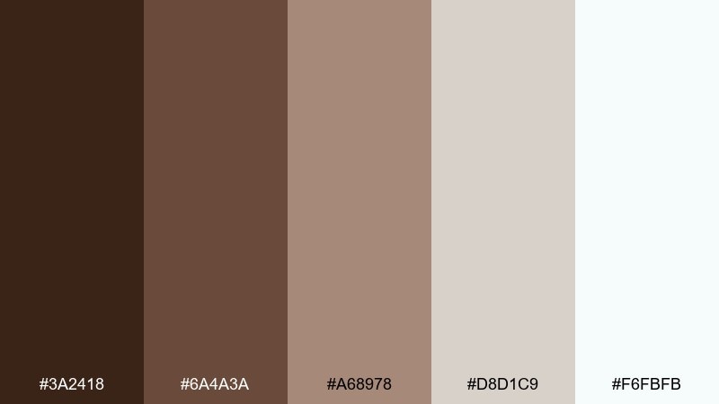
HEX: #3a2418 #6a4a3a #a68978 #d8d1c9 #f6fbfb
Mood: clean and coastal
Best for: spa packaging, candle labels, and airy ecommerce pages
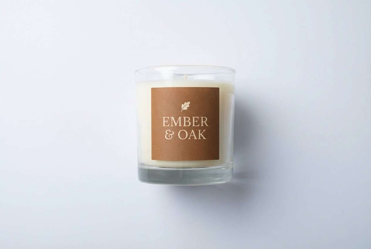
Clean and coastal, it suggests sea salt on driftwood with a soft, misty finish. The cool near-white keeps the warm browns feeling fresh and modern, not heavy. Pair it with minimal line illustrations, lots of whitespace, and soft shadows for an elevated spa vibe. Usage tip: use the sandy beige for panels and cards, and keep the cool white for background to maintain that breezy feel.
Image example of cocoa sea salt generated using media.io
20) Cherry Cordial
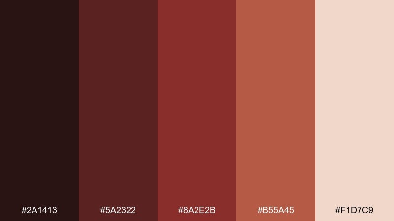
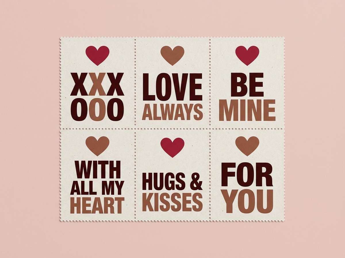
HEX: #2a1413 #5a2322 #8a2e2b #b55a45 #f1d7c9
Mood: bold and indulgent
Best for: valentines promos, confectionery branding, and gift tags
Bold and indulgent, these chocolate colors bring up cherry cordial centers wrapped in dark cocoa. The deep red-browns feel luxurious and festive, while the soft blush keeps it friendly for print. Pair it with playful patterns like dots or hearts and strong, simple type for easy readability. Usage tip: use the deepest shade for text and outlines, then reserve the brighter cherry tone for stamps and limited highlights.
Image example of cherry cordial generated using media.io
What Colors Go Well with Chocolate?
Chocolate brown pairs naturally with warm neutrals like cream, ivory, sand, and taupe. These create a soft, cozy foundation that works across packaging, interiors, and UI backgrounds.
For contrast, try cool accents like sage green, mint, denim blue, or smoky gray. These tones keep chocolate from feeling too heavy and help modernize the overall look.
If you need a “pop” color, controlled accents like gold, copper, or orange work best. Keep them limited to highlights (buttons, badges, borders) so the palette stays rich and readable.
How to Use a Chocolate Color Palette in Real Designs
Start by assigning roles: one dark cocoa for headings and key UI elements, one mid-brown for surfaces, and a light cream for backgrounds. This prevents the common “muddy” effect that happens when too many browns compete.
Use texture thoughtfully. Chocolate palettes look premium with matte paper grain, subtle shadows, and warm lighting—especially in product graphics and brand mockups.
In digital design, check accessibility contrast early. Chocolate-on-cream is usually reliable, but mid-browns on beige may fail—reserve mid-tones for fills, cards, and secondary UI details.
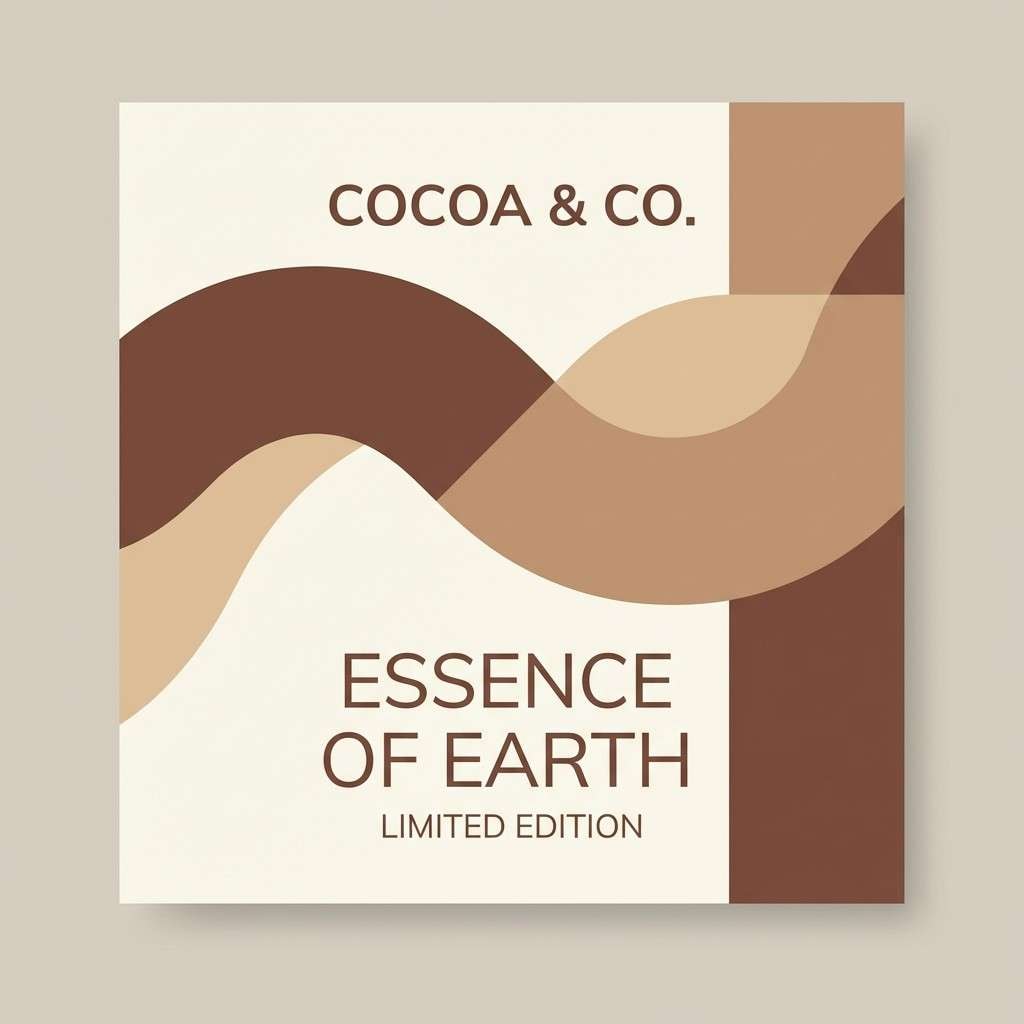
Create Chocolate Palette Visuals with AI
If you want to see a chocolate color scheme in action, generate a few concept visuals first—social posts, labels, hero sections, or moodboards. It’s the fastest way to validate contrast, mood, and hierarchy before committing to production.
With Media.io Text to Image, you can paste a prompt, match your aspect ratio, and iterate quickly. Keep your prompt specific (layout type, style, “no photo” vs. “realistic studio shot”) to get consistent results.
When you find a direction you like, reuse the same palette across variants: ads, stories, posters, and packaging inserts. Consistency is what makes chocolate palettes feel “brand” instead of “brown.”
Chocolate Color Palette FAQs
-
What is a chocolate color palette?
A chocolate color palette is a set of warm brown shades (from cocoa to espresso) paired with supporting neutrals and accents like cream, gold, sage, or muted blues to create a cohesive design system. -
Is chocolate brown good for branding?
Yes. Chocolate brown often signals craftsmanship, warmth, and reliability, making it popular for food, lifestyle, wellness, and premium packaging brands. -
How do I keep a brown color scheme from looking muddy?
Use clear role separation: one darkest shade for text, one mid-tone for surfaces, and a light neutral for backgrounds. Add one contrasting accent (green, blue, or gold) and limit it to highlights. -
What accent colors pair best with chocolate?
Gold/copper for luxury, sage/mint for freshness, denim/navy for modern contrast, and orange for high-energy calls to action. The best choice depends on whether you want cozy, premium, or contemporary. -
What background color works best with chocolate tones?
Creamy off-white, ivory, and warm beige are the safest backgrounds for readability. Cool whites can also work when you want a cleaner, lighter feel. -
Can I use chocolate colors in UI design?
Absolutely. Chocolate palettes can create calm, premium interfaces—just verify contrast for buttons and text, and use off-white or light beige as your primary canvas. -
How can I generate chocolate palette visuals quickly?
Use an AI generator like Media.io Text to Image. Start with a layout-specific prompt (poster, label, hero UI), specify “flat design” or “realistic studio shot,” and iterate while keeping your HEX palette consistent.


