

Arabian Nights palettes are built around deep, ink-like blues, warm metals, and soft parchment neutrals—so they feel cinematic without becoming too dark.
Below are 20 modern Arabian Nights color palette ideas with HEX codes, plus practical notes for branding, UI, and print.
In this article
Why Arabian Nights Palettes Work So Well
Arabian Nights color schemes are naturally high-contrast: midnight blues and near-blacks make typography feel premium, while warm golds and ambers add “light” without needing neon brights.
They also balance cool and warm temperatures in a way that reads both modern and timeless—think indigo navigation, parchment backgrounds, and metallic accents used like jewelry.
Because the base tones are deep and stable, these palettes scale well across formats: small UI components, large hero banners, and print pieces like menus, invitations, and packaging.
20+ Arabian Nights Color Palette Ideas (with HEX Codes)
1) Midnight Souk
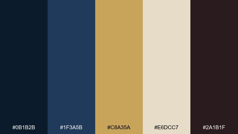
HEX: #0b1b2b #1f3a5b #c8a35a #e6dcc7 #2a1b1f
Mood: mysterious, luxe, and cinematic
Best for: boutique hotel branding and stationery
Mysterious and velvety, like lantern light glinting off brass in a late-night market. This arabian nights color scheme shines when you let the deep navy lead and reserve the antique gold for logos, borders, and tiny highlights. Pair the ivory with generous whitespace to keep it premium rather than heavy. Usage tip: keep gold elements thin and consistent to avoid a noisy, glittery look.
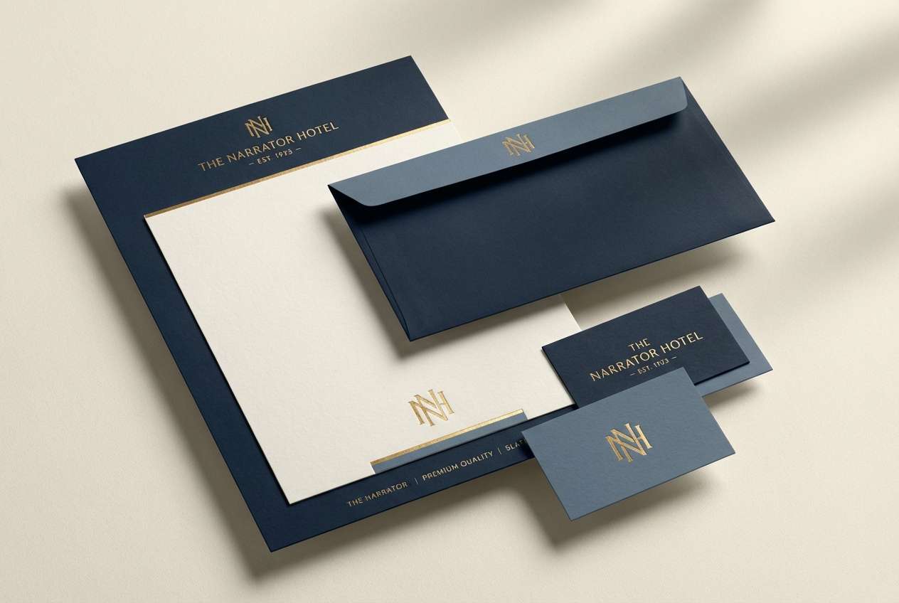
Image example of midnight souk generated using media.io
Media.io is an online AI studio for creating and editing video, image, and audio in your browser.

2) Desert Lantern
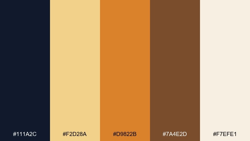
HEX: #111a2c #f2d28a #d9822b #7a4e2d #f7efe1
Mood: warm, welcoming, and nostalgic
Best for: restaurant menus and cafe identity
Warm and inviting, like a lantern glow against evening sand. The soft cream and honey tones make great backgrounds, while the burnt orange adds appetite-friendly energy for headings and callouts. Anchor the palette with the dark blue for readability and contrast, especially for body text. Usage tip: use the deepest shade for typography and keep the brightest yellow limited to small highlights.
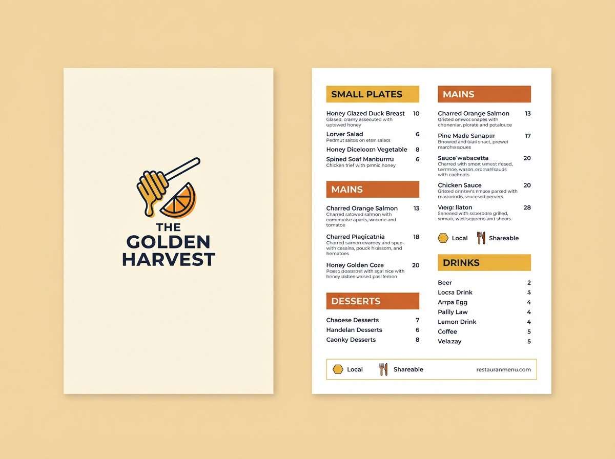
Image example of desert lantern generated using media.io
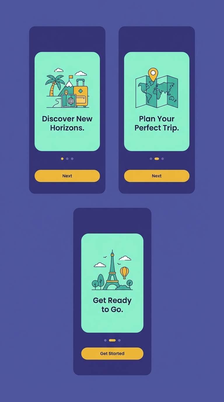
3) Indigo Oasis
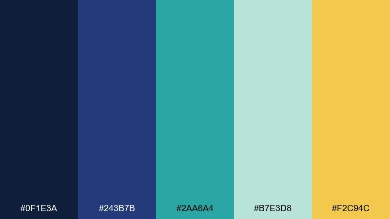
HEX: #0f1e3a #243b7b #2aa6a4 #b7e3d8 #f2c94c
Mood: fresh, adventurous, and tech-forward
Best for: travel app UI and onboarding screens
Fresh and adventurous, like cool water cutting through deep indigo night. These arabian nights color combinations work best when teal becomes the primary action color and the indigos hold navigation and headers steady. The mint tint softens panels and cards, while the golden yellow should be used sparingly for badges or progress moments. Usage tip: keep yellow under 10 percent of the screen so it reads as a spark, not a warning.
Image example of indigo oasis generated using media.io
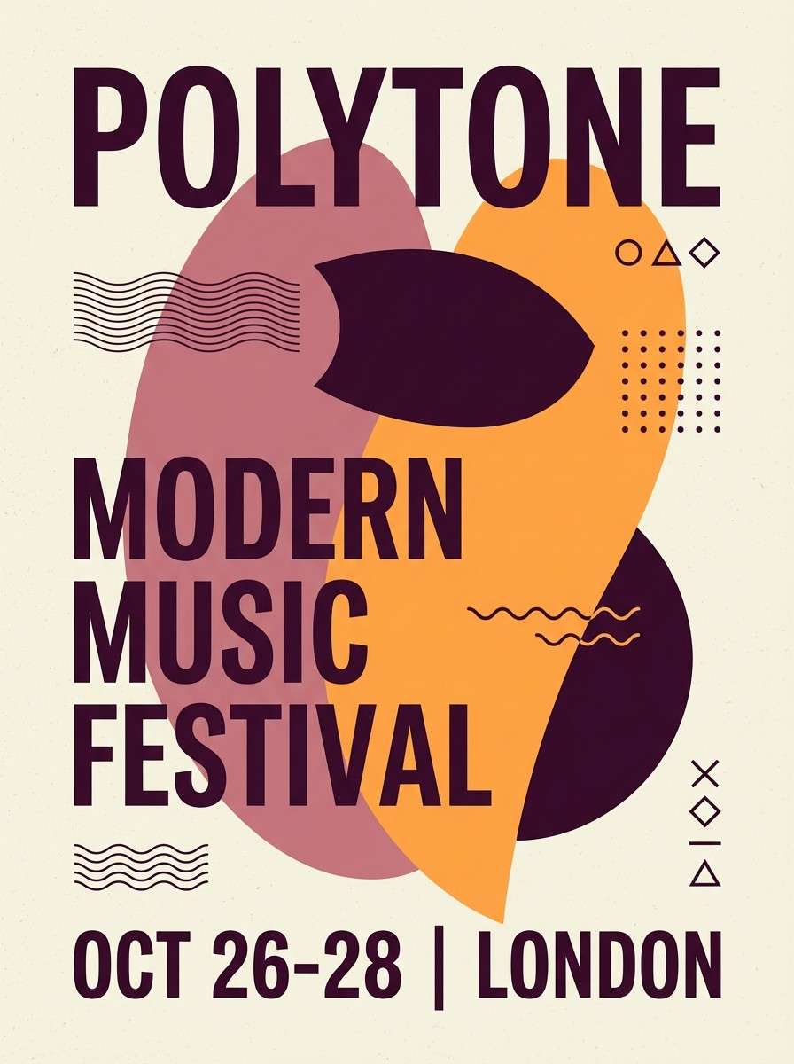
4) Saffron Silk
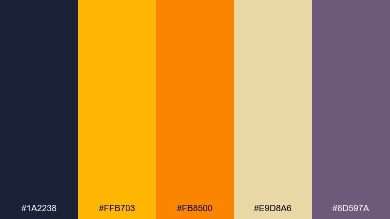
HEX: #1a2238 #ffb703 #fb8500 #e9d8a6 #6d597a
Mood: bold, festive, and fashion-minded
Best for: event posters and campaign graphics
Bold and festive, like saffron fabric catching stage light. Let the navy set the backdrop, then layer saffron and tangerine for big typography, stickers, or key dates. The pale sand keeps sections breathable, and the muted violet adds a refined secondary accent for subheads. Usage tip: choose either saffron or tangerine as the hero accent per layout to avoid competing heat.
Image example of saffron silk generated using media.io

5) Palm Courtyard
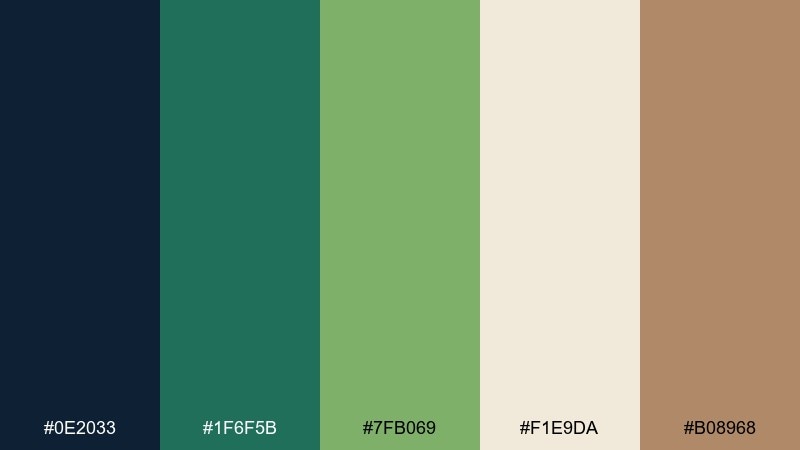
HEX: #0e2033 #1f6f5b #7fb069 #f1e9da #b08968
Mood: calm, natural, and resort-like
Best for: skincare packaging and wellness brands
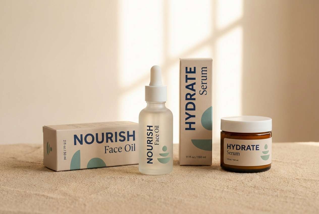
Calm and restorative, like shade under palms with sunlit stone nearby. The greens feel credible for wellness, while the warm sand and clay tones prevent it from going too clinical. Use the deep navy as your type and barcode color to keep labels sharp and legible. Usage tip: print the lightest tone slightly warmer to avoid a gray cast on matte stock.
Image example of palm courtyard generated using media.io
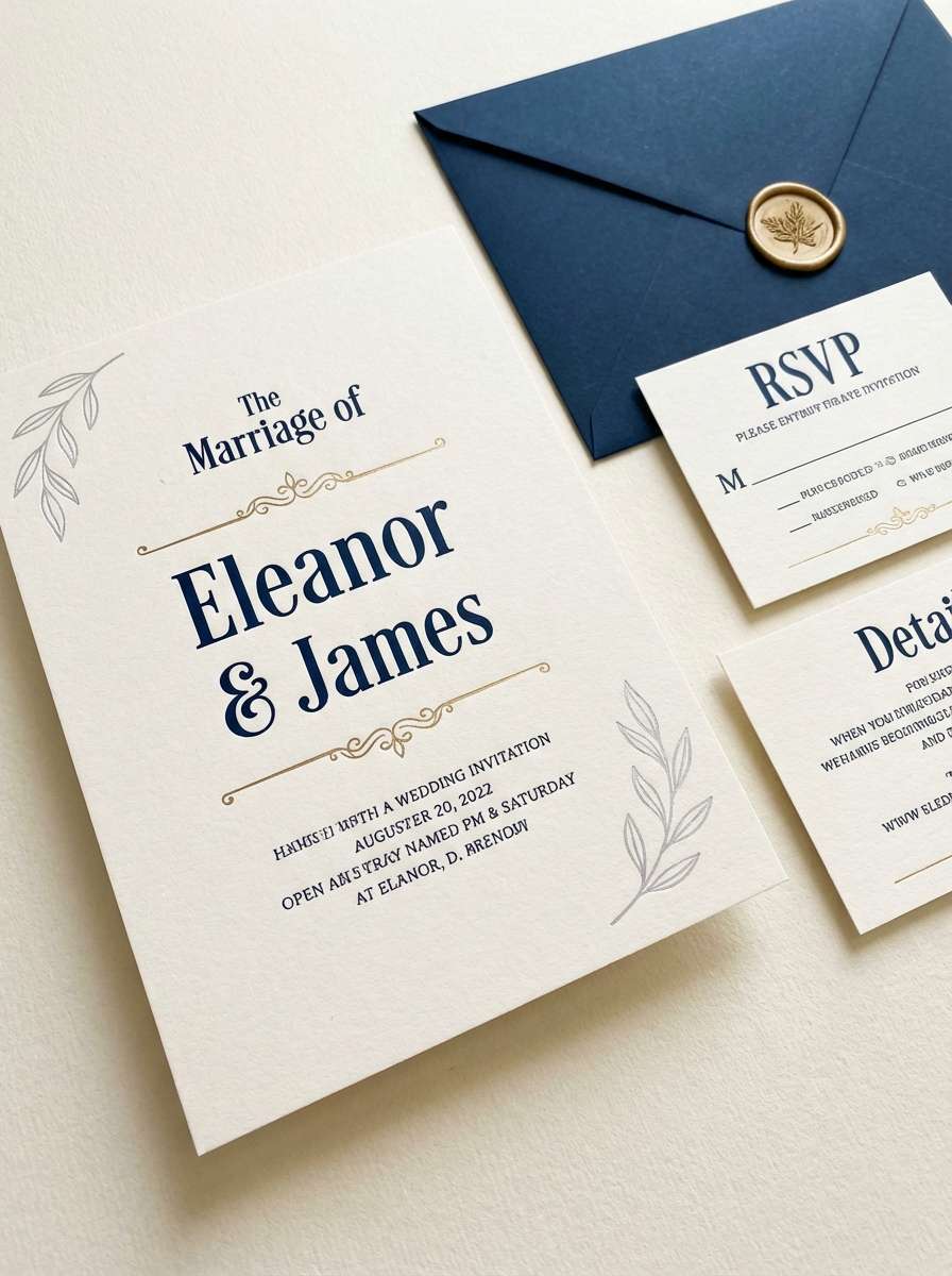
6) Moonlit Minaret
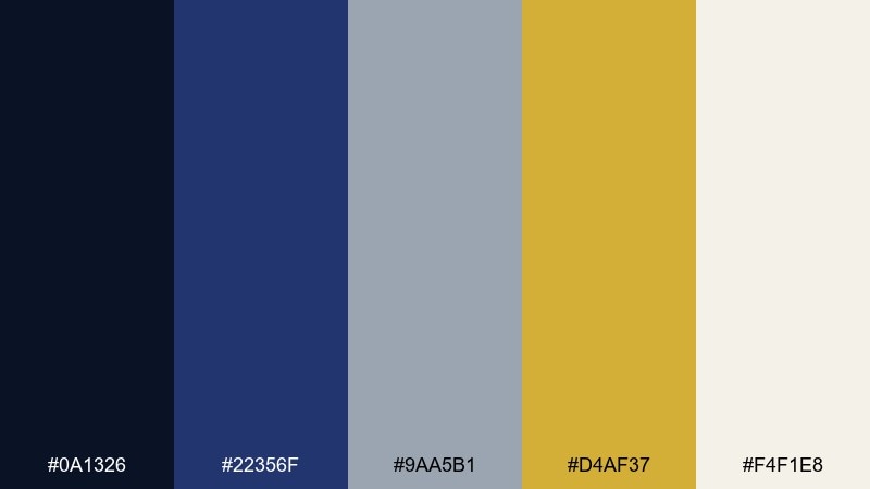
HEX: #0a1326 #22356f #9aa5b1 #d4af37 #f4f1e8
Mood: elegant, serene, and ceremonial
Best for: wedding invitations and formal announcements
Elegant and serene, like moonlight outlining a skyline of domes. The arabian nights color palette here feels formal when you keep the blues dominant and let gold appear as foil-style rules, monograms, or tiny motifs. Silver-gray is ideal for secondary text and RSVP details without losing hierarchy. Usage tip: increase line spacing and use a slightly heavier font weight for the gray text to maintain readability on cream paper.
Image example of moonlit minaret generated using media.io
7) Spice Bazaar
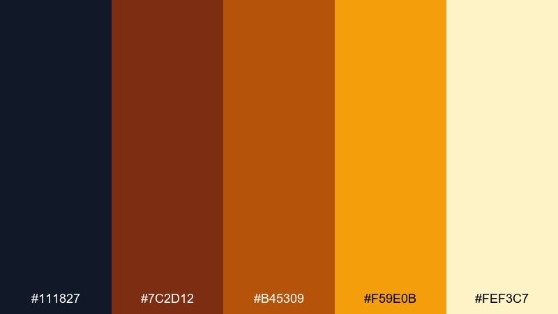
HEX: #111827 #7c2d12 #b45309 #f59e0b #fef3c7
Mood: rich, energetic, and handcrafted
Best for: coffee labels and small-batch food brands
Rich and aromatic, like toasted spice and dark wood shelves. The chili and amber tones make strong flavor cues, while the near-black keeps labels crisp and premium. Use the pale cream for breathing room and ingredient panels so the warm accents stay appetizing. Usage tip: test small text on the amber shade, since it can reduce contrast in low light.
Image example of spice bazaar generated using media.io
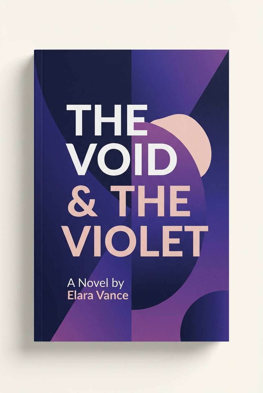
8) Royal Tapestry
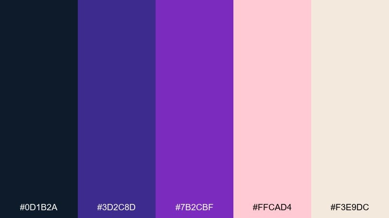
HEX: #0d1b2a #3d2c8d #7b2cbf #ffcad4 #f3e9dc
Mood: opulent, artistic, and romantic
Best for: book covers and album artwork
Opulent and artistic, like woven velvet and jeweled thread. Purple and violet do the drama, while the blush tone keeps it modern and approachable instead of overly gothic. Use the off-white for titles and negative space so the dark base does not swallow details. Usage tip: apply the blush as a single large shape rather than many small accents to avoid visual clutter.
Image example of royal tapestry generated using media.io
9) Sandstone Ink
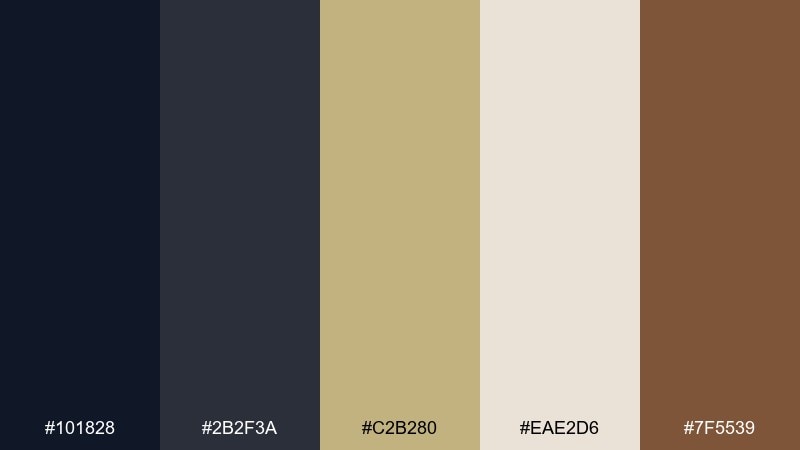
HEX: #101828 #2b2f3a #c2b280 #eae2d6 #7f5539
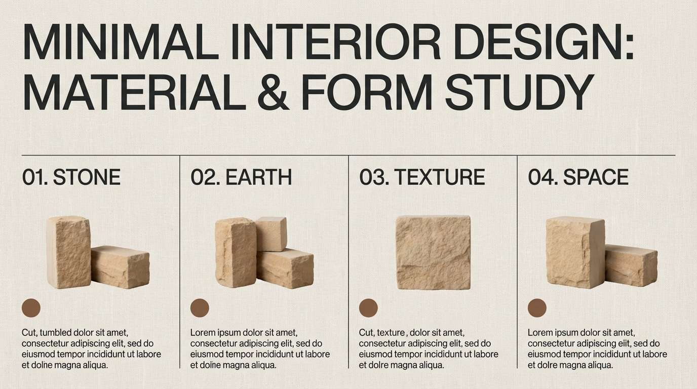
Mood: grounded, editorial, and timeless
Best for: interior design presentation slides
Grounded and timeless, like ink sketches on warm stone. These arabian nights color combinations are strong for decks and portfolios where you need contrast without harshness. Let sandstone and linen be your canvas, then use cocoa for callouts and the near-black for headings and diagrams. Usage tip: keep charts to two tones plus one accent so the neutral story stays cohesive.
Image example of sandstone ink generated using media.io
10) Date Nectar
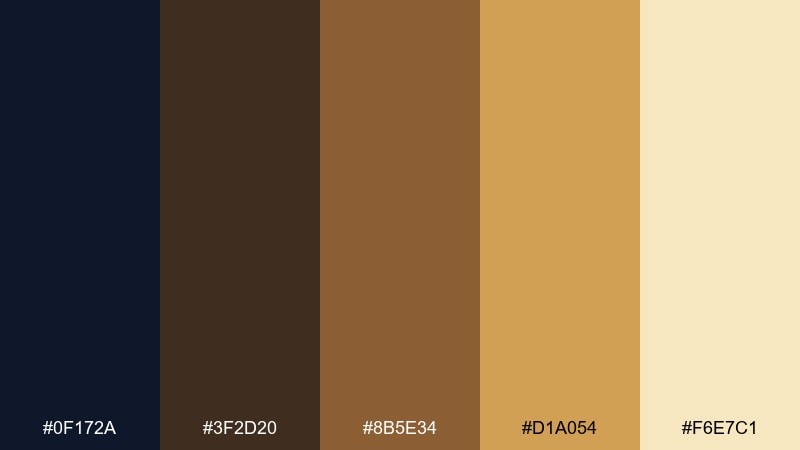
HEX: #0f172a #3f2d20 #8b5e34 #d1a054 #f6e7c1
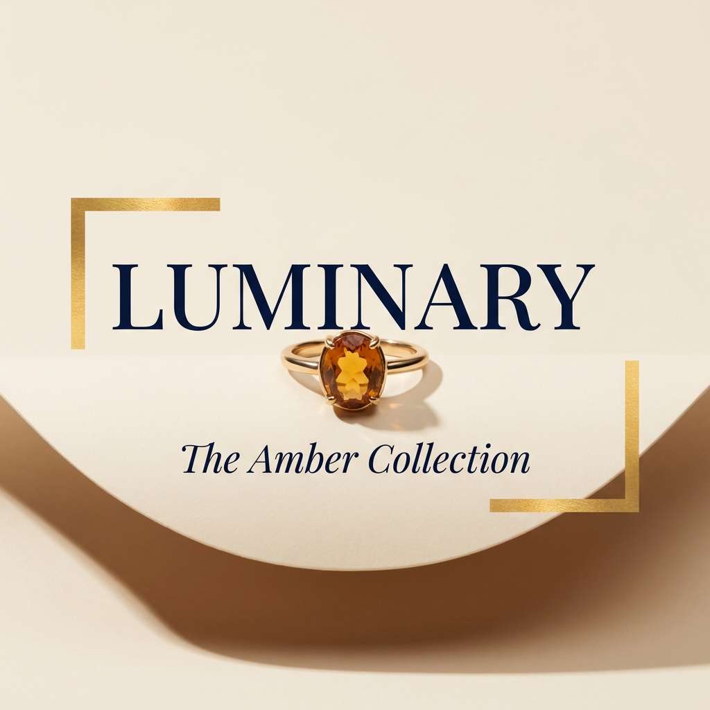
Mood: cozy, gourmet, and sophisticated
Best for: jewelry product ads and ecommerce banners
Cozy and gourmet, like caramelized sugar and polished wood under soft light. Use the gold-amber as your hero accent for price tags, product names, or sparkle highlights, then rely on the dark navy for clean contrast. The creamy tone keeps the overall look airy and helps reflective metals stand out. Usage tip: avoid pure white backgrounds and choose the cream instead for a more luxurious finish.
Image example of date nectar generated using media.io
11) Starry Dune
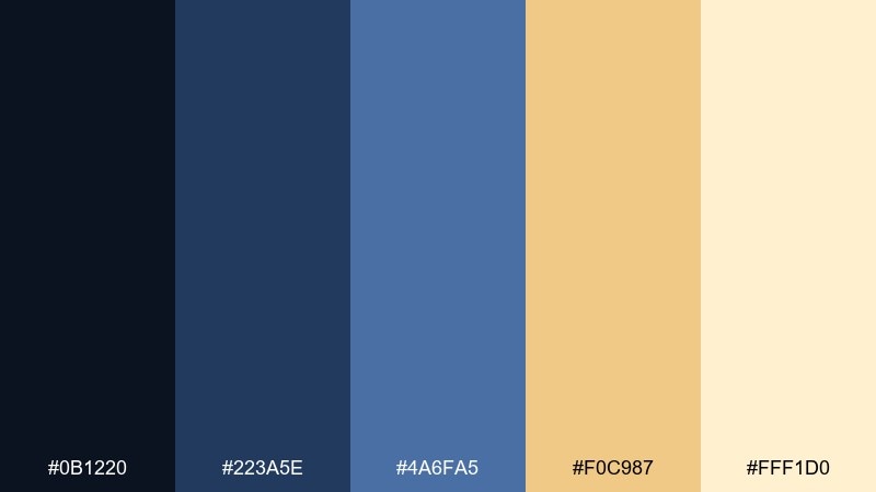
HEX: #0b1220 #223a5e #4a6fa5 #f0c987 #fff1d0
Mood: dreamy, airy, and travel-inspired
Best for: social media story templates
Dreamy and airy, like constellations over rolling dunes. The blues stack beautifully for gradients, while the sandy gold reads as a gentle highlight for buttons or key phrases. Keep the pale cream as the base layer so text stays easy to scan on small screens. Usage tip: put the lightest text on the mid-blue, not the darkest, to reduce glare-like contrast.
Image example of starry dune generated using media.io
12) Copper Tea Set
HEX: #0e1a2b #2f4858 #c17c54 #f2e9e4 #6b705c
Mood: artisan, calm, and refined
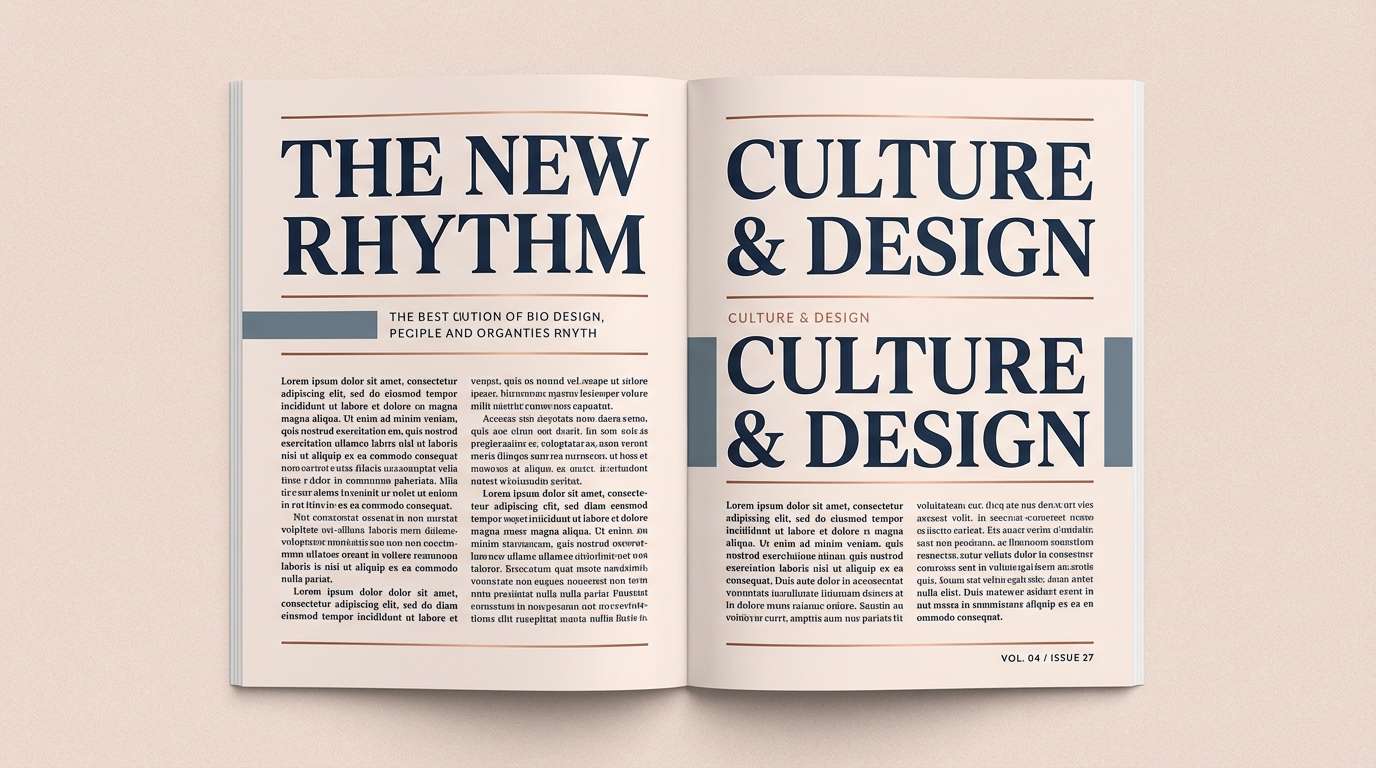
Best for: magazine features and editorial layouts
Artisan and refined, like burnished copper on a linen tablecloth. The blue-black and slate tones make strong typographic anchors, while copper is perfect for pull quotes, drop caps, or section dividers. Use the soft blush-cream to keep spreads bright and contemporary. Usage tip: repeat the copper accent at consistent intervals to guide the reader through long articles.
Image example of copper tea set generated using media.io
13) Velvet Caravan
HEX: #120a1f #3c1642 #8f2d56 #f2a65a #f7f3e3
Mood: dramatic, vintage, and playful
Best for: music event flyers
Dramatic and playful, like velvet curtains and warm stage lights. The plum and rose shades create instant nightlife energy, while apricot adds a friendly glow for dates and ticket info. Balance the intensity with the soft cream so the flyer stays readable at a glance. Usage tip: use apricot only for the highest-priority elements to keep the hierarchy crystal clear.
Image example of velvet caravan generated using media.io
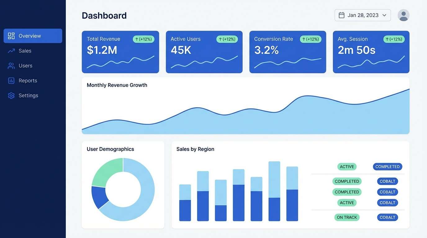
14) Azure Tilework
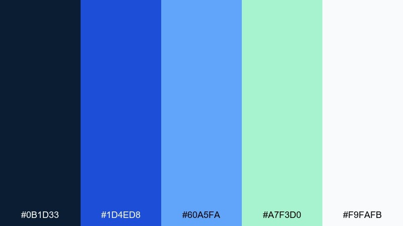
HEX: #0b1d33 #1d4ed8 #60a5fa #a7f3d0 #f9fafb
Mood: clean, crisp, and contemporary
Best for: dashboard UI and SaaS marketing pages
Clean and crisp, like glazed tiles catching morning light. Use the cobalt for primary buttons and links, then lean on navy for navigation and headings to keep contrast strong. The mint tone works well for success states, tags, and subtle data highlights. Usage tip: keep large backgrounds near-white so the blues stay vibrant and accessible.
Image example of azure tilework generated using media.io
15) Pearl Onyx
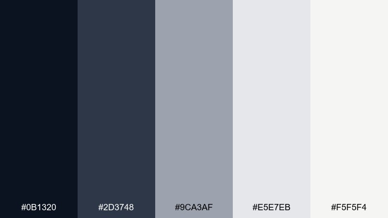
HEX: #0b1320 #2d3748 #9ca3af #e5e7eb #f5f5f4
Mood: minimal, modern, and professional
Best for: corporate rebrands and legal firms
Minimal and confident, like polished stone and soft pearl sheen. The near-black and slate make dependable foundations for typography, while the grays build a clean hierarchy across headings, captions, and dividers. Keep the warm off-white as your main background for a friendlier feel than stark white. Usage tip: introduce one metallic accent in print finishes if you want extra premium without adding new colors.
Image example of pearl onyx generated using media.io
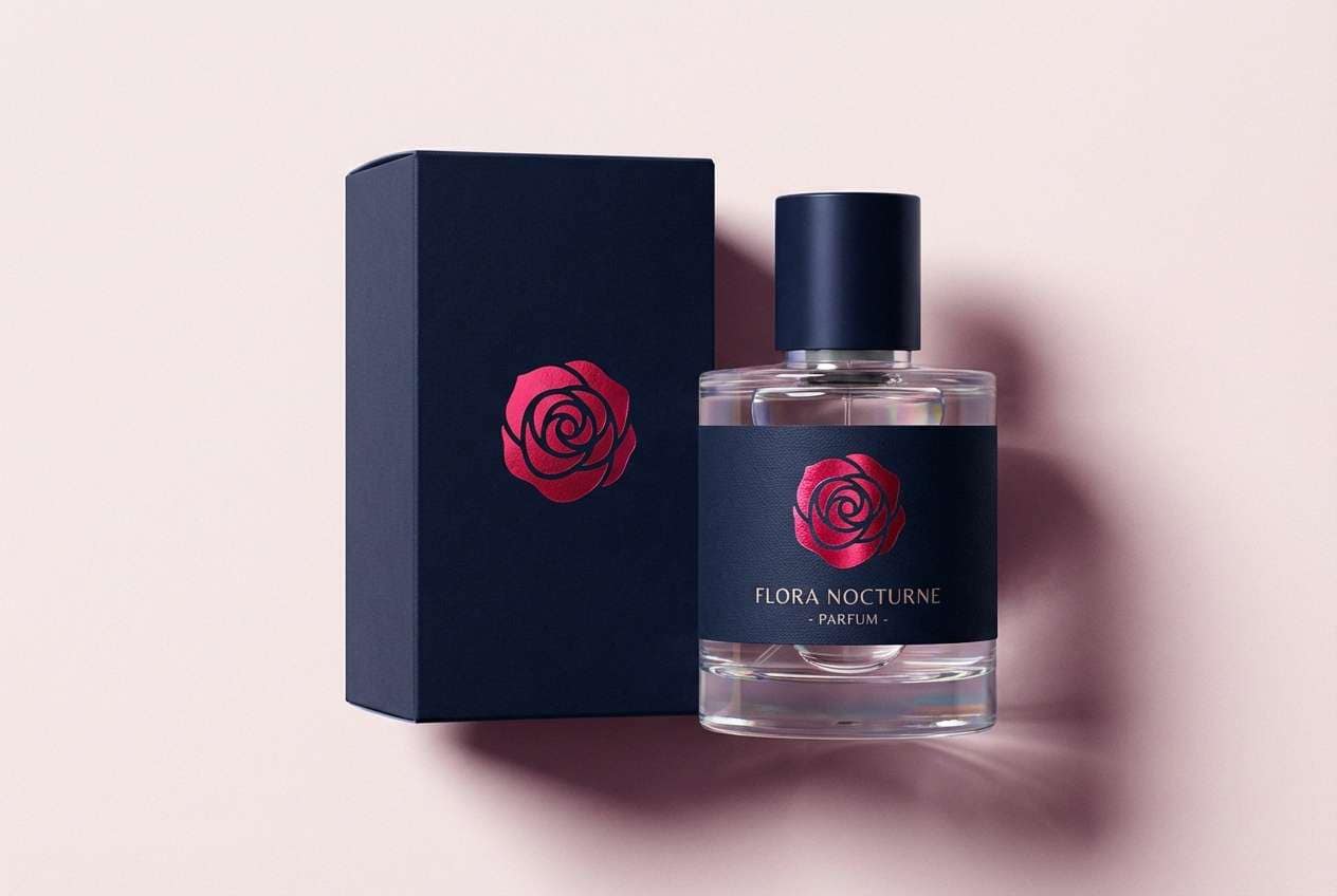
16) Rosewater Night
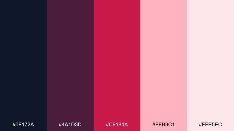
HEX: #0f172a #4a1d3d #c9184a #ffb3c1 #ffe5ec
Mood: romantic, bold, and modern
Best for: perfume packaging and beauty launches
Romantic and bold, like rosewater sweetness drifting through a dark room. The deep navy and plum create a luxury base, while the vivid rose red gives you instant hero moments for names and seals. Use the pale pinks as soft gradients or background panels to keep the look airy. Usage tip: reserve the brightest red for one focal element per panel to prevent visual fatigue.
Image example of rosewater night generated using media.io
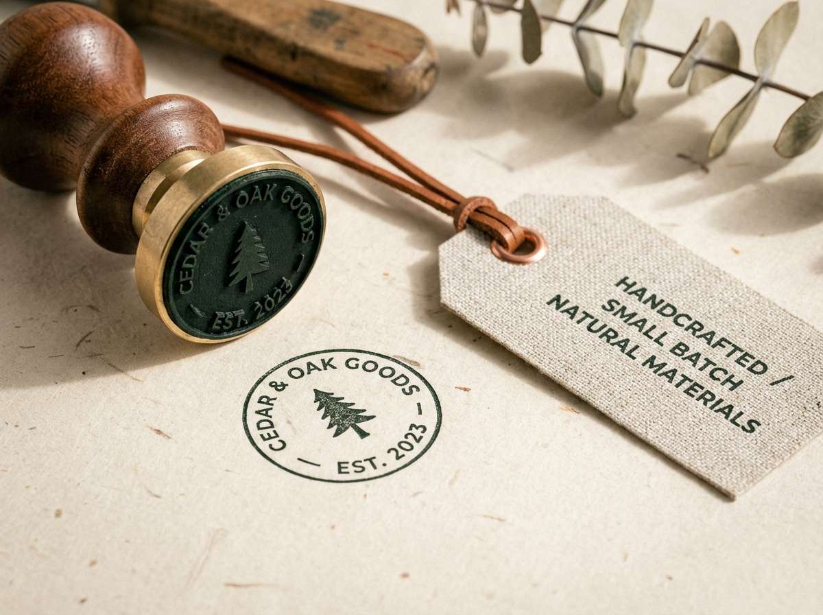
17) Cedar Smoke
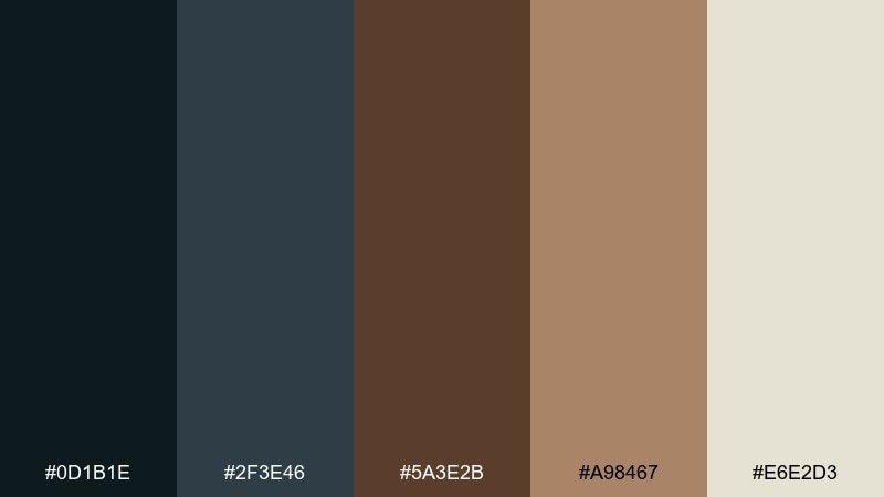
HEX: #0d1b1e #2f3e46 #5a3e2b #a98467 #e6e2d3
Mood: earthy, moody, and mature
Best for: craft goods brands and maker logos
Earthy and moody, like cedar smoke curling into cool evening air. The deep green-black and slate give a sturdy base, while the browns bring warmth that feels handmade and honest. Use the light neutral for labels and web backgrounds so the darker tones do not feel oppressive. Usage tip: add subtle texture in the background rather than extra colors to keep the palette grounded.
Image example of cedar smoke generated using media.io
18) Golden Calligraphy
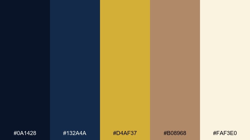
HEX: #0a1428 #132a4a #d4af37 #b08968 #faf3e0
Mood: regal, traditional, and luminous
Best for: luxury stationery and certificates
Regal and luminous, like gold ink flowing across textured parchment. The arabian nights color palette feels most authentic when navy dominates and the metallic tones are treated as ornamental, not structural. Use the cream background to keep the overall contrast soft and expensive, especially for formal documents. Usage tip: mimic foil by using gold only on headings, seals, and thin borders rather than large fills.
Image example of golden calligraphy generated using media.io
19) Cool Marble Hall
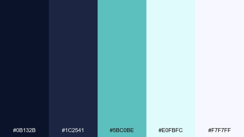
HEX: #0b132b #1c2541 #5bc0be #e0fbfc #f7f7ff
Mood: cool, modern, and architectural
Best for: architecture portfolios and case studies
Cool and architectural, like marble floors under blue-tinted skylight. The dark blues provide a confident frame for grids, while teal adds a clean modern accent for captions, icons, and section markers. Use the icy tints for generous negative space so the layout feels spacious and gallery-like. Usage tip: keep teal accents consistent in size and placement to make navigation effortless.
Image example of cool marble hall generated using media.io
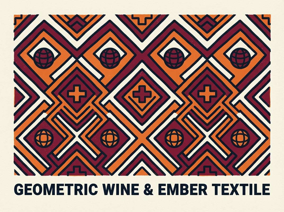
20) Ember Carpet
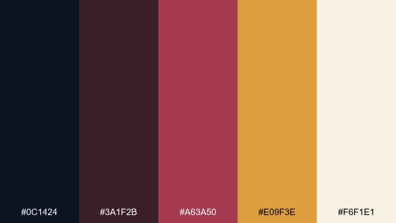
HEX: #0c1424 #3a1f2b #a63a50 #e09f3e #f6f1e1
Mood: cozy, dramatic, and handcrafted
Best for: textile pattern posters and decor prints
Cozy and dramatic, like embroidered carpets glowing near a fire. The wine and ember tones bring warmth and movement, while the dark blue-black keeps the pattern grounded. Use the soft cream as negative space so motifs can breathe and feel intentional. Usage tip: scale patterns up for posters and down for fabric swatches, but keep line thickness consistent for a cohesive set.
Image example of ember carpet generated using media.io
What Colors Go Well with Arabian Nights?
Arabian Nights palettes pair best with deep navies, indigos, and blue-blacks as the foundation, then add warmth through gold, saffron, copper, or amber. This creates the “night + lantern light” contrast that makes the theme feel instantly recognizable.
For modern work, add one clean cool accent (teal, sky blue, or mint) to sharpen UI states and bring freshness to dark headers. For print, lean into parchment creams and warm off-whites to keep the overall finish soft and premium.
If you need an extra pop, use a single jewel tone (violet, rose, or wine) as a controlled hero accent—best used for one focal element per layout.
How to Use a Arabian Nights Color Palette in Real Designs
Start with a dark base (navy or near-black) for headers, navigation, or key shapes, then choose one “metal” color (gold/copper/amber) for logos, dividers, icons, and micro-highlights. Treat metallic tones as ornament, not background fill, to avoid visual noise.
In UI, keep readability high by using warm off-white surfaces and mid-tone blues for secondary panels, reserving the darkest shade for text or top bars. In print, test your creams and sands on the actual paper stock—some neutrals shift cooler on matte finishes.
To keep the look contemporary, limit the palette to 2 neutrals + 2 darks + 1 accent, and repeat accent placement consistently across screens or pages.
Create Arabian Nights Palette Visuals with AI
If you want to see these Arabian Nights color combinations as real posters, packaging, UI screens, or branding mockups, generate quick concept images first. It helps you validate contrast, mood, and accent balance before committing to production.
With Media.io Text-to-Image, you can paste a prompt, describe the layout, and iterate styles fast—then refine your favorite direction into a cohesive system.
Arabian Nights Color Palette FAQs
-
What is an Arabian Nights color palette?
An Arabian Nights color palette typically blends deep midnight blues or near-blacks with warm gold/amber accents and soft cream neutrals, creating a “night sky + lantern glow” look that feels luxe and cinematic. -
Which HEX colors are common in Arabian Nights palettes?
Common choices include deep navy (like #0f172a), blue-black (like #0b1220), antique gold (like #d4af37), warm amber (like #f59e0b), and parchment/off-white backgrounds (like #f4f1e8 or #faf3e0). -
What colors go well with Arabian Nights navy?
Gold, copper, saffron, sand, and warm creams pair naturally with navy. For a modern twist, add teal or mint as a cool accent for UI states, icons, or small highlights. -
How do I keep an Arabian Nights color scheme from looking too dark?
Use a warm off-white or cream as the main background, reserve the darkest navy for typography/navigation, and apply gold accents sparingly (thin lines, small icons, or a single focal badge). -
Is an Arabian Nights palette good for UI design?
Yes—use indigo/navy for structure (top bars, headers) and pick one bright accent (teal or cobalt) for CTAs. Keep large surfaces near-white or very light tints to maintain accessibility and reduce visual heaviness. -
Is Arabian Nights a good branding palette for luxury?
It works especially well for premium branding because dark blues signal confidence and craft, while gold/copper suggests heritage and refinement. The key is restraint: treat metallic tones as detail, not a full background color. -
How can I preview Arabian Nights color combinations quickly?
Generate mockups with AI (menus, packaging, invitations, dashboards) using your exact HEX direction as guidance in the prompt, then iterate until the contrast and accent percentage feel balanced.


