

Cartoon color palettes are built for instant clarity: bold fills, readable outlines, and playful accents that feel friendly across characters, UI, and branding.
Below are 20 cartoon color scheme ideas with HEX codes, plus practical tips for pairing high-contrast hues without overwhelming your design.
In this article
- Why Cartoon Palettes Work So Well
-
- bubblegum parade
- sunny storybook
- grape soda pop
- ocean splash toons
- citrus punchline
- retro saturday
- cotton candy cloud
- hero cape primary
- forest friends
- space jelly neon
- pumpkin patch giggle
- cozy comic pastels
- chalkboard mascot
- desert doodle
- ice cream stand
- safari sticker set
- candy arcade nights
- monochrome toon ink
- rainy day rainbow
- carnival confetti
- What Colors Go Well with Cartoon?
- How to Use a Cartoon Color Palette in Real Designs
- Create Cartoon Palette Visuals with AI
Why Cartoon Palettes Work So Well
Cartoon palettes are designed to read fast. High chroma colors, clear light/dark separation, and strong outline tones make characters and icons recognizable even at small sizes.
They also create a consistent emotional signal: warm brights feel friendly and energetic, while cool accents and deep inks add structure for UI and typography.
Because cartoons often rely on flat shapes, color does more of the “depth” work. Smart accents and controlled contrast can suggest hierarchy, motion, and personality without heavy shading.
20+ Cartoon Color Palette Ideas (with HEX Codes)
1) Bubblegum Parade
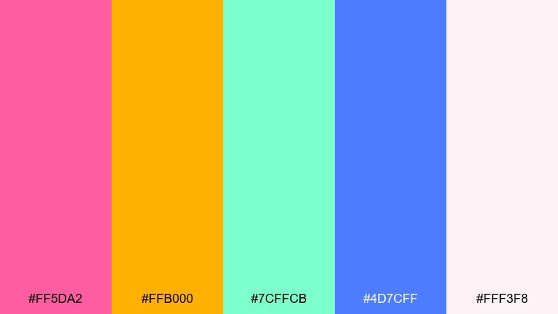
HEX: #FF5DA2 #FFB000 #7CFFCB #4D7CFF #FFF3F8
Mood: playful, glossy, upbeat
Best for: mascot logo and sticker pack for kids brands
Playful and glossy like candy wrappers and balloon animals, these tones feel instantly upbeat. Use the pink and mango as your main duo, then drop in mint for surprise highlights. The periwinkle blue adds structure for outlines, buttons, and headers. Tip: keep the blush off-white as the background to avoid overwhelming saturation while staying cheerful.
Image example of bubblegum parade generated using media.io
Media.io is an online AI studio for creating and editing video, image, and audio in your browser.

2) Sunny Storybook
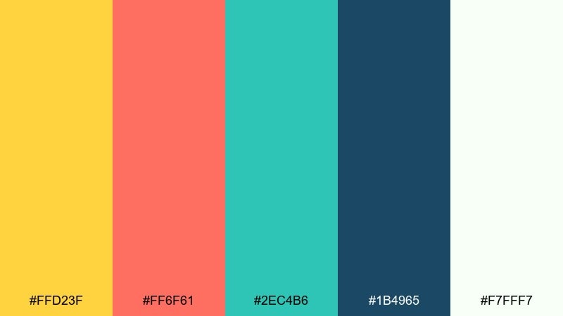
HEX: #FFD23F #FF6F61 #2EC4B6 #1B4965 #F7FFF7
Mood: bright, friendly, story-driven
Best for: children's storybook cover illustration
Bright and friendly like a morning classroom mural, it reads warm without feeling chaotic. For a clean cartoon color combination, anchor with sunshine yellow and coral, then let teal handle props and details. The deep navy is ideal for titles and outlines so characters pop on light areas. Tip: use navy sparingly in large fills, and lean on it for typography and linework.
Image example of sunny storybook generated using media.io
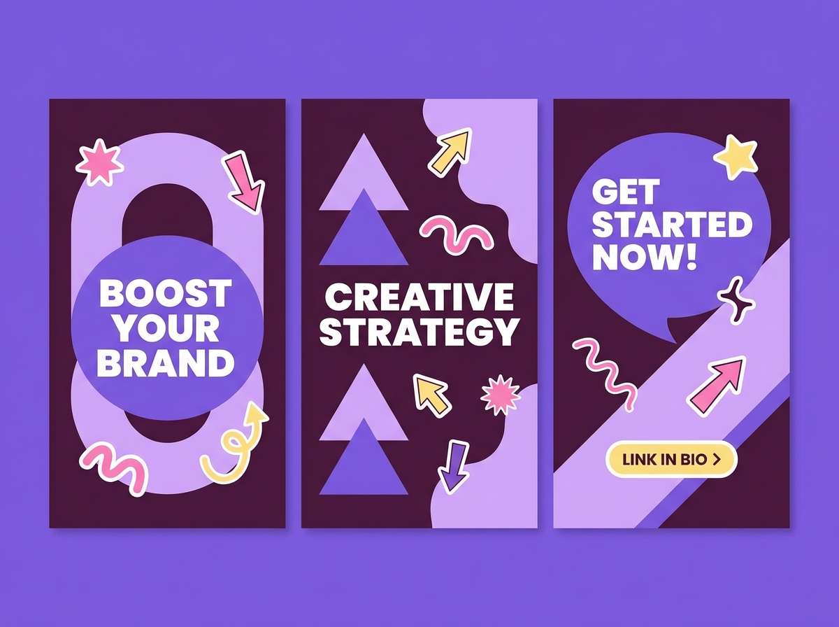
3) Grape Soda Pop
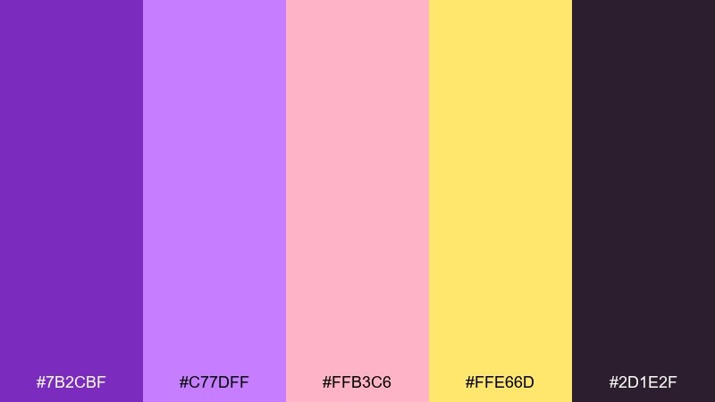
HEX: #7B2CBF #C77DFF #FFB3C6 #FFE66D #2D1E2F
Mood: funky, sweet, high-energy
Best for: social media carousel graphics for creators
Funky and sweet like a soda shop sign, this mix balances neon-ish joy with a moody base. Use violet and lavender for big shapes, then add butter yellow as a callout color for badges and prices. Pink keeps it approachable and helps skin tones and props feel friendly. Tip: set the dark plum behind light type to keep carousel text readable on small screens.
Image example of grape soda pop generated using media.io
4) Ocean Splash Toons
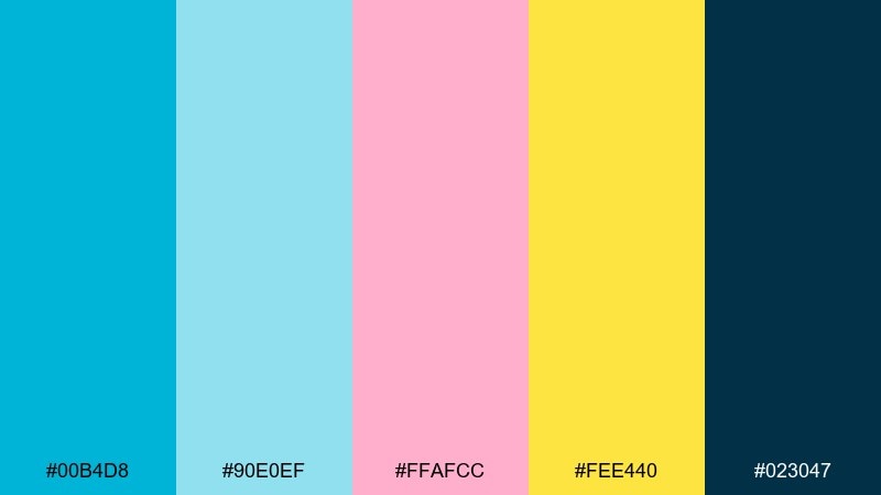
HEX: #00B4D8 #90E0EF #FFAFCC #FEE440 #023047
Mood: fresh, splashy, summer fun
Best for: mobile game UI mockup
Fresh and splashy like pool tiles and popsicles, it brings instant summer energy. Use the bright cyan for primary buttons and the pale aqua for panels and cards. Pink works well as a reward or power-up indicator, while the lemon yellow is perfect for coins and highlights. Tip: reserve the deep navy for text and icon strokes to keep the interface crisp.
Image example of ocean splash toons generated using media.io
5) Citrus Punchline

HEX: #FF9F1C #FF4040 #2EC4B6 #CBF3F0 #011627
Mood: zesty, bold, punchy
Best for: snack packaging concept and product ad
Zesty and punchy like citrus soda, the contrast feels bold without turning harsh. These cartoon color combinations shine on packaging when orange leads, red becomes the flavor cue, and teal supports secondary labels. The icy aqua keeps negative space lively, especially behind nutrition details. Tip: use the near-black for small type and barcode areas so the bright hues stay clean and legible.
Image example of citrus punchline generated using media.io
6) Retro Saturday
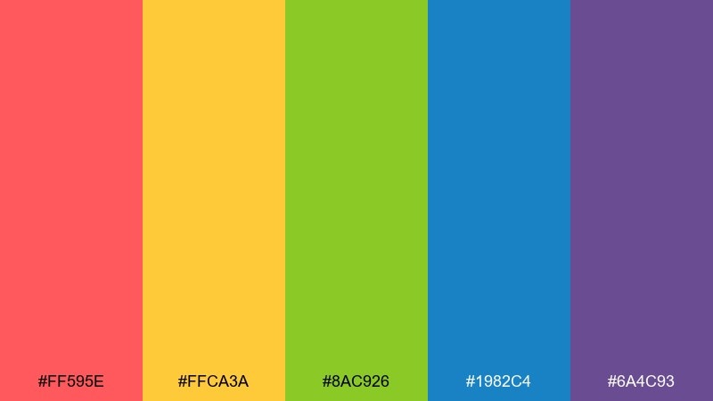
HEX: #FF595E #FFCA3A #8AC926 #1982C4 #6A4C93
Mood: retro, punchy, weekend fun
Best for: event poster for family activities
Retro and punchy like arcade tickets and Saturday cartoons, it delivers instant energy. Use red and yellow for the headline and focal shapes, then keep green and blue for supporting blocks and icons. Purple works best as a shadow or border to add depth without gradients. Tip: build a simple two-color hierarchy first, then add the remaining tones as small accents.
Image example of retro saturday generated using media.io
7) Cotton Candy Cloud
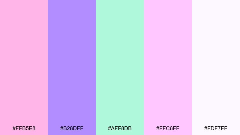
HEX: #FFB5E8 #B28DFF #AFF8DB #FFC6FF #FDF7FF
Mood: soft, dreamy, bubbly
Best for: character sheet and emote set
Soft and dreamy like cotton candy skies, these pastels feel light but still expressive. Use lavender for hair, outfits, or UI chips, and let mint carry secondary highlights. The pinks are best for blush, hearts, and small badges rather than full backgrounds. Tip: add thin darker linework or drop shadows so shapes do not blend into the airy off-white.
Image example of cotton candy cloud generated using media.io
8) Hero Cape Primary
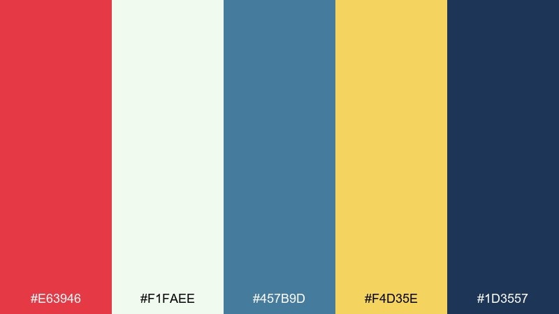
HEX: #E63946 #F1FAEE #457B9D #F4D35E #1D3557
Mood: heroic, classic, confident
Best for: superhero app onboarding UI screens
Heroic and classic like a comic book cover, this mix feels confident and clean. A cartoon color palette like this works best when red drives the main call to action and navy handles headers and icons. Use the pale minty white for breathing room, and drop in gold for rewards, stars, and progress markers. Tip: keep blue as a mid-tone for cards so the red stays special.
Image example of hero cape primary generated using media.io
9) Forest Friends
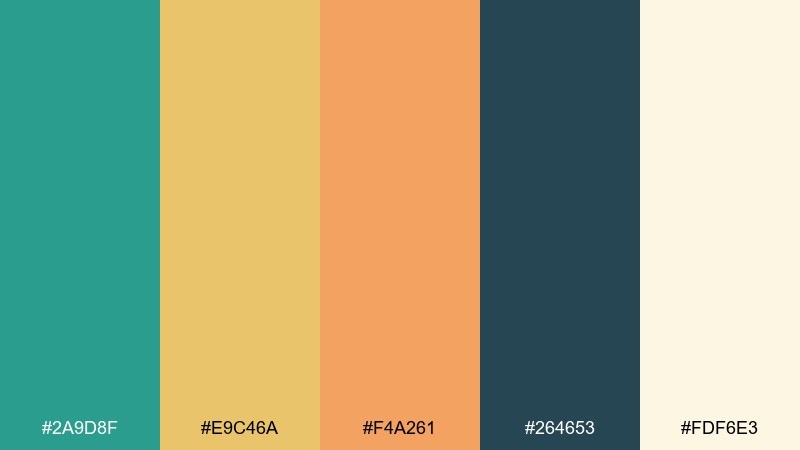
HEX: #2A9D8F #E9C46A #F4A261 #264653 #FDF6E3
Mood: cozy, outdoorsy, wholesome
Best for: educational infographic for kids
Cozy and outdoorsy like a nature trail sign, this set feels wholesome and grounded. Teal makes a reliable base for charts and headers, while warm sand and apricot keep callouts friendly. The deep green-blue is perfect for icons and outlines that need to stay sharp. Tip: use the cream as the main canvas so the warm tones read like sunlight, not clutter.
Image example of forest friends generated using media.io
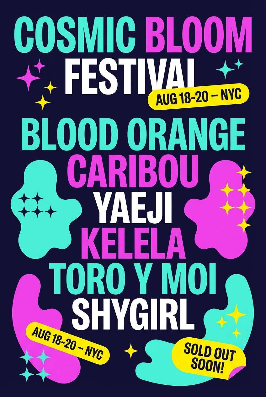
10) Space Jelly Neon
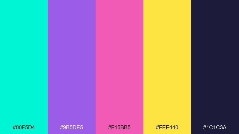
HEX: #00F5D4 #9B5DE5 #F15BB5 #FEE440 #1C1C3A
Mood: electric, futuristic, playful
Best for: music festival flyer graphic
Electric and futuristic like neon jellyfish in space, it pops hard against dark backgrounds. Use the midnight indigo as your field color, then let aqua and magenta carry the main shapes and gradients-free glow effects. Yellow is best as a tiny attention magnet for dates, tickets, and stickers. Tip: keep body text in light neutral or aqua so it stays readable on the deep base.
Image example of space jelly neon generated using media.io
11) Pumpkin Patch Giggle
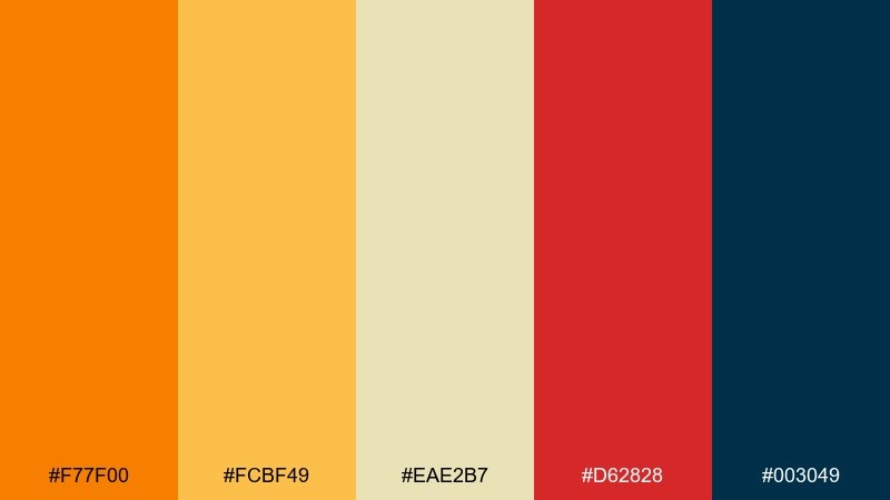
HEX: #F77F00 #FCBF49 #EAE2B7 #D62828 #003049
Mood: warm, festive, autumn fun
Best for: kids menu for a family restaurant
Warm and festive like pumpkin lanterns and carnival snacks, it feels seasonal without going muddy. Use orange for section headers, yellow for highlights, and the soft tan for the menu background. Red is great for spicy callouts or chef picks, while the deep navy keeps typography crisp. Tip: pair illustrated icons with navy outlines to keep the warm fills clean and easy to scan.
Image example of pumpkin patch giggle generated using media.io
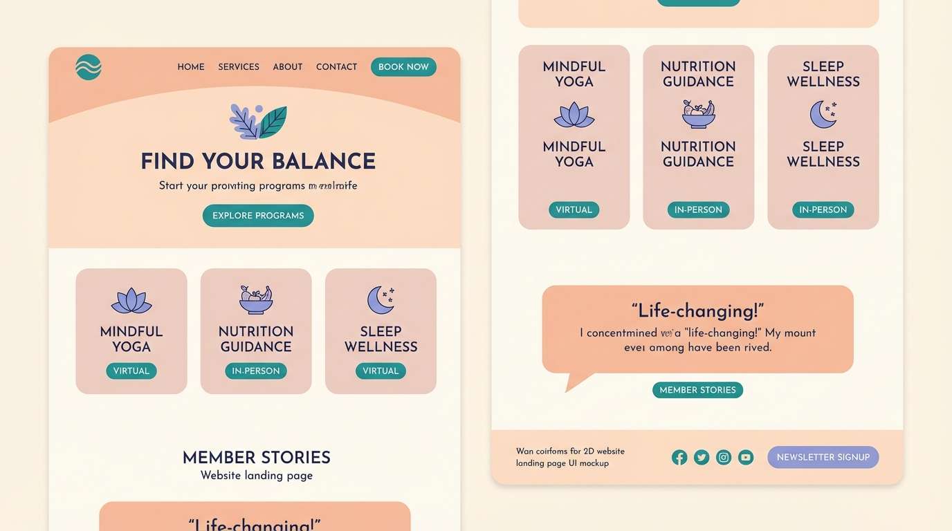
12) Cozy Comic Pastels
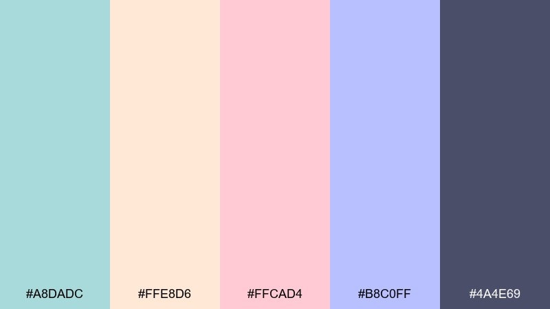
HEX: #A8DADC #FFE8D6 #FFCAD4 #B8C0FF #4A4E69
Mood: cozy, calm, approachable
Best for: wellness landing page UI mockup
Cozy and calm like a soft comic panel, it reads approachable and modern. For a gentle cartoon color scheme, let the dusty navy handle text and navigation, then layer blush and peach for cards and highlights. Teal and periwinkle work best as secondary UI states like toggles, tags, and progress chips. Tip: keep saturation low in large areas and use the darkest tone only for hierarchy, not decoration.
Image example of cozy comic pastels generated using media.io
13) Chalkboard Mascot
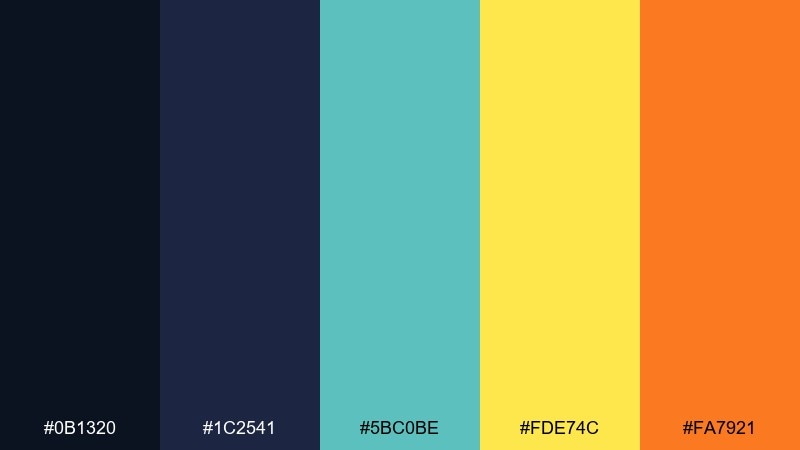
HEX: #0B1320 #1C2541 #5BC0BE #FDE74C #FA7921
Mood: bold, academic, high-contrast
Best for: esports team logo and banner
Bold and high-contrast like chalk on a classroom board, it feels sharp and competitive. Use the near-black and navy as the primary base, then drop in teal for energy and motion. Yellow and orange work best as small sparks on edges, badges, and callouts. Tip: keep the bright accents under 20 percent of the composition so the banner stays premium, not noisy.
Image example of chalkboard mascot generated using media.io
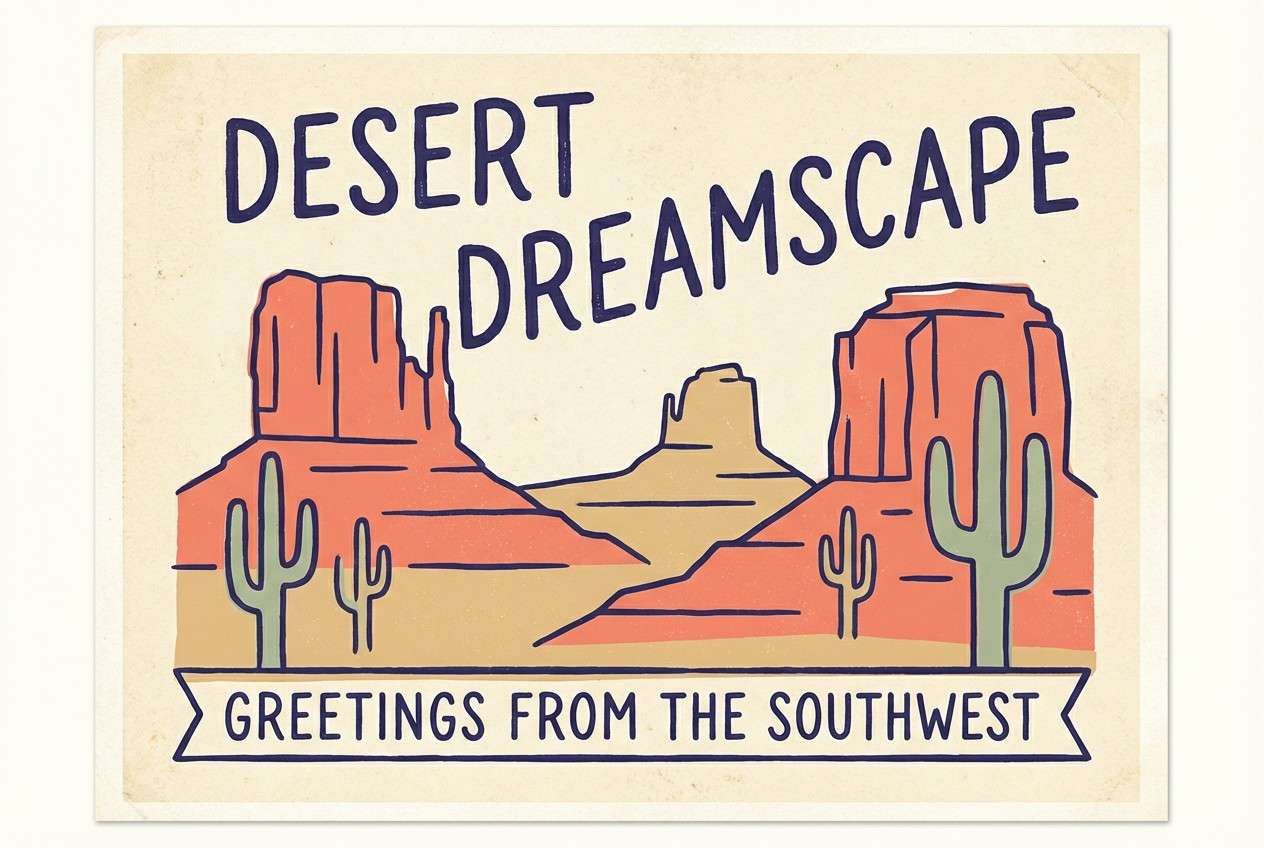
14) Desert Doodle
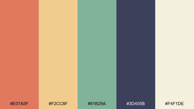
HEX: #E07A5F #F2CC8F #81B29A #3D405B #F4F1DE
Mood: sun-baked, calm, artsy
Best for: travel postcard illustration
Sun-baked and calm like desert cliffs at golden hour, it feels artsy and relaxed. Coral and sand make the main landscape tones, while sage adds cacti, foliage, or signage. The deep indigo is great for hand-drawn outlines and typography. Tip: use the creamy off-white as paper texture so the palette keeps its warm, illustrated feel.
Image example of desert doodle generated using media.io
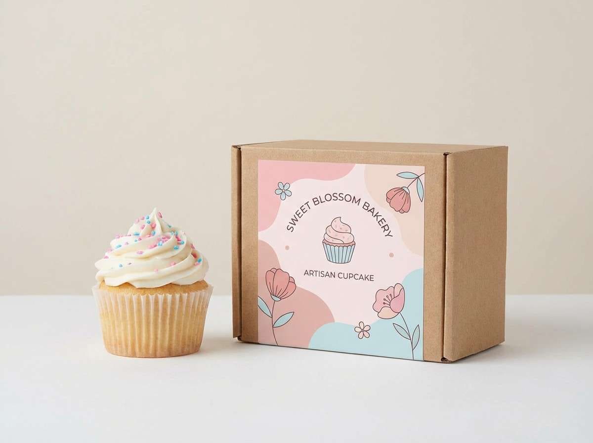
15) Ice Cream Stand
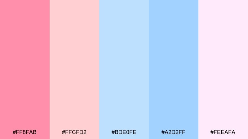
HEX: #FF8FAB #FFCFD2 #BDE0FE #A2D2FF #FEEAFA
Mood: sweet, airy, cute
Best for: bakery product ad for cupcakes
Sweet and airy like whipped frosting, this set feels cute and clean. Keep the bright pink as the hero color for the product label, then layer the softer blush for backgrounds and shadows. The two blues are perfect for wrappers, ribbons, and small brand elements that need contrast. Tip: shoot on a simple light backdrop so the pastels stay true and do not get tinted by the environment.
Image example of ice cream stand generated using media.io
16) Safari Sticker Set
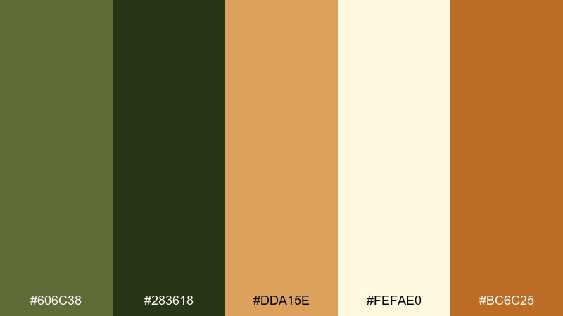
HEX: #606C38 #283618 #DDA15E #FEFAE0 #BC6C25
Mood: earthy, adventurous, friendly
Best for: wildlife sticker pack illustration
Earthy and adventurous like a picture-book safari, these tones feel friendly and natural. Use cream for the sticker paper base, then build animals with olive and tan shapes for quick recognition. The deeper green and warm brown are great for outlines, spots, and tiny details like eyes and paws. Tip: keep shadows simple and flat so the stickers remain readable at small sizes.
Image example of safari sticker set generated using media.io
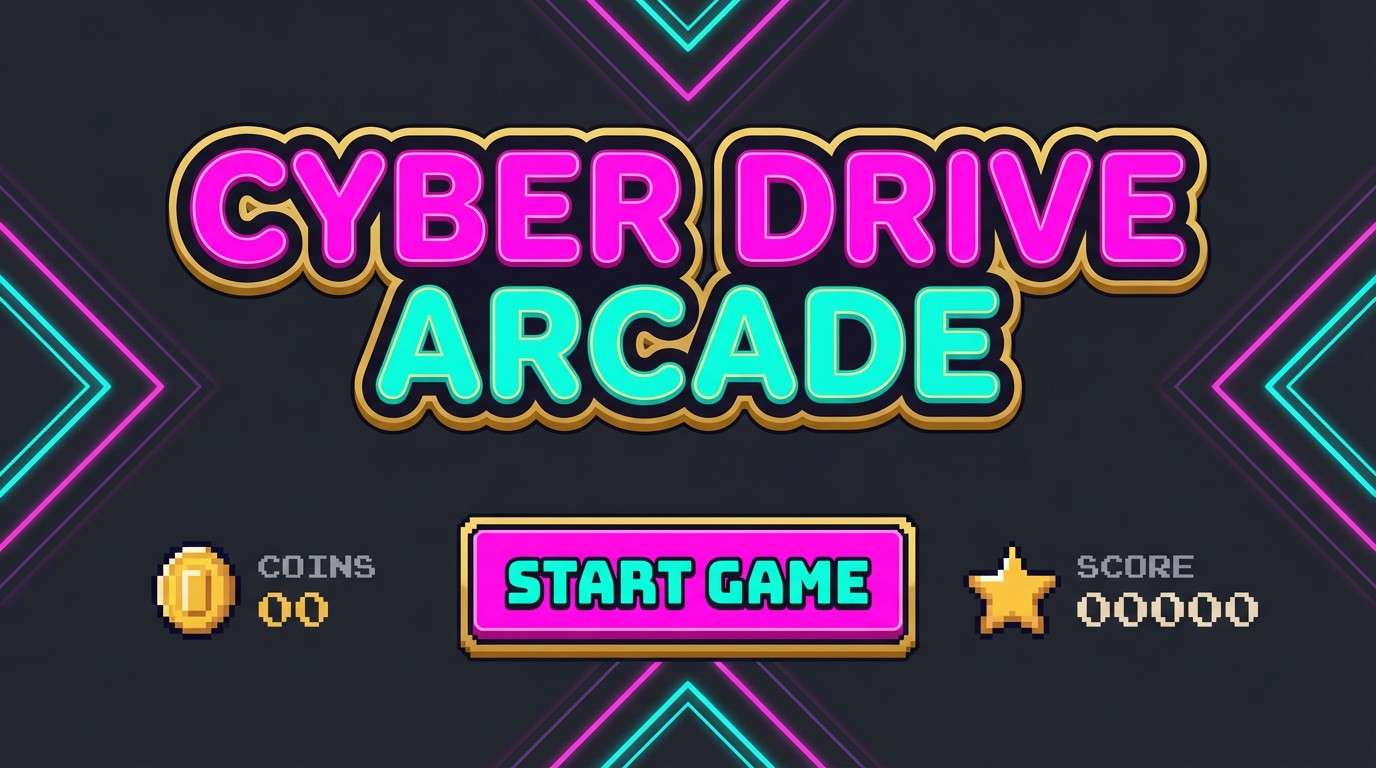
17) Candy Arcade Nights
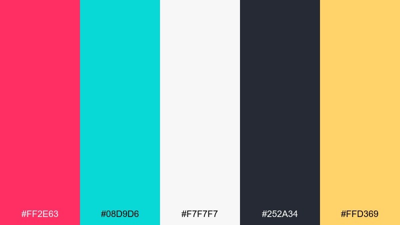
HEX: #FF2E63 #08D9D6 #F7F7F7 #252A34 #FFD369
Mood: energetic, arcade, night-glow
Best for: arcade game splash screen UI mockup
Energetic and night-glow like an arcade marquee, it feels fast and modern. A cartoon color palette like this sings when charcoal is the backdrop and the neon pink plus aqua drive the main UI buttons. Use warm gold for coins, stars, and score boosts, keeping it secondary to the neons. Tip: add plenty of light neutral for labels so the dark screen stays readable.
Image example of candy arcade nights generated using media.io
18) Monochrome Toon Ink
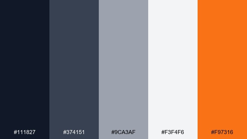
HEX: #111827 #374151 #9CA3AF #F3F4F6 #F97316
Mood: clean, graphic, modern
Best for: editorial blog header layout
Clean and graphic like inked panels on newsprint, this set feels modern and sharp. Use the grayscale steps for structure, spacing, and typography hierarchy without fighting your illustrations. The orange works best as a single accent for links, highlights, or a key icon. Tip: limit orange to one focal point per section so the layout stays editorial, not promotional.
Image example of monochrome toon ink generated using media.io
19) Rainy Day Rainbow
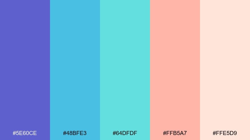
HEX: #5E60CE #48BFE3 #64DFDF #FFB5A7 #FFE5D9
Mood: hopeful, soothing, playful
Best for: classroom wall poster design
Hopeful and soothing like a rainbow after rain, these colors feel calm but still playful. This cartoon color combinations set works nicely on posters when indigo and aqua form the main blocks and the peach tones soften the message. Keep the light blush as your background to preserve readability for big headings. Tip: add simple icon shapes in aqua for consistency across multiple classroom prints.
Image example of rainy day rainbow generated using media.io
20) Carnival Confetti
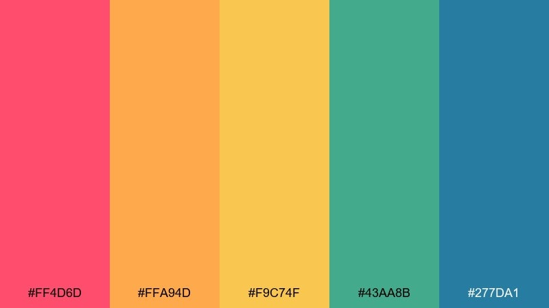
HEX: #FF4D6D #FFA94D #F9C74F #43AA8B #277DA1
Mood: festive, bold, high-spirited
Best for: animated series title card concept
Festive and bold like confetti bursts, it feels loud in the best way. Use the hot pink for the title wordmark and the orange plus yellow for shapes that suggest motion and celebration. Teal and blue ground the layout so the warm tones do not take over. Tip: keep your background simple and let confetti shapes use only two warm hues at a time for clarity.
Image example of carnival confetti generated using media.io
What Colors Go Well with Cartoon?
Cartoon palettes pair best with a strong “ink” color (deep navy, charcoal, or near-black) plus 2–3 bright hero hues. The ink keeps edges crisp and type readable, while the brights carry the personality.
To avoid visual noise, balance warm and cool: e.g., pink/orange with teal/blue, or yellow with indigo. Add a light neutral (cream or off-white) to give characters and UI room to breathe.
If you need extra pop, use one small “spark” accent (like lemon yellow or neon aqua) for badges, coins, or key UI states—then keep it rare so it feels special.
How to Use a Cartoon Color Palette in Real Designs
Start with a simple hierarchy: 1 background neutral, 1 primary brand color, and 1 ink/outline color. Once your layout reads clearly in grayscale, introduce one or two accents for highlights and states.
For illustration, keep large shapes in mid-to-light values and reserve your darkest tone for outlines, facial features, and typography. For UI, put saturated colors on buttons and rewards, while using softer tints for panels and cards.
When printing (posters, packaging), test contrast at small sizes. Bright-on-bright can look fun on screen but may reduce legibility in production—use the darkest tone for critical text and icons.
Create Cartoon Palette Visuals with AI
If you want to preview how a cartoon color scheme looks in real scenes—stickers, posters, UI screens, or packaging—generate quick mockups with AI before you commit to final artwork.
Use prompts that specify “flat vector,” “bold outlines,” and your dominant colors, then control composition with an aspect ratio (like 1:1 for sticker sheets or 16:9 for UI).
With Media.io, you can turn these palette ideas into on-brand visuals in minutes and iterate faster on contrast, accents, and readability.
Cartoon Color Palette FAQs
-
What makes a color palette feel “cartoon”?
Cartoon palettes typically use high-contrast combinations, clean light/dark separation, and an “ink” outline color (like deep navy or charcoal) so shapes stay readable with minimal shading. -
How many colors should I use in a cartoon color scheme?
A practical setup is 3–5 colors: one background neutral, one outline/typography color, one main hero color, and 1–2 accents for props, UI states, or highlights. -
Which background colors work best for cartoons?
Off-whites and light creams are the safest because they keep saturation from feeling overwhelming. For night or neon styles, use a deep indigo/charcoal background and switch text to light neutrals. -
How do I keep cartoon UI readable on mobile?
Reserve your darkest tone for text and icon strokes, place saturated colors on buttons/badges, and use lighter tints for panels. Test at small sizes to ensure labels still pass contrast. -
Can I use pastel cartoon palettes without losing clarity?
Yes—add a darker outline or typography color, and avoid using multiple similar-value pastels for adjacent shapes. Thin linework and small shadows help separate elements. -
What’s the best accent color strategy for cartoon designs?
Pick one “spark” accent (often yellow or neon aqua) and use it only for the highest-priority items like rewards, CTAs, or callouts. Limiting it keeps the design punchy. -
How can I generate cartoon-style visuals from a palette quickly?
Use an AI image generator and specify “flat vector,” “bold outlines,” and your dominant colors in the prompt. Media.io Text-to-Image makes it easy to iterate on characters, posters, and UI mockups.


