

Burnt umber is a deep, earthy brown with warm red undertones that instantly makes designs feel grounded, premium, and human. It’s a go-to base color for rustic, heritage, and modern editorial looks because it pairs beautifully with both creamy neutrals and bold accents.
Below are 20+ burnt umber color combinations with HEX codes, plus practical guidance for branding, packaging, interiors, and UI—along with AI prompt examples you can recreate in minutes.
In this article
- Why Burnt Umber Color Combinations Work So Well
-
- desert terracotta
- smoked leather
- clay and sage
- copper canyon
- mocha linen
- forest cabin
- vintage library
- spiced cocoa
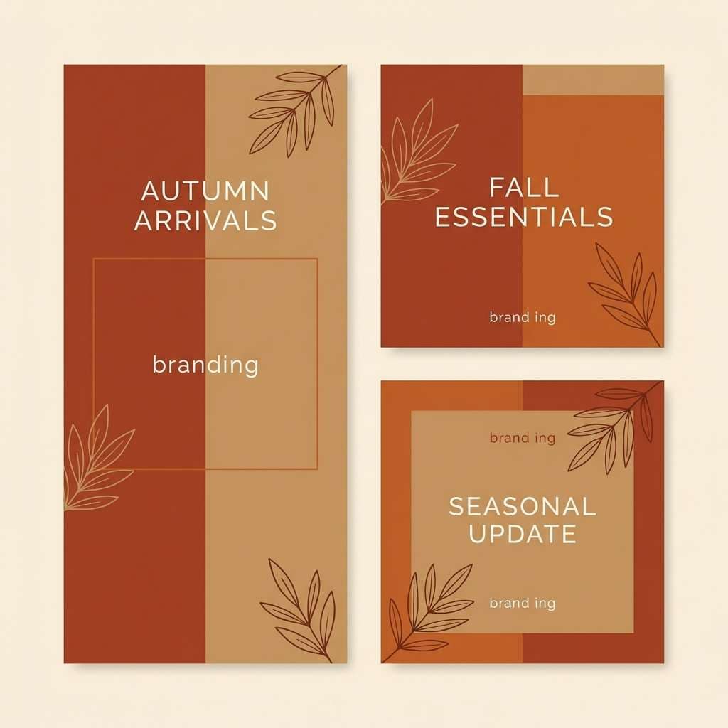
- autumn market
- minimal umber ui
- warm stoneware
- rust and denim
- sandstone sunrise
- charred cedar
- amber spice
- dusty rose umber
- olive orchard
- night espresso
- terracotta journal
- cinnamon oat
- heritage poster
- quiet studio
- What Colors Go Well with Burnt Umber?
- How to Use Burnt Umber Color Combinations in Real Designs
- Create Burnt Umber Palette Visuals with AI
Why Burnt Umber Color Combinations Work So Well
Burnt umber sits in the “warm neutral” family, which makes it flexible: it can behave like a calm background tone or a strong anchor for typography, frames, and product labels. That versatility is why it shows up in everything from editorial UI to premium packaging.
It also adds instant depth. Compared to flat browns, burnt umber’s reddish warmth gives designs a more tactile, material feel—think leather, clay, wood, and roasted coffee—without needing heavy textures.
Most importantly, burnt umber plays well with contrast. Pair it with creamy off-whites for readability, with sage/olive for organic balance, or with denim/blues for a modern complementary punch.
20+ Burnt Umber Color Palette Ideas (with HEX Codes)
1) Desert Terracotta
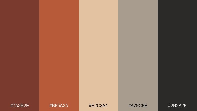
HEX: #7a3b2e #b65a3a #e2c2a1 #a79c8e #2b2a28
Mood: sunbaked and grounded
Best for: travel brochure cover design
Sunbaked and grounded, these burnt umber tones feel like canyon walls, clay pots, and late-afternoon dust. Use the deep umber as the headline anchor and let terracotta and sand handle big shapes and photo overlays. Pair with warm paper textures or subtle grain for an authentic desert vibe. Usage tip: keep body text in near-charcoal to avoid muddy contrast on the beige.
Image example of desert terracotta generated using media.io
Media.io is an online AI studio for creating and editing video, image, and audio in your browser.

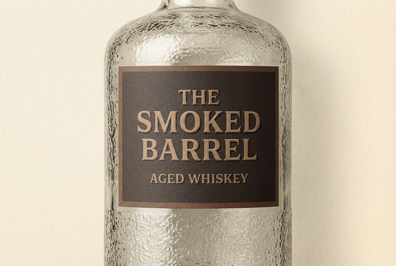
2) Smoked Leather
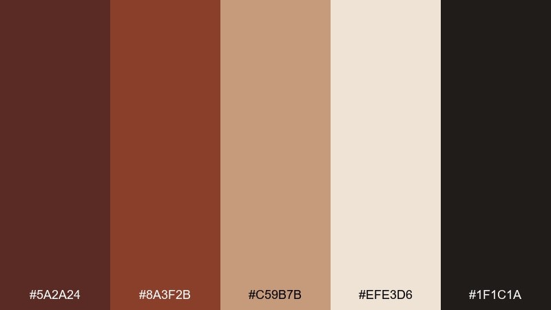
HEX: #5a2a24 #8a3f2b #c59b7b #efe3d6 #1f1c1a
Mood: rugged and premium
Best for: whiskey label packaging
Rugged and premium, the mix reads like worn leather, barrel smoke, and aged oak. Let the dark brown and near-black build a heritage frame, then bring in the tan for seals and secondary badges. Foil accents in copper or brass sit naturally with these warm neutrals. Usage tip: use the light cream for negative space so the label stays readable at shelf distance.
Image example of smoked leather generated using media.io
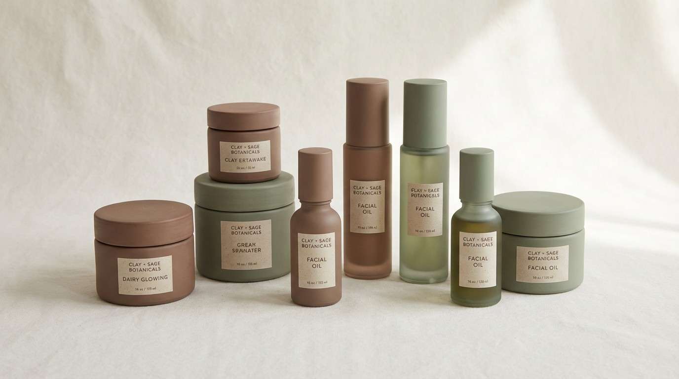
3) Clay and Sage
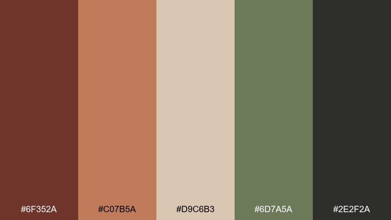
HEX: #6f352a #c07b5a #d9c6b3 #6d7a5a #2e2f2a
Mood: calm and organic
Best for: botanical skincare brand identity
Calm and organic, this burnt umber color palette evokes ceramic planters, dried herbs, and a quiet apothecary shelf. Balance the earthy browns with sage for a fresh counterpoint, especially in icons and small UI accents. It works beautifully on kraft paper, recycled stock, and soft-touch packaging. Usage tip: reserve the green for callouts so the brand feels botanical without turning overly rustic.
Image example of clay and sage generated using media.io
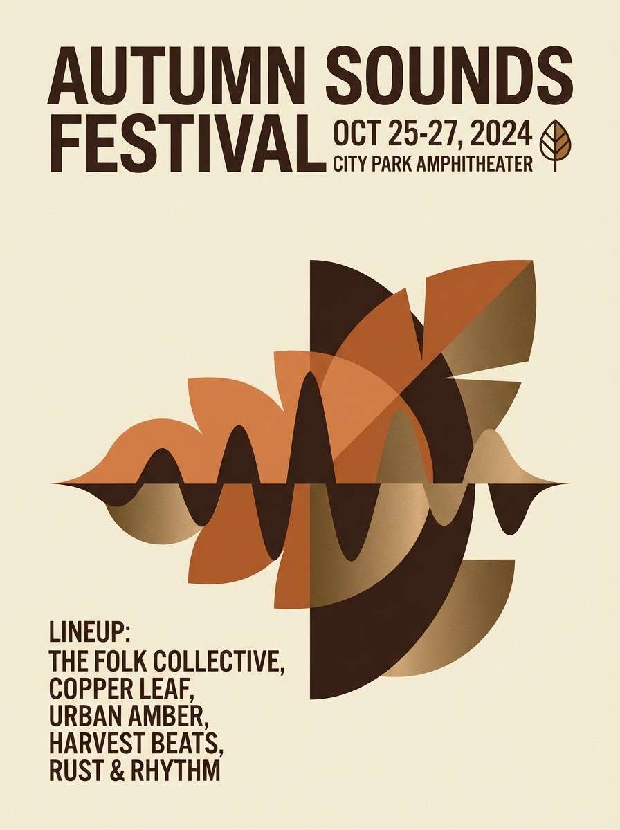
4) Copper Canyon
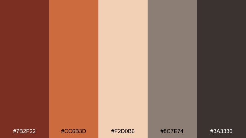
HEX: #7b2f22 #cc6b3d #f2d0b6 #8c7e74 #3a3330
Mood: bold and sunlit
Best for: event poster for a fall music festival
Bold and sunlit, these burnt umber colors feel like copper metal warmed by the sun and rock shadows at dusk. Use the bright copper as the hero shape color, then ground the layout with deep umber type and frames. Pair with condensed typography and simple geometric patterns for a modern festival look. Usage tip: keep the pale peach behind small text to maintain contrast.
Image example of copper canyon generated using media.io
5) Mocha Linen
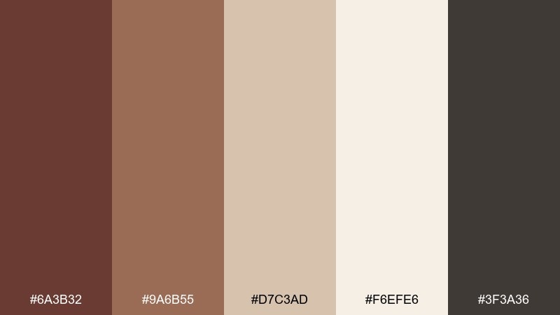
HEX: #6a3b32 #9a6b55 #d7c3ad #f6efe6 #3f3a36
Mood: soft and homey
Best for: interior design mood board
Soft and homey, it brings to mind mocha, linen curtains, and warm afternoon light. This burnt umber color palette shines in cozy interiors, especially when you mix matte browns with creamy off-whites. Add black-brown sparingly for outlines, hardware, or thin typography to keep things crisp. Usage tip: repeat the linen tone in large areas so the deeper browns feel intentional, not heavy.
Image example of mocha linen generated using media.io
6) Forest Cabin
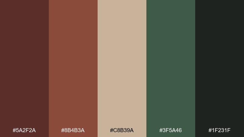
HEX: #5a2f2a #8b4b3a #c8b39a #3f5a46 #1f231f
Mood: woodsy and restorative
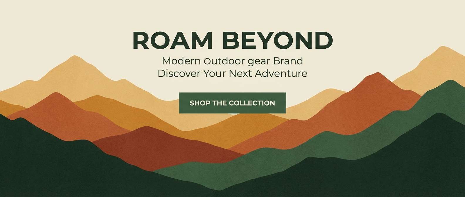
Best for: outdoor gear website hero banner
Woodsy and restorative, the palette feels like cabin wood, mossy trails, and embers in a fire pit. Let the green play as an accent for buttons and highlights while the browns build a dependable base. It pairs well with textured photography and understated sans-serif typography. Usage tip: keep CTA buttons in the green against the light tan for the cleanest click contrast.
Image example of forest cabin generated using media.io
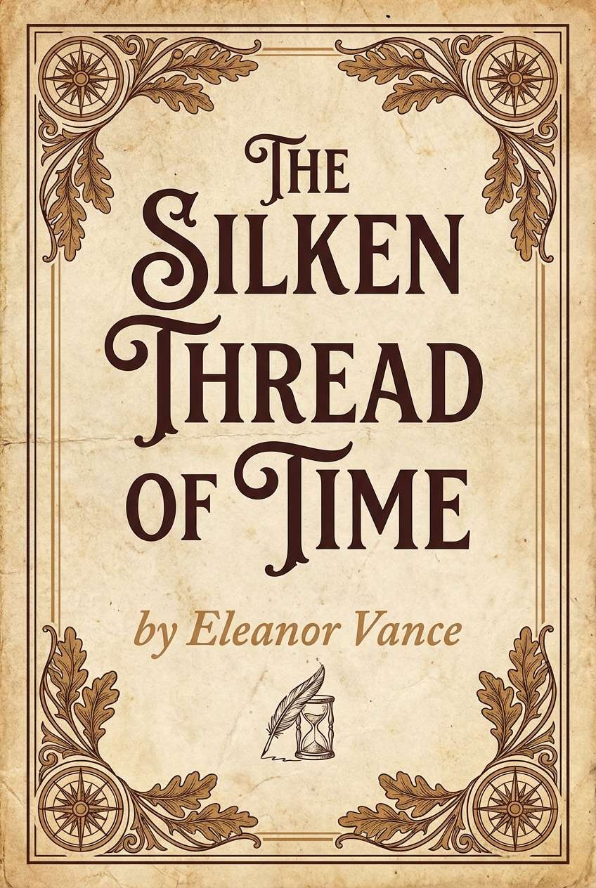
7) Vintage Library
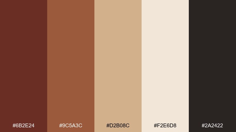
HEX: #6b2e24 #9c5a3c #d2b08c #f2e6d8 #2a2422
Mood: scholarly and nostalgic
Best for: book cover design for historical fiction
Scholarly and nostalgic, it recalls leather-bound spines, parchment edges, and quiet reading rooms. Use the darkest tone for the title and author name, then let the warm tan fill large blocks and borders. It pairs naturally with serif typography and subtle ornamental dividers. Usage tip: keep ornament lines thin and in the mid-brown so the cover looks refined, not busy.
Image example of vintage library generated using media.io
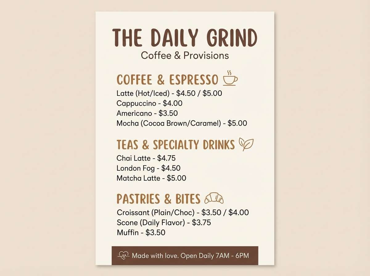
8) Spiced Cocoa

HEX: #7a2f23 #a6543a #d8a77f #f4dfc8 #3a2a26
Mood: sweet and inviting
Best for: coffee shop menu design
Sweet and inviting, these burnt umber color combinations feel like cocoa powder, cinnamon, and steamed milk foam. Use the cream as the menu background and the deep brown for item names to keep readability high. The warm caramel shade works well for price tags, icons, and section headers. Usage tip: limit the bright spice color to 10 to 15 percent so it stays appetizing, not loud.
Image example of spiced cocoa generated using media.io
9) Autumn Market
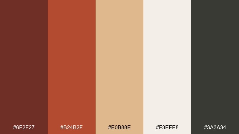
HEX: #6f2f27 #b24b2f #e0b88e #f3efe8 #3a3a34
Mood: festive and warm
Best for: seasonal social media template set
Festive and warm, it suggests harvest stalls, baked treats, and crisp air under string lights. Build your grid with the light neutral, then rotate the rust and tan for variety across posts. It pairs well with hand-lettered headings and simple illustrated leaves. Usage tip: keep the dark gray-brown for small text only so the feed stays bright.
Image example of autumn market generated using media.io
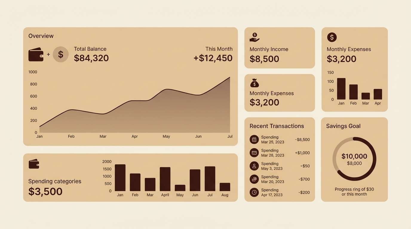
10) Minimal Umber UI
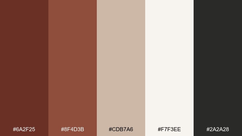
HEX: #6a2f25 #8f4d3b #cdb7a6 #f7f3ee #2a2a28
Mood: clean and editorial
Best for: finance dashboard UI mockup
Clean and editorial, these neutrals feel like warm paper with a sharp ink finish. Use the near-black for labels and data, and bring in the mid-brown for active states and key metrics. The soft beige works as a calm panel background that reduces visual fatigue. Usage tip: apply the darkest brown only to the primary CTA to keep the interface focused.
Image example of minimal umber ui generated using media.io
11) Warm Stoneware
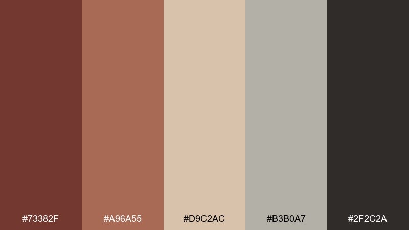
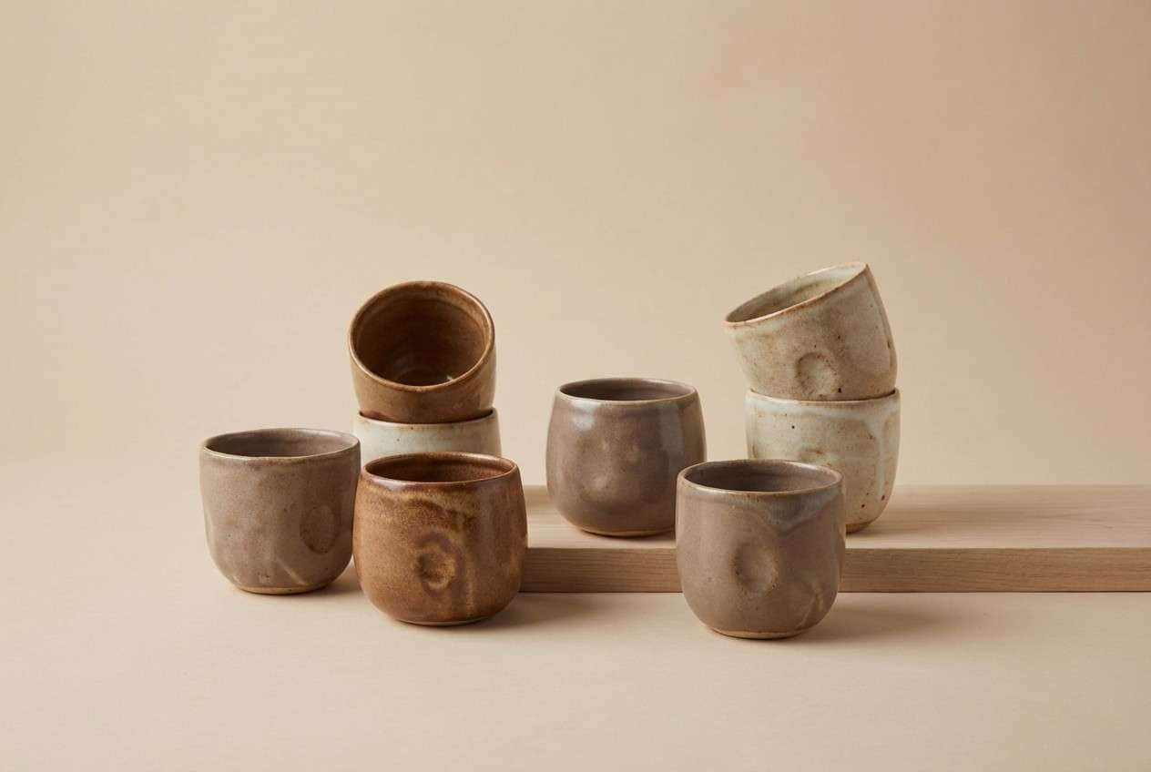
HEX: #73382f #a96a55 #d9c2ac #b3b0a7 #2f2c2a
Mood: artisan and tactile
Best for: handmade ceramics product photography
Artisan and tactile, it evokes glazed stoneware, kiln heat, and matte clay dust. Use the taupe-gray as a quiet bridge tone between the warm browns and the soft beige. This set is ideal for studio product shots where you want warmth without turning orange. Usage tip: place products on the pale beige and use the deep brown only in small props or labels for depth.
Image example of warm stoneware generated using media.io
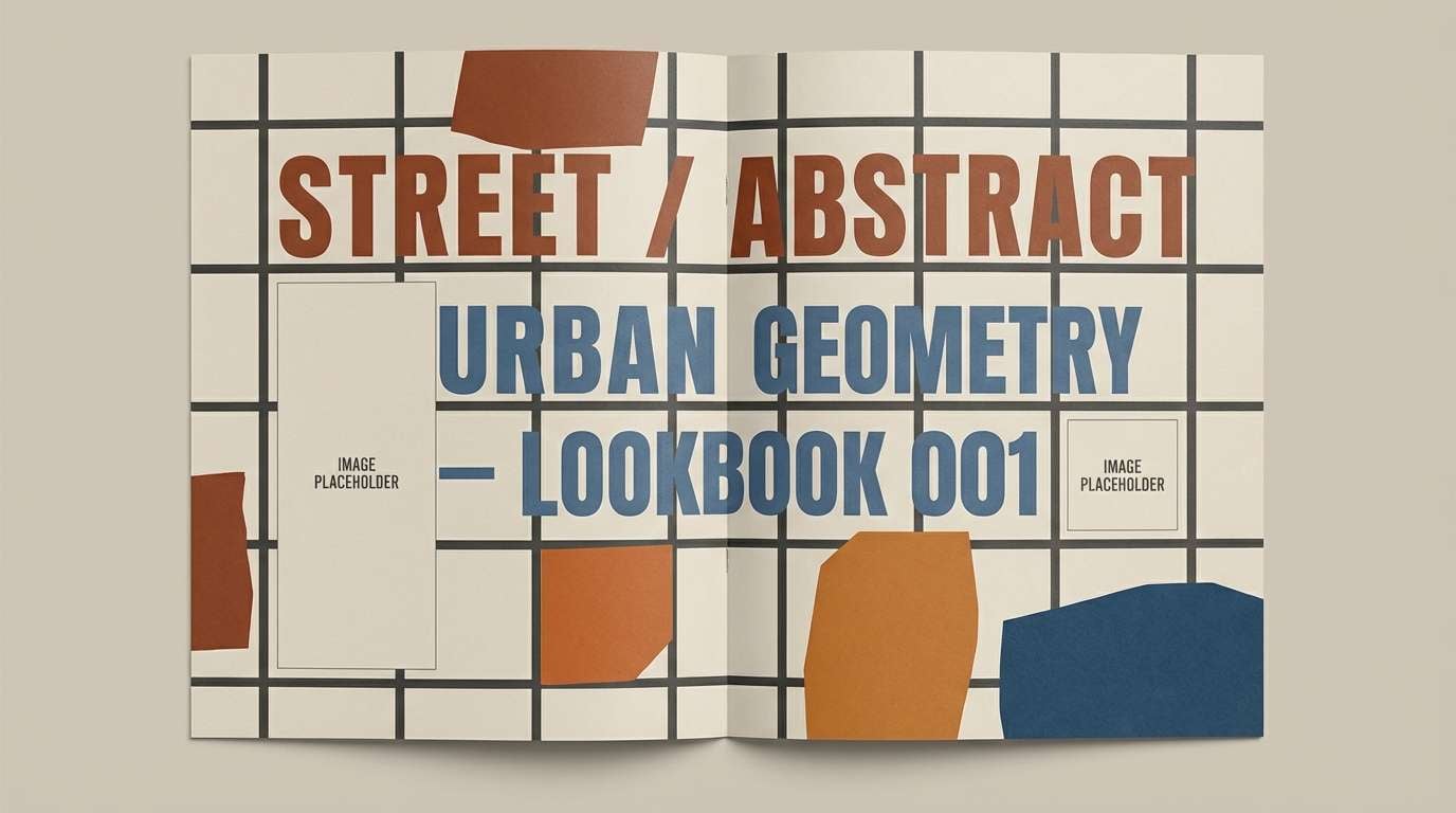
12) Rust and Denim
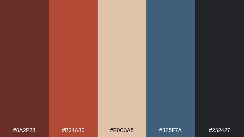
HEX: #6a2f28 #b24a36 #e0c3a8 #3f5f7a #232427
Mood: modern and confident
Best for: streetwear lookbook editorial spread
Modern and confident, it blends rusted warmth with cool denim and ink-like depth. These burnt umber color combinations work best when the blue stays secondary, used for pull quotes, links, or one standout block. Pair with bold grids and plenty of whitespace for a sharp, magazine feel. Usage tip: keep photos slightly desaturated so the rust accents remain the loudest element.
Image example of rust and denim generated using media.io
13) Sandstone Sunrise
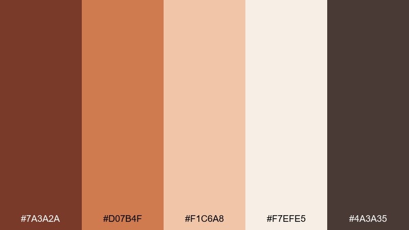
HEX: #7a3a2a #d07b4f #f1c6a8 #f7efe5 #4a3a35
Mood: bright and optimistic
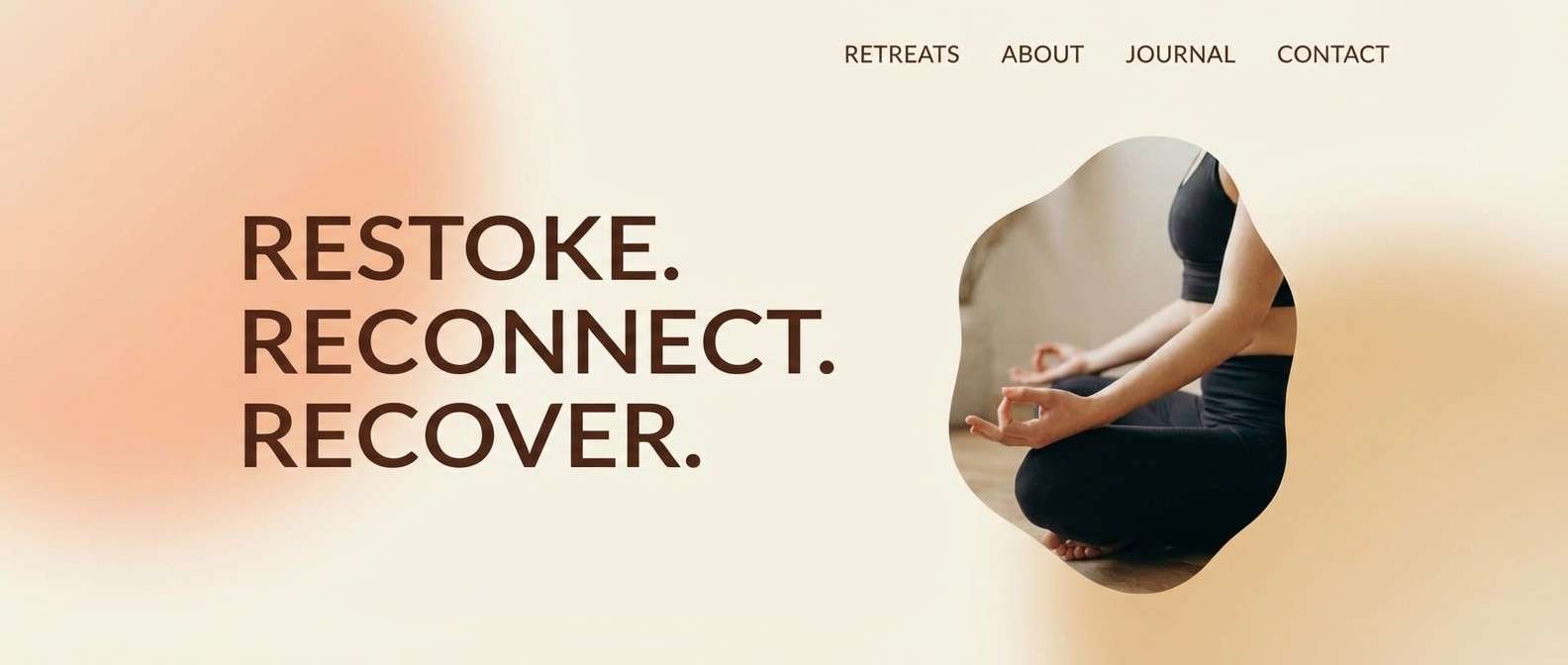
Best for: wellness retreat landing page
Bright and optimistic, it feels like sunrise on sandstone with a soft, breathable glow. Use the peach and cream as the main page background layers, then let the deeper brown carry headings and navigation. It pairs well with airy photography and rounded sans-serif fonts. Usage tip: make the orange a highlight color for only one action per screen to keep the retreat vibe calm.
Image example of sandstone sunrise generated using media.io
14) Charred Cedar
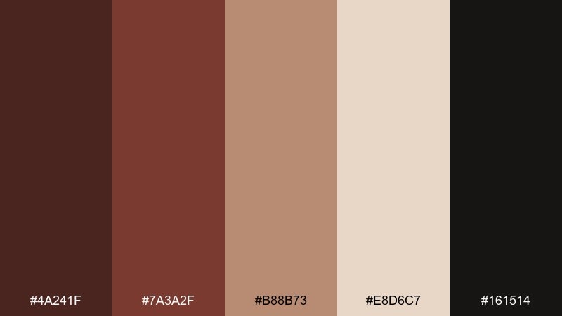
HEX: #4a241f #7a3a2f #b88b73 #e8d6c7 #161514
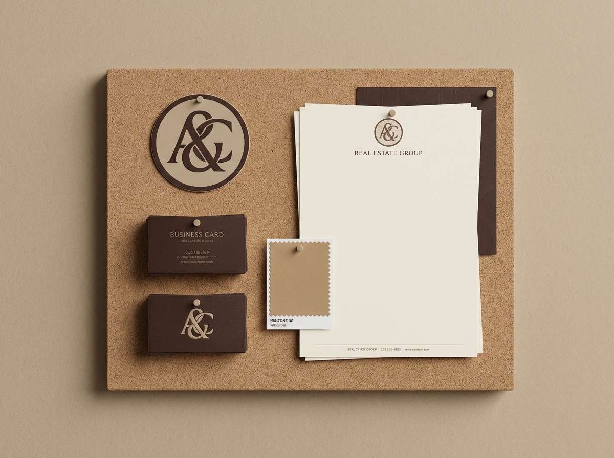
Mood: moody and architectural
Best for: premium real estate branding
Moody and architectural, it brings to mind charred cedar siding, concrete shadows, and warm interior glow. Use the near-black and deep brown for monograms and signage, with beige as the breathing room. It pairs beautifully with minimalist layouts and high-contrast photography. Usage tip: keep the mid-tan for secondary details like icons or divider lines so the identity stays elegant.
Image example of charred cedar generated using media.io
15) Amber Spice
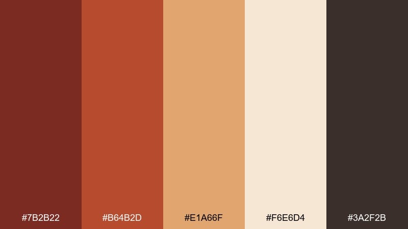
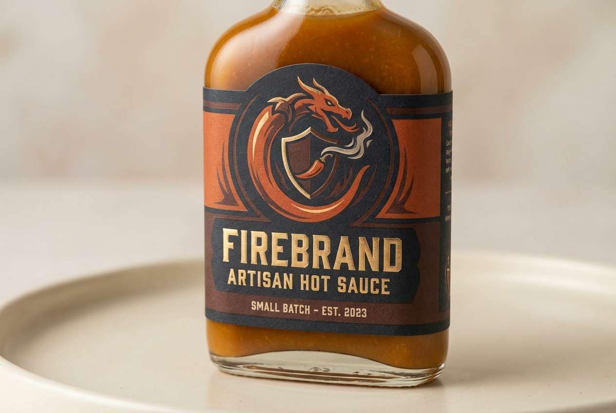
HEX: #7b2b22 #b64b2d #e1a66f #f6e6d4 #3a2f2b
Mood: zesty and cozy
Best for: artisan hot sauce label
Zesty and cozy, this burnt umber color palette feels like toasted chili, caramelized citrus, and a smoky kitchen. Use the amber as the hero color for the label icon and flavor stripe, then ground everything with deep brown type. It pairs well with bold illustration and chunky sans-serif lettering. Usage tip: keep the light cream behind the ingredient list to avoid readability issues on curved bottles.
Image example of amber spice generated using media.io
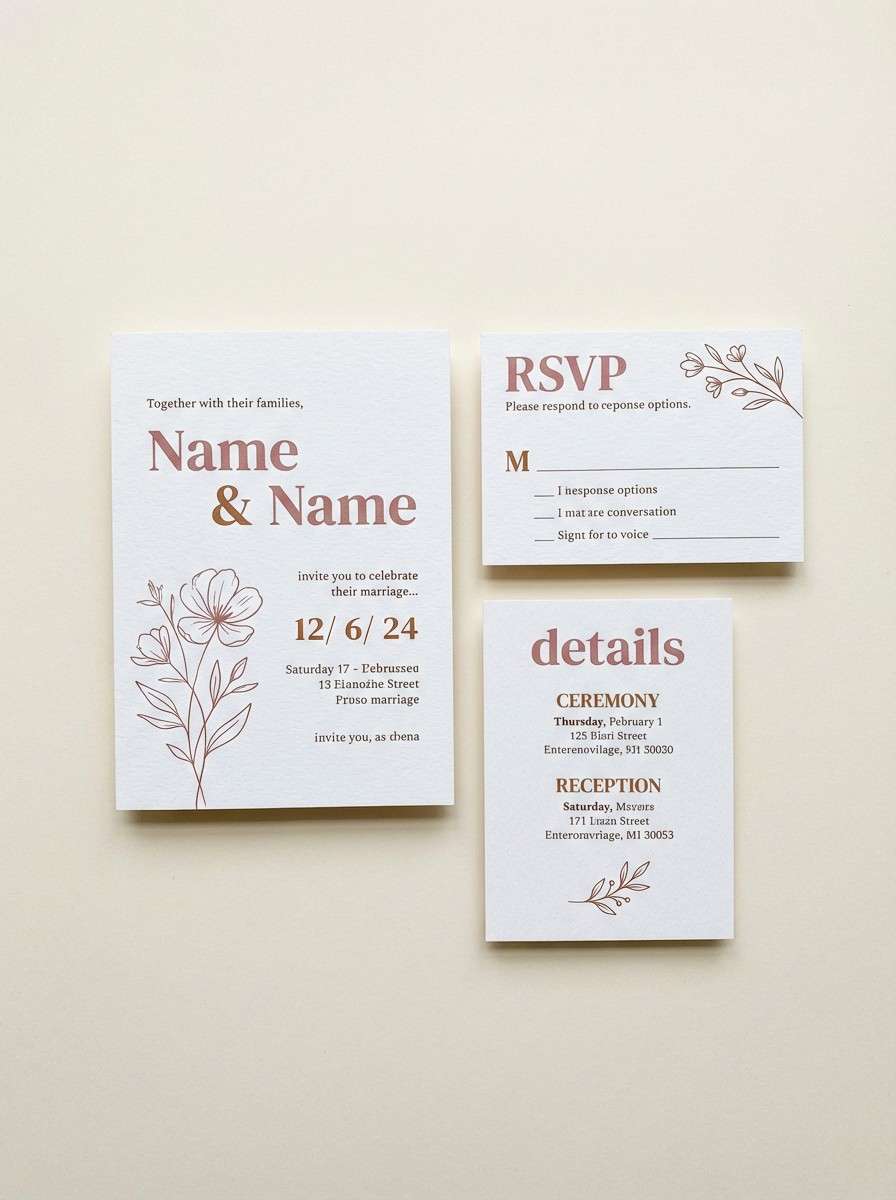
16) Dusty Rose Umber
HEX: #6f2f2a #9b4a3f #d6a3a0 #f2e2d9 #2f2a28
Mood: romantic and muted
Best for: wedding invitation suite
Romantic and muted, it reads like dried roses, antique ribbon, and warm ink on soft paper. Let the blush tone carry florals or borders, while the deep brown handles names and key details. It pairs nicely with serif typography and minimal line art. Usage tip: print the darkest tone slightly softer than pure black to keep the suite gentle.
Image example of dusty rose umber generated using media.io
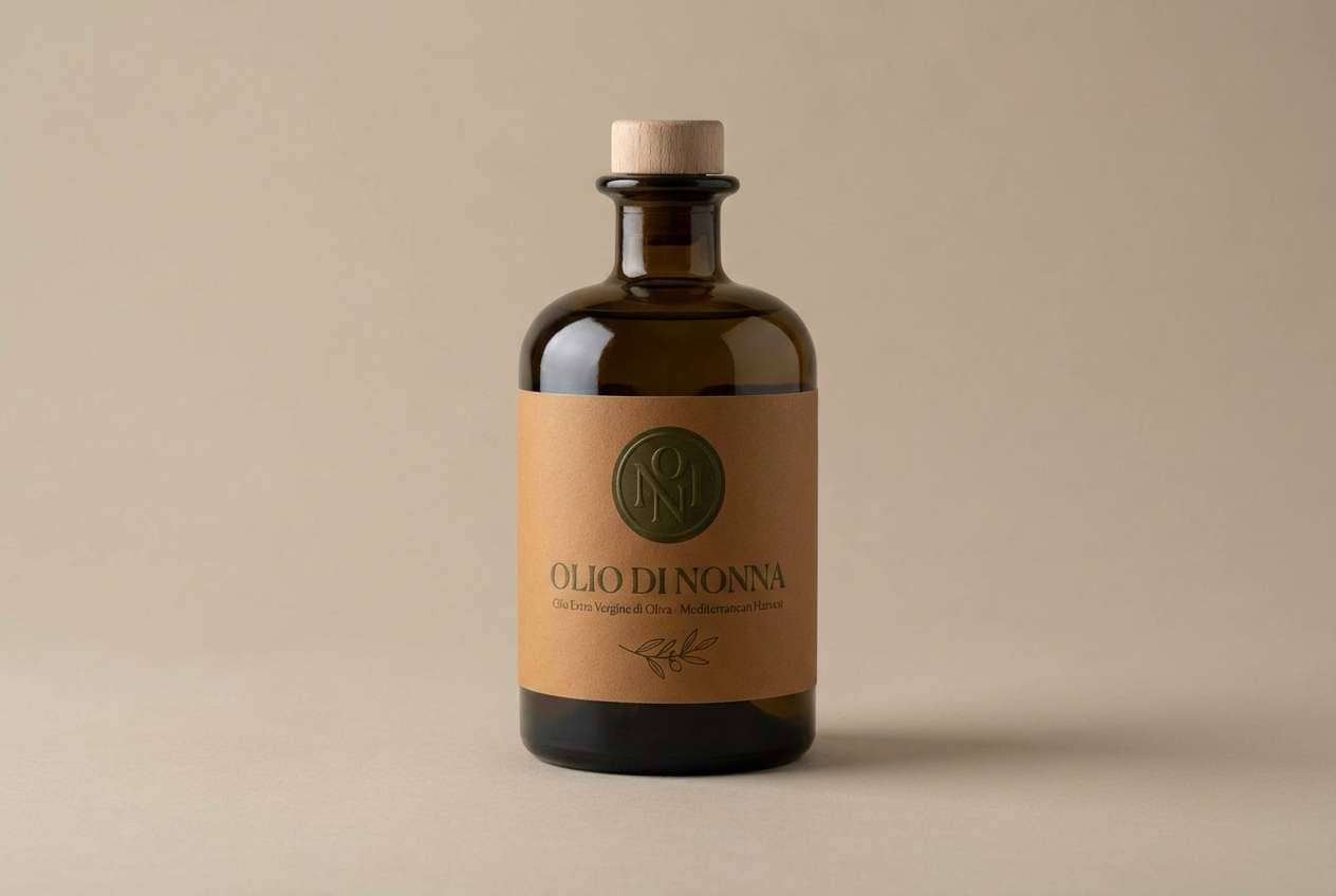
17) Olive Orchard
HEX: #6a2e26 #8a4a3a #d5bfa8 #7a7a4e #2a2a22
Mood: earthy and Mediterranean
Best for: olive oil packaging design
Earthy and Mediterranean, it evokes olive groves, terracotta roofs, and shaded stone courtyards. Use the olive tone as a signature accent on caps, seals, or pattern bands, and keep the rest warm and neutral. It pairs well with classic serif labels and small hand-drawn illustrations. Usage tip: limit the darkest tone to type and borders so the green stays fresh.
Image example of olive orchard generated using media.io
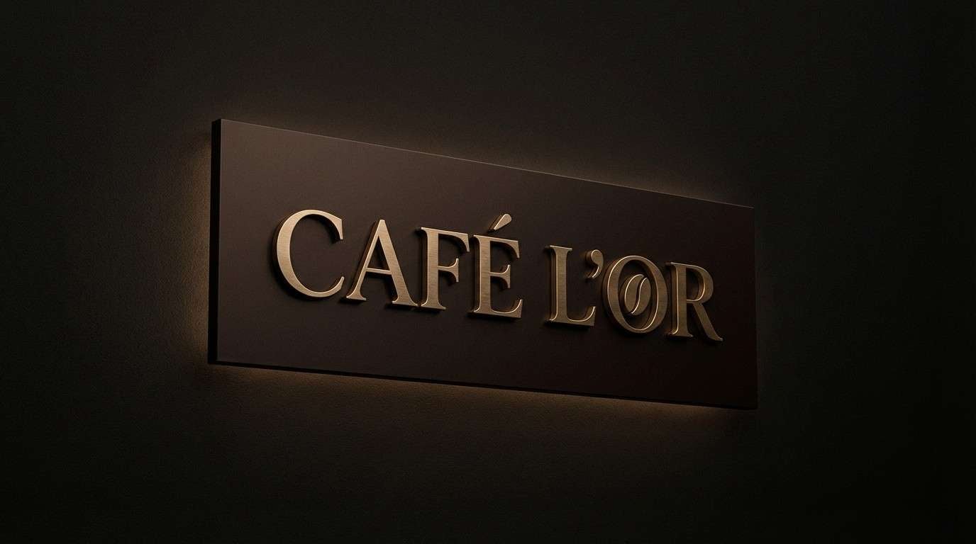
18) Night Espresso
HEX: #3b1e1a #6b2f25 #9c6b56 #d8c4b3 #0f0f10
Mood: dramatic and intimate
Best for: luxury cafe logo and signage
Dramatic and intimate, it feels like espresso crema against a dark countertop at night. Use the near-black as the signage base and bring in warm browns for the mark and secondary text. It pairs perfectly with gold foil, brushed brass, and high-end serif lettering. Usage tip: keep background areas deep and clean so the mid-brown details do not get lost.
Image example of night espresso generated using media.io
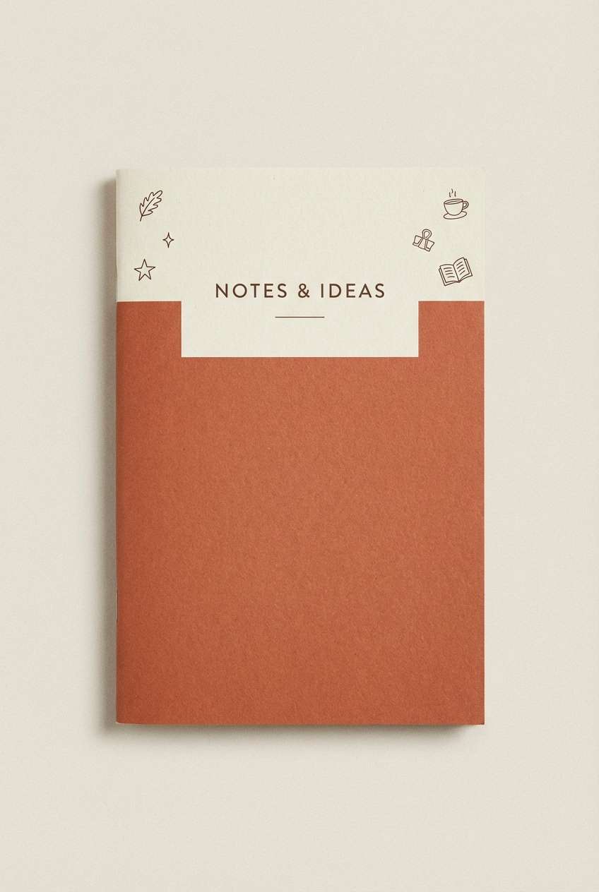
19) Terracotta Journal
HEX: #7a3328 #a9573f #cfa48a #f5ecdf #34302e
Mood: creative and cozy
Best for: notebook cover design
Creative and cozy, it suggests sketchbooks, dried ink, and terracotta tiles. Use the warm mid-brown for the main cover field and the pale cream for type blocks and small labels. It pairs well with hand-drawn doodles, stamps, and subtle paper texture. Usage tip: add a thin dark border to frame the design and prevent the cover from feeling flat.
Image example of terracotta journal generated using media.io
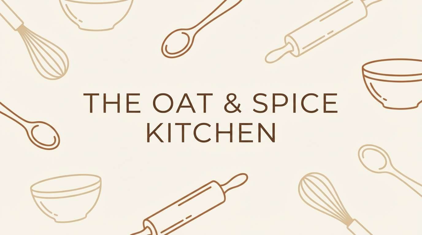
20) Cinnamon Oat
HEX: #6f342a #b06a4f #e2c9ad #f7f0e6 #4a3f39
Mood: wholesome and airy
Best for: recipe blog header and pins
Wholesome and airy, it recalls cinnamon, oats, and warm kitchen light. Use the cream and oat tones as the main canvas, with brown reserved for headings and small separators. It pairs nicely with simple food illustrations and rounded type. Usage tip: keep the cinnamon shade for one callout badge per layout so the header stays uncluttered.
Image example of cinnamon oat generated using media.io
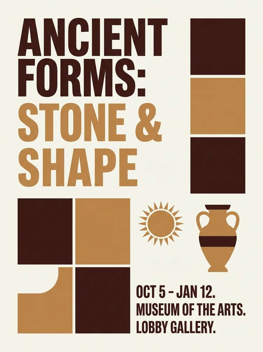
21) Heritage Poster
HEX: #6a2b22 #8f4a37 #c78e6c #efe0d2 #24201f
Mood: classic and bold
Best for: museum exhibition poster
Classic and bold, the tones feel like letterpress ink, aged paper, and warm wood frames. The burnt umber color combination here is ideal for big typography and strong contrast blocks without looking harsh. Pair with clean margins, a single vintage motif, and a restrained grid for a curated look. Usage tip: print the background slightly off-white to preserve the poster's archival feel.
Image example of heritage poster generated using media.io
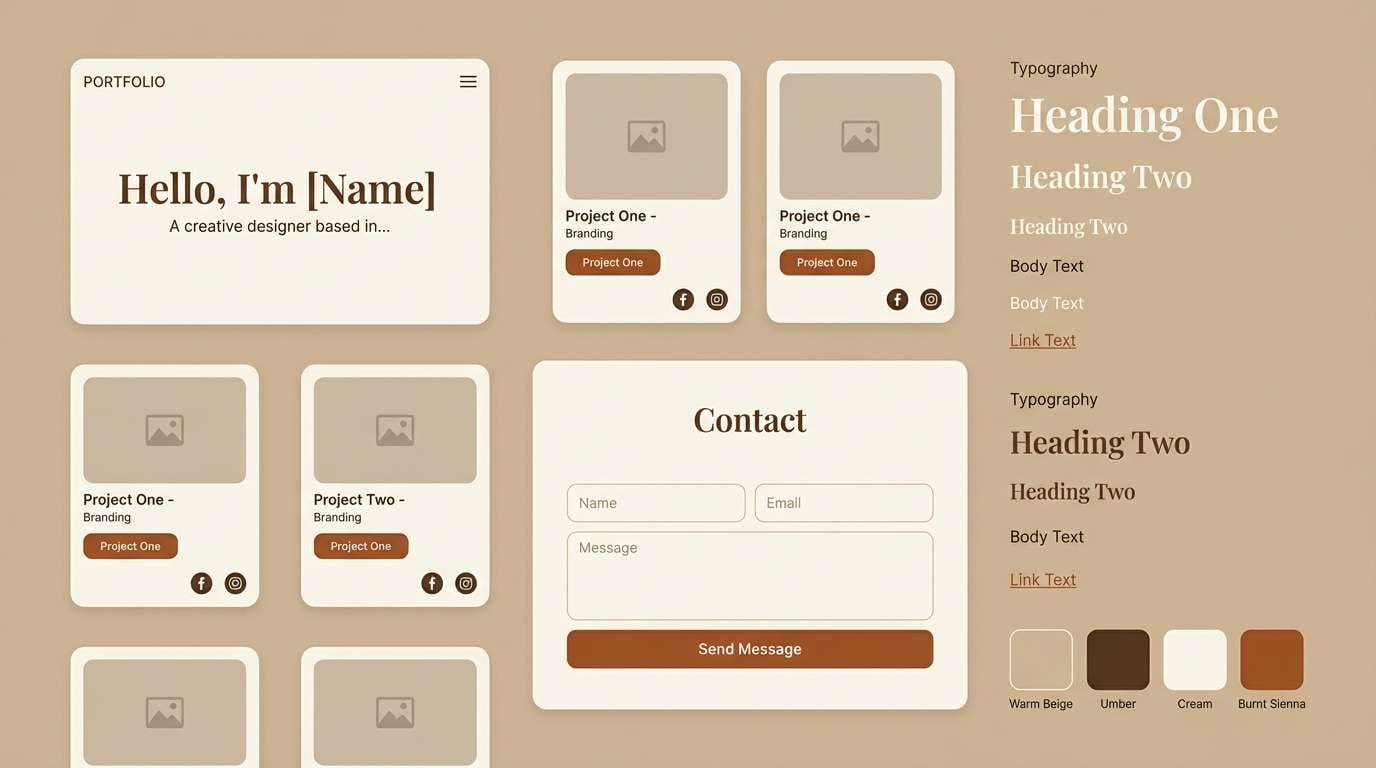
22) Quiet Studio
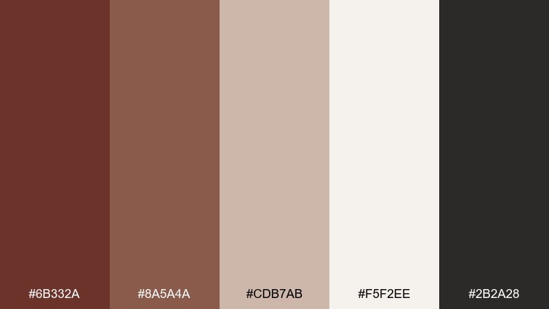
HEX: #6b332a #8a5a4a #cdb7ab #f5f2ee #2b2a28
Mood: neutral and focused
Best for: portfolio website UI kit
Neutral and focused, it feels like a calm studio space with warm shadows and soft paper. Use the lightest tone for backgrounds, the mid-browns for section breaks, and the darkest for navigation and titles. It pairs well with minimalist photography and plenty of breathing room. Usage tip: keep hover states subtle by shifting between the two mid-browns rather than jumping to the darkest shade.
Image example of quiet studio generated using media.io
What Colors Go Well with Burnt Umber?
Burnt umber pairs naturally with warm neutrals like cream, oat, sand, and parchment, giving you a timeless, readable base for layouts and packaging. These lighter tones also prevent umber-heavy designs from feeling too dense.
For a fresh, organic contrast, try greens like sage, olive, and moss. The warm brown + muted green combo is especially effective for natural brands, outdoors products, and Mediterranean-inspired identities.
If you want a more modern edge, introduce cool accents like denim blue or slate, then keep them secondary. That warm/cool tension makes burnt umber feel contemporary without losing its earthy character.
How to Use Burnt Umber Color Combinations in Real Designs
Use burnt umber as an anchor: headlines, borders, nav bars, or logo marks. Then let light neutrals (cream, beige, off-white) carry the background so your typography stays crisp and your layouts breathe.
In packaging and print, burnt umber shines with tactile finishes—kraft stock, embossing, soft-touch lamination, and copper/brass foils. Keep one warm accent (terracotta, amber, or copper) as a “flavor” color for badges and highlights.
For UI, treat umber like an “ink” rather than a fill. Apply it to key numbers, active states, and primary CTAs, while using warm beiges for panels to reduce glare and visual fatigue.
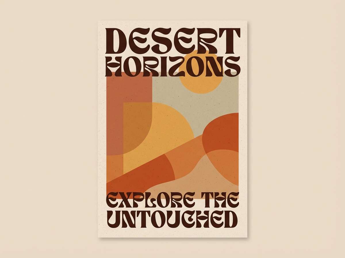
Create Burnt Umber Palette Visuals with AI
If you want to preview how a burnt umber color scheme looks on real assets (posters, labels, invitations, dashboards), generate quick mockups from text prompts. It’s a fast way to test mood, hierarchy, and contrast before committing to production.
Start with one of the prompts above, then swap in your brand keywords (e.g., “skincare,” “museum,” “streetwear”) and adjust the aspect ratio to match your deliverable. Keep the darkest umber for type and structure, and let lighter neutrals do the heavy lifting.
With Media.io, you can iterate multiple palette directions in minutes and pick the one that best matches your audience and product.
Burnt Umber Color Palette FAQs
-
What is burnt umber (and how is it different from umber)?
Burnt umber is typically warmer and deeper than raw umber, with more reddish undertones. “Burnt” indicates the pigment (or color mix) has been heated or shifted to a richer, darker brown that feels more roasted and earthy. -
Is burnt umber a good choice for branding?
Yes. Burnt umber communicates stability, craft, and authenticity, making it popular for heritage brands, food and beverage packaging, premium real estate, and natural skincare. Pair it with cream for clarity and one accent color for personality. -
What colors complement burnt umber best?
Muted greens (sage/olive), warm creams and beiges, and cool denim/slate blues all complement burnt umber well. For a bolder look, copper/amber accents amplify the warmth without clashing. -
How do I keep burnt umber palettes from looking too dark?
Increase the proportion of light neutrals (off-white, sand, parchment) and reserve burnt umber for structure—headlines, frames, icons, and small blocks. Avoid using deep browns for large backgrounds unless you also add strong light contrast. -
Can I use burnt umber in UI design?
Absolutely. Use near-black or dark umber for text, warm beige for panels, and mid-browns for states (hover/active). This keeps the interface readable while adding a softer, editorial warmth compared to pure grayscale. -
What finish or texture works well with burnt umber in print?
Burnt umber pairs beautifully with kraft paper, warm uncoated stocks, subtle grain, embossing, and metallic foils like copper or brass. These finishes reinforce the tactile, premium feel associated with earthy browns. -
How can I generate burnt umber palette mockups quickly?
Use Media.io’s text-to-image tool: paste a prompt (like the examples above), specify your layout type (label, poster, UI), and iterate with small changes to accents and backgrounds until the contrast and mood feel right.


