

Beige red color palettes blend warm neutrals with confident reds, giving you a look that feels inviting but still high-impact. They’re especially useful when you want softness, romance, or “premium warmth” without going overly bright.
Below are 20 ready-to-use beige red palette ideas with HEX codes, plus practical tips for branding, UI, invitations, packaging, and more.
In this article
Why Beige Red Palettes Work So Well
Beige and red is a naturally flattering combination: beige brings calm, warmth, and “breathing room,” while red adds emotion, energy, and a clear focal point. Together, you get contrast that feels human rather than harsh.
These palettes are versatile across print and digital because you can scale intensity. Use beige for backgrounds and surfaces, then introduce red as an accent for calls-to-action, headings, or key details.
Beige red schemes also photograph well with real materials—linen paper, kraft textures, clay, wood, and matte coatings—making them a strong choice for packaging, stationery, interiors, and lifestyle branding.
20+ Beige Red Color Palette Ideas (with HEX Codes)
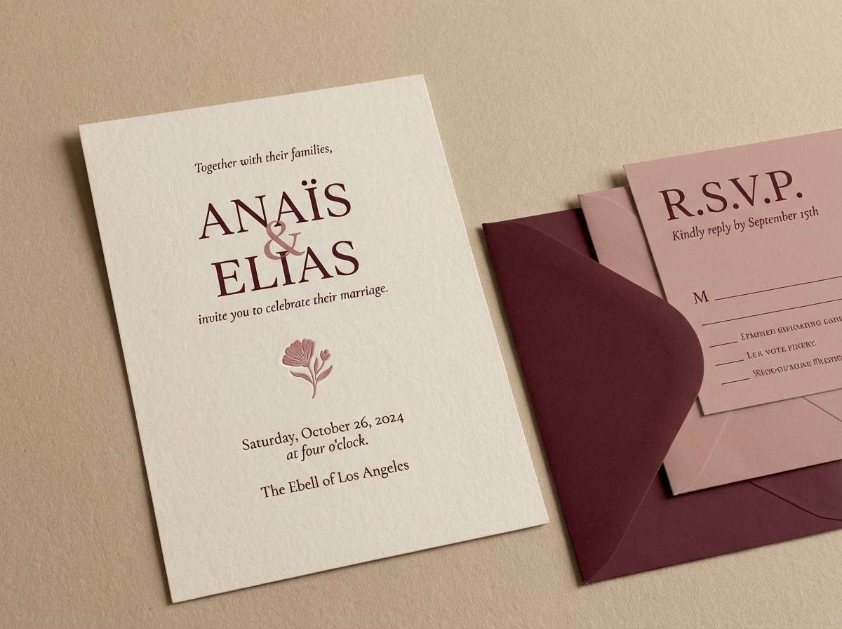
1) Linen Rose
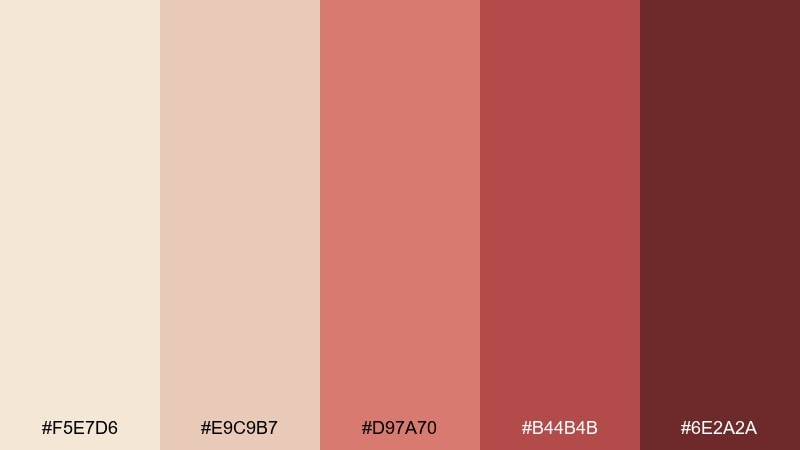
HEX: #F5E7D6 #E9C9B7 #D97A70 #B44B4B #6E2A2A
Mood: soft, romantic, airy
Best for: wedding invitation suites and RSVP cards
Soft and romantic, this mix feels like linen fabric, dried roses, and candlelight at golden hour. It works beautifully for wedding suites, save-the-dates, and menu cards where warmth matters more than contrast. Pair it with plenty of negative space and a subtle paper texture to keep it elevated. Tip: use the deeper maroon only for names or headings so the palette stays light and graceful.
Image example of linen rose generated using media.io
Media.io is an online AI studio for creating and editing video, image, and audio in your browser.

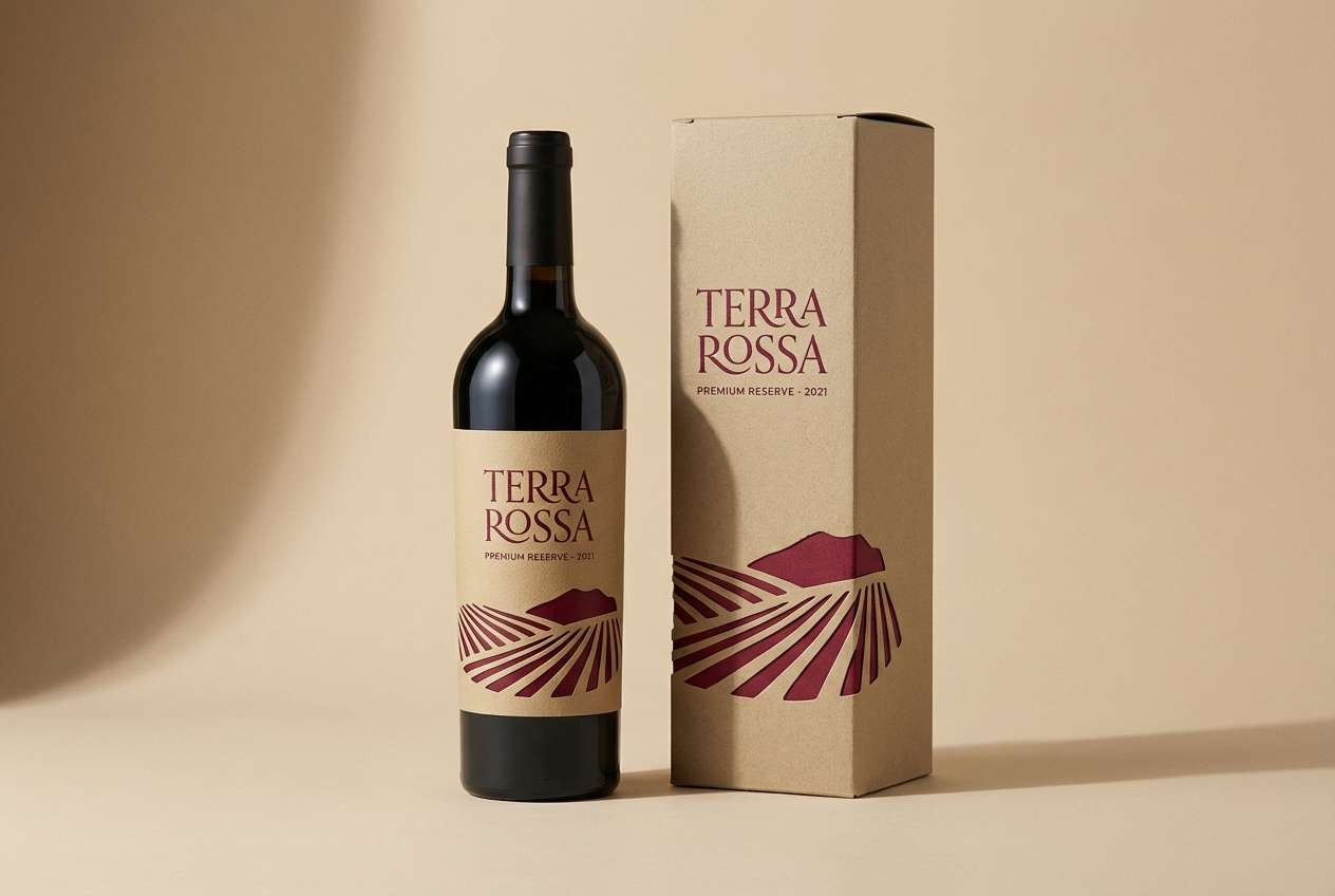
2) Desert Garnet
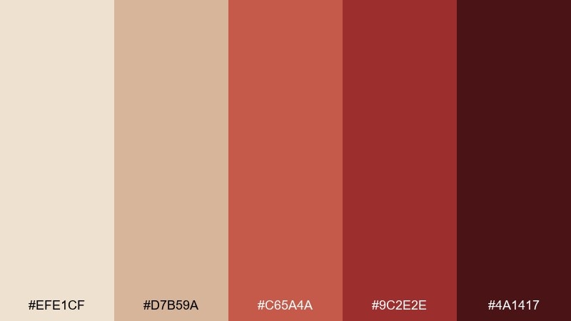
HEX: #EFE1CF #D7B59A #C65A4A #9C2E2E #4A1417
Mood: bold, earthy, dramatic
Best for: premium wine labels and gourmet packaging
Bold and earthy, it evokes sun-baked sand, red stone, and a dark garnet finish. The contrast makes it ideal for premium labels, gift boxes, and gourmet packaging that needs to feel rich without going glossy. Pair the sandy beige with matte finishes and reserve the darkest tone for small stamp details or borders. Tip: add a subtle emboss to the deep garnet areas to amplify the luxe feel.
Image example of desert garnet generated using media.io
3) Blush Brick
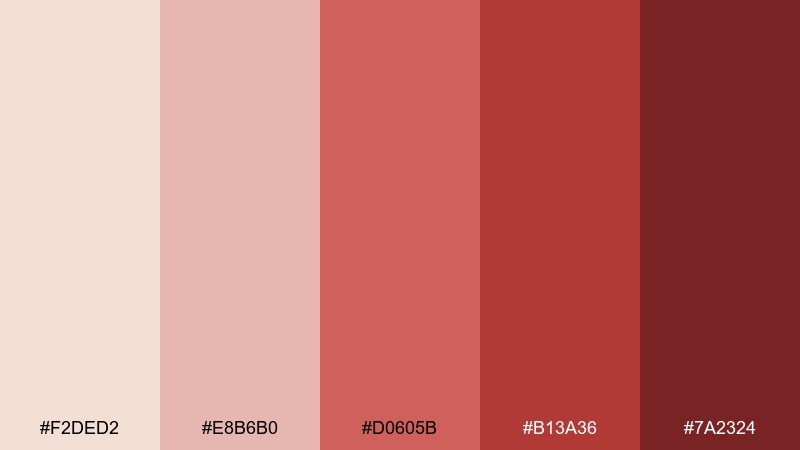
HEX: #F2DED2 #E8B6B0 #D0605B #B13A36 #7A2324
Mood: friendly, modern, confident
Best for: beauty brand social posts and product launches
Friendly and modern, it brings to mind rosy cheeks, brick facades, and a confident pop of lipstick. This beige red color palette shines in beauty launches, social tiles, and lookbook covers where you want warmth with clarity. Pair it with clean sans-serif type and plenty of pale background for a fresh, editorial vibe. Tip: use the bright coral-red as the call-to-action color and keep everything else muted.
Image example of blush brick generated using media.io
4) Oat Cranberry
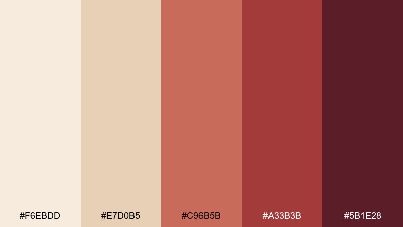
HEX: #F6EBDD #E7D0B5 #C96B5B #A33B3B #5B1E28
Mood: cozy, rustic, seasonal
Best for: fall cafe menus and bakery branding
Cozy and seasonal, these tones feel like oat milk, cranberry jam, and warm bakery light. They work well for cafe menus, bakery branding, and loyalty cards that should feel inviting rather than loud. Pair with kraft paper textures or creamy whites to keep the reds grounded. Tip: set menu categories in the darkest cranberry and highlight prices in the mid red for easy scanning.
Image example of oat cranberry generated using media.io
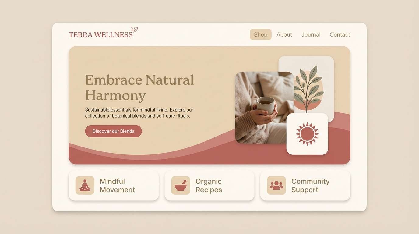
5) Sand Rouge
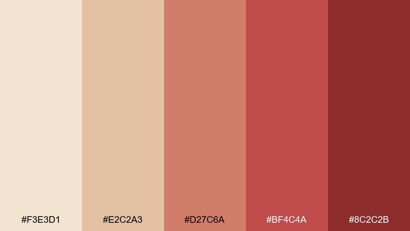
HEX: #F3E3D1 #E2C2A3 #D27C6A #BF4C4A #8C2C2B
Mood: sun-warmed, approachable, balanced
Best for: landing pages for wellness and lifestyle brands
Sun-warmed and approachable, it suggests sandy beaches, rosy clay, and a grounded red accent. It fits wellness landing pages, lifestyle newsletters, and blog headers where calm neutrality needs a bit of energy. Pair it with soft gradients and rounded UI elements for a friendly tone. Tip: keep buttons in the muted rouge and use the deeper red only for hover states or alerts.
Image example of sand rouge generated using media.io
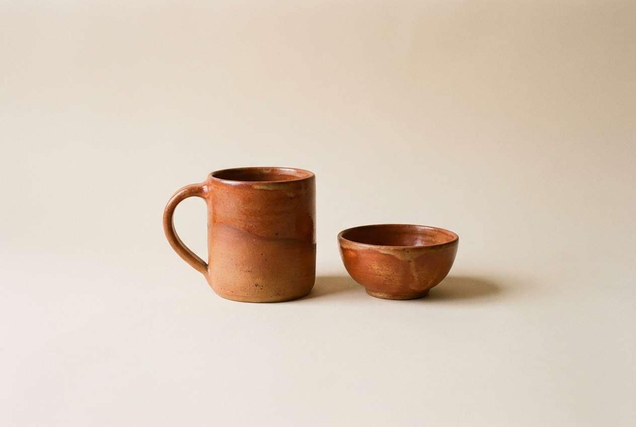
6) Warm Adobe
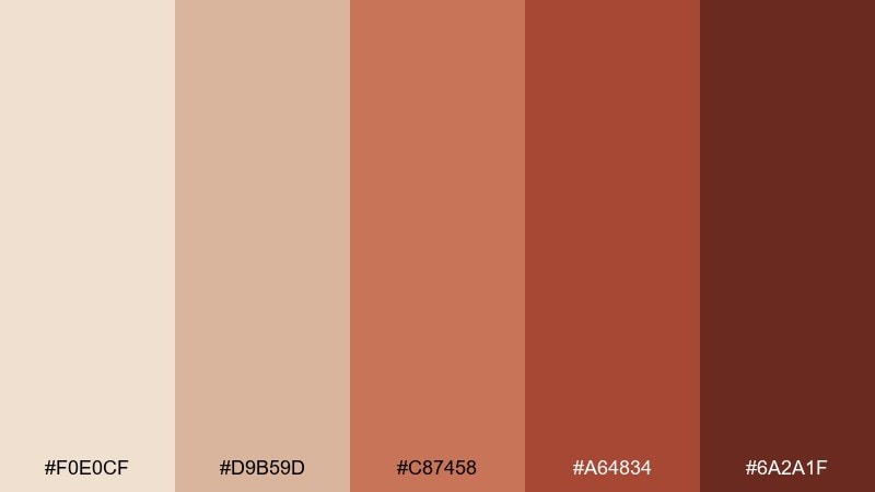
HEX: #F0E0CF #D9B59D #C87458 #A64834 #6A2A1F
Mood: grounded, artisanal, earthy
Best for: ceramic product ads and handmade shop banners
Grounded and artisanal, it feels like adobe walls, kiln-fired clay, and warm spice. Use it for handmade marketplaces, ceramic collections, and product ads that lean natural and tactile. Pair with simple product photography and a lightly grained backdrop to reinforce the craft vibe. Tip: make the mid terracotta your hero color and keep the dark brown-red for typography to improve readability.
Image example of warm adobe generated using media.io
7) Petal Suede
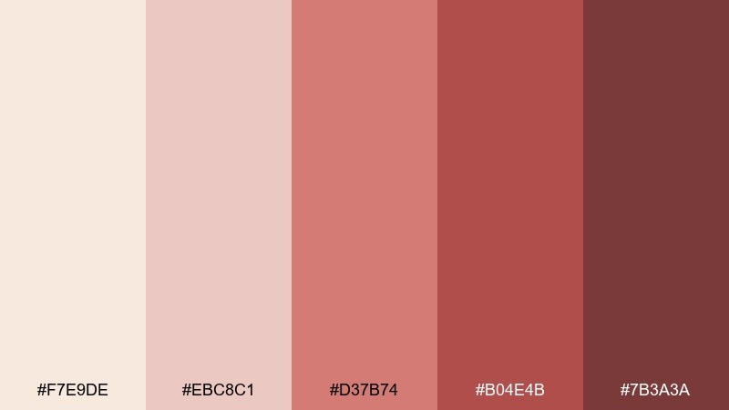
HEX: #F7E9DE #EBC8C1 #D37B74 #B04E4B #7B3A3A
Mood: tender, feminine, relaxed
Best for: skincare packaging and gentle product labels
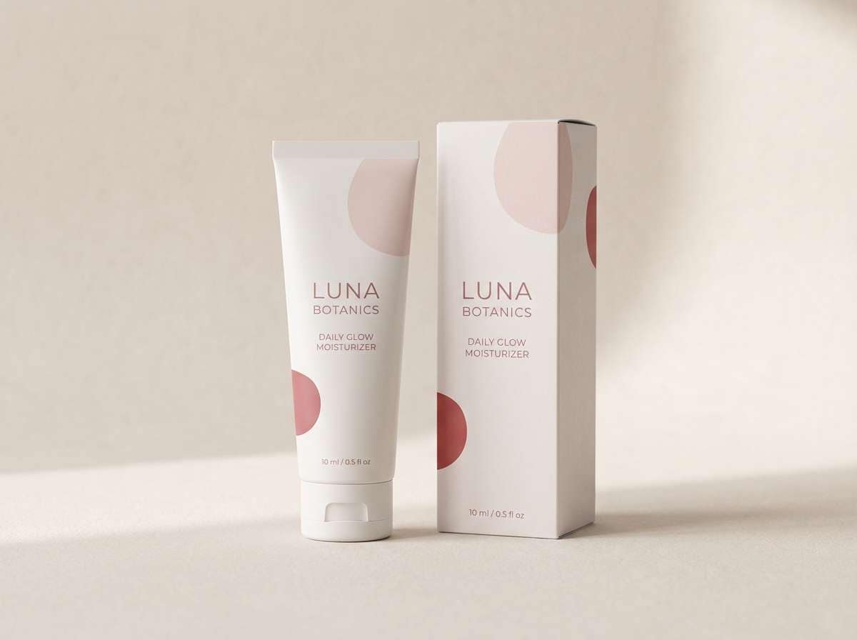
Tender and relaxed, these tones read like rose petals against soft suede. The beige red color combinations are especially strong for skincare labels, body lotion packaging, and calming product pages. Pair with minimal line art and lots of breathing room so the colors feel clean, not sugary. Tip: set ingredient callouts on the palest beige and use the muted red for brand marks.
Image example of petal suede generated using media.io
8) Rosy Mocha
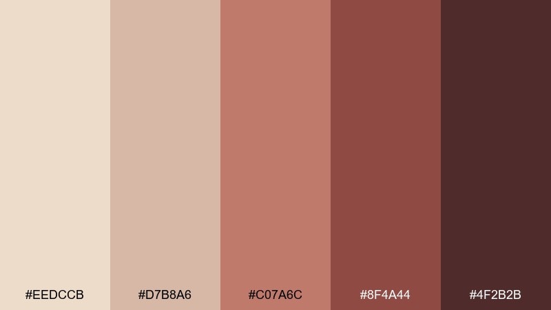
HEX: #EEDCCB #D7B8A6 #C07A6C #8F4A44 #4F2B2B
Mood: cozy, mature, understated
Best for: boutique hotel branding and stationery
Cozy and mature, it suggests a rosy latte, leather accents, and a quiet boutique lobby. These hues suit hotel stationery, welcome cards, and membership programs where warmth should feel refined. Pair with off-white stock and a touch of metallic foil for a premium finish. Tip: keep body text in the deep mocha-red and use rosy tones for highlights to avoid low contrast.
Image example of rosy mocha generated using media.io
9) Antique Ruby
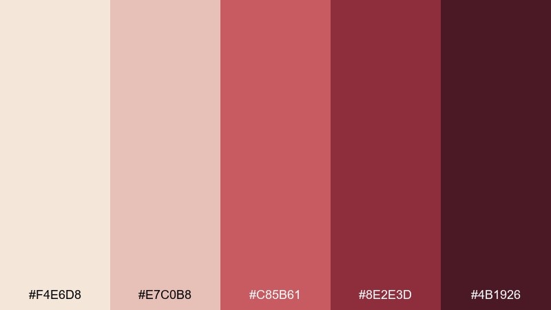
HEX: #F4E6D8 #E7C0B8 #C85B61 #8E2E3D #4B1926
Mood: vintage, romantic, dramatic
Best for: editorial magazine covers and book jackets
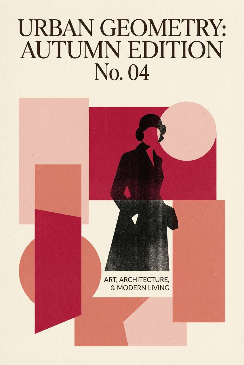
Vintage and dramatic, it feels like antique velvet, pressed flowers, and a ruby glass stem. Use it for magazine covers, book jackets, and editorial layouts that need emotion without neon intensity. Pair with high-contrast serif typography and a cream background to keep it legible. Tip: use the ruby tone as a single strong block behind the title for instant hierarchy.
Image example of antique ruby generated using media.io
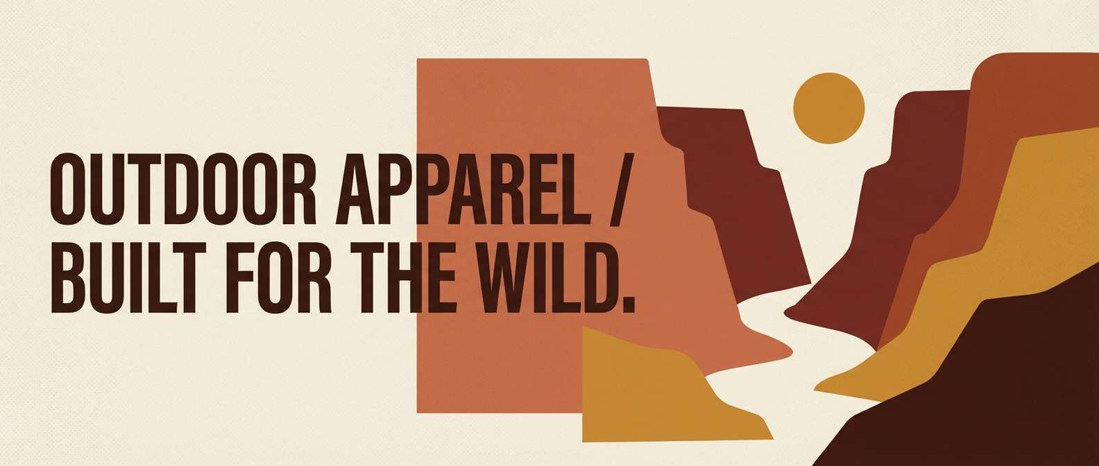
10) Canyon Clay
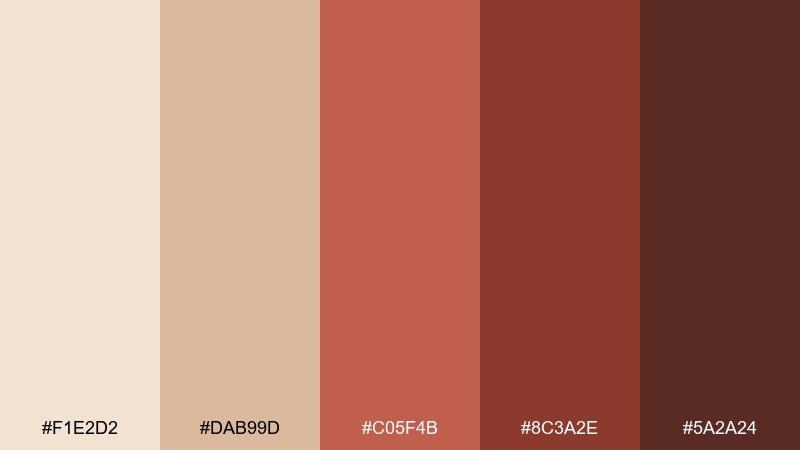
HEX: #F1E2D2 #DAB99D #C05F4B #8C3A2E #5A2A24
Mood: rugged, warm, grounded
Best for: outdoor brand web banners and lookbooks
Rugged and warm, these tones evoke canyon walls, clay trails, and a worn leather belt. In a beige red color scheme, it works well for outdoor lookbooks, rugged apparel branding, and web banners that need earthy confidence. Pair with bold condensed type and simple shapes to keep it modern rather than rustic. Tip: use the lighter beige for background and save the darkest brown-red for small UI labels.
Image example of canyon clay generated using media.io
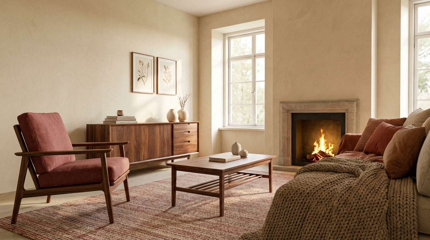
11) Rosewood Cream
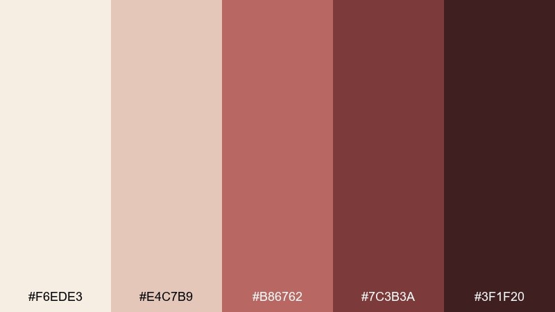
HEX: #F6EDE3 #E4C7B9 #B86762 #7C3B3A #3F1F20
Mood: calm, classic, sophisticated
Best for: interior design mood boards and living rooms
Calm and classic, it reads like cream walls, rosewood furniture, and a subtle red textile. It is ideal for living room mood boards, boutique interiors, and staging decks where warmth should feel timeless. Pair with natural wood grain and soft lighting to bring out the depth of the darker tones. Tip: add accents in the mid rosewood to connect the light neutrals with the deeper reds.
Image example of rosewood cream generated using media.io
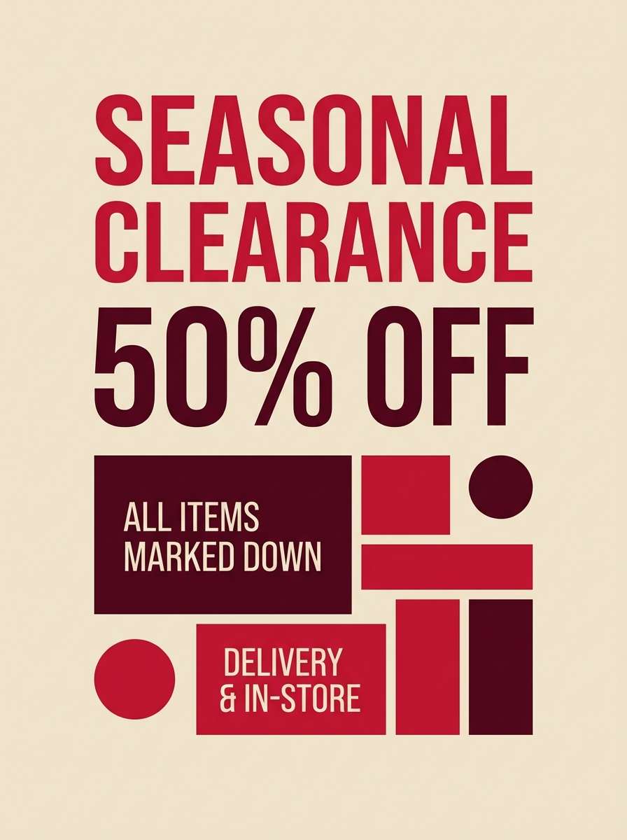
12) Crimson Almond
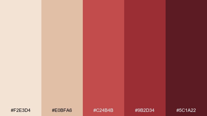
HEX: #F2E3D4 #E0BFA6 #C24B4B #9B2D34 #5C1A22
Mood: energetic, elegant, high-contrast
Best for: holiday sale posters and retail campaigns
Energetic and elegant, it looks like toasted almonds with a crisp crimson accent. The contrast is perfect for retail posters, holiday campaigns, and announcement banners where readability matters. Pair with clean grids and strong typography to avoid a heavy look. Tip: keep the background in almond beige and use crimson only for price tags and key numbers.
Image example of crimson almond generated using media.io
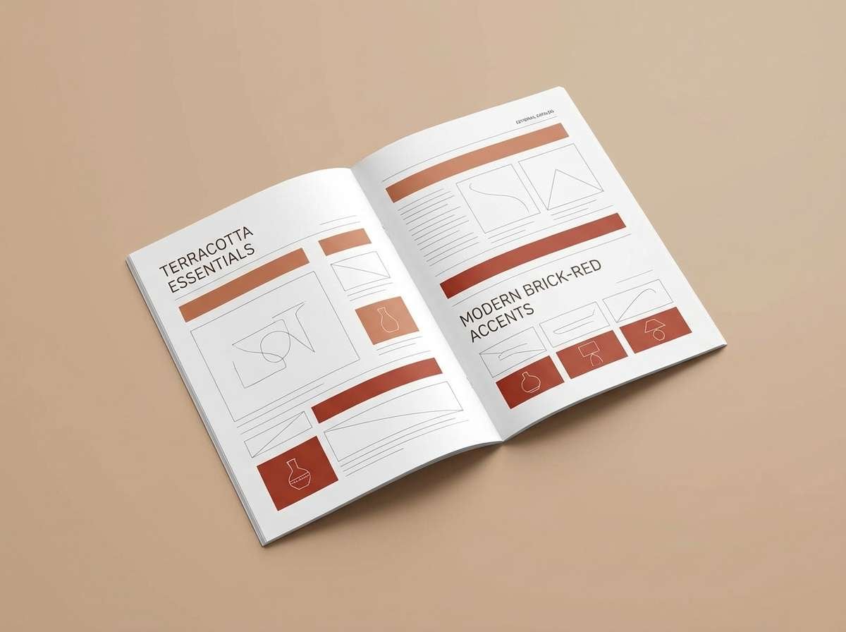
13) Dusted Terracotta
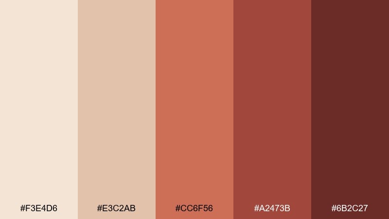
HEX: #F3E4D6 #E3C2AB #CC6F56 #A2473B #6B2C27
Mood: warm, natural, sun-faded
Best for: home decor product pages and catalog spreads
Warm and sun-faded, it brings to mind terracotta pots, woven rugs, and dusty stucco. It is a reliable mix for home decor catalogs and product pages that need to feel earthy but bright. Pair with natural fibers and simple photography to keep the look believable. Tip: use the mid terracotta for section headers so the page feels organized without harsh contrast.
Image example of dusted terracotta generated using media.io
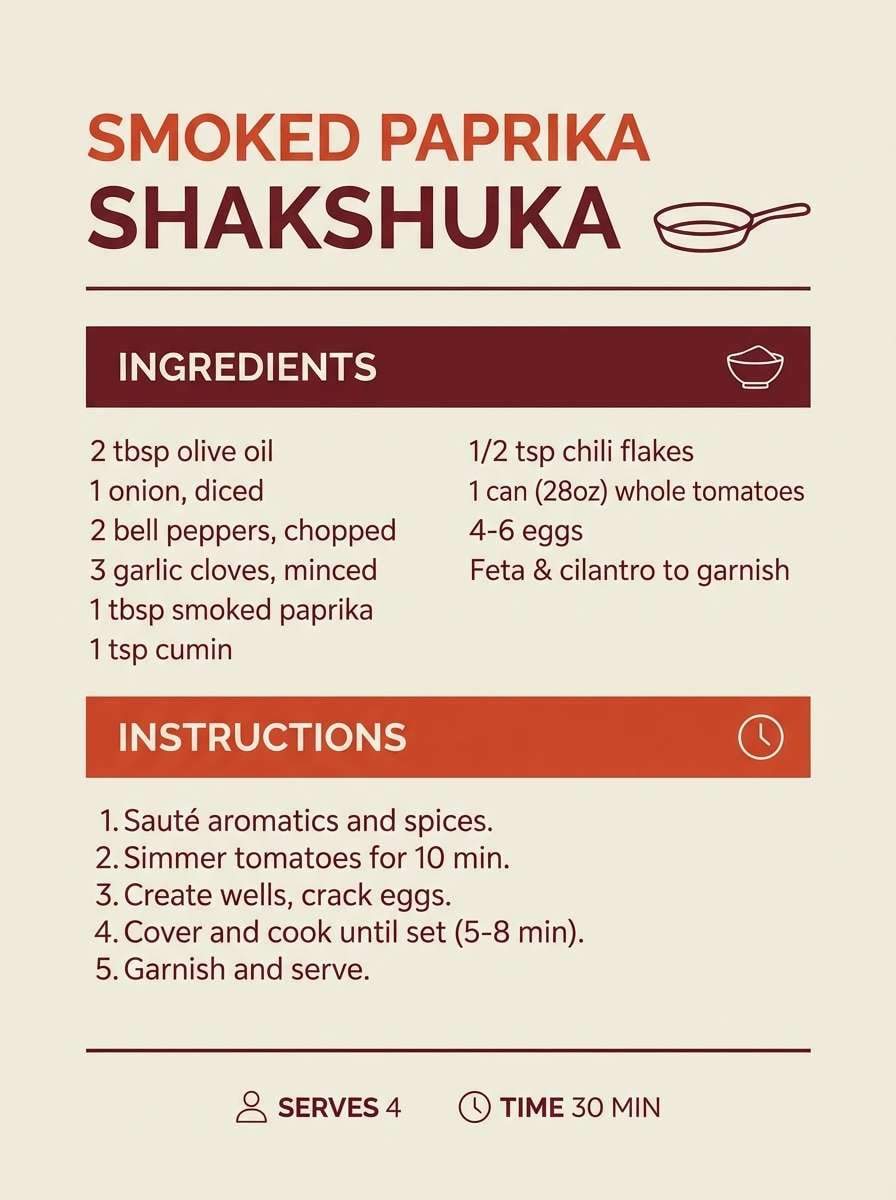
14) Soft Paprika
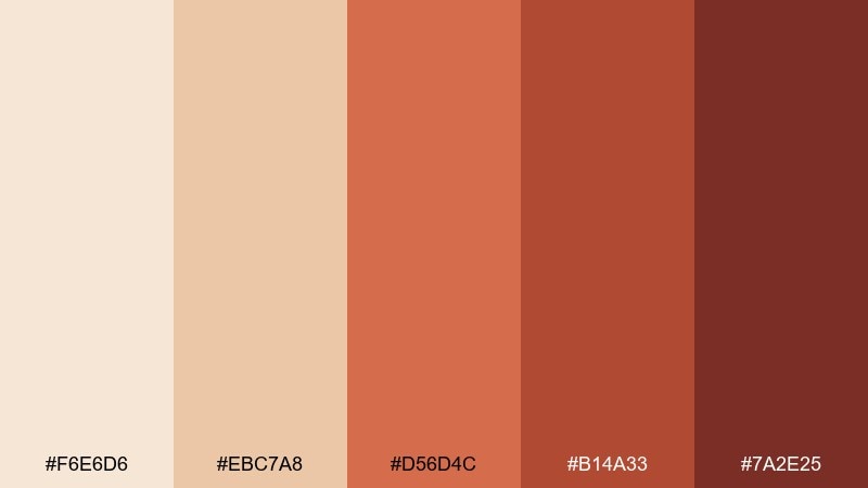
HEX: #F6E6D6 #EBC7A8 #D56D4C #B14A33 #7A2E25
Mood: spicy, cheerful, welcoming
Best for: food blog headers and recipe cards
Spicy and cheerful, it feels like paprika on creamy soup with a warm kitchen glow. It works great for recipe cards, food blog headers, and cooking newsletters that need appetite and clarity. Pair with neutral backgrounds and simple ingredient icons so the reds do not overwhelm the layout. Tip: use the brightest paprika for highlight badges like new or spicy, and keep the rest muted.
Image example of soft paprika generated using media.io
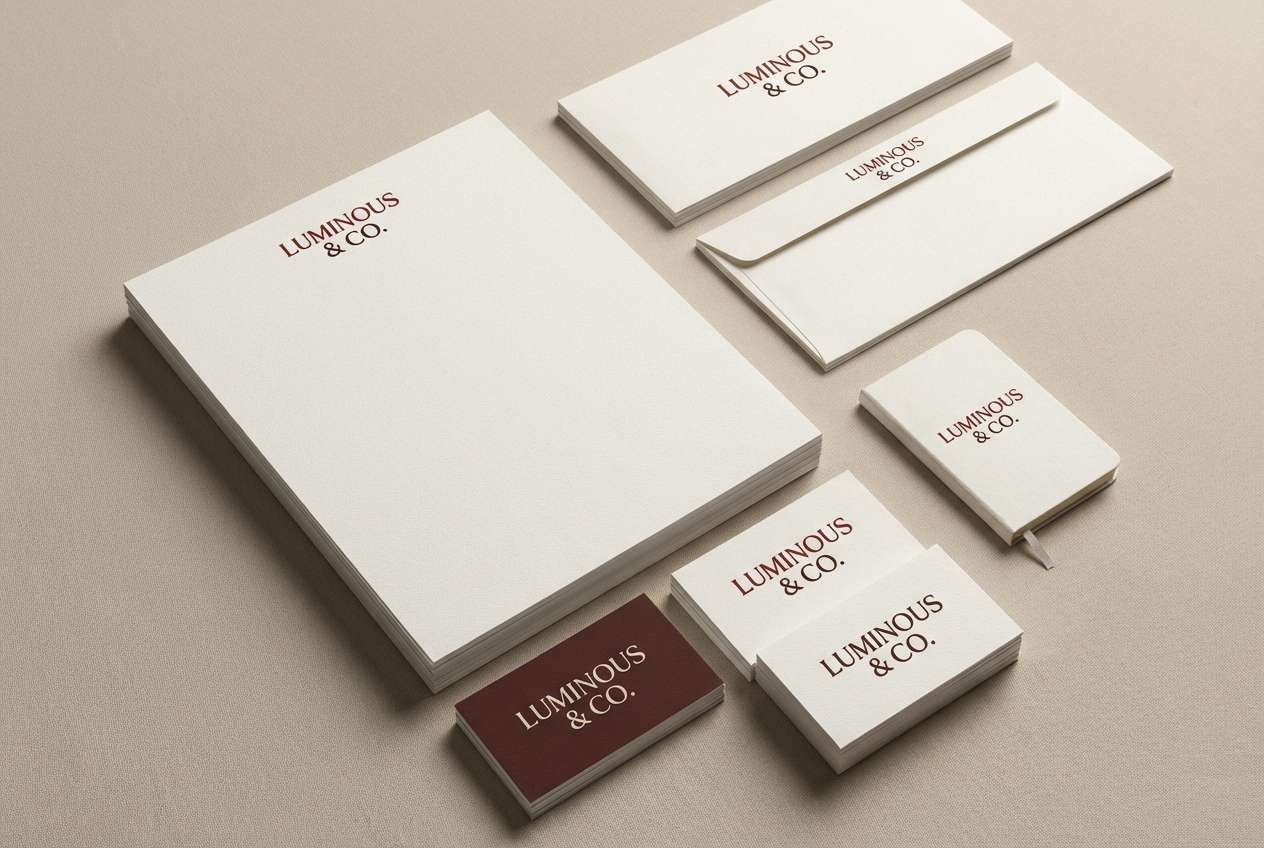
15) Mahogany Linen
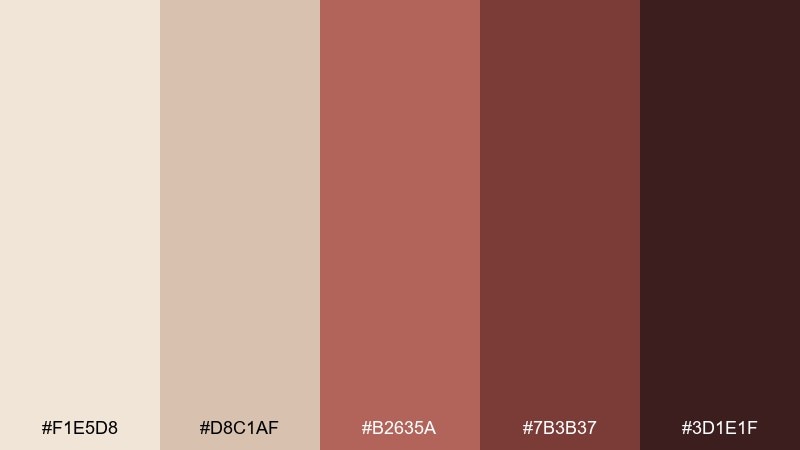
HEX: #F1E5D8 #D8C1AF #B2635A #7B3B37 #3D1E1F
Mood: heritage, warm, grounded
Best for: law firm branding and premium business cards
Heritage and grounded, these shades resemble linen paper, mahogany desks, and a deep red seal. They fit professional branding, premium business cards, and letterheads that should feel trustworthy and warm. Pair with classic serif typography and restrained spacing for a timeless look. Tip: print the darkest tone for text and use the mid red as a subtle rule line or crest fill.
Image example of mahogany linen generated using media.io
16) Mulled Rose
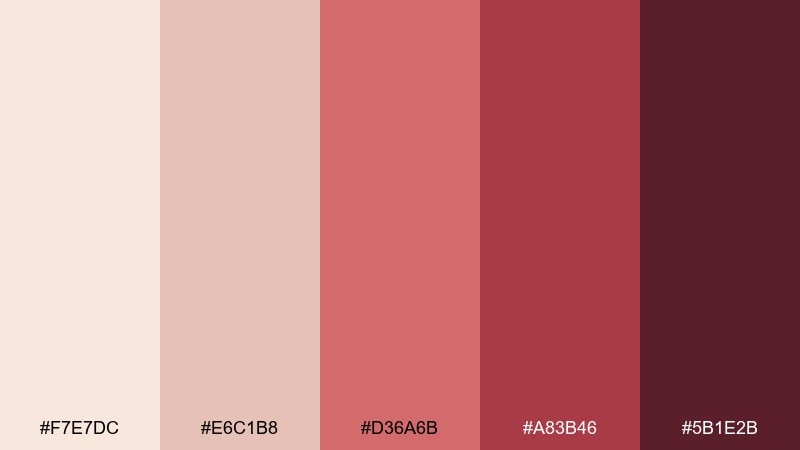
HEX: #F7E7DC #E6C1B8 #D36A6B #A83B46 #5B1E2B
Mood: cozy, festive, romantic
Best for: seasonal email templates and gift guides
Cozy and festive, it evokes mulled wine, rose jam, and soft knit scarves. These beige red color combinations are perfect for gift guides, seasonal email headers, and promotion tiles that need warmth without holiday green. Pair with cream backgrounds and simple iconography to keep the message crisp. Tip: use the mid rose tone for buttons and reserve the darkest shade for small headline emphasis.
Image example of mulled rose generated using media.io

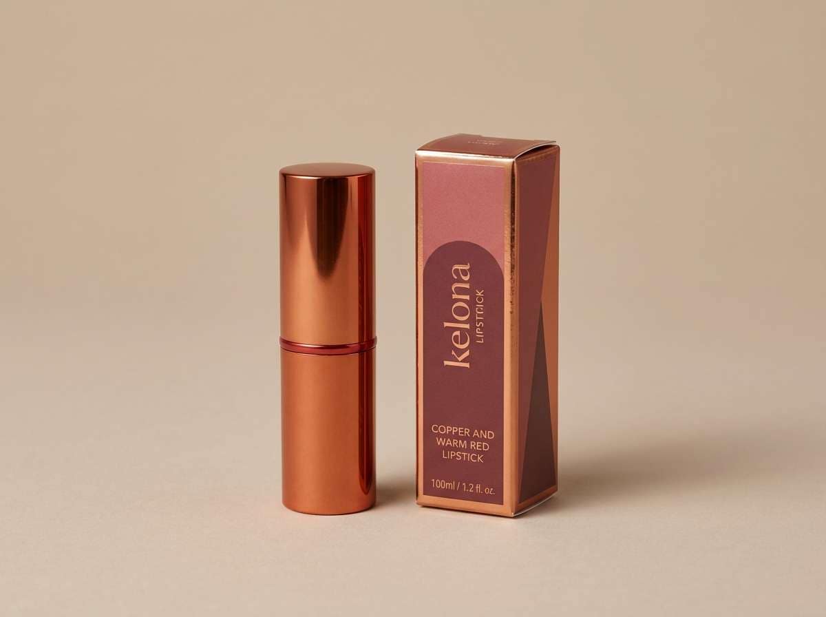
17) Copper Blush
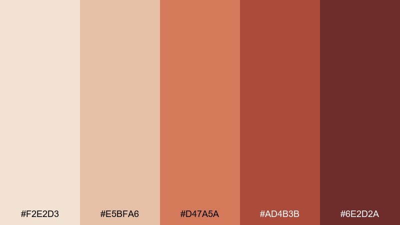
HEX: #F2E2D3 #E5BFA6 #D47A5A #AD4B3B #6E2D2A
Mood: warm, radiant, stylish
Best for: cosmetics ads and lipstick packaging
Radiant and stylish, it reads like copper shimmer over soft blush skin. It suits cosmetics ads, lipstick boxes, and beauty landing pages that want warmth with a modern edge. Pair with high-gloss highlights and minimal type to let the hues do the work. Tip: use the coppery midtone for the hero product area and keep deep red for small legal text only.
Image example of copper blush generated using media.io
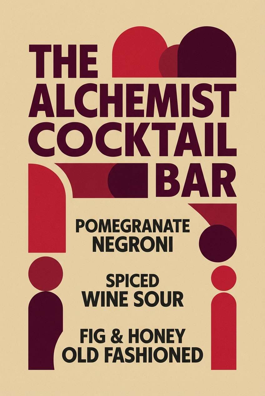
18) Rustic Pomegranate
HEX: #F0E0D2 #D9B3A5 #B85E5E #8C2C3A #4D1720
Mood: moody, rustic, romantic
Best for: restaurant menus and cocktail bar posters
Moody and rustic, it feels like pomegranate seeds, dark wood, and candlelit tables. It is a great fit for cocktail menus, restaurant posters, and tasting events that need richness without turning black. Pair it with textured backgrounds and restrained type to keep the reds sophisticated. Tip: highlight signature items with the mid pomegranate and keep the darkest shade for section dividers.
Image example of rustic pomegranate generated using media.io
19) Barely Blush Red
HEX: #FAEFE7 #F2D1C9 #E49A8F #C45A54 #7B2E2C
Mood: fresh, light, optimistic
Best for: baby shower invites and gentle announcements
Fresh and optimistic, it looks like a blush sunrise with a soft red underline. It works nicely for baby shower invites, birth announcements, and family event graphics that should feel warm and airy. Pair with delicate illustrations and simple frames to keep it sweet but not overly pastel. Tip: use the pale peach as the main background and keep the deeper red for dates and RSVP details.
Image example of barely blush red generated using media.io

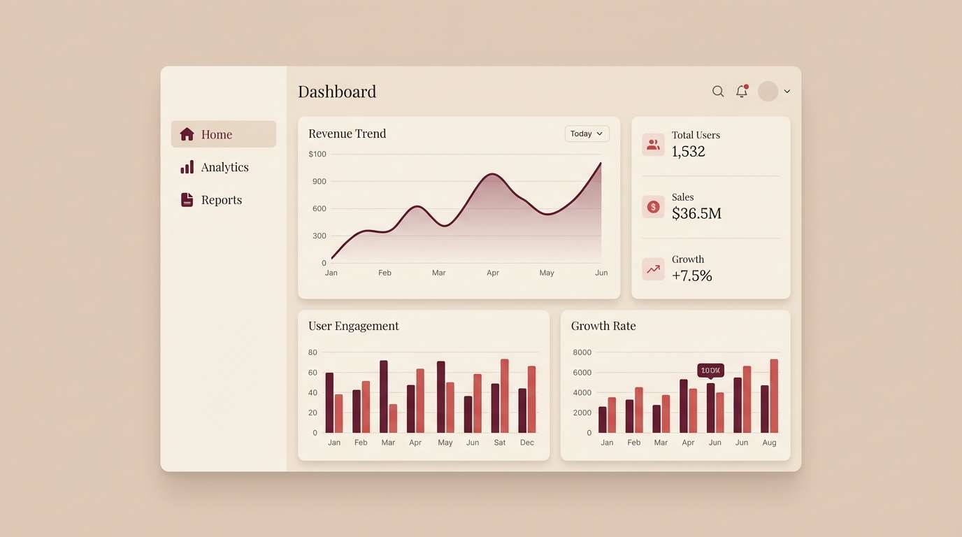
20) Elegant Merlot Beige
HEX: #F1E3D6 #D8B8A4 #B65A5A #7C2B3A #3A121C
Mood: luxurious, intimate, refined
Best for: high-end UI themes and membership dashboards
Luxurious and intimate, it evokes merlot velvet, beige stone, and a quiet after-hours mood. This beige red color palette works especially well for premium app themes, membership dashboards, and finance UI that needs warmth without looking playful. Pair with subtle dividers and generous spacing so the dark merlot does not dominate. Tip: use merlot for primary actions and keep backgrounds in the soft beige for accessibility.
Image example of elegant merlot beige generated using media.io
What Colors Go Well with Beige Red?
Beige red pairs easily with warm whites, cream, and soft taupe for a cohesive neutral base. These keep layouts airy and help red accents feel intentional rather than overwhelming.
For contrast, add deep browns (espresso), charcoal, or near-black for typography and UI structure. If you want a fresher twist, muted greens (sage/olive) and dusty blues can balance red’s warmth without clashing.
Metallic accents also work well: champagne gold for romance and premium packaging, or brushed copper for modern beauty and lifestyle branding.
How to Use a Beige Red Color Palette in Real Designs
Start with beige as the dominant background (especially in UI, landing pages, and invitations), then assign one mid-red as the main accent for buttons, highlights, or section headers. This preserves readability and keeps the palette feeling calm.
Use the darkest wine or maroon tones for text, dividers, and small UI labels rather than large fills. Deep reds can feel heavy at scale, but they’re excellent for hierarchy and “premium” detail work.
In print, consider texture and finish: uncoated paper, linen stock, embossing, or spot gloss on selected red elements can elevate the palette without adding new colors.
Create Beige Red Palette Visuals with AI
If you want to preview how a beige red color scheme looks in real designs, generate quick mockups with AI—social posts, packaging, invitations, dashboards, and more. This makes it easier to test contrast, mood, and readability before committing.
Use one palette at a time, then iterate by swapping only the accent red (CTA color) to find the most effective option for your brand or layout style.
Beige Red Color Palette FAQs
-
What does a beige red color palette communicate?
It typically signals warmth, approachability, and confidence. Beige softens the intensity of red, so the overall look feels inviting rather than aggressive. -
Is beige and red a good combo for branding?
Yes—especially for lifestyle, beauty, food, hospitality, and premium products. Use beige as the main base and reserve red for key brand accents (logos, CTAs, seals, or highlights). -
How do I keep beige red designs readable?
Use high-contrast text colors (deep maroon, espresso, or charcoal) on beige backgrounds. Avoid placing light beige text on mid-red blocks unless you verify contrast. -
What accent colors work well with beige red palettes?
Champagne gold, copper, warm white, taupe, espresso brown, and muted greens like sage/olive are safe pairings. Dusty blue can also add balance for modern layouts. -
Which beige red palette is best for UI and apps?
Try balanced sets like Sand Rouge or Elegant Merlot Beige. Keep backgrounds light and use the deeper reds sparingly for primary actions, hover states, and alerts. -
Which beige red palette works best for weddings or invitations?
Linen Rose and Barely Blush Red are strong choices for a soft, romantic feel. Use the deepest shade only for names, dates, or headings to keep the suite airy. -
Can I use beige red palettes for packaging without looking “too seasonal”?
Yes—choose muted terracotta, brick, or suede-like reds and avoid overly saturated crimson. Matte finishes, natural textures, and restrained type help the palette feel timeless.


