

A brown green blue color palette blends grounded warmth (brown), organic balance (green), and calm clarity (blue). It’s a nature-inspired mix that works across branding, UI, packaging, and interior decor.
Below are 20+ curated brown green blue combinations with HEX codes, plus practical ways to balance contrast and choose accents without muddying the design.
In this article
- Why Brown Green Blue Palettes Work So Well
-
- riverbank cabin
- coastal pine
- mossy denim
- alpine lakewood
- vintage field journal
- cedar spruce surf
- deep harbor grove
- desert oasis ink
- rainy trailhead
- teal fern leather
- botanical workbench
- midnight seagrass
- clay and kelp
- garden atlas
- bark and bay
- picnic blanket blues
- stormy evergreen
- copper coastline
- woodland minimal ui
- lakeside poster print
- herbarium packaging
- studio brand kit
- What Colors Go Well with Brown Green Blue?
- How to Use a Brown Green Blue Color Palette in Real Designs
- Create Brown Green Blue Palette Visuals with AI
Why Brown Green Blue Palettes Work So Well
Brown green blue palettes feel instantly believable because they mirror what we see outdoors: wood and earth tones, foliage, and water or sky. That built-in familiarity makes the combination easy to trust for brands and calming for interfaces.
They also offer a strong functional range: brown can anchor and add warmth, blue can carry structure and hierarchy, and green can signal status, categories, or “natural” cues. With a light neutral, the palette stays readable instead of heavy.
Most importantly, the mix gives you both contrast and cohesion. If you keep saturation controlled and assign clear roles (background, text, accent), you get a premium, balanced look rather than a busy, outdoorsy cliché.
20+ Brown Green Blue Color Palette Ideas (with HEX Codes)
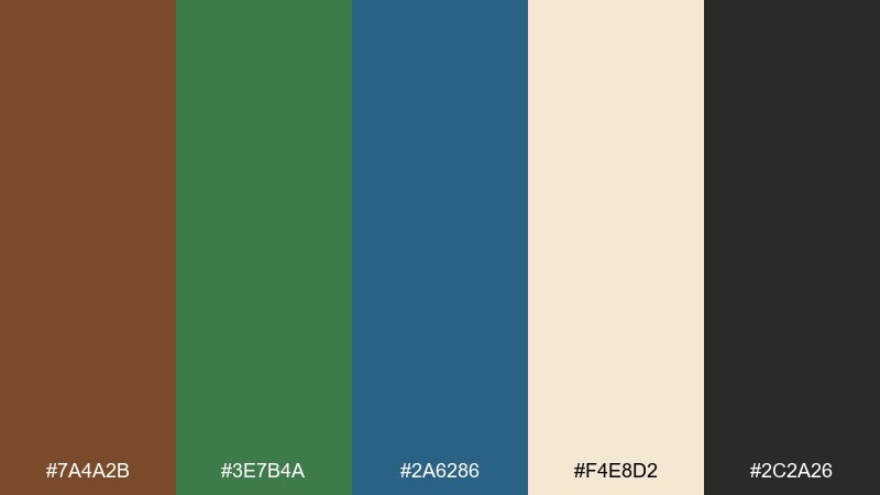
1) Riverbank Cabin
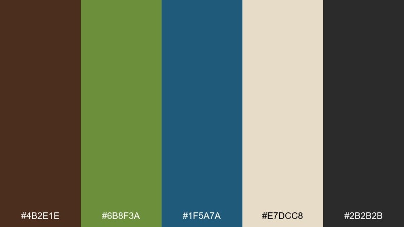
HEX: #4b2e1e #6b8f3a #1f5a7a #e7dcc8 #2b2b2b
Mood: rustic, grounded, cozy
Best for: cabin interior decor mood board
Rustic and grounded, it feels like a riverside cabin at dusk with pine shadows and a calm blue current. Use the deep brown on wood accents, let the green sit on textiles, and keep the blue for a single focal wall or artwork. Creamy off-white prevents the mix from getting too heavy and makes the palette look intentional. Tip: repeat the blue twice in small decor pieces to create rhythm without overpowering the room.
Image example of riverbank cabin generated using media.io
Media.io is an online AI studio for creating and editing video, image, and audio in your browser.

2) Coastal Pine
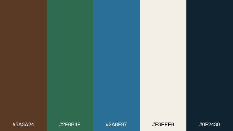
HEX: #5a3a24 #2f6b4f #2a6f97 #f3efe6 #0f2430
Mood: fresh, outdoorsy, modern
Best for: travel brand landing page UI mockup
Fresh and outdoorsy, it brings to mind coastal pines against a clear blue horizon. The navy-leaning dark shade is perfect for headers and navigation, while the pale off-white keeps sections breathable. Use the green for buttons and icons, and reserve the brighter blue for highlights like links or active states. Tip: keep text mostly in the deep inky tone for contrast, and let color do the wayfinding.
Image example of coastal pine generated using media.io
3) Mossy Denim
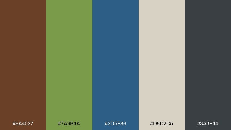
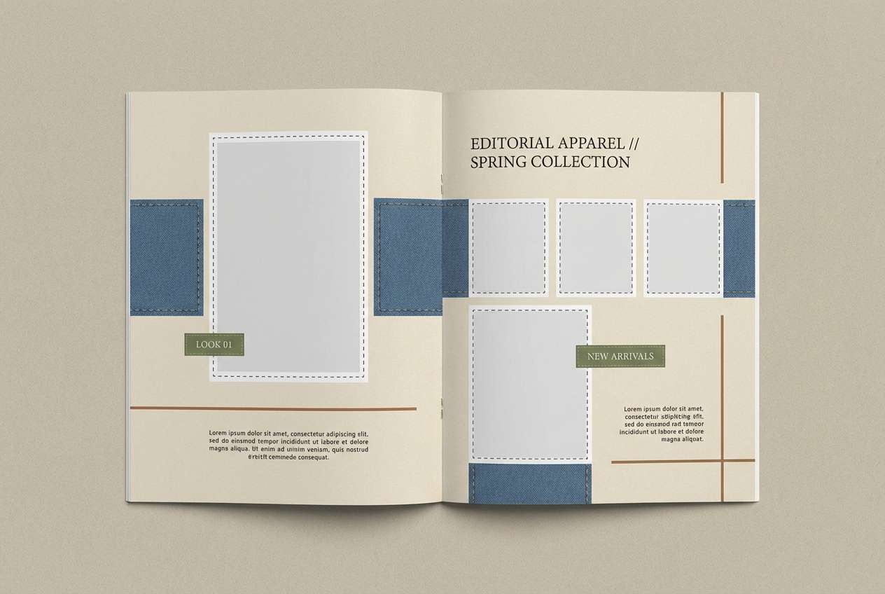
HEX: #6a4027 #7a9b4a #2d5f86 #d8d2c5 #3a3f44
Mood: casual, earthy, relaxed
Best for: apparel lookbook layout
Casual and earthy, it reads like worn denim, sun-dried canvas, and a hint of garden moss. The muted blue makes a strong base for backgrounds or photo frames without stealing attention from product images. Bring in the green for small editorial marks such as section labels, icons, or price tags. Tip: keep the brown as a trim color on rules and captions to give the pages a crafted, premium feel.
Image example of mossy denim generated using media.io
4) Alpine Lakewood
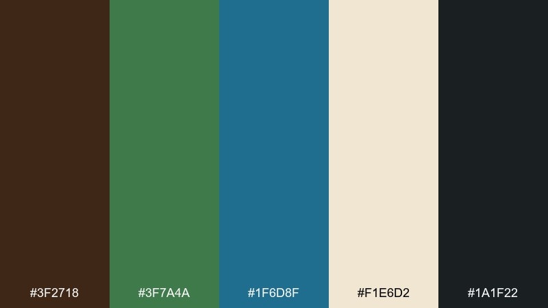
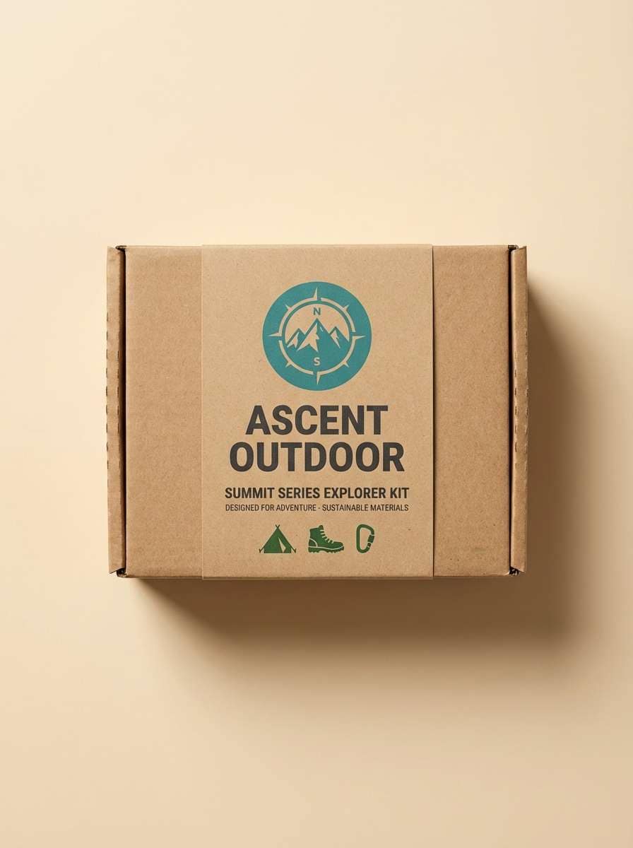
HEX: #3f2718 #3f7a4a #1f6d8f #f1e6d2 #1a1f22
Mood: adventurous, crisp, natural
Best for: outdoor gear packaging design
Crisp and adventurous, it evokes alpine trails, lake water, and well-worn leather. This brown green blue color palette works especially well for rugged packaging where you want nature cues without looking overly rustic. Use the dark near-black for product names, place the teal-blue on badges, and let the green carry secondary info like features or sizes. Tip: print the brown as a matte texture to add a tactile, premium finish.
Image example of alpine lakewood generated using media.io
5) Vintage Field Journal
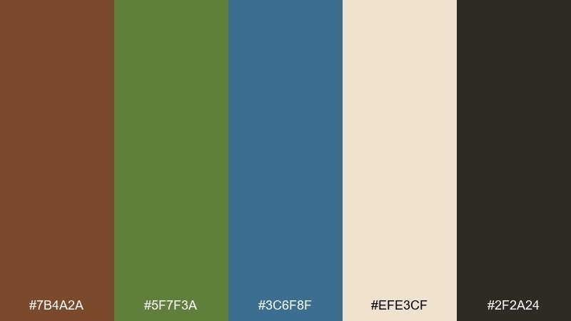
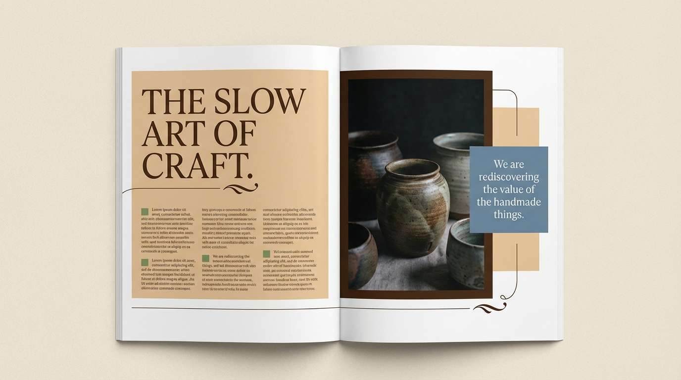
HEX: #7b4a2a #5f7f3a #3c6f8f #efe3cf #2f2a24
Mood: nostalgic, scholarly, calm
Best for: magazine feature layout
Nostalgic and calm, it feels like a well-used journal filled with pressed leaves and ink sketches. The warm paper tone is a natural background for long reads, while the darker brown keeps headlines grounded. Add the blue to pull quotes or infographics, and use the green sparingly for section navigation. Tip: keep imagery slightly desaturated so the palette stays cohesive and editorial.
Image example of vintage field journal generated using media.io
6) Cedar Spruce Surf
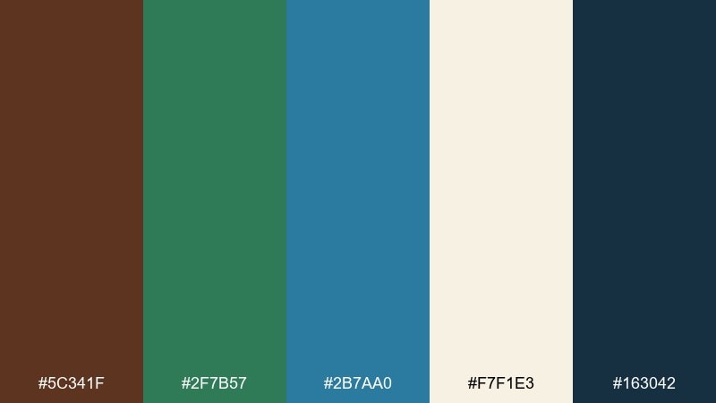
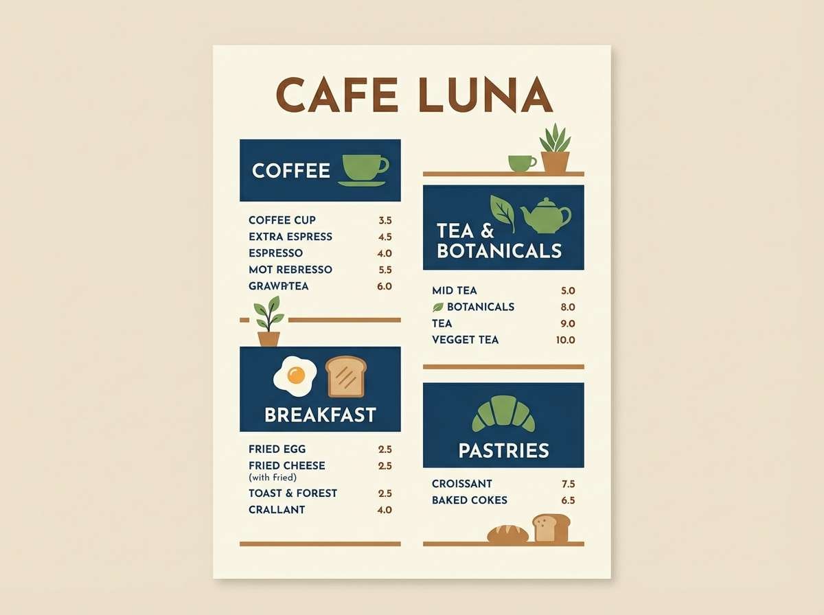
HEX: #5c341f #2f7b57 #2b7aa0 #f7f1e3 #163042
Mood: lively, welcoming, clean
Best for: cafe menu design
Lively and welcoming, it suggests cedar counters, fresh herbs, and a splash of sparkling water. Use the deep blue for menu section headers to keep scanning easy, then bring in green for dietary icons or featured items. The warm brown supports food photography and makes the design feel handcrafted rather than sterile. Tip: set the background to the soft cream and avoid pure white for a more appetizing look.
Image example of cedar spruce surf generated using media.io
7) Deep Harbor Grove
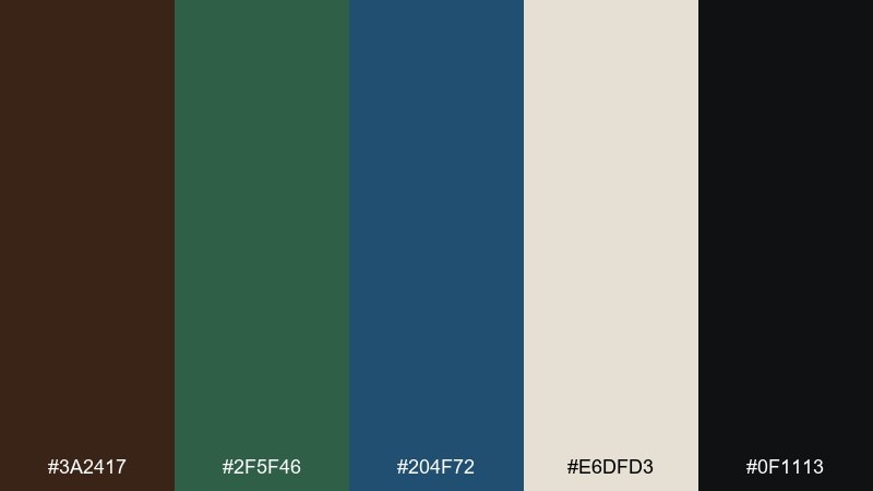
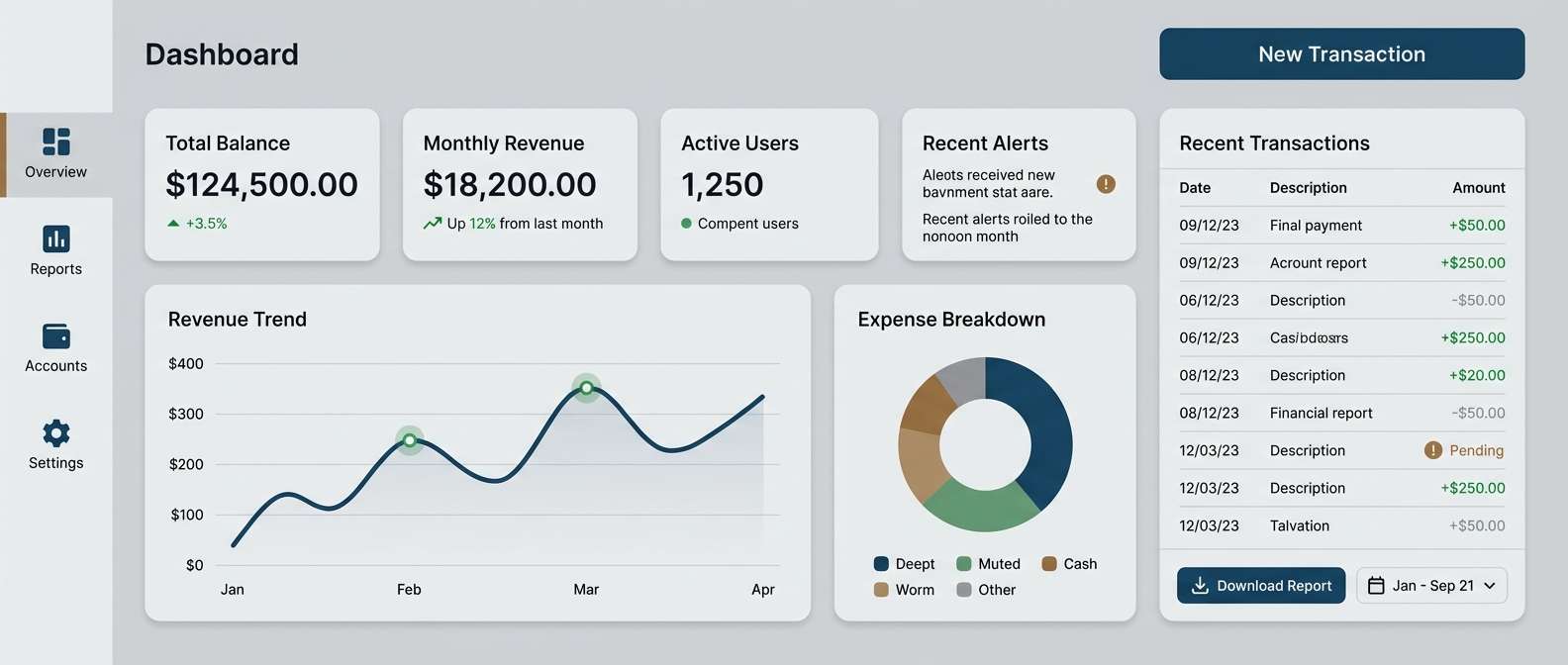
HEX: #3a2417 #2f5f46 #204f72 #e6dfd3 #0f1113
Mood: serious, steady, trustworthy
Best for: fintech dashboard UI
Serious and steady, it feels like a deep harbor framed by evergreen cliffs. The dark tones make charts and data blocks look anchored, while the light neutral keeps the interface from turning gloomy. Use blue for primary actions and selected states, then keep green for positive indicators and secondary controls. Tip: reserve the near-black for typography and dividers to maintain readability at smaller sizes.
Image example of deep harbor grove generated using media.io
8) Desert Oasis Ink
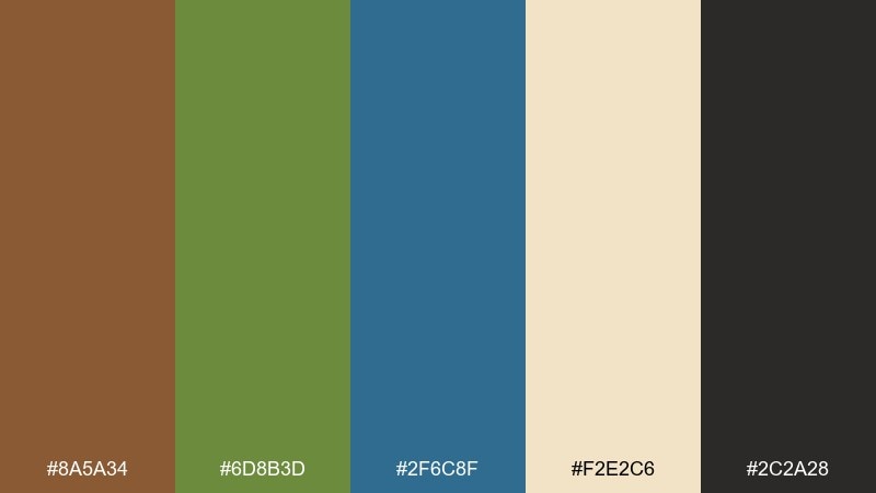
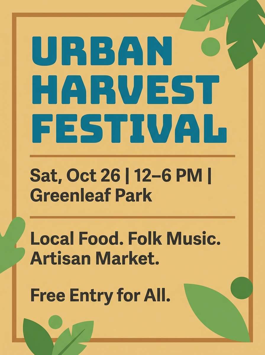
HEX: #8a5a34 #6d8b3d #2f6c8f #f2e2c6 #2c2a28
Mood: sun-warmed, artistic, bold
Best for: event flyer poster
Sun-warmed and artistic, it recalls a desert oasis where teal water cuts through sandy trails. The tan-cream base gives you an easy poster background that still feels textured and warm. Use the blue for the event title to grab attention, with green for supporting details like date and venue. Tip: add a subtle grain effect to unify the colors and keep the design from looking too flat.
Image example of desert oasis ink generated using media.io
9) Rainy Trailhead
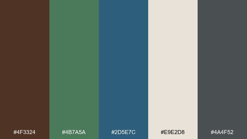
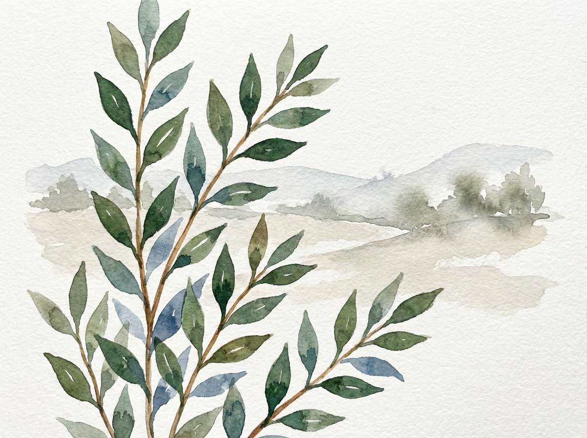
HEX: #4f3324 #4b7a5a #2d5e7c #e9e2d8 #4a4f52
Mood: misty, peaceful, reflective
Best for: watercolor botanical illustration
Misty and peaceful, it looks like a rainy trailhead where wet bark and foliage soften into blue-gray distance. The cooler blue is ideal for shadows and depth, while green carries the leaf shapes without turning neon. Keep the light neutral as paper tone, and use brown for stems or textured washes. Tip: limit yourself to two pigment strengths per color so the illustration stays airy and cohesive.
Image example of rainy trailhead generated using media.io
10) Teal Fern Leather
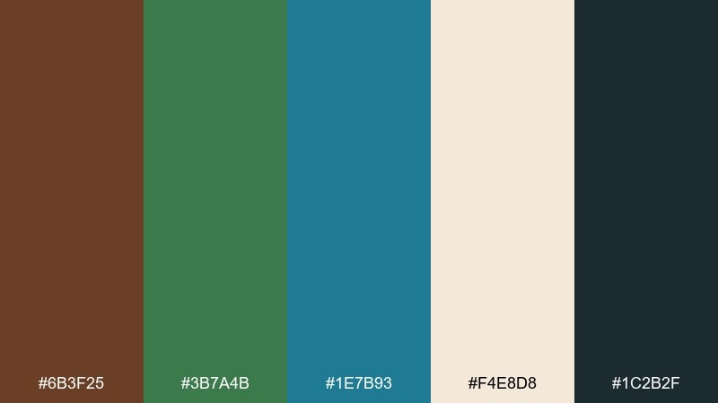
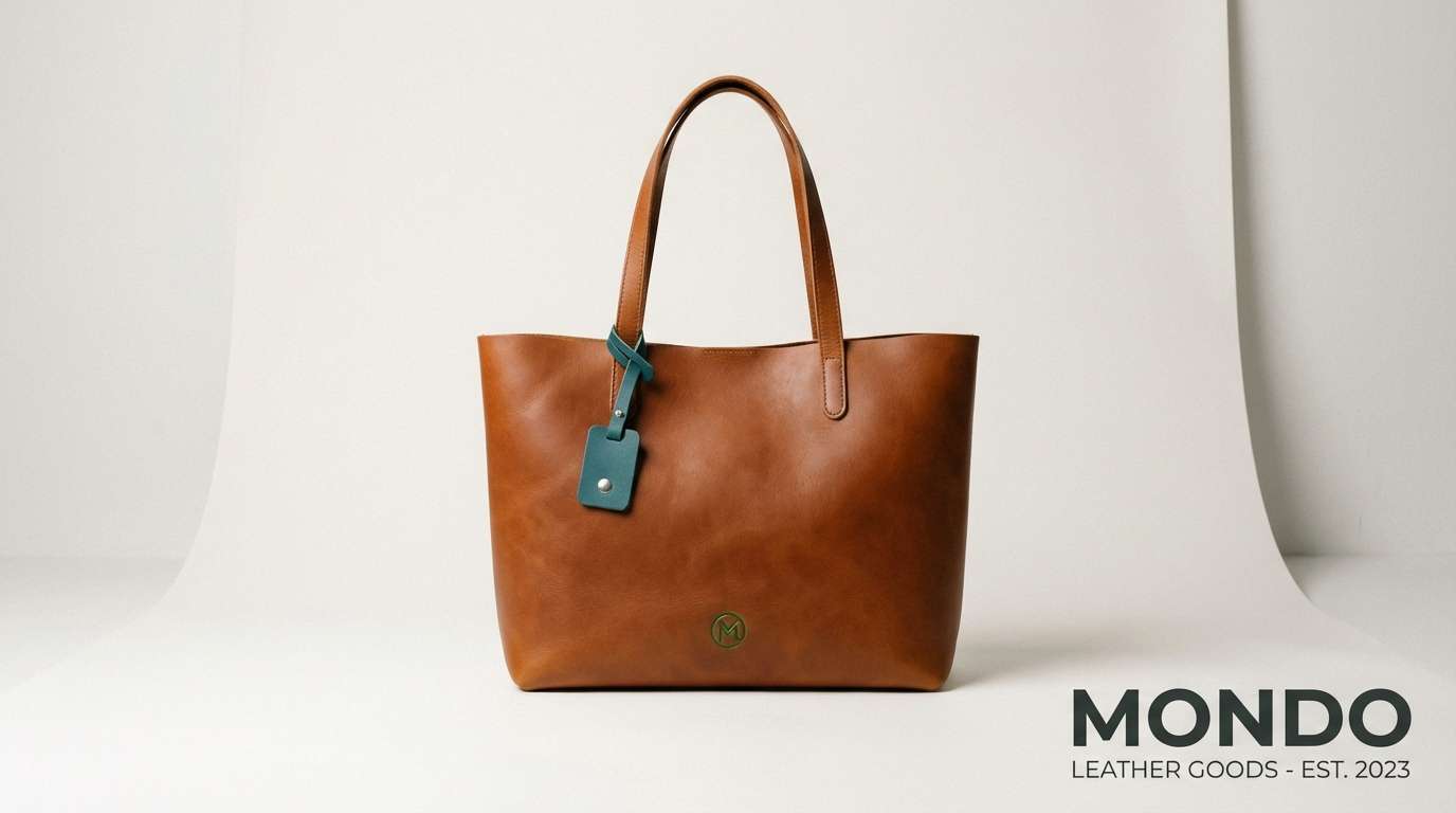
HEX: #6b3f25 #3b7a4b #1e7b93 #f4e8d8 #1c2b2f
Mood: premium, confident, outdoorsy
Best for: leather bag product ad
Premium and confident, it suggests leather craftsmanship with a cool teal edge. The rich brown reads as material-first, while teal and green add a contemporary outdoor vibe. Use the off-white for negative space and product specs so the ad stays clean and upscale. Tip: keep the background neutral and let one bold teal element carry the call to action.
Image example of teal fern leather generated using media.io
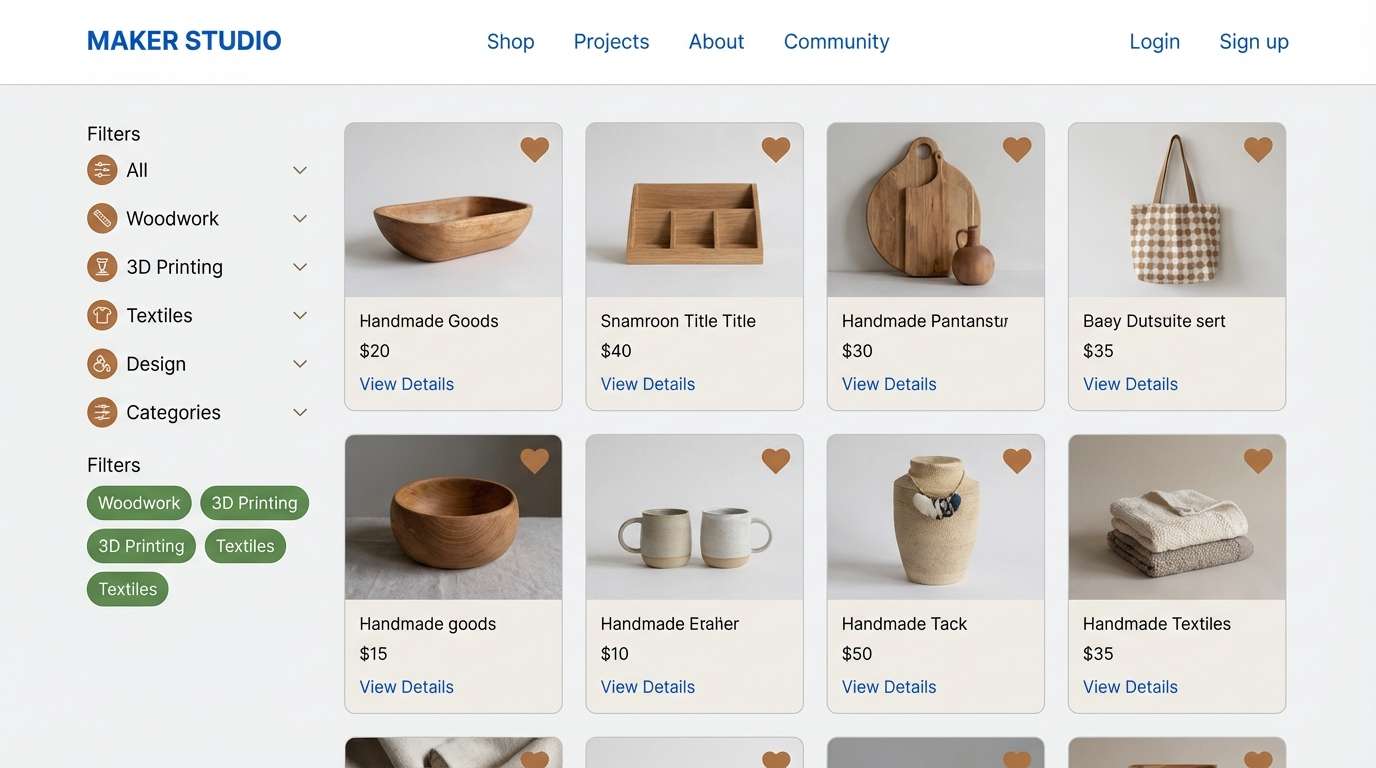
11) Botanical Workbench
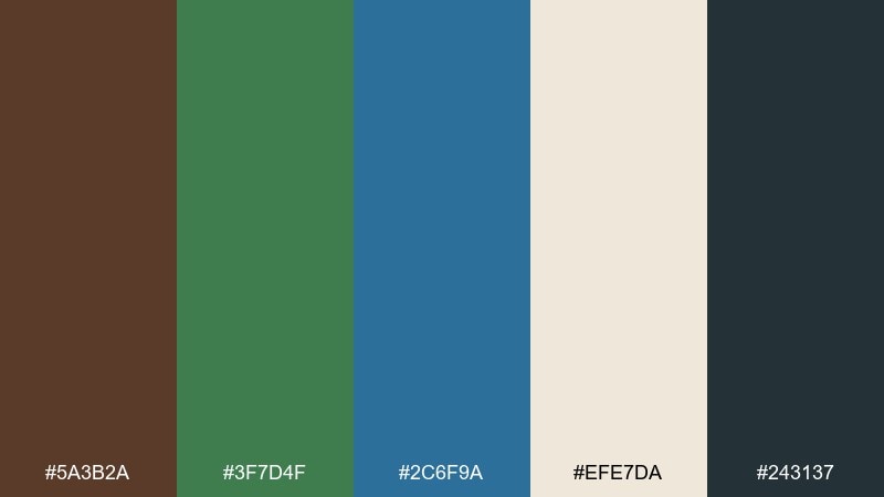
HEX: #5a3b2a #3f7d4f #2c6f9a #efe7da #243137
Mood: practical, calm, craft-forward
Best for: maker studio website UI
Practical and calm, it feels like a tidy workbench surrounded by plant cuttings and labeled jars. This brown green blue color scheme is a strong fit for maker brands because it balances warmth with clarity. Use blue for links and interactive states, keep green for category filters, and let brown show up in icons or illustrations. Tip: set large content panels on the soft neutral to keep product photos true to color.
Image example of botanical workbench generated using media.io
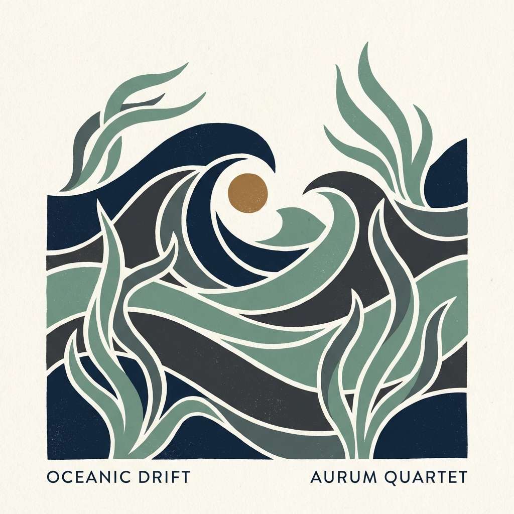
12) Midnight Seagrass
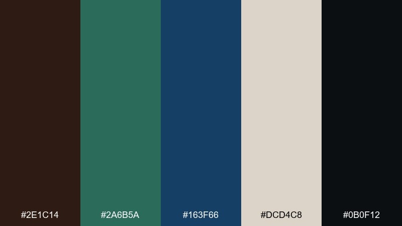
HEX: #2e1c14 #2a6b5a #163f66 #dcd4c8 #0b0f12
Mood: moody, elegant, cinematic
Best for: album cover design
Moody and cinematic, it brings midnight water, seagrass silhouettes, and a hint of smoked wood. The deep blue and near-black create instant drama for typography, while the muted green adds organic movement. Use the light neutral sparingly for track text or a single emblem so the cover stays dark and immersive. Tip: add a soft vignette and keep contrast controlled to avoid harsh edges.
Image example of midnight seagrass generated using media.io
13) Clay and Kelp
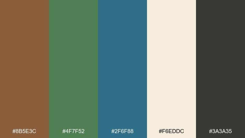
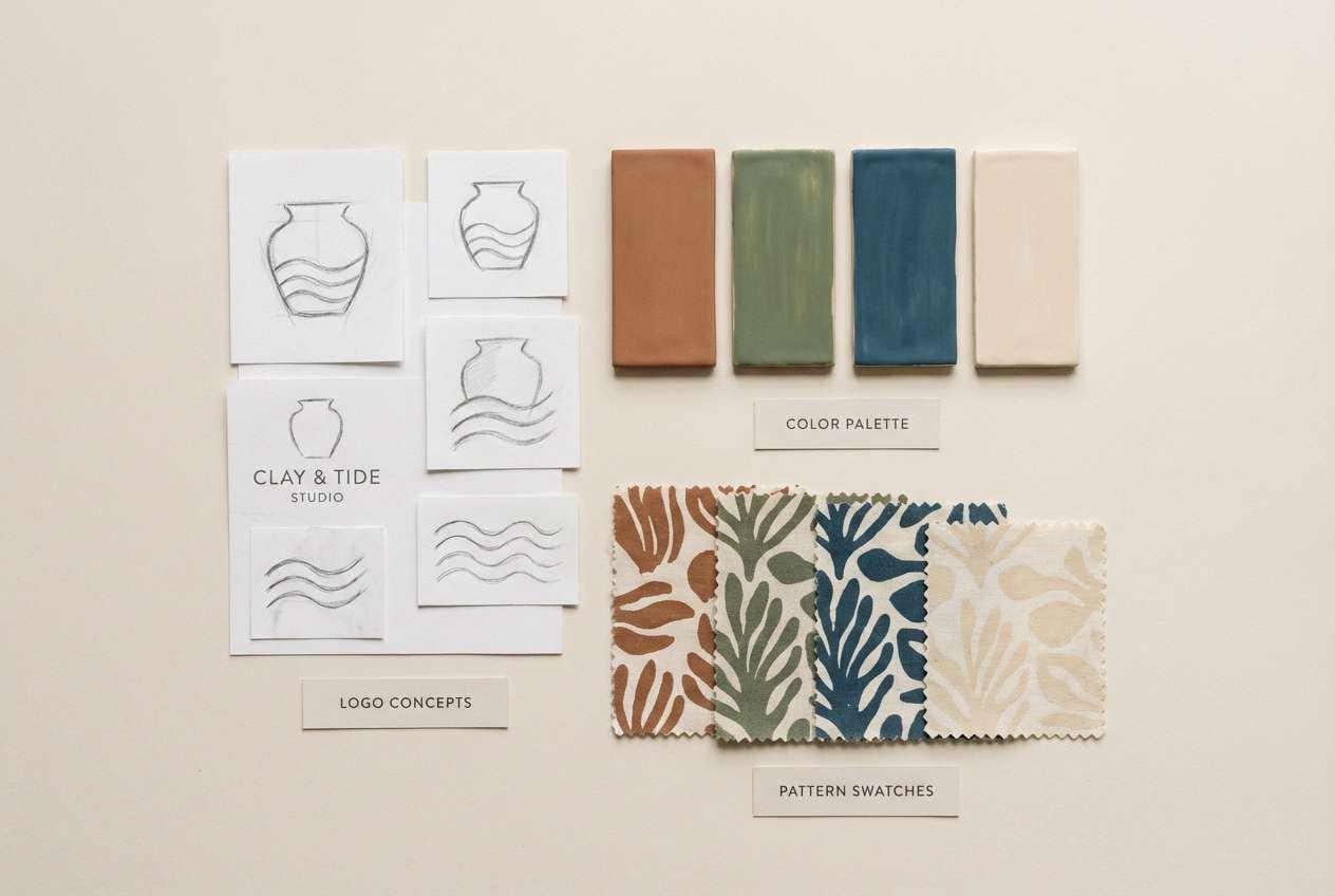
HEX: #8b5e3c #4f7f52 #2f6f88 #f6eddc #3a3a35
Mood: earthy, artisanal, balanced
Best for: ceramic studio brand identity
Earthy and artisanal, it resembles hand-thrown clay beside kelp and tidepool blues. The warm brown is ideal for logo marks and stamp-style textures, while the blue keeps the identity feeling fresh and coastal. Use green as an accent on patterns, hang tags, or social templates to add life without shouting. Tip: try uncoated paper stock so the palette looks soft and tactile rather than glossy.
Image example of clay and kelp generated using media.io
14) Garden Atlas
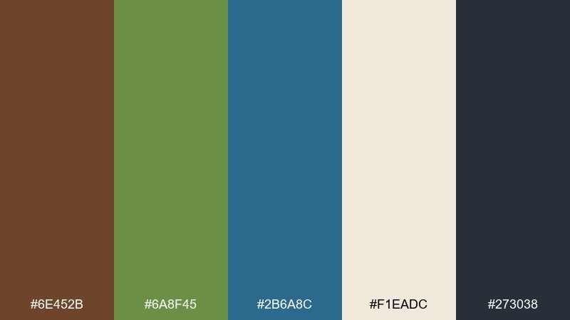
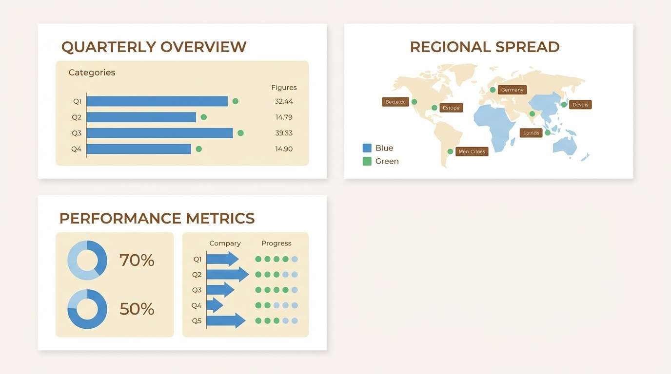
HEX: #6e452b #6a8f45 #2b6a8c #f1eadc #273038
Mood: curated, informative, natural
Best for: infographic slide deck
Curated and informative, it feels like a garden atlas with neat labels and watercolor maps. The mid blue is excellent for charts and callouts, while the green communicates categories naturally. Use brown for titles or keylines to keep everything anchored and readable against the light background. Tip: keep icons simple and consistent so the palette does the storytelling.
Image example of garden atlas generated using media.io
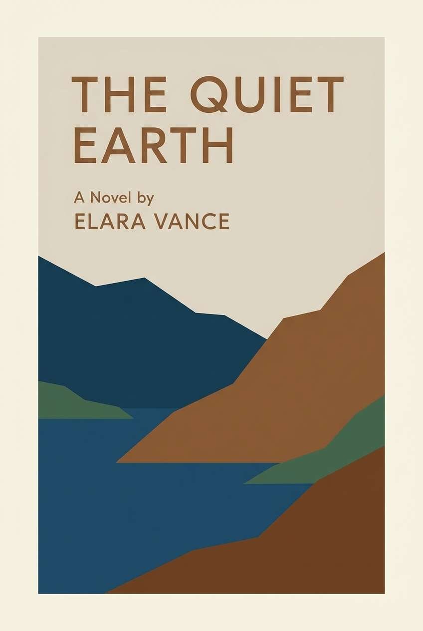
15) Bark and Bay
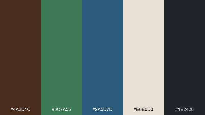
HEX: #4a2d1c #3c7a55 #2a5d7d #e8e0d3 #1e2428
Mood: steady, classic, outdoorsy
Best for: book cover design
Steady and classic, it suggests bark textures meeting a sheltered bay. The darker shades support bold title type and strong contrast, while the light neutral keeps the cover from feeling too heavy. Use green for a small motif or author name highlight, and keep blue for the main visual block or illustration wash. Tip: choose a slightly condensed typeface so the design feels timeless, not trendy.
Image example of bark and bay generated using media.io
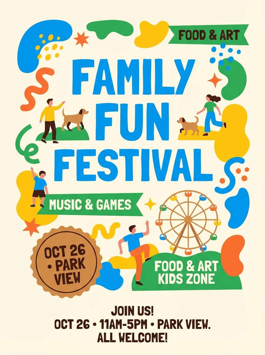
16) Picnic Blanket Blues
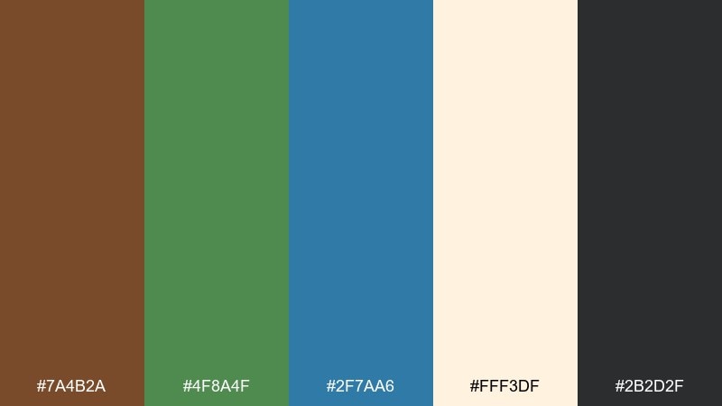
HEX: #7a4b2a #4f8a4f #2f7aa6 #fff3df #2b2d2f
Mood: cheerful, friendly, bright
Best for: family festival poster
Cheerful and friendly, it feels like a picnic blanket under blue sky with fresh greens nearby. The brighter blue can carry the headline, while the green supports subheads and wayfinding elements like arrows or maps. Use brown as a grounding accent for borders, badges, or sponsor lines so the layout does not float. Tip: keep plenty of cream space to maintain that sunny, open-air vibe.
Image example of picnic blanket blues generated using media.io
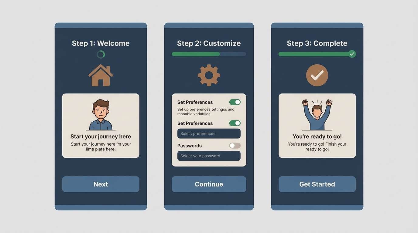
17) Stormy Evergreen
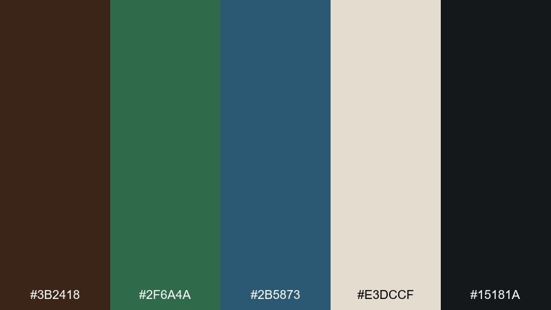
HEX: #3b2418 #2f6a4a #2b5873 #e3dccf #15181a
Mood: dramatic, refined, grounded
Best for: SaaS onboarding screens
Dramatic and refined, it resembles storm clouds rolling over evergreen ridges. The blue-gray tone is excellent for large panels and illustrations, while the green can guide progress states without feeling overly bright. Warm brown adds a subtle human touch for icons or micro-accents, balancing the cooler tones. Tip: keep gradients minimal and lean on solid fills for a more premium, stable product feel.
Image example of stormy evergreen generated using media.io
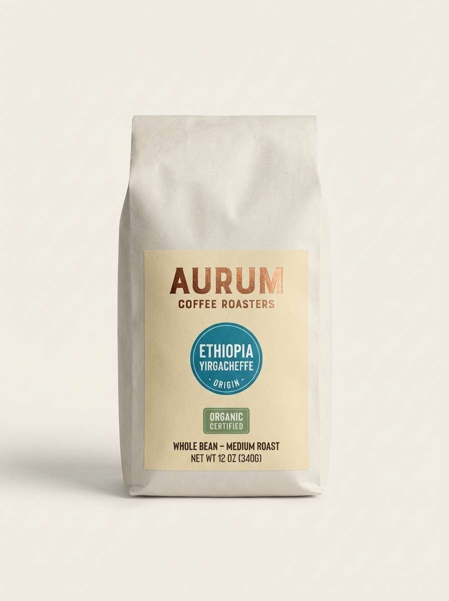
18) Copper Coastline
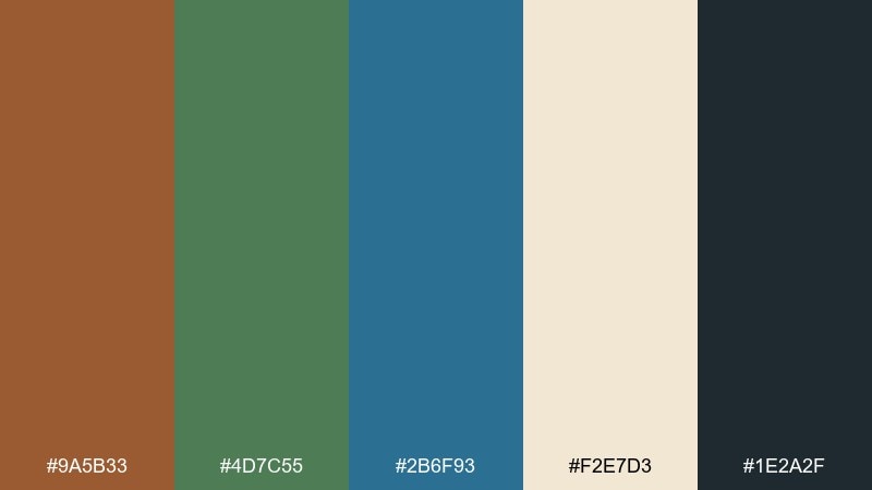
HEX: #9a5b33 #4d7c55 #2b6f93 #f2e7d3 #1e2a2f
Mood: warm, polished, coastal
Best for: coffee packaging and label
Warm and polished, it calls up copper highlights on a coastal boardwalk with sea air in the background. These brown green blue color combinations are ideal for coffee labels that want to feel both artisanal and modern. Put the warm brown on the logo and roast notes, use blue for origin or tasting badges, and let green mark sustainability or certifications. Tip: test the blue at small sizes on print so it stays legible against the cream stock.
Image example of copper coastline generated using media.io
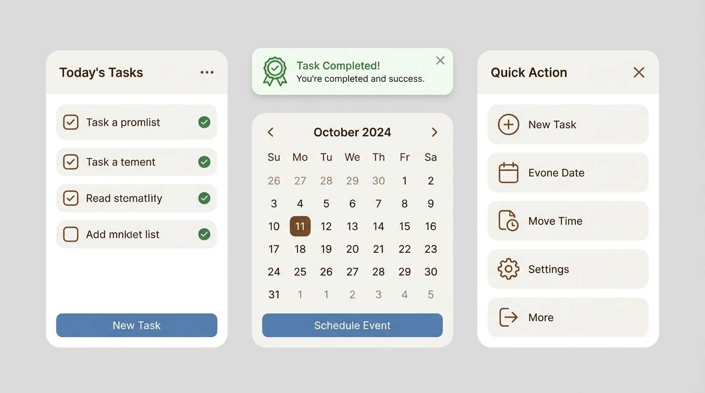
19) Woodland Minimal UI
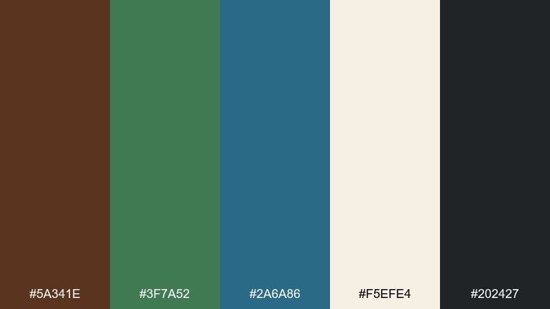
HEX: #5a341e #3f7a52 #2a6a86 #f5efe4 #202427
Mood: minimal, calm, nature-led
Best for: productivity app UI kit
Minimal and calm, it feels like a quiet woodland with just enough color to guide the eye. Use the soft neutral for the canvas, then choose blue for primary actions and active tabs. Green can indicate completed tasks or status success, while brown works well for subtle dividers and icon strokes. Tip: keep saturation consistent across components so the UI looks cohesive in both light and dark rooms.
Image example of woodland minimal ui generated using media.io
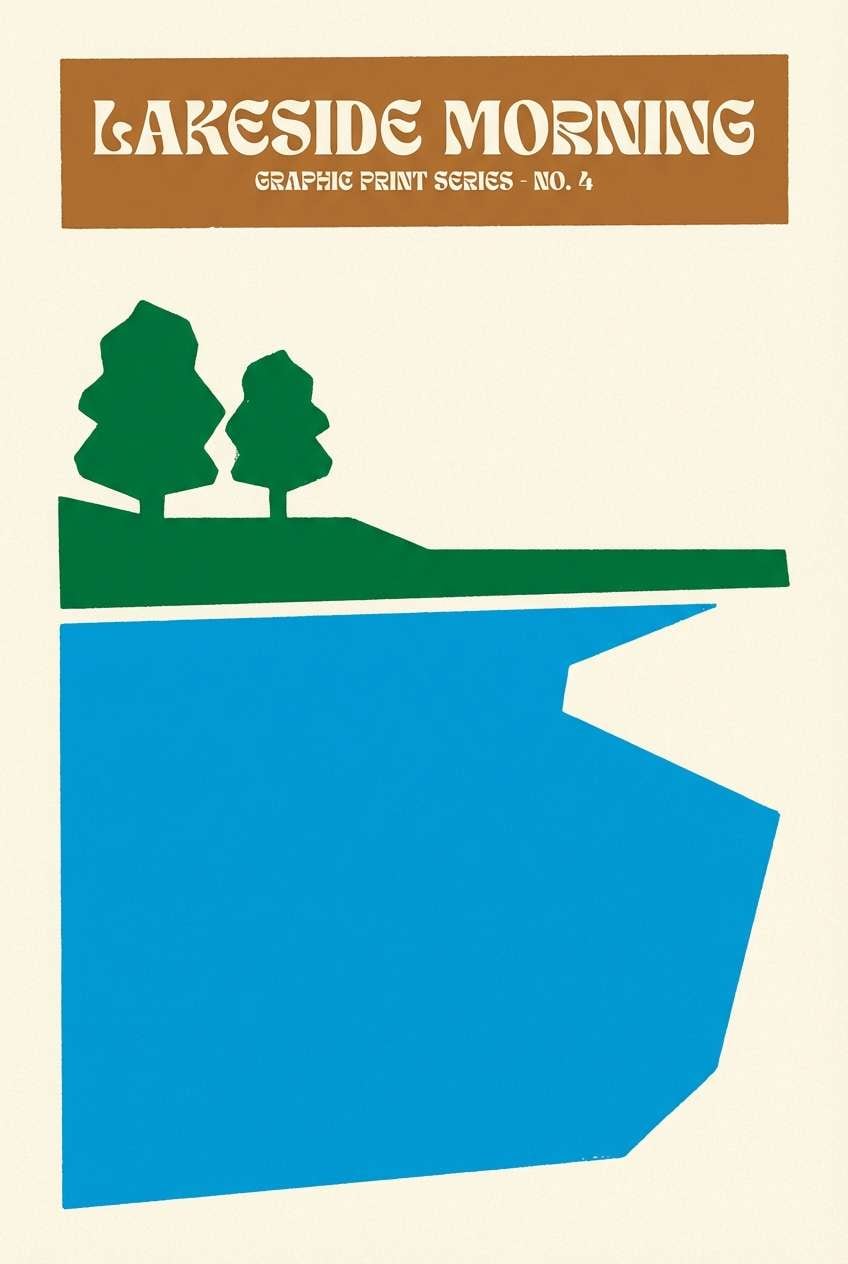
20) Lakeside Poster Print
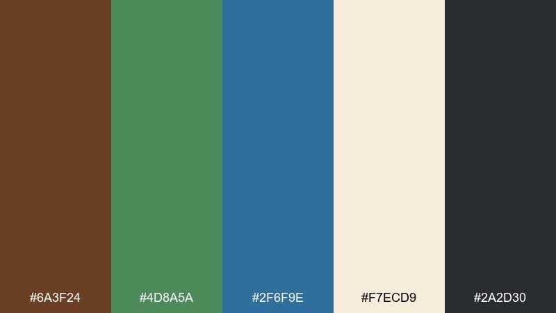
HEX: #6a3f24 #4d8a5a #2f6f9e #f7ecd9 #2a2d30
Mood: fresh, graphic, upbeat
Best for: art print poster design
Fresh and graphic, it looks like a sunny lakeside scene reduced to clean shapes and bold blocks. The bright blue makes a strong focal area, while green supports secondary shapes like trees or hills. Use brown for outlines or a small title line to keep the print grounded and finished. Tip: limit yourself to three large color areas and let the cream background do the breathing room.
Image example of lakeside poster print generated using media.io
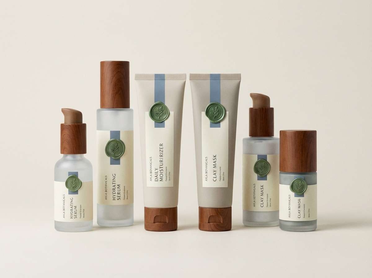
21) Herbarium Packaging
HEX: #7a4a2b #3e7b4a #2a6286 #f4e8d2 #2c2a26
Mood: clean, botanical, trustworthy
Best for: skincare packaging set
Clean and botanical, it feels like an herbarium drawer with labels, dried leaves, and inky notes. The soft cream keeps the set looking gentle and skin-friendly, while the deeper shades add credibility and contrast. Use blue for product type differentiation, and keep green for ingredient callouts or seal marks. Tip: keep the brown to small areas like caps or brand stamps to avoid a heavy look.
Image example of herbarium packaging generated using media.io
22) Studio Brand Kit
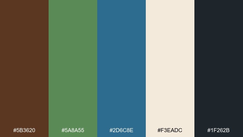
HEX: #5b3620 #5a8a55 #2d6c8e #f3eadc #1f262b
Mood: confident, modern, versatile
Best for: brand guidelines presentation
Confident and modern, it reads like a studio desk where warm materials meet clear, cool structure. A brown green blue color combination like this is versatile for brands that want both approachability and professionalism. Use the deep slate for typography, keep the cream as your default background, and reserve blue and green for systems such as charts, links, and callouts. Tip: document color roles clearly in the guide so teams stay consistent across web and print.
Image example of studio brand kit generated using media.io
What Colors Go Well with Brown Green Blue?
Light neutrals are the easiest partners for brown green blue—think warm cream, sand, or soft gray—because they keep the palette breathable and maintain text readability. They also help separate the earthy tones from the cooler blues so nothing feels muddy.
For extra pop, try controlled warm accents like copper, terracotta, or muted mustard. If you want a cleaner, more modern direction, add crisp off-white plus a near-black (charcoal) for type and dividers.
When you need a soft highlight, dusty pink or muted coral can work surprisingly well against teal/forest tones, as long as it stays desaturated and is used sparingly.
How to Use a Brown Green Blue Color Palette in Real Designs
Assign roles before you design: use a light neutral as the main background, a deep charcoal/ink tone for text, and choose either blue or green as your primary action color. Keep brown as a supporting “material” accent (borders, icons, labels, textures) so it doesn’t overwhelm layouts.
Balance temperature by pairing warm brown with cooler blue in the same visual area, then use green to bridge them. In UI, reserve green for success states and filters, and use blue for links, focus, and selected states to maintain predictable behavior.
For print and branding, avoid pushing all three colors to maximum saturation. Slightly muting the green and blue often makes brown look richer and more premium.
Create Brown Green Blue Palette Visuals with AI
If you’re pitching a concept or building a mood board, AI visuals help you test how your brown green blue tones behave in real scenes—packaging, interiors, posters, and UI frames—before committing to production.
Start with a simple prompt describing the design format (poster, website, label), then specify the mood (rustic, modern, cinematic) and your key colors as materials or accents. Iterate by changing only one variable at a time (lighting, texture, or composition) to stay consistent.
Use Media.io to generate fast, on-theme examples you can share with clients or teammates.
Brown Green Blue Color Palette FAQs
-
What does a brown green blue color palette communicate?
It typically communicates nature, stability, and trust. Brown adds warmth and craftsmanship, green signals growth and balance, and blue brings calm structure—making the mix useful for both branding and functional UI. -
How do I keep brown green blue from looking muddy?
Use a light neutral background, limit how many mid-tones appear in the same area, and keep saturation consistent (usually slightly muted). Also separate warm (brown) and cool (blue/green) with whitespace or a charcoal text color. -
Which color should be the primary accent in UI: blue or green?
In most interfaces, blue works best for primary actions, links, and focus states because users expect it. Use green for positive status (success), filters, or secondary actions so the system feels clear and predictable. -
What’s a good background color for a brown green blue palette?
Warm creams and soft off-whites are ideal because they keep the palette inviting and reduce harsh contrast. For dark themes, use a near-black/ink tone and bring in blue/green as controlled highlights. -
What colors pair well as accents with brown green blue?
Muted copper, terracotta, or mustard can add warmth and energy without clashing. If you want a modern feel, stick to neutrals (cream, stone, charcoal) and let blue/green handle interaction or emphasis. -
Is this palette good for print packaging?
Yes—especially for coffee, skincare, outdoor goods, and artisanal products. Test the blues at small sizes and consider uncoated stock if you want the browns and greens to feel softer and more tactile. -
How can I visualize these palettes quickly before designing?
Generate mockups with AI: describe the layout (label, poster, UI), the mood, and where each color appears (background, typography, badges, icons). This helps you validate contrast and balance in realistic scenarios.


