

Brick red is a warm, earthy red that feels grounded and modern at the same time. It’s a go-to for brands and designs that want warmth without the intensity of pure scarlet.
Below are 20 ready-to-use brick red color combinations (with HEX codes), plus practical pairing tips for UI, print, packaging, and interiors.
In this article
- Why Brick Red Color Combinations Work So Well
-
- clay hearth
- desert terracotta
- rustic winery
- vintage brickwork
- cozy library
- autumn market
- minimal studio
- mediterranean tile
- copper and cream
- nordic cabin
- modern bistro
- botanical clay
- sunset masonry
- urban loft
- heritage label
- soft blush brick
- stormy brick
- playful retro pop
- earthy monochrome
- festive spice
- What Colors Go Well with Brick Red?
- How to Use a Brick Red Color Palette in Real Designs
- Create Brick Red Palette Visuals with AI
Why Brick Red Color Combinations Work So Well
Brick red sits between red and brown, which makes it feel warm, natural, and dependable. It has the emotional pull of red, but with a calmer, more “lived-in” character.
Because it’s slightly muted, brick red plays nicely with neutrals (cream, taupe, charcoal) and also handles contrast with cool tones (slate, teal, navy). That flexibility makes it easy to use across branding, UI systems, packaging, and interior accents.
It also reproduces well across materials—paper stocks, textiles, paint, and screens—especially when you build the palette around supportive neutrals and keep the darkest tone for readable type.
20+ Brick Red Color Palette Ideas (with HEX Codes)
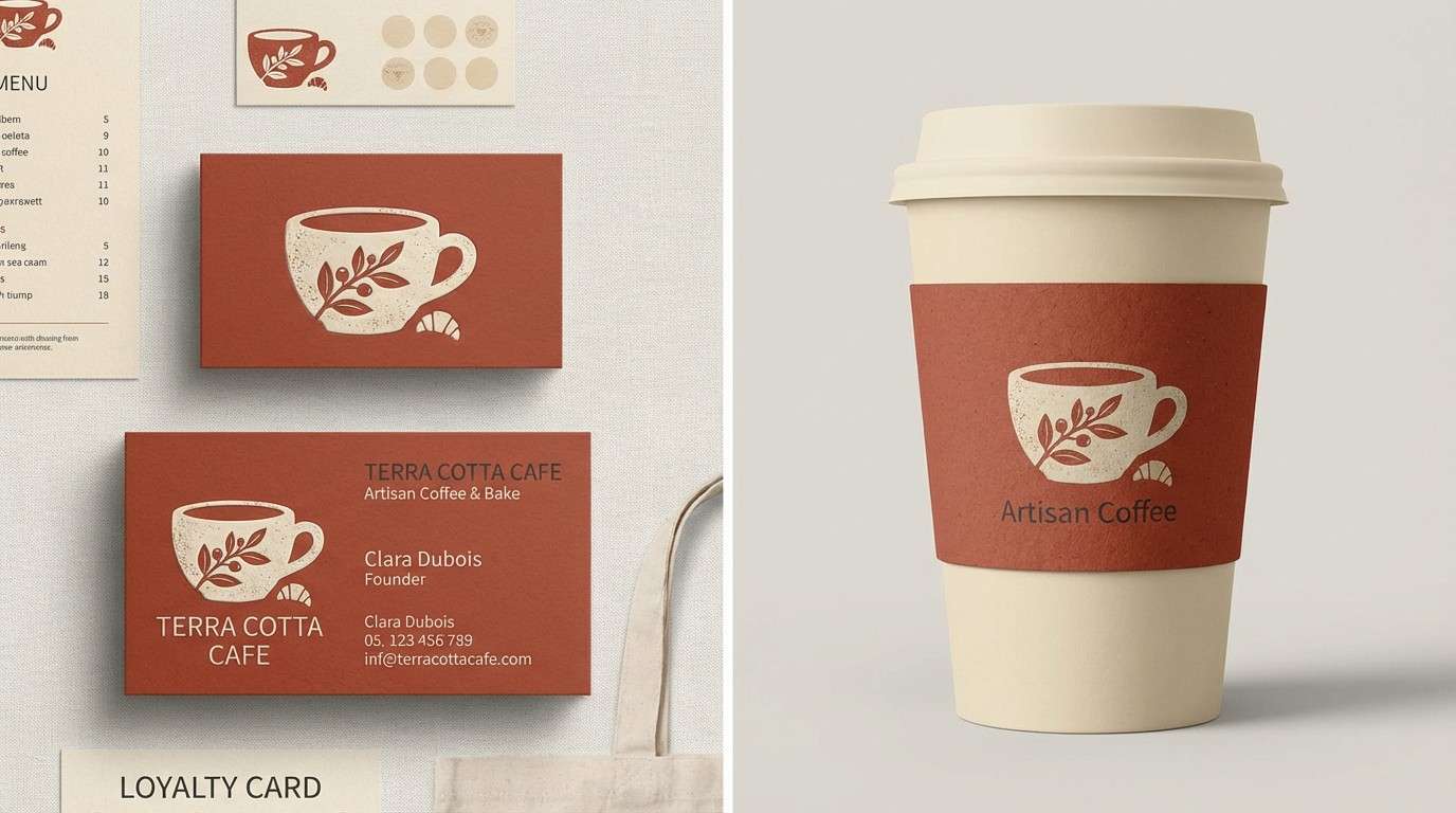
1) Clay Hearth
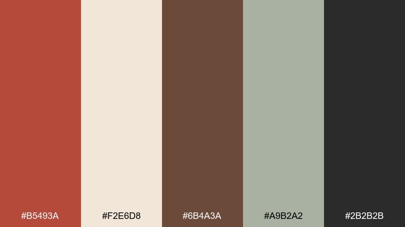
HEX: #B5493A #F2E6D8 #6B4A3A #A9B2A2 #2B2B2B
Mood: warm, grounded, artisanal
Best for: artisan cafe branding
Warm and grounded, like kiln-fired clay by a hearth, these brick red tones feel handmade and inviting. Use the brick red as your hero color, then lean on cream for breathing room and charcoal for type. Sage keeps the look fresh without turning cold. Tip: reserve the darkest shade for headlines and icons to keep the brand readable at small sizes.
Image example of clay hearth generated using media.io
Media.io is an online AI studio for creating and editing video, image, and audio in your browser.

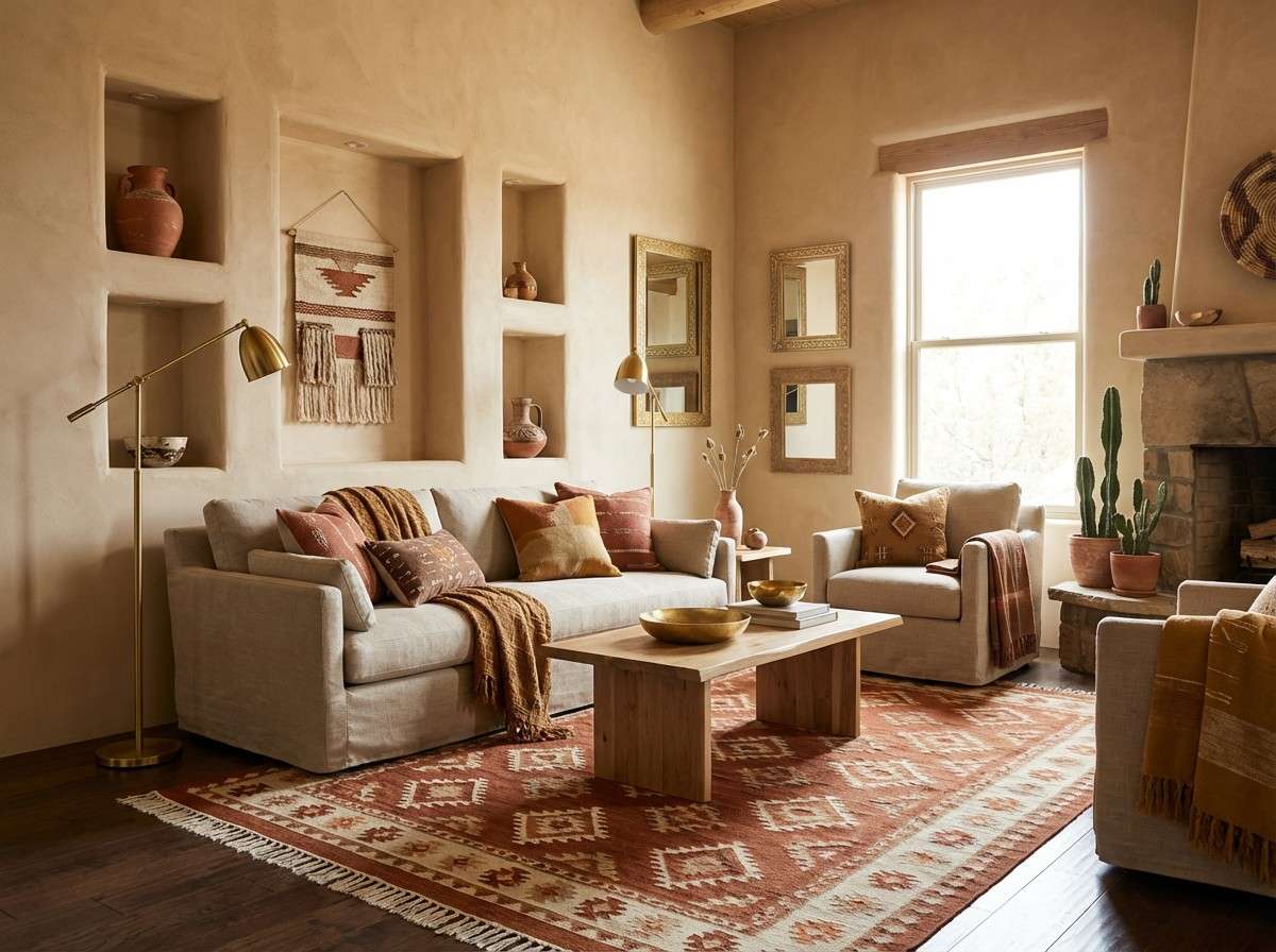
2) Desert Terracotta
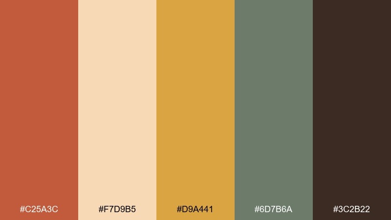
HEX: #C25A3C #F7D9B5 #D9A441 #6D7B6A #3C2B22
Mood: sunbaked, optimistic, earthy
Best for: southwestern interior accents
Sunbaked and optimistic, this brick red color palette evokes adobe walls, woven textiles, and late-afternoon light. Pair the warm sand and golden tones with the muted green for a balanced, lived-in feel. The deep brown anchors the scheme in wood and leather finishes. Tip: repeat the gold in small décor details like frames or hardware to unify the room.
Image example of desert terracotta generated using media.io
3) Rustic Winery
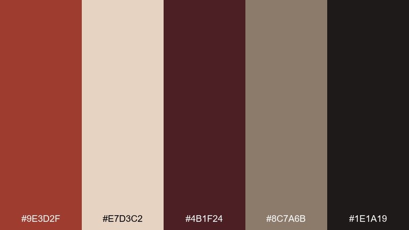
HEX: #9E3D2F #E7D3C2 #4B1F24 #8C7A6B #1E1A19
Mood: moody, rustic, refined
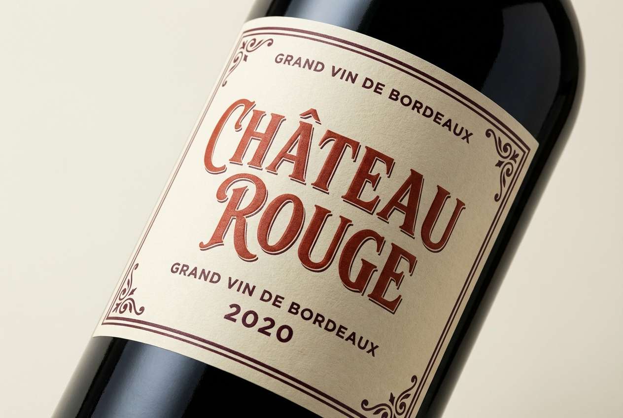
Best for: wine label packaging
Moody and rustic, the brick red color scheme brings to mind oak barrels, cellar shadows, and dark fruit notes. For a premium brick red color palette, let the deep maroon handle emphasis while cream supports elegant label copy. Taupe keeps the warmth consistent across paper stocks and foils. Tip: use black sparingly as a border or capsule to avoid flattening the label.
Image example of rustic winery generated using media.io
4) Vintage Brickwork
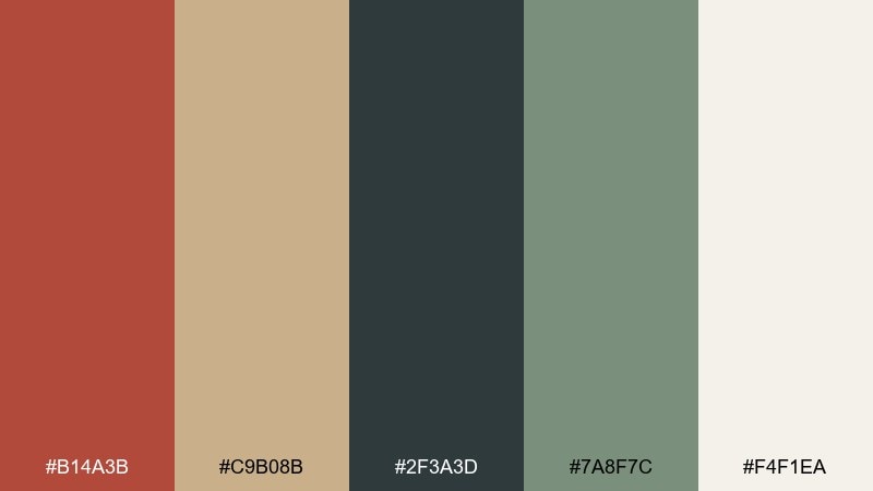
HEX: #B14A3B #C9B08B #2F3A3D #7A8F7C #F4F1EA
Mood: heritage, calm, architectural
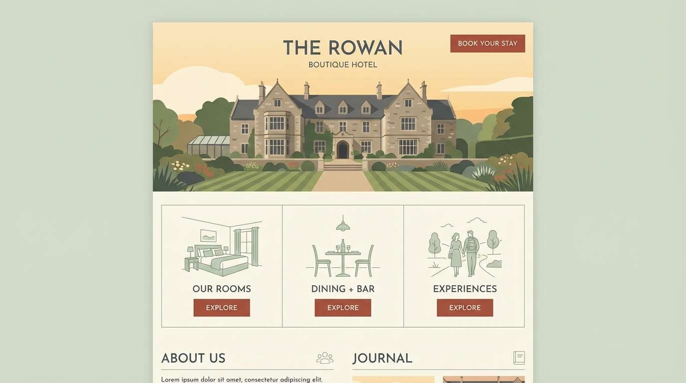
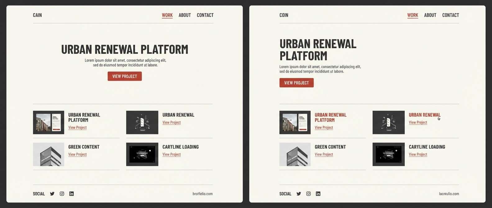
Best for: boutique hotel website UI
Heritage and calm, like sunlit brick facades and patinated metal details. Use cream as the main background so the red feels intentional rather than heavy. Slate and soft green make confident, readable UI elements that still feel welcoming. Tip: keep buttons in the brick tone and use slate for secondary actions to guide attention.
Image example of vintage brickwork generated using media.io
5) Cozy Library
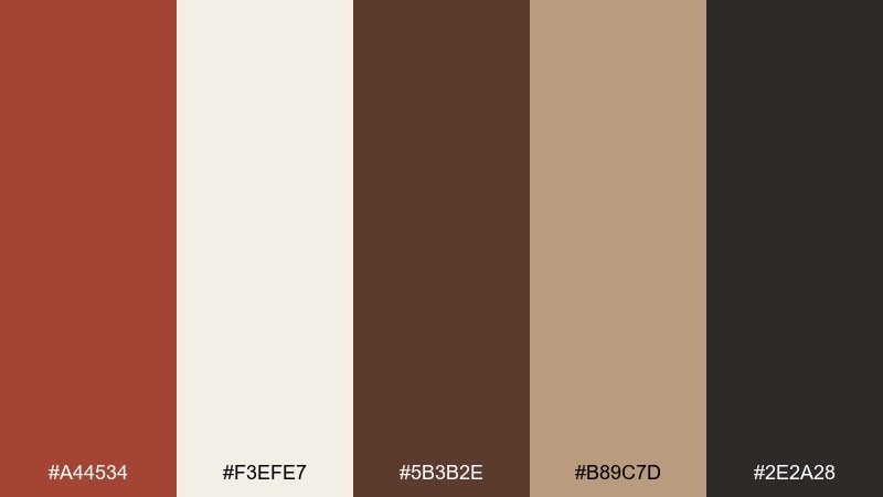
HEX: #A44534 #F3EFE7 #5B3B2E #B89C7D #2E2A28
Mood: cozy, classic, bookish
Best for: bookstore poster design
Cozy and classic, this brick red color palette feels like worn leather, paper edges, and a quiet reading nook. The creamy off-white keeps text areas soft, while brown and near-black give strong contrast for titles. Use the tan for frames, rules, and small illustrations to add warmth without clutter. Tip: limit the red to the headline and one key callout for a timeless look.
Image example of cozy library generated using media.io

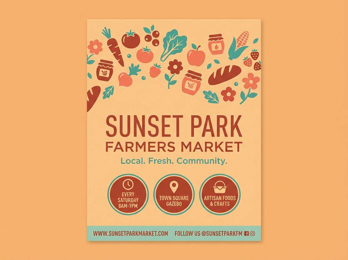
6) Autumn Market
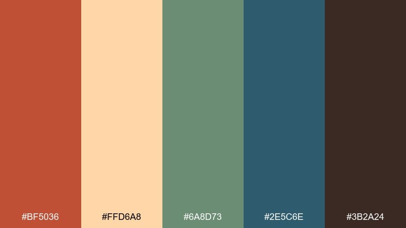
HEX: #BF5036 #FFD6A8 #6A8D73 #2E5C6E #3B2A24
Mood: lively, seasonal, friendly
Best for: farmers market flyer
Lively and seasonal, it suggests pumpkins, canvas totes, and crisp air at an outdoor stall. These brick red color combinations shine when you let the warm peach lead the background and keep the red for headers. The teal-blue adds a surprising cool counterpoint that improves legibility. Tip: use the green for section labels like dates and locations to make scanning easy.
Image example of autumn market generated using media.io
7) Minimal Studio
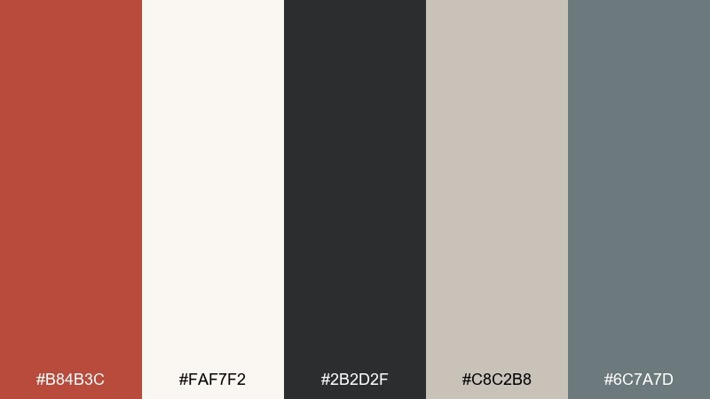
HEX: #B84B3C #FAF7F2 #2B2D2F #C8C2B8 #6C7A7D
Mood: modern, minimal, confident
Best for: portfolio website UI
Modern and confident, it feels like a clean studio wall with a single bold art print. Keep the off-white as your main canvas and let the red act as a sharp accent for links and highlights. Cool grays handle navigation, captions, and dividers without competing. Tip: apply the red consistently to one interaction state, such as hover, to avoid visual noise.
Image example of minimal studio generated using media.io
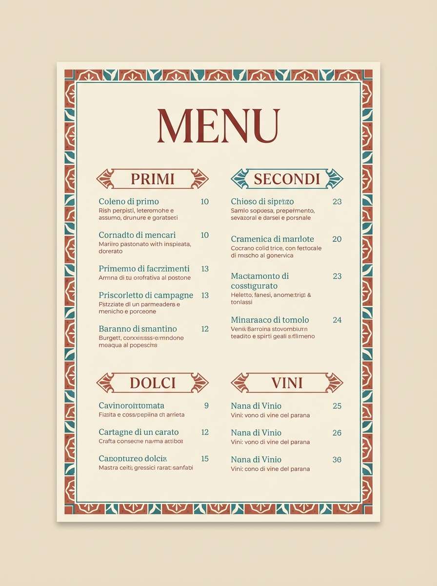
8) Mediterranean Tile
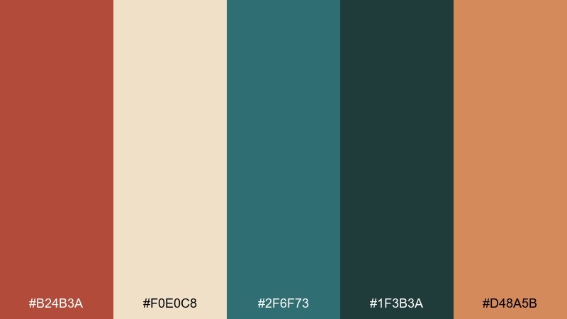
HEX: #B24B3A #F0E0C8 #2F6F73 #1F3B3A #D48A5B
Mood: coastal, patterned, sunny
Best for: restaurant menu design
Coastal and patterned, this brick red color scheme recalls hand-painted tiles, terracotta pots, and seaside shade. Use teal as a strong supporting color for category headers, while cream keeps the menu light and readable. The soft orange bridges warm and cool tones, perfect for small icons or borders. Tip: print on uncoated stock to keep the palette feeling authentic and tactile.
Image example of mediterranean tile generated using media.io
9) Copper and Cream
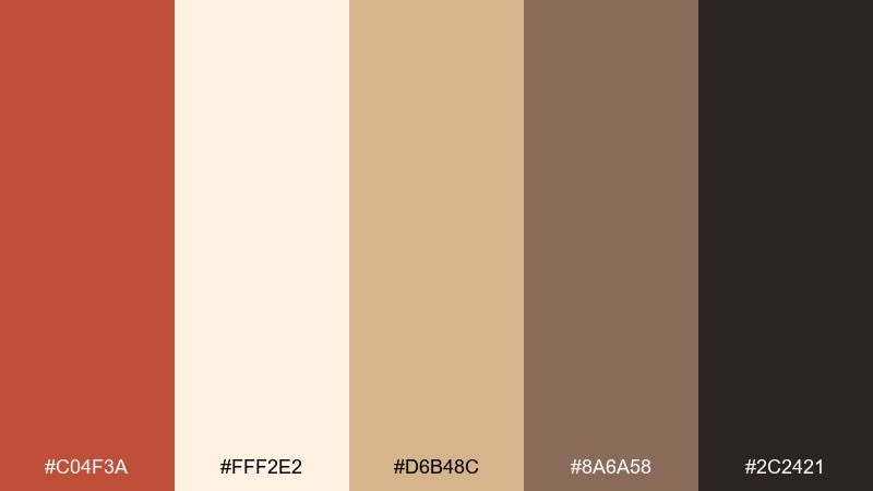
HEX: #C04F3A #FFF2E2 #D6B48C #8A6A58 #2C2421
Mood: soft luxe, warm, elegant
Best for: skincare product packaging
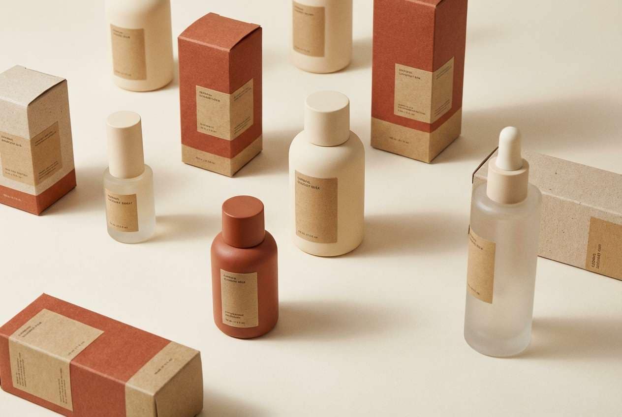
Soft luxe and warm, these brick red hues feel like copper glow against creamy porcelain. Let the light cream dominate the packaging so the reds read sophisticated, not loud. Use tan and mocha for ingredient panels and secondary copy to keep hierarchy clear. Tip: a matte finish with a small metallic accent will amplify the premium vibe.
Image example of copper and cream generated using media.io
10) Nordic Cabin
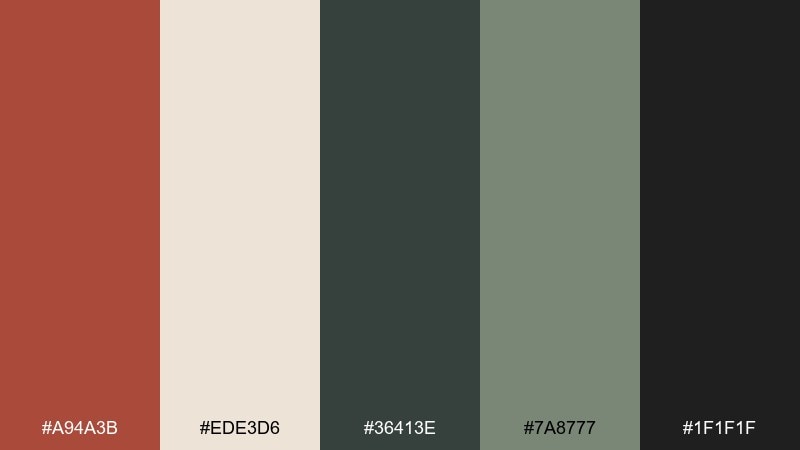
HEX: #A94A3B #EDE3D6 #36413E #7A8777 #1F1F1F
Mood: cozy modern, outdoorsy, balanced
Best for: winter sale social ad
Cozy modern and outdoorsy, it brings pine shadows and a warm cabin glow. Use the red sparingly for price tags or key offers, while cream and charcoal handle the layout. The muted greens keep the overall temperature calm and seasonal. Tip: add generous spacing so the dark tones do not overwhelm the ad on small screens.
Image example of nordic cabin generated using media.io

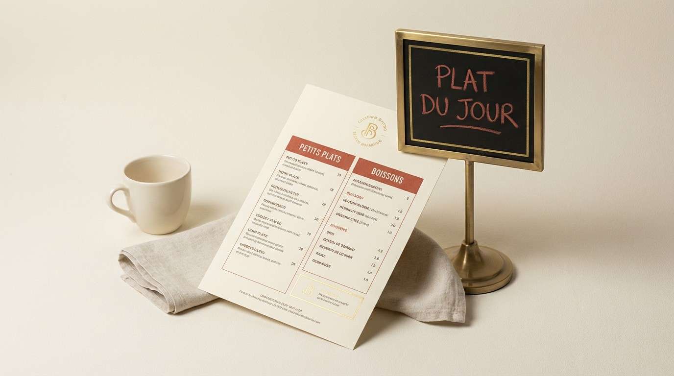
11) Modern Bistro
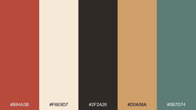
HEX: #B84A3B #F6E9D7 #2F2A26 #D0A06A #5B7D74
Mood: inviting, contemporary, food-forward
Best for: bistro signage and menu set
Inviting and contemporary, this brick red color palette feels like a warm dining room with brass details and crisp linen. Keep the cream as the base for menus and table tents, then use the red for headings and highlights. Gold adds appetite-friendly warmth, while the green cools the set for balance. Tip: pair with a bold serif for the name and a clean sans for item descriptions.
Image example of modern bistro generated using media.io
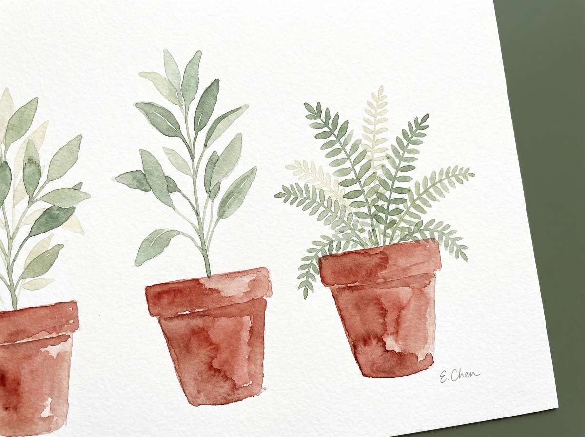
12) Botanical Clay
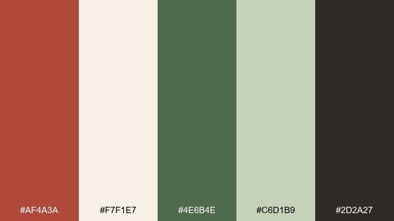
HEX: #AF4A3A #F7F1E7 #4E6B4E #C6D1B9 #2D2A27
Mood: natural, gentle, organic
Best for: watercolor botanical illustration
Natural and gentle, it evokes clay planters, leafy stems, and soft studio light. Let the pale cream and light green wash build your paper-like background. Use the deeper green for stems and shadows, then add the clay red as a focal bloom or pot. Tip: keep edges slightly imperfect to preserve the watercolor feel.
Image example of botanical clay generated using media.io
13) Sunset Masonry
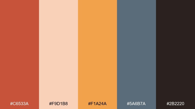
HEX: #C6533A #F9D1B8 #F1A24A #5A6B7A #2B2220
Mood: energetic, sunny, bold
Best for: music festival poster
Energetic and sunny, these brick red color combinations feel like sunset light hitting brick walls downtown. Use the peach as the poster field to keep the bright orange readable and fun. Slate blue is a strong counterweight for lineups and details, keeping the palette from going too hot. Tip: set key information in the darkest tone and reserve orange for one high-impact graphic element.
Image example of sunset masonry generated using media.io

14) Urban Loft
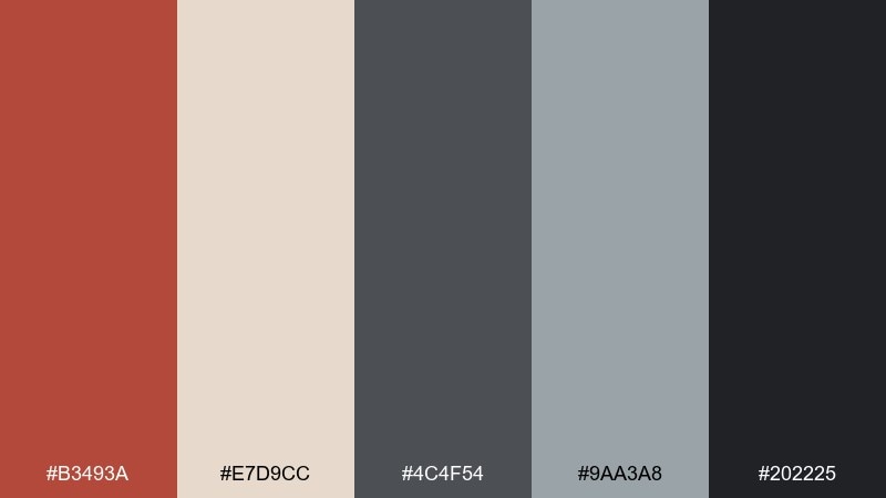
HEX: #B3493A #E7D9CC #4C4F54 #9AA3A8 #202225
Mood: industrial, cool, modern
Best for: architecture portfolio layout
Industrial and cool, it recalls concrete floors, steel beams, and an exposed brick feature wall. The warm off-white keeps spreads airy, while grays handle grids, captions, and diagrams. Use the brick tone as an accent for section dividers or project markers. Tip: stick to one accent per spread so the portfolio reads clean and professional.
Image example of urban loft generated using media.io
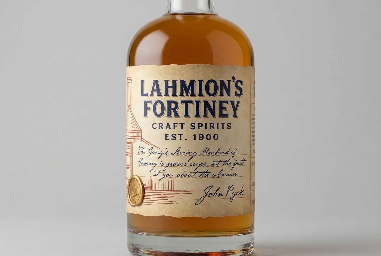
15) Heritage Label
HEX: #A33F33 #F2E2CF #233142 #C9A46A #3A2B24
Mood: heritage, premium, timeless
Best for: craft spirits label design
Heritage and premium, this palette suggests old-world stamps, navy ink, and aged paper. The navy creates a striking counterpoint that elevates brick red color combinations beyond rustic into refined. Use parchment as the main label field and save gold for borders or seals. Tip: test the red and navy at small sizes to ensure the details do not muddy on textured stock.
Image example of heritage label generated using media.io
16) Soft Blush Brick
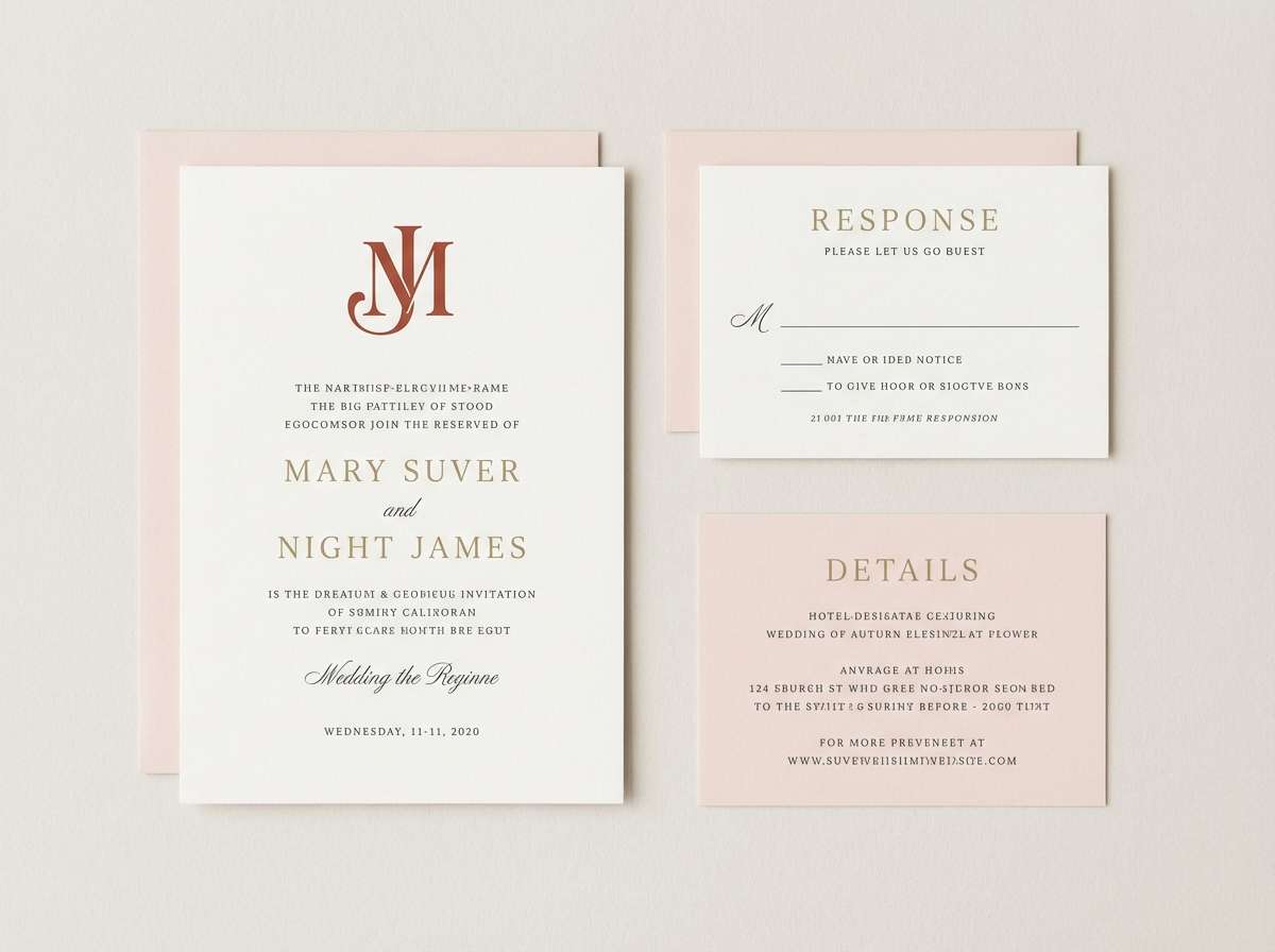
HEX: #B24A3B #F6D6D0 #F9F4EE #8F7C74 #3B2F2C
Mood: romantic, soft, modern
Best for: wedding invitation suite
Romantic and soft, this brick red color palette feels like blush florals against warm paper and hand-tied ribbons. Use the blush and ivory for large areas and keep the deeper tones for names, dates, and RSVP details. The brick shade works beautifully for a wax seal or monogram mark. Tip: choose one elegant script and one clean serif to keep the suite refined.
Image example of soft blush brick generated using media.io
17) Stormy Brick
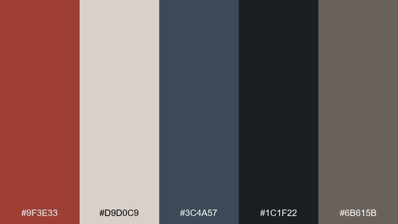
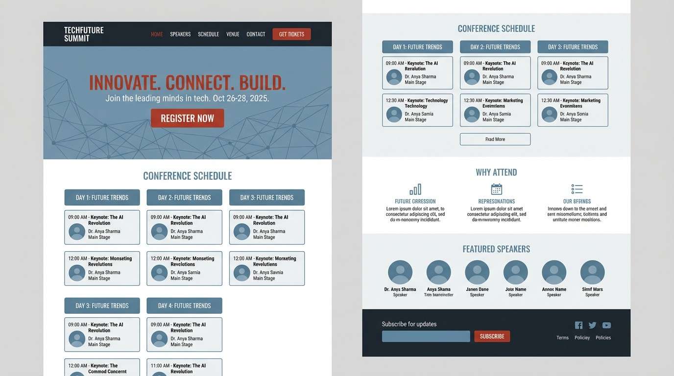
HEX: #9F3E33 #D9D0C9 #3C4A57 #1C1F22 #6B615B
Mood: dramatic, modern, cinematic
Best for: tech conference landing page
Dramatic and cinematic, it brings storm clouds over a glowing city wall of brick. Use the light gray as a calm surface for sections, then punch up calls to action with the red. Blue-gray supports data visuals and keeps the page feeling tech-forward. Tip: maintain high contrast by pairing the red with the lightest background, not the mid grays.
Image example of stormy brick generated using media.io
18) Playful Retro Pop
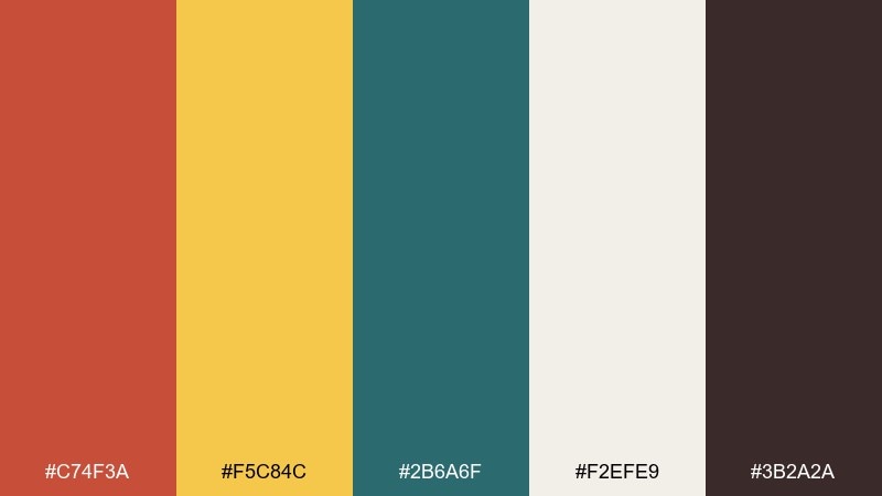
HEX: #C74F3A #F5C84C #2B6A6F #F2EFE9 #3B2A2A
Mood: playful, retro, energetic
Best for: snack brand product ad
Playful and retro, it feels like mid-century packaging with bold shapes and punchy contrast. For a bright brick red color palette that still reads modern, use the warm white as negative space and let yellow carry the cheerful highlights. Teal adds a crisp edge for badges and secondary messaging. Tip: keep your typography chunky and simple so the colors do most of the talking.
Image example of playful retro pop generated using media.io
19) Earthy Monochrome
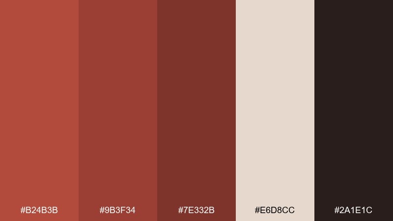
HEX: #B24B3B #9B3F34 #7E332B #E6D8CC #2A1E1C
Mood: earthy, tonal, sophisticated
Best for: fashion lookbook editorial
Earthy and tonal, these brick red color combinations read like layered clay pigments and rich leather. Use the light neutral as a clean margin and let the three reds create depth through typography, shapes, and overlays. The near-black is perfect for captions and small print. Tip: keep photography warm and slightly desaturated so the tonal reds feel cohesive on the page.
Image example of earthy monochrome generated using media.io
20) Festive Spice
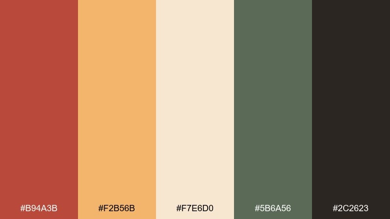
HEX: #B94A3B #F2B56B #F7E6D0 #5B6A56 #2C2623
Mood: festive, cozy, welcoming
Best for: holiday recipe card design
Festive and cozy, it evokes cinnamon sticks, baked crusts, and candlelit gatherings. These brick red color combinations work best when the cream stays dominant and the red is saved for titles and small motifs. The muted green adds a classic seasonal touch without turning overly bright. Tip: use the golden tone for ingredient icons to keep the card cheerful and easy to follow.
Image example of festive spice generated using media.io
What Colors Go Well with Brick Red?
Brick red pairs beautifully with warm neutrals like cream, ivory, sand, and parchment, which help it feel airy and premium. For deeper, richer looks, add cocoa browns and near-black charcoals to create contrast and hierarchy.
To balance the warmth, mix in cooler counterpoints such as slate blue, teal, blue-gray, and navy. Muted greens (sage, olive, pine) are another natural match that keeps the palette earthy rather than overly saturated.
If you want a brighter accent, try golden tones (mustard, brass, amber) in small doses—great for highlights, icons, and callouts without stealing focus from the brick red.
How to Use a Brick Red Color Palette in Real Designs
For branding and packaging, treat brick red as the “hero” color for logos, seals, and key panels, then rely on light neutrals for the main field so typography stays readable. Dark accents (charcoal or deep brown) are ideal for fine print and structure.
For UI design, use brick red for primary actions (buttons, active states) and keep backgrounds soft (off-white or light gray). Support it with a cool slate/teal for secondary actions and navigation so users can scan and interact confidently.
For interiors and print, repeat brick red in controlled spots—trim, textiles, headlines, or borders—rather than covering large areas. That repetition creates cohesion while keeping the overall space or layout breathable.
Create Brick Red Palette Visuals with AI
If you want to preview how a brick red color scheme will look in a real project, generate fast mockups from text prompts. It’s a practical way to test mood (cozy, premium, playful, cinematic) before committing to production.
Try describing your use case (logo set, landing page, menu, label, poster) and include your favorite HEX codes from the palettes above. You’ll get visual directions you can refine into a final design system.
Brick Red Color Palette FAQs
-
What HEX code is brick red?
Brick red doesn’t have one universal HEX value, but common brick red tones sit around #B24B3B to #C25A3C. In the palettes above, you’ll see multiple brick-red variations depending on whether the look is more muted, coppery, or deep. -
Is brick red warm or cool?
Brick red is typically warm because it has brown/orange undertones. You can cool it down by pairing it with slate blue, teal, or blue-gray, which adds contrast while keeping the palette balanced. -
What colors complement brick red?
Great complements include cream/ivory, charcoal, navy, teal, sage/olive greens, and golden mustard tones. The best choice depends on whether you want a cozy earthy vibe (greens and browns) or a modern contrast (navy/teal and light neutrals). -
Can brick red work for modern UI design?
Yes—use it as an accent for primary buttons, links, or active states, and keep backgrounds light (off-white or light gray). Pair with clean grays for layout structure and a cool supporting color for secondary actions. -
How do I keep brick red from feeling too heavy?
Limit brick red to key elements, increase negative space, and lean on light neutrals for large areas. Also reserve the darkest shade for text, so the palette stays readable and doesn’t turn muddy. -
What’s the difference between brick red and terracotta?
Terracotta usually leans more orange and clay-like, while brick red leans deeper and browner (closer to a fired brick). In practice they overlap, but terracotta often reads sunnier; brick red often reads sturdier and more classic. -
How can I generate brick red palette mockups quickly?
Use Media.io’s text-to-image tool: describe the design type (menu, label, landing page, poster), mention “brick red,” and add your chosen HEX codes. Generate a few options, then refine the prompt to match your brand style.
Next: Violet Color Palette


