

Aquarium color palettes bring together sea-glass greens, cool blues, and sandy neutrals to create designs that feel clean, calm, and modern.
Whether you’re building a brand, a slide deck, or a room mood board, these underwater-inspired hues make contrast easy while keeping the overall vibe fresh and breathable.
In this article
- Why Aquarium Palettes Work So Well
-
- sea glass drift
- kelp forest
- coral whisper
- tidepool pebble
- reef lanterns
- deep reef night
- breeze and foam
- seaside minimal
- mermaid market
- harbor slate
- tropical current
- pearl and aqua
- vintage aquarium postcard
- sushi bar aquatic
- spa water
- kids exhibit splash
- tech tank dashboard
- coastal wedding glass
- marine research lab
- neon jelly glow
- sandbar calm
- bubble tea seafoam
- glass tank classic
- coral reef neutral pop
- What Colors Go Well with Aquarium?
- How to Use a Aquarium Color Palette in Real Designs
- Create Aquarium Palette Visuals with AI
Why Aquarium Palettes Work So Well
Aquarium palettes sit in a naturally “calm” range of the spectrum—teals, cyans, seafoam, and soft blues—so they instantly communicate freshness, clarity, and trust.
They’re also easy to balance: cool aquatic hues can carry big surfaces (backgrounds, sections, slides), while warm sand, cream, or coral accents add human warmth and clear hierarchy.
From UI to interiors, these colors stay versatile because you can push them minimal and professional, or brighten them into playful, high-energy combinations without losing cohesion.
20+ Aquarium Color Palette Ideas (with HEX Codes)
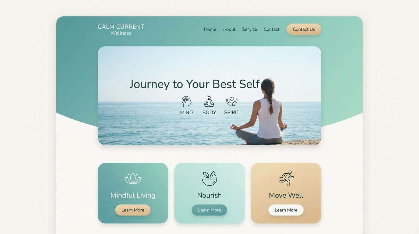
1) Sea Glass Drift
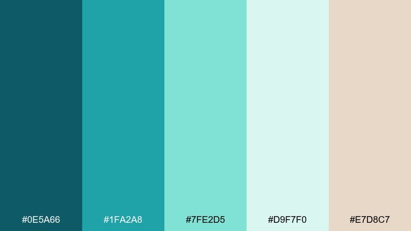
HEX: #0E5A66 #1FA2A8 #7FE2D5 #D9F7F0 #E7D8C7
Mood: clean, breezy, restorative
Best for: wellness branding and calm landing pages
Clean and breezy like sea glass smoothed by gentle waves, these tones feel fresh without going icy. Use the darker teal for headings and navigation, then let mint and foam carry large backgrounds. The sandy beige keeps the mix human and warm, especially for wellness, skincare, or slow-living brands. Tip: keep contrast crisp by pairing the darkest teal with the palest foam for key CTAs.
Image example of sea glass drift generated using media.io
Media.io is an online AI studio for creating and editing video, image, and audio in your browser.

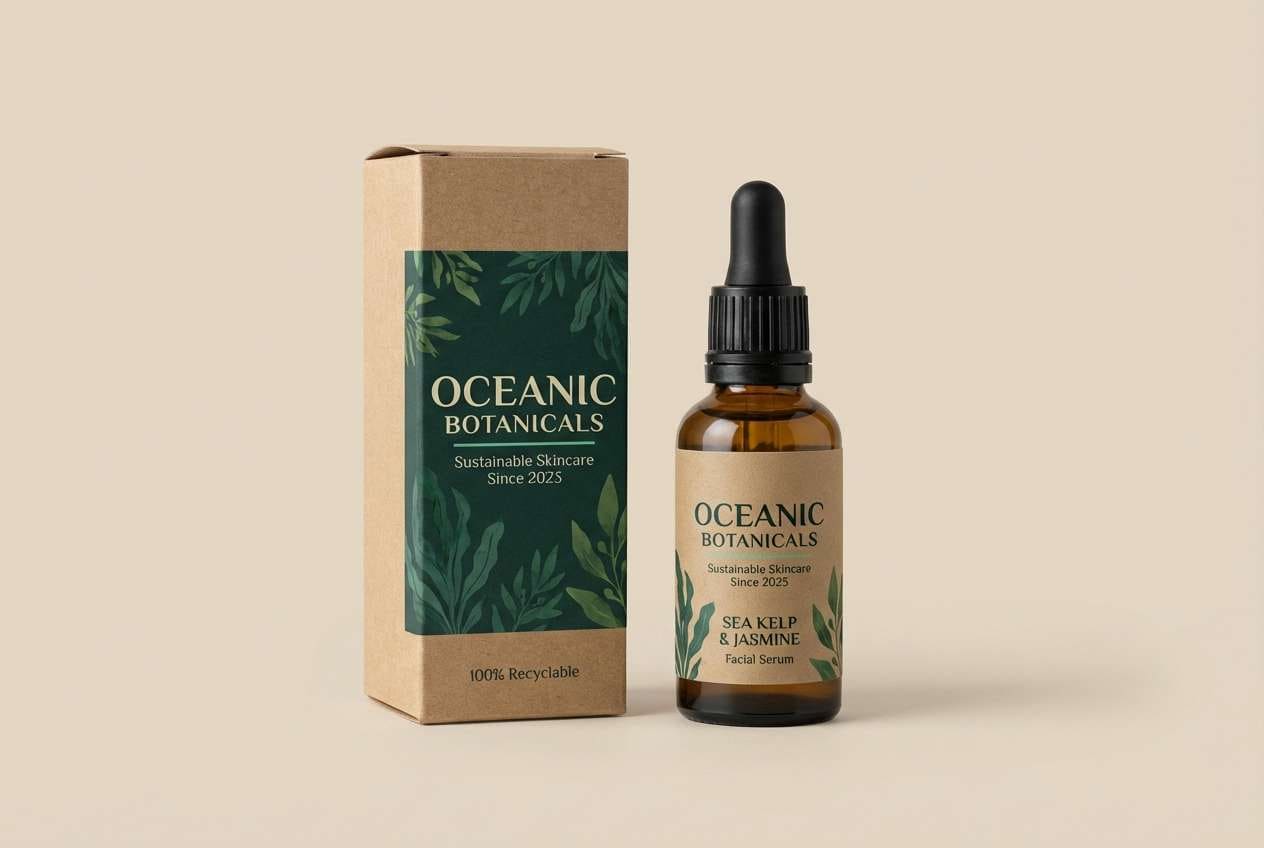
2) Kelp Forest
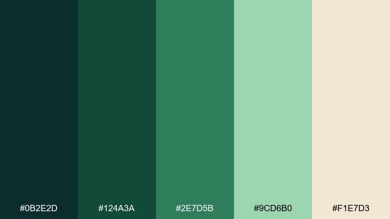
HEX: #0B2E2D #124A3A #2E7D5B #9CD6B0 #F1E7D3
Mood: earthy, lush, grounded
Best for: eco packaging and outdoor product labels
Earthy and lush like sunlight filtering through kelp, this set leans natural rather than tropical. Put the deep green-black on packaging type and logos, then use the mid greens for panels and icons. The pale cream keeps it readable and premium, especially on paper textures. Tip: add small highlights of the light mint around claims or badges to guide the eye.
Image example of kelp forest generated using media.io
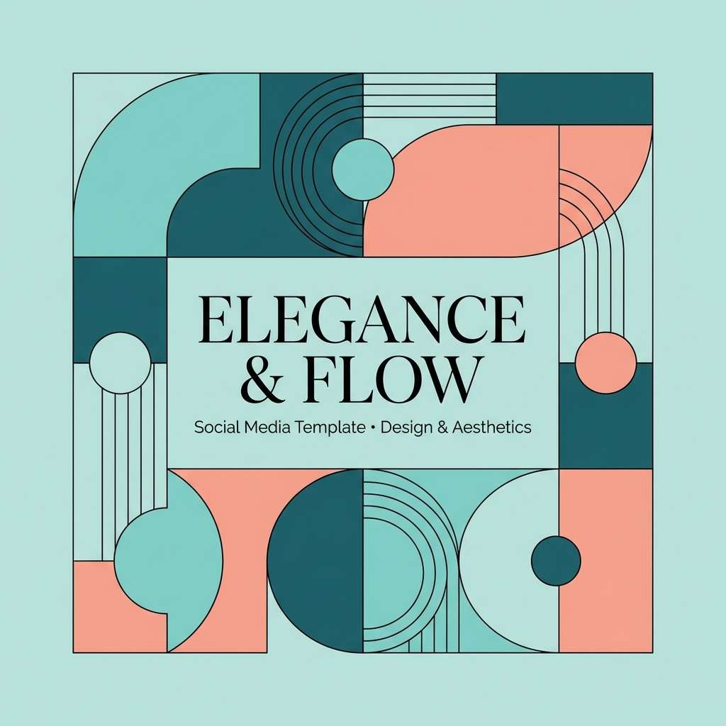
3) Coral Whisper
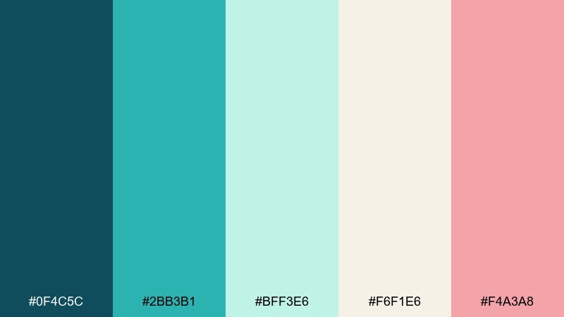
HEX: #0F4C5C #2BB3B1 #BFF3E6 #F6F1E6 #F4A3A8
Mood: soft, friendly, modern
Best for: beauty promos and social templates
Soft and friendly like coral seen through clear water, the pink accent adds warmth without stealing the spotlight. Keep teal and aqua as the main blocks, then sprinkle blush on buttons, stickers, or highlight prices. The creamy off-white prevents the layout from feeling clinical and plays nicely with lifestyle photography. Tip: use the blush only once per section so the design stays airy.
Image example of coral whisper generated using media.io
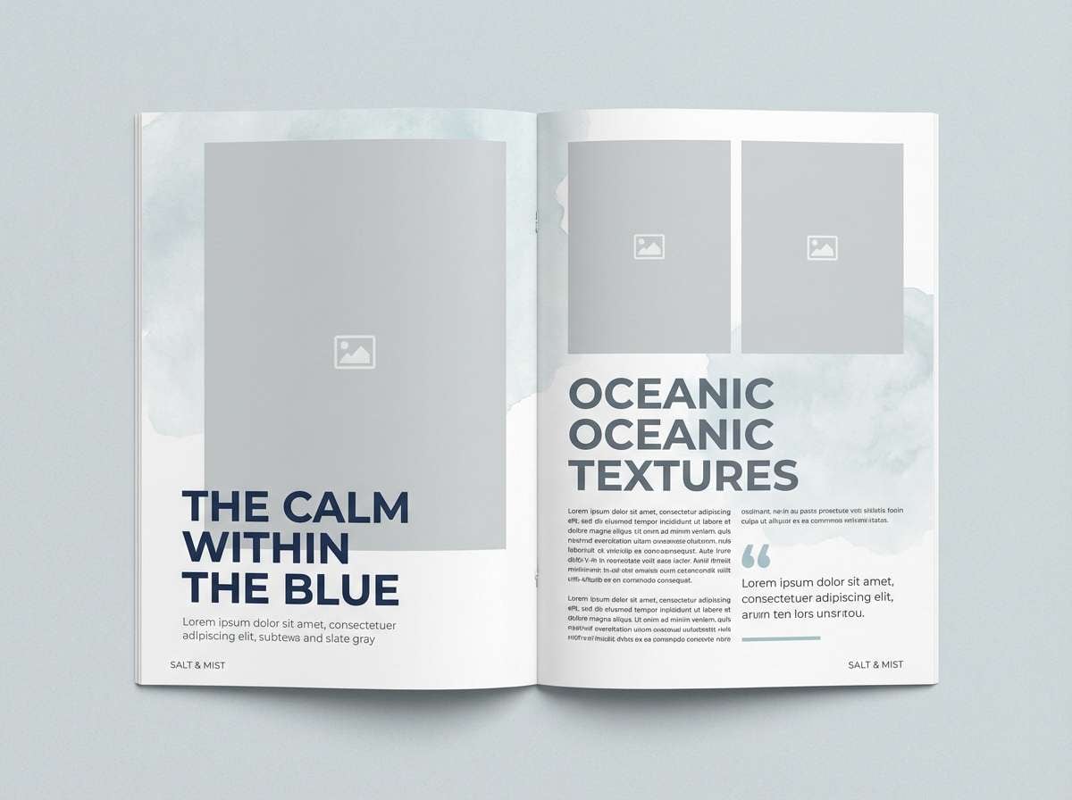
4) Tidepool Pebble
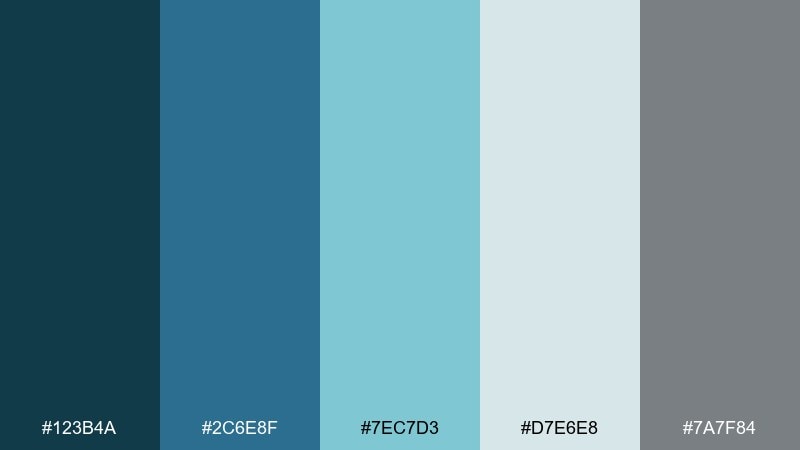
HEX: #123B4A #2C6E8F #7EC7D3 #D7E6E8 #7A7F84
Mood: quiet, coastal, balanced
Best for: editorial layouts and portfolio sites
Quiet and coastal like stones in a tidepool, these blues and grays feel steady and grown-up. Use the slate gray to ground captions and UI chrome, and let the lighter misty tones carry generous whitespace. The mid blue works well for links and section dividers without looking overly bright. Tip: stick to one bold accent per spread and rely on typography for drama.
Image example of tidepool pebble generated using media.io
5) Reef Lanterns
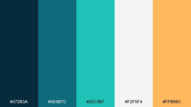
HEX: #072B3A #0E6B7C #20C3B7 #F2F5F4 #FFB85C
Mood: bold, energetic, contemporary
Best for: event posters and announcement graphics
Bold and energetic like reef lights at dusk, this mix pairs cool water tones with a warm amber spark. Let the deep blue anchor the background, then use aqua for big shapes and the amber for dates or callouts. The off-white keeps text crisp and prevents color banding in print. Tip: reserve amber for one hierarchy level to avoid a cluttered poster.
Image example of reef lanterns generated using media.io

6) Deep Reef Night
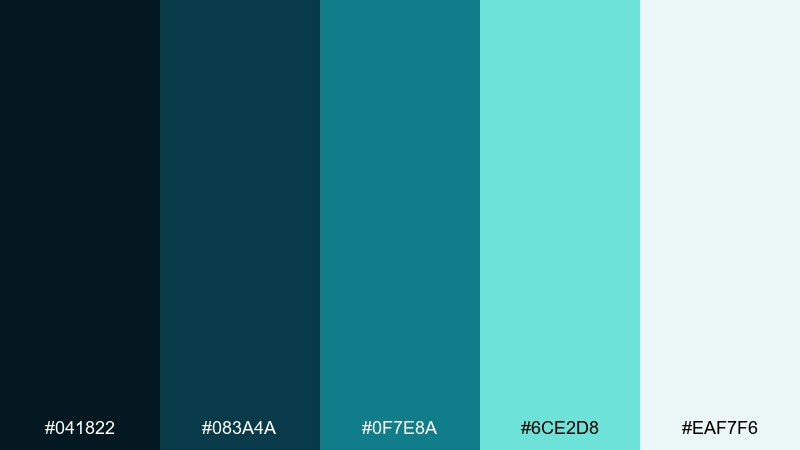
HEX: #041822 #083A4A #0F7E8A #6CE2D8 #EAF7F6
Mood: mysterious, sleek, high-contrast
Best for: dark mode dashboards and fintech UI
Mysterious and sleek like a midnight dive, the dark base makes the aqua highlights feel electric. Use the near-black for backgrounds, then bring in teal for charts, toggles, and active states. The pale foam works best for body text and card surfaces where you need calm contrast. Tip: keep saturated accents to interactive elements so the interface stays readable.
Image example of deep reef night generated using media.io
7) Breeze and Foam
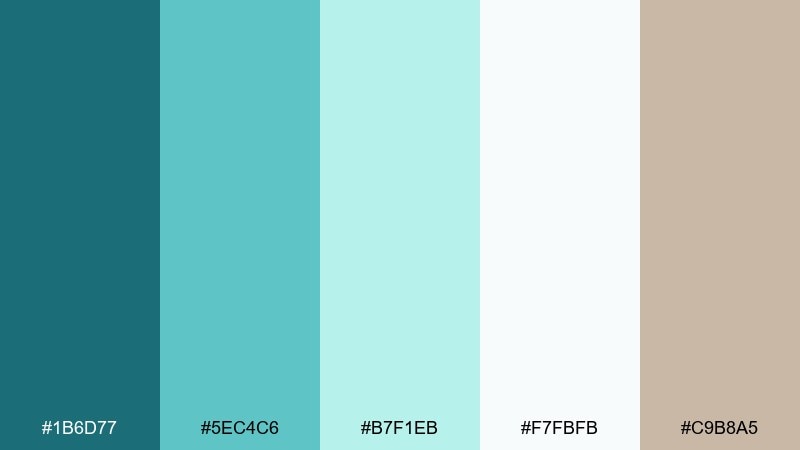
HEX: #1B6D77 #5EC4C6 #B7F1EB #F7FBFB #C9B8A5
Mood: light, airy, welcoming
Best for: cafe menus and lifestyle blogs
Light and airy like morning foam on calm water, these tones feel instantly welcoming. Use the mid teal for headings and menu sections, then let the pale aqua carry wide backgrounds. The warm taupe adds a grounded, handcrafted touch that works well with food photography and paper textures. Tip: pair taupe with the darkest teal for small text areas where you need extra contrast.
Image example of breeze and foam generated using media.io
8) Seaside Minimal
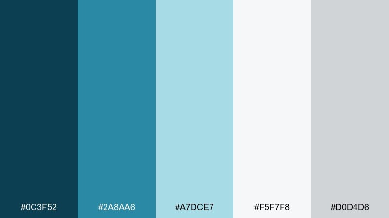
HEX: #0C3F52 #2A8AA6 #A7DCE7 #F5F7F8 #D0D4D6
Mood: minimal, professional, crisp
Best for: corporate presentations and reports
Minimal and professional like a clear horizon line, this set stays crisp even in dense layouts. Use the deep blue for titles and section bars, with the muted teal for charts and icons. The light blue and cool grays create breathable spacing and reduce visual fatigue on long slides. Tip: keep charts to two data colors and let gray handle grids and labels.
Image example of seaside minimal generated using media.io

9) Mermaid Market
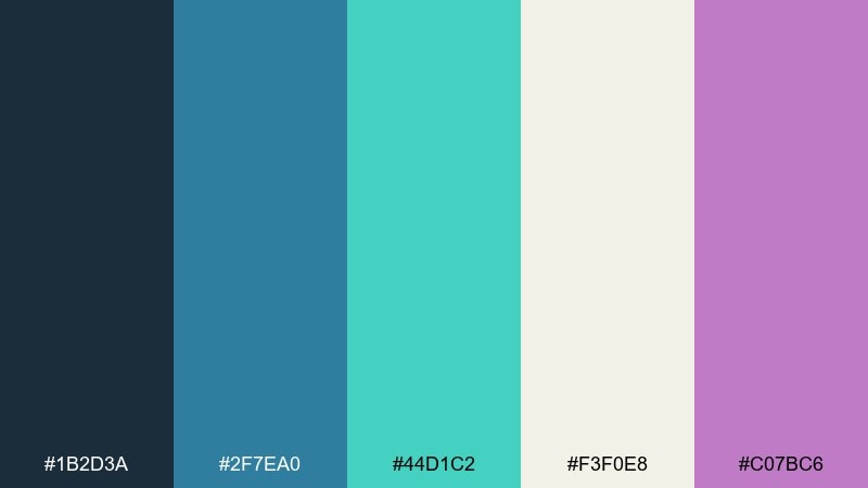
HEX: #1B2D3A #2F7EA0 #44D1C2 #F3F0E8 #C07BC6
Mood: playful, trendy, artsy
Best for: boutique branding and sticker packs
Playful and trendy like a seaside night market, the purple accent gives the aqua tones a creative twist. Let the deep ink blue hold logos and outlines, then layer teal and mint for lively backgrounds. Use the warm off-white to keep it friendly and printable across merch. Tip: apply purple sparingly on badges or illustrations so it reads like a surprise, not noise.
Image example of mermaid market generated using media.io
10) Harbor Slate
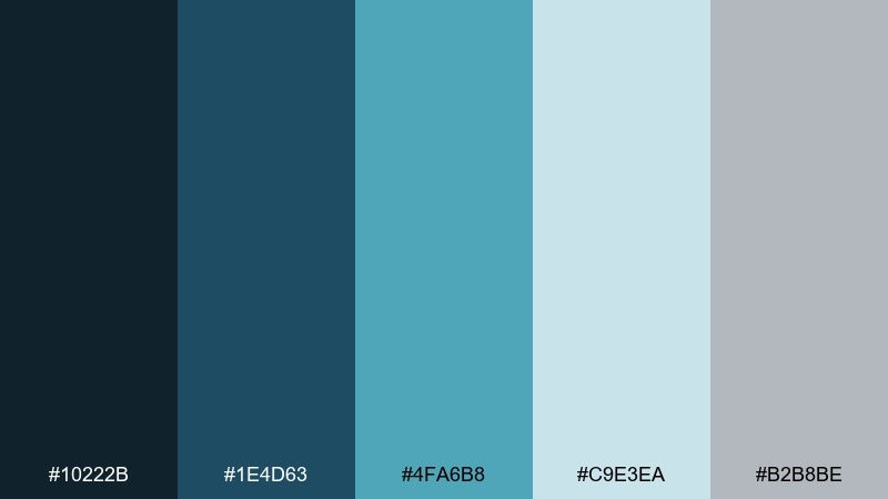
HEX: #10222B #1E4D63 #4FA6B8 #C9E3EA #B2B8BE
Mood: cool, structured, dependable
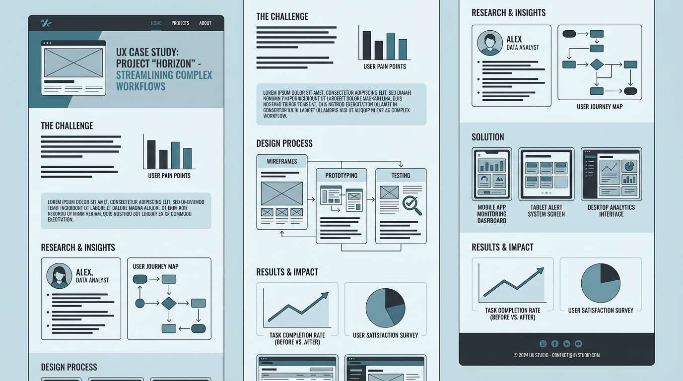
Best for: B2B websites and UX case studies
Cool and structured like a modern harbor, these tones feel dependable without going dull. Put the inky charcoal on navigation and footer areas, and use steel teal for key sections and diagrams. The pale blue-gray works as a soft canvas for screenshots and long-form reading. Tip: add micro-accents in the bright teal only on links and progress states for clarity.
Image example of harbor slate generated using media.io
11) Tropical Current
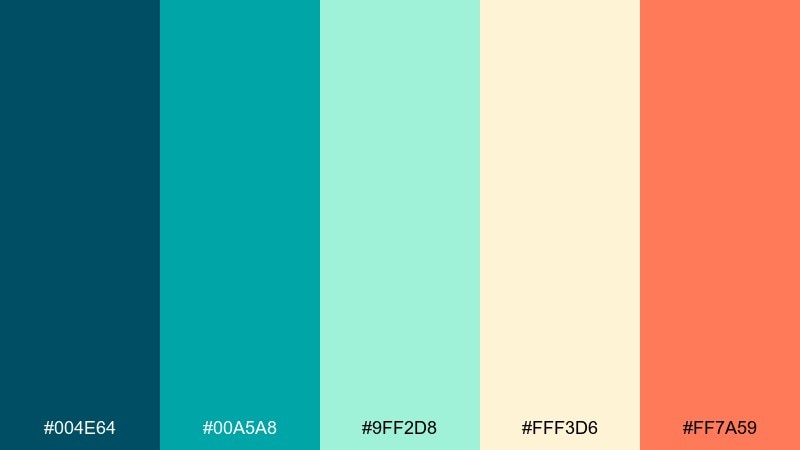
HEX: #004E64 #00A5A8 #9FF2D8 #FFF3D6 #FF7A59
Mood: sunny, vibrant, adventurous
Best for: travel ads and summer campaigns
Sunny and adventurous like a boat ride over bright shallows, this set brings warmth to cool water tones. Use teal as the hero color, then let the coral-orange drive CTAs, prices, or limited-time labels. The buttery cream keeps everything readable and adds a vacation glow. Tip: if your photos are busy, keep text on cream blocks and outline in the deep blue for legibility.
Image example of tropical current generated using media.io

12) Pearl and Aqua
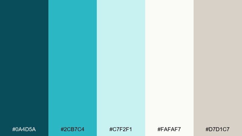
HEX: #0A4D5A #2CB7C4 #C7F2F1 #FAFAF7 #D7D1C7
Mood: soft, polished, premium
Best for: jewelry lookbooks and luxe ecommerce
Soft and polished like pearls in clear water, these tones feel premium without being cold. Use the deep teal for elegant typography and thin borders, and lean on pale aqua for product cards. The warm greige adds a subtle luxury cue that pairs beautifully with metallics. Tip: keep shadows minimal and let the color contrast do the work for a high-end finish.
Image example of pearl and aqua generated using media.io
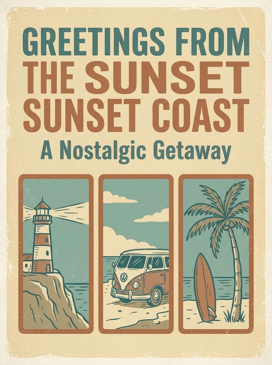
13) Vintage Aquarium Postcard
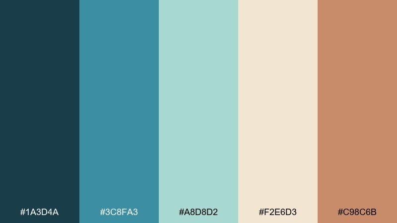
HEX: #1A3D4A #3C8FA3 #A8D8D2 #F2E6D3 #C98C6B
Mood: nostalgic, warm, curated
Best for: retro posters and cafe wall art
Nostalgic and warm like a faded seaside postcard, this mix balances aquatic blues with sun-baked neutrals. Use the creamy tan as the main paper tone, then layer teal for illustration blocks and headers. The clay brown works as a vintage accent for stamps, borders, or pricing labels. Tip: add subtle grain and keep saturation slightly muted for an authentic retro print feel.
Image example of vintage aquarium postcard generated using media.io
14) Sushi Bar Aquatic
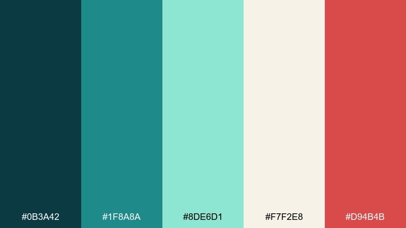
HEX: #0B3A42 #1F8A8A #8DE6D1 #F7F2E8 #D94B4B
Mood: modern, appetizing, high-contrast
Best for: restaurant menus and delivery apps
Modern and appetizing like a sleek sushi bar, the cool greens make the red pop in all the right places. Use the deep teal for menu headers and navigation, then let mint brighten category cards. The bold red works best for spicy markers, order buttons, or limited specials. Tip: keep red to small elements so the overall look stays fresh, not aggressive.
Image example of sushi bar aquatic generated using media.io
15) Spa Water
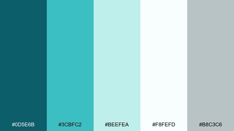
HEX: #0D5E6B #3CBFC2 #BEEFEA #F8FEFD #B8C3C6
Mood: fresh, soothing, hygienic
Best for: clinic pages and skincare packaging
Fresh and soothing like chilled spa water, these colors signal cleanliness and care. Lean on the near-white as your main background, with teal used for trust-building headlines and icons. The soft gray-blue keeps secondary text calm and readable on long pages. Tip: add rounded shapes and plenty of spacing so the palette feels even more breathable.
Image example of spa water generated using media.io
16) Kids Exhibit Splash
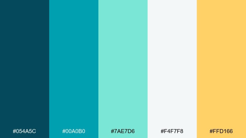
HEX: #054A5C #00A0B0 #7AE7D6 #F4F7F8 #FFD166
Mood: bright, friendly, educational
Best for: museum signage and kids learning sheets
Bright and friendly like interactive touch tanks, these tones feel educational without being boring. Use turquoise for big headers and section bands, then let mint and white keep reading areas open. The sunny yellow is perfect for arrows, icons, and fun callouts that guide kids through the content. Tip: avoid tiny text on turquoise and keep body copy on white for accessibility.
Image example of kids exhibit splash generated using media.io
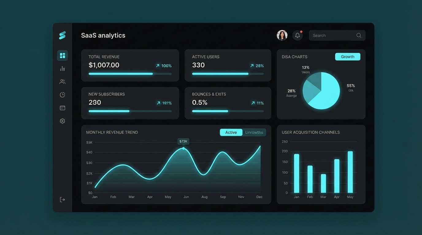
17) Tech Tank Dashboard
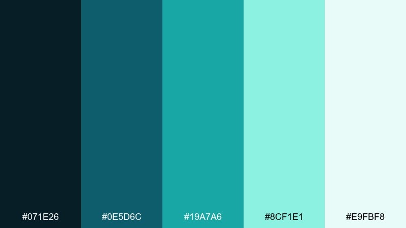
HEX: #071E26 #0E5D6C #19A7A6 #8CF1E1 #E9FBF8
Mood: futuristic, precise, confident
Best for: data dashboards and SaaS product UI
Futuristic and precise like glowing instruments in a glass tank, this set is made for numbers and navigation. Use the dark base for sidebars and top bars, then keep charts in teal and aqua for clarity. The pale mint-white helps cards feel lightweight even on dense screens. Tip: for the best aquarium color combinations in charts, limit yourself to the teal and aqua pair and use the lightest tone for highlights.
Image example of tech tank dashboard generated using media.io

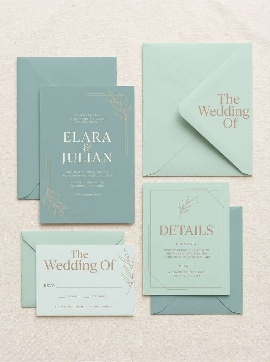
18) Coastal Wedding Glass
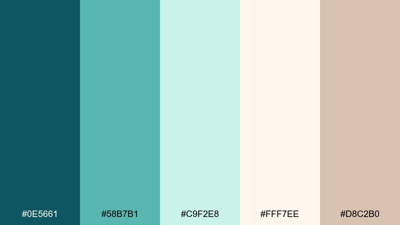
HEX: #0E5661 #58B7B1 #C9F2E8 #FFF7EE #D8C2B0
Mood: romantic, airy, elegant
Best for: wedding invitations and stationery
Romantic and airy like ocean light through glass, these pastels feel elegant and effortless. Use teal for names and monograms, with soft mint for borders and subtle watercolor washes. The warm ivory and blush-tan keep the design timeless for print. Tip: choose textured paper and keep the ink coverage light to avoid muddy tones.
Image example of coastal wedding glass generated using media.io
19) Marine Research Lab

HEX: #0A2A33 #155E75 #3BB6C6 #D7F3F5 #F2F2EF
Mood: clinical, smart, trustworthy
Best for: science reports and infographics
Clinical and smart like a marine lab notebook, this set feels trustworthy and highly legible. Use the dark blue-green for titles and data labels, then keep charts in the brighter cyan for clear separation. Pale aqua and soft white work well for table backgrounds and callout panels. Tip: stick to thin line icons and consistent grid spacing to reinforce the research vibe.
Image example of marine research lab generated using media.io
20) Neon Jelly Glow
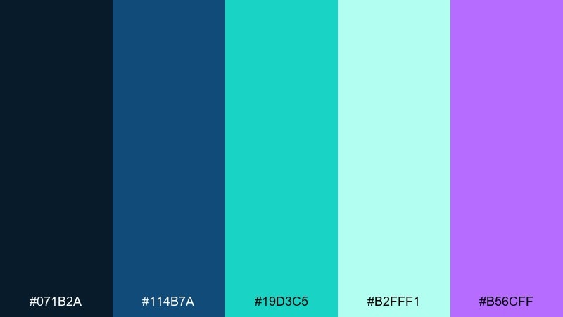
HEX: #071B2A #114B7A #19D3C5 #B2FFF1 #B56CFF
Mood: electric, playful, night-life
Best for: music flyers and streaming banners
Electric and playful like jellyfish glow in dark water, this mix is built for nightlife energy. Keep the deep navy as the base, then let bright aqua and violet create high-impact highlights. The pale mint works best for text blocks where you want light without stark white. Tip: use gradients between aqua and violet sparingly so the design stays sharp, not hazy.
Image example of neon jelly glow generated using media.io
21) Sandbar Calm
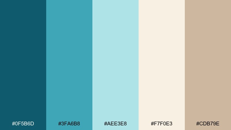
HEX: #0F5B6D #3FA6B8 #AEE3E8 #F7F0E3 #CDB79E
Mood: calm, warm, approachable
Best for: home decor mood boards and blogs
Calm and warm like a shallow sandbar, these tones feel relaxed and approachable. Use teal for structure, then let the sandy creams take over large areas for a softer, homey look. The warm beige is ideal for borders, frames, and subtle texture overlays. Tip: pair with natural materials like linen, oak, and rattan to make the palette feel lived-in.
Image example of sandbar calm generated using media.io
22) Bubble Tea Seafoam
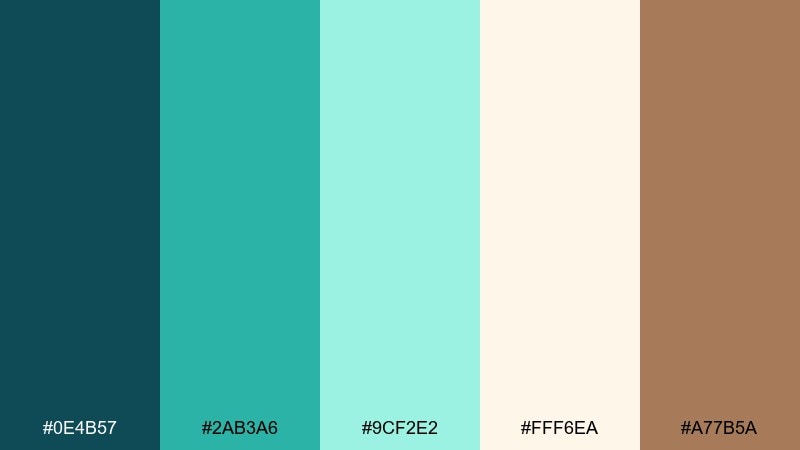
HEX: #0E4B57 #2AB3A6 #9CF2E2 #FFF6EA #A77B5A
Mood: sweet, trendy, inviting
Best for: drink shop branding and menus
Sweet and trendy like a seafoam drink topped with pearls, this set mixes freshness with a cozy brown note. Use teal and mint for the brand core, then bring in the milk-cream for menu space and packaging backgrounds. The caramel brown works great for icons, outlines, and small product details. Tip: keep the brown in thinner strokes so it reads like a topping, not a heavy base.
Image example of bubble tea seafoam generated using media.io
23) Glass Tank Classic
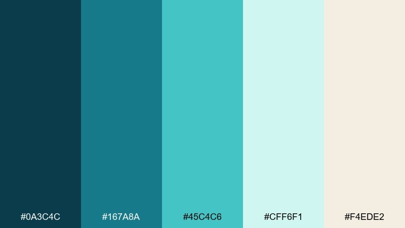
HEX: #0A3C4C #167A8A #45C4C6 #CFF6F1 #F4EDE2
Mood: classic, fresh, versatile
Best for: general branding systems and templates
Classic and fresh like a well-lit glass tank, these tones are versatile enough for almost any layout. Use the navy-teal as your anchor, then rotate teal and cyan for sections, icons, and charts. The soft mint and warm off-white keep the composition gentle and print-friendly. Tip: if you need a single go-to set, this aquarium color palette stays balanced across web and paper.
Image example of glass tank classic generated using media.io
24) Coral Reef Neutral Pop
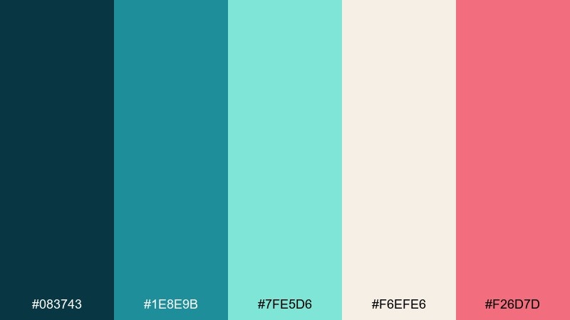
HEX: #083743 #1E8E9B #7FE5D6 #F6EFE6 #F26D7D
Mood: fresh, confident, friendly
Best for: startup branding and marketing pages
Fresh and confident like reef life against pale sand, this mix blends calm neutrals with a lively rosy pop. Keep the teal family as your foundation, then use the pink for one high-priority action like a signup button. The warm off-white helps the colors feel modern and approachable, not candy-like. Tip: for memorable aquarium color combinations, pair the pink only with the darkest teal so it reads bold and intentional.
Image example of coral reef neutral pop generated using media.io

What Colors Go Well with Aquarium?
Aquarium tones pair beautifully with warm neutrals like sand, ivory, taupe, and greige—these add comfort and keep teal-heavy designs from feeling cold.
For bolder contrast, add coral, amber, or rosy pink as a single accent color. Used sparingly, warm pops create clear CTA hierarchy against the calmer water hues.
If you need a more structured, professional look, add slate gray or charcoal for typography, UI chrome, and dividers while keeping aqua for highlights.
How to Use a Aquarium Color Palette in Real Designs
Start with one dark anchor (navy-teal or deep green) for headings, navigation, and key outlines, then pick one mid-tone teal for primary UI elements like links and icons.
Use the lightest seafoam/near-white as your main background to maintain a clean, airy feel. Reserve warm sand or cream for cards and content blocks to soften the layout.
For accessibility, test contrast on text-heavy areas: keep body copy on the lightest tones, and use saturated aqua mainly for buttons, charts, and interactive states.
Create Aquarium Palette Visuals with AI
If you want to see an aquarium color scheme in action, generate quick mockups (posters, landing pages, packaging, or dashboards) before committing to a final design direction.
With Media.io, you can turn a short prompt into consistent visuals and iterate fast—swap accents, adjust mood, and explore variations for web or print in minutes.
Pick a palette above, reuse the included prompt, and tweak the use case (brand, event, product, UI) to match your project.
Aquarium Color Palette FAQs
-
What is an aquarium color palette?
An aquarium color palette is a set of colors inspired by underwater scenes—teal, aqua, seafoam, deep ocean blues, and often warm sand or coral accents—to create a fresh, coastal look. -
Which HEX color is closest to “aquarium”?
Aquarium usually sits between teal and cyan. In these palettes, strong “aquarium” anchors include #1FA2A8, #20C3B7, and #2CB7C4 depending on how blue or green you want it. -
What accent color works best with aquarium teal?
Warm accents like coral, amber, or pastel red tend to pop cleanly against teal. Try #FFB85C (amber) or #F26D7D (rosy pink) for clear CTA emphasis. -
Are aquarium palettes good for professional slide decks?
Yes. Use a deep blue-teal for titles, a muted teal for charts, and light blue-gray/white backgrounds for readability. A set like Seaside Minimal is designed for dense presentation layouts. -
How do I keep aquarium palettes from feeling too cold?
Add warm neutrals (ivory, sand, taupe) on large surfaces like cards and sections, and keep the coolest aquas for highlights. This balance makes the palette feel welcoming instead of icy. -
Do aquarium colors work in dark mode UI?
They work especially well in dark mode because aqua highlights read “electric” against near-black backgrounds. Keep the brightest tones for interactive states and charts, and use off-white for body text. -
How can I generate aquarium-themed visuals quickly?
Use Media.io Text-to-Image: paste one of the prompts above, keep the palette’s dominant colors in the prompt, and iterate by changing the design type (poster, packaging, dashboard) while keeping the same core HEX mood.
Next: Pastel Red Color Palette


