

Baby blue is one of the easiest colors to make feel modern: it’s light, clean, and instantly calming, but it can also look bold when you pair it with deep neutrals or energetic accents.
Below are 20 baby blue color combinations (with HEX codes) you can copy for branding, UI, print, and home decor—plus practical tips for keeping contrast and warmth balanced.
In this article
- Why Baby Blue Palettes Work So Well
-
- cloud nursery
- powder denim
- icy mint whisper
- sky milk tea
- coastal linen
- bluebell and buttercream
- frosted lavender
- minimal clinic
- retro soda pop
- nordic winter light
- cotton candy calm
- gentle storm
- pearl aquarium
- springtime stationery
- luxe spa marble
- baby blue and charcoal edge
- sunlit patio
- storybook clouds
- modern tech onboarding
- wedding hydrangea
- What Colors Go Well with Baby Blue?
- How to Use a Baby Blue Color Palette in Real Designs
- Create Baby Blue Palette Visuals with AI
Why Baby Blue Palettes Work So Well
Baby blue sits in a “safe” part of the spectrum: it feels friendly, open, and airy, which makes layouts look less crowded and products feel more approachable.
Because it’s light in value, it pairs naturally with whitespace and cool neutrals—great for clean UI, editorial grids, and modern packaging where readability matters.
It’s also flexible: shift it toward mint for a fresh, wellness vibe, toward gray for a professional tone, or add warm accents (tan, peach, amber) to keep it from feeling too cold.
20+ Baby Blue Color Palette Ideas (with HEX Codes)
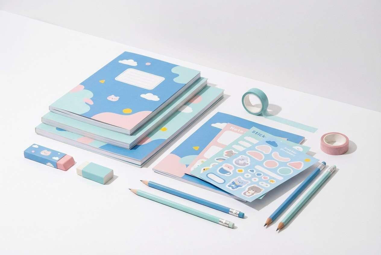
1) Cloud Nursery
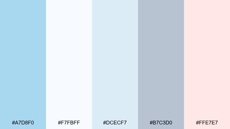
HEX: #A7D8F0 #F7FBFF #DCECF7 #B7C3D0 #FFE7E7
Mood: gentle, airy, comforting
Best for: nursery wall art and baby shower decor
Gentle, airy, and comforting, it feels like drifting clouds and clean cotton sheets. This baby blue color palette works beautifully with white space, soft gray typography, and a blush accent for warmth. Use it on nursery prints, gift tags, or a simple backdrop to keep the look calm. Tip: let the pale blue lead, then add pink only in small highlights to avoid a sugary finish.
Image example of cloud nursery generated using media.io
Media.io is an online AI studio for creating and editing video, image, and audio in your browser.

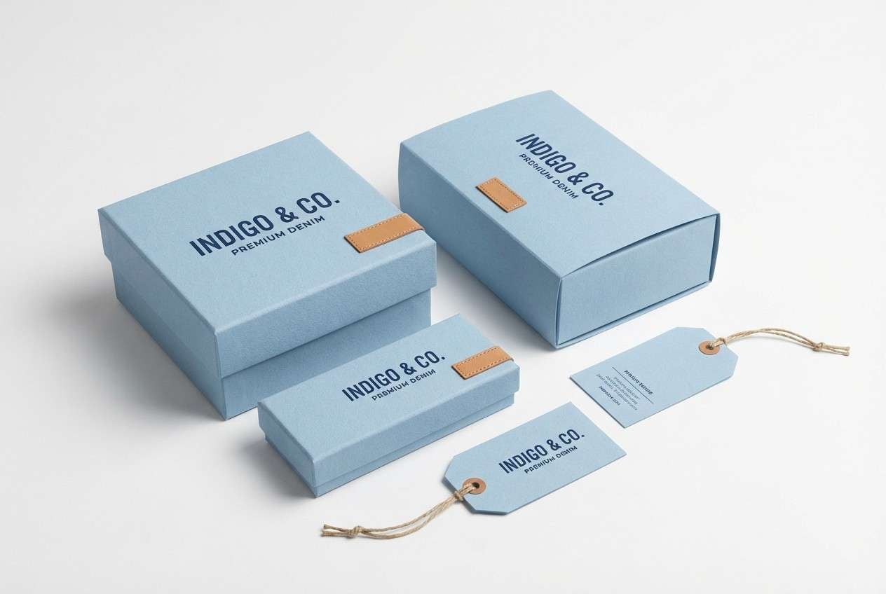
2) Powder Denim
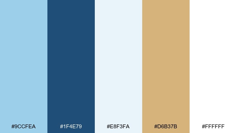
HEX: #9CCFEA #1F4E79 #E8F3FA #D6B37B #FFFFFF
Mood: clean, confident, classic
Best for: denim brand packaging and hang tags
Clean and confident, it evokes sun-faded denim with crisp stitching. The deep navy grounds the light blue so logos and size labels stay readable. Pair the warm tan as a leather-like accent on tags, seals, or stitching details. Tip: keep navy for text and barcodes, and reserve the tan for small brand marks to stay premium.
Image example of powder denim generated using media.io
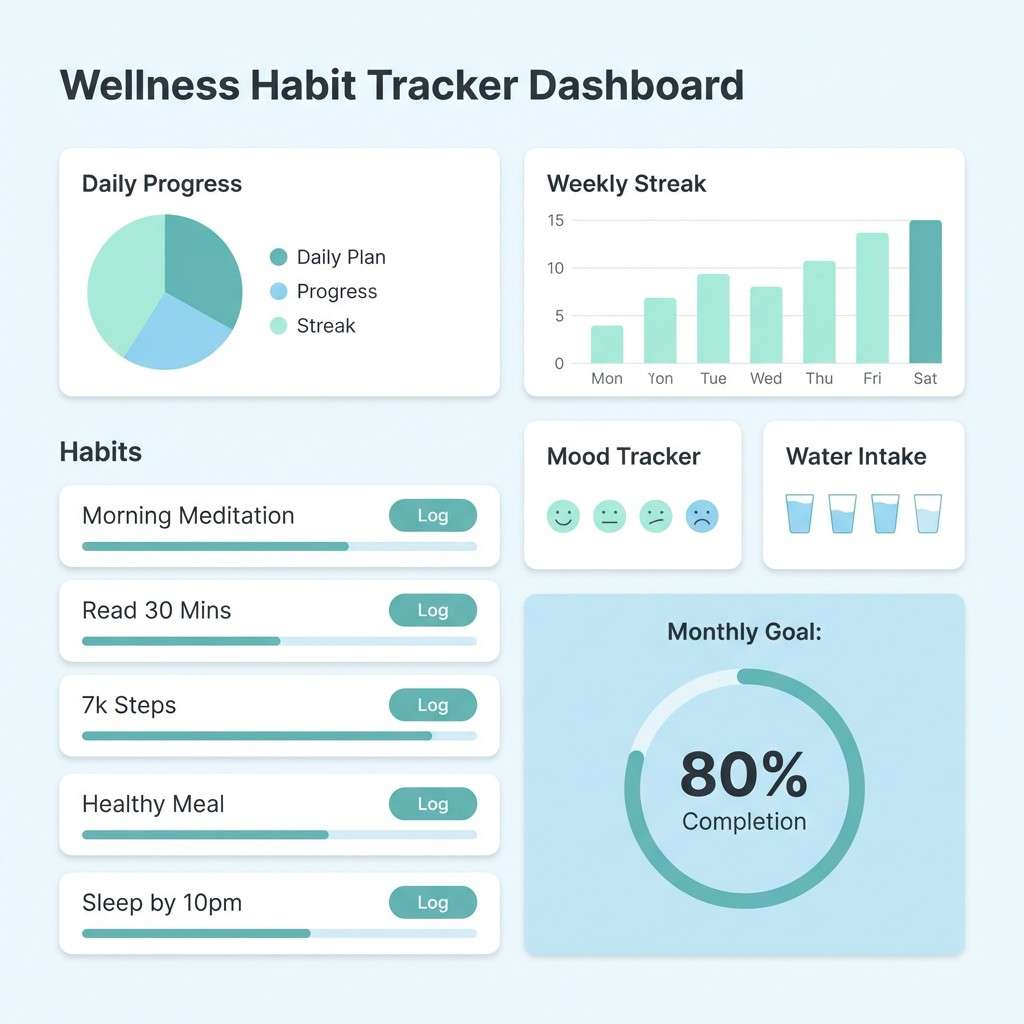
3) Icy Mint Whisper
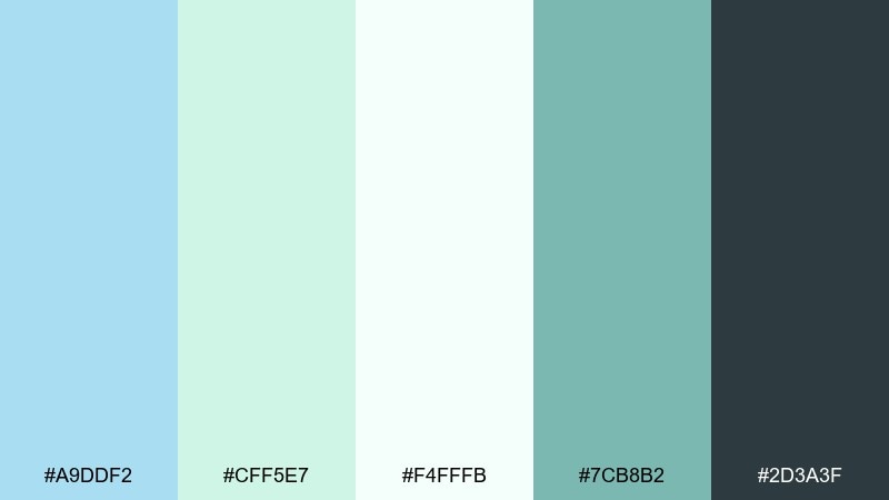
HEX: #A9DDF2 #CFF5E7 #F4FFFB #7CB8B2 #2D3A3F
Mood: fresh, light, restorative
Best for: wellness app UI and habit trackers
Fresh and restorative, it feels like cool air and a minty spa towel. The pale aqua and mint keep screens breathable, while the charcoal anchors headings and icons. Combine the deeper teal for toggles, progress rings, or active states without adding harsh contrast. Tip: use the off-white as the primary canvas to reduce eye fatigue on long sessions.
Image example of icy mint whisper generated using media.io
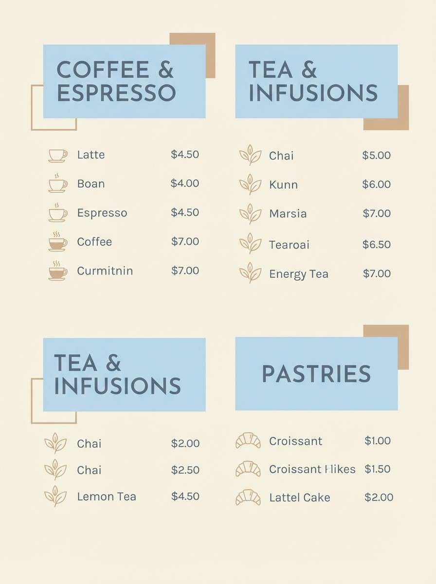
4) Sky Milk Tea
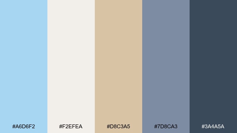
HEX: #A6D6F2 #F2EFEA #D8C3A5 #7D8CA3 #3A4A5A
Mood: cozy, modern, mellow
Best for: cafe menus and beverage posters
Cozy and mellow, it brings to mind milky tea under a bright sky. The cream and latte tones soften the blue so menu layouts feel welcoming rather than cold. Use slate and deep blue-gray for prices and section titles to keep contrast accessible. Tip: add the tan as a thin divider line or icon color to guide scanning without clutter.
Image example of sky milk tea generated using media.io
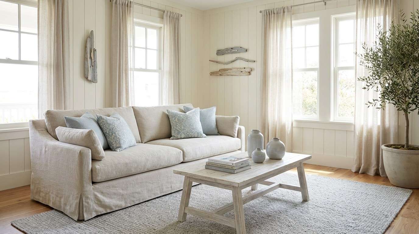
5) Coastal Linen
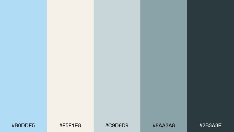
HEX: #B0DDF5 #F5F1E8 #C9D6D9 #8AA3A8 #2B3A3E
Mood: relaxed, breezy, natural
Best for: beach house interiors and home decor moodboards
Relaxed and breezy, it feels like linen curtains moving in a sea wind. The sandy off-white and foggy grays keep the blue sophisticated for living rooms, bedrooms, or rental listings. Pair the darker charcoal for metal fixtures, frames, or typography on a moodboard. Tip: repeat the pale blue in two places (pillows and artwork) to make the space feel intentional.
Image example of coastal linen generated using media.io
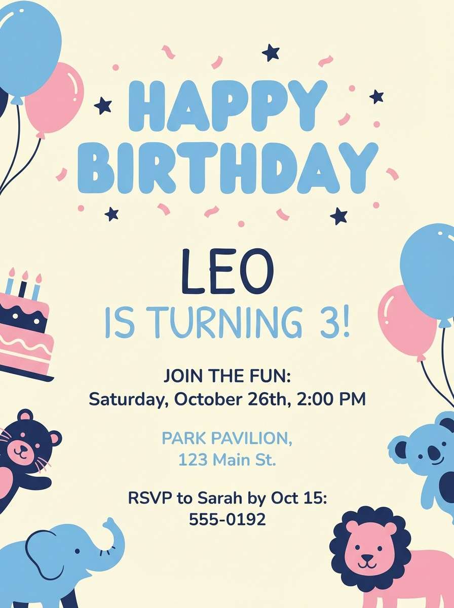
6) Bluebell and Buttercream
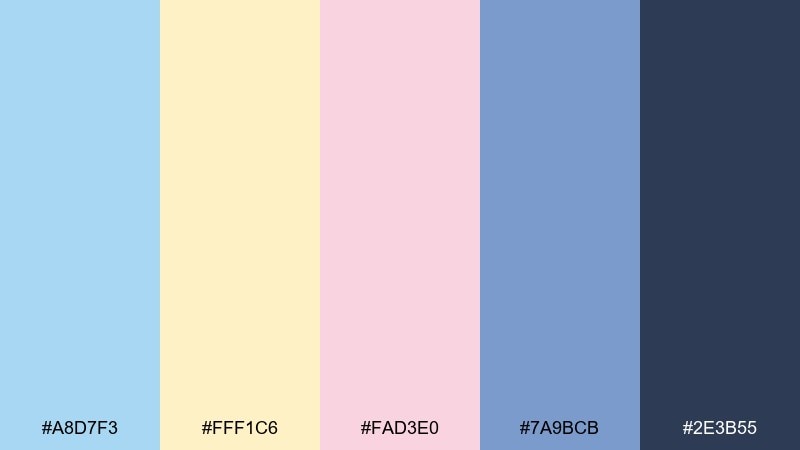
HEX: #A8D7F3 #FFF1C6 #FAD3E0 #7A9BCB #2E3B55
Mood: cheerful, sweet, playful
Best for: birthday invitations and kids party graphics
Cheerful and sweet, it looks like frosted cupcakes and spring flowers. These baby blue color combinations shine on invitations when you balance the pastels with a single deep navy for names and details. Keep buttercream as the background and use pink only for small confetti shapes or icons. Tip: print tests matter here, so avoid ultra-thin fonts on the light yellow.
Image example of bluebell and buttercream generated using media.io
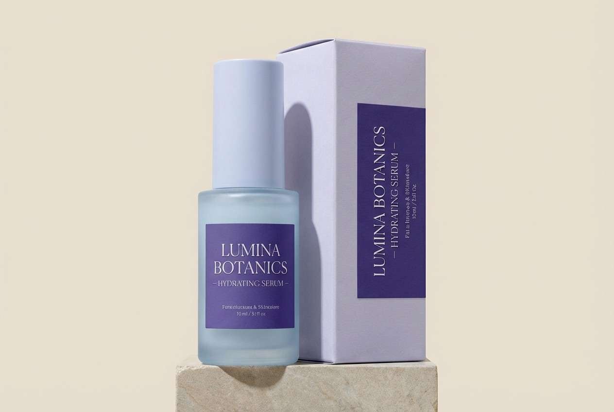
7) Frosted Lavender
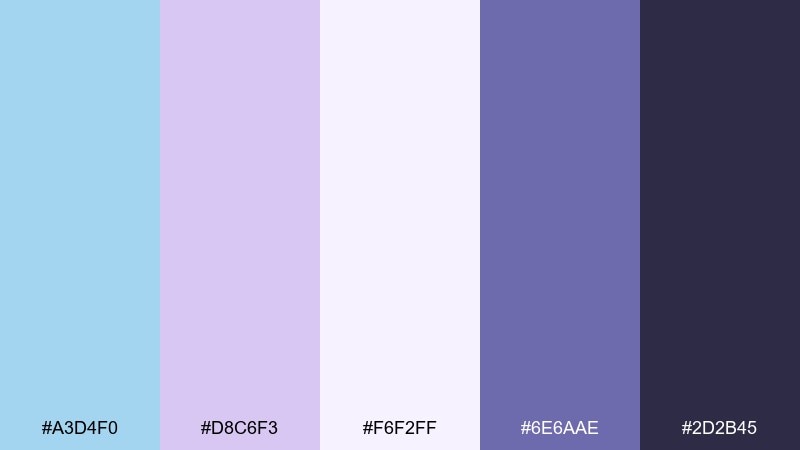
HEX: #A3D4F0 #D8C6F3 #F6F2FF #6E6AAE #2D2B45
Mood: dreamy, calming, elegant
Best for: skincare branding and product ads
Dreamy and calming, it suggests lavender steam in a cool morning bath. The pale lilac and icy blue create a soft premium feel for serums, masks, and gentle cleansers. Use the deeper violet for ingredient highlights, badges, or a subtle gradient shadow. Tip: keep text mostly in the near-black to maintain a luxe, readable finish on pale packaging.
Image example of frosted lavender generated using media.io
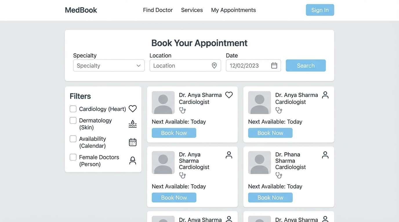
8) Minimal Clinic
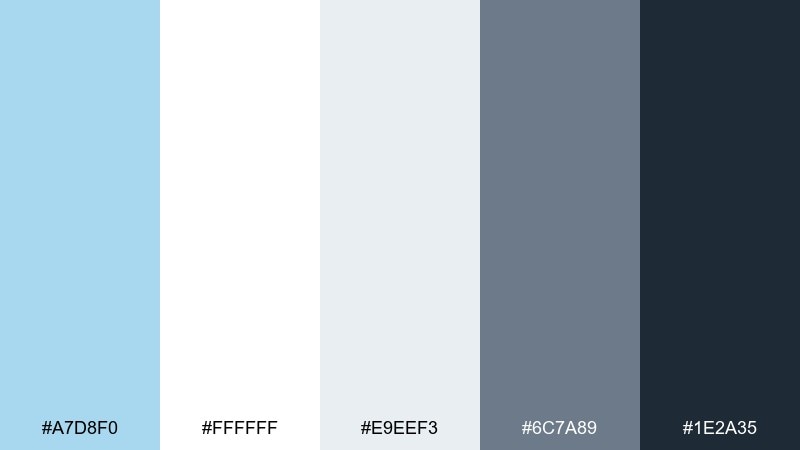
HEX: #A7D8F0 #FFFFFF #E9EEF3 #6C7A89 #1E2A35
Mood: sterile, trustworthy, modern
Best for: medical clinic websites and appointment booking UI
Trustworthy and modern, it feels like clean hallways, fresh uniforms, and clear signage. In a baby blue color scheme like this, the trick is using the blue as reassurance while the dark slate carries all critical text. Keep cards and form fields in soft gray so the interface does not feel stark. Tip: reserve the light blue for primary buttons and success states to guide patient actions.
Image example of minimal clinic generated using media.io
9) Retro Soda Pop
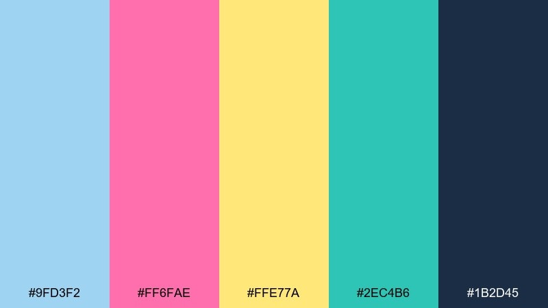
HEX: #9FD3F2 #FF6FAE #FFE77A #2EC4B6 #1B2D45
Mood: bold, fun, nostalgic
Best for: summer event flyers and promo graphics
Bold and nostalgic, it feels like a fizzy soda shop sign on a sunny afternoon. These baby blue color combinations get extra energy from hot pink and lemon, while the dark navy keeps type sharp. Use teal for secondary badges or callouts to avoid making the design too candy-heavy. Tip: keep the brightest colors in flat shapes, not gradients, to preserve the retro vibe.
Image example of retro soda pop generated using media.io

10) Nordic Winter Light
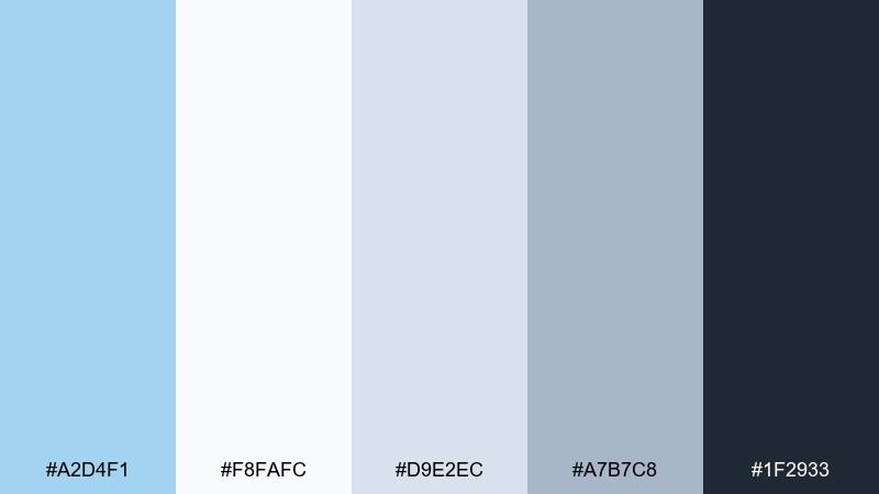
HEX: #A2D4F1 #F8FAFC #D9E2EC #A7B7C8 #1F2933
Mood: quiet, crisp, Scandinavian
Best for: minimal brand systems and editorial headers
Quiet and crisp, it captures the look of winter daylight on snow. The cool grays make the pale blue feel more architectural than cute. Pair the deep charcoal for headlines and thin rule lines to get a clean Scandinavian rhythm. Tip: keep accent usage low and let spacing do the work for a high-end, minimal feel.
Image example of nordic winter light generated using media.io
11) Cotton Candy Calm
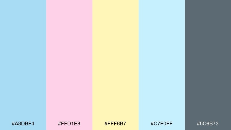
HEX: #A8DBF4 #FFD1E8 #FFF6B7 #C7F0FF #5C6B73
Mood: soft, upbeat, youthful
Best for: kids stationery sets and sticker packs
Soft and upbeat, it feels like a pastel carnival with plenty of breathing room. The light blue and pale aqua can carry most surfaces, while pink and butter yellow work best as tiny sticker accents. Use the gray-blue for outlines and small text so the cute tones still read clearly. Tip: limit each page to one bright accent so the set stays cohesive.
Image example of cotton candy calm generated using media.io
12) Gentle Storm
HEX: #9BCBE7 #5E6D7A #CED6E0 #F0F4F8 #2F3B46
Mood: moody, professional, steady
Best for: corporate reports and pitch decks
Moody yet steady, it suggests rain clouds clearing into soft light. The steel grays make the blue feel mature for charts, tables, and data-heavy pages. Use the darkest tone for headings and keep the pale blue for section highlights or callout boxes. Tip: apply the lightest gray as the slide background so graphs do not look over-contrasted.
Image example of gentle storm generated using media.io
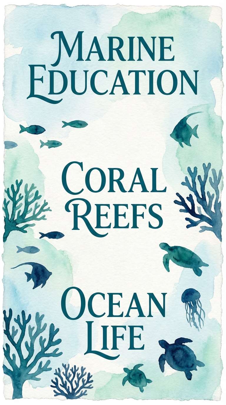
13) Pearl Aquarium
HEX: #A6D9F3 #B7F0F5 #E8FFF7 #6FB0C8 #0F2E3A
Mood: aquatic, luminous, tranquil
Best for: aquarium posters and marine education graphics
Luminous and tranquil, it feels like sunlight rippling across shallow water. The seafoam and pearl tones keep backgrounds bright, while the deep teal adds museum-like authority to labels and titles. Pair the medium aqua for icons, bubbles, or simple wave patterns. Tip: use generous margins so the darker text never competes with watery textures.
Image example of pearl aquarium generated using media.io
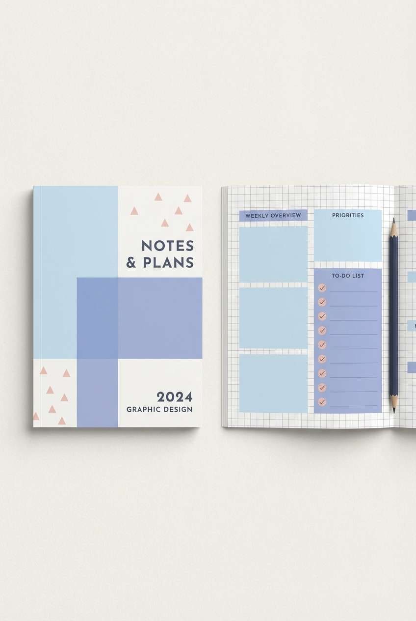
14) Springtime Stationery
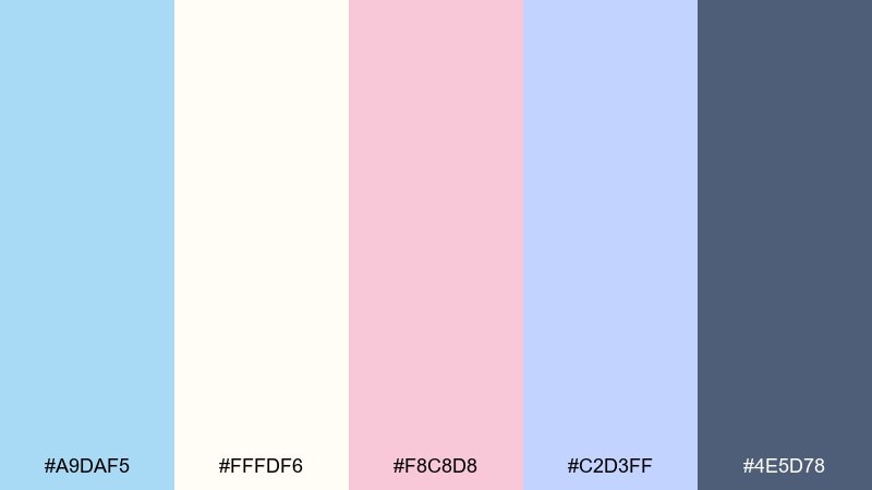
HEX: #A9DAF5 #FFFDF6 #F8C8D8 #C2D3FF #4E5D78
Mood: light, tidy, optimistic
Best for: planner covers and notebook designs
Light and optimistic, it brings to mind fresh paper, ribbon tabs, and early spring blooms. The warm off-white keeps the blues from feeling icy, while the navy-gray holds titles and dates. Pair the blush as a subtle highlight for weekends or important notes. Tip: use the periwinkle as a secondary block color to separate sections without harsh lines.
Image example of springtime stationery generated using media.io
15) Luxe Spa Marble
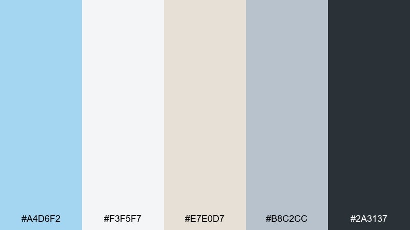
HEX: #A4D6F2 #F3F5F7 #E7E0D7 #B8C2CC #2A3137
Mood: polished, serene, upscale
Best for: spa gift sets and candle labels
Polished and serene, it evokes cool marble, warm towels, and quiet lobbies. This baby blue color palette feels most luxurious when the blue is used sparingly against soft stone neutrals. Pair the deep charcoal for label text and fine linework, and keep the beige as a warm counterbalance. Tip: emboss or foil the darkest tone on pale stock for a subtle premium finish.
Image example of luxe spa marble generated using media.io

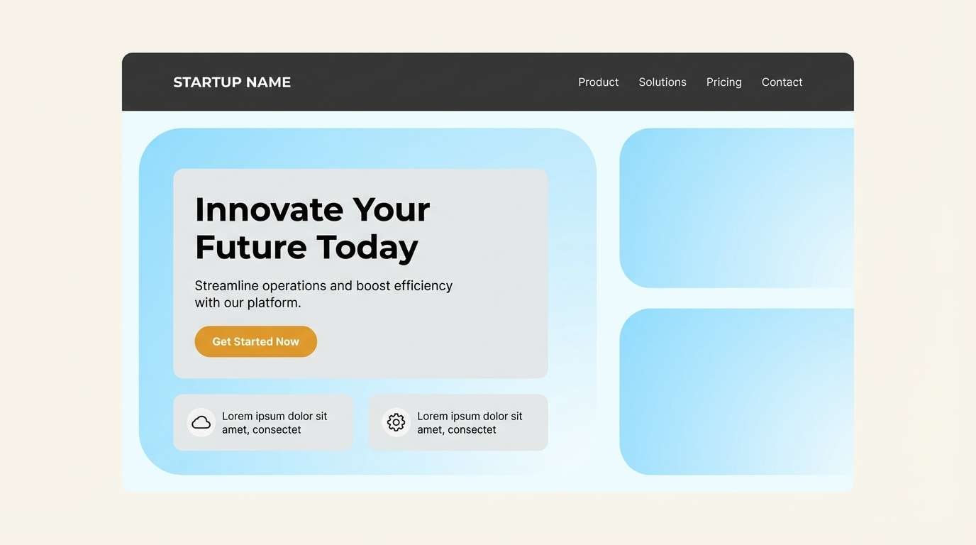
16) Baby Blue and Charcoal Edge
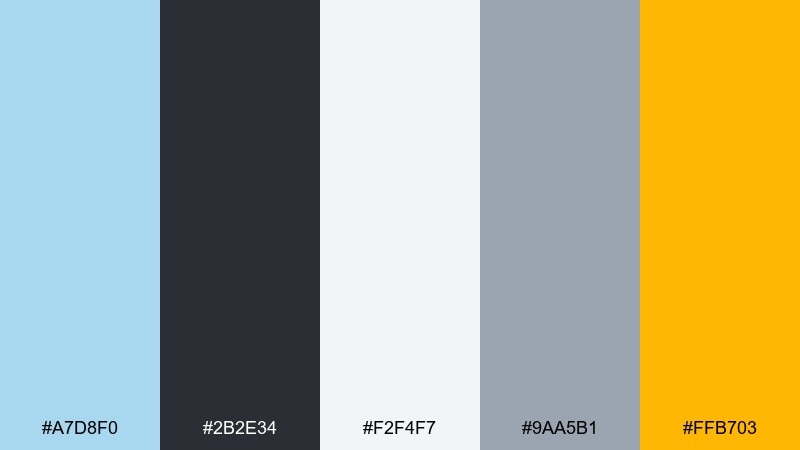
HEX: #A7D8F0 #2B2E34 #F2F4F7 #9AA5B1 #FFB703
Mood: modern, high-contrast, energetic
Best for: startup landing pages and hero sections
Modern and energetic, it feels like crisp air cut with a bold spotlight. This baby blue color combination stands out when charcoal handles structure and the warm amber is reserved for one action at a time. Pair the pale grays for backgrounds and card surfaces to keep contrast comfortable. Tip: use amber only on primary CTAs, and keep secondary buttons in outline styles.
Image example of baby blue and charcoal edge generated using media.io
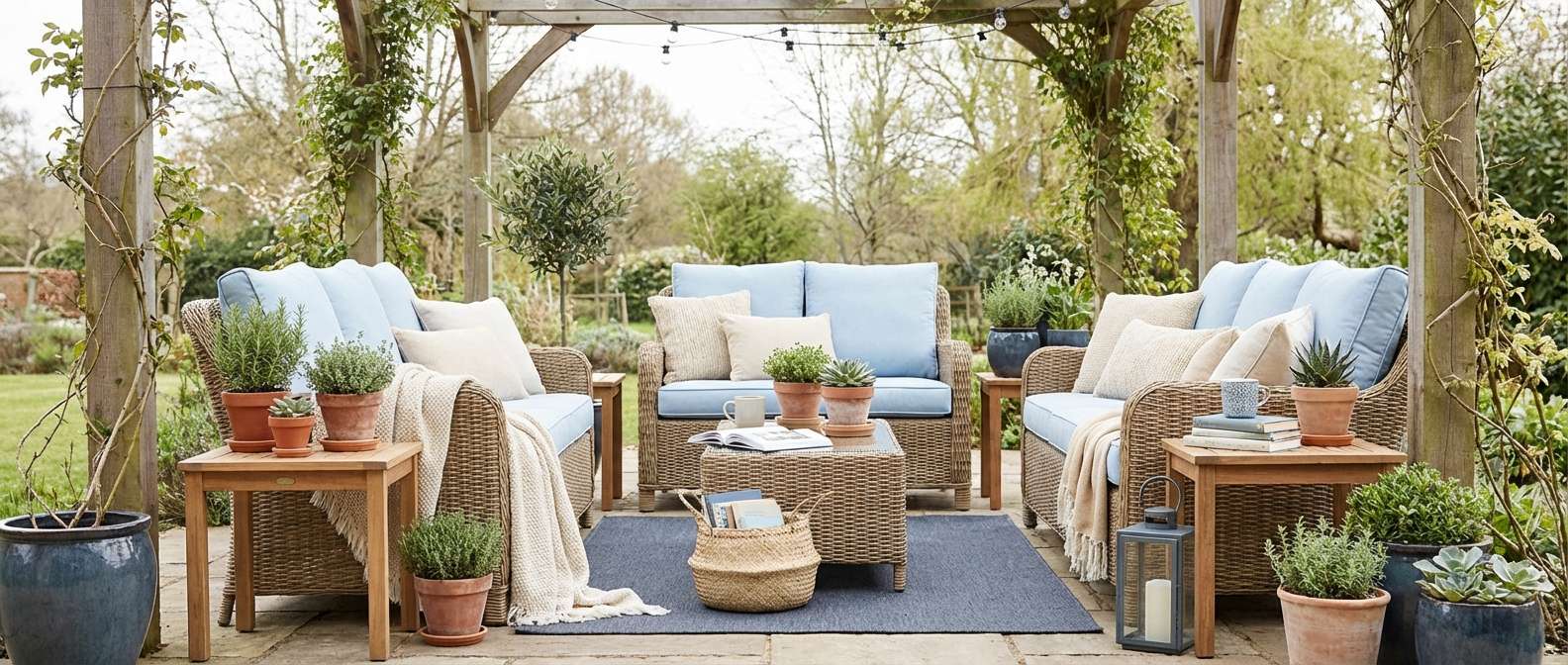
17) Sunlit Patio
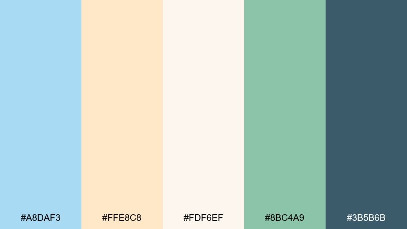
HEX: #A8DAF3 #FFE8C8 #FDF6EF #8BC4A9 #3B5B6B
Mood: bright, welcoming, airy
Best for: outdoor furniture ads and lifestyle banners
Bright and welcoming, it suggests a sunny patio with cool shade nearby. The creamy neutrals keep the blue light and livable, while the soft green nods to plants without stealing focus. Pair the deep blue-gray for headings and product names to maintain clarity. Tip: use the pale blue as the largest color area, then add green only in small decor elements.
Image example of sunlit patio generated using media.io
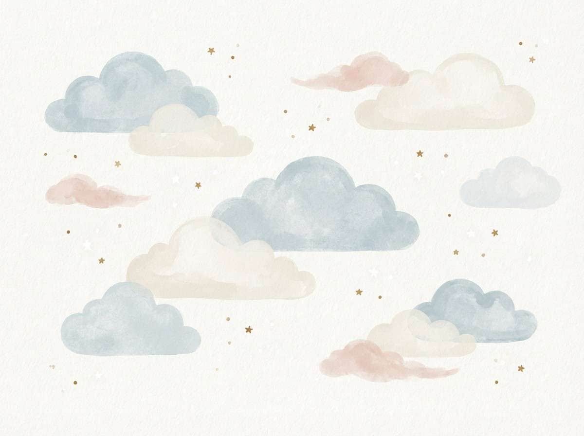
18) Storybook Clouds
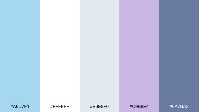
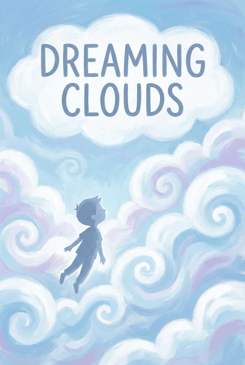
HEX: #A6D7F1 #FFFFFF #E3E9F0 #C9B6E4 #6A7BA2
Mood: whimsical, soft, imaginative
Best for: children's book covers and illustrations
Whimsical and soft, it feels like a bedtime story told under twilight clouds. The lavender adds magic to the light blue, while the deeper periwinkle gives characters and titles enough definition. Pair white as a highlight color for stars, sparkles, or speech bubbles. Tip: keep the darkest tone for the title only, so the cover stays dreamy rather than heavy.
Image example of storybook clouds generated using media.io
19) Modern Tech Onboarding
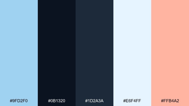
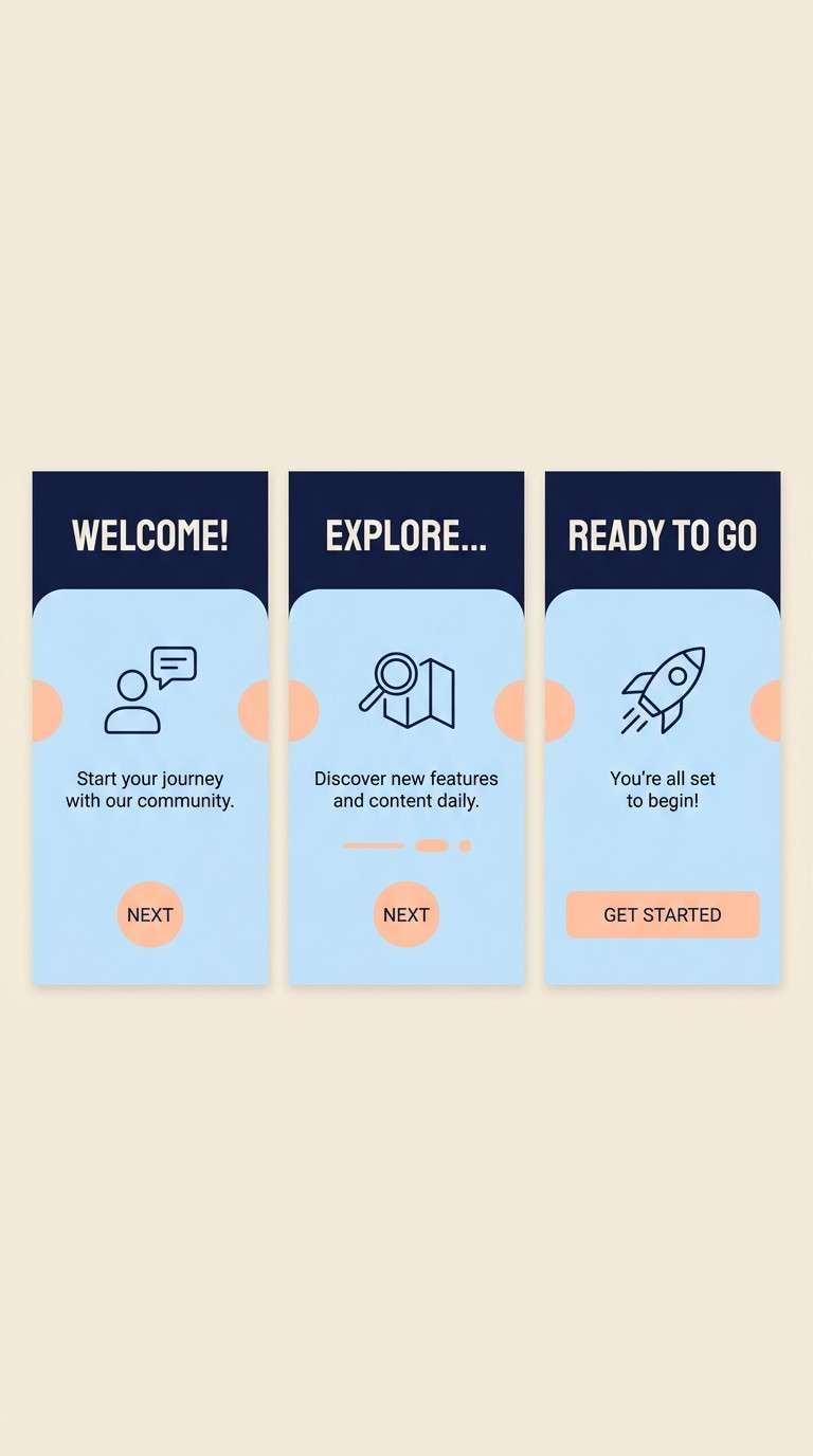
HEX: #9FD2F0 #0B1320 #1D2A3A #E6F4FF #FFB4A2
Mood: sleek, focused, friendly
Best for: app onboarding screens and feature walkthroughs
Sleek and focused, it looks like a night-mode interface softened by friendly highlights. The pale blue background panels keep the dark nav from feeling too severe, and the peach accent adds warmth to key moments. Pair the two dark tones for hierarchy: one for headers, one for body text and icons. Tip: use peach only for one highlight per screen to keep onboarding steps clear.
Image example of modern tech onboarding generated using media.io
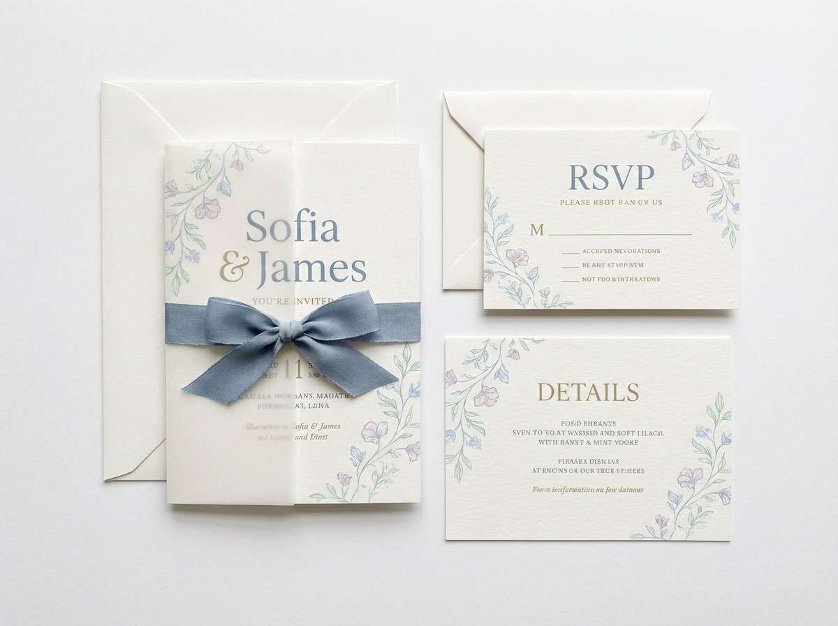
20) Wedding Hydrangea
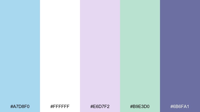
HEX: #A7D8F0 #FFFFFF #E6D7F2 #B9E3D0 #6B6FA1
Mood: romantic, fresh, airy
Best for: wedding invitations and ceremony stationery
Romantic and airy, it brings to mind hydrangea petals and soft garden light. The mix of pale blue, lilac, and mint feels floral without leaning too sweet. Pair the deeper violet-blue for names and RSVP details so the type stays elegant and readable. Tip: print on matte, slightly textured stock to make the pastels feel elevated rather than glossy.
Image example of wedding hydrangea generated using media.io
What Colors Go Well with Baby Blue?
Baby blue pairs best with crisp neutrals (white, off-white, cool light gray) when you want a calm, modern base—especially for layouts with lots of negative space.
For stronger contrast and legibility, add dark anchors like navy, charcoal, or deep blue-gray. This is the easiest way to keep baby blue from feeling “too sweet” in professional branding and UI.
If you want warmth, choose soft peach, blush, tan, or amber accents. Warm highlights make baby blue feel more human and inviting—perfect for CTAs, badges, or small decor touches.
How to Use a Baby Blue Color Palette in Real Designs
Start with baby blue as a background, surface, or secondary brand color, then assign a darker neutral for text and UI structure. This keeps contrast predictable across headings, labels, and small typography.
Use one accent color at a time for emphasis (for example: amber for primary buttons, blush for highlights, or teal for secondary callouts). Baby blue becomes more “designed” when accents are limited and consistent.
In print and interiors, repeat baby blue in at least two places (like a header + icon set, or pillows + artwork) so it feels intentional rather than accidental.
Create Baby Blue Palette Visuals with AI
If you have HEX codes but need finished visuals (posters, UI mockups, packaging, or moodboards), AI generation is a fast way to test how baby blue behaves with different lighting, textures, and typography styles.
With Media.io, you can paste a prompt, describe the design scenario, and iterate quickly—helpful when you’re comparing pastel balance, contrast, or “warm vs. cool” styling.
Try generating a few variations per palette (flat vector, studio product photo, watercolor) to see which direction matches your brand or project.
Baby Blue Color Palette FAQs
-
What is the HEX code for baby blue in this article?
A popular modern baby blue used across multiple palettes here is #A7D8F0. It’s light enough for airy backgrounds while still reading as clearly “blue.” -
Does baby blue work for professional branding?
Yes—pair it with navy or charcoal for typography and structure, and keep accents minimal. This turns baby blue into a modern, trustworthy color instead of a childish one. -
What’s the best text color on a baby blue background?
Use deep neutrals like charcoal, slate, or navy for body text and UI labels. Avoid light gray text on baby blue, because contrast drops quickly and hurts accessibility. -
What warm accent colors go well with baby blue?
Peach, blush, tan, buttercream, and amber are strong options. Warm accents counterbalance the coolness of baby blue and make designs feel more inviting. -
How do I keep baby blue from looking “too pastel” in UI design?
Use baby blue on surfaces (cards, panels, highlights), not for all UI elements. Add a dark navigation or strong headline color, then reserve bright accents for primary actions. -
Can I use baby blue in home decor without making a room feel cold?
Yes—combine baby blue with warm off-whites, beige, natural wood tones, and soft grays. Repeat baby blue in two or three small elements to keep the room cohesive. -
How can I generate images that match my baby blue palette?
Use an AI text-to-image tool and specify your HEX colors, materials (paper, denim, marble), and lighting style. Generating a few versions helps you lock in the right mood before production.
Next: Dinosaur Color Palette


