

Blue and peach is a modern color pairing that balances calm clarity with friendly warmth. It can look airy and pastel, or bold and high-contrast, depending on how you weight the blues versus the peach accents.
Below are 20+ blue and peach color combinations with HEX codes, plus quick, practical tips for branding, UI, and print layouts.
In this article
- Why Blue and Peach Color Combinations Work So Well
-
- coastal sorbet
- apricot atelier
- peachy skyline
- gelato glow
- sunday brunch
- seashell letterpress
- neon-free pop
- cloudy coral
- porcelain sunset
- boardwalk breeze
- linen and lagoon
- peach seltzer
- museum modern
- sunlit spreadsheet
- coral compass
- soft punch list
- peach quartz tech
- skincare daydream
- playroom pastels
- editorial aperitif
- aqua apricot stationery
- blue-peach contrast classic
- What Colors Go Well with Blue Peach?
- How to Use Blue and Peach Color Combinations in Real Designs
- Create Blue and Peach Palette Visuals with AI
Why Blue and Peach Color Combinations Work So Well
Blue brings structure, trust, and readability, while peach adds approachability and human warmth. Together, they create a warm-cool contrast that feels contemporary without being harsh.
This pairing is versatile because you can dial the energy up or down by shifting saturation. Pale blues with soft peach read calm and wellness-friendly, while deep navy with coral-peach accents feels bold, premium, and action-oriented.
In practical design work, blue usually performs better for typography and large backgrounds, and peach works best as an accent for highlights, buttons, and key moments. That division keeps layouts clean and prevents warm tones from overpowering the page.
20+ Blue and Peach Color Palette Ideas (with HEX Codes)
1) Coastal Sorbet
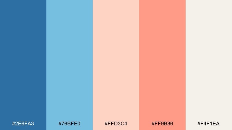
HEX: #2E6FA3 #76BFE0 #FFD3C4 #FF9B86 #F4F1EA
Mood: breezy, cheerful, sun-warmed
Best for: beach resort branding
Breezy blues meet sunlit peach like a boardwalk morning and a soft sea haze. The cooler tones work beautifully as the base, while peach and coral pop as friendly accents for calls to action. Pair with creamy off-white to keep the look airy and premium rather than loud. Usage tip: keep coral limited to one focal element per layout to avoid visual heat overload.
Image example of coastal sorbet generated using media.io
Media.io is an online AI studio for creating and editing video, image, and audio in your browser.

2) Apricot Atelier
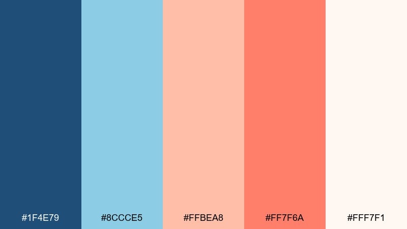
HEX: #1F4E79 #8CCCE5 #FFBEA8 #FF7F6A #FFF7F1
Mood: creative, polished, lightly playful
Best for: design studio website
Creative and polished, these blue peach tones feel like a sunlit studio with paint tubes and fresh paper. Use the deep blue for navigation and type, then bring in apricot for buttons, badges, and hover states. The pale blue keeps sections calm and readable while warm peach prevents the page from feeling cold. Usage tip: set the lightest shade as your main background to keep contrast clean and accessible.
Image example of apricot atelier generated using media.io
3) Peachy Skyline
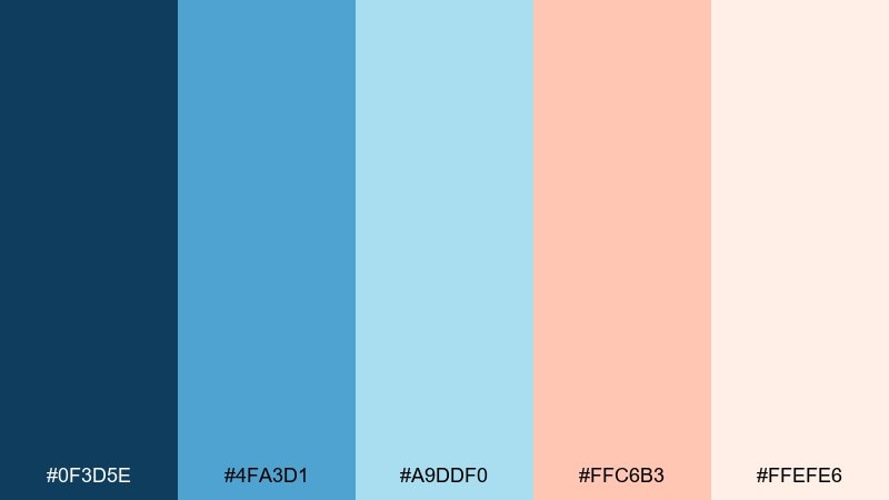
HEX: #0F3D5E #4FA3D1 #A9DDF0 #FFC6B3 #FFEFE6
Mood: fresh, optimistic, city-summer
Best for: startup pitch deck
Fresh and optimistic, it reads like a clear skyline with a warm sunset blush. Anchor slides with the inky blue for headings and charts, then use peach to highlight metrics and key takeaways. The lighter blues keep data sections breathable and modern. Usage tip: reserve the warmest peach for a single highlight color across the whole deck for consistency.
Image example of peachy skyline generated using media.io

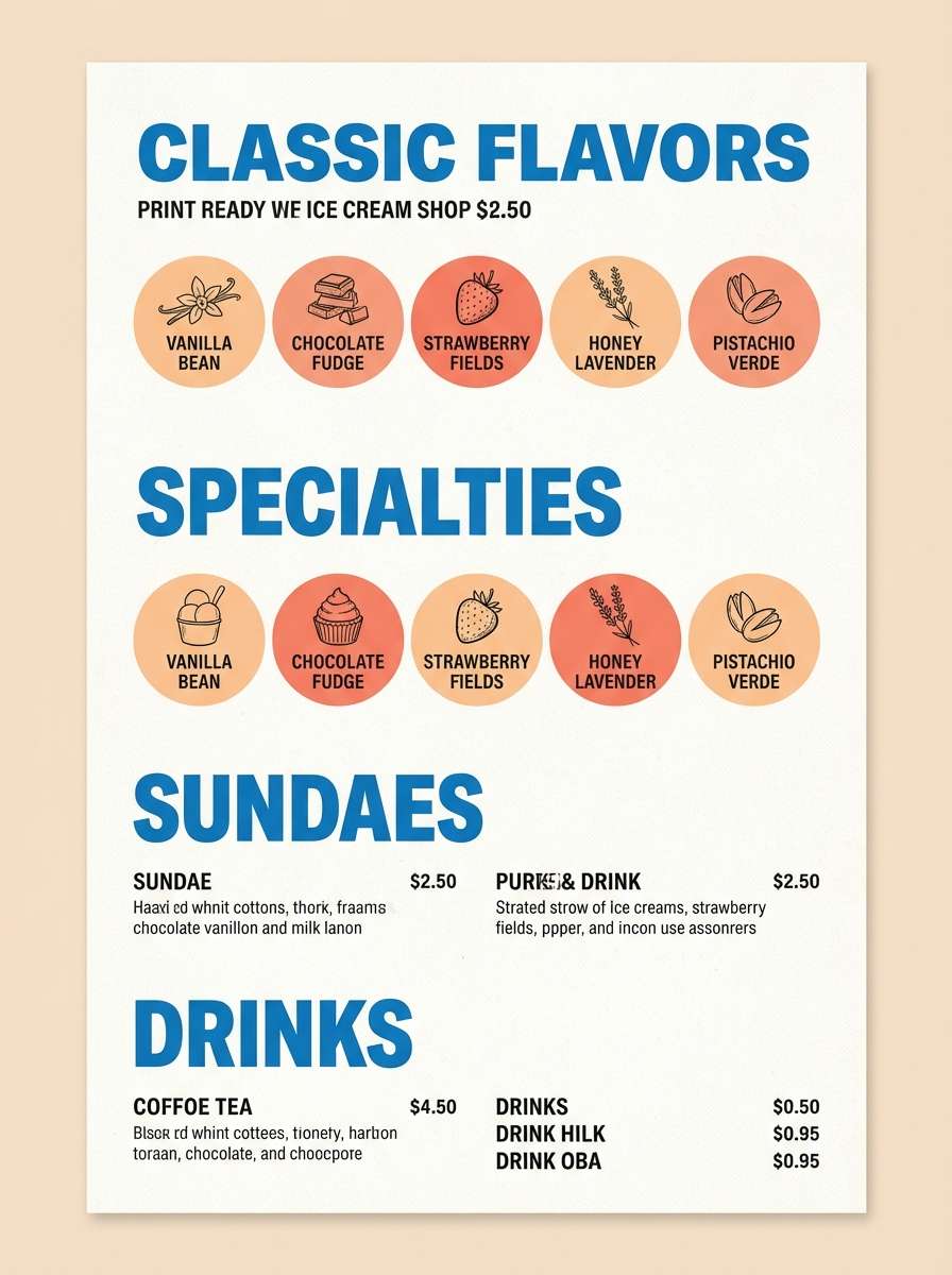
4) Gelato Glow
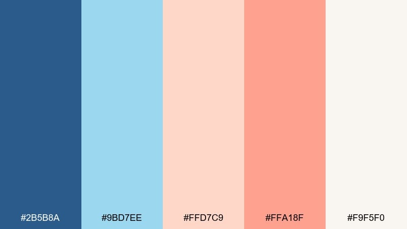
HEX: #2B5B8A #9BD7EE #FFD7C9 #FFA18F #F9F5F0
Mood: sweet, friendly, airy
Best for: ice cream shop menu
Sweet and friendly, these blue and peach hues feel like gelato in a chilled display case. Use the mid blue for section headers and pricing, then let peach and coral drive flavor callouts and limited-time tags. The pale blue works well for subtle panels behind text without overpowering photography. Usage tip: keep body text in the darker blue for clarity against the creamy base.
Image example of gelato glow generated using media.io
5) Sunday Brunch
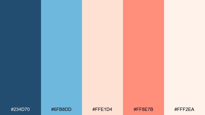
HEX: #234D70 #6FB8DD #FFE1D4 #FF8E7B #FFF2EA
Mood: cozy, sociable, inviting
Best for: cafe social posts
Cozy and sociable, these blue and peach combinations evoke linen napkins, iced coffee, and a peach pastry on the side. Build posts with light blue blocks for structure, then use the warm coral for prices, stickers, and limited offers. The deep blue keeps typography crisp and prevents the palette from turning too sugary. Usage tip: add generous white space so the warm accents feel intentional, not crowded.
Image example of sunday brunch generated using media.io
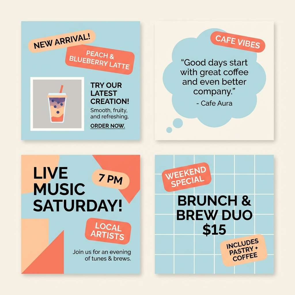
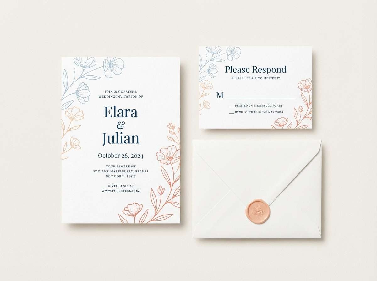
6) Seashell Letterpress
HEX: #1E4666 #7EC3E5 #FFD0BE #FF7565 #FAF0E8
Mood: classic, handcrafted, romantic
Best for: wedding invitation suite
Classic and handcrafted, this blue and peach palette feels like letterpress paper with a seaside breeze. Use the deep blue for names and key details, while peach brings softness to borders, icons, and RSVP highlights. The creamy neutral keeps everything elegant and readable for print. Usage tip: choose one warm accent (peach or coral) for embellishments and keep the other for tiny details only.
Image example of seashell letterpress generated using media.io
7) Neon-Free Pop
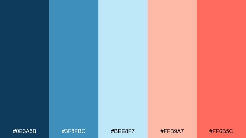
HEX: #0E3A5B #3F8FBC #BEE8F7 #FFB9A7 #FF6B5C
Mood: bold, modern, energetic
Best for: event poster series
Bold and modern, it brings concert-poster energy without drifting into neon. These blue peach color combinations work best when the deep blue carries typography and the coral is saved for date, venue, and key hooks. Use the icy blue as a buffer color to separate warm blocks and keep hierarchy clear. Usage tip: try a two-color headline (deep blue plus coral) and keep everything else quieter.
Image example of neon-free pop generated using media.io

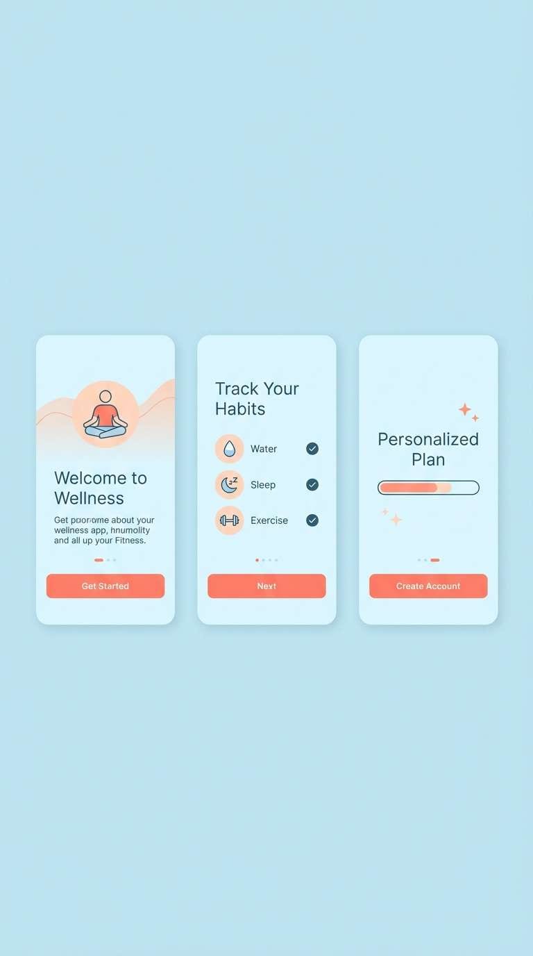
8) Cloudy Coral
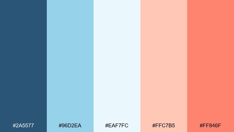
HEX: #2A5577 #96D2EA #EAF7FC #FFC7B5 #FF846F
Mood: calm, uplifting, approachable
Best for: wellness app onboarding
Calm and uplifting, it feels like slow breaths under a bright sky with a hint of coral sunrise. Use the softest blue as your main canvas, then bring coral in for progress indicators and primary buttons. The deeper blue keeps copy readable and makes icons feel grounded. Usage tip: keep button fills coral but set button text in deep blue for a softer, less aggressive contrast.
Image example of cloudy coral generated using media.io
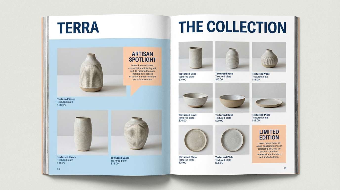
9) Porcelain Sunset
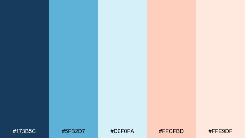
HEX: #173B5C #5FB2D7 #D6F0FA #FFCFBD #FFE9DF
Mood: soft, refined, gallery-like
Best for: ceramics product catalog
Soft and refined, this blue peach color palette resembles glazed porcelain lit by a gentle sunset. Use cool blues for section structure and product specs, then layer peach as a subtle highlight for featured items. The pale neutrals help photography feel lighter and more premium. Usage tip: add thin blue rules and ample margins to give the layout a gallery-catalog rhythm.
Image example of porcelain sunset generated using media.io
10) Boardwalk Breeze
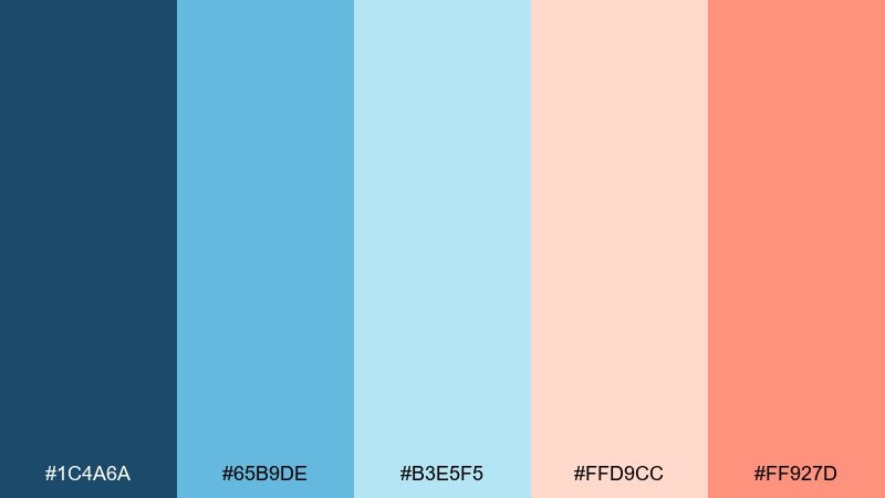
HEX: #1C4A6A #65B9DE #B3E5F5 #FFD9CC #FF927D
Mood: bright, outdoorsy, carefree
Best for: summer festival flyer
Bright and outdoorsy, it captures a breezy boardwalk afternoon with cotton-candy skies. Let the mid blue set the headline base, then use peach and coral for performer names and ticket badges. The lighter blues make strong backgrounds for small text blocks without sacrificing contrast. Usage tip: keep the warm tones clustered in one area to create a clear focal point.
Image example of boardwalk breeze generated using media.io

11) Linen and Lagoon
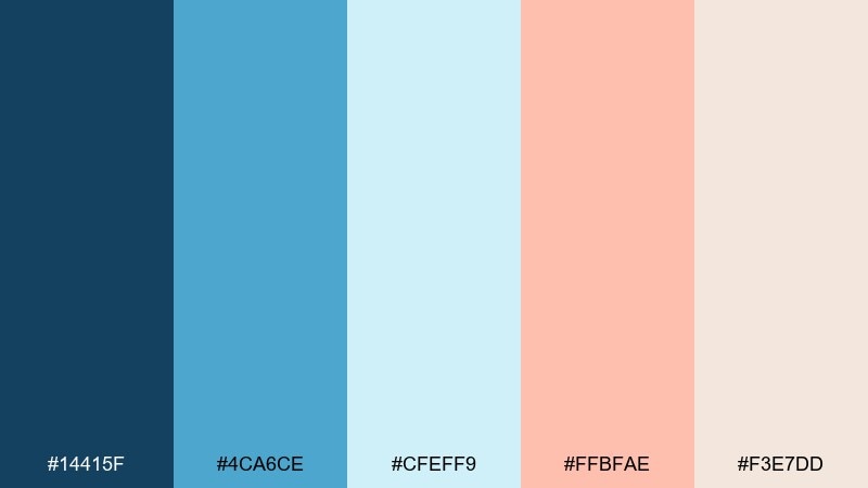
HEX: #14415F #4CA6CE #CFEFF9 #FFBFAE #F3E7DD
Mood: relaxed, coastal, understated
Best for: interior design mood board
Relaxed and understated, these blue peach hues feel like washed linen beside a quiet lagoon. Use the creamy linen tone for walls and large surfaces, then bring in lagoon blues for cabinetry, tiles, or textiles. Peach works best as a small accent in art prints or throw pillows to warm up the cool base. Usage tip: repeat peach in two small spots rather than one large block for a more designer look.
Image example of linen and lagoon generated using media.io
12) Peach Seltzer
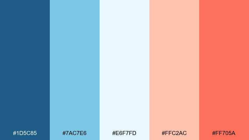
HEX: #1D5C85 #7AC7E6 #E6F7FD #FFC2AC #FF705A
Mood: sparkly, youthful, refreshing
Best for: beverage can packaging
Sparkly and refreshing, it gives the vibe of fizzy bubbles and fruit slices in a cold glass. Put the deeper blue on key brand elements for shelf clarity, then use peach and coral for flavor cues and icons. The light blue keeps the can feeling clean and modern. Usage tip: use the coral sparingly as a punch color so the package stays premium, not cartoonish.
Image example of peach seltzer generated using media.io
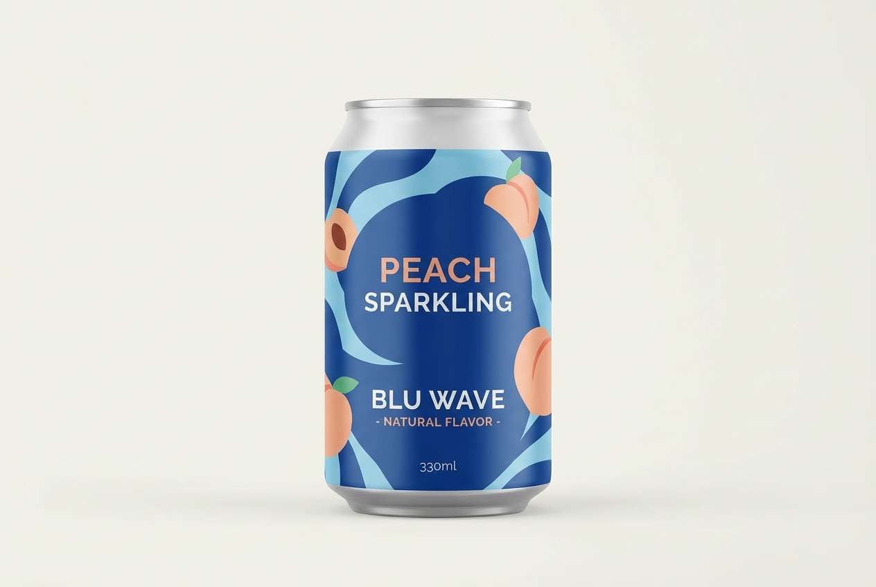
13) Museum Modern
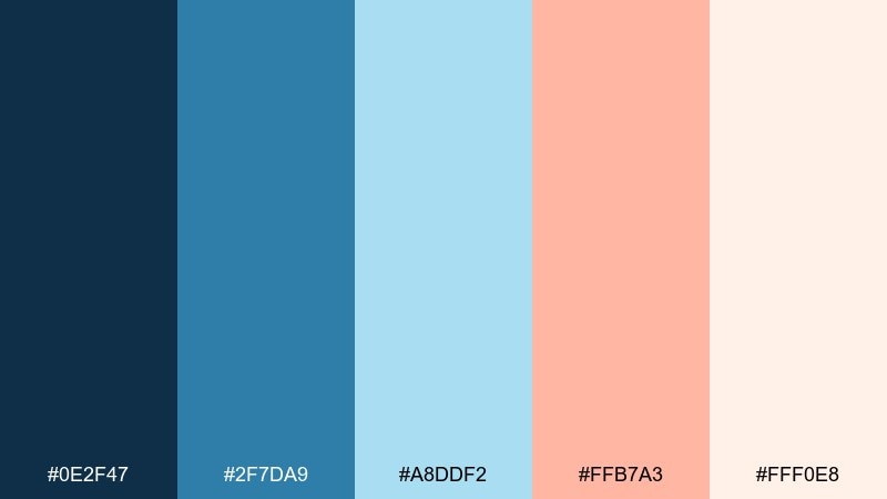
HEX: #0E2F47 #2F7DA9 #A8DDF2 #FFB7A3 #FFF0E8
Mood: smart, modern, curated
Best for: art gallery landing page
Smart and curated, it feels like a modern exhibit with warm lighting over cool walls. A strong navy-blue base makes typography and navigation feel confident, while the peach accent adds approachability to tickets and CTAs. If you want a blue peach color palette that stays refined, keep the warm hue to small UI moments and let pale blue handle large panels. Usage tip: pair with a clean grotesk font and generous spacing for a gallery-grade finish.
Image example of museum modern generated using media.io
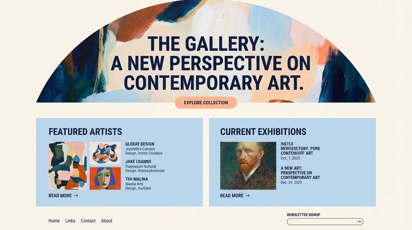
14) Sunlit Spreadsheet
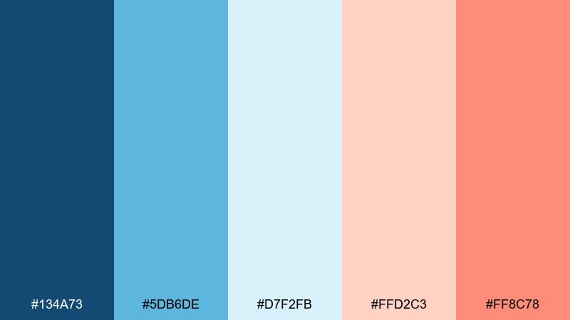
HEX: #134A73 #5DB6DE #D7F2FB #FFD2C3 #FF8C78
Mood: clear, organized, friendly
Best for: dashboard UI theme
Clear and organized, it feels like a spreadsheet that finally looks friendly. Use the deeper blue for primary text and navigation, and set cards in pale blue to separate modules without heavy borders. Peach is great for status highlights, selected states, and gentle warnings that should not feel alarming. Usage tip: keep charts mostly in blues and reserve peach for one key data series to guide attention.
Image example of sunlit spreadsheet generated using media.io
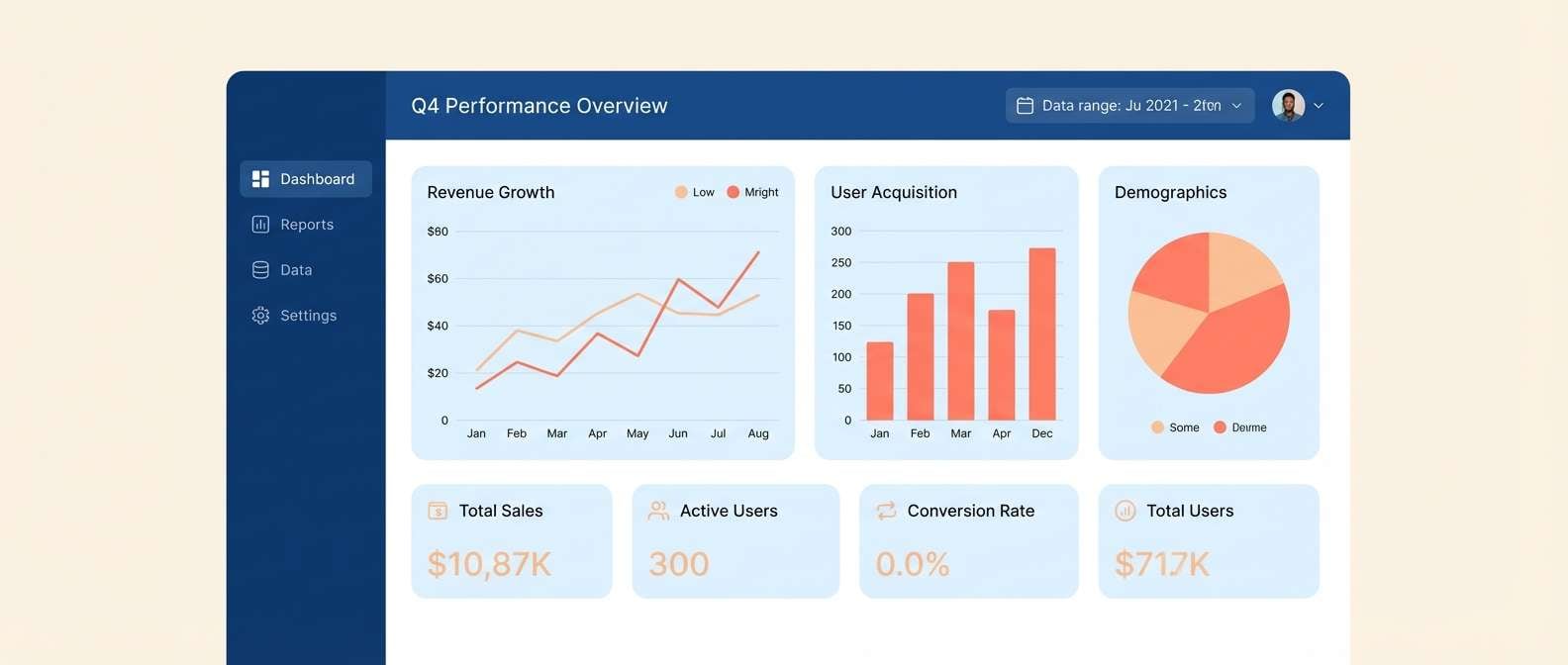
15) Coral Compass
HEX: #0F4468 #6CC0E2 #BFEAFA #FFC8B4 #FF6F5E
Mood: adventurous, clean, contemporary
Best for: travel blog hero graphics
Adventurous and clean, this blue and peach combination suggests ocean charts with a coral-tinted sunrise on the horizon. Keep blues dominant for headers and background gradients, then let coral point to headlines, tags, and interactive prompts. The soft peach tone helps transition between warm and cool elements without harsh edges. Usage tip: try a light-blue background with a single coral badge to make the hero feel crisp and clickable.
Image example of coral compass generated using media.io

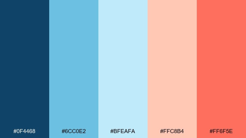
16) Soft Punch List
HEX: #1A567C #88CFEA #EAF9FE #FFCCB9 #FF806A
Mood: helpful, light, optimistic
Best for: infographic templates
Helpful and optimistic, it feels like sticky notes and clean diagrams on a bright desk. Use blues for the core structure and data blocks, then add peach for icons, numbered steps, and emphasis labels. The near-white tint keeps dense information readable without looking sterile. Usage tip: cap accent usage at about 10 percent of the page so the hierarchy stays strong.
Image example of soft punch list generated using media.io
17) Peach Quartz Tech
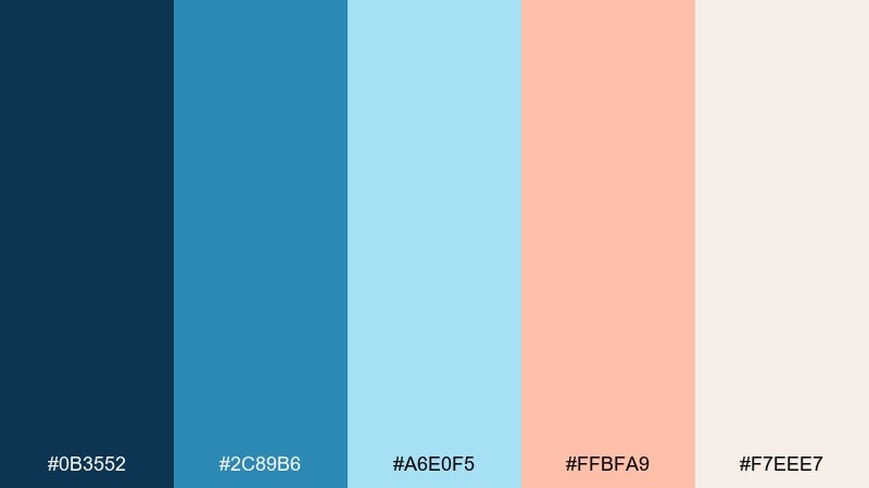
HEX: #0B3552 #2C89B6 #A6E0F5 #FFBFA9 #F7EEE7
Mood: sleek, trustworthy, warm-modern
Best for: SaaS branding kit
Sleek and trustworthy, it mixes tech confidence with a warm quartz glow. Use navy for your wordmark and core brand typography, then bring peach into illustrations, gradients, and secondary buttons. The lighter blues make excellent backgrounds for diagrams and onboarding cards. Usage tip: pair with a neutral gray for form fields so the warm accents stay special.
Image example of peach quartz tech generated using media.io
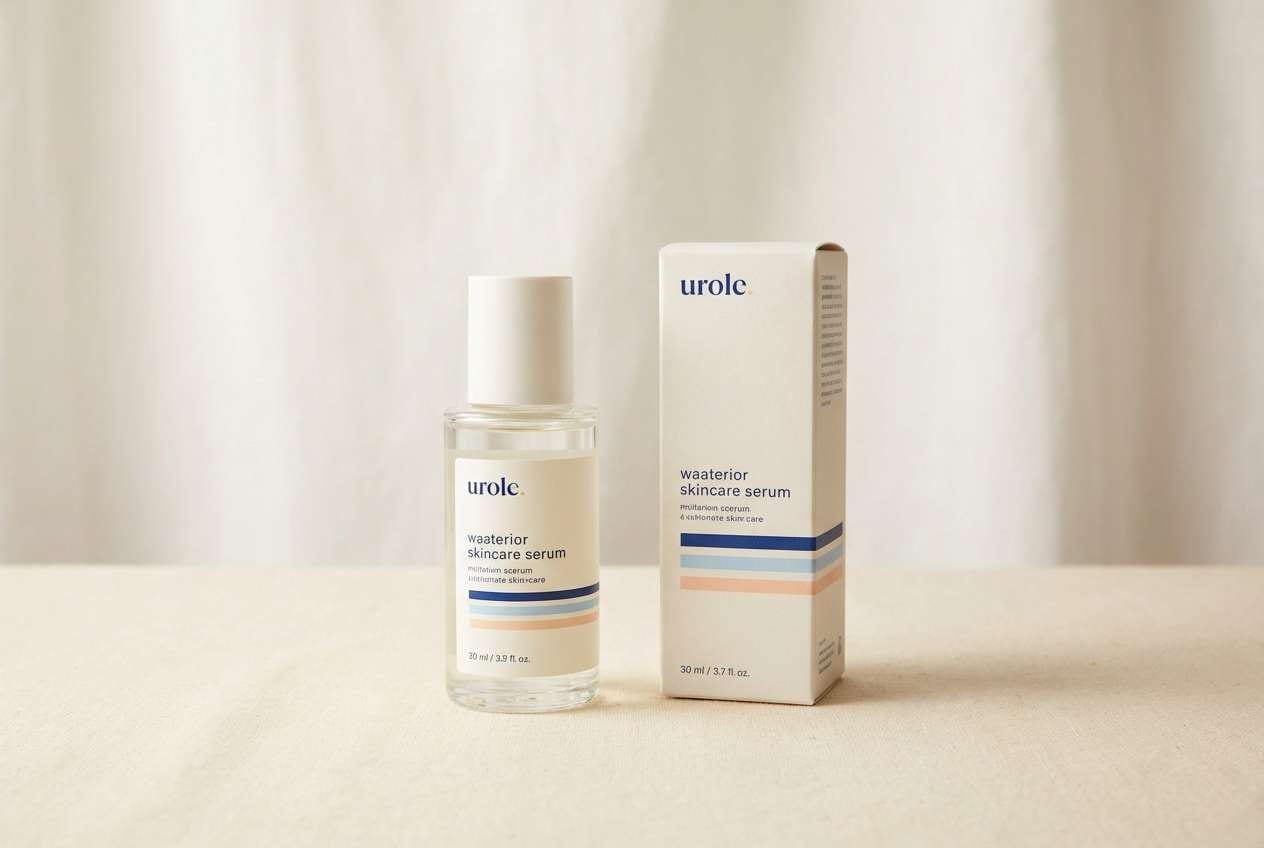
18) Skincare Daydream
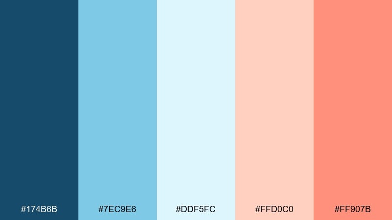
HEX: #174B6B #7EC9E6 #DDF5FC #FFD0C0 #FF907B
Mood: clean, gentle, spa-like
Best for: skincare product ad
Clean and gentle, it reads like a spa towel, cool mist, and a soft peach glow on skin. These blue peach color combinations shine in skincare when blue sets trust and cleanliness, while peach suggests warmth and glow. Use the palest tint as the background and let coral handle one hero detail like a seal or benefit callout. Usage tip: keep copy in deep blue and avoid using coral for long text blocks.
Image example of skincare daydream generated using media.io
19) Playroom Pastels
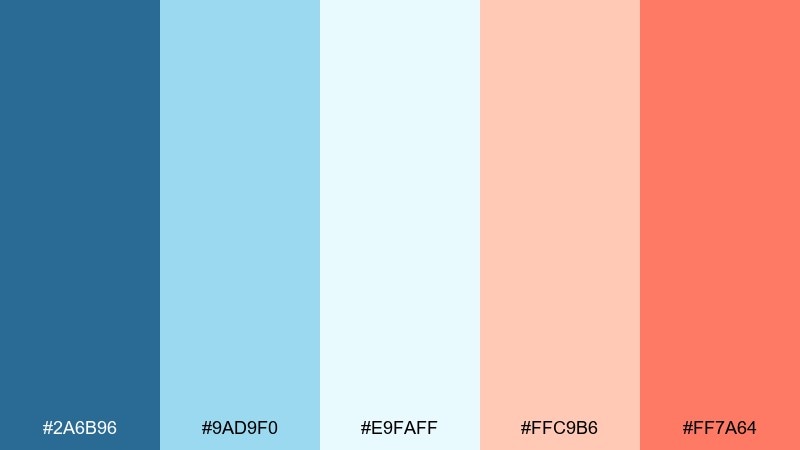
HEX: #2A6B96 #9AD9F0 #E9FAFF #FFC9B6 #FF7A64
Mood: playful, safe, sunny
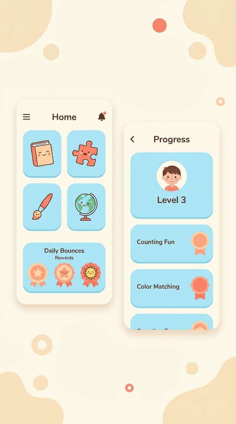
Best for: kids education app UI
Playful and sunny, it feels like soft blocks, storybooks, and a warm afternoon window. Use bright blues for friendly navigation and progress, then add peach for reward states and celebratory stickers. The almost-white tint keeps screens from feeling busy even with lots of icons. Usage tip: apply coral only to success moments so it stays exciting and easy to spot.
Image example of playroom pastels generated using media.io
20) Editorial Aperitif
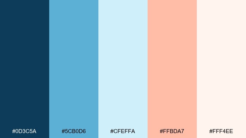
HEX: #0D3C5A #5CB0D6 #CFEFFA #FFBDA7 #FFF4EE
Mood: stylish, airy, magazine-ready
Best for: lifestyle magazine spread
Stylish and airy, it feels like an aperitif at golden hour with crisp, editorial typography. Use deep blue for headlines and captions, then let peach appear in pull quotes, section tabs, or small decorative rules. The pale blue helps create gentle color blocks behind text without heavy contrast. Usage tip: keep imagery warm-neutral so the peach accents read intentional, not mismatched.
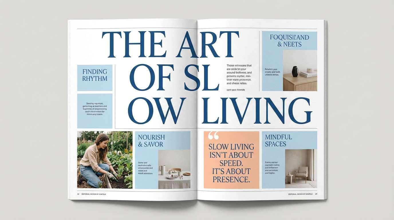
Image example of editorial aperitif generated using media.io
21) Aqua Apricot Stationery

HEX: #1D4F74 #73C2E2 #E3F7FE #FFCDBA #FF856F
Mood: neat, friendly, giftable
Best for: stationery set packaging
Neat and giftable, it brings to mind crisp notepaper with a soft apricot seal. Use the mid blue for patterns and borders, and reserve peach for labels, stickers, or a small brand mark. The near-white and pale blue keep the set looking clean on shelves and in product photos. Usage tip: use a repeating blue pattern and a single peach focal label for a balanced, boutique feel.
Image example of aqua apricot stationery generated using media.io
22) Blue-Peach Contrast Classic
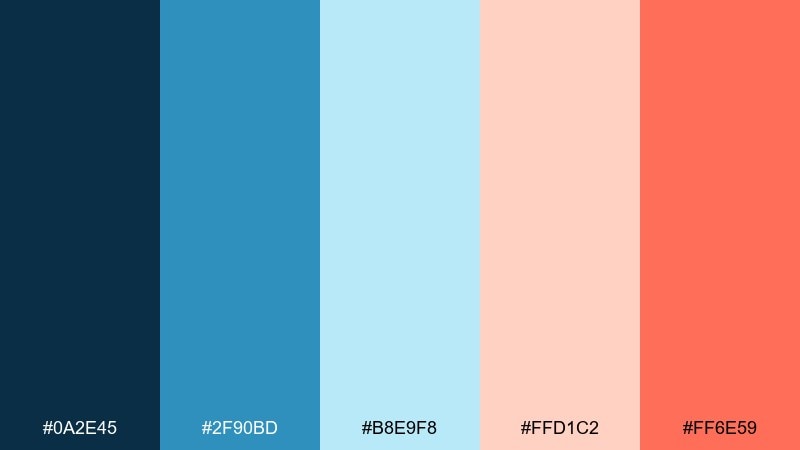
HEX: #0A2E45 #2F90BD #B8E9F8 #FFD1C2 #FF6E59
Mood: balanced, classic, confidently modern
Best for: brand guidelines one-pager
Balanced and confidently modern, it combines a classic navy foundation with a warm peach lift. Use the darkest blue for your primary identity elements, then apply coral as the signature highlight across buttons, bullets, and key callouts. For teams that need consistency, this blue peach color palette is easy to standardize across print and digital. Usage tip: define one primary blue, one accent warm, and keep the rest as supporting tints in your guidelines.
Image example of blue-peach contrast classic generated using media.io
What Colors Go Well with Blue Peach?
Neutrals are the easiest add-on: warm off-white, cream, sand, and light greige help the palette feel premium and keep peach accents from getting too sweet. Charcoal or deep navy also works well for typography when you need consistent readability.
For extra depth, try adding muted teal or seafoam as a bridge between blue and peach, or a soft terracotta for a warmer, more editorial look. If you want a sharper modern edge, a tiny amount of cool gray-blue can keep the system crisp.
When in doubt, keep blue as the main system color, neutrals as the canvas, and peach/coral as the attention driver. That ratio tends to work in branding, UI, and print without feeling busy.
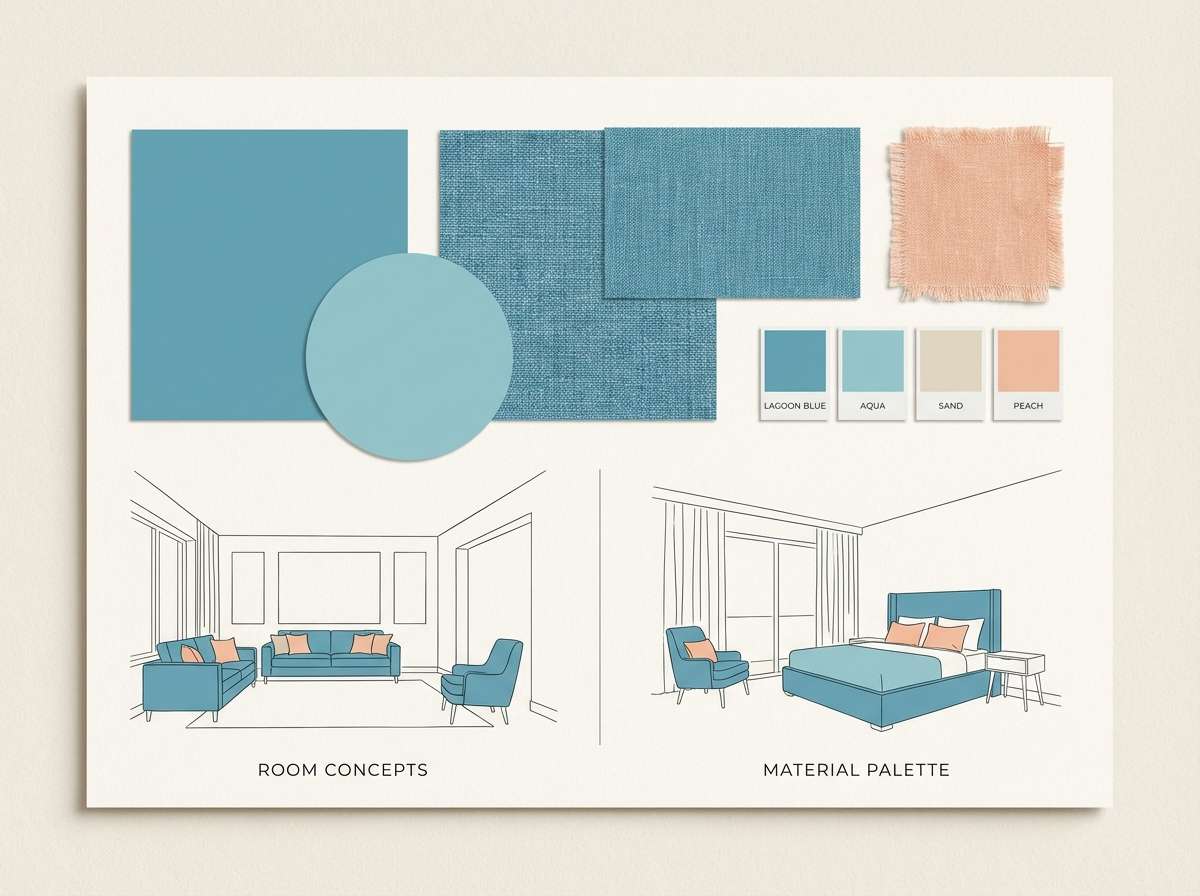
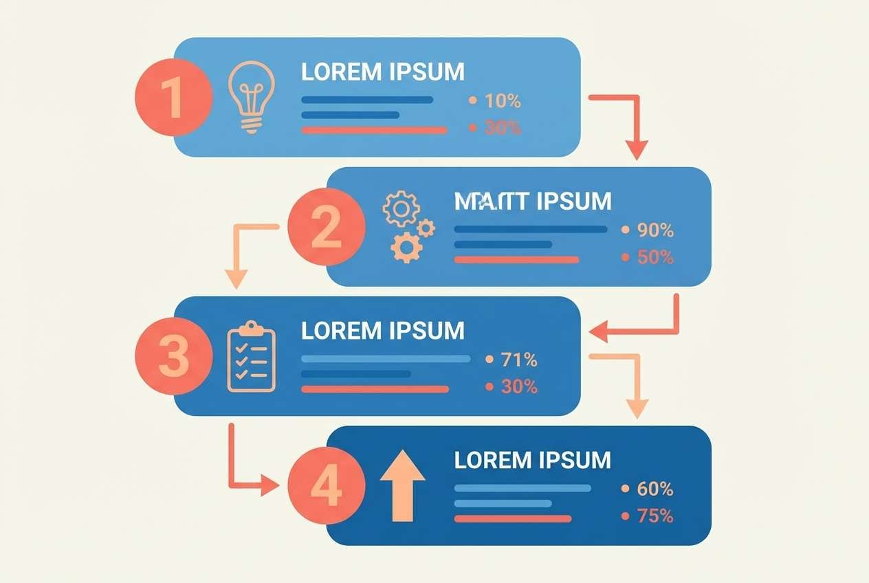
How to Use Blue and Peach Color Combinations in Real Designs
In branding, set a “primary blue” for logos, headlines, and key typography, then reserve peach for moments that should feel human and welcoming (buttons, badges, product highlights). This creates a reliable hierarchy that scales across ads, web, and packaging.
In UI design, use pale blues for surfaces (cards, panels, section backgrounds) and a darker blue for text/icons. Keep peach for one primary action and a small set of states (selected, success, gentle warning) so it stays meaningful.
For print, make sure your warm accents don’t dominate large areas unless you want a bold poster look. Peach works beautifully in small shapes, rules, and spot highlights, especially when paired with clean margins and a creamy paper-like base.
Create Blue and Peach Palette Visuals with AI
If you have HEX codes but need real mockups (posters, menus, dashboards, packaging, and brand kits), AI can help you iterate quickly. The key is to describe the layout and materials, then specify where blue is dominant and where peach appears as an accent.
Reuse a consistent prompt structure across concepts so you can compare variations fairly. For example: define background, typography style, main UI color (blue), accent color (peach/coral), and the final aspect ratio.
When your favorite direction is clear, generate a few versions for spacing and hierarchy, then refine your prompt to lock in the same “brand feel” across every asset.
Blue Peach Color Palette FAQs
-
Why do blue and peach work so well together?
Blue is visually stable and trustworthy, while peach is warm and friendly. The warm-cool contrast creates clear hierarchy, so blue can carry structure and text while peach highlights CTAs and key details. -
Is a blue peach palette considered pastel or bold?
It can be either. If you choose pale blues and soft peach tints, it reads pastel and airy; if you pair navy with coral-peach accents, it becomes bold and modern. -
What’s a good ratio for using blue vs. peach in UI?
A common approach is to keep blues and neutrals as 80–90% of the interface and use peach/coral for 10–20% as accents. This keeps actions and highlights obvious without making the UI feel overly warm. -
Which text color is safest on peach backgrounds?
Deep navy or a very dark blue-gray is usually safest for readability on peach. Avoid long paragraphs in coral/peach, and always double-check contrast for accessibility. -
What neutrals pair best with blue and peach?
Warm off-white, cream, sand, and light greige pair especially well because they support the warmth of peach while keeping blue looking clean and modern. -
Can I use blue peach palettes for corporate branding?
Yes—especially when you lean on navy and restrained peach accents. It keeps a professional foundation while adding approachability for marketing pages, presentations, and social graphics. -
How do I keep peach accents from feeling too “sweet”?
Use peach in smaller doses, add plenty of white space, and anchor the design with darker blues and neutral surfaces. Also consider a slightly muted peach rather than a highly saturated coral for large areas.
Next: Vampire Color Palette


