

Blue + cyan is a high-clarity color family that instantly reads as modern, fresh, and tech-friendly. It can feel icy and futuristic, calm and clinical, or electric and nightlife—depending on how dark your base is and how bright your accent cyan goes.
Below are 20 curated blue cyan color combinations with HEX codes, plus ready-to-copy AI prompts you can use to generate matching visuals for UI, branding, posters, and more.
In this article
Why Blue Cyan Color Combinations Work So Well
Blue communicates stability and trust, while cyan adds a sense of speed, clarity, and innovation. Together, they create a “clean signal” look that’s easy to read across screens, especially for UI and data-heavy layouts.
Blue-cyan ranges also make smooth gradients that feel natural (ocean-to-sky, deep-to-light), so you can add depth without introducing extra hues. That’s useful for buttons, hero backgrounds, overlays, and highlights.
Because the family spans from near-black navy to airy ice tints, you can build strong hierarchy: dark for structure, mid-tones for components, and bright cyan for the one action you want people to notice.
20+ Blue Cyan Color Palette Ideas (with HEX Codes)
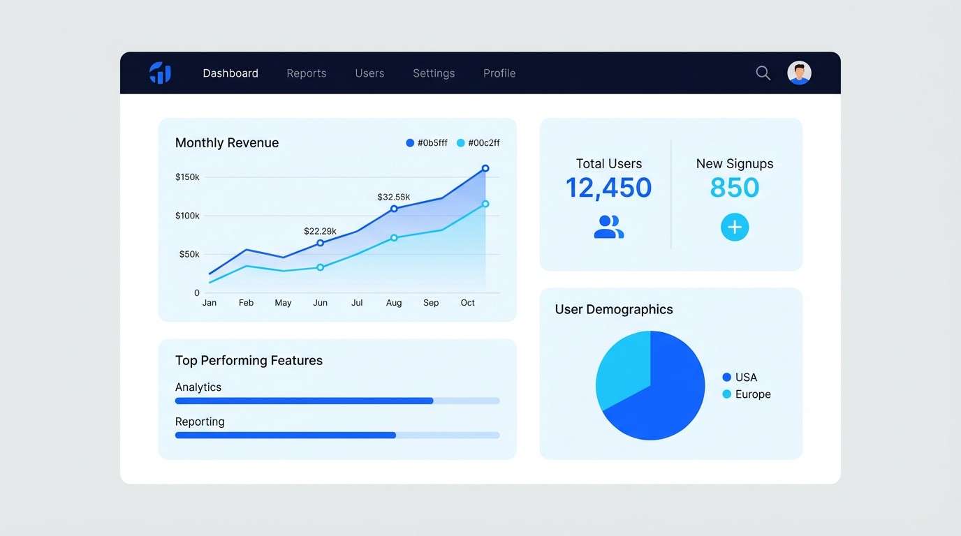
1) Arctic Glow
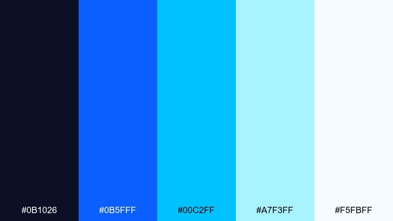
HEX: #0b1026 #0b5fff #00c2ff #a7f3ff #f5fbff
Mood: crisp, futuristic, luminous
Best for: saas dashboard ui
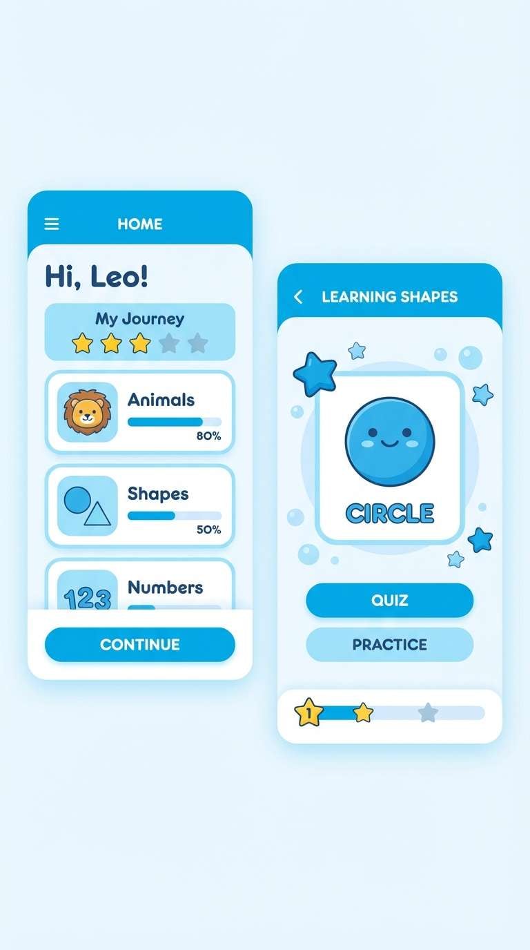
Crisp and luminous like sunlit ice, these blue cyan tones feel clean, fast, and modern. The deep navy anchors charts and navigation while the bright cyan handles highlights and active states. Pair it with lots of white space and soft gray dividers to keep the interface readable. Tip: reserve the brightest cyan for one primary action so the hierarchy stays obvious.
Image example of arctic glow generated using media.io
Media.io is an online AI studio for creating and editing video, image, and audio in your browser.

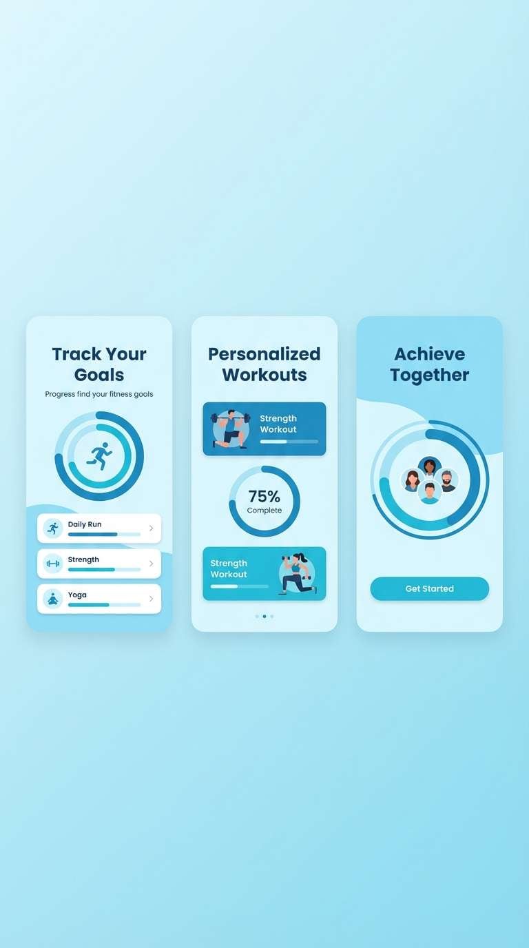
2) Lagoon Sprint
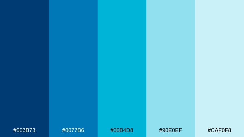
HEX: #003b73 #0077b6 #00b4d8 #90e0ef #caf0f8
Mood: sporty, refreshing, upbeat
Best for: fitness app onboarding
Upbeat and splashy, this mix evokes a morning swim and clear, energized focus. Use the medium blues for headers and progress bars, then let the brighter cyan handle buttons and badges. It pairs well with charcoal text and simple line icons for a crisp, athletic feel. Tip: keep gradients subtle by blending #0077b6 into #00b4d8 for motion without visual noise.
Image example of lagoon sprint generated using media.io
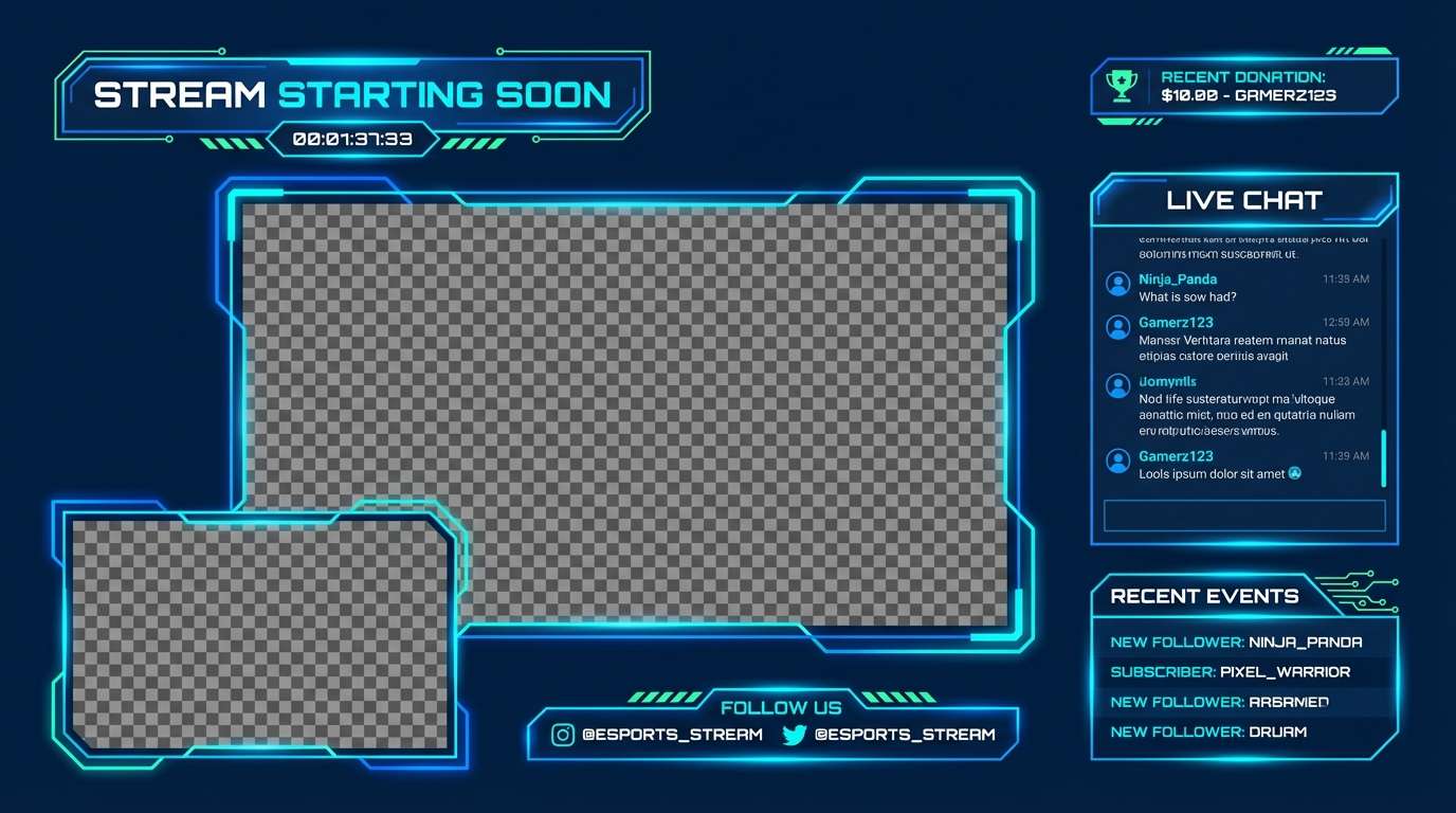
3) Neon Harbor
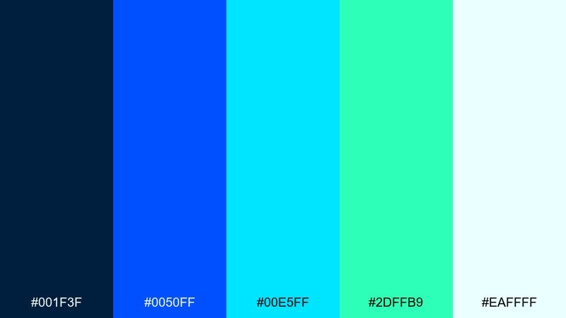
HEX: #001f3f #0050ff #00e5ff #2dffb9 #eaffff
Mood: electric, nightlife, high-contrast
Best for: gaming stream overlay
Electric and late-night like neon on wet pavement, these colors pop with high-contrast clarity. In a blue cyan color palette like this, the dark base keeps overlays readable while the bright accents make alerts feel instant. Pair it with bold sans fonts and simple geometric frames so the glow effect stays intentional. Tip: use #00e5ff for callouts and keep #2dffb9 to small moments like wins or donations.
Image example of neon harbor generated using media.io
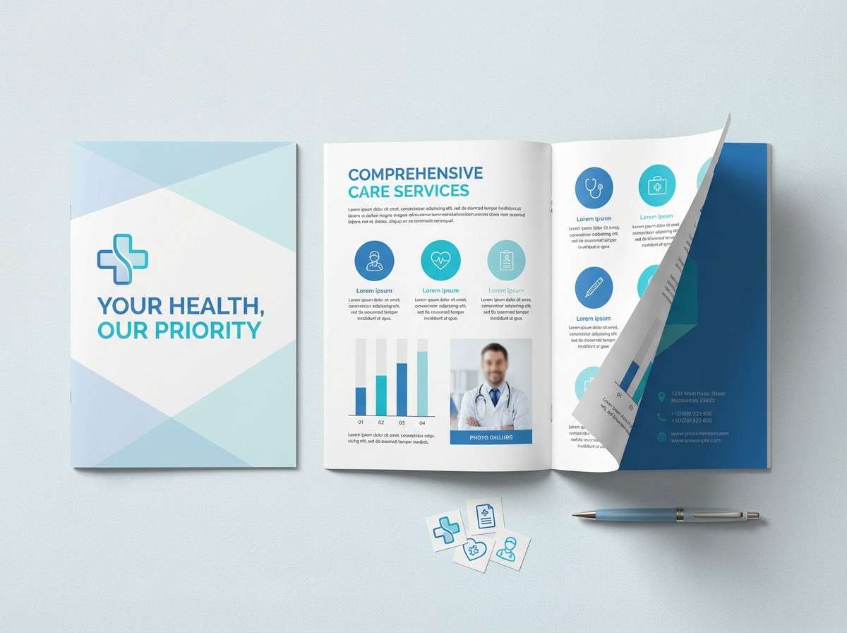
4) Glacier Mist
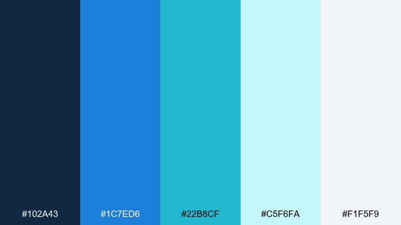
HEX: #102a43 #1c7ed6 #22b8cf #c5f6fa #f1f5f9
Mood: calm, clinical, reassuring
Best for: healthcare brochure
Calm and reassuring, these blue cyan shades feel like cool air and clean glass. The softened cyan and pale ice tones work beautifully for medical layouts where trust and clarity matter. Pair with neutral grays and plenty of margin space to prevent information overload. Tip: set body text in dark slate and reserve #22b8cf for section markers and diagrams.
Image example of glacier mist generated using media.io
5) Poolside Minimal
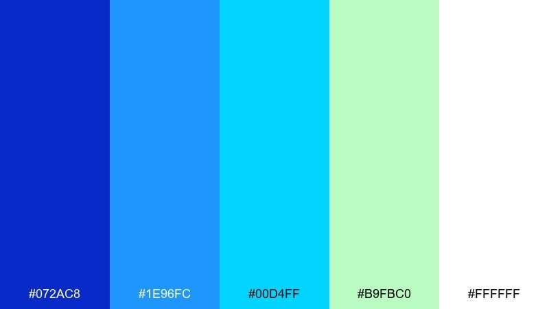
HEX: #072ac8 #1e96fc #00d4ff #b9fbc0 #ffffff
Mood: sunny, minimal, playful
Best for: product landing page
Sunny and minimal like a pool tile under bright light, this blue cyan set feels friendly without getting loud. Use the royal blue for headlines, the sky cyan for primary buttons, and the mint as a small supportive accent. It pairs nicely with black or deep navy text to keep conversion pages sharp. Tip: keep imagery simple and let one bold button color do the heavy lifting.
Image example of poolside minimal generated using media.io

6) Tech Aqua

HEX: #0a2540 #1463ff #00a3ff #00f5d4 #e9ecef
Mood: confident, technical, polished
Best for: fintech brand kit
Polished and technical, these blue cyan color combinations feel like illuminated data on a dark terminal. The navy base brings authority, while the cyan and aqua add speed and innovation. Pair with structured grids, thin line icons, and a neutral gray for supporting elements. Tip: keep the aqua-green to small highlights so the overall look stays premium, not playful.
Image example of tech aqua generated using media.io
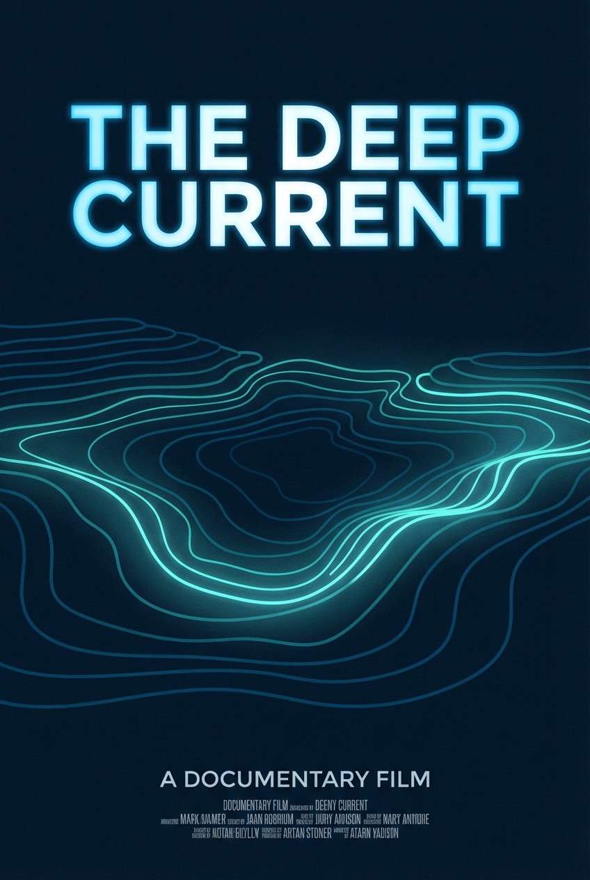
7) Deep Current
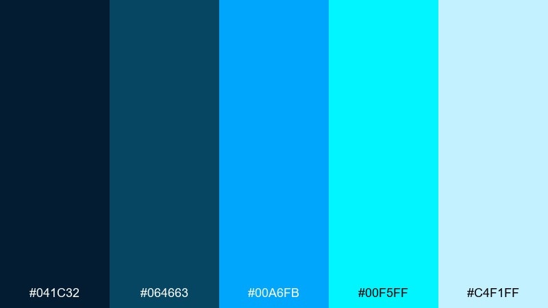
HEX: #041c32 #064663 #00a6fb #00f5ff #c4f1ff
Mood: moody, cinematic, ocean-deep
Best for: documentary poster
Moody and cinematic like a deep-sea dive, this set gives you drama without turning gloomy. These blue cyan color combinations work especially well for title typography, maps, and glow-like highlights on dark backgrounds. Pair with condensed fonts and a subtle grain texture for a filmic finish. Tip: keep #00f5ff for the title or one key datum so it reads like a spotlight.
Image example of deep current generated using media.io
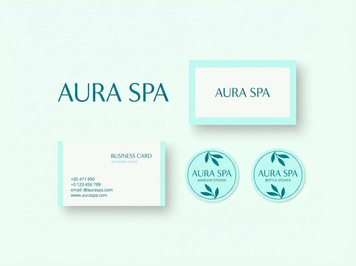
8) Coastal Breeze
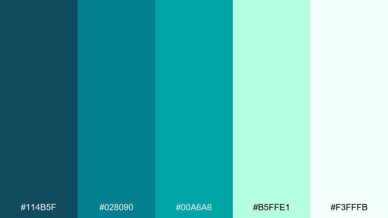
HEX: #114b5f #028090 #00a6a6 #b5ffe1 #f3fffb
Mood: relaxed, spa-like, breezy
Best for: spa branding
Relaxed and airy, these blue cyan hues feel like a quiet shoreline and a slow exhale. The teal-leaning cyan brings a natural calm that works beautifully in wellness branding and packaging. Pair with soft creams, gentle photography, and thin serif headlines for a refined touch. Tip: use #114b5f for logo marks so everything else can stay light and soothing.
Image example of coastal breeze generated using media.io
9) Aurora Circuit
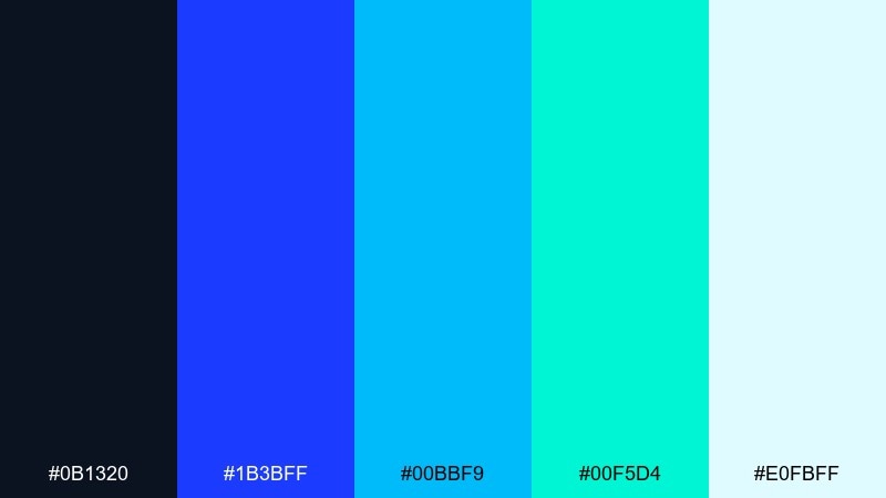
HEX: #0b1320 #1b3bff #00bbf9 #00f5d4 #e0fbff
Mood: bold, electric, tech-forward
Best for: conference event poster
Bold and electric, this blue cyan color palette evokes an aurora cutting across a midnight sky. The saturated blue makes a strong headline color, while the cyan and aqua bring motion to shapes and gradients. Pair with geometric patterns and strict alignment for a modern tech vibe. Tip: keep the background dark and let #00bbf9 handle the most important dates and calls to action.
Image example of aurora circuit generated using media.io

10) Icepop Candy
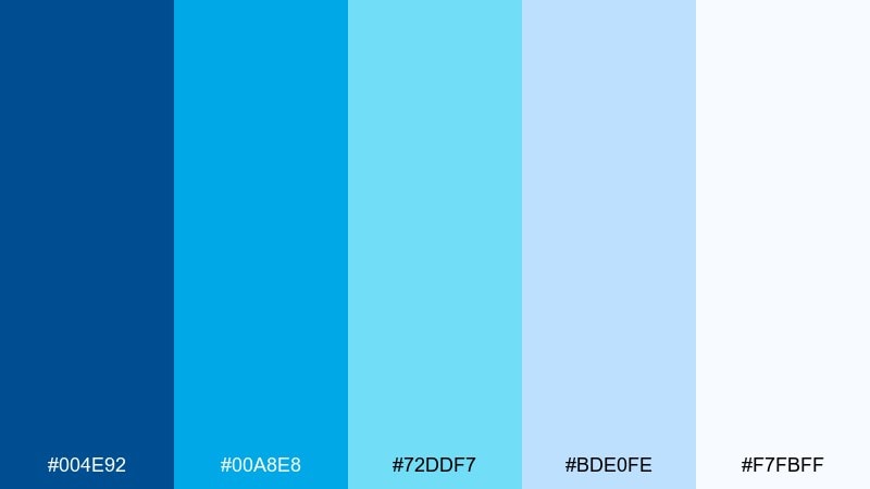
HEX: #004e92 #00a8e8 #72ddf7 #bde0fe #f7fbff
Mood: sweet, light, friendly
Best for: kids learning app ui
Sweet and light like a frozen treat, these blues feel friendly and approachable. The softer tints reduce harsh contrast, making them great for educational screens and playful illustrations. Pair with rounded typography and simple icons, adding neutral white to keep everything airy. Tip: use the darkest blue only for labels so the interface stays cheerful.
Image example of icepop candy generated using media.io
11) Rainy Metro
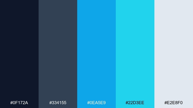
HEX: #0f172a #334155 #0ea5e9 #22d3ee #e2e8f0
Mood: urban, sleek, understated
Best for: editorial infographic
Sleek and urban like a city after rain, this set balances seriousness with crisp highlights. The slate tones support long-form reading, while the bright cyan makes data points and callouts easy to scan. Pair with thin rules, clear spacing, and a restrained icon style. Tip: use #22d3ee for one data series so your chart legend stays instantly readable.
Image example of rainy metro generated using media.io
12) Skywave Gradient
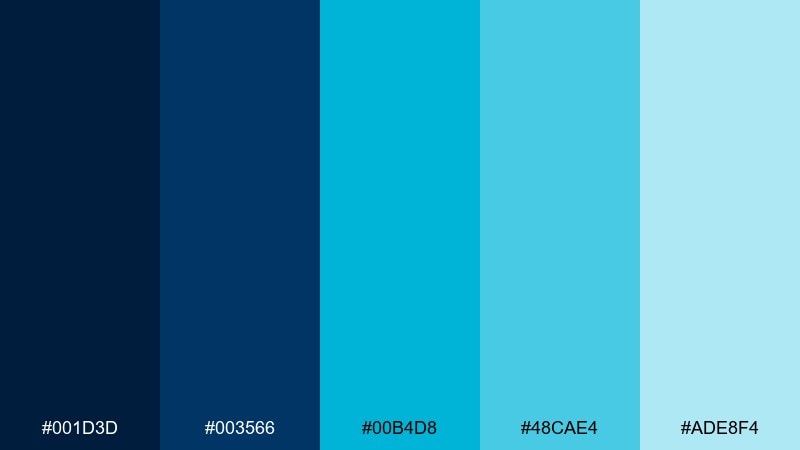
HEX: #001d3d #003566 #00b4d8 #48cae4 #ade8f4
Mood: open, optimistic, airy
Best for: travel flyer
Open and optimistic, these blue cyan tones feel like climbing into a clear sky above the sea. Use the darker blues for structure and the lighter cyans for spacious gradients and feature blocks. Pair with bright white and minimal photography so the layout stays light. Tip: try a vertical gradient from #003566 to #48cae4 behind the headline for instant depth.
Image example of skywave gradient generated using media.io
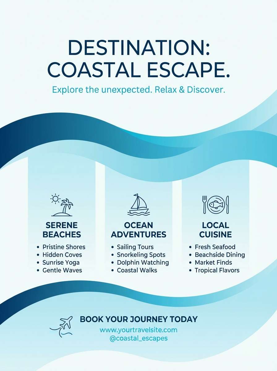
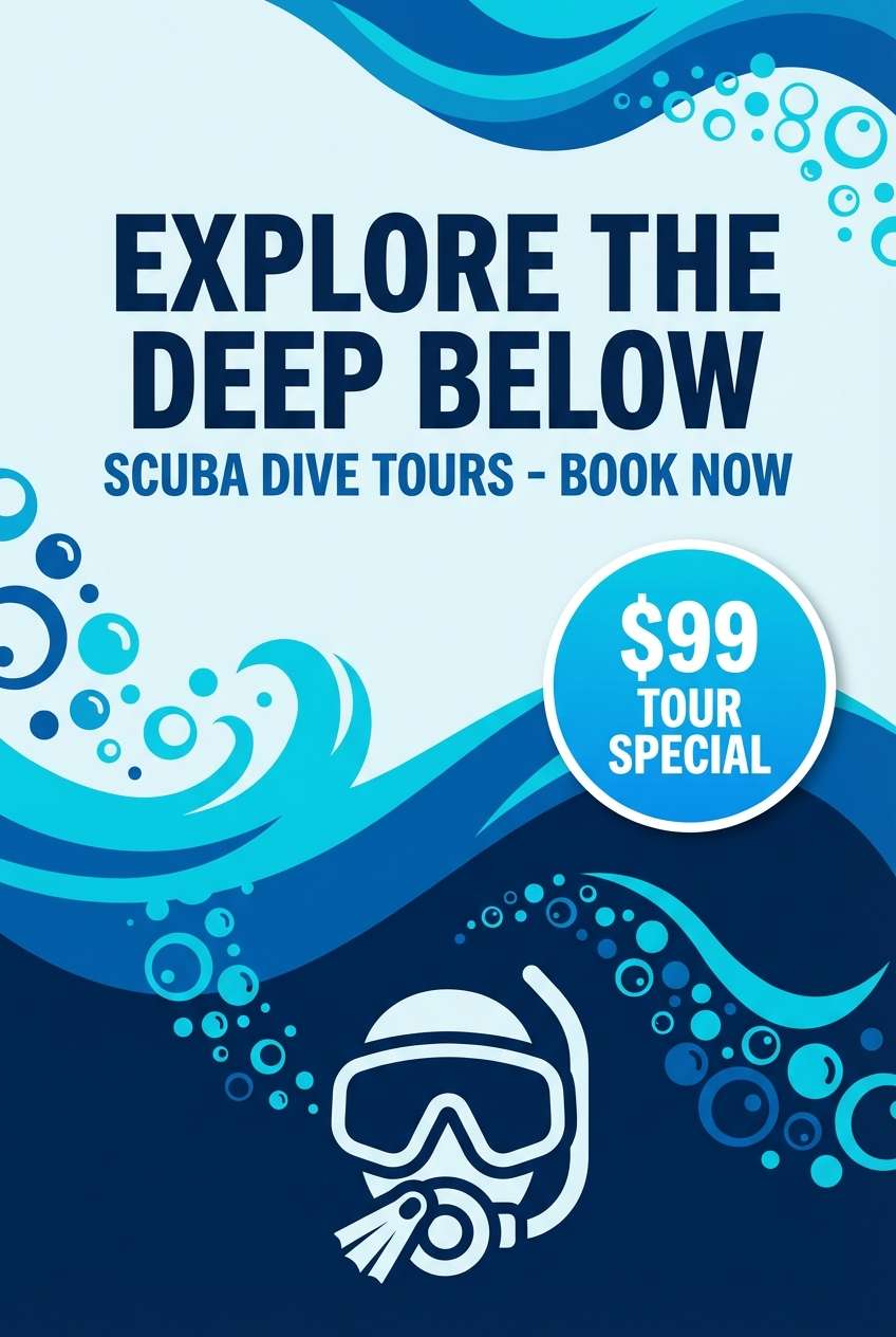
13) Reef Dive
HEX: #002855 #0353a4 #00a6fb #00d9ff #b9f2ff
Mood: adventurous, bright, aquatic
Best for: scuba tour ad
Adventurous and bright, this mix evokes sunlight flickering through reef water. The layered blues give you depth for headings and frames, while the vivid cyan acts like a sparkle for price tags and badges. Pair with sharp, high-contrast photography and minimal copy for a punchy ad. Tip: use #00d9ff for the booking callout so it stands out without shouting.
Image example of reef dive generated using media.io
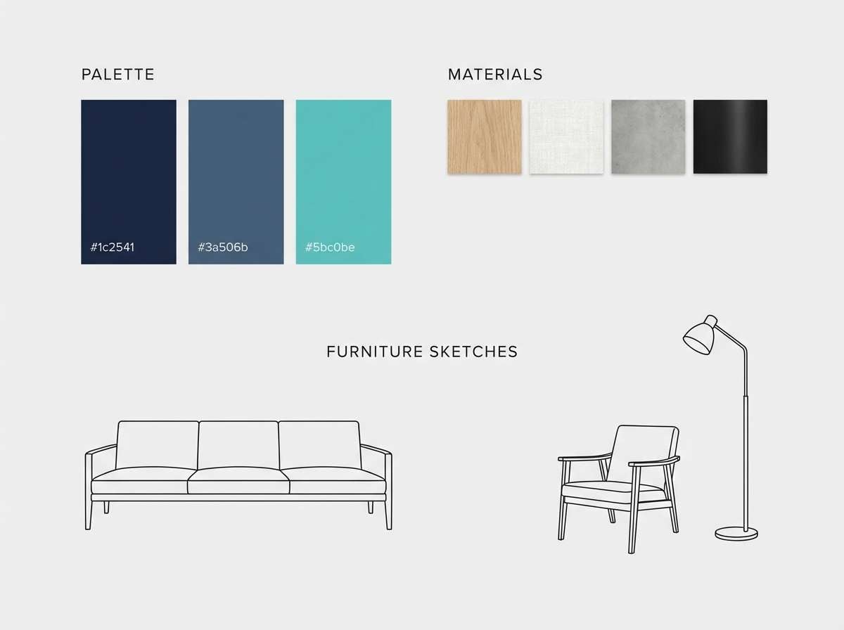
14) Winter Pool
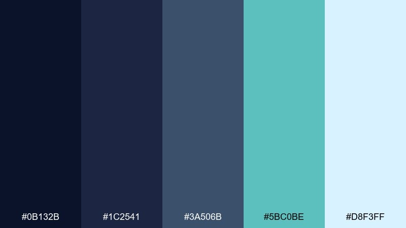
HEX: #0b132b #1c2541 #3a506b #5bc0be #d8f3ff
Mood: cool, quiet, sophisticated
Best for: minimalist interior moodboard
Cool and quiet, these shades suggest a still winter pool and matte stone surfaces. A blue cyan color palette like this shines in moodboards where you want calm sophistication rather than bright energy. Pair it with pale wood textures, brushed metal, and warm white lighting notes to keep the space inviting. Tip: let #5bc0be appear only in small accents, like ceramics or a single textile swatch.
Image example of winter pool generated using media.io
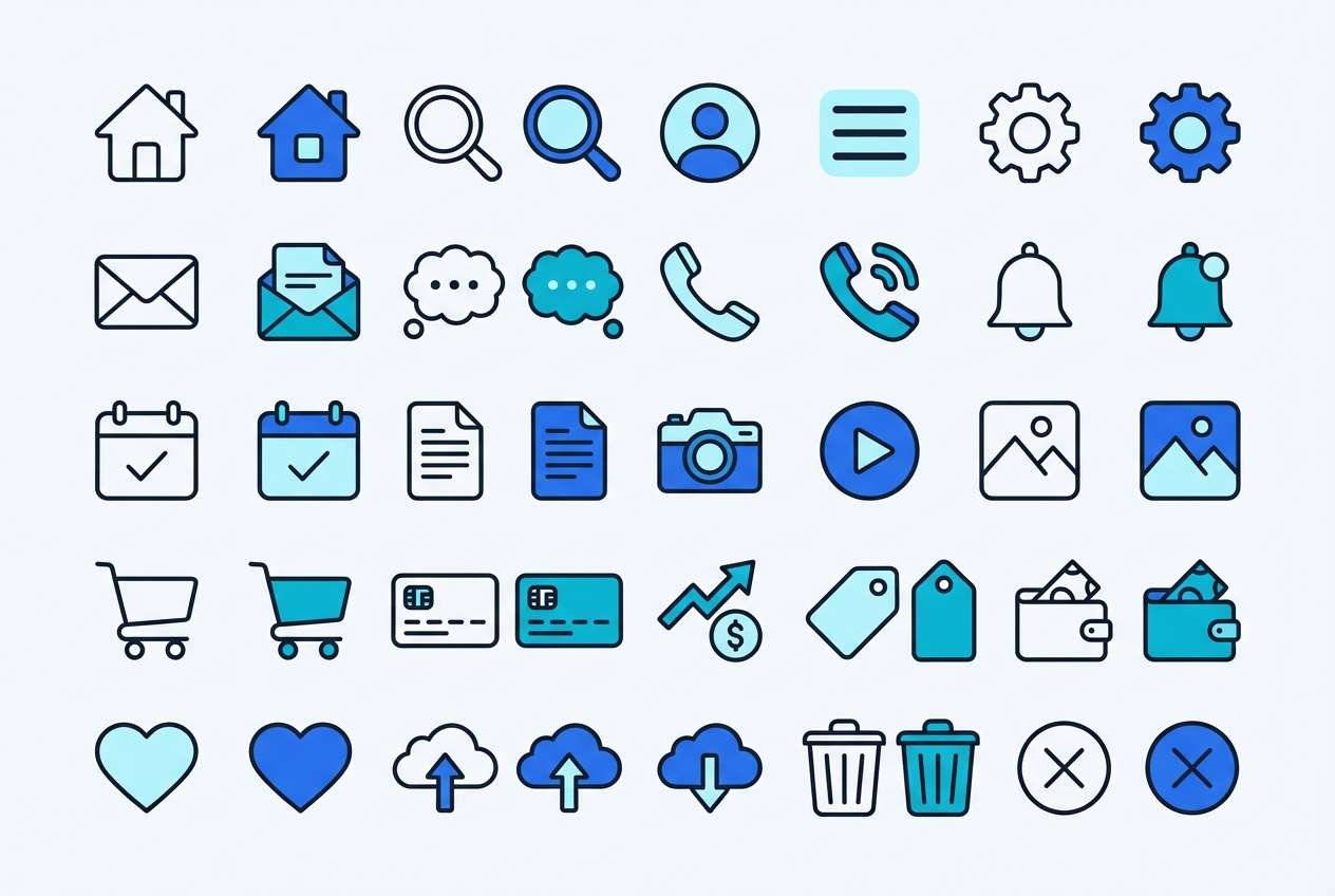
15) Cloudglass
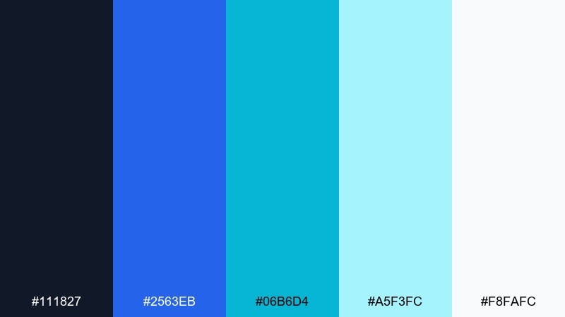
HEX: #111827 #2563eb #06b6d4 #a5f3fc #f8fafc
Mood: clean, modern, transparent
Best for: ui icon set
Clean and glassy, this set feels like light passing through a modern interface. The bright blue adds crisp definition, while the soft cyan tints keep icon fills airy and contemporary. Pair with consistent stroke widths and a small set of corner radii for cohesion. Tip: test icons at 16px using #111827 for outlines to maintain legibility.
Image example of cloudglass generated using media.io
16) Electric Tidal
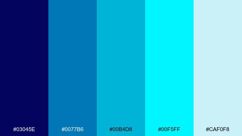
HEX: #03045e #0077b6 #00b4d8 #00f5ff #caf0f8
Mood: energetic, bold, kinetic
Best for: music festival poster
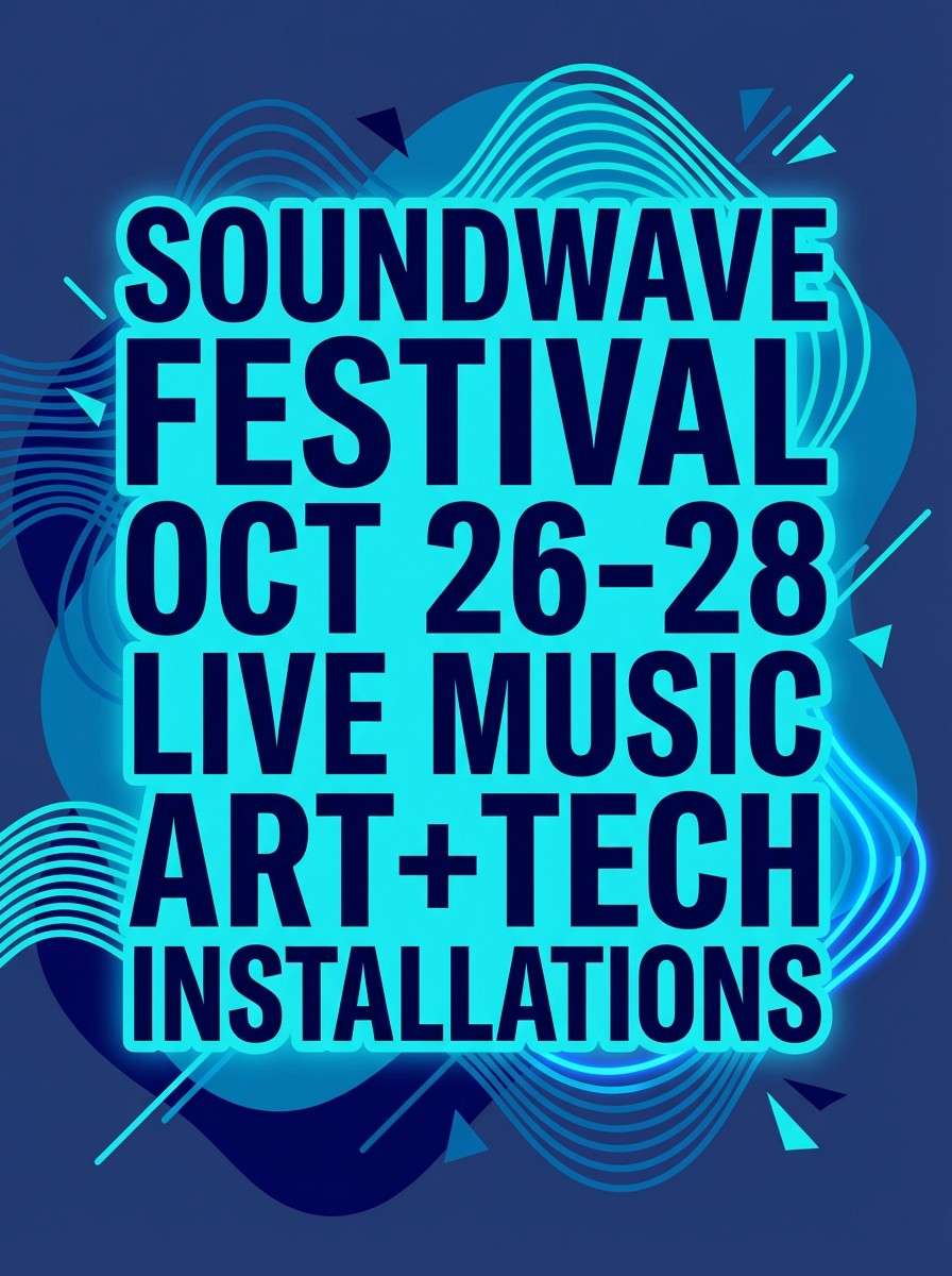
Energetic and kinetic, these blue cyan colors feel like strobe lights reflecting on waves. The deep blue sets a dramatic stage, while the cyan range can drive gradients, outlines, and big typographic blocks. Pair with high-impact layouts and minimal secondary colors so the poster stays punchy. Tip: use #00f5ff on the lineup section for quick readability at a distance.
Image example of electric tidal generated using media.io
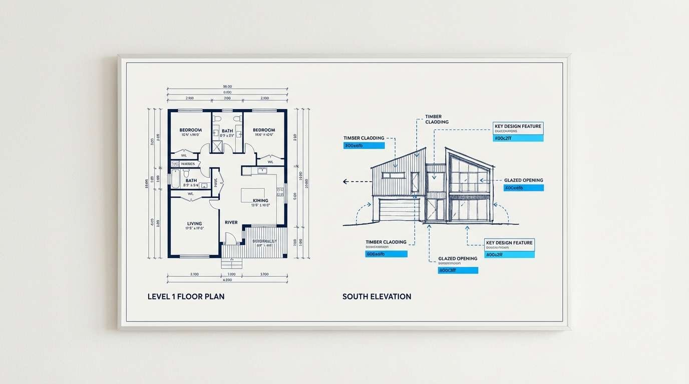
17) Blueprint Aqua
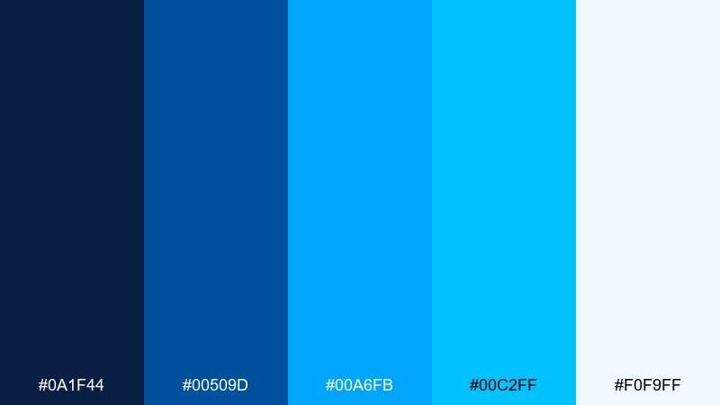
HEX: #0a1f44 #00509d #00a6fb #00c2ff #f0f9ff
Mood: structured, precise, professional
Best for: architectural presentation
Structured and precise, this blue cyan combination reads like a blueprint brought to life. The darker blues make perfect gridlines and titles, while the brighter cyan can highlight callouts, dimensions, or key features. Pair with thin strokes and plenty of negative space for a studio-clean look. Tip: limit the brightest accents to one layer of annotations so the drawing stays calm.
Image example of blueprint aqua generated using media.io
18) Aqua Denim
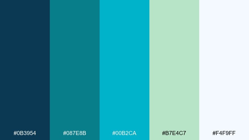
HEX: #0b3954 #087e8b #00b2ca #b7e4c7 #f4f9ff
Mood: casual, coastal, contemporary
Best for: ecommerce product packaging
Casual and contemporary like washed denim by the coast, these tones feel modern and approachable. Blue cyan color combinations here work well for packaging that needs to look clean, fresh, and trustworthy on a product grid. Pair with matte textures, simple line illustrations, and a restrained accent green for eco cues. Tip: put #0b3954 on the product name for contrast, and reserve #00b2ca for seals or feature bullets.
Image example of aqua denim generated using media.io
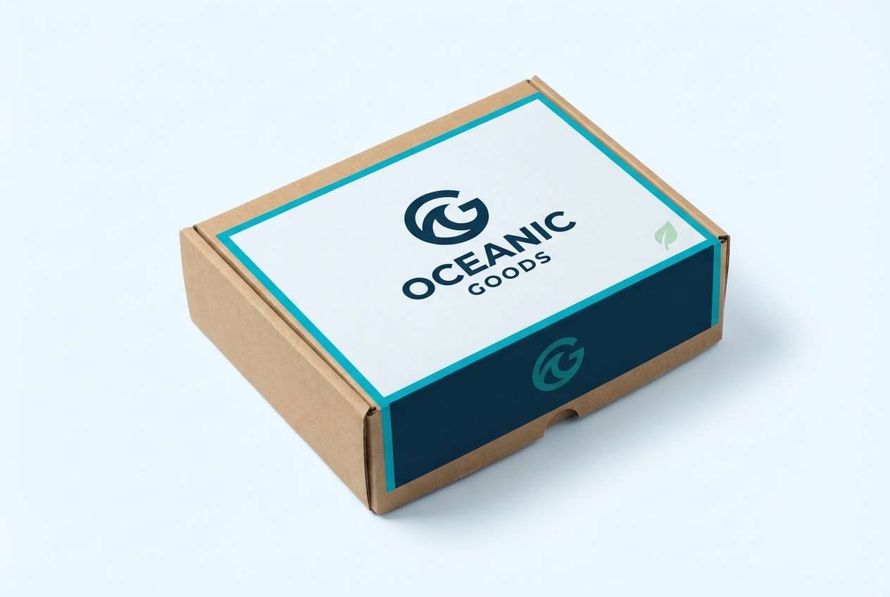
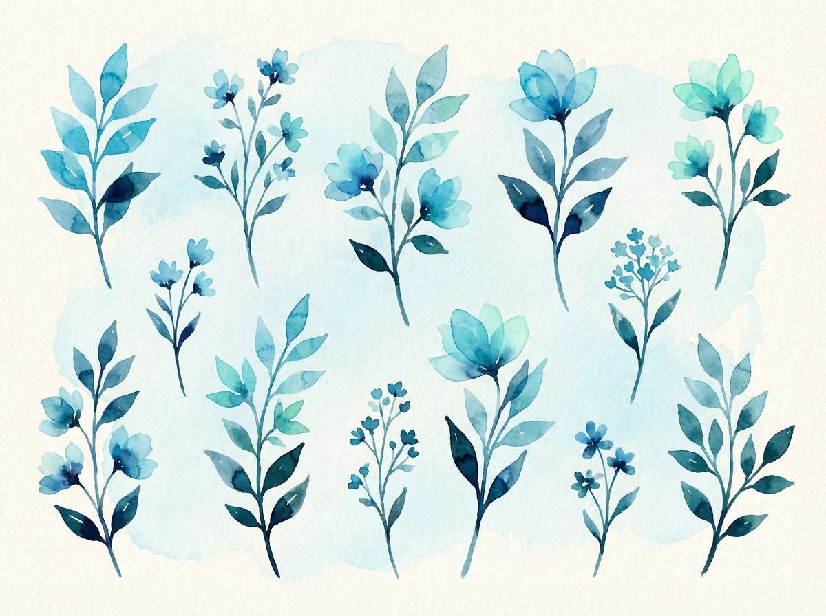
19) Minted Cyan
HEX: #012a4a #013a63 #00b4d8 #80ffdb #f1fffe
Mood: fresh, botanical, light
Best for: botanical illustration set
Fresh and botanical, this blue and cyan mix feels like mint leaves cooled by ocean air. The deep blues give your outlines and shadows a crisp base, while the cyan and mint lift the highlights. Pair with soft paper textures and delicate watercolor washes for a natural, airy finish. Tip: keep the mint as a highlight color so the illustration stays balanced and not overly pastel.
Image example of minted cyan generated using media.io
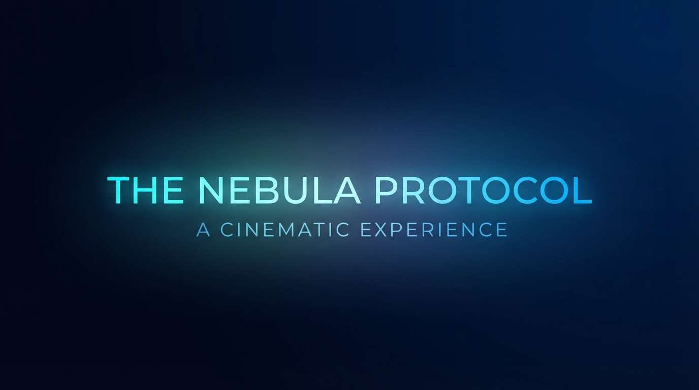
20) Midnight Lagoon
HEX: #03071e #001f54 #00509d #00a6fb #00f5ff
Mood: dramatic, cinematic, sleek
Best for: cinematic title card
Dramatic and sleek, these blue cyan color combinations evoke a midnight lagoon with shimmering light on the surface. The near-black base delivers instant contrast, and the bright cyan creates a razor-sharp focal point for titles. Pair with minimal typography and subtle glow effects to keep it cinematic, not flashy. Tip: add a faint gradient between #001f54 and #00509d to give depth behind the text.
Image example of midnight lagoon generated using media.io
What Colors Go Well with Blue Cyan?
Neutrals are the easiest match: white, off-white, cool gray, and charcoal help blue-cyan palettes stay readable and professional. They also prevent bright cyans from overwhelming your layout.
For contrast, try warm complements in small doses—coral, orange, or soft peach—especially for alerts, price tags, or one standout CTA. Metallics (silver, chrome) also pair well for a sleek, tech-forward feel.
If you want a more natural vibe, add muted greens (sage, mint) alongside teal-leaning cyans. Keep saturation controlled so the palette still feels cohesive rather than rainbow.
How to Use a Blue Cyan Combination in Real Designs
Start with a dark anchor (navy/slate) for headers, nav, or poster backgrounds, then assign one bright cyan as your primary accent. This keeps hierarchy clear and avoids “everything looks clickable” UI.
Use lighter cyans and ice tints for panels, cards, and subtle backgrounds—especially for dashboards and onboarding screens. Gradients work best when they move between nearby hues (deep blue → cyan) instead of jumping across the wheel.
For print (flyers, brochures, packaging), test color shifts under real lighting and paper stock. A cyan that looks crisp on screen can print brighter than expected, so reserve the most vivid value for highlights.
Create Blue Cyan Palette Visuals with AI
If you already have HEX codes, you can turn them into consistent mockups fast by describing the layout (UI, poster, brand kit) and explicitly calling out your palette colors in the prompt. This helps the AI keep the same “blue-cyan energy” across a whole set of assets.
To get cleaner results, specify style (flat vector, editorial, cinematic), keep backgrounds simple, and mention where each color should appear (background, primary accents, small highlights). Then iterate by adjusting only one variable—like contrast or saturation—per prompt.
Blue Cyan Color Palette FAQs
-
What’s the difference between cyan blue and teal blue?
Cyan blue leans brighter and more “electric” (closer to pure cyan), while teal blue carries more green and feels calmer or more natural. Both sit well in blue-cyan schemes, but teal usually reads more spa/wellness and cyan reads more tech/energy. -
Is a blue cyan color palette good for UI design?
Yes—blue builds trust and cyan creates clear emphasis for interactive states. For accessibility, keep body text dark (navy/charcoal) and reserve the brightest cyan for primary actions or key highlights. -
What background color works best with bright cyan accents?
Deep navy or slate gives maximum contrast and makes cyan feel luminous. For lighter designs, use off-white or very pale ice blue and keep cyan saturation under control to avoid visual fatigue. -
What colors pair well with blue and cyan for contrast?
Warm accents like coral, orange, and peach add strong complementary contrast. Use them sparingly (badges, alerts, one CTA) so the palette still feels clean and cohesive. -
How do I make a blue-cyan gradient look modern (not dated)?
Keep the gradient within a tight hue range (deep blue → cyan → light tint) and avoid adding too many extra colors. Pair it with lots of whitespace, simple typography, and minimal shadow effects. -
Which blue-cyan color combinations here are best for dark mode?
Try Arctic Glow, Neon Harbor, Deep Current, Aurora Circuit, or Midnight Lagoon. They start with very dark bases, so bright cyan highlights remain readable and feel intentional rather than harsh. -
Can I generate on-brand images using these HEX codes?
Yes—include the HEX values directly in your prompt and specify what each color should control (background, accents, highlights). Using the same prompt structure across images helps maintain consistency for a brand system.
Next: Fairy Tale Color Palette


