

Blonde color palettes bring a warm, sunlit neutrality that feels clean, premium, and easy to style across digital and print.
Below are 20+ ready-to-use blonde color scheme ideas with HEX codes—ideal for branding, UI, and interiors, plus AI image prompts to visualize each look fast.
In this article
- Why Blonde Palettes Work So Well
-
- sunlit wheat
- champagne linen
- honey driftwood
- vanilla oat
- golden sandstone
- buttercream peach
- nordic blonde minimal
- desert blonde rose
- caramel latte
- blonde & sage studio
- antique brass glow
- soft blonde & ink
- coastal blonde sky
- blush blonde wedding
- retro blonde pop
- blonde marble editorial
- warm blonde monochrome
- blonde & terracotta home
- pale blonde nightfall
- bright blonde citrus
- almond silk
- spring blonde botanica
- What Colors Go Well with Blond?
- How to Use a Blonde Color Palette in Real Designs
- Create Blonde Palette Visuals with AI
Why Blonde Palettes Work So Well
blonde tones sit in a sweet spot between warm neutrals and soft golden hues, so they feel friendly and bright without turning into loud yellow. That makes them versatile for backgrounds, packaging, and UI surfaces.
They also pair beautifully with both earthy browns and modern near-blacks, giving you clean contrast for typography and icons while keeping the overall mood airy.
Because blonde palettes read as natural (wheat, oat, linen, sand), they instantly communicate comfort and quality—great for lifestyle brands, wellness products, and premium editorial layouts.
20+ Blonde Color Palette Ideas (with HEX Codes)
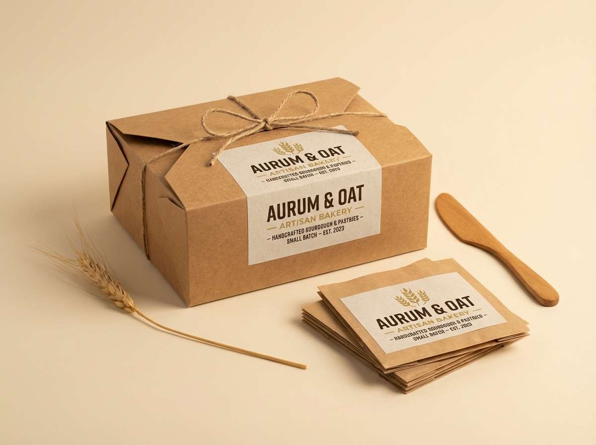
1) Sunlit Wheat
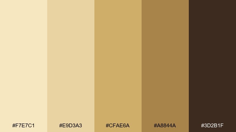
HEX: #F7E7C1 #E9D3A3 #CFAE6A #A8844A #3D2B1F
Mood: warm, sunny
Best for: brand identity for cafes and bakeries
Warm and sun-kissed, these tones feel like wheat fields at golden hour. Use the pale cream as your background and let the deeper caramel and espresso shades carry headings and logos. It works beautifully for food brands, artisanal packaging, and menu layouts. Tip: reserve the darkest brown for small, high-contrast details so the palette stays airy.
Image example of sunlit wheat generated using media.io
Media.io is an online AI studio for creating and editing video, image, and audio in your browser.

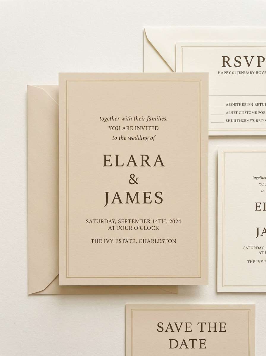
2) Champagne Linen
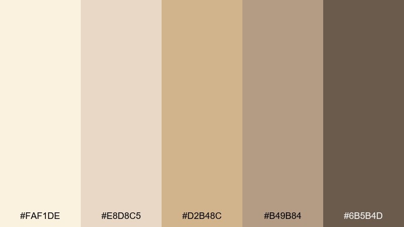
HEX: #FAF1DE #E8D8C5 #D2B48C #B49B84 #6B5B4D
Mood: soft, elegant
Best for: wedding invitations and stationery
Soft and refined, it evokes champagne bubbles over crisp linen fabric. Keep layouts minimal with the ivory and beige tones, then anchor typography with the smoky taupe for readability. It shines on invitations, RSVP cards, and upscale event signage. Tip: add subtle paper texture and use the darkest shade only for names and key details.
Image example of champagne linen generated using media.io
3) Honey Driftwood
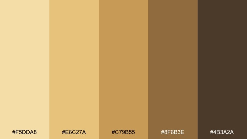
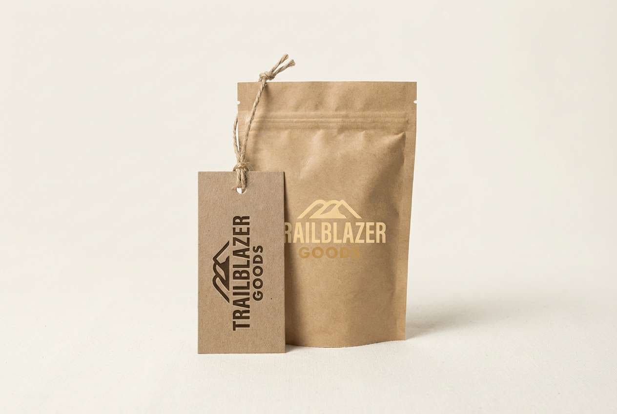
HEX: #F5DDA8 #E6C27A #C79B55 #8F6B3E #4B3A2A
Mood: rustic, cozy
Best for: outdoor lifestyle branding and logos
Cozy and earthy, it feels like honey glazed wood and well-worn leather. These blonde color combinations work best when you let the light honey lead and keep the darkest shade for stamps, icons, and outlines. Great for outdoor brands, handmade goods, and rustic signage. Tip: pair with warm off-white and natural materials photography for a believable finish.
Image example of honey driftwood generated using media.io
4) Vanilla Oat
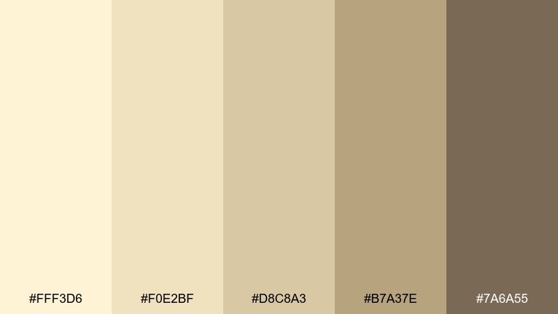
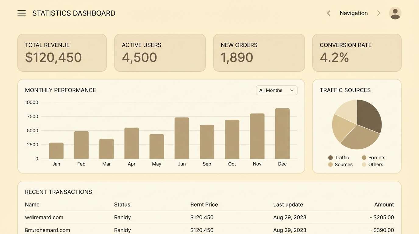
HEX: #FFF3D6 #F0E2BF #D8C8A3 #B7A37E #7A6A55
Mood: calm, clean
Best for: minimal UI dashboards
Calm and creamy, it recalls vanilla oat milk and soft morning light. Use the palest tone for panels and spacing, then step down gradually for cards, dividers, and secondary surfaces. It fits finance, wellness, and productivity dashboards where clarity matters. Tip: keep primary buttons in the medium oat shade and reserve the darkest color for text contrast.
Image example of vanilla oat generated using media.io
5) Golden Sandstone
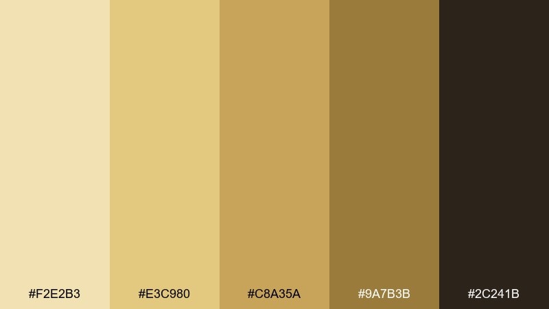
HEX: #F2E2B3 #E3C980 #C8A35A #9A7B3B #2C241B
Mood: bold, grounded
Best for: sports posters and bold headers
Bold and grounded, it suggests sunlit stone and desert trails. Use the bright gold as a headline highlight, then stabilize the layout with sandstone mid-tones and a near-black anchor. It works for posters, hero banners, and energetic announcements. Tip: add grain or halftone texture to avoid flat blocks of yellow in large areas.
Image example of golden sandstone generated using media.io

6) Buttercream Peach
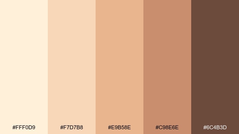
HEX: #FFF0D9 #F7D7B8 #E9B58E #C98E6E #6C4B3D
Mood: sweet, friendly
Best for: beauty product ads and social posts
Sweet and gentle, it feels like buttercream frosting with a peachy glow. Let the creamy base carry negative space while the peach and tan tones shape highlights and callouts. Perfect for beauty promotions, skincare feeds, and lifestyle graphics. Tip: use the deep cocoa shade for small type only, keeping the overall look soft and approachable.
Image example of buttercream peach generated using media.io
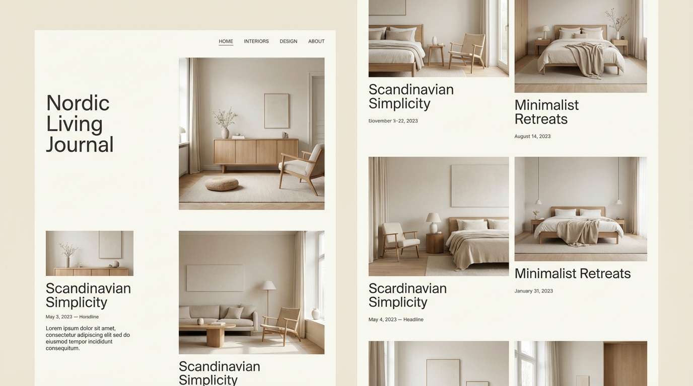
7) Nordic Blonde Minimal
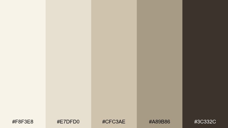
HEX: #F8F3E8 #E7DFD0 #CFC3AE #A89B86 #3C332C
Mood: scandi, airy
Best for: interior mood boards and websites
Airy and understated, it reads like Nordic rooms with pale woods and matte ceramics. Build pages with the near-white and light greige, then rely on the deeper taupe for navigation and text. It is ideal for interior studios, architecture sites, and calm ecommerce layouts. Tip: add one natural texture image per section to keep the neutrals from feeling sterile.
Image example of nordic blonde minimal generated using media.io
8) Desert Blonde Rose
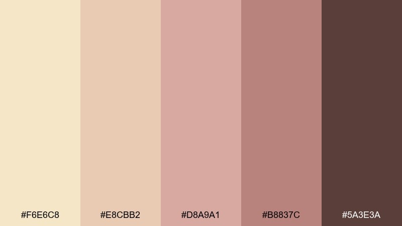
HEX: #F6E6C8 #E8CBB2 #D8A9A1 #B8837C #5A3E3A
Mood: romantic, desert
Best for: boutique branding and lookbooks
Romantic and sun-warmed, it evokes desert sand with a dusty rose horizon. These blonde color combinations are easy to style: keep backgrounds light, use the rose-tan for accents, and set type in the deep cocoa for clarity. Great for boutique labels, lookbooks, and product storytelling. Tip: pair with soft shadow and rounded shapes to keep the vibe gentle rather than vintage.
Image example of desert blonde rose generated using media.io
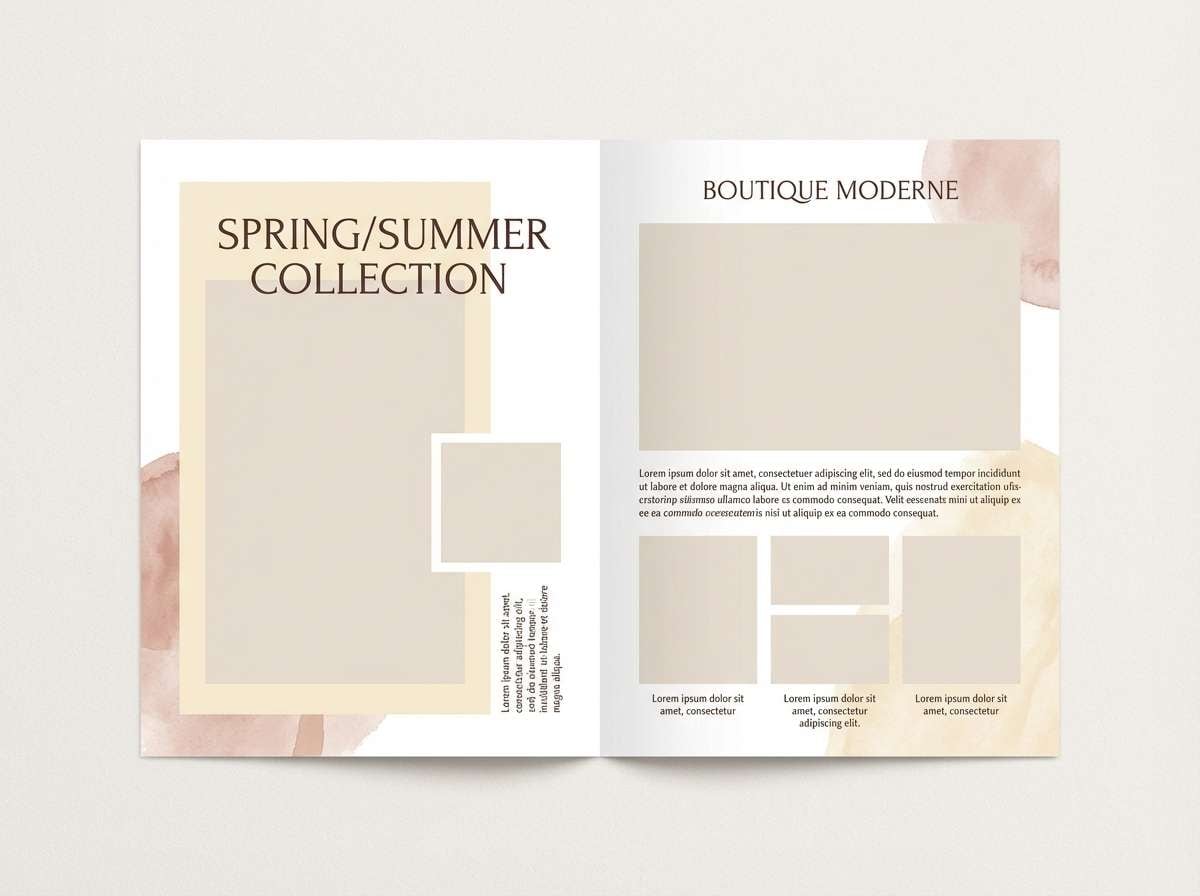
9) Caramel Latte
HEX: #F2E1C4 #D9B98F #B6895E #7D5A3A #2B1E16
Mood: rich, inviting
Best for: coffee shop menus and signage
Rich and inviting, it brings to mind caramel drizzle over a foamy latte. Use the creamy beige for menu backgrounds, the caramel for category headers, and the dark roast tone for prices and body text. It suits signage, takeaway cups, and loyalty cards. Tip: keep icons simple and thick so they read well against mid-tone browns.
Image example of caramel latte generated using media.io
10) Blonde & Sage Studio
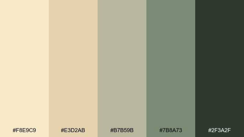
HEX: #F8E9C9 #E3D2AB #B7B59B #7B8A73 #2F3A2F
Mood: fresh, natural
Best for: wellness packaging and labels
Fresh and natural, it feels like dried grasses with a hint of garden sage. Keep the blonde base as your label field and bring in sage greens for trust-building accents and ingredient callouts. It is a strong fit for wellness, apothecary, and clean beauty packaging. Tip: use matte finishes and minimal line art to make the greens feel modern, not rustic.
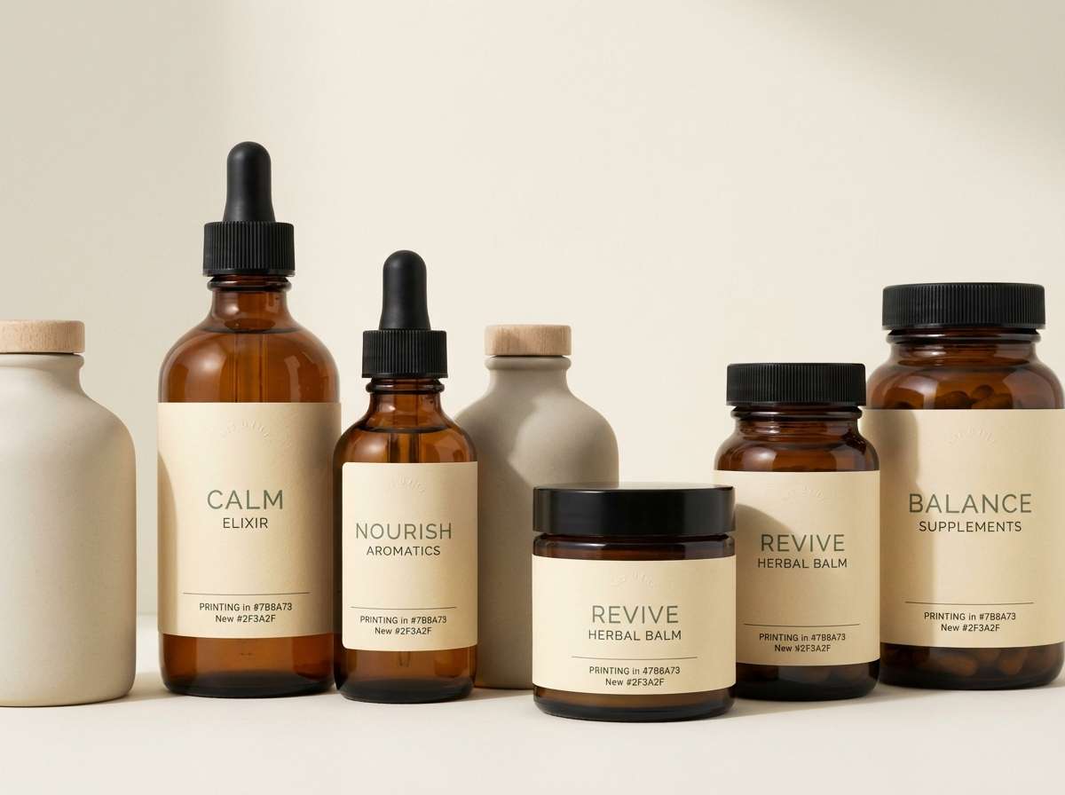
Image example of blonde & sage studio generated using media.io
11) Antique Brass Glow
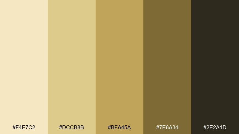
HEX: #F4E7C2 #DCCB8B #BFA45A #7E6A34 #2E2A1D
Mood: vintage, luxe
Best for: premium badges and brand marks
Vintage and luxe, it suggests antique brass catching warm light. Use the pale cream as negative space, then let brass and olive-gold shapes form emblems and seals. It works for premium badges, craft spirits, and heritage branding. Tip: add subtle metallic gradients sparingly so the design still prints cleanly.
Image example of antique brass glow generated using media.io
12) Soft Blonde & Ink
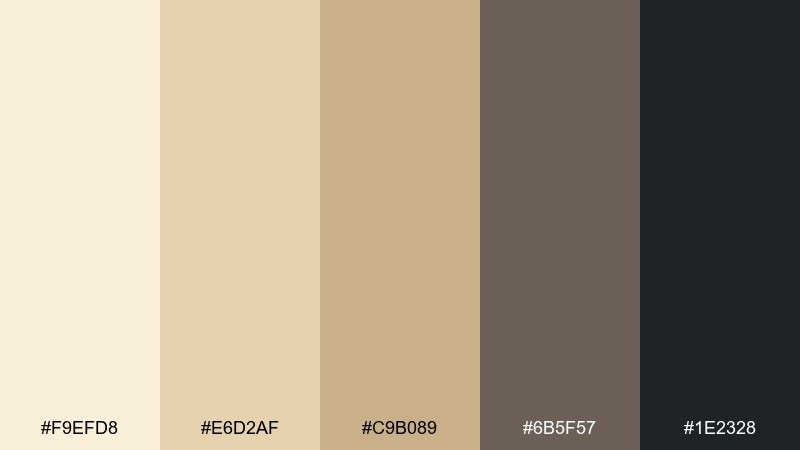
HEX: #F9EFD8 #E6D2AF #C9B089 #6B5F57 #1E2328
Mood: editorial, modern
Best for: magazine layouts and portfolios
Editorial and modern, it feels like creamy paper with crisp ink lines. This blonde color palette is ideal for typography-first layouts where contrast must stay classy, not harsh. Use the near-black for headlines, the warm taupe for captions, and keep imagery framed by soft blonde margins. Tip: maintain generous line spacing so the darker text does not overpower the warm background.
Image example of soft blonde & ink generated using media.io
13) Coastal Blonde Sky
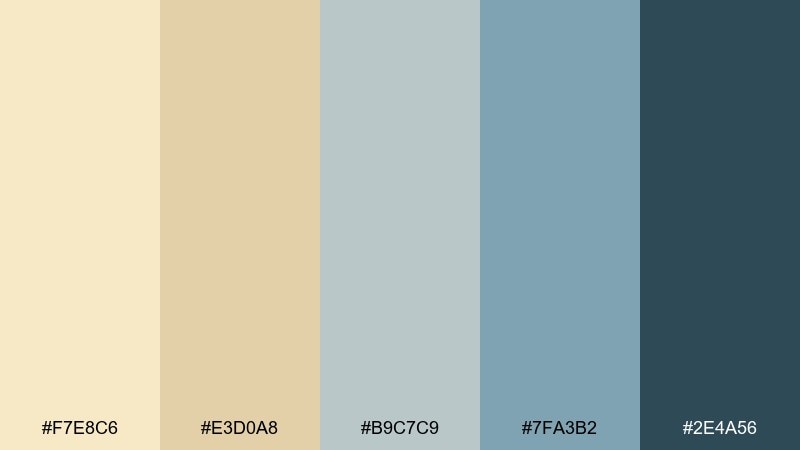
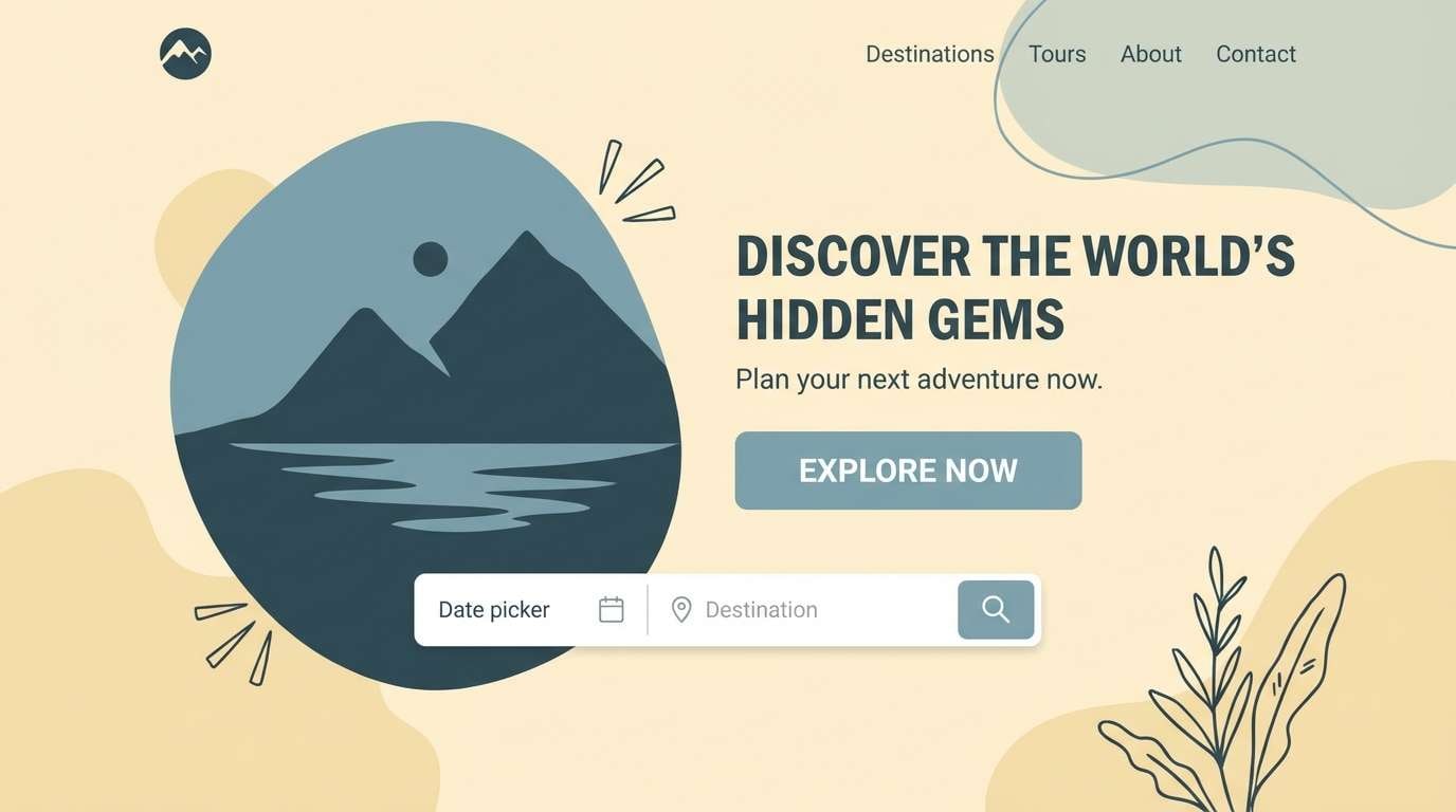
HEX: #F7E8C6 #E3D0A8 #B9C7C9 #7FA3B2 #2E4A56
Mood: breezy, coastal
Best for: travel websites and landing pages
Breezy and open, it blends sandy blonde with sea-glass blue. Use the pale sand for background sections and let the muted blues guide links, buttons, and info blocks. It is a natural fit for travel sites, beach rentals, and calm landing pages. Tip: keep the darkest teal for CTAs only to create clear hierarchy without shouting.
Image example of coastal blonde sky generated using media.io
14) Blush Blonde Wedding
HEX: #FFF1DE #F1D7C8 #D9B3A9 #B98987 #5D3B3B
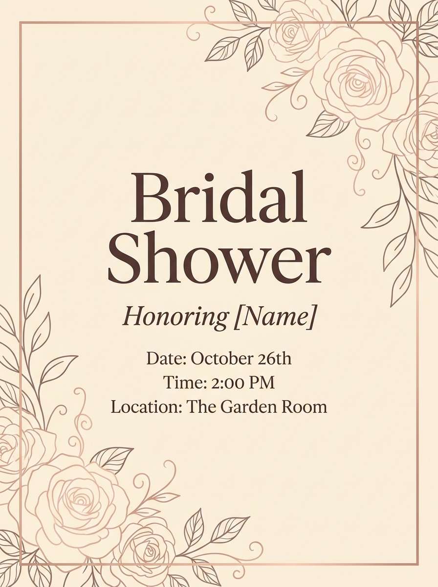
Mood: tender, romantic
Best for: bridal shower flyers
Tender and romantic, it brings soft blush petals over warm cream. Use blush tones for borders and headings, then rely on the deep rose-brown for legible event details. It looks beautiful in bridal shower flyers, save-the-dates, and thank-you cards. Tip: add a single floral line illustration in the mid blush to tie everything together without clutter.
Image example of blush blonde wedding generated using media.io
15) Retro Blonde Pop
HEX: #F6E3B4 #F0C86E #D88A5B #7A6B8F #2A2234
Mood: playful, retro
Best for: event posters and album covers
Playful and retro, it feels like sun-faded posters with a quirky lavender twist. Let the warm blonde and golden tones do most of the work, then use the purple for punchy shapes and secondary headlines. It is great for event posters, indie album covers, and bold promo graphics. Tip: keep the darkest shade for outlines to sharpen the vintage color blocks.
Image example of retro blonde pop generated using media.io
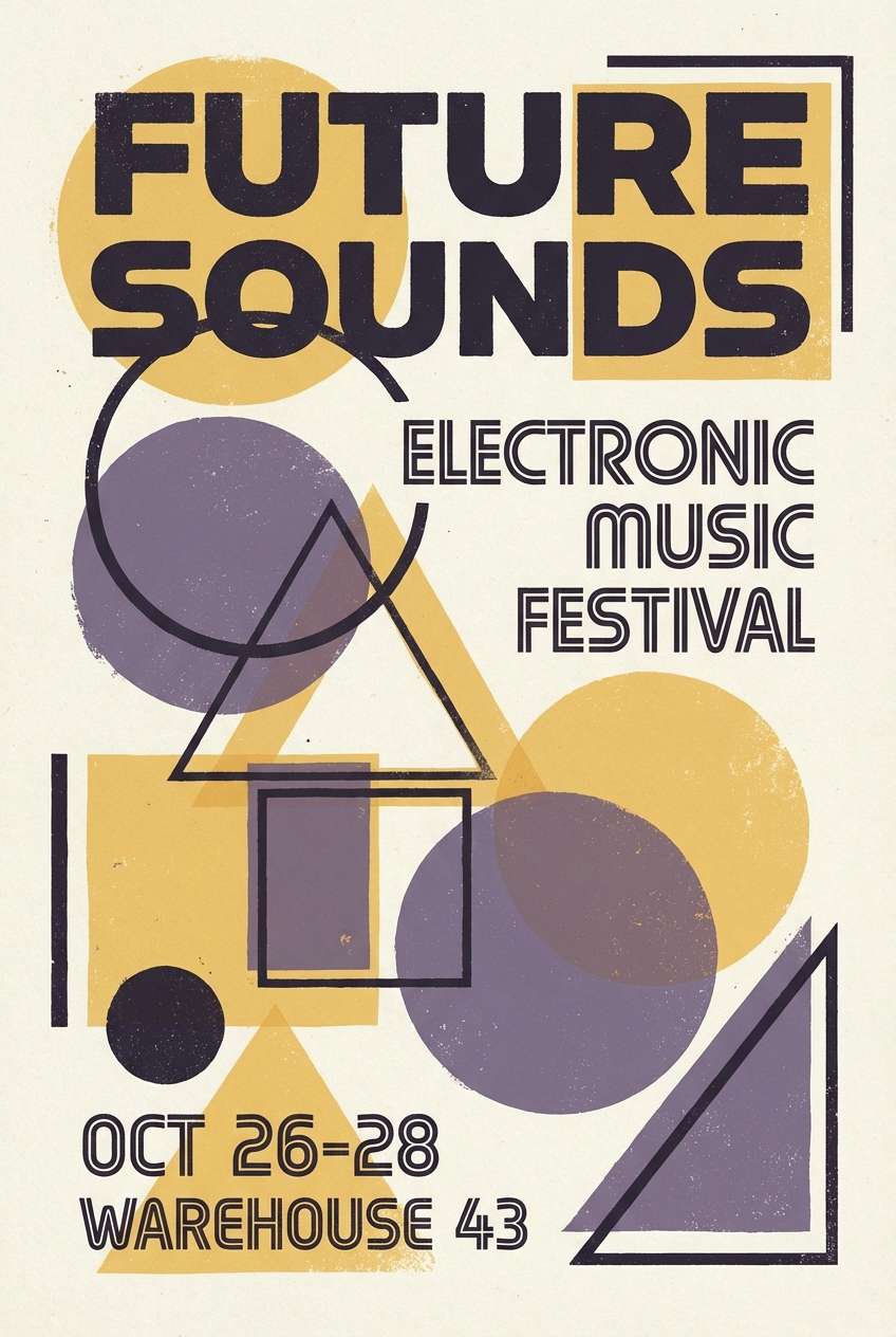
16) Blonde Marble Editorial
HEX: #FBF6EE #E9E0D3 #D1C3B3 #9A8D84 #2D2A28
Mood: polished, neutral
Best for: luxury real estate brochures
Polished and neutral, it resembles light marble veining and soft stone. Build brochures with creamy backgrounds, then layer mid-greige blocks for sections and pull quotes. It fits luxury real estate, architecture portfolios, and high-end service decks. Tip: use the near-black only for the most important headings and keep body text in the medium taupe for a softer read.
Image example of blonde marble editorial generated using media.io
17) Warm Blonde Monochrome
HEX: #FFF2CF #F2DEB0 #D7BF8D #B79A63 #8B6C3E
Mood: harmonious, warm
Best for: presentation decks and templates
Harmonious and warm, it looks like layered sand dunes in soft focus. A blonde color palette like this is perfect when you want depth without introducing new hues. Use the lightest shades for slide backgrounds, then step up through mid-tones for charts and callouts. Tip: add thin separators in the deepest brown to keep sections organized without heavy boxes.
Image example of warm blonde monochrome generated using media.io
18) Blonde & Terracotta Home
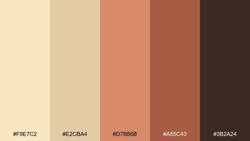
HEX: #F9E7C2 #E2CBA4 #D78B6B #A85C43 #3B2A24
Mood: earthy, homey
Best for: home decor ecommerce banners
Earthy and homey, it recalls sunlit clay pots against pale wood floors. Use the blonde neutrals for spacious banner backgrounds and let terracotta shades spotlight products and promo tags. It works especially well for home decor shops, ceramics brands, and seasonal drops. Tip: keep shadows warm and soft so the terracotta does not feel too heavy.
Image example of blonde & terracotta home generated using media.io
19) Pale Blonde Nightfall
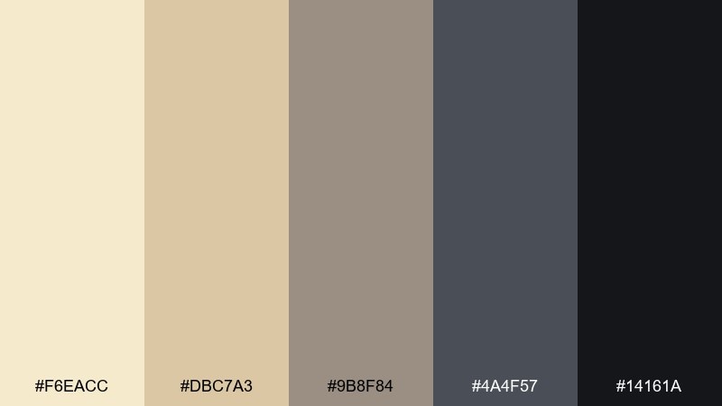
HEX: #F6EACC #DBC7A3 #9B8F84 #4A4F57 #14161A
Mood: moody, cinematic
Best for: film posters and dramatic covers
Moody and cinematic, it feels like pale sand under a darkening sky. Balance the creamy highlights with slate grays for structure, then use near-black for bold titles and silhouettes. It suits film posters, dramatic book covers, and luxury campaigns with contrast. Tip: keep the light blonde limited to highlights so the darkness stays intentional, not muddy.
Image example of pale blonde nightfall generated using media.io
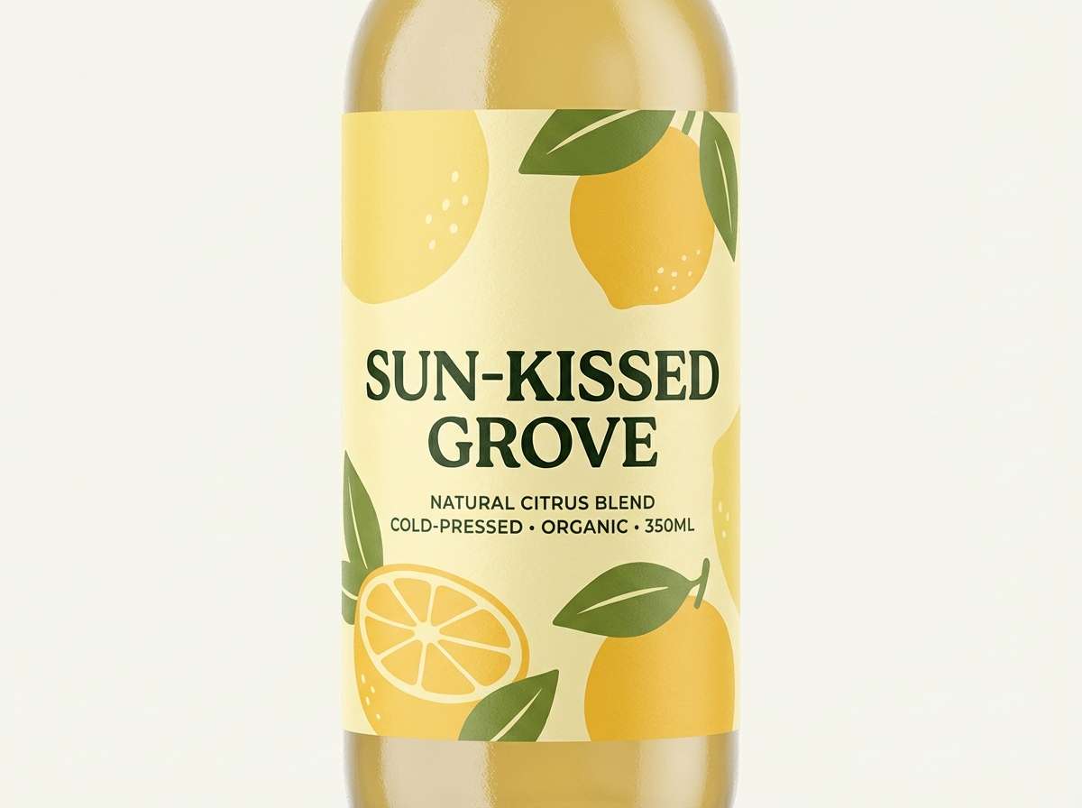
20) Bright Blonde Citrus
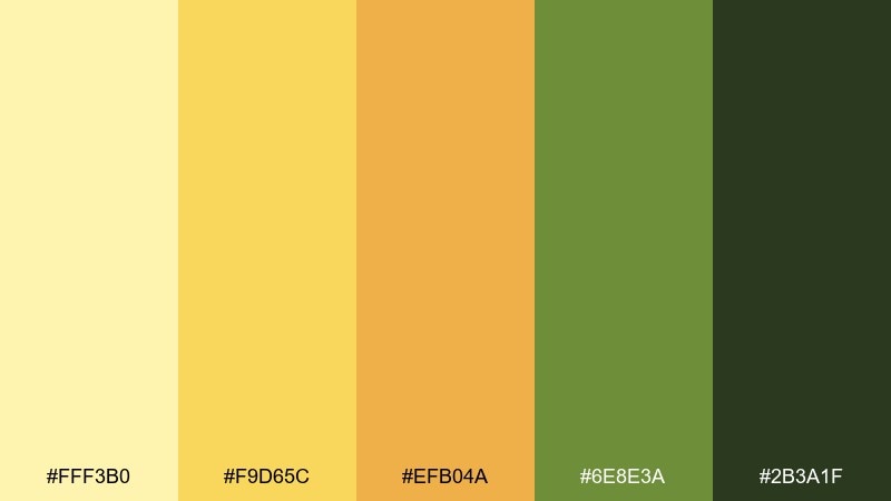
HEX: #FFF3B0 #F9D65C #EFB04A #6E8E3A #2B3A1F
Mood: energetic, fresh
Best for: juice labels and summer promos
Energetic and fresh, it channels lemon zest with a leafy green bite. Use the bright blonde and sunny yellow for the main field, then bring in green for flavor cues and sustainability notes. Ideal for juice labels, summer promos, and playful social ads. Tip: keep typography bold and simple so it stays readable against the high-chroma yellows.
Image example of bright blonde citrus generated using media.io
21) Almond Silk
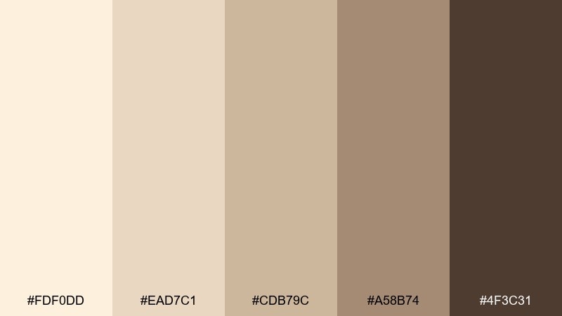
HEX: #FDF0DD #EAD7C1 #CDB79C #A58B74 #4F3C31
Mood: soft, premium
Best for: cosmetics packaging and gift boxes
Soft and premium, it resembles almond silk and warm candlelight. Use the light cream as the main surface and build contrast with sandy mid-tones for borders and product names. It is a strong fit for cosmetics, gift boxes, and boutique unboxing experiences. Tip: add a tiny pop of gloss on the darkest shade for a subtle upscale finish.
Image example of almond silk generated using media.io
22) Spring Blonde Botanica
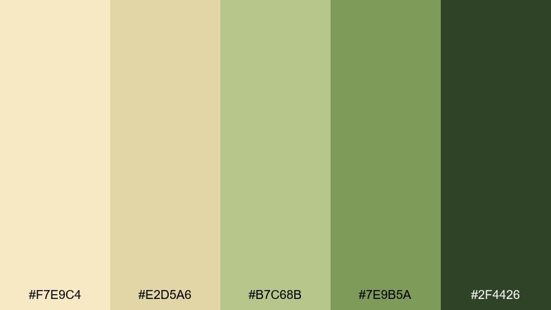
HEX: #F7E9C4 #E2D5A6 #B7C68B #7E9B5A #2F4426
Mood: botanical, light
Best for: watercolor prints and garden invites
Botanical and light, it feels like fresh leaves over sunlit straw. Use the pale blonde as paper tone, then layer sage greens for stems, frames, and soft typography accents. Great for garden invitations, nursery prints, and seasonal market posters. Tip: keep greens slightly desaturated so the overall look stays airy and watercolor-friendly.
Image example of spring blonde botanica generated using media.io
What Colors Go Well with Blonde?
Blonde plays well with deep browns, espresso, and near-black for legible contrast—especially for logos, headlines, and UI text. This pairing keeps the warmth while adding structure.
For a softer feel, mix blonde with blush, dusty rose, peach, or muted lavender to create romantic, lifestyle-friendly color combinations. These accents work best in small doses (buttons, tags, dividers).
If you want a fresher direction, add desaturated greens (sage/olive) or coastal blues (sea-glass/teal). They balance the golden base and make designs feel modern and clean.
How to Use a Blonde Color Palette in Real Designs
Use the lightest blonde as your main background to create space and a premium “paper-like” finish, then place mid-tones on cards, panels, or content sections to build hierarchy without harsh lines.
Reserve the darkest shade for typography, icons, and small UI elements—this keeps contrast accessible while maintaining the airy look that makes blonde palettes attractive.
When you need a focal point, choose one accent (sage, teal, terracotta, or lavender) and apply it consistently to CTAs, labels, and highlights so the palette stays cohesive.
Create Blonde Palette Visuals with AI
If you’re pitching a brand direction or building a mood board, generating quick visuals helps you validate how a blonde color scheme behaves on packaging, posters, and UI layouts.
With Media.io’s text-to-image tool, you can paste a prompt, specify your dominant HEX colors, and iterate variations in seconds—without complicated design setup.
Start with one of the prompts above, then swap the subject (menu, label, landing page) to match your project while keeping the same blonde palette.
Blonde Color Palette FAQs
-
What is a blonde color palette?
A blonde color palette is a set of warm light neutrals—cream, wheat, beige, oat, and soft gold—often paired with deeper browns or muted accent colors for contrast. -
Is blonde the same as beige?
Not exactly. Beige is usually more muted and neutral, while blonde tends to feel sunnier and more golden. Many palettes include both, with blonde leaning warmer. -
What accent colors look best with blond?
Sage/olive greens, dusty blues/teals, blush/rose, terracotta, and muted lavender all pair well with blonde because they balance warmth without overpowering it. -
How do I keep blonde designs from looking washed out?
Add a strong anchor color (espresso, taupe, near-black) for text and key UI elements, and use mid-tones to create separation between sections instead of relying only on very light shades. -
Are blonde palettes good for UI design?
Yes—especially for wellness, finance, and editorial UI. Use the lightest shades for surfaces, keep interactive elements clearly differentiated, and check contrast to maintain readability. -
What’s the best way to use blonde in branding?
Use blonde as the primary background or packaging base to signal warmth and quality, then apply one consistent accent (like sage or teal) and one dark tone for logos and typography. -
Can I generate blonde palette mockups with AI?
Yes. Include your HEX colors in a text prompt (dominant + accents), specify the design type (label, poster, UI), and iterate until the lighting and materials match your brand vibe.


