

Beige and black is one of the easiest ways to get a “modern neutral” look that still feels warm and human. Beige brings softness and approachability, while black adds instant structure, contrast, and authority.
Whether you’re building a brand system, decorating a room, or designing a UI, a beige black color palette helps you keep layouts clean and premium—without relying on bright colors to create hierarchy.
In this article
- Why Beige Black Palettes Work So Well
-
- gallery noir
- desert tuxedo
- linen and ink
- monochrome sand
- museum label
- cocoa outline
- stonewear
- quiet contrast
- bamboo shadow
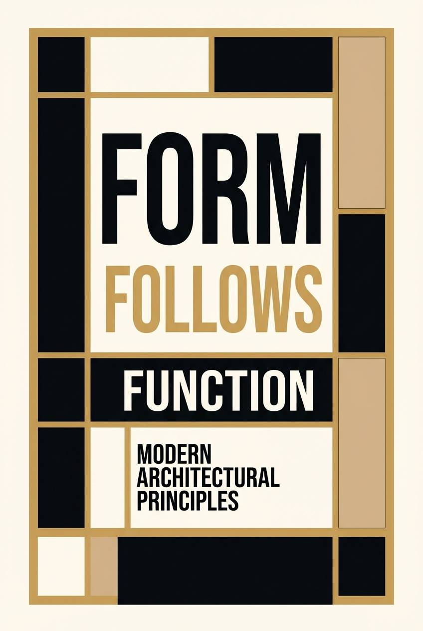
- architect beige
- soft noir kitchen
- vintage film
- cashmere night
- minimal stationery set
- modern monastery
- sandstone type
- earthy minimal
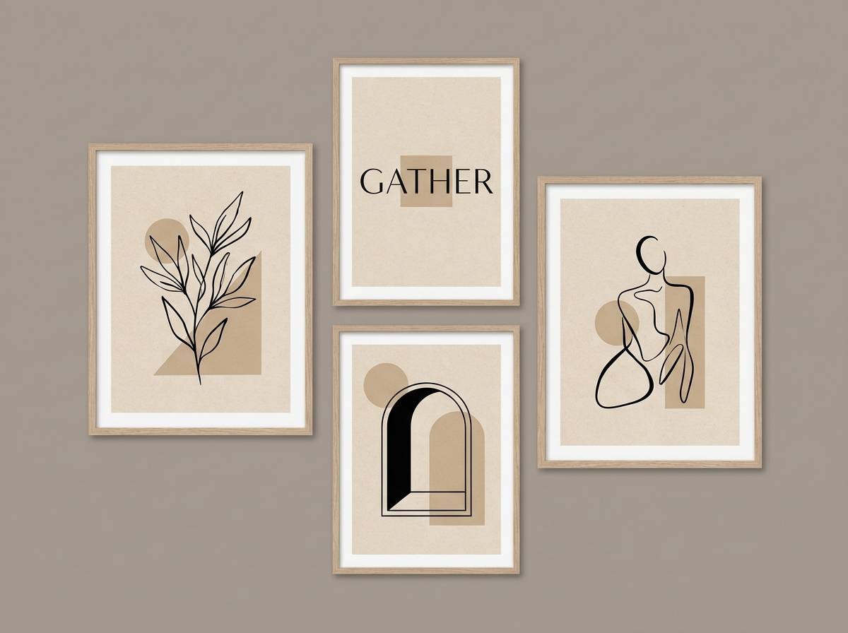
- chic gallery wall
- neutral tech
- dune noir
- clay and carbon
- opera neutral
- calm contrast grid
- What Colors Go Well with Beige Black?
- How to Use a Beige Black Color Palette in Real Designs
- Create Beige Black Palette Visuals with AI
Why Beige Black Palettes Work So Well
Beige black color combinations balance comfort and clarity. Beige tones reduce visual harshness and add warmth, while black provides strong contrast for typography, navigation, and key focal points.
This pairing is naturally versatile: it can look minimalist and modern, vintage and cinematic, or heritage and luxury depending on which beige undertones (cream, sand, camel) and which darks (charcoal, espresso, true black) you choose.
It’s also practical. You can build consistent hierarchy with just neutrals—light beige for backgrounds, mid-beige for structure, and black for emphasis—making it ideal for branding systems, product packaging, and UI.
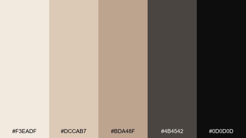
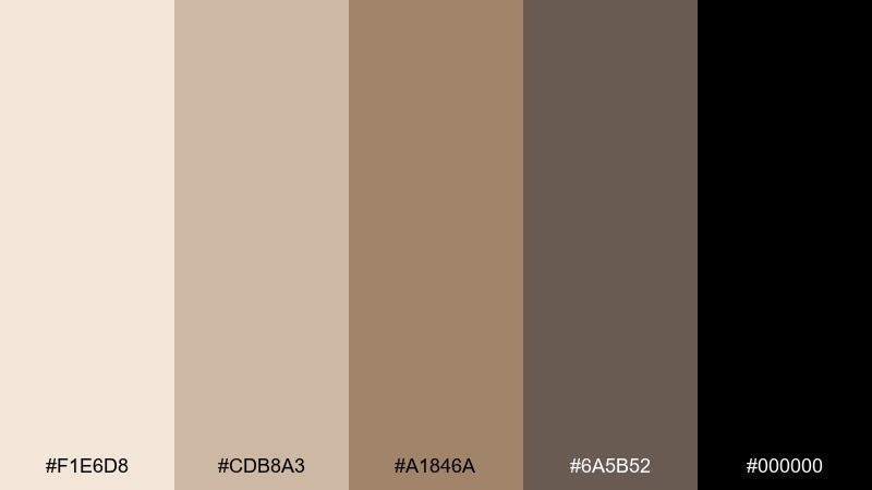
20+ Beige Black Color Palette Ideas (with HEX Codes)
1) Gallery Noir
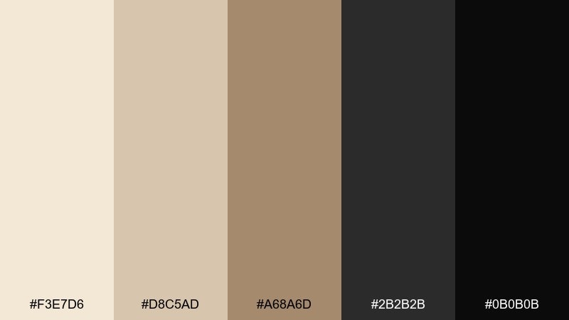
HEX: #F3E7D6 #D8C5AD #A68A6D #2B2B2B #0B0B0B
Mood: refined, minimalist, curated
Best for: luxury branding and editorial covers
Refined and gallery-like, these tones feel like linen walls against a black frame. Use the pale beige as breathing room, then let the deeper sand and charcoal handle headlines and dividers. It works beautifully for fashion, art, and premium services where contrast needs to feel controlled. Tip: keep body text in charcoal instead of pure black for a softer, printed look.
Image example of gallery noir generated using media.io
Media.io is an online AI studio for creating and editing video, image, and audio in your browser.

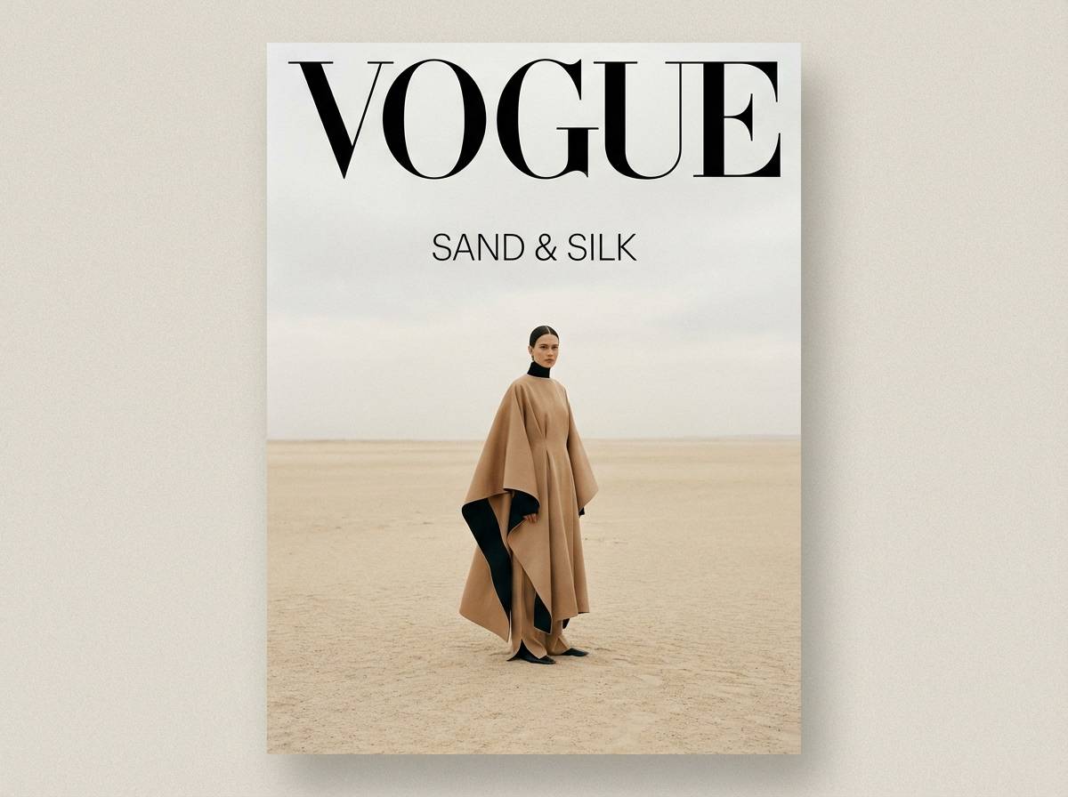
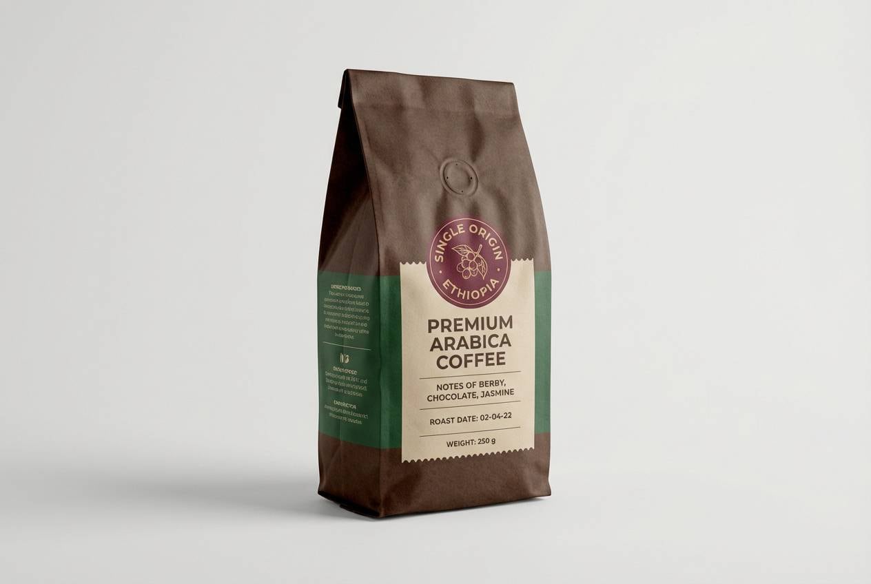
2) Desert Tuxedo
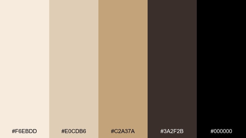
HEX: #F6EBDD #E0CDB6 #C2A37A #3A2F2B #000000
Mood: warm, grounded, upscale
Best for: cafe packaging and labels
Warm desert neutrals paired with a tuxedo-black anchor create a cozy, premium feel. Use the creamy beige for the package base and reserve black for logos and key callouts. The tan and camel notes are ideal for flavor cues like caramel, oat, or spice. Tip: add subtle matte textures so the dark elements feel less harsh and more artisanal.
Image example of desert tuxedo generated using media.io
3) Linen and Ink
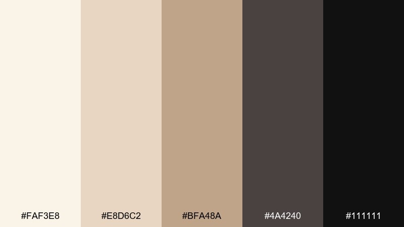
HEX: #FAF3E8 #E8D6C2 #BFA48A #4A4240 #111111
Mood: calm, airy, modern classic
Best for: interior mood boards and client proposals
Calm and airy like fresh linen with a fountain-pen finish, this mix stays soft without feeling bland. Lean on the lightest cream for backgrounds, then layer mid-beige blocks for swatches and notes. The warm gray-brown and near-black keep titles crisp and professional. Tip: use the mid beige as a unifying border color to tie photos and diagrams together.
Image example of linen and ink generated using media.io
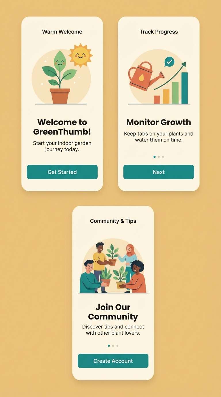
4) Monochrome Sand

HEX: #EFE2D1 #D3BFA8 #9B7C5E #1F1F1F #070707
Mood: bold, modern, confident
Best for: mobile app onboarding screens
Bold and confident, these shades feel like sunlit sand cut by sharp shadows. Use the pale beige for screen backgrounds, then place black and near-black for primary buttons and navigation. The mid sand and toasted brown are perfect for illustrations, icons, or highlight cards. Tip: keep contrast accessible by pairing black text with the two lightest tones.
Image example of monochrome sand generated using media.io
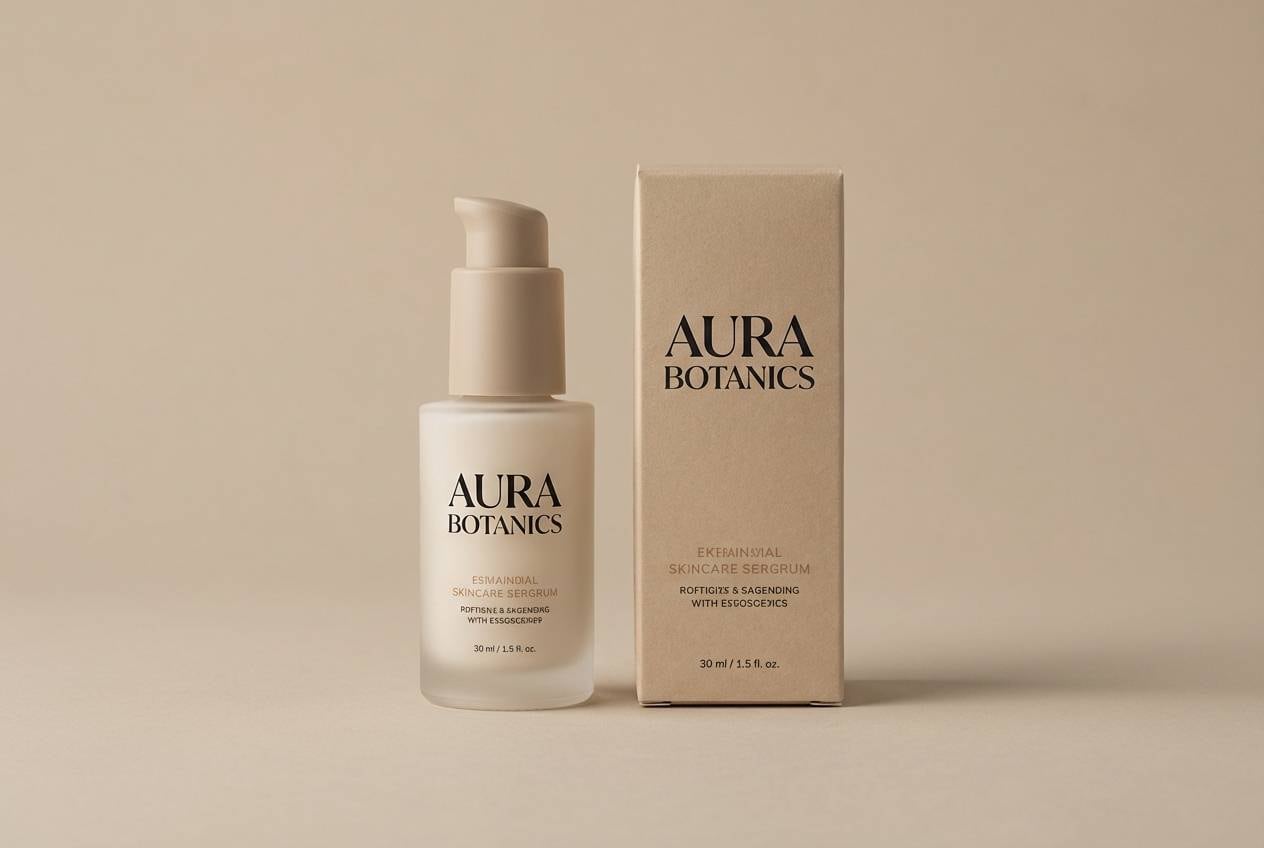
5) Museum Label
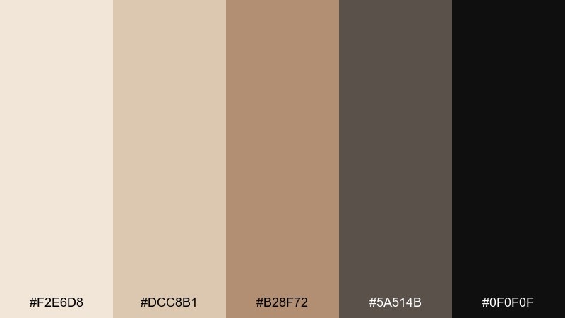
HEX: #F2E6D8 #DCC8B1 #B28F72 #5A514B #0F0F0F
Mood: heritage, thoughtful, polished
Best for: skincare label design and product names
Heritage and polished, it evokes gallery placards, apothecary jars, and quiet confidence. These beige black color combinations shine on minimalist skincare where ingredients and claims need to read clearly. Pair the darkest tones with lots of cream space, then use the warm mid-tan for secondary hierarchy like scent notes or usage steps. Tip: print black as rich black only for logos, and use the deep brown-gray for body copy to avoid over-contrast.
Image example of museum label generated using media.io
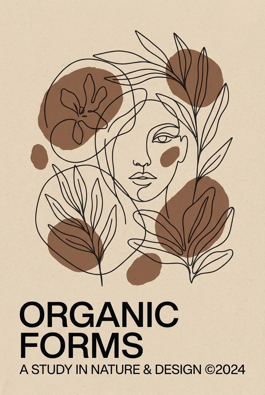
6) Cocoa Outline
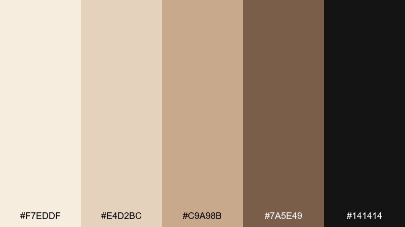
HEX: #F7EDDF #E4D2BC #C9A98B #7A5E49 #141414
Mood: cozy, artsy, understated
Best for: line-art posters and typography prints
Cozy and artsy, it feels like cocoa powder on sketch paper with crisp ink lines. The light beige tones make an ideal poster base, while the cocoa brown adds warmth to illustrations and headings. Use near-black sparingly for outlines and small text so the print stays soft. Tip: try a thin border in the mid beige to frame the layout without heavy black blocks.
Image example of cocoa outline generated using media.io
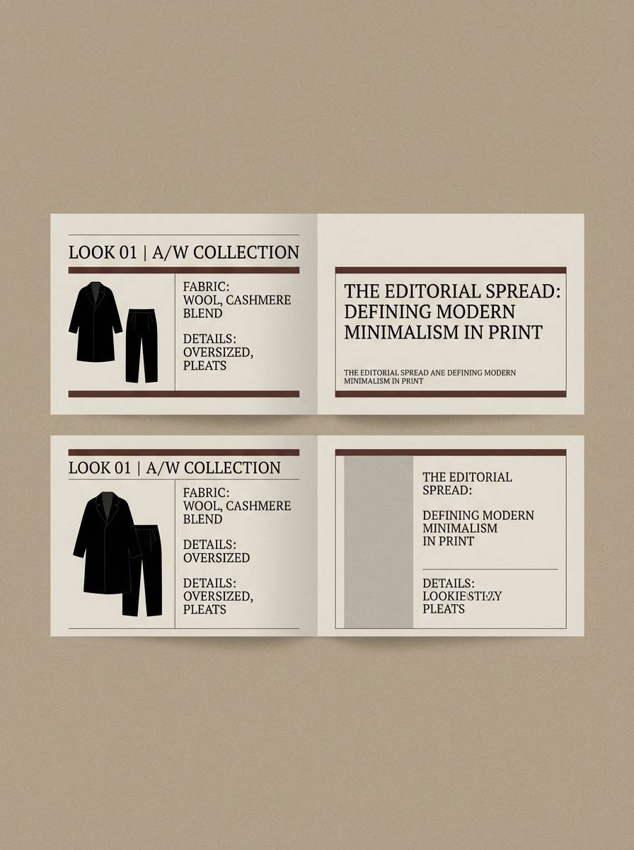
7) Stonewear
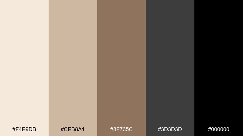
HEX: #F4E9DB #CEB8A1 #8F735C #3D3D3D #000000
Mood: urban, rugged, premium
Best for: menswear lookbooks and editorial spreads
Urban and rugged, it reads like sandstone, worn leather, and a black denim finish. Keep pages mostly light beige, then let charcoal and black carry the type system for a sharp lookbook. The warm brown is perfect for small accents like price, fabric notes, or section tabs. Tip: use large beige margins so dark photography captions never feel heavy.
Image example of stonewear generated using media.io
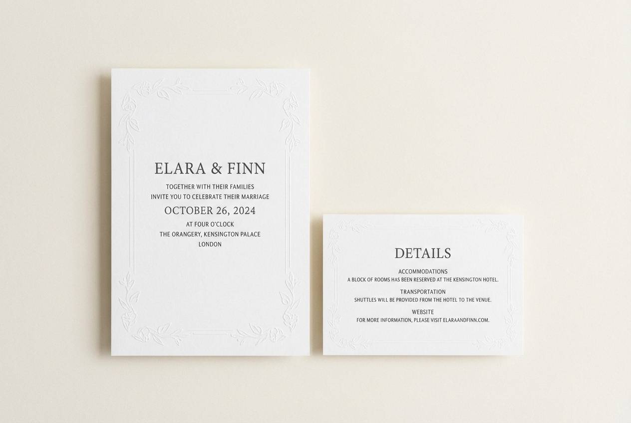
8) Quiet Contrast

HEX: #FFF6EC #E2D2C0 #C0A28B #2C2524 #0A0A0A
Mood: romantic, clean, timeless
Best for: wedding invitations and save-the-dates
Romantic and clean, it feels like ivory paper with crisp letterpress ink. Use the palest tone as the invitation base, then set names in black for maximum legibility. The warm beiges can live in monograms, envelope liners, or subtle patterns. Tip: choose a slightly textured paper and keep ink coverage low to preserve the airy look.
Image example of quiet contrast generated using media.io
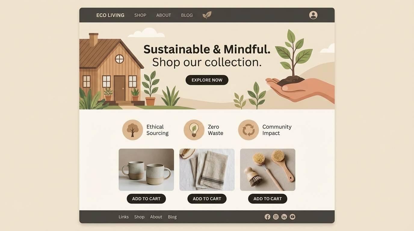
9) Bamboo Shadow
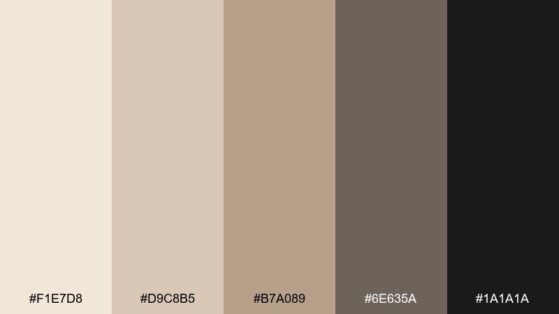
HEX: #F1E7D8 #D9C8B5 #B7A089 #6E635A #1A1A1A
Mood: natural, calm, eco-modern
Best for: eco brand landing pages
Natural and calm, it brings to mind bamboo fibers and soft shadows at dusk. The light beige works well as a page canvas, while the gray-brown keeps UI elements grounded and gentle. Add the deeper near-black for primary actions to maintain clarity without losing the organic vibe. Tip: pair with warm photography and keep accent color usage under 10 percent for a clean, sustainable feel.
Image example of bamboo shadow generated using media.io
10) Architect Beige
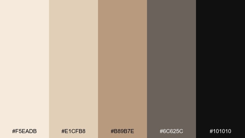
HEX: #F5EADB #E1CFB8 #B89B7E #6C625C #101010
Mood: structured, professional, modern
Best for: architecture firm pitch decks
Structured and professional, these shades feel like tracing paper, concrete, and a sharp graphite line. Use the lightest beige for slide backgrounds and the warm mid-tone for callout boxes and section headers. The darker neutrals are ideal for diagrams, captions, and strong title contrast. Tip: keep one accent tone consistent across all slides to make the deck feel engineered and intentional.
Image example of architect beige generated using media.io

11) Soft Noir Kitchen
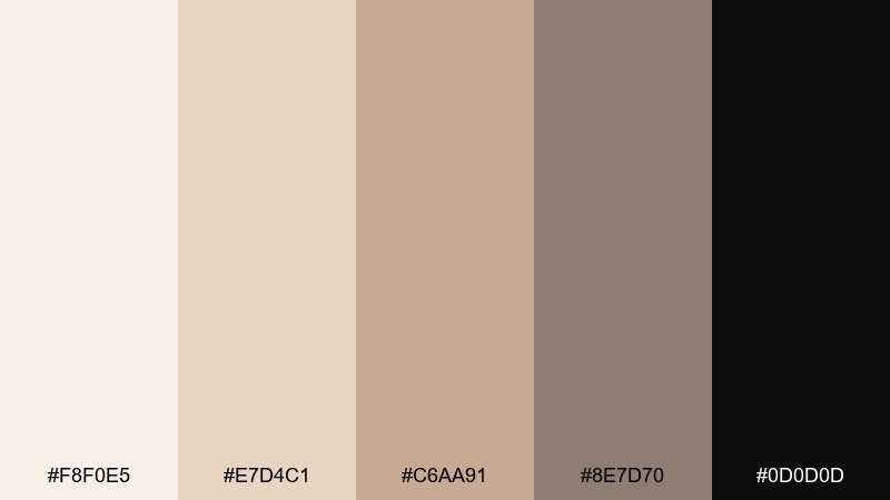
HEX: #F8F0E5 #E7D4C1 #C6AA91 #8E7D70 #0D0D0D
Mood: inviting, upscale, comforting
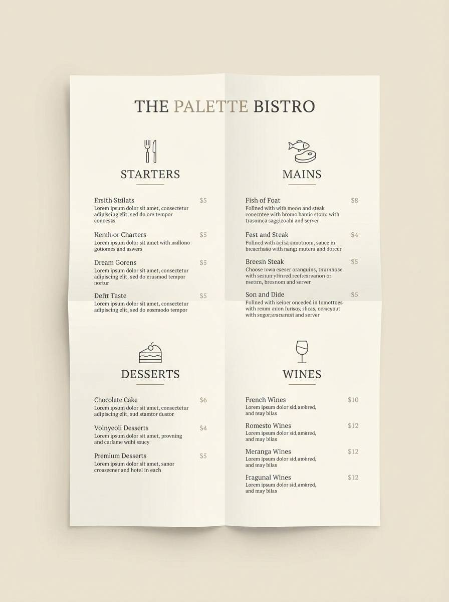
Best for: restaurant menus and table cards
Inviting and upscale, it suggests candlelit dining and creamy ceramic plates. Build the menu on the light cream, then use black for section titles and prices so guests can scan quickly. The warm taupes add hierarchy for descriptions and dietary icons without looking clinical. Tip: avoid thick black rules and use the mid taupe instead for a softer, more premium menu layout.
Image example of soft noir kitchen generated using media.io
12) Vintage Film
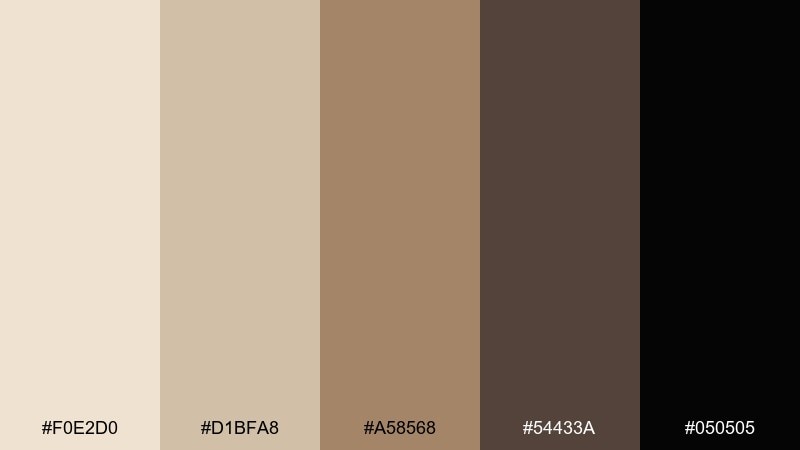
HEX: #F0E2D0 #D1BFA8 #A58568 #54433A #050505
Mood: nostalgic, moody, cinematic
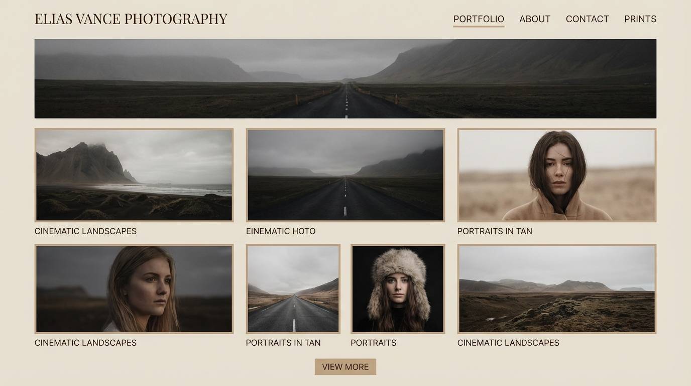
Best for: photography portfolio websites
Nostalgic and cinematic, these tones echo grainy film, sepia highlights, and a deep darkroom edge. Use beige backgrounds to keep galleries bright, then set navigation and captions in the rich brown and black for a classic finish. The mid tan works well for hover states or subtle separators. Tip: pair with warm-toned photos and limit pure black to your strongest CTA.
Image example of vintage film generated using media.io
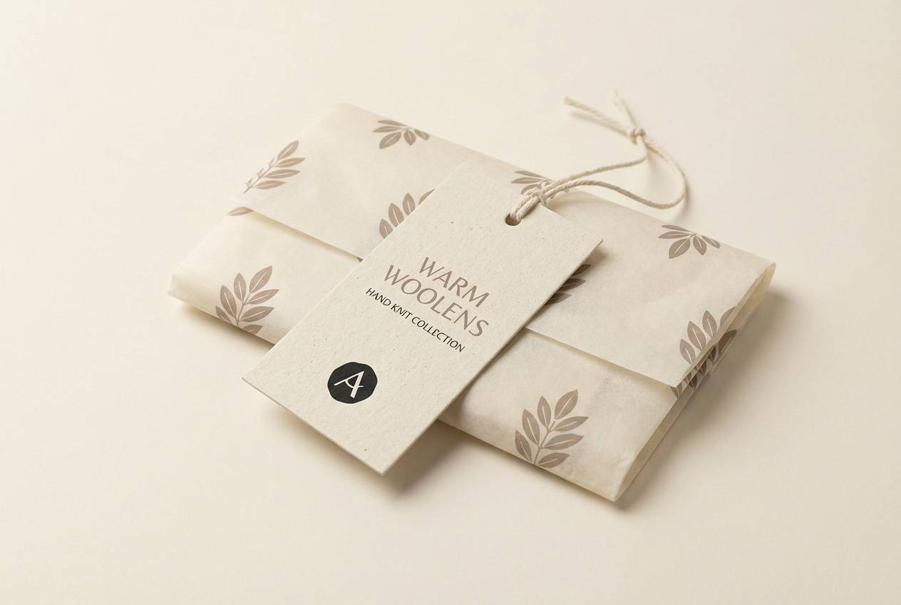
13) Cashmere Night
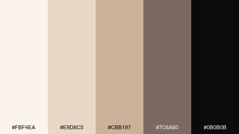
HEX: #FBF4EA #E9D8C5 #CBB197 #7C6A60 #0B0B0B
Mood: soft, elegant, cozy-luxe
Best for: knitwear tags and premium packaging
Soft and cozy-luxe, it feels like cashmere in a dim boutique. The creamy beige is perfect for packaging bases, while the warm taupe adds gentle depth for patterns or borders. Use near-black for brand marks and sizing so details stay crisp. Tip: emboss or spot-UV the darkest ink to add tactile contrast without changing the calm palette.
Image example of cashmere night generated using media.io
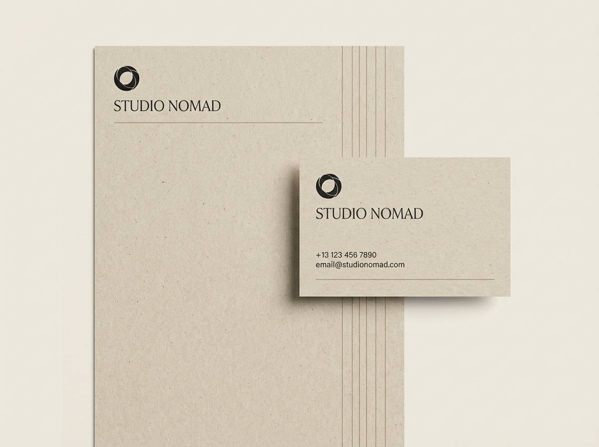
14) Minimal Stationery Set
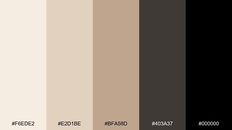
HEX: #F6EDE2 #E2D1BE #BFA58D #403A37 #000000
Mood: clean, modern, understated
Best for: business stationery and letterheads
Clean and understated, it evokes crisp paper stock with a confident black signature. A beige base keeps layouts approachable, while deep charcoal and black bring authority to names and contact lines. For a beige black color combination that prints reliably, use the mid beige for subtle rules and section breaks instead of thin black lines. Tip: keep logos in a single dark tone to avoid banding on textured paper.
Image example of minimal stationery set generated using media.io
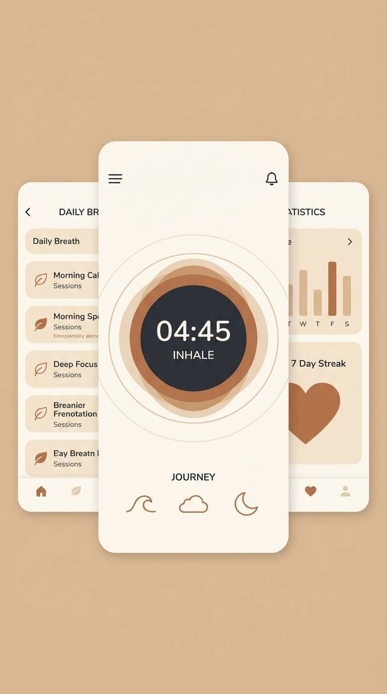
15) Modern Monastery
HEX: #F2E8DC #D7C6B3 #A68B73 #2A2624 #0A0A0A
Mood: quiet, mindful, grounded
Best for: meditation and wellness app UI
Quiet and mindful, it brings monastery stone, warm candles, and calm shadows to the screen. This beige black color palette works best with plenty of open space and a clear type scale. Let the lightest beige carry most surfaces, then use the darker pair for focus states and primary actions. Tip: introduce the warm brown only on progress rings or small icons so the UI feels steady, not busy.
Image example of modern monastery generated using media.io
16) Sandstone Type
HEX: #F9F1E7 #E5D3C0 #C3A489 #6B5C54 #141414
Mood: editorial, warm, design-forward
Best for: typographic poster series
Editorial and design-forward, it feels like sandstone paper with dark ink pressed into type. The creamy base keeps posters bright, while the deeper brown adds richness to oversized letterforms. Use near-black for small details like dates, venues, or QR codes to preserve readability. Tip: alternate backgrounds between the first two tones to create a cohesive series without changing the overall vibe.
Image example of sandstone type generated using media.io
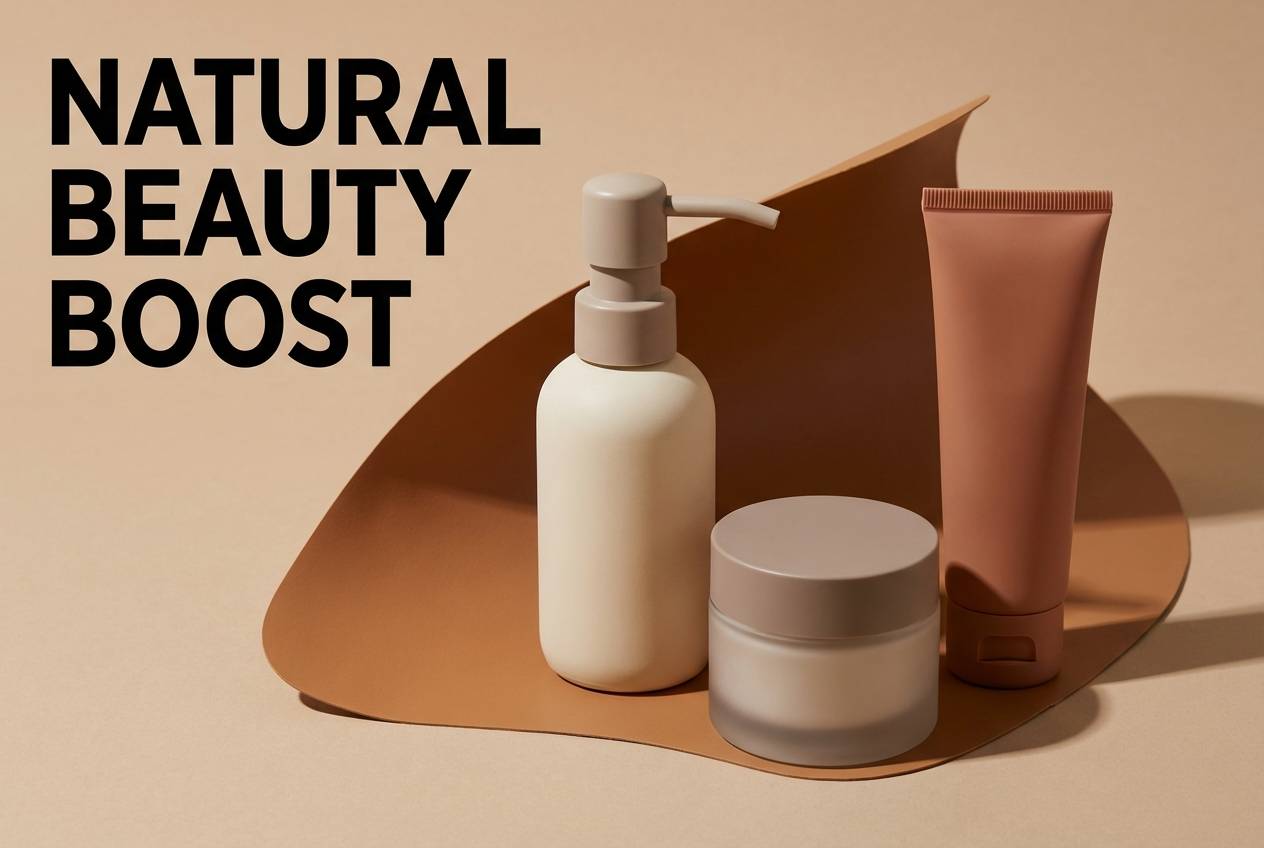
17) Earthy Minimal
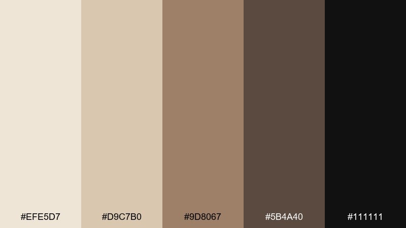
HEX: #EFE5D7 #D9C7B0 #9D8067 #5B4A40 #111111
Mood: earthy, modern, trustworthy
Best for: cosmetics product ads and hero images
Earthy and trustworthy, it suggests clay, natural pigments, and a clean studio backdrop. Use the light beige as the hero background, then feature products with black logotypes for instant clarity. The warm brown and taupe give you space for ingredient callouts and small graphic accents. Tip: keep the darkest tone only on the focal product and headline to make the ad feel premium, not heavy.
Image example of earthy minimal generated using media.io
18) Chic Gallery Wall
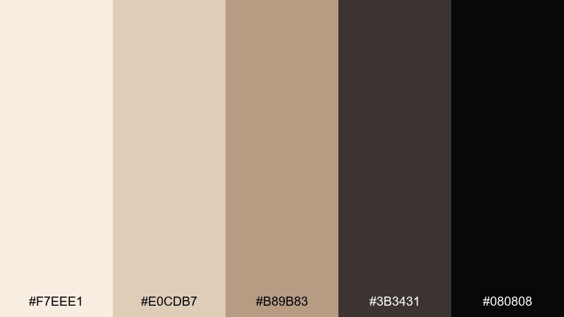
HEX: #F7EEE1 #E0CDB7 #B89B83 #3B3431 #080808
Mood: chic, artistic, balanced
Best for: gallery wall print sets
Chic and artistic, it feels like framed sketches on warm plaster with a dark wood edge. A beige black color palette like this is ideal for coordinating multiple prints without fighting the room. Use the lighter tones for backgrounds and matting effects, then reserve the deep shades for linework and titles. Tip: repeat the mid tan across the set as a consistent accent so the collection looks intentional.
Image example of chic gallery wall generated using media.io
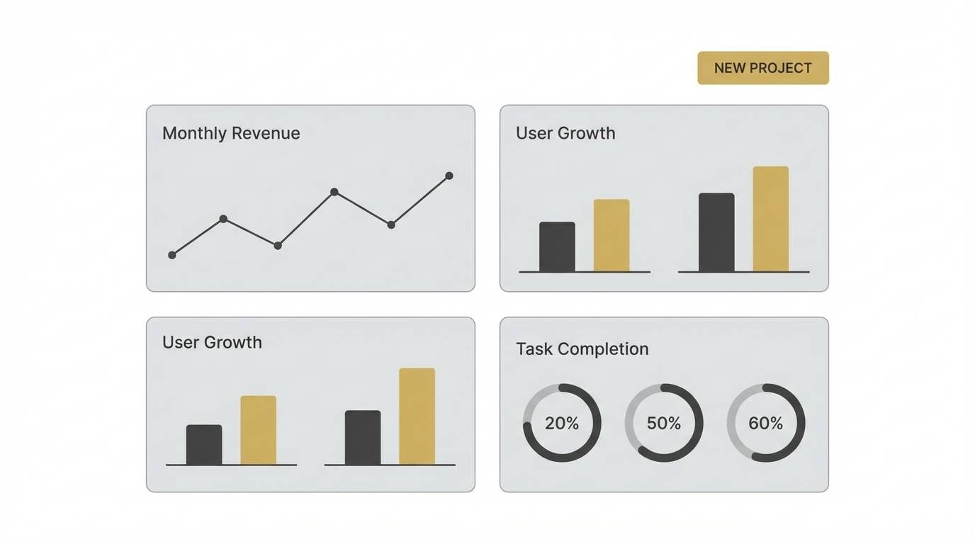
19) Neutral Tech
HEX: #F3EADF #DCCAB7 #BDA48F #4B4542 #0D0D0D
Mood: sleek, calm, professional
Best for: SaaS dashboard UI
Sleek and calm, it reads like a modern workspace with warm light and sharp monitors. Use the lightest beige for the dashboard canvas to reduce glare and keep long sessions comfortable. Deep neutrals can define sidebars, charts, and selected states without the harshness of pure black everywhere. Tip: apply the mid beige to table rows and cards to create structure with minimal borders.
Image example of neutral tech generated using media.io
20) Dune Noir
HEX: #F1E6D8 #CDB8A3 #A1846A #6A5B52 #000000
Mood: elegant, grounded, architectural
Best for: interior paint brochures and swatch pages
Elegant and grounded, it evokes dunes at twilight with a crisp black silhouette. Use the light beige as the page base, then stack swatches from tan to deep gray-brown for a natural progression. Black should be reserved for headings and small brand marks so the brochure stays warm. Tip: add plenty of white or cream margins to keep the darker swatches from overpowering the spread.
Image example of dune noir generated using media.io
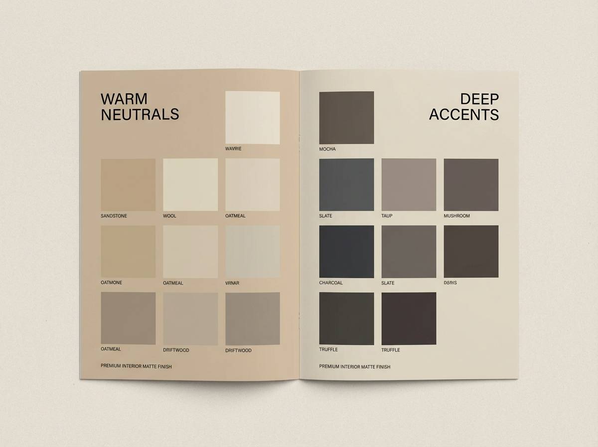
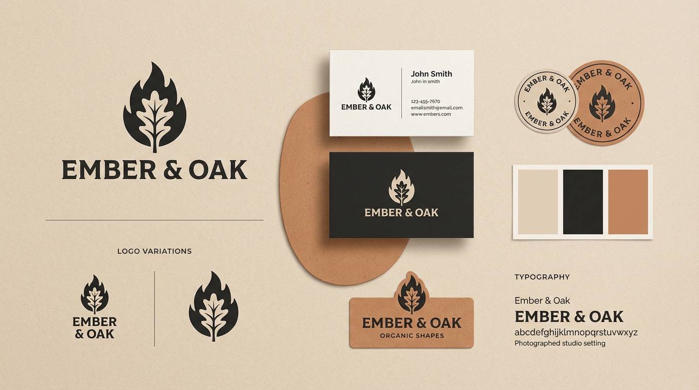
21) Clay and Carbon
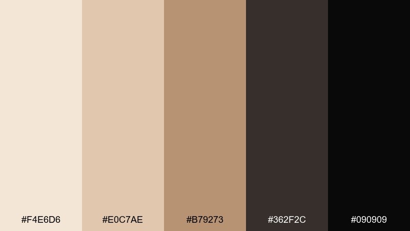
HEX: #F4E6D6 #E0C7AE #B79273 #362F2C #090909
Mood: earthy, bold, contemporary
Best for: ceramics brand identity and logo systems
Earthy and bold, it feels like raw clay beside a carbon-fired finish. Use the lighter beiges for stationery and backgrounds, and lean on the deep brown-black for marks and wordmarks. The warm tan is a strong accent for seals, stickers, and secondary labels. Tip: keep gradients out and let flat color blocks do the heavy lifting for a modern craft look.
Image example of clay and carbon generated using media.io
22) Opera Neutral
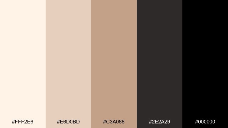
HEX: #FFF2E6 #E6D0BD #C3A088 #2E2A29 #000000
Mood: dramatic, elegant, high-contrast
Best for: event posters and concert flyers
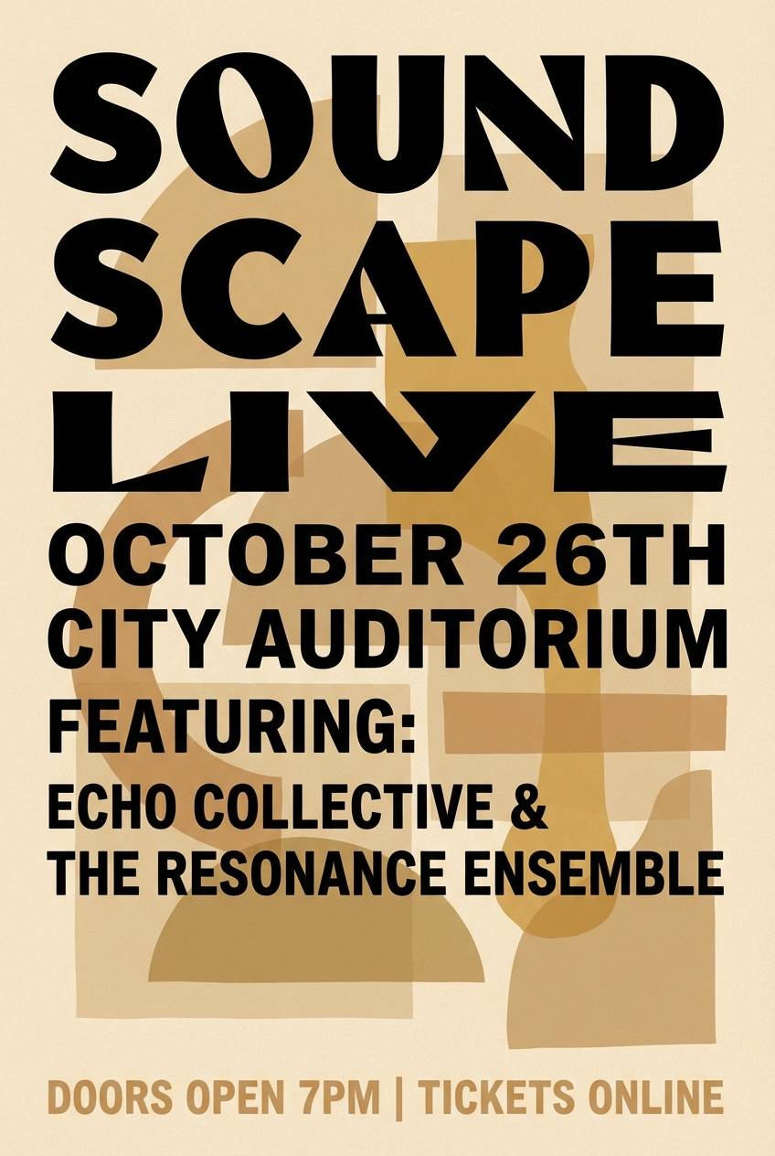
Dramatic and elegant, it echoes velvet curtains and warm stage light. Beige grounds the layout so black typography can be large, loud, and still readable. The mid tones add depth to graphic shapes, borders, and supporting text. Tip: use oversized black type on the lightest beige and keep decorative elements in tan to avoid clutter.
Image example of opera neutral generated using media.io
23) Calm Contrast Grid

HEX: #F8EFE3 #E3D0BC #AD8E74 #4E4642 #0C0C0C
Mood: orderly, calm, modern
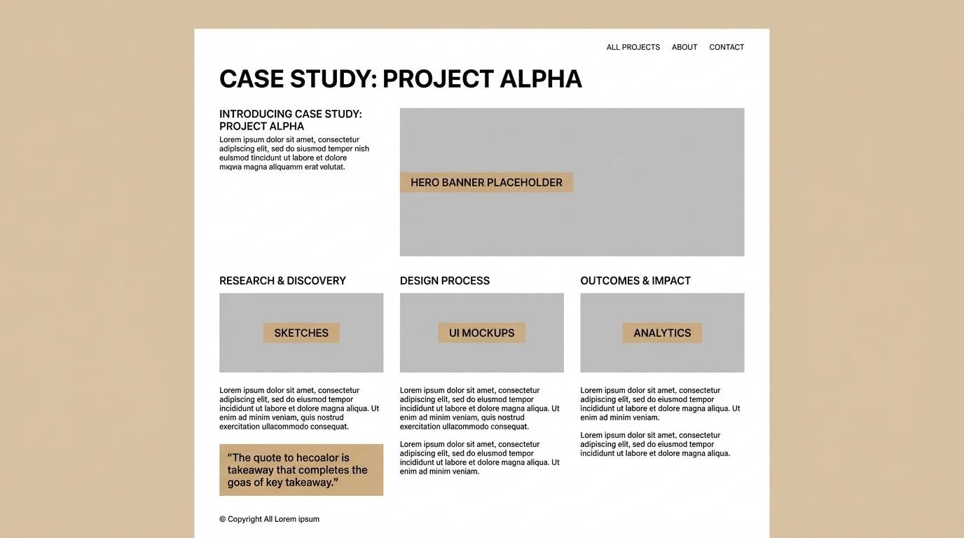
Best for: portfolio case study pages
Orderly and calm, it feels like a tidy studio desk with clean shadows and warm paper. The range of beiges supports grids, captions, and pull quotes without the coldness of pure gray. Use the deep neutrals for section headers and navigation to keep the reading flow strong. Tip: apply the mid brown sparingly to highlight metrics or key outcomes in your case study.
Image example of calm contrast grid generated using media.io
What Colors Go Well with Beige Black?
Beige and black pair well with other warm neutrals like camel, tan, taupe, and soft browns—these keep the scheme cohesive while giving you more steps for hierarchy and depth.
If you want a modern pop, muted accents work best: dusty teal, sage green, terracotta, or warm gold. Because beige black palettes are already high-contrast, a restrained accent (used sparingly) tends to look more premium than bright saturated colors.
For digital products, consider “soft black” (charcoal) and off-white/cream instead of pure black and pure white. The overall feel becomes calmer, while still maintaining strong readability.
How to Use a Beige Black Color Palette in Real Designs
Start with beige as your main surface color—backgrounds, large blocks, packaging bases, or wall paint. Then assign black to the elements that must lead: headline type, logos, primary buttons, or key navigation.
Use mid-beiges and warm browns as “layout tools” for cards, dividers, borders, and small highlights. This keeps the design from feeling stark, and it helps you avoid overusing black in large areas.
When printing, consider swapping pure black body text for a deep charcoal to reduce glare and improve the tactile, editorial look. In UI, check accessibility contrast on beige backgrounds to keep text and controls easy to read.
Create Beige Black Palette Visuals with AI
If you’re pitching a concept or building a mood board, visuals sell the palette faster than swatches alone. Generate poster mockups, packaging scenes, UI screens, and editorial layouts in the same beige-black style to validate the vibe early.
With Media.io, you can turn a simple description into consistent image examples—then iterate quickly by changing keywords like “matte,” “linen texture,” “editorial grid,” or “soft shadow” while keeping the color direction steady.
Use the palette HEX values as guidance, then refine with lighting and materials (paper, ceramic, fabric) to make beige look rich instead of flat.
Beige Black Color Palette FAQs
-
Is beige and black a good color combination?
Yes. Beige adds warmth and approachability, while black adds contrast and structure, making the pair ideal for modern minimal design, luxury branding, and clean UI layouts. -
What HEX code is a good beige base for a beige black palette?
A reliable warm beige starting point is #F2E6D8 (a creamy, gallery-like neutral). It pairs well with charcoal and true black without looking too yellow. -
How do I keep beige and black from looking too harsh?
Use charcoal or deep brown-gray for body text and secondary elements, reserve true black for logos/headlines, and add mid-beige separators instead of heavy black rules. -
What accent colors work with beige and black?
Muted accents like dusty teal, sage, terracotta, and warm gold pair well. They add personality without fighting the neutral base or overpowering the high-contrast look. -
Is a beige black palette suitable for UI design?
Yes. Beige backgrounds can reduce glare, and black/charcoal creates strong hierarchy. Just verify contrast for accessibility and avoid using pure black everywhere to keep screens comfortable. -
Does beige and black work for interiors?
It works especially well when beige is used on large surfaces (walls, textiles) and black is used as an anchor (frames, fixtures, hardware). Add warm woods or taupe tones to keep it inviting. -
How can I generate beige black palette mockups quickly?
Use an AI image generator like Media.io Text-to-Image. Describe the design (e.g., “skincare label,” “editorial cover,” “SaaS dashboard”), keep lighting/material cues consistent, and iterate variations until the palette feels right.
Next: Teal Brown Color Palette


