

Baroque color palettes are built for drama: deep shadows, warm neutrals, and metallic-like highlights that feel ornate without becoming chaotic.
Below are 20+ baroque color scheme ideas with HEX codes plus practical ways to keep contrast readable and the overall look refined.
In this article
- Why Baroque Palettes Work So Well
-
- gilded chapel
- velvet drapery
- aged fresco
- candlelit marble
- royal tapestry
- shadowed gilding
- ornate olive
- pearl and patina
- crimson reliquary
- bronzed walnut
- ivory sonata
- emerald brocade
- sepia gallery
- courtly rose
- stormy stucco
- saffron incense
- nocturne goldleaf
- harvest caravaggio
- pewter halo
- lacquer and linen
- botanical baroque
- opera house
- What Colors Go Well with Baroque?
- How to Use a Baroque Color Palette in Real Designs
- Create Baroque Palette Visuals with AI
Why Baroque Palettes Work So Well
Baroque art color palettes feel instantly premium because they combine dark anchors (near-black, espresso, deep green) with warm, candlelit lights (ivory, parchment, cream). That contrast creates depth like carved wood, velvet drapery, and marble in low light.
They also rely on “controlled luxury” accents—gold, bronze, and saffron used sparingly—so highlights read like ornament rather than noise. When you keep metallic tones limited to borders, icons, or crests, the composition stays elegant.
Finally, baroque color combinations are forgiving across print and digital because they lean warm and slightly muted. That makes typography feel classic and helps photos, textures, and engraved illustrations blend naturally.
20+ Baroque Color Palette Ideas (with HEX Codes)
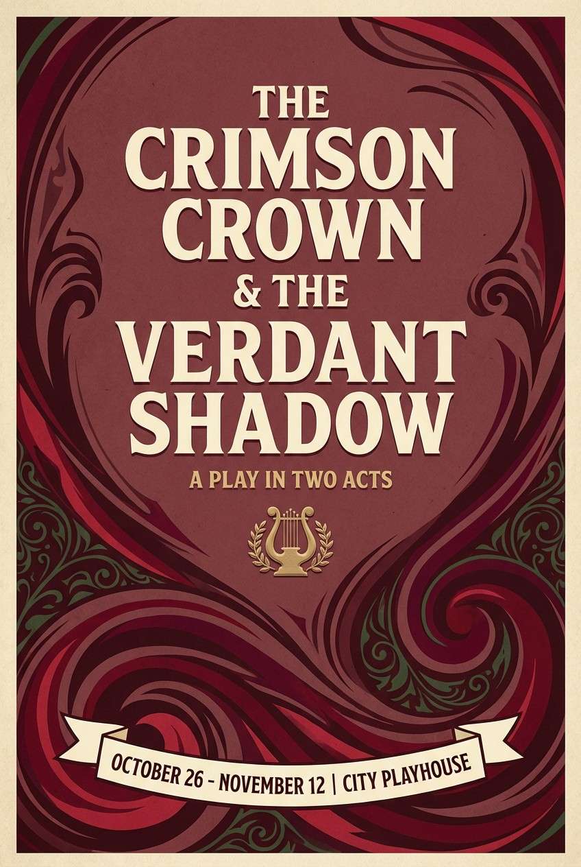
1) Gilded Chapel
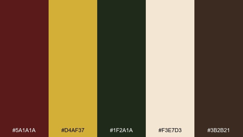
HEX: #5A1A1A #D4AF37 #1F2A1A #F3E7D3 #3B2B21
Mood: opulent and reverent
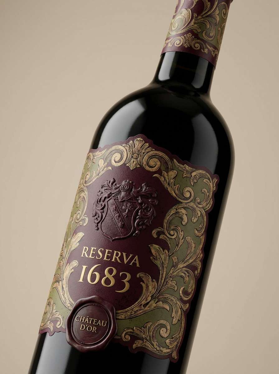
Best for: luxury branding and wine labels
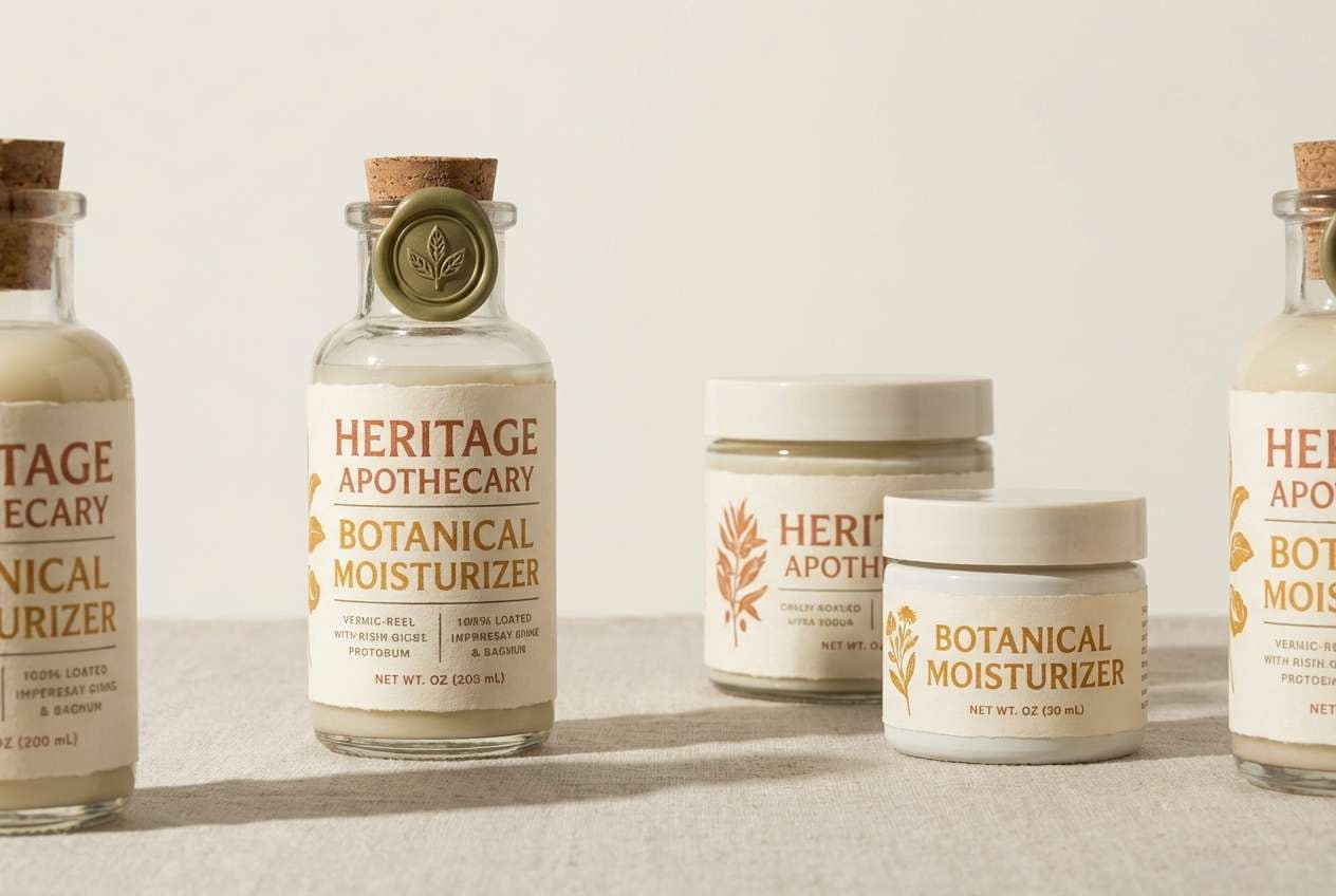
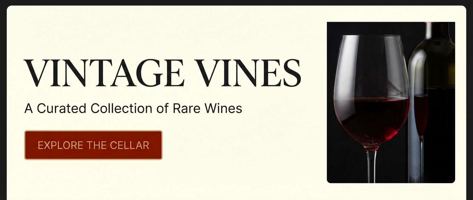
Opulent and reverent, this Baroque color scheme feels like candlelight catching gold leaf against dark wood. Use the deep burgundy and umber for hierarchy, then let the gold work as a controlled accent on seals, borders, and icons. The parchment tone keeps typography readable without losing warmth. For a refined baroque color palette, pair serif headlines with thin linework and leave generous margins so the drama stays classy.
Image example of gilded chapel generated using media.io
Media.io is an online AI studio for creating and editing video, image, and audio in your browser.

2) Velvet Drapery
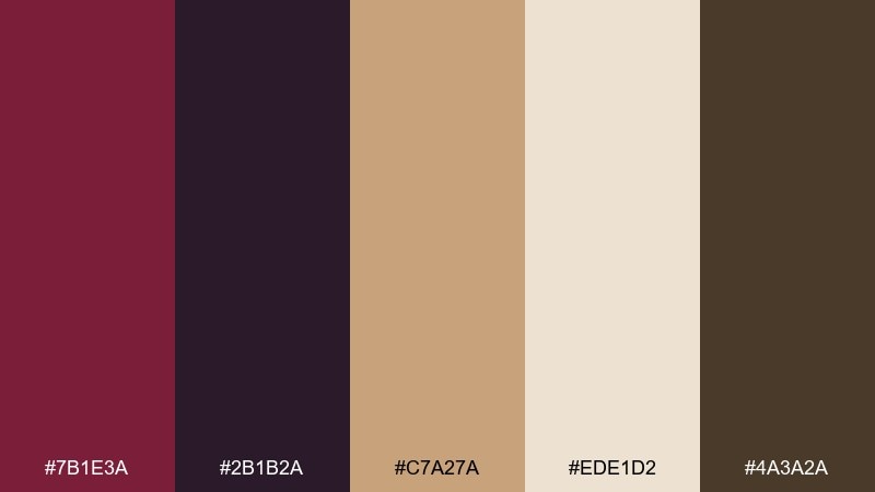
HEX: #7B1E3A #2B1B2A #C7A27A #EDE1D2 #4A3A2A
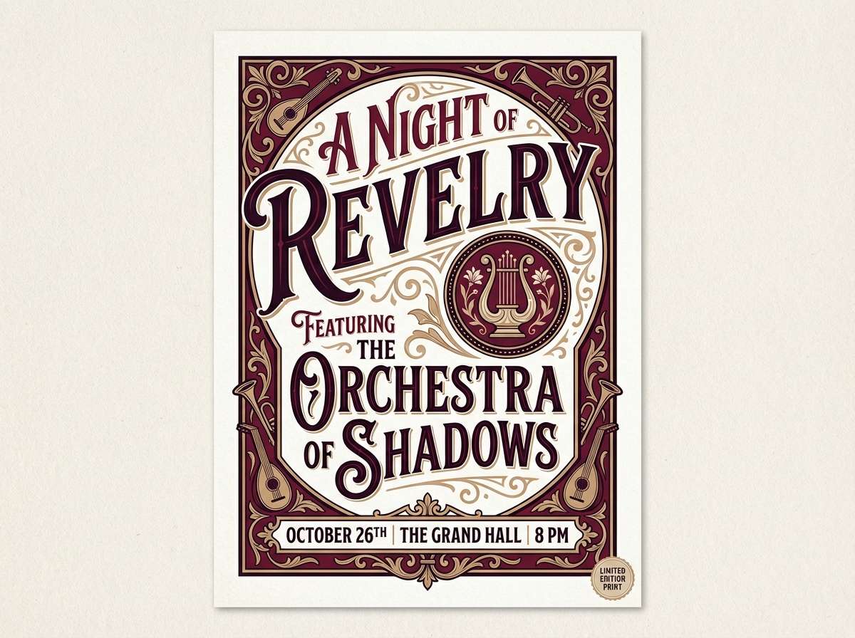
Mood: theatrical and intimate
Best for: event posters and album covers
Theatrical and intimate, these Baroque tones evoke velvet curtains, shadowed balconies, and warm spotlight glow. Keep the plum-black as the grounding base, then bring in antique beige for titles and credits. The rose wine shade works best in large blocks or gradients rather than tiny details. Add texture like grain or paper to make the palette feel more lived-in.
Image example of velvet drapery generated using media.io
3) Aged Fresco
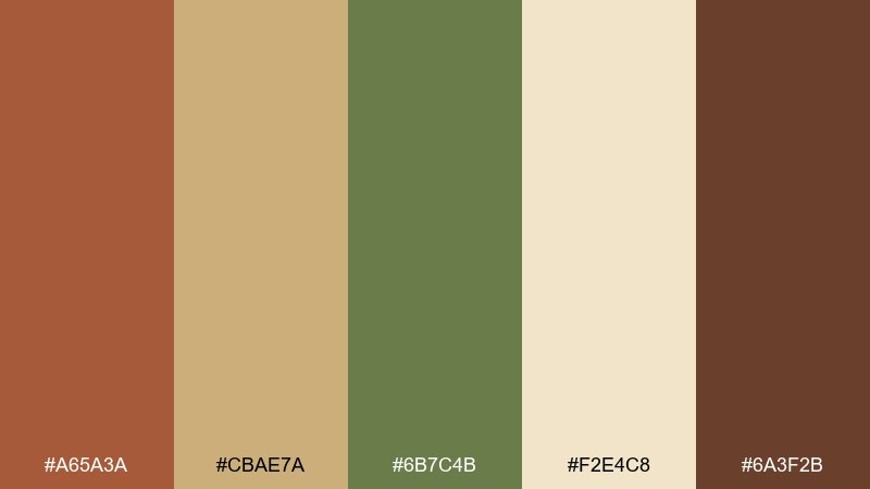
HEX: #A65A3A #CBAE7A #6B7C4B #F2E4C8 #6A3F2B
Mood: sun-warmed and antique
Best for: interior mood boards and heritage packaging
Sun-warmed and antique, this Baroque color palette recalls cracked fresco paint and patinated frames. Let the cream and ochre carry large surfaces, while the terracotta and umber define edges and headings. The muted olive is a smart accent for secondary buttons or stamp marks. Use matte finishes and minimal gloss to keep the aged effect believable.
Image example of aged fresco generated using media.io
4) Candlelit Marble
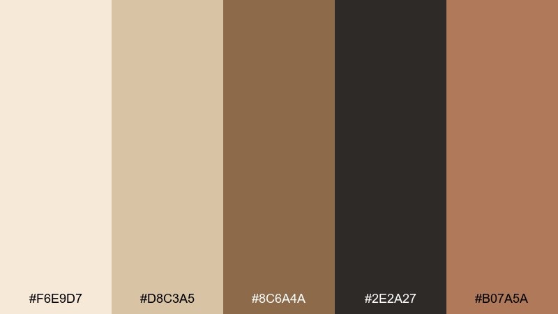
HEX: #F6E9D7 #D8C3A5 #8C6A4A #2E2A27 #B07A5A
Mood: soft and stately
Best for: editorial layouts and museum brochures
Soft and stately, it looks like cream marble warmed by candlelight. Use the off-white and sand tones for spacious layouts, then rely on charcoal for crisp type. The warm tan and sienna are ideal for pull quotes, rules, and small icons. Keep contrast accessible by reserving the darkest shade for body text.
Image example of candlelit marble generated using media.io
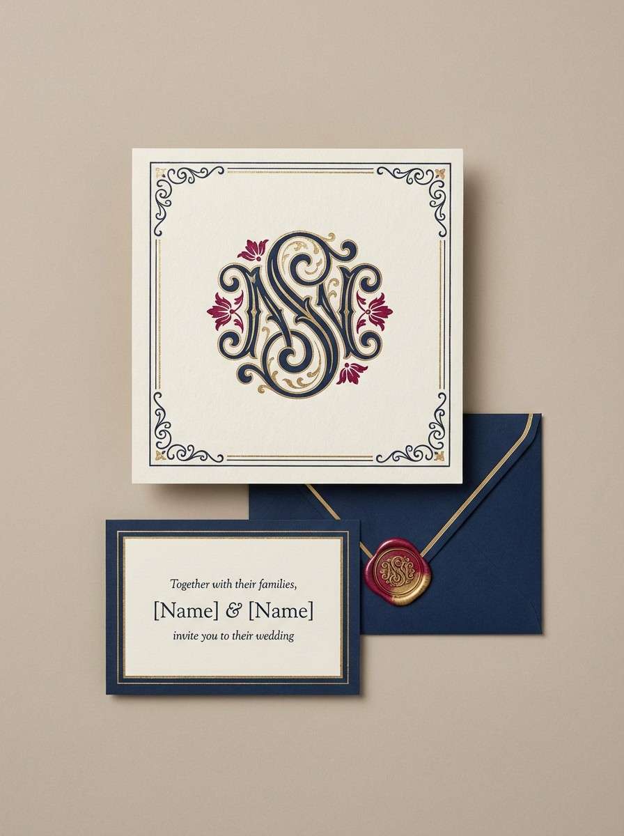
5) Royal Tapestry
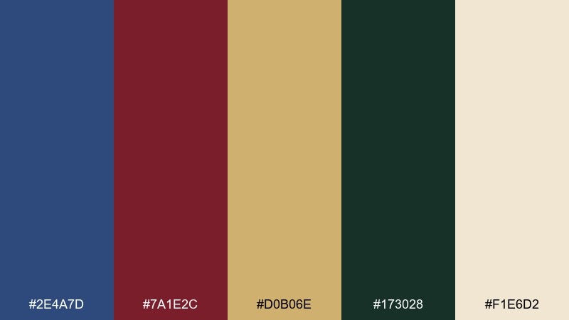
HEX: #2E4A7D #7A1E2C #D0B06E #173028 #F1E6D2
Mood: regal and story-rich
Best for: book covers and premium invitations
Regal and story-rich, it brings to mind woven tapestries with hidden gold threads. The navy and deep green give the background a noble weight, while the crimson adds ceremony. These baroque color combinations shine when you limit gold to borders, monograms, and small highlights. Print tip: choose uncoated stock so the tones feel textile-like instead of glossy.
Image example of royal tapestry generated using media.io
6) Shadowed Gilding
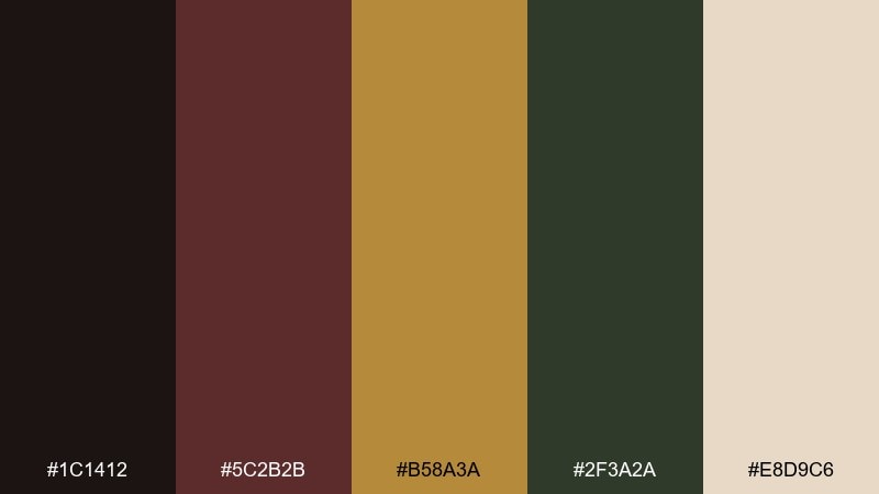
HEX: #1C1412 #5C2B2B #B58A3A #2F3A2A #E8D9C6
Mood: moody and luxurious
Best for: premium UI themes and dark-mode dashboards
Moody and luxurious, it feels like a gallery at night with frames catching a faint gleam. Use near-black for the canvas, then lift cards with warm parchment so content stays legible. The bronze reads best as a highlight color for toggles, badges, and charts. Keep the crimson-brown for warnings or emphasis to avoid overdramatizing the interface.
Image example of shadowed gilding generated using media.io

7) Ornate Olive
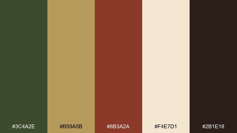
HEX: #3C4A2E #B59A5B #8B3A2A #F4E7D1 #2B1E18
Mood: earthy and refined
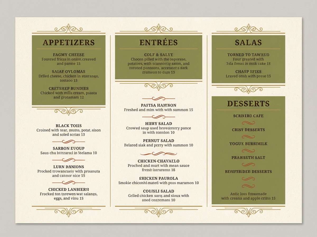
Best for: restaurant branding and menu design
Earthy and refined, these Baroque colors suggest old-world kitchens, brass fixtures, and herb-stained linens. Make olive the hero for menus, then use cream for breathing room and easy reading. The brick-brown adds appetite and warmth when used in section headers or small illustrations. A thin black-brown rule line can keep the layout structured without feeling modern-cold.
Image example of ornate olive generated using media.io
8) Pearl and Patina
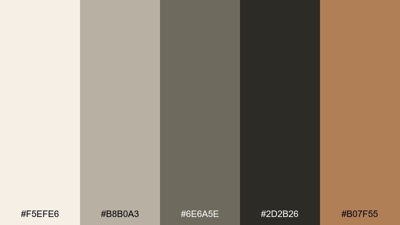
HEX: #F5EFE6 #B8B0A3 #6E6A5E #2D2B26 #B07F55
Mood: quietly antique
Best for: minimal branding and stationery
Quietly antique, this Baroque art color palette feels like pearls, aged paper, and worn leather bindings. Use pearl as the base to keep things light, then build depth with stone gray and charcoal. The warm tan reads as a subtle luxury cue for logos, wax seals, or small patterns. Tip: combine with letterpress-style textures for a tactile, archival finish.
Image example of pearl and patina generated using media.io
9) Crimson Reliquary
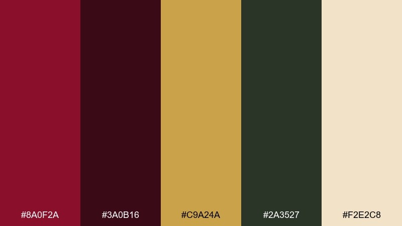
HEX: #8A0F2A #3A0B16 #C9A24A #2A3527 #F2E2C8
Mood: dramatic and ceremonial
Best for: theater branding and poster series
Dramatic and ceremonial, these Baroque tones evoke crimson velvet, dark lacquer, and gilded ornament. Keep the deep maroon for large fields and use cream for high-contrast type that reads from a distance. A single baroque color combination trick here is to reserve gold only for a crest or a date line so it still feels precious. Add subtle filigree in the green-black for depth without clutter.
Image example of crimson reliquary generated using media.io
10) Bronzed Walnut
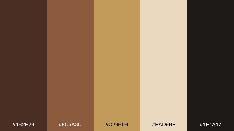
HEX: #4B2E23 #8C5A3C #C29B5B #EAD9BF #1E1A17
Mood: warm and crafted
Best for: product ads for leather goods
Warm and crafted, it resembles polished walnut, burnished metal, and soft suede. Use the cream as negative space so the browns do not feel heavy. Bronze works best as a highlight for buckles, stitching lines, or price tags. Keep the near-black for sharp logo contrast and clean readability in small sizes.
Image example of bronzed walnut generated using media.io
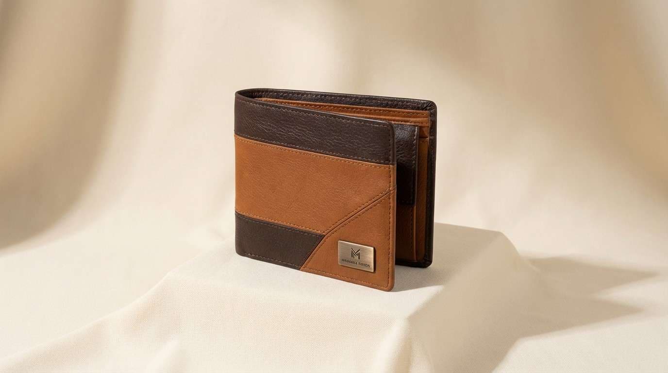
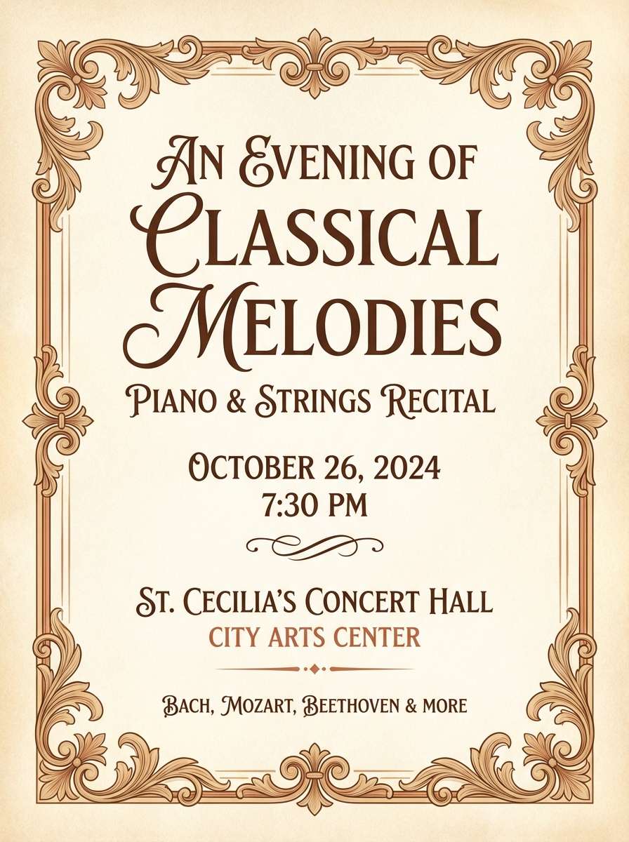
11) Ivory Sonata
HEX: #FFF4E6 #E2C9A6 #B57B5A #6A4B3A #2B2420
Mood: romantic and classical
Best for: music recital flyers and programs
Romantic and classical, it feels like aged sheet music and ivory keys under warm lamps. Set the flyer base in soft ivory, then layer caramel and cocoa for headings and ornaments. The terracotta-tan is great for small highlights such as dates and venue icons. Print tip: keep backgrounds light so the darkest shade can stay dedicated to body copy.
Image example of ivory sonata generated using media.io
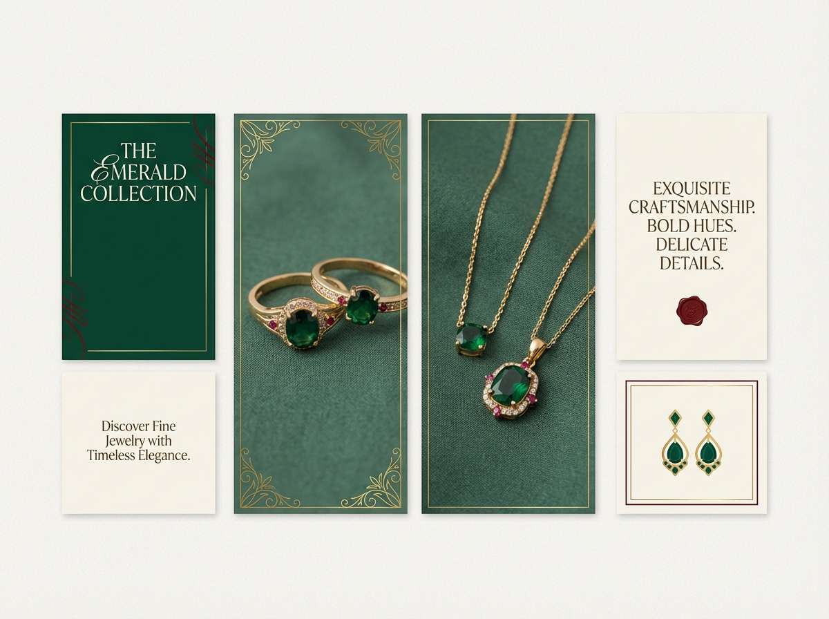
12) Emerald Brocade
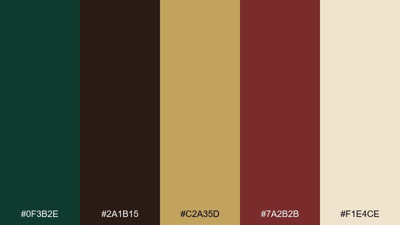
HEX: #0F3B2E #2A1B15 #C2A35D #7A2B2B #F1E4CE
Mood: rich and aristocratic
Best for: jewelry branding and lookbooks
Rich and aristocratic, it mirrors brocade fabric with jewel tones and metallic glints. Use emerald as the dominant field and keep cream for text blocks that need clarity. The gold and oxblood make excellent accents for callouts and small pattern details. For a timeless baroque color palette, avoid bright whites and instead stick to warm ivory for a softer, curated feel.
Image example of emerald brocade generated using media.io
13) Sepia Gallery
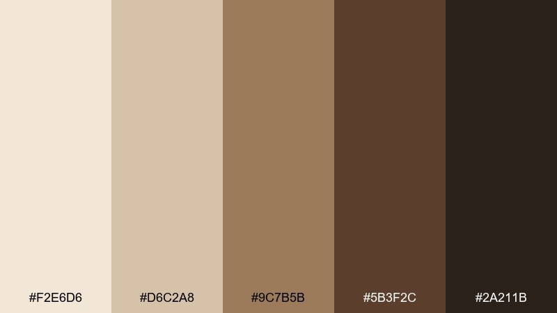
HEX: #F2E6D6 #D6C2A8 #9C7B5B #5B3F2C #2A211B
Mood: nostalgic and curated
Best for: photo book design and portfolios
Nostalgic and curated, this Baroque color palette resembles sepia prints and wooden frames lined along a hallway. Build your grid on the creamy base, then use mid-browns for captions and dividers. The deepest shade should be reserved for titles and key navigation to maintain strong contrast. Add subtle film grain or paper texture to reinforce the archival vibe.
Image example of sepia gallery generated using media.io
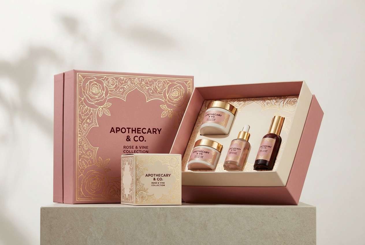
14) Courtly Rose
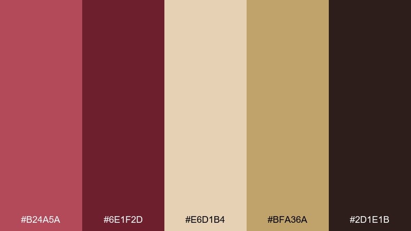
HEX: #B24A5A #6E1F2D #E6D1B4 #BFA36A #2D1E1B
Mood: romantic and regal
Best for: beauty packaging and gift sets
Romantic and regal, it evokes powdered roses, velvet boxes, and warm gilding. Make the blush-rose the main brand tone and use cream for label readability. Gold-tan is perfect for foil stamps or thin borders, while the deep wine anchors the logo. Keep the darkest shade for small text only, so the packaging stays soft rather than gothic.
Image example of courtly rose generated using media.io
15) Stormy Stucco
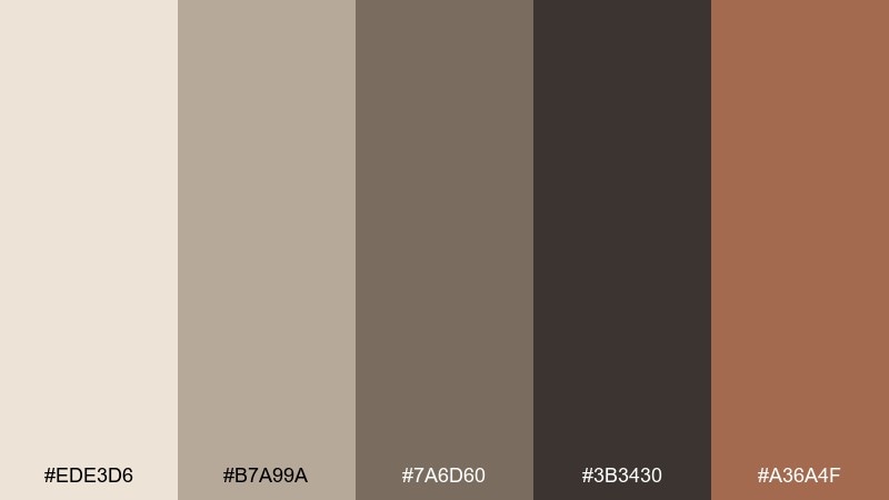
HEX: #EDE3D6 #B7A99A #7A6D60 #3B3430 #A36A4F
Mood: grounded and architectural
Best for: interior design presentations
Grounded and architectural, it suggests old stucco walls, stone corridors, and warm wood trim. Use the pale plaster as the canvas, then layer taupe and slate for typography and diagrams. The clay accent brings warmth to callouts without stealing focus. Tip: keep gradients subtle so the palette reads like materials, not digital effects.
Image example of stormy stucco generated using media.io
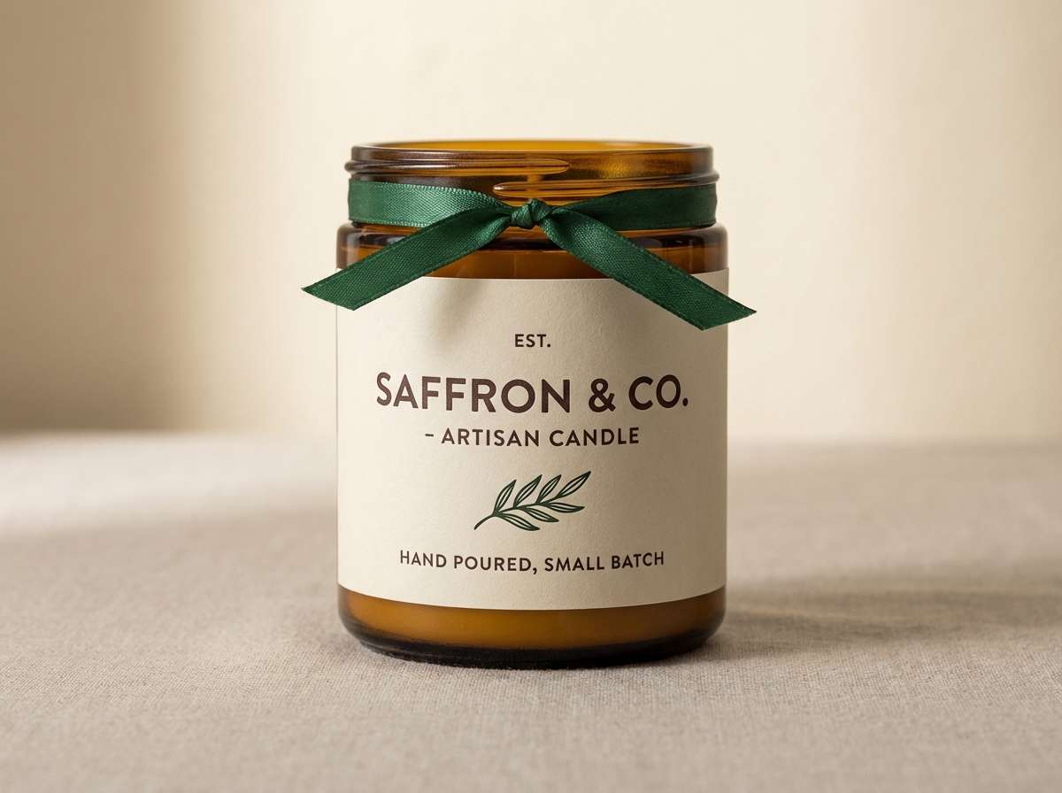
16) Saffron Incense
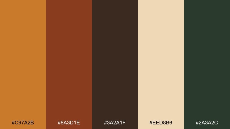
HEX: #C97A2B #8A3D1E #3A2A1F #EED8B6 #2A3A2C
Mood: spiced and atmospheric
Best for: artisan candle branding
Spiced and atmospheric, this Baroque color palette feels like incense smoke curling through amber light. Let saffron be the signature hue, balanced by creamy wax tones for labels. The forested green-black can appear in small marks like batch numbers or icons. Usage tip: choose one dominant warm color and keep the rest quiet so the design stays premium.
Image example of saffron incense generated using media.io
17) Nocturne Goldleaf
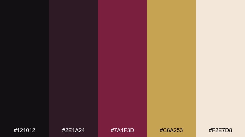
HEX: #121012 #2E1A24 #7A1F3D #C6A253 #F2E7D8
Mood: dramatic and elegant
Best for: luxury landing pages and hero sections
Dramatic and elegant, it reads like midnight silk with a flash of gold leaf. Use near-black for the hero background and reserve ivory for headline clarity. The magenta-wine can guide attention for CTAs, while gold stays for tiny UI highlights and dividers. Keep shadows soft and avoid pure black text on ivory to maintain the nocturne feel.
Image example of nocturne goldleaf generated using media.io
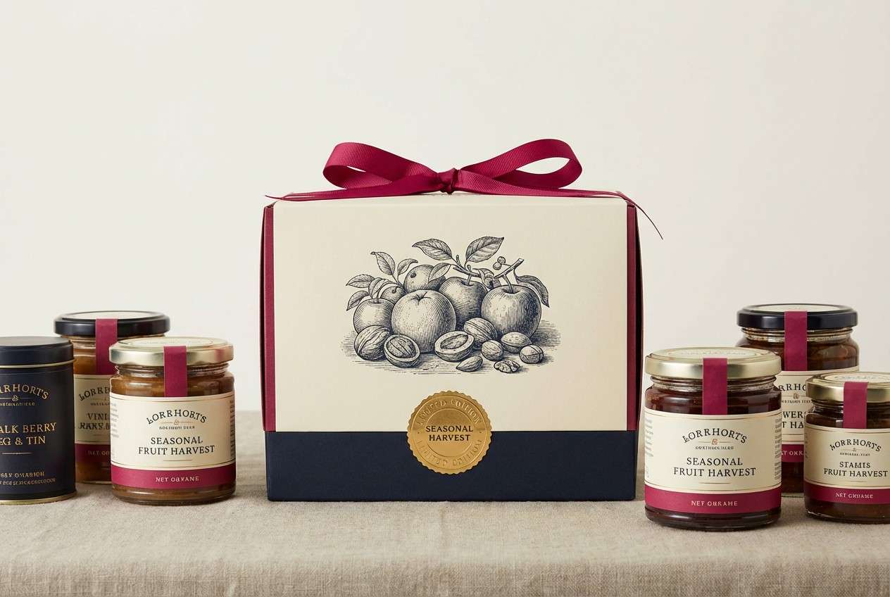
18) Harvest Caravaggio
HEX: #6F1D1B #C9A227 #2B2B22 #E8D8C0 #6A4E2E
Mood: bold and painterly
Best for: food packaging and seasonal campaigns
Bold and painterly, this Baroque color scheme channels still-life fruit against deep shadows with a warm golden pop. Build the base with cream and dark olive-black for contrast, then bring in crimson as the appetite driver. These baroque color combinations work especially well with serif typography and engraved-style illustrations. Tip: use gold only for small badges so it reads as premium, not loud.
Image example of harvest caravaggio generated using media.io
19) Pewter Halo
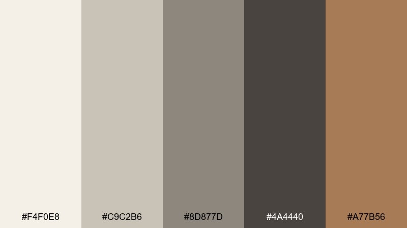
HEX: #F4F0E8 #C9C2B6 #8D877D #4A4440 #A77B56
Mood: calm and classical
Best for: brand guidelines and identity systems
Calm and classical, it feels like pewter candlesticks on linen with a warm bronze glow. Use the light neutrals for grids and background, then reserve charcoal-taupe for core typography. The bronze-tan should appear sparingly as the brand accent to maintain consistency across touchpoints. For a clean system, keep saturation low and rely on spacing and type weight for emphasis.
Image example of pewter halo generated using media.io
20) Lacquer and Linen
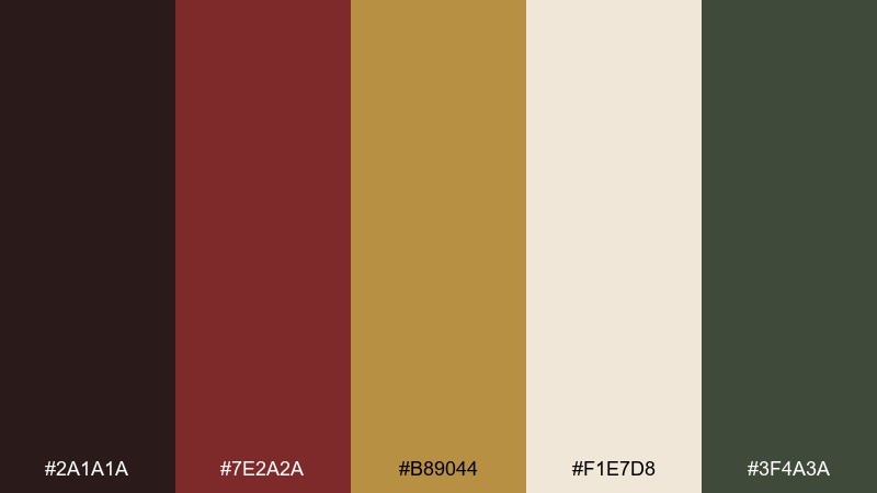
HEX: #2A1A1A #7E2A2A #B89044 #F1E7D8 #3F4A3A
Mood: polished and traditional
Best for: gift box packaging and unboxing inserts
Polished and traditional, it suggests lacquered wood, stitched linen, and antique brass. Use linen as the base for inserts and instruction cards, then lean on the deep red for headings and brand marks. A touch of brass works beautifully on borders or small icons, while the muted green steadies the overall warmth. Keep finishes matte with selective foil to make the contrast feel intentional.
Image example of lacquer and linen generated using media.io
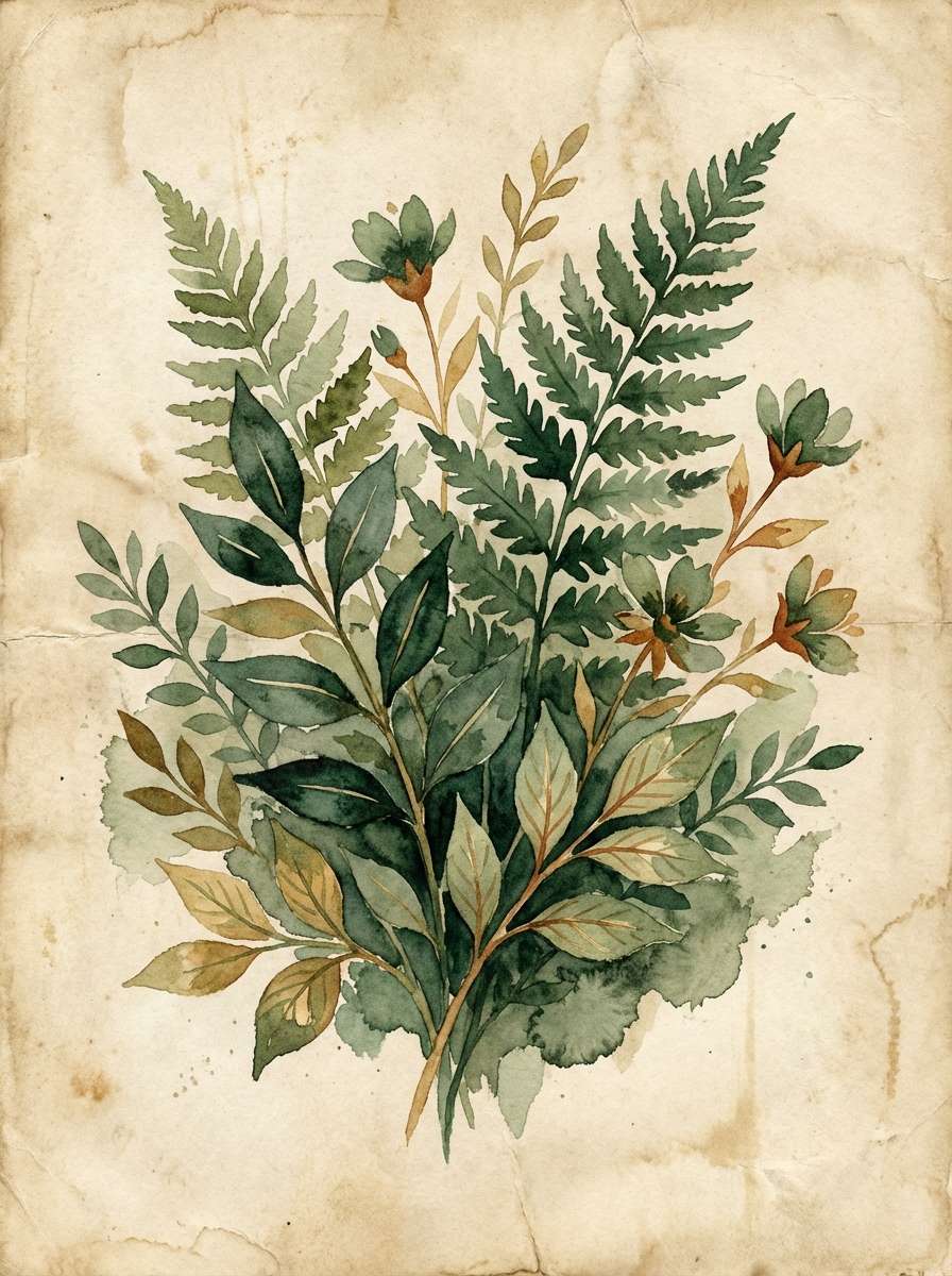
21) Botanical Baroque
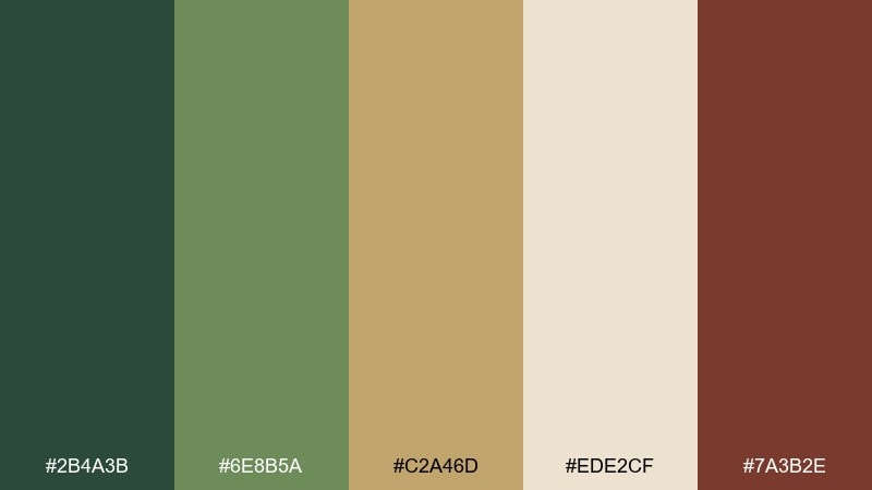
HEX: #2B4A3B #6E8B5A #C2A46D #EDE2CF #7A3B2E
Mood: lush and romantic
Best for: botanical illustrations and spring stationery
Lush and romantic, it brings to mind painted herbals, trailing vines, and aged parchment margins. Let the parchment and gold-tan act as the paper and ink warmth, while greens carry the foliage. The russet makes a beautiful accent for flower centers, ribbons, or drop caps. Keep outlines soft and watercolor textures visible for a hand-crafted finish.
Image example of botanical baroque generated using media.io
22) Opera House
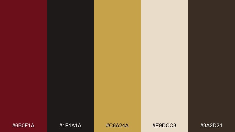
HEX: #6B0F1A #1F1A1A #C6A24A #E9DCC8 #3A2D24
Mood: grand and spotlight-ready
Best for: season brochures and ticketing visuals
Grand and spotlight-ready, this Baroque color scheme feels like an opera balcony wrapped in velvet and gold trim. Use the deep red for featured shows and key CTAs, with cream keeping schedules and details readable. The black-brown and espresso shades help with structure, dividers, and fine print. For strong baroque color combinations, keep gold minimal and consistent so it reads as a signature, not noise.
Image example of opera house generated using media.io
What Colors Go Well with Baroque?
Baroque colors pair best with warm neutrals (ivory, parchment, sand) because they keep ornate combinations readable and stop deep tones from feeling heavy. Think creamy backgrounds with espresso typography for a classic editorial finish.
For accents, choose one “precious” hue—gold, bronze, or saffron—and repeat it consistently in small doses. This makes the design feel intentional, like gilded trim rather than a random highlight.
To modernize baroque palettes, add a muted green or navy as a counterweight to reds and browns. It preserves the old-world richness while improving balance across layouts and screens.
How to Use a Baroque Color Palette in Real Designs
Start with a hierarchy: one dark anchor (background or headings), one light base (content areas), and one metallic-like accent (icons, rules, badges). This three-part structure keeps baroque drama organized.
In print, favor matte or uncoated finishes so creams and browns look like paper and fabric, not plastic. In digital, reserve the darkest shade for text and key UI elements to maintain contrast and accessibility.
If you’re using ornaments, frames, or filigree, let color do less. Keep patterns tone-on-tone and use saturation sparingly so typography and calls-to-action remain clear.
Create Baroque Palette Visuals with AI
Want to see these baroque color combinations as posters, packaging, mood boards, or UI mockups? Generate consistent visuals by pasting the palette HEX codes into your prompt and describing the material feel (velvet, marble, gold leaf, aged paper).
With Media.io, you can iterate quickly: try one composition with a dark nocturne base, then produce a second version with a parchment layout for readability. Keep the gold/bronze details minimal so they stay “special.”
Once you like a direction, generate a small set (cover, banner, social tile) using the same palette and prompt style for a cohesive system.
Baroque Color Palette FAQs
-
What defines a baroque color palette?
A baroque color palette typically uses deep, shadowy anchors (burgundy, near-black, deep green/navy) paired with warm lights (ivory, parchment, cream) and a restrained metallic-like accent (gold/bronze) for ornament. -
Are baroque colors only dark and heavy?
No. Baroque schemes feel rich because of contrast, not darkness alone. Using a large amount of warm light neutrals (like cream or parchment) keeps the look airy, readable, and editorial. -
What’s the best “gold” HEX style for baroque designs?
Muted golds and bronzes work best (not neon yellow). Look for warm, slightly desaturated tones like #D4AF37, #C6A253, or #C9A24A and use them sparingly for borders, seals, and icons. -
How do I keep baroque palettes readable for text?
Reserve the darkest shade for body text and core UI elements, and place text on parchment/ivory backgrounds instead of pure white. Avoid low-contrast combos like mid-brown text on tan backgrounds. -
Which baroque palette is best for modern UI or dark mode?
Try moody sets like Shadowed Gilding or Nocturne Goldleaf: near-black backgrounds, warm card surfaces, and bronze highlights. Keep accent colors limited to maintain a premium, calm interface. -
Do baroque color palettes work for branding?
Yes—especially for luxury, heritage, hospitality, wine/spirits, beauty, and events. The key is consistency: pick one signature accent (gold/bronze/saffron) and repeat it across touchpoints. -
How can I generate baroque-style visuals from HEX codes?
Use a text-to-image tool and describe both the palette and materials (velvet, lacquer, marble, gold leaf, aged paper). Include the intended design type (poster, invitation, packaging, UI) to guide composition.
Next: Brick Red Color Palette


