

Yellow and red are a classic warm duo: yellow brings optimism and visibility, while red adds urgency and emotional punch. Together, they create palettes that feel energetic, flavorful, and instantly attention-grabbing.
Below are 20 curated yellow red color palette ideas with HEX codes, mood notes, and real-world use cases—plus AI prompts you can use to generate matching visuals fast.
In this article
Why Yellow Red Palettes Work So Well
Yellow red palettes sit in the warm spectrum, so they naturally feel lively, social, and high-impact. That’s why they’re common in food, entertainment, sports, and promos where you want instant attention.
Yellow typically reads as light and optimistic, helping layouts feel open and friendly. Red delivers contrast and hierarchy—ideal for CTAs, price tags, alerts, and emphasis.
With the right neutral (cream, off-white, charcoal, or deep brown), yellow and red become easier to balance. Neutrals also improve readability so the palette stays bold without becoming overwhelming.
20+ Yellow Red Color Palette Ideas (with HEX Codes)
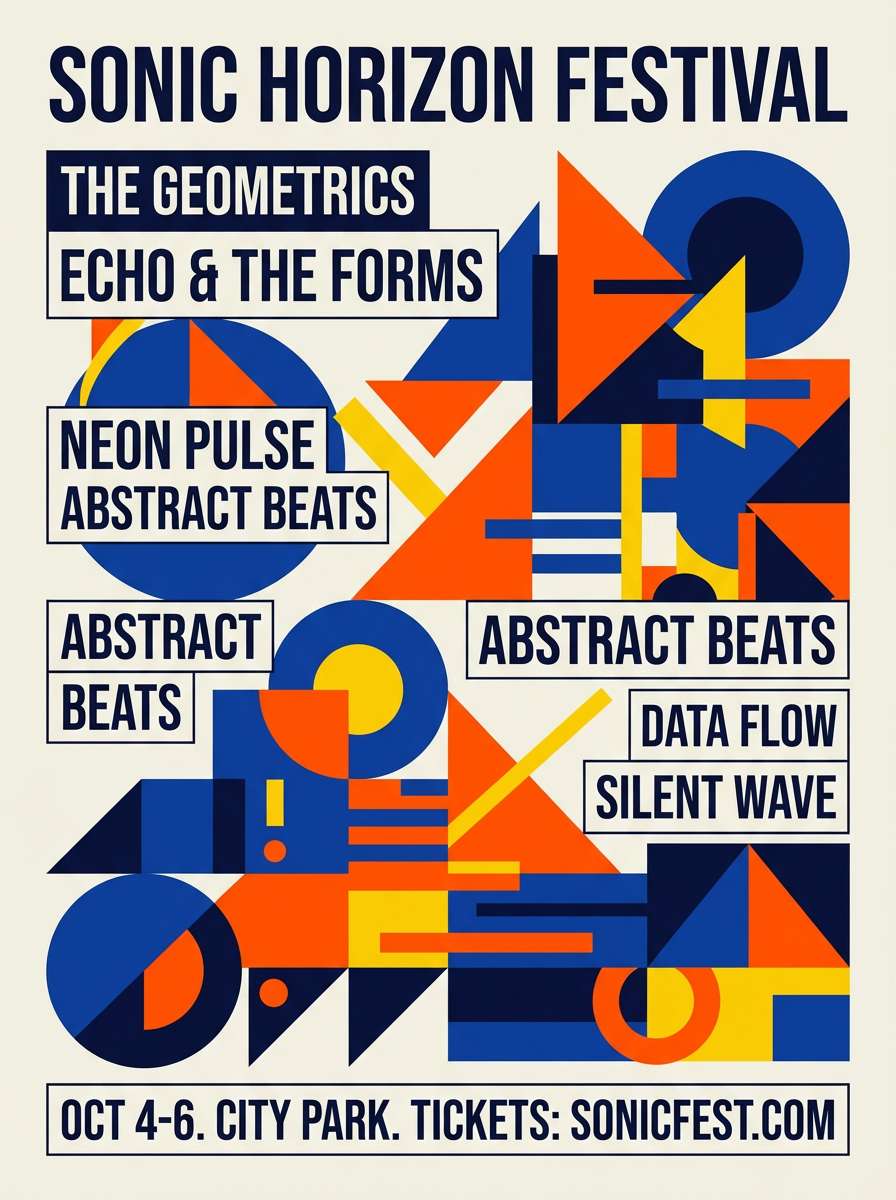
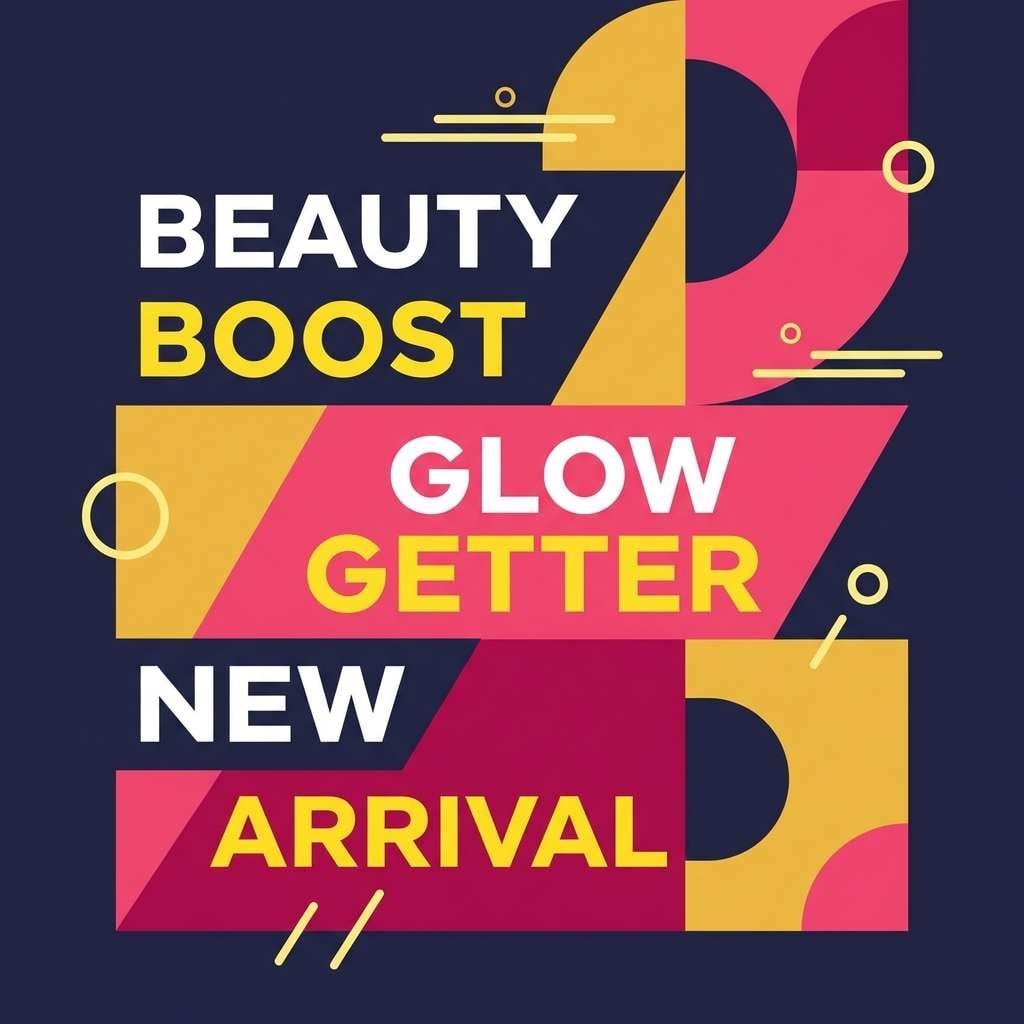
1) Sunlit Fiesta
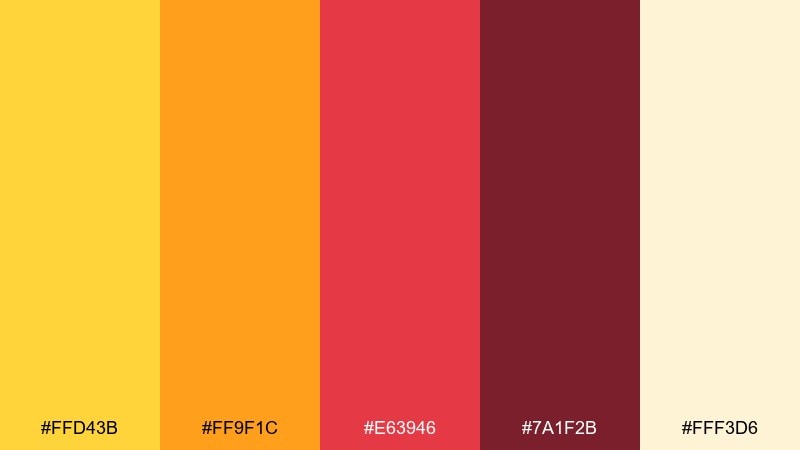
HEX: #ffd43b #ff9f1c #e63946 #7a1f2b #fff3d6
Mood: joyful, festive, high-energy
Best for: festival poster and event branding
Joyful and celebratory, these tones feel like confetti in warm afternoon light. Use the pale cream as breathing room, then let the yellow and orange drive attention to headlines and calls to action. Pair with clean sans-serif type and simple geometric shapes to keep it modern. Tip: keep the deep burgundy for small text or borders so it adds punch without darkening the layout.
Image example of sunlit fiesta generated using media.io
Media.io is an online AI studio for creating and editing video, image, and audio in your browser.

2) Saffron Ember
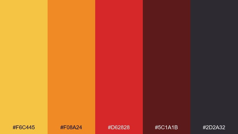
HEX: #f6c445 #f08a24 #d62828 #5c1a1b #2d2a32
Mood: dramatic, bold, cinematic
Best for: movie night flyer and nightlife promos
Dramatic and smoky, it evokes neon signs glowing over late-night streets. Use the saffron and orange to spotlight key information, then anchor the composition with the near-black charcoal. Pair with condensed display fonts and tight spacing for a punchy, cinematic feel. Tip: reserve the darkest shade for backgrounds and use the red mainly for badges and emphasis.
Image example of saffron ember generated using media.io
3) Mango Chili
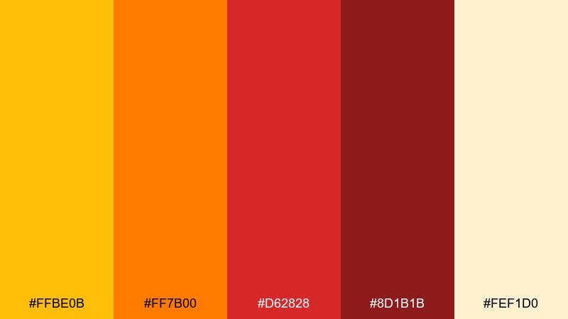
HEX: #ffbe0b #ff7b00 #d62828 #8d1b1b #fef1d0
Mood: spicy, playful, attention-grabbing
Best for: food truck branding and menu highlights
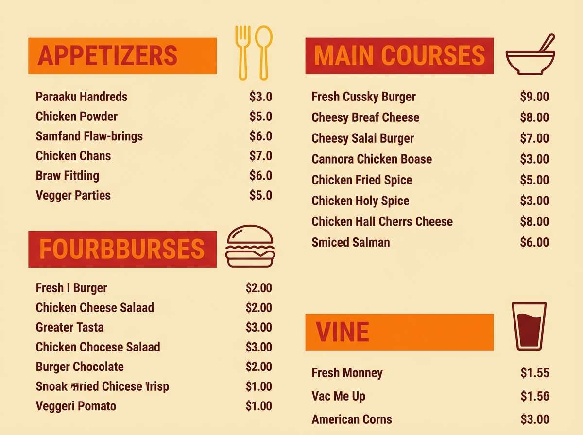
Spicy and playful, it brings to mind ripe mango slices dusted with chili powder. This yellow red color palette works best when the soft cream is the base and the darker reds are saved for pricing, icons, and key menu items. Pair with hand-drawn accents or bold vector illustrations for a street-food vibe. Tip: keep the orange as your main midtone so the reds do not overpower the page.
Image example of mango chili generated using media.io
4) Golden Poppy
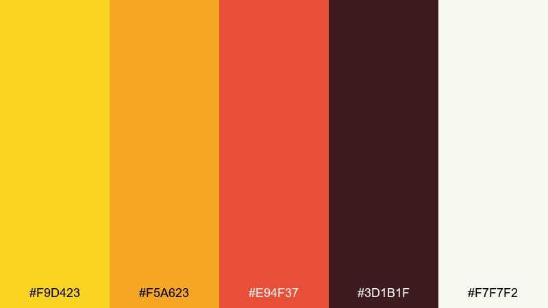
HEX: #f9d423 #f5a623 #e94f37 #3d1b1f #f7f7f2
Mood: sunny, confident, modern
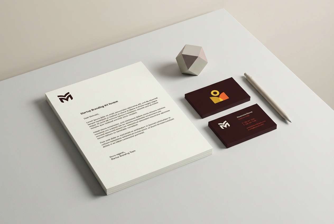
Best for: startup logo and brand guidelines
Sunny and confident, it feels like poppies in full bloom against bright sky. Use the off-white as the main canvas, then layer yellow and orange for friendly warmth and approachability. Pair with charcoal linework, plenty of whitespace, and a simple grid so the look stays premium. Tip: let the deep brown-black handle body text for readability across print and web.
Image example of golden poppy generated using media.io
5) Citrus Brick
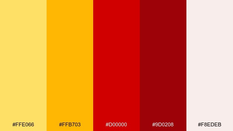
HEX: #ffe066 #ffb703 #d00000 #9d0208 #f8edeb
Mood: punchy, sporty, upbeat
Best for: sports team merch and bold badges
Punchy and sporty, these colors feel like stadium lights and fast-paced chants. The soft blush neutral helps the bright yellow read cleanly without becoming harsh. Pair with blocky typography, strong outlines, and simple crest shapes for instant recognition. Tip: avoid large red backgrounds; use red for marks and the neutral for the field behind text.
Image example of citrus brick generated using media.io
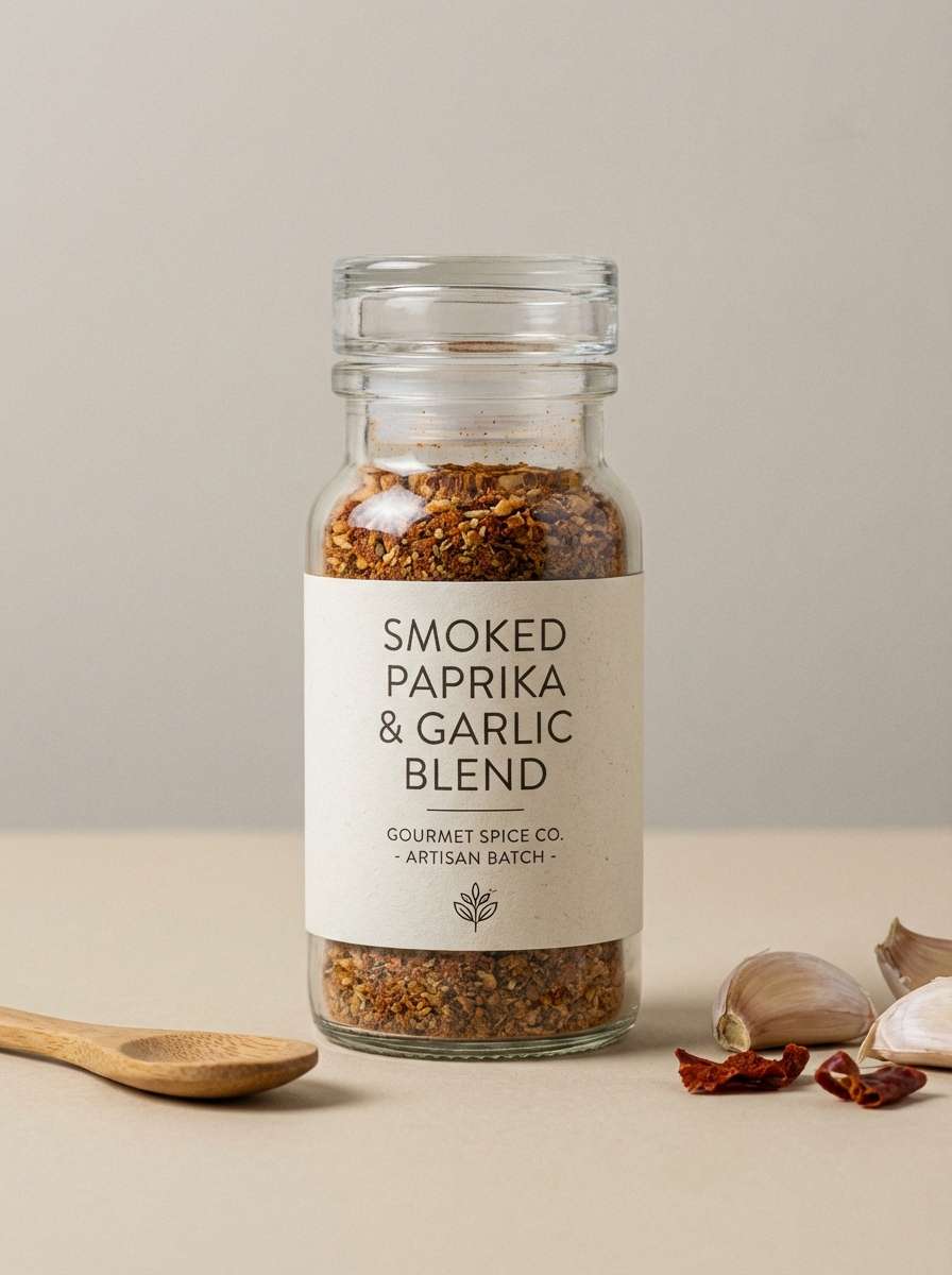
6) Honey Paprika
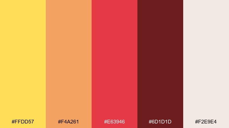
HEX: #ffdd57 #f4a261 #e63946 #6d1d1d #f2e9e4
Mood: cozy, appetizing, inviting
Best for: gourmet spice packaging and product ads
Cozy and appetizing, it suggests honey drizzle, toasted spices, and warm kitchen light. These yellow red color combinations shine on packaging when the beige background stays dominant and the red is used as a seal or flavor marker. Pair with kraft-paper textures, serif labels, and simple ingredient icons for an artisanal feel. Tip: keep the darkest shade for small legal text to maintain a handcrafted look without losing contrast.
Image example of honey paprika generated using media.io
7) Marigold Merlot
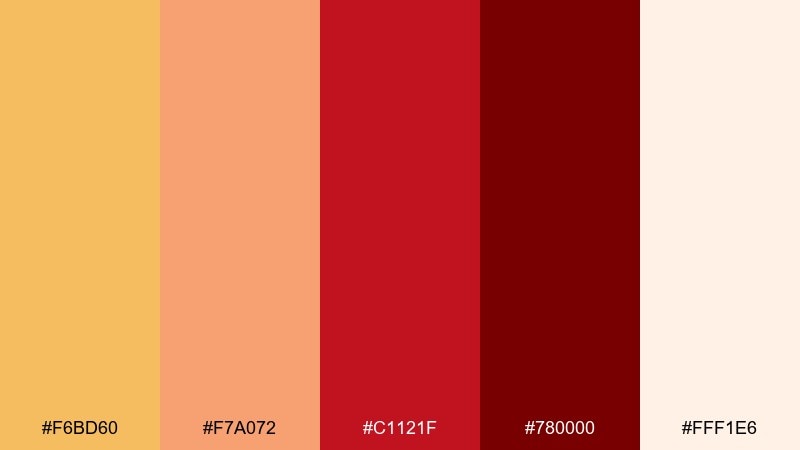
HEX: #f6bd60 #f7a072 #c1121f #780000 #fff1e6
Mood: romantic, rich, elegant
Best for: wedding stationery and formal invites
Romantic and rich, it feels like marigolds beside a deep glass of red wine. Use the warm blush as the paper tone, then add marigold accents for borders, monograms, or wax-seal motifs. Pair with classic serif type and delicate line illustrations to keep it refined. Tip: keep the darkest red for names and key details so the invitation reads clearly in print.
Image example of marigold merlot generated using media.io
8) Apricot Rust
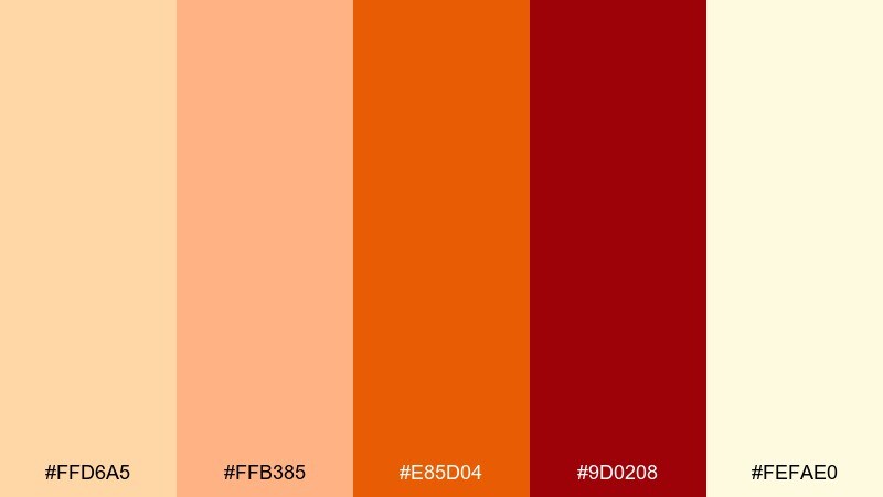
HEX: #ffd6a5 #ffb385 #e85d04 #9d0208 #fefae0
Mood: earthy, nostalgic, handmade
Best for: craft labels and seasonal market signage
Earthy and nostalgic, these hues recall dried apricots, clay pots, and late-summer markets. Use the pale butter tone as your background to keep the rust and deep red from feeling heavy. Pair with hand-lettered headings and simple stamps for a maker vibe. Tip: introduce the orange as a midtone for buttons or price tags to guide the eye.
Image example of apricot rust generated using media.io
9) Lemon Garnet
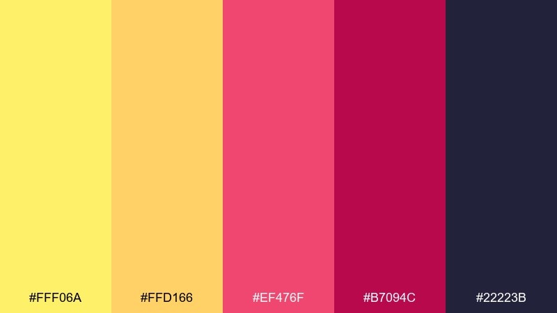
HEX: #fff06a #ffd166 #ef476f #b7094c #22223b
Mood: bold, trendy, high-contrast
Best for: beauty launch graphics and social promos
Bold and trendy, it feels like glossy lipstick against a bright lemon pop. Use the deep charcoal as the backdrop to make the yellows glow without straining the eyes. Pair with modern sans-serif type, rounded shapes, and tight color blocking for a fashion-forward look. Tip: keep the pink-red as an accent for stickers and limited-time banners rather than full panels.
Image example of lemon garnet generated using media.io
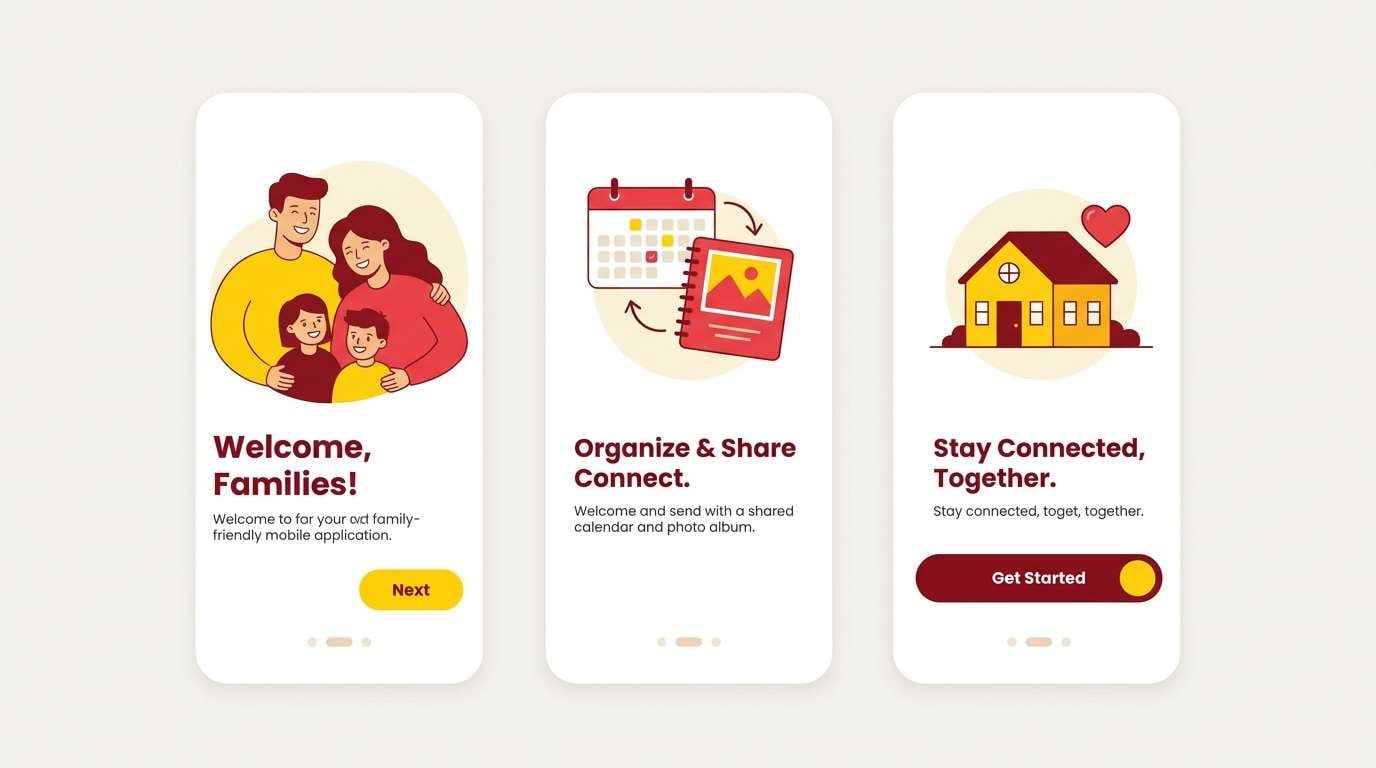
10) Butter Crimson
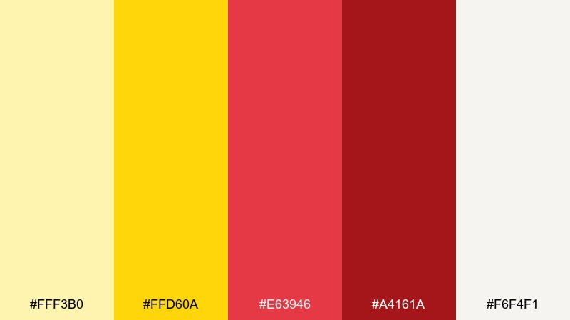
HEX: #fff3b0 #ffd60a #e63946 #a4161a #f6f4f1
Mood: cheerful, clean, friendly
Best for: family-friendly app onboarding UI
Cheerful and clean, it suggests sunny breakfasts and bright, welcoming interfaces. Use the off-white and butter tones for most surfaces, then add crimson for primary buttons and key alerts. Pair with rounded UI components and generous spacing to keep the energy approachable. Tip: limit saturated red to a single action per screen to avoid visual noise.
Image example of butter crimson generated using media.io
11) Sunrise Terracotta
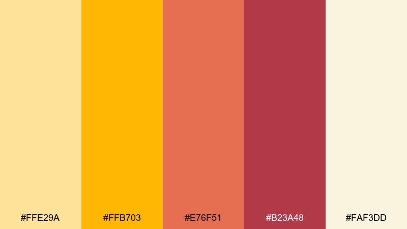
HEX: #ffe29a #ffb703 #e76f51 #b23a48 #faf3dd
Mood: warm, comforting, lifestyle
Best for: home decor lookbooks and landing pages
Warm and comforting, it feels like sunrise on terracotta tiles. Build pages with the creamy neutral first, then use the terracotta for section headers and the deeper red for calls to action. Pair with natural textures, soft shadows, and editorial-style spacing. Tip: use the bright yellow sparingly as a highlight for ratings, tags, or small icons.
Image example of sunrise terracotta generated using media.io
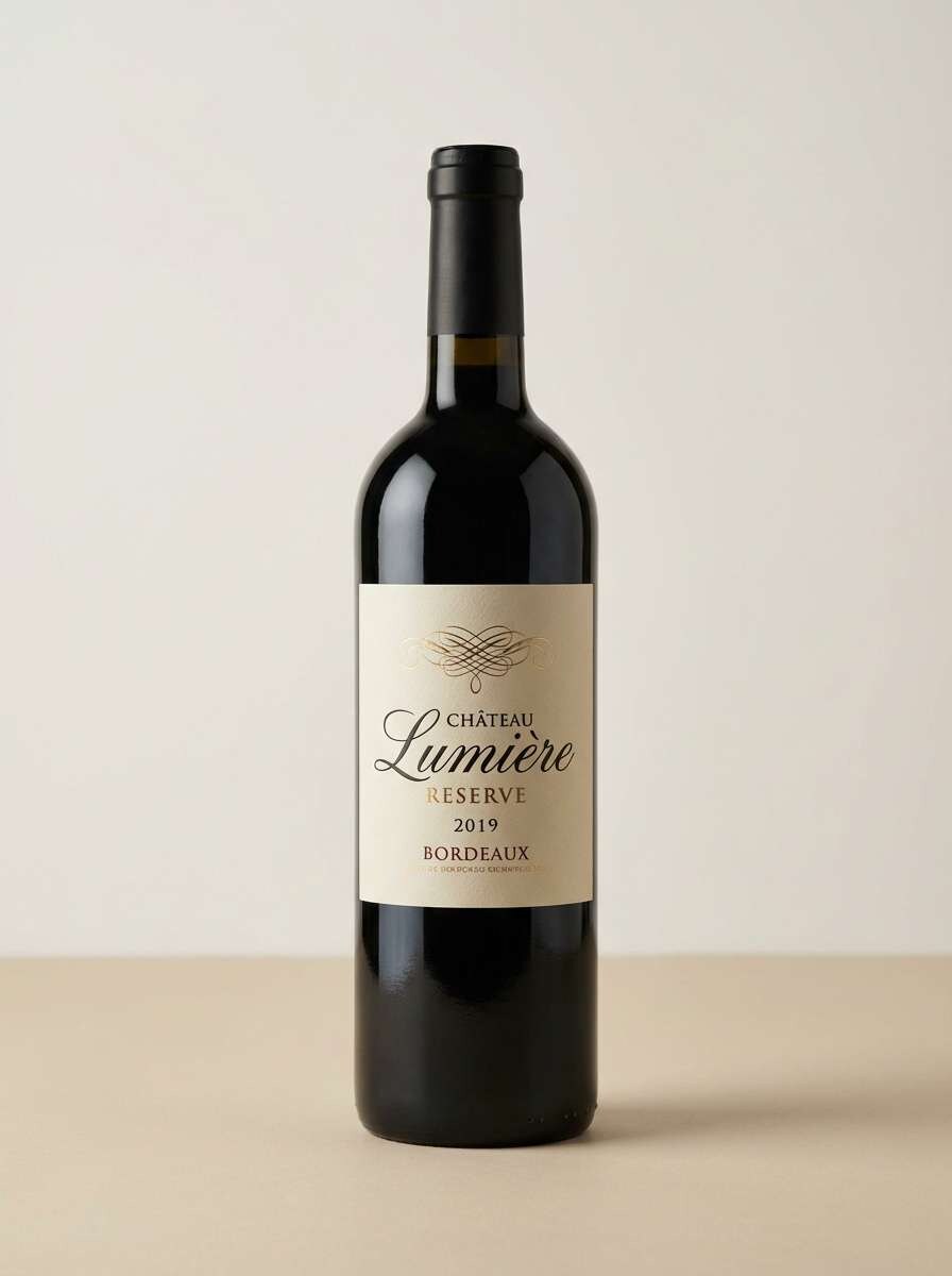
12) Dandelion Wine
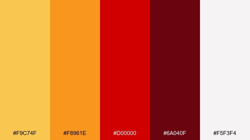
HEX: #f9c74f #f8961e #d00000 #6a040f #f5f3f4
Mood: classic, bold, premium
Best for: wine label concepts and tasting menus
Classic and premium, it evokes candlelit tastings and rich, velvety notes. Use the pale neutral as your label base, then set the deep wine shade for typography and crest details. Pair with foil-like accents and restrained ornamentation to keep it upscale. Tip: make the dandelion yellow a small stamp or medallion so it reads as intentional, not loud.
Image example of dandelion wine generated using media.io
13) Pineapple Rouge
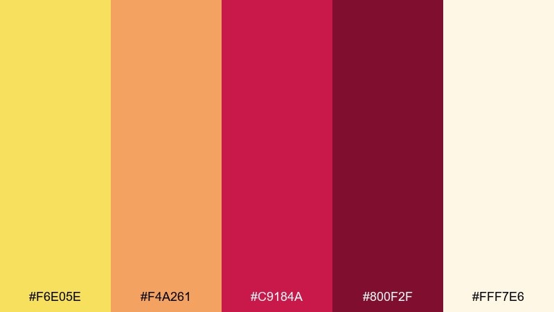
HEX: #f6e05e #f4a261 #c9184a #800f2f #fff7e6
Mood: tropical, playful, stylish
Best for: summer campaign graphics and email headers
Tropical and playful, it brings to mind pineapple slices and bright resort textiles. Use the creamy tint as the base to keep the palette airy, then add rouge as the signature accent for buttons and promo codes. Pair with simple patterns like dots or stripes for a breezy summer feel. Tip: keep body text in the darkest rouge for consistent readability.
Image example of pineapple rouge generated using media.io

14) Warm Bazaar
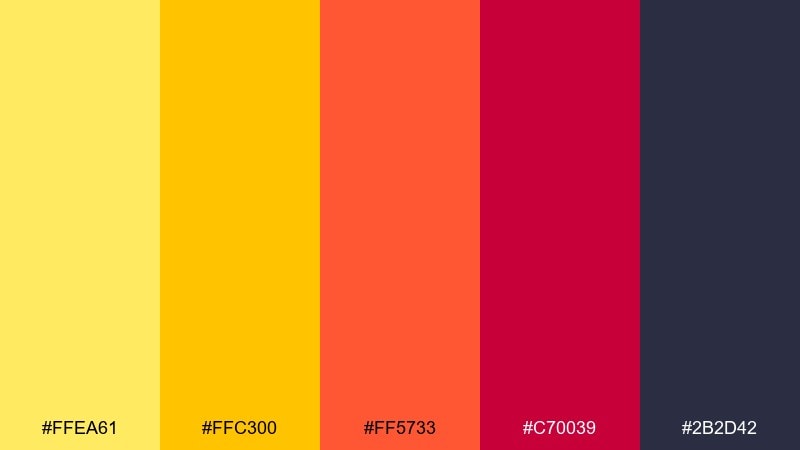
HEX: #ffea61 #ffc300 #ff5733 #c70039 #2b2d42
Mood: lively, urban, energetic
Best for: street market signage and wayfinding
Lively and urban, it feels like busy stalls, hand-painted signs, and lanterns at dusk. A yellow red color palette like this works best when the dark navy-charcoal is your grounding base and the brights are saved for arrows and category labels. Pair with chunky icons and high-contrast type for quick scanning from a distance. Tip: use the warm yellow for the most important direction cues, and keep red-orange for secondary calls.
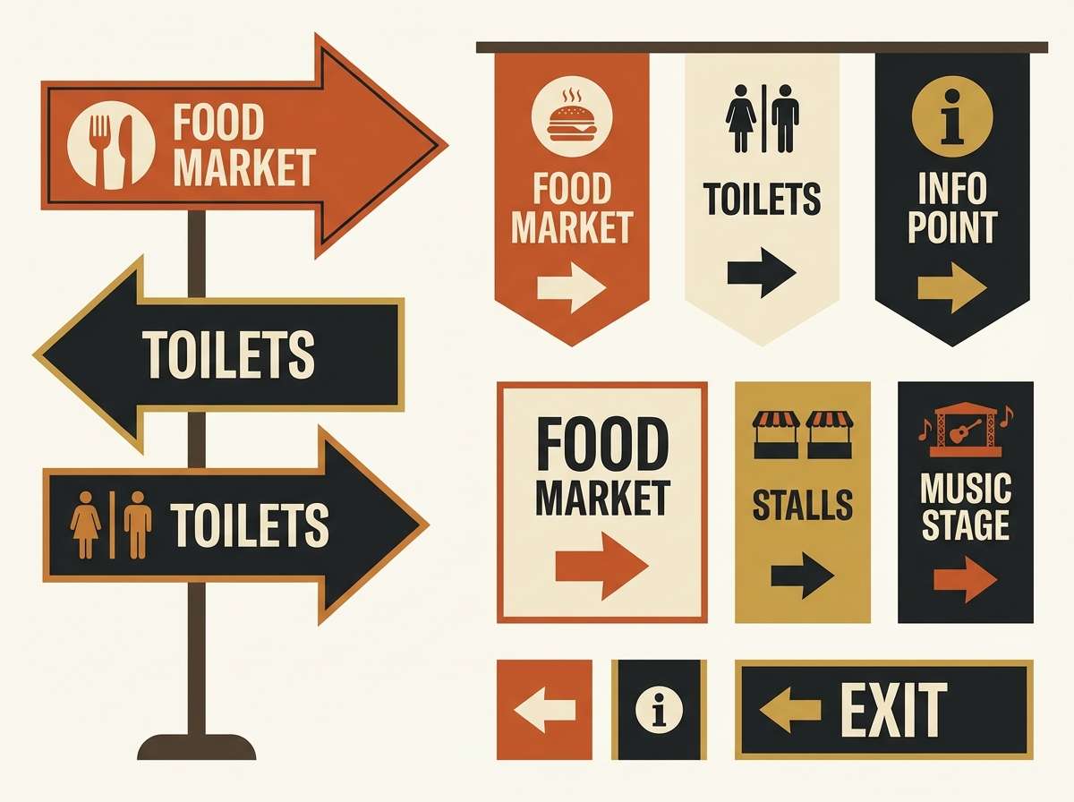
Image example of warm bazaar generated using media.io
15) Radiant Carnival
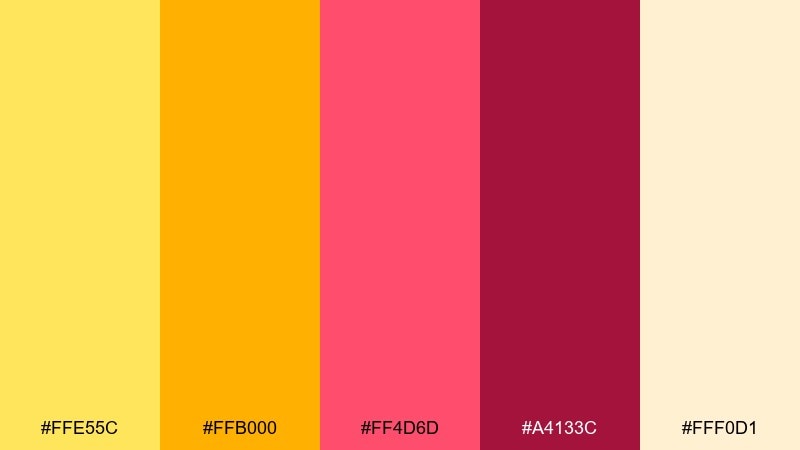
HEX: #ffe55c #ffb000 #ff4d6d #a4133c #fff0d1
Mood: fun, bubbly, youthful
Best for: kids party invitations and playful posters
Fun and bubbly, it captures the feeling of carnival tickets and sugar-sweet treats. Use the soft cream as the paper color, then let the yellow and hot pink-red carry the decorative shapes and confetti. Pair with rounded display fonts and simple illustrations for a kid-friendly vibe. Tip: keep the darker berry shade for outlines so the bright colors stay crisp.
Image example of radiant carnival generated using media.io

16) Autumn Lantern
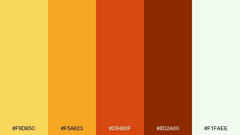
HEX: #f9d65c #f5a623 #d9480f #8d2a00 #f1faee
Mood: rustic, warm, seasonal
Best for: fall product packaging and candle labels
Rustic and warm, it evokes paper lanterns, dried leaves, and cozy evenings. Use the airy minty-white as negative space so the burnt orange and brown-red can feel rich without becoming muddy. Pair with textured paper, minimal serif typography, and small illustrated motifs like leaves or spices. Tip: keep the darkest brown-red for ingredient lists and small print to maintain clarity.
Image example of autumn lantern generated using media.io
17) Spiced Sunset
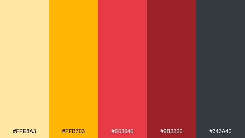
HEX: #ffe8a3 #ffb703 #e63946 #9b2226 #343a40
Mood: bold, grounded, modern
Best for: tech conference landing page UI
Bold yet grounded, it feels like a sunset fading into city skylines. Use the charcoal for navigation and footer areas, then bring in yellow for highlights and red for primary actions. Pair with a clean grid, large section headers, and simple line icons for a modern tech look. Tip: keep the pale yellow for card backgrounds so the interface stays light and readable.
Image example of spiced sunset generated using media.io
18) Desert Marigold
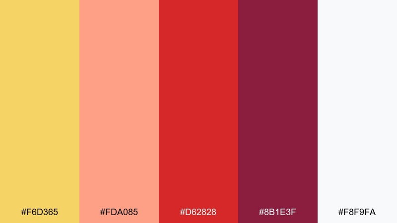
HEX: #f6d365 #fda085 #d62828 #8b1e3f #f8f9fa
Mood: sun-washed, artistic, airy
Best for: watercolor botanical prints and stationery
Sun-washed and artistic, it suggests desert blooms painted in a travel sketchbook. These yellow red color combinations look especially soft when the near-white paper tone dominates and the reds are used as tiny petals or stamens. Pair with loose watercolor textures and lots of margin space for a calm, gallery feel. Tip: repeat the peach tone as a light wash behind text blocks to improve legibility without harsh borders.
Image example of desert marigold generated using media.io
19) Vintage Market

HEX: #fff1a8 #f4d35e #ee6c4d #9a031e #2f2f2f
Mood: retro, grounded, eclectic
Best for: retro label design and sticker packs
Retro and grounded, it feels like vintage price tags and sun-faded shop awnings. Use the warm yellow as the main field, then add tomato and deep red for stripes, seals, and small illustrations. Pair with slab-serif typography and simple halftone textures to lean into the throwback look. Tip: keep the charcoal for outlines and barcodes so everything stays crisp on print runs.
Image example of vintage market generated using media.io

20) Bold Picnic
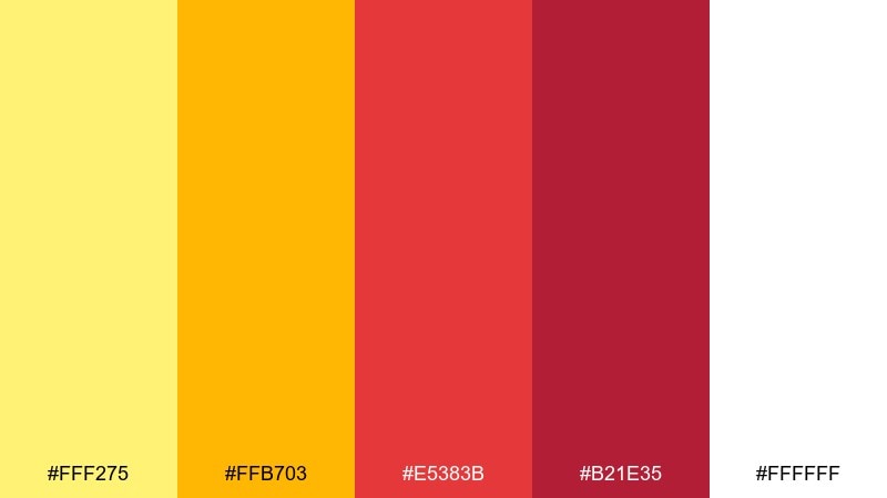
HEX: #fff275 #ffb703 #e5383b #b21e35 #ffffff
Mood: bright, friendly, classic
Best for: summer sale posters and storefront signs
Bright and friendly, it recalls picnic blankets, lemonade stands, and classic summer signage. Use white as your primary background to keep the palette crisp, then push the reds into headlines and discount badges. Pair with simple shapes and thick strokes for maximum readability from a distance. Tip: keep the two yellows separated by whitespace so they do not blend into a single flat block.
Image example of bold picnic generated using media.io

What Colors Go Well with Yellow Red?
Neutrals are the easiest match: cream, off-white, beige, and warm gray help yellow and red feel polished and readable. For modern contrast, charcoal and near-black make the warm tones pop without looking noisy.
For a grounded, earthy direction, pair yellow-red with cocoa brown, terracotta, and muted clay tones. If you want a fresher twist, try a cool counterbalance like deep navy or a tiny touch of teal—used sparingly to avoid clashing.
When you need accessibility and legibility (especially in UI), keep body text on light neutrals or deep charcoal backgrounds, and reserve saturated reds for a single primary action at a time.
How to Use a Yellow Red Color Palette in Real Designs
Start with a neutral base (white/cream/charcoal), then choose one “hero” warm color—usually yellow for friendliness or red for urgency. Use the second warm color as an accent for hierarchy (badges, icons, CTA states, highlights).
Control saturation by scaling areas: large backgrounds should be neutral, mid-size sections can use yellow/orange, and small elements can take the deepest reds. This keeps the design energetic while preventing eye fatigue.
For branding systems, define roles: yellow for highlights and optimistic messaging, red for action/alerts, and a dark tone for type. This role-based approach keeps posters, landing pages, and social graphics consistent.
Create Yellow Red Palette Visuals with AI
If you already have HEX codes, you can turn them into consistent visuals by describing the layout (poster, UI, label, invite), the style (vector, minimal, premium), and the background tone (cream, white, charcoal). Good prompts also specify “no photos” or “print-ready” when needed.
Use Media.io to generate on-brand examples quickly—then iterate by tweaking typography, shapes, spacing, or the balance between yellow and red. This is especially helpful when you’re testing multiple ad variations or building a brand moodboard.
Pick a palette above, copy its prompt, and adjust the subject to your project (menu, product launch, app screen, flyer) for fast, cohesive results.
Yellow Red Color Palette FAQs
-
What does a yellow red color palette communicate?
Yellow red palettes usually communicate warmth, energy, optimism, appetite, and urgency. They’re common in food branding, promotions, entertainment, and sports because they grab attention quickly. -
How do I keep yellow and red from looking too harsh?
Use a neutral base (cream/white/beige) for most of the layout and limit saturated red to accents like buttons or badges. Adding a dark anchor (charcoal/burgundy) also helps the palette feel intentional and readable. -
What background works best for yellow red designs?
For bright, friendly designs, use white or warm cream backgrounds. For high-contrast modern looks, use charcoal or deep brown-black so yellow becomes the highlight and red becomes the accent. -
Which text color is most readable with yellow red palettes?
Deep charcoal, near-black, or very dark burgundy typically offers the best readability. Avoid using saturated red for long body text; keep it for short emphasis elements. -
Are yellow red palettes good for UI and apps?
Yes, if used with restraint. Keep neutrals for surfaces, use yellow for highlights, and reserve red for one primary action or alert per screen to reduce visual noise and improve accessibility. -
What colors pair well with yellow and red besides neutrals?
Deep navy can add a clean, modern counterbalance, while brown and terracotta keep the palette earthy. Small amounts of teal can work as a cool accent, but it should be used sparingly to avoid clashing. -
How can I generate matching graphics for a yellow red palette?
Use a text-to-image tool like Media.io and include your design type (poster, logo, landing page), style keywords (minimal, vector, premium), and composition notes (color blocks, whitespace). Then iterate by adjusting the balance between yellow and red.


