

A white brown color palette blends airy whites with grounded browns, creating designs that feel warm, clean, and trustworthy. It’s an easy way to get a premium look without relying on loud color.
From cafe menus to minimal UI, these warm neutrals bring calm structure, soft contrast, and a natural “crafted” vibe that works across print and digital.
In this article
- Why White Brown Palettes Work So Well
-
- linen latte
- marble mocha
- oatmilk studio
- cocoa paper
- sandy cabin
- porcelain chestnut
- vanilla walnut
- clay & cream
- cappuccino drift
- birch bark
- antique parchment
- toasted almond
- espresso glaze
- milk tea minimal
- rustic gallery
- desert cotton
- stone & scone
- cinnamon whisper
- museum sepia
- coconut cocoa
- winter mocha mist
- biscuit & bark
- What Colors Go Well with White Brown?
- How to Use a White Brown Color Palette in Real Designs
- Create White Brown Palette Visuals with AI
Why White Brown Palettes Work So Well
White brings clarity and breathing room, while brown adds weight, warmth, and a natural feel. Together, they create a comfortable contrast that reads as modern, timeless, and “real.”
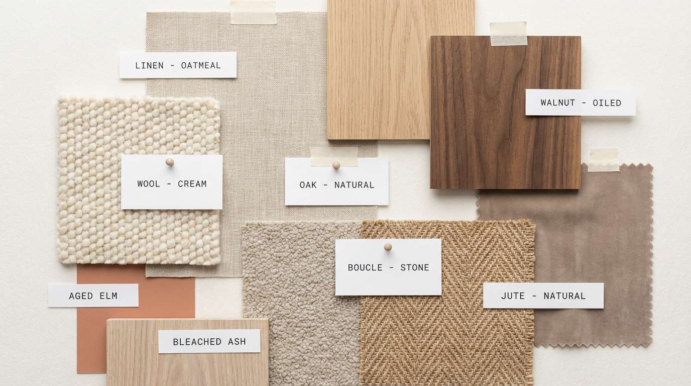
These palettes are flexible: push them lighter for minimal, editorial layouts, or lean into deeper cocoa tones for premium, moody branding. They also pair beautifully with texture—paper grain, wood, stone, and soft shadows.
Because the hues are familiar (cream, coffee, sand, walnut), a white and brown color scheme tends to feel trustworthy and approachable—ideal for product labels, lifestyle brands, and calm interfaces.
20+ White Brown Color Palette Ideas (with HEX Codes)
1) Linen Latte
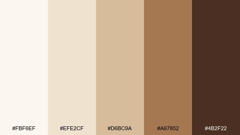
HEX: #fbf6ef #efe2cf #d6bc9a #a67852 #4b2f22
Mood: cozy, inviting, softly rustic
Best for: cafe branding and menu design
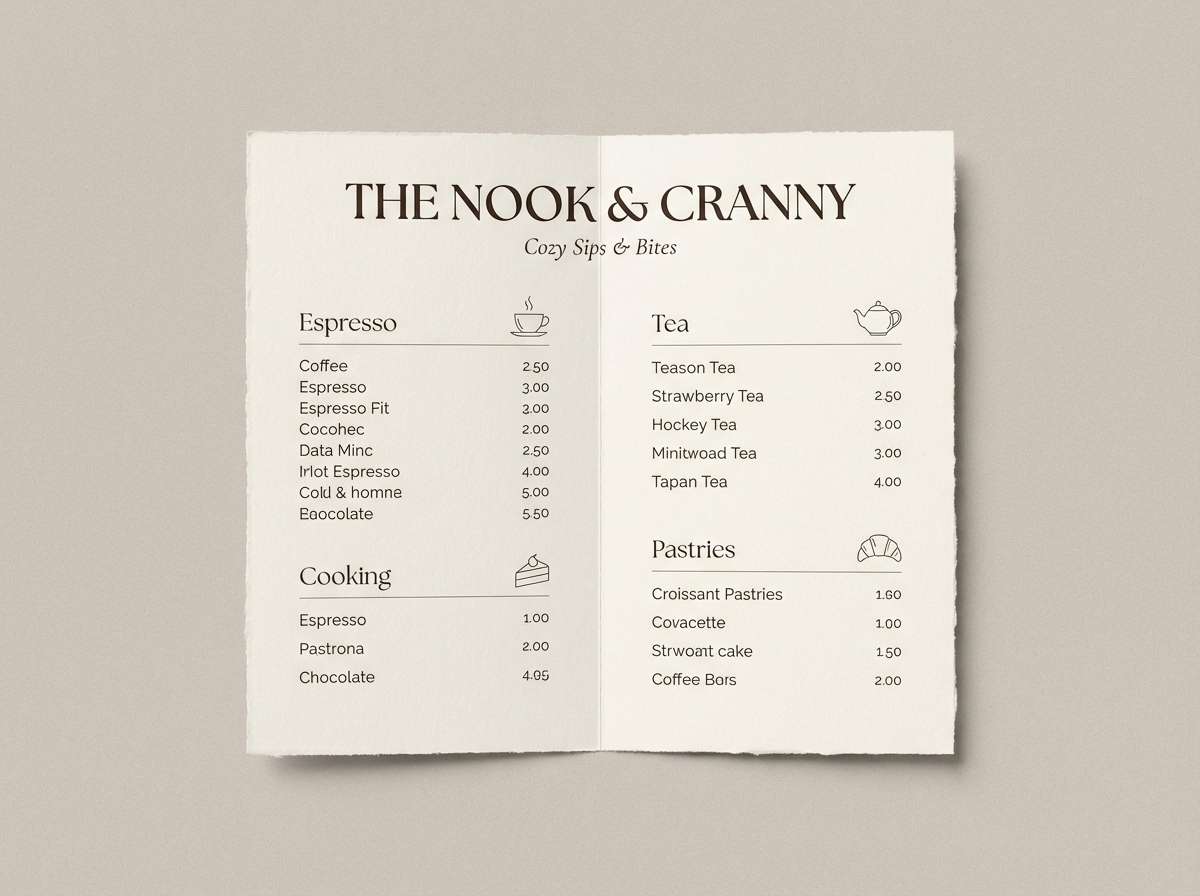
Cozy and inviting, like steamed milk swirling into espresso on a rainy morning. Use the pale linen tones for generous whitespace and the caramel browns for headlines and dividers. It fits cafe logos, menus, and loyalty cards where warmth matters more than contrast. Tip: print on uncoated stock to make the tans feel even richer.
Image example of linen latte generated using media.io
Media.io is an online AI studio for creating and editing video, image, and audio in your browser.

2) Marble Mocha
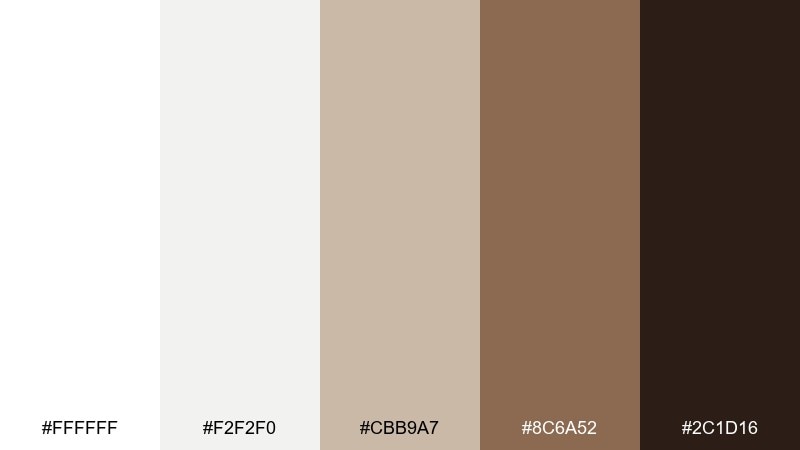
HEX: #ffffff #f2f2f0 #cbb9a7 #8c6a52 #2c1d16
Mood: sleek, upscale, editorial
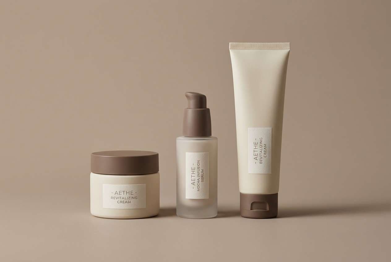
Best for: luxury skincare packaging
Sleek and upscale, like marble countertops beside a dark roast. Keep the near-white tones as the main surface, then use mocha and espresso for typography and ingredient callouts. The mix works beautifully with metallic foil or spot gloss for a premium feel. Tip: reserve the deepest brown for small details so the pack still reads airy.
Image example of marble mocha generated using media.io
3) Oatmilk Studio
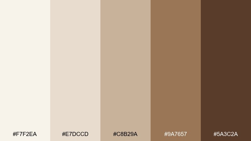
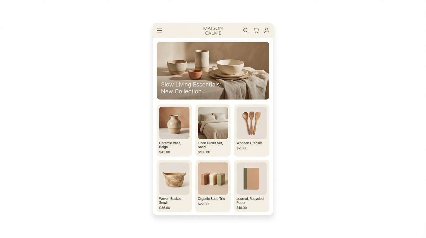
HEX: #f7f2ea #e7dccd #c8b29a #9a7657 #5a3c2a
Mood: minimal, calm, modern
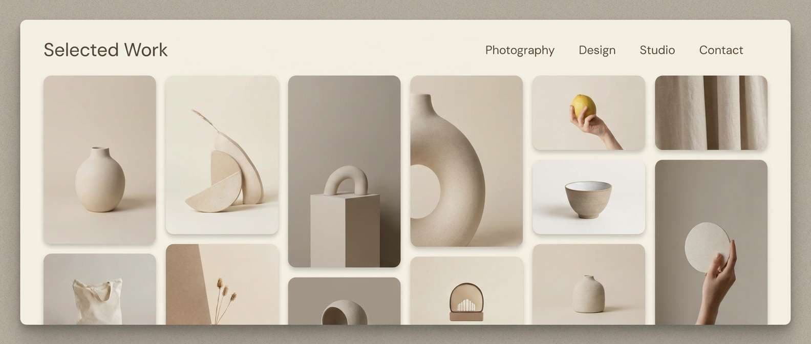
Best for: 2d ui mockup for a lifestyle shop
Calm and modern, like a sunlit studio with oak shelving and soft textiles. Use the oat and sand tones for panels and cards, then bring in walnut for key actions and navigation. The contrast stays gentle, making it ideal for long-scroll shopping pages. Tip: pair with warm gray icons to keep the UI crisp without turning cold.
Image example of oatmilk studio generated using media.io
4) Cocoa Paper

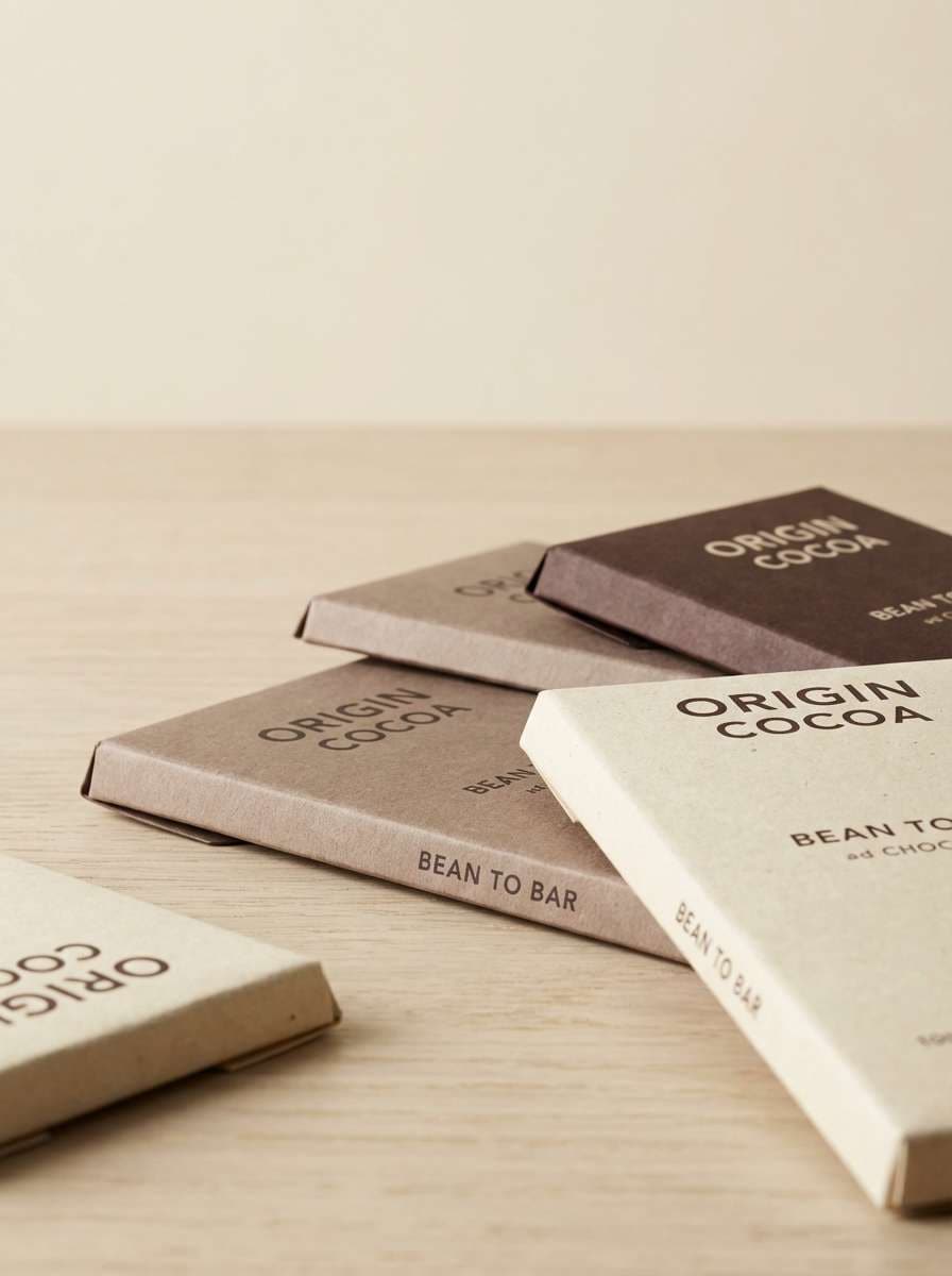
HEX: #fffaf3 #eadfce #c6aa8c #8a5c3c #3a241c
Mood: handcrafted, grounded, warm
Best for: craft chocolate wrapper design
Handcrafted and grounded, like folded paper wraps and the scent of cocoa nibs. Keep the creamy white for the brand mark and let the mid browns carry pattern work and ingredient blocks. It suits small-batch packaging, labels, and gift sets that need an artisanal look. Tip: add a subtle grain texture to the lightest tones to avoid a flat print.
Image example of cocoa paper generated using media.io
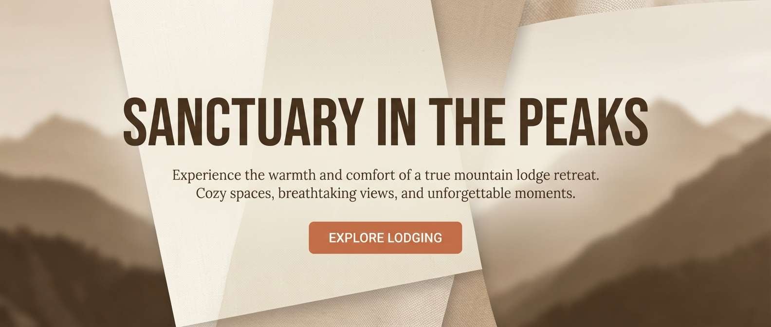
5) Sandy Cabin
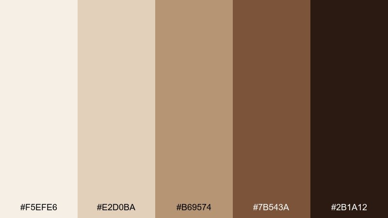
HEX: #f5efe6 #e2d0ba #b69574 #7b543a #2b1a12
Mood: rustic, outdoorsy, comforting
Best for: mountain lodge website hero
Rustic and comforting, like a cabin porch after a hike and boots kicked off by the door. Use the pale sand as the backdrop and bring in chestnut for headlines that feel sturdy and welcoming. It pairs well with nature photography, especially evergreen and stone textures. Tip: keep body text in the darkest brown to maintain readability over light panels.
Image example of sandy cabin generated using media.io
6) Porcelain Chestnut
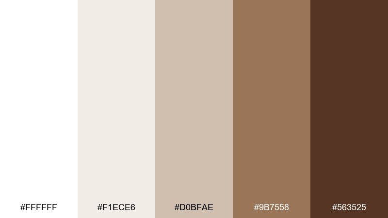
HEX: #ffffff #f1ece6 #d0bfae #9b7558 #563525
Mood: timeless, refined, soft contrast
Best for: wedding invitation suite
Timeless and refined, like porcelain dishes beside polished wood. Keep the whites dominant for a formal feel, then use chestnut for monograms, borders, and RSVP details. The tones look beautiful with serif type, embossing, and envelope liners. Tip: choose a warm white paper to prevent the browns from turning too orange in print.
Image example of porcelain chestnut generated using media.io
7) Vanilla Walnut
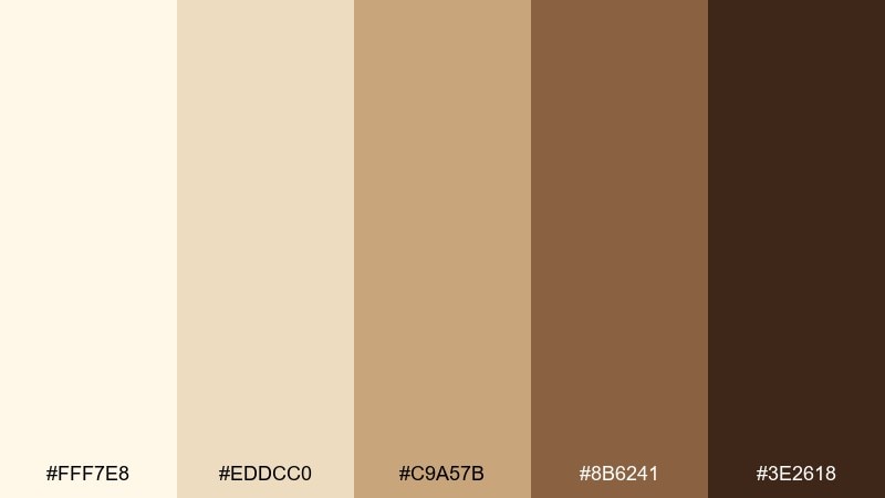
HEX: #fff7e8 #eddcc0 #c9a57b #8b6241 #3e2618
Mood: sweet, cozy, approachable
Best for: bakery product labels
Sweet and approachable, like vanilla frosting over toasted nuts. Use the buttery light tones for the label base and the walnut shades for product names and flavor badges. It works especially well on jars, bread bags, and seasonal stickers. Tip: add a small high-contrast badge in the deepest brown for quick shelf scanning.
Image example of vanilla walnut generated using media.io
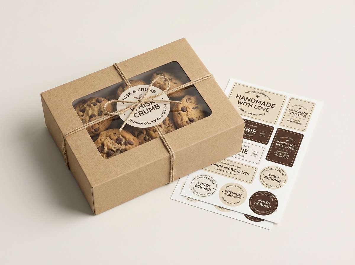
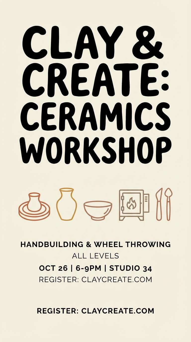
8) Clay & Cream
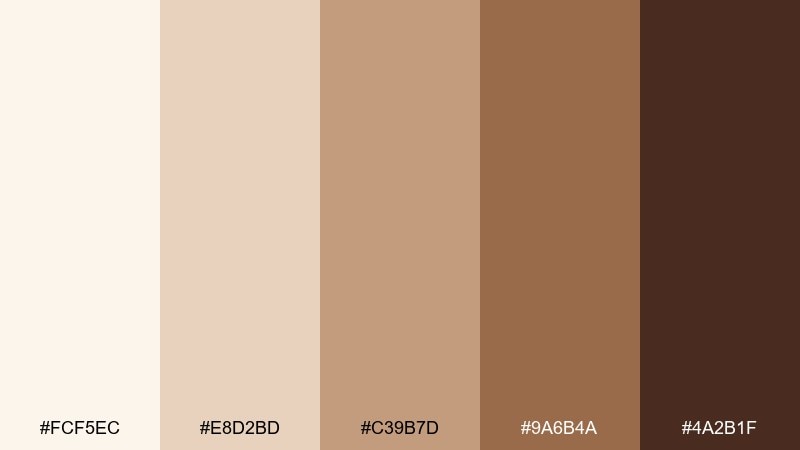
HEX: #fcf5ec #e8d2bd #c39b7d #9a6b4a #4a2b1f
Mood: earthy, creative, artisan
Best for: ceramics workshop flyer
Earthy and creative, like wet clay on hands and kiln-warmed shelves. Let cream carry the headline space, then layer clay and terracotta browns for shapes, class info, and pricing blocks. It pairs nicely with simple line illustrations of pots and tools. Tip: keep the darkest shade for the call to action so the flyer stays easy to scan.
Image example of clay & cream generated using media.io
9) Cappuccino Drift
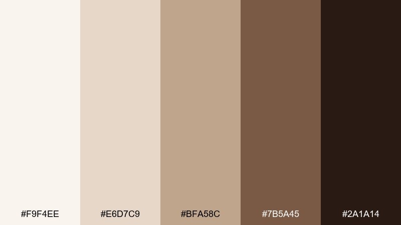
HEX: #f9f4ee #e6d7c9 #bfa58c #7b5a45 #2a1a14
Mood: relaxed, intimate, classic
Best for: book cover design
Relaxed and intimate, like foam art slowly fading on a cappuccino. Use the lighter tones for background gradients and the medium brown for title lettering that feels literary and warm. It works well with subtle paper textures and minimal illustration. Tip: add a thin white keyline around dark type if the background includes grain.
Image example of cappuccino drift generated using media.io
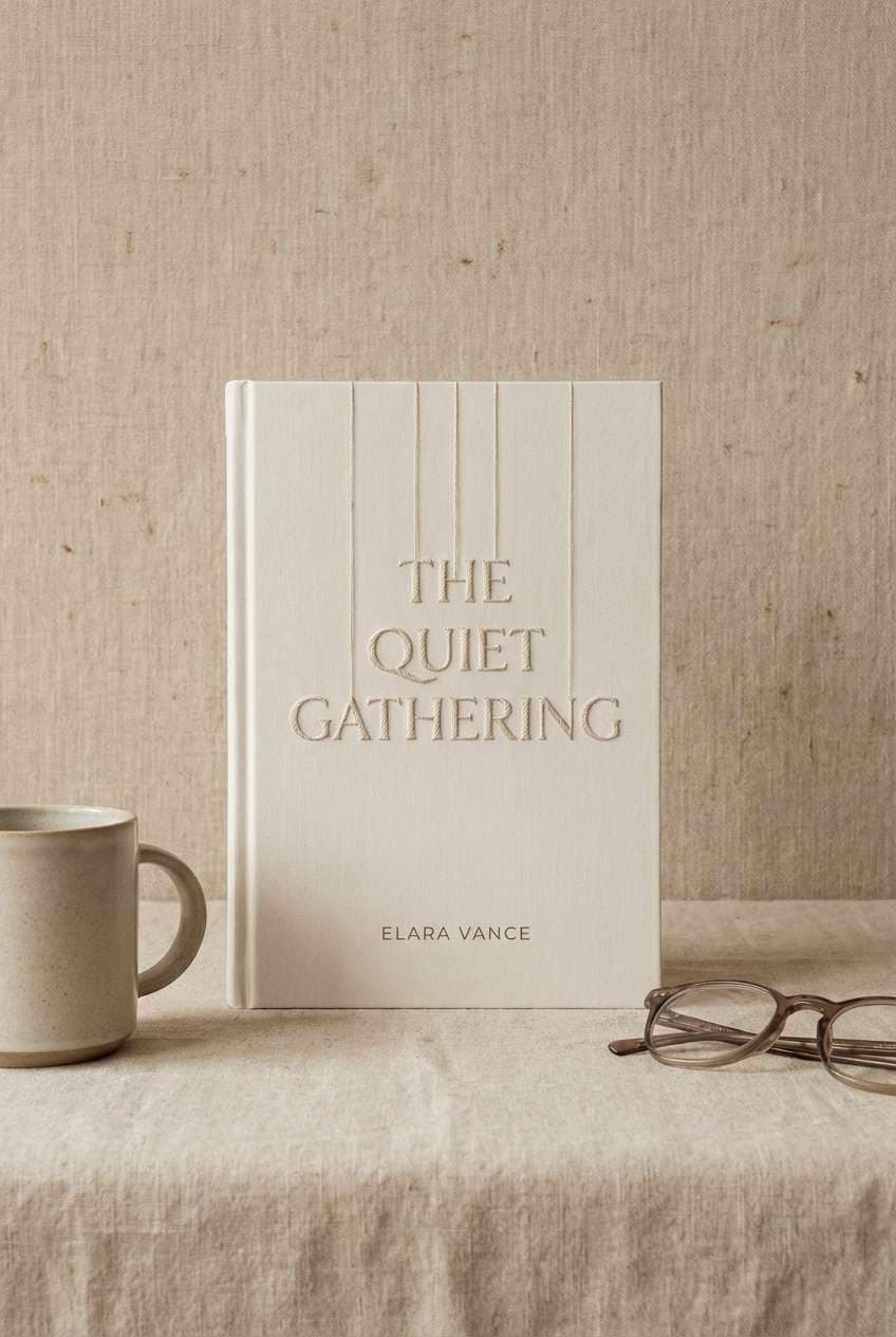
10) Birch Bark
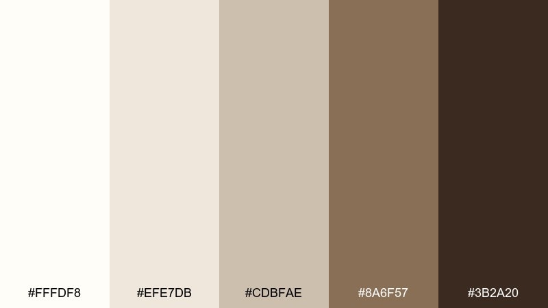
HEX: #fffdf8 #efe7db #cdbfae #8a6f57 #3b2a20
Mood: natural, airy, Nordic
Best for: interior design mood board
Natural and airy, like birch trees against a pale winter sky. Use the off-whites and pale taupes for large blocks, then bring in bark brown for furniture notes and material labels. This set loves pairing with matte black fixtures and muted sage accents. Tip: keep patterns subtle and let texture do the heavy lifting.
Image example of birch bark generated using media.io
11) Antique Parchment
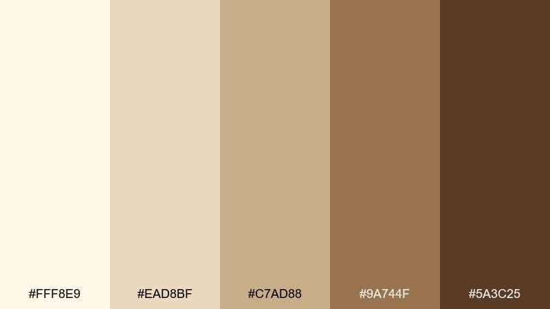
HEX: #fff8e9 #ead8bf #c7ad88 #9a744f #5a3c25
Mood: vintage, scholarly, warm
Best for: editorial magazine spread
Vintage and scholarly, like old parchment pages and leather spines. Use the lightest cream for margins and columns, then rely on the richer browns for section headers and pull quotes. It suits long-form layouts where comfort matters as much as clarity. Tip: choose a slightly warm black for body text so it sits naturally within the palette.
Image example of antique parchment generated using media.io
12) Toasted Almond
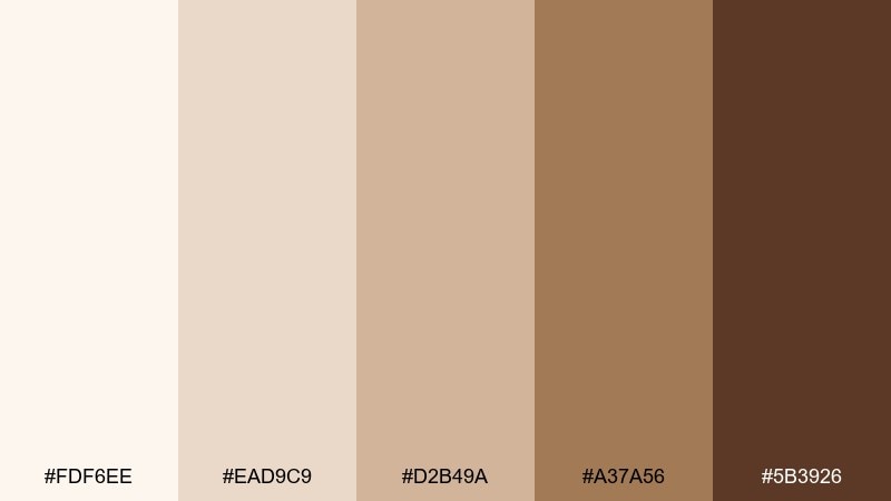
HEX: #fdf6ee #ead9c9 #d2b49a #a37a56 #5b3926
Mood: friendly, wholesome, sunlit
Best for: food blog recipe cards
Friendly and sunlit, like toasted almonds scattered on a linen napkin. Keep the pale tones for recipe steps and whitespace, then use caramel browns for titles and ingredient highlights. It pairs well with overhead food photos and simple icons. Tip: use the mid-tone brown for dividers so the layout stays soft rather than boxy.
Image example of toasted almond generated using media.io
13) Espresso Glaze
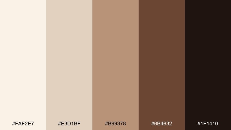
HEX: #faf2e7 #e3d1bf #b99378 #6b4632 #1f1410
Mood: bold, dramatic, moody
Best for: premium coffee product ad
Bold and moody, like espresso syrup poured over cream. Use the near-black espresso as the anchor for headlines, then lift the layout with soft beige negative space. It works in high-end ads where contrast and restraint feel luxurious. Tip: keep only one accent element in the darkest shade to avoid overpowering the lighter tones.
Image example of espresso glaze generated using media.io
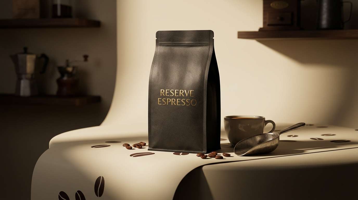
14) Milk Tea Minimal
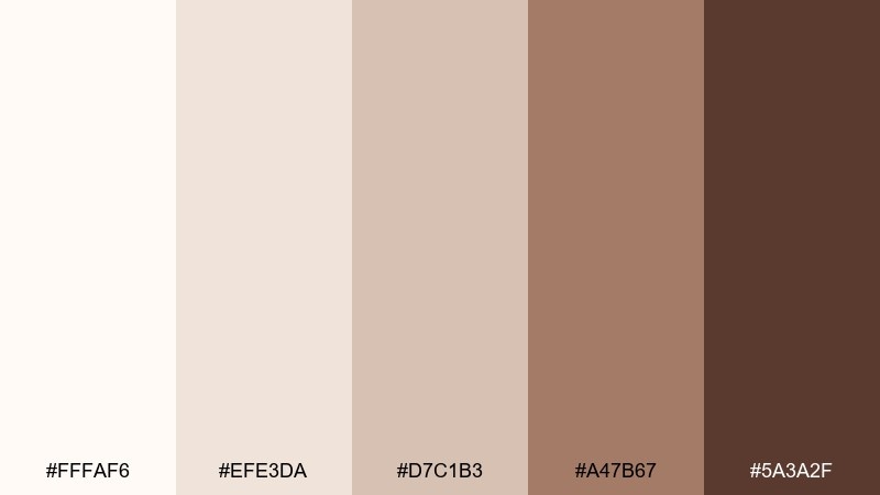
HEX: #fffaf6 #efe3da #d7c1b3 #a47b67 #5a3a2f
Mood: soft, modern, understated
Best for: 2d ui mockup for a wellness app
Soft and understated, like milky tea in a clear glass. Use the blush-beige midtones for cards and inputs, then reserve the deeper cocoa for primary buttons and active states. It supports calm onboarding screens without feeling washed out. Tip: add subtle shadows instead of hard borders to keep the interface gentle.
Image example of milk tea minimal generated using media.io
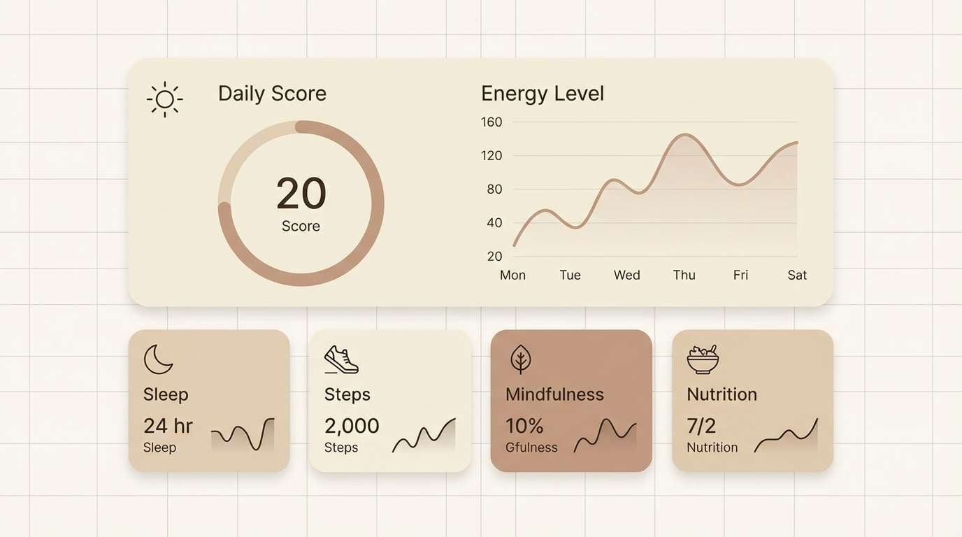
15) Rustic Gallery
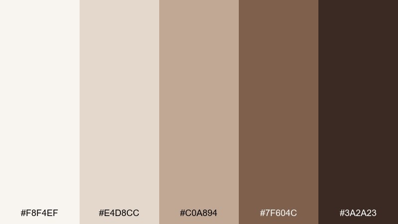
HEX: #f8f4ef #e4d8cc #c0a894 #7f604c #3a2a23
Mood: curated, warm, artsy
Best for: portfolio website layout
Curated and artsy, like a small gallery with warm track lights and wood frames. Keep the background near-white so photography stands out, then use taupe and brown for navigation and captions. These tones support a quiet, confident look without stealing attention from the work. Tip: use the darkest shade only for hover states to keep the page feeling light.
Image example of rustic gallery generated using media.io
16) Desert Cotton
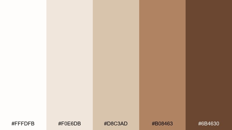
HEX: #fffdfb #f0e6db #d8c3ad #b08463 #6b4630
Mood: sun-washed, relaxed, airy
Best for: boutique interior signage
Sun-washed and relaxed, like cotton fabric drying in desert air. Use the pale whites for negative space and the warm tans for wayfinding and price signs that feel friendly. It pairs well with brass fixtures, light oak, and dried florals. Tip: test the midtone on matte vinyl so it stays legible under warm lighting.
Image example of desert cotton generated using media.io
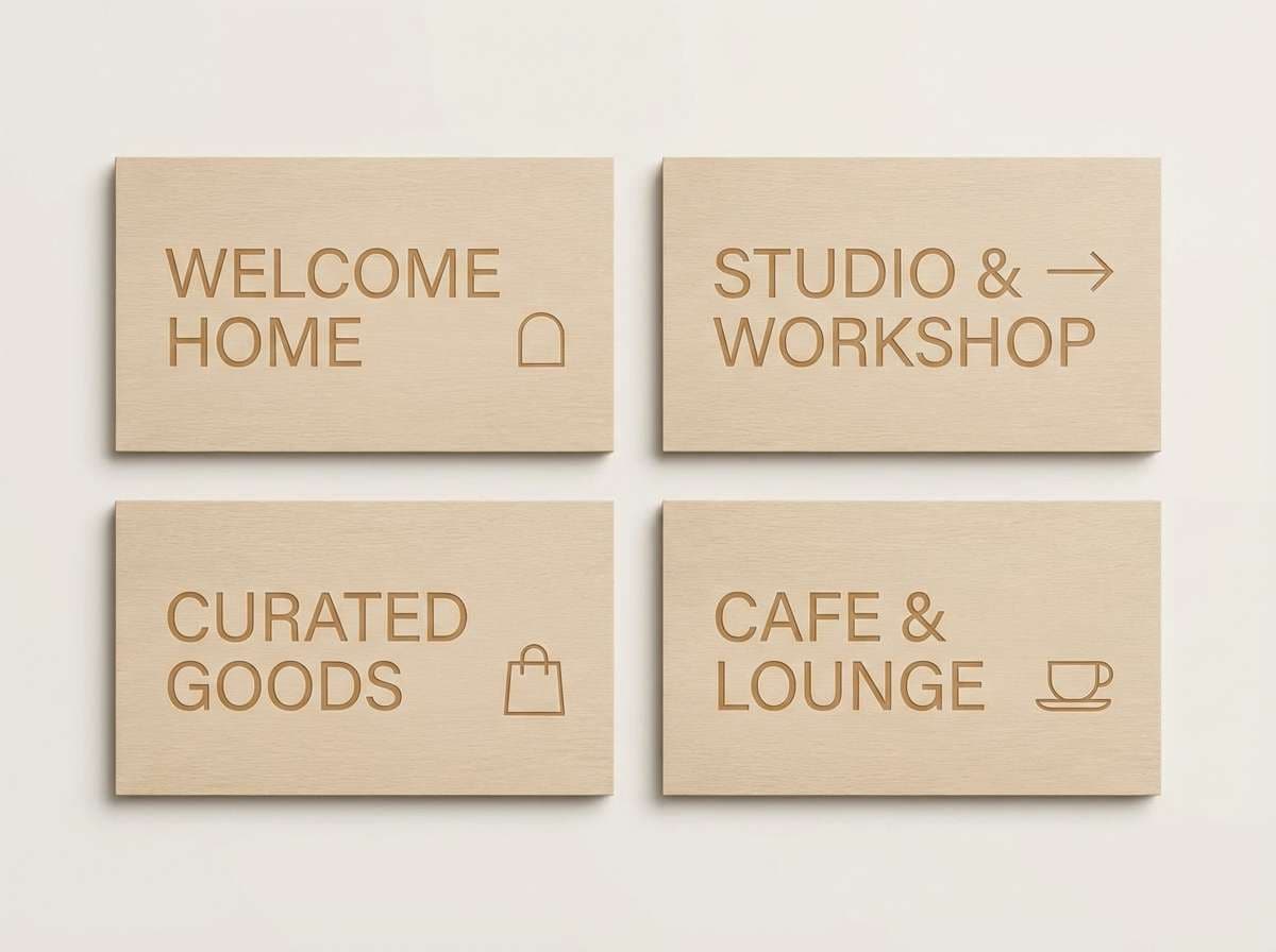
17) Stone & Scone
HEX: #f6f3ee #e2d8ce #bca998 #806452 #38261f
Mood: hearty, homey, balanced
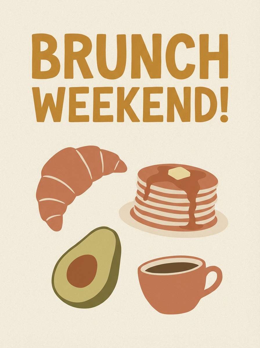
Best for: brunch poster design
Hearty and homey, like a warm scone on a stoneware plate. Use the creamy base for the poster field, then layer mid browns for illustration blocks and the schedule. These tones feel welcoming for neighborhood events and seasonal menus. Tip: add a single small pop of muted green if you need an extra hierarchy cue.
Image example of stone & scone generated using media.io
18) Cinnamon Whisper
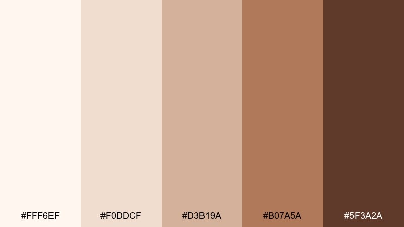
HEX: #fff6ef #f0ddcf #d3b19a #b07a5a #5f3a2a
Mood: romantic, gentle, cozy
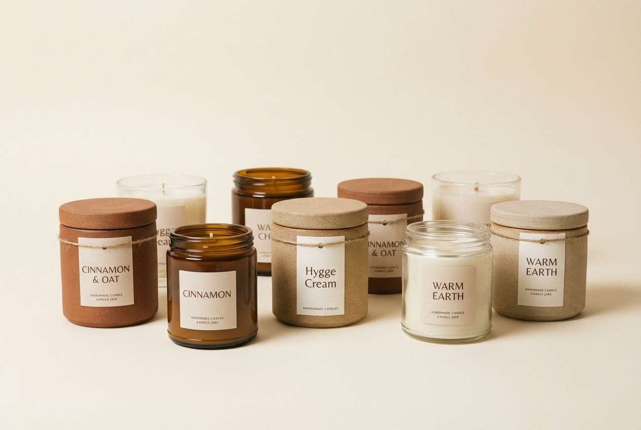
Best for: handmade candle labels
Romantic and gentle, like cinnamon in warm air at dusk. Soft creams and rosy tans make a beautiful label base, while the deeper spice brown sharpens the scent name. One of the easiest white brown color combinations for small packaging because it stays readable without feeling harsh. Tip: use rounded type and lots of breathing room to lean into the calm mood.
Image example of cinnamon whisper generated using media.io
19) Museum Sepia
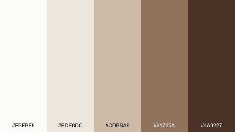
HEX: #fbfbf8 #ede6dc #cdbba8 #91725a #4a3227
Mood: historic, thoughtful, polished
Best for: exhibition brochure
Historic and thoughtful, like sepia photos in a quiet museum hall. Use the pale neutrals for generous margins and let the warmer browns guide headings and section tabs. It pairs nicely with monochrome imagery and fine rules in warm gray. Tip: keep contrast high on small captions by choosing the two darkest tones for type.
Image example of museum sepia generated using media.io
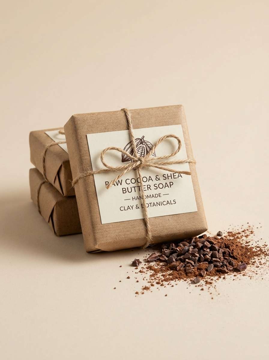
20) Coconut Cocoa
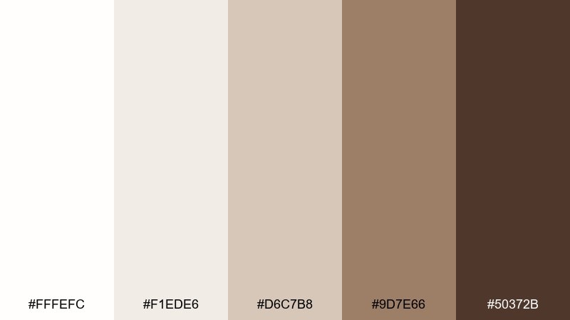
HEX: #fffefc #f1ede6 #d6c7b8 #9d7e66 #50372b
Mood: clean, organic, modern
Best for: natural soap packaging
Clean and organic, like coconut shavings over dark cocoa. Use the whites for a fresh, ingredient-forward look, then bring in cocoa brown for scent variants and stamp marks. A well-balanced white brown color palette for eco brands because it feels natural without looking muddy. Tip: add a small botanical line drawing in the midtone to tie everything together.
Image example of coconut cocoa generated using media.io
21) Winter Mocha Mist
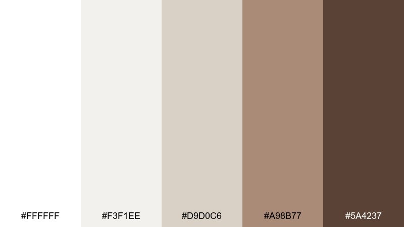
HEX: #ffffff #f3f1ee #d9d0c6 #a98b77 #5a4237
Mood: soft, airy, quietly warm
Best for: holiday email header design
Soft and airy, like a winter morning with a warm mug in hand. The cool-leaning whites keep layouts crisp, while the mocha browns add seasonal warmth without going red or green. It performs well for email headers, banners, and simple promo blocks. Tip: use the midtone for subtle snow-like dots or patterning, not heavy fills.
Image example of winter mocha mist generated using media.io
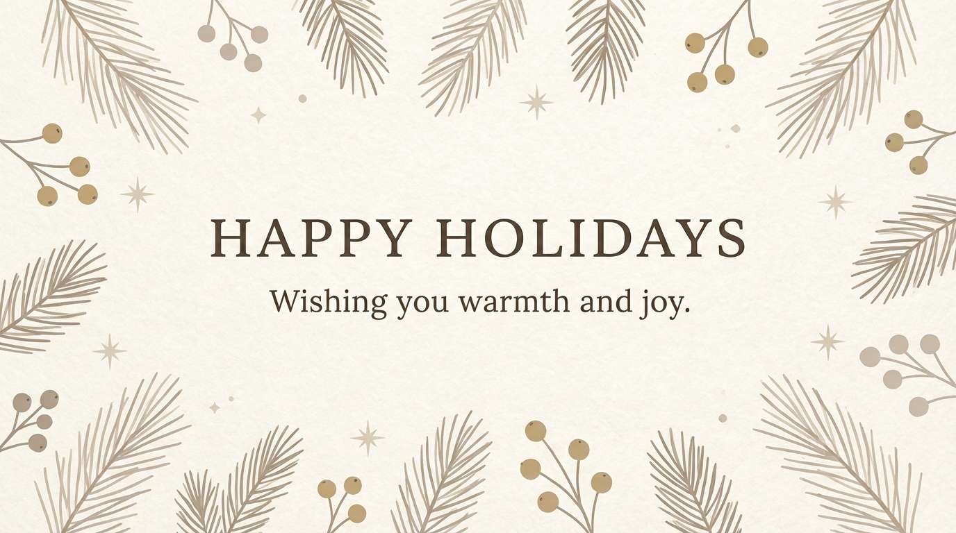
22) Biscuit & Bark
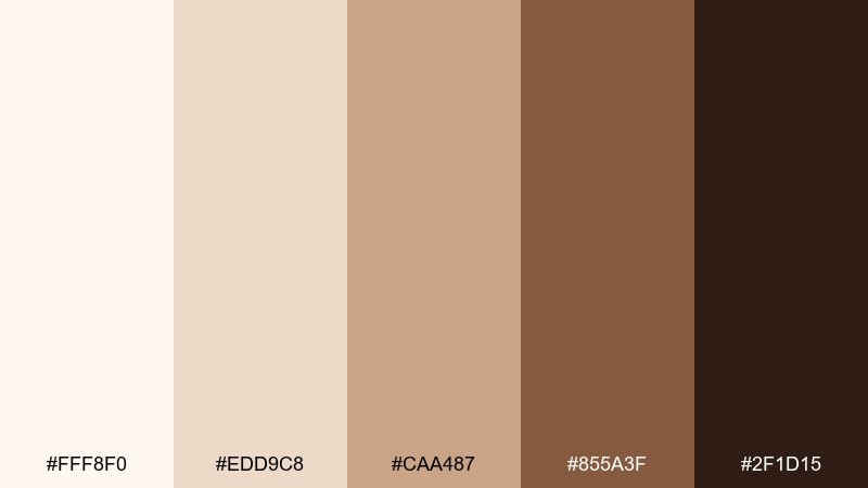
HEX: #fff8f0 #edd9c8 #caa487 #855a3f #2f1d15
Mood: comforting, earthy, bold contrast
Best for: rustic restaurant branding
Comforting and earthy, like biscuits on a wooden board. Use the biscuit cream for signage backgrounds and the bark brown for logotypes and stamp-style marks. These white brown color combinations look especially strong with textured paper, letterpress, and simple badge logos. Tip: keep your accent color to one tiny element, like a chili-red dot, so the brand stays grounded.
Image example of biscuit & bark generated using media.io
What Colors Go Well with White Brown?
White and brown pair naturally with warm grays, soft charcoals, and muted greens (sage, olive, eucalyptus). These additions keep the palette calm while adding depth for UI states, icons, and typography hierarchy.
For a slightly more premium or editorial direction, try metallic accents (gold, brass) or inky near-blacks. If you want a fresh, modern twist, dusty blues can cool the warmth without clashing.
When adding an accent color, keep it small and intentional—badges, links, or a single highlight—so the warm neutral foundation still feels cohesive.
How to Use a White Brown Color Palette in Real Designs
Start with the lightest white/cream as your main canvas, then assign one mid-brown for secondary surfaces (cards, panels, labels). Use the darkest brown sparingly for text, icons, and key CTAs to protect readability.
In print, white-brown palettes look best when you lean into materials: uncoated paper, subtle grain, embossing, or spot gloss. In digital, replace heavy borders with gentle shadows and warm-gray dividers to avoid a “muddy” look.
If contrast feels too soft, increase separation with scale (bigger headings), spacing (more whitespace), and texture (patterns only in midtones) rather than adding more colors.
Create White Brown Palette Visuals with AI
Want to see these HEX codes in real mockups—menus, packaging, posters, UI screens, and more? With Media.io, you can generate on-brand visuals from a single prompt and iterate quickly.
Describe the layout, style, and lighting you want (for example: “minimal skincare label, cream background, mocha typography”), then refine until the palette looks perfect for your project.
White Brown Color Palette FAQs
-
What does a white and brown color palette communicate?
It usually signals warmth, stability, and comfort, with white adding cleanliness and space. Together they often feel natural, handcrafted, and trustworthy—great for lifestyle, food, wellness, and home brands. -
Are white brown palettes good for modern web design?
Yes—especially for minimal sites and ecommerce. Use an off-white background, a mid-brown for surfaces, and a deep brown for text/CTAs, then rely on spacing and type scale to keep the layout crisp. -
How do I keep a white brown scheme from looking dull?
Add texture (paper grain, subtle gradients), use strong typography hierarchy, and introduce one restrained accent (sage green, brass, or charcoal). Keep the accent small so the neutrals stay dominant. -
What’s the best text color on a cream background?
A very dark brown or warm charcoal typically reads better than pure black in warm neutral designs. Check contrast ratios, especially for body text and small UI labels. -
Can I use white and brown for a luxury brand?
Absolutely. Choose cleaner whites and richer espresso browns, keep the layout airy, and consider premium finishes (foil, emboss, spot gloss). Reserve the darkest tone for small details so it still feels light. -
What accent colors pair well with cream and cocoa tones?
Muted sage/olive, dusty blue, warm gray, and metallic gold/brass are reliable options. Pick one accent and apply it consistently to interactive elements or highlights. -
How can I generate palette-based mockups quickly?
Use Media.io’s AI text-to-image tool: describe the design type (packaging, UI, poster), mention your white/brown tones, and iterate prompts until the lighting, texture, and contrast match your brand.


