

Deep pink is bold, expressive, and instantly attention-grabbing—perfect when you want a design to feel modern, confident, and a little daring.
Below are 20 deep pink color palette ideas (with HEX codes), plus quick tips for using them in branding, UI, and print without overwhelming your layout.
In this article
- Why Deep Pink Palettes Work So Well
-
- neon bougainvillea
- velvet raspberry
- candy orchid
- sunset fuchsia
- berry noir
- rosewater latte
- pop art punch
- sakura disco
- tropical hibiscus
- vintage valentine
- magenta metallic
- ballet studio
- pink + sage calm
- coral peony
- grape sorbet
- minimal pink & charcoal
- festival confetti
- luxe rose gold
- midnight bloom
- soft sand contrast
- What Colors Go Well with Deep Pink?
- How to Use a Deep Pink Color Palette in Real Designs
- Create Deep Pink Palette Visuals with AI
Why Deep Pink Palettes Work So Well
Deep pink sits in a sweet spot between playful and powerful—more energetic than rose, more readable than neon, and more modern than classic red. It naturally becomes a focal color, so your hierarchy feels clear fast.
It also adapts well across styles: pair it with charcoal and cool grays for a professional UI, with lilac and violet for a dreamy aesthetic, or with warm neutrals to make it feel grounded and handmade.
Because deep pink carries strong emotion, it helps branding communicate personality at a glance. The key is balancing it with calming backgrounds and dependable text colors so the design stays usable.
20+ Deep Pink Color Palette Ideas (with HEX Codes)
1) Neon Bougainvillea
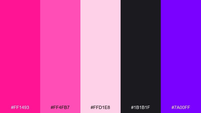
HEX: #FF1493 #FF4FB7 #FFD1E8 #1B1B1F #7A00FF
Mood: electric, nightlife, confident
Best for: club poster design
Electric bougainvillea blooms against city-night shadows, giving the mix a bold, after-dark glow. Use the inky near-black for type and negative space, then let the pinks do the shouting in headlines and shapes. Violet adds a futuristic edge that pairs well with metallic textures or gradients. Tip: keep the pale blush as a breathing zone so the poster still reads from a distance.
Image example of neon bougainvillea generated using media.io
Media.io is an online AI studio for creating and editing video, image, and audio in your browser.

2) Velvet Raspberry
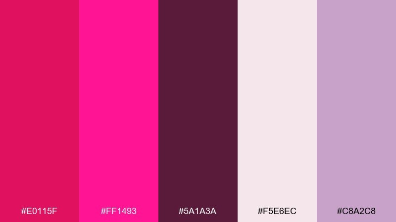
HEX: #E0115F #FF1493 #5A1A3A #F5E6EC #C8A2C8
Mood: luxe, romantic, dramatic
Best for: beauty brand identity
Plush berry tones feel like velvet lipstick and dim candlelight. The deep wine shade grounds the brighter pink so logos and wordmarks look premium instead of loud. Pair the mauve-lavender with soft gradients for a modern cosmetic feel. Tip: use the off-white as your main background to keep packaging looking clean and editorial.
Image example of velvet raspberry generated using media.io
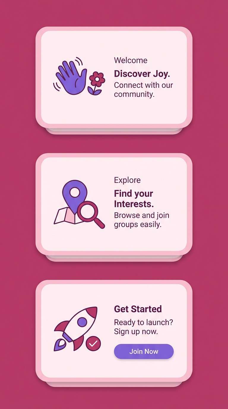
3) Candy Orchid
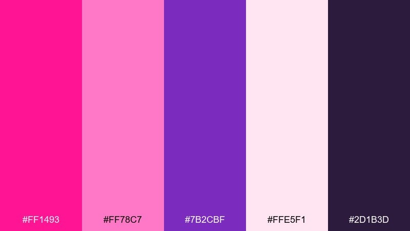
HEX: #FF1493 #FF78C7 #7B2CBF #FFE5F1 #2D1B3D
Mood: playful, dreamy, youthful
Best for: mobile app onboarding screens
Sugary orchid pinks and a hint of grape create a cheerful, candy-store mood. The dark plum works well for headings and icons so the UI stays legible on light backgrounds. Keep the soft blush for cards and panels to avoid visual fatigue. Tip: reserve the bright pink for primary buttons and key CTAs only.
Image example of candy orchid generated using media.io
4) Sunset Fuchsia
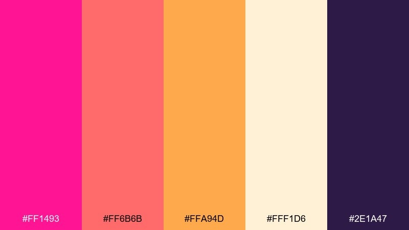
HEX: #FF1493 #FF6B6B #FFA94D #FFF1D6 #2E1A47
Mood: warm, energetic, optimistic
Best for: summer campaign banner ads
A fuchsia-to-sunset blend feels like golden hour hitting bright fabric. Use the creamy light tone for background space, then layer coral and orange as supporting blocks or gradients. The deep violet is perfect for crisp text and small UI elements that need contrast. Tip: keep orange as a secondary highlight so pink remains the hero.
Image example of sunset fuchsia generated using media.io

5) Berry Noir
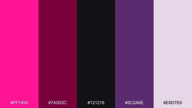
HEX: #FF1493 #7A003C #121216 #5C2A6E #E6D7E6
Mood: moody, edgy, high-fashion
Best for: editorial magazine spread
Dark berry shadows with a hot pink flash feel like a fashion shoot under low light. The near-black and wine tones make excellent body text and grid lines for a refined layout. Add the pale lavender as a quiet margin color to prevent the page from feeling heavy. Tip: use pink sparingly for pull quotes and section markers to keep it couture, not chaotic.
Image example of berry noir generated using media.io
6) Rosewater Latte
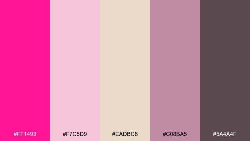
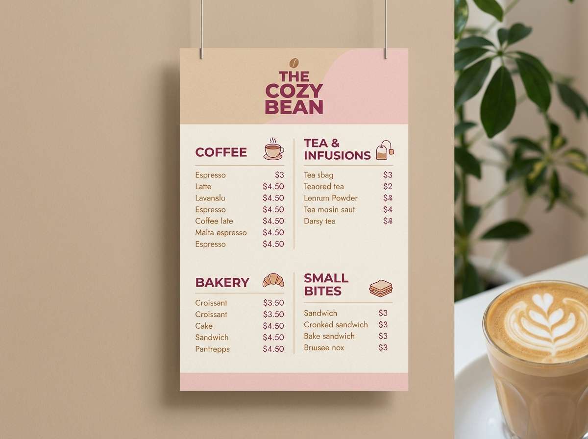
HEX: #FF1493 #F7C5D9 #EADBC8 #C08BA5 #5A4A4F
Mood: soft, cozy, modern romantic
Best for: cafe menu design
Rosy foam and warm milk tones create a gentle, welcoming look that still feels stylish. This deep pink color palette works beautifully for menu highlights, while the latte beige keeps the page calm and readable. Pair the charcoal-mauve with simple sans serif type and thin dividers for a contemporary feel. Tip: use the brightest pink only for best-sellers and seasonal callouts.
Image example of rosewater latte generated using media.io
7) Pop Art Punch
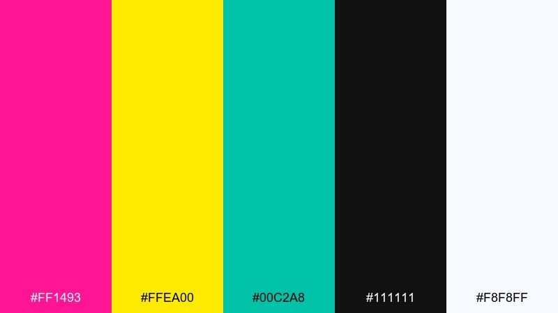
HEX: #FF1493 #FFEA00 #00C2A8 #111111 #F8F8FF
Mood: bold, fun, attention-grabbing
Best for: social media promo graphics
Punchy pop-art energy jumps off the screen with loud pink, sunshine yellow, and fresh teal. These deep pink color combinations are ideal for promos, stickers, and carousel slides where you need instant stop-scroll impact. Keep black for clean outlines and high-contrast headlines. Tip: limit each graphic to two dominant blocks of color so the layout stays punchy, not messy.
Image example of pop art punch generated using media.io

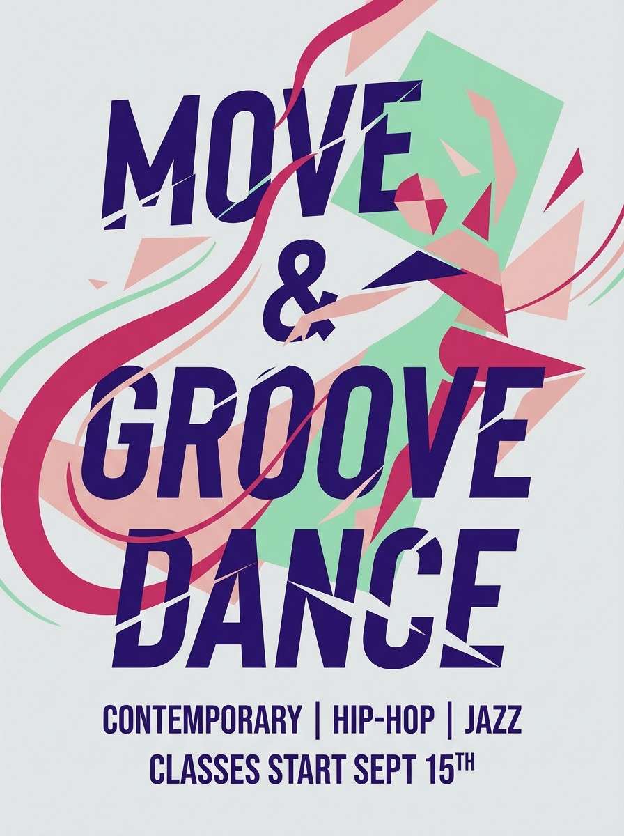
8) Sakura Disco
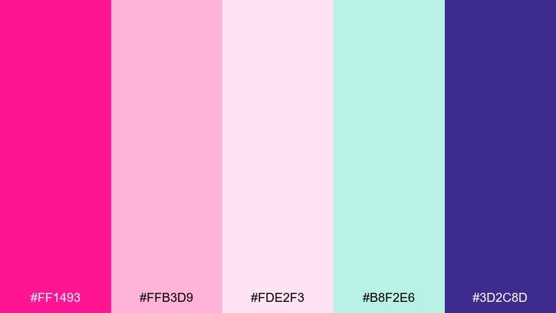
HEX: #FF1493 #FFB3D9 #FDE2F3 #B8F2E6 #3D2C8D
Mood: cute, vibrant, upbeat
Best for: dance class flyer
Cherry-blossom softness meets a late-night dance floor for a playful, bouncy vibe. Use the mint as a cool counterbalance to the pinks, especially for secondary panels and small badges. The deep indigo is excellent for readable text and crisp icons. Tip: add a subtle gradient from blush to pink behind the headline for extra movement.
Image example of sakura disco generated using media.io
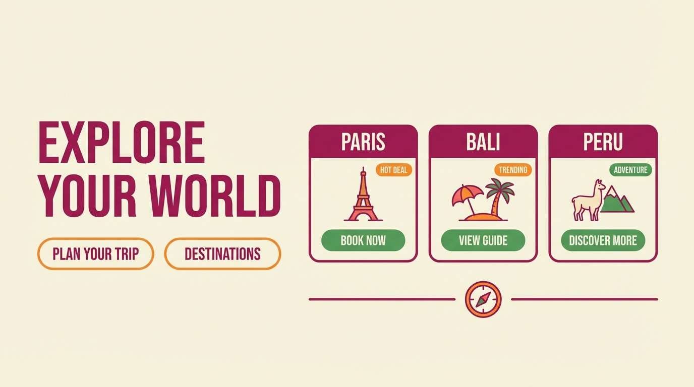
9) Tropical Hibiscus
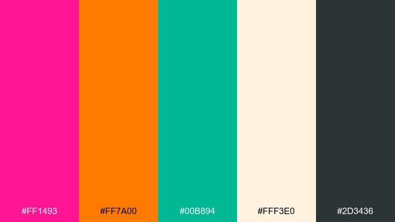
HEX: #FF1493 #FF7A00 #00B894 #FFF3E0 #2D3436
Mood: tropical, bright, adventurous
Best for: travel landing page hero
Hibiscus pink with citrus orange feels like a beach drink in the sun. Use cream for the hero background and reserve the dark gray for navigation and body copy so it stays accessible. The green adds a fresh, leafy accent for buttons, tags, or map pins. Tip: keep orange to small highlights so the hero still reads as pink-forward.
Image example of tropical hibiscus generated using media.io
10) Vintage Valentine
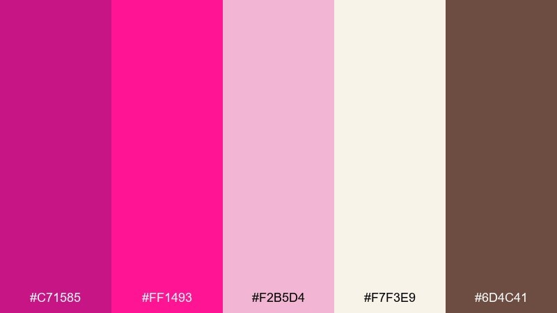
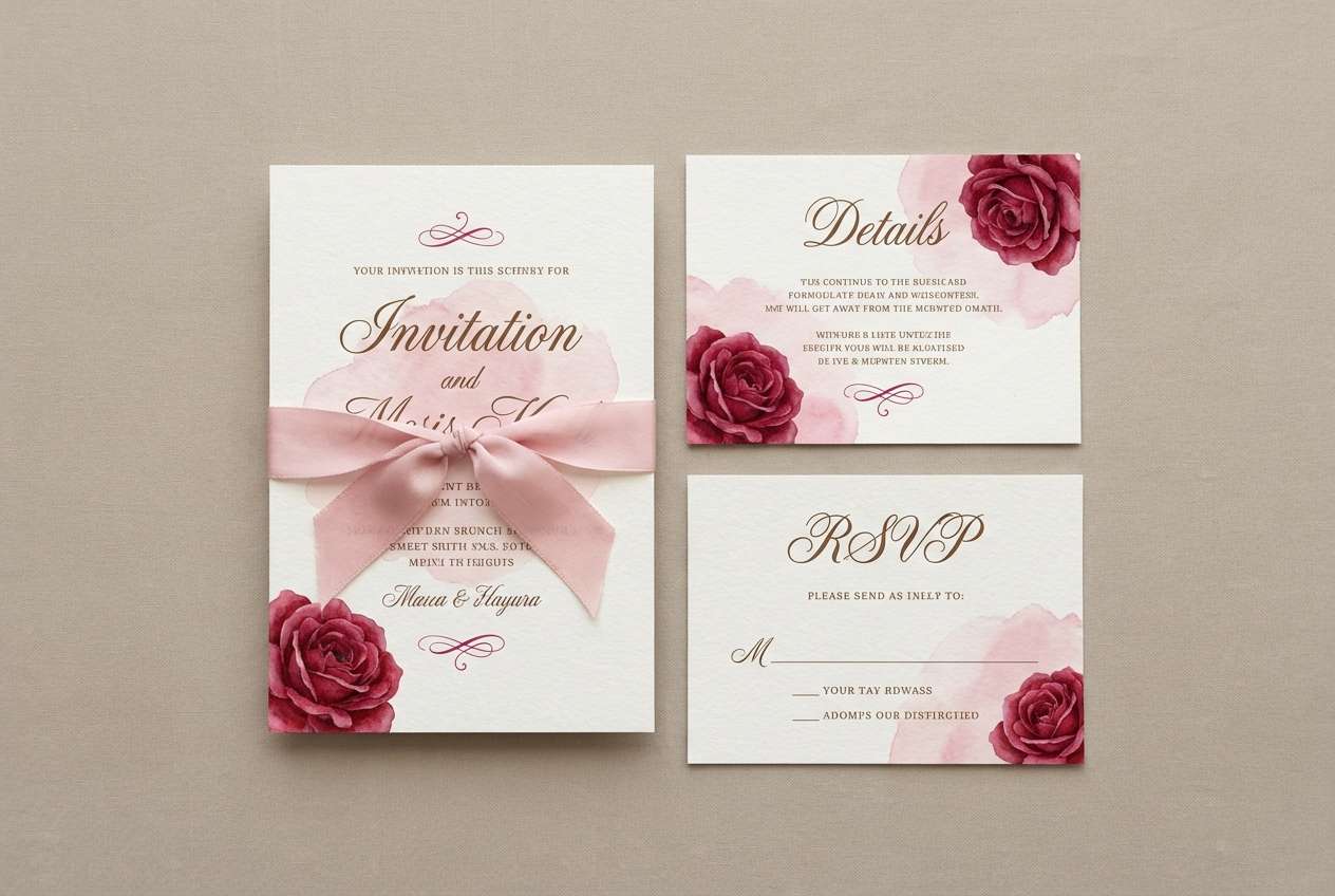
HEX: #C71585 #FF1493 #F2B5D4 #F7F3E9 #6D4C41
Mood: nostalgic, sweet, warm
Best for: wedding invitation suite
A vintage valentine feel comes through with dusty pinks and warm paper tones. Use the cream as your base to mimic stationery stock, then layer the brighter pink for monograms and flourishes. The cocoa brown works well for serif typography and RSVP details. Tip: keep embellishments thin and airy so the suite stays elegant, not overly cute.
Image example of vintage valentine generated using media.io
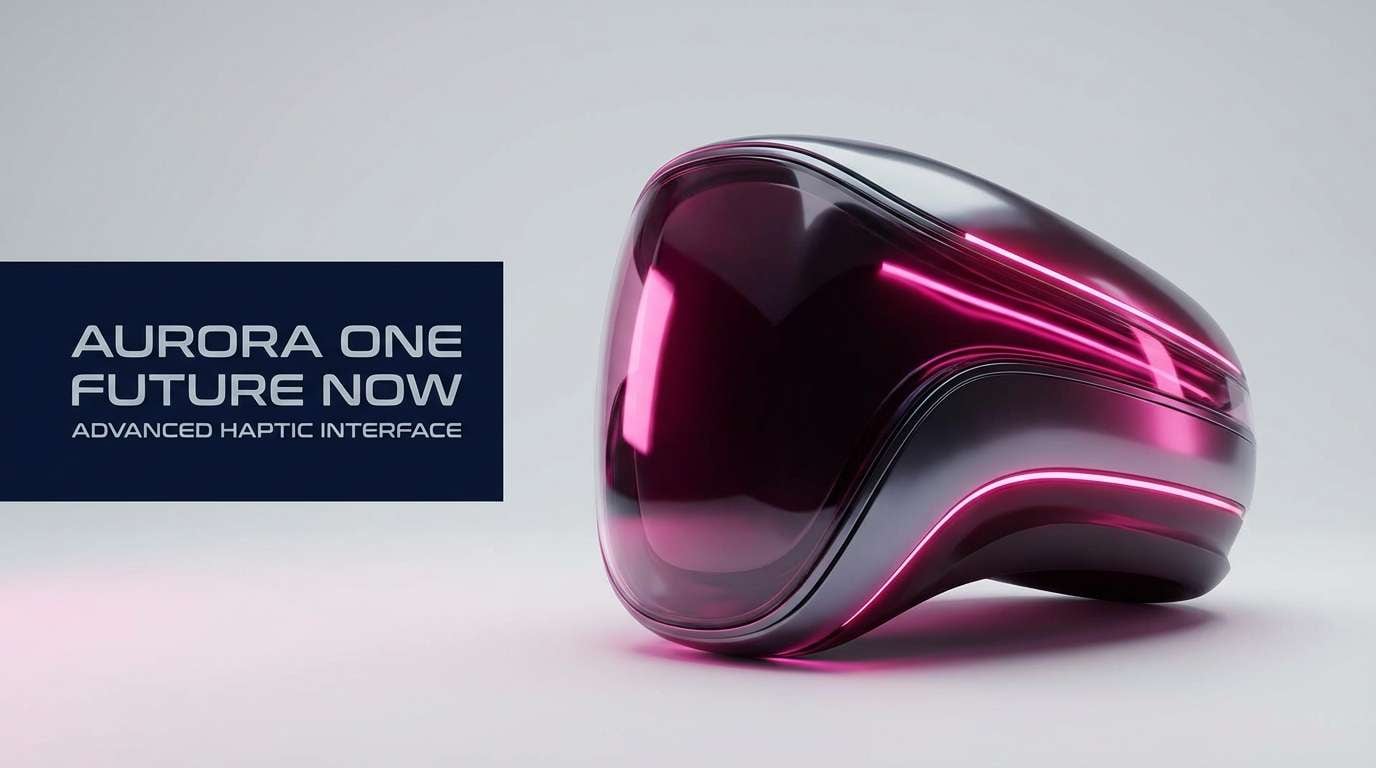
11) Magenta Metallic
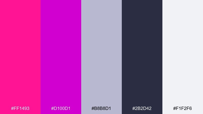
HEX: #FF1493 #D100D1 #B8B8D1 #2B2D42 #F1F2F6
Mood: futuristic, glossy, premium
Best for: tech product ad
Glossy magenta and deep pink feel like neon reflections on polished metal. The cool grays help the palette land in a modern tech space, especially for specs and fine print. Use the midnight navy for strong contrast in headlines and UI callouts. Tip: apply a subtle metallic gradient between pink and purple to sell the high-end look.
Image example of magenta metallic generated using media.io
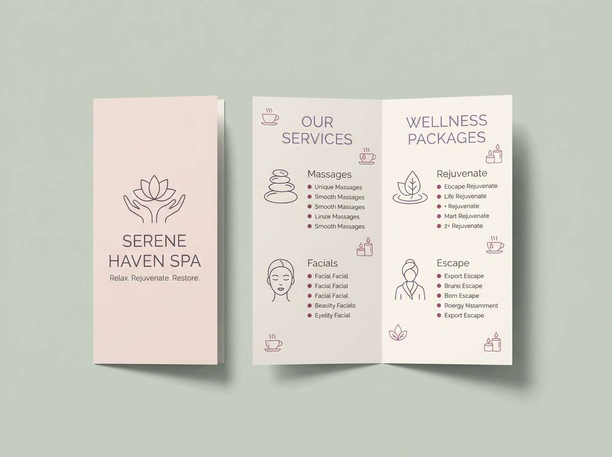
12) Ballet Studio
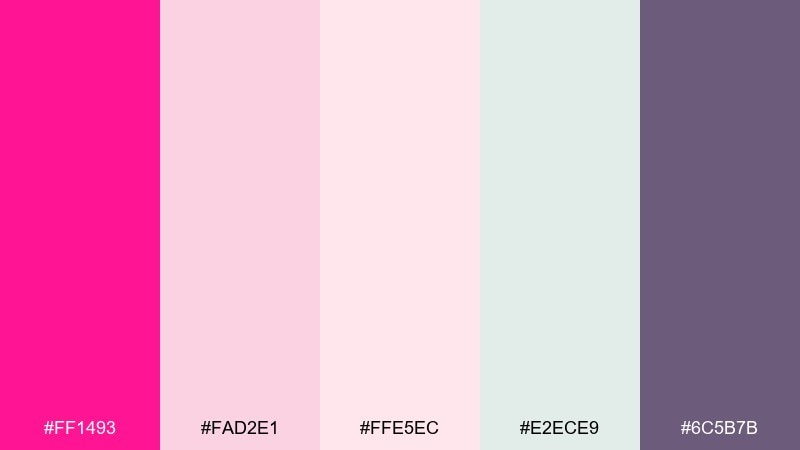
HEX: #FF1493 #FAD2E1 #FFE5EC #E2ECE9 #6C5B7B
Mood: airy, delicate, graceful
Best for: spa brochure design
Soft blush layers feel like tulle and quiet morning light. Use the pale pinks and misty green as calming backgrounds for service lists and feature panels. The muted violet anchors headings without breaking the serene tone. Tip: add generous margins and thin line icons so the brochure feels light and premium.
Image example of ballet studio generated using media.io
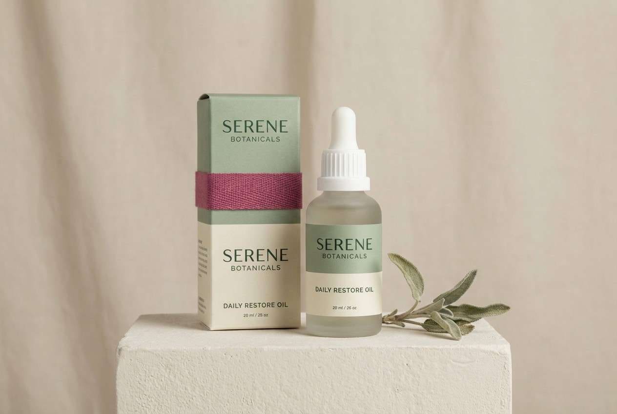
13) Pink + Sage Calm
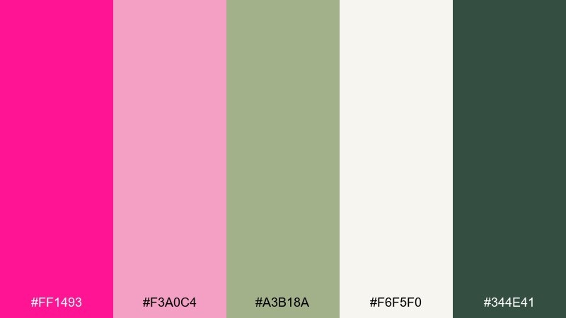
HEX: #FF1493 #F3A0C4 #A3B18A #F6F5F0 #344E41
Mood: fresh, balanced, natural
Best for: wellness packaging
Fresh sage and creamy off-white soften the punch of pink, like flowers in a herb garden. Use the dark forest tone for ingredient text and compliance info to keep the label readable. The brighter pink works best as a seal, stripe, or small logo mark rather than a full background. Tip: pair with matte paper textures for an earthy, modern finish.
Image example of pink + sage calm generated using media.io
14) Coral Peony
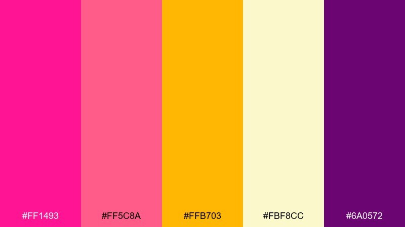
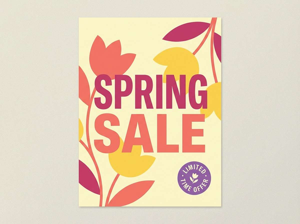
HEX: #FF1493 #FF5C8A #FFB703 #FBF8CC #6A0572
Mood: cheerful, sunny, inviting
Best for: spring sale poster
Sunny yellow and coral-peony pink feel like fresh blooms in a storefront window. Deep pink color combinations like this work best with simple shapes and large type, letting the warmth carry the message. Use the soft butter tone as a background and keep purple to thin outlines or small stamps. Tip: avoid heavy shadows; flat color makes the poster look cleaner and more modern.
Image example of coral peony generated using media.io
15) Grape Sorbet
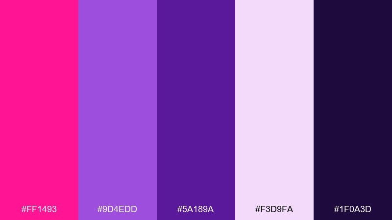
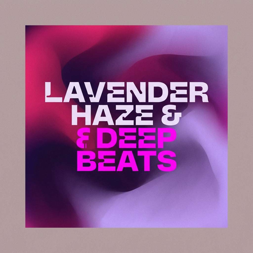
HEX: #FF1493 #9D4EDD #5A189A #F3D9FA #1F0A3D
Mood: bold, creative, atmospheric
Best for: music playlist cover art
Grape-purple depth with bright pink feels like synth music and midnight glow. Use the dark violet for strong contrast and the lavender for soft gradients behind the title. Keep the palette mostly within pink-purple to maintain a cohesive, genre-forward mood. Tip: add a grain texture over the background to make the colors feel richer and less flat.
Image example of grape sorbet generated using media.io
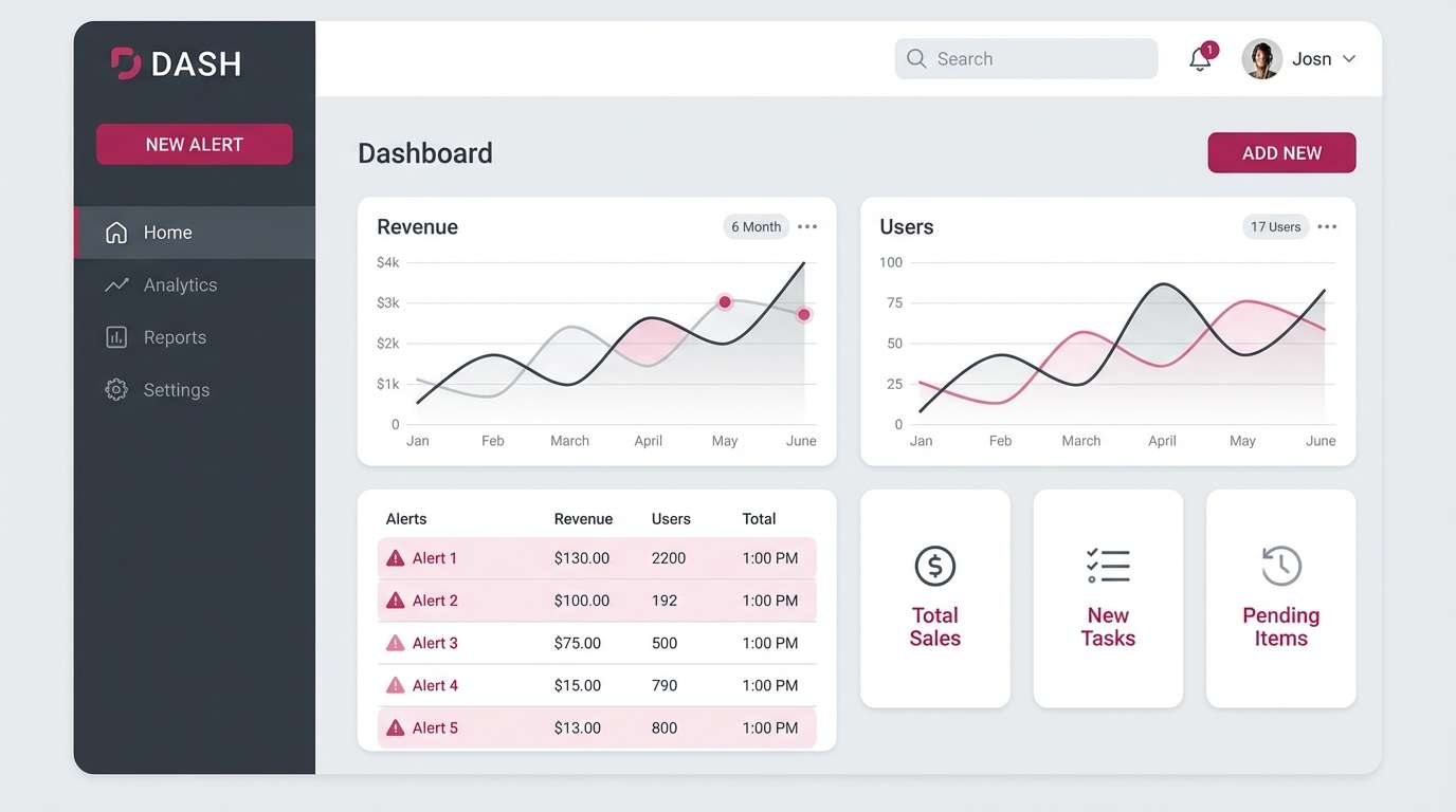
16) Minimal Pink & Charcoal
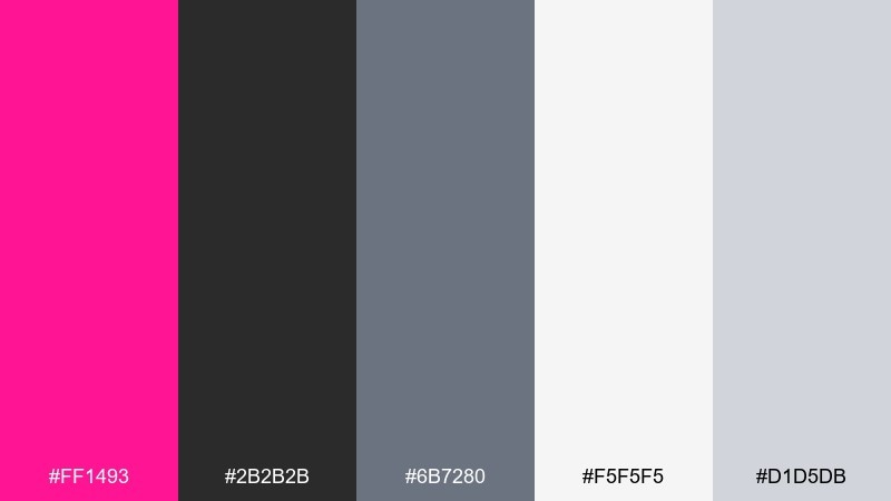
HEX: #FF1493 #2B2B2B #6B7280 #F5F5F5 #D1D5DB
Mood: clean, modern, professional
Best for: dashboard UI theme
Sharp charcoal and soft grays make the pink feel intentional, like a precise highlighter stroke. A deep pink color palette like this is ideal for dashboards where you want alerts and CTAs to stand out without overwhelming the data. Keep the brightest tone for status badges and primary actions, and rely on gray hierarchy for everything else. Tip: use consistent spacing and thin borders so the accent color stays the star.
Image example of minimal pink & charcoal generated using media.io
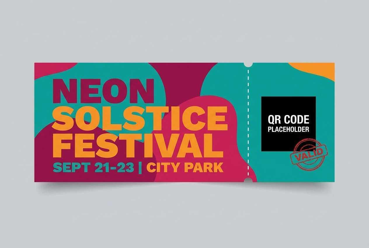
17) Festival Confetti
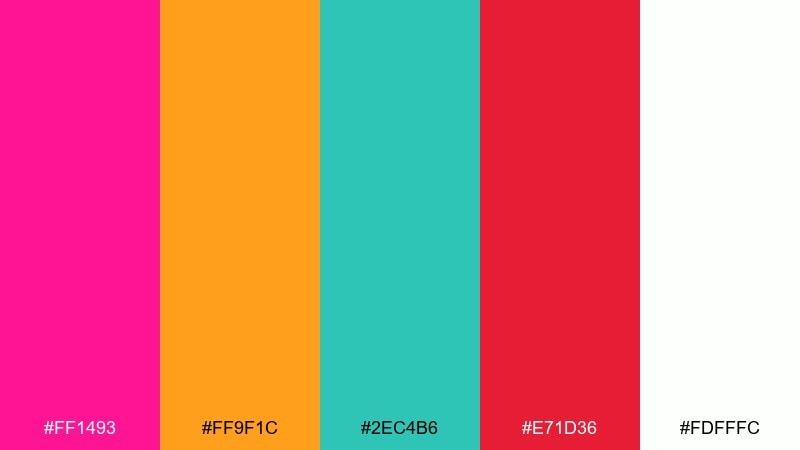
HEX: #FF1493 #FF9F1C #2EC4B6 #E71D36 #FDFFFC
Mood: festive, loud, youthful
Best for: event ticket design
Confetti-bright color hits feel like music, lights, and motion. Use white as the base so the hot colors stay crisp, then layer teal and orange for sections and QR areas. Red works best in small bursts, like warnings, sold-out tags, or VIP stamps. Tip: keep typography bold and simple to avoid competing with the palette.
Image example of festival confetti generated using media.io
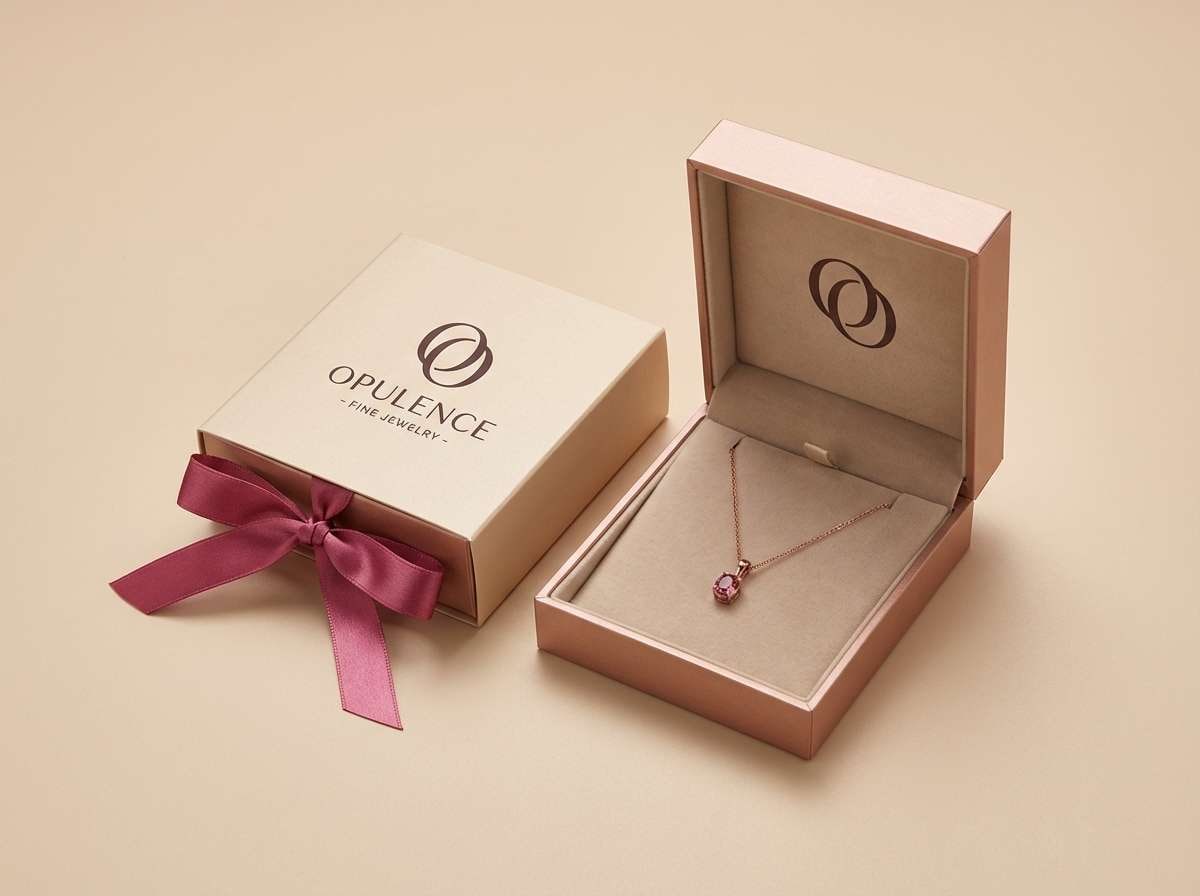
18) Luxe Rose Gold
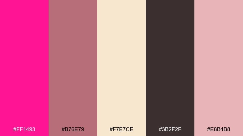
HEX: #FF1493 #B76E79 #F7E7CE #3B2F2F #E8B4B8
Mood: elegant, warm, upscale
Best for: jewelry product packaging
Rose gold warmth and deep pink glamour feel instantly gift-ready. Use the champagne tone as a soft base and keep the dark cocoa for premium, high-contrast type. The muted rose shades help gradients look expensive rather than flashy. Tip: add subtle foil details in rose-gold areas to elevate the unboxing moment.
Image example of luxe rose gold generated using media.io
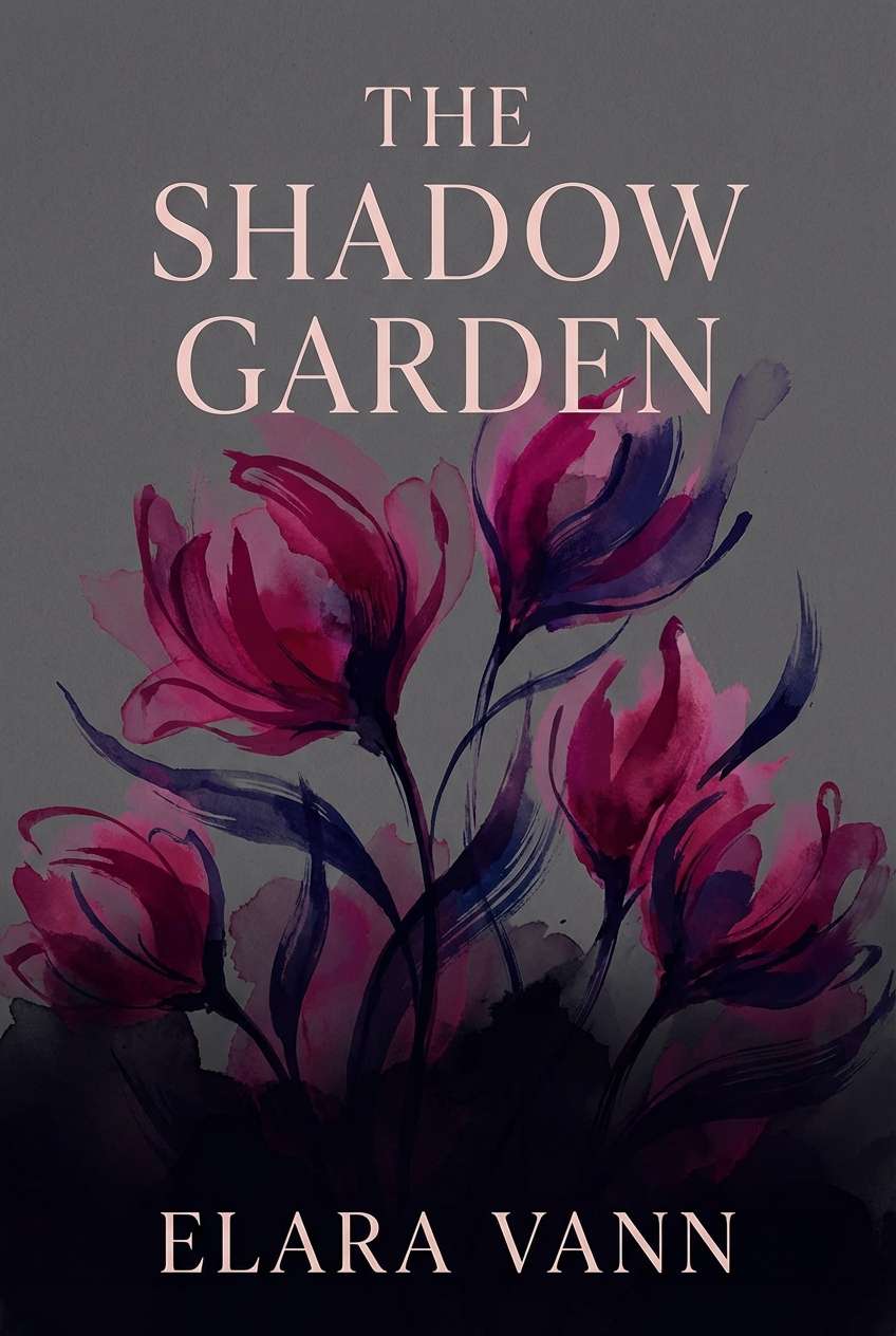
19) Midnight Bloom
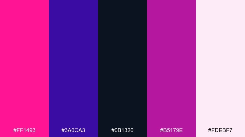
HEX: #FF1493 #3A0CA3 #0B1320 #B5179E #FDEBF7
Mood: mysterious, artistic, dramatic
Best for: book cover design
Midnight darkness with glowing pink petals creates a cinematic, artistic tension. Use the near-black for the background and let pink and magenta form a focal bloom or abstract shape. The pale blush is ideal for author name and small subtitles that need gentler contrast. Tip: keep the composition centered so the bright accents feel intentional and collectible.
Image example of midnight bloom generated using media.io
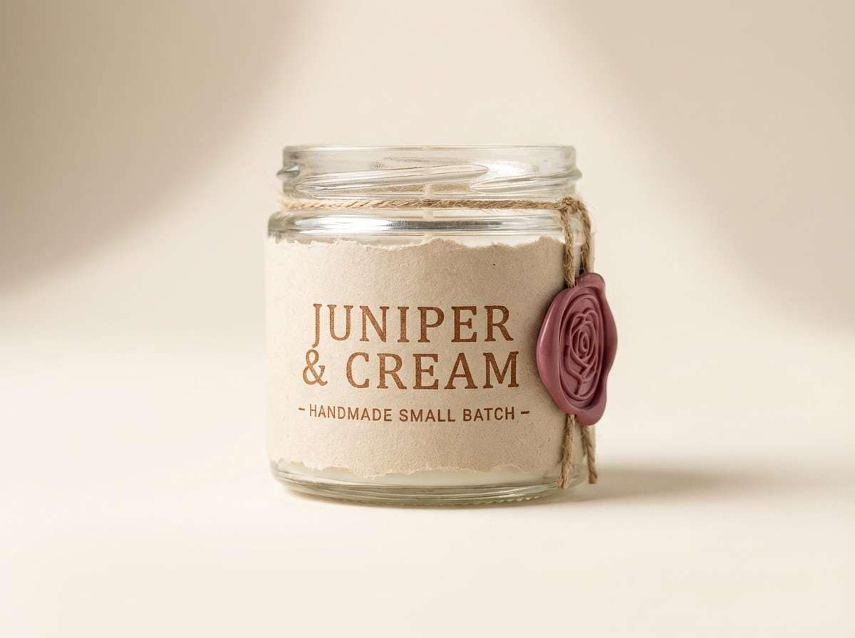
20) Soft Sand Contrast
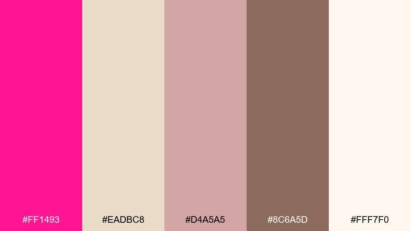
HEX: #FF1493 #EADBC8 #D4A5A5 #8C6A5D #FFF7F0
Mood: warm, grounded, approachable
Best for: handmade product label
Warm sand and clay browns calm the bright pink, like a bold flower in a desert garden. Use the creamy tones for label backgrounds and the taupe-brown for readable ingredient lists. The muted rose bridges the gap so transitions feel smooth instead of harsh. Tip: print the brightest pink as a small emblem or stamp to keep the handmade vibe intact.
Image example of soft sand contrast generated using media.io
What Colors Go Well with Deep Pink?
Deep pink pairs especially well with dark neutrals (charcoal, near-black, deep navy) because they improve readability and make the pink feel crisp instead of chaotic. This combo is a go-to for headlines, CTAs, and premium brand marks.
For a softer look, mix deep pink with warm neutrals like beige, champagne, latte, and cream. These tones keep the palette approachable and print-friendly—great for menus, labels, and invitations.
If you want extra energy, add complementary brights like teal, mint, sunny yellow, or citrus orange—but keep them as accents so deep pink remains the hero.
How to Use a Deep Pink Color Palette in Real Designs
Start by assigning roles: one deep pink for primary actions or focal elements, one dark color for text, and one light neutral for backgrounds. This simple system prevents “all-accent” designs and keeps your hierarchy consistent.
In UI, reserve deep pink for primary buttons, active states, or key highlights, and use grays for most surfaces. In print, deep pink works best in spot areas (stamps, ribbons, section dividers) where it can look intentional and premium.
When in doubt, increase whitespace and reduce saturation elsewhere. Deep pink doesn’t need help being noticed—your layout just needs to support it.
Create Deep Pink Palette Visuals with AI
If you already have HEX codes, you can turn them into real-looking posters, packaging, UI mockups, and cover art by describing the layout and style—then keeping deep pink as the dominant accent.
To get cleaner results, specify a plain background, clear typography, and a single use case (like “dashboard UI” or “wedding invitation suite”). Then iterate by adjusting contrast and swapping accent colors while keeping your core pink consistent.
Use Media.io’s text-to-image tool to generate quick palette previews and design directions before you commit to a final brand or campaign system.
Deep Pink Color Palette FAQs
-
What is the HEX code for deep pink?
A common deep pink HEX code is #FF1493. It’s a vivid, saturated pink often used for bold accents, buttons, and eye-catching headlines. -
Is deep pink the same as hot pink or fuchsia?
They’re closely related but not identical. Deep pink (often #FF1493) usually sits between hot pink and magenta; fuchsia tends to lean more purple, while hot pink can feel brighter or more neon depending on the exact HEX. -
What colors match deep pink for a modern look?
Charcoal, near-black, cool grays, and deep navy make deep pink feel modern and controlled. This pairing is especially strong for tech, dashboards, and minimal branding. -
What colors make deep pink feel softer?
Warm neutrals like beige, champagne, cream, and latte tones soften deep pink and make it feel cozy and approachable—ideal for packaging, menus, and lifestyle brands. -
How do I keep deep pink readable in UI design?
Use deep pink as an accent (primary buttons, active states, badges) and keep most surfaces neutral. Pair it with a dark text color (charcoal/near-black) and test contrast on key components. -
Can deep pink work for luxury branding?
Yes—combine it with wine tones, cocoa browns, metallic rose-gold hues, and plenty of off-white space. Limiting deep pink to highlights helps it read as premium rather than loud. -
What’s the safest background color for deep pink?
Off-white and very light warm neutrals (cream, light beige) are the safest for most layouts. They reduce visual fatigue and make deep pink accents look intentional.
Next: Beige Sand Color Palette


