

Burnt orange is the sweet spot between bold and earthy—warm enough to feel inviting, muted enough to look premium. It’s a go-to for autumn color schemes, rustic branding, and modern UI accents that need energy without neon.
Below are 20 burnt orange color palette ideas with hex codes, plus practical tips for pairing, contrast, and real-world use in brands, interiors, and graphics.
In this article
Why Burnt Orange Palettes Work So Well
Burnt orange reads as warm, natural, and grounded—so it adds personality without feeling loud. Compared with bright orange, the added brown undertone makes it feel more mature and easier to pair with neutrals.
It also plays nicely with contrast: put burnt orange next to creamy off-whites for softness, or against charcoal/navy for a crisp, modern edge. That flexibility is why it shows up in everything from packaging to dashboards.
Finally, burnt orange is strongly associated with craft, harvest, clay, wood, and fire—visual cues that instantly communicate comfort, tradition, and warmth in branding and interiors.
20+ Burnt Orange Color Palette Ideas (with HEX Codes)
1) Ember & Oat
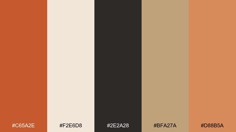
HEX: #C65A2E #F2E6D8 #2E2A28 #BFA27A #D88B5A
Mood: cozy, grounded, modern rustic
Best for: coffee shop branding and menu design
Cozy ember tones against oat neutrals feel like warm ceramics and toasted grain. Use it for cafe logos, menus, and loyalty cards where comfort matters. Pair the deep charcoal for type and outlines, and let the light cream carry the background. Tip: reserve the burnt hue for highlights like prices or call-to-action badges so the layout stays readable.
Image example of ember & oat generated using media.io
Media.io is an online AI studio for creating and editing video, image, and audio in your browser.

2) Desert Clay
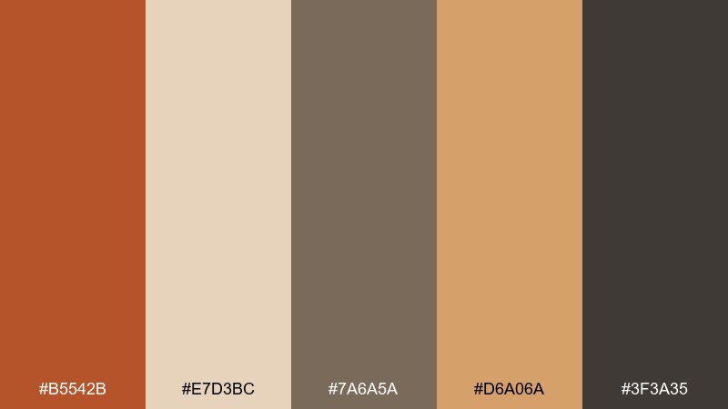
HEX: #B5542B #E7D3BC #7A6A5A #D6A06A #3F3A35
Mood: sunbaked, earthy, minimal
Best for: interior mood boards and boho decor
Sunbaked clay and sandy beige evoke adobe walls and late-afternoon heat. It works beautifully in interior mood boards, textile picks, and styling guides for warm spaces. Combine the muted taupe for large surfaces and keep the darker brown for contrast in furniture notes or captions. Tip: add texture like linen or matte plaster finishes to keep the palette from feeling flat.
Image example of desert clay generated using media.io
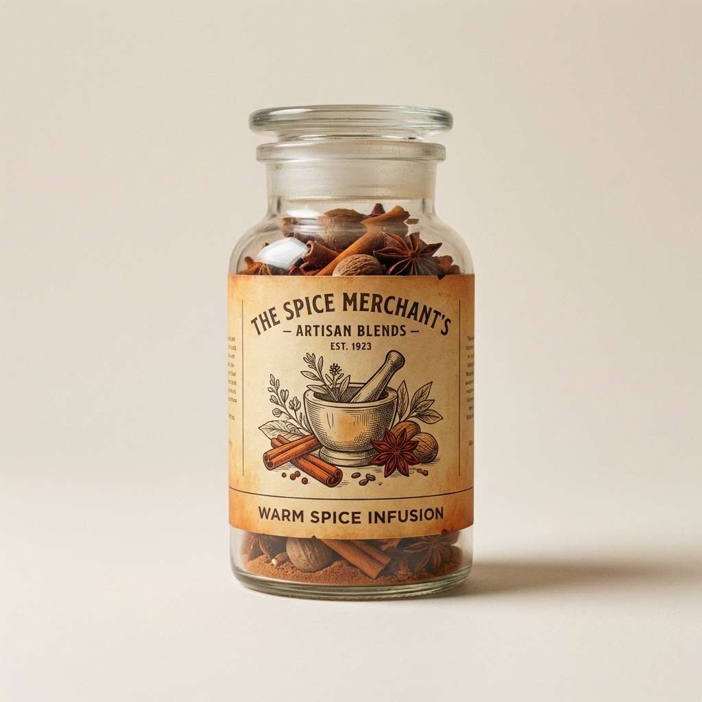
3) Vintage Spice

HEX: #CC5B3A #F6F0E8 #6B4F3A #A87C5B #2F2320
Mood: nostalgic, warm, handcrafted
Best for: artisan food labels and jar packaging
Nostalgic spice tones bring to mind old apothecary labels and wooden shelves. These burnt orange color combinations shine on craft food packaging, especially sauces, spice blends, and small-batch preserves. Use the soft off-white as the label base, then lean on the dark espresso for ingredient blocks and barcode areas. Tip: a subtle paper grain and serif headline will make the design feel authentically vintage.
Image example of vintage spice generated using media.io
4) Citrus Smoke
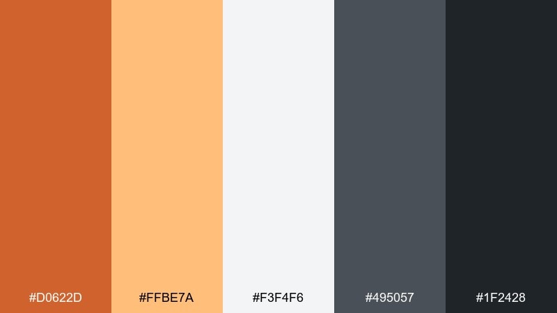
HEX: #D0622D #FFBE7A #F3F4F6 #495057 #1F2428
Mood: energetic, techy, high contrast
Best for: analytics dashboard UI and data highlights
Zesty orange with smoky grays feels like neon light cutting through a night cityscape. It is a strong fit for dashboards where status states and data points need instant focus. Keep light gray as the canvas, then use the bright citrus for active filters and key metrics. Tip: limit the saturated accent to one component type so the interface does not look noisy.
Image example of citrus smoke generated using media.io
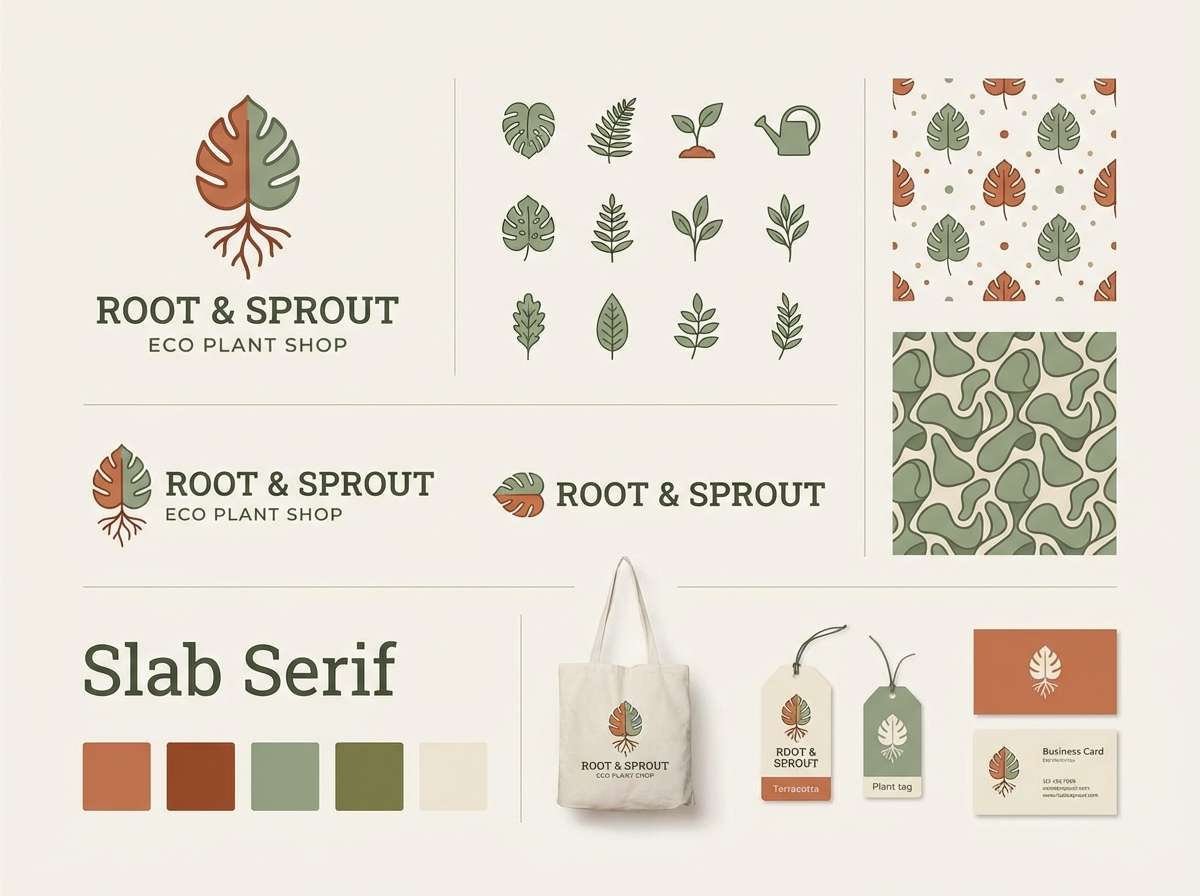
5) Terracotta Garden
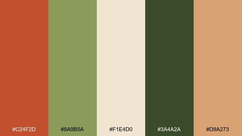
HEX: #C24F2D #8A9B5A #F1E4D0 #3A4A2A #D9A273
Mood: botanical, grounded, inviting
Best for: brand visuals for plant shops and eco products
Terracotta with soft greens evokes potted herbs on a sunny windowsill. It fits plant shop branding, sustainable product lines, and any identity that wants natural warmth without looking overly rustic. Let the cream tone handle whitespace, then use the olive and dark green for hierarchy and supporting copy. Tip: pair with hand-drawn leaf icons to reinforce the garden feel.
Image example of terracotta garden generated using media.io
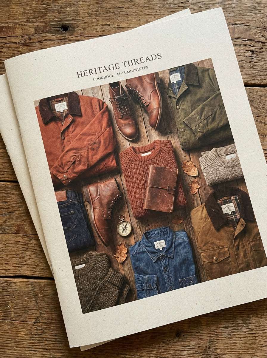
6) Rustic Leather
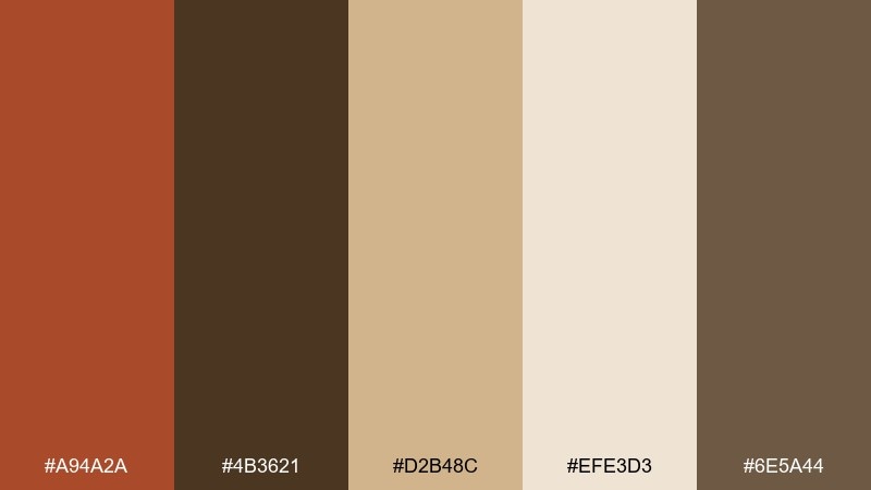
HEX: #A94A2A #4B3621 #D2B48C #EFE3D3 #6E5A44
Mood: heritage, rugged, premium
Best for: menswear lookbooks and outdoor gear branding
Rugged leather browns and warm rust tones feel like well-worn boots and vintage satchels. Use it for menswear lookbooks, outdoor gear branding, or premium craft goods that lean heritage. The tan and cream keep layouts breathable while the deep brown anchors headlines and logos. Tip: try matte finishes and subtle emboss effects to make the palette feel tactile.
Image example of rustic leather generated using media.io
7) Sunset Aperitif
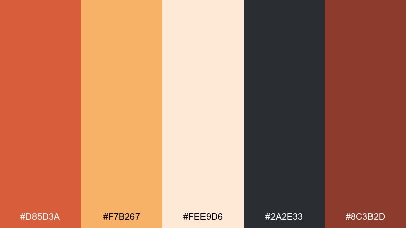
HEX: #D85D3A #F7B267 #FEE9D6 #2A2E33 #8C3B2D
Mood: playful, warm, social
Best for: cocktail bar posters and event promos
Aperitif oranges and soft peach feel like golden-hour drinks on a rooftop. It is ideal for bar posters, happy hour promos, and seasonal event graphics that should look upbeat yet refined. Use the pale peach as the background, then build contrast with charcoal type and a rich red-brown for secondary headings. Tip: add a thin border in the darker tone to frame the layout and keep it punchy.
Image example of sunset aperitif generated using media.io

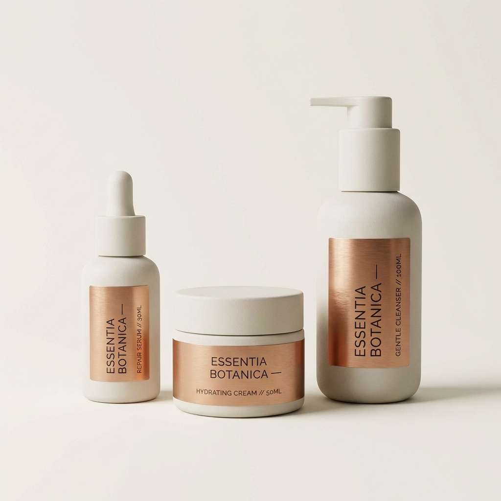
8) Copper Minimal
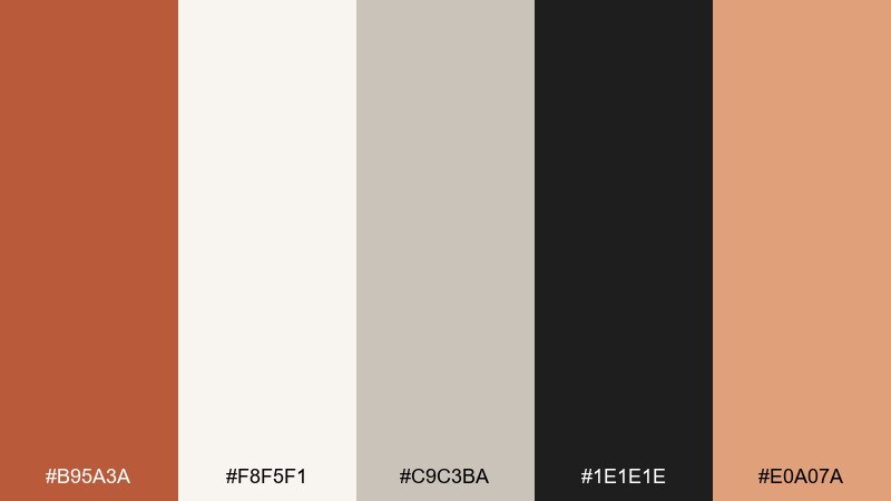
HEX: #B95A3A #F8F5F1 #C9C3BA #1E1E1E #E0A07A
Mood: clean, elevated, contemporary
Best for: beauty product packaging and landing pages
Polished copper on warm whites suggests sleek countertops and spa-like calm. These burnt orange color combinations work well for modern beauty packaging, skincare landing pages, and minimalist lifestyle brands. Keep the off-white dominant, use black for crisp typography, and add the copper tones as accents for buttons and seals. Tip: a touch of metallic foil on the primary accent will instantly lift perceived value.
Image example of copper minimal generated using media.io
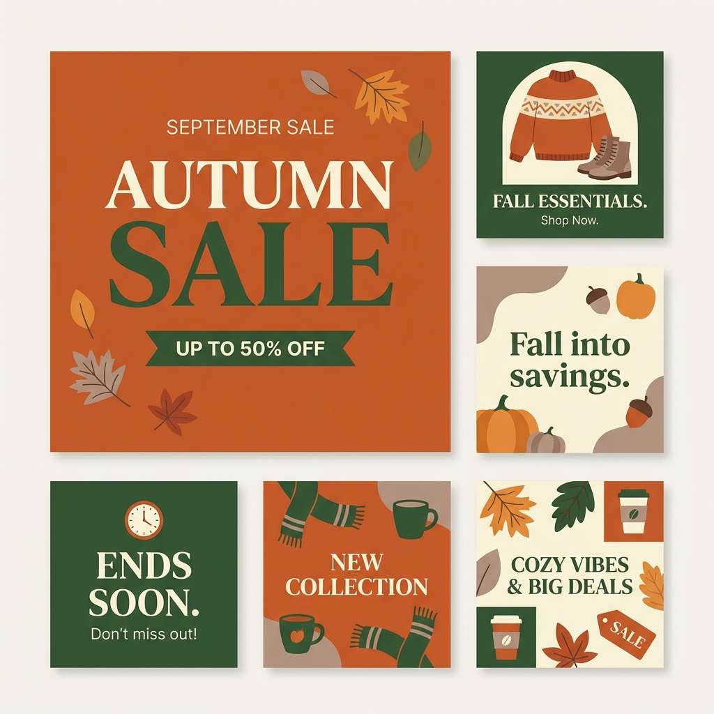
9) Autumn Plaid
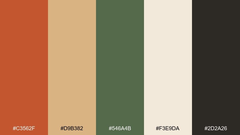
HEX: #C3562F #D9B382 #546A4B #F3E9DA #2D2A26
Mood: autumnal, cozy, outdoorsy
Best for: seasonal social media templates and promos
Warm rust, wheat, and forest green feel like plaid blankets and crunchy leaves. It is perfect for fall sale graphics, seasonal Instagram templates, and outdoor lifestyle content. Use the cream as the base, then alternate rust and green for headers and stickers while keeping dark text consistent. Tip: a simple check pattern in low contrast can add the plaid vibe without hurting readability.
Image example of autumn plaid generated using media.io
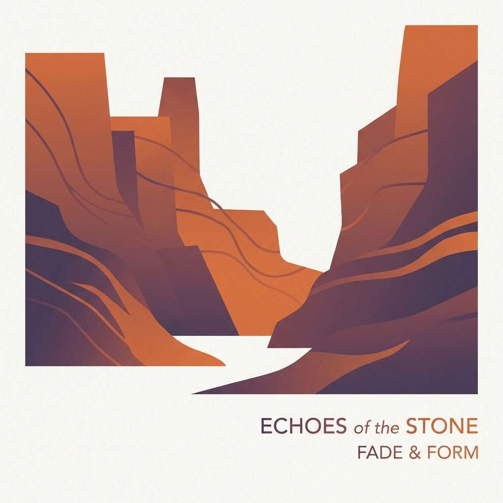
10) Canyon Dusk
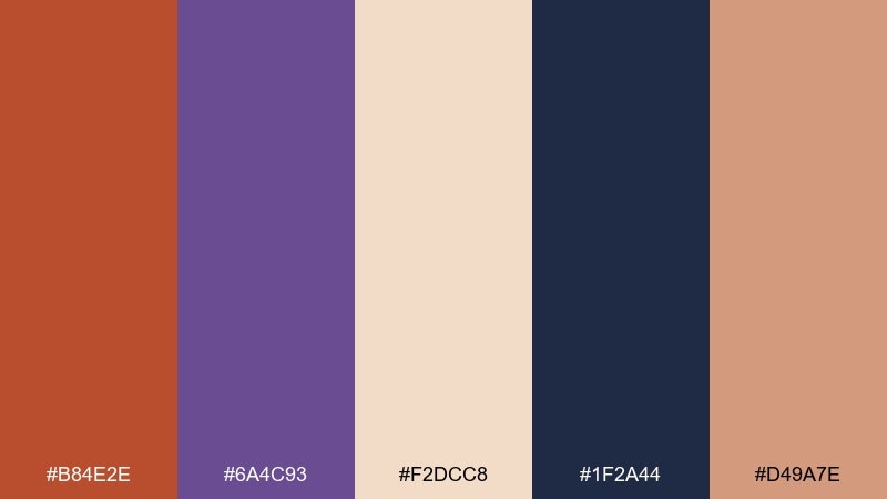
HEX: #B84E2E #6A4C93 #F2DCC8 #1F2A44 #D49A7E
Mood: moody, cinematic, bold
Best for: album covers and creative portfolio headers
Canyon rust with twilight purple feels dramatic, like distant cliffs under a fading sky. Use it for album art, hero headers, or portfolio sections where you want emotion and depth. Let the deep navy carry typography, and soften large blocks with the pale sand tone. Tip: gradients between rust and purple can create a cinematic glow without adding extra colors.
Image example of canyon dusk generated using media.io
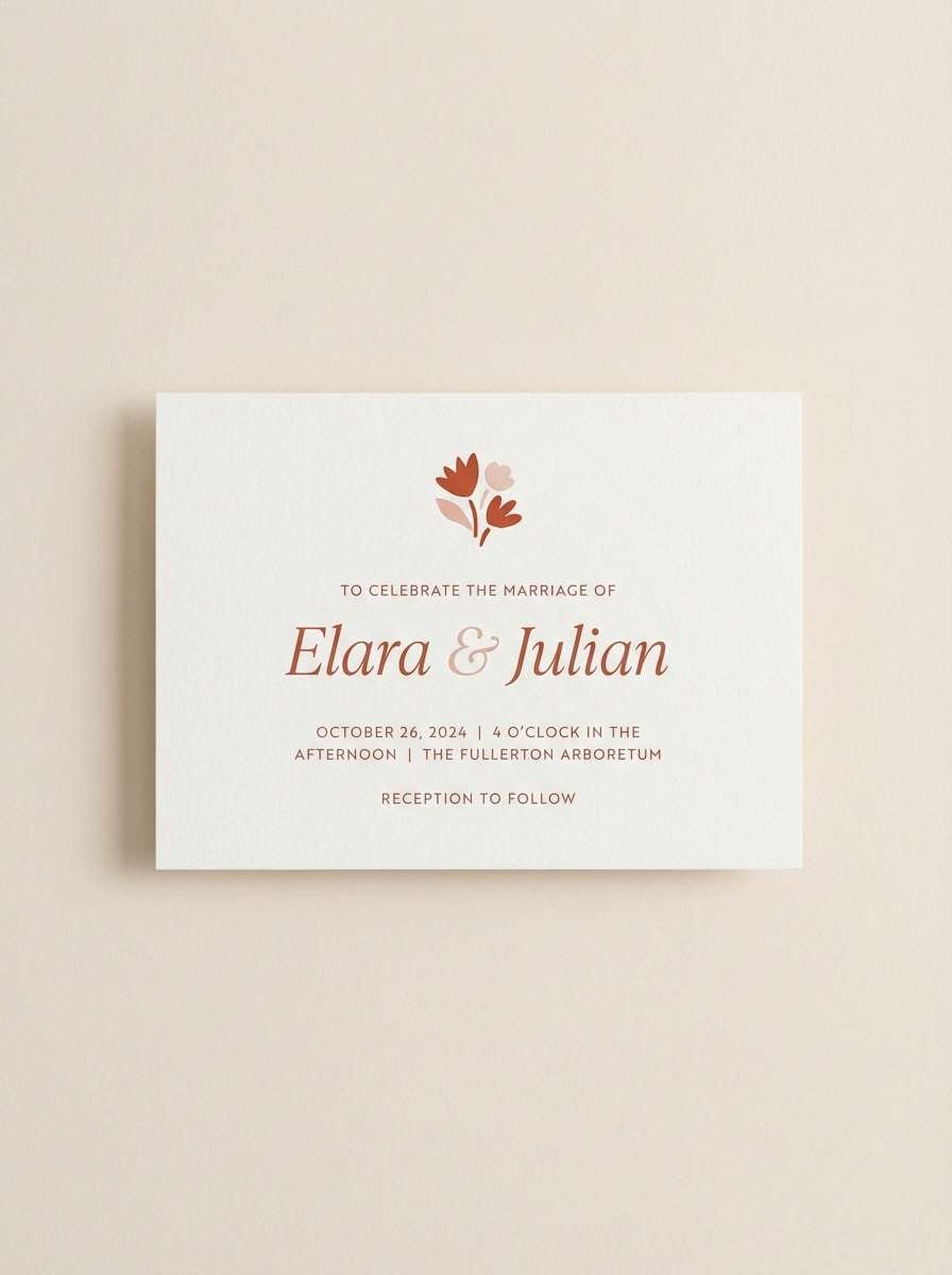
11) Paprika & Pearl
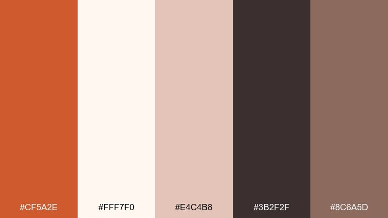
HEX: #CF5A2E #FFF7F0 #E4C4B8 #3B2F2F #8C6A5D
Mood: soft, romantic, warm neutral
Best for: wedding stationery and bridal shower invites
Paprika and pearly blush tones feel romantic, like dried florals and silk ribbon. It is a lovely choice for wedding stationery, bridal shower invites, and RSVP cards that need warmth without harsh contrast. Use the pearl white for the page, then set text in the deep cocoa for legibility. Tip: keep the accent to wax seals, monograms, or small dividers for an elegant finish.
Image example of paprika & pearl generated using media.io
12) Amber Workshop
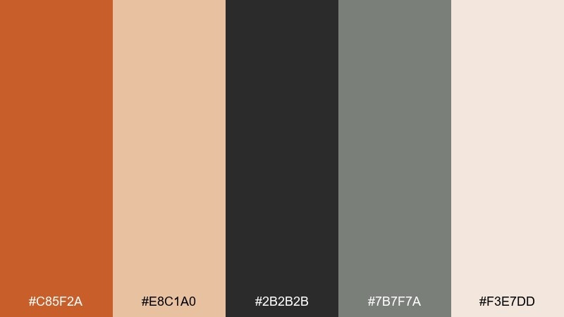
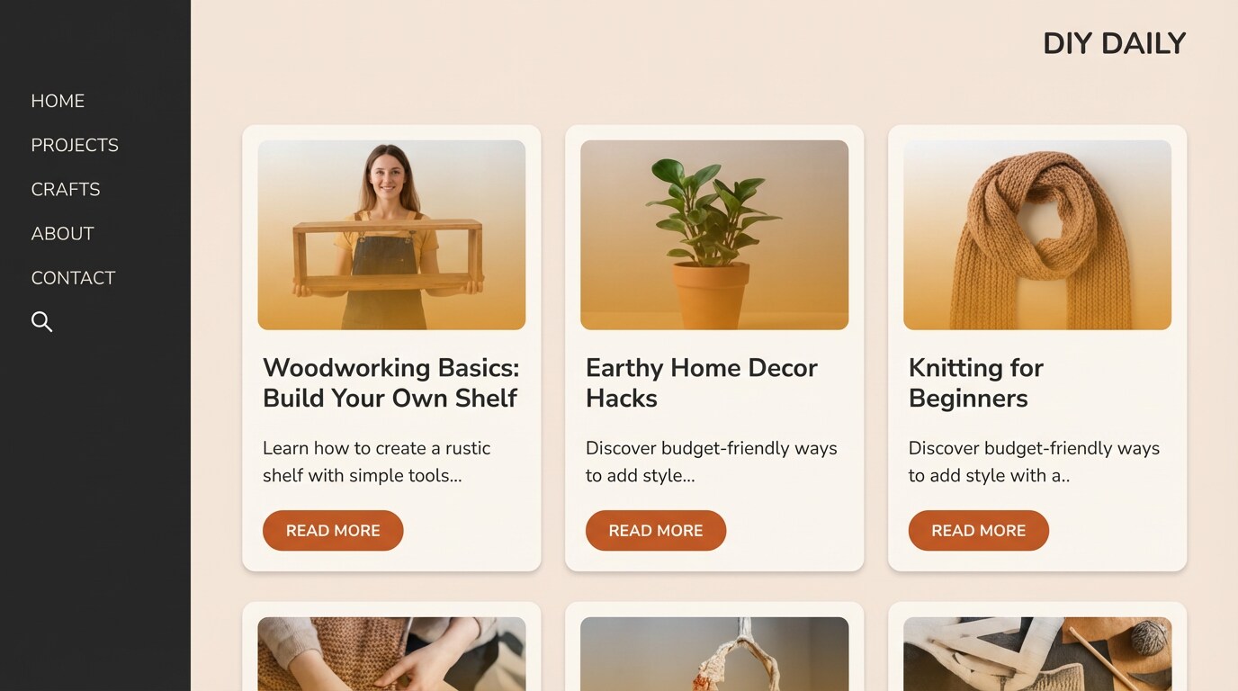
HEX: #C85F2A #E8C1A0 #2B2B2B #7B7F7A #F3E7DD
Mood: industrial, practical, confident
Best for: DIY blog UI and tool brand graphics
Amber and graphite tones evoke a well-lit workshop and fresh-cut wood. It fits DIY blog UI, how-to infographics, and tool brand graphics that need to look capable and no-nonsense. Use the warm off-white to keep pages bright, then lean on charcoal for headings and outlines. Tip: use the accent color only for steps, warnings, and key measurements so instructions scan fast.
Image example of amber workshop generated using media.io
13) Pumpkin Latte
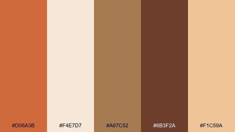
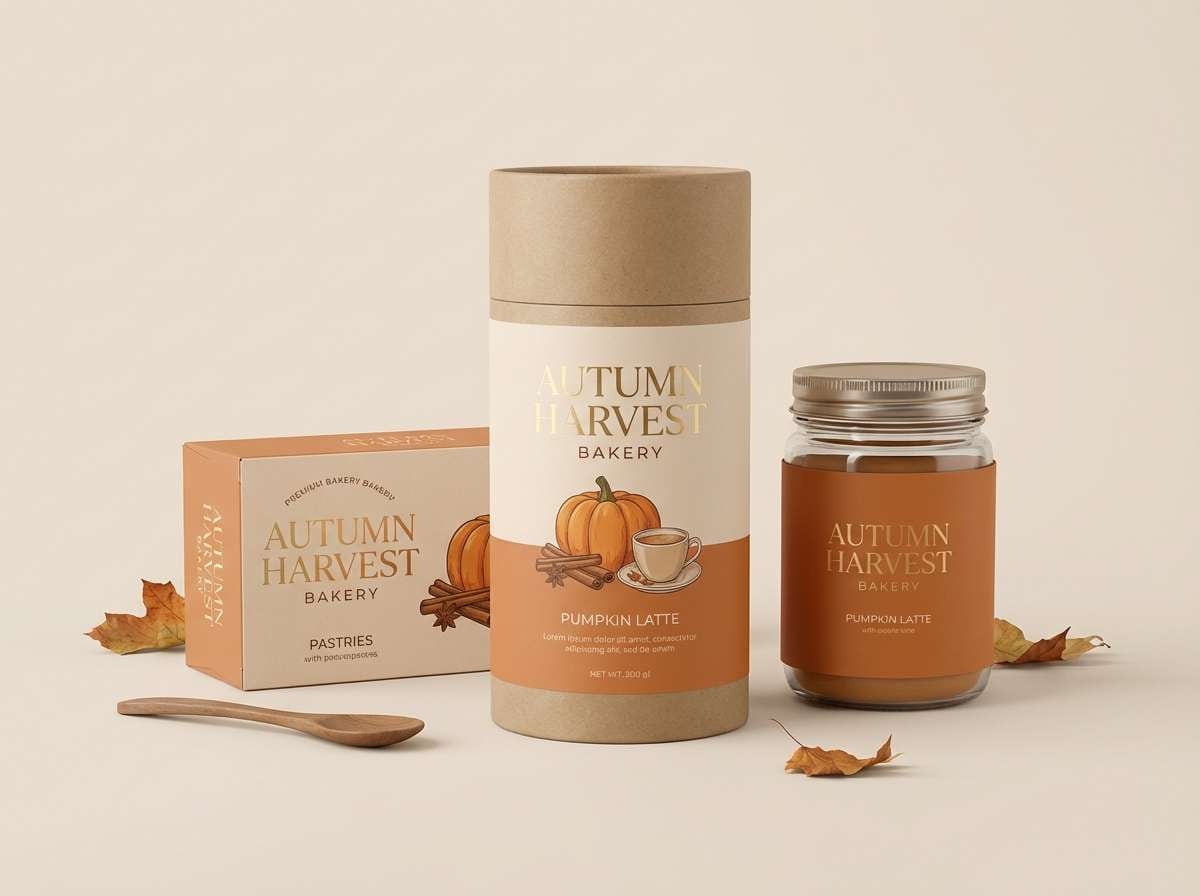
HEX: #D06A3B #F4E7D7 #A67C52 #6B3F2A #F1C59A
Mood: sweet, cozy, seasonal
Best for: bakery promos and autumn product ads
Creamy pumpkin and caramel browns feel like a frothy latte and cinnamon dust. Use it for bakery promos, seasonal product ads, and email banners where warmth should feel appetizing. The pale cream keeps copy readable while the deep mocha can frame headlines and pricing. Tip: add soft shadowed shapes behind text to mimic foam and make the layout extra inviting.
Image example of pumpkin latte generated using media.io
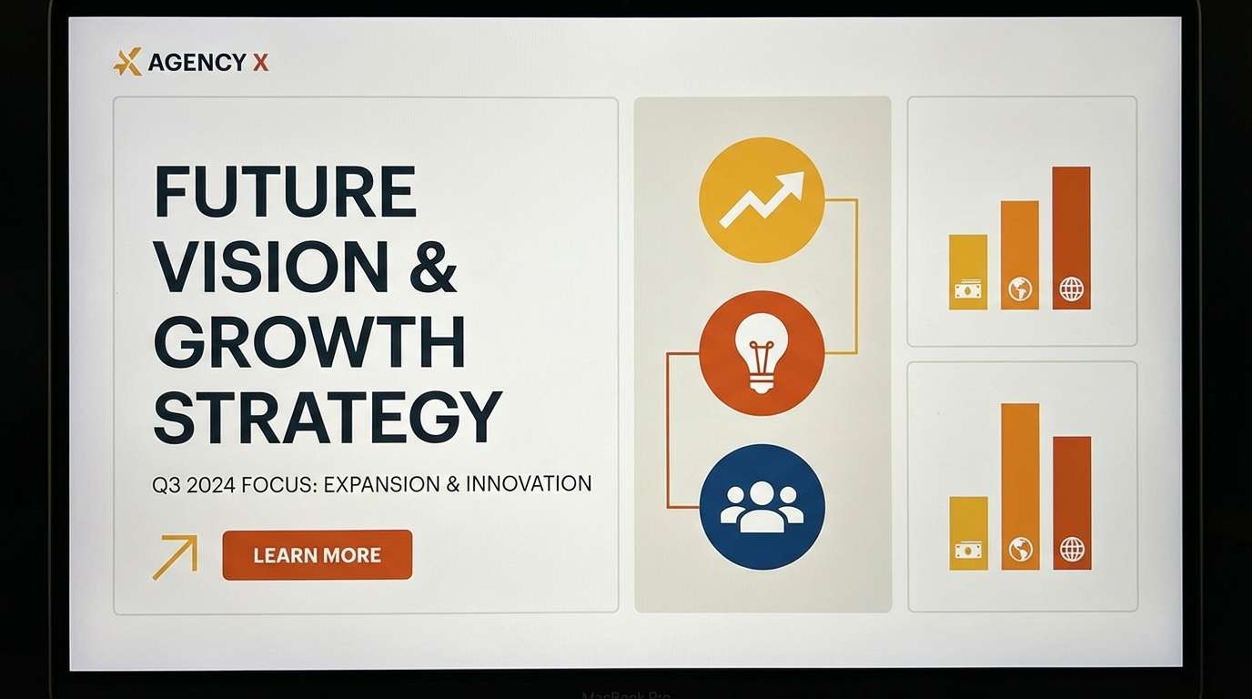
14) Saffron Studio
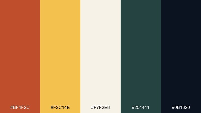
HEX: #BF4F2C #F2C14E #F7F2E8 #254441 #0B1320
Mood: creative, punchy, modern
Best for: design agency branding and pitch decks
Saffron yellow with deep green-blue feels like a bright studio lamp over a drafting table. It works for agency branding, pitch decks, and creative portfolios that need confident contrast. Keep the near-white as the slide base, then use the dark blue-black for text and the warm accents for callouts. Tip: use saffron for section headers and the rust tone for charts to create clear hierarchy.
Image example of saffron studio generated using media.io
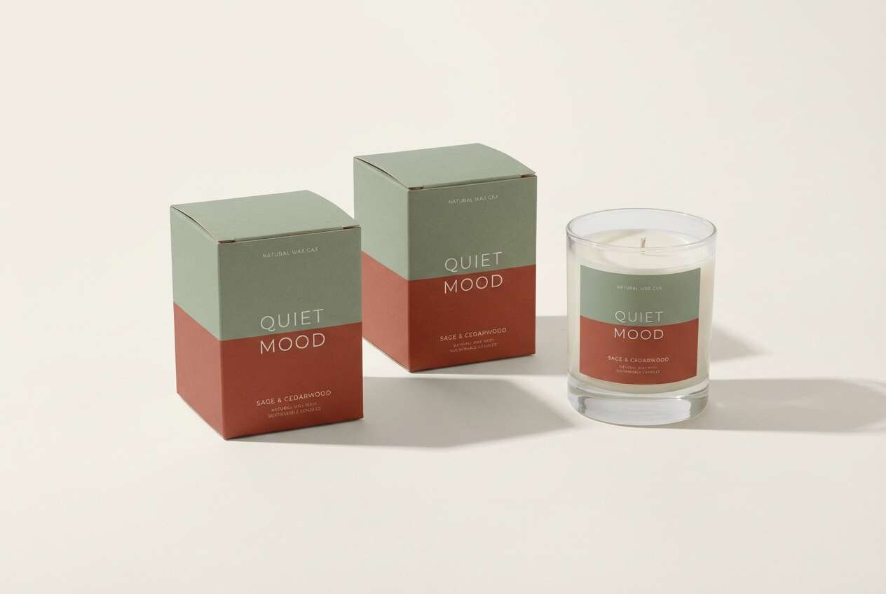
15) Brick & Sage
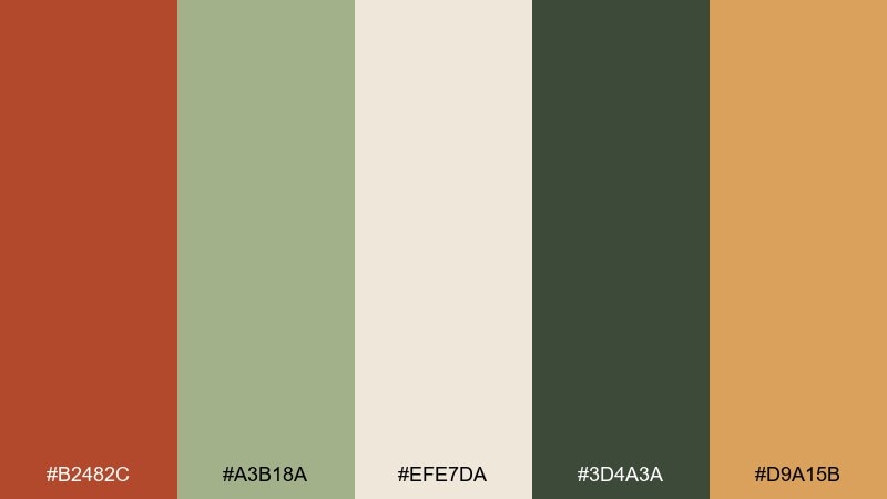
HEX: #B2482C #A3B18A #EFE7DA #3D4A3A #D9A15B
Mood: calm, natural, balanced
Best for: wellness brands and mindful packaging
Brick warmth paired with sage green feels steady and restorative, like a quiet garden path. It suits wellness brands, candle labels, and mindful packaging where you want warmth without shouting. Use the soft beige as the main field, then set typography in the dark green for a natural, readable contrast. Tip: keep the orange as a small accent stripe or seal to maintain a calm overall look.
Image example of brick & sage generated using media.io
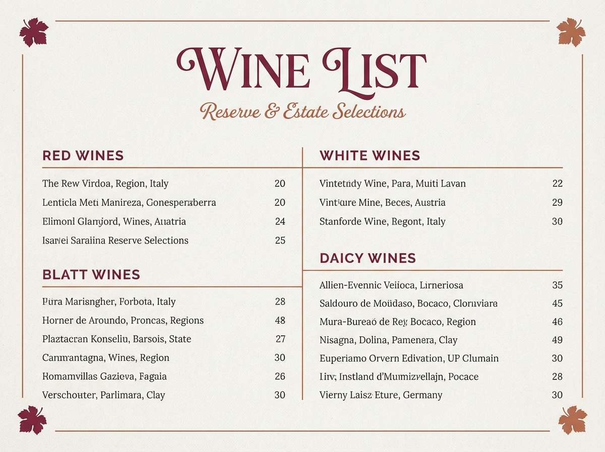
16) Marsala Heat
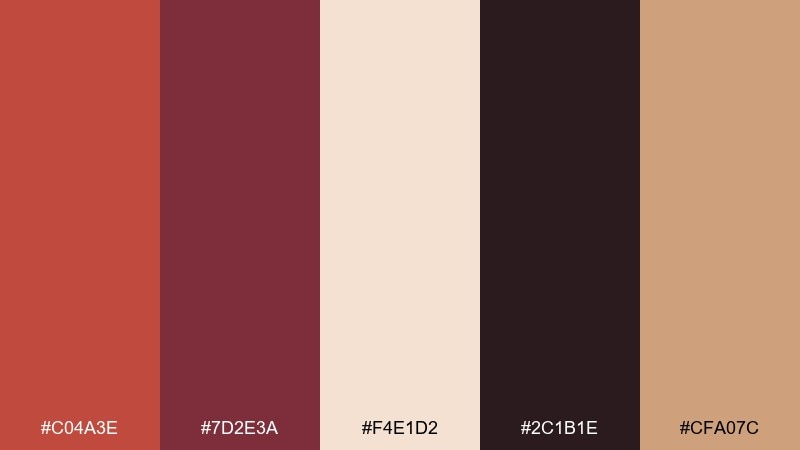
HEX: #C04A3E #7D2E3A #F4E1D2 #2C1B1E #CFA07C
Mood: dramatic, luxe, intimate
Best for: restaurant branding and wine menus
Deep marsala and warm clay feel intimate, like candlelight over a red velvet booth. Use it for restaurant branding, wine menus, and tasting events that need a luxurious mood. Let the pale beige handle negative space, then use the near-black for body text and the burgundy for section breaks. Tip: a thin line system in the warm taupe keeps layouts elegant and structured.
Image example of marsala heat generated using media.io
17) Burnished Wood
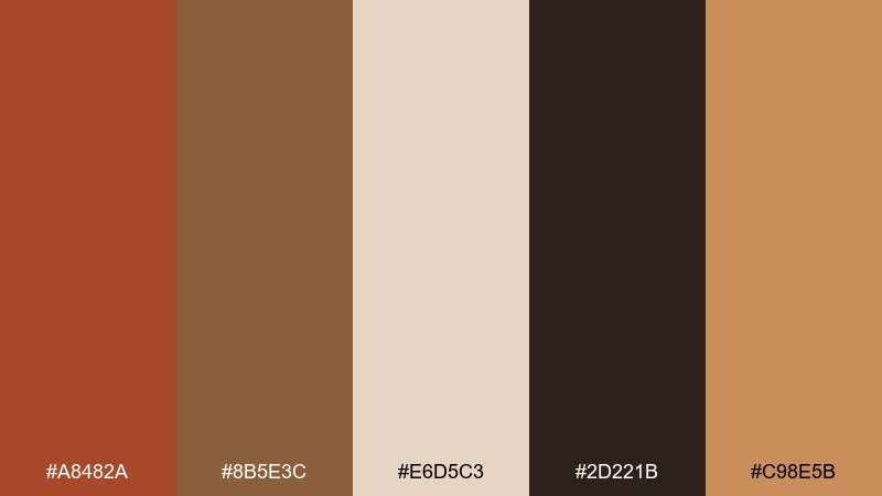
HEX: #A8482A #8B5E3C #E6D5C3 #2D221B #C98E5B
Mood: warm, classic, artisanal
Best for: handmade craft stores and Etsy banners
Burnished browns and warm rust tones suggest carved wood and hand-finished details. It is great for handmade craft stores, Etsy banners, and workshop signage where authenticity matters. Keep the light tan as your base and use the dark brown for text to ensure strong contrast. Tip: use the mid caramel tone for button fills so the primary accent stays reserved for special callouts.
Image example of burnished wood generated using media.io
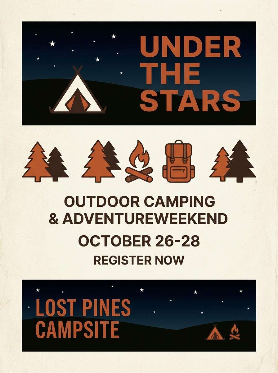
18) Campfire Night
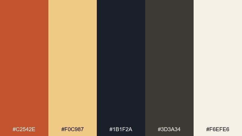
HEX: #C2542E #F0C987 #1B1F2A #3D3A34 #F6EFE6
Mood: adventurous, cozy, high contrast
Best for: outdoor event flyers and camping brands
Glowing embers against midnight tones feel like a campfire cracking under a starry sky. This burnt orange color palette is ideal for outdoor event flyers, camping brands, and adventure newsletters. Use the off-white for body text blocks, then lean on the deep night blue for backgrounds and section panels. Tip: keep the ember accent for icons and key dates so the layout stays punchy and legible.
Image example of campfire night generated using media.io
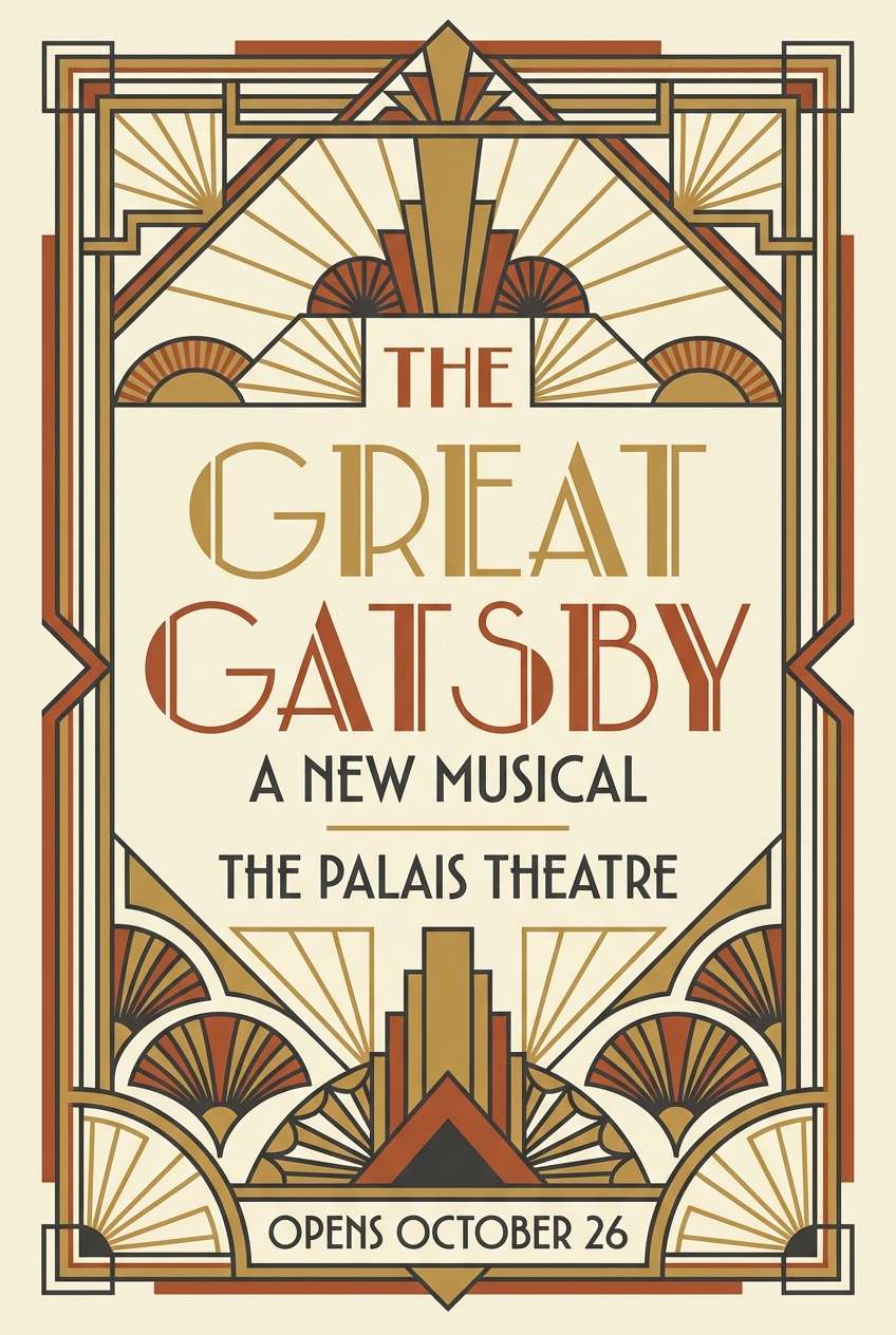
19) Art Deco Rust
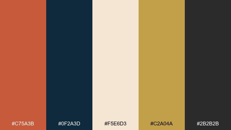
HEX: #C75A3B #0F2A3D #F5E6D3 #C2A04A #2B2B2B
Mood: glam, structured, vintage-modern
Best for: theater posters and gala invitations
Rust, gold, and deep blue feel glamorous, like an Art Deco lobby with brass details. It is perfect for theater posters, gala invitations, and editorial covers that want structure and drama. Use the cream as the base, then build geometric accents with gold and rust while keeping type mostly dark. Tip: stick to symmetrical layouts and thin linework to sell the Deco vibe.
Image example of art deco rust generated using media.io
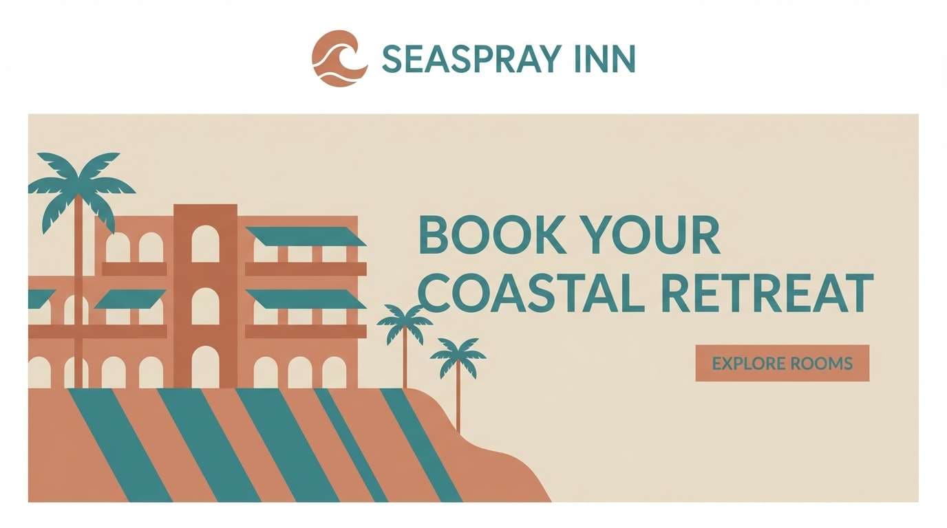
20) Clay Coast
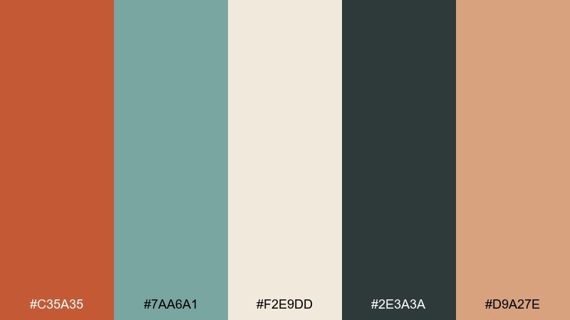
HEX: #C35A35 #7AA6A1 #F2E9DD #2E3A3A #D9A27E
Mood: fresh, airy, coastal earthy
Best for: travel blogs and boutique hotel branding
Coastal teal with soft clay tones feels like a seaside town with terracotta roofs. Use it for travel blogs, boutique hotel branding, and guidebook layouts that need both warmth and freshness. Let the light sand color handle backgrounds, and use the deep slate for readable text and navigation. Tip: keep teal for secondary accents like links and icons so the warm clay stays the hero.
Image example of clay coast generated using media.io
What Colors Go Well with Burnt Orange?
Burnt orange pairs effortlessly with warm neutrals like cream, oat, sand, camel, and taupe—these keep the palette cohesive and soft. Add dark anchors like charcoal, espresso, or deep navy to ensure readable typography and clear hierarchy.
For a nature-forward look, mix burnt orange with greens (sage, olive, forest). For a more modern, cinematic vibe, use cool contrast like slate, steel gray, or deep blue—burnt orange pops more when the background is cooler and darker.
If you want a richer, more luxurious direction, try pairing burnt orange with burgundy/marsala or muted gold. Keep saturation controlled so the palette stays refined instead of loud.
How to Use a Burnt Orange Color Palette in Real Designs
Start with roles: pick a light neutral for backgrounds, a dark shade for text, and reserve burnt orange as your primary accent. This keeps layouts clean while still delivering warmth and personality.
In branding and packaging, burnt orange works best in small high-impact areas—seals, badges, icons, and key highlights—while creams and browns carry the bulk of the surface. In UI, use it for one component family (CTAs, active states, or data highlights) to avoid visual noise.
For print and interiors, texture matters: matte paper, linen, wood grain, or plaster finishes make burnt orange feel more natural. When in doubt, increase contrast (darker text, lighter background) and reduce saturation for a premium look.
Create Burnt Orange Palette Visuals with AI
If you already have hex codes, you can generate on-brand visuals quickly by describing the layout, style, and mood—then letting AI render variations. This is ideal for mood boards, poster mockups, packaging concepts, and UI hero images.
To stay consistent, reuse the same palette across prompts and specify where each color should appear (background, typography, accents). You’ll get cleaner outputs and faster iterations.
Burnt Orange Color Palette FAQs
-
What is the hex code for burnt orange?
Burnt orange isn’t a single fixed hex, but common burnt orange hex codes include #C65A2E, #D0622D, and #B5542B. The “burnt” feel usually comes from adding brown/earthy undertones (lower brightness, warmer hue). -
Is burnt orange the same as terracotta or rust?
They’re related but not identical. Terracotta tends to be clay-like and slightly softer; rust often leans deeper and browner. Burnt orange sits between them—orange-forward but muted and earthy. -
What colors complement burnt orange?
Great complements include cream/off-white, charcoal, navy, slate gray, and blue-green tones (teal). For nature palettes, pair burnt orange with sage/olive/forest greens. -
Does burnt orange work for branding?
Yes—burnt orange is popular for brands that want warmth, craft, and approachability (food, cafes, outdoor, handmade goods). Balance it with neutrals and a strong dark text color to keep the identity readable and modern. -
How do I make burnt orange look modern in UI design?
Use a light neutral canvas (e.g., #F3F4F6 or warm off-white), anchor typography with charcoal/near-black, and limit burnt orange to key UI states (primary buttons, active tabs, or data highlights) for a clean hierarchy. -
What’s the best background color for burnt orange?
Warm whites and creams create a soft, editorial look, while charcoal/navy backgrounds create high-contrast, cinematic energy. Choose based on whether you want “cozy and airy” or “bold and dramatic.” -
How many colors should a burnt orange palette have?
For most projects, 5 colors is ideal: 1 background neutral, 1 dark text/anchor, 1 primary burnt orange, plus 2 supporting tones (a mid neutral and a secondary accent like green, gold, or peach).


