

Beige green is the sweet spot between warm neutrals and natural greens, giving your designs a calm, modern, lived-in feel. It’s especially effective when you want “earthy” without going dark or rustic.
Below are 20+ curated beige green color palette ideas with HEX codes, plus quick tips for interiors, branding, and UI. You’ll also find AI prompts you can reuse to generate matching visuals.
In this article
- Why Beige Green Palettes Work So Well
-
- sandalwood sage
- linen fern
- mossy canvas
- eucalyptus oat
- olive drift
- desert aloe
- pebble basil
- vintage meadow
- clay sprout
- seafoam suede
- tea garden
- pistachio parchment
- woodland latte
- soft khaki mint
- herb bouquet
- stoneleaf minimal
- garden studio
- terracotta leaflight
- spring terrace
- gallery sagewash
- cottage conservatory
- modern safari
- What Colors Go Well with Beige Green?
- How to Use a Beige Green Color Palette in Real Designs
- Create Beige Green Palette Visuals with AI
Why Beige Green Palettes Work So Well
Beige green palettes balance comfort and clarity: beige adds warmth and light, while green brings a grounded, nature-led structure. Together, they create a look that feels modern but not cold.
They’re also flexible across mediums. In interiors, they read as calm and livable; in branding, they communicate trust and sustainability; in UI, they keep screens soft while still offering clear hierarchy.
Most beige greens sit in low-to-mid saturation, which makes them easy to pair with textures (paper, linen, wood) and with high-contrast typography. That’s why they’re a go-to for “quiet luxury” and eco-inspired design.
20+ Beige Green Color Palette Ideas (with HEX Codes)
1) Sandalwood Sage
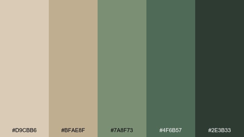
HEX: #D9CBB6 #BFAE8F #7A8F73 #4F6B57 #2E3B33
Mood: grounded, warm, natural
Best for: Scandinavian living room styling
Grounded and warm, these tones feel like sunlit wood, dried grasses, and soft sage leaves. Use it for cozy interiors with light oak, linen upholstery, and matte black hardware. Keep walls in the light beige, then layer greens through textiles and plants for depth. Tip: repeat the darkest green in small accents like frames or lamp bases to anchor the room.
Image example of sandalwood sage generated using media.io
Media.io is an online AI studio for creating and editing video, image, and audio in your browser.

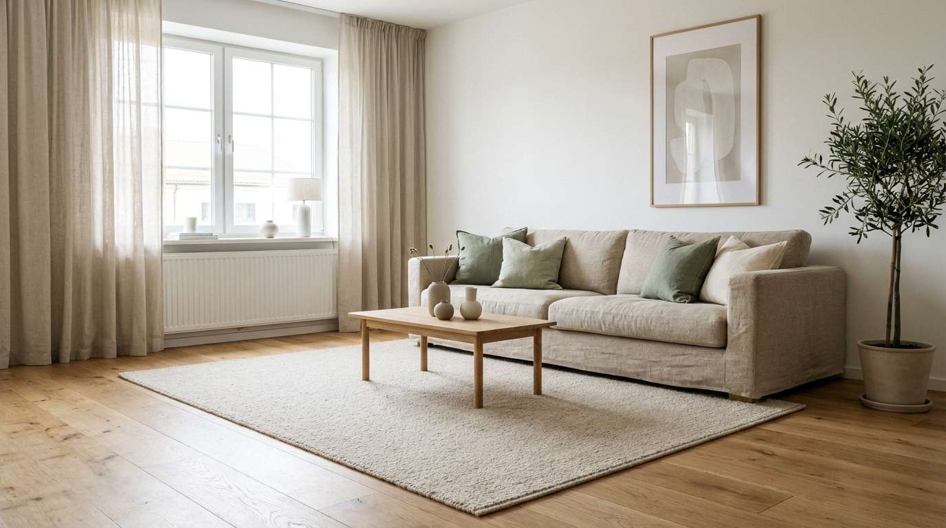
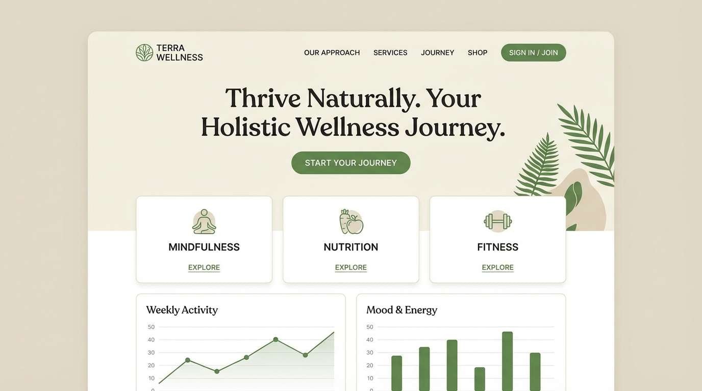
2) Linen Fern
HEX: #EFE6D8 #D2C2A8 #A8B8A2 #6E8A6A #3E5A45
Mood: airy, fresh, relaxed
Best for: Wellness brand landing page UI
Airy and fresh, it reads like clean linens and a fern-filled morning. The pale neutrals keep layouts spacious, while mid greens guide attention without shouting. Pair with rounded sans-serif type and plenty of white space for a modern wellness feel. Tip: reserve the deepest green for primary buttons to maintain a calm hierarchy.
Image example of linen fern generated using media.io
3) Mossy Canvas
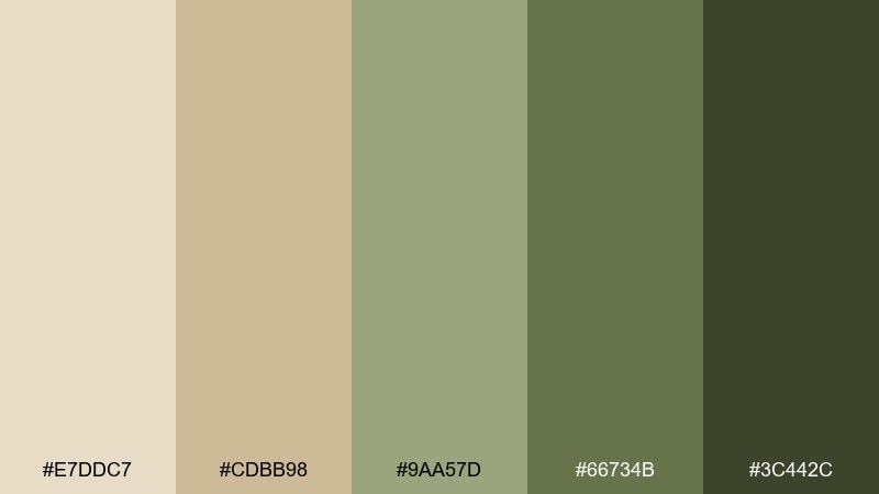
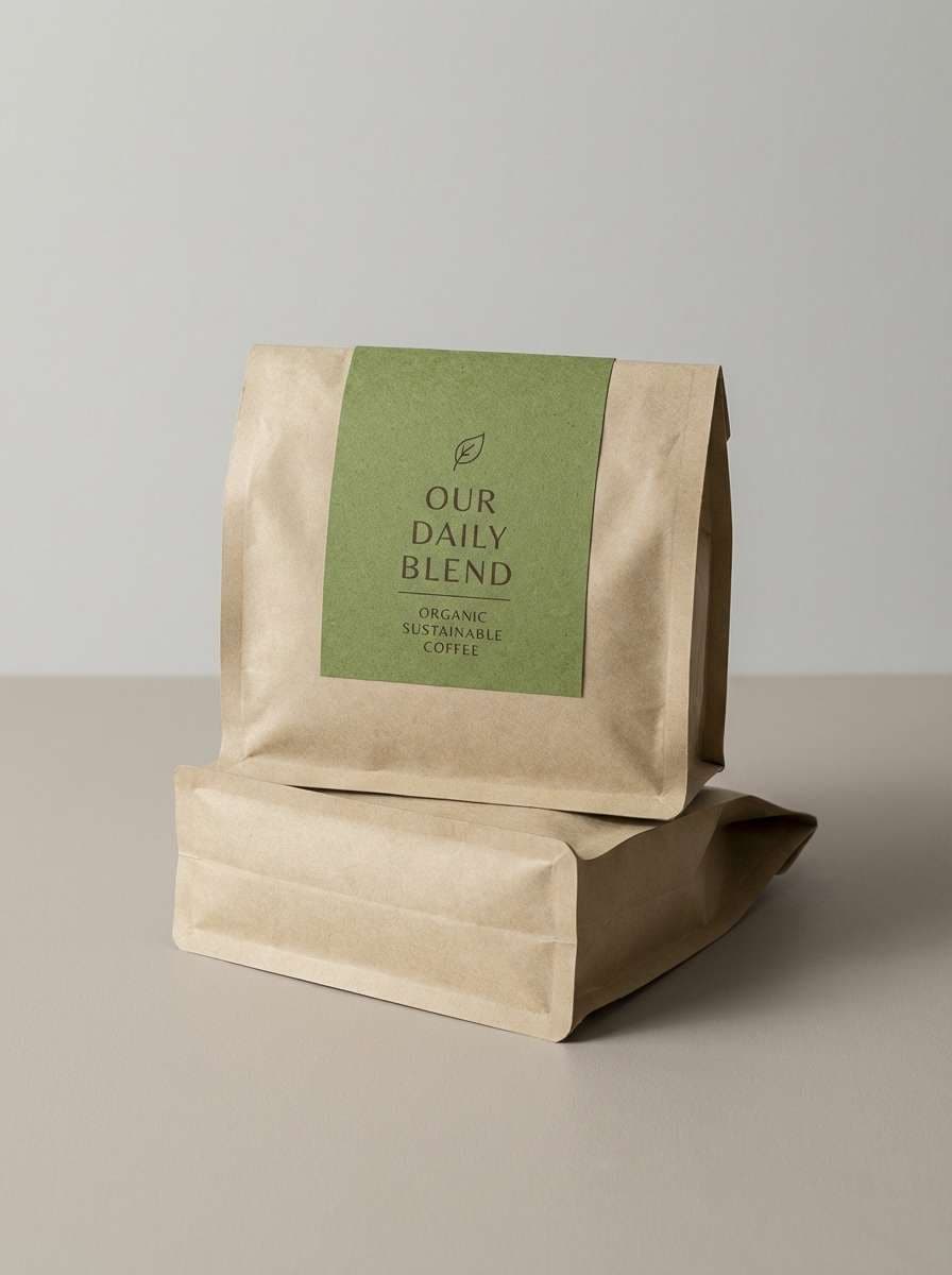
HEX: #E7DDC7 #CDBB98 #9AA57D #66734B #3C442C
Mood: rustic, muted, outdoorsy
Best for: Eco-friendly coffee packaging
Rustic and muted, it evokes canvas totes, mossy stones, and shaded trails. This beige green color palette suits sustainable packaging where you want earthy credibility without looking dull. Pair it with kraft paper textures and simple iconography for a handcrafted vibe. Tip: print the light beige as a matte base and use olive tones for labels to improve shelf readability.
Image example of mossy canvas generated using media.io
4) Eucalyptus Oat
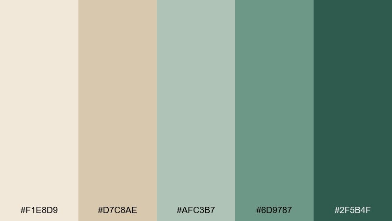
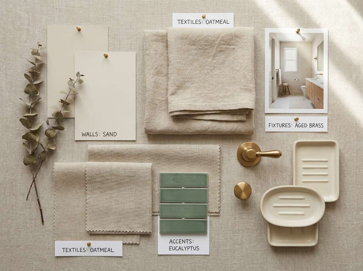
HEX: #F1E8D9 #D7C8AE #AFC3B7 #6D9787 #2F5B4F
Mood: spa-like, clean, soothing
Best for: Bathroom remodel mood board
Spa-like and soothing, these hues suggest eucalyptus stems against warm oat textiles. Use the pale tones for tile and paint, then bring in green through cabinetry, towels, or plants. Brass fixtures and light walnut add warmth without fighting the cool greens. Tip: keep grout and trims in the lightest beige to maintain a seamless, airy look.
Image example of eucalyptus oat generated using media.io
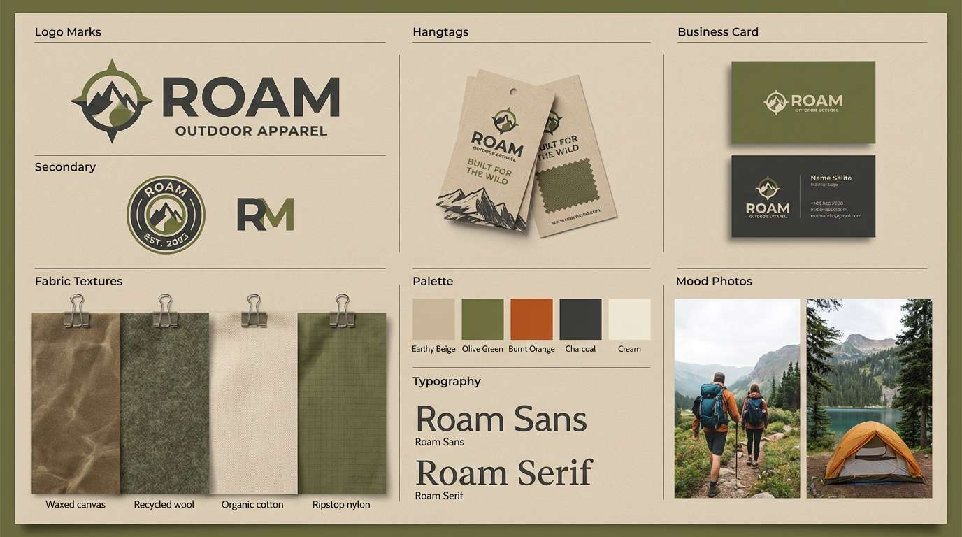
5) Olive Drift
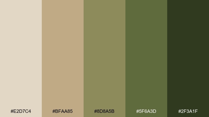
HEX: #E2D7C4 #BFAA85 #8D8A5B #5F6A3D #2F3A1F
Mood: heritage, earthy, confident
Best for: Outdoor apparel brand identity
Heritage and confident, it feels like worn leather, field jackets, and dry earth. These beige green color combinations work well for outdoorsy branding where you want durability and trust. Pair with serif headlines and textured photography to amplify the classic feel. Tip: keep the logo in the darkest olive and let the lighter beiges handle backgrounds and hangtags.
Image example of olive drift generated using media.io
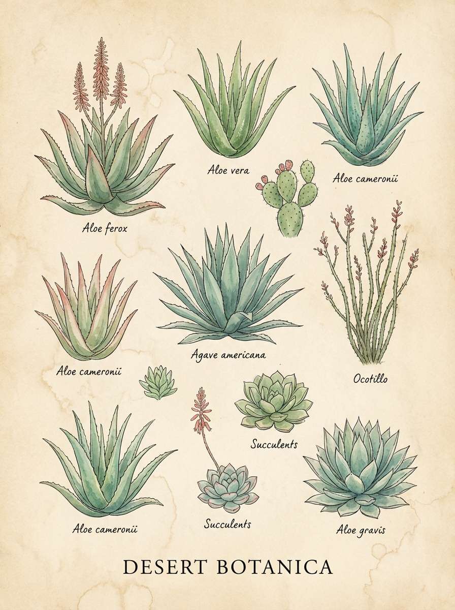
6) Desert Aloe
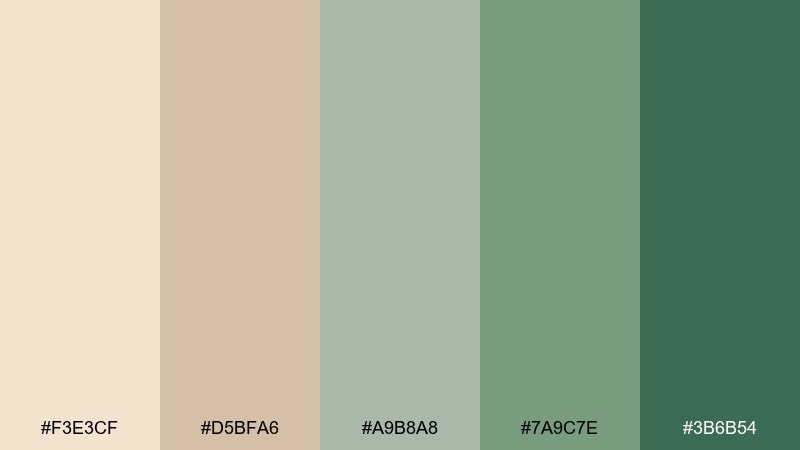
HEX: #F3E3CF #D5BFA6 #A9B8A8 #7A9C7E #3B6B54
Mood: sun-warmed, calm, botanical
Best for: Watercolor botanical poster
Sun-warmed and calm, it brings to mind desert light hitting aloe and dried florals. The soft beige keeps the look gentle, while cooler greens add a clean botanical note. Pair with off-white paper texture and delicate line work for an art-print feel. Tip: use the darkest green sparingly for outlines so the watercolor washes stay airy.
Image example of desert aloe generated using media.io
7) Pebble Basil
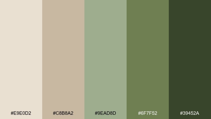
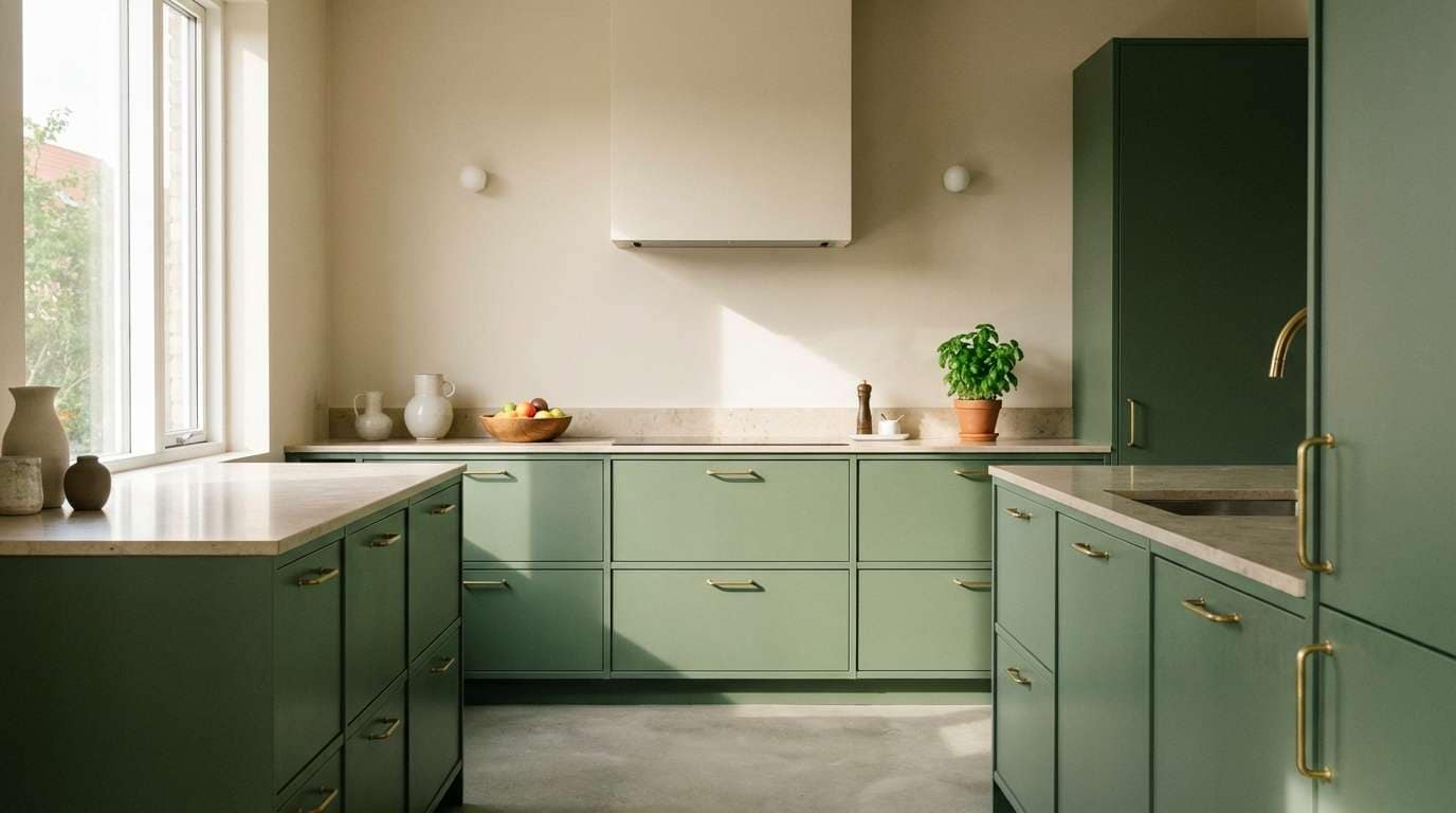
HEX: #E9E0D2 #C8B8A2 #9EAD8D #6F7F52 #39452A
Mood: quiet, practical, balanced
Best for: Kitchen cabinet and countertop pairing
Quiet and balanced, it resembles smooth pebbles with fresh basil tucked beside them. Use the lighter neutrals for counters, backsplash, and walls to keep the room bright. Bring the greens into cabinets or island paint for a grounded center. Tip: choose brushed nickel or stainless hardware to keep the palette feeling crisp.
Image example of pebble basil generated using media.io
8) Vintage Meadow
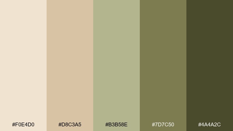
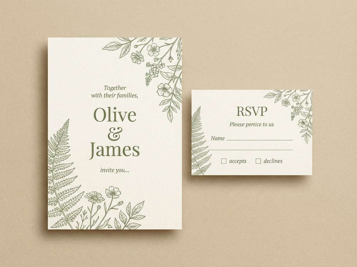
HEX: #F0E4D0 #D8C3A5 #B3B58E #7D7C50 #4A4A2C
Mood: nostalgic, soft, pastoral
Best for: Wedding invitation suite
Nostalgic and pastoral, these colors feel like pressed flowers in an old book. The warm beige makes a flattering paper base, while muted meadow greens add gentle contrast. Pair with elegant serif type and fine botanical flourishes for a timeless suite. Tip: use the darker olive for names and headings to keep readability high on textured stock.
Image example of vintage meadow generated using media.io
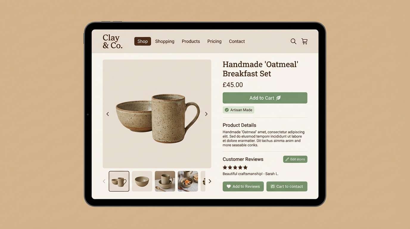
9) Clay Sprout
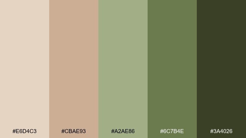
HEX: #E6D4C3 #CBAE93 #A2AE86 #6C7B4E #3A4026
Mood: artisan, earthy, lively
Best for: Handmade ceramics product page
Artisan and earthy, it looks like clay dust next to new sprouts. This beige green color combination shines in product pages where you want warmth without losing clarity. Pair it with large product photography and minimal UI chrome so the textures do the talking. Tip: set the background to the light clay tone and use the mid green for price tags and badges.
Image example of clay sprout generated using media.io
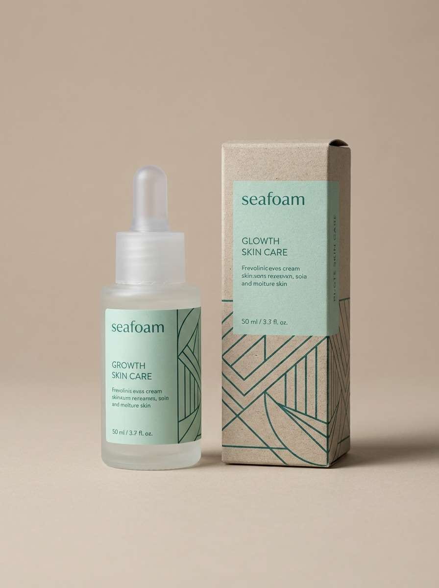
10) Seafoam Suede
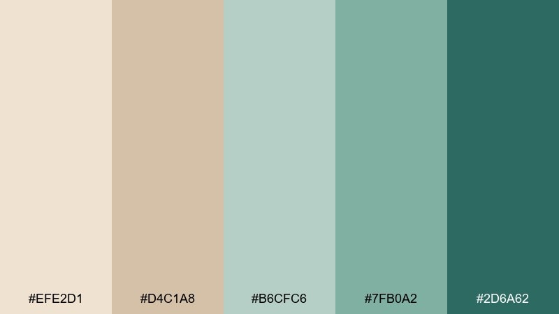
HEX: #EFE2D1 #D4C1A8 #B6CFC6 #7FB0A2 #2D6A62
Mood: coastal, polished, refreshing
Best for: Skincare product ad
Polished and refreshing, it mixes seafoam air with a soft suede warmth. Use the pale beige for breathing room, then let the aqua greens signal cleanliness and hydration. Pair with glossy product renders, thin line icons, and minimal copy for a premium look. Tip: keep the deepest teal-green only for the product name and key claims to avoid visual noise.
Image example of seafoam suede generated using media.io
11) Tea Garden
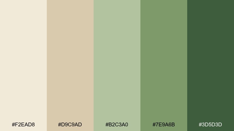
HEX: #F2EAD8 #D9C9AD #B2C3A0 #7E9A6B #3D5D3D
Mood: gentle, inviting, organic
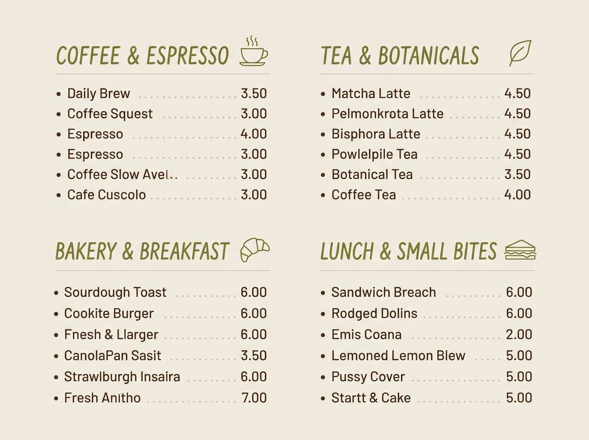
Best for: Cafe menu design
Gentle and inviting, it feels like a quiet tea garden with dappled shade. The creamy beige works as a menu background, while leafier greens make sections easy to scan. Pair with hand-drawn icons and a mix of serif headings with simple body text. Tip: use one green for category headers and another for callouts like seasonal specials to keep structure clear.
Image example of tea garden generated using media.io
12) Pistachio Parchment
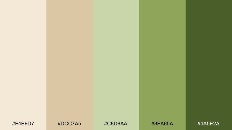
HEX: #F4E9D7 #DCC7A5 #C8D6AA #8FA65A #4A5E2A
Mood: cheerful, light, natural
Best for: Spring sale poster
Cheerful and light, it suggests pistachio cream on warm parchment paper. The soft greens feel friendly for promotions without turning neon, especially against creamy neutrals. Pair with bold sans-serif headlines and plenty of margin so the design stays upscale. Tip: put discount numbers in the brighter green and keep supporting text in the darker olive for contrast.
Image example of pistachio parchment generated using media.io

13) Woodland Latte
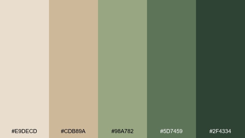
HEX: #E9DECD #CDB89A #98A782 #5D7459 #2F4334
Mood: cozy, mature, outdoorsy
Best for: Book cover for nature essays
Cozy and mature, it feels like a latte in a cabin with pine trees outside. This beige green color palette is strong for book covers where you want a natural theme with literary restraint. Pair with a bold title in dark forest green and subtle grainy textures to add depth. Tip: keep the mid green for secondary text so the hierarchy stays clear at thumbnail size.
Image example of woodland latte generated using media.io
14) Soft Khaki Mint
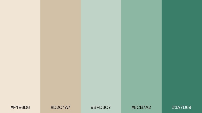
HEX: #F1E6D6 #D2C1A7 #BFD3C7 #8CB7A2 #3A7D69
Mood: modern, clean, calming
Best for: Mobile app onboarding UI
Modern and calming, it combines soft khaki warmth with a minty lift. The pale neutrals reduce glare, while the cooler greens signal progress and reassurance. Pair with simple illustrations and subtle gradients to keep onboarding screens friendly. Tip: use the teal-green only for the active step and primary CTA to avoid competing highlights.
Image example of soft khaki mint generated using media.io
15) Herb Bouquet
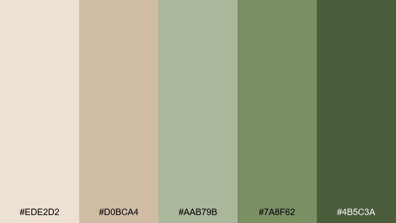
HEX: #EDE2D2 #D0BCA4 #AAB79B #7A8F62 #4B5C3A
Mood: homey, rustic, comforting
Best for: Farm-to-table restaurant branding
Homey and comforting, it evokes dried herbs tied in a bundle and warm stoneware plates. A balanced beige green color scheme like this supports logos, menus, and signage without overwhelming food photography. Pair with textured paper, stamped marks, and a restrained typography system. Tip: keep backgrounds light and reserve the deepest green for the wordmark and wayfinding arrows.
Image example of herb bouquet generated using media.io
16) Stoneleaf Minimal
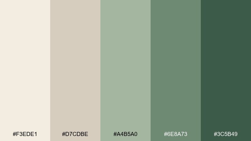
HEX: #F3EDE1 #D7CDBE #A4B5A0 #6E8A73 #3C5B49
Mood: minimal, elegant, quiet
Best for: Architecture portfolio website
Minimal and elegant, it reads like pale stone with a single leaf shadow. The warm off-whites create gallery space, while the greens add just enough structure for navigation. Pair with large whitespace, grid-based layouts, and monochrome photography for a refined portfolio. Tip: use the mid green for link states and keep body text near charcoal for accessibility.
Image example of stoneleaf minimal generated using media.io
17) Garden Studio
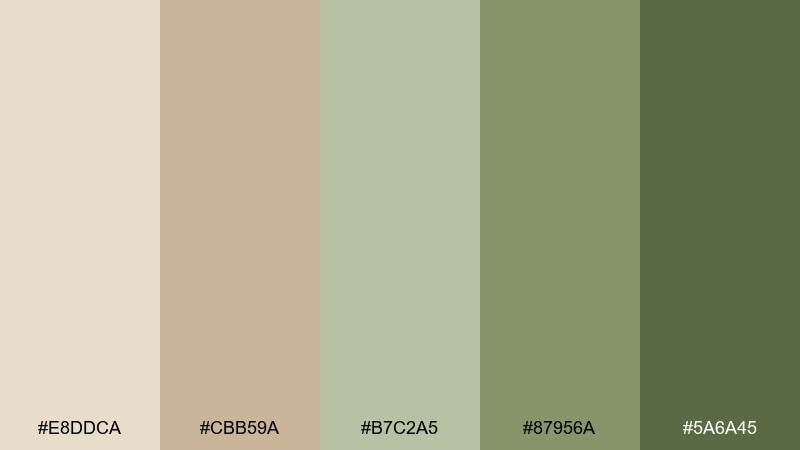
HEX: #E8DDCA #CBB59A #B7C2A5 #87956A #5A6A45
Mood: creative, natural, focused
Best for: Editorial magazine spread
Creative and focused, it feels like a sunlit studio with clippings from a garden journal. The beige gives a paper-like foundation, and the greens bring calm emphasis to pull quotes and section labels. Pair with airy serif headlines and plenty of leading for an editorial rhythm. Tip: keep only one accent green per spread so the layout stays cohesive.
Image example of garden studio generated using media.io
18) Terracotta Leaflight
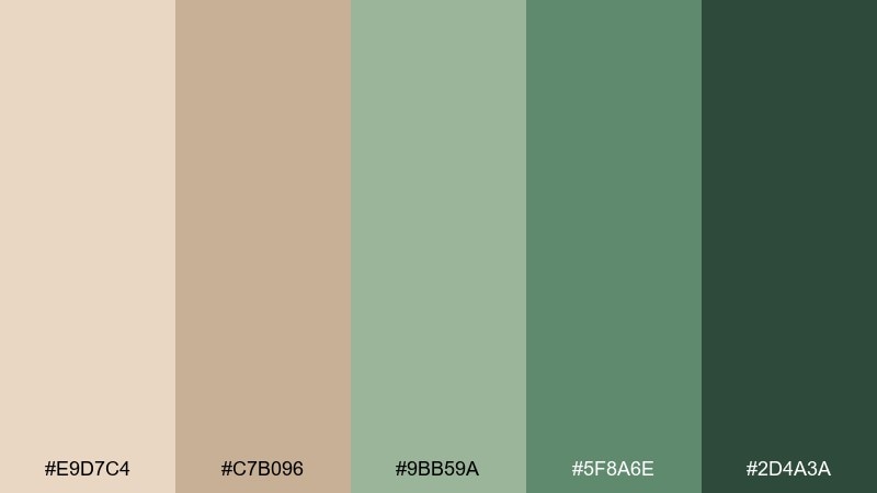
HEX: #E9D7C4 #C7B096 #9BB59A #5F8A6E #2D4A3A
Mood: warm, earthy, botanical
Best for: Home decor product catalog
Warm and botanical, it brings together clay warmth and leaf-filtered light. The beiges keep catalog pages bright, while the cooler greens make product categories easy to navigate. Pair with natural materials photography like rattan, ceramics, and woven textiles. Tip: use the darkest shade for prices and SKU text so the details remain crisp in print.
Image example of terracotta leaflight generated using media.io
19) Spring Terrace
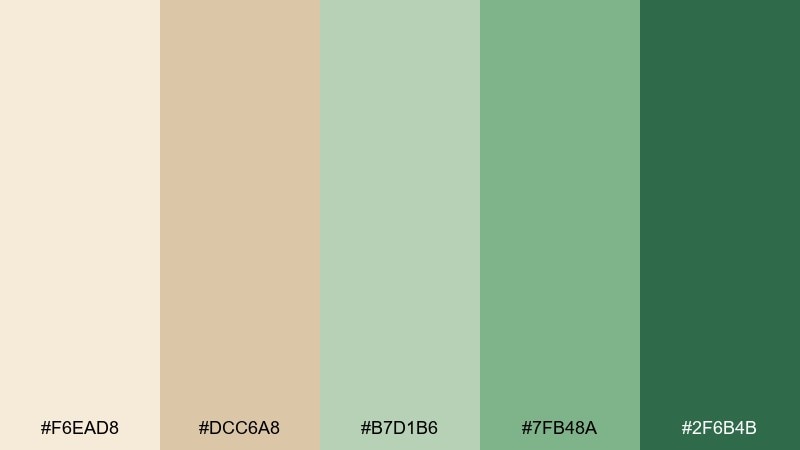
HEX: #F6EAD8 #DCC6A8 #B7D1B6 #7FB48A #2F6B4B
Mood: fresh, optimistic, breezy
Best for: Florist social media templates
Fresh and optimistic, it feels like a terrace after rain with new leaves everywhere. These beige green color combinations are ideal for florists who want posts that look airy, not overly pastel. Pair with white space, delicate borders, and natural-light bouquet photos. Tip: keep text overlays on the light beige and save the deepest green for icons and highlights.
Image example of spring terrace generated using media.io
20) Gallery Sagewash
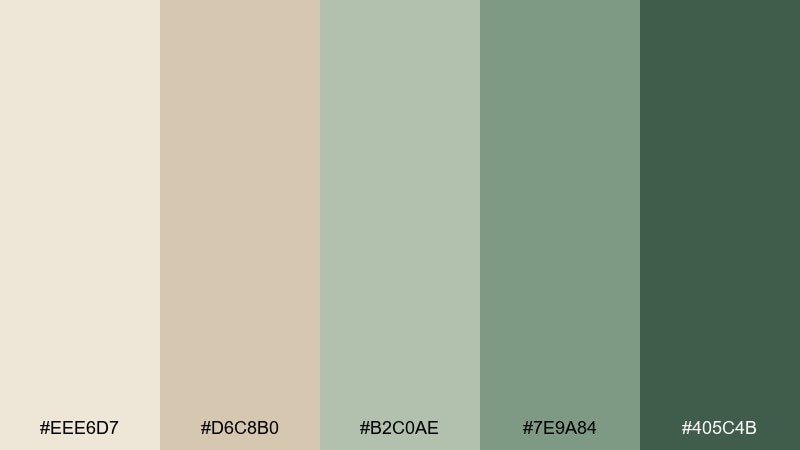
HEX: #EEE6D7 #D6C8B0 #B2C0AE #7E9A84 #405C4B
Mood: curated, calm, refined
Best for: Art gallery event flyer
Curated and calm, it resembles a sagewash wall in a quiet gallery. The warm beige keeps the design approachable, while the cooler greens add an understated modern edge. Pair with large type, careful alignment, and minimal imagery for a contemporary arts feel. Tip: use the darkest tone for date and location so the essentials pop at a glance.
Image example of gallery sagewash generated using media.io

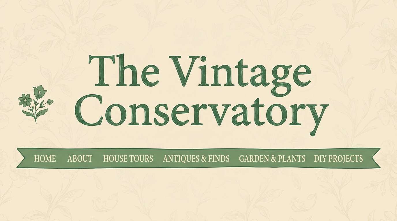
21) Cottage Conservatory
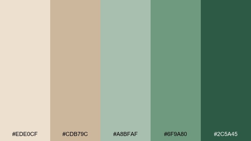
HEX: #EDE0CF #CDB79C #A8BFAF #6F9A80 #2C5A45
Mood: romantic, lived-in, greenhouse
Best for: Vintage home blog header
Romantic and lived-in, it brings to mind a cottage conservatory with aged pots and trailing vines. The soft beige feels like sun-faded paper, and the greens add that greenhouse freshness. Pair with serif titles, subtle floral motifs, and warm photography filters. Tip: keep navigation in a mid green so it stays legible without overpowering the header image.
Image example of cottage conservatory generated using media.io
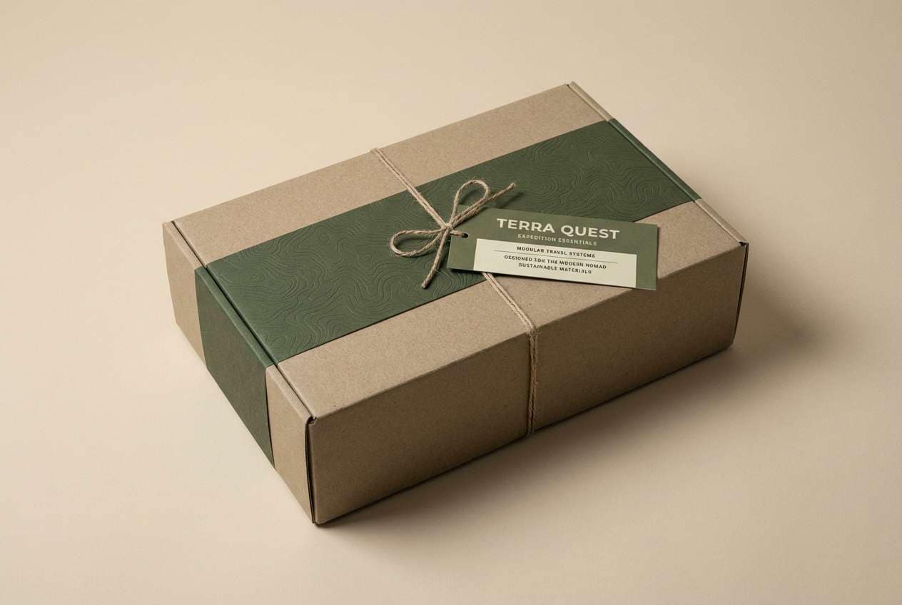
22) Modern Safari
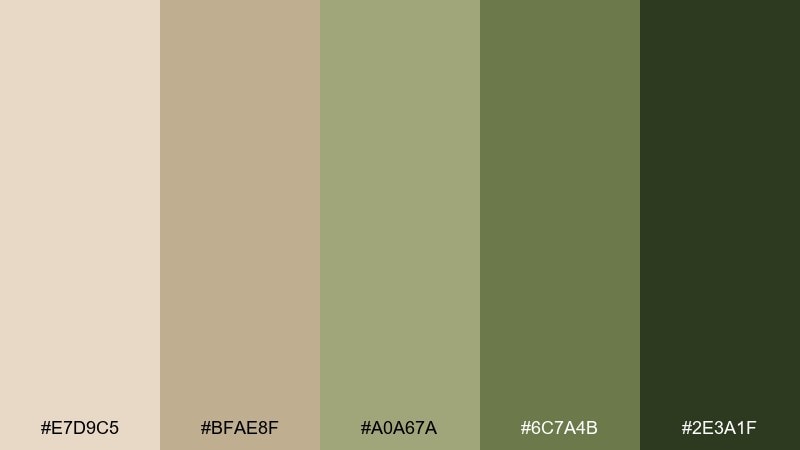
HEX: #E7D9C5 #BFAE8F #A0A67A #6C7A4B #2E3A1F
Mood: adventurous, bold, grounded
Best for: Travel gear product packaging
Adventurous and grounded, it channels modern safari neutrals with a confident green backbone. A beige green color palette like this looks premium on travel gear, especially with matte finishes and clean typography. Pair with topographic line patterns or subtle embossing for tactile appeal. Tip: keep the label background beige and use the darkest green for key specs so they read fast in-store.
Image example of modern safari generated using media.io
What Colors Go Well with Beige Green?
Beige green pairs naturally with warm neutrals like ivory, sand, taupe, and warm gray, especially when you want an interior or UI to feel bright and breathable. Add charcoal or near-black for typography and crisp edges.
For a more elevated look, mix in muted metals: brushed brass warms sage, while stainless/nickel keeps olive and basil tones feeling clean. If you want a subtle “pop,” try clay/terracotta accents or dusty blush.
For modern contrast, deep teal, inky navy, or espresso brown can anchor the palette without breaking its calm tone. Keep the accent color limited so beige and green remain the main story.
How to Use a Beige Green Color Palette in Real Designs
Start with beige as your dominant background (walls, page backgrounds, packaging base) and use mid greens to guide attention (navigation, section headers, cabinet color blocks). Save the darkest green for small high-contrast moments like CTAs, pricing, or key labels.
Texture matters with beige green. Linen, paper grain, wood, stone, and matte finishes make the palette feel intentional rather than “flat.” In digital UI, you can mimic this with subtle noise, low-contrast shadows, and gentle gradients.
Watch contrast: many sage and olive tones are mid-value, so pair them with charcoal text and test accessibility for buttons and links. If your green is too muted, increase weight, size, or add a darker outline to maintain clarity.
Create Beige Green Palette Visuals with AI
If you already have HEX codes, the fastest way to validate a palette is to generate a few realistic scenes: a room mockup, a landing page hero, and a packaging shot. This helps you see how the colors behave under different lighting and materials.
Reuse the prompts above and swap details (materials, product type, room style) while keeping your beige and green notes consistent. You’ll quickly find whether you need a warmer beige, a cooler sage, or a deeper anchor green.
With Media.io, you can create on-brand beige green visuals in minutes and iterate until the palette feels right for your project.
Beige Green Color Palette FAQs
-
What is a beige green color palette?
A beige green palette combines warm neutral beiges (sand, oat, parchment) with muted greens (sage, olive, basil, eucalyptus) to create a calm, nature-inspired scheme for interiors, branding, and UI. -
Is beige and green a good combination for modern interiors?
Yes. Beige keeps rooms bright and warm, while green adds grounded contrast. The mix works especially well with natural materials like oak, linen, rattan, stone, and matte metal finishes. -
Which green works best with beige: sage or olive?
Sage with beige feels lighter and more “spa/Scandi,” while olive with beige feels more rugged and heritage. Choose sage for airy spaces and olive for outdoorsy, durable, or classic styles. -
What accent colors pair well with beige green palettes?
Charcoal and soft black for contrast, brass for warmth, and terracotta/clay for an earthy accent are reliable options. For a cooler edge, try muted teal or deep navy in small doses. -
How do I keep beige green UI from looking low-contrast?
Use beige as the background, keep body text near charcoal, and reserve the deepest green for primary buttons. Add clear spacing and a consistent hierarchy so muted colors still feel structured. -
What finish or texture makes beige green look premium?
Matte and tactile finishes elevate beige green: uncoated paper, linen textures, soft-touch packaging, stone or plaster walls, and subtle grain/noise in digital designs. -
Can I generate beige green mockups with AI using these HEX palettes?
Yes. Use the palette HEX codes as your color direction, then generate scenes (rooms, packaging, flyers, UI) with consistent lighting and materials. Iterating on 2–3 prompts usually reveals the best balance of beige warmth and green depth.


