

Brown red palettes blend the comfort of earth tones with the energy of red, creating visuals that feel grounded, premium, and memorable.
Below you’ll find 20 brown red color combinations with HEX codes, plus practical tips for branding, UI, packaging, and fall-inspired graphics.
In this article
Why Brown Red Palettes Work So Well
Brown red sits in a sweet spot between natural and bold: it keeps designs warm and familiar, while still feeling expressive enough for strong branding.
These tones often read “crafted” and “premium” because they echo real materials—leather, clay, brick, wood stain, cocoa, and spice—so they translate beautifully to packaging and editorial layouts.
They’re also easy to balance in UI and marketing: deep browns provide dependable contrast for type, and muted reds add attention without the harshness of bright primary red.
20+ Brown Red Color Palette Ideas (with HEX Codes)
1) Cinnamon Brick
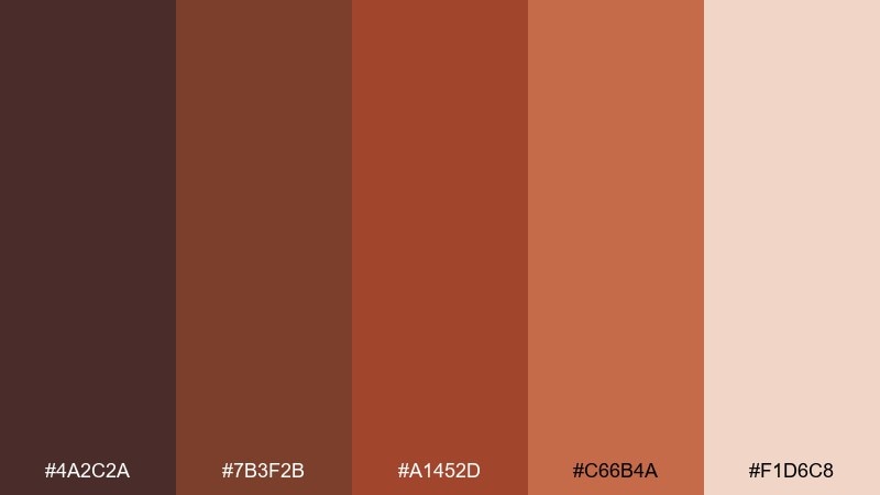
HEX: #4A2C2A #7B3F2B #A1452D #C66B4A #F1D6C8
Mood: warm, rustic, inviting
Best for: coffee packaging and cafe branding
Warm and rustic like a cinnamon-dusted latte beside brick walls, these tones feel instantly welcoming. The contrast between deep cocoa browns and spiced reds reads premium on packaging and signage. Pair it with cream typography and a small brass accent for a crafted look. Usage tip: keep the darkest shade for logos and the lightest for labels to maintain readability on curved packs.
Image example of cinnamon brick generated using media.io
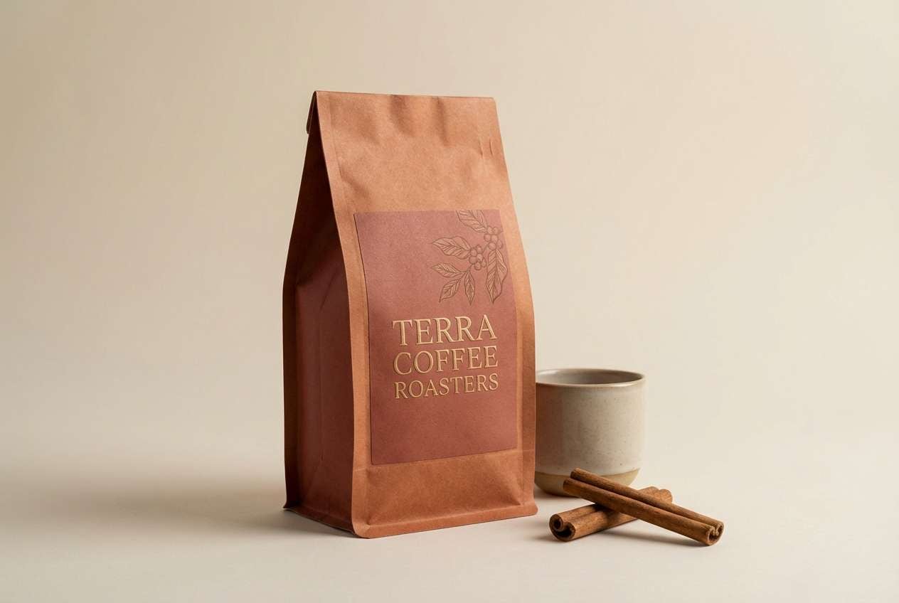
Media.io is an online AI studio for creating and editing video, image, and audio in your browser.

2) Rustic Clay
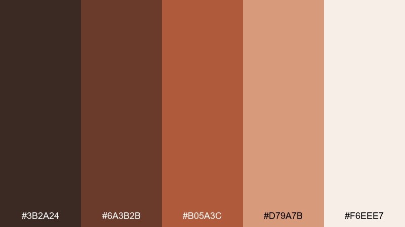
HEX: #3B2A24 #6A3B2B #B05A3C #D79A7B #F6EEE7
Mood: grounded, handcrafted, calm
Best for: ceramics shop website and product pages
Grounded and handcrafted, it evokes sun-baked clay, kiln warmth, and soft studio light. The mid terracotta works beautifully for buttons and highlights, while the dark brown anchors headers and navigation. Pair with off-white space and subtle texture to keep it airy rather than heavy. Usage tip: reserve the clay tone for one primary CTA so the page feels curated, not busy.
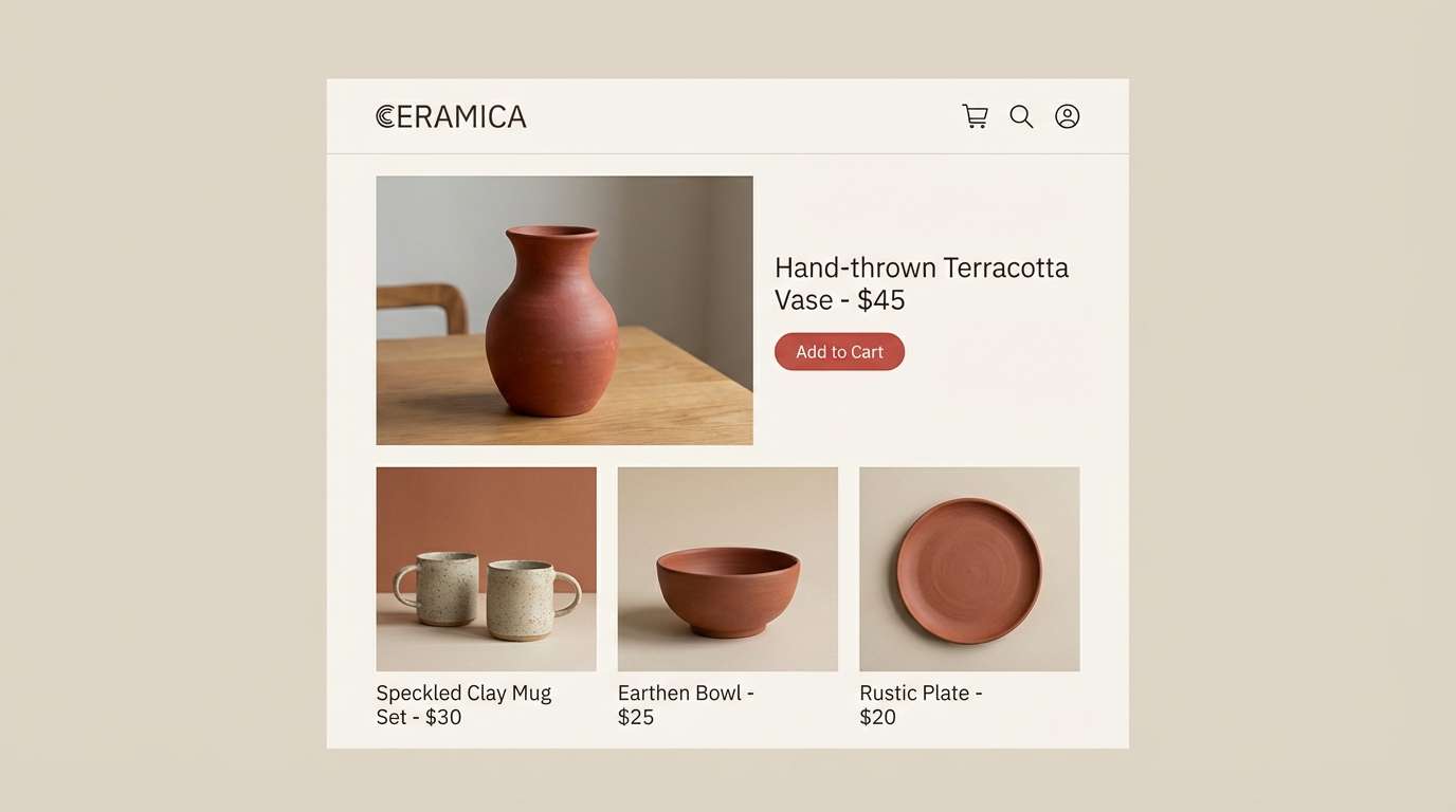
Image example of rustic clay generated using media.io
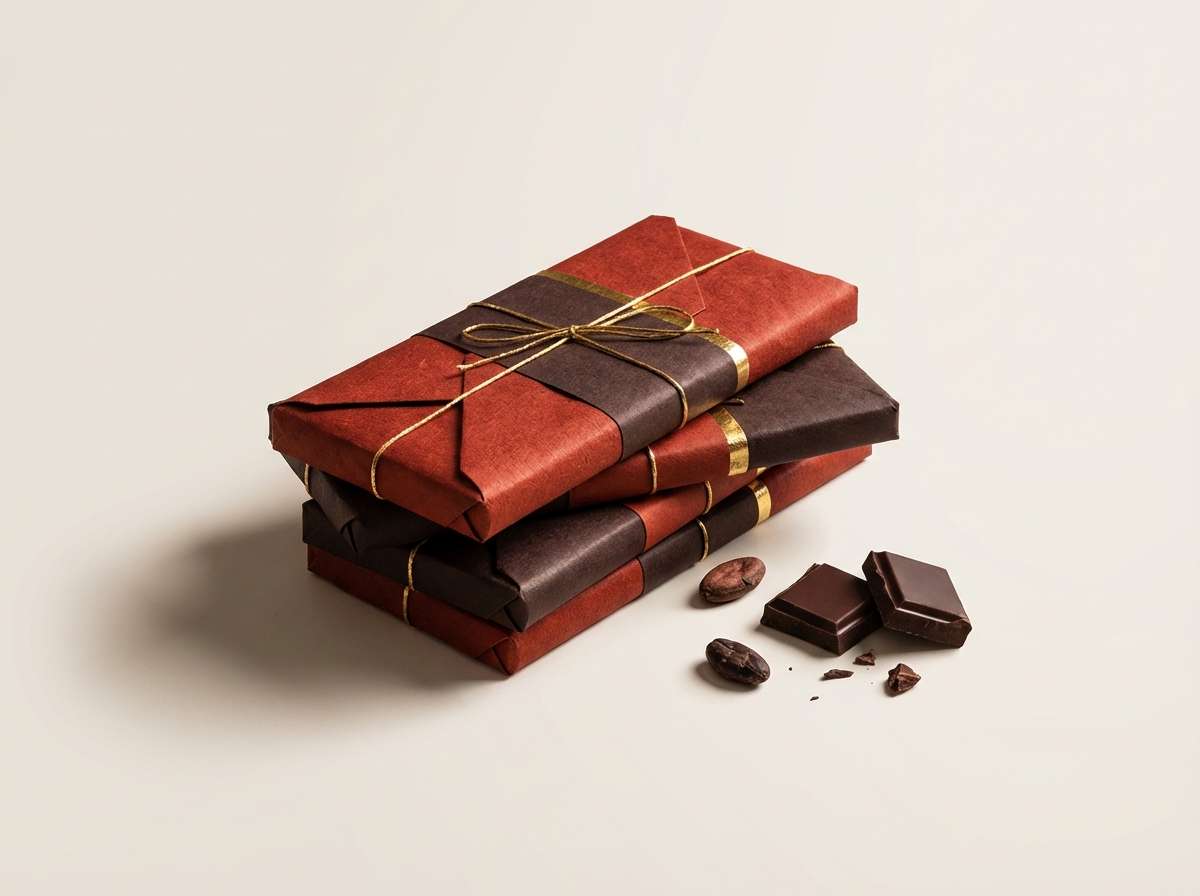
3) Ember Truffle
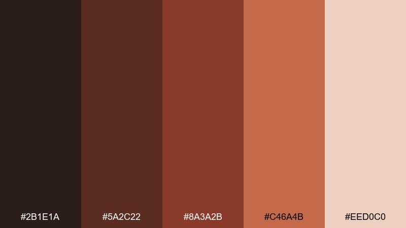
HEX: #2B1E1A #5A2C22 #8A3A2B #C46A4B #EED0C0
Mood: moody, luxe, dramatic
Best for: chocolate brand ad creative
Moody and luxe, it feels like glowing embers against dark truffle chocolate. The deep near-black brown adds drama, while ember red brings appetite appeal without looking neon. Pair with matte black photography and minimal serif type for a high-end impression. Usage tip: apply the light cream as negative space around product shots to keep the dark tones from swallowing detail.
Image example of ember truffle generated using media.io
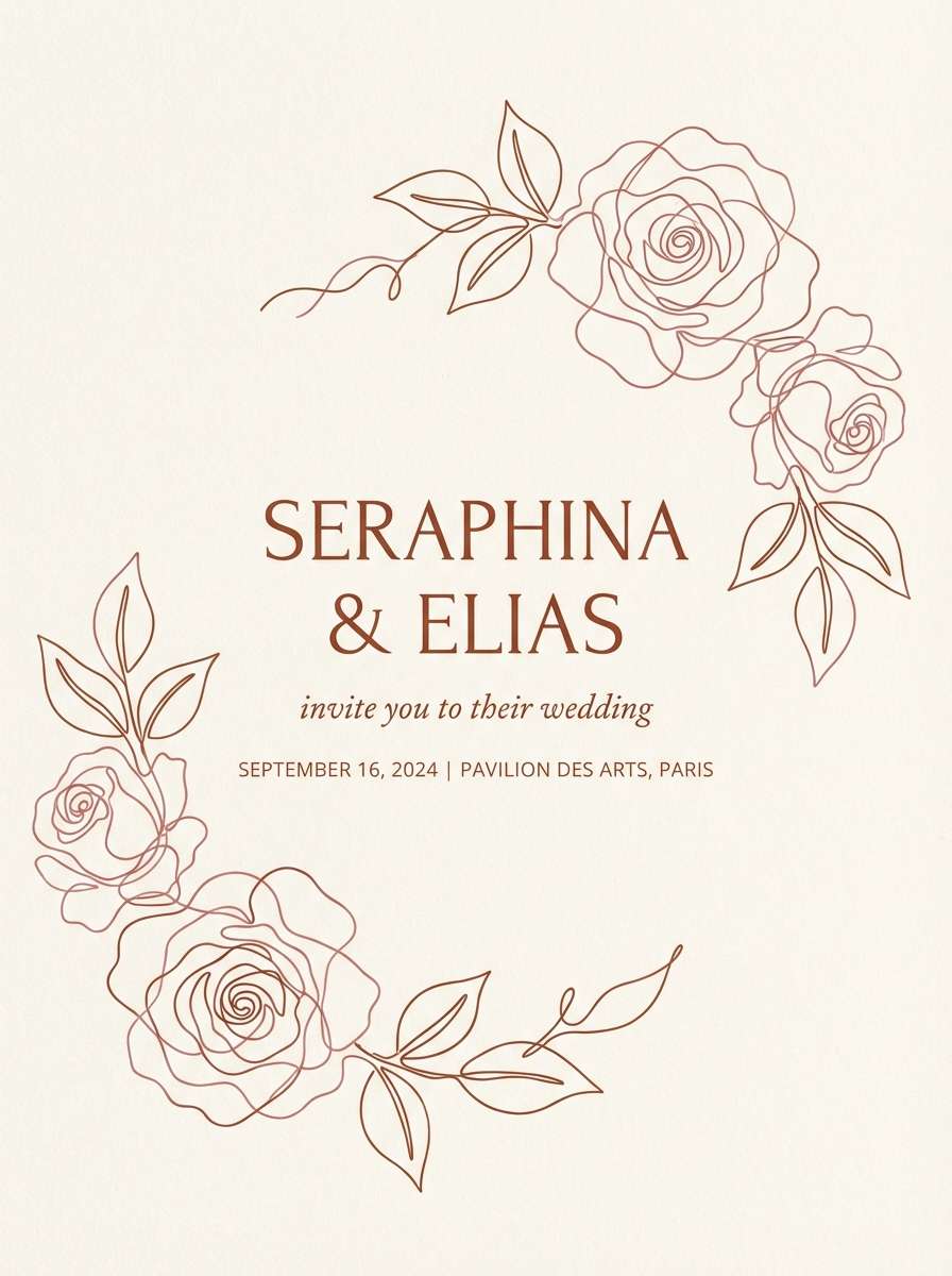
4) Sienna Rose
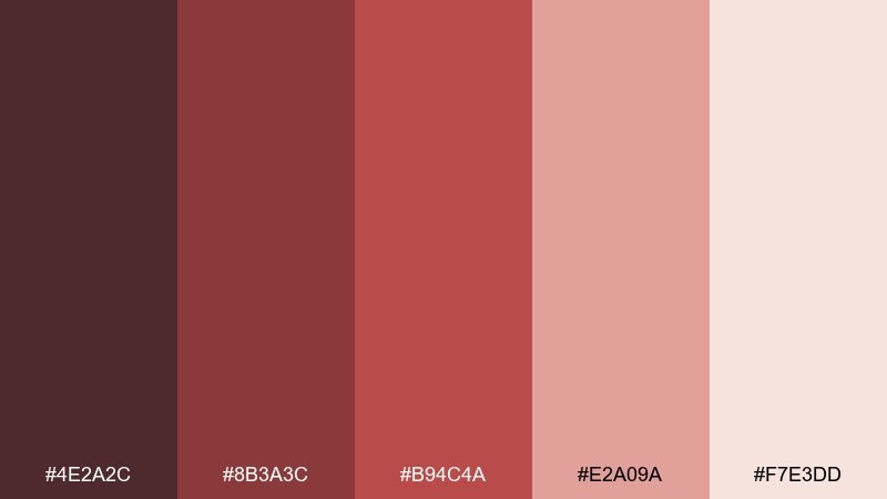
HEX: #4E2A2C #8B3A3C #B94C4A #E2A09A #F7E3DD
Mood: romantic, soft, refined
Best for: wedding invitation suite
Romantic and refined, it suggests dried roses, warm candlelight, and vintage stationery. The muted reds stay elegant, while the blush and soft cream keep the overall look airy. Pair with delicate line art and a touch of foil-like gold for a timeless finish. Usage tip: print the darkest shade sparingly for names and key details so the suite stays legible.
Image example of sienna rose generated using media.io
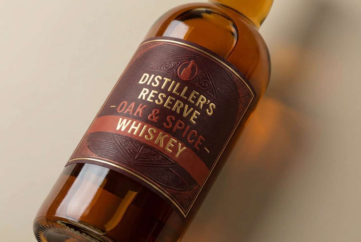
5) Mahogany Spice
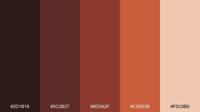
HEX: #2D1B18 #5C2B27 #8D3A2F #C85D3B #F0C8B0
Mood: bold, masculine, premium
Best for: whiskey label and bottle packaging
Bold and premium, these shades evoke polished mahogany, barrel staves, and a hint of spice. The coppery red-orange lifts the palette just enough to feel energetic on labels. Pair with textured paper and condensed typography to lean into heritage styling. Usage tip: keep the highlight color to borders and seals so the bottle still reads classic from a distance.
Image example of mahogany spice generated using media.io
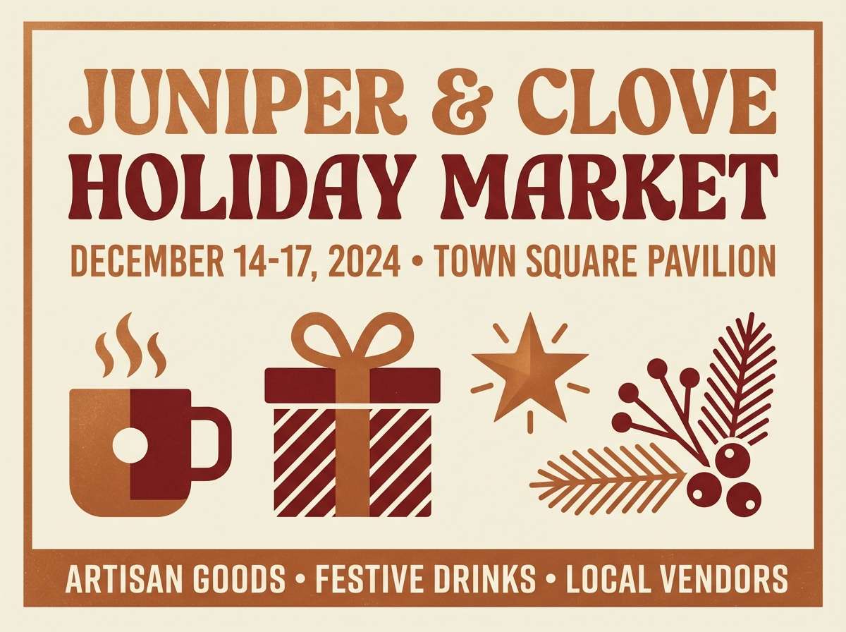
6) Copper Hearth
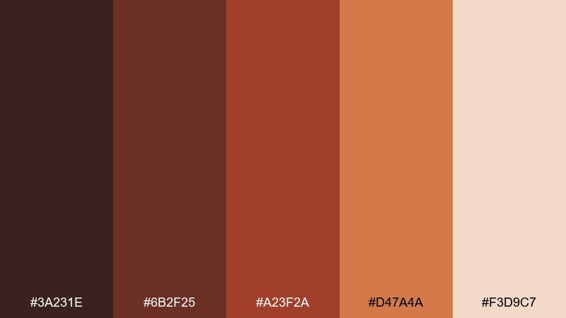
HEX: #3A231E #6B2F25 #A23F2A #D47A4A #F3D9C7
Mood: cozy, festive, welcoming
Best for: holiday promo poster for a local market
Cozy and festive, it brings to mind copper cookware, mulled cider, and a glowing hearth. These brown red color combination notes work well for bold headlines paired with warm cream backgrounds. Add evergreen or deep navy accents when you need extra seasonal contrast. Usage tip: use the copper tone for a single focal badge to guide the eye on busy posters.
Image example of copper hearth generated using media.io
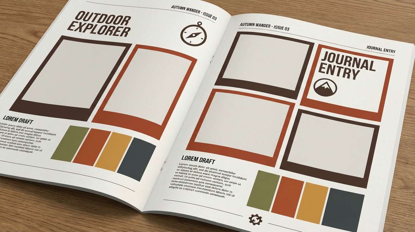
7) Autumn Bark
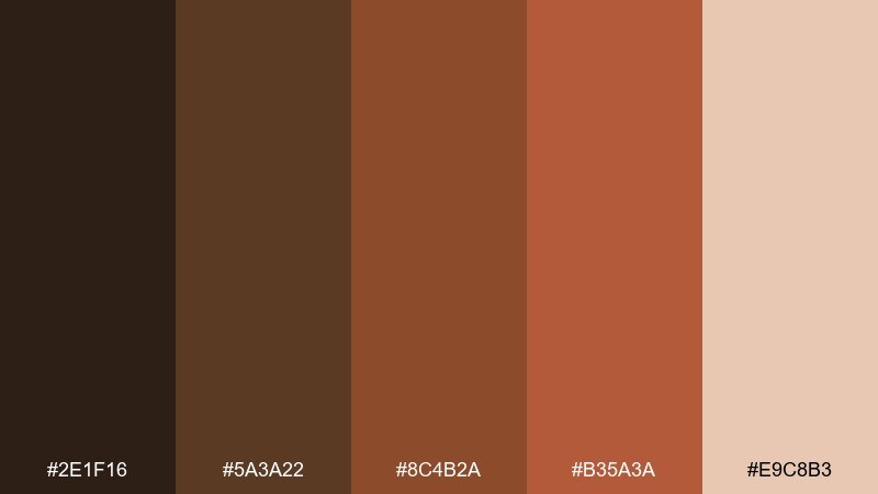
HEX: #2E1F16 #5A3A22 #8C4B2A #B35A3A #E9C8B3
Mood: earthy, outdoorsy, steady
Best for: outdoor brand lookbook
Earthy and outdoorsy, it feels like trail bark, dry leaves, and late-afternoon sun. The browns provide a strong base for photo-heavy layouts, while the reddish tones add warmth to callouts. Pair with natural paper textures and plenty of breathing room. Usage tip: keep captions in the deepest shade to maintain contrast on warm lifestyle images.
Image example of autumn bark generated using media.io
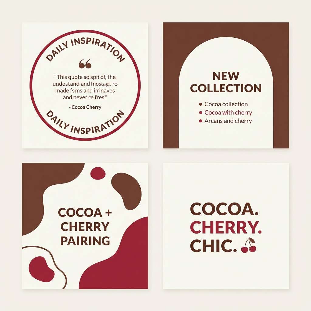
8) Cocoa Cherry
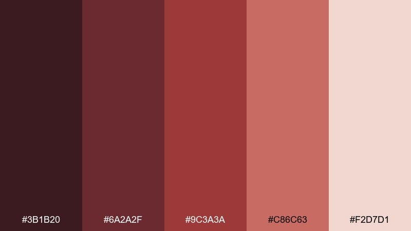
HEX: #3B1B20 #6A2A2F #9C3A3A #C86C63 #F2D7D1
Mood: sweet, playful, modern
Best for: dessert shop social media templates
Sweet and modern, it suggests cocoa powder with cherry glaze and glossy berries. The deeper red-browns make text pop, while the pale blush keeps posts bright and scroll-stopping. Pair with simple geometric stickers and clean sans-serif type. Usage tip: repeat one accent color for price tags or highlights to build a recognizable feed rhythm.
Image example of cocoa cherry generated using media.io
9) Terracotta Wine
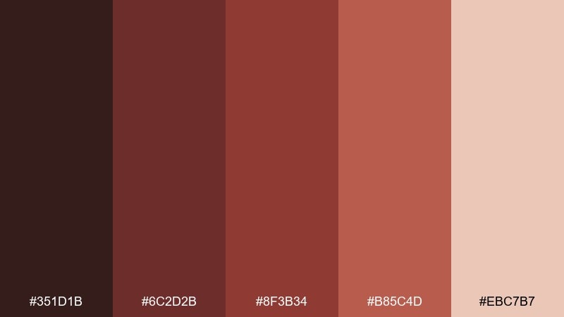
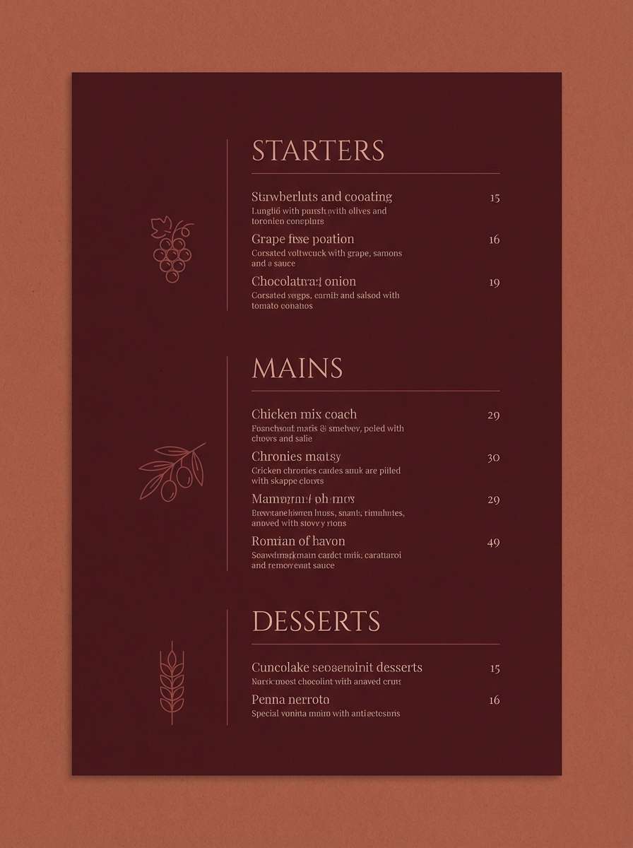
HEX: #351D1B #6C2D2B #8F3B34 #B85C4D #EBC7B7
Mood: rich, elegant, intimate
Best for: restaurant menu design
Rich and intimate, it recalls terracotta tiles, red wine, and dim bistro lighting. The darker tones feel upscale for headings, while the warm blush keeps sections readable and refined. Pair with cream paper stock and a subtle grain to amplify the cozy mood. Usage tip: limit the mid red to section dividers so the menu stays calm and premium.
Image example of terracotta wine generated using media.io
10) Chestnut Blush
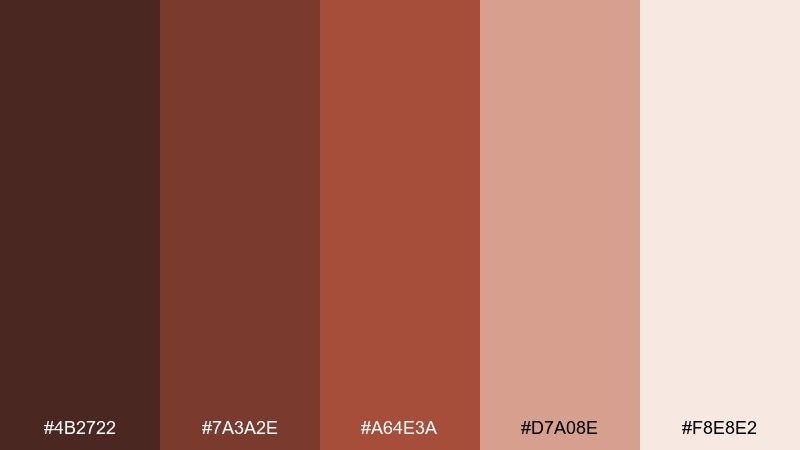
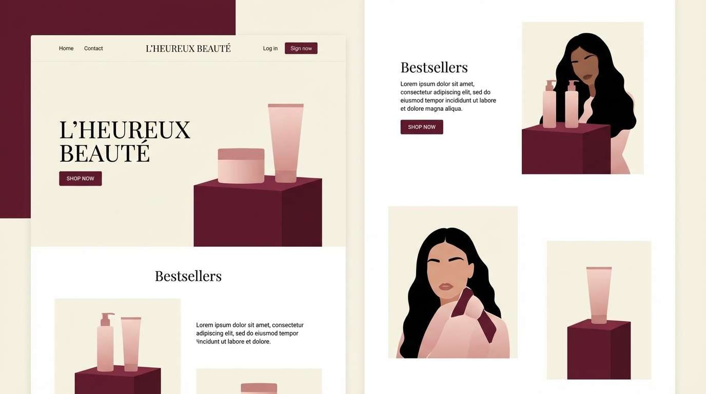
HEX: #4B2722 #7A3A2E #A64E3A #D7A08E #F8E8E2
Mood: gentle, cozy, approachable
Best for: beauty brand landing page
Gentle and cozy, it feels like chestnuts, soft blush makeup, and warm knit textures. The palette balances natural warmth with a clean, modern finish that works well for skincare and cosmetics. Pair with plenty of white space and product photos on light backdrops. Usage tip: use the blush tone for hover states and micro-interactions so the UI feels subtle, not loud.
Image example of chestnut blush generated using media.io
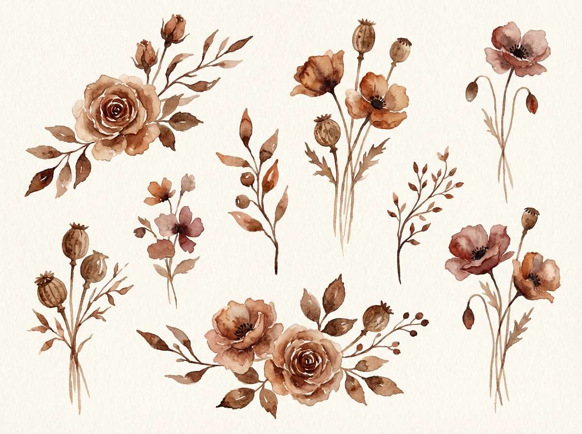
11) Burnt Umber Bloom
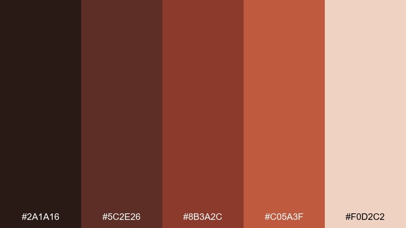
HEX: #2A1A16 #5C2E26 #8B3A2C #C05A3F #F0D2C2
Mood: artsy, warm, expressive
Best for: watercolor floral illustration set
Artsy and warm, it brings up watercolor blooms painted with burnt umber washes and rosy petals. The spectrum is ideal for botanical illustrations where you want depth without harsh black. Pair with hand-lettered captions and soft paper textures to reinforce the handmade feel. Usage tip: keep the darkest shade for stems and shadows so the flowers stay luminous.
Image example of burnt umber bloom generated using media.io
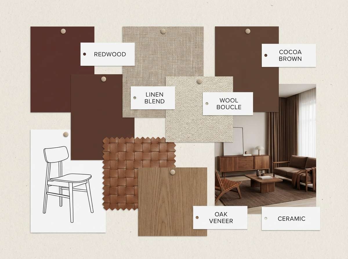
12) Redwood Cocoa
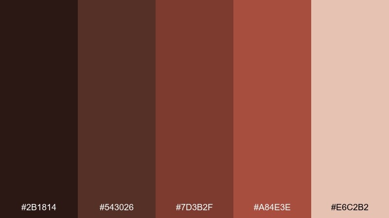
HEX: #2B1814 #543026 #7D3B2F #A84E3E #E6C2B2
Mood: natural, sturdy, modern rustic
Best for: interior design moodboard
Natural and sturdy, it evokes redwood panels, cocoa leather, and warm daylight filtering through linen curtains. Use the mid red-brown as an accent wall indicator and the lighter shade for fabric swatches and notes. Pair with beige, matte black hardware, or olive accents for a grounded room concept. Usage tip: keep text and labels in the deepest brown so the moodboard stays readable over textures.
Image example of redwood cocoa generated using media.io
13) Paprika Mocha
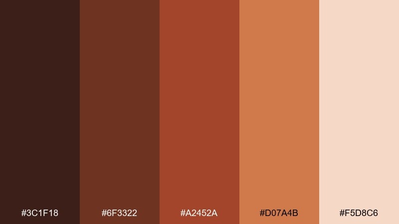
HEX: #3C1F18 #6F3322 #A2452A #D07A4B #F5D8C6
Mood: energetic, savory, bold
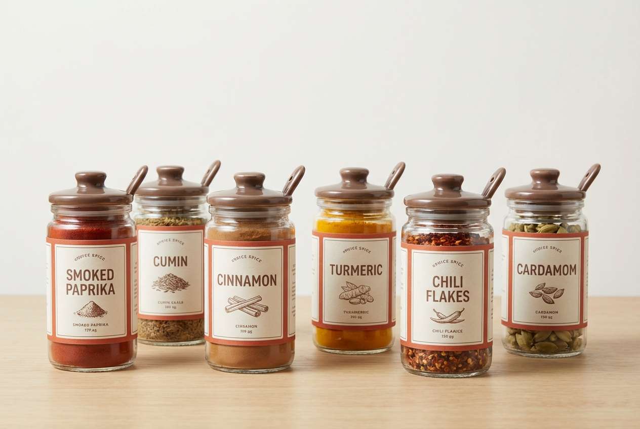
Best for: spice jar label system
Energetic and savory, it feels like paprika dust swirling over a mocha-brown surface. The brighter orange-red is perfect for flavor cues, while the deeper browns keep the label system grounded. Pair with simple iconography and clear sans-serif type to help shoppers scan quickly. Usage tip: assign one accent shade per flavor family so the shelf looks organized.
Image example of paprika mocha generated using media.io
14) Garnet Walnut
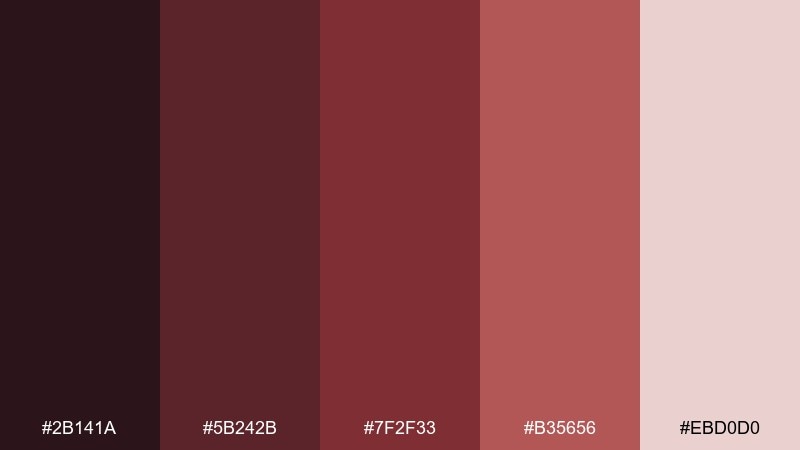
HEX: #2B141A #5B242B #7F2F33 #B35656 #EBD0D0
Mood: classic, academic, sophisticated
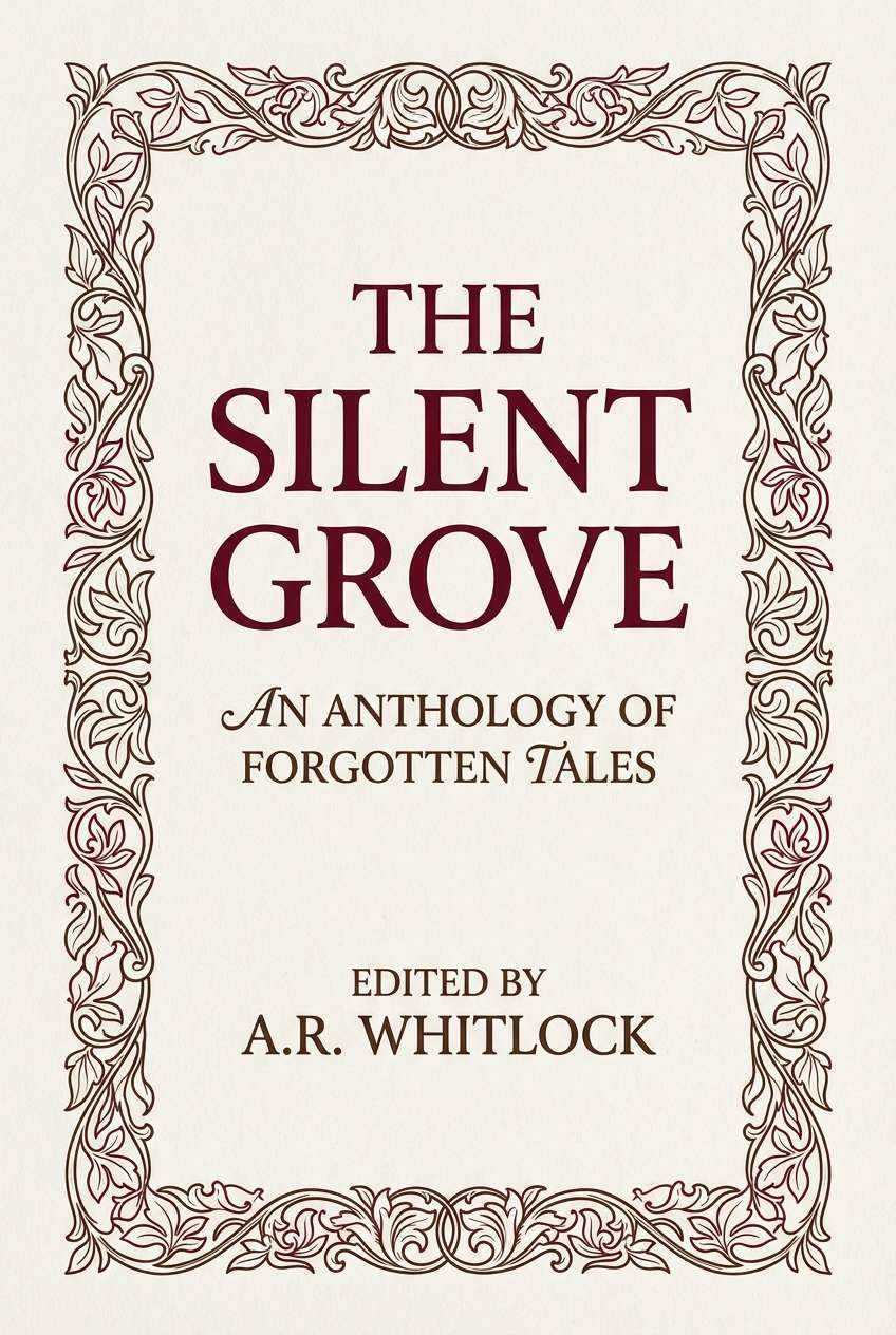
Best for: book cover design for historical fiction
Classic and academic, it suggests garnet ink, walnut wood desks, and worn library bindings. The deeper garnet reads serious and literary, while the pale blush keeps the composition from feeling too heavy. Pair with serif typography and subtle ornament borders for a period feel. Usage tip: use the mid tone for subtitle and author text to create clear hierarchy without stark contrast.
Image example of garnet walnut generated using media.io
15) Brick Dust Neutral
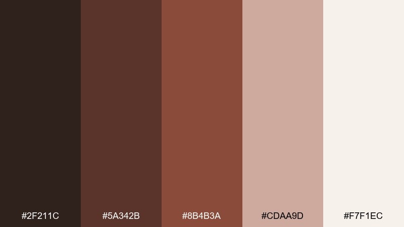
HEX: #2F211C #5A342B #8B4B3A #CDAA9D #F7F1EC
Mood: minimal, warm, architectural
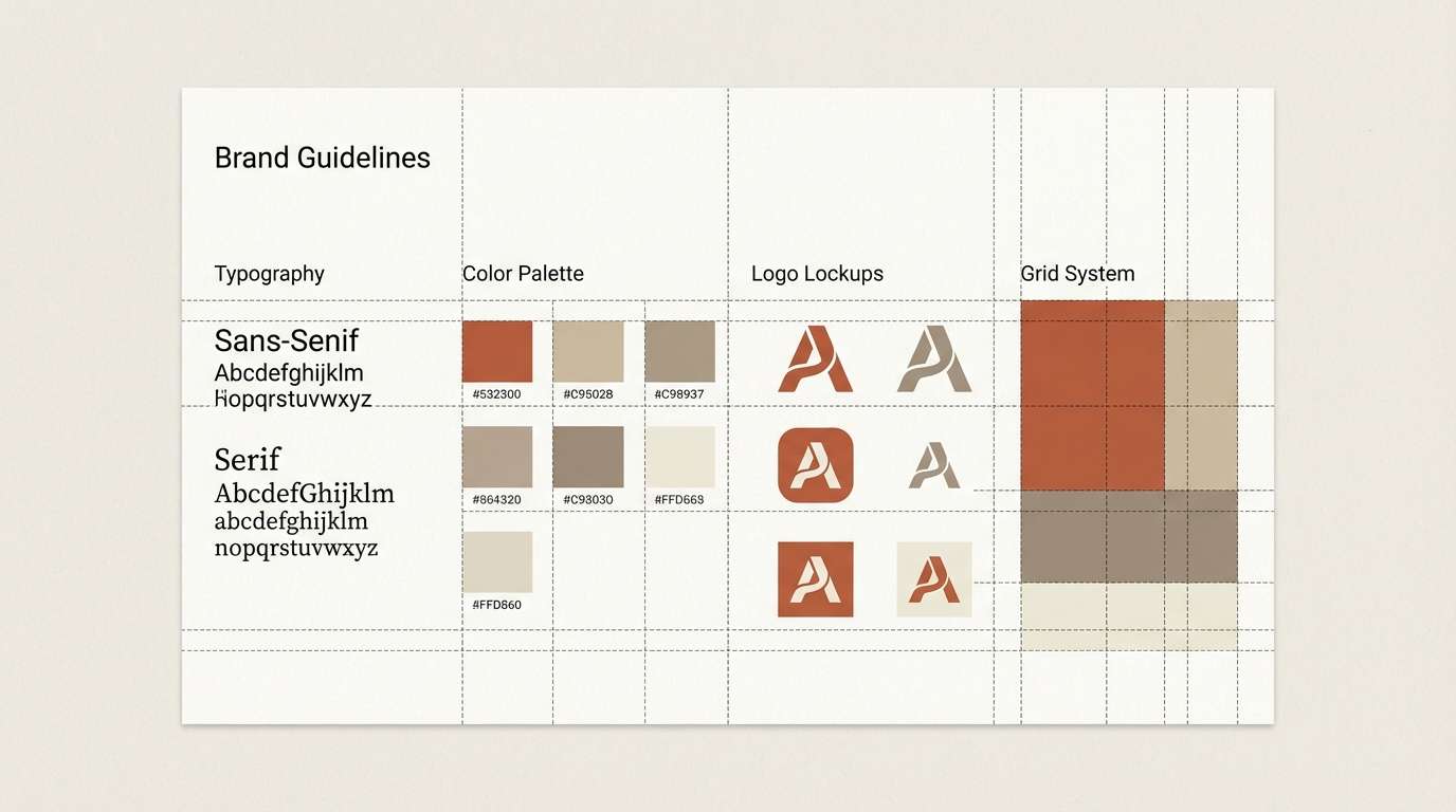
Best for: brand guidelines and identity system
Minimal and architectural, it looks like brick dust on concrete with a soft warm glow. As a brown red color scheme, it supports clean logos, grids, and long-form documents without visual fatigue. Pair with charcoal linework and plenty of off-white margins for a contemporary studio vibe. Usage tip: set one primary neutral for backgrounds and use brick as an accent to keep consistency across pages.
Image example of brick dust neutral generated using media.io
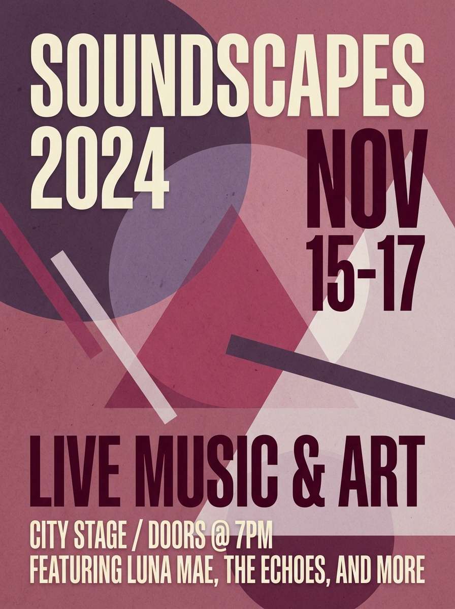
16) Smoked Berry
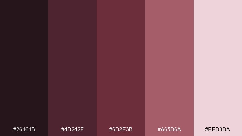
HEX: #26161B #4D242F #6D2E3B #A65D6A #EED3DA
Mood: mysterious, contemporary, smooth
Best for: music event flyer
Mysterious and smooth, it brings up smoked berries, velvet curtains, and late-night lighting. The deep berry-brown is strong for backgrounds, while the dusty rose creates readable type blocks and accents. Pair with minimal geometric shapes and high-contrast type to push a modern nightlife vibe. Usage tip: keep one bright accent for the date and venue so key info stands out instantly.
Image example of smoked berry generated using media.io
17) Caramel Crimson
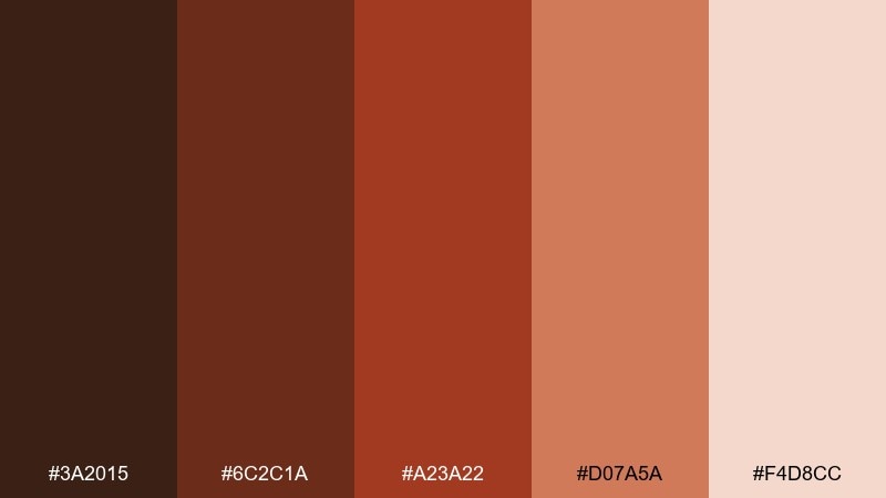
HEX: #3A2015 #6C2C1A #A23A22 #D07A5A #F4D8CC
Mood: bold, tasty, high-contrast
Best for: ecommerce promo banner set
Bold and tasty, it feels like caramel drizzle against a sharp crimson pop. These brown red color combinations are great for ecommerce banners where you want warmth plus clear contrast for pricing. Pair with clean white product cutouts and a single dark text color to avoid visual noise. Usage tip: place the brightest red behind limited-time badges only, so urgency reads instantly.
Image example of caramel crimson generated using media.io
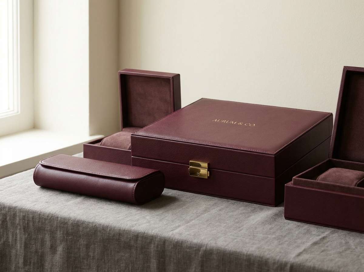
18) Burgundy Leather
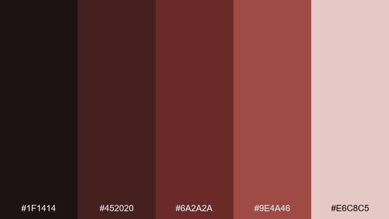
HEX: #1F1414 #452020 #6A2A2A #9E4A46 #E6C8C5
Mood: heritage, elegant, confident
Best for: luxury accessories branding
Heritage and elegant, it recalls burgundy leather, stitched edges, and a quiet boutique interior. The deep tones create a confident foundation for monograms and minimal marks, while the light blush softens the finish. Use this brown red color palette with matte textures, small gold details, and lots of negative space. Usage tip: keep the lightest shade for packaging interiors so the unboxing feels premium and bright.
Image example of burgundy leather generated using media.io
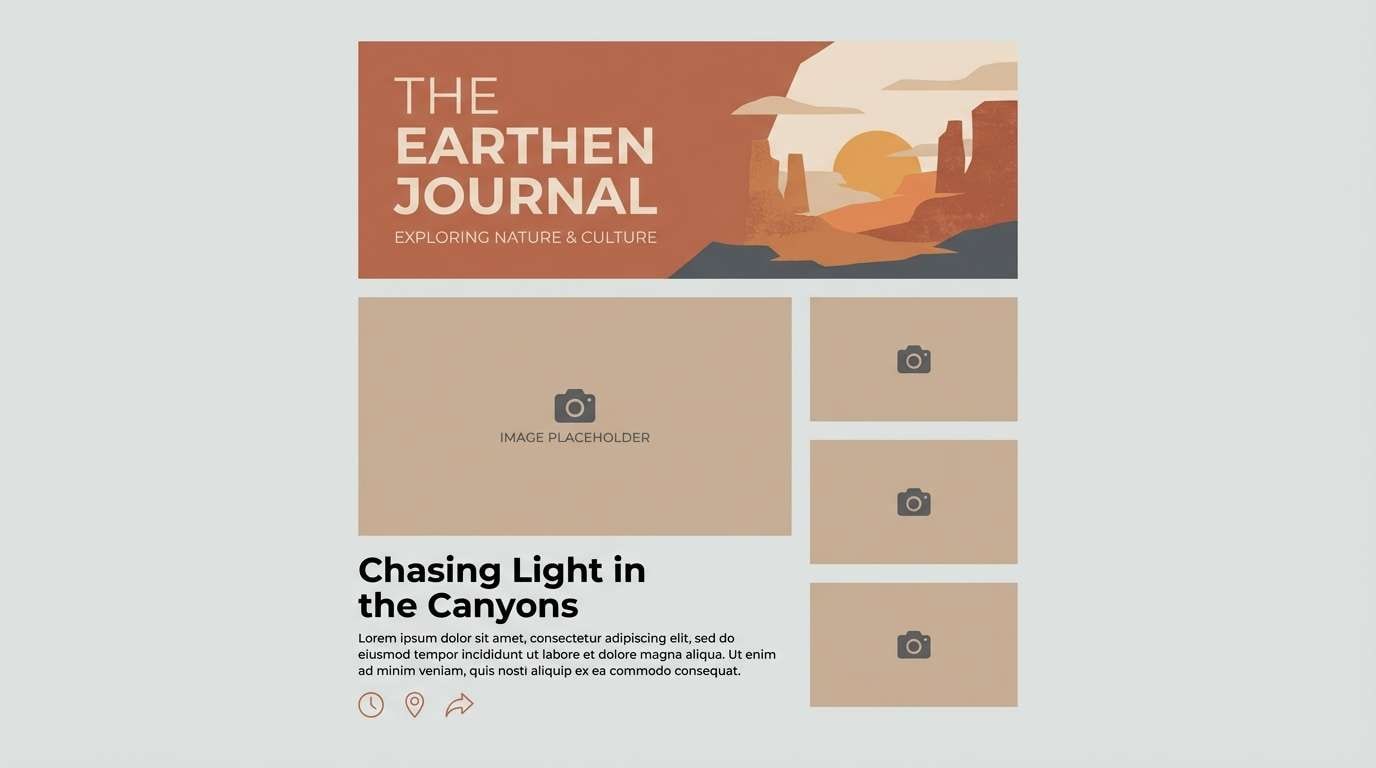
19) Claystone Sunset
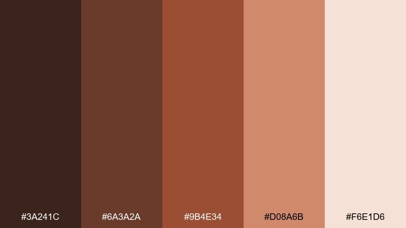
HEX: #3A241C #6A3A2A #9B4E34 #D08A6B #F6E1D6
Mood: serene, sunlit, optimistic
Best for: travel blog header and article graphics
Serene and sunlit, it brings to mind claystone cliffs glowing at sunset. The gradient from deep brown to soft peach makes headers feel warm without overpowering photography. Pair with airy layouts, thin dividers, and a muted blue accent for sky-like contrast. Usage tip: use the lightest tone behind pull quotes to add emphasis without heavy boxes.
Image example of claystone sunset generated using media.io
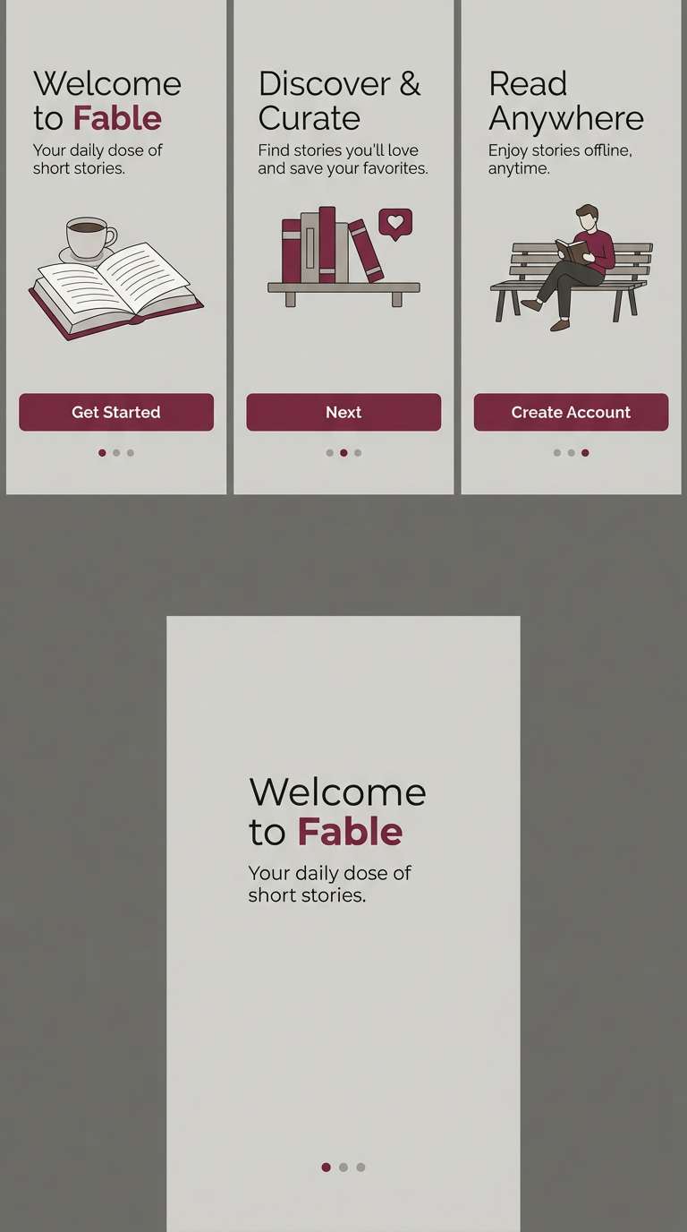
20) Toffee Rust
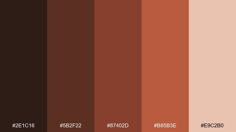
HEX: #2E1C16 #5B2F22 #87402D #B85B3E #E9C2B0
Mood: cozy, practical, friendly
Best for: app onboarding screens
Cozy and friendly, it feels like toffee warmth with a touch of rusty metal. The darker shades are reliable for navigation and body text, while the warm mid tones add personality to illustrations and progress indicators. Pair with simple rounded shapes and cream backgrounds to keep onboarding approachable. Usage tip: keep one consistent accent for primary buttons so users learn the pattern fast.
Image example of toffee rust generated using media.io
What Colors Go Well with Brown Red?
Brown red pairs naturally with warm neutrals like cream, ivory, sand, and beige—these keep the palette breathable and help typography stay readable in both print and UI.
For contrast, try deep navy, charcoal, or forest green. These cooler anchors sharpen the look and make brown red accents feel more intentional (great for seasonal campaigns and premium branding).
If you want a brighter lift, muted peach, dusty rose, or soft teal can add modern energy without clashing with the earthy base.
How to Use a Brown Red Color Palette in Real Designs
Start with roles: use the darkest brown-red for headers or logos, a mid tone for accents (buttons, badges, dividers), and the lightest cream/blush for backgrounds and negative space.
In packaging, lean into material cues—kraft textures, matte labels, embossing, and small metallic highlights (gold/brass) make these tones look crafted and high-end.
In UI, keep saturation controlled: choose one primary accent for CTAs, then use lighter tints for hover states and backgrounds to maintain a calm, cohesive interface.
Create Brown Red Palette Visuals with AI
If you have HEX codes but need finished visuals—mockups, posters, UI screens, or product ads—AI generation can help you explore styles quickly while keeping your palette consistent.
With Media.io’s text-to-image tool, you can paste a prompt, specify composition and aspect ratio, and iterate until your brown red tones feel right for the brand or campaign.
Save your strongest results as reusable templates for social posts, banners, packaging concepts, or moodboards.
Brown Red Color Palette FAQs
-
What does a brown red color palette communicate in branding?
Brown red usually signals warmth, craftsmanship, and authenticity. It’s common in food, beverage, heritage, and lifestyle brands because it feels material-driven (wood, leather, clay) while still being energetic. -
Is brown red suitable for modern UI design?
Yes—use deep brown-red for text and navigation, and reserve a mid terracotta/rust for a single primary CTA. Pair with off-white backgrounds to keep the interface clean and contemporary. -
How do I keep brown red designs from looking too dark?
Increase negative space with cream or blush backgrounds, limit the darkest shades to typography, and use the lightest tone around photos or product shots so details don’t get lost. -
What are the best accent colors with brown red?
Great accents include cream/ivory, charcoal, deep navy, forest green, and muted gold/brass. Choose one cool contrast (navy/green) or one warm metallic to avoid visual clutter. -
Which brown red palettes work best for packaging?
Premium packaging often benefits from high-contrast, material-inspired sets like Cinnamon Brick, Mahogany Spice, and Burgundy Leather—especially when paired with matte textures and minimal typography. -
Can I use brown red for seasonal (fall/holiday) designs?
Absolutely. Brown red naturally fits autumn themes (leaves, cider, spice). Add evergreen or deep navy for holiday contrast, and keep creams as a balancing background for readability. -
How can I generate brown red marketing images quickly?
Use Media.io text-to-image: write a clear prompt describing the layout (poster, banner, mockup), include style cues (minimal, premium, flat, realistic), and iterate while keeping your chosen HEX palette consistent.
Next: Yellow Red Color Palette


