

Brown maroon is a modern classic: deep enough to feel premium, warm enough to feel human, and versatile across print, web, and interiors.
Below are 20 curated brown maroon palettes (including the standout #7a1f2b) with practical usage notes and AI-ready prompts you can copy to generate matching visuals fast.
In this article
- Why Brown Maroon Palettes Work So Well
-
- rusted vineyard
- cocoa cabernet
- antique leather and rose
- terracotta truffle
- mocha merlot minimal ui
- autumn library
- velvet brick and sand
- garnet walnut studio
- copper clay wedding suite
- mahogany espresso poster
- burnt sienna bistro
- dried cherry neutrals
- cranberry charcoal contrast
- rosewood and oat
- smoked paprika packaging
- maple bronze editorial
- maroon meadow botanicals
- chestnut night sky
- berry bark playroom
- earthy maroon gradient ui
- What Colors Go Well with Brown Maroon?
- How to Use a Brown Maroon Color Palette in Real Designs
- Create Brown Maroon Palette Visuals with AI
Why Brown Maroon Palettes Work So Well
Brown maroon blends the stability of brown with the sophistication of red, so it reads as trustworthy, vintage, and upscale at the same time. It’s a great choice when you want warmth without the loudness of bright reds.
These palettes also photograph and print beautifully: maroon anchors depth, while creams and tans keep layouts readable and tactile. That makes them ideal for packaging, editorial work, and interior mood boards.
Most importantly, brown maroon pairs well with both modern neutrals (ivory, charcoal) and natural accents (sage, forest green), giving you flexible systems for branding and UI.
20+ Brown Maroon Color Palette Ideas (with HEX Codes)
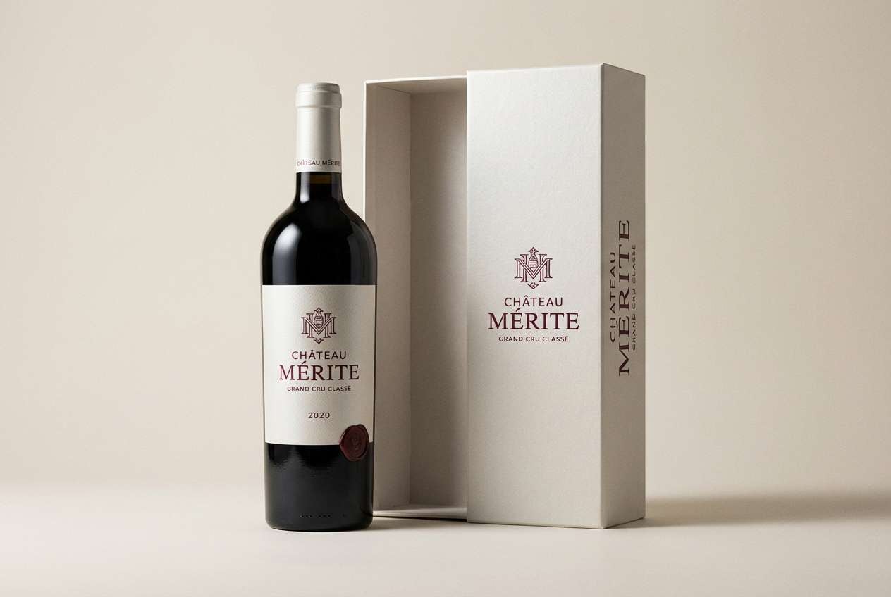
1) Rusted Vineyard

HEX: #4b1b22 #7a1f2b #a44a3f #d2b48c #f3e9dc
Mood: rich, rustic, romantic
Best for: wine brand identity and label design
Rich and romantic like a candlelit cellar, these tones feel grounded yet indulgent. This brown maroon color palette works beautifully for wine, gourmet foods, and heritage-style branding where warmth matters. Pair it with uncoated cream paper textures and a small touch of brass foil for a premium finish. Usage tip: keep maroon as the primary field color and reserve the tan as a breathing-space background for legibility.
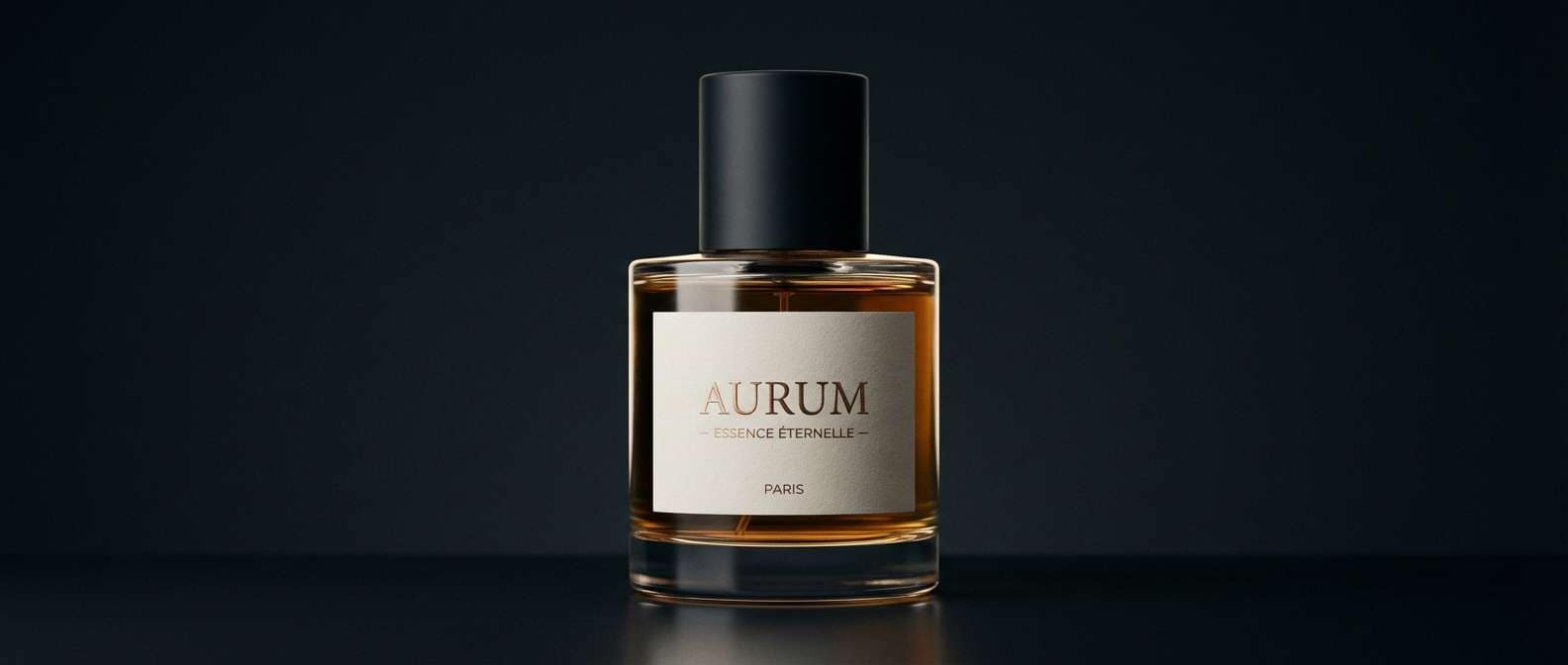
Image example of rusted vineyard generated using media.io
Media.io is an online AI studio for creating and editing video, image, and audio in your browser.

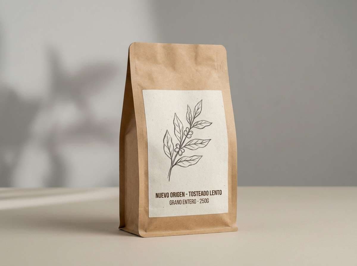
2) Cocoa Cabernet
HEX: #3a241c #5b2a2f #8c3a2e #c49a6c #f6f1e6
Mood: cozy, intimate, artisanal
Best for: coffee packaging and cafe menus
Cozy and intimate like espresso with a splash of red wine, this mix balances depth with creamy softness. It suits cafe menus, roastery packaging, and small-batch food labels where you want handcrafted credibility. Pair with kraft textures, off-white type, and one bright accent line in the caramel tone for hierarchy. Usage tip: use the deep cocoa for headlines and the ivory for body text to keep menus easy to scan.
Image example of cocoa cabernet generated using media.io
3) Antique Leather and Rose
HEX: #4a2c24 #6b1f2a #c07c7a #e7d2c5 #2b2b2b
Mood: vintage, elegant, moody
Best for: book covers and boutique stationery
Vintage and elegant like worn leather beside dried roses, this palette leans classic without feeling dated. It shines on book covers, boutique stationery, and editorial headlines where contrast is key. Pair the blush-rose with charcoal for crisp typography, and keep the darker tones for frames and borders. Usage tip: limit the rose to small highlights so the overall look stays sophisticated, not sweet.
Image example of antique leather and rose generated using media.io
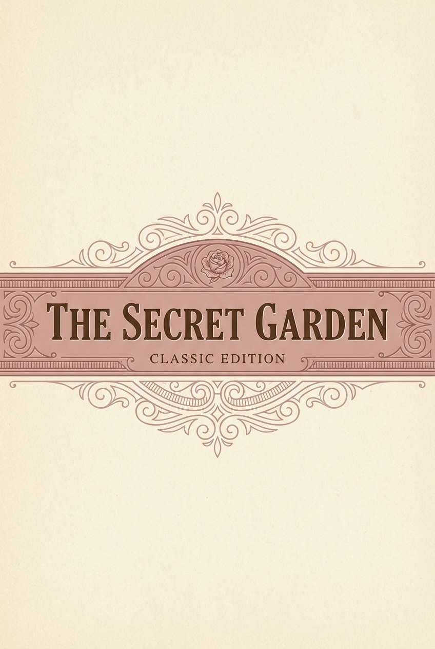
4) Terracotta Truffle
HEX: #5a2a22 #8b2f2a #c85a3a #e0b07e #f7efe3
Mood: sunbaked, warm, inviting
Best for: restaurant branding and signage
Sunbaked and inviting, these shades feel like clay pots, roasted spices, and warm stone. They fit restaurants, food trucks, and signage that needs to look friendly from a distance. Pair with simple sans-serif lettering and plenty of the pale cream to keep the reds from feeling heavy. Usage tip: use the terracotta as your hero color and the gold-tan as a supporting accent for icons and dividers.
Image example of terracotta truffle generated using media.io
5) Mocha Merlot Minimal UI
HEX: #2a1a18 #6a2430 #9b6b5a #d9c7b8 #f2f2f2
Mood: minimal, modern, calm
Best for: finance dashboard UI and data cards
Minimal and calm like matte ceramics in a modern studio, these tones create a confident interface. As a brown maroon color scheme, it is ideal for finance dashboards, analytics cards, and settings pages where trust and clarity matter. Pair it with thin dividers and subtle shadows, letting the light neutrals carry most of the layout. Usage tip: reserve the maroon for primary buttons and alerts so actions pop without overwhelming the screen.
Image example of mocha merlot minimal ui generated using media.io
6) Autumn Library
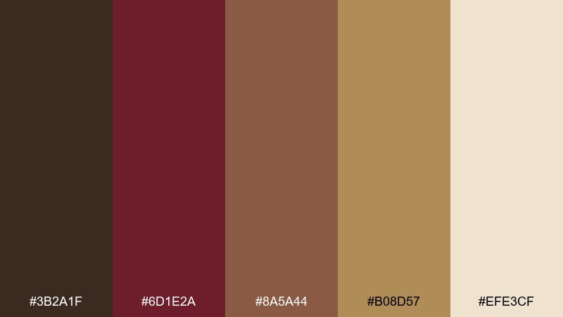
HEX: #3b2a1f #6d1e2a #8a5a44 #b08d57 #efe3cf
Mood: scholarly, warm, nostalgic
Best for: publishing brands and podcast cover art
Scholarly and nostalgic, it evokes stacked hardcovers, amber lamps, and quiet focus. The deep maroon anchors headlines while the tan and parchment tones keep the layout readable. Pair with classic serifs, small caps, and subtle grain for an editorial feel. Usage tip: use the gold-brown as a single accent rule to guide the eye across sections.
Image example of autumn library generated using media.io

7) Velvet Brick and Sand
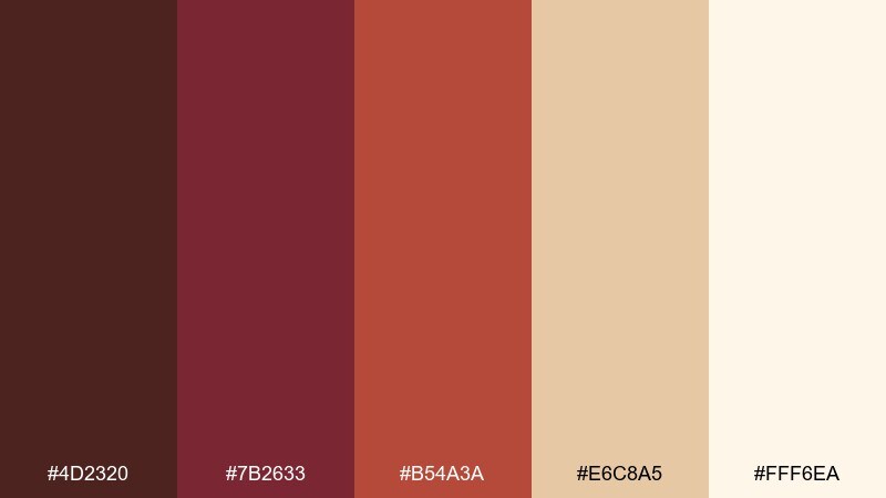
HEX: #4d2320 #7b2633 #b54a3a #e6c8a5 #fff6ea
Mood: bold, tactile, welcoming
Best for: boutique hotel interiors and mood boards
Bold and tactile, it feels like velvet drapes, brick walls, and sunlit sand. Use it for boutique hotel mood boards, interior direction decks, or lifestyle brands that lean warm and human. Pair the brick tone with soft ivory textiles and a few matte black details to sharpen edges. Usage tip: keep the brightest cream as negative space so the reds read rich, not loud.
Image example of velvet brick and sand generated using media.io
8) Garnet Walnut Studio
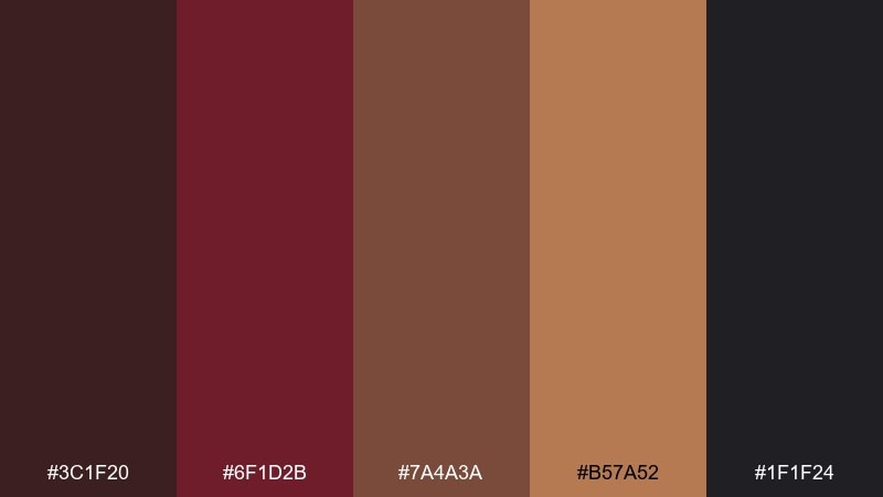
HEX: #3c1f20 #6f1d2b #7a4a3a #b57a52 #1f1f24
Mood: dramatic, refined, high-contrast
Best for: luxury product ads and hero banners
Dramatic and refined, these tones read like garnet gemstones against walnut wood in a dim studio. The near-black adds instant luxury and makes the warm browns glow. Pair with minimal type, large margins, and one metallic-looking highlight in the bronze tone. Usage tip: use the darkest shade as the background and let the mid browns do the gradient work for depth.
Image example of garnet walnut studio generated using media.io
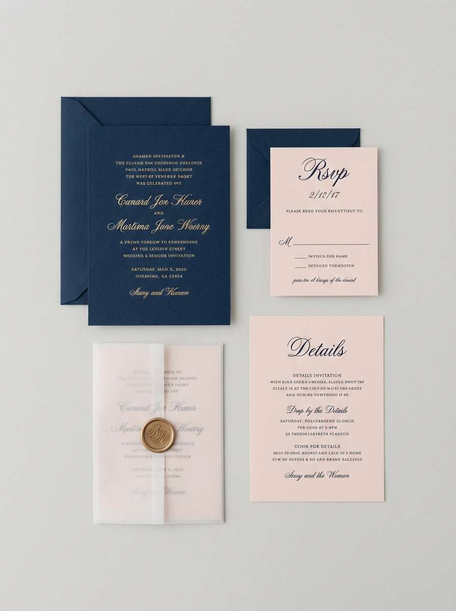
9) Copper Clay Wedding Suite
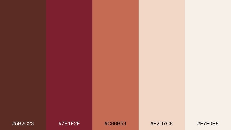
HEX: #5b2c23 #7e1f2f #c66b53 #f2d7c6 #f7f0e8
Mood: romantic, soft, celebratory
Best for: wedding invitations and RSVP cards
Romantic and soft, it brings to mind copper ink, clay blooms, and candlelit receptions. These colors work especially well for invitations, RSVP cards, and day-of signage that needs warmth without going too dark. Pair with delicate line florals and a lot of the blush paper tone for an airy feel. Usage tip: print the maroon for names and key details, then use the clay shade for secondary info and borders.
Image example of copper clay wedding suite generated using media.io
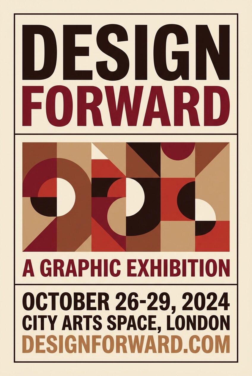
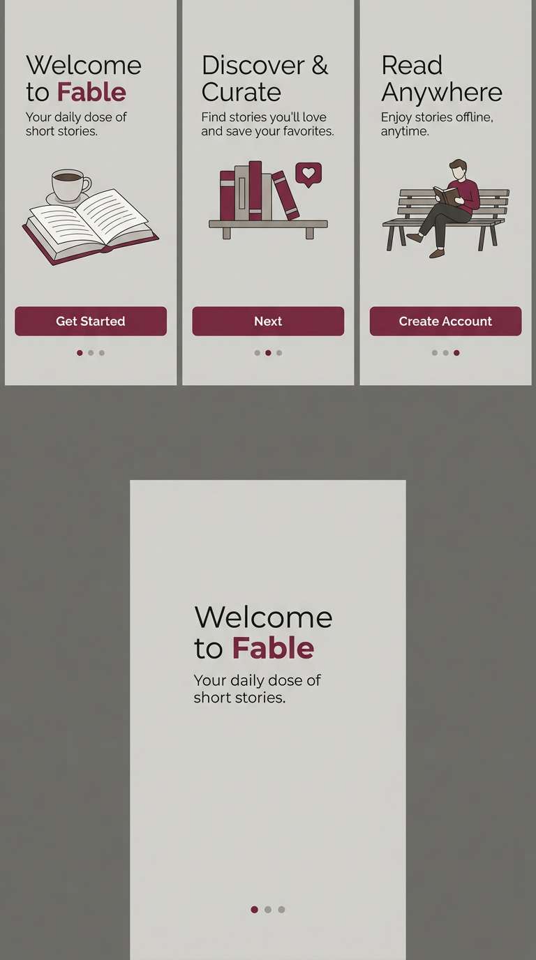
10) Mahogany Espresso Poster
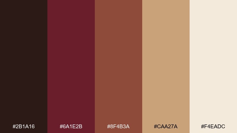
HEX: #2b1a16 #6a1e2b #8f4b3a #caa27a #f4eadc
Mood: urban, confident, warm
Best for: event posters and music flyers
Urban and confident, it feels like mahogany bar tops, espresso shots, and late-night venues. The deep maroon sets a strong base for bold typography and high contrast layouts. Pair with oversized type in cream and add a single warm gold accent for dates or callouts. Usage tip: keep background noise low and use the espresso brown for subtle texture blocks, not full patterns.
Image example of mahogany espresso poster generated using media.io
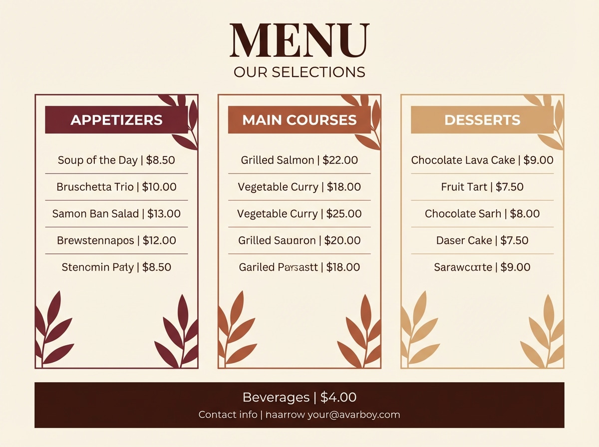
11) Burnt Sienna Bistro
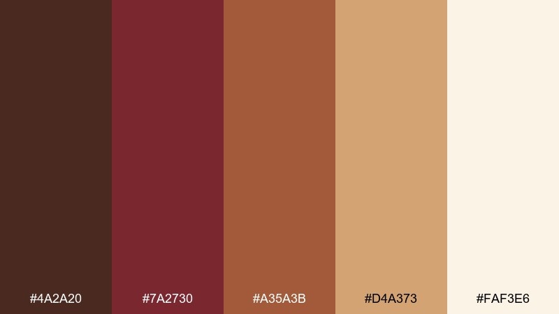
HEX: #4a2a20 #7a2730 #a35a3b #d4a373 #faf3e6
Mood: hearty, friendly, appetizing
Best for: menu templates and food photography overlays
Hearty and friendly, these shades evoke roasted vegetables, brick ovens, and warm hospitality. They are great for menu templates, food promo overlays, and social posts where readability matters. Pair with cream text and keep the sienna as a band or frame so dishes remain the star. Usage tip: use the golden brown for price highlights and icons to guide quick decisions.
Image example of burnt sienna bistro generated using media.io
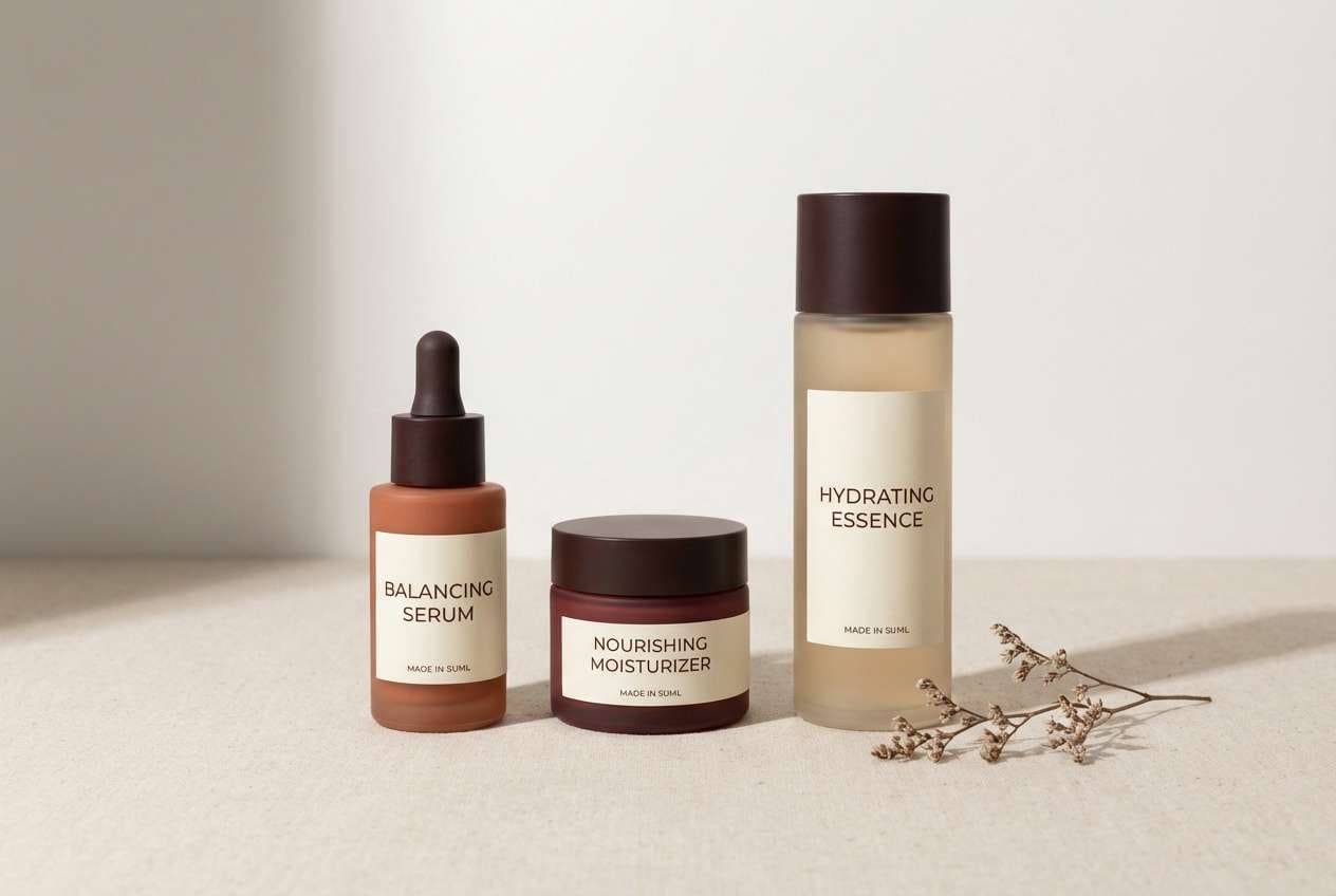
12) Dried Cherry Neutrals
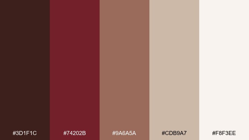
HEX: #3d1f1c #74202b #9a6a5a #cdb9a7 #f8f3ee
Mood: soft, mature, understated
Best for: skincare branding and calm web pages
Soft and mature like dried cherries and linen, this set feels gentle but grounded. This brown maroon color palette is a strong fit for skincare branding, calm landing pages, and lifestyle packaging that needs warmth without noise. Pair with lots of off-white space, thin rules, and muted photography to keep it airy. Usage tip: let the taupe carry backgrounds and save maroon for small trust signals like badges, links, or seals.
Image example of dried cherry neutrals generated using media.io
13) Cranberry Charcoal Contrast
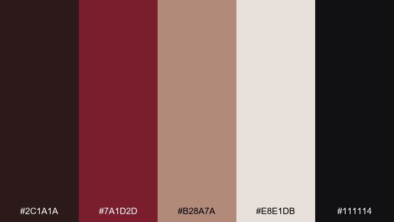
HEX: #2c1a1a #7a1d2d #b28a7a #e8e1db #111114
Mood: sleek, editorial, dramatic
Best for: fashion lookbooks and homepage hero sections
Sleek and dramatic, it reads like cranberry lipstick against charcoal tailoring. The near-black gives you instant contrast for fashion lookbooks, hero sections, and premium campaigns. Pair with crisp whites and minimal lines, keeping the dusty rose-brown for secondary blocks and captions. Usage tip: set buttons in maroon on a light background for accessibility while maintaining a high-end feel.
Image example of cranberry charcoal contrast generated using media.io
14) Rosewood and Oat
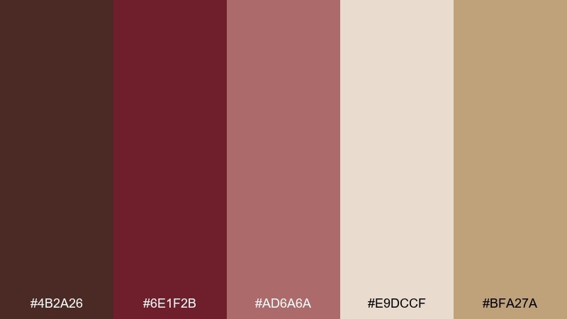
HEX: #4b2a26 #6e1f2b #ad6a6a #e9dccf #bfa27a
Mood: gentle, handcrafted, cozy
Best for: handmade goods shops and Etsy banners
Gentle and handcrafted, it feels like rosewood tools and warm oat textiles. The mix is perfect for handmade goods shops, Etsy banners, and small brand kits that want to feel personal. Pair with simple iconography, rounded corners, and a warm cream background to keep it inviting. Usage tip: keep the pink-rose shade for small highlights like stars, ratings, or call-to-action labels.
Image example of rosewood and oat generated using media.io
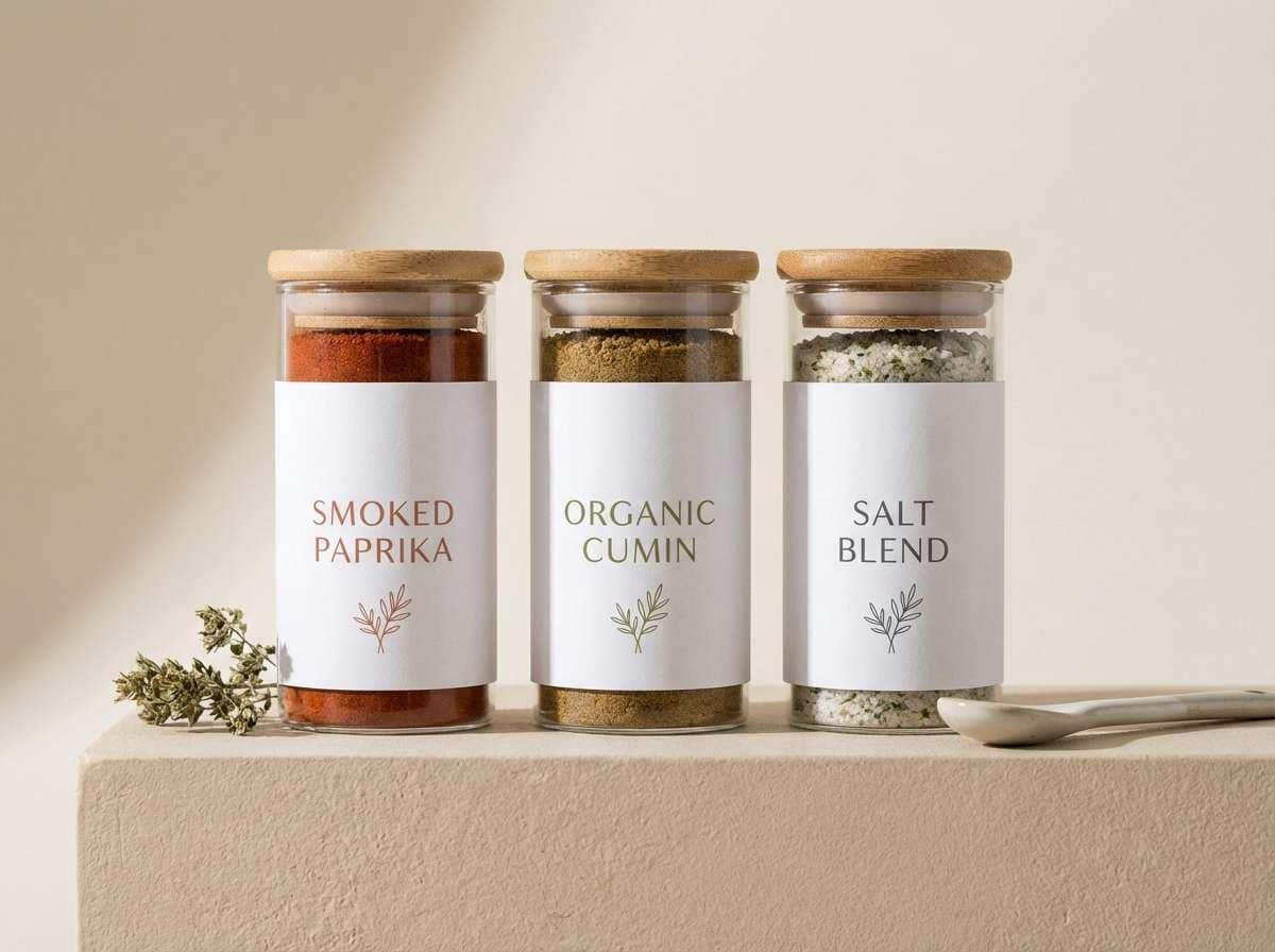
15) Smoked Paprika Packaging
HEX: #3a1f1b #7d2231 #b14a35 #d0a25f #f5efe6
Mood: spicy, bold, appetizing
Best for: spice jars and condiment labels
Spicy and bold, it evokes smoked paprika, clay bowls, and golden oil. These colors are made for spice jars, condiment labels, and shelf-ready packaging that needs instant appetite appeal. Pair with strong sans-serif type, simple icons, and a clean cream base so the reds stay vibrant. Usage tip: use the gold-tan for heat-level badges and keep the darkest shade for barcode panels and fine print.
Image example of smoked paprika packaging generated using media.io
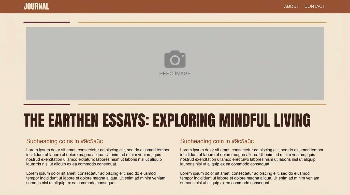
16) Maple Bronze Editorial
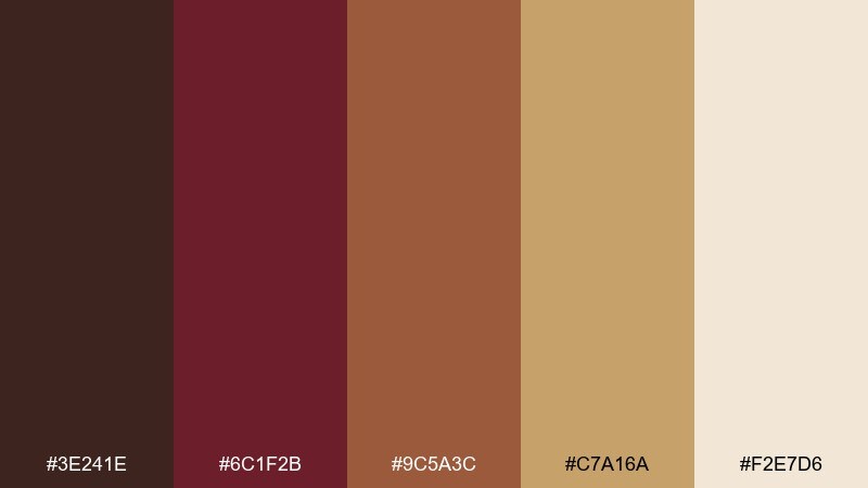
HEX: #3e241e #6c1f2b #9c5a3c #c7a16a #f2e7d6
Mood: warm, refined, story-driven
Best for: magazine features and blog templates
Warm and story-driven, it suggests maple syrup, bronzed light, and long-form reading. The mid browns are excellent for pull quotes and section headers, while the cream keeps pages calm. Pair with generous line height, serif headlines, and subtle rules in the bronze tone for an editorial rhythm. Usage tip: keep images slightly warm-toned to match the palette and avoid cool blues that clash.
Image example of maple bronze editorial generated using media.io
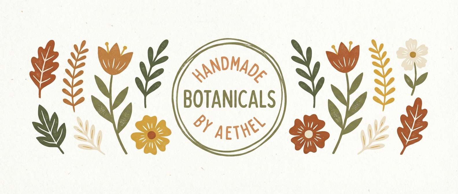
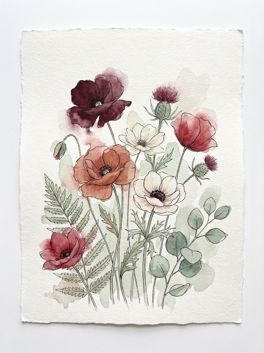
17) Maroon Meadow Botanicals
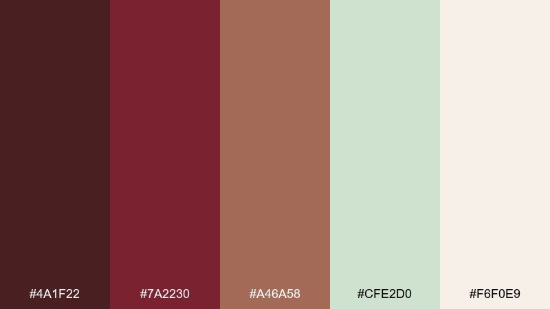
HEX: #4a1f22 #7a2230 #a46a58 #cfe2d0 #f6f0e9
Mood: earthy, botanical, serene
Best for: watercolor botanical illustrations and prints
Earthy and serene, it feels like pressed flowers beside a deep red journal. These brown maroon color combinations pair beautifully with soft greens when you want a natural, grounded look for botanical prints or packaging accents. Pair with watercolor textures and plenty of paper-white space so the greens stay fresh against the reds. Usage tip: keep the green as foliage and use maroon sparingly for petals or title lettering to maintain balance.
Image example of maroon meadow botanicals generated using media.io
18) Chestnut Night Sky
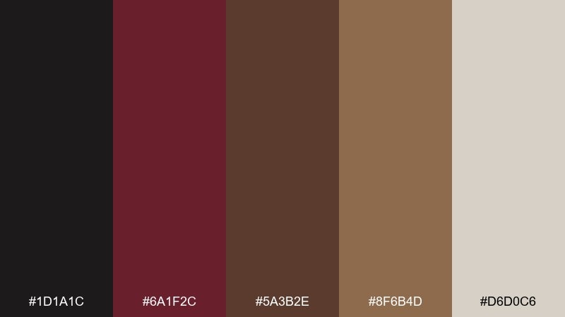
HEX: #1d1a1c #6a1f2c #5a3b2e #8f6b4d #d6d0c6
Mood: moody, cinematic, grounded
Best for: film posters and dramatic landing pages
Moody and cinematic, it suggests night skies over chestnut streets and dim neon glow. The near-black makes the maroon feel richer and helps typography pop for posters or hero sections. Pair with subtle gradients, grain, and a single warm tan highlight for credits or navigation states. Usage tip: avoid pure white text and use the pale stone instead for a softer, premium contrast.
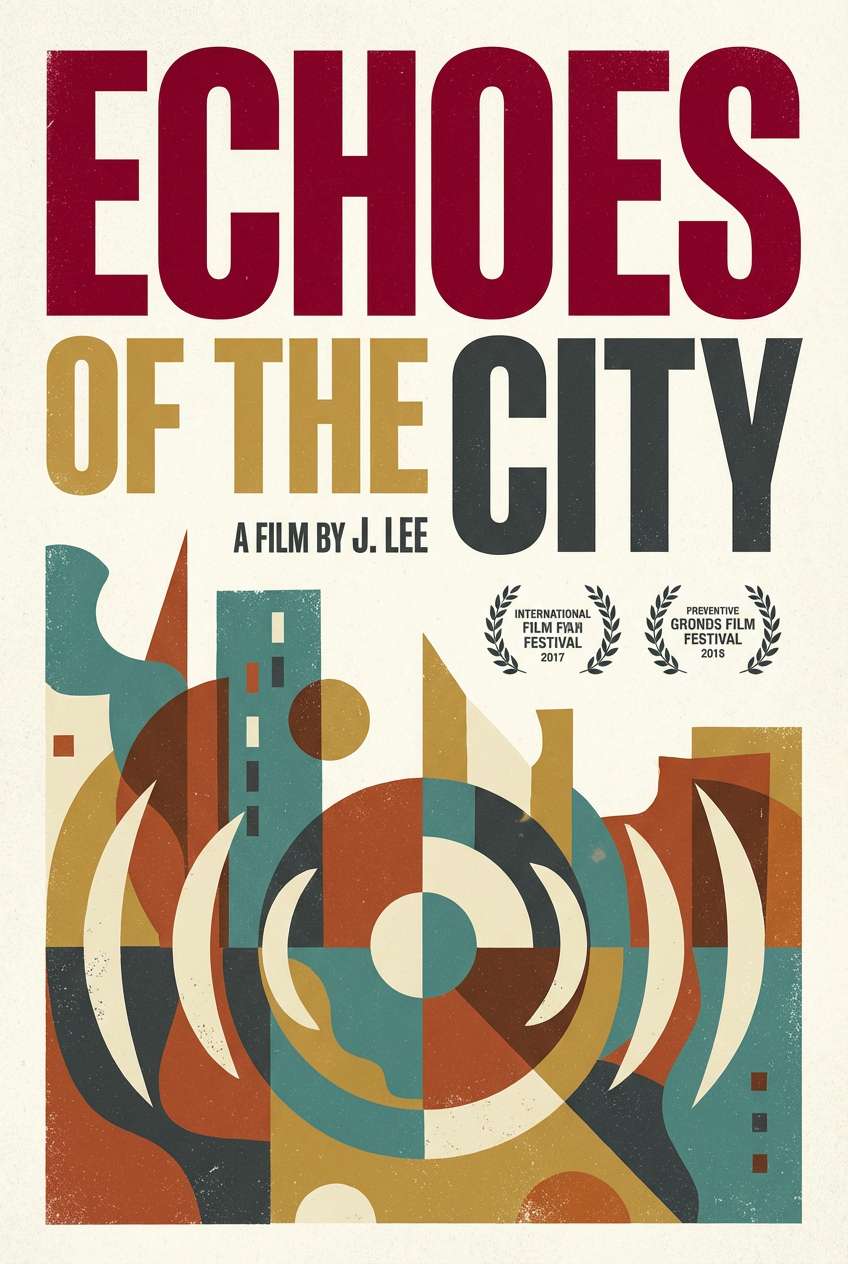
Image example of chestnut night sky generated using media.io
19) Berry Bark Playroom
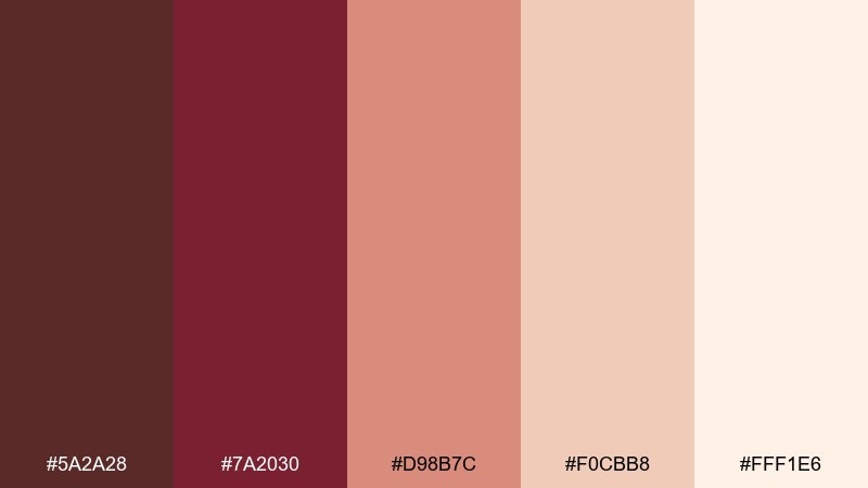
HEX: #5a2a28 #7a2030 #d98b7c #f0cbb8 #fff1e6
Mood: warm, playful, comforting
Best for: family brand graphics and kids product labels
Warm and playful, it feels like berry jam, soft wood toys, and peachy light. The pinker tones make the deeper reds friendlier, which is great for family brands and kids product labels. Pair with rounded type, simple doodle icons, and plenty of the light peach background. Usage tip: use the maroon for small anchors like outlines or headings, not large fills, to keep it bright and upbeat.
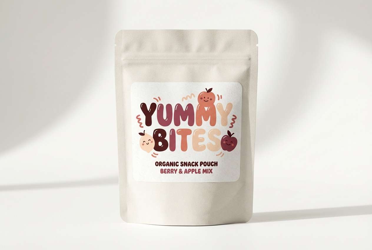
Image example of berry bark playroom generated using media.io
20) Earthy Maroon Gradient UI
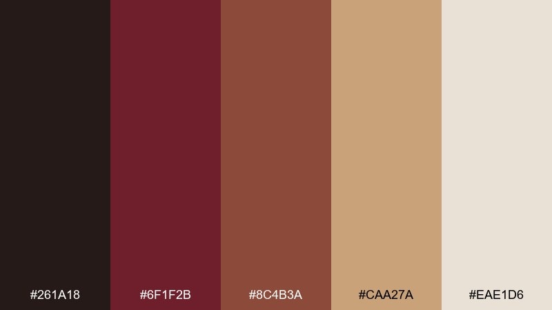
HEX: #261a18 #6f1f2b #8c4b3a #caa27a #eae1d6
Mood: smooth, modern, trustworthy
Best for: app onboarding screens and button systems
Smooth and modern, it evokes polished clay and warm parchment with a confident red core. It is ideal for onboarding screens, CTA buttons, and component libraries where a warm gradient can guide attention. Pair with subtle shadows and thin strokes, letting the light neutral carry most surfaces. Usage tip: build a maroon-to-clay gradient for primary actions, and keep secondary actions in the pale beige to reduce visual noise.
Image example of earthy maroon gradient ui generated using media.io
What Colors Go Well with Brown Maroon?
Brown maroon pairs naturally with warm neutrals like cream, ivory, parchment, and oat, which keep layouts readable and let the maroon feel rich rather than heavy. For contrast, charcoal and near-black add a crisp, editorial edge.
If you want a fresher, nature-driven direction, add greens like sage or forest green. The red-brown base makes greens look more botanical and grounded, especially in packaging and interiors.
For a premium highlight, small touches of bronze, brass, or warm gold work well as accent strokes, icons, rules, and foil details—just keep them minimal so the palette stays sophisticated.
How to Use a Brown Maroon Color Palette in Real Designs
Start with role assignment: pick one deep maroon as your anchor (headers, primary CTA, hero backgrounds), then choose a light neutral for surfaces and text areas. Use mid browns and tans for secondary components like cards, dividers, and tags.
Keep saturation under control. Brown maroon looks best when surrounded by breathing space—use cream or warm gray negative space to prevent the design from feeling too dense, especially on mobile UI.
For print and branding, lean into texture: uncoated paper, grain, and subtle shadows enhance the “heritage” feel. For digital products, prefer thin strokes, restrained gradients, and consistent contrast ratios for accessibility.
Create Brown Maroon Palette Visuals with AI
When you already have HEX codes, the fastest way to validate a palette is to generate realistic mockups (labels, posters, UI screens) and see how the colors behave in context—especially contrast, hierarchy, and warmth.
With Media.io, you can paste a prompt, describe the scene, and keep the palette consistent across multiple variations. This helps you iterate on brand direction boards, landing pages, and packaging concepts in minutes.
Brown Maroon Color Palette FAQs
-
What is a good HEX code for brown maroon?
A reliable modern brown maroon is #7a1f2b. It has enough depth for premium branding while still reading warm and approachable next to cream or tan backgrounds. -
Is brown maroon the same as burgundy?
They’re close, but not identical. Burgundy typically leans more purple-red, while brown maroon carries more earthy brown undertones, making it feel warmer and more rustic. -
What neutral colors work best with brown maroon?
Warm neutrals like ivory, parchment, oat, and sand are the easiest matches. They keep contrast comfortable and help maroon look rich instead of heavy. -
What accent colors make brown maroon look modern?
Charcoal/near-black adds a sleek edge, while muted greens (sage or forest) add a fresh, botanical counterbalance. Use metallic-style bronze or brass sparingly for premium highlights. -
How do I use brown maroon in UI without making it dark?
Use maroon primarily for CTAs, active states, and key labels, and keep most surfaces in light neutrals. Reserve near-black for text only when needed, and avoid large solid maroon backgrounds on small screens. -
Does brown maroon print well on packaging?
Yes—especially on uncoated or textured stocks where it looks tactile and heritage-friendly. Pair it with cream typography and limit highly saturated reds to small areas for cleaner results. -
How can I generate matching images for a brown maroon palette?
Use an AI image generator and include both the scene description and “colors matching the palette” in your prompt. Creating a few consistent mockups (label, poster, UI) helps you confirm hierarchy and contrast quickly.


