

Forest green is one of the easiest “anchor” colors to design with: it feels natural, confident, and timeless across brand, UI, and interior work.
Below are curated forest green palette ideas built around #0B3D2E, each with mood notes, best-use cases, and an AI prompt you can reuse to generate matching visuals.
In this article
Why Forest Green Palettes Work So Well
Forest green sits in a sweet spot between “neutral” and “statement.” It has enough depth to feel premium and grounded, but it’s still familiar and easy on the eyes—especially in long-form layouts or product interfaces.
Because it’s associated with nature, it pairs naturally with warm materials (kraft paper, wood, leather tones) and modern surfaces (off-whites, cool grays, ink blacks). That makes it flexible across rustic, minimal, and luxury styles.
In digital design, forest green also performs well as a hierarchy color: strong for headers and navigation, calm for backgrounds, and excellent as an accent when you need a trustworthy CTA color that isn’t overly loud.
20+ Forest Green Color Palette Ideas (with HEX Codes)
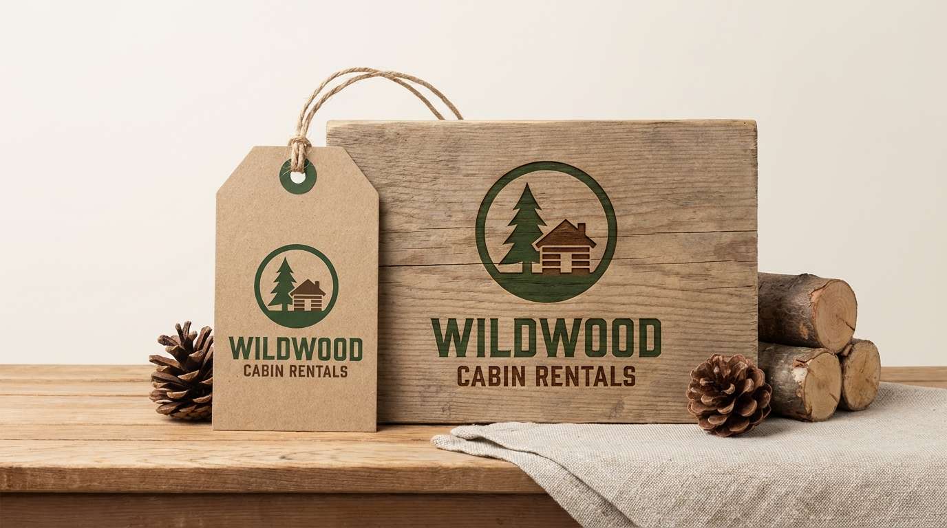
1) Evergreen Cabin
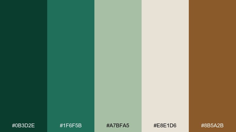
HEX: #0B3D2E #1F6F5B #A7BFA5 #E8E1D6 #8B5A2B
Mood: cozy, outdoorsy, grounded
Best for: cabin rentals, outdoor brands, rustic signage
Cozy and woodsy, like pine needles underfoot and warm light in a cabin window. These tones shine on hospitality branding, trailhead signage, and lifestyle packaging where authenticity matters. Pair the deep green with creamy neutrals for readability, then let the brown do the heavy lifting for warmth. Usage tip: keep the darkest green for headers and logos so the palette stays legible at a distance.
Image example of evergreen cabin generated using media.io
Media.io is an online AI studio for creating and editing video, image, and audio in your browser.

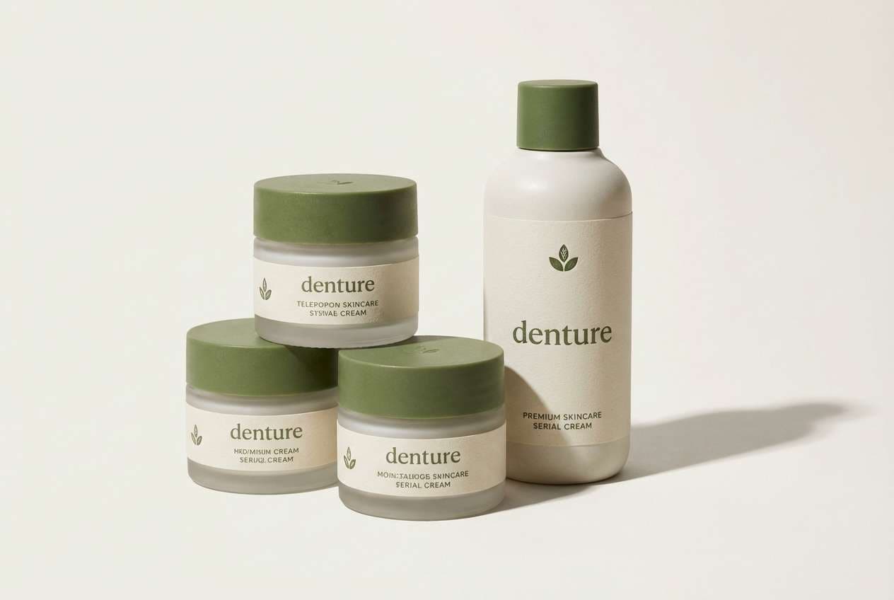
2) Moss and Cream
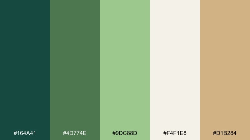
HEX: #164A41 #4D774E #9DC88D #F4F1E8 #D1B284
Mood: soft, calming, organic
Best for: wellness packaging, skincare labels, airy interiors
Soft and clean, like moss in morning shade against sun-warmed linen. The creamy off-white keeps layouts light, while the greens bring a gentle natural cue for wellness and self-care. Pair with warm tan for a premium, approachable finish, especially on paper textures. Usage tip: use the lightest shade as negative space so the greener accents feel fresh, not heavy.
Image example of moss and cream generated using media.io
3) Pine and Clay
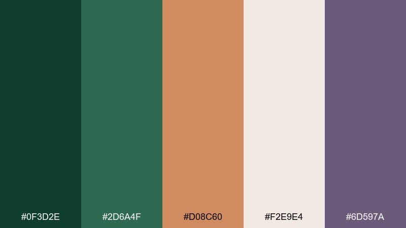
HEX: #0F3D2E #2D6A4F #D08C60 #F2E9E4 #6D597A
Mood: earthy, artsy, modern rustic
Best for: ceramics brands, artisan shops, lifestyle posters
Earthy and tactile, like pine boughs beside sunbaked terracotta. These forest green color combinations work beautifully for handmade goods where you want grounded color with a creative twist. Pair the clay tone with the deeper green for strong contrast, then soften with the warm off-white for breathing room. Usage tip: let the purple-gray sit in the background as a quiet secondary, not a headline color.
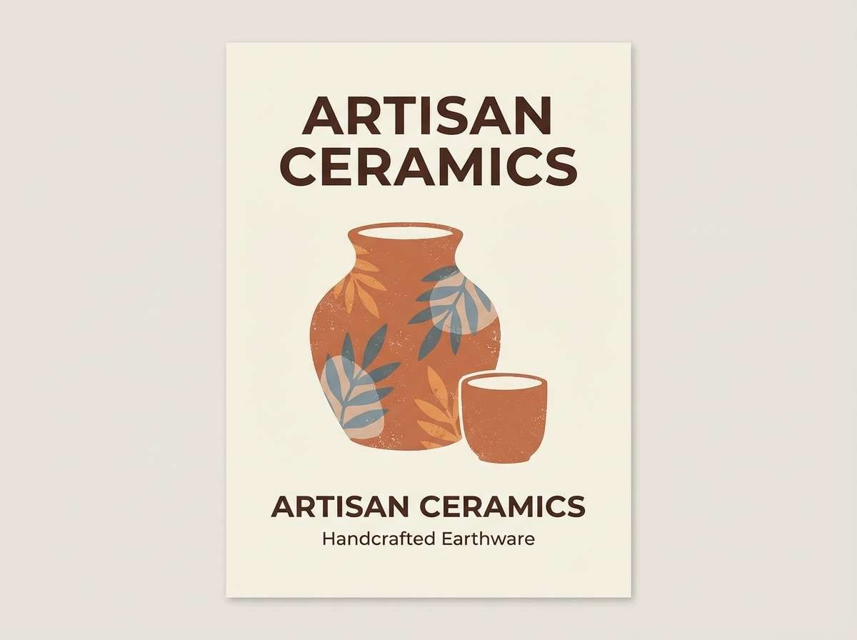
Image example of pine and clay generated using media.io
4) Forest and Fog
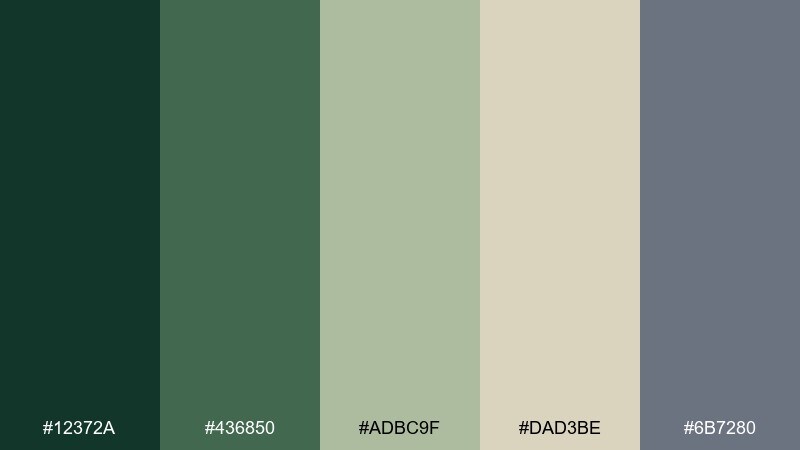
HEX: #12372A #436850 #ADBC9F #DAD3BE #6B7280
Mood: misty, quiet, sophisticated
Best for: minimal websites, editorial layouts, boutique hotels
Misty and reserved, like a foggy trail with muted leaves and soft stone. The mid greens feel refined, while the beige and gray keep the whole mix modern and calm. Pair with crisp white type and minimal photography for a boutique, editorial mood. Usage tip: reserve the gray for UI borders and dividers to avoid flattening the greens.
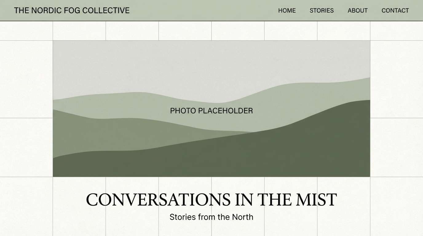
Image example of forest and fog generated using media.io
5) Jungle Pop
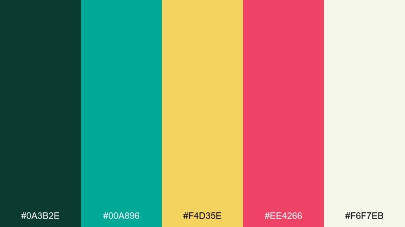
HEX: #0A3B2E #00A896 #F4D35E #EE4266 #F6F7EB
Mood: bold, playful, tropical
Best for: social ads, festival flyers, youth branding
Loud and lively, like neon fruit stands tucked into deep foliage. The bright teal, yellow, and pink create energetic contrast against the dark green base. Pair with clean off-white for spacing, then pick one pop color per layout to keep it from turning chaotic. Usage tip: use the yellow for calls to action and keep the pink for small highlights like icons.
Image example of jungle pop generated using media.io

6) Heritage Tartan
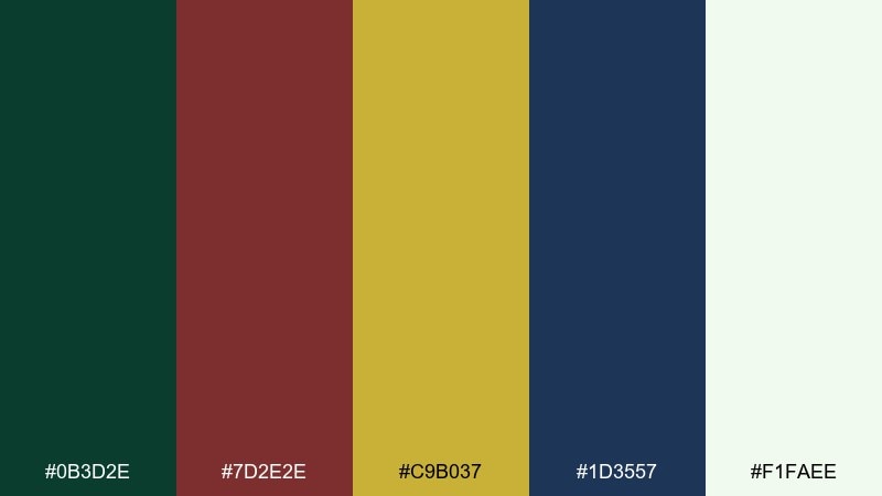
HEX: #0B3D2E #7D2E2E #C9B037 #1D3557 #F1FAEE
Mood: classic, scholarly, timeless
Best for: universities, heritage brands, long-form editorial
Classic and confident, like a tartan scarf paired with a well-worn hardback. This forest green color scheme balances tradition with clarity through strong contrast and a clean off-white. Pair the gold sparingly with the deepest tones for crests, seals, and premium details. Usage tip: keep body text on the off-white and use the navy for subheads to avoid an overly dark page.
Image example of heritage tartan generated using media.io
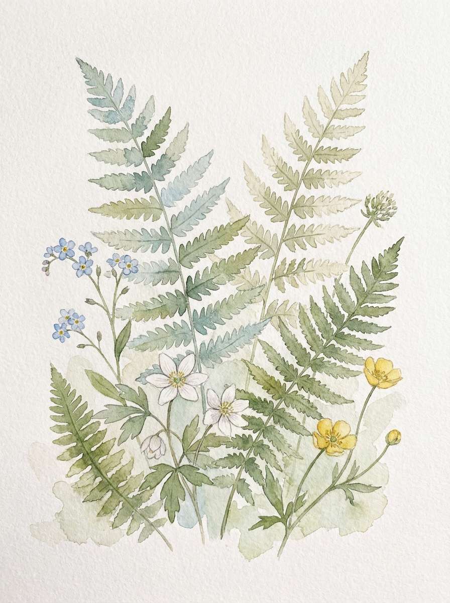
7) Botanical Watercolor
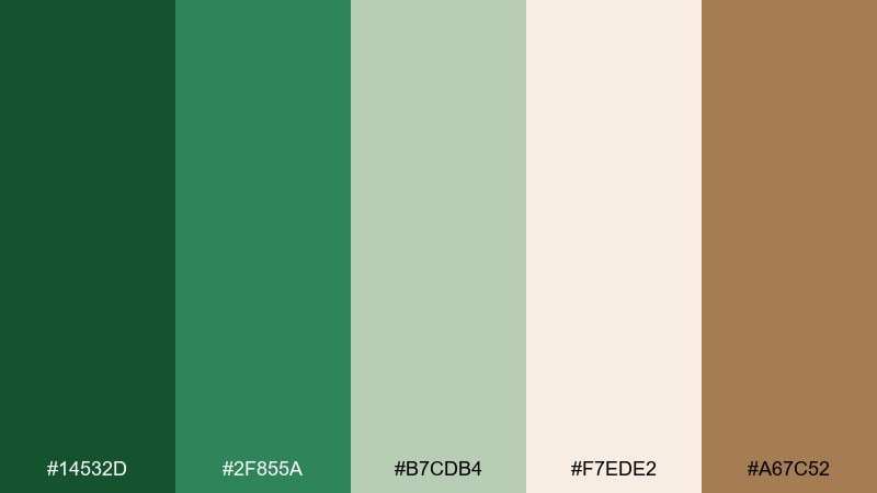
HEX: #14532D #2F855A #B7CDB4 #F7EDE2 #A67C52
Mood: delicate, fresh, handmade
Best for: botanical prints, spring stationery, natural goods
Delicate and airy, like pressed leaves on textured paper. The soft greens and blushy neutral create an inviting, handmade feel that suits prints and stationery. Pair with warm brown for linework, borders, or small typographic flourishes. Usage tip: keep gradients subtle and let the light neutral dominate so the watercolor look stays believable.
Image example of botanical watercolor generated using media.io
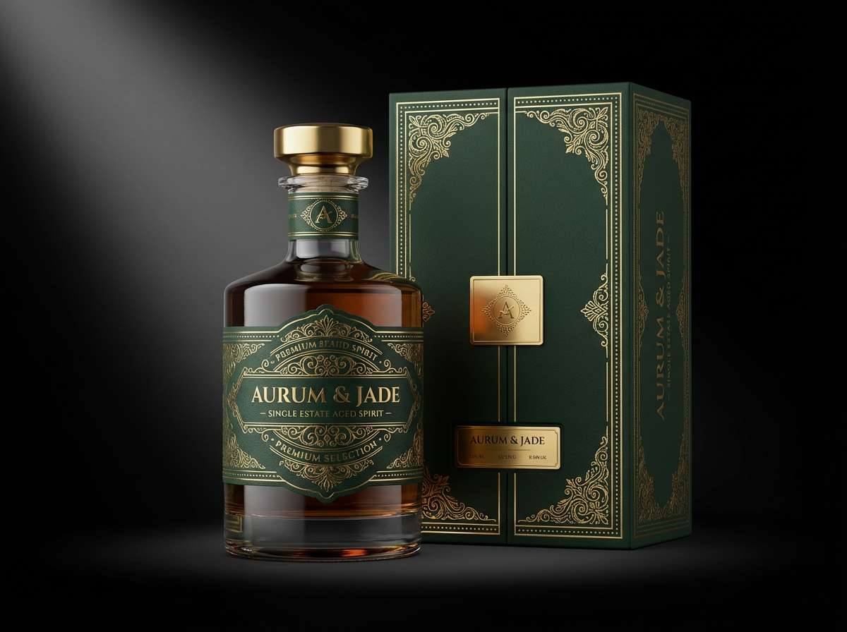
8) Deep Woods Luxury
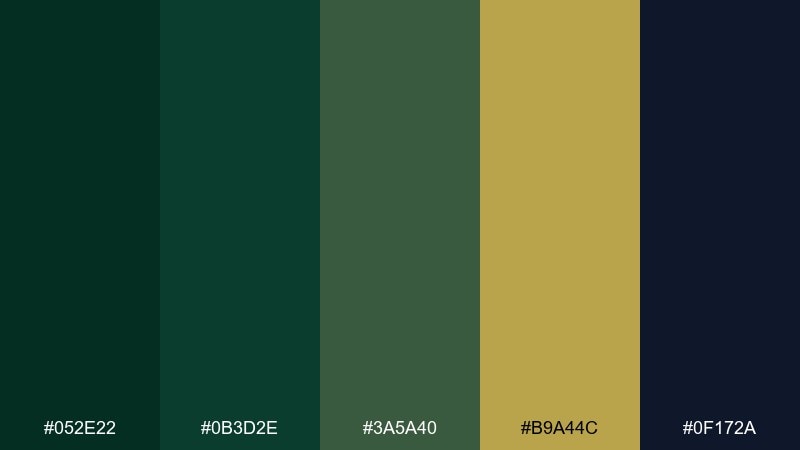
HEX: #052E22 #0B3D2E #3A5A40 #B9A44C #0F172A
Mood: luxurious, moody, high-contrast
Best for: premium spirits, jewelry ads, upscale landing pages
Moody and opulent, like candlelight reflecting off dark glass in a wood-paneled room. The gold reads instantly as premium when it is framed by deep greens and near-black navy. Pair with minimal typography and generous spacing to keep the luxury vibe sharp. Usage tip: treat gold like a spotlight, using it for only the logo mark and one key detail per page.
Image example of deep woods luxury generated using media.io
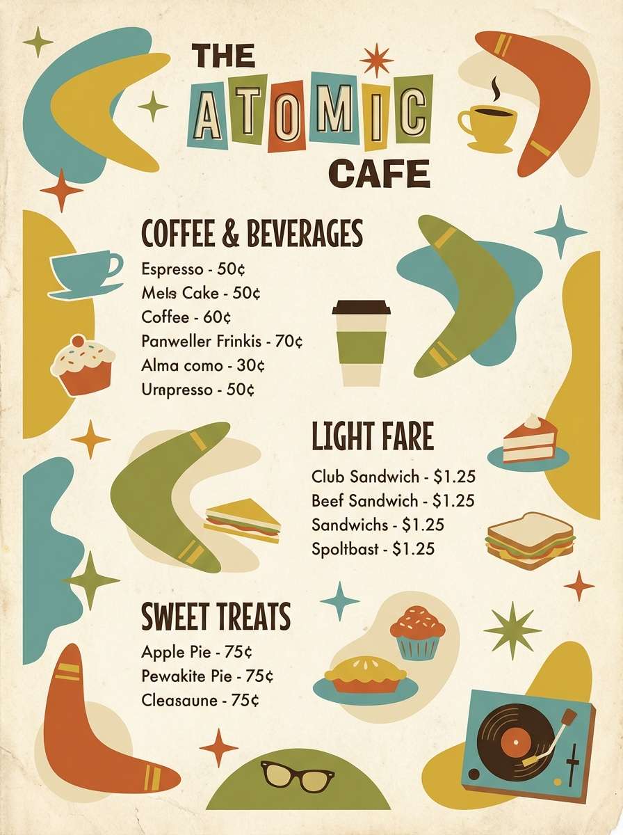
9) Midcentury Fern
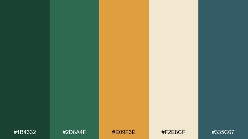
HEX: #1B4332 #2D6A4F #E09F3E #F2E8CF #335C67
Mood: retro, warm, optimistic
Best for: brand identities, cafe menus, vintage posters
Warm and retro, like a midcentury kitchen with leafy prints and amber glassware. A forest green color palette like this feels friendly when you balance the darker greens with the creamy neutral and optimistic orange. Pair the teal-gray with the orange for small graphic moments such as icons, bullets, or patterns. Usage tip: keep the orange to about 10 percent so the greens remain the anchor.
Image example of midcentury fern generated using media.io
10) Alpine Lake
HEX: #0B3D2E #1D4E89 #3A86FF #A8DADC #F1FAEE
Mood: crisp, adventurous, clean
Best for: travel sites, outdoor apps, presentation decks
Crisp and refreshing, like cold lake water under evergreen slopes. The blues sharpen the green base and create a clean, trustworthy feel for digital products. Pair with plenty of off-white and use the bright blue as the primary action color for buttons. Usage tip: keep the light aqua for backgrounds and data highlights so charts stay readable.
Image example of alpine lake generated using media.io
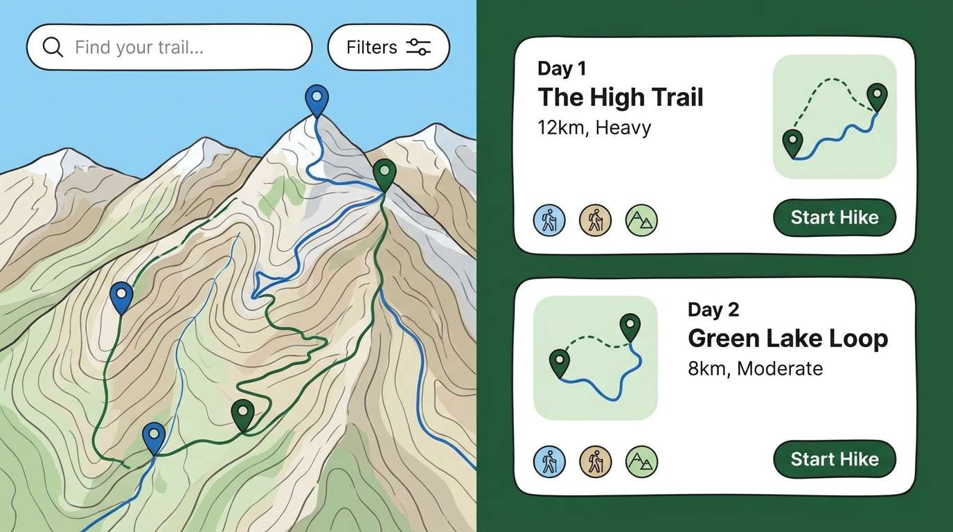
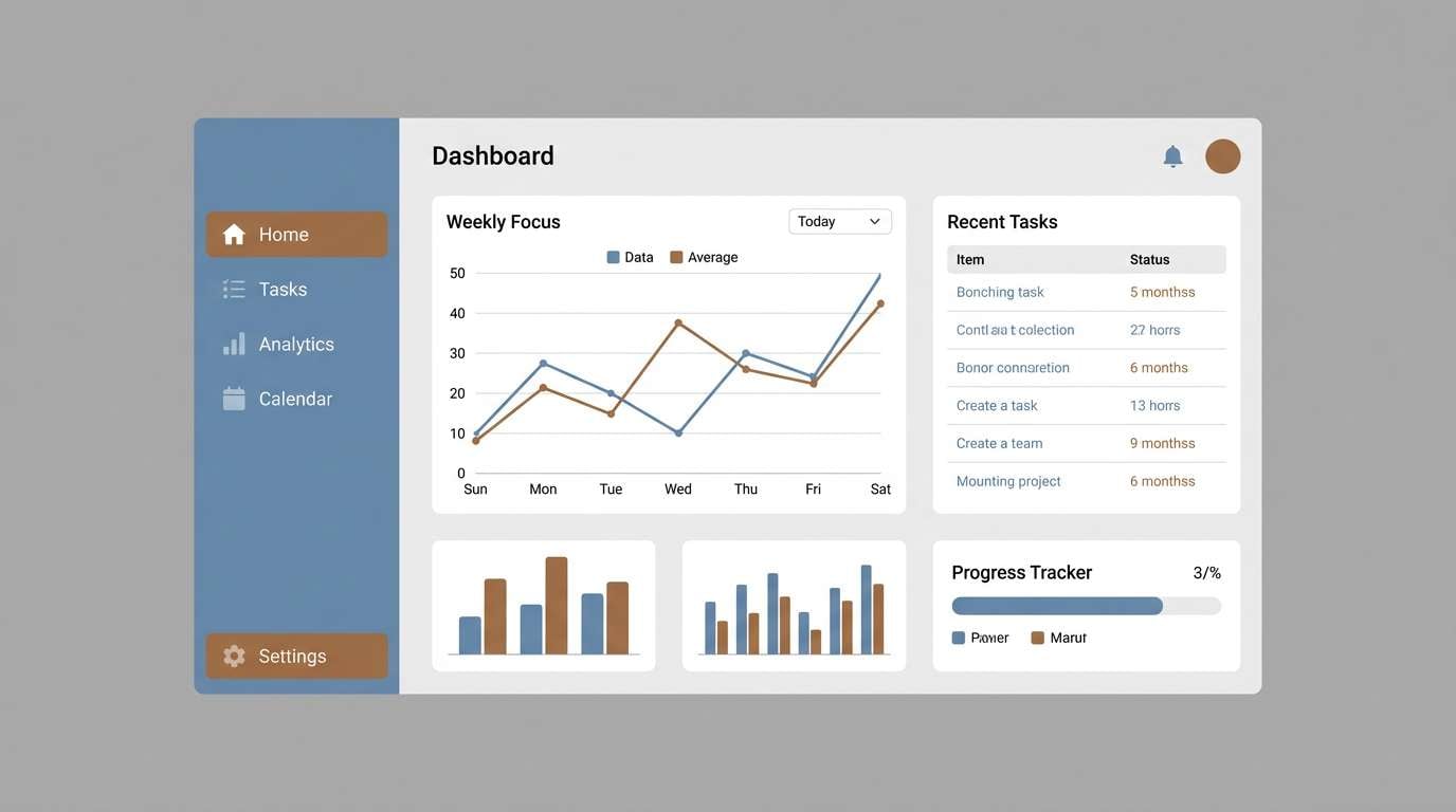
11) Sage Workspace
HEX: #0F3D2E #3A5A40 #8FAE7A #EDEDE9 #2B2D42
Mood: focused, calm, professional
Best for: SaaS dashboards, productivity tools, corporate decks
Calm and focused, like a tidy desk beside a plant-filled window. The softened sage makes the darker green feel approachable, while the inky blue-gray adds structure for text and navigation. Pair with simple iconography and subtle shadows to keep the interface modern. Usage tip: use the light neutral as your default canvas and the deepest tones only for selected states and headings.
Image example of sage workspace generated using media.io
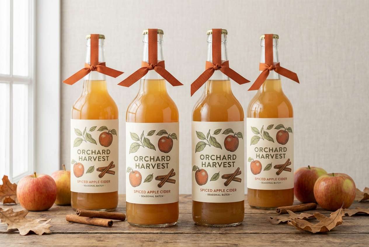
12) Autumn Woodland
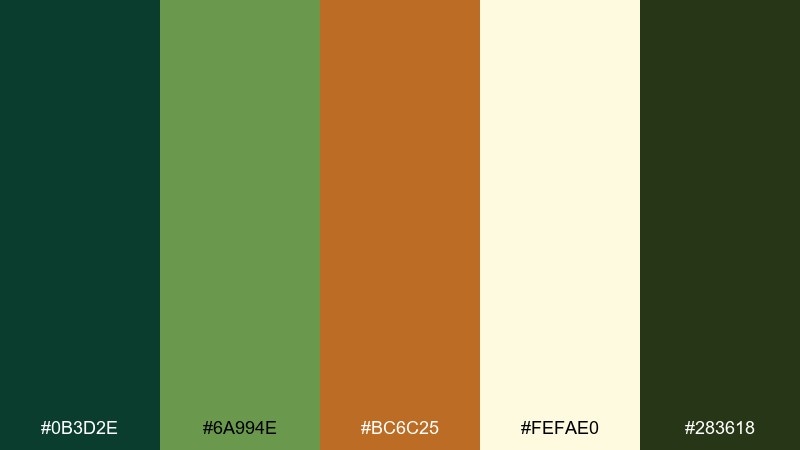
HEX: #0B3D2E #6A994E #BC6C25 #FEFAE0 #283618
Mood: seasonal, cozy, storybook
Best for: fall campaigns, farmers markets, seasonal packaging
Seasonal and cozy, like fallen leaves and spiced cider on a cool afternoon. The orange-brown brings warmth, while layered greens keep the look grounded and natural. Pair with cream for labels and headlines to maintain contrast in busy designs. Usage tip: use the brighter green for secondary accents so the deep tones do not swallow small text.
Image example of autumn woodland generated using media.io
13) Minimal Ink
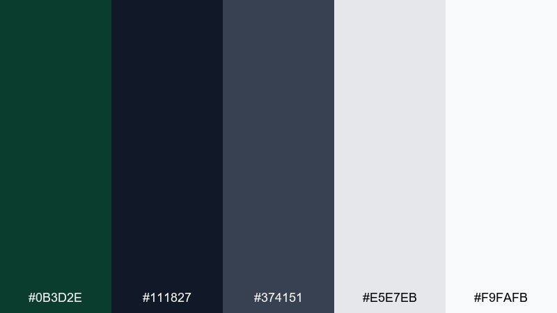
HEX: #0B3D2E #111827 #374151 #E5E7EB #F9FAFB
Mood: minimal, modern, confident
Best for: legal sites, fintech, monochrome branding
Sharp and minimal, like fresh ink on bright paper. The near-black and grays give structure, while the deep green adds personality without feeling loud. Pair with clean typography and simple line icons for a modern, trustworthy look. Usage tip: keep green reserved for links and key CTAs so it reads as intentional, not decorative.
Image example of minimal ink generated using media.io
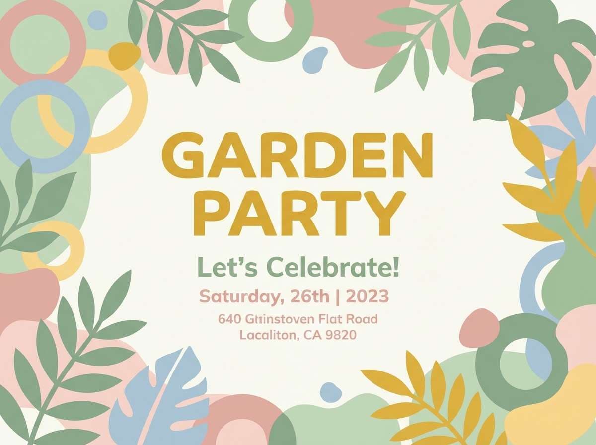
14) Garden Party
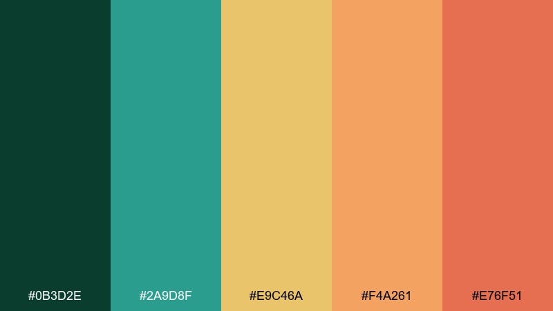
HEX: #0B3D2E #2A9D8F #E9C46A #F4A261 #E76F51
Mood: cheerful, social, sunlit
Best for: event invites, brunch branding, lifestyle content
Cheerful and sunlit, like citrus slices on a picnic table under leafy shade. The warm oranges and yellow feel friendly against the steady green base, making layouts feel energetic but still grounded. Pair with a simple sans-serif and lots of white space for a modern invite look. Usage tip: choose either yellow or orange as the main highlight and let the other act as a small supporting accent.
Image example of garden party generated using media.io
15) Night Hike
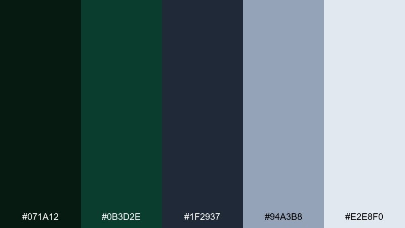
HEX: #071A12 #0B3D2E #1F2937 #94A3B8 #E2E8F0
Mood: mysterious, cool, atmospheric
Best for: album art, film posters, moody websites
Mysterious and cool, like a trail lit by a small headlamp under a starless sky. The slate tones create depth, while the pale blue-gray provides contrast for text and small details. Pair with condensed typography and minimal graphics to keep the mood cinematic. Usage tip: use the lightest color for titles and keep mid grays for secondary credits so hierarchy stays clear.
Image example of night hike generated using media.io
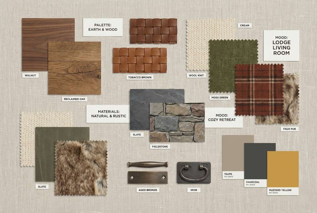
16) Rustic Lodge
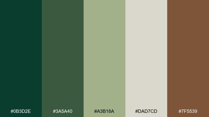
HEX: #0B3D2E #3A5A40 #A3B18A #DAD7CD #7F5539
Mood: warm, welcoming, handcrafted
Best for: interior mood boards, cafes, woodcraft brands
Warm and welcoming, like a lodge lounge with worn leather and pine walls. The layered greens feel natural next to the soft beige and rich wood brown. Pair with textured materials such as linen, kraft, or matte ceramics to amplify the handcrafted vibe. Usage tip: use the light beige as the main background so the brown reads as a cozy accent, not a heavy block.
Image example of rustic lodge generated using media.io
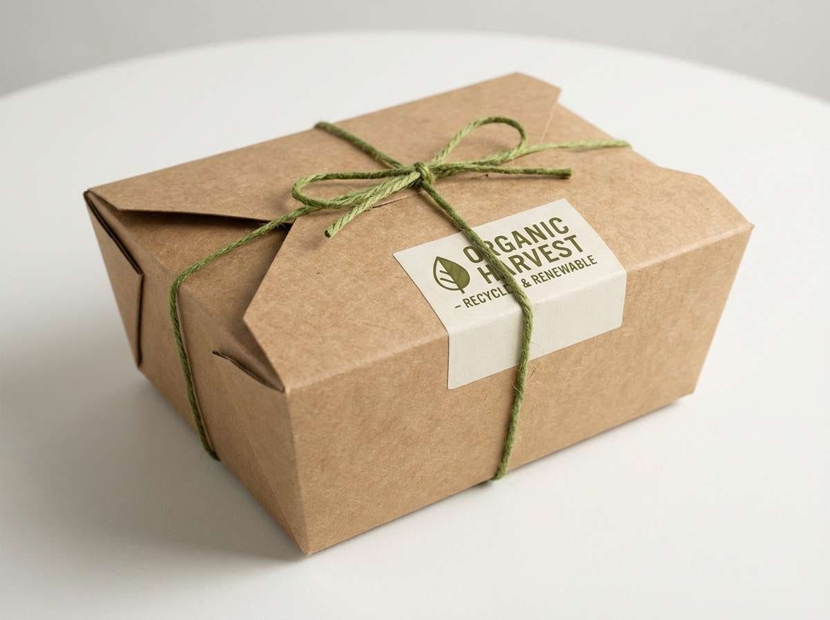
17) Eco Packaging
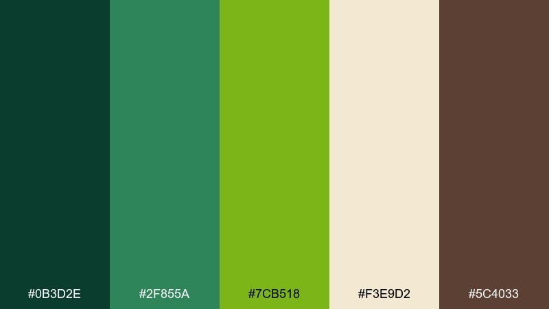
HEX: #0B3D2E #2F855A #7CB518 #F3E9D2 #5C4033
Mood: fresh, responsible, energetic
Best for: sustainable packaging, organic food labels, eco startups
Fresh and responsible, like a farm stand with crisp herbs and recycled paper bags. The bright green adds energy, while the cream and brown keep the look grounded and eco-forward. Pair with simple icons and uncoated paper textures for credibility. Usage tip: print-test the brightest green early, since it can shift dramatically across recycled stocks.
Image example of eco packaging generated using media.io
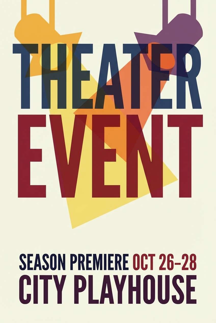
18) Velvet Theater
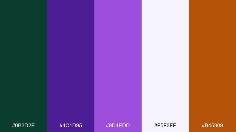
HEX: #0B3D2E #4C1D95 #9D4EDD #F5F3FF #B45309
Mood: dramatic, creative, upscale
Best for: event posters, performing arts branding, nightlife ads
Dramatic and creative, like velvet curtains and stage lights catching haze. These tones bring out playful elegance, with purple adding depth and the amber accent providing a warm spotlight. A forest green color palette in this range works best when you keep layouts bold and typographic. Usage tip: use the pale lavender as your negative space so the dark colors feel intentional rather than heavy.
Image example of velvet theater generated using media.io
19) Coastal Spruce
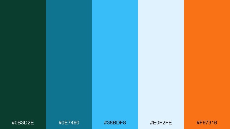
HEX: #0B3D2E #0E7490 #38BDF8 #E0F2FE #F97316
Mood: fresh, breezy, adventurous
Best for: surf and hike brands, travel content, modern merch
Fresh and breezy, like spruce trees near a bright, windy shoreline. The cyan and teal lighten the deep green, while the orange adds a sun-kissed counterpoint. Pair with clean photography and simple shapes for a modern outdoor-meets-coastal feel. Usage tip: keep orange for micro accents such as price tags, labels, or small icons to avoid visual noise.
Image example of coastal spruce generated using media.io

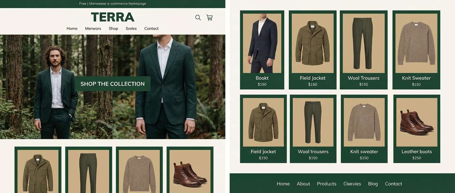
20) Modern Plaid
HEX: #0B3D2E #2D6A4F #B08968 #E6CCB2 #1F2937
Mood: modern classic, warm, versatile
Best for: menswear brands, product catalogs, lifestyle websites
Modern classic, like a tailored coat with a subtle plaid lining. The warm tans soften the greens, and the dark slate adds a crisp anchor for text and UI elements. These forest green color combinations are especially strong for catalogs and ecommerce where you need both warmth and contrast. Usage tip: use the light tan for product-card backgrounds so the deep green feels like a premium framing color.
Image example of modern plaid generated using media.io
What Colors Go Well with Forest Green?
Forest green pairs beautifully with warm neutrals like cream, beige, and tan when you want a natural, approachable look. These combinations are especially effective for packaging, interiors, and lifestyle branding where texture matters.
For a more modern, “product” feel, combine forest green with cool grays, ink black, and crisp whites. This keeps UI clean and readable while giving you a distinctive accent color for links, toggles, or button states.
If you want contrast, try gold/amber for premium highlights, or teal/bright blue for a fresh outdoorsy energy. Use bold accents sparingly so the deep green remains the visual anchor.
How to Use a Forest Green Color Palette in Real Designs
Start with roles, not swatches: assign one forest green as your primary (logos, headers), a light neutral as your canvas, and one mid-tone as your supporting UI/background. This prevents the palette from feeling overly dark or “muddy.”
When you add a bright accent (gold, orange, teal, pink), treat it like a signal color for one purpose: CTA buttons, badges, or key data highlights. Consistency is what makes the palette feel intentional.
For print, test greens early—forest hues can shift across coated vs. uncoated stocks. For screens, check contrast (especially green-on-beige) and reserve the darkest tones for large type or high-importance elements.
Create Forest Green Palette Visuals with AI
If you already have HEX codes you love, the fastest way to validate them is to see them in context: packaging, UI mockups, posters, or interior mood boards. AI-generated examples help you spot contrast issues and balance accents before committing to a full design system.
Reuse the prompts above (or swap in your product and layout type), then iterate by changing lighting, materials, and aspect ratio. You’ll quickly land on a look that matches your brand tone—from rustic to luxury.
Generate a few options per palette, then choose the one that best supports readability and hierarchy for your real-world use case.
Forest Green Color Palette FAQs
-
What HEX code is “forest green” in this article?
The main forest green used throughout these palettes is #0B3D2E, a deep evergreen tone that works well as a primary brand or header color. -
What neutral colors pair best with forest green?
Warm off-whites and beiges (cream, linen, sand) make forest green feel inviting and readable. Cool light grays work best for modern UI and minimalist layouts. -
Is forest green good for website UI?
Yes. Forest green is strong for navigation, headings, and accents. For best accessibility, keep body text on a light neutral and use forest green for emphasis rather than long paragraphs. -
What accent colors look premium with forest green?
Gold, brass, and amber accents read instantly “luxury” against deep greens. Use them sparingly for logos, borders, icons, or one standout call-to-action. -
How do I keep a forest green palette from feeling too dark?
Increase the proportion of light neutrals, add a mid-tone green/sage for transitions, and reserve the darkest green for key blocks (headers, footers, hero overlays) instead of full-page backgrounds. -
What colors create high contrast with forest green?
Crisp off-white, pale mint, light aqua, and warm cream create clean contrast. For punchy contrast, try bright teal, cobalt/sky blue, or a controlled orange highlight. -
Can I generate palette-based mockups with Media.io?
Yes. You can paste a prompt (like the examples above), describe your layout (UI, packaging, poster), and iterate quickly to produce visuals that match your forest green palette direction.
Next: Teal Blue Color Palette


