

Brown burgundy blends the grounded comfort of brown with the richness of burgundy, creating palettes that feel warm, premium, and emotionally resonant.
From dark-mode UI accents to stationery and packaging, these brown burgundy color combinations make it easy to build contrast, hierarchy, and a timeless mood with just a few well-chosen tones.
In this article
- Why Brown Burgundy Palettes Work So Well
-
- cocoa merlot
- chestnut velvet
- roasted brick
- mahogany dusk
- cinnamon cabernet
- truffle rosewood
- sable cranberry
- autumn leather
- burgundy bark
- spiced mocha
- garnet clay
- smoked plum
- cask and cream
- copperwood night
- maple sangria
- walnut berry
- toffee bordeaux
- burnt umber blush
- forest trunk wine
- pomegranate suede
- rosewood botanica
- What Colors Go Well with Brown Burgundy?
- How to Use a Brown Burgundy Color Palette in Real Designs
- Create Brown Burgundy Palette Visuals with AI
Why Brown Burgundy Palettes Work So Well
Brown burgundy palettes feel instantly “designed” because they combine earthy stability with a wine-like richness. That balance makes them versatile: cozy enough for lifestyle brands, yet refined enough for premium packaging and editorial work.
They also create natural hierarchy. Deep cocoa and near-black browns make strong anchors, burgundy becomes the hero accent, and warm creams or blush neutrals keep layouts readable and breathable.
Finally, brown burgundy tones play well with real-world materials—kraft paper, linen textures, wood, leather, and soft matte finishes—so they translate beautifully from screen to print.
20+ Brown Burgundy Color Palette Ideas (with HEX Codes)
1) Cocoa Merlot
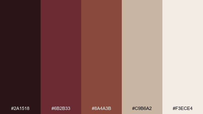
HEX: #2a1518 #6b2b33 #8a4a3b #c9b6a2 #f3ece4
Mood: moody, refined, warm
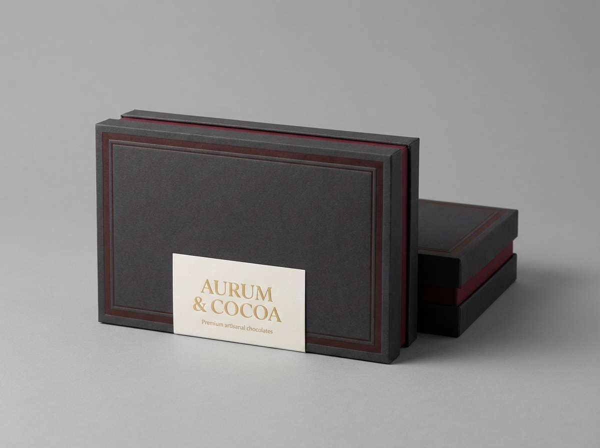
Best for: luxury branding and packaging
Moody and velvety like a candlelit wine bar, these tones feel rich without getting heavy. Use it for premium packaging, labels, and brand systems that need depth and restraint. Pair the dark base with creamy negative space to keep layouts breathable, then reserve the burgundy for headlines and seals. For a polished finish, keep type in near-black and let the warm neutrals carry the calm.
Image example of cocoa merlot generated using media.io
Media.io is an online AI studio for creating and editing video, image, and audio in your browser.

2) Chestnut Velvet
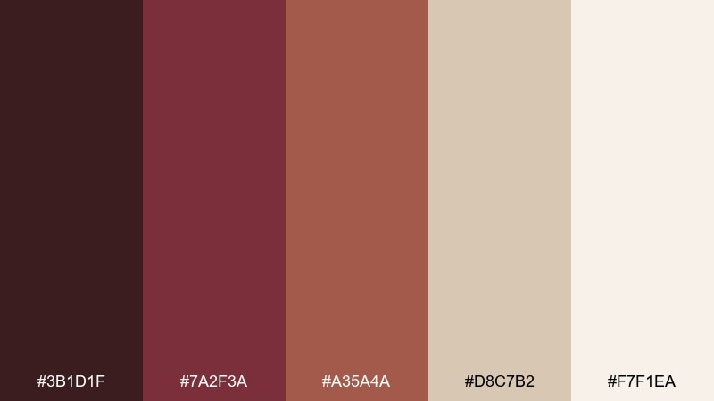
HEX: #3b1d1f #7a2f3a #a35a4a #d8c7b2 #f7f1ea
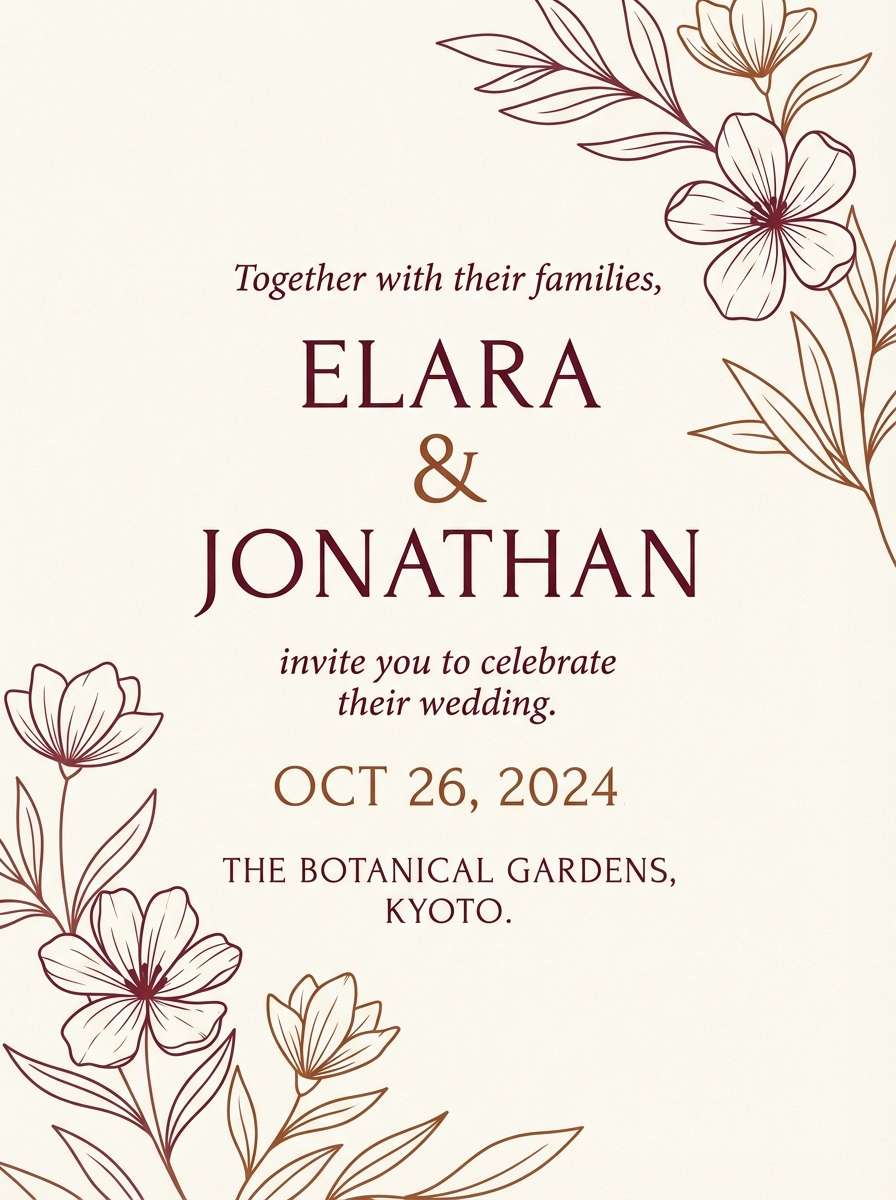
Mood: cozy, classic, intimate
Best for: wedding invitations and stationery
Cozy and romantic like velvet ribbons and dried roses, this mix leans timeless. It works beautifully on invitations, place cards, and programs where you want warmth over sparkle. Let the light cream handle most of the page, then add burgundy for names and key details. A small chestnut border or monogram keeps the layout feeling intentional.
Image example of chestnut velvet generated using media.io
3) Roasted Brick
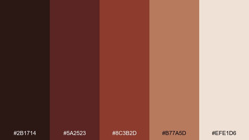
HEX: #2b1714 #5a2523 #8c3b2d #b77a5d #efe1d6
Mood: earthy, bold, grounded
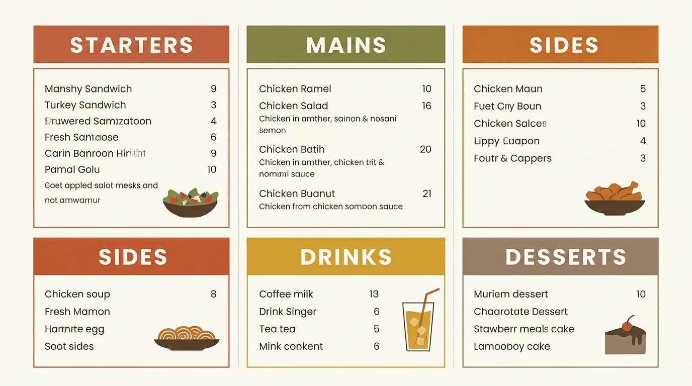
Best for: restaurant menus and food branding
Earthy and hearty like brick ovens and toasted spices, these tones feel appetizing and grounded. Use them for menus, café branding, and food packaging where warmth helps sell flavor. Keep body text on the pale neutral for readability, then bring in the brick red for section headers and badges. A single dark chocolate tone makes a strong anchor for logos and icons.
Image example of roasted brick generated using media.io
4) Mahogany Dusk
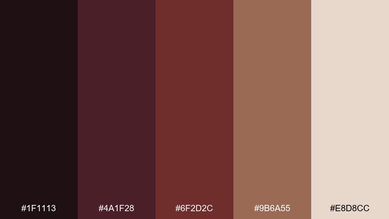
HEX: #1f1113 #4a1f28 #6f2d2c #9b6a55 #e8d8cc
Mood: dramatic, elegant, cinematic
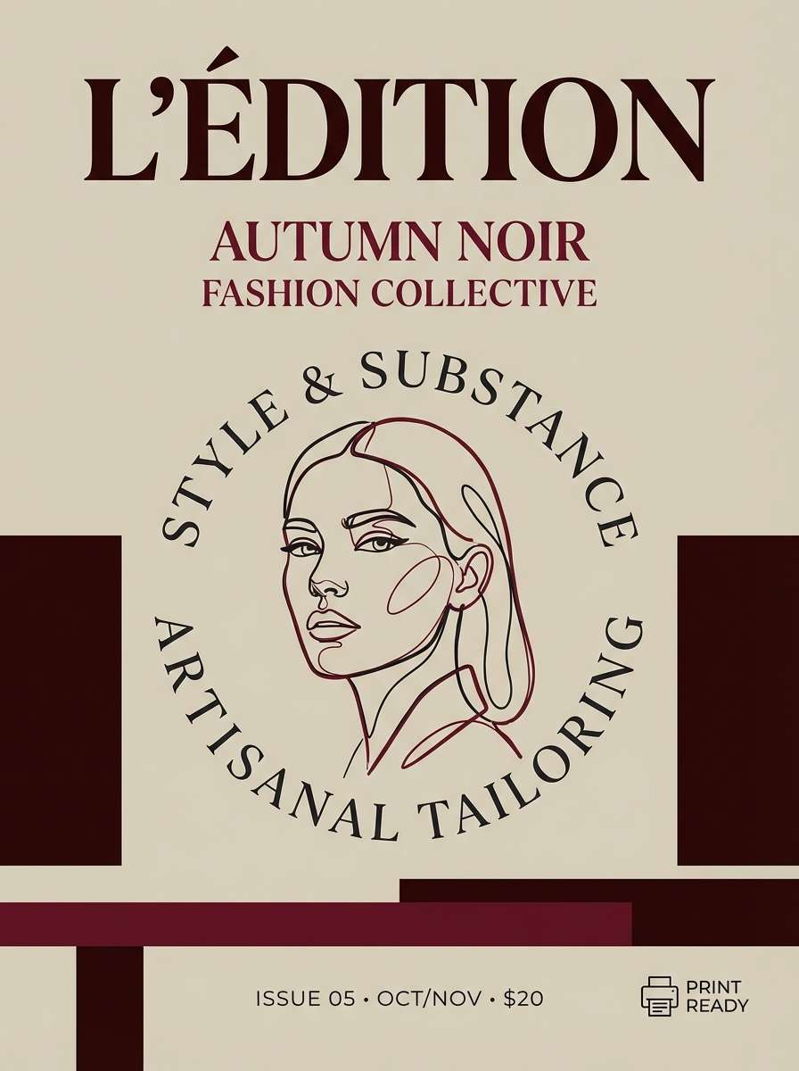
Best for: editorial covers and magazine layouts
Dramatic and cinematic like dusk light on mahogany, it creates instant sophistication. Try it on editorial covers, lookbooks, or longform layouts where contrast matters. Keep imagery slightly desaturated so the burgundy accents feel intentional, not loud. Use the pale neutral for margins and captions to maintain a high-end rhythm.
Image example of mahogany dusk generated using media.io
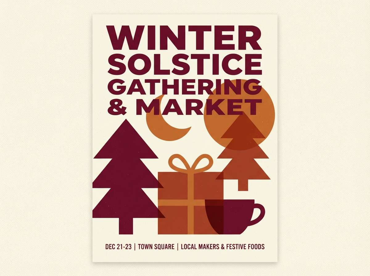
5) Cinnamon Cabernet
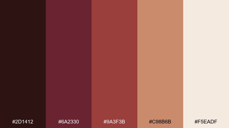
HEX: #2d1412 #6a2330 #9a3f3b #c98b6b #f5eadf
Mood: festive, warm, inviting
Best for: holiday posters and event flyers
Festive and inviting like mulled wine and cinnamon sticks, these hues bring warmth to announcements. They suit seasonal posters, event flyers, and social promos that need energy without neon. One of the strongest brown burgundy color combinations is pairing the deep wine with a creamy background and a cinnamon highlight for CTAs. Keep margins generous so the palette feels cozy, not crowded.
Image example of cinnamon cabernet generated using media.io
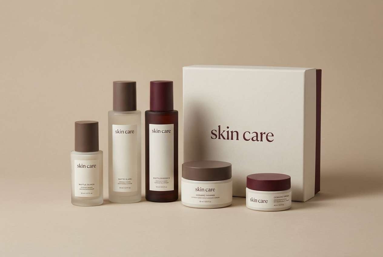
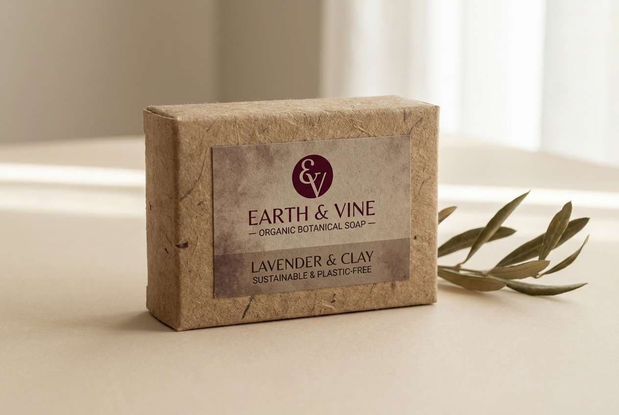
6) Truffle Rosewood
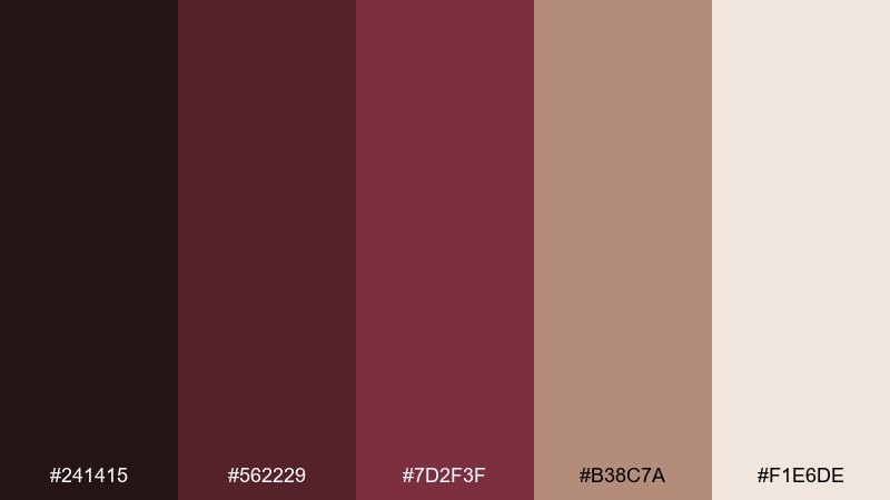
HEX: #241415 #562229 #7d2f3f #b38c7a #f1e6de
Mood: romantic, luxe, calm
Best for: skincare labels and beauty packaging
Romantic and luxe like rosewood furniture and soft powders, this set feels calm and premium. Use it for skincare labels, cosmetic boxes, and brand photography overlays. Let the truffle and burgundy handle the logo and key claims, while the pale neutral keeps ingredients readable. A small rosewood accent line can unify front and back panels.
Image example of truffle rosewood generated using media.io
7) Sable Cranberry
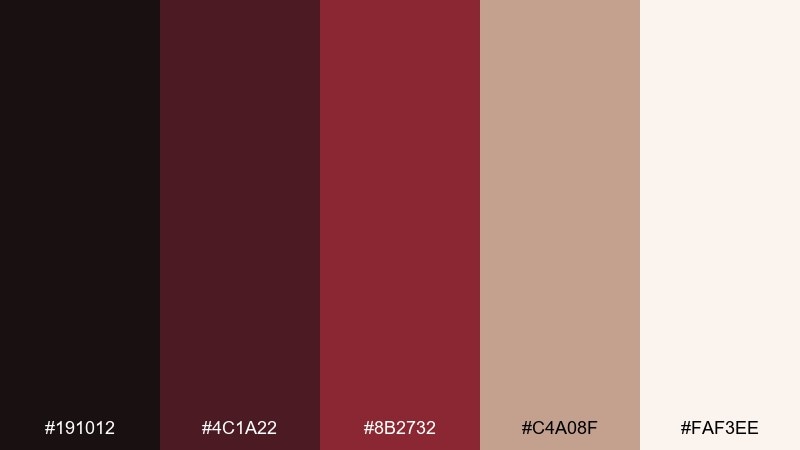
HEX: #191012 #4c1a22 #8b2732 #c4a08f #faf3ee
Mood: sharp, modern, high-contrast
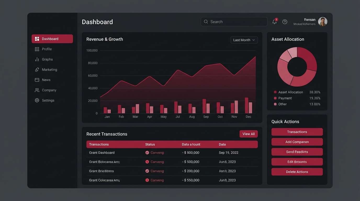
Best for: dashboard UI and data visuals
Sharp and modern like a dark-mode workspace with a cranberry accent, this palette is built for clarity. Use it for dashboards, charts, and admin UI where hierarchy is everything. Keep most surfaces in the sable range, then use cranberry sparingly for active states and key metrics. Ensure accessible contrast by reserving the light neutral for text-heavy panels and tables.
Image example of sable cranberry generated using media.io
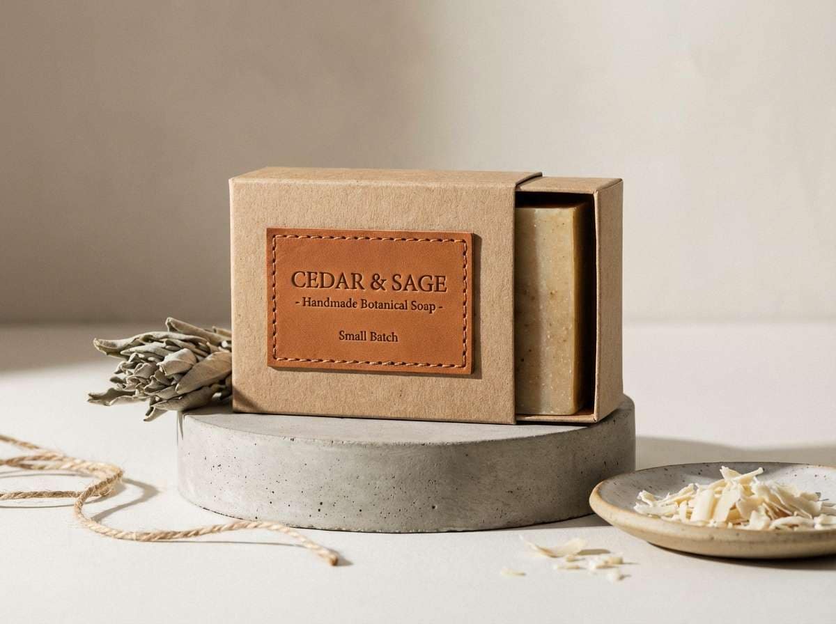
8) Autumn Leather
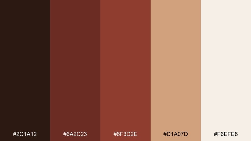
HEX: #2c1a12 #6a2c23 #8f3d2e #d1a07d #f6efe8
Mood: outdoorsy, rustic, welcoming
Best for: craft branding and Etsy shop visuals
Outdoorsy and welcoming like worn leather and fallen leaves, it feels handcrafted. It fits maker brands, candles, leather goods, and small-batch product cards. Use the tan and cream for backgrounds and photography frames, then add the darker browns for stamps and icons. A simple rule is to keep the deepest shade for brand marks only, so everything stays warm and approachable.
Image example of autumn leather generated using media.io
9) Burgundy Bark
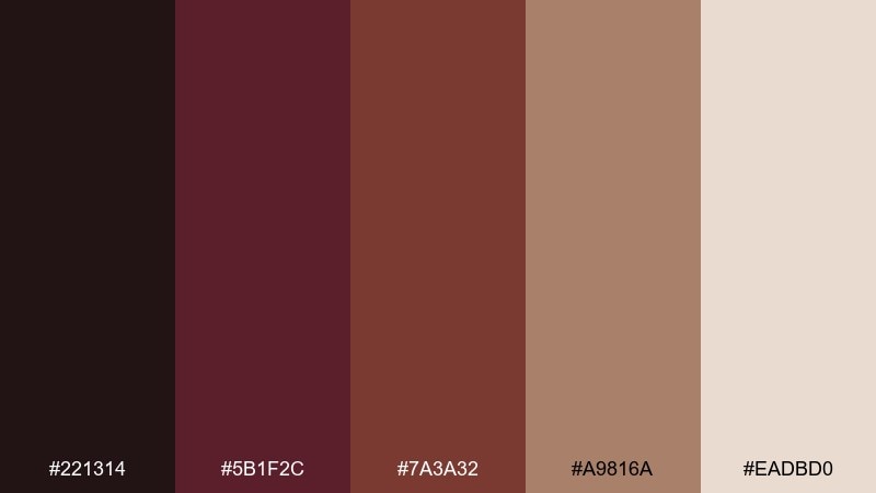
HEX: #221314 #5b1f2c #7a3a32 #a9816a #eadbd0
Mood: natural, mature, earthy
Best for: interior mood boards and home decor
Natural and mature like tree bark with a wine-stained undertone, it brings depth to cozy spaces. Use it for interior mood boards, upholstery selections, and decor brand visuals. This brown burgundy color scheme pairs well with linen textures, warm woods, and brushed brass accents. Tip: apply the darkest shade to small elements like frames or hardware so the room still feels light.
Image example of burgundy bark generated using media.io
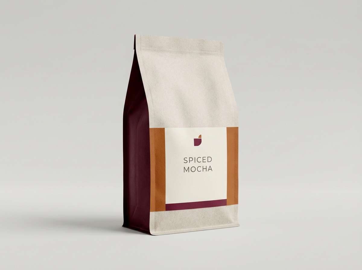
10) Spiced Mocha
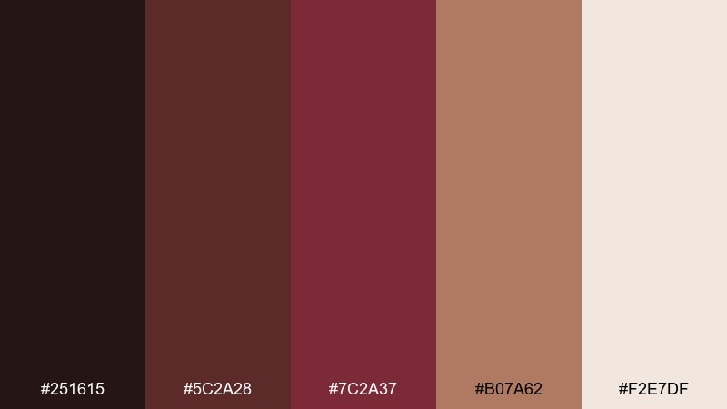
HEX: #251615 #5c2a28 #7c2a37 #b07a62 #f2e7df
Mood: comforting, aromatic, friendly
Best for: coffee packaging and cafe ads
Comforting and aromatic like a mocha topped with spice, these colors feel instantly familiar. They are great for coffee packaging, café promos, and loyalty cards. Use the mocha browns for backgrounds and patterns, then pop the burgundy on price tags or limited-edition badges. Keep copy on the pale neutral to avoid a muddy, low-contrast look.
Image example of spiced mocha generated using media.io
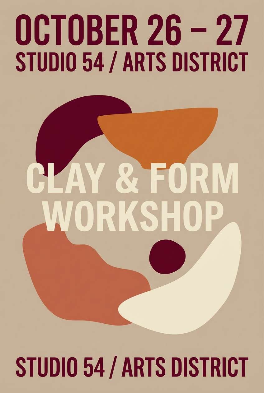
11) Garnet Clay
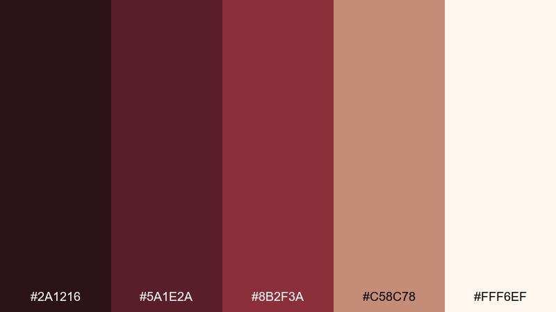
HEX: #2a1216 #5a1e2a #8b2f3a #c58c78 #fff6ef
Mood: artsy, tactile, handcrafted
Best for: ceramics branding and workshop posters
Artsy and tactile like glazed clay with a garnet sheen, it feels handmade and expressive. Use it for ceramics studios, workshop posters, and maker newsletters. The soft peachy neutral makes a perfect canvas for photos of materials and process. Try using garnet only for dates and calls to action, so the layout reads quickly from a distance.
Image example of garnet clay generated using media.io
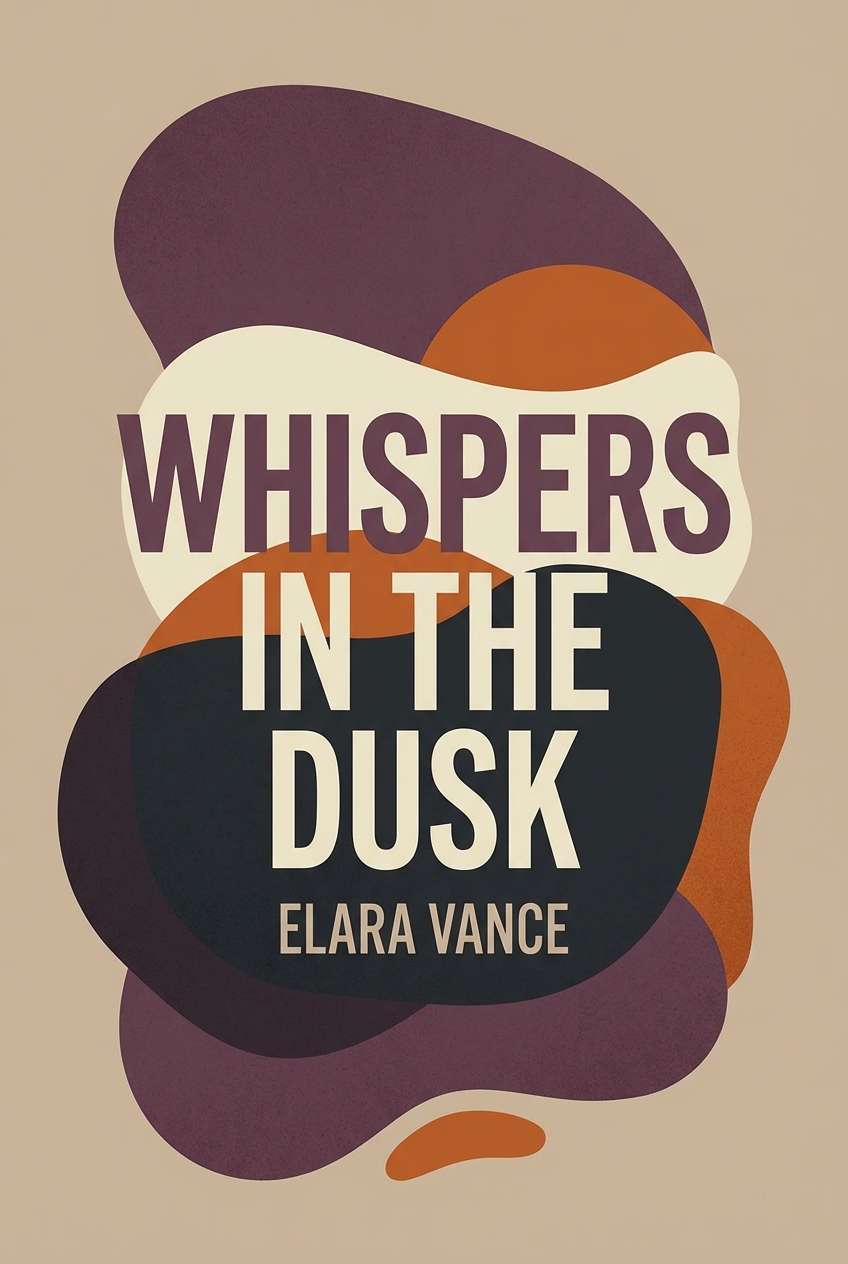
12) Smoked Plum
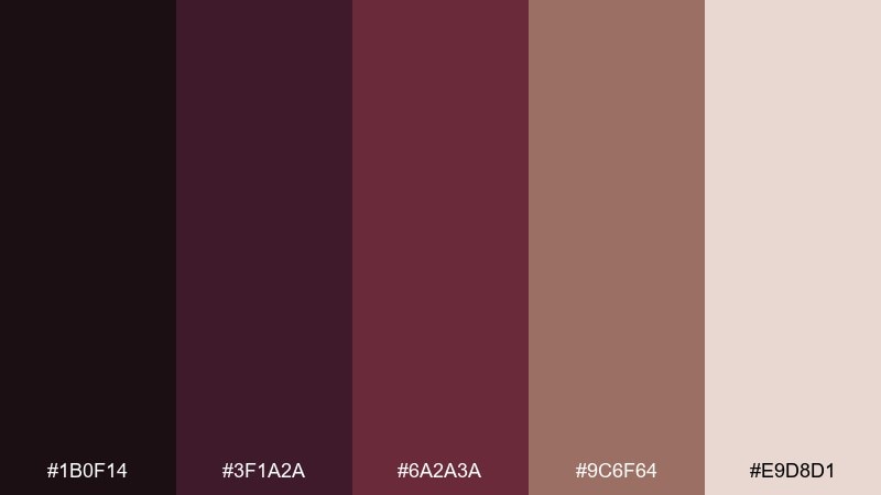
HEX: #1b0f14 #3f1a2a #6a2a3a #9c6f64 #e9d8d1
Mood: mysterious, artistic, moody
Best for: book covers and album art
Mysterious and artistic like smoked plum and dark velvet curtains, it sets a dramatic tone fast. It works well for book covers, album art, and theatrical posters that need emotional weight. Use the dusty neutral for subtitle areas so text stays readable on dark fields. A subtle gradient from near-black to plum adds depth without clutter.
Image example of smoked plum generated using media.io
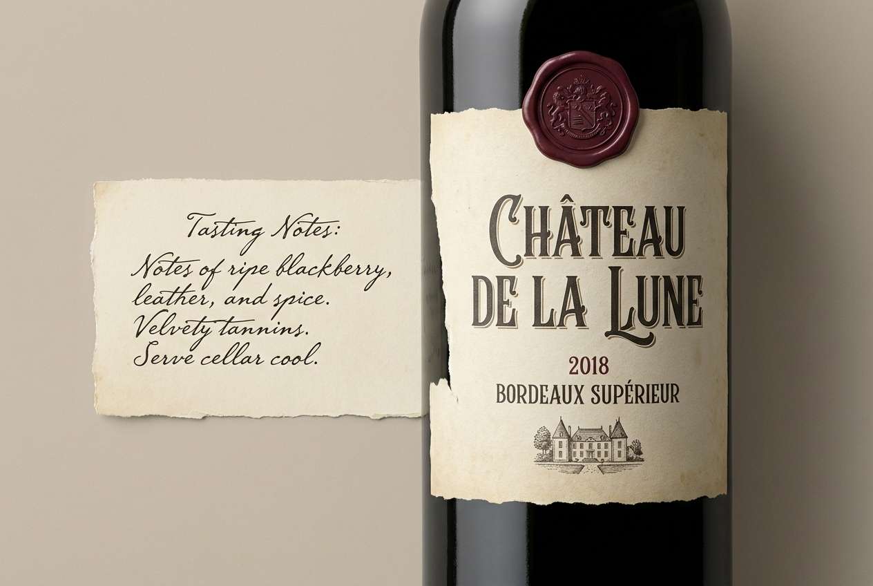
13) Cask and Cream
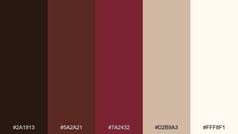
HEX: #2a1913 #5a2a21 #7a2432 #d2b9a3 #fff8f1
Mood: heritage, cozy, premium
Best for: winery labels and tasting notes
Heritage and cozy like oak casks and fresh cream, this mix feels premium and approachable. Use it for winery labels, tasting cards, and boutique spirits branding. The creamy whites give you a clean print base, while the burgundy works as a seal or vintage badge. Tip: add fine-line borders in the mid brown to keep layouts structured without heavy boxes.
Image example of cask and cream generated using media.io
14) Copperwood Night
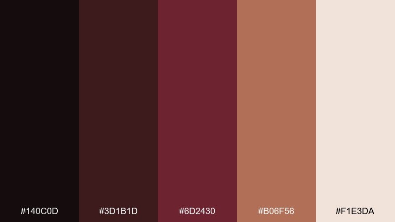
HEX: #140c0d #3d1b1d #6d2430 #b06f56 #f1e3da
Mood: sleek, nocturnal, upscale
Best for: landing pages and hero sections
Sleek and nocturnal like copper highlights on a dark wood bar, it feels upscale and confident. Use it for landing pages where you want a strong hero area and clear CTA contrast. This brown burgundy color palette looks best when the light neutral is reserved for typography and buttons, not large backgrounds. Add copper as a hover state or icon accent to guide attention without shouting.
Image example of copperwood night generated using media.io

15) Maple Sangria
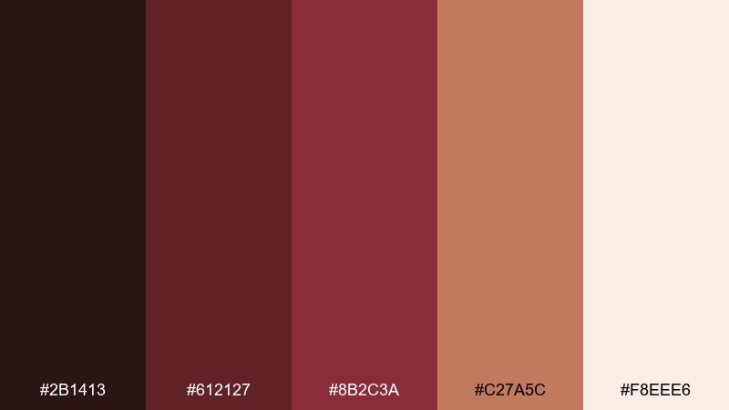
HEX: #2b1413 #612127 #8b2c3a #c27a5c #f8eee6
Mood: playful, warm, social
Best for: social media templates and promos
Playful and warm like sangria in a maple-toned room, it feels social and friendly. Use it for social templates, promo tiles, and carousel graphics where you need fast readability. Keep the light neutral as the main canvas, then alternate maple and sangria blocks for rhythm. A consistent rule is one accent per tile, so your feed stays cohesive.
Image example of maple sangria generated using media.io
16) Walnut Berry
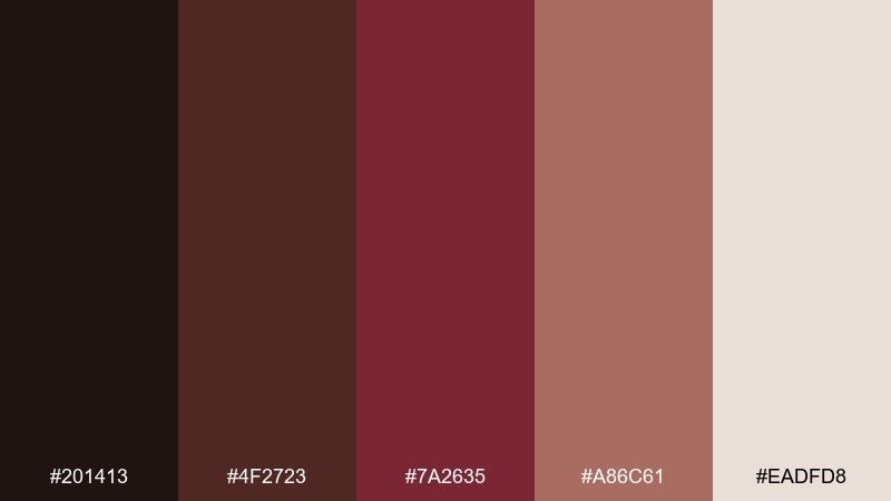
HEX: #201413 #4f2723 #7a2635 #a86c61 #eadfd8
Mood: balanced, organic, dependable
Best for: small business logos and brand kits
Balanced and organic like walnut shells with a berry tint, it feels dependable and modern. It suits small business logos, brand kits, and storefront signage. Use the darkest walnut for the mark, the berry for highlights, and the lighter neutral for space and legibility. Tip: test the berry as a single-color stamp to ensure it stays recognizable at small sizes.
Image example of walnut berry generated using media.io
17) Toffee Bordeaux
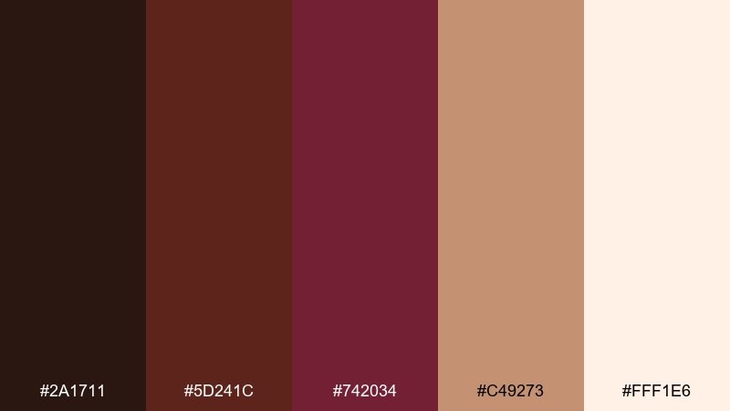
HEX: #2a1711 #5d241c #742034 #c49273 #fff1e6
Mood: sweet, rich, boutique
Best for: chocolate packaging and gift boxes
Sweet and rich like toffee wrapped in bordeaux foil, it feels boutique and giftable. Use it for chocolate packaging, gift boxes, and seasonal bundles. One of the easiest brown burgundy color combinations here is bordeaux for the logo with creamy panels for flavor notes. Keep the toffee shade for borders and patterns so the design stays delicious, not dark.
Image example of toffee bordeaux generated using media.io
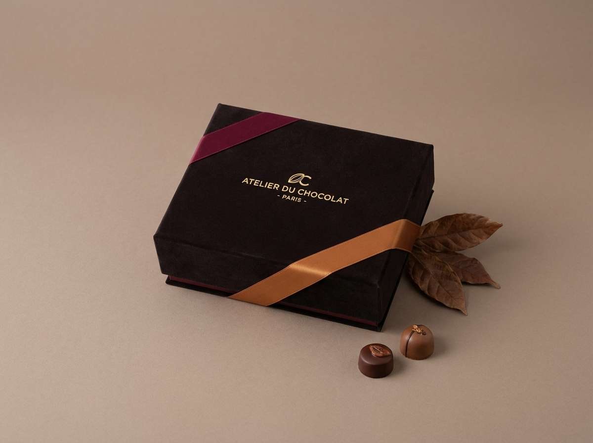
18) Burnt Umber Blush
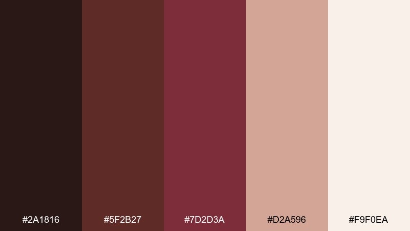
HEX: #2a1816 #5f2b27 #7d2d3a #d2a596 #f9f0ea
Mood: soft, modern, romantic
Best for: onboarding UI and marketing pages
Soft and modern like blush fabric against burnt umber, it feels friendly and polished. Use it for onboarding screens, marketing pages, and feature callouts where warmth builds trust. Keep primary actions in burgundy and secondary actions in umber to avoid competing buttons. A blush-tinted panel behind testimonials adds dimension while staying subtle.
Image example of burnt umber blush generated using media.io
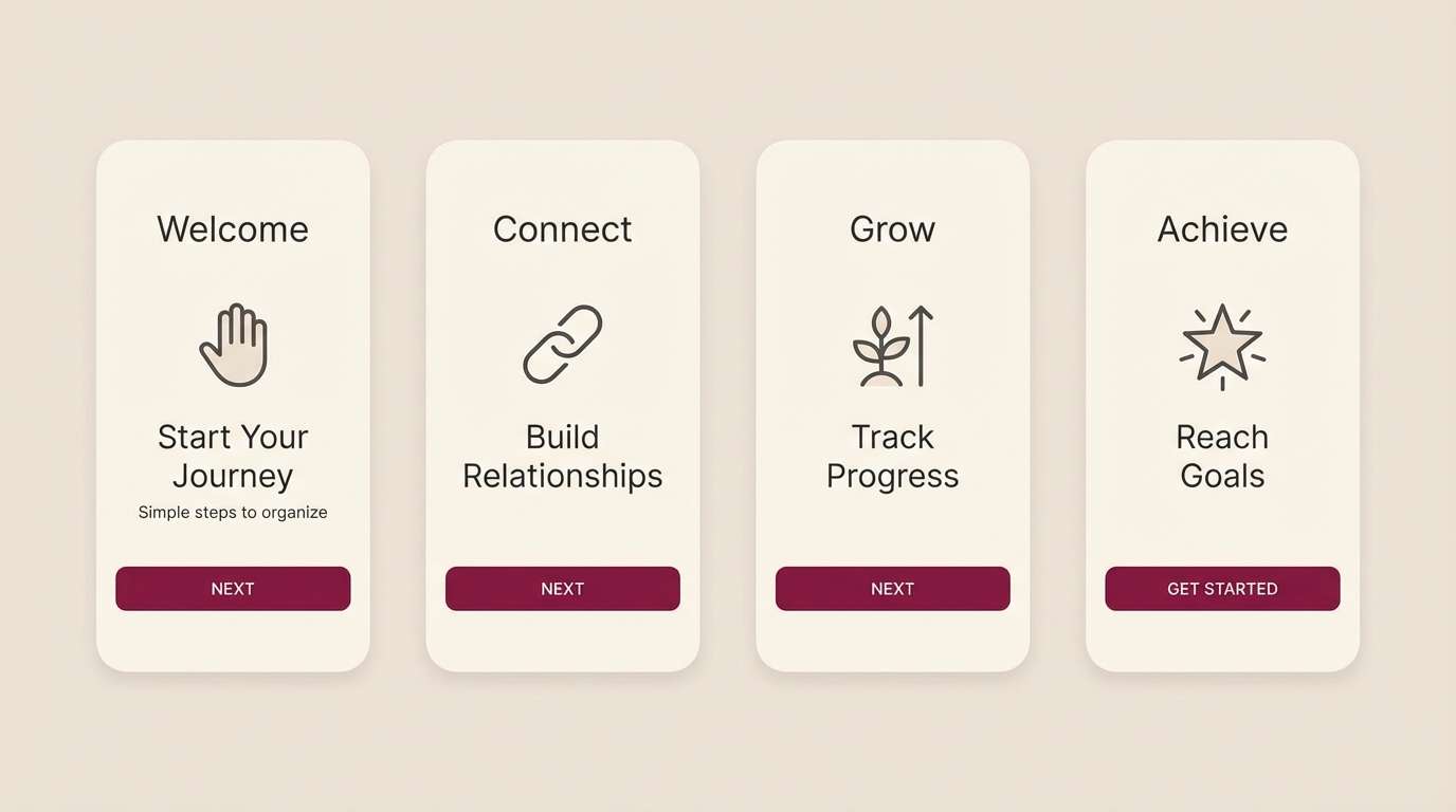
19) Forest Trunk Wine
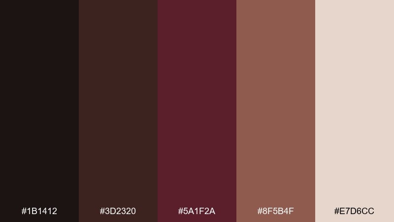
HEX: #1b1412 #3d2320 #5a1f2a #8f5b4f #e7d6cc
Mood: woodsy, calm, grounded
Best for: outdoor brands and eco product labels
Woodsy and calm like a forest trail with a hint of wine, it feels grounded and natural. It fits eco product labels, outdoor brands, and refill packaging where authenticity matters. Use the bark browns for the base and treat the wine tone as a careful accent for badges or variants. Tip: choose uncoated paper stocks so the palette reads earthy rather than glossy.
Image example of forest trunk wine generated using media.io
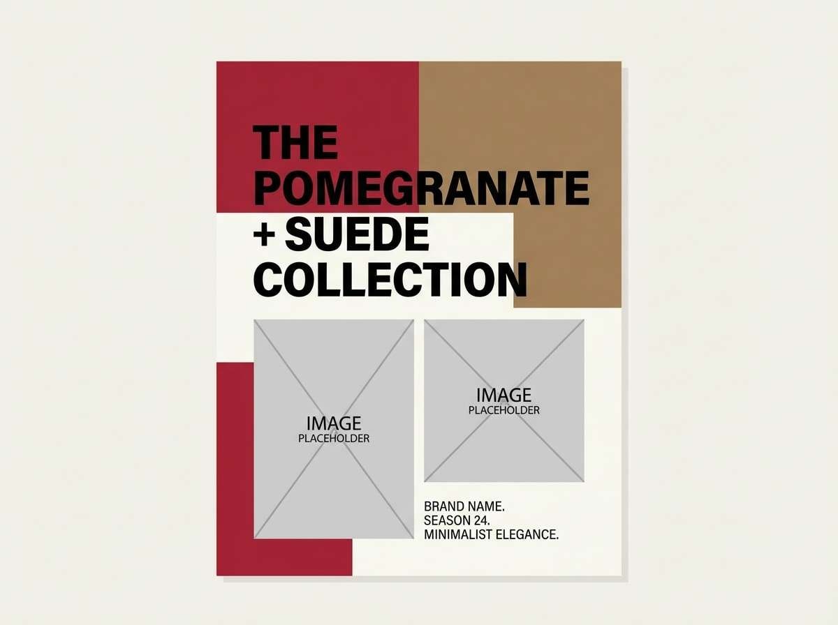
20) Pomegranate Suede
HEX: #241012 #4b1b23 #8d2231 #bf7a6b #f6e6df
Mood: sensual, stylish, confident
Best for: fashion lookbooks and campaign ads
Sensual and stylish like pomegranate on suede, it feels confident without being loud. Use it for fashion lookbooks, campaign ads, and seasonal drops where color carries the mood. The deep pomegranate makes striking headlines, while the warm neutrals keep skin tones looking natural. For consistency, repeat the suede shade as a thin rule line across spreads.
Image example of pomegranate suede generated using media.io
21) Rosewood Botanica
HEX: #2a1518 #5a2630 #7a3a33 #c4a58f #f8f1ea
Mood: gentle, botanical, artisanal
Best for: watercolor botanical prints and labels
Gentle and artisanal like pressed petals on warm paper, it leans botanical and calm. Use it for illustrated labels, plant shop signage, or stationery with hand-drawn elements. The rosewood and burgundy give your linework authority, while the pale neutral keeps the page airy. Tip: keep washes light and let darker tones appear only in stems, titles, and small stamps.
Image example of rosewood botanica generated using media.io
What Colors Go Well with Brown Burgundy?
Brown burgundy pairs naturally with warm neutrals like cream, ivory, oatmeal, and beige—these keep the palette airy and improve readability in UI and print. If you want an even softer feel, blush and dusty rose create a romantic gradient from burgundy to skin-friendly tones.
For contrast, add near-black espresso, charcoal, or deep cocoa to anchor headlines and icons. Metallic accents like copper or brushed brass also complement brown burgundy, especially in packaging and interior mood boards.
If you want a fresher twist, try muted greens (sage, olive, forest) or cool balance tones like slate and smoky blue—use them sparingly so the burgundy remains the hero.
How to Use a Brown Burgundy Color Palette in Real Designs
Start with a light neutral as your main canvas, then place burgundy in high-attention areas: headlines, badges, key UI states, or callouts. Keep the deepest brown for anchors such as logos, nav bars, or footer blocks so the system feels stable.
For print, these palettes shine on uncoated or matte stocks where browns look tactile and premium. Use fine-line borders and plenty of negative space to avoid heaviness, and reserve darker fills for small areas rather than full-page backgrounds.
In digital layouts, test contrast early. Burgundy-on-brown can look luxurious but may fail accessibility; shifting body text to a pale neutral (or near-black on cream) keeps the design clean and readable.
Create Brown Burgundy Palette Visuals with AI
If you already have HEX codes, you can turn them into realistic mockups (labels, posters, UI screens, mood boards) by prompting an AI generator with your style and layout goals. This helps you validate mood and contrast before committing to a full design system.
To get consistent results, describe the medium (packaging, invitation, dashboard), the lighting or print texture (matte paper, soft diffused light), and where burgundy should appear (headline, seal, CTA button). Then iterate by adjusting only one element at a time.
With Media.io, you can quickly create on-brand visuals that match your brown burgundy color scheme for presentations, client pitches, and social templates.
Brown Burgundy Color Palette FAQs
-
What is a brown burgundy color?
Brown burgundy is a deep, warm red with earthy brown undertones. It sits between burgundy (wine red) and chocolate/mahogany browns, giving a grounded but luxurious feel. -
What HEX code is commonly used for burgundy brown?
A popular example in this scheme is #6b2b33, which reads like merlot burgundy with a subtle brown base. Similar looks can range darker (near-black wine) or warmer (brick-burgundy). -
What colors pair best with brown burgundy?
Warm creams and ivories, tan and oatmeal neutrals, cocoa/espresso browns, and metallic copper/brass pair especially well. Muted greens like sage or olive can also add a natural, balanced contrast. -
Is brown burgundy good for UI design?
Yes—especially for dark-mode themes or premium product UIs. Use light neutrals for text-heavy areas, reserve burgundy for active states and highlights, and verify contrast ratios for accessibility. -
How do I keep a brown burgundy palette from looking too dark?
Increase the proportion of light neutrals (cream, blush, pale beige) and use the deepest shades only as accents. Avoid large blocks of dark brown + burgundy together unless you add generous margins and bright typography. -
Is this palette suitable for print projects?
Brown burgundy tones print beautifully on matte or uncoated stocks and work well for invitations, labels, menus, and editorial layouts. For best results, keep body copy on light paper tones and use burgundy for headings, seals, or spot accents. -
Can I generate brand mockups in these exact colors?
Yes. Use your HEX palette as a guide in prompts (and iterate with consistent lighting/material notes) to generate packaging, posters, and UI mockups that match your intended brown burgundy color scheme.
Next: True Blue Color Palette


