

True blue is a high-clarity, high-trust color that reads instantly in digital interfaces and holds its own in print. It’s bold without being aggressive, which is why it shows up everywhere from SaaS dashboards to premium packaging.
Below are curated true blue color palette ideas with HEX codes, mood notes, and practical pairing tips you can apply to branding, UI, social templates, and more.
In this article
- Why True Blue Palettes Work So Well
-
- harbor beacon
- denim driftwood
- electric navy pop
- glacier letterpress
- marina pastels
- ceramic indigo
- signal blue neutrals
- riviera suit
- blue hour linen
- pure true blue focus
- ocean glass gradient
- ink and citrus
- sapphire botanical wash
- skyline concrete
- starlit circuit
- minimal maritime invite
- true blue and blush
- cobalt clay studio
- clean clinic blue
- night swim metals
- What Colors Go Well with True Blue?
- How to Use a True Blue Color Palette in Real Designs
- Create True Blue Palette Visuals with AI
Why True Blue Palettes Work So Well
True blue sits in a “sweet spot” of visibility: it’s saturated enough to grab attention, yet familiar enough to feel reliable. That balance makes it a strong primary brand color for products that need clarity, confidence, and authority.
In UI, true blue performs well for interactive states like links, active tabs, and primary buttons because users already associate blue with clickability. In print and packaging, it reads clean and premium when supported by neutrals or a single warm accent.
Most importantly, true blue is flexible: push it toward navy for sophistication, toward cyan for freshness, or pair it with warm metals and earth tones for a crafted, human feel.
20+ True Blue Color Palette Ideas (with HEX Codes)
1) Harbor Beacon
HEX: #0B4FDE #0A1E3F #2EC4C6 #F4F7FF #FFB703
Mood: crisp, nautical, confident
Best for: startup branding and hero sections
Crisp and nautical, this mix feels like sun on water and a beacon cutting through mist. The deep navy anchors layouts while bright blue drives attention for CTAs and headlines. Pair it with clean typography and generous white space to keep it premium. Use the amber accent sparingly for badges and key metrics so it reads as intentional, not noisy.
Image example of harbor beacon generated using media.io

Media.io is an online AI studio for creating and editing video, image, and audio in your browser.

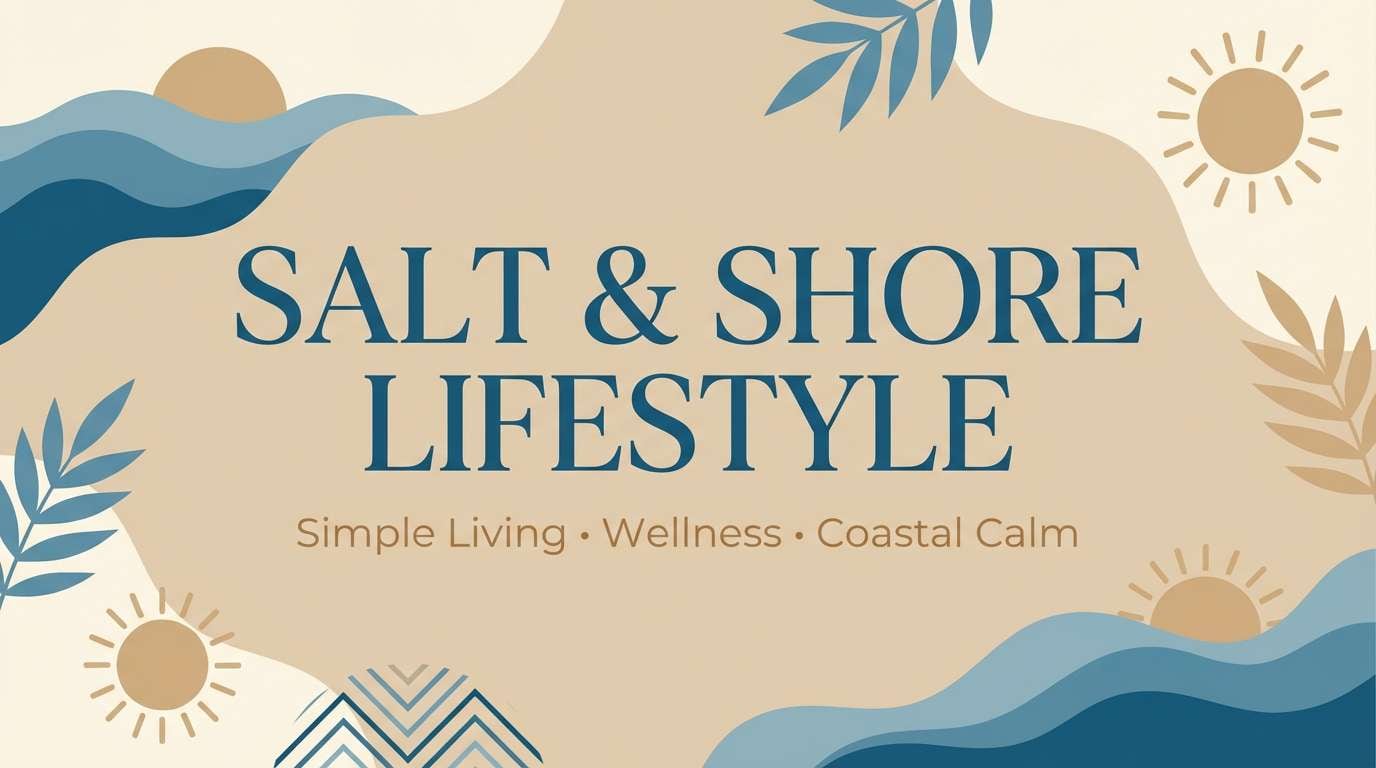
2) Denim Driftwood
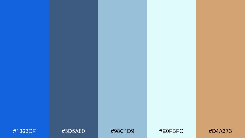
HEX: #1363DF #3D5A80 #98C1D9 #E0FBFC #D4A373
Mood: relaxed, coastal, approachable
Best for: lifestyle blog headers and social posts
Relaxed coastal tones bring to mind worn denim, pale seafoam, and sun-bleached wood. The softer blues are easy on the eyes, making them ideal for long reads and image-heavy layouts. Add the warm tan for captions, dividers, or subtle icons to prevent the page from feeling cold. Keep contrast high on body text by leaning on the deeper slate-blue.
Image example of denim driftwood generated using media.io
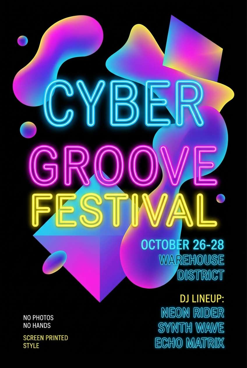
3) Electric Navy Pop
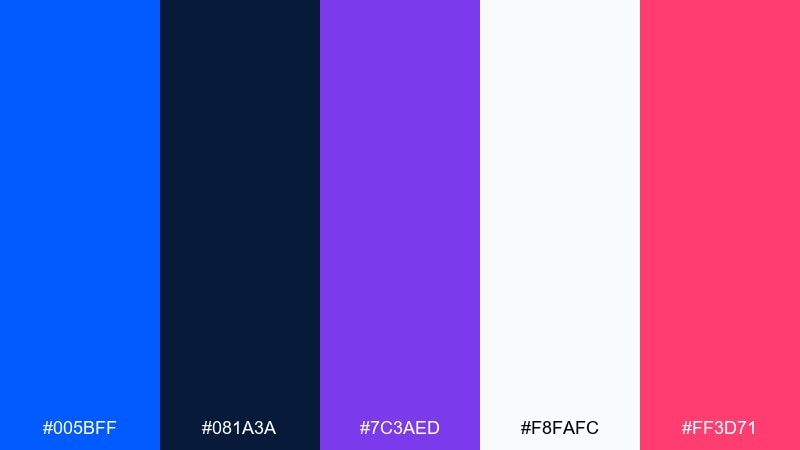
HEX: #005BFF #081A3A #7C3AED #F8FAFC #FF3D71
Mood: high-voltage, bold, nightlife
Best for: music event posters and promo graphics
High-voltage and nightlife-ready, these tones feel like neon signage against a midnight sky. The blue and navy set a punchy base, while violet and hot pink add expressive edges for type and shapes. If you want true blue color combinations that still feel modern, keep backgrounds dark and let the brights handle emphasis. Use off-white for legibility and reserve pink for the one element you want people to notice first.
Image example of electric navy pop generated using media.io
4) Glacier Letterpress
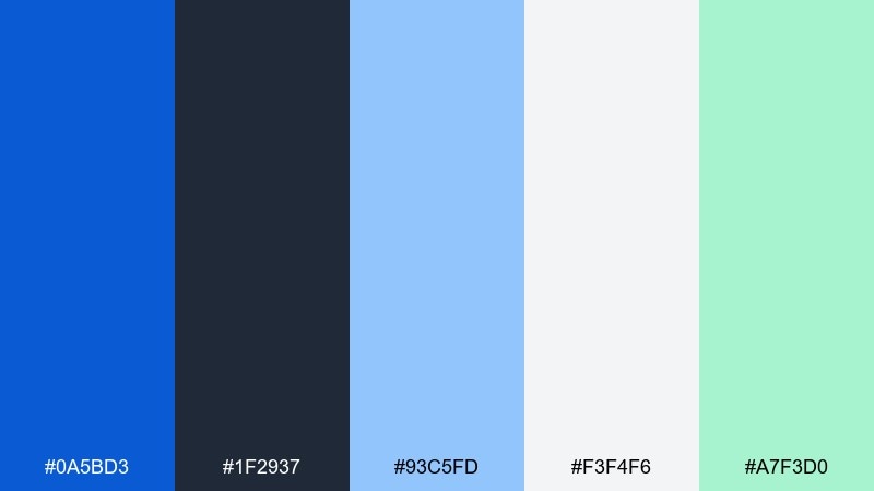
HEX: #0A5BD3 #1F2937 #93C5FD #F3F4F6 #A7F3D0
Mood: clean, editorial, fresh
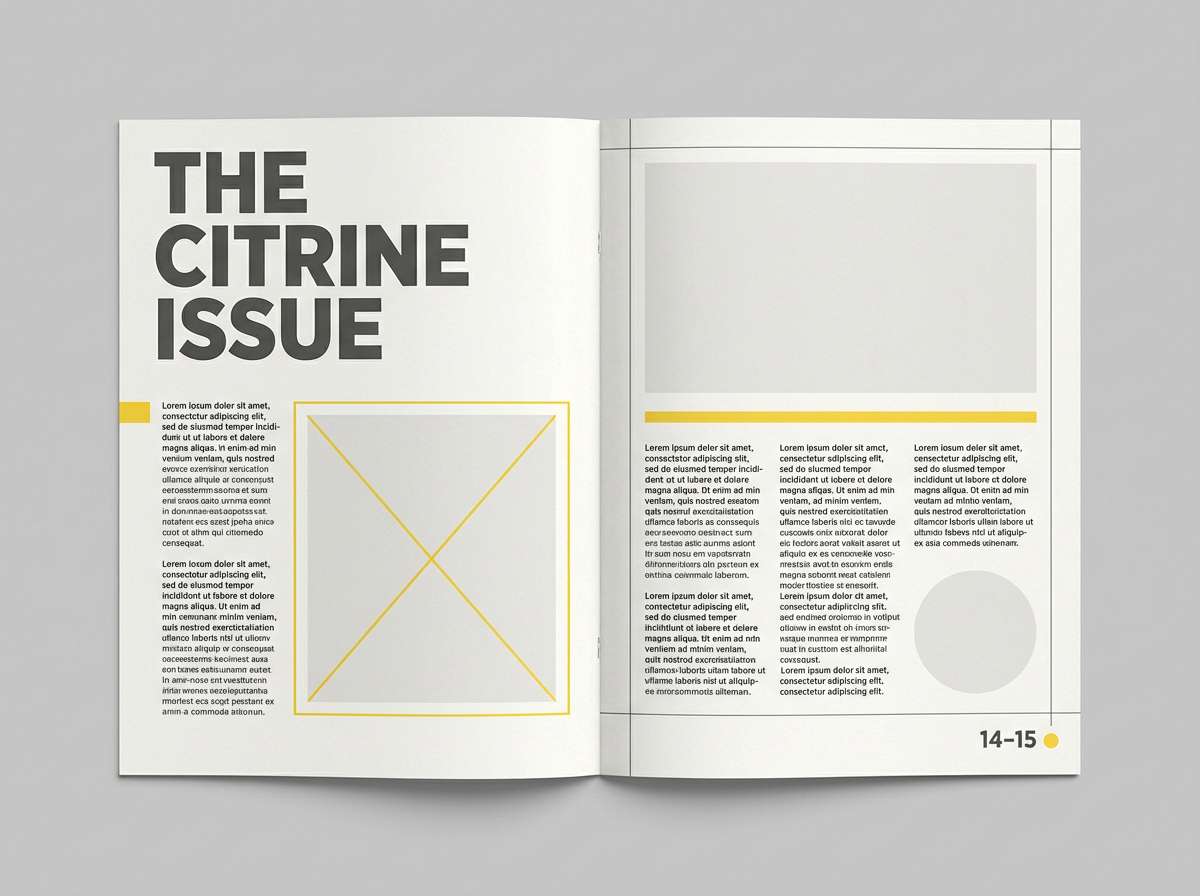
Best for: magazine layouts and reports
Clean and editorial, this palette reads like icy air and sharp ink on textured paper. The bright blue highlights pull attention without overpowering charts, pull-quotes, or section headers. Pair the mint with light grays for subtle infographics and callouts. For print, test the blue at smaller sizes so it stays crisp and doesn't fill in on coated stock.
Image example of glacier letterpress generated using media.io
5) Marina Pastels
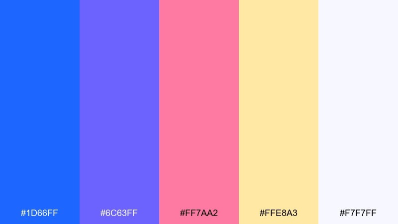
HEX: #1D66FF #6C63FF #FF7AA2 #FFE8A3 #F7F7FF
Mood: playful, sunny, upbeat
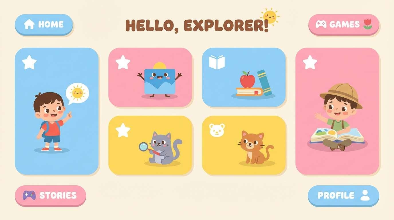
Best for: kids learning visuals and friendly apps
Playful and sunny, these pastels feel like beach umbrellas, candy wrappers, and happy stickers. The blue keeps the set grounded so the pink and yellow stay charming rather than chaotic. Use the cream-white as your main canvas, then layer colored cards or chips on top for clarity. A simple tip: keep icons one color at a time to avoid visual clutter.
Image example of marina pastels generated using media.io
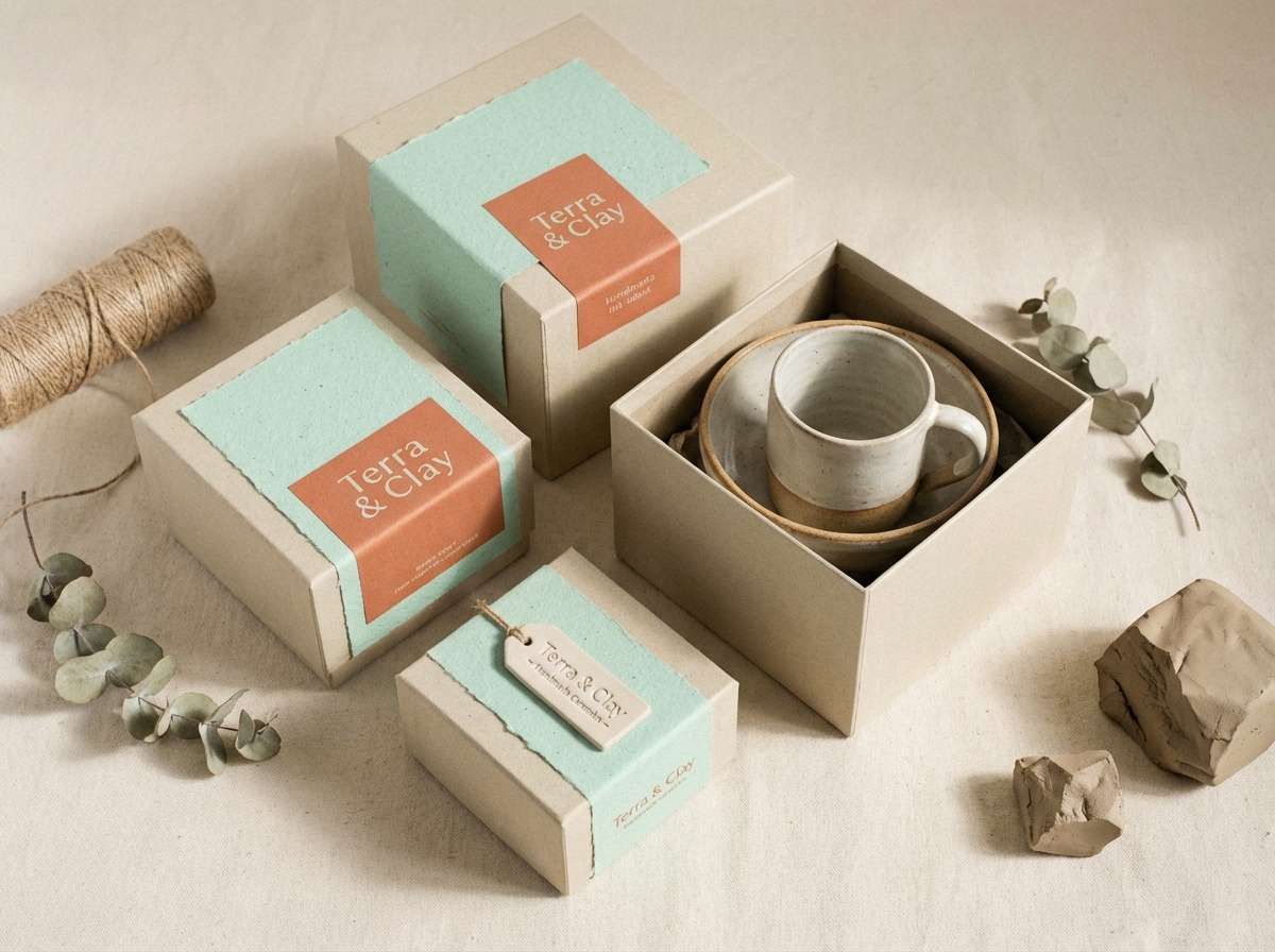
6) Ceramic Indigo
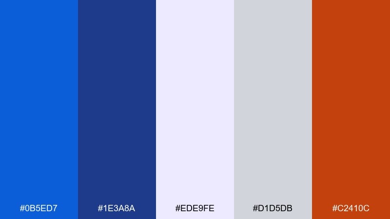
HEX: #0B5ED7 #1E3A8A #EDE9FE #D1D5DB #C2410C
Mood: crafted, refined, warm-cool balance
Best for: packaging for ceramics, coffee, and craft goods
Crafted and refined, this blend evokes glazed pottery, indigo dye, and kiln-warm clay. The blues feel trustworthy while the earthy orange adds a handmade edge that works beautifully on labels. Pair it with textured paper stocks or subtle grain to enhance the artisanal vibe. Keep the orange for seals or small stamps so the overall look stays calm and premium.
Image example of ceramic indigo generated using media.io
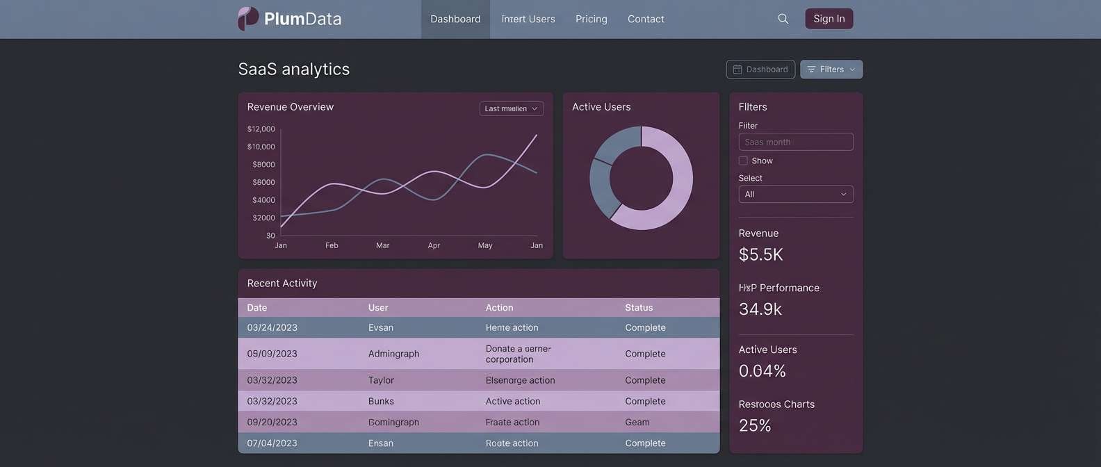
7) Signal Blue Neutrals
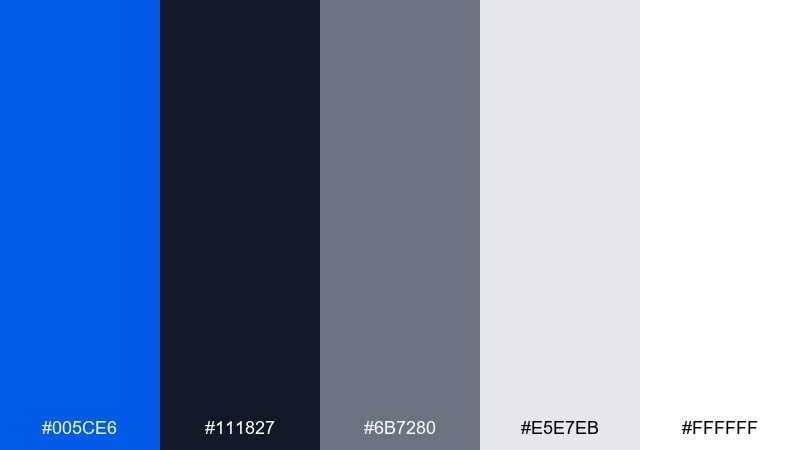
HEX: #005CE6 #111827 #6B7280 #E5E7EB #FFFFFF
Mood: minimal, sharp, professional
Best for: SaaS dashboards and data-heavy UI
Minimal and sharp, these tones feel like a polished control room with lights that never flicker. The restrained neutrals let the blue do the heavy lifting for active states, links, and key numbers. For true blue color combinations in dashboards, use the dark charcoal for navigation and keep tables on light gray for easier scanning. Tip: reserve the pure white for cards and modals so hierarchy stays clear.
Image example of signal blue neutrals generated using media.io
8) Riviera Suit
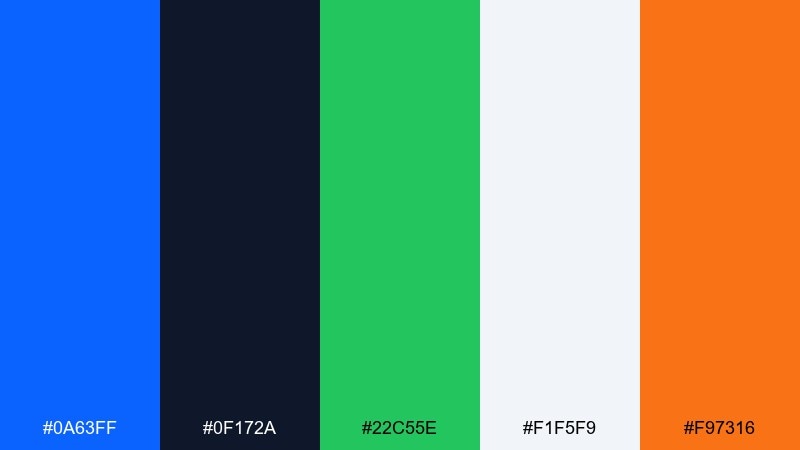
HEX: #0A63FF #0F172A #22C55E #F1F5F9 #F97316
Mood: confident, sporty, energetic
Best for: sports branding and team graphics
Confident and sporty, this set feels like a crisp jersey under stadium lights. The blue and near-black create strong contrast, while green and orange add competitive energy for highlights. Keep the bright accents for score callouts, buttons, or sponsor tags so the layout stays readable. If you need quick impact, put orange next to blue for a clean, high-contrast punch.
Image example of riviera suit generated using media.io
9) Blue Hour Linen
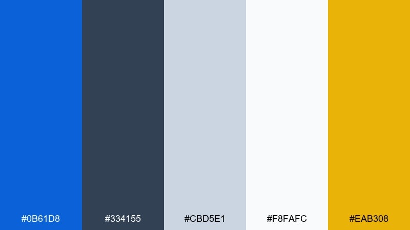
HEX: #0B61D8 #334155 #CBD5E1 #F8FAFC #EAB308
Mood: calm, airy, understated luxury
Best for: interior mood boards and home brands
Calm and airy, these tones evoke blue hour light on soft linen curtains. The palette leans neutral-first, making the blue feel like a deliberate accent rather than a flood of color. Pair it with warm wood photography and matte finishes for a relaxed, upscale look. Use the golden yellow only as a thin line or small icon to keep the mood serene.
Image example of blue hour linen generated using media.io
10) Pure True Blue Focus
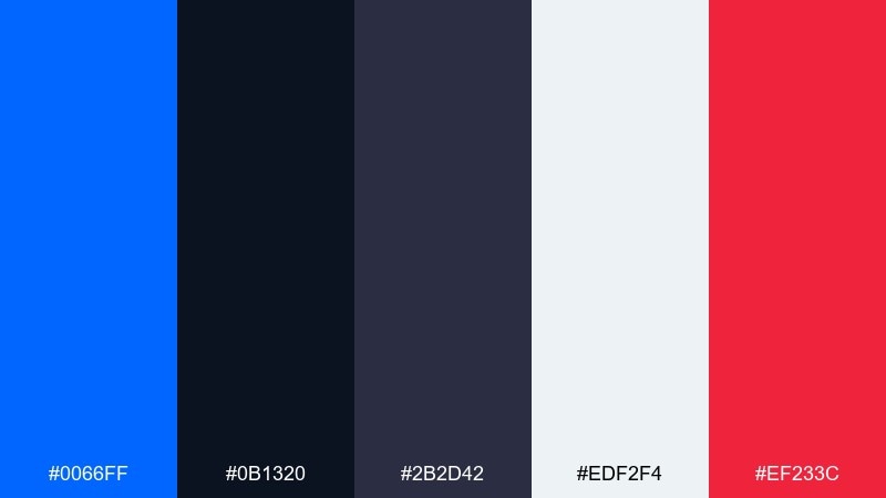
HEX: #0066FF #0B1320 #2B2D42 #EDF2F4 #EF233C
Mood: focused, modern, high-contrast
Best for: brand systems and logo exploration
Focused and modern, the look is like a spotlight on a deep stage with one vivid cue. The blue takes center stage, supported by inky neutrals that keep typography crisp. When you want a true blue color palette that feels decisive, introduce the red only for alerts, limited editions, or one hero element. Tip: test the blue on both light and dark backgrounds to keep brand consistency across channels.
Image example of pure true blue focus generated using media.io
11) Ocean Glass Gradient
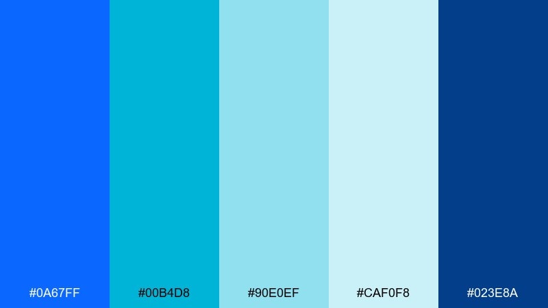
HEX: #0A67FF #00B4D8 #90E0EF #CAF0F8 #023E8A
Mood: fresh, fluid, aquatic
Best for: app onboarding screens and gradients
Fresh and fluid, these colors feel like light refracting through ocean glass. The range from deep blue to airy cyan is perfect for gradients, illustrations, and soft background panels. Pair it with thin-line icons and plenty of breathing room to keep the interface modern. A helpful tip: use the darkest blue for text on light aqua backgrounds to avoid low contrast.
Image example of ocean glass gradient generated using media.io
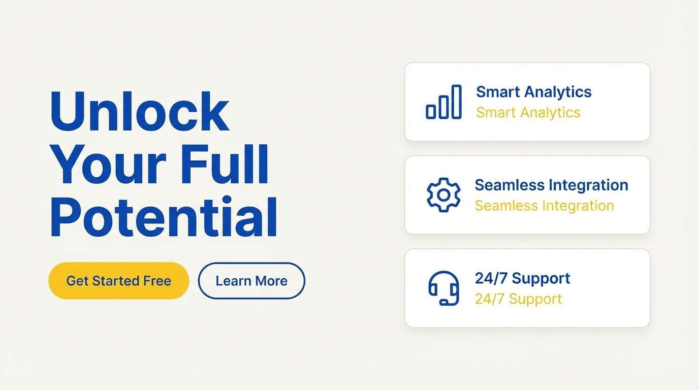
12) Ink and Citrus
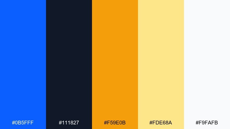
HEX: #0B5FFF #111827 #F59E0B #FDE68A #F9FAFB
Mood: punchy, clear, optimistic
Best for: call-to-action landing pages
Punchy and clear, the vibe is like fresh ink next to a slice of citrus. Strong neutrals keep things readable, while warm yellows add optimism without feeling childish. Use blue for links and primary buttons, then save the amber for secondary highlights like feature tags. Keep the light yellow as a background wash behind small sections to guide the eye down the page.
Image example of ink and citrus generated using media.io
13) Sapphire Botanical Wash
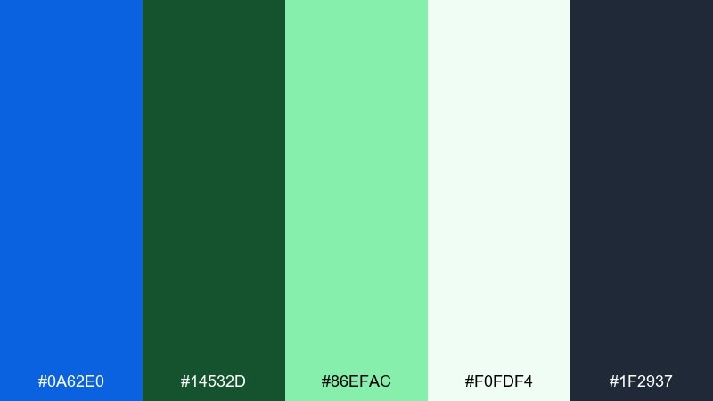
HEX: #0A62E0 #14532D #86EFAC #F0FDF4 #1F2937
Mood: fresh, natural, grounded
Best for: eco branding and botanical stationery
Fresh and grounded, this blend feels like dew on leaves under a clear blue sky. The green range softens the blue, making it ideal for sustainability messaging and nature-forward brands. Pair it with recycled textures and simple line illustrations for a calm, honest look. Tip: keep charcoal for text to avoid the green reading muddy in print.
Image example of sapphire botanical wash generated using media.io
14) Skyline Concrete
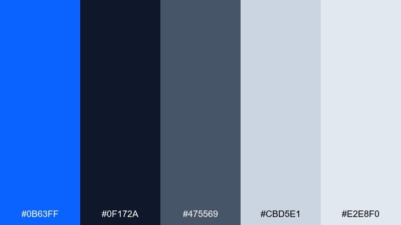
HEX: #0B63FF #0F172A #475569 #CBD5E1 #E2E8F0
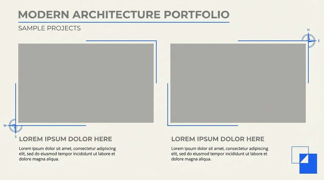
Mood: urban, steady, modern
Best for: architecture portfolios and presentations
Urban and steady, these shades evoke glass towers, concrete planes, and a crisp sky line. The grays build a strong framework, letting the blue add a modern signal for headings and key slides. Pair it with monochrome photography and simple grids for a professional finish. Use the darkest navy for slide titles to keep projection contrast reliable.
Image example of skyline concrete generated using media.io
15) Starlit Circuit
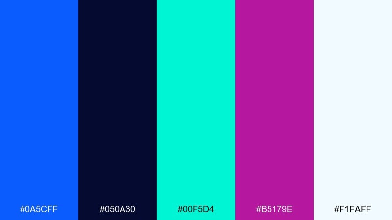
HEX: #0A5CFF #050A30 #00F5D4 #B5179E #F1FAFF
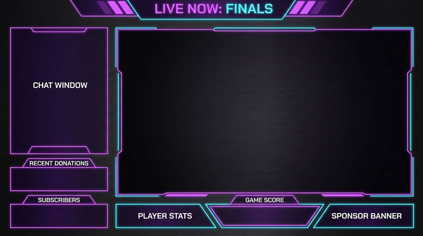
Mood: futuristic, cinematic, techy
Best for: gaming overlays and stream graphics
Futuristic and cinematic, this mix looks like circuitry glowing under a starry night. The electric teal adds a high-tech edge, while magenta brings energy for labels and alerts. Use the near-black for panels so bright elements feel luminous rather than loud. Tip: keep text in the icy off-white to prevent color fringing on dark backgrounds.
Image example of starlit circuit generated using media.io
16) Minimal Maritime Invite
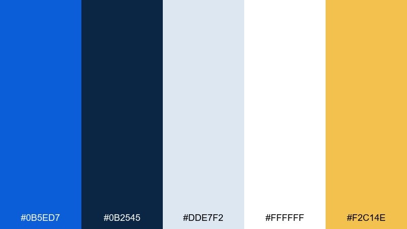
HEX: #0B5ED7 #0B2545 #DDE7F2 #FFFFFF #F2C14E
Mood: elegant, breezy, celebratory
Best for: wedding invitations and event stationery
Elegant and breezy, it feels like a seaside ceremony with crisp linens and soft salt air. The deep blue adds formality, while pale blue-gray keeps the paper look light and refined. Pair it with gold-leaning yellow for monograms, borders, or tiny icons that mimic foil. Tip: use the navy for names and the brighter blue for dates to create gentle hierarchy.
Image example of minimal maritime invite generated using media.io
17) True Blue and Blush
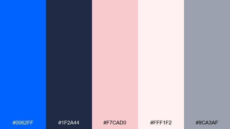
HEX: #0062FF #1F2A44 #F7CAD0 #FFF1F2 #9CA3AF
Mood: soft, modern, friendly
Best for: beauty brands and social templates
Soft and modern, the tones suggest satin fabric, gentle blush, and crisp blue accents. The pinks keep the look approachable, while the deeper blue adds structure for headlines and logos. If you want a true blue color palette that still feels warm, use blush for backgrounds and keep blue for typography and buttons. Tip: add the cool gray to separate sections without introducing another color family.
Image example of true blue and blush generated using media.io

18) Cobalt Clay Studio
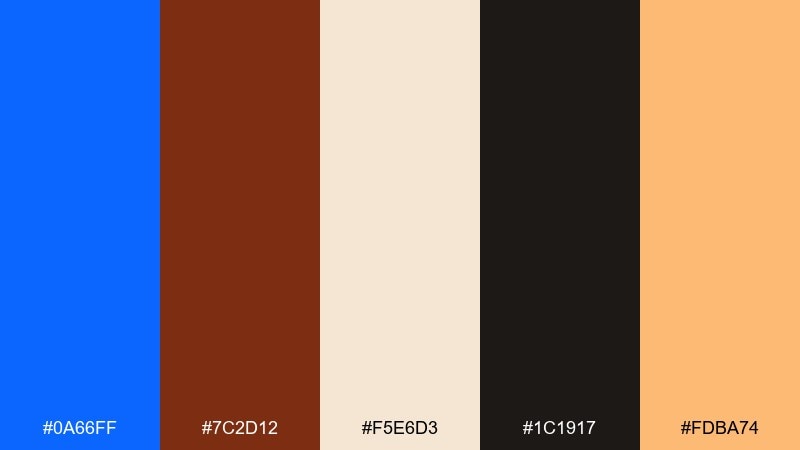
HEX: #0A66FF #7C2D12 #F5E6D3 #1C1917 #FDBA74
Mood: earthy, bold, gallery-like
Best for: book covers and art posters
Earthy yet bold, this pairing feels like cobalt paint beside raw clay and a dark gallery wall. The creamy neutral gives your layout breathing room while keeping the warm tones sophisticated. Pair it with large typography and simple shapes for a modern art-book vibe. Tip: keep the black-brown for titles and let blue carry the main graphic element.
Image example of cobalt clay studio generated using media.io
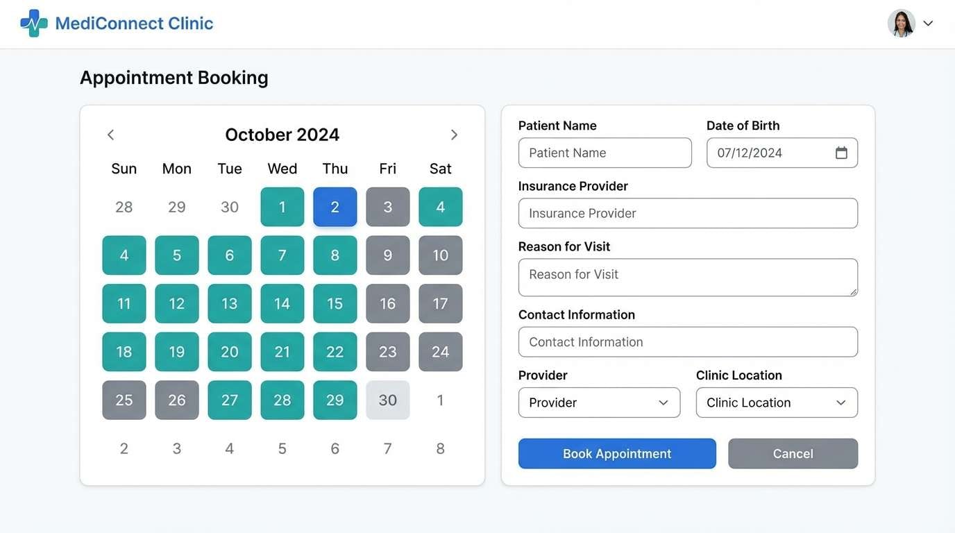
19) Clean Clinic Blue
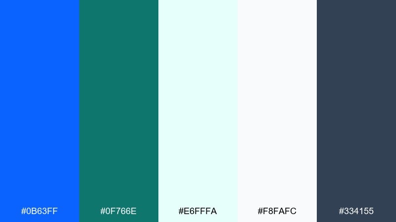
HEX: #0B63FF #0F766E #E6FFFA #F8FAFC #334155
Mood: sterile-clean, reassuring, calm
Best for: healthcare UI and appointment flows
Sterile-clean and reassuring, these colors evoke fresh scrubs, bright lights, and calm order. The teal supports the blue without competing, making it great for tabs, filters, and success states. Used as a true blue color scheme in healthcare UI, keep backgrounds nearly white and reserve darker slate for text and icons. Tip: ensure the teal and blue states are distinct for accessibility in active and hover interactions.
Image example of clean clinic blue generated using media.io
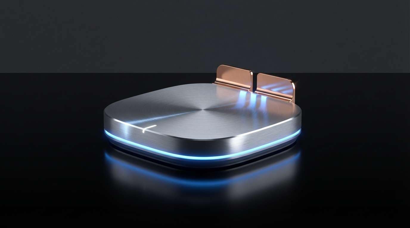
20) Night Swim Metals
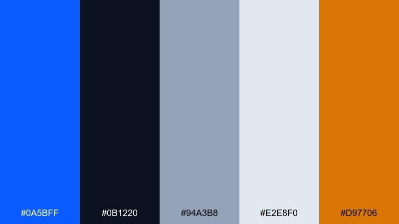
HEX: #0A5BFF #0B1220 #94A3B8 #E2E8F0 #D97706
Mood: sleek, moody, premium
Best for: tech product ads and landing visuals
Sleek and moody, it brings to mind a night swim with reflections bouncing off brushed metal. The cool grays add a premium tech feel, while the warm copper lifts key details without breaking the mood. Use the darkest tone for backgrounds and let the blue outline features, links, and hover states. Tip: keep copper for small highlights like price, limited-time tags, or feature icons.
Image example of night swim metals generated using media.io
What Colors Go Well with True Blue?
True blue pairs effortlessly with cool neutrals like charcoal, slate, and soft gray to create a modern, “designed” look. This is the safest route for UI and enterprise branding where legibility and hierarchy matter most.
For more personality, add warm accents like amber, copper, tan, or blush—these complement blue by increasing perceived contrast and making layouts feel more human. If you want a fresh, contemporary feel, try cyan/teal gradients or mint highlights alongside true blue.
When in doubt, treat true blue as the primary, choose one supporting neutral family (light + dark), then add a single accent color used sparingly for emphasis.
How to Use a True Blue Color Palette in Real Designs
Start with roles, not swatches: assign true blue to primary actions (CTA buttons, links, active states), then use darker navy/charcoal for text and navigation. This keeps interfaces predictable and accessible while still feeling bold.
In branding and packaging, let true blue carry the “signal” areas (logo marks, borders, key claims) and keep the background neutral or lightly tinted. Small warm accents—like gold or clay—work best as stamps, icons, or short highlight lines.
For print, do a quick proof pass: saturated blues can shift depending on paper stock and coating. Use slightly deeper neutrals for small text and fine lines to avoid softness.
Create True Blue Palette Visuals with AI
If you already have HEX codes, you can turn them into real layouts fast by generating mockups that match your intended use—hero sections, posters, packaging, onboarding screens, or social templates. This helps you validate contrast, mood, and hierarchy before committing to a full design system.
With Media.io text-to-image, paste a prompt that describes the layout and style, then refine until the blue reads the way you want across light and dark backgrounds. Save variations to compare different accents (gold, blush, teal, copper) side-by-side.
True Blue Color Palette FAQs
-
What is “true blue” in HEX?
There isn’t one universal true blue, but common “true blue” picks in modern UI range from around #0066FF to #0B63FF. Choose the exact shade based on your background (light vs. dark) and accessibility contrast targets. -
What colors complement true blue best?
Warm complements like amber/gold, copper, tan, and blush balance true blue nicely. For a clean, professional look, pair it with neutrals such as charcoal, slate, and light gray. -
Is true blue good for branding?
Yes—true blue signals trust, clarity, and competence, which is why it’s popular in tech, finance, healthcare, and education. It also scales well across web, social, and print when supported by consistent neutrals. -
How do I keep a true blue UI from feeling too cold?
Use warm neutrals (off-white, sand, light tan) and a small warm accent (gold or orange) for highlights. You can also soften the overall feel with rounded components, subtle shadows, or light gradient backgrounds. -
What’s a safe neutral set to pair with true blue?
Use a near-black for text/nav (e.g., #0F172A or #111827), mid-gray for secondary labels, and a light gray/white for surfaces (e.g., #E5E7EB and #FFFFFF). Then reserve true blue for interactions and key emphasis. -
Can I use true blue with pink or purple accents?
Yes—pink and violet can make true blue feel more modern and expressive, especially for events, entertainment, and social templates. Keep the background dark or neutral and limit saturated accents to a few focal elements to avoid visual noise. -
How can I preview a true blue palette before designing everything?
Generate quick mockups (landing sections, posters, packaging labels, app screens) using AI and your HEX palette as guidance. This lets you test contrast, readability, and “vibe” early, then iterate on accents and neutrals.
Next: Gold Green Color Palette


