

Bronze is a warm metallic neutral that instantly adds depth, heritage, and a premium feel—without the harshness of pure gold or the flatness of basic browns.
Below are curated bronze color palette ideas (with HEX codes) you can use for branding, UI, packaging, interiors, and campaign graphics—plus practical pairing tips and AI prompts to visualize each look fast.
In this article
- Why Bronze Palettes Work So Well
-
- aged copper glow
- museum patina
- sunlit terracotta bronze
- midnight bronze luxe
- sandstone alloy
- autumn ember
- bronze blush romance
- industrial bronze concrete
- cedar cabin
- coastal bronze drift
- art deco brassline
- espresso bronze minimal
- orchard harvest
- vintage leatherbound
- night market lanterns
- clay studio neutrals
- modern bridal bronze
- cosmic bronze nebula
- warm ui bronze
- forest bronze trail
- candlelit bronze table
- gallery wall bronze
- bronze orchid ink
- What Colors Go Well with Bronze?
- How to Use a Bronze Color Palette in Real Designs
- Create Bronze Palette Visuals with AI
Why Bronze Palettes Work So Well
Bronze sits between brown and gold, so it reads as both natural and elevated. That dual personality makes it useful for everything from earthy brands to premium launches.
It also pairs easily across temperature: warm creams, terracottas, and reds intensify its glow, while cool teals, slates, and navies add modern contrast.
Most importantly, bronze supports hierarchy. You can keep layouts mostly neutral and use bronze sparingly for accents (buttons, borders, icons) to guide attention without overwhelming the design.
20+ Bronze Color Palette Ideas (with HEX Codes)
1) Aged Copper Glow
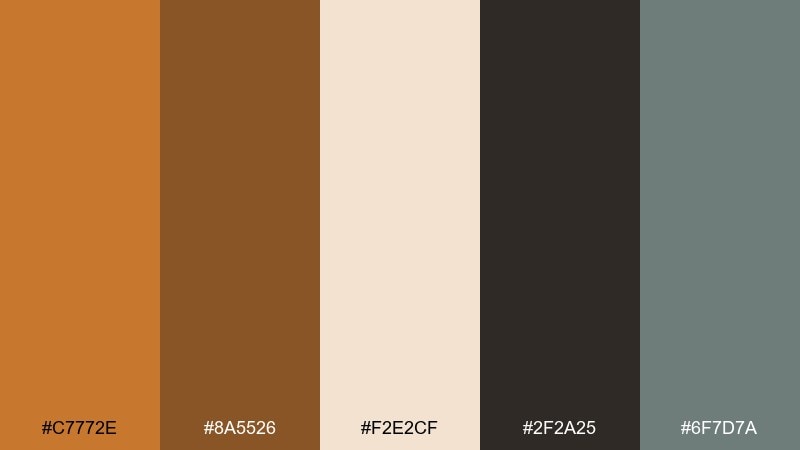
HEX: #c7772e #8a5526 #f2e2cf #2f2a25 #6f7d7a
Mood: rustic, warm, grounded
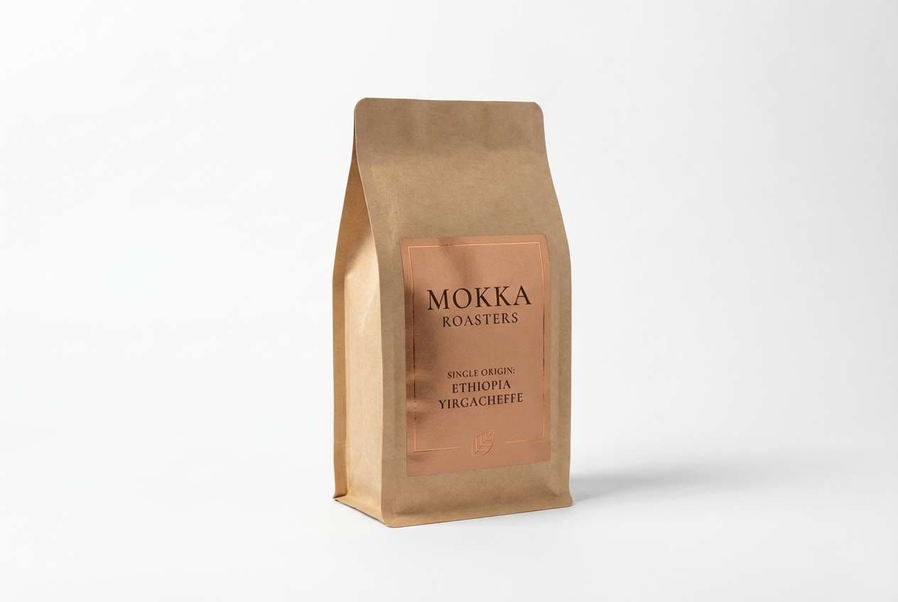
Best for: artisan coffee packaging and labels
Rustic warmth with a burnished-metal shine, like a well-loved kettle by the hearth. Use it on kraft textures, matte labels, and stamped details to get a premium handmade feel. Pair the bronze tone with soft cream for readability and a charcoal base for contrast. Tip: keep the teal-gray as a small accent for batch numbers or origin notes.
Image example of aged copper glow generated using media.io
Media.io is an online AI studio for creating and editing video, image, and audio in your browser.

2) Museum Patina
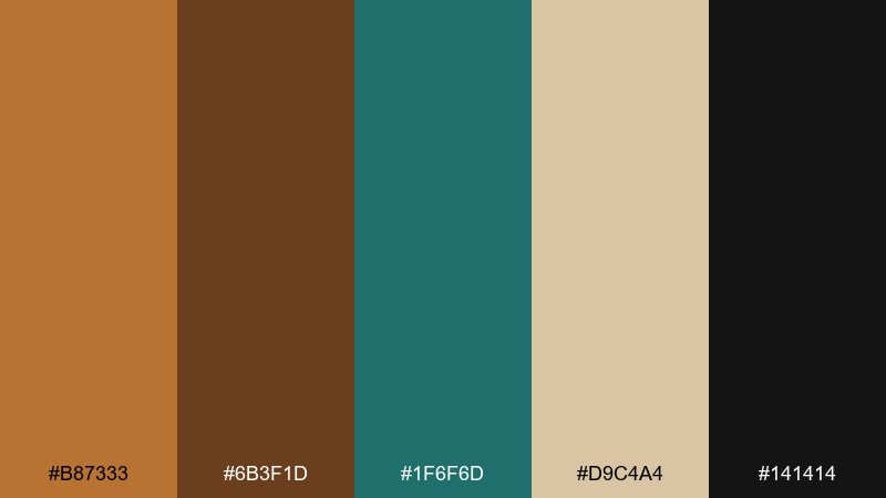
HEX: #b87333 #6b3f1d #1f6f6d #d9c4a4 #141414
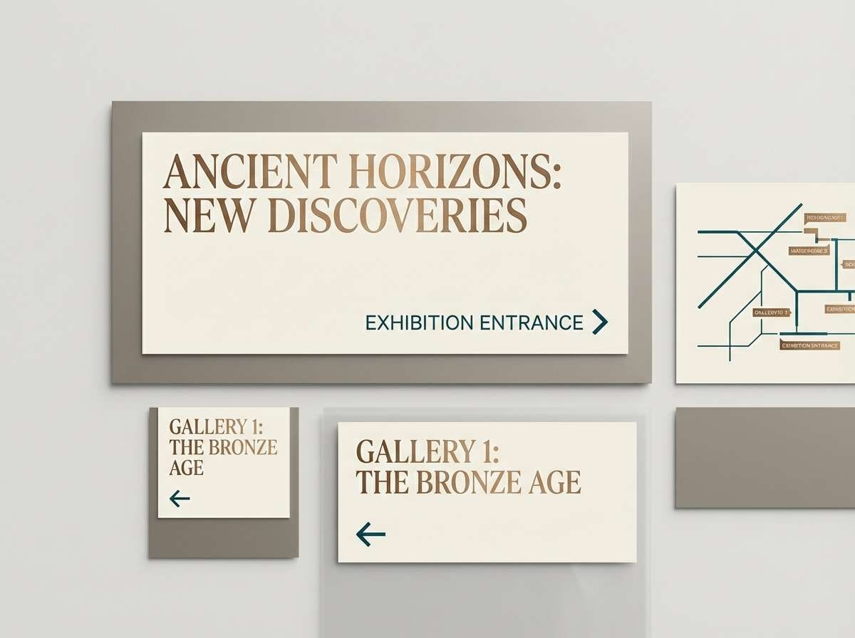
Mood: heritage, cultured, cinematic
Best for: exhibition branding and museum signage
Heritage tones with patina greens evoke oxidized statues, velvet ropes, and quiet galleries. The deep teal brings authority while the bronze and umber keep the look tactile and historic. Use warm parchment for wayfinding panels and reserve near-black for titles and icons. Tip: in signage, set teal on parchment, then accent sparingly with bronze for section markers.
Image example of museum patina generated using media.io
3) Sunlit Terracotta Bronze
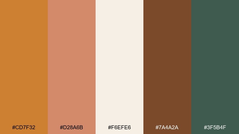
HEX: #cd7f32 #d28a6b #f6efe6 #7a4a2a #3f5b4f
Mood: sun-baked, friendly, natural
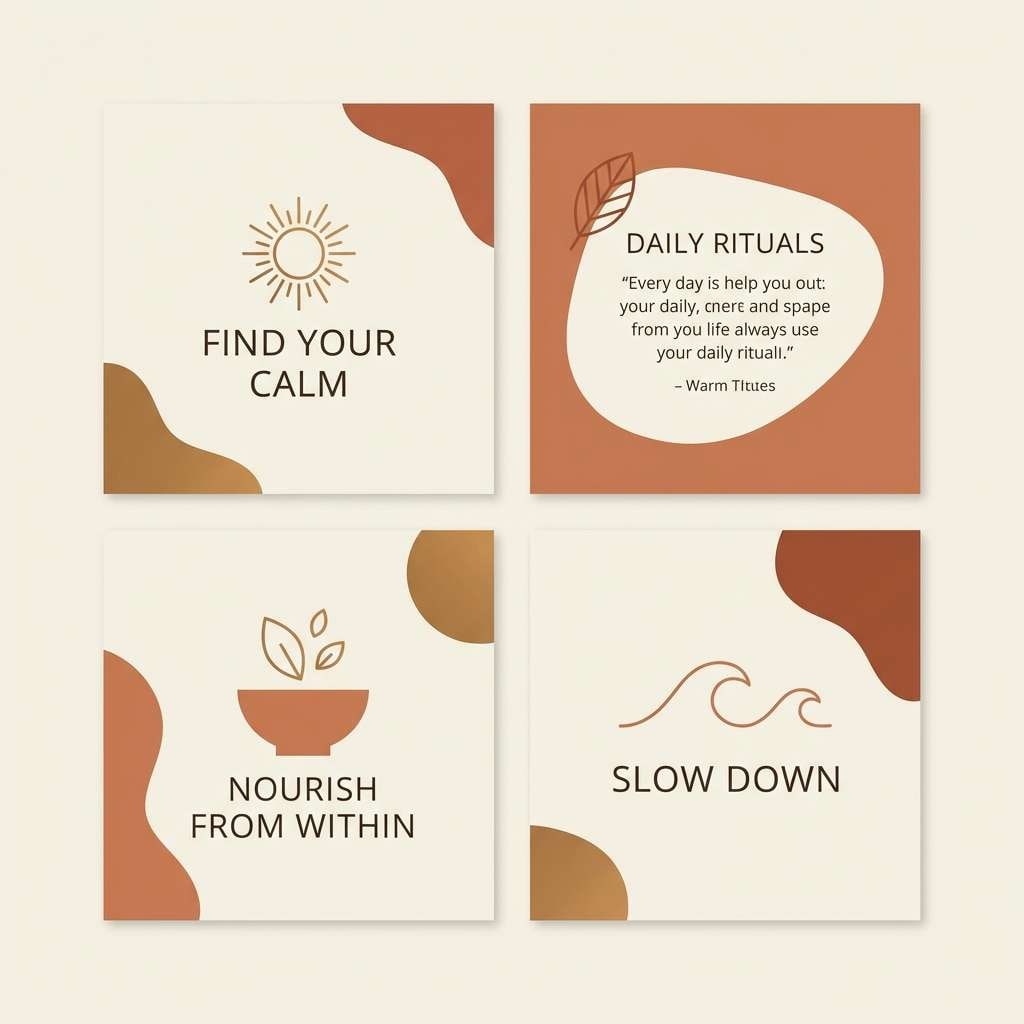
Best for: wellness branding and social templates
Sun-baked and approachable, like clay walls catching late-afternoon light. The terracotta and bronze tones feel energetic without shouting, while the off-white keeps layouts airy. Add the muted green for calm secondary buttons or highlights. Tip: use the darkest brown for body text to keep the warm theme without sacrificing contrast.
Image example of sunlit terracotta bronze generated using media.io
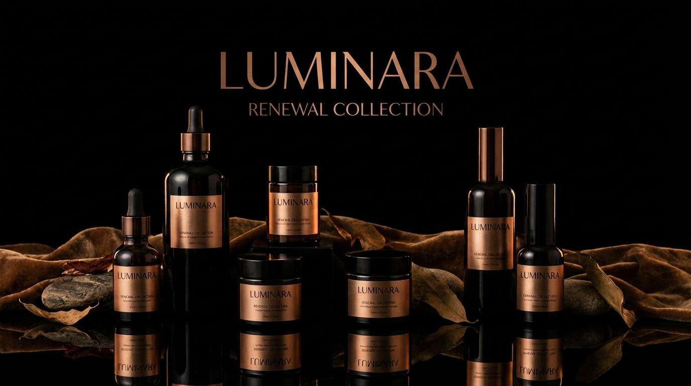
4) Midnight Bronze Luxe
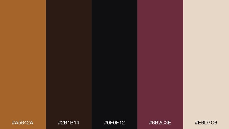
HEX: #a5642a #2b1b14 #0f0f12 #6b2c3e #e6d7c6
Mood: dramatic, luxe, nocturnal
Best for: beauty product ads and premium launches
Nocturnal and glossy, like city lights glinting off metal at midnight. These bronze color combinations work beautifully with high-contrast layouts, where cream highlights feel like spotlight reflections. Let near-black dominate for a luxe mood, then add a thin bronze line to frame key claims. Tip: keep the wine tone for one hero element, such as a callout badge or shade name.
Image example of midnight bronze luxe generated using media.io
5) Sandstone Alloy
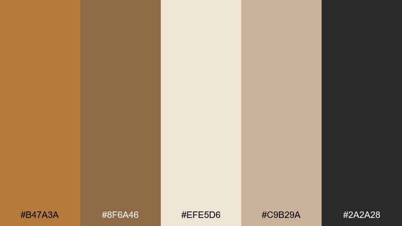
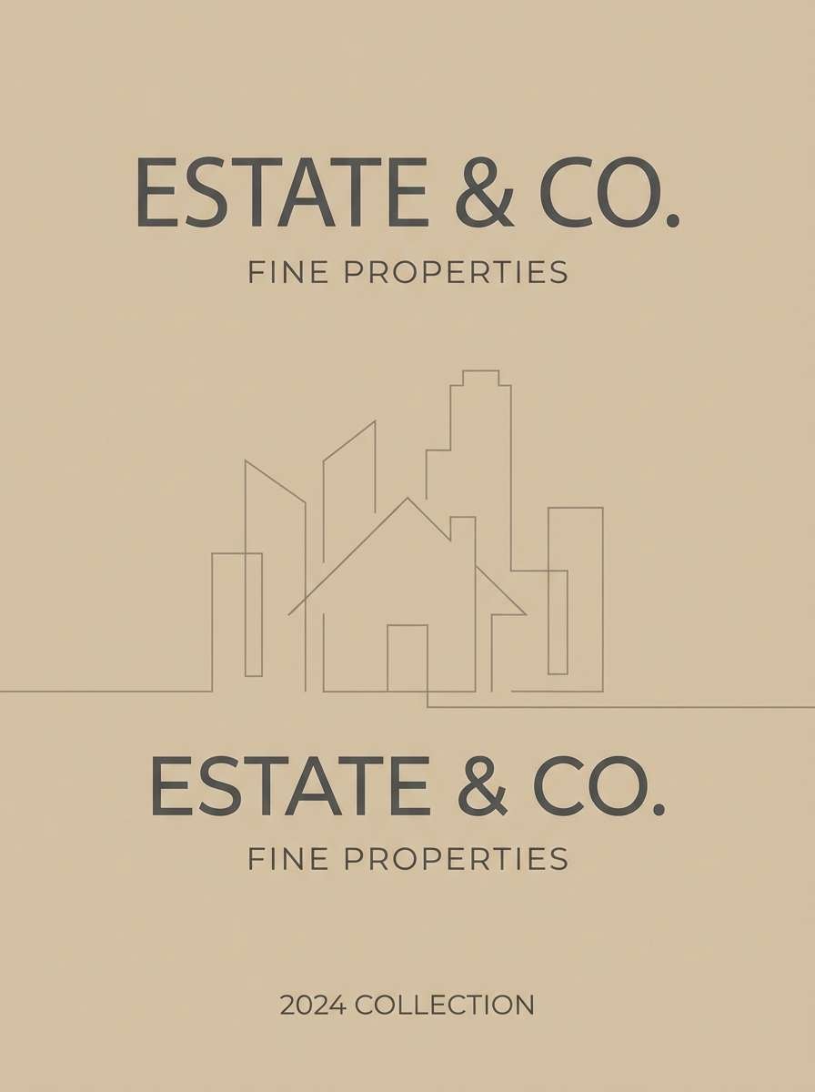
HEX: #b47a3a #8f6a46 #efe5d6 #c9b29a #2a2a28
Mood: calm, refined, architectural
Best for: interior mood boards and real estate brochures
Calm and architectural, like carved sandstone with a subtle metallic sheen. The soft neutrals keep it timeless, while the deeper bronze adds structure for headings and trim. Pair with natural textures like linen, oak, and stone photography for an elevated look. Tip: use the mid-tan as your dominant background and keep the darkest tone for typography only.
Image example of sandstone alloy generated using media.io
6) Autumn Ember
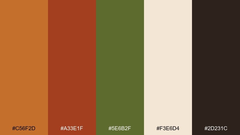
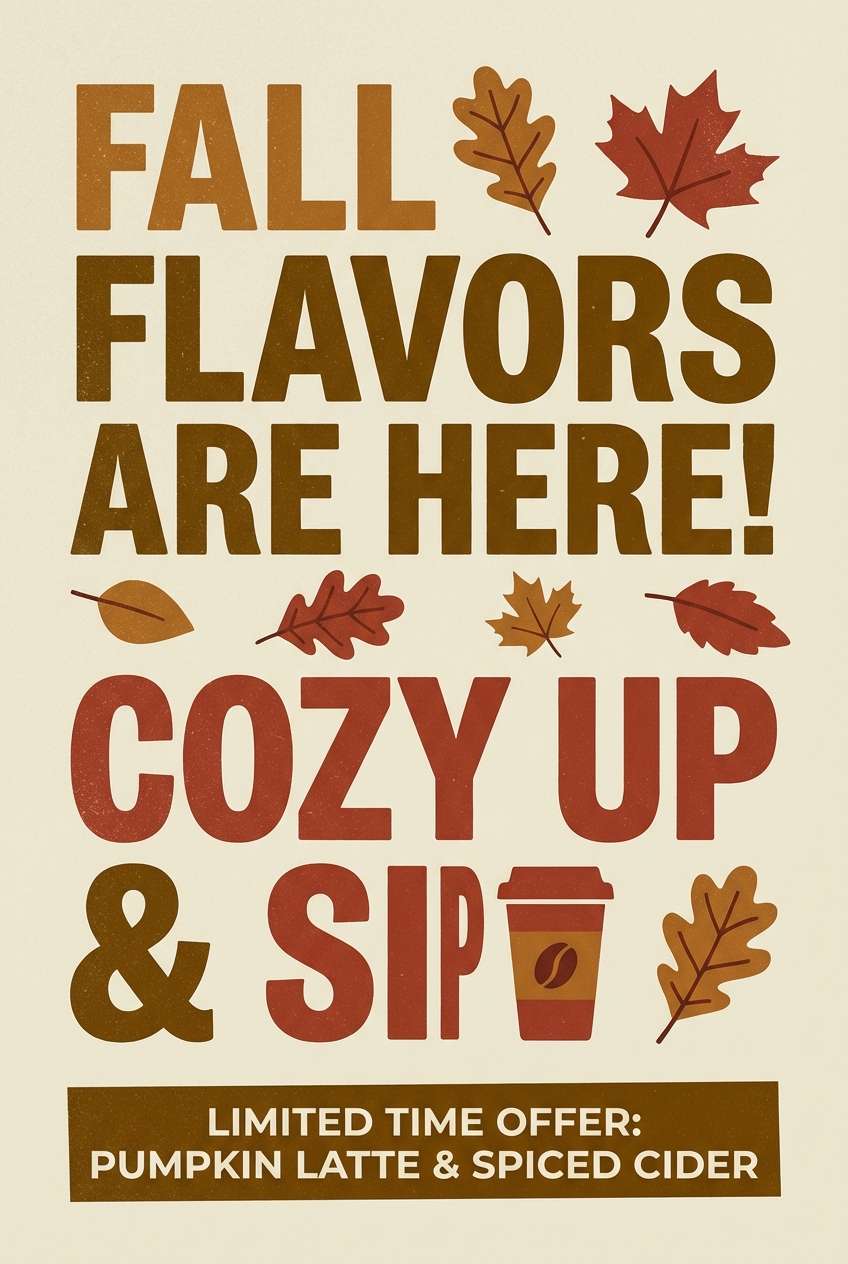
HEX: #c56f2d #a33e1f #5e6b2f #f3e6d4 #2d231c
Mood: cozy, seasonal, bold
Best for: fall campaign posters and cafe promos
Cozy and bold, like ember sparks in a fire pit on a crisp evening. The bronze-orange and brick red create instant seasonal energy, while olive keeps it grounded and modern. Use the cream for poster space and let the dark brown anchor type and pricing. Tip: for promos, keep the red as a small punch so the warm metals stay in control.
Image example of autumn ember generated using media.io
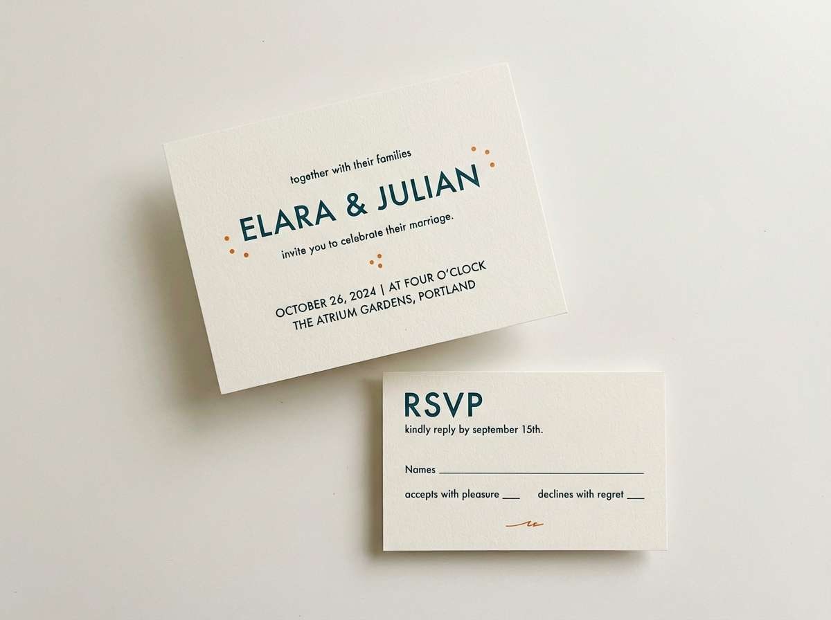
7) Bronze Blush Romance
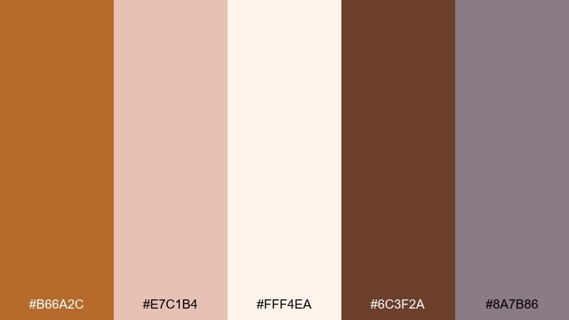
HEX: #b66a2c #e7c1b4 #fff4ea #6c3f2a #8a7b86
Mood: soft, romantic, modern
Best for: wedding invitations and RSVP cards
Soft and romantic, like blush silk paired with warm metal jewelry. The gentle pink and creamy white keep it airy, while the deep brown adds elegant structure for names and dates. Pair with modern serif type and subtle foil stamping for a refined finish. Tip: use bronze for monograms or thin borders instead of large fills to keep it light.
Image example of bronze blush romance generated using media.io
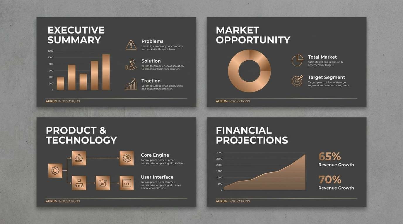
8) Industrial Bronze Concrete
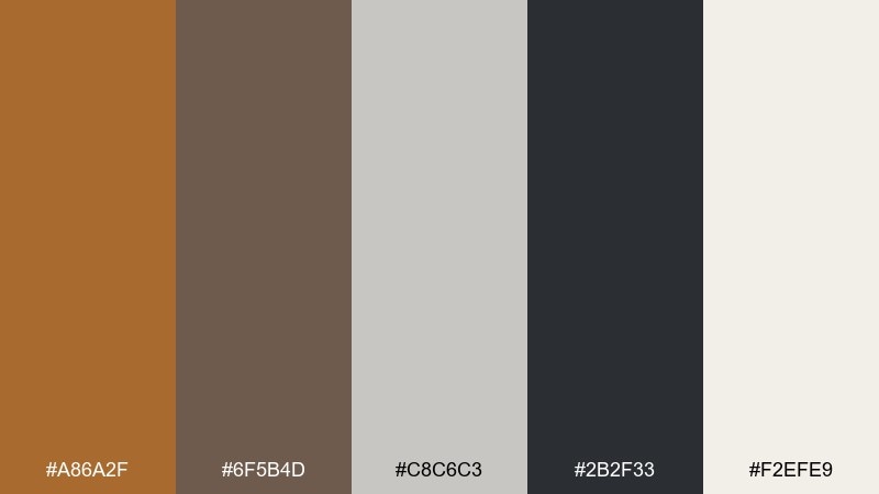
HEX: #a86a2f #6f5b4d #c8c6c3 #2b2f33 #f2efe9
Mood: urban, practical, contemporary
Best for: startup branding and pitch decks
Urban and practical, like brushed metal against cool concrete. The bronze warms up the slate grays without losing a modern edge, making it great for decks and one-pagers. Use light gray as the main canvas, then bring in bronze for highlights and data points. Tip: keep the darkest slate for charts and headers to maintain crisp contrast.
Image example of industrial bronze concrete generated using media.io
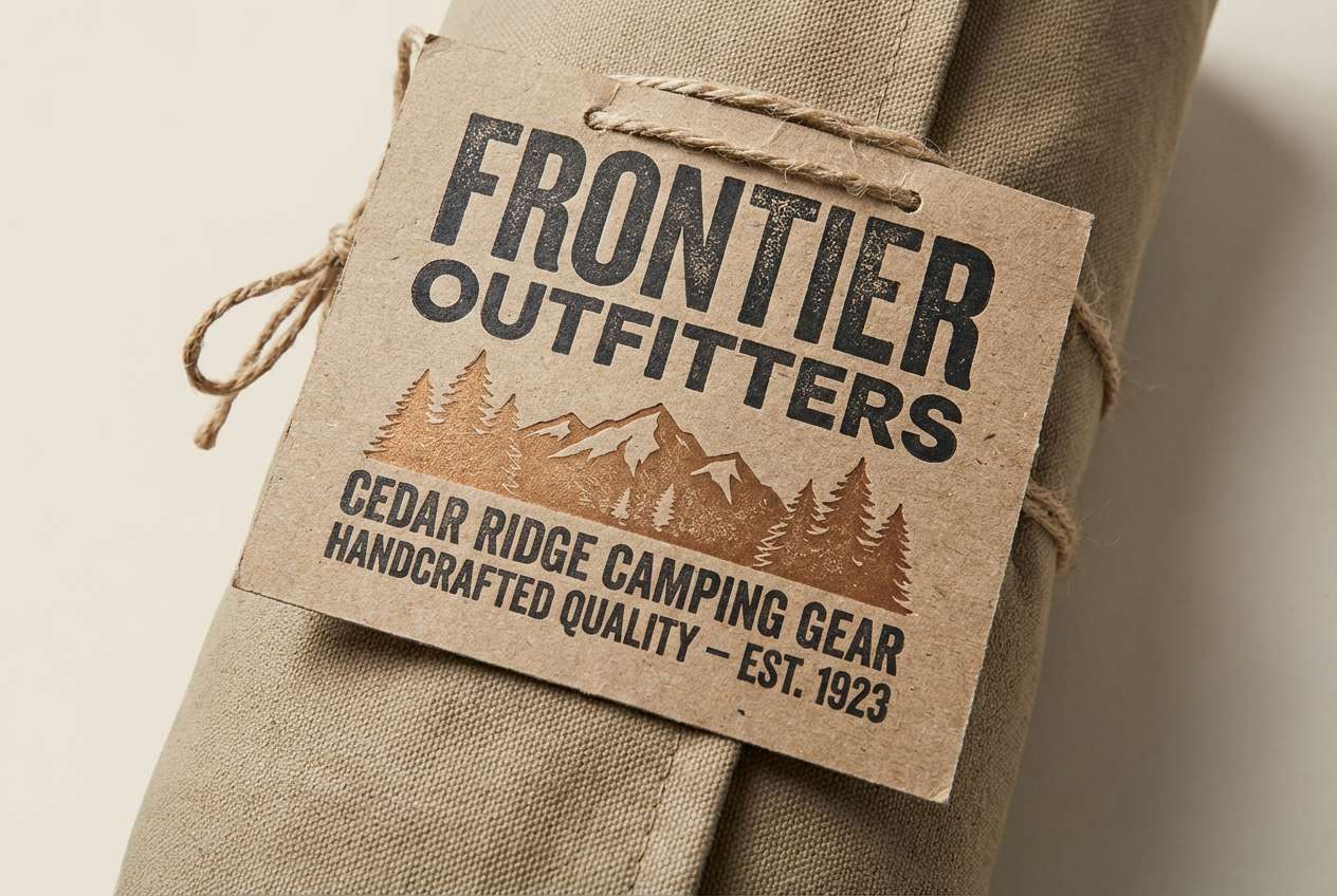
9) Cedar Cabin
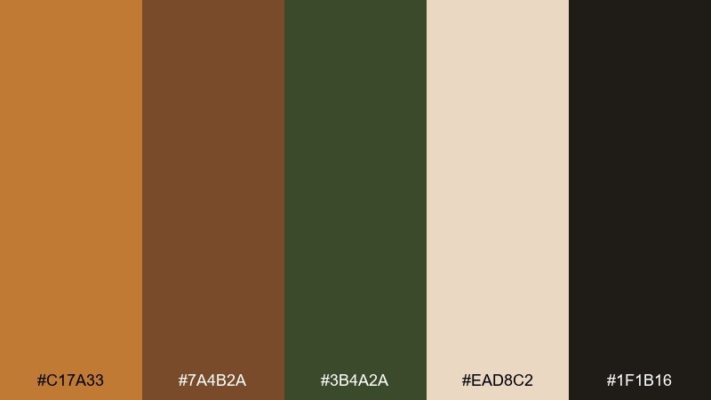
HEX: #c17a33 #7a4b2a #3b4a2a #ead8c2 #1f1b16
Mood: outdoorsy, rugged, inviting
Best for: camping gear packaging and outdoor brands
Outdoorsy and rugged, like cedar planks, campfire smoke, and worn leather. This bronze color palette pairs beautifully with forest greens and deep shadows for a trustworthy, adventure-ready look. Use the cream tone for label readability and the near-black for strong logos. Tip: add texture through paper grain or embossed marks to amplify the cabin feel.
Image example of cedar cabin generated using media.io
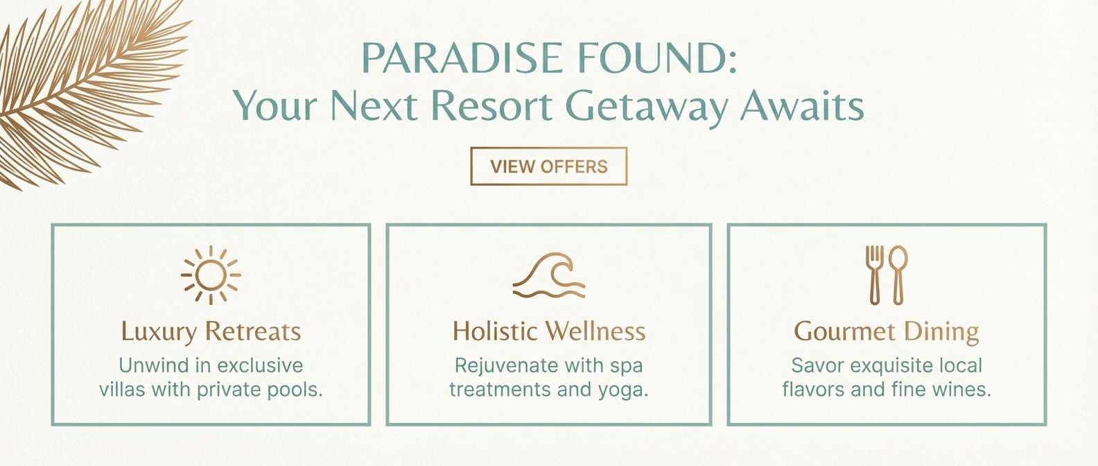
10) Coastal Bronze Drift
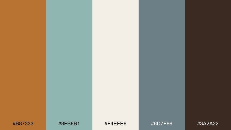
HEX: #b87333 #8fb6b1 #f4efe6 #6d7f86 #3a2a22
Mood: breezy, balanced, sophisticated
Best for: resort branding and travel emails
Breezy and sophisticated, like driftwood, sea glass, and warm sand at sunset. The cool aquas keep the bronze grounded and modern, perfect for travel marketing that needs calm energy. Use the off-white for spacious email sections and reserve bronze for CTAs or icons. Tip: keep the slate-blue for secondary buttons so the primary action stays clear.
Image example of coastal bronze drift generated using media.io
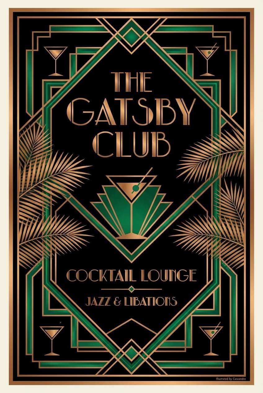
11) Art Deco Brassline
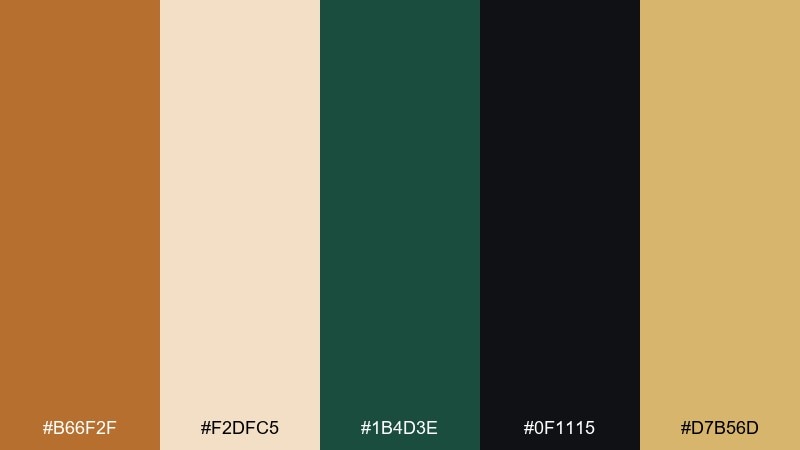
HEX: #b66f2f #f2dfc5 #1b4d3e #0f1115 #d7b56d
Mood: glam, geometric, high-contrast
Best for: cocktail bar posters and menus
Glam and geometric, like a jazz-age lobby lit by gold trim. This bronze color combination shines when you use sharp lines, symmetrical frames, and deep black grounding. Pair with emerald green for a classic deco pop and keep the cream tone for readable menu sections. Tip: use thin metallic strokes rather than large fills to keep the look crisp.
Image example of art deco brassline generated using media.io
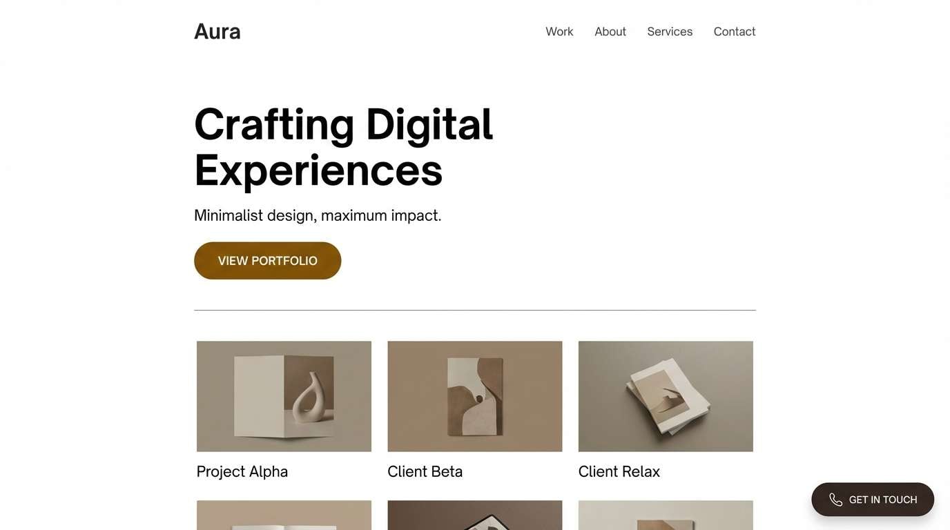
12) Espresso Bronze Minimal
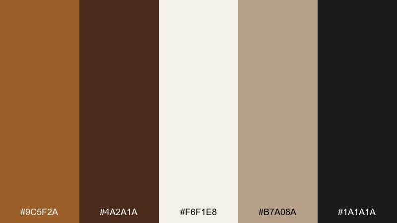
HEX: #9c5f2a #4a2a1a #f6f1e8 #b7a08a #1a1a1a
Mood: minimal, warm, professional
Best for: portfolio sites and agency identities
Minimal and warm, like espresso crema against a clean ceramic cup. The palette keeps neutrals in charge, with bronze acting as a confident accent for links and badges. Pair with lots of whitespace and a single strong type family for a premium feel. Tip: use bronze only on interactive states so the interface stays calm.
Image example of espresso bronze minimal generated using media.io
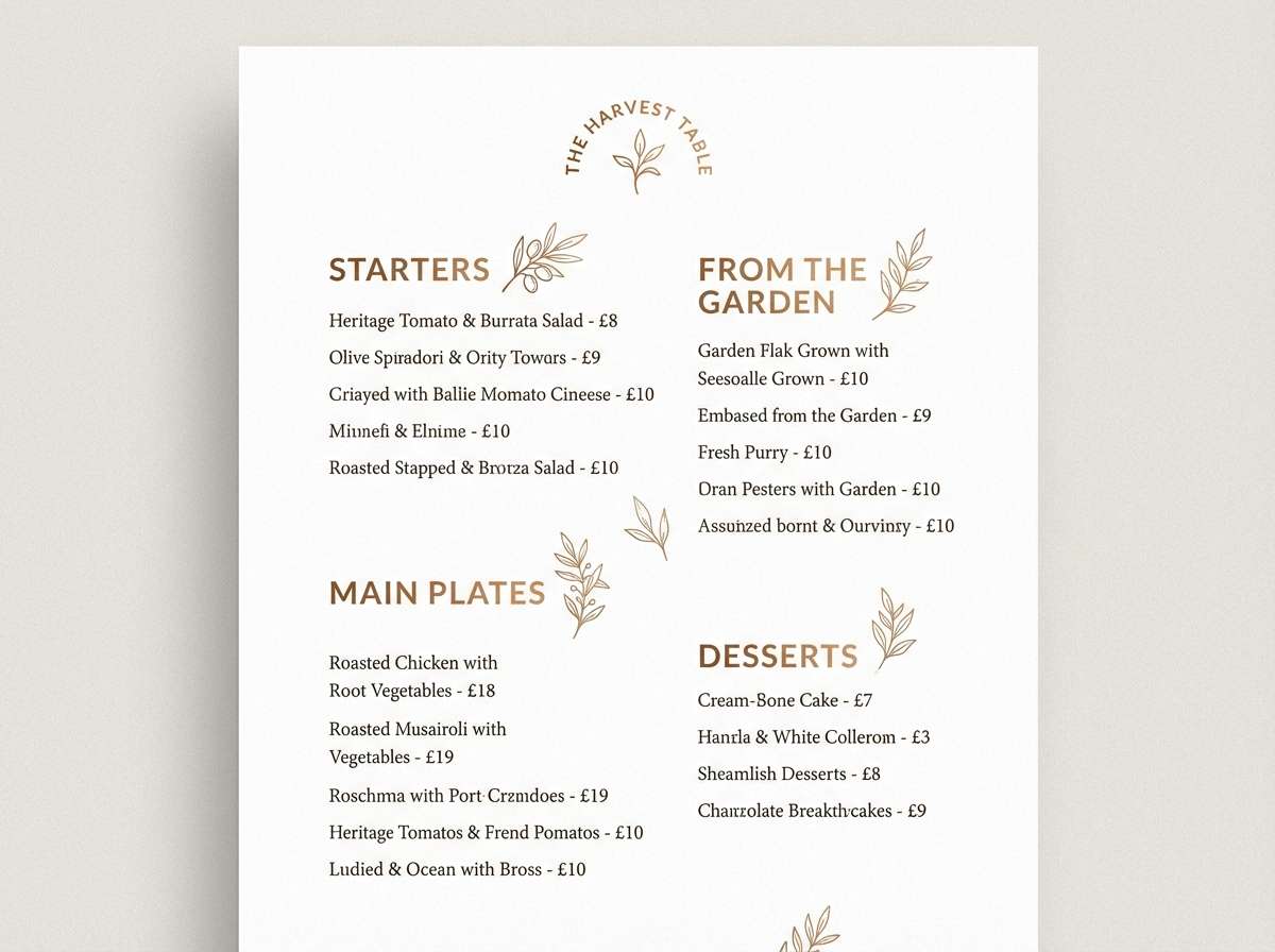
13) Orchard Harvest
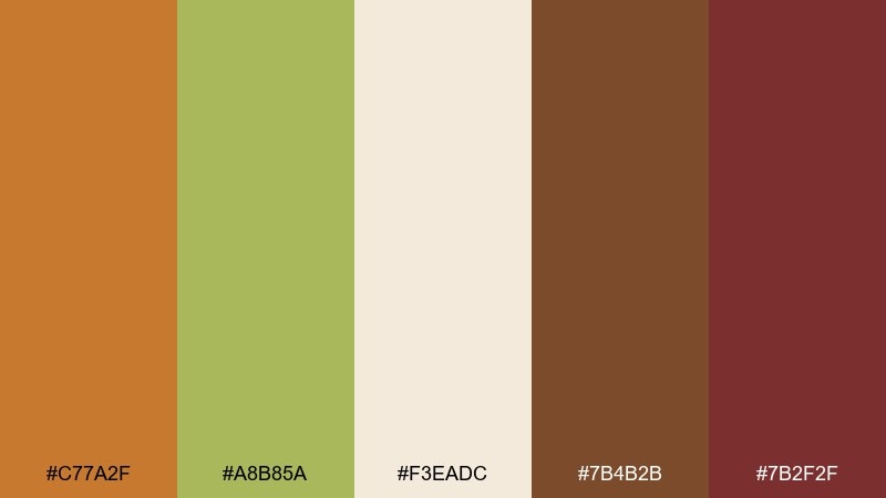
HEX: #c77a2f #a8b85a #f3eadc #7b4b2b #7b2f2f
Mood: fresh, rustic, appetizing
Best for: farm-to-table menus and food labels
Fresh and rustic, like picked apples laid on a wooden table. The muted greens and warm browns make food photography look richer and more natural. Keep the cream tone as your main menu background and use the deep red as a small seasonal accent. Tip: for labels, set product names in dark brown and save bronze for icons and seals.
Image example of orchard harvest generated using media.io
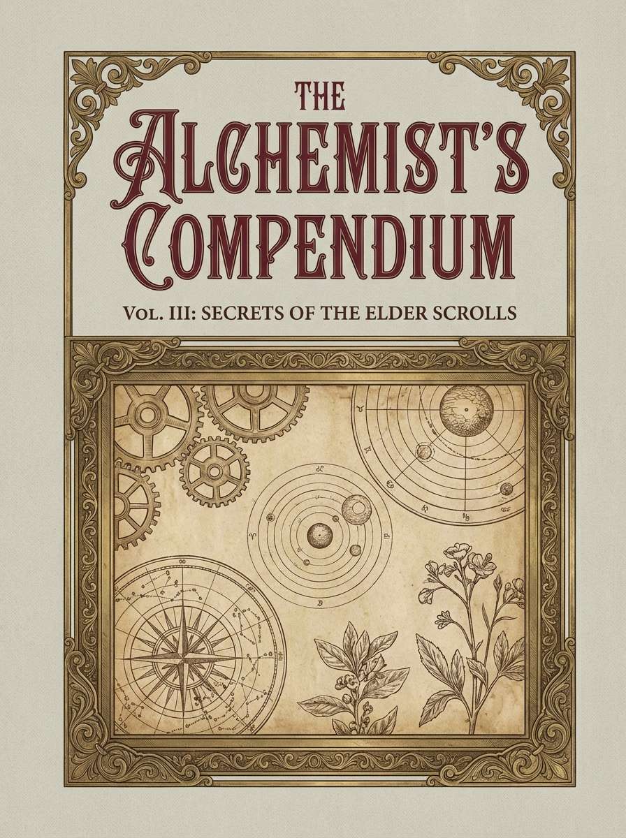
14) Vintage Leatherbound
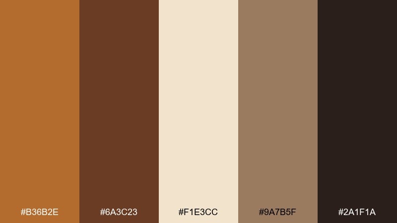
HEX: #b36b2e #6a3c23 #f1e3cc #9a7b5f #2a1f1a
Mood: vintage, scholarly, tactile
Best for: book covers and stationery sets
Vintage and tactile, like a leatherbound journal with softly aged pages. The warm browns and parchment neutral build instant credibility for authors, workshops, and stationery. Use the lighter tan for background blocks and keep the deepest brown for titles to avoid muddy contrast. Tip: a subtle grain overlay helps the colors feel authentically printed.
Image example of vintage leatherbound generated using media.io
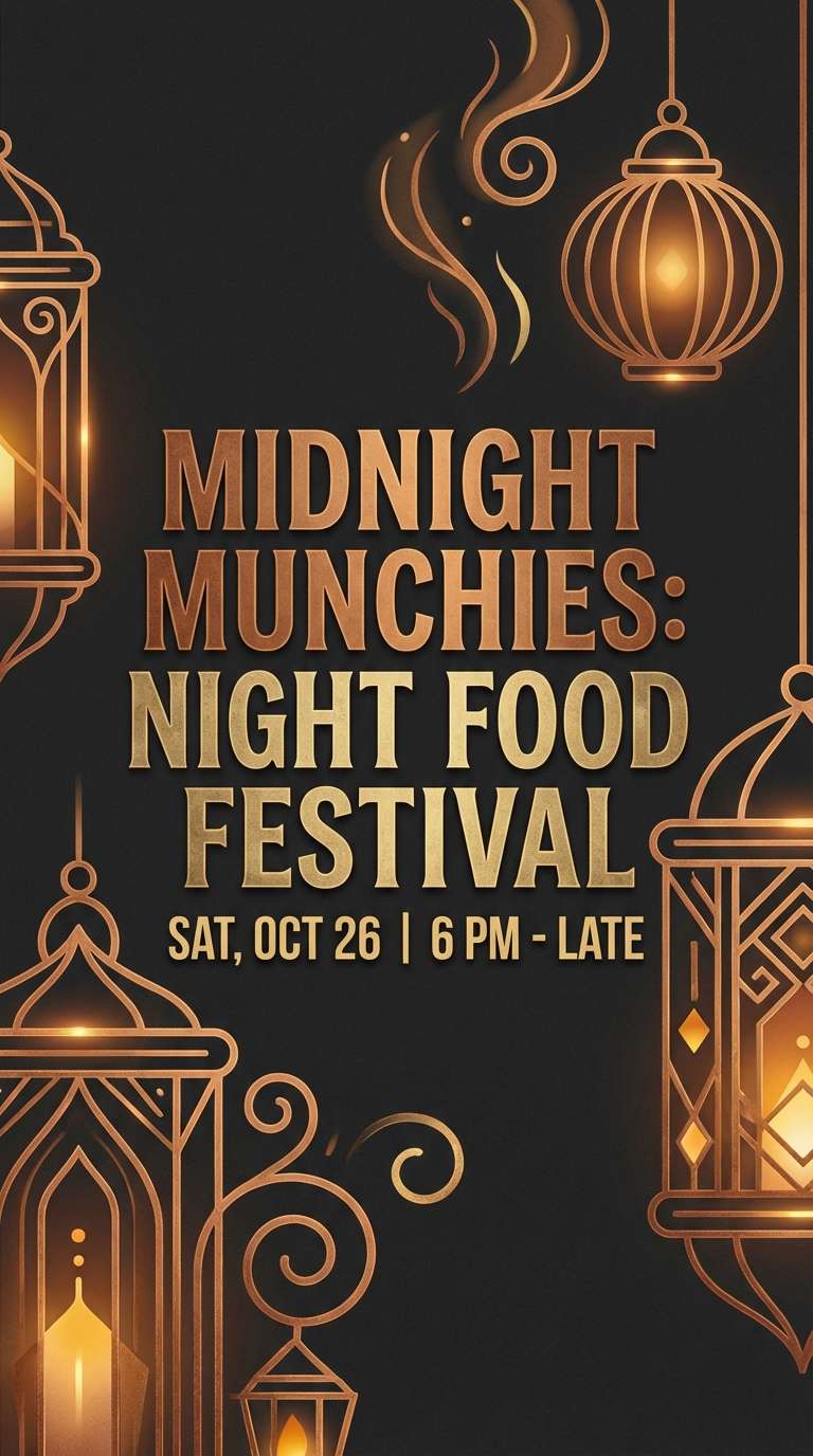
15) Night Market Lanterns
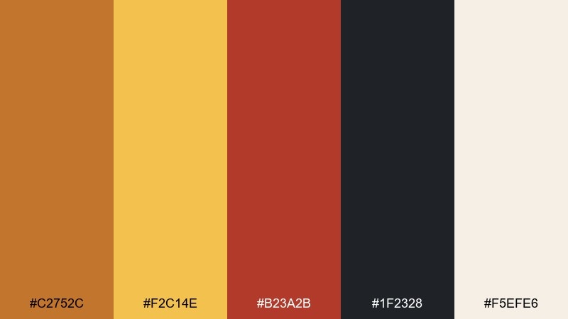
HEX: #c2752c #f2c14e #b23a2b #1f2328 #f5efe6
Mood: lively, warm, streetwise
Best for: event flyers and night food festivals
Lively and warm, like lantern light bouncing off street stalls after dark. The mix reads as a bronze color scheme with just enough gold and red to feel celebratory, not heavy. Use near-black for bold type and the soft white for negative space so the colors glow. Tip: keep the red for one focal element, like a date badge or location pin.
Image example of night market lanterns generated using media.io
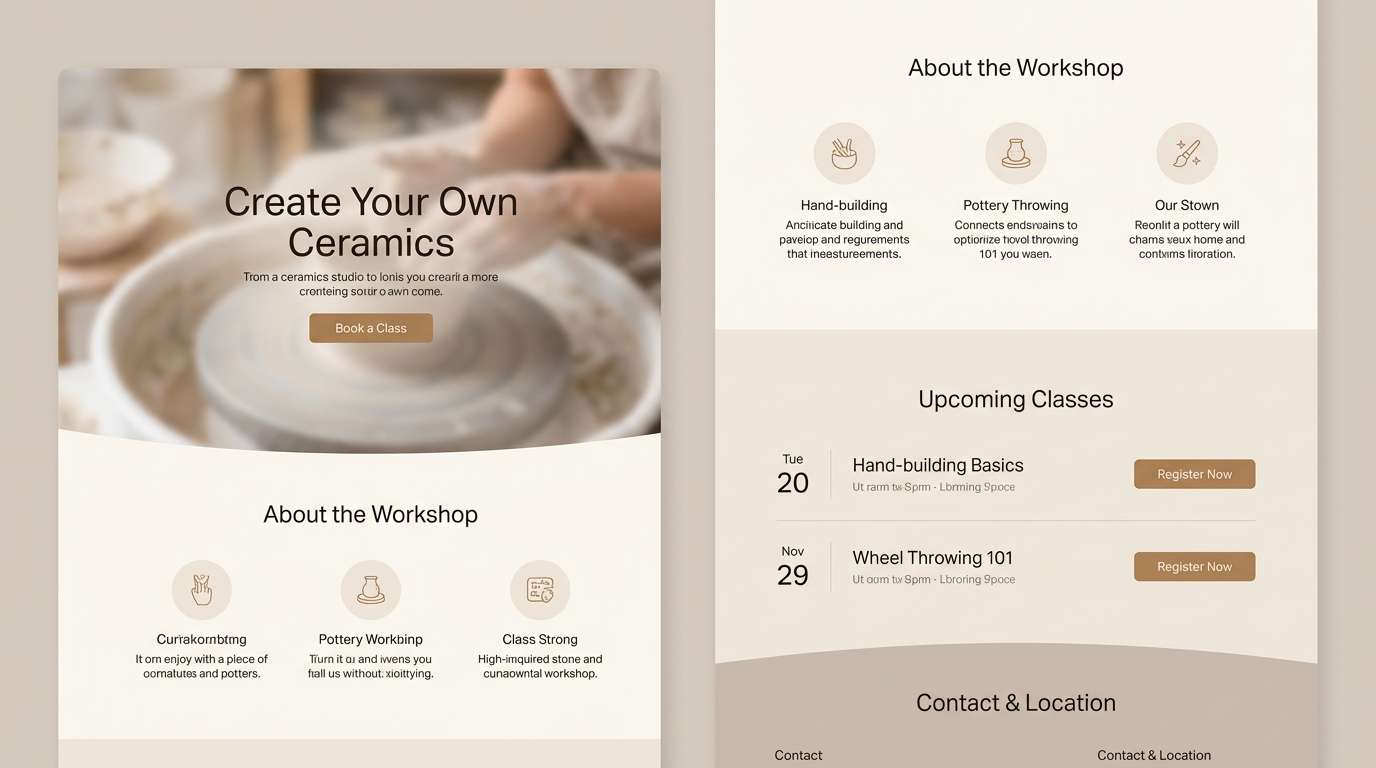
16) Clay Studio Neutrals
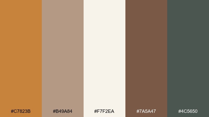
HEX: #c7823b #b49a84 #f7f2ea #7a5a47 #4c5650
Mood: soft, creative, calming
Best for: ceramics studios and workshop landing pages
Soft and calming, like wet clay, linen aprons, and quiet studio light. The neutrals stay gentle while the bronze adds a warm focal point for buttons and section headers. Pair with simple product photos on light backgrounds to keep the page airy. Tip: use the muted gray-green for secondary navigation and footer areas.
Image example of clay studio neutrals generated using media.io
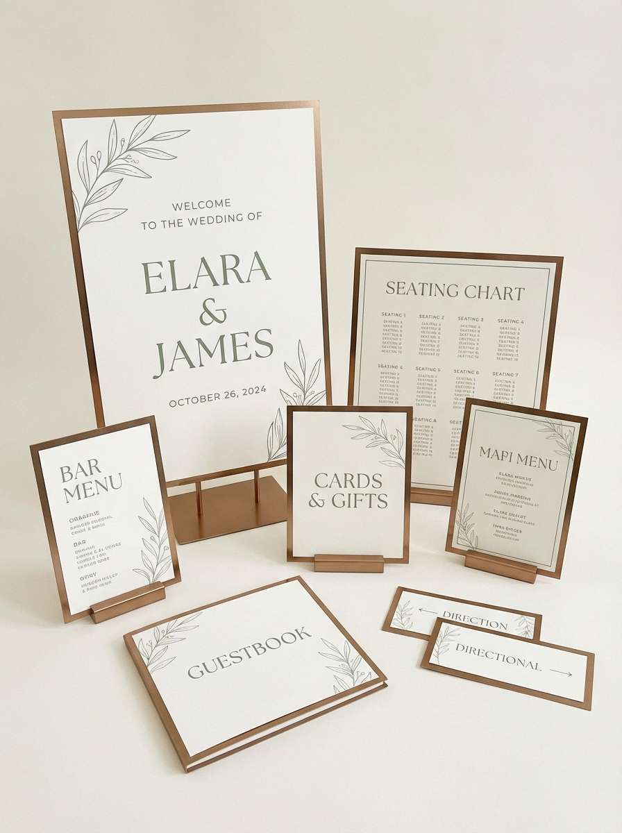
17) Modern Bridal Bronze
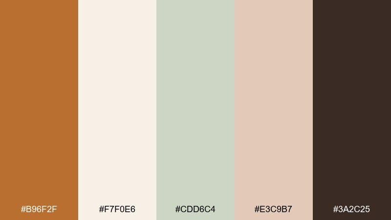
HEX: #b96f2f #f7f0e6 #cdd6c4 #e3c9b7 #3a2c25
Mood: clean, romantic, contemporary
Best for: wedding websites and day-of signage
Clean romance with a modern edge, like satin ribbons on eucalyptus stems. The soft greens and blush neutrals keep everything fresh while bronze gives the suite a polished finish. Use the dark brown for high-contrast text and reserve bronze for separators, icons, and small flourishes. Tip: keep backgrounds mostly ivory so photos and typography breathe.
Image example of modern bridal bronze generated using media.io
18) Cosmic Bronze Nebula
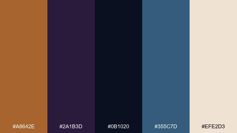
HEX: #a8642e #2a1b3d #0b1020 #355c7d #efe2d3
Mood: mysterious, modern, bold
Best for: music covers and tech conference graphics
Mysterious and modern, like a nebula glow cutting through deep space. The warm bronze pops against midnight blues and purple shadows, making titles feel electric. Use the pale neutral as a highlight for dates, speakers, or track lists to keep legibility. Tip: add a subtle gradient from navy to purple to echo the cosmic mood without clutter.
Image example of cosmic bronze nebula generated using media.io

19) Warm UI Bronze
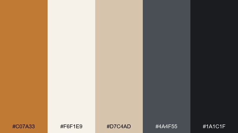
HEX: #c07a33 #f6f1e9 #d7c4ad #4a4f55 #1a1c1f
Mood: clear, trustworthy, warm
Best for: fintech dashboards and admin panels
Clear and trustworthy, like warm light on brushed metal in a modern office. The soft neutrals support dense data while the bronze accent guides attention to key actions. Use the near-black for headings and the slate gray for secondary labels and dividers. Tip: keep bronze limited to one primary button style and key chart highlights to avoid visual noise.
Image example of warm ui bronze generated using media.io
20) Forest Bronze Trail
HEX: #b66e2f #2f5b3f #8b9a4a #f1e8d8 #2a211b
Mood: natural, sturdy, confident
Best for: outdoor app branding and badges
Natural and sturdy, like a trail marker nailed into an old pine. The greens give it credibility for outdoor products, while bronze adds a warm, premium accent. These bronze color combinations feel best when you keep backgrounds light and let green handle most navigation states. Tip: use bronze sparingly for achievement badges or premium plan highlights.
Image example of forest bronze trail generated using media.io
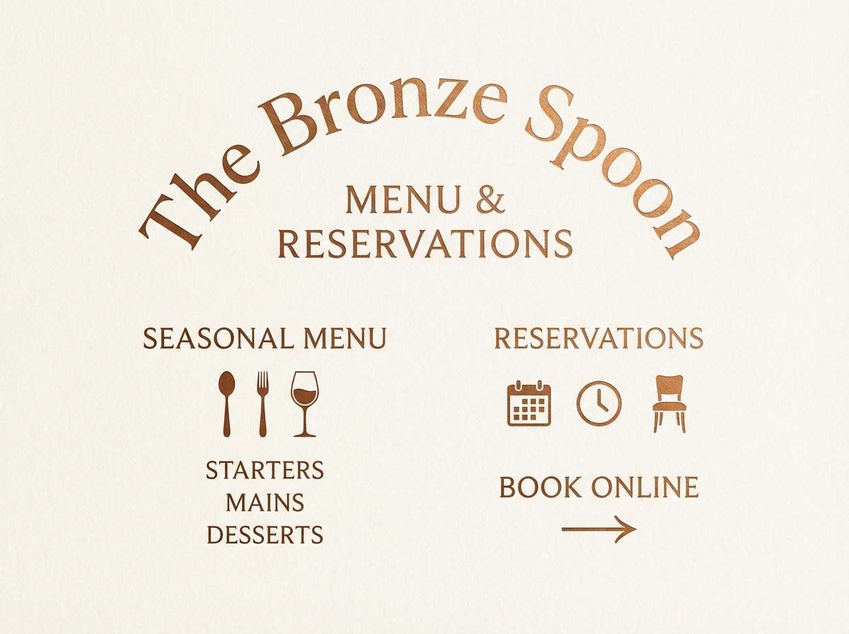
21) Candlelit Bronze Table
HEX: #c57a2d #f2d6b3 #8c2f2a #3b2a25 #f7f0e5
Mood: intimate, inviting, rich
Best for: restaurant menus and reservation ads
Intimate and inviting, like candlelight catching on cutlery at a late dinner. The warm bronze and soft gold tones set a welcoming stage, while the deep brown keeps typography elegant. Add the muted red for a single appetizing accent, such as a chef special callout. Tip: keep the light cream as the dominant surface so the palette feels upscale, not heavy.
Image example of candlelit bronze table generated using media.io
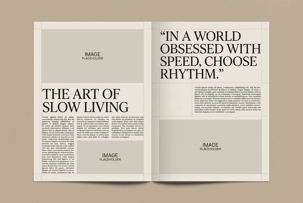
22) Gallery Wall Bronze
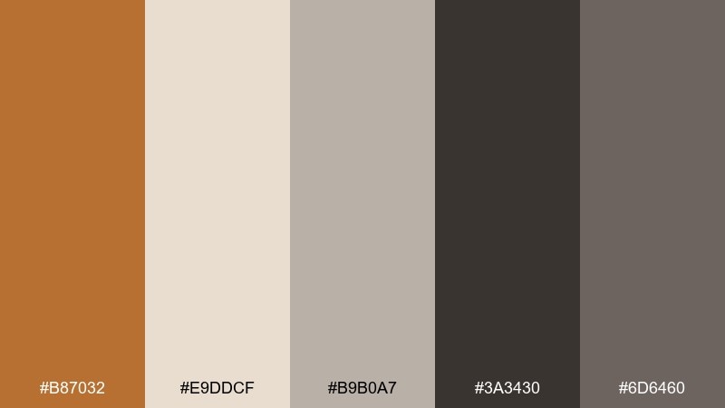
HEX: #b87032 #e9ddcf #b9b0a7 #3a3430 #6d6460
Mood: curated, neutral, editorial
Best for: magazine layouts and portfolio case studies
Curated and editorial, like a gallery wall of neutral prints in warm afternoon light. The bronze accent adds a subtle signature without overpowering photography or long-form text. Use the pale beige for margins and the dark charcoal for body copy to keep pages readable. Tip: apply bronze to pull quotes or section numbers for a cohesive rhythm across spreads.
Image example of gallery wall bronze generated using media.io
23) Bronze Orchid Ink
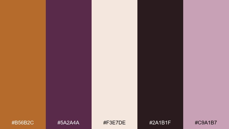
HEX: #b56b2c #5a2a4a #f3e7de #2a1b1f #c9a1b7
Mood: artful, moody, expressive
Best for: boutique brand identities and lookbooks
Artful and moody, like orchid petals against ink-dark shadows. A bronze color palette like this works well for boutiques that want warmth without going overly sweet. Let the near-black carry most text, then use mauve for soft panels and bronze for a logo mark or spine detail. Tip: print tests matter here, so choose uncoated paper to keep the mauves from shifting too pink.
Image example of bronze orchid ink generated using media.io
What Colors Go Well with Bronze?
Bronze pairs beautifully with creamy whites, warm beiges, and parchment neutrals when you want a soft, premium look that still feels readable. These light tones also help bronze accents look more “metallic” by contrast.
For modern energy, combine bronze with cool complements like teal, seafoam, slate blue, or charcoal. This warm/cool tension is a reliable way to make bronze feel contemporary rather than vintage.
For seasonal or story-driven work, bronze also plays well with terracotta, brick red, olive, and deep brown—ideal for autumn campaigns, food brands, and heritage identities.
How to Use a Bronze Color Palette in Real Designs
Treat bronze like a highlight ink: use it for CTAs, icons, borders, dividers, badges, or small typographic moments (numbers, labels, separators). When bronze becomes a full-page fill, it can quickly feel heavy or muddy.
Balance is easiest when you pick one dominant neutral (cream, off-white, light gray) and one strong anchor (charcoal, espresso, near-black). Then let bronze be the “spark” that creates hierarchy and brand signature.
If you’re designing for print or packaging, test how bronze-adjacent browns reproduce on coated vs. uncoated stock. Paper texture can make bronze feel richer, while glossy finishes can push it closer to gold.
Create Bronze Palette Visuals with AI
If you have HEX codes but need fast mockups (posters, packaging, UI screens, or signage), generating a few image concepts can help you validate contrast, mood, and composition before production.
Start with a clear design subject (e.g., “menu layout,” “dashboard UI,” “product label”), then add your bronze palette intent (matte kraft, foil accents, editorial grid, etc.). Keep prompts specific about background, typography style, and lighting.
Use Media.io Text-to-Image to turn these bronze palette prompts into visuals you can iterate in minutes.
Bronze Color Palette FAQs
-
What HEX code is “bronze”?
There isn’t one universal bronze HEX, but a common digital bronze is around #CD7F32. Many “bronze” palettes shift warmer (more orange) or deeper (more brown) depending on the mood and medium. -
Is bronze a warm or cool color?
Bronze is typically a warm color because it sits between brown and golden-orange. You can make it feel cooler by pairing it with teal, slate blue, and charcoal. -
What colors complement bronze best?
Great complements include teal (for contrast), cream/ivory (for softness and readability), and near-black/charcoal (for luxe depth). Sage and olive also work well for natural themes. -
Does bronze work for UI and dashboards?
Yes—bronze is excellent as an accent color in UI, especially on warm neutrals. Keep it limited to primary buttons, active states, and key chart highlights to avoid visual noise. -
How do I keep bronze palettes from looking “muddy”?
Use a light neutral background (ivory, parchment, light gray) and a dark anchor for text (charcoal/near-black). Then apply bronze in smaller areas (lines, icons, badges) instead of large blocks. -
Bronze vs. gold: what’s the difference in design?
Gold reads brighter and more celebratory, while bronze feels earthier, deeper, and more heritage. Bronze is often easier to use in modern layouts because it behaves like a neutral with a metallic edge. -
What’s a good “bronze and teal” pairing for branding?
Try a bronze like #B87333 with a deep teal like #1F6F6D, supported by parchment (#D9C4A4) and near-black (#141414). This mix feels premium, cultured, and highly legible.


