

Candy apple red is the kind of color that instantly signals energy, appetite, and confidence. It can feel glossy and modern, or rich and cinematic, depending on the neutrals and accents you pair with it.
Below are 20 best candy apple red color combinations with HEX codes for branding, UI, packaging, and print—plus image prompts you can reuse to generate matching visuals.
In this article
- Why Candy Apple Red Palettes Work So Well
-
- glossy gala
- retro soda pop
- velvet noir accent
- rosewood and cream
- citrus spark
- winterberry chic
- neon arcade
- heritage kitchen
- luxe lipstick
- stadium energy
- minimal redline ui
- artisan candle label
- cherry blossom contrast
- film poster drama
- modern holiday trim
- botanical watercolor reds
- tech startup punch
- bridal bouquet warmth
- car show shine
- steel and snow
- What Colors Go Well with Candy Apple Red?
- How to Use a Candy Apple Red Color Palette in Real Designs
- Create Candy Apple Red Palette Visuals with AI
Why Candy Apple Red Palettes Work So Well
Candy apple red sits in a high-attention zone of the spectrum, so it naturally creates hierarchy. In layouts, it’s easy to reserve for CTAs, badges, and hero elements while letting calmer neutrals handle readability.
It also adapts across styles: with black and charcoal it becomes dramatic and premium; with cream and blush it turns romantic and artisanal. Add cool blues or greens and it feels sporty, techy, or fresh.
Because it’s so saturated, candy apple red benefits from balance—negative space, soft grays, and a “one-hero-accent” mindset keep designs bold without feeling aggressive.
20+ Candy Apple Red Color Palette Ideas (with HEX Codes)
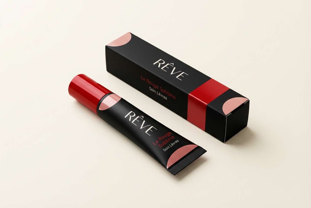
1) Glossy Gala
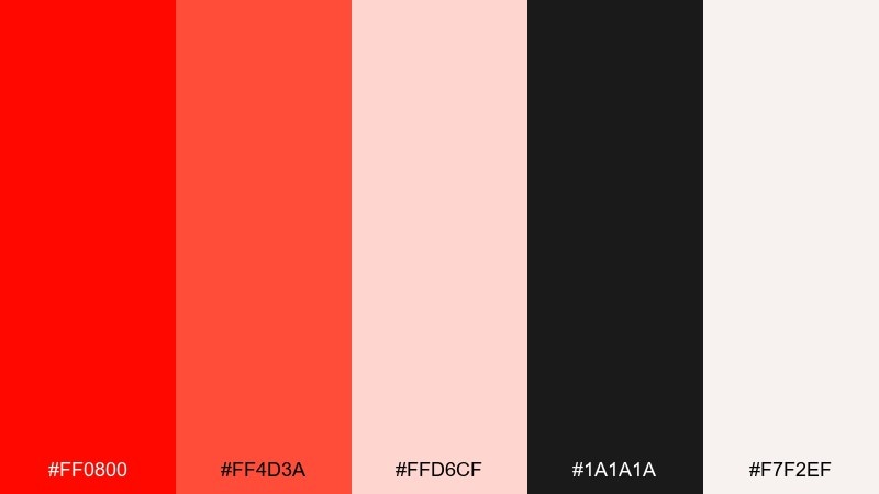
HEX: #ff0800 #ff4d3a #ffd6cf #1a1a1a #f7f2ef
Mood: glamorous and high-contrast
Best for: beauty branding and event promos
Glamorous shine and a red-carpet vibe come through with crisp black and soft blush highlights. Use the bright red as the hero color, then let the warm off-white carry the negative space for a premium feel. Pair it with clean sans-serif type and minimal line icons to keep it modern. Tip: reserve the darkest tone for headlines and CTA buttons so the red stays vibrant, not heavy.
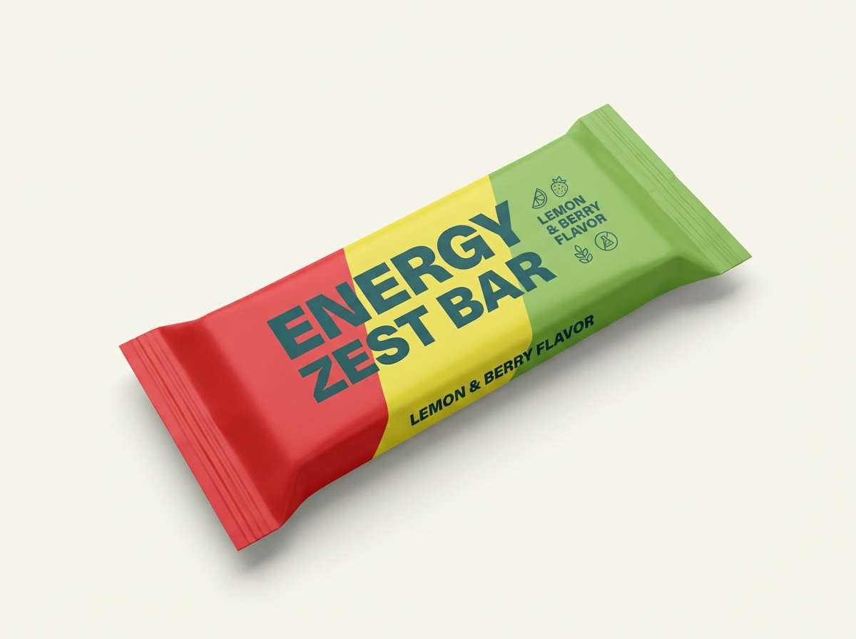
Image example of glossy gala generated using media.io
Media.io is an online AI studio for creating and editing video, image, and audio in your browser.

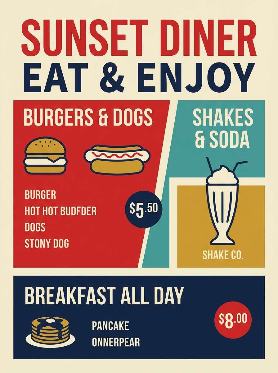
2) Retro Soda Pop
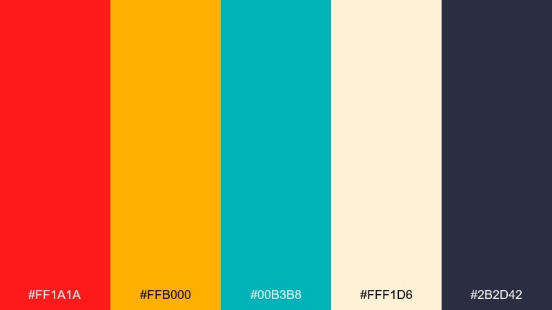
HEX: #ff1a1a #ffb000 #00b3b8 #fff1d6 #2b2d42
Mood: playful and nostalgic
Best for: diner menus and summer social posts
Playful fizz and retro signage energy pop with teal and golden highlights against a creamy base. Keep the red for key badges, prices, or stickers, and let teal handle secondary buttons or subheads. This pairing works best with rounded type and simple geometric shapes. Tip: add thin navy outlines to improve readability when colors sit side by side.
Image example of retro soda pop generated using media.io
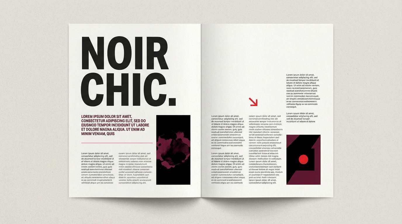
3) Velvet Noir Accent
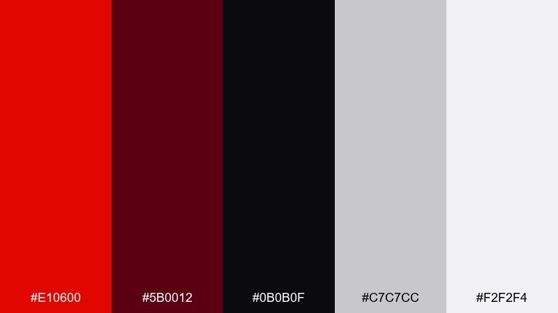
HEX: #e10600 #5b0012 #0b0b0f #c7c7cc #f2f2f4
Mood: moody and cinematic
Best for: luxury fashion lookbooks and editorial layouts
Velvet shadows and spotlight red create a cinematic, late-night mood. Use the near-black background to make the red feel like a controlled accent rather than a wall of color. Soft grays keep body text legible and refined in print. Tip: apply the deep wine tone to dividers and rules for a subtle, premium structure.
Image example of velvet noir accent generated using media.io
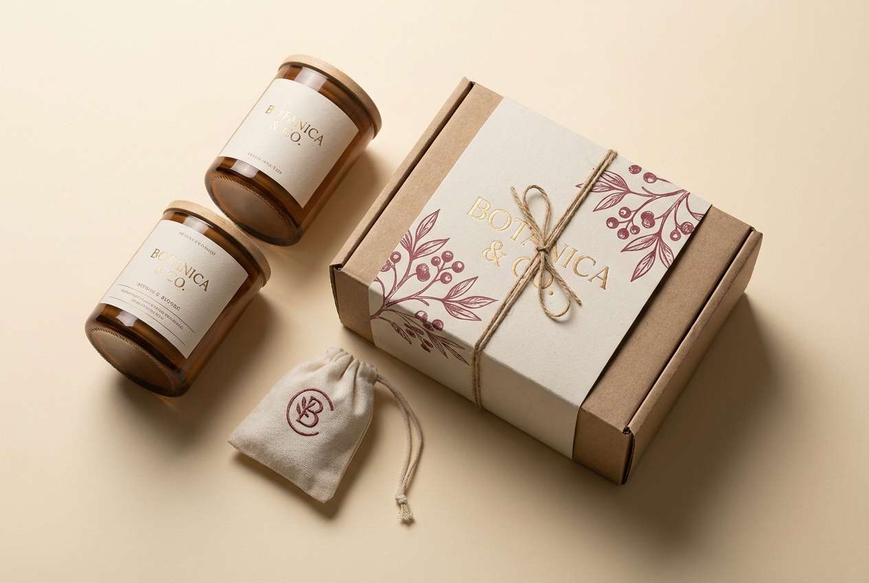
4) Rosewood and Cream
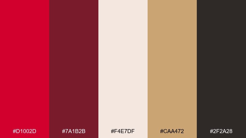
HEX: #d1002d #7a1b2b #f4e7df #caa472 #2f2a28
Mood: warm and romantic
Best for: artisan packaging and boutique branding
Warm romance and handcrafted charm show up in the rosewood reds against creamy paper tones. These tones suit a candy apple red color palette when you want a softer, more vintage-leaning finish. Pair with kraft textures, gold foil accents, or serif typography for an elevated boutique look. Tip: keep the brightest red to small stamps or seals so the palette stays elegant.
Image example of rosewood and cream generated using media.io
5) Citrus Spark
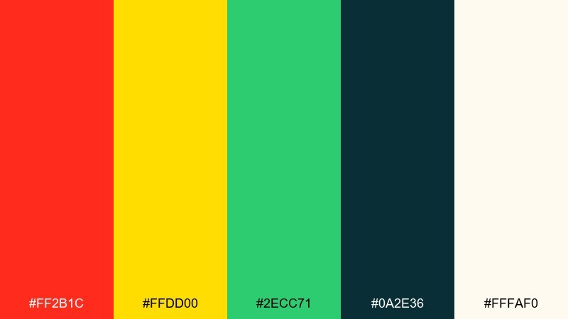
HEX: #ff2b1c #ffdd00 #2ecc71 #0a2e36 #fffaf0
Mood: energetic and sunny
Best for: fitness promos and snack brand ads
Energetic sunshine and fresh-squeezed zest jump out with yellow and green supporting a bold red. Use the deep teal as a grounding base for text and navigation so the bright accents do not compete. This mix shines in short-form ads, sale banners, and punchy CTA sections. Tip: keep yellow to highlights and icons to avoid overpowering the red.
Image example of citrus spark generated using media.io
6) Winterberry Chic
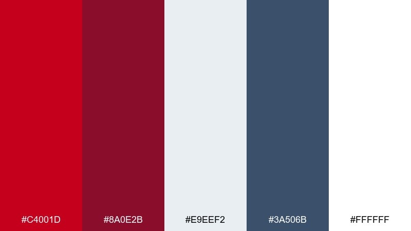
HEX: #c4001d #8a0e2b #e9eef2 #3a506b #ffffff
Mood: crisp and sophisticated
Best for: holiday campaigns and modern stationery
Crisp winter air and berry tones feel polished against cool blue-gray and clean white. Let the lighter neutrals carry backgrounds, then place the red on ribbons, headers, or stamps for a festive pop. This set works especially well with minimal layouts and plenty of spacing. Tip: use the wine shade for shadows and hover states to create depth without adding new colors.
Image example of winterberry chic generated using media.io

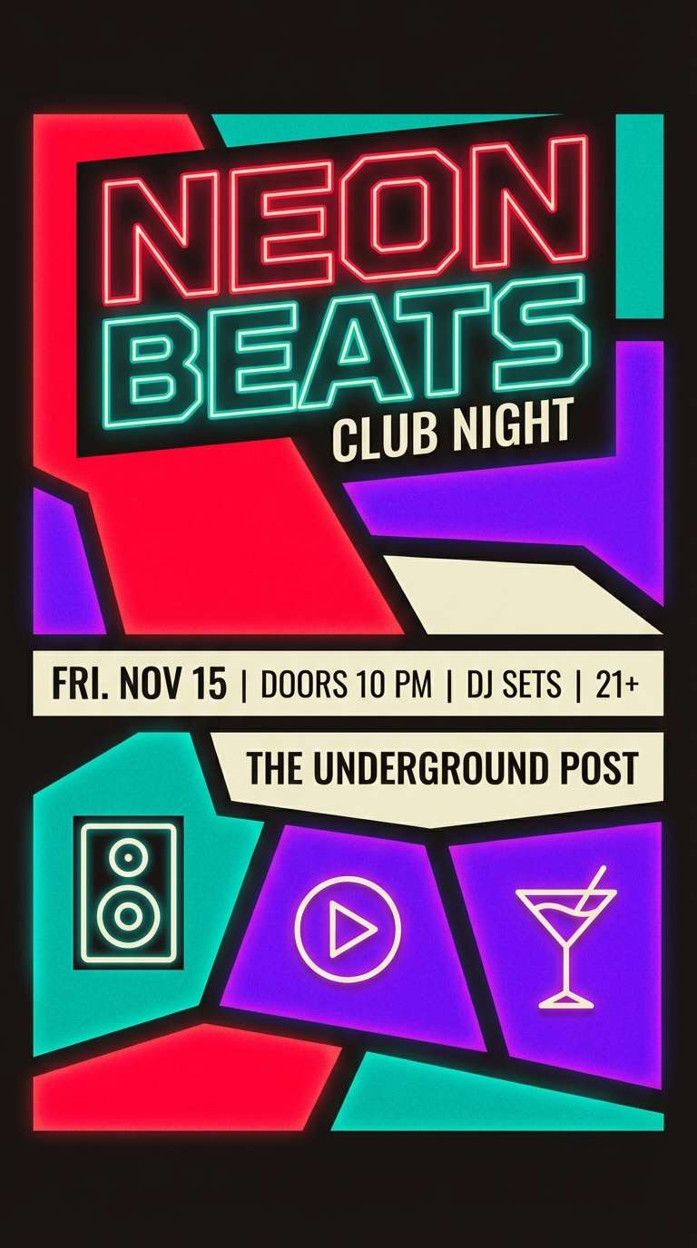
7) Neon Arcade
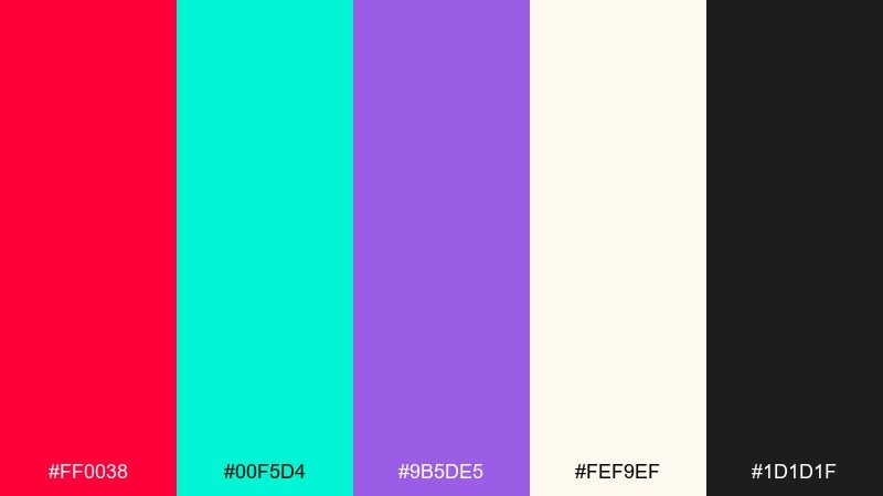
HEX: #ff0038 #00f5d4 #9b5de5 #fef9ef #1d1d1f
Mood: electric and youthful
Best for: music flyers and gaming promos
Electric arcade glow feels loud, playful, and unapologetically modern. Balance the neon accents with the soft cream and a strong dark base so text stays readable. Use purple for gradients and teal for highlights to keep the red from dominating every element. Tip: limit neon blocks to 20 to 30 percent of the layout for a cleaner, more premium poster.
Image example of neon arcade generated using media.io
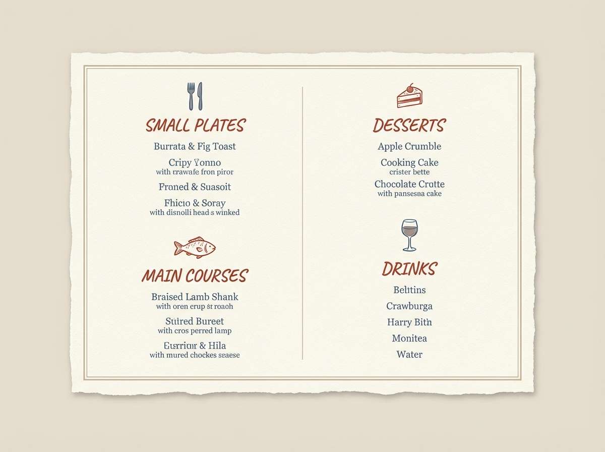
8) Heritage Kitchen
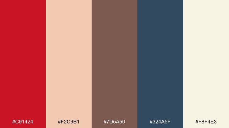
HEX: #c91424 #f2c9b1 #7d5a50 #324a5f #f8f4e3
Mood: cozy and homey
Best for: recipe blogs and restaurant branding
Cozy, Sunday-simmer warmth comes through with brick red, toasted neutrals, and a hint of slate blue. Use the cream and blush for backgrounds to keep the palette light and inviting. Pair with hand-drawn icons, textured paper, or classic serif headlines for a heritage feel. Tip: set the slate blue as the primary text color for a softer, more readable page than pure black.
Image example of heritage kitchen generated using media.io
9) Luxe Lipstick
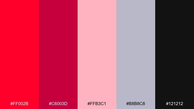
HEX: #ff002b #c6003d #ffb3c1 #b8b8c8 #121212
Mood: bold and glamorous
Best for: cosmetics launches and premium product ads
Bold lipstick glamour feels sleek with inky black, cool gray, and rosy tints. Use the brighter red for hero product moments and keep the blush tones for supportive backgrounds or soft gradients. This mix looks best with high-contrast photography and minimal copy. Tip: apply the cool gray to fine print and ingredient text so it stays readable without stealing attention.
Image example of luxe lipstick generated using media.io
10) Stadium Energy
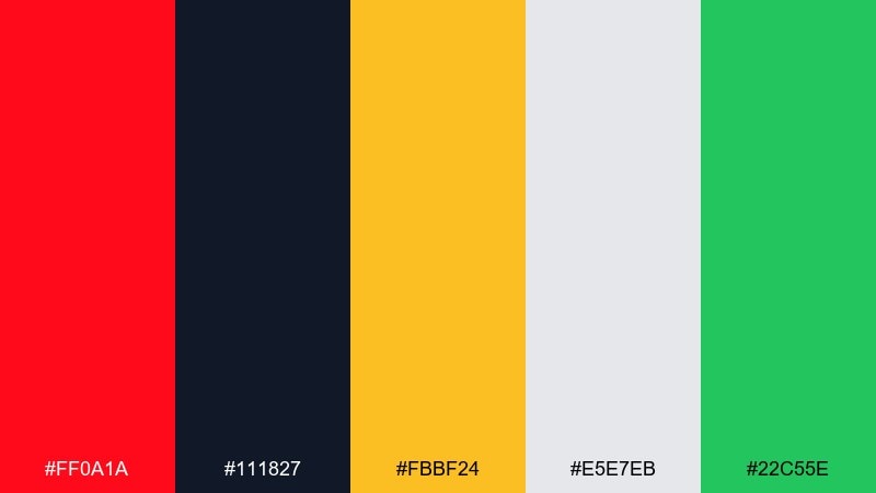
HEX: #ff0a1a #111827 #fbbf24 #e5e7eb #22c55e
Mood: competitive and punchy
Best for: sports graphics and bold merch
Stadium lights and game-day hype come through with a sharp red, deep navy, and bright gold. Use navy for backgrounds and type, then hit red and gold for scores, badges, and highlights. A small green accent can signal success states, tickets, or availability without clashing. Tip: keep the gold limited to key moments so it reads as premium, not noisy.
Image example of stadium energy generated using media.io

11) Minimal Redline UI
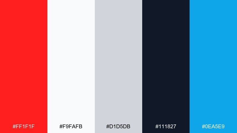
HEX: #ff1f1f #f9fafb #d1d5db #111827 #0ea5e9
Mood: clean and modern
Best for: SaaS dashboards and app UI
Clean interfaces feel sharper when a single redline accent cuts through cool grays and bright white. These candy apple red color combinations work best when red is reserved for primary actions, alerts, and selected states. Use sky blue for links and secondary buttons to prevent a warning-heavy look. Tip: keep error states in red, but use the darker navy for confirmation copy so users do not feel stressed.
Image example of minimal redline ui generated using media.io

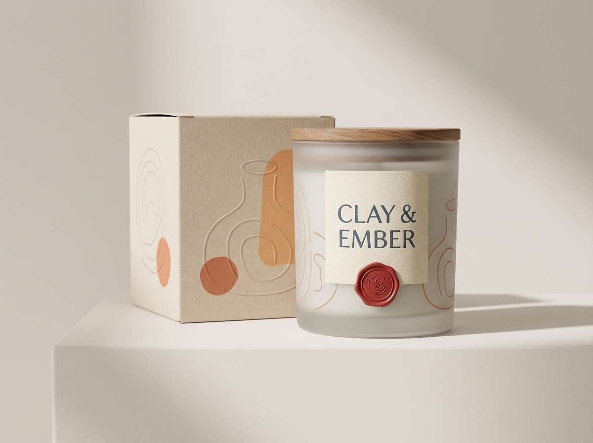
12) Artisan Candle Label
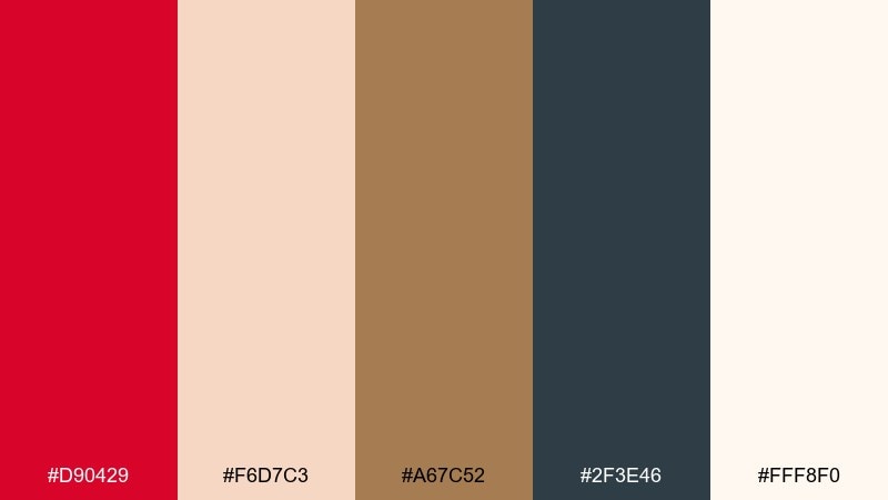
HEX: #d90429 #f6d7c3 #a67c52 #2f3e46 #fff8f0
Mood: earthy and refined
Best for: candle packaging and handcrafted goods
Earthy warmth and a boutique apothecary feel come from the mix of red, clay, and soft cream. Use the red for seals, brand marks, or a single label stripe to keep it tasteful. Pair with textured paper, copper foil, and simple botanical line art for a handcrafted finish. Tip: set body text in the deep slate tone for a calmer, more premium read than pure black.
Image example of artisan candle label generated using media.io
13) Cherry Blossom Contrast
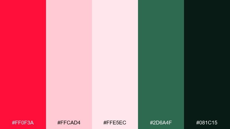
HEX: #ff0f3a #ffcad4 #ffe5ec #2d6a4f #081c15
Mood: fresh and romantic
Best for: spring campaigns and floral branding
Fresh spring petals meet a grounded forest green for a lively, romantic contrast. Use blush and pale pink as generous backgrounds so the red feels like a natural blossom accent. Green works beautifully for stems, eco cues, or secondary headings. Tip: keep dark green for text and outlines to maintain readability on the soft pink fields.
Image example of cherry blossom contrast generated using media.io
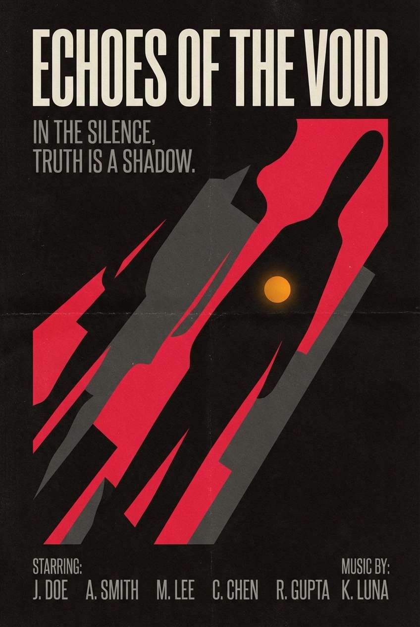
14) Film Poster Drama
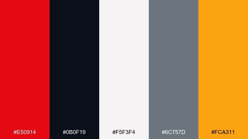
HEX: #e50914 #0b0f19 #f5f3f4 #6c757d #fca311
Mood: dramatic and suspenseful
Best for: movie posters and bold announcement graphics
Dramatic tension and spotlight urgency build with deep night tones and a bright, punchy red. This candy apple red color scheme fits thriller-style layouts where contrast and hierarchy matter most. Use off-white for credits and details, and bring in the amber only for rating badges or release-date highlights. Tip: add subtle grain to the dark background to make flat blocks feel more cinematic.
Image example of film poster drama generated using media.io
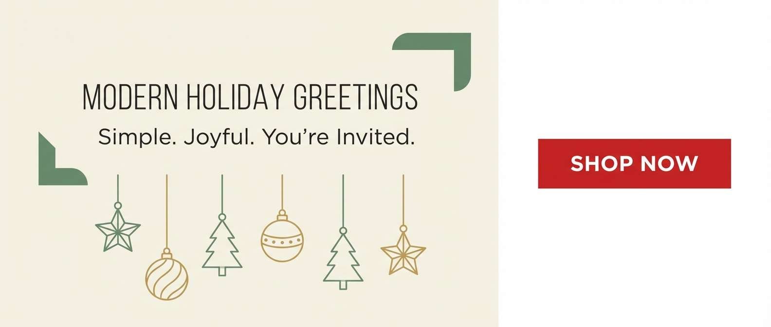
15) Modern Holiday Trim
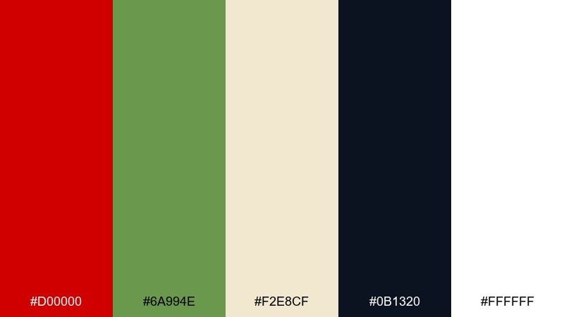
HEX: #d00000 #6a994e #f2e8cf #0b1320 #ffffff
Mood: festive and clean
Best for: holiday landing pages and email headers
Festive trim and evergreen hints feel modern when grounded with deep ink and lots of white space. Use red for CTAs and banners, green for supportive icons or secondary sections, and cream to warm up backgrounds. This approach keeps holiday work looking fresh instead of overly themed. Tip: stick to one accent per module so the page feels organized and premium.
Image example of modern holiday trim generated using media.io
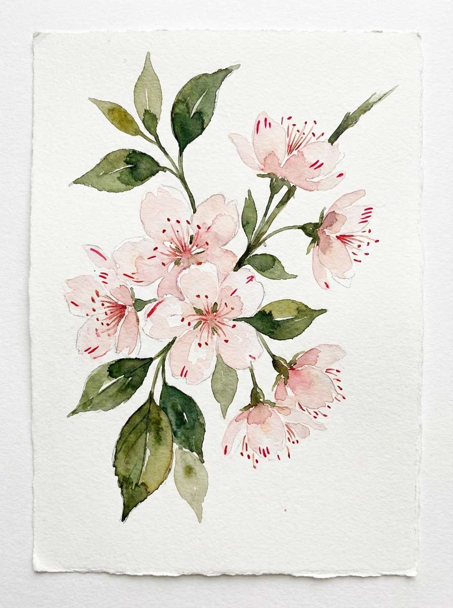
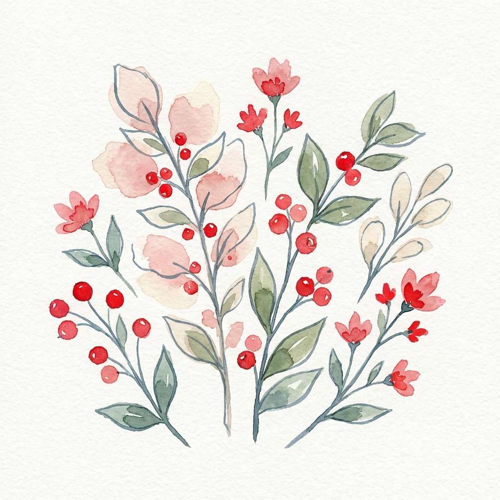
16) Botanical Watercolor Reds
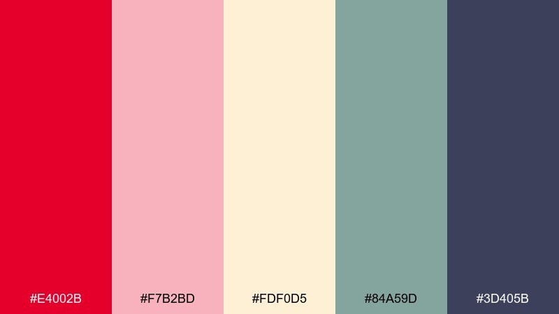
HEX: #e4002b #f7b2bd #fdf0d5 #84a59d #3d405b
Mood: soft and artistic
Best for: wellness brands and stationery illustrations
Soft watercolor blooms and calm herbal greens create a gentle, artistic red-forward mix. Use the blush and cream as your main washes, then add red sparingly for petals and focal points. The muted green and slate help anchor text overlays and borders without looking harsh. Tip: keep saturation low in large areas and let the brightest red be a small focal accent.
Image example of botanical watercolor reds generated using media.io
17) Tech Startup Punch
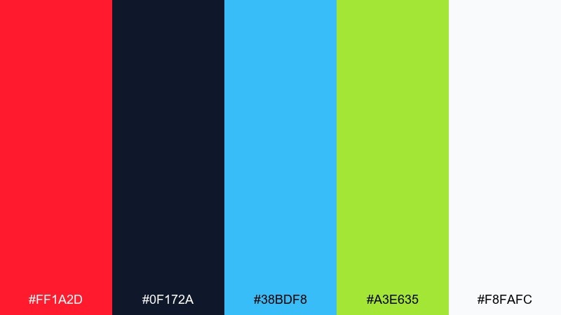
HEX: #ff1a2d #0f172a #38bdf8 #a3e635 #f8fafc
Mood: confident and forward
Best for: startup landing pages and product UI
Confident momentum and modern clarity come through with crisp navy, bright red, and electric accents. For fast, scannable layouts, these candy apple red color combinations work best when the red is reserved for a single primary CTA and key highlights. Use sky blue for links and lime for status tags or success indicators. Tip: keep backgrounds very light so the palette feels techy and breathable, not aggressive.
Image example of tech startup punch generated using media.io

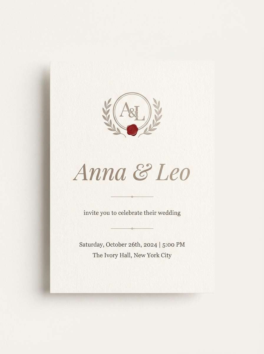
18) Bridal Bouquet Warmth
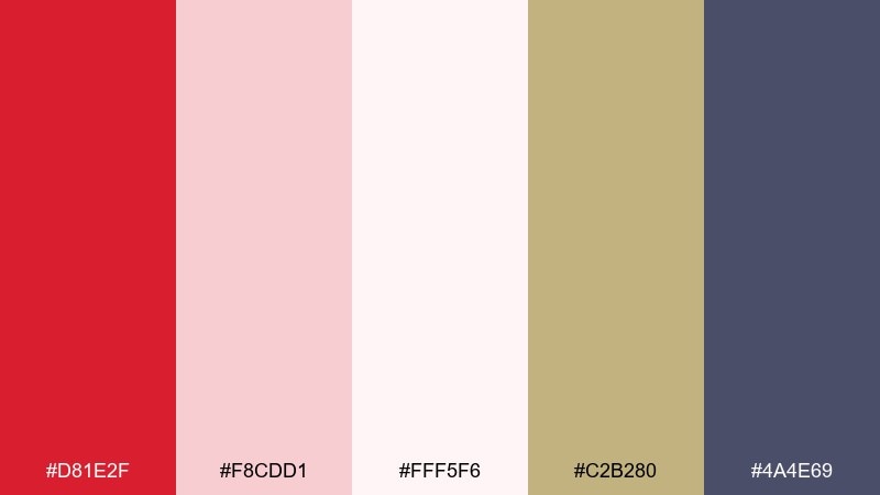
HEX: #d81e2f #f8cdd1 #fff5f6 #c2b280 #4a4e69
Mood: tender and elegant
Best for: wedding invites and romantic photo books
Tender bouquet warmth feels romantic with blush layers and soft ivory, then a grounded touch of taupe and dusky slate. Use the red as a small flourish for monograms, wax-seal motifs, or RSVP highlights. Pair with thin serif fonts and lots of spacing for an airy look. Tip: choose the slate tone for body text to keep long details readable on pale backgrounds.
Image example of bridal bouquet warmth generated using media.io
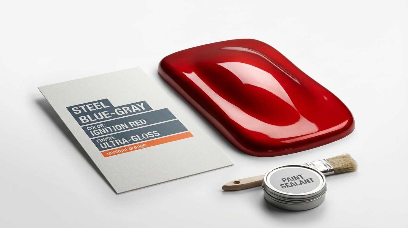
19) Car Show Shine
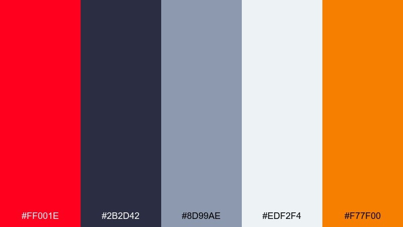
HEX: #ff001e #2b2d42 #8d99ae #edf2f4 #f77f00
Mood: sleek and powerful
Best for: automotive ads and performance branding
Sleek speed and polished metal vibes stand out with hot red against steel blues and clean whites. A candy apple red color scheme like this is ideal for performance messaging where sharp contrast sells the punch. Use orange sparingly for special edition callouts or pricing tags, and keep the cool grays for technical specs. Tip: place red on diagonal shapes to amplify motion without cluttering the layout.
Image example of car show shine generated using media.io
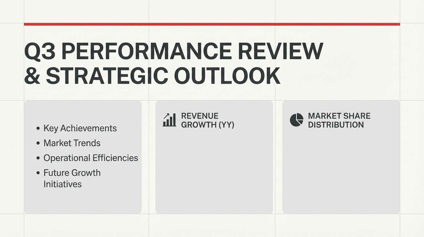
20) Steel and Snow
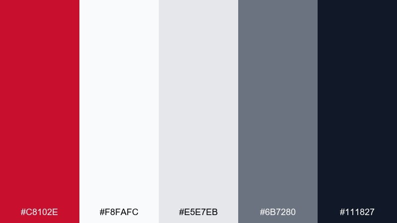
HEX: #c8102e #f8fafc #e5e7eb #6b7280 #111827
Mood: balanced and professional
Best for: corporate decks and clean web sections
Steel, snow, and a precise red accent create a calm professional tone with just enough edge. Use the near-white and light gray for large surfaces, then add red for emphasis lines, bullets, or section markers. The charcoal keeps typography strong and accessible in slides and long pages. Tip: apply the mid-gray to borders and dividers to maintain structure without visual noise.
Image example of steel and snow generated using media.io
What Colors Go Well with Candy Apple Red?
Neutrals are the easiest win: charcoal, near-black, and cool grays make candy apple red feel sharper and more premium, while warm whites and creams soften it for packaging and editorial layouts.
For contrast, try cool complements like teal, sky blue, or blue-gray to modernize the red and keep interfaces from feeling “warning-heavy.” Forest and herbal greens also pair beautifully when you want a natural, romantic, or seasonal look.
Use bright accents (gold, amber, lime) sparingly—think tags, icons, and highlights—so the red remains the main character rather than one of many competing saturated colors.
How to Use a Candy Apple Red Color Palette in Real Designs
Start with role assignment: pick one red as the primary accent, then choose a dark neutral for text and a light neutral for backgrounds. This keeps hierarchy consistent across pages, screens, or print pieces.
In UI, reserve candy apple red for primary actions, selected states, and errors, then lean on blues/teals for links and secondary actions. In branding and packaging, use red as a mark, seal, stripe, or hero panel while letting paper-like creams carry the “premium” space.
If the palette feels too intense, reduce red coverage (not saturation) and increase whitespace. Small red moments tend to read more intentional and higher-end than large red fills.
Create Candy Apple Red Palette Visuals with AI
If you already have HEX codes, the fastest way to validate a palette is to generate mock visuals—posters, packaging, UI screens, or brand boards—and see how the colors behave with typography and spacing.
With Media.io’s text-to-image tool, you can paste a ready-made prompt (like the ones above) and quickly iterate on layout styles, lighting, and textures while keeping the candy apple red mood consistent.
Generate a few variations and keep the best-performing version as your reference image for future designs.
Candy Apple Red Color Palette FAQs
-
What is the HEX code for candy apple red?
“Candy apple red” is commonly represented around #ff0800, but many palettes use nearby high-saturation reds (like #ff001e or #e10600) depending on whether you want a brighter glossy look or a deeper cinematic tone. -
Is candy apple red good for UI and app design?
Yes—when used as an accent. Reserve it for primary CTAs, selected states, and error messaging, then rely on cool grays/white for surfaces and a darker neutral for text to avoid a stressful “alert-only” interface. -
What neutral colors pair best with candy apple red?
Charcoal/near-black, cool grays, and crisp white create the cleanest contrast. Warm off-whites and creams make it feel more editorial, romantic, or premium in packaging and print. -
Does candy apple red work with green?
It can work extremely well—especially with forest or muted herbal greens. Keep backgrounds light (cream/blush) and use deep green for text and outlines so the red reads like a controlled accent. -
How do I keep a candy apple red palette from looking too harsh?
Reduce coverage and increase whitespace: use red in small, high-impact areas (badges, rules, buttons) instead of large blocks. Pair with soft neutrals (cream, blush, light gray) and avoid adding multiple neon accents. -
What’s a good candy apple red palette for branding?
For premium branding, try a black/cream base with a glossy red hero (like “Glossy Gala”). For artisanal brands, use red with paper creams, clay/taupe, and deep slate (like “Artisan Candle Label”). -
Can I generate candy apple red palette mockups with AI?
Yes. Use Media.io text-to-image prompts (brand boards, packaging shots, UI mockups) and iterate until the red feels balanced with your neutrals and typography.
Next: Gray White Color Palette


