

Blue and tan is one of those rare pairings that feels both calming and practical: cool ocean-like blues bring clarity, while warm tans add comfort and approachability.
Below are 20 curated blue tan color palette ideas with HEX codes, plus quick guidance for using them in UI, branding, and interior-style visuals.
In this article
- Why Blue Tan Palettes Work So Well
-
- coastal dune
- harbor linen
- desert yacht
- ink and raffia
- sky khaki
- midnight sandbar
- powdered suede
- blueprints and burlap
- alpine canvas
- retro surf shop
- stonewashed denim
- seaside museum
- warm minimal workspace
- vintage map room
- ceramic bath
- evening bistro
- modern ranch
- soft nursery wave
- gallery label
- autumn trailhead
- What Colors Go Well with Blue Tan?
- How to Use a Blue Tan Color Palette in Real Designs
- Create Blue Tan Palette Visuals with AI
Why Blue Tan Palettes Work So Well
Blue brings structure, trust, and a clean visual temperature, while tan adds a grounded, human warmth. Together, they strike a balance that feels modern but not sterile.
Because blues naturally recede and tans sit closer to the eye, the combo creates easy hierarchy: blue can anchor navigation and typography, and tan can highlight secondary panels, badges, and textures.
Blue-and-tan also adapts across styles—from coastal and airy to moody and upscale—simply by shifting the blue depth (navy to sky) and the tan undertone (beige to caramel).
20+ Blue Tan Color Palette Ideas (with HEX Codes)
1) Coastal Dune
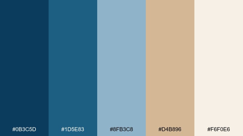
HEX: #0B3C5D #1D5E83 #8FB3C8 #D4B896 #F6F0E6
Mood: breezy, relaxed, coastal
Best for: travel branding, lifestyle websites, beach house decor
Breezy ocean air and sun-warmed sand come through with crisp blues and creamy dune neutrals. This blue tan color palette works beautifully for travel brands, coastal landing pages, and calm living spaces. Pair it with off-white space and simple line icons so the tan reads warm, not yellow. Tip: use the darkest blue for headings and buttons, and keep tan as background blocks for an effortless shoreline feel.
Image example of coastal dune generated using media.io
Media.io is an online AI studio for creating and editing video, image, and audio in your browser.

2) Harbor Linen
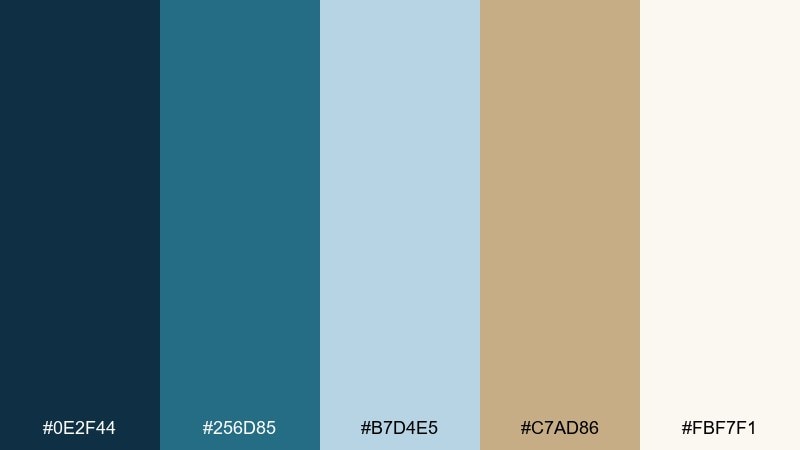
HEX: #0E2F44 #256D85 #B7D4E5 #C7AD86 #FBF7F1
Mood: clean, trustworthy, airy
Best for: SaaS dashboards, finance apps, B2B presentations
Calm harbor blues feel structured and dependable, softened by linen-like tans and a bright, clean base. The contrast is strong enough for data-heavy screens while still feeling welcoming. Pair with subtle gray dividers and keep the tan to highlights like tags, warnings, or secondary panels. Tip: reserve the light blue for charts so the UI stays readable and not overly pastel.
Image example of harbor linen generated using media.io
3) Desert Yacht
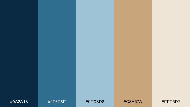
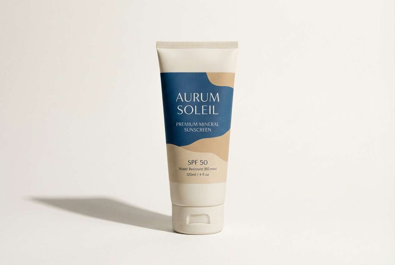
HEX: #0A2A43 #2F6E8E #9EC3D6 #C8A57A #EFE5D7
Mood: adventurous, sunlit, premium
Best for: suncare packaging, resort ads, outdoor product launches
Sunlit tans meet crisp marine blues for a look that feels both luxe and outdoorsy. It shines on premium packaging where you want freshness without going sterile. Pair with matte textures, minimal typography, and one metallic detail if you need extra polish. Tip: keep the lightest cream as the hero background so the blues read vivid and clean.
Image example of desert yacht generated using media.io
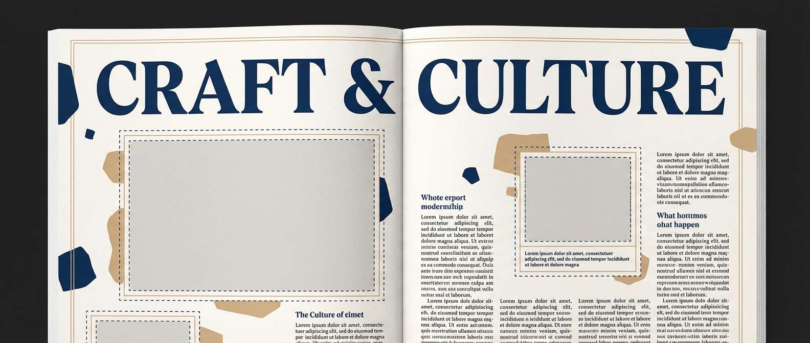
4) Ink and Raffia
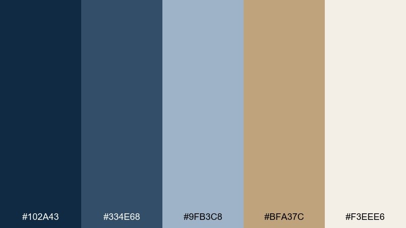
HEX: #102A43 #334E68 #9FB3C8 #BFA37C #F3EEE6
Mood: editorial, textured, sophisticated
Best for: magazine layouts, lookbooks, minimalist posters
Inky blues bring a refined editorial tone, while raffia tans add a tactile, handmade warmth. The mix is ideal for long-form layouts that need hierarchy without harsh contrast. Pair with serif headlines, generous margins, and a single tan highlight for pull quotes or section labels. Tip: use the medium blue for body text to reduce glare while staying sharp on off-white.
Image example of ink and raffia generated using media.io
5) Sky Khaki

HEX: #1A3D5A #3A7CA5 #B7DFF2 #BFA57A #FFF7EA
Mood: fresh, optimistic, outdoorsy
Best for: camping brands, hiking posters, event graphics
Open-sky blues and practical khaki tones create an upbeat, trail-ready vibe. These blue tan color combinations are great for outdoor campaigns where you want clarity, energy, and approachability. Pair with bold sans-serif type and simple badge icons for dates and locations. Tip: put the light sky blue behind key copy blocks so tan accents stay crisp and readable.
Image example of sky khaki generated using media.io

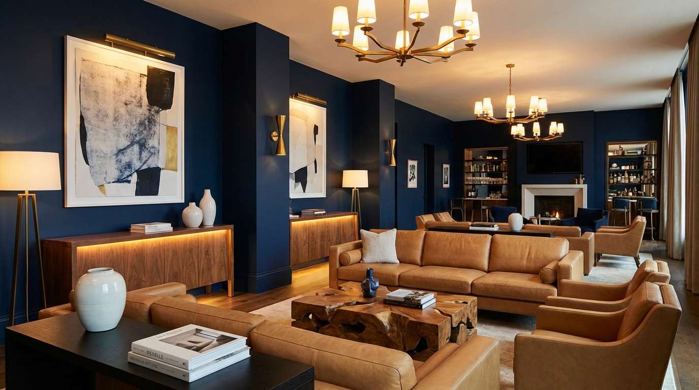
6) Midnight Sandbar
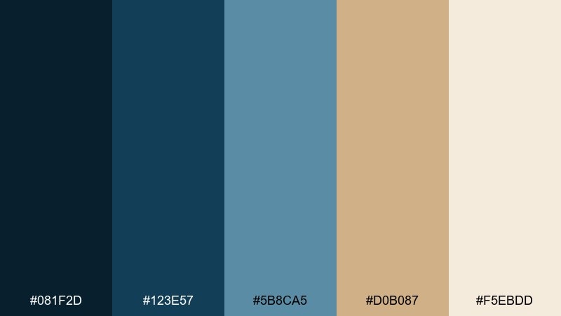
HEX: #081F2D #123E57 #5B8CA5 #D0B087 #F5EBDD
Mood: moody, grounded, upscale
Best for: hotel interiors, lounge branding, cinematic web design
Deep midnight blues set a dramatic base, while sandbar tans keep the mood inviting instead of heavy. It works well for hospitality brands and luxe spaces that want warmth without going rustic. Pair with brass details, dark wood, or black typography for a refined finish. Tip: use tan on lighting elements and soft furnishings to lift the dark blue foundation.
Image example of midnight sandbar generated using media.io
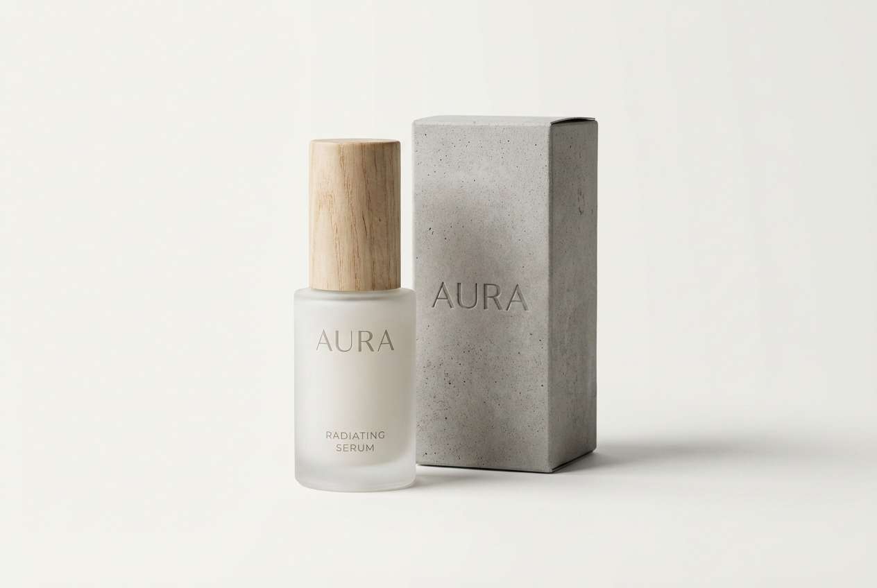
7) Powdered Suede
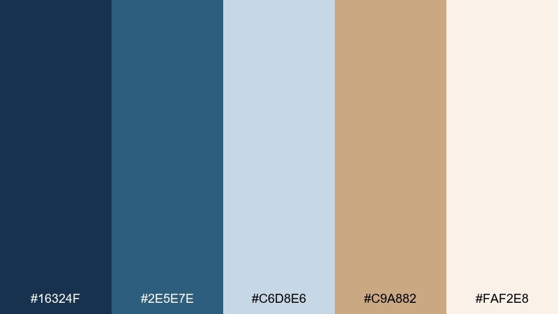
HEX: #16324F #2E5E7E #C6D8E6 #C9A882 #FAF2E8
Mood: soft, elegant, modern
Best for: beauty packaging, skincare ads, boutique websites
Powdery blues feel clean and skincare-fresh, balanced by suede tans that add warmth and softness. This set is ideal for minimalist beauty where you want calm luxury rather than stark clinical white. Pair with thin lines, lots of negative space, and a subtle paper grain for a tactile feel. Tip: keep tan for caps, labels, or callouts and let blue carry the brand signature.
Image example of powdered suede generated using media.io
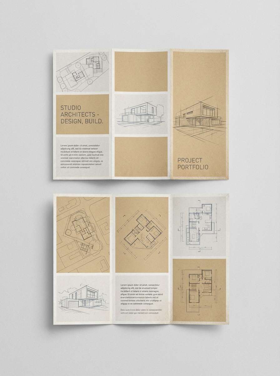
8) Blueprints and Burlap
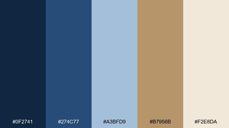
HEX: #0F2741 #274C77 #A3BFD9 #B7956B #F2E8DA
Mood: crafty, structured, artisan-modern
Best for: architecture portfolios, home renovation brands, brochures
Blueprint blues bring precision, while burlap tan adds a handcrafted, homey edge. Used as a blue tan color scheme, it feels perfect for design studios that want to look both technical and approachable. Pair with grid-based layouts, thin strokes, and textured tan sections for section breaks. Tip: keep the tan slightly muted so it reads natural and not overly golden on print.
Image example of blueprints and burlap generated using media.io
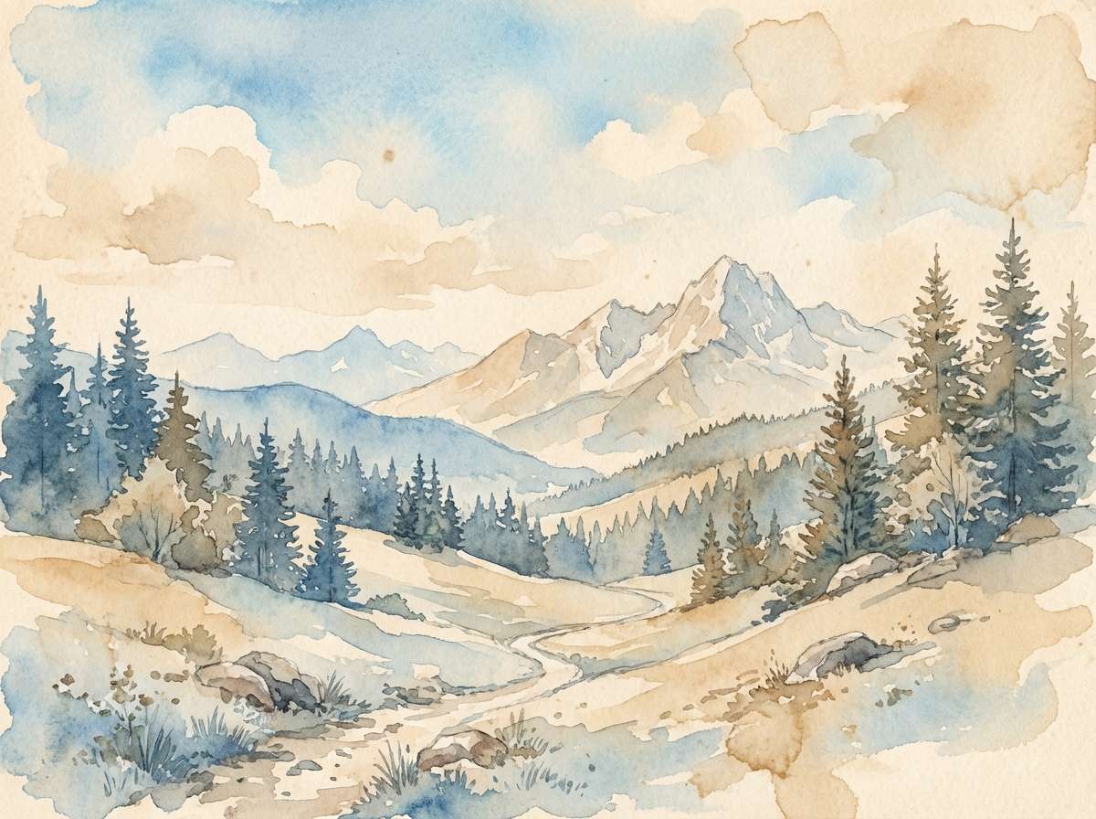
9) Alpine Canvas
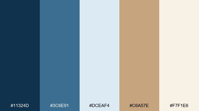
HEX: #11324D #3C6E91 #DCEAF4 #C6A57E #F7F1E6
Mood: crisp, airy, nature-inspired
Best for: watercolor prints, eco brands, wellness blogs
Crisp mountain air and pale sky tones come to life with a warm, canvas-like tan base. The palette reads natural and calm, ideal for wellness stories and eco-forward packaging. Pair with watercolor textures, soft gradients, and minimal copy so the hues feel spacious. Tip: use the darkest blue sparingly for titles to keep the overall look light.
Image example of alpine canvas generated using media.io
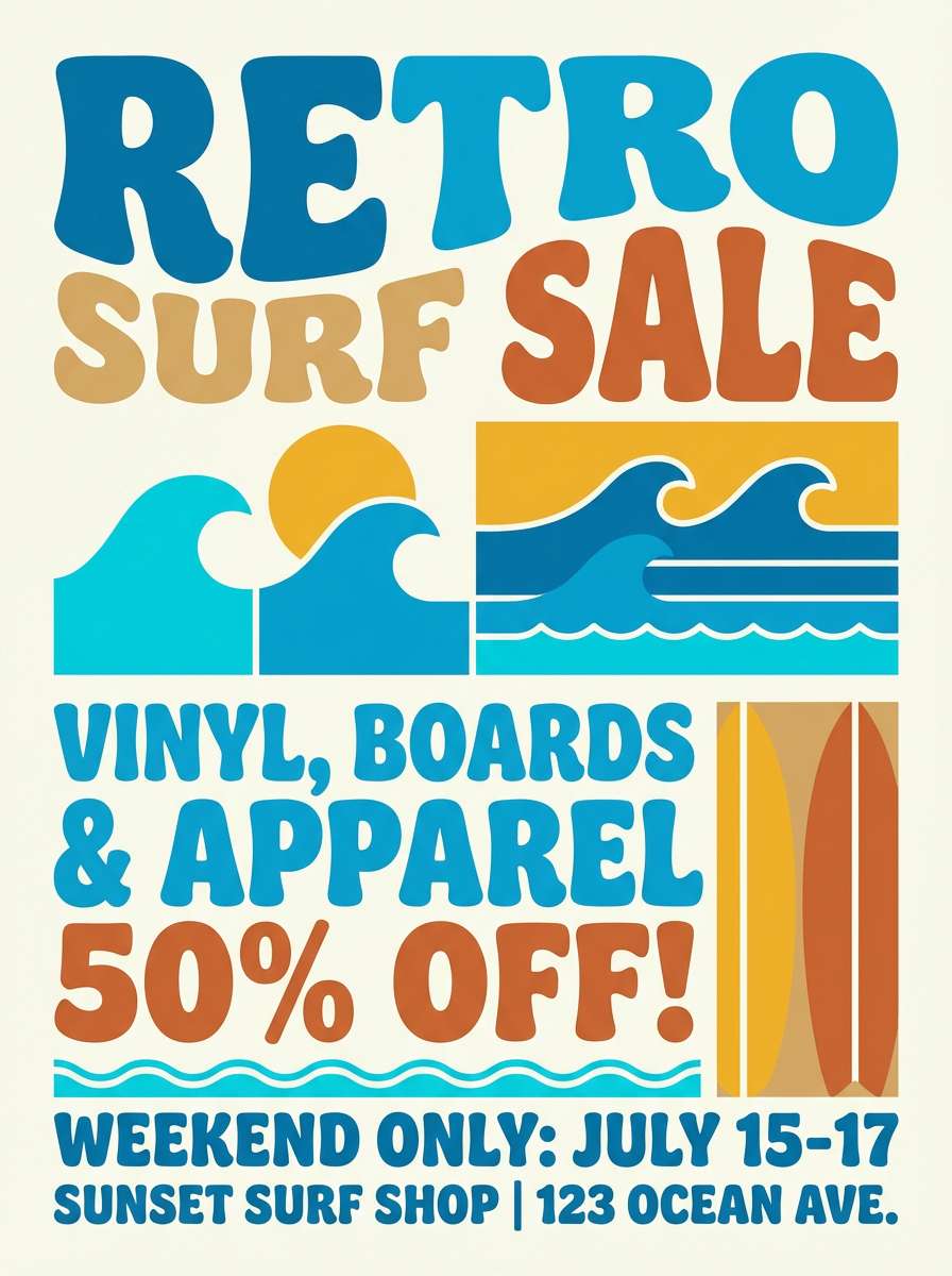
10) Retro Surf Shop
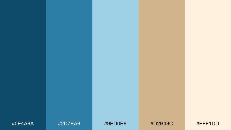
HEX: #0E4A6A #2D7EA6 #9ED0E6 #D2B48C #FFF1DD
Mood: playful, nostalgic, sunny
Best for: summer flyers, cafe menus, merch graphics
Retro surf blues feel bright and friendly, while classic tan brings that sun-bleached boardwalk warmth. It suits playful print pieces like menus, flyers, and sticker-style merch. Pair with rounded typography and simple illustrated shapes for a nostalgic vibe. Tip: use the brightest blue for key headlines and keep tan for backgrounds to avoid visual clutter.
Image example of retro surf shop generated using media.io
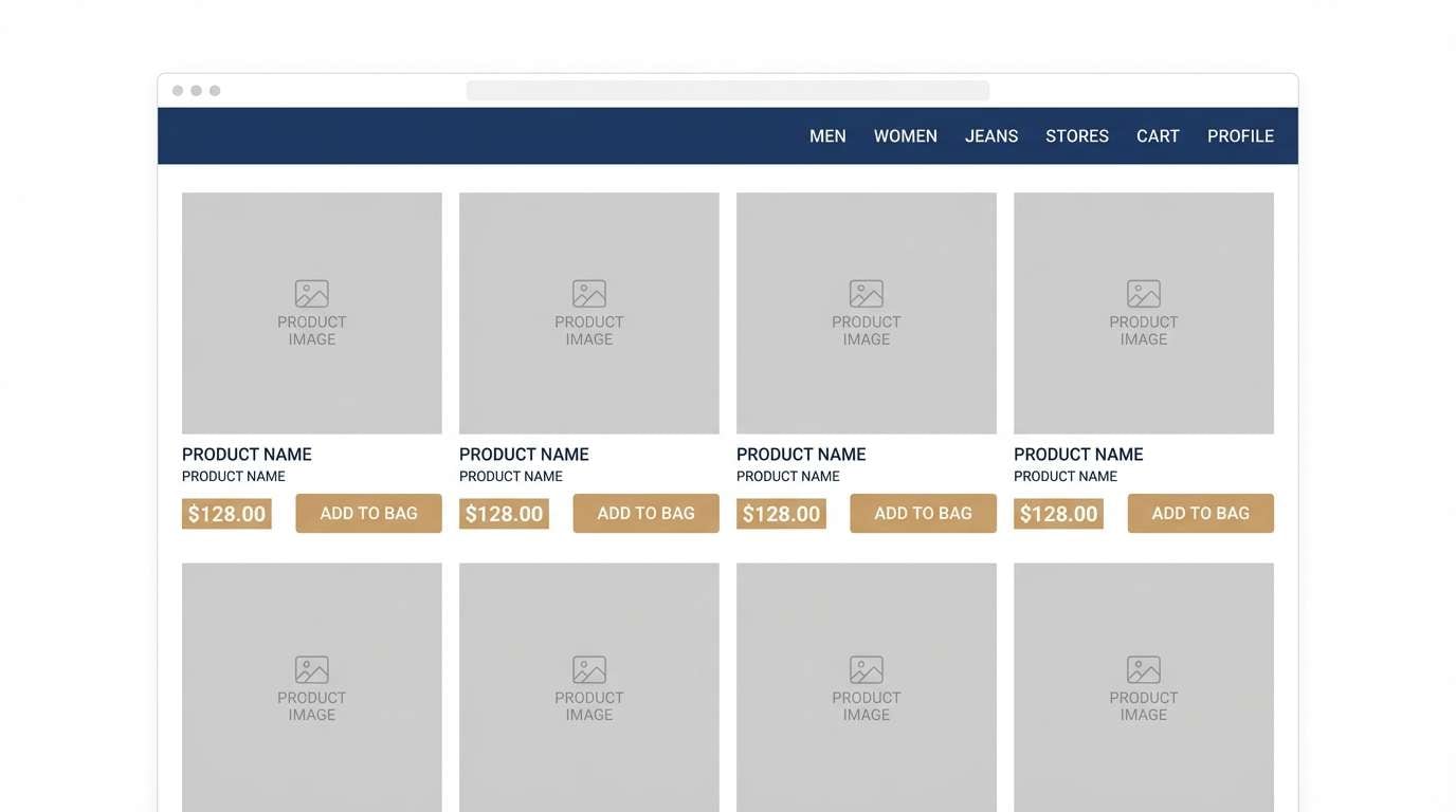
11) Stonewashed Denim
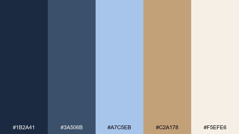
HEX: #1B2A41 #3A506B #A7C5EB #C2A178 #F5EFE6
Mood: casual, classic, dependable
Best for: fashion ecommerce, product pages, lookbook UI
Stonewashed denim blues feel familiar and easygoing, grounded by a warm tan that reads like leather trim. This blue tan color palette is a strong fit for fashion ecommerce where you want trust and comfort. Pair with sharp product photography and keep the cream as the main canvas for clean layouts. Tip: use tan for price highlights or size chips so calls to action feel warm but not loud.
Image example of stonewashed denim generated using media.io
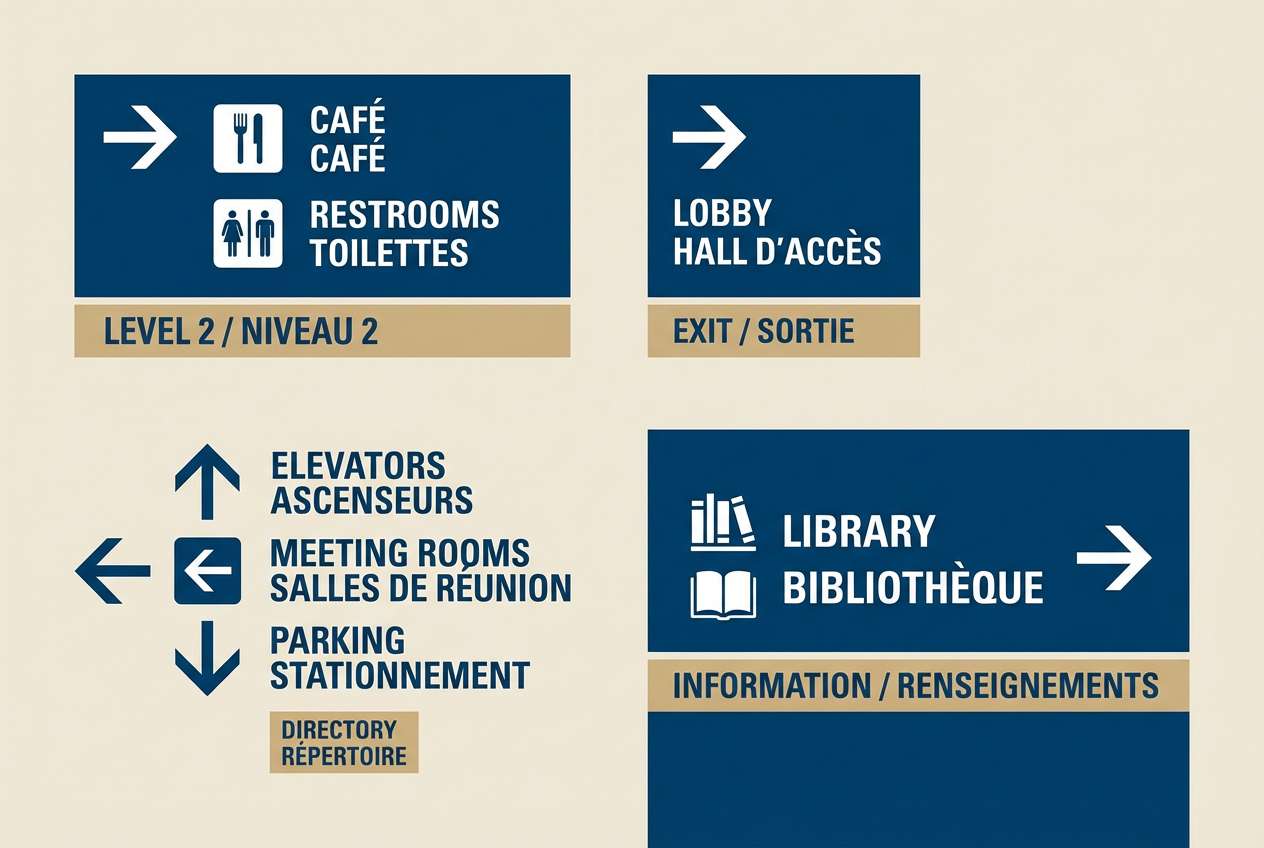
12) Seaside Museum
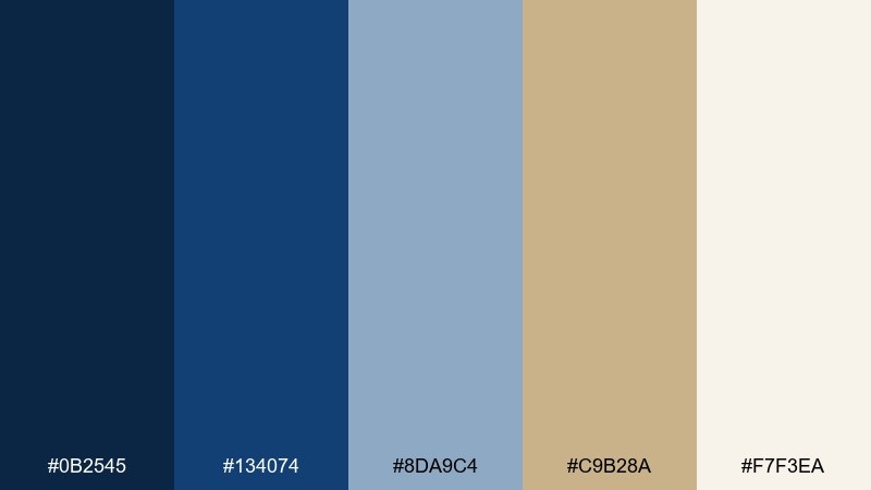
HEX: #0B2545 #134074 #8DA9C4 #C9B28A #F7F3EA
Mood: cultured, calm, quietly bold
Best for: museum signage, exhibit graphics, cultural branding
Quiet nautical blues bring a sense of history, while sandy tan adds warmth like aged paper. It is excellent for signage and wayfinding where legibility and tone both matter. Pair with high-contrast type, clean arrows, and plenty of breathing room around icons. Tip: keep tan to secondary panels so directional blue elements remain unmistakable from a distance.
Image example of seaside museum generated using media.io
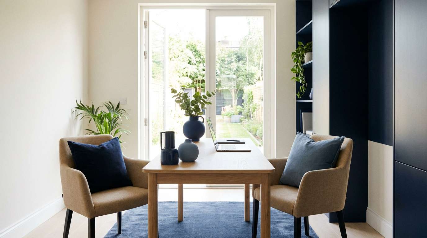
13) Warm Minimal Workspace
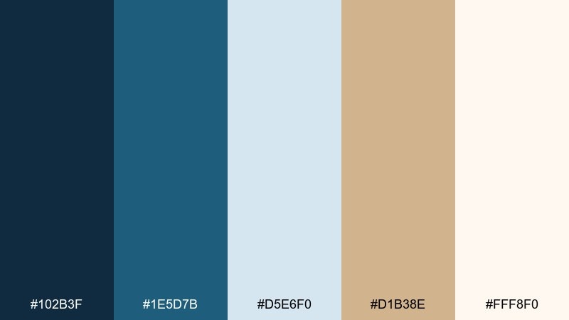
HEX: #102B3F #1E5D7B #D5E6F0 #D1B38E #FFF8F0
Mood: focused, tidy, welcoming
Best for: home office interiors, productivity blogs, Notion templates
Cool blue structure meets warm tan comfort, like a tidy desk by a window on a calm morning. The tones help a workspace feel productive without turning sterile. Pair with light wood, black accents, and a creamy background to keep the look soft. Tip: choose one blue for storage elements and repeat tan in textiles for a cohesive room.
Image example of warm minimal workspace generated using media.io
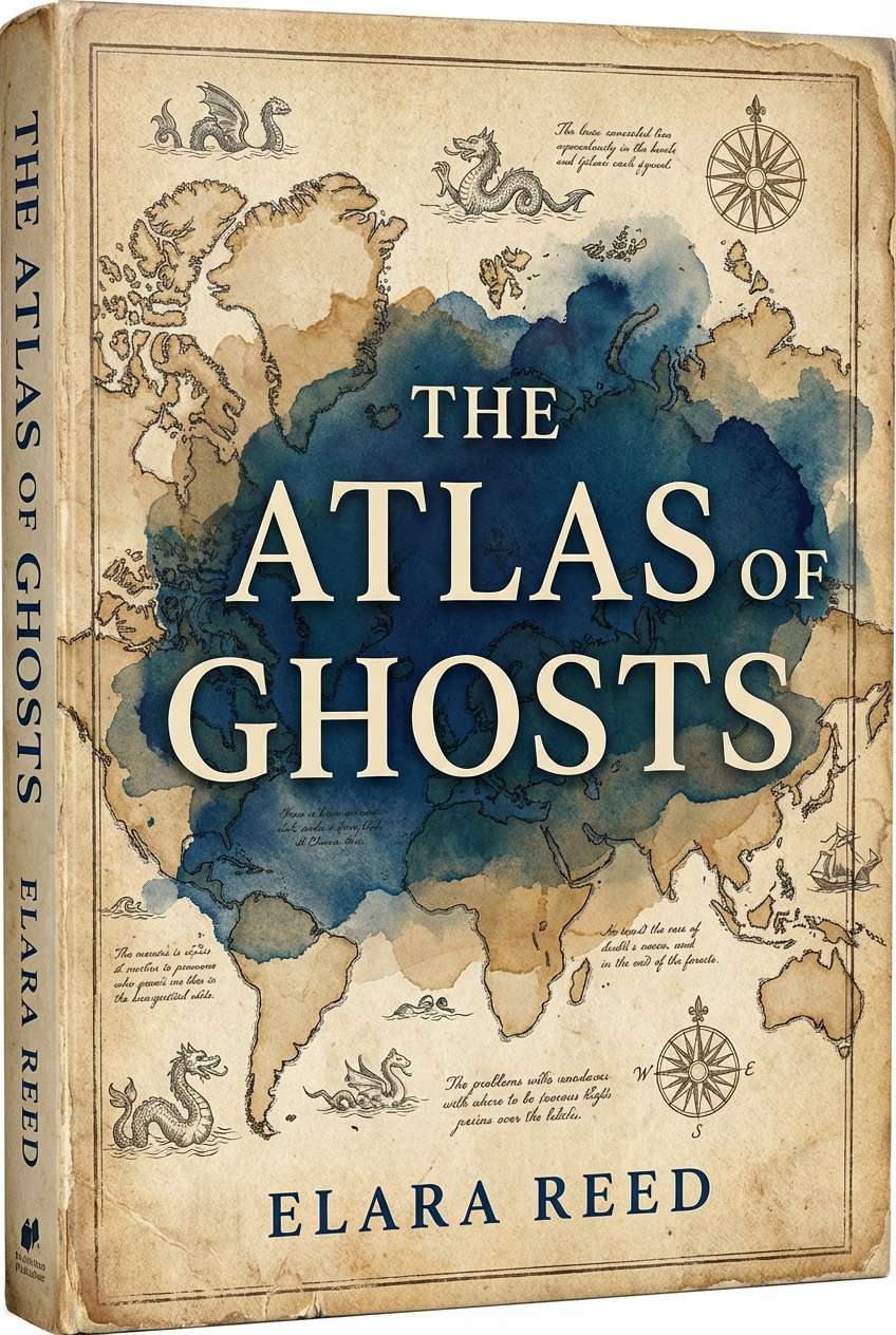
14) Vintage Map Room
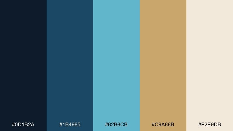
HEX: #0D1B2A #1B4965 #62B6CB #C9A66B #F2E9DB
Mood: nostalgic, curious, scholarly
Best for: book covers, podcast art, heritage branding
Old-world map vibes come through with deep ink blue, faded teal, and parchment-like tan. The blue tan color combination feels perfect for storytelling projects that need a sense of place and time. Pair with serif typography and subtle grain to mimic printed paper. Tip: keep the brighter teal as a small accent so it reads like a highlighted route line.
Image example of vintage map room generated using media.io
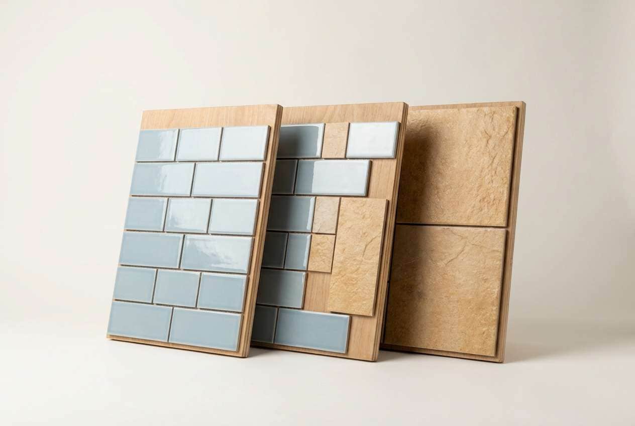
15) Ceramic Bath
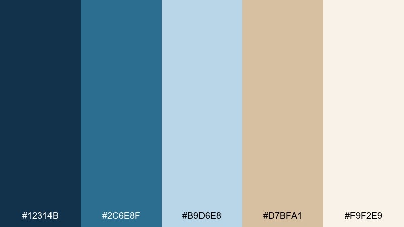
HEX: #12314B #2C6E8F #B9D6E8 #D7BFA1 #F9F2E9
Mood: spa-like, fresh, gentle
Best for: bathroom remodels, tile catalogs, skincare landing pages
Clean ceramic blues feel refreshing like water on glazed tile, warmed by a sandy tan that reads like natural stone. It is a great fit for bathroom visuals, tile catalogs, and calming product pages. Pair with white grout tones, matte textures, and soft shadows for a realistic finish. Tip: use tan on trim details and keep blue on larger surfaces to avoid a busy look.
Image example of ceramic bath generated using media.io
16) Evening Bistro
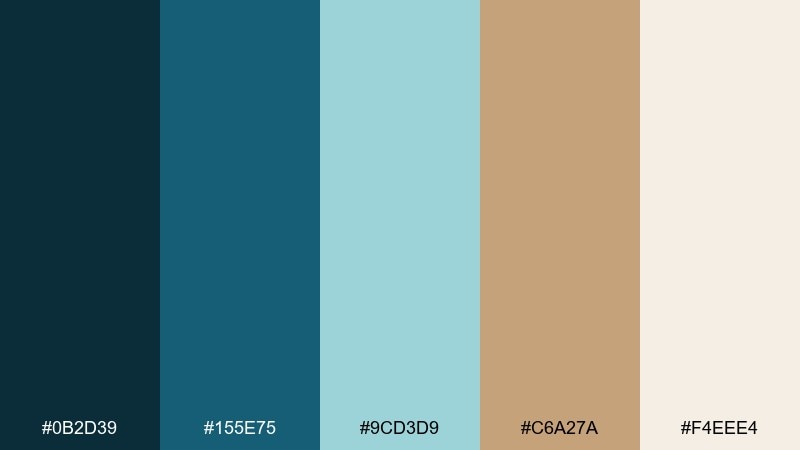
HEX: #0B2D39 #155E75 #9CD3D9 #C6A27A #F4EEE4
Mood: cozy, intimate, refined
Best for: restaurant menus, wine bar branding, reservation pages
Evening blues feel like dim candlelight reflected on glass, balanced by a warm tan that suggests wood and linen. The contrast supports readable menus and elegant branding without going too formal. Pair with cream paper texture, thin rules, and a single accent color like burgundy if needed. Tip: set menu section headers in the darkest blue and use tan for price callouts or icons.
Image example of evening bistro generated using media.io
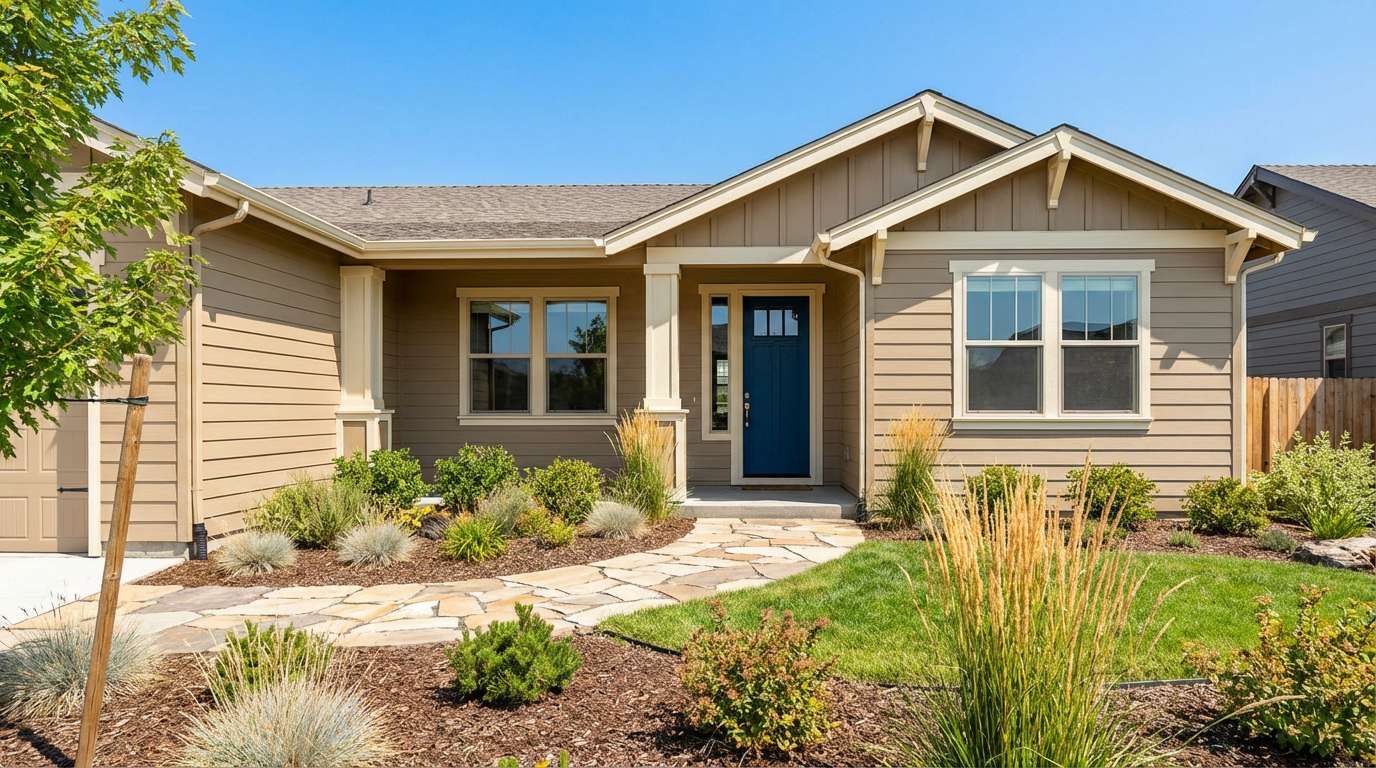
17) Modern Ranch
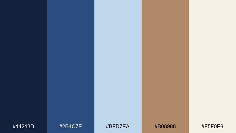
HEX: #14213D #2B4C7E #BFD7EA #B08968 #F5F0E6
Mood: rustic-modern, sturdy, welcoming
Best for: home exteriors, real estate branding, interior styling
Sturdy blues bring a modern ranch confidence, while caramel tan adds a sun-baked, natural warmth. It is ideal for exterior paint planning, real estate materials, and cozy-yet-clean interiors. Pair with stone textures, matte black hardware, and warm white trim. Tip: use the deeper blue for doors or shutters and keep tan on broader surfaces to maintain balance.
Image example of modern ranch generated using media.io
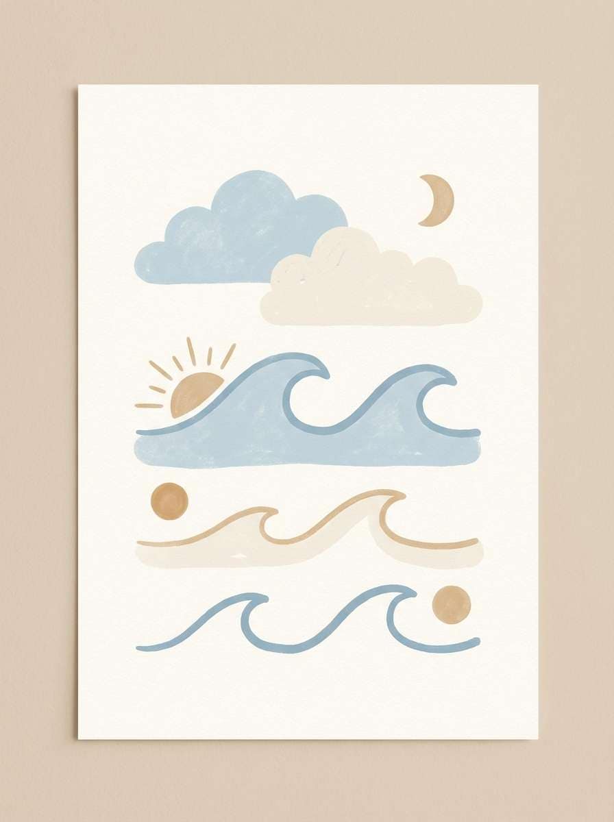
18) Soft Nursery Wave
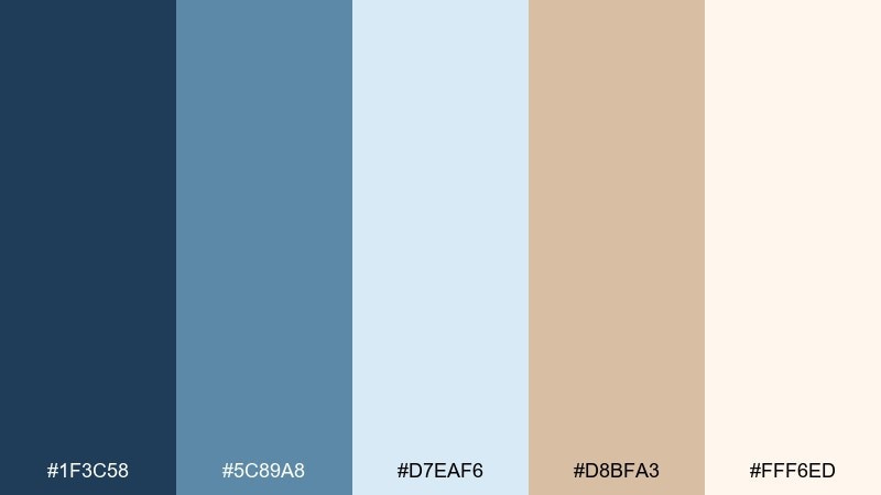
HEX: #1F3C58 #5C89A8 #D7EAF6 #D8BFA3 #FFF6ED
Mood: gentle, soothing, playful
Best for: nursery decor, baby shower invites, kids room art
Gentle wave-like blues feel soothing and sleepy, warmed by a soft tan that keeps the mood cozy. It fits nursery art and invitations that should feel calm rather than candy-bright. Pair with rounded shapes, simple animals, and lots of cream space for a breathable look. Tip: keep contrast moderate by using the mid-blue for text instead of the darkest shade.
Image example of soft nursery wave generated using media.io
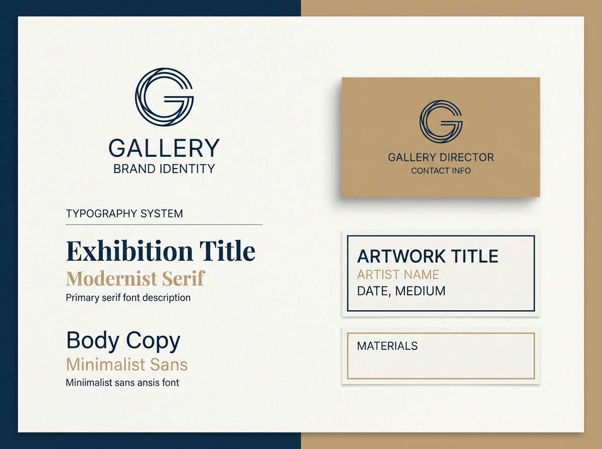
19) Gallery Label

HEX: #0A2342 #2C4F6D #B3CDE3 #C7A97A #F8F4EC
Mood: minimal, curated, modern-classic
Best for: art gallery identity, exhibition cards, portfolio sites
Curated blues feel crisp and contemporary, while warm tan adds a subtle, collector-grade softness. These blue tan color combinations are excellent for gallery labels, artist portfolios, and exhibition collateral where restraint matters. Pair with clean grids, understated typography, and high-contrast artwork photography. Tip: use tan as a small signature accent on rules or stamps to keep the identity premium.
Image example of gallery label generated using media.io
20) Autumn Trailhead
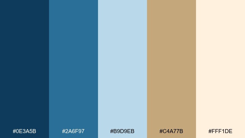
HEX: #0E3A5B #2A6F97 #B9D9EB #C4A77B #FFF1DE
Mood: energetic, outdoorsy, friendly
Best for: Instagram stories, event promos, community groups
Bright trail-sky blues meet earthy tan like boots on a sandy path at the start of a hike. The set feels upbeat for quick social graphics while still grounded and natural. Pair with bold type, simple location pins, and a clean cream background for clarity on mobile. Tip: keep text on the lightest tones and use the darkest blue only for key numbers like dates and times.
Image example of autumn trailhead generated using media.io

What Colors Go Well with Blue Tan?
Soft whites and creams are the easiest companions for blue and tan, because they keep the palette breathable and let both temperatures feel intentional. For digital products, an off-white background also reduces the harshness of deep navy.
Muted greens (sage, olive) reinforce an earthy, coastal, or outdoorsy direction, while charcoal and black add modern contrast for typography and UI controls. If you want a subtle pop, try a restrained accent like burgundy, rust, or teal—used sparingly against the blue base.
Metallics also pair naturally: brass or champagne gold complements tan undertones, while brushed silver feels crisp next to cooler blues.
How to Use a Blue Tan Color Palette in Real Designs
For UI and branding, let blue do the “work” (navigation, headers, primary buttons) and use tan for supporting roles (badges, secondary panels, highlights). This keeps contrast predictable and prevents tan from turning overly yellow or muddy.
In interiors and lifestyle visuals, scale matters: large tan surfaces (walls, textiles, paper textures) feel warm and inviting, while blue works best as a strong anchor on smaller areas (doors, cabinetry, feature walls, or hero elements).
When printing, test the tan on paper stock—some tans shift warmer than expected. Slightly muting the tan or moving toward a canvas-like beige often gives the most premium result.
Create Blue Tan Palette Visuals with AI
If you want to preview how a blue tan scheme looks on a brand board, UI mockup, poster, or packaging concept, generating quick visuals can help you validate contrast and mood before committing to production.
Start with one of the prompts above, then swap in your preferred HEX shades or adjust style keywords (e.g., “minimal,” “photorealistic,” “vector,” “paper grain”) to match your project’s direction.
With Media.io, you can generate multiple variations fast—so you can compare calm coastal blues versus deep navy-and-caramel tones without rebuilding your design from scratch.
Blue Tan Color Palette FAQs
-
What does a blue and tan color palette communicate?
Blue signals calm, reliability, and clarity, while tan adds warmth and approachability. Together, they often feel trustworthy and comfortable—great for brands that want to look modern but still human. -
Is blue and tan a good palette for websites and apps?
Yes. Deep blues work well for navigation and typography, and tan makes a strong accent for tags, secondary panels, and highlights. Use an off-white base so the UI stays clean and readable. -
How do I keep tan from looking yellow next to blue?
Choose a more muted, beige-leaning tan and pair it with a cream/off-white background. Also avoid placing saturated tan directly beside very bright cyan; a mid or deep blue usually makes tan read more natural. -
What accent color can I add to a navy and tan palette?
Try a restrained accent like burgundy, rust, or teal in small doses (icons, links, or a single callout). These add energy without breaking the calm balance of blue and tan. -
Which blue is best: navy, dusty blue, or sky blue?
Navy is best for strong contrast and premium moods, dusty blue for soft and modern looks, and sky blue for fresh, outdoorsy designs. Many palettes work best by combining a dark blue anchor with a lighter blue for depth. -
How can I use a blue tan palette in interior design?
Use tan for large surfaces and soft goods (walls, rugs, upholstery) and apply blue as an anchor (doors, cabinetry, accent wall, artwork). This keeps the room warm while still feeling structured and crisp. -
Can I generate blue tan palette mockups quickly?
Yes—use an AI image generator to produce brand boards, packaging concepts, menus, or room scenes, then iterate by swapping in your exact HEX colors and adjusting the prompt style (vector vs. photorealistic).


