

Yellow orange sits right between optimistic yellow and confident orange, making it one of the easiest warm families to design with. It brings instant “sunlit energy” while still feeling friendly and modern.
Below are 20+ yellow orange color palette ideas with HEX codes, plus practical tips for using them in branding, UI, and print—especially around the core accent #ffb000.
In this article
- Why Yellow Orange Palettes Work So Well
-
- citrus sunrise
- apricot glow
- marigold market
- honeyed terracotta
- saffron sand
- tangerine cream
- retro sunset pop
- desert citrus
- mango smoothie
- golden hour neutrals
- coral zest
- pumpkin spice studio
- papaya punch
- warm minimal ui
- autumn orchard
- sunlit festival
- soft sorbet pastels
- bright safety accent
- rustic clay citrus
- amber nightfall
- citrus chalkboard
- What Colors Go Well with Yellow Orange?
- How to Use a Yellow Orange Color Palette in Real Designs
- Create Yellow Orange Palette Visuals with AI
Why Yellow Orange Palettes Work So Well
Yellow orange palettes feel energetic without becoming harsh. They naturally pull attention, which is why they’re so effective for highlights, calls to action, and “hero” moments in a layout.
They also pair beautifully with deep anchors (navy, charcoal, teal) that restore contrast and readability. That balance is key when you want warmth on the page but still need crisp typography and clear hierarchy.
Finally, yellow orange is highly adaptable: shift it lighter for airy, lifestyle vibes, or push it deeper into amber and terracotta for premium, editorial, and craft-forward branding.
20+ Yellow Orange Color Palette Ideas (with HEX Codes)
1) Citrus Sunrise
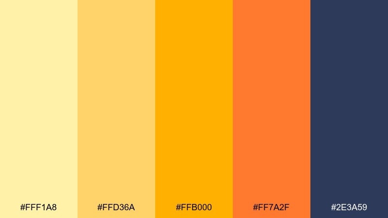
HEX: #fff1a8 #ffd36a #ffb000 #ff7a2f #2e3a59
Mood: uplifting, fresh, energizing
Best for: beverage branding, social headers, and hero banners
Uplifting and juicy, it feels like the first sip of fresh-squeezed citrus at sunrise. The bright yellows and tangerine pop best against the deep navy for instant contrast and legibility. Use it for bold headlines, badges, and call-to-action buttons, then let the lighter yellow handle backgrounds. Tip: keep navy as your primary text color to avoid eye strain on warm fields.
Image example of citrus sunrise generated using media.io
Media.io is an online AI studio for creating and editing video, image, and audio in your browser.

2) Apricot Glow
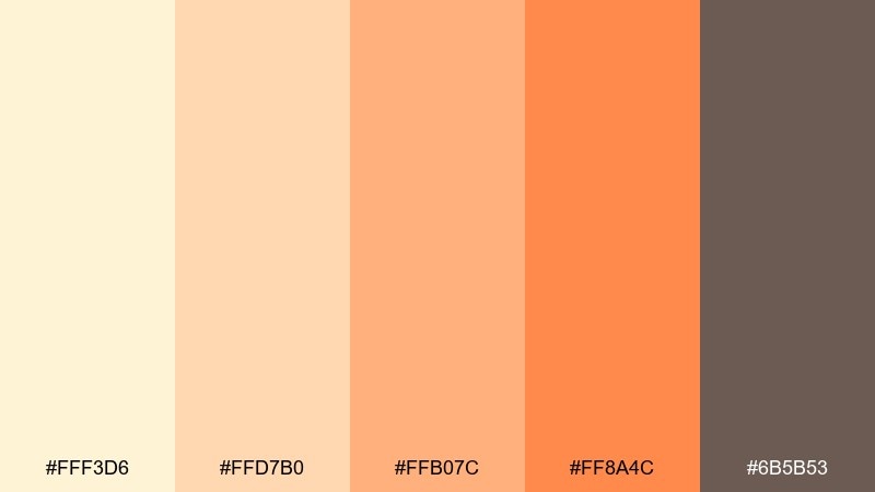
HEX: #fff3d6 #ffd7b0 #ffb07c #ff8a4c #6b5b53
Mood: soft, cozy, welcoming
Best for: wellness brands, lifestyle blogs, and cozy interiors
Soft and cozy, it evokes sunlit linen curtains and warm apricot tea. The gentle warm neutrals make a calm base, while the richer orange adds just enough emphasis for buttons or section headers. Pair with textured photography and muted browns for an organic feel. Tip: reserve the darkest brown for small type and icons to keep the page airy.
Image example of apricot glow generated using media.io
3) Marigold Market
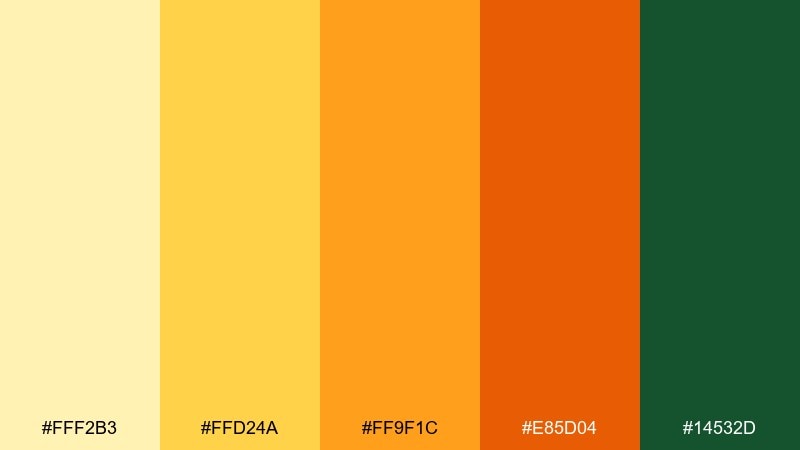
HEX: #fff2b3 #ffd24a #ff9f1c #e85d04 #14532d
Mood: lively, handcrafted, outdoorsy
Best for: farmers market posters, labels, and seasonal promos
Lively and handcrafted, it brings to mind marigold bouquets, fruit crates, and bustling weekend stalls. The green grounds the warm hues and makes the oranges feel fresher, not overly sweet. Use the saturated orange for price tags or promo stamps, and keep the pale yellow for negative space. Tip: add a subtle paper grain to reinforce the market vibe without clutter.
Image example of marigold market generated using media.io
4) Honeyed Terracotta
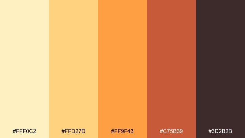
HEX: #fff0c2 #ffd27d #ff9f43 #c75b39 #3d2b2b
Mood: earthy, artisanal, grounded
Best for: handmade goods, ceramics shops, and warm packaging
Earthy and artisanal, it feels like glazed terracotta warmed by a spoonful of honey. This yellow orange color palette works beautifully on kraft textures and matte finishes, where the terracotta reads rich and premium. Pair with off-white space and deep cocoa text for a boutique look. Tip: use the darkest shade for small print to keep labels readable under warm lighting.
Image example of honeyed terracotta generated using media.io
5) Saffron Sand
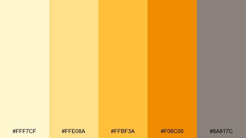
HEX: #fff7cf #ffe08a #ffbf3a #f08c00 #8a817c
Mood: minimal, sunny, refined
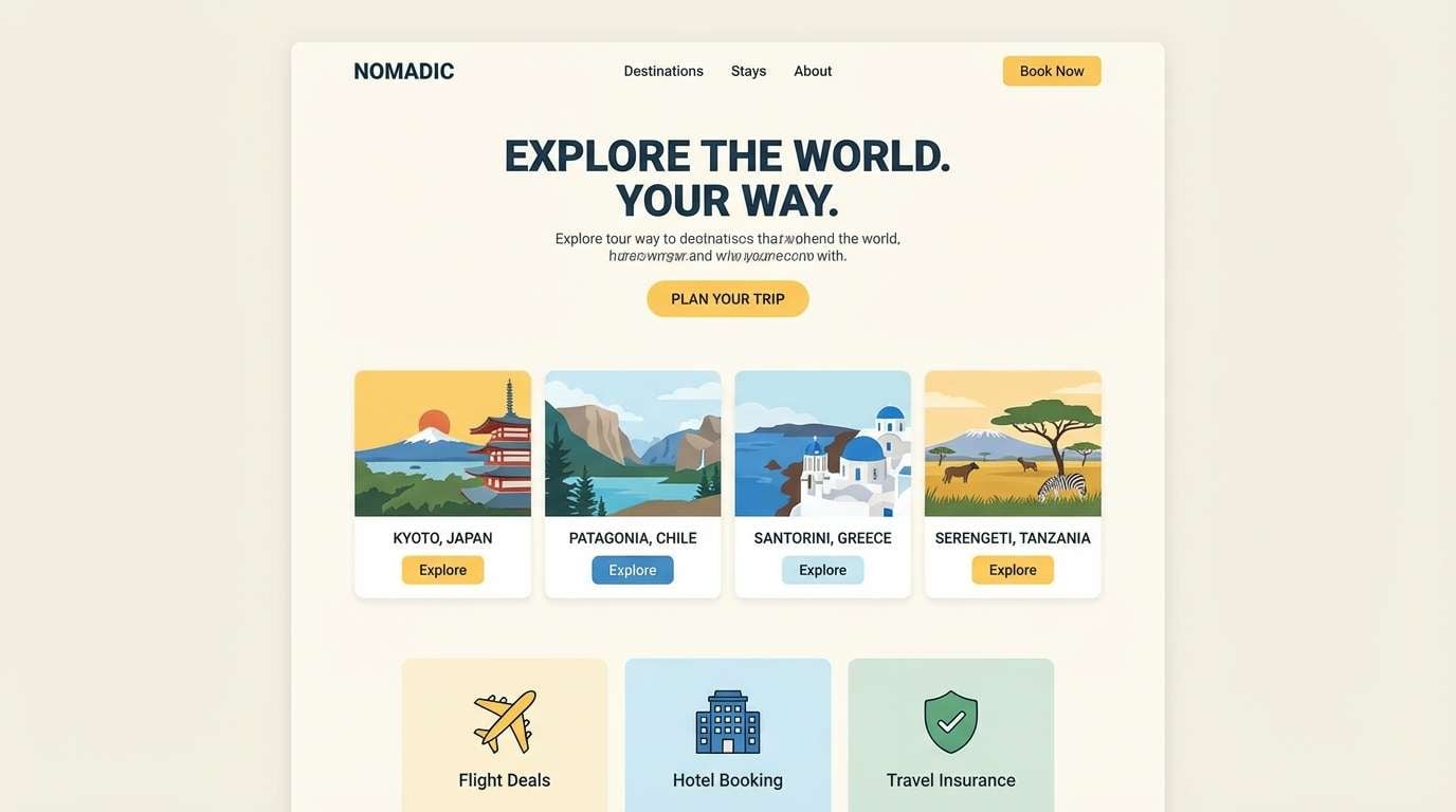
Best for: travel sites, landing pages, and minimalist UI
Minimal and sunny, it recalls saffron threads over warm sand dunes. The warm golds feel premium when balanced with the calm greige, making it suitable for clean layouts and restrained typography. Use the bright saffron as a single accent for links or primary buttons, and keep the sand tone for panels. Tip: avoid pure black text here, and use a softened charcoal for a smoother finish.
Image example of saffron sand generated using media.io
6) Tangerine Cream
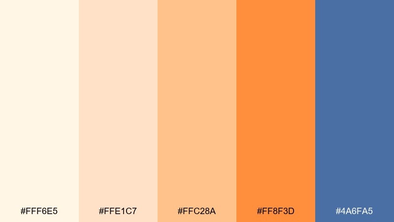
HEX: #fff6e5 #ffe1c7 #ffc28a #ff8f3d #4a6fa5
Mood: cheerful, airy, modern
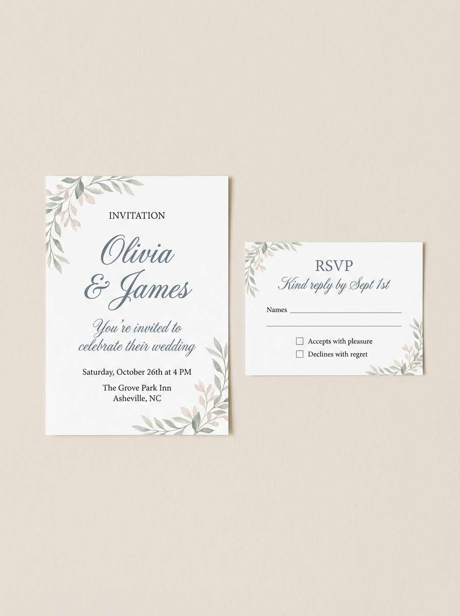
Best for: wedding invitations, baby showers, and greeting cards
Cheerful and airy, it feels like whipped cream topped with bright tangerine zest. The soft creams keep the look delicate, while the cool blue adds a crisp counterpoint for names and details. It suits elegant stationery when you want warmth without going full neon. Tip: print the orange in small doses for envelopes and wax seal accents to avoid overpowering the layout.
Image example of tangerine cream generated using media.io
7) Retro Sunset Pop
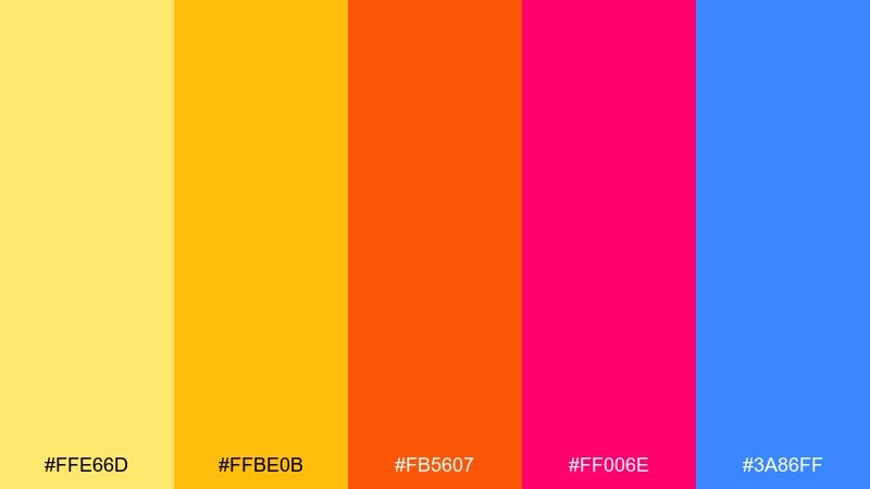
HEX: #ffe66d #ffbe0b #fb5607 #ff006e #3a86ff
Mood: bold, playful, nostalgic
Best for: campaign graphics, merch drops, and pop culture posters
Bold and nostalgic, it channels arcade lights and a loud sunset gradient. The hot pink and electric blue turn the warm core into a high-impact statement for modern campaigns. Use the yellow for highlights and the magenta for secondary accents, while keeping plenty of whitespace to prevent visual noise. Tip: apply a simple two-color rule per section to keep the retro energy controlled.
Image example of retro sunset pop generated using media.io
8) Desert Citrus
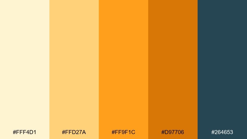
HEX: #fff4d1 #ffd27a #ff9f1c #d97706 #264653
Mood: adventurous, warm, cinematic
Best for: outdoor brands, travel thumbnails, and illustrated scenes
Adventurous and cinematic, it looks like a desert horizon with citrus light spilling over rocky shadows. The deep teal keeps the warm tones from flattening, giving your layout depth and a sense of distance. Great for illustrated maps, cover art, and seasonal campaigns where you want heat without aggression. Tip: use the pale sand as atmospheric haze behind silhouettes and icons.
Image example of desert citrus generated using media.io

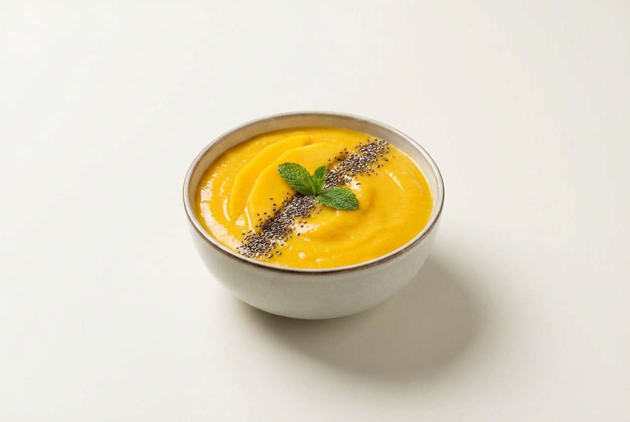
9) Mango Smoothie
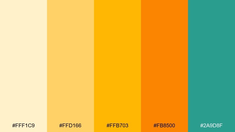
HEX: #fff1c9 #ffd166 #ffb703 #fb8500 #2a9d8f
Mood: fun, tropical, appetizing
Best for: food content, cafe menus, and snack packaging
Fun and tropical, it reads like a thick mango smoothie with a fresh mint garnish. The teal accent adds a clean, refreshing hit that keeps the oranges from feeling heavy. Use the bright mango for hero imagery overlays and the pale cream for menus or recipe cards. Tip: keep teal for small icons and separators so the warm colors stay in the spotlight.
Image example of mango smoothie generated using media.io
10) Golden Hour Neutrals
HEX: #fff4e0 #ffe0b2 #ffb74d #f57c00 #3f3d3c
Mood: calm, premium, editorial
Best for: portfolio sites, premium decks, and brand guidelines
Calm and premium, it feels like golden hour light on stone and brushed metal. As a yellow orange color scheme, it shines when you keep the neutrals dominant and let the orange appear as a measured accent. Pair with grayscale photography and spacious margins for a high-end editorial mood. Tip: use the dark charcoal for body text and keep the warm hues for headings and highlights only.
Image example of golden hour neutrals generated using media.io
11) Coral Zest
HEX: #fff0d9 #ffcc80 #ff9f68 #ff6f59 #37474f
Mood: friendly, creative, social
Best for: community apps, creator tools, and onboarding screens
Friendly and creative, it suggests coral reefs, sunlit fruit, and upbeat conversation. The coral red-orange gives you a strong action color, while the slate keeps UI elements crisp and modern. Use the light peach as your main background for a gentle, approachable feel. Tip: apply coral to only one primary action per screen to maintain clear focus.
Image example of coral zest generated using media.io
12) Pumpkin Spice Studio
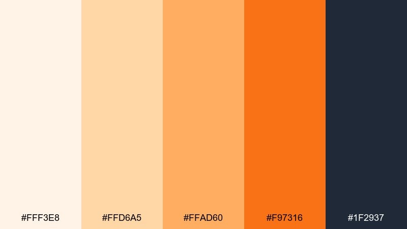
HEX: #fff3e8 #ffd6a5 #ffad60 #f97316 #1f2937
Mood: warm, confident, studio-clean
Best for: coffee shop menus, seasonal promos, and signage
Warm and confident, it brings pumpkin spice lattes and clean studio lighting to mind. The deep slate gives the orange a modern edge, perfect for sharp typography and icons. Use the pale cream for breathing room and reserve the bright orange for price tags or special items. Tip: add simple line dividers in slate to keep menu sections easy to scan.
Image example of pumpkin spice studio generated using media.io
13) Papaya Punch
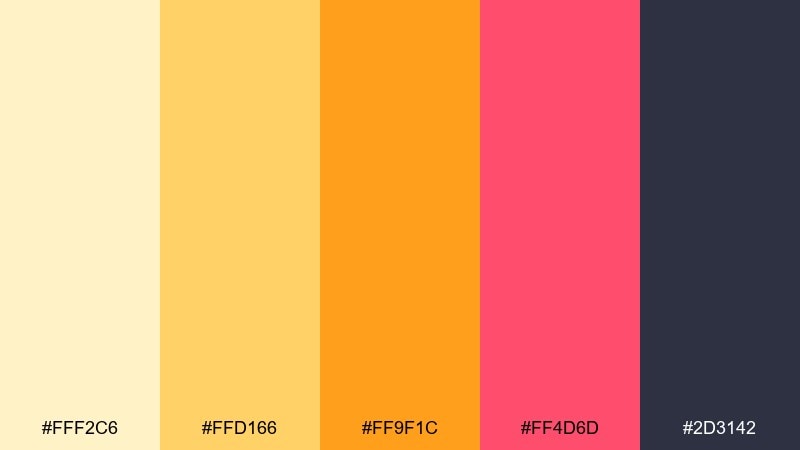
HEX: #fff2c6 #ffd166 #ff9f1c #ff4d6d #2d3142
Mood: vibrant, youthful, punchy
Best for: youth campaigns, sports promos, and playful branding
Vibrant and punchy, it looks like papaya slices with a splash of berry syrup. This yellow orange color combination gets extra energy from the pink accent, while the deep ink tone keeps layouts readable. Use the pink for secondary calls to action and the orange for primary highlights to guide attention. Tip: keep backgrounds light to avoid muddy contrast when using both warm accents together.
Image example of papaya punch generated using media.io
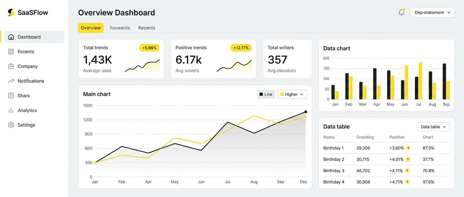
14) Warm Minimal UI

HEX: #fff7e6 #ffe0b2 #ffb74d #ff8f00 #263238
Mood: clean, modern, approachable
Best for: saas dashboards, pricing pages, and analytics UI
Clean and modern, it feels like warm sunlight on a minimalist desk setup. The palette stays approachable thanks to soft creams, while the orange provides a clear hierarchy for active states and key metrics. Pair with plenty of whitespace and thin dividers for a crisp dashboard look. Tip: use orange for one data series only, and rely on neutrals for the rest of the chart.
Image example of warm minimal ui generated using media.io
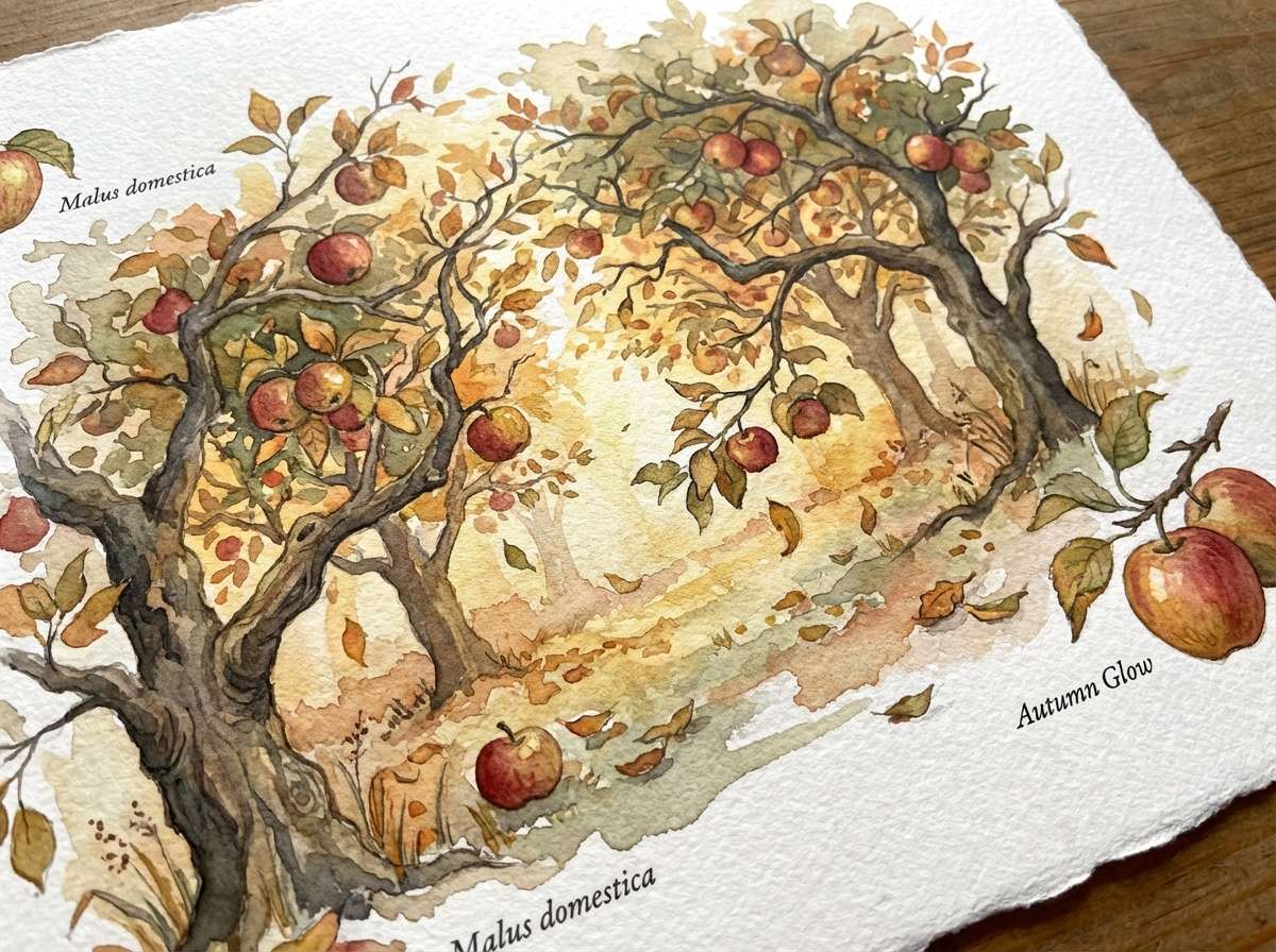
15) Autumn Orchard
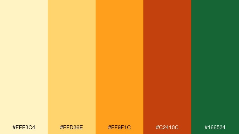
HEX: #fff3c4 #ffd36e #ff9f1c #c2410c #166534
Mood: seasonal, rustic, natural
Best for: harvest festivals, organic products, and botanical art
Seasonal and rustic, it suggests apple orchards, fallen leaves, and late-afternoon warmth. The forest green keeps the oranges grounded and works well for borders, type, and leafy motifs. Use the lighter yellow for sky or paper areas, and let the deeper burnt orange carry focal details. Tip: in illustrations, add gentle watercolor blooms to make the warm tones feel natural, not flat.
Image example of autumn orchard generated using media.io
16) Sunlit Festival
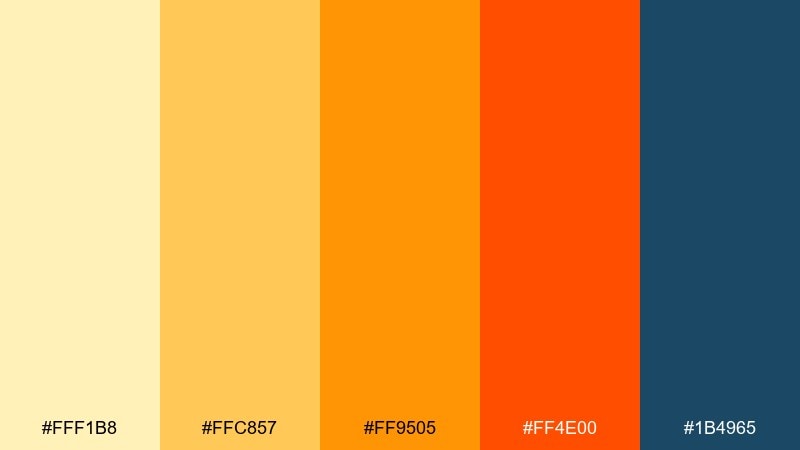
HEX: #fff1b8 #ffc857 #ff9505 #ff4e00 #1b4965
Mood: electric, celebratory, bold
Best for: festival flyers, concert tickets, and promos
Electric and celebratory, it feels like stage lights cutting through warm dusk. This yellow orange color palette delivers instant impact, especially when the deep blue is used for typography and outlines. Put the brightest yellow on highlights and stickers, and use the orange-red for the main headline. Tip: keep gradients subtle, and rely on solid blocks for better print consistency.
Image example of sunlit festival generated using media.io

17) Soft Sorbet Pastels
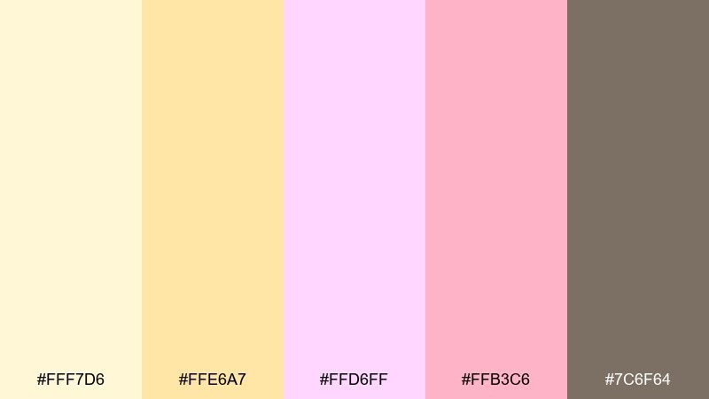
HEX: #fff7d6 #ffe6a7 #ffd6ff #ffb3c6 #7c6f64
Mood: sweet, gentle, dreamy
Best for: beauty launches, pastel packaging, and social templates
Sweet and dreamy, it reads like sorbet shades melting together on a warm day. The pastel pinks soften the yellow-orange notes, making the overall look friendly and light. Pair with thin serif typography and simple icons for a boutique aesthetic. Tip: keep contrast by using the muted brown for text and saving pastels for backgrounds and shapes.
Image example of soft sorbet pastels generated using media.io
18) Bright Safety Accent
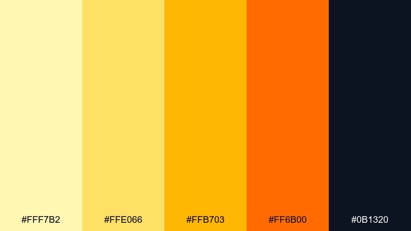
HEX: #fff7b2 #ffe066 #ffb703 #ff6b00 #0b1320
Mood: high-visibility, direct, energetic
Best for: warning labels, callouts, and attention-grabbing banners
High-visibility and direct, it feels like safety tape and bright worksite signage. The near-black anchor gives the warms maximum punch, making small text and icons easy to read. Use the brightest yellow for alerts and the deeper orange for secondary warnings or emphasis bars. Tip: increase padding around callouts so the intense colors do not feel cramped.
Image example of bright safety accent generated using media.io

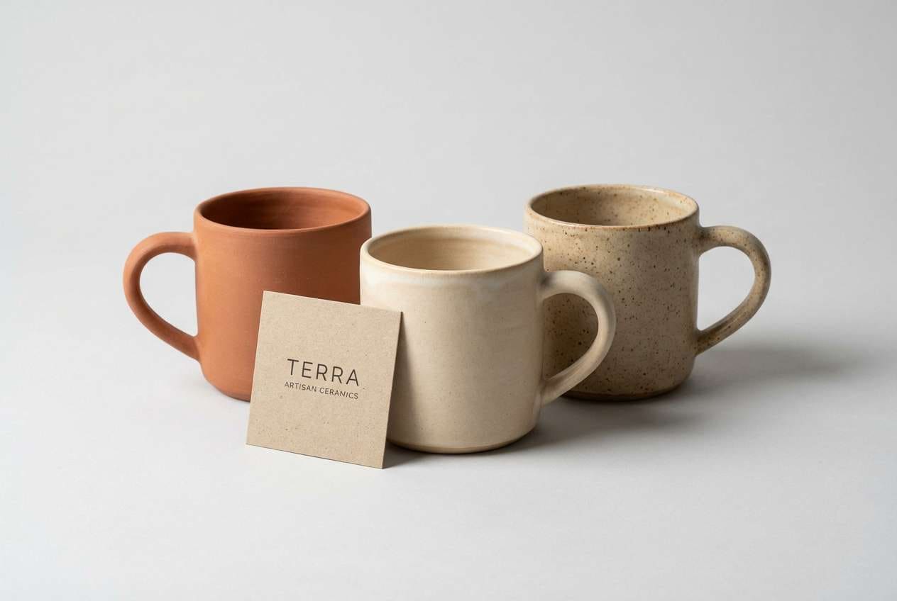
19) Rustic Clay Citrus
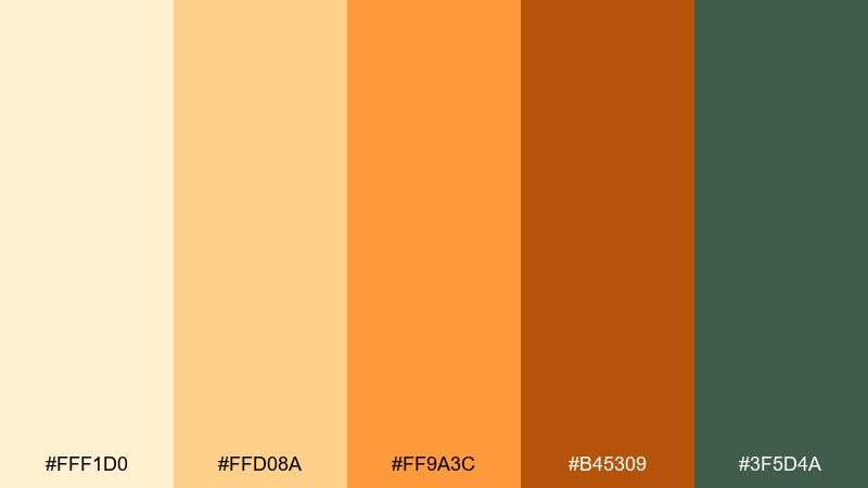
HEX: #fff1d0 #ffd08a #ff9a3c #b45309 #3f5d4a
Mood: rustic, grounded, outdoorsy
Best for: pottery ads, craft fairs, and artisan ecommerce
Rustic and grounded, it evokes clay dust, kiln heat, and a hint of citrus peel. The muted green brings a natural counterbalance that feels handcrafted rather than flashy. Use the clay brown for titles and borders, and keep the brighter orange for product highlights or sale tags. Tip: pair with warm directional lighting in photos to make the browns look richer.
Image example of rustic clay citrus generated using media.io
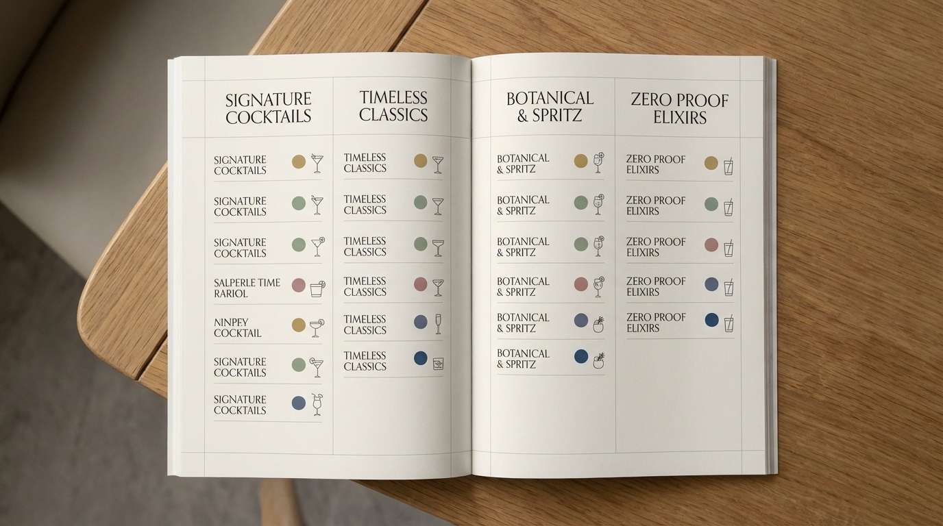
20) Amber Nightfall
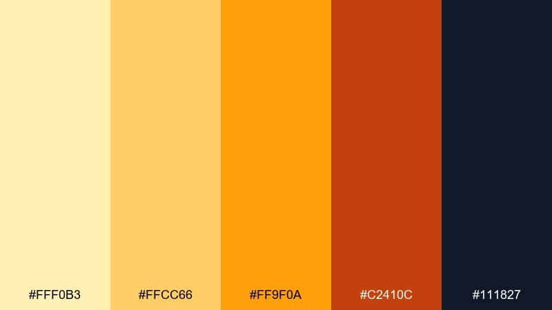
HEX: #fff0b3 #ffcc66 #ff9f0a #c2410c #111827
Mood: moody, upscale, cinematic
Best for: cocktail menus, nightlife branding, and editorial layouts
Moody and upscale, it suggests amber glass glowing against a midnight bar. These yellow orange color combinations look especially luxurious when the dark navy dominates and the warm hues appear as highlights. Use the amber for section headers, pull quotes, and tiny icon accents to create a glow effect. Tip: keep gradients minimal and rely on solid blocks so text stays sharp in print.
Image example of amber nightfall generated using media.io
21) Citrus Chalkboard
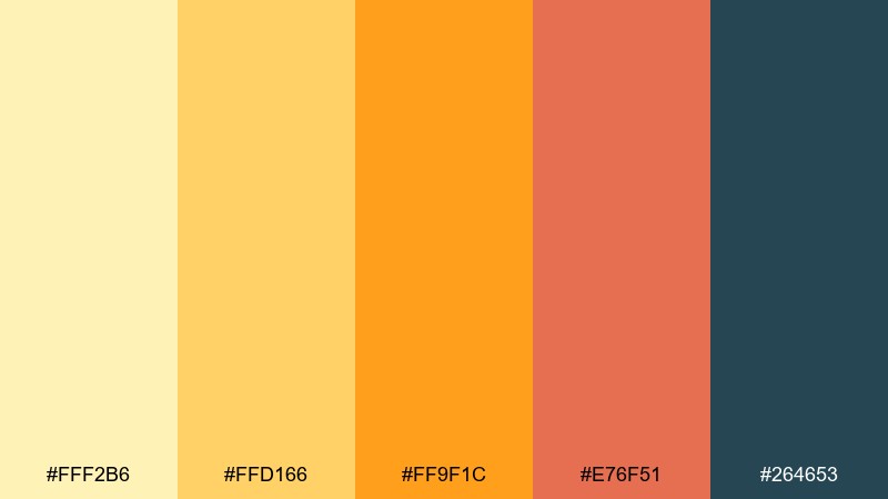
HEX: #fff2b6 #ffd166 #ff9f1c #e76f51 #264653
Mood: casual, friendly, cafe-like
Best for: restaurant specials, chalk-style menus, and daily promos
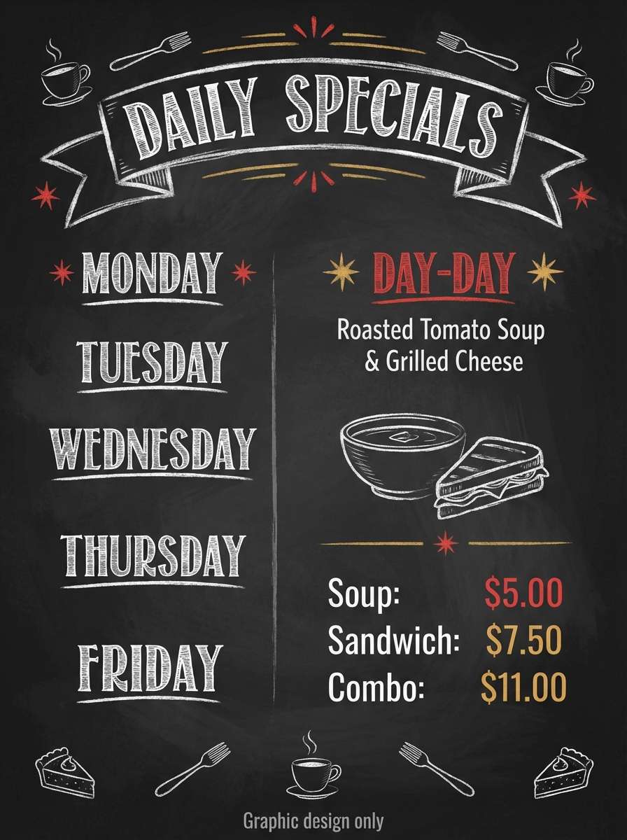
Casual and friendly, it feels like chalk lettering under warm cafe lights. The deep teal reads like a chalkboard surface, letting the citrus tones stand out for headings and prices. Use the pale yellow for small highlights and the coral-orange for featured items. Tip: keep type bold and slightly condensed so the warm colors stay readable from a distance.
Image example of citrus chalkboard generated using media.io
What Colors Go Well with Yellow Orange?
Yellow orange pairs best with cool, deep anchors that stabilize the warmth: navy, slate, teal, and charcoal instantly improve contrast for UI and print. These darker counterparts also make bright accents like #ffb000 feel intentional rather than overwhelming.
For softer looks, combine yellow orange with creams, warm grays, and light peaches—great for backgrounds, cards, and packaging whitespace. If you want extra pop, add a controlled “electric” accent like sky blue or magenta, then keep it to small areas (buttons, badges, or icons).
In general, aim for one warm hero (yellow/orange), one dark neutral (text/structure), and one supporting light neutral (background) to keep the palette clean and scalable.
How to Use a Yellow Orange Color Palette in Real Designs
In branding, yellow orange works well as an “optimism signal”—use it for logos, labels, or a single signature accent across packaging. Pair it with a dark wordmark color so the brand remains readable under different lighting and print conditions.
In UI, treat yellow orange as a priority color: primary buttons, active states, and key metrics. Keep most surfaces neutral, and test contrast (especially on pale yellows) to ensure body text remains comfortable for longer reading.
For posters and social graphics, lean into bold blocks and large type. Yellow orange is excellent for headlines, but it’s even stronger when framed by dark outlines or deep backgrounds that sharpen edges.
Create Yellow Orange Palette Visuals with AI
If you already have HEX codes, you can quickly turn them into moodboards, brand boards, posters, and UI mockups—without starting from a blank canvas. The fastest workflow is to describe your design format (menu, landing page, packaging) and include the palette intent (warm, premium, playful).
Try generating a few variations with different lighting cues (golden hour, studio softbox, cinematic night) to see how the same yellow orange tones shift in mood. Then reuse the best prompt as a template for consistent campaign assets.
Yellow Orange Color Palette FAQs
-
What hex code is a good “core” yellow orange for accents?
A widely usable core yellow orange is #ffb000. It’s saturated enough for buttons and highlights, but still flexible across branding, UI, and print when paired with a dark anchor like navy or charcoal. -
Is yellow orange better for backgrounds or accents?
It’s typically best as an accent (CTAs, badges, highlights). For backgrounds, use lighter tints (cream/apricot) and keep body text in a deep neutral to avoid glare and maintain readability. -
What colors complement yellow orange the most?
Deep blues and blue-greens (navy, teal, slate) complement yellow orange by adding cool contrast. Warm neutrals (ivory, sand, greige) also work well when you want a softer, premium look. -
How do I keep a yellow orange palette from feeling too “loud”?
Let neutrals dominate and limit saturated warms to small areas. Use one primary orange accent, one dark text/structure color, and plenty of whitespace to keep the layout calm. -
What’s the best text color on yellow orange?
Usually a deep navy or charcoal performs better than pure black, especially on warm yellows. Always verify contrast—bright yellows can reduce legibility if the text color isn’t dark enough. -
Does yellow orange print well?
Yes, but very bright yellows can shift depending on paper and ink. For print, consider slightly warmer, darker oranges for key elements, and proof your palette on the intended stock (matte, kraft, coated). -
Can I mix yellow orange with sky blue?
Yes—sky blue is a crisp, modern counterpoint that makes yellow orange feel fresher and more digital. Keep one of them dominant and use the other as a secondary accent to avoid visual competition.
Next: Sky Blue Color Palette


