

Blue, green, and purple create a unique balance of calm and energy—perfect for modern brands that want to feel trustworthy, fresh, and a little unexpected.
Below are 20+ curated blue green purple color combinations with HEX codes, plus practical pairing tips for UI, branding, print, and social designs.
In this article
- Why Blue Green Purple Palettes Work So Well
-
- aurora lagoon
- plum tidepool
- twilight hibiscus
- glacier amethyst
- rainforest violet
- electric kelp
- soft sea lavender
- cosmic garden
- denim iris
- metro nightshade
- orchid current
- tealberry punch
- misty nebula
- royal lagoon
- ultraviolet aquarium
- harbor lilac
- aurora sprint
- deep sea orchid
- vaporwave lagoon
- studio spectrum
- sage eclipse
- prism haze
- What Colors Go Well with Blue Green Purple?
- How to Use a Blue Green Purple Color Palette in Real Designs
- Create Blue Green Purple Palette Visuals with AI
Why Blue Green Purple Palettes Work So Well
Blue signals clarity and trust, green brings freshness and balance, and purple adds imagination and premium flair. Together, they cover both “reliable” and “expressive,” which is why they’re popular in SaaS, fintech, wellness, and creative campaigns.
This trio also performs well across light and dark modes. Deep navies and indigos create strong structure, while teal and violet deliver punchy accents that still feel cohesive.
Because the hues sit close enough to blend (great for gradients) but different enough to separate UI states, a blue green purple color scheme helps you build hierarchy without relying on extra colors.
20+ Blue Green Purple Color Palette Ideas (with HEX Codes)
1) Aurora Lagoon
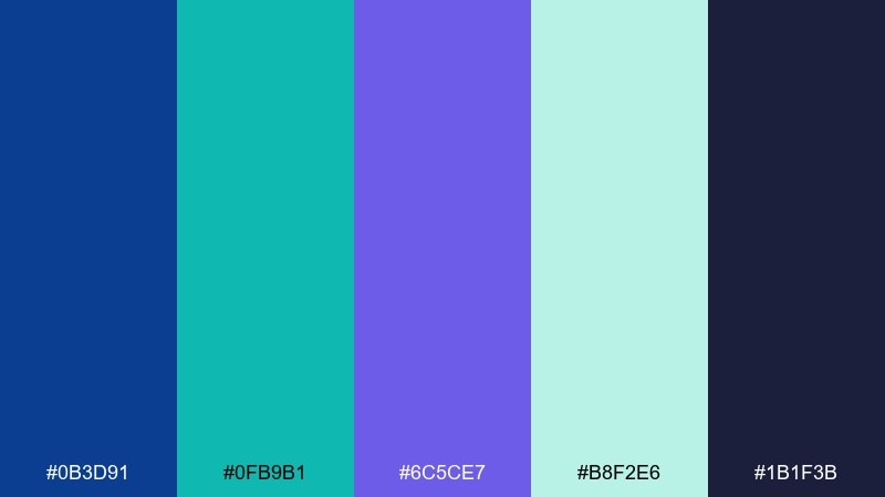
HEX: #0B3D91 #0FB9B1 #6C5CE7 #B8F2E6 #1B1F3B
Mood: luminous, calm, modern
Best for: saas dashboard ui
Luminous and calm, like northern lights reflecting on still water. The deep navy anchors layouts while teal and violet add motion without feeling loud. Use the mint tint for spacious panels and keep the brightest accents for primary buttons and highlights. Pair with cool grays and a clean geometric sans to maintain a modern, product-led look.
Image example of aurora lagoon generated using media.io
Media.io is an online AI studio for creating and editing video, image, and audio in your browser.

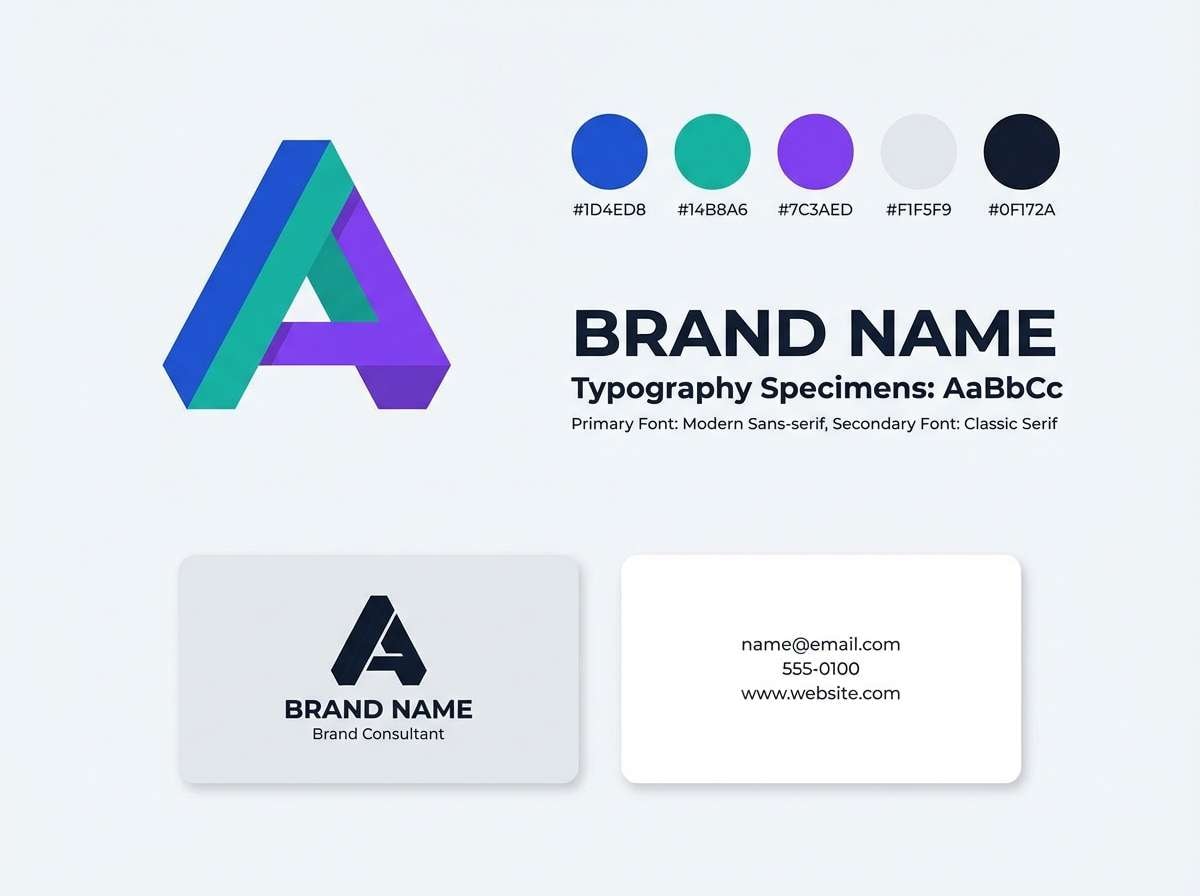
2) Plum Tidepool
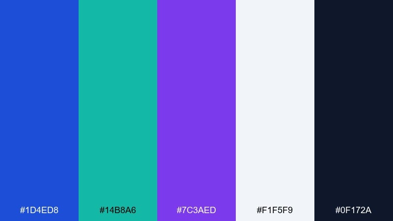
HEX: #1D4ED8 #14B8A6 #7C3AED #F1F5F9 #0F172A
Mood: crisp, professional, energetic
Best for: brand identity system
Crisp and professional, like ocean light hitting polished stone. The cobalt and teal feel confident, while plum adds a distinctive signature for logos and key marks. Use the off-white as your primary background and reserve the near-black for typography and outlines. Pair with a minimal icon set and one strong display font to keep the identity sharp.
Image example of plum tidepool generated using media.io
3) Twilight Hibiscus
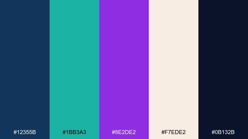
HEX: #12355B #1BB3A3 #8E2DE2 #F7EDE2 #0B132B
Mood: romantic, moody, vibrant
Best for: event poster design
Romantic and moody, like hibiscus petals glowing after sunset. This blue green purple color palette works especially well when you let the cream tone carry the negative space. Keep teal for supporting elements, then punch in violet for headlines and featured details. Pair with subtle grain and bold type, and limit the darkest navy to small text for readability.
Image example of twilight hibiscus generated using media.io

4) Glacier Amethyst
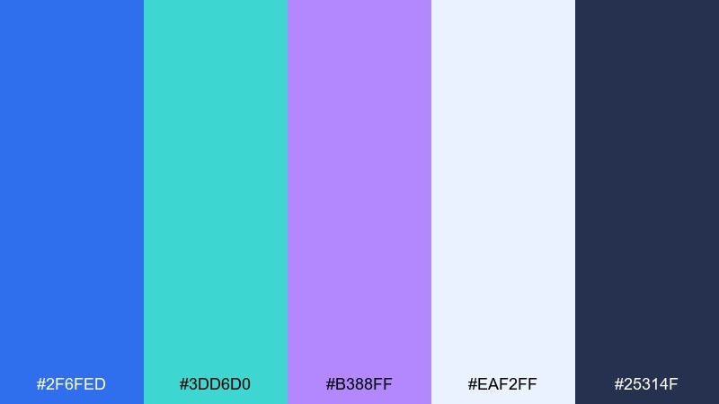
HEX: #2F6FED #3DD6D0 #B388FF #EAF2FF #25314F
Mood: fresh, airy, optimistic
Best for: mobile app onboarding screens
Fresh and airy, like glacial water under a bright sky. The pale lavender and icy blue make friendly backgrounds, while the deeper blue delivers strong contrast for CTAs. Use teal as a progress indicator or micro-interaction color to keep the flow feeling upbeat. Pair with rounded UI components and generous spacing for a welcoming first-run experience.
Image example of glacier amethyst generated using media.io
5) Rainforest Violet
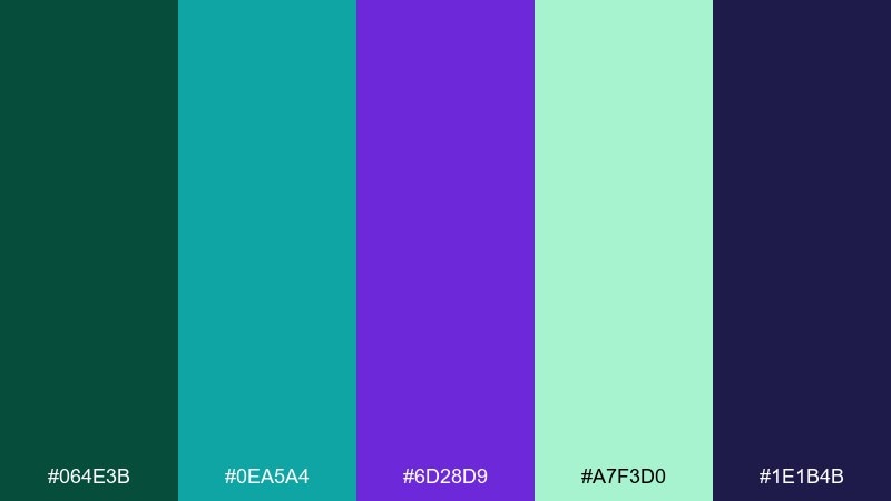
HEX: #064E3B #0EA5A4 #6D28D9 #A7F3D0 #1E1B4B
Mood: earthy, bold, adventurous
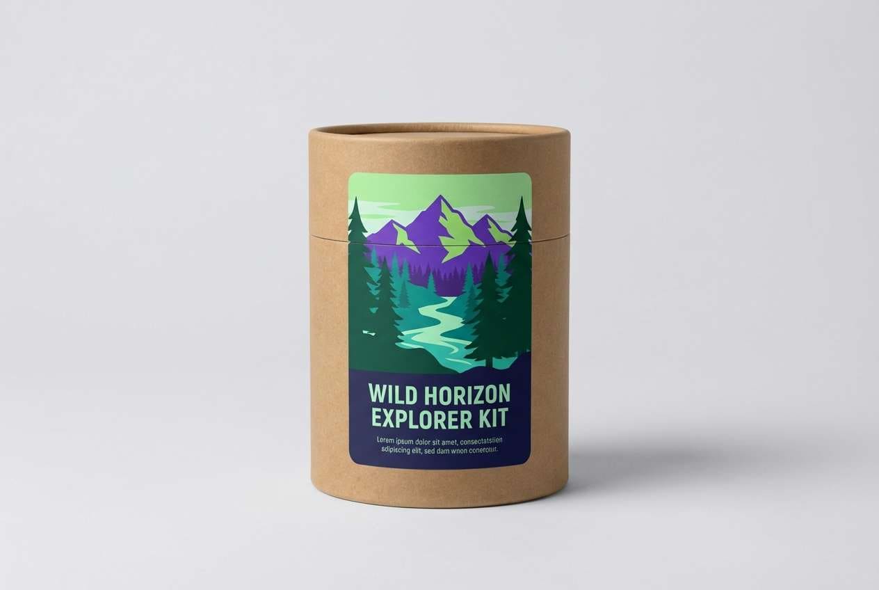
Best for: outdoor product packaging
Earthy and bold, like dense rainforest shade with a flash of rare flowers. The deep green and midnight indigo feel rugged, while violet brings a premium twist that stands out on shelves. Use the mint as a breathable label background and keep teal for badges or feature callouts. Pair with matte textures and simple line icons to avoid visual clutter.
Image example of rainforest violet generated using media.io
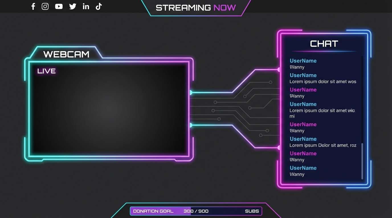
6) Electric Kelp
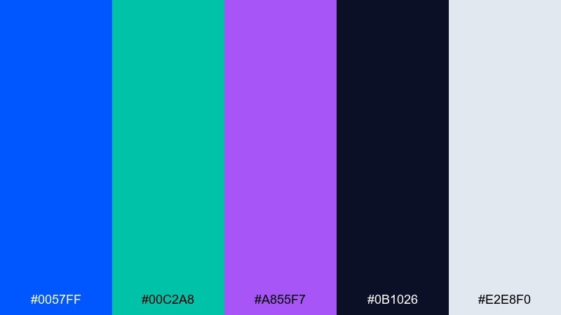
HEX: #0057FF #00C2A8 #A855F7 #0B1026 #E2E8F0
Mood: high-contrast, techy, punchy
Best for: gaming stream overlay
High-contrast and techy, like neon light slicing through deep water. These blue green purple color combinations are strongest when you keep the dark ink tone as the main canvas. Use the electric blue for alerts, teal for secondary labels, and violet for featured moments like wins or milestones. Pair with sharp shapes and a restrained glow effect, and avoid using all three brights in the same module.
Image example of electric kelp generated using media.io
7) Soft Sea Lavender
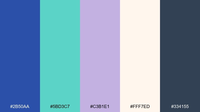
HEX: #2B50AA #5BD3C7 #C3B1E1 #FFF7ED #334155
Mood: gentle, cozy, approachable
Best for: wellness blog theme
Gentle and cozy, like sea foam drifting into lavender mist. The peachy off-white keeps pages warm, while the periwinkle and teal offer a calm rhythm for links, tags, and section headers. Use slate for body text and accessibility-friendly contrast. Pair with soft illustration accents and avoid heavy gradients to maintain the soothing tone.
Image example of soft sea lavender generated using media.io
8) Cosmic Garden
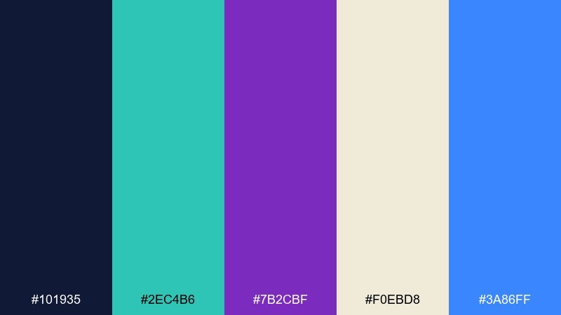
HEX: #101935 #2EC4B6 #7B2CBF #F0EBD8 #3A86FF
Mood: mystical, creative, playful
Best for: album cover artwork
Mystical and creative, like starlight sprinkled over a midnight garden. The creamy neutral lets the jewel tones pop without turning harsh, making it ideal for bold typography. Use teal for organic shapes and violet for focal elements such as titles or icons. Pair with grainy textures and abstract botanicals for a modern, dreamy finish.
Image example of cosmic garden generated using media.io
9) Denim Iris
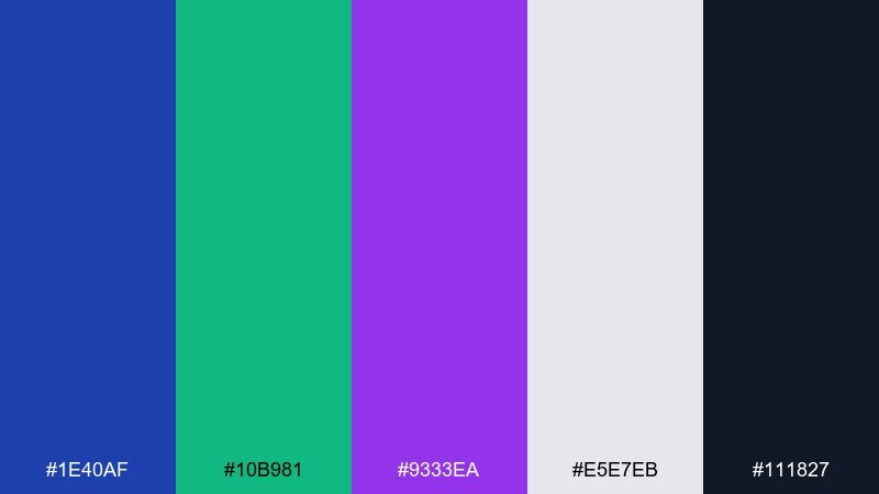
HEX: #1E40AF #10B981 #9333EA #E5E7EB #111827
Mood: confident, balanced, contemporary
Best for: corporate slide deck
Confident and balanced, like dark denim with a pop of iris. Use the gray as your slide background to keep charts readable, then apply blue and green as primary data series. Violet works best as a spotlight color for key metrics and section dividers. Pair with clean infographics and keep the near-black for headers to avoid a washed-out look.
Image example of denim iris generated using media.io
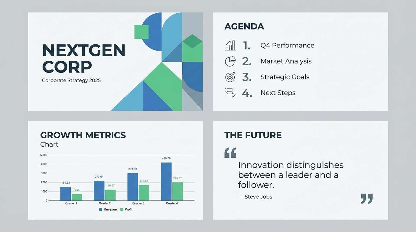
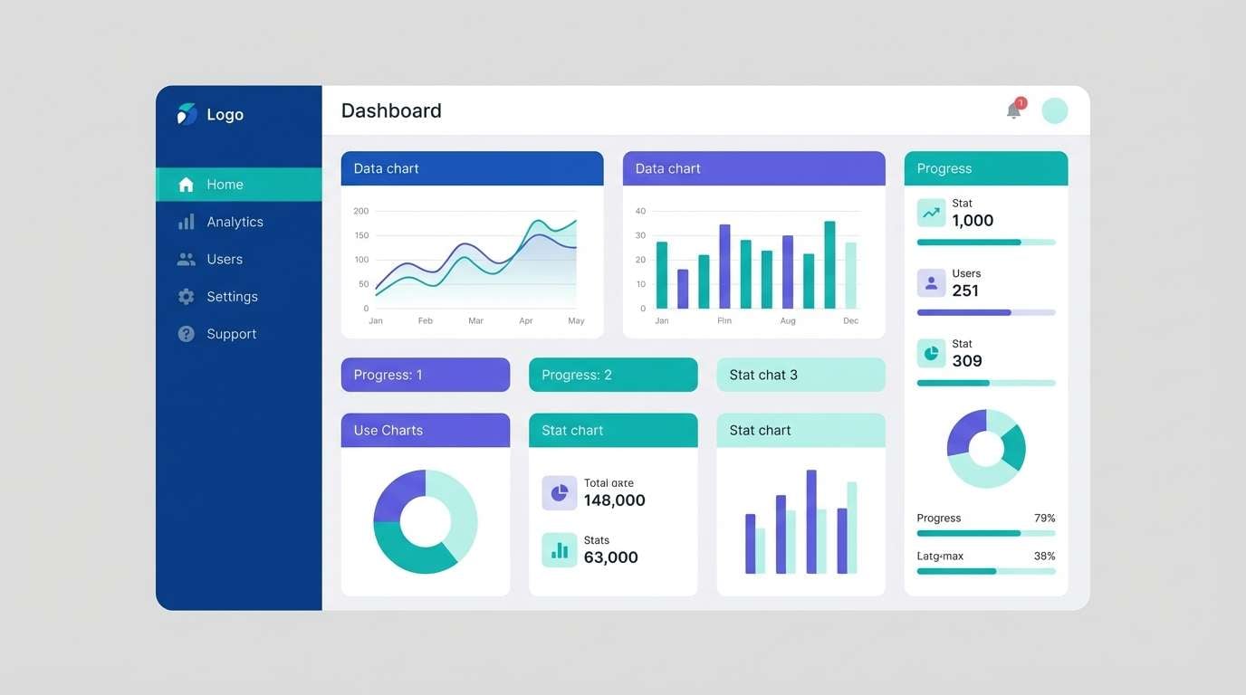
10) Metro Nightshade
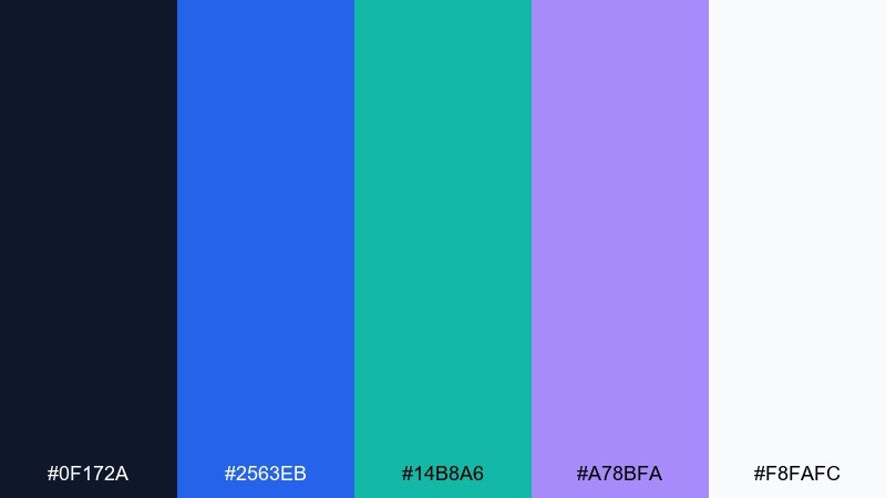
HEX: #0F172A #2563EB #14B8A6 #A78BFA #F8FAFC
Mood: sleek, urban, polished
Best for: fintech landing page
Sleek and urban, like neon signage against wet pavement. A blue green purple color scheme like this reads premium when you lead with the inky base and keep the white for breathing room. Let blue handle primary actions, teal support trust signals, and lavender highlight feature callouts. Pair with thin line icons and plenty of spacing to keep the page feeling high-end.
Image example of metro nightshade generated using media.io
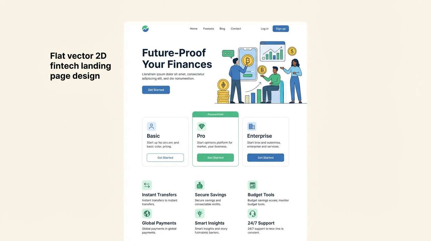
11) Orchid Current
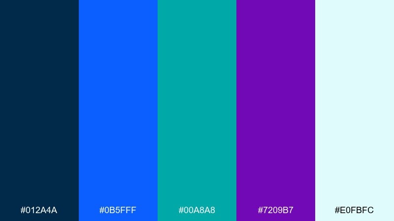
HEX: #012A4A #0B5FFF #00A8A8 #7209B7 #E0FBFC
Mood: bold, glossy, expressive
Best for: beauty product ad
Bold and glossy, like orchid petals catching a flash of blue light. The saturated primaries feel editorial, while the pale aqua keeps the layout from getting heavy. Use teal to support claims and ingredients, then reserve violet for premium cues like limited edition or signature scent. Pair with macro typography and a single hero product shot to keep it luxe.
Image example of orchid current generated using media.io
12) Tealberry Punch
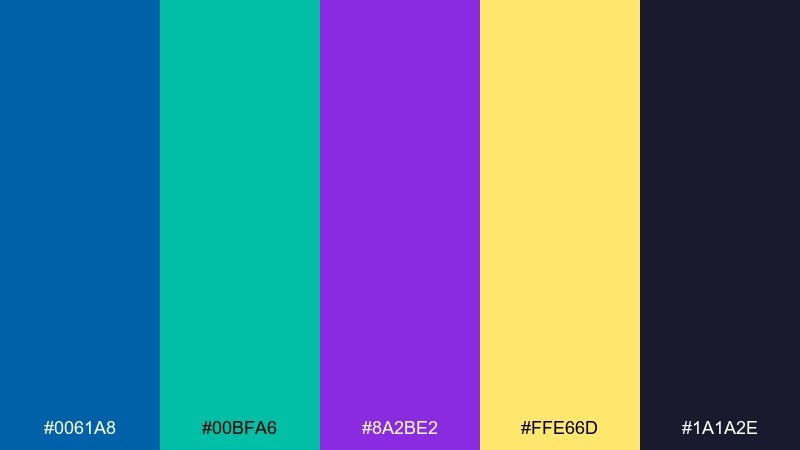
HEX: #0061A8 #00BFA6 #8A2BE2 #FFE66D #1A1A2E
Mood: fun, youthful, upbeat
Best for: summer festival flyer
Fun and upbeat, like sparkling soda with a berry twist. The sunny yellow adds instant energy, while teal and violet keep the flyer feeling modern instead of retro. Use the deep midnight tone for text blocks and sponsor rows to maintain clarity. Pair with playful shapes and a strict type hierarchy so the bright accent does not overwhelm the details.
Image example of tealberry punch generated using media.io

13) Misty Nebula
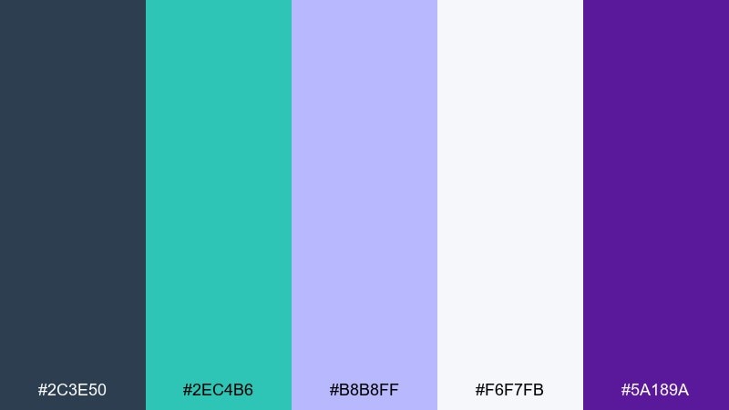
HEX: #2C3E50 #2EC4B6 #B8B8FF #F6F7FB #5A189A
Mood: soft, dreamy, thoughtful
Best for: book cover design
Soft and dreamy, like mist drifting across a distant nebula. The near-white background makes the lavender feel airy, while the deep purple provides a strong title color. Teal works well for small motifs or series labels without stealing attention from the main type. Pair with minimal illustration and keep contrast high for bookstore thumbnail readability.
Image example of misty nebula generated using media.io

14) Royal Lagoon
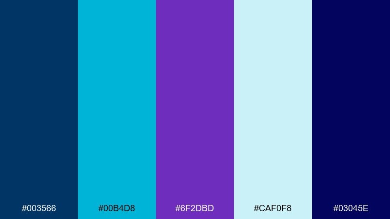
HEX: #003566 #00B4D8 #6F2DBD #CAF0F8 #03045E
Mood: regal, clean, high-impact
Best for: sports team branding
Regal and high-impact, like a championship banner under stadium lights. This blue green purple color palette shines when you lean into the deep royal blues for uniforms and wordmarks. Use cyan as an energetic trim and violet as a secondary accent for merch and social graphics. Pair with bold condensed type and keep the pale tint for breathable backgrounds in digital layouts.
Image example of royal lagoon generated using media.io
15) Ultraviolet Aquarium
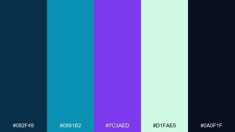
HEX: #082F49 #0891B2 #7C3AED #D1FAE5 #0A0F1F
Mood: deep, aquatic, futuristic
Best for: music visualizer ui
Deep and futuristic, like an aquarium lit by ultraviolet tubes. The dark base makes animations feel vivid, while the minty highlight color prevents the interface from turning too heavy. Use teal for waveform elements and violet for beat markers or active states. Pair with smooth gradients and keep text in high-contrast neutrals for legibility.
Image example of ultraviolet aquarium generated using media.io
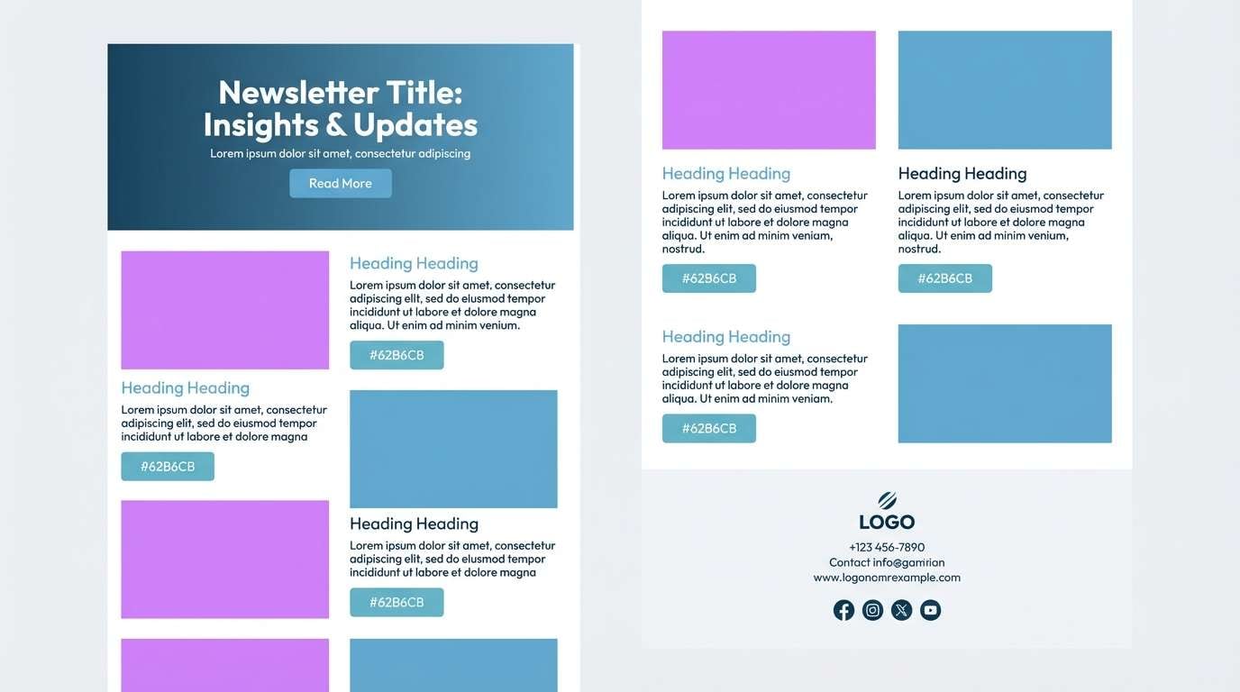
16) Harbor Lilac
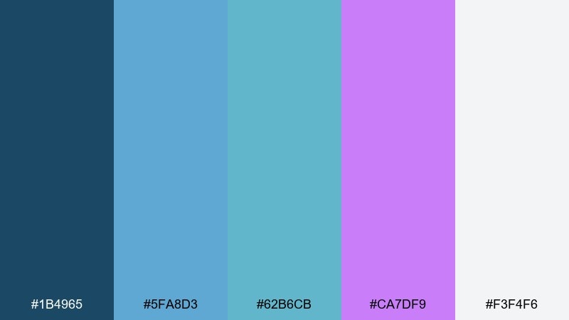
HEX: #1B4965 #5FA8D3 #62B6CB #CA7DF9 #F3F4F6
Mood: coastal, light, friendly
Best for: travel newsletter design
Coastal and friendly, like a bright harbor morning with lilac haze on the horizon. The lighter blues make clean sections for photos and headlines, while the purple accent adds a memorable brand touch. Use teal for links and small UI indicators, keeping the background mostly airy and neutral. Pair with generous margins and simple dividers to keep the layout easy to scan.
Image example of harbor lilac generated using media.io
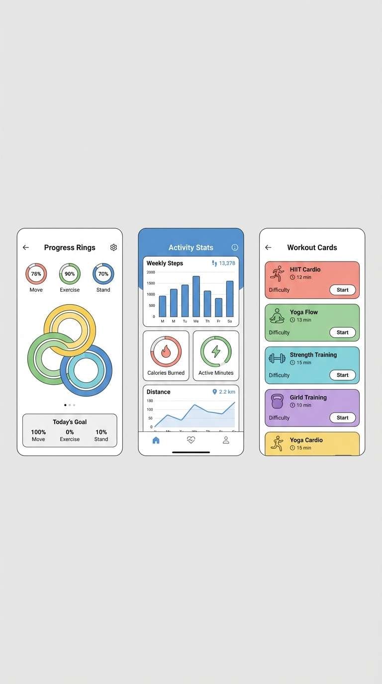
17) Aurora Sprint
HEX: #3A86FF #06D6A0 #8338EC #F1FAEE #1D3557
Mood: sporty, bright, motivating
Best for: fitness app ui
Sporty and motivating, like an early run under a bright, shifting sky. The fresh green reads instantly as progress and success, while violet adds personality to badges and milestones. Keep the off-white for screens with lots of metrics and use the navy for text and tab bars. Pair with rounded charts and clear iconography for fast, at-a-glance tracking.
Image example of aurora sprint generated using media.io
18) Deep Sea Orchid
HEX: #001D3D #0077B6 #00A896 #9D4EDD #E9D8FD
Mood: luxurious, calm, nocturnal
Best for: spa website hero section
Luxurious and calm, like deep water with a soft orchid glow. The navy and ocean blue create instant serenity, while lavender keeps the mood gentle rather than stark. Use teal as a subtle accent for links and trust cues, and keep the light lilac for overlays behind text. Pair with elegant serif headlines and soft gradients for a premium spa feel.
Image example of deep sea orchid generated using media.io
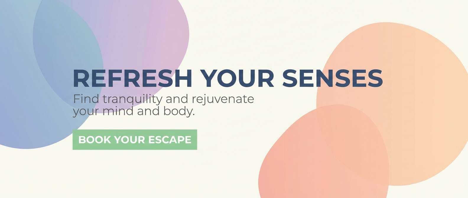
19) Vaporwave Lagoon
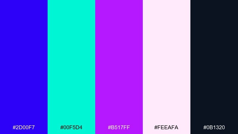
HEX: #2D00F7 #00F5D4 #B517FF #FEEAFA #0B1320
Mood: retro-future, loud, playful
Best for: social media promo banner
Retro-future and playful, like a glowing sign in a midnight arcade. The neon teal and purple demand attention, so give them space on a soft pink highlight instead of stacking them everywhere. Use the deep blue-black for text and logo lockups to keep the message readable. Pair with bold geometric patterns and keep copy short for high scroll-stopping impact.
Image example of vaporwave lagoon generated using media.io

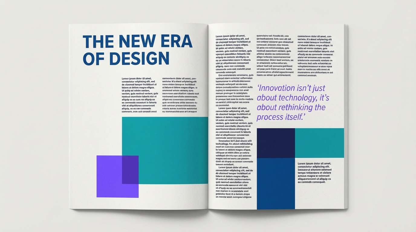
20) Studio Spectrum
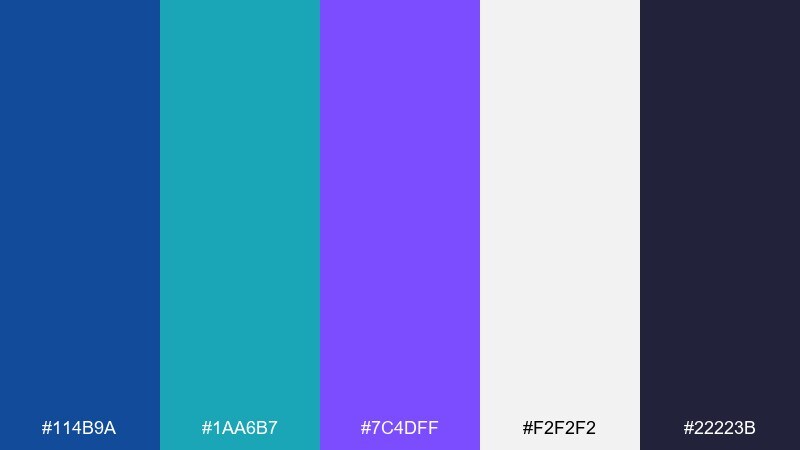
HEX: #114B9A #1AA6B7 #7C4DFF #F2F2F2 #22223B
Mood: clean, creative, versatile
Best for: editorial magazine spread
Clean and creative, like a studio set with colored gels and crisp paper. These blue green purple color combinations feel especially versatile in editorial layouts where hierarchy matters. Use the off-white for reading comfort, keep teal for callouts and sidebars, and let violet headline your feature pages. Pair with strong grid structure and one accent rule per page to avoid visual noise.
Image example of studio spectrum generated using media.io
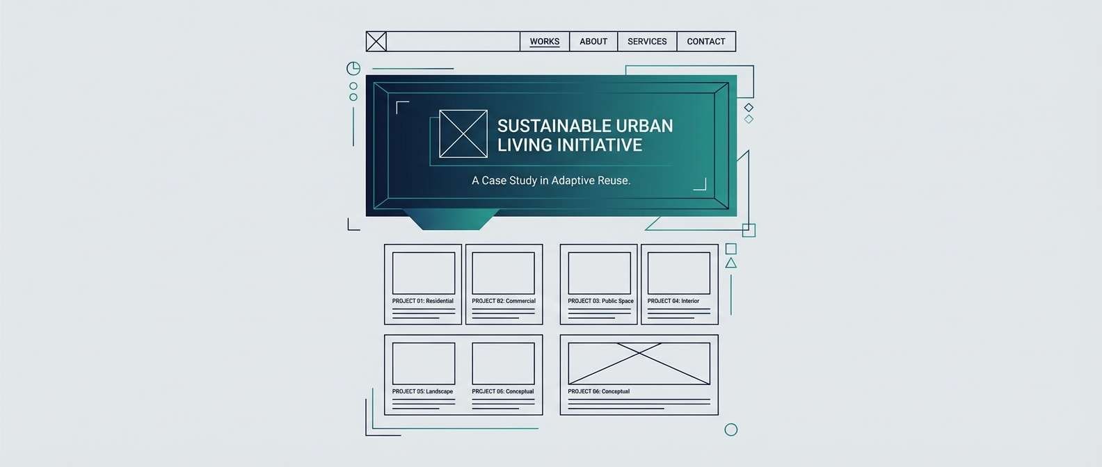
21) Sage Eclipse
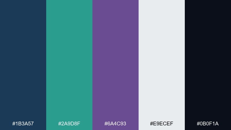
HEX: #1B3A57 #2A9D8F #6A4C93 #E9ECEF #0B0F1A
Mood: moody, grounded, elegant
Best for: architect portfolio website
Moody and grounded, like an eclipse over calm stone and glass. The cool gray background keeps projects feeling spacious, while teal and violet add sophisticated section accents. Use the darkest tone for navigation and captions to ensure contrast against photography. Pair with lots of whitespace and a restrained animation style for a refined portfolio presentation.
Image example of sage eclipse generated using media.io
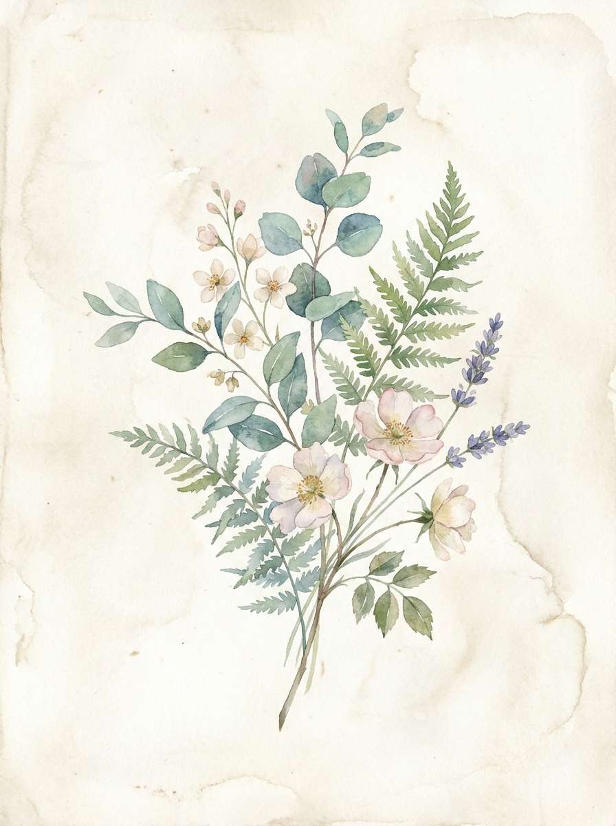
22) Prism Haze
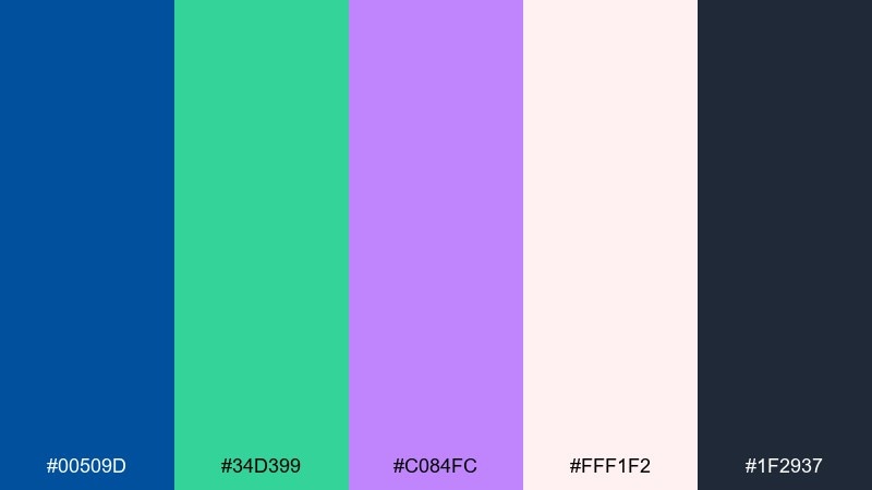
HEX: #00509D #34D399 #C084FC #FFF1F2 #1F2937
Mood: bright, airy, optimistic
Best for: watercolor botanical illustration
Bright and airy, like sunlight refracting through a soft prism. The pinkish white adds warmth, while green and violet make florals feel modern instead of traditional. Use the deep charcoal only for tiny details such as stems, labels, or outlines. Pair with gentle washes and keep saturation slightly uneven for an authentic watercolor feel.
Image example of prism haze generated using media.io
What Colors Go Well with Blue Green Purple?
For clean, modern balance, pair blue green purple tones with cool neutrals like white, off-white, light gray, and charcoal. These help keep contrast readable while letting teal and violet stay “hero” accents.
If you want warmer contrast, try soft beige, cream, blush, or pale sand—these warm neutrals reduce the “icy” feel and make the palette friendlier for lifestyle brands.
For extra punch, use one bright accent only (like lemon yellow, coral, or hot pink). Keeping the accent limited prevents the palette from turning chaotic, especially in UI systems.
How to Use a Blue Green Purple Color Palette in Real Designs
Start with roles: choose a dark base (navy/ink) for structure, a mid blue for primary actions, teal for secondary states, and purple for highlights like badges, pricing emphasis, or key features. This creates predictable hierarchy across screens.
In print and brand identity, let one hue lead (often blue), then use teal as the “fresh” support and purple as the signature. This keeps logos and layouts recognizable even when you can’t use every color at once.
For gradients, blend blue → teal for calm motion and teal → violet for more energy. Keep backgrounds subtle and reserve saturated blends for hero areas, posters, and social promos.
Create Blue Green Purple Palette Visuals with AI
If you already have HEX codes, you can generate on-brand mockups fast by describing the layout (poster, app screen, packaging) and the vibe (calm, glossy, futuristic). This helps you validate how the colors feel in real compositions, not just swatches.
With Media.io’s text-to-image workflow, you can iterate quickly: try different aspect ratios, swap a neutral background, or push teal/purple saturation until the contrast feels right for accessibility and marketing.
Use the palette name as a style anchor (for consistency) and add a clear subject (dashboard, flyer, product ad) so the AI knows what to design.
Blue Green Purple Color Palette FAQs
-
What does a blue green purple color palette communicate?
It typically communicates trust (blue), freshness and balance (green/teal), and creativity or premium personality (purple). Together, the scheme can feel both calming and modern. -
Is blue green purple a good palette for UI design?
Yes. It supports strong hierarchy: navy/indigo for structure, blue for primary actions, teal for supporting states, and purple for highlights such as badges, active tabs, or featured pricing. -
What neutrals work best with teal indigo violet palettes?
Cool neutrals like #F8FAFC, #F1F5F9, #E5E7EB, and deep charcoals (near-black) keep the look crisp and readable. Warm neutrals like cream can soften the overall mood. -
How do I keep blue teal purple combinations from looking too loud?
Use one dominant hue, one supporting hue, and treat the third as an accent. Also increase neutral space (off-white or dark ink) and avoid placing all three saturated colors in the same component. -
Which accent colors pair well with blue green purple?
Lemon yellow and soft coral can add contrast and energy, but use them sparingly (CTAs, tags, or small highlights). Too many accents reduce cohesion. -
Can I use blue green purple palettes for branding?
Absolutely—especially for SaaS, fintech, wellness, and creative brands. Blue builds trust, teal signals innovation and clarity, and purple becomes a distinctive brand signature. -
How can I generate palette-based visuals quickly?
Use Media.io’s AI image generator: describe the design type (landing page, packaging, poster), specify the mood, and reference your palette colors/HEX so you can iterate on composition and contrast fast.
Next: Bronze Color Palette


