

A blue green gray color palette is a go-to choice when you want designs to feel calm, contemporary, and easy to read. It blends the trust of blue, the freshness of green-teal, and the balance of modern cool grays.
Below are 20 ready-to-use blue green gray palette picks with HEX codes, plus tips for pairing and real-world usage across UI, branding, print, and interiors.
In this article
- Why Blue Green Gray Palettes Work So Well
-
- seaside graphite
- mint harbor
- slate lagoon
- arctic sage
- copper kelp
- rainy boardwalk
- foggy fjord
- eucalyptus steel
- nautical concrete
- glacier moss
- blue spruce office
- soft tidepaper
- industrial seafoam
- pebble bay
- deep teal charcoal
- winter poolside
- coastal clinic
- riverstone minimal
- stormlight botanical
- night pier neon
- What Colors Go Well with Blue Green Gray?
- How to Use a Blue Green Gray Color Palette in Real Designs
- Create Blue Green Gray Palette Visuals with AI
Why Blue Green Gray Palettes Work So Well
Blue green gray color schemes sit in a “quiet” zone of the spectrum, so they feel modern without looking loud. That makes them ideal for interfaces, corporate pages, and editorial layouts where clarity matters.
Blue builds trust, teal adds a clean energy, and gray creates structure for typography and spacing. Together, they support hierarchy (headings, buttons, backgrounds) without relying on heavy contrast.
These palettes also translate well across screens and print. With the right gray balance, you can keep designs crisp in bright UI contexts or soften them for interiors and paper goods.
20+ Blue Green Gray Color Palette Ideas (with HEX Codes)
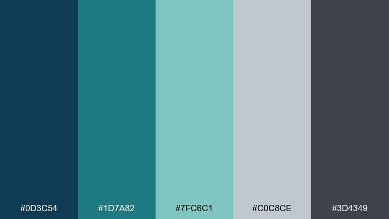
1) Seaside Graphite
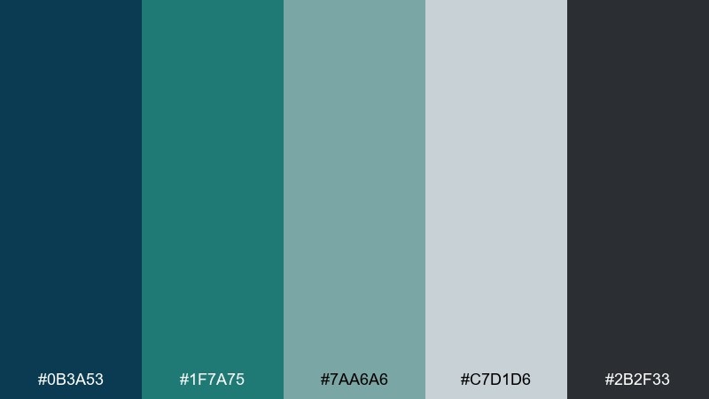
HEX: #0b3a53 #1f7a75 #7aa6a6 #c7d1d6 #2b2f33
Mood: calm and modern
Best for: analytics dashboard UI
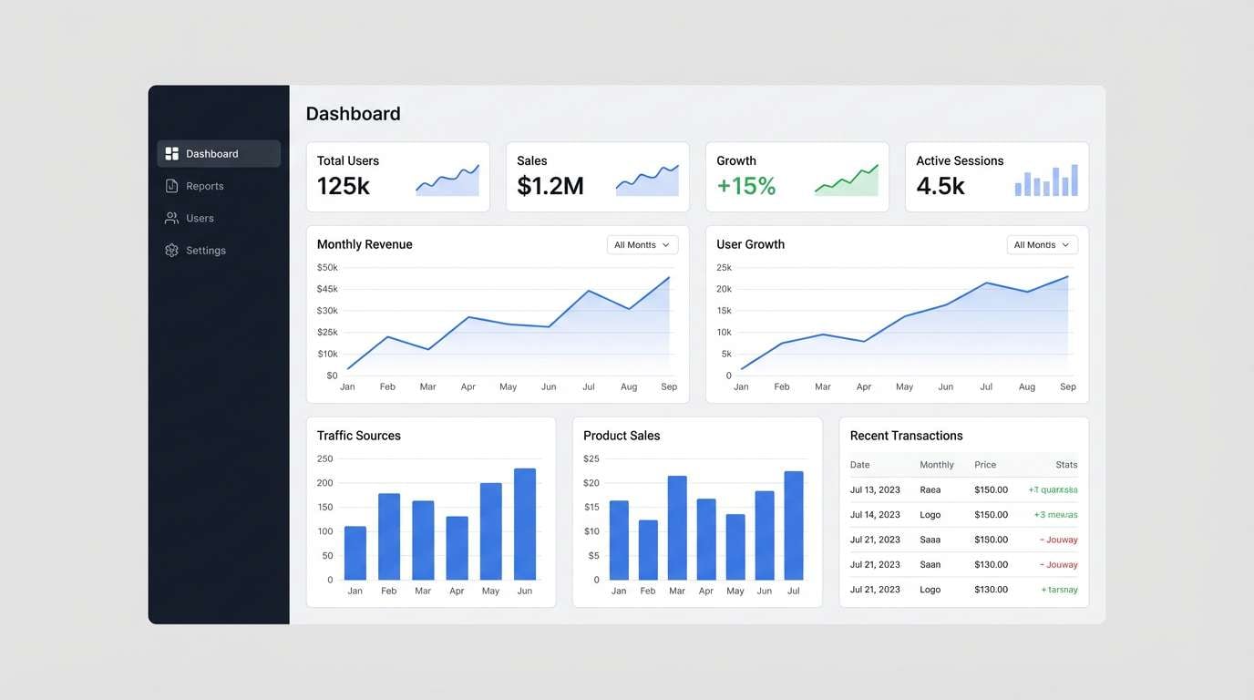
Calm and modern like a windy pier with deep water and graphite railings. The dark blue anchors navigation, while teal and sea-mist tones keep charts readable without glare. Pair with crisp white space and one warm accent (like amber) for alerts. Usage tip: reserve the near-black graphite for headings and key numbers to improve scan speed.
Image example of seaside graphite generated using media.io
Media.io is an online AI studio for creating and editing video, image, and audio in your browser.

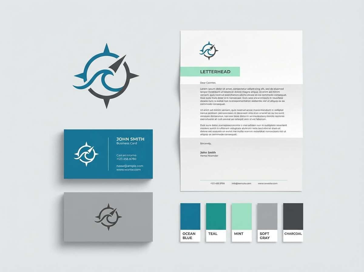
2) Mint Harbor
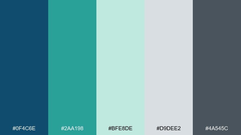
HEX: #0f4c6e #2aa198 #bfe8de #d9dee2 #4a545c
Mood: fresh and welcoming
Best for: wellness brand identity
Fresh and welcoming, like mint leaves by cool harbor water on an overcast day. This blue green gray color palette balances a confident ocean blue with a friendly mint lift, grounded by soft grays for typography. Pair with natural textures and uncoated paper for a gentle, premium feel. Usage tip: keep mint as a highlight color (10 to 15 percent) to avoid a washed look.
Image example of mint harbor generated using media.io
3) Slate Lagoon
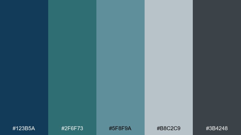
HEX: #123b5a #2f6f73 #5f8f9a #b8c2c9 #3b4248
Mood: steady and refined
Best for: corporate website
Steady and refined, like a quiet lagoon framed by slate cliffs. The mid-teal and blue support strong hierarchy for headers, buttons, and link states, while the cool grays keep pages looking professional. Pair with simple photography and thin-line icons to maintain the clean rhythm. Usage tip: use the lighter gray as section backgrounds so content blocks feel structured without heavy borders.
Image example of slate lagoon generated using media.io
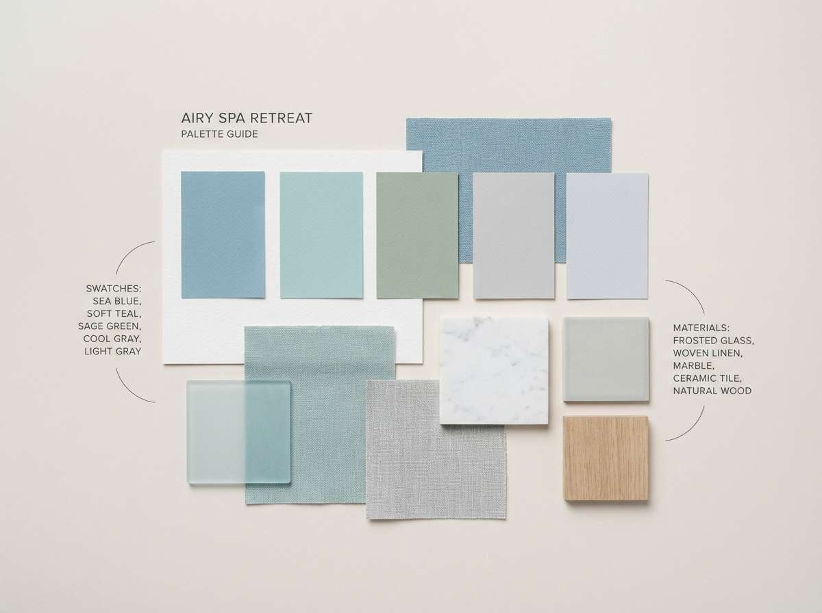
4) Arctic Sage
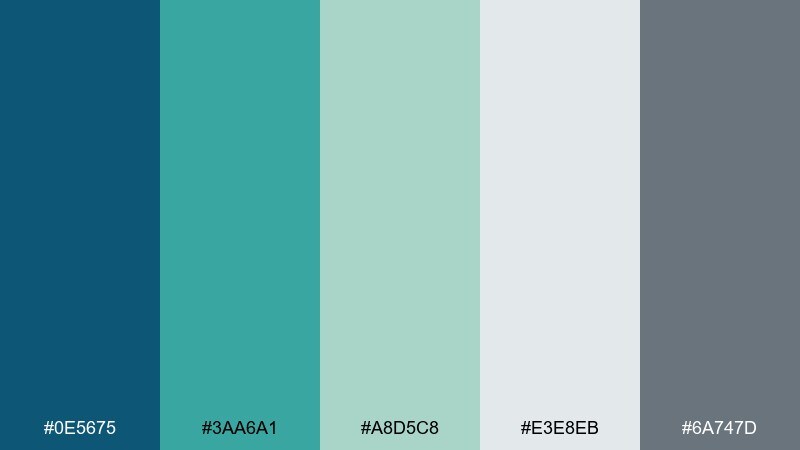
HEX: #0e5675 #3aa6a1 #a8d5c8 #e3e8eb #6a747d
Mood: airy and soothing
Best for: spa interior palette guide
Airy and soothing, like sage steam drifting through an arctic-blue morning. Soft mint and pale gray create a clean base for walls and linens, while the deeper blue keeps signage and wayfinding legible. Pair with light oak, brushed nickel, and matte white ceramics. Usage tip: repeat the sage tone in small textiles to unify the room without repainting.
Image example of arctic sage generated using media.io
5) Copper Kelp
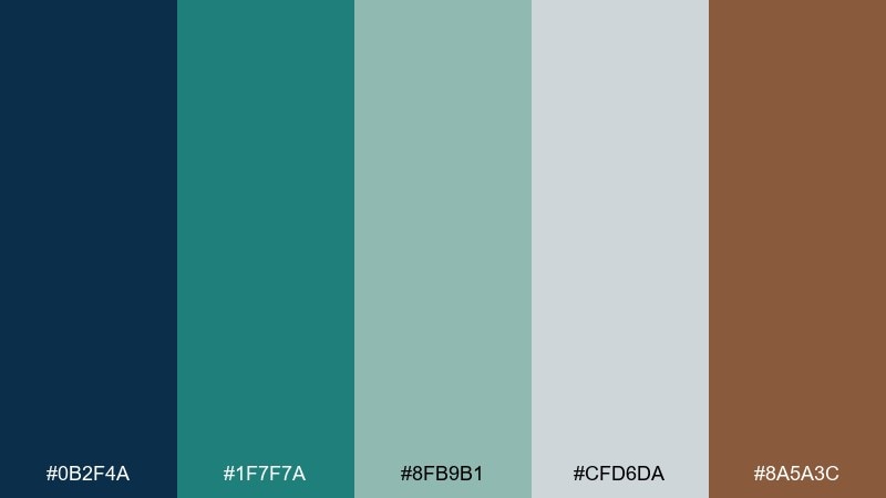
HEX: #0b2f4a #1f7f7a #8fb9b1 #cfd6da #8a5a3c
Mood: coastal and grounded
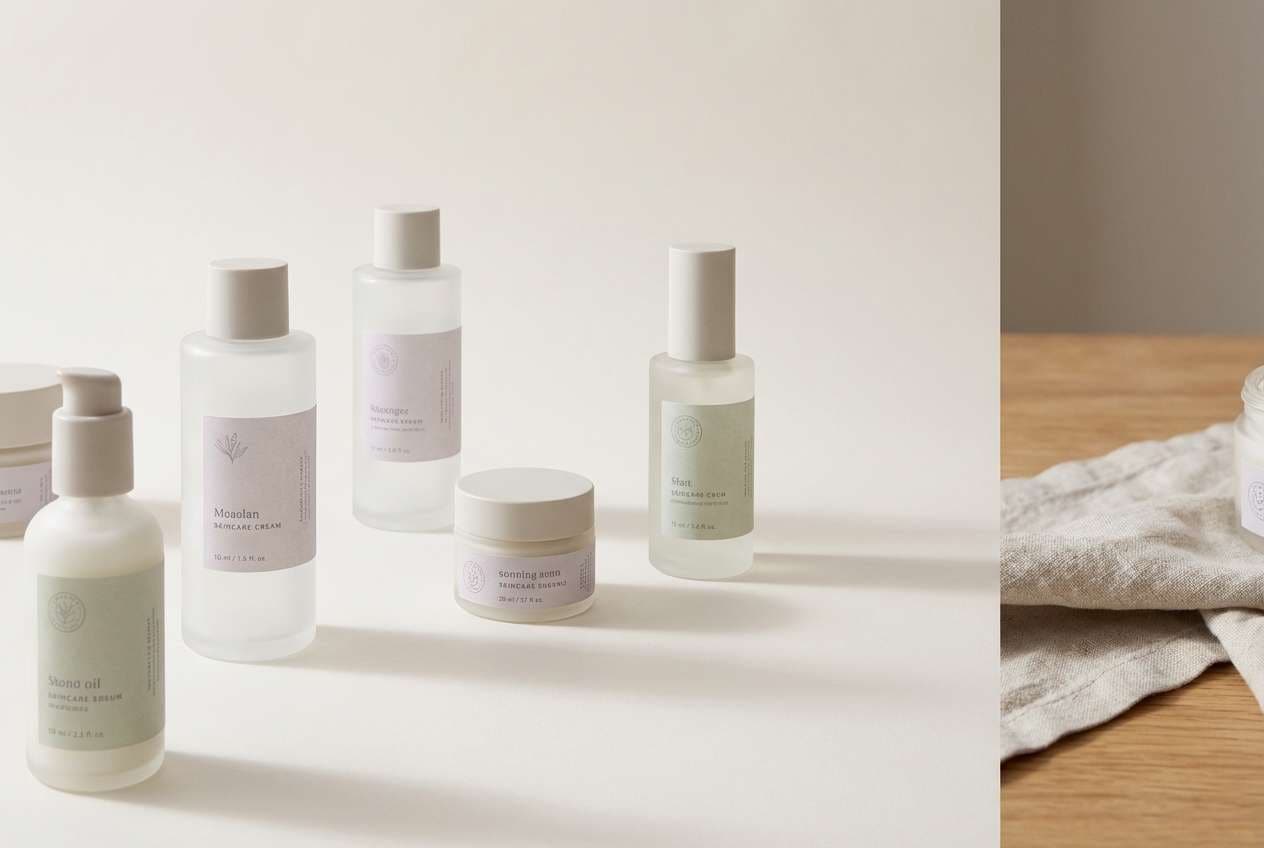
Best for: product packaging for skincare
Coastal and grounded, like kelp beds against rocks with a hint of sun-warmed copper. The teal and blue feel clean and aquatic, while the copper-brown adds a human warmth that suits personal care. Pair with minimal sans-serif type and plenty of negative space for a modern shelf look. Usage tip: print copper as a spot foil or ink to elevate the premium signal.
Image example of copper kelp generated using media.io
6) Rainy Boardwalk
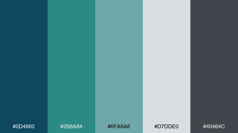
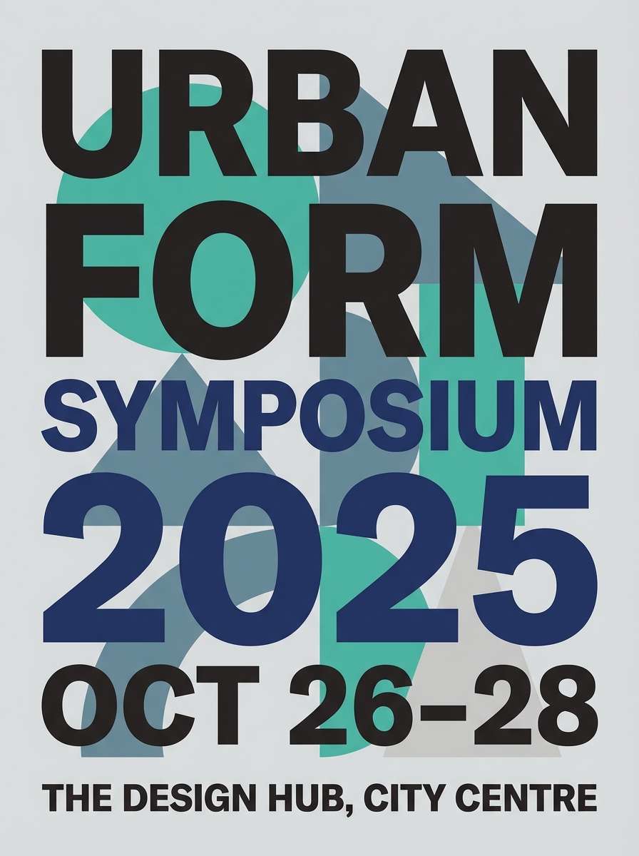
HEX: #0d4860 #2b8a84 #6fa8a8 #d7dde0 #40464c
Mood: moody and clean
Best for: event poster design
Moody and clean, like wet planks reflecting harbor lights after rain. These blue green gray color combinations work well for posters that need atmosphere without sacrificing readability. Pair with bold condensed type and simple geometric shapes for instant hierarchy. Usage tip: set body text in the mid-gray and reserve the dark slate for titles and dates.
Image example of rainy boardwalk generated using media.io
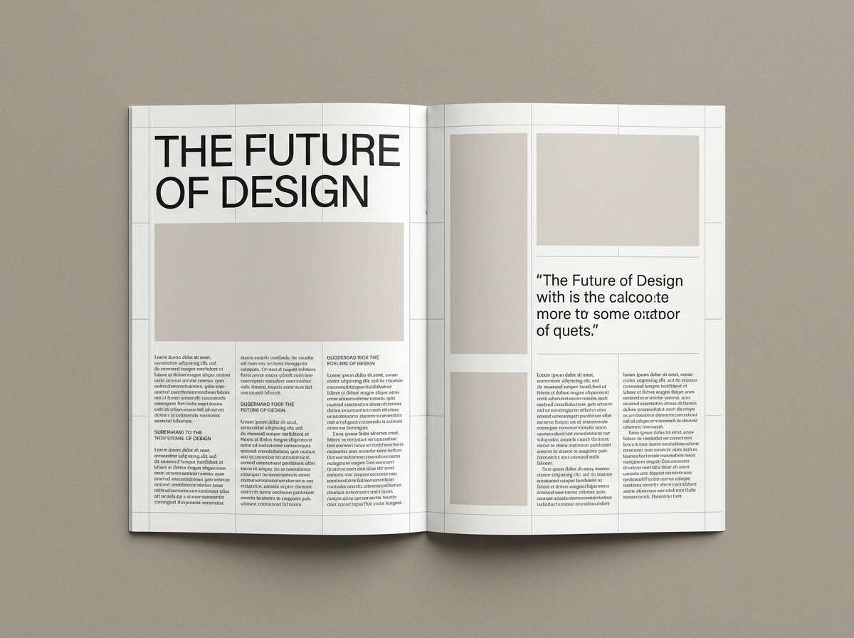
7) Foggy Fjord
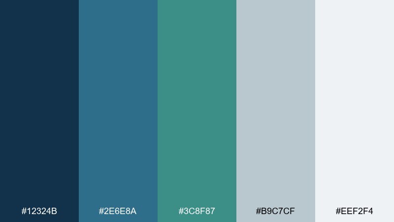
HEX: #12324b #2e6e8a #3c8f87 #b9c7cf #eef2f4
Mood: misty and spacious
Best for: editorial magazine spread
Misty and spacious, like a fjord disappearing into low cloud. The pale gray-white opens up layouts, while blue and teal build a calm visual cadence across headlines and pull quotes. Pair with serif headings and muted photography for a premium editorial tone. Usage tip: keep teal for section markers so navigation feels intuitive across pages.
Image example of foggy fjord generated using media.io
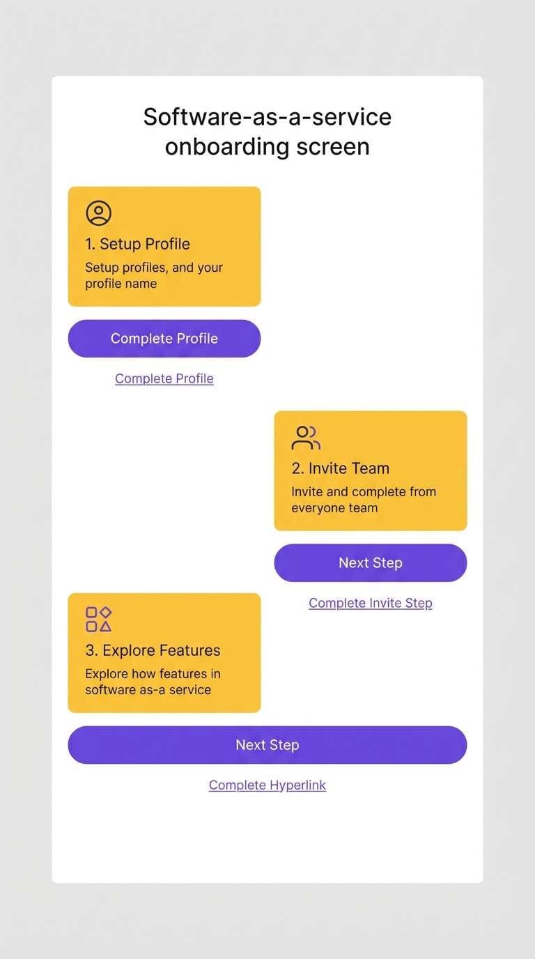
8) Eucalyptus Steel
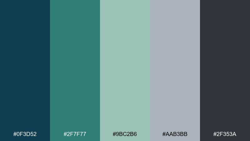
HEX: #0f3d52 #2f7f77 #9bc2b6 #aab3bb #2f353a
Mood: practical and serene
Best for: SaaS onboarding screens
Practical and serene, like eucalyptus leaves against brushed steel. The mix of deep blue and teal supports clear CTAs, and the cool grays keep forms feeling lightweight. Pair with rounded components and generous spacing for a friendly product tone. Usage tip: use the steel-gray for input borders and the dark blue for primary buttons to avoid teal overuse.
Image example of eucalyptus steel generated using media.io
9) Nautical Concrete
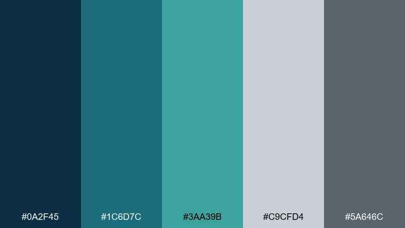
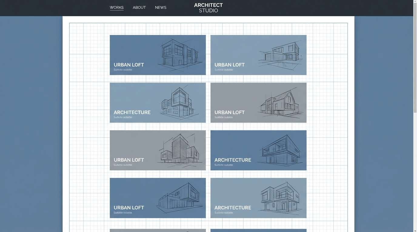
HEX: #0a2f45 #1c6d7c #3aa39b #c9cfd4 #5a646c
Mood: urban and nautical
Best for: architecture portfolio site
Urban and nautical, like blue water beside concrete docks. The cool neutrals highlight photography, while teal adds a crisp modern accent for hover states and section labels. Pair with black-and-white project images and a minimalist grid. Usage tip: keep the concrete gray as the dominant background so the teal reads as intentional, not decorative.
Image example of nautical concrete generated using media.io
10) Glacier Moss
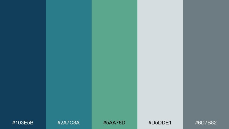
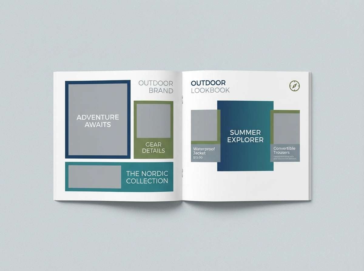
HEX: #103e5b #2a7c8a #5aa78d #d5dde1 #6d7b82
Mood: crisp and natural
Best for: outdoor brand lookbook
Crisp and natural, like glacier melt running past mossy stone. This set reads adventurous without going neon, making it ideal for clean lookbook layouts and product callouts. As a blue green gray color scheme, it pairs especially well with recycled textures, kraft paper notes, and high-contrast outdoor photography. Usage tip: place moss green on badges and icons to guide attention without competing with images.
Image example of glacier moss generated using media.io
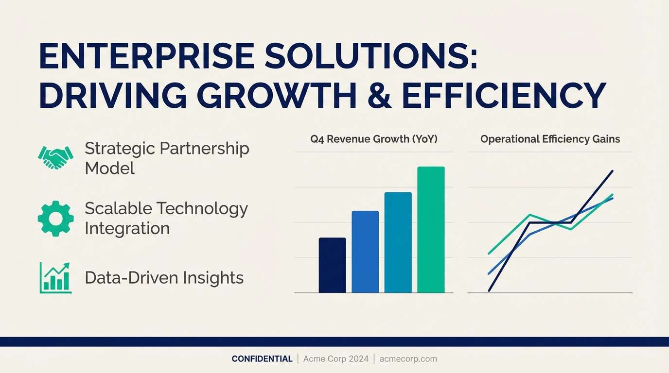
11) Blue Spruce Office
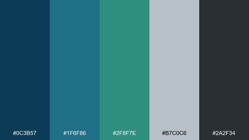
HEX: #0c3b57 #1f6f86 #2f8f7e #b7c0c6 #2a2f34
Mood: focused and trustworthy
Best for: B2B pitch deck
Focused and trustworthy, like blue spruce needles in a tidy office. The darker hues feel authoritative for titles and charts, while the soft gray keeps slides breathable. Pair with simple data viz and plenty of margin so content feels confident. Usage tip: use teal for one data series consistently across the deck to build recognition.
Image example of blue spruce office generated using media.io
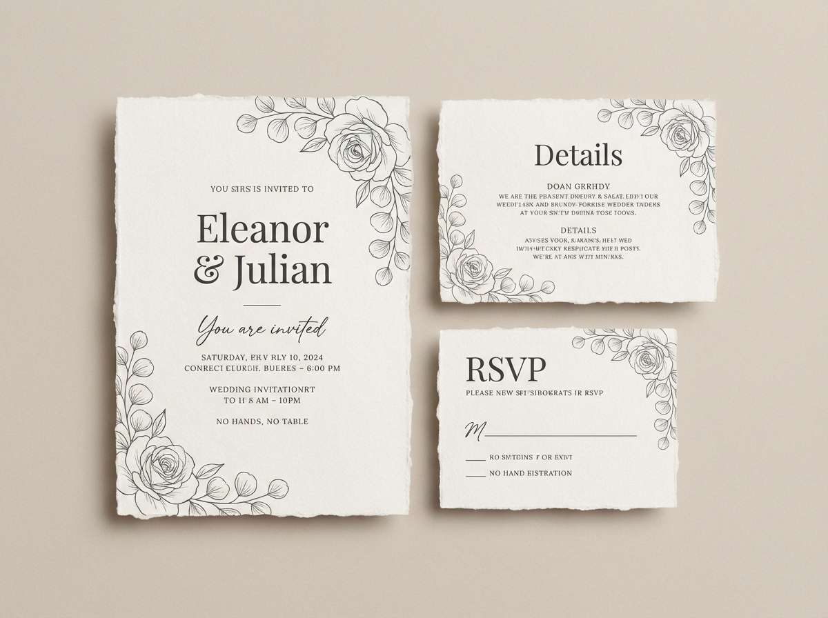
12) Soft Tidepaper
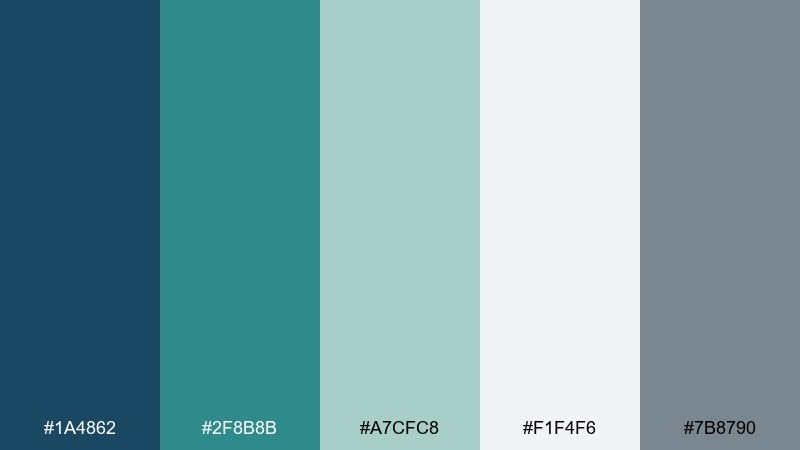
HEX: #1a4862 #2f8b8b #a7cfc8 #f1f4f6 #7b8790
Mood: gentle and airy
Best for: wedding invitation suite
Gentle and airy, like tide-washed paper with sea glass tucked inside. The pale background keeps the suite elegant, while teal and blue add just enough color for monograms and borders. Pair with deckle-edge textures or subtle watercolor washes for a romantic finish. Usage tip: print the darkest tone only for names and key details to preserve softness.
Image example of soft tidepaper generated using media.io
13) Industrial Seafoam
HEX: #0d3c54 #1d7a82 #7fc6c1 #c0c8ce #3d4349
Mood: edgy yet approachable
Best for: tech startup landing page
Edgy yet approachable, like seafoam paint on an industrial door. The bright aqua lifts CTAs and micro-interactions, while the slate and charcoal keep the page feeling serious. Pair with bold geometric illustrations and light gradients for a modern tech look. Usage tip: keep aqua to buttons and links only, and let gray carry the long-form text.
Image example of industrial seafoam generated using media.io
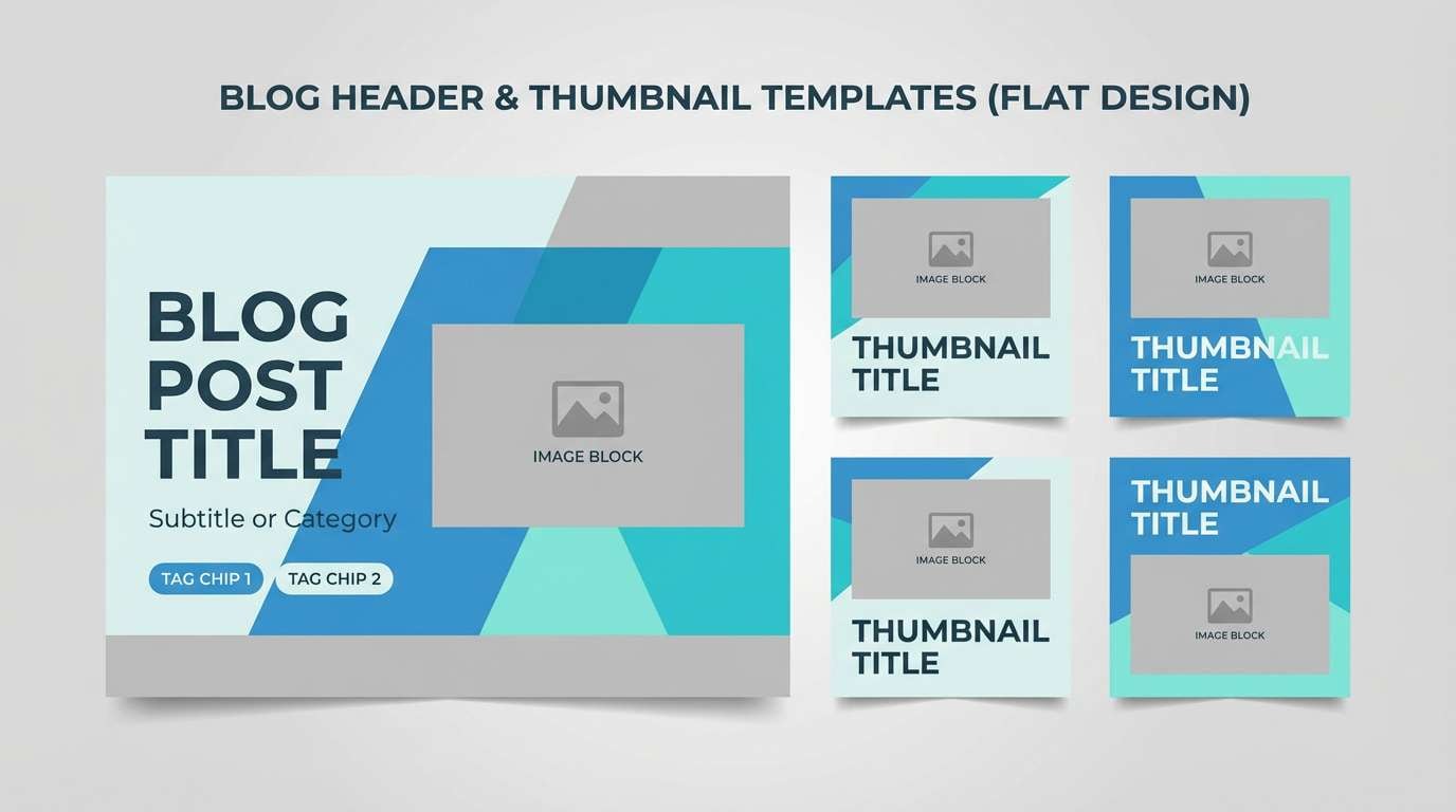
14) Pebble Bay
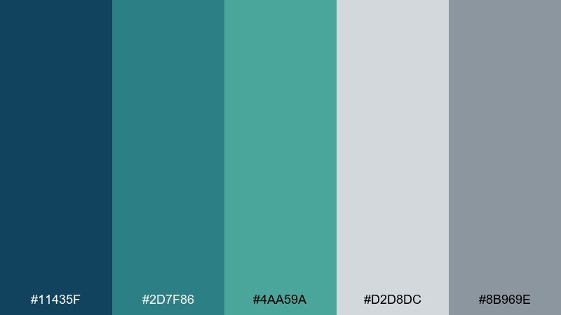
HEX: #11435f #2d7f86 #4aa59a #d2d8dc #8b969e
Mood: balanced and friendly
Best for: blog header and thumbnails
Balanced and friendly, like smooth pebbles under clear bay water. The medium tones make it easy to create consistent thumbnail frames, tags, and category colors without harsh contrast. Pair with warm photography and simple overlays for readable titles. Usage tip: use the light gray as a subtle gradient base to unify mixed images.
Image example of pebble bay generated using media.io
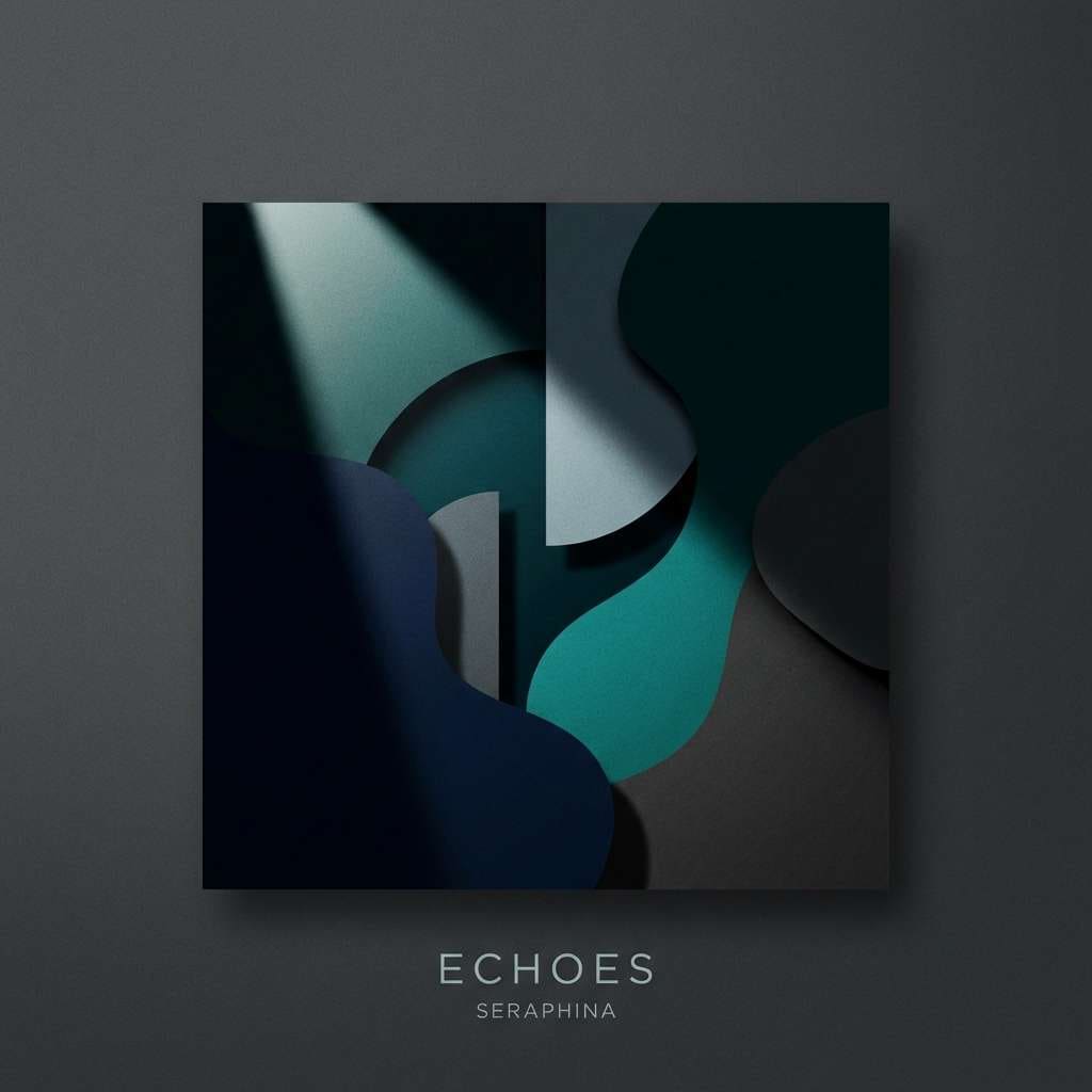
15) Deep Teal Charcoal
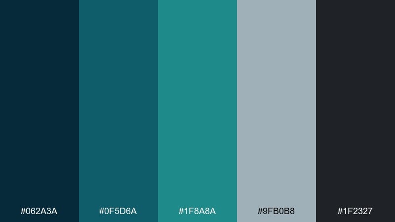
HEX: #062a3a #0f5d6a #1f8a8a #9fb0b8 #1f2327
Mood: bold and cinematic
Best for: music album cover artwork
Bold and cinematic, like deep teal light cutting through charcoal fog. These blue green gray color combinations shine on cover art where you want mood first and details second. Pair with high-contrast photography and minimal type for a striking, contemporary finish. Usage tip: keep text in the pale steel tone to avoid vibrating edges against the dark base.
Image example of deep teal charcoal generated using media.io
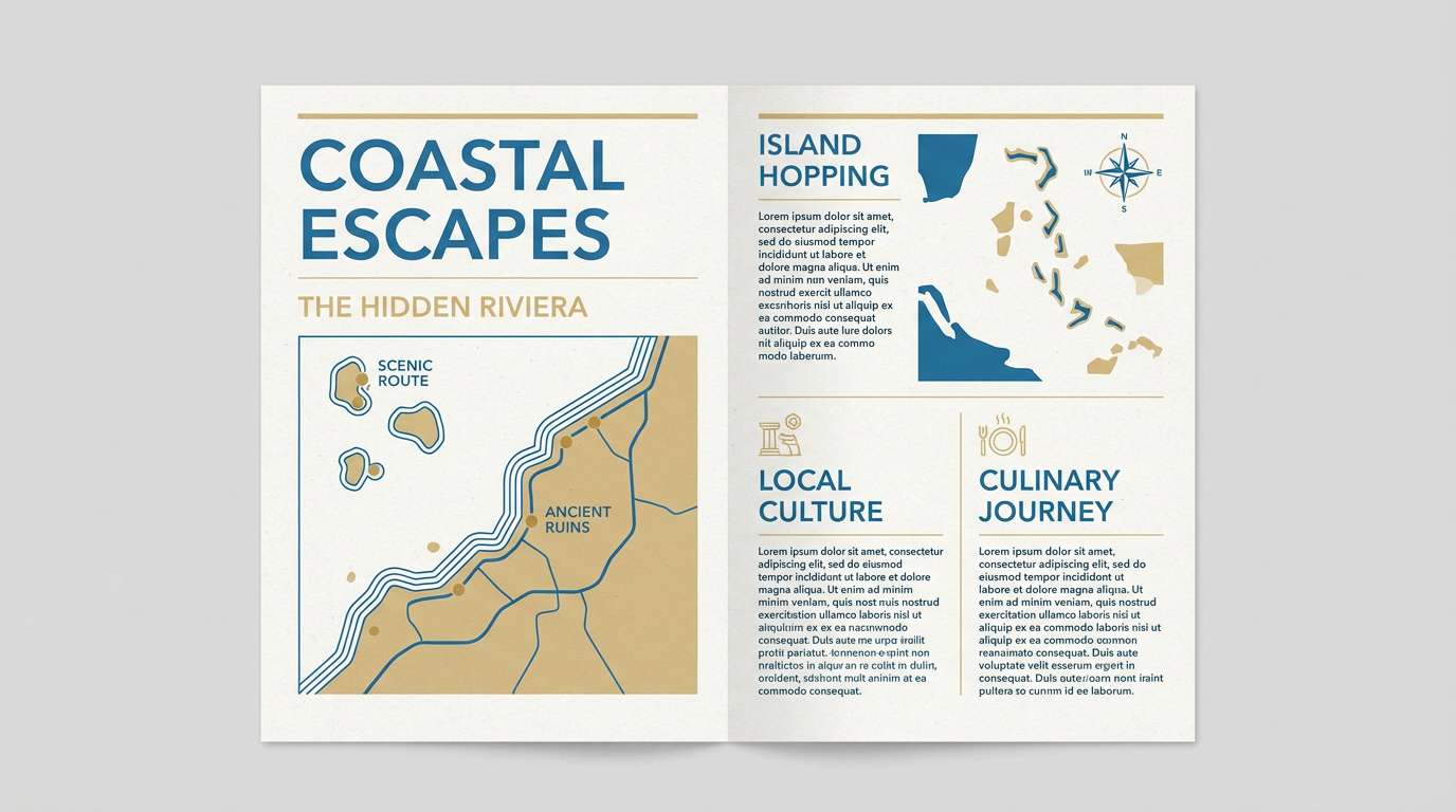
16) Winter Poolside
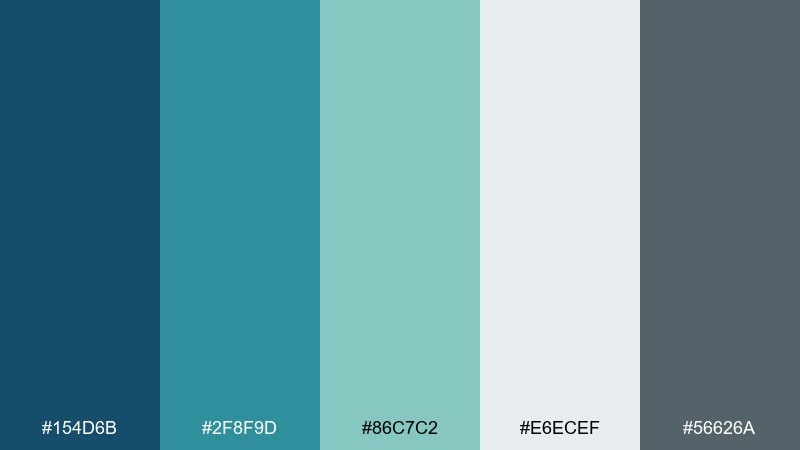
HEX: #154d6b #2f8f9d #86c7c2 #e6ecef #56626a
Mood: cool and optimistic
Best for: travel brochure layout
Cool and optimistic, like a heated pool on a winter morning. The light gray keeps pages bright, while the teal range adds an inviting vacation vibe without feeling tropical. Pair with clean sans-serif type and wide margins for an upscale brochure feel. Usage tip: use the mid-teal for section dividers so readers can skim quickly.
Image example of winter poolside generated using media.io
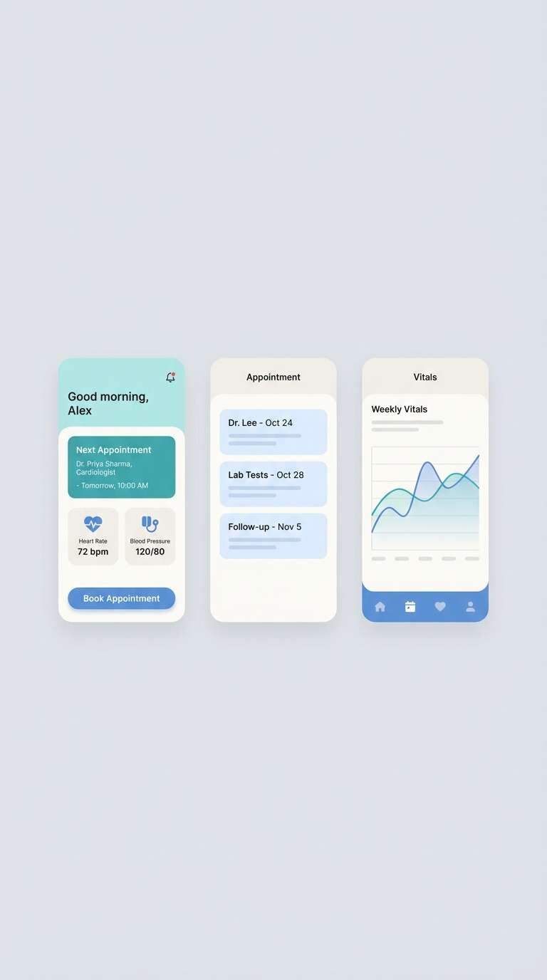
17) Coastal Clinic
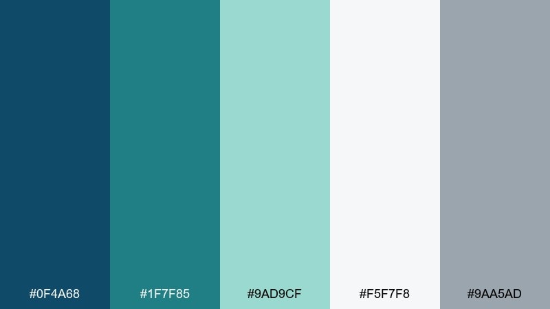
HEX: #0f4a68 #1f7f85 #9ad9cf #f5f7f8 #9aa5ad
Mood: clean and reassuring
Best for: healthcare app UI
Clean and reassuring, like a bright clinic with a view of calm water. The soft aqua feels caring for status states and supportive UI, while the blue brings trust to primary actions. Pair with rounded UI components and high-contrast iconography for accessibility. Usage tip: keep success messages in aqua and reserve teal for interactive elements so states are distinct.
Image example of coastal clinic generated using media.io
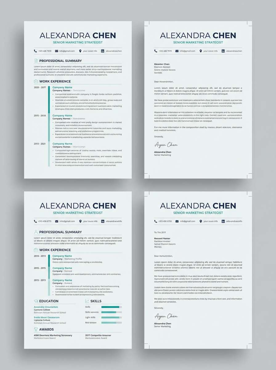
18) Riverstone Minimal
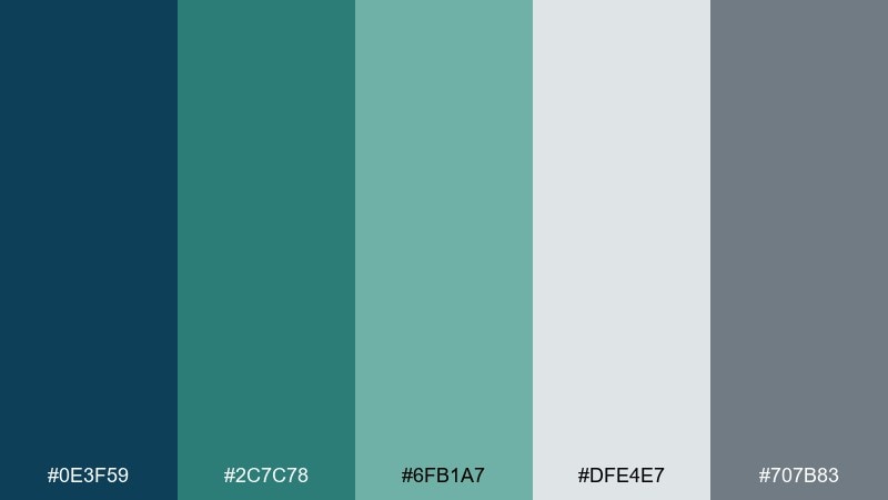
HEX: #0e3f59 #2c7c78 #6fb1a7 #dfe4e7 #707b83
Mood: quiet and minimalist
Best for: resume and cover letter template
Quiet and minimalist, like riverstones lined up on a cool shore. The restrained colors keep typography in charge, and the teal adds a subtle signature for section headers. Pair with a single modern type family and thin rules for structure. Usage tip: apply teal only to headings and small icons so the page prints cleanly in grayscale too.
Image example of riverstone minimal generated using media.io
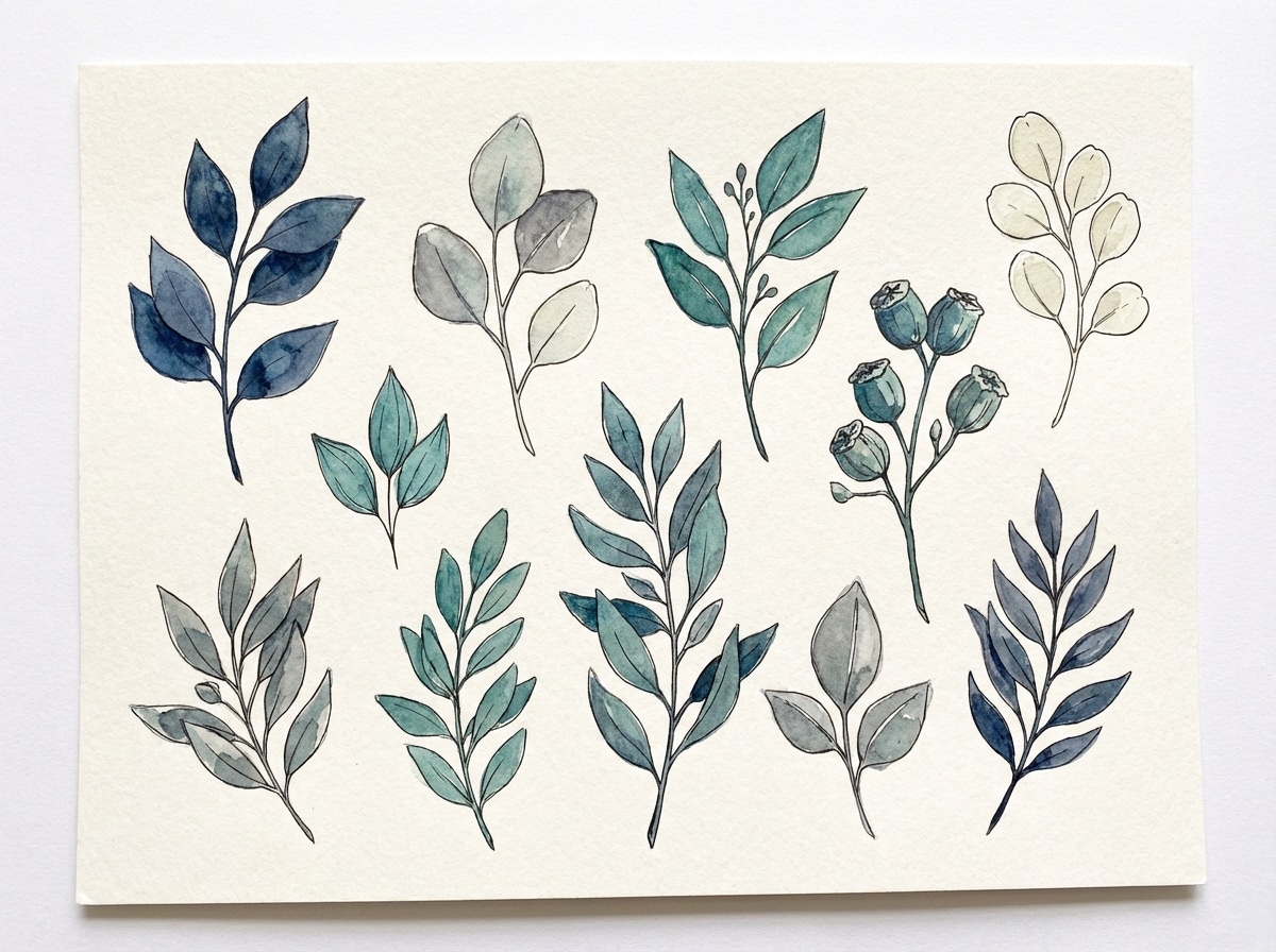
19) Stormlight Botanical
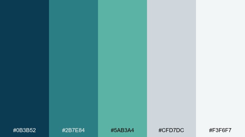
HEX: #0b3b52 #2b7e84 #5ab3a4 #cfd7dc #f3f6f7
Mood: fresh and artistic
Best for: botanical illustration set
Fresh and artistic, like stormlight breaking over a greenhouse. The teal-green range feels lively for leaves and stems, while the cool grays keep the composition airy and modern. Pair with delicate linework and soft watercolor washes for a natural, contemporary style. Usage tip: limit the darkest blue to shadows so the botanicals stay light and transparent.
Image example of stormlight botanical generated using media.io
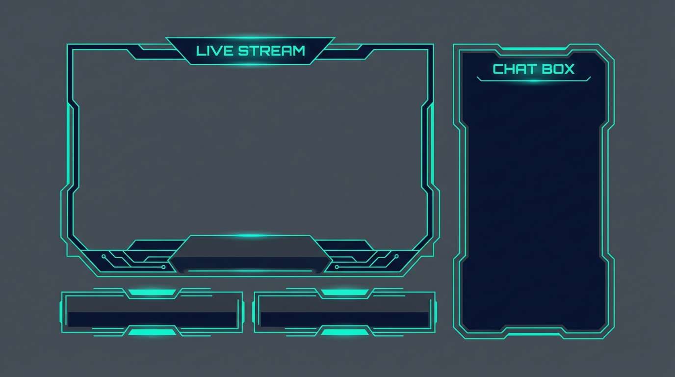
20) Night Pier Neon
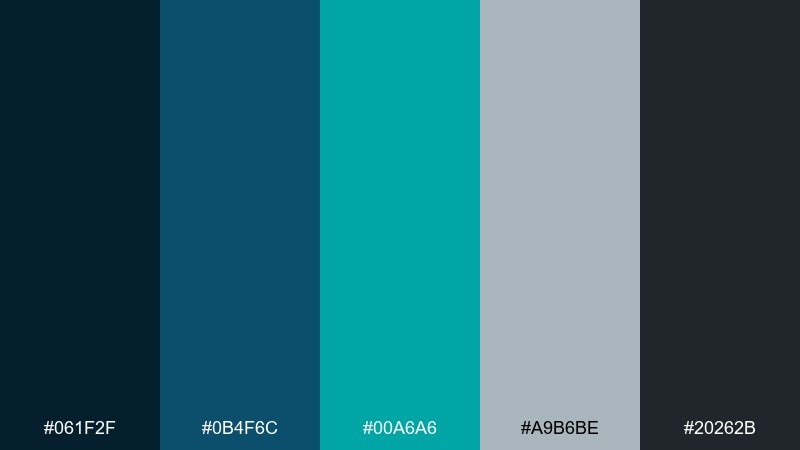
HEX: #061f2f #0b4f6c #00a6a6 #a9b6be #20262b
Mood: electric and sleek
Best for: gaming stream overlay
Electric and sleek, like neon signage glowing over a night pier. High contrast between near-black and bright teal makes alerts, labels, and timers pop without clutter. Pair with subtle gradients and sharp sans-serif type for a competitive vibe. Usage tip: keep the neon teal to key UI elements only so it stays impactful throughout a long stream.
Image example of night pier neon generated using media.io
What Colors Go Well with Blue Green Gray?
Warm accents are the easiest way to add contrast to a blue green gray palette. Try amber, terracotta, copper, or muted coral for buttons, highlights, badges, or print spot elements.
For a clean, modern direction, pair these tones with crisp white, soft off-white, or a pale cool gray. This keeps layouts airy and helps teal details look intentional rather than overpowering.
If you want a darker, more cinematic look, add charcoal and near-black plus a single bright teal for emphasis. This combo works especially well for overlays, hero sections, and album-style graphics.
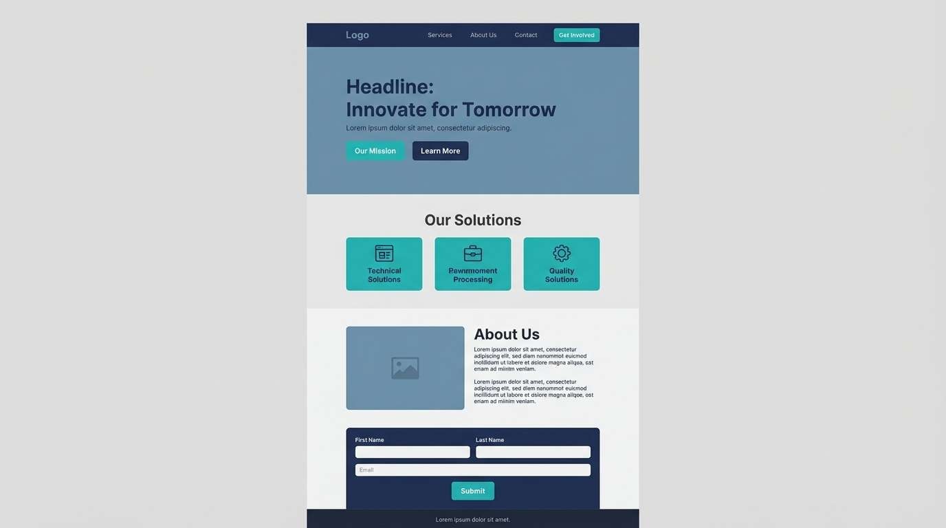
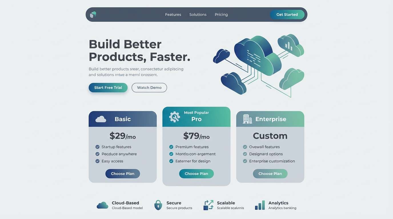
How to Use a Blue Green Gray Color Palette in Real Designs
Start by assigning roles: choose one deep blue/charcoal as the anchor (navigation, headers), one teal as the interactive accent (links, CTAs), and let light grays carry backgrounds and spacing. This keeps hierarchy consistent across screens or pages.
In UI, ensure readability by reserving saturated teal for small areas and using grays for long-form text. In print, consider slightly warmer paper whites to prevent the palette from feeling too cold.
For branding and interiors, repeat one signature teal across touchpoints (labels, signage, textiles) and keep the rest neutral. The repetition creates cohesion even when photography and materials change.
Create Blue Green Gray Palette Visuals with AI
If you already have HEX codes, you can quickly visualize them in layouts like dashboards, posters, brand boards, and invitation suites. Generating a few variations also helps you test contrast and vibe before committing to a final direction.
With Media.io’s text-to-image tools, you can describe your design (format, style, and palette) and get polished concept visuals in minutes. It’s a fast way to validate a blue green gray color scheme for UI, print, or marketing.
Use the button below to start creating blue green gray palette visuals for free.
Blue Green Gray Color Palette FAQs
-
What does a blue green gray color palette communicate?
It usually communicates calm, trust, cleanliness, and modern professionalism. Blue adds reliability, teal adds freshness and clarity, and gray stabilizes the whole look so it feels contemporary rather than playful. -
Is blue green gray a good palette for UI design?
Yes—especially for dashboards, healthcare apps, and SaaS products—because cool grays create readable structure while teal can be reserved for interactions and states. The key is to avoid using saturated teal as a large background, which can reduce legibility. -
How do I pick an accent color for a blue green gray scheme?
Choose one warm contrasting accent like amber, copper, terracotta, or muted coral for alerts and highlights. A warm accent prevents the palette from feeling too cold and improves visual hierarchy without adding many extra colors. -
What neutrals work best with teal blue gray combinations?
Crisp white, off-white, and cool light grays work best for clean layouts, while charcoal and near-black are great for a cinematic style. Keep one neutral dominant so the teal reads as a deliberate accent. -
How can I keep blue green gray designs from looking flat?
Use tonal separation: a very light gray background, a mid-gray for borders and secondary text, and one dark anchor for headings. Then add teal in small, high-impact areas (buttons, icons, tags) plus subtle texture or photography to add depth. -
Do these palettes print well?
They can print beautifully, but cool tones may shift depending on paper and ink. For print projects, proof the teal and blue on the intended stock, and consider using an off-white base to keep the result softer and less clinical. -
Can I generate mockups using these HEX codes?
Yes—use the palette HEX values in your prompt and describe the format you need (e.g., “landing page UI,” “poster,” “brand identity board”). Media.io can generate concept images so you can compare variations before final production.


