

Gray dark blue palettes sit right in the sweet spot between modern neutral and deep, confident color. They read clean in UI, feel premium in branding, and stay calm and composed in interiors.
From concrete-inspired grays to inky navy accents, these schemes are easy to scale across backgrounds, typography, and supporting elements—without losing contrast or clarity.
In this article
- Why Gray Dark Blue Palettes Work So Well
-
- stormy concrete
- midnight harbor
- slate & silver
- denim office
- winter asphalt
- inkbound minimal
- coastal dusk
- graphite blossom
- steel blueprints
- museum night
- clouded navy
- industrial chic
- quiet observatory
- nordic workday
- charcoal lavender
- rainy commute
- deep sea metro
- smoky sapphire
- fog & fjord
- nightshift dashboard
- What Colors Go Well with Gray Dark Blue?
- How to Use a Gray Dark Blue Color Palette in Real Designs
- Create Gray Dark Blue Palette Visuals with AI
Why Gray Dark Blue Palettes Work So Well
Gray and dark blue create a naturally balanced contrast: gray brings neutrality and structure, while dark blue adds depth and authority. Together, they feel modern without becoming sterile.
These palettes are also flexible across mediums. On screens, navy-leaning dark blues support readable typography and accessible UI states; in print, cool grays keep layouts crisp and consistent.
Because the hues are restrained, you can introduce a single accent (like copper, coral, or neon green) and instantly create hierarchy—without fighting the base scheme.
20+ Gray Dark Blue Color Palette Ideas (with HEX Codes)
1) Stormy Concrete
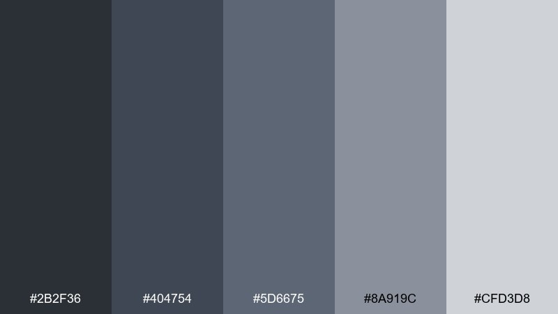
HEX: #2b2f36 #404754 #5d6675 #8a919c #cfd3d8
Mood: urban, calm, grounded
Best for: modern interior design moodboards
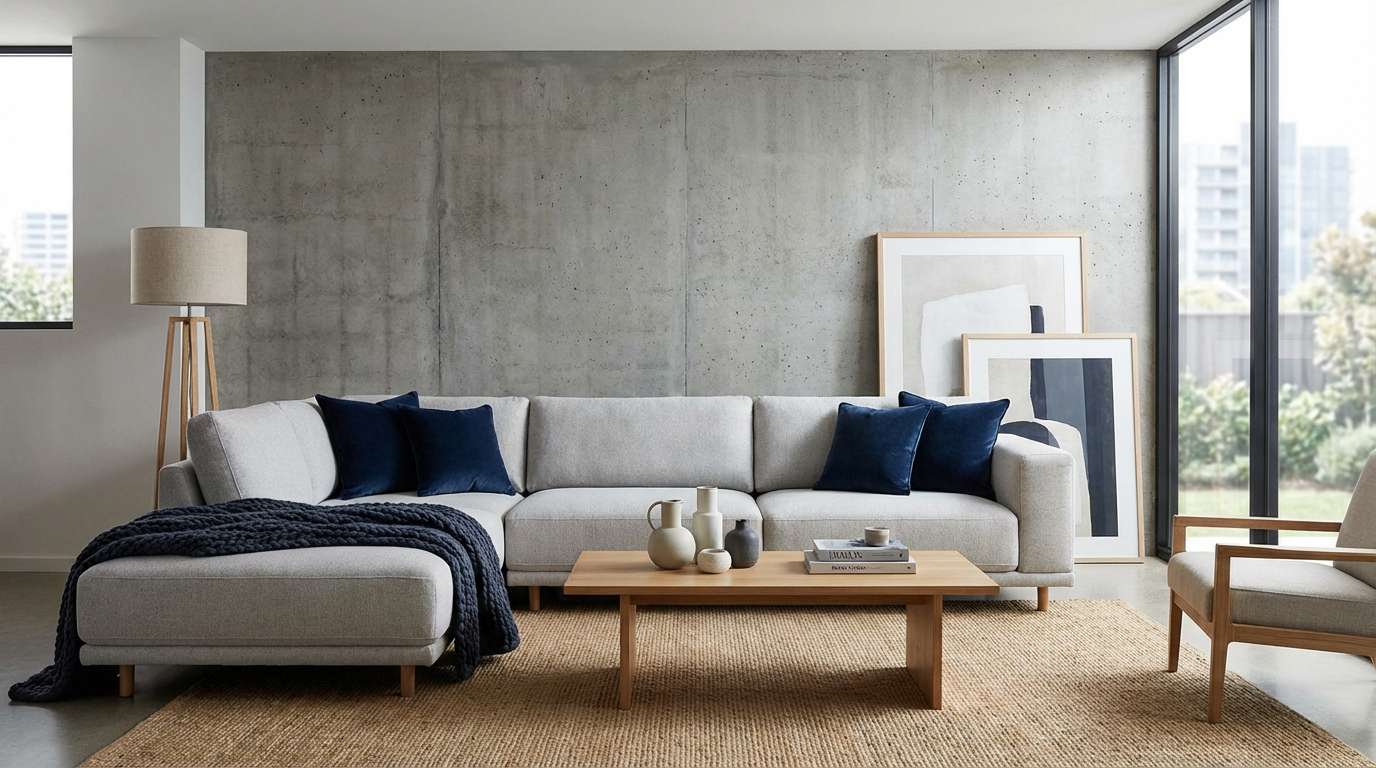
Cool, rain-washed concrete and midnight shadows set a calm, urban tone. The mix reads refined without feeling cold, especially when you add warm wood or brushed brass. Use this gray dark blue color palette for living rooms, office spaces, or architecture presentations where clarity matters. Tip: keep the lightest gray as the main surface color, then reserve the deep navy for trims and focal pieces.
Image example of stormy concrete generated using media.io
Media.io is an online AI studio for creating and editing video, image, and audio in your browser.

2) Midnight Harbor
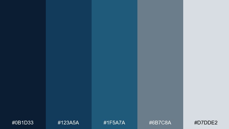
HEX: #0b1d33 #123a5a #1f5a7a #6b7c8a #d7dde2
Mood: nautical, cinematic, confident
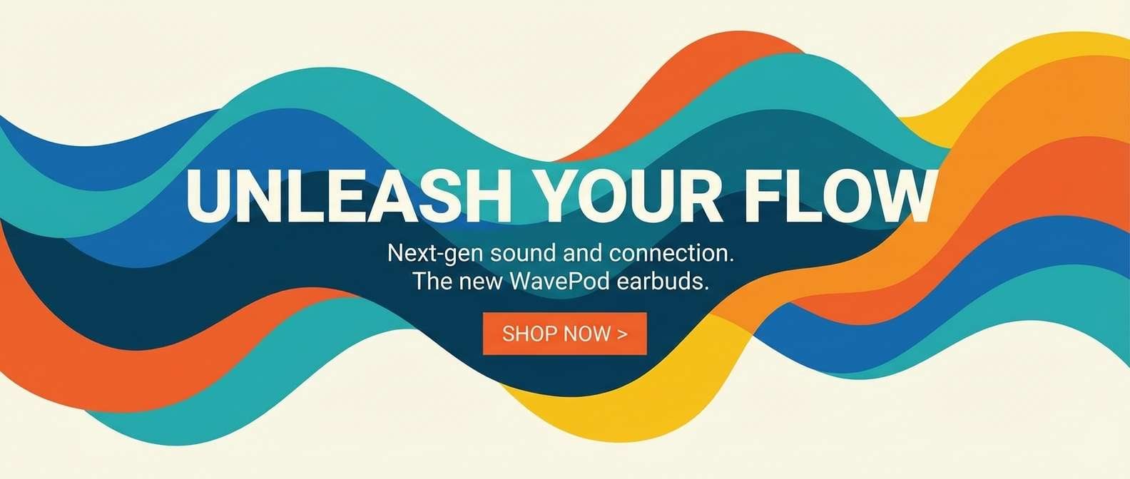
Best for: brand hero banners and landing pages
Inky water, dock lights, and a crisp horizon give this set a cinematic edge. It shines on hero sections, where deep blues can carry the headline while cool grays keep the layout clean. Pair with a single warm accent like copper or coral for instant contrast. Tip: use the pale gray for body text backgrounds to avoid a heavy, dark page.
Image example of midnight harbor generated using media.io

3) Slate & Silver
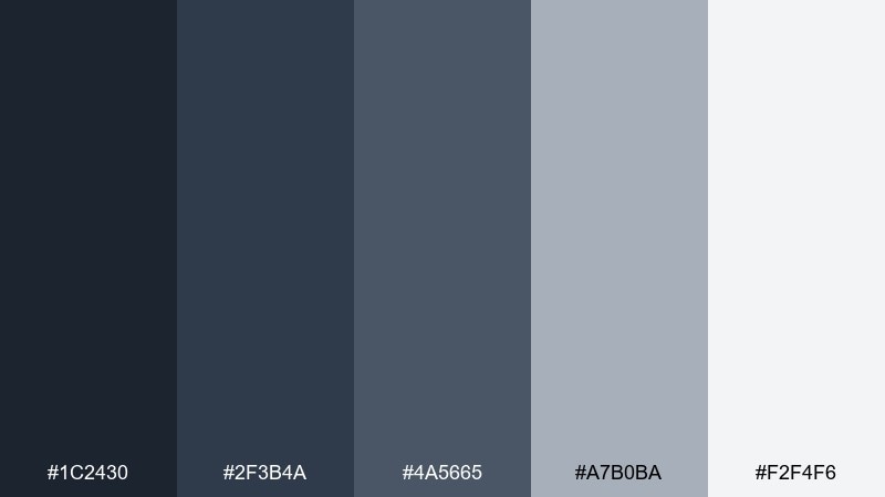
HEX: #1c2430 #2f3b4a #4a5665 #a7b0ba #f2f4f6
Mood: polished, minimal, professional
Best for: corporate slide decks and reports
Smooth slate and soft silver feel like a well-tailored suit under cool office lighting. The tones keep charts, tables, and dense copy readable without looking bland. Add a restrained accent color like teal or gold for callouts and section breaks. Tip: reserve the darkest shade for headings and key numbers to create instant hierarchy.
Image example of slate & silver generated using media.io
4) Denim Office
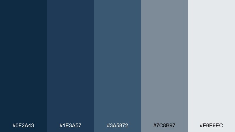
HEX: #0f2a43 #1e3a57 #3a5872 #7c8b97 #e6e9ec
Mood: approachable, modern, dependable
Best for: SaaS UI and settings screens
Clean denim blues with soft gray neutrals feel friendly and productive. The contrast range supports clear UI states, from navigation to subtle dividers. Pair with a bright action color like lime or cyan for primary buttons. Tip: use the mid-tone blue for selected states so the darkest shade stays available for accessibility-heavy text.
Image example of denim office generated using media.io
5) Winter Asphalt
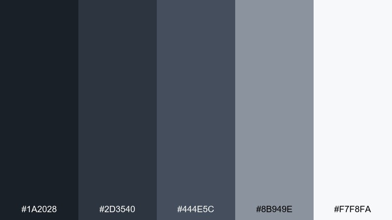
HEX: #1a2028 #2d3540 #444e5c #8b949e #f7f8fa
Mood: crisp, cool, understated
Best for: fashion lookbooks and ecommerce photography backdrops
Frosty light on dark asphalt creates a clean, editorial chill. The palette supports product shots and typography without stealing attention from fabrics or silhouettes. Pair with off-white space and a single punchy accent like red for sale tags. Tip: keep shadows slightly bluish to maintain the winter feel across photos.
Image example of winter asphalt generated using media.io
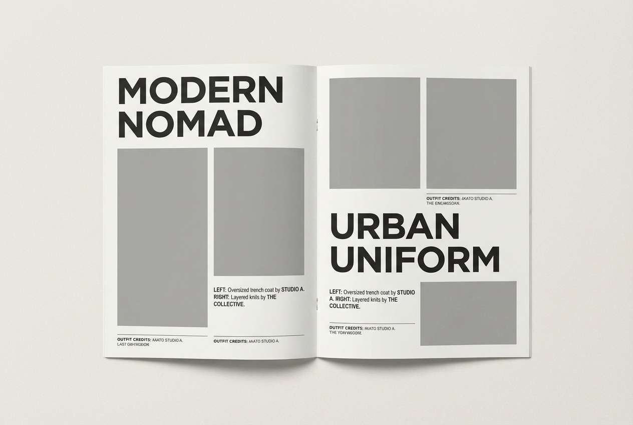
6) Inkbound Minimal
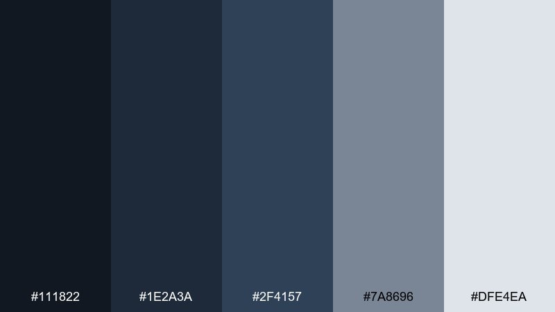
HEX: #111822 #1e2a3a #2f4157 #7a8696 #dfe4ea
Mood: focused, elegant, quiet
Best for: portfolio websites and case studies
Deep ink tones and softened grays feel like a well-lit studio desk at night. The restrained contrast makes long-form case studies easy to scan, especially with strong typographic hierarchy. Pair with a warm neutral like sand to keep the page from feeling too cool. Tip: use the light gray for section backgrounds so images and screenshots pop.
Image example of inkbound minimal generated using media.io
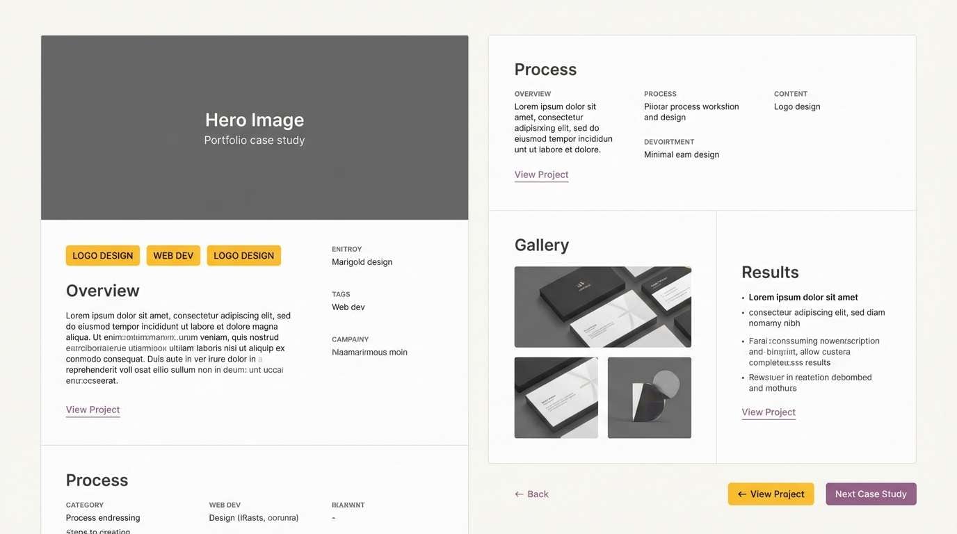
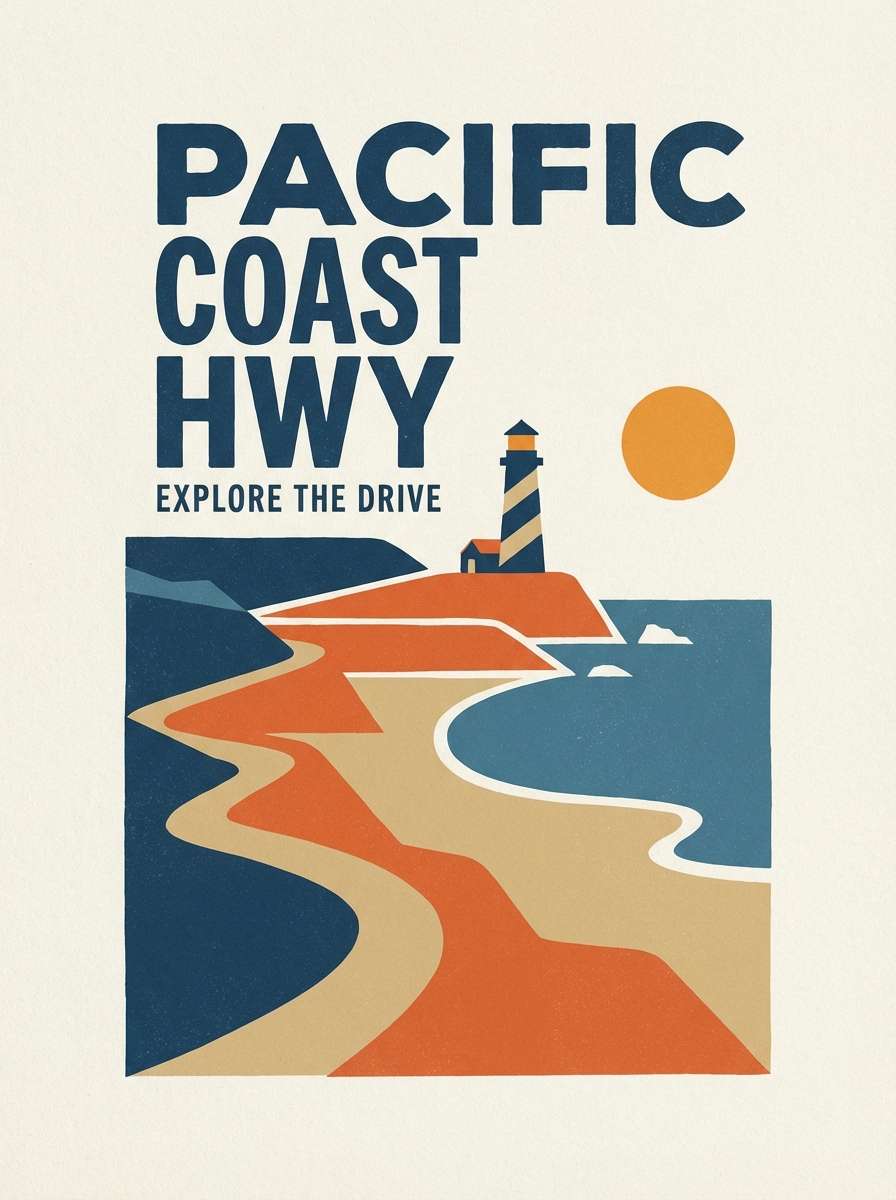
7) Coastal Dusk
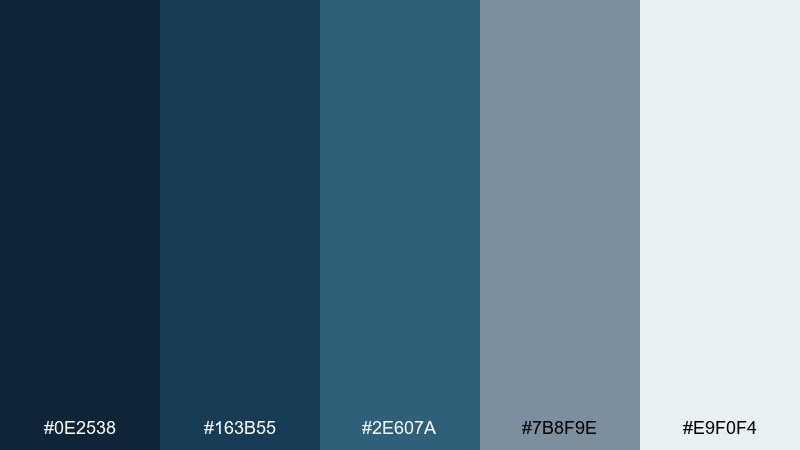
HEX: #0e2538 #163b55 #2e607a #7b8f9e #e9f0f4
Mood: fresh, airy, coastal
Best for: travel posters and destination guides
Sea air and fading sunset blues bring a breezy calm to the page. These gray dark blue color combinations work beautifully for travel graphics, where clarity and mood need to coexist. Pair with sandy beige or sunlit peach for warmth and a hint of nostalgia. Tip: keep the lightest tone as the background to preserve that open-sky feeling.
Image example of coastal dusk generated using media.io
8) Graphite Blossom
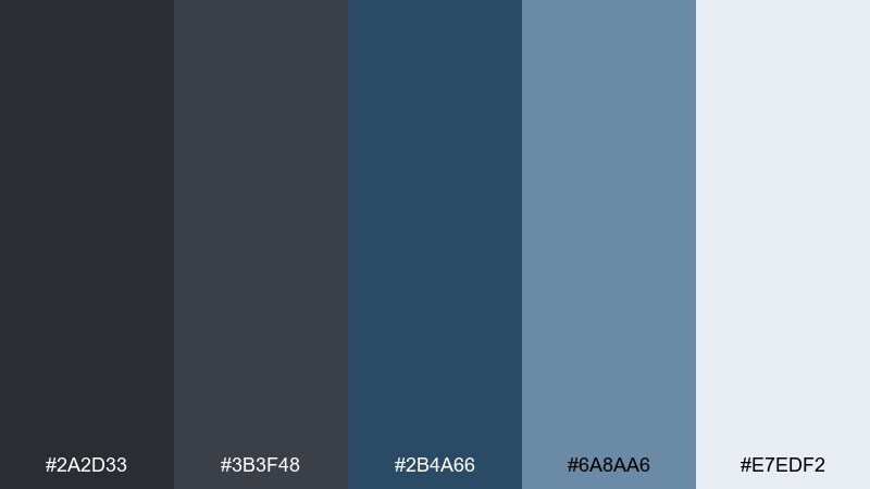
HEX: #2a2d33 #3b3f48 #2b4a66 #6a8aa6 #e7edf2
Mood: moody, soft, artistic
Best for: botanical illustrations and stationery
Smoky graphite with gentle blue petals feels poetic and slightly mysterious. The darker neutrals add depth, while the airy highlight keeps florals from turning heavy. Pair with muted mauve or cream paper textures for a romantic finish. Tip: use the mid blue for linework so the darkest tone can stay reserved for shadows.
Image example of graphite blossom generated using media.io
9) Steel Blueprints
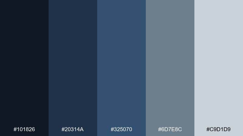
HEX: #101826 #20314a #325070 #6d7e8c #c9d1d9
Mood: technical, precise, modern
Best for: data dashboards and analytics UI
Blueprint blues and steel grays feel sharp, ordered, and quietly futuristic. The value steps support charts, grids, and hover states without visual noise. Pair with a single bright indicator color like neon green for alerts and success states. Tip: keep gridlines in the light gray so the data, not the scaffolding, gets attention.
Image example of steel blueprints generated using media.io
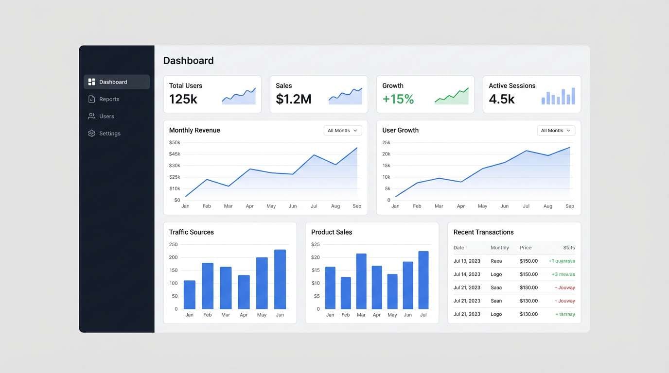
10) Museum Night
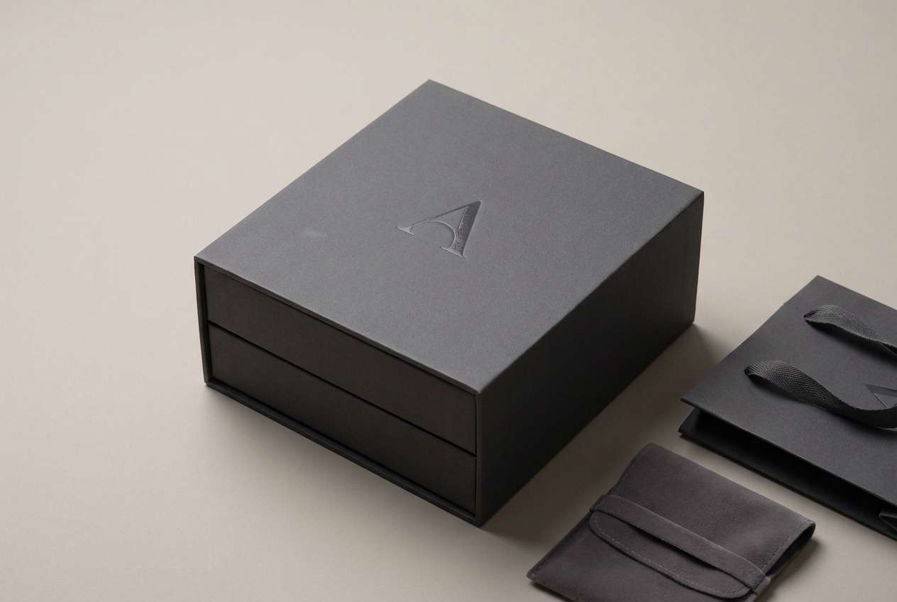
HEX: #0a0f19 #152033 #223552 #5f6d7c #e0e5ea
Mood: luxury, dramatic, curated
Best for: art exhibition flyers and event promos
Dim gallery walls and spotlighted frames create a dramatic, curated mood. The deep tones make typography feel premium, while the pale gray keeps dates and details legible. Pair with a refined accent like champagne gold for a high-end finish. Tip: use the darkest shade for the background and pull text into the lightest gray for clean contrast.
Image example of museum night generated using media.io
11) Clouded Navy
HEX: #141b24 #223044 #2f4663 #6f8294 #f0f3f6
Mood: soft, trustworthy, balanced
Best for: healthcare branding and service websites
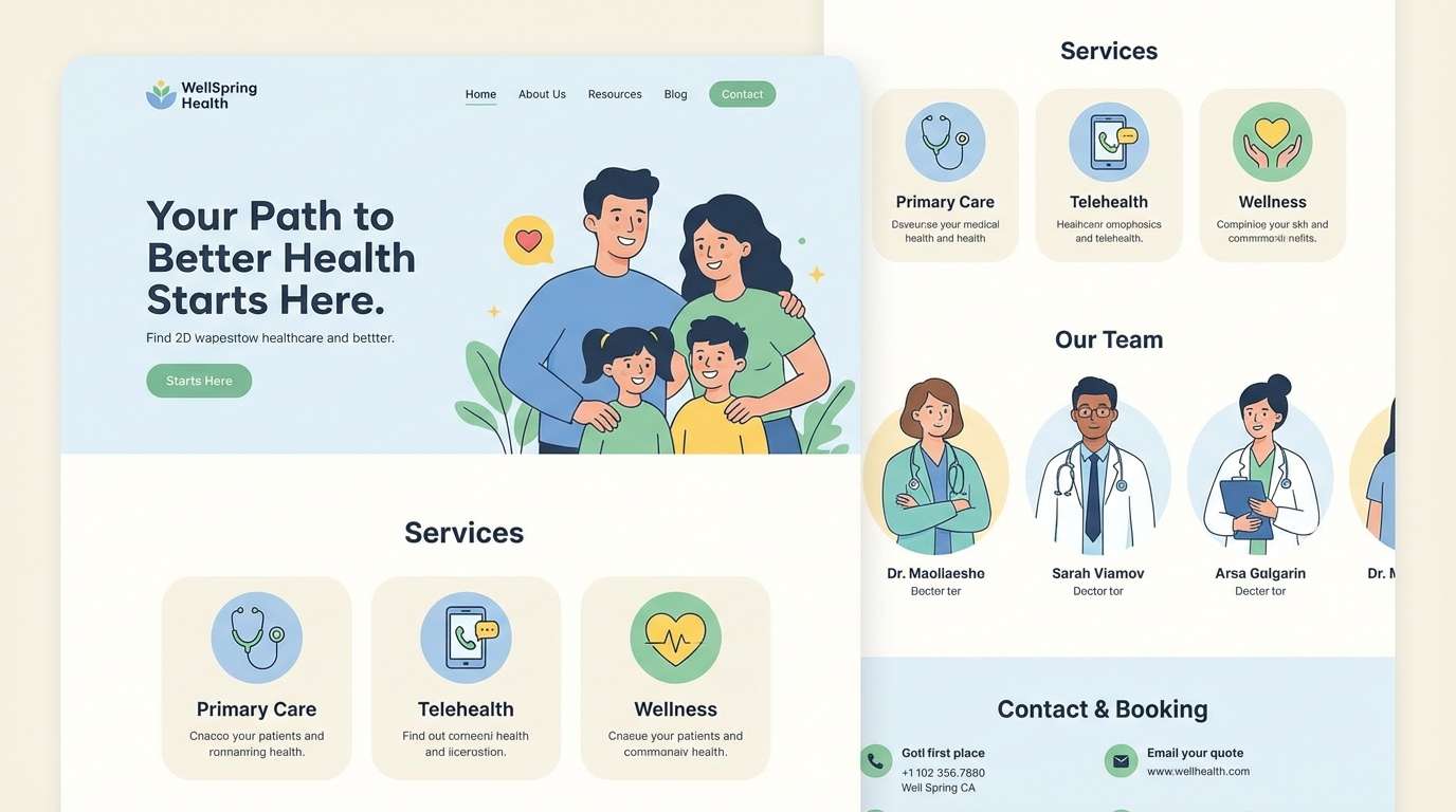
A clouded navy base with misty grays feels reassuring and calm. The tones are soft enough for wellness brands but still structured for service pages and forms. Pair with a gentle green or aqua to reinforce a clean, caring message. Tip: keep the mid gray for secondary buttons and helper text so primary actions stand out.
Image example of clouded navy generated using media.io
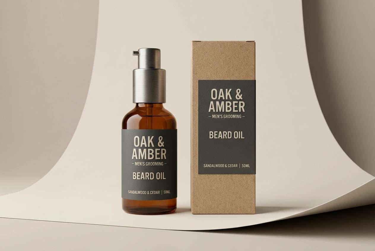
12) Industrial Chic
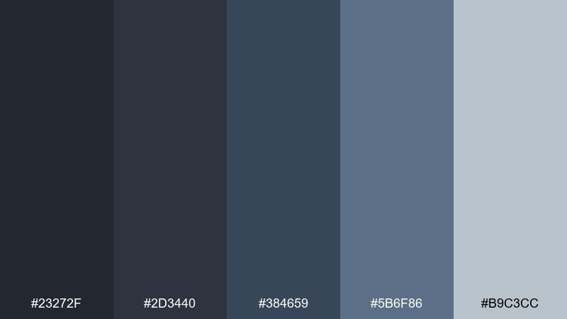
HEX: #23272f #2d3440 #384659 #5b6f86 #b9c3cc
Mood: edgy, modern, utilitarian
Best for: product packaging for mens grooming
Matte metal grays and dark blue edges feel bold, clean, and utilitarian. The palette suits minimalist labels, letting typography and finishes do the heavy lifting. Use a warm metallic foil or subtle texture to add tactile contrast. Tip: print the darkest tone as a rich background and keep the light gray for ingredients and small legal text.
Image example of industrial chic generated using media.io
13) Quiet Observatory
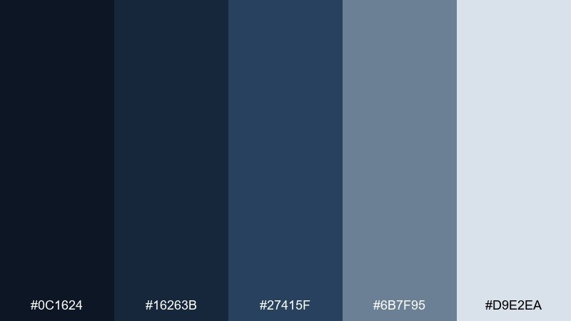
HEX: #0c1624 #16263b #27415f #6b7f95 #d9e2ea
Mood: thoughtful, scientific, serene
Best for: educational infographics and science blogs
Night-sky blues with measured grays evoke a quiet observatory and focused curiosity. The contrast works well for diagrams, charts, and long reads where clarity is key. As a gray dark blue color scheme, it pairs nicely with a small pop of yellow for highlights and annotations. Tip: keep headings in the deepest shade and use the pale gray to open up dense sections.
Image example of quiet observatory generated using media.io
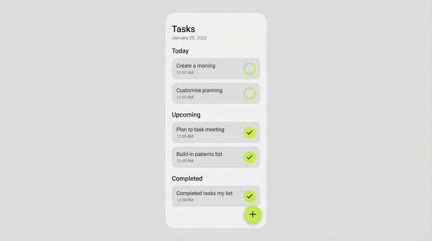
14) Nordic Workday
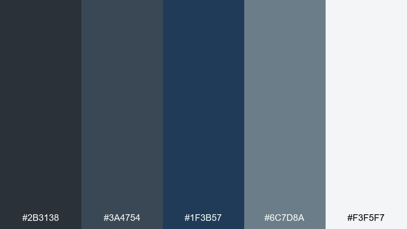
HEX: #2b3138 #3a4754 #1f3b57 #6c7d8a #f3f5f7
Mood: scandinavian, tidy, practical
Best for: productivity app UI and to-do lists
Clean nordic neutrals with a deep blue anchor feel organized and quietly motivating. Rounded cards and simple icons look especially crisp against the pale background. This gray dark blue color palette works best when you limit color usage to states like active, done, and overdue. Tip: assign the darkest blue to the primary action, then let grays handle structure and spacing.
Image example of nordic workday generated using media.io
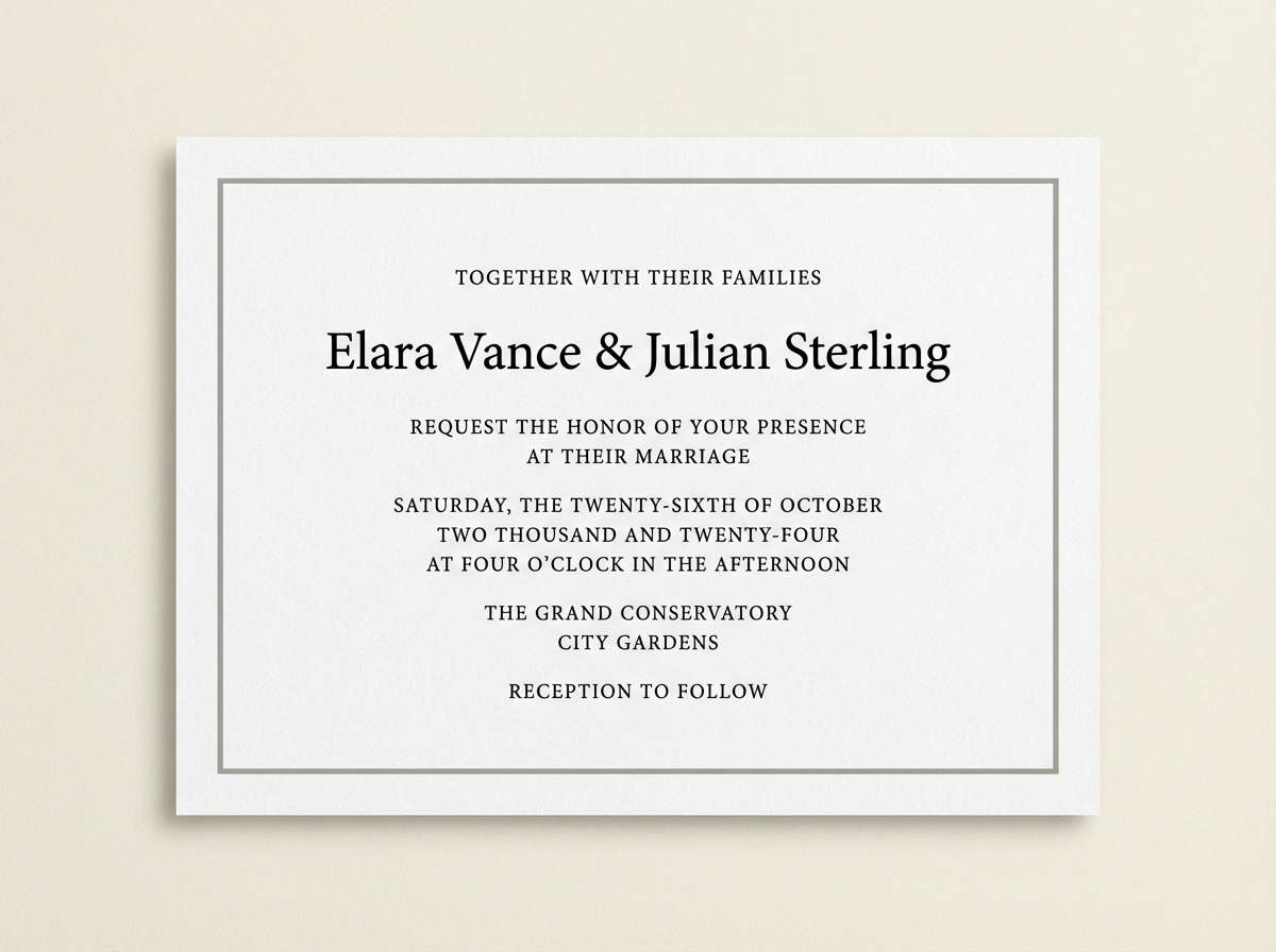
15) Charcoal Lavender
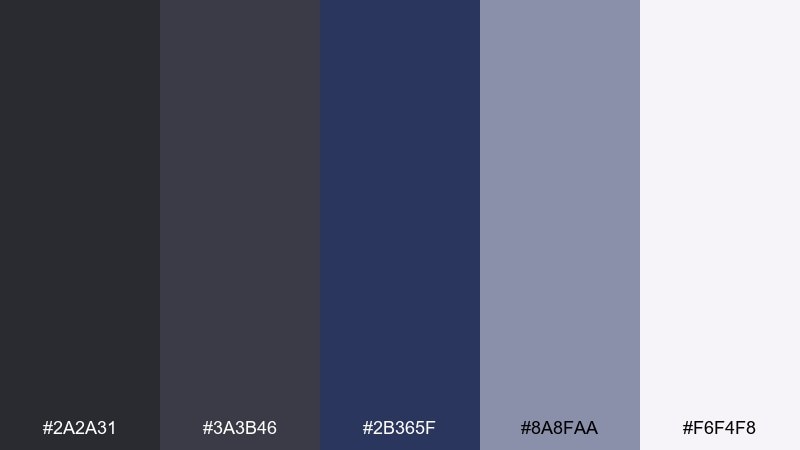
HEX: #2a2a31 #3a3b46 #2b365f #8a8faa #f6f4f8
Mood: soft, elegant, slightly romantic
Best for: wedding invitations and formal stationery
Charcoal shadows with a lavender-tinted light feel formal yet gentle. The cool neutrals keep typography sharp, while the soft highlight adds a dreamy paper-like finish. Pair with pearl white stock and a touch of silver foil for a refined look. Tip: set body text in the charcoal and use the lavender gray only for ornament lines or monograms.
Image example of charcoal lavender generated using media.io
16) Rainy Commute
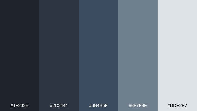
HEX: #1f232b #2c3441 #3b4b5f #6f7f8e #dde2e7
Mood: moody, everyday, grounded
Best for: streetwear lookbooks and social posts
Wet pavement grays and commuter blues feel real, textured, and modern. The mid tones are perfect for overlays on photos, keeping captions readable without harsh blocks. Pair with a bold accent like safety orange for streetwear energy. Tip: use the light gray for negative space so the palette stays breathable on mobile.
Image example of rainy commute generated using media.io
17) Deep Sea Metro
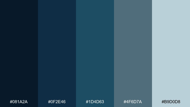
HEX: #081a2a #0f2e46 #1d4d63 #4f6d7a #b9d0d8
Mood: cool, modern, energetic
Best for: tech product ads and app launch pages
Deep sea blues with a bright, watery highlight feel sleek and fast-moving. The range supports bold headlines, gradient accents, and subtle depth in cards. Pair with white space and a single neon accent for a modern tech vibe. Tip: use the light blue-gray for glow effects and separators instead of pure white.
Image example of deep sea metro generated using media.io
18) Smoky Sapphire

HEX: #1c1f28 #2a3240 #1e3a68 #3d6a9a #cfd9e6
Mood: bold, luxe, nocturnal
Best for: jewelry branding and premium packaging
Smoky shadows with sapphire blues feel luxurious and night-ready. These gray dark blue color combinations look especially rich on matte papers with spot gloss on logos. Pair with warm metallics like gold or bronze to make the blues feel jewel-toned. Tip: keep the lightest shade for inner packaging and product info so it reads cleanly.
Image example of smoky sapphire generated using media.io
19) Fog & Fjord
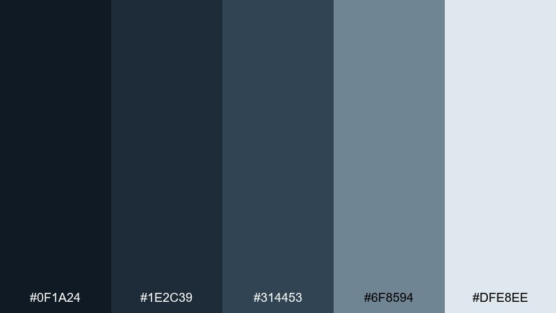
HEX: #0f1a24 #1e2c39 #314453 #6f8594 #dfe8ee
Mood: misty, natural, contemplative
Best for: outdoor brand guidelines and catalogs
Misty fjord air and slate water create a natural, contemplative calm. The palette feels outdoorsy without leaning too rustic, making it great for modern gear brands. Pair with moss green or clay to echo terrain and keep the story grounded. Tip: use the foggy light tone for page backgrounds to maintain a fresh, open feel.
Image example of fog & fjord generated using media.io
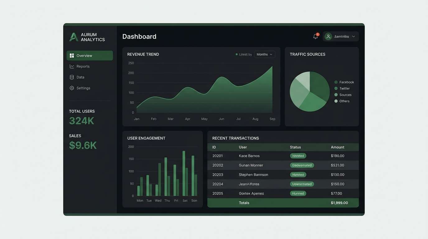
20) Nightshift Dashboard
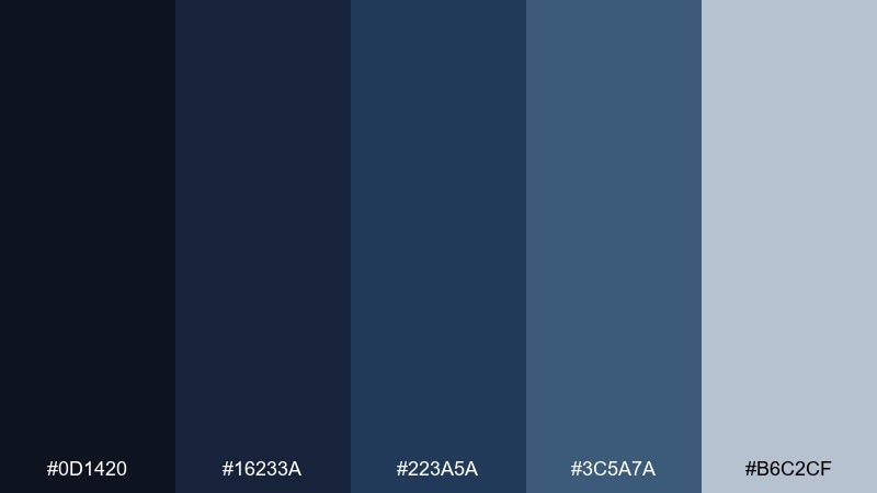
HEX: #0d1420 #16233a #223a5a #3c5a7a #b6c2cf
Mood: focused, high-contrast, techy
Best for: dark mode dashboard UI
Late-night control room blues feel focused and high-contrast without looking harsh. The deep base supports dark mode layouts, while the cool highlight makes charts and toggles easy to spot. Pair with a restrained accent like cyan for active states and warnings. Tip: keep large surfaces in the two darkest tones and use the lightest shade only for key numbers and labels.
Image example of nightshift dashboard generated using media.io
What Colors Go Well with Gray Dark Blue?
Warm metallics and warm neutrals are the fastest way to make gray dark blue feel premium: think champagne gold, brass, copper, cream, or sand. They counterbalance the cool base and keep the look from feeling too clinical.
For modern contrast, pair gray dark blue with bright, saturated accents like coral, lime, cyan, or safety orange. Use accents sparingly on CTAs, tags, or key data points so the interface stays calm.
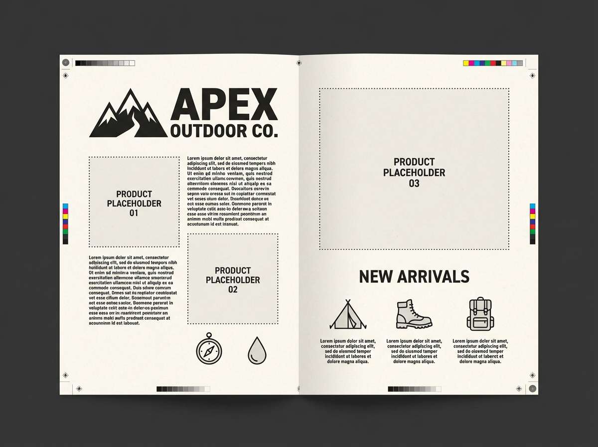
If you want a natural mood, add earthy greens (moss, sage) or clay tones. These combinations keep the palette grounded and work especially well for outdoor, wellness, and lifestyle brands.
How to Use a Gray Dark Blue Color Palette in Real Designs
Start by assigning roles: a light gray for backgrounds, a mid gray for borders and secondary UI, and a dark blue for headings or navigation. This keeps hierarchy consistent across pages, slides, or print layouts.
Maintain readability by testing contrast early, especially in dark mode. Reserve the darkest navy/charcoal for large surfaces or headline type, and keep body copy on lighter grays to avoid eye strain.
Finally, choose one accent color and stick to it for emphasis (primary buttons, highlights, alerts). With gray dark blue, a single well-chosen accent often does more than multiple competing colors.
Create Gray Dark Blue Palette Visuals with AI
Want to see how your gray dark blue color palette looks in real scenes—like dashboards, packaging, posters, or interiors? Generating quick mock visuals helps you validate contrast, mood, and brand fit before you commit.
With Media.io Text-to-Image, you can turn a simple prompt into palette-consistent concepts for UI screens, marketing graphics, or print-ready layouts. It’s a fast way to explore variations without rebuilding designs from scratch.
Pick one of the prompts above (or write your own), generate a few options, then refine the winner by adjusting lighting, materials, and accent colors.
Gray Dark Blue Color Palette FAQs
-
What is a gray dark blue color palette?
A gray dark blue color palette is a set of coordinated shades built from cool grays (light to charcoal) plus deep blues (navy/slate). It’s popular for modern, professional designs because it balances neutrality with depth. -
Is gray dark blue good for UI and app design?
Yes. Gray provides clean structure for backgrounds and dividers, while dark blue creates strong hierarchy for navigation, headings, and selected states. Just verify contrast for text and interactive elements to meet accessibility guidelines. -
What accent colors work best with gray and dark blue?
Warm accents like copper, coral, and champagne gold add instant contrast and warmth. For a tech-forward look, try cyan or neon green; for lifestyle/outdoor, use sage or moss green. -
How do I keep a gray dark blue design from looking too cold?
Add one warm element: a warm accent color, warm photography tones, or materials like wood, paper textures, or metallic finishes. You can also shift one gray toward a slightly warmer tint for balance. -
Which shades should I use for text and backgrounds?
Use the lightest gray (or near-white) for main backgrounds, mid grays for surfaces and borders, and the darkest navy/charcoal for headings or dark sections. Avoid placing long body text on very dark backgrounds unless contrast is carefully tuned. -
Do gray dark blue palettes print well?
They usually print cleanly because grays and navies are stable and predictable, but results depend on paper and ink. For packaging or premium stationery, test a proof—dark blues can shift slightly depending on coating and lighting. -
Can I generate gray dark blue palette mockups with AI?
Yes. Use Media.io’s text-to-image generator to create palette-driven concepts (UI mockups, posters, interiors, packaging) and iterate quickly by changing prompts, lighting, and accent colors.
Next: Retro 90s Color Palette


