

Blue green sits in that sweet spot between calm blue and refreshing green, making it one of the easiest color families to build with.
Below are 20+ curated blue green color combinations with HEX codes, plus practical pairing tips for UI, branding, print, and social designs.
In this article
- Why Blue Green Palettes Work So Well
-
- coastal calm
- deep lagoon
- sea glass minimal
- tropical reef
- arctic mint
- rainy harbor
- botanical breeze
- retro poolside
- slate and teal office
- aurora night
- mountain lake
- fresh clinic
- summer sorbet
- denim and jade
- modern spa stone
- ocean depth gradient
- neon kelp hud
- maritime editorial
- aqua classroom
- sustainable seafoam pack
- seaside wedding
- What Colors Go Well with Blue Green?
- How to Use a Blue Green Color Palette in Real Designs
- Create Blue Green Palette Visuals with AI
Why Blue Green Palettes Work So Well
Blue green palettes feel naturally balanced because they borrow trust and stability from blue while keeping the lively, organic energy of green. The result is a color family that reads “clean” without looking sterile.
They also scale well across contexts: deep teals create strong structure for headers and navigation, while mint and seafoam tints open up whitespace for modern layouts. This makes blue green especially reliable for UI systems and brand kits.
Finally, blue green harmonizes with both cool and warm accents, so you can steer the vibe from spa-serene to neon-tech simply by adjusting one or two supporting colors.
20+ Blue Green Color Palette Ideas (with HEX Codes)
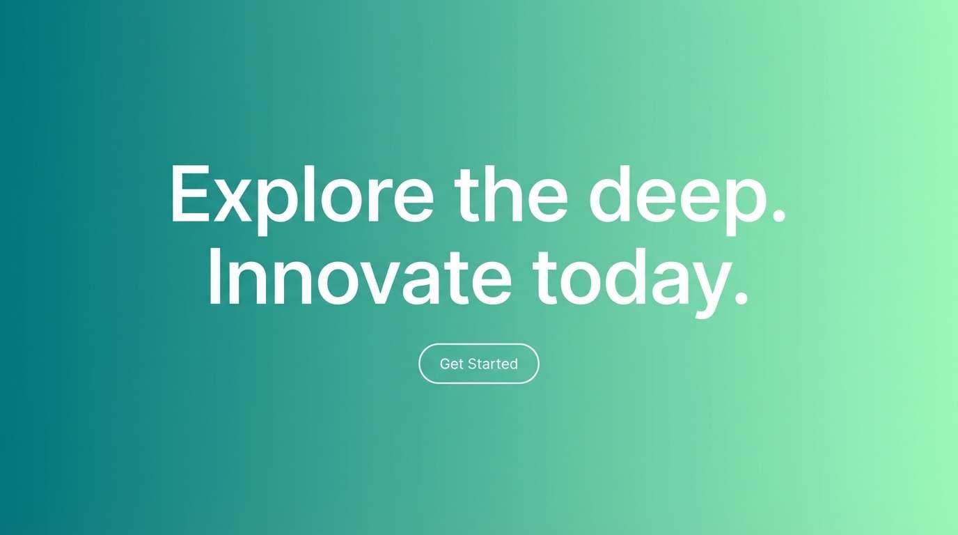
1) Coastal Calm
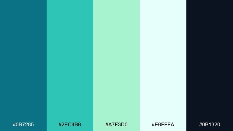
HEX: #0B7285 #2EC4B6 #A7F3D0 #E6FFFA #0B1320
Mood: serene, breezy, clean
Best for: wellness landing pages and spa branding
Serene and breezy like a quiet shoreline at sunrise, these tones feel clean without turning cold. Use the deep teal as your anchor and let mint and seafoam carry the whitespace. Pair with warm sand neutrals or soft coral for a gentle contrast that still feels natural. Tip: keep body text on the dark navy for readability and reserve the light aqua for sections and cards.
Image example of coastal calm generated using media.io
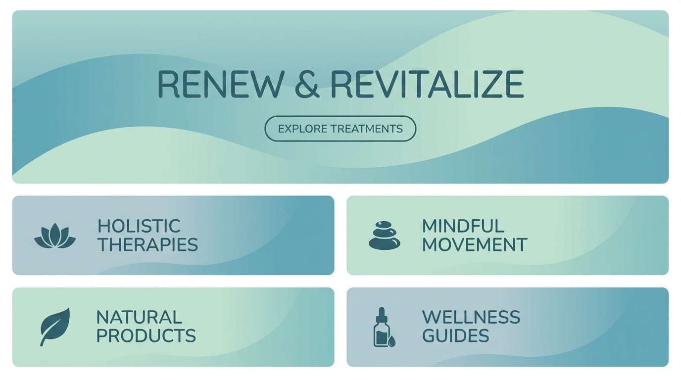
Media.io is an online AI studio for creating and editing video, image, and audio in your browser.

2) Deep Lagoon
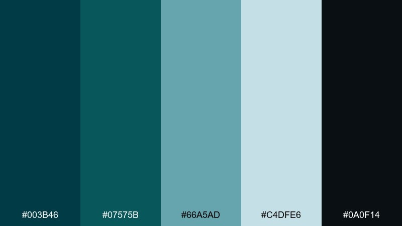
HEX: #003B46 #07575B #66A5AD #C4DFE6 #0A0F14
Mood: moody, immersive, cinematic
Best for: tech branding and dark-mode dashboards
Moody and immersive like a lagoon at dusk, this set leans cinematic and premium. The deep greens and blue-teals work beautifully for dark UI surfaces, while the misty cyan keeps data and labels crisp. This blue green color palette pairs well with brushed silver, charcoal, and a small hit of lime for status accents. Tip: use the palest tint for charts and separators so the interface stays calm, not busy.
Image example of deep lagoon generated using media.io

3) Sea Glass Minimal
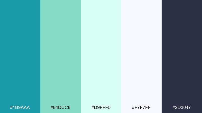
HEX: #1B9AAA #84DCC6 #D9FFF5 #F7F7FF #2D3047
Mood: light, modern, airy
Best for: minimalist brand identities and stationery
Light and modern like sun-bleached sea glass, these hues feel airy and refined. Use the bright teal for marks and headlines, then let the pale aquas keep layouts spacious. Pair with off-white paper textures and a graphite ink tone to avoid a sugary look. Tip: print-heavy designs look best when the teal is slightly muted and used sparingly.
Image example of sea glass minimal generated using media.io
4) Tropical Reef
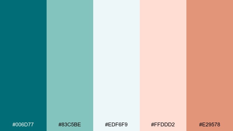
HEX: #006D77 #83C5BE #EDF6F9 #FFDDD2 #E29578
Mood: playful, sunny, vacation-ready
Best for: travel ads and social graphics
Playful and sunny like a reef holiday, this mix balances cool water tones with warm peach. The teal stays grounded while the coral and sand notes make calls-to-action pop. Pair with clean sans-serif type and bright photography for an upbeat feel. Tip: keep coral to buttons and badges so the overall look stays fresh, not loud.
Image example of tropical reef generated using media.io

5) Arctic Mint
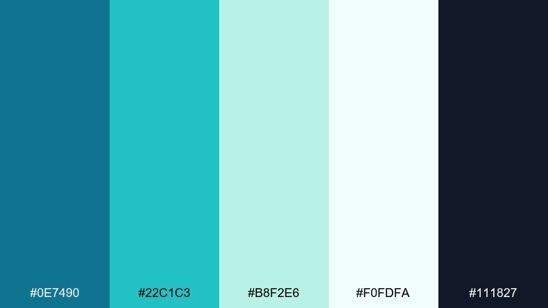
HEX: #0E7490 #22C1C3 #B8F2E6 #F0FDFA #111827
Mood: crisp, refreshing, high-clarity
Best for: product UI and onboarding screens
Crisp and refreshing like polar air, these tints are built for clarity. The cool teal reads confident, while the icy mint keeps backgrounds bright and spacious. Pair with deep slate text and a single warm accent like amber for progress states. Tip: use the mint as a subtle gradient to separate sections without adding extra lines.
Image example of arctic mint generated using media.io
6) Rainy Harbor
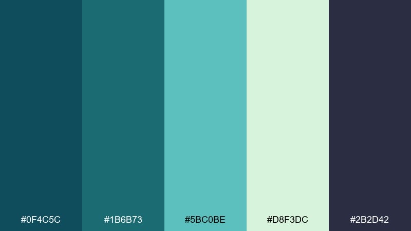
HEX: #0F4C5C #1B6B73 #5BC0BE #D8F3DC #2B2D42
Mood: grounded, calm, professional
Best for: corporate presentations and reports
Grounded and calm like a harbor in light rain, these shades feel professional without being stiff. Use the dark teal for headers and charts, then bring in the soft green-tint for tables and callouts. Pair with cool grays and plenty of whitespace to keep slides readable. Tip: keep charts to two primary tones and let the light mint handle secondary series.
Image example of rainy harbor generated using media.io
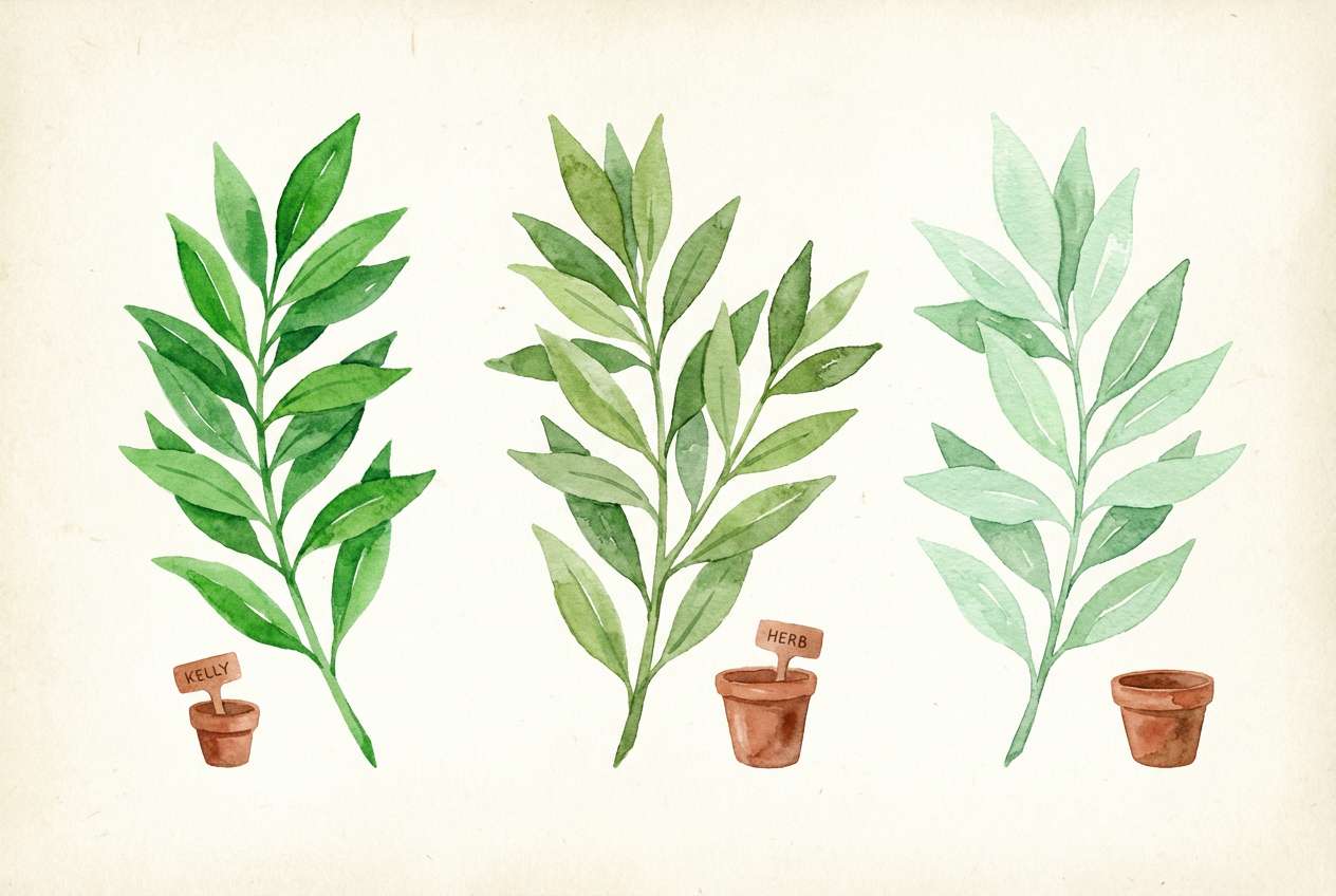
7) Botanical Breeze
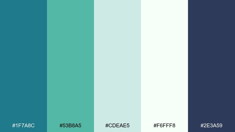
HEX: #1F7A8C #53B8A5 #CDEAE5 #F6FFF8 #2E3A59
Mood: fresh, natural, gentle
Best for: botanical illustrations and spring campaigns
Fresh and gentle like leaves after a morning mist, this set leans natural and optimistic. The mid-teal works well for stems and outlines, while the pale tints make perfect watercolor washes. Pair with muted clay or soft ochre if you want a more earthy finish. Tip: use the darkest tone sparingly for fine details so the illustration stays light.
Image example of botanical breeze generated using media.io
8) Retro Poolside
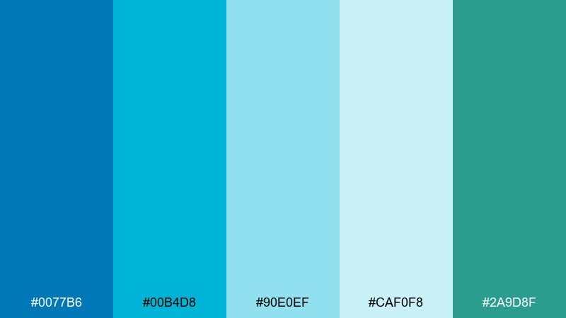
HEX: #0077B6 #00B4D8 #90E0EF #CAF0F8 #2A9D8F
Mood: fun, nostalgic, summery
Best for: event flyers and retro posters
Fun and nostalgic like a pool day soundtrack, these blues and teals feel instantly summery. Use the bright cyan for big type and shapes, then bring in the seafoam tints for layered depth. Pair with off-black outlines and a small pop of sunshine yellow for a true vintage vibe. Tip: add simple halftone texture to the lightest shade to mimic old print posters.
Image example of retro poolside generated using media.io
9) Slate and Teal Office
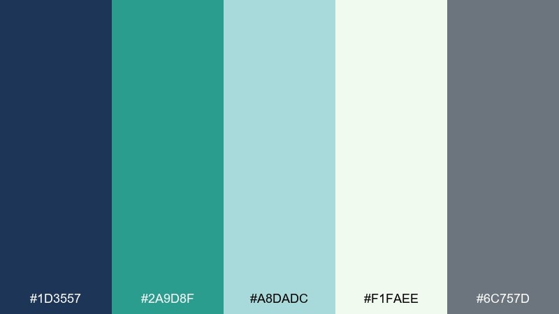
HEX: #1D3557 #2A9D8F #A8DADC #F1FAEE #6C757D
Mood: smart, stable, modern
Best for: B2B websites and SaaS branding
Smart and stable like a well-lit studio office, this mix balances slate blue with confident teal. The contrast is strong enough for navigation and buttons, yet the lighter aqua keeps pages friendly. These blue green color combinations work especially well with crisp grids, thin icon strokes, and neutral photography. Tip: set primary actions in teal and keep the slate tone for headers to create a clear hierarchy.
Image example of slate and teal office generated using media.io
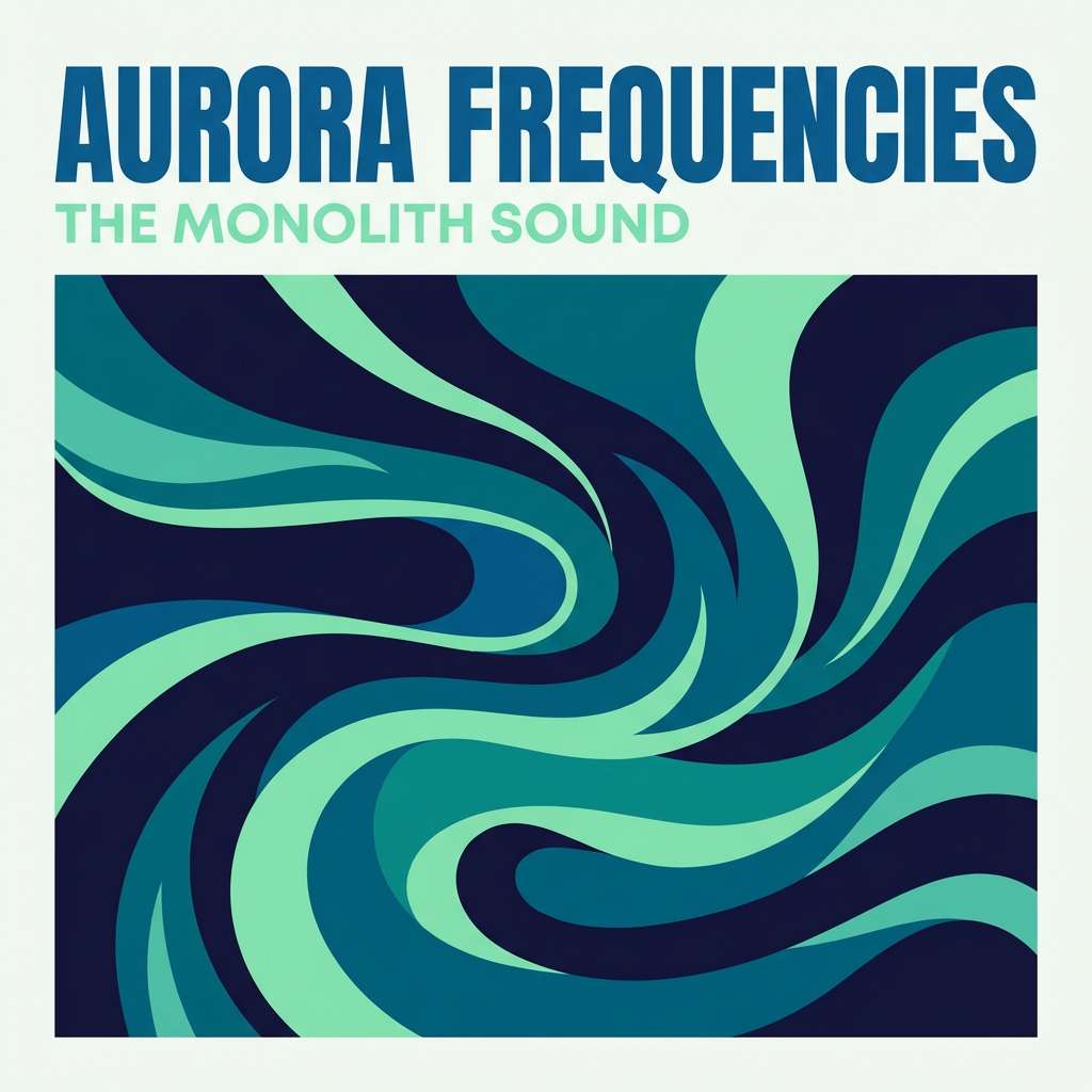
10) Aurora Night
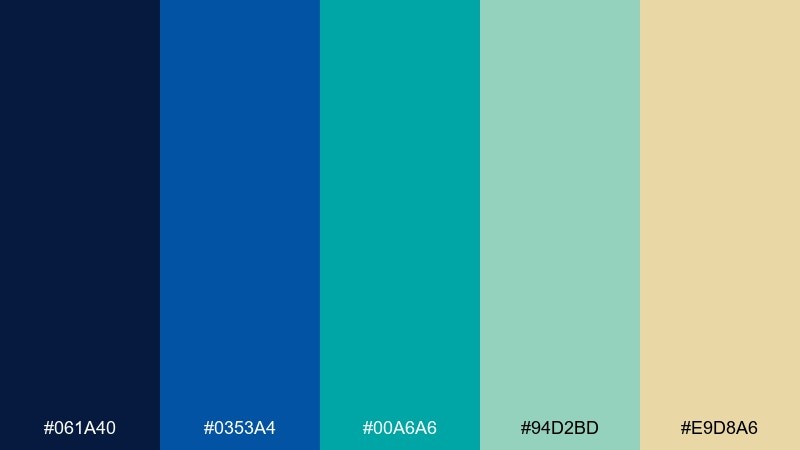
HEX: #061A40 #0353A4 #00A6A6 #94D2BD #E9D8A6
Mood: electric, dreamy, high-contrast
Best for: music visuals and bold brand campaigns
Electric and dreamy like aurora streaks over a dark sky, this palette loves contrast. The deep navy sets a dramatic base, while teal and mint glow on top for highlights and motion graphics. Pair with soft gold for typography or badges to add warmth without losing the night feel. Tip: keep gradients subtle and directional so the neon-like tones do not band on screens.
Image example of aurora night generated using media.io
11) Mountain Lake
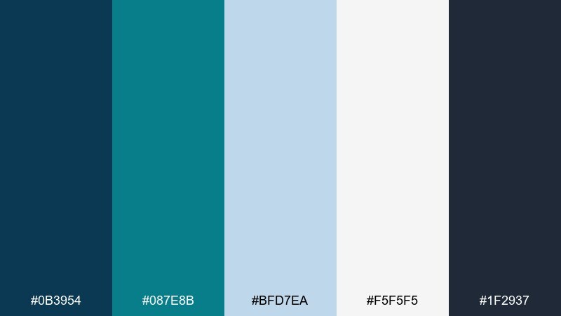
HEX: #0B3954 #087E8B #BFD7EA #F5F5F5 #1F2937
Mood: quiet, outdoorsy, balanced
Best for: outdoor brands and editorial features
Quiet and outdoorsy like still water under pine trees, these tones feel balanced and trustworthy. Use the deeper blue-teal for headlines and navigation, then let the pale blue-gray open up the page. Pair with warm tan leather textures or matte black hardware for a rugged finish. Tip: keep imagery slightly desaturated so the teal remains the hero color.
Image example of mountain lake generated using media.io
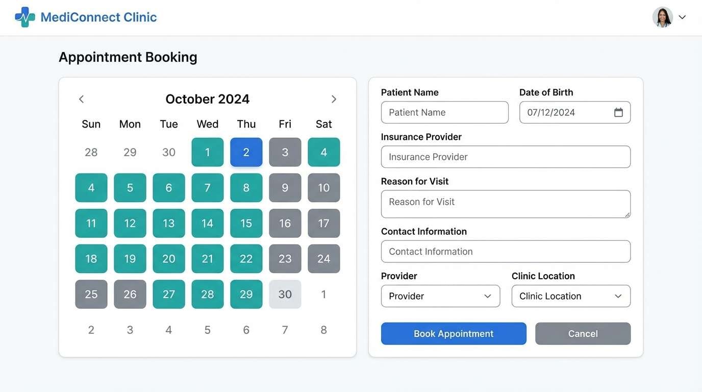
12) Fresh Clinic
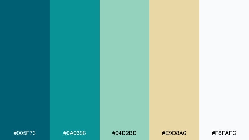
HEX: #005F73 #0A9396 #94D2BD #E9D8A6 #F8FAFC
Mood: reassuring, hygienic, approachable
Best for: healthcare apps and appointment booking UI
Reassuring and hygienic like a bright clinic lobby, these hues communicate care and clarity. The teal tones make buttons and tabs feel confident, while the creamy accent softens the overall look. A blue green color scheme like this pairs well with friendly rounded components and simple line icons. Tip: reserve the warm cream for alerts and highlights so accessibility stays strong.
Image example of fresh clinic generated using media.io
13) Summer Sorbet
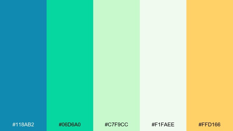
HEX: #118AB2 #06D6A0 #C7F9CC #F1FAEE #FFD166
Mood: bright, youthful, energetic
Best for: startup marketing and social templates
Bright and youthful like a sorbet sampler, this set feels energetic but still clean. The vivid aqua and green carry headlines and stickers, while the pale mint keeps backgrounds from feeling heavy. Pair with simple black type and rounded shapes for a friendly brand tone. Tip: use the yellow only for micro-accents like icons or price tags to avoid overpowering the cool base.
Image example of summer sorbet generated using media.io

14) Denim and Jade
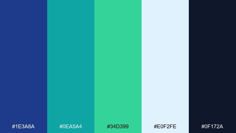
HEX: #1E3A8A #0EA5A4 #34D399 #E0F2FE #0F172A
Mood: confident, sporty, clean
Best for: sports brands and app UI accents
Confident and sporty like denim with a jade accessory, these tones pop without feeling neon. Use the deep blue for structure, then let teal and green carry highlights and active states. Pair with white space and sharp typography for a modern, athletic look. Tip: keep gradients minimal and rely on solid fills for better legibility in small UI elements.
Image example of denim and jade generated using media.io
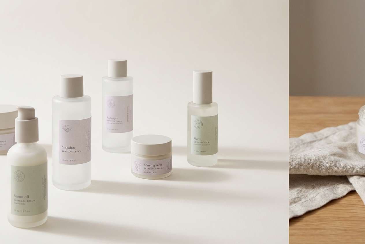
15) Modern Spa Stone
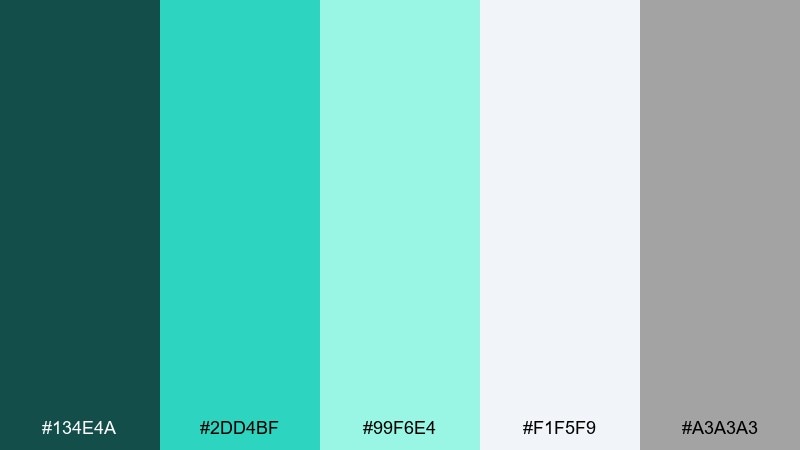
HEX: #134E4A #2DD4BF #99F6E4 #F1F5F9 #A3A3A3
Mood: zen, polished, understated
Best for: hotel branding and premium skincare
Zen and polished like smooth stone beside warm water, these tones feel understated and premium. The dark green-teal adds luxury, while the bright aqua keeps the look fresh and modern. Pair with soft grays, linen textures, and minimal serif headlines for a refined finish. Tip: use the medium teal for small highlight strokes so the design stays quiet and upscale.
Image example of modern spa stone generated using media.io
16) Ocean Depth Gradient
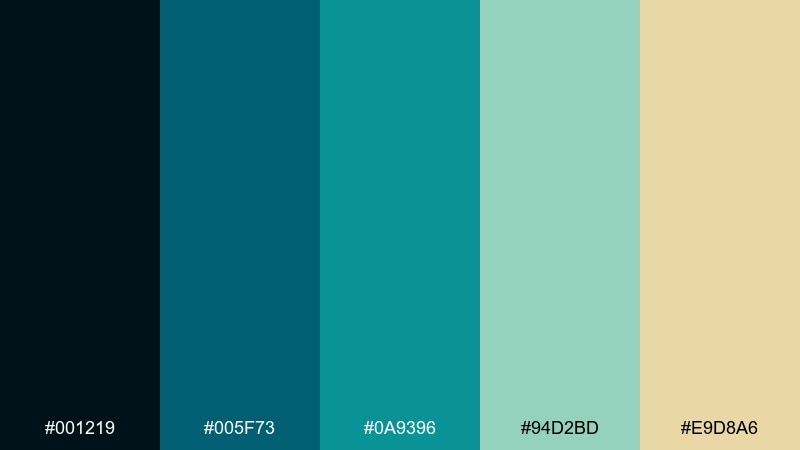
HEX: #001219 #005F73 #0A9396 #94D2BD #E9D8A6
Mood: deep, smooth, sophisticated
Best for: background gradients and hero sections
Deep and smooth like looking down through clear ocean layers, this set is made for gradients. The near-black blue gives you depth, and the teal-to-mint steps transition cleanly across sections. Pair with warm cream highlights and plenty of breathing room for a premium feel. Tip: test gradients on low-end displays and add slight noise to prevent banding.
Image example of ocean depth gradient generated using media.io
17) Neon Kelp HUD
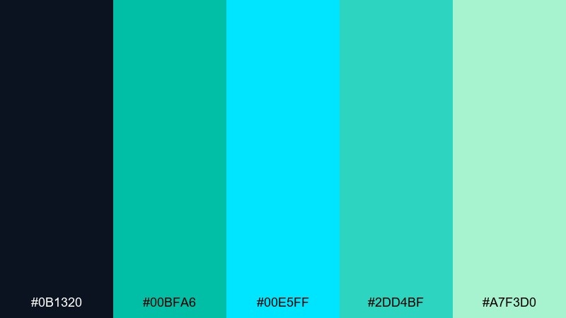
HEX: #0B1320 #00BFA6 #00E5FF #2DD4BF #A7F3D0
Mood: futuristic, punchy, high-tech
Best for: gaming overlays and streaming graphics
Futuristic and punchy like a glowing HUD under sea light, these brights read fast on dark backgrounds. Use cyan for primary readouts and the greener teal for secondary meters and focus rings. Blue green color combinations like this shine when paired with crisp monospaced numerals and thin line icons. Tip: keep glow effects subtle and rely on contrast first for accessibility.
Image example of neon kelp hud generated using media.io
18) Maritime Editorial
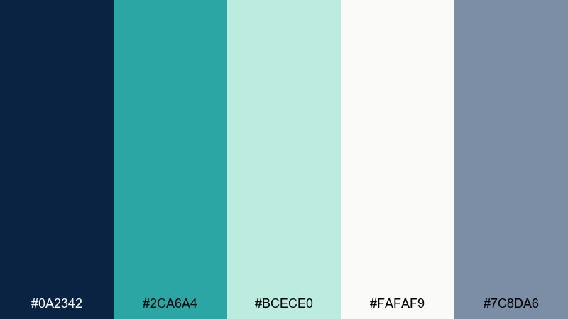
HEX: #0A2342 #2CA6A4 #BCECE0 #FAFAF9 #7C8DA6
Mood: clean, journal-like, thoughtful
Best for: magazine layouts and blog headers
Clean and thoughtful like a maritime journal, this mix feels calm and well-edited. Navy brings authority, while soft teal keeps the page approachable and modern. Pair with warm off-white paper tones and subtle gray rules for an elevated editorial finish. Tip: use teal for pull quotes and section labels to guide scanning without overpowering the content.
Image example of maritime editorial generated using media.io
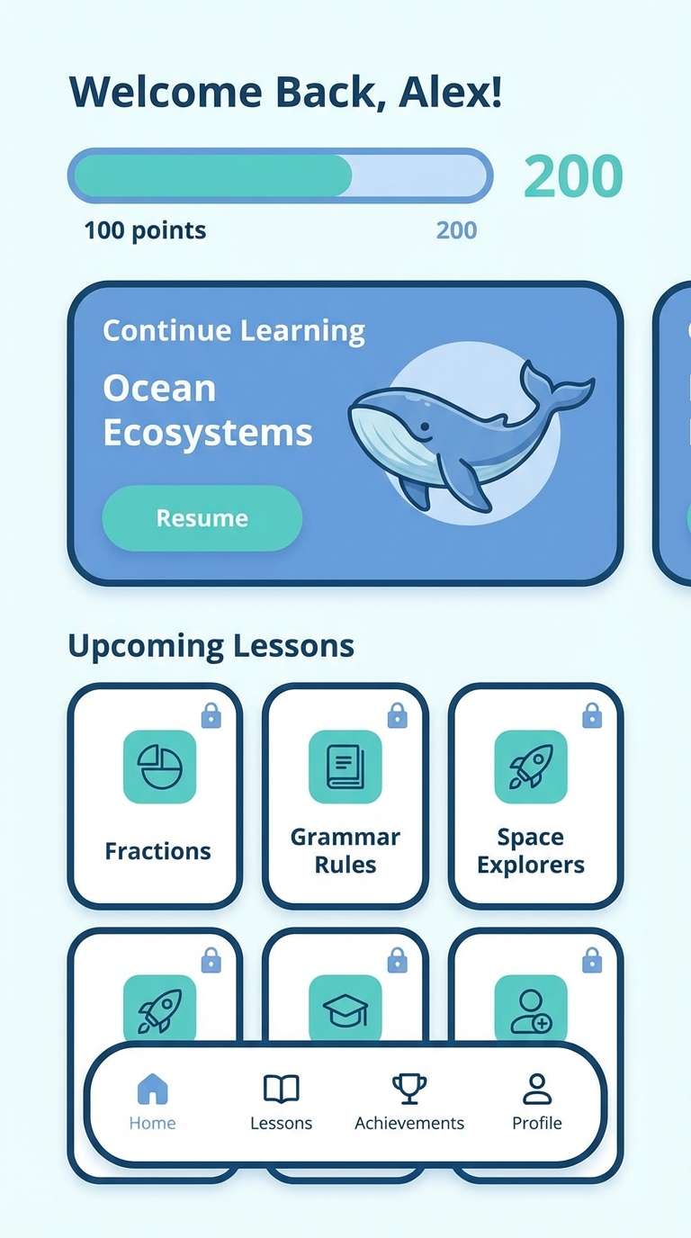
19) Aqua Classroom
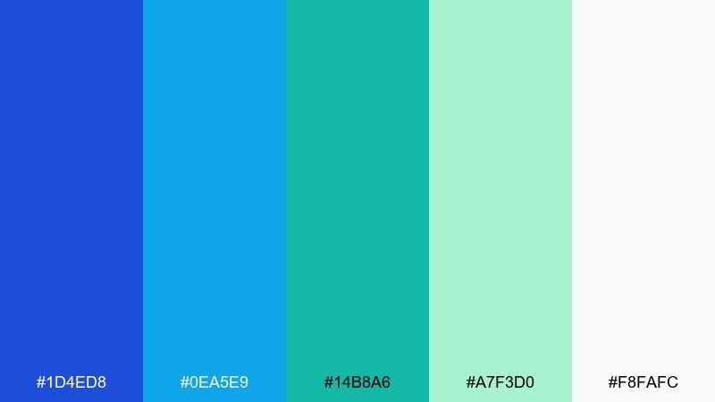
HEX: #1D4ED8 #0EA5E9 #14B8A6 #A7F3D0 #F8FAFC
Mood: friendly, clear, optimistic
Best for: education apps and kid-friendly UI
Friendly and optimistic like a bright classroom wall, these colors feel clear and inviting. The sky blues handle headings and navigation, while the teal-mint range makes supportive highlights and success states. Pair with simple illustrations and rounded cards to keep the tone approachable. Tip: keep saturation slightly lower for long reading screens to reduce eye fatigue.
Image example of aqua classroom generated using media.io
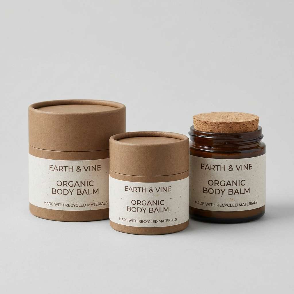
20) Sustainable Seafoam Pack
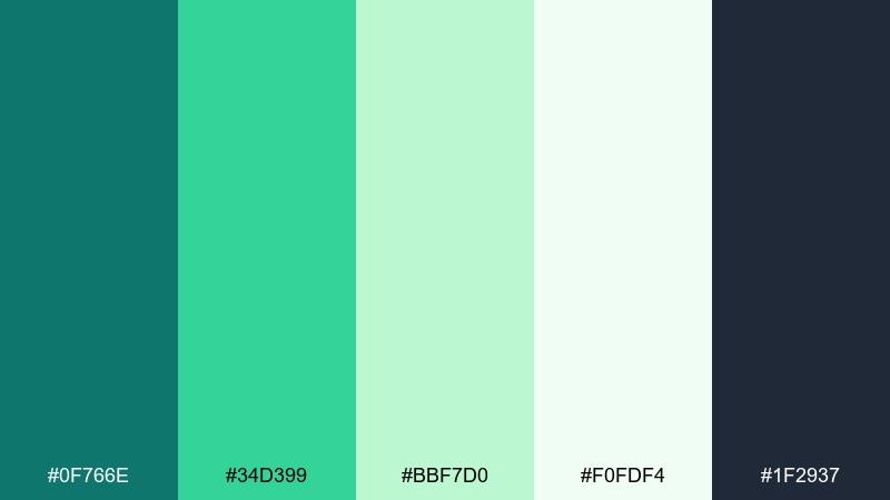
HEX: #0F766E #34D399 #BBF7D0 #F0FDF4 #1F2937
Mood: eco, clean, trustworthy
Best for: sustainable packaging and DTC products
Eco and clean like fresh herbs and seafoam, this set reads trustworthy on shelves. The richer teal works for logos and caps, while the pale greens feel natural on large label areas. Pair with kraft-paper neutrals and a charcoal ink for a grounded, sustainable vibe. Tip: use the lightest tone as the label base to keep printing costs predictable and text sharp.
Image example of sustainable seafoam pack generated using media.io
21) Seaside Wedding
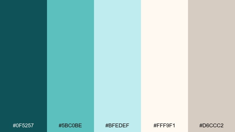
HEX: #0F5257 #5BC0BE #BFEDEF #FFF9F1 #D6CCC2
Mood: romantic, airy, elegant
Best for: wedding invitations and event suites
Romantic and airy like a seaside ceremony, these shades feel elegant and soft. Teal keeps the suite modern, while the warm ivory and sand notes add a timeless touch. Pair with delicate serif type and minimal line art for florals or waves. Tip: foil details look best when you keep the teal slightly deeper and let the ivory dominate the page.
Image example of seaside wedding generated using media.io
What Colors Go Well with Blue Green?
Blue green pairs effortlessly with clean neutrals like off-white, cool gray, and charcoal—great for modern UI and editorial layouts. These neutrals keep the palette readable and let teal tones feel intentional instead of overpowering.
For warmer contrast, try sand, cream, terracotta, peach, or soft gold. Warm accents make calls-to-action and highlights stand out while still feeling natural, especially in ocean-inspired palettes.
If you want a sharper, more tech-forward look, add high-chroma accents like lime, cyan, or electric mint in small doses. Keep them as micro-accents (badges, states, icons) to maintain balance.
How to Use a Blue Green Color Palette in Real Designs
Start with role assignment: pick one deep teal or navy for typography and structure, one mid-tone teal for primary actions, and one or two pale mints for surfaces, cards, and section backgrounds.
Prioritize accessibility early—teal can look “mid-contrast” even when it feels dark. Test button text and body copy against your chosen surfaces, and reserve the lightest tints for backgrounds rather than text.
Finally, decide your “temperature”: cooler palettes feel clinical and modern, while adding cream, peach, or sand makes the same teal family feel friendlier and more lifestyle-oriented.
Create Blue Green Palette Visuals with AI
Want to see these blue green HEX codes applied to real layouts? Generate matching UI mockups, posters, packaging, and brand scenes in minutes using AI prompts.
With Media.io, you can experiment quickly—swap a teal anchor, adjust saturation, and compare variations side-by-side until the palette feels right for your brand or product.
Blue Green Color Palette FAQs
-
What is a blue green color palette?
A blue green color palette is a set of colors built around teal, aqua, turquoise, and blue-leaning greens—often supported by navy, mint, seafoam, and neutral whites or grays. -
Is teal considered blue green?
Yes. Teal is one of the most common blue green hues, sitting between blue and green on the color wheel and working well as an anchor color for modern brands and UI. -
What colors complement blue green?
Warm complements and near-complements like coral, peach, terracotta, and soft gold create pleasing contrast. Neutrals (ivory, cool gray, charcoal) also pair well for clean, readable designs. -
How do I make a blue green palette look more modern?
Use a deep navy/teal for structure, lots of whitespace with pale mint surfaces, and one clear accent for CTAs. Keep gradients subtle and rely on consistent spacing and typography for a UI-forward look. -
What’s the best blue green palette for dark mode?
Look for sets with a near-black base and a misty cyan/seafoam highlight for legibility—like “Deep Lagoon” or “Neon Kelp HUD”—so labels, charts, and states stay crisp. -
How many colors should a palette include for UI design?
Start with 5 core colors (dark base, primary, secondary, surface, accent), then expand into tints/shades for states. Keeping the core tight makes systems easier to maintain. -
Can I generate blue green design mockups from these HEX codes?
Yes. You can use Media.io’s text-to-image tool to generate scenes and layouts, then iterate by prompting specific components (hero sections, dashboards, posters) and color roles (primary, surface, accent).
Next: Neon Green Color Palette


