

Neon green (#39FF14) is a modern “signal” color: it grabs attention instantly, reads as tech-forward, and makes small UI elements or highlights feel alive.
In the palettes below, you’ll see neon green paired with deep charcoals, soft creams, and bold pop colors—so you can choose anything from premium dark-mode contrast to playful poster energy.
In this article
- Why Neon Green Palettes Work So Well
-
- lime punch charcoal
- neon aloe sandstone
- bubblegum acid pastels
- arcade glow nights
- safety lime concrete
- highlighter noir interface
- citrus tech gradient
- neon matcha latte
- midnight jungle glow
- poolside neon splash
- cleanroom lime white
- beige brown lime balance
- vaporwave lime lavender
- streetwear citrus tag
- mint voltage minimal
- botanical neon wash
- stadium neon energy
- editorial lime accent
- product launch neon pop
- dark mode glow lines
- What Colors Go Well with Neon Green?
- How to Use a Neon Green Color Palette in Real Designs
- Create Neon Green Palette Visuals with AI
Why Neon Green Palettes Work So Well
Neon green works because it behaves like visual “electricity”: our eyes lock onto it faster than most hues, so it’s perfect for calling out actions, status states, or key messages.
It also pairs unusually well with structure. Put neon green next to charcoals, navies, and cool grays, and it feels premium and technical; add warm beiges or browns, and it suddenly becomes more lifestyle-friendly.
Most importantly, neon green is strongest in small doses. When the palette gives it room—through neutrals, dark anchors, or soft pastels—the result looks intentional instead of overwhelming.
20+ Neon Green Color Palette Ideas (with HEX Codes)
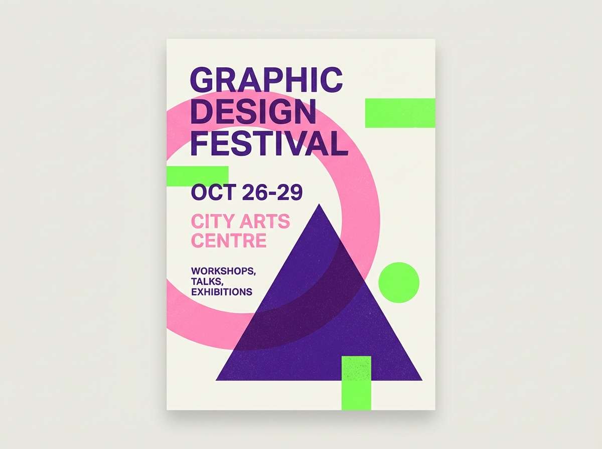
1) Lime Punch Charcoal
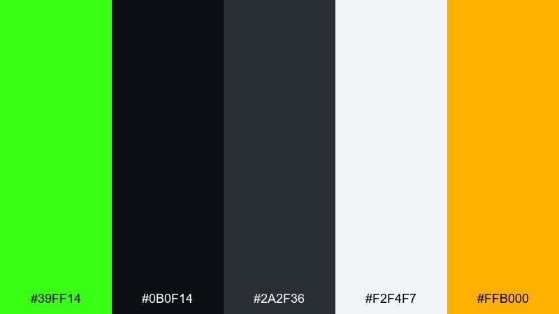
HEX: #39FF14 #0B0F14 #2A2F36 #F2F4F7 #FFB000
Mood: electric, urban, high-contrast
Best for: tech branding and launch graphics
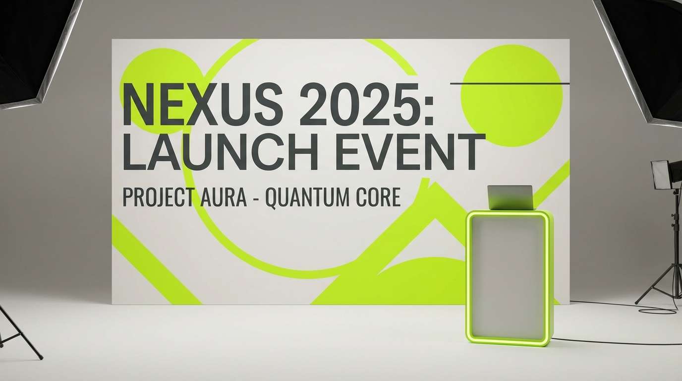
Electric lime pops like a night sign against deep charcoal and clean off-white. These neon green color combinations work best when the dark tones do most of the heavy lifting and the bright green stays as a sharp accent. Add the warm amber for buttons, badges, or limited-time labels. Tip: keep the lime to small areas like 5 to 10 percent for a premium, not chaotic, look.
Image example of lime punch charcoal generated using media.io
Media.io is an online AI studio for creating and editing video, image, and audio in your browser.

2) Neon Aloe Sandstone
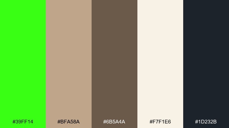
HEX: #39FF14 #BFA58A #6B5A4A #F7F1E6 #1D232B
Mood: fresh, grounded, organic modern
Best for: wellness packaging and eco-forward labels
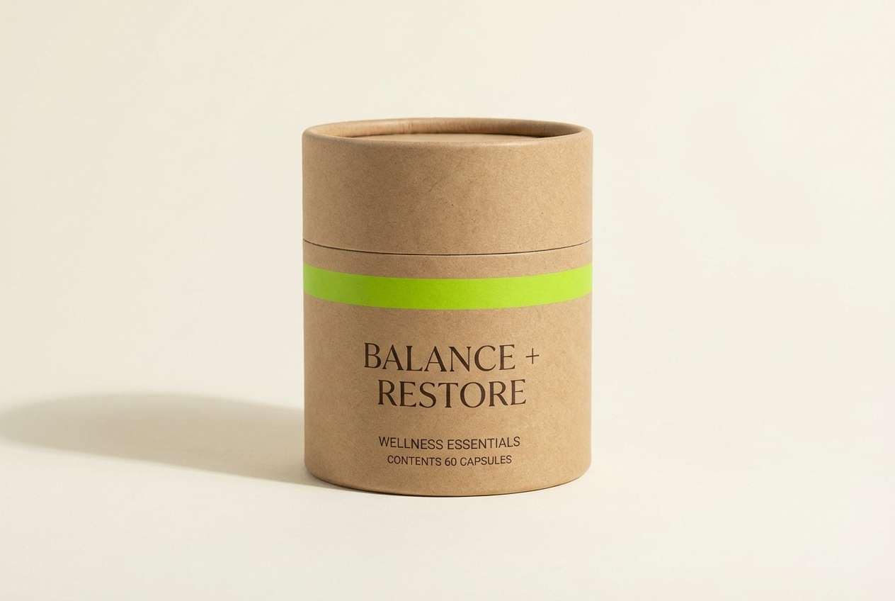
Fresh aloe brightness meets sandy neutrals, like a greenhouse set in a desert lodge. The beige and cocoa tones calm the neon down, making it feel more natural and wearable. Use the near-black for ingredient text and the cream for breathing room on labels. Tip: try a matte kraft texture with a glossy lime spot accent to make the green feel intentional.
Image example of neon aloe sandstone generated using media.io
3) Bubblegum Acid Pastels

HEX: #39FF14 #FF5BC8 #7A5CFF #B9F6FF #FFF1A6
Mood: playful, pop, candy-bright
Best for: festival posters and social tiles
Playful candy tones collide with an acid-green spark, like bubblegum lights under a blacklight. This neon green color palette shines when you let pink and violet carry the main blocks and keep the lime for highlights and outlines. Cyan works well as a background wash, while the pale yellow lifts headings without fighting the green. Tip: use thick type and simple shapes so the colors feel fun, not noisy.
Image example of bubblegum acid pastels generated using media.io
4) Arcade Glow Nights
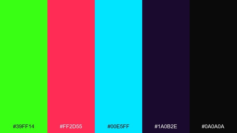
HEX: #39FF14 #FF2D55 #00E5FF #1A0B2E #0A0A0A
Mood: retro-futuristic, neon-lit, energetic
Best for: gaming overlays and streamer graphics
Arcade energy hits fast with neon lime, hot magenta, and icy cyan over deep midnight purples. The dark base keeps the brights crisp, especially for HUD elements and callouts. Pair the lime with cyan for status indicators and reserve magenta for alerts. Tip: add a soft outer glow effect only to key icons so the scene stays readable.
Image example of arcade glow nights generated using media.io
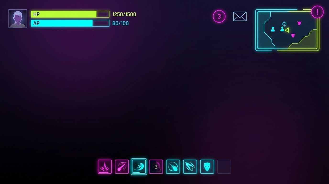
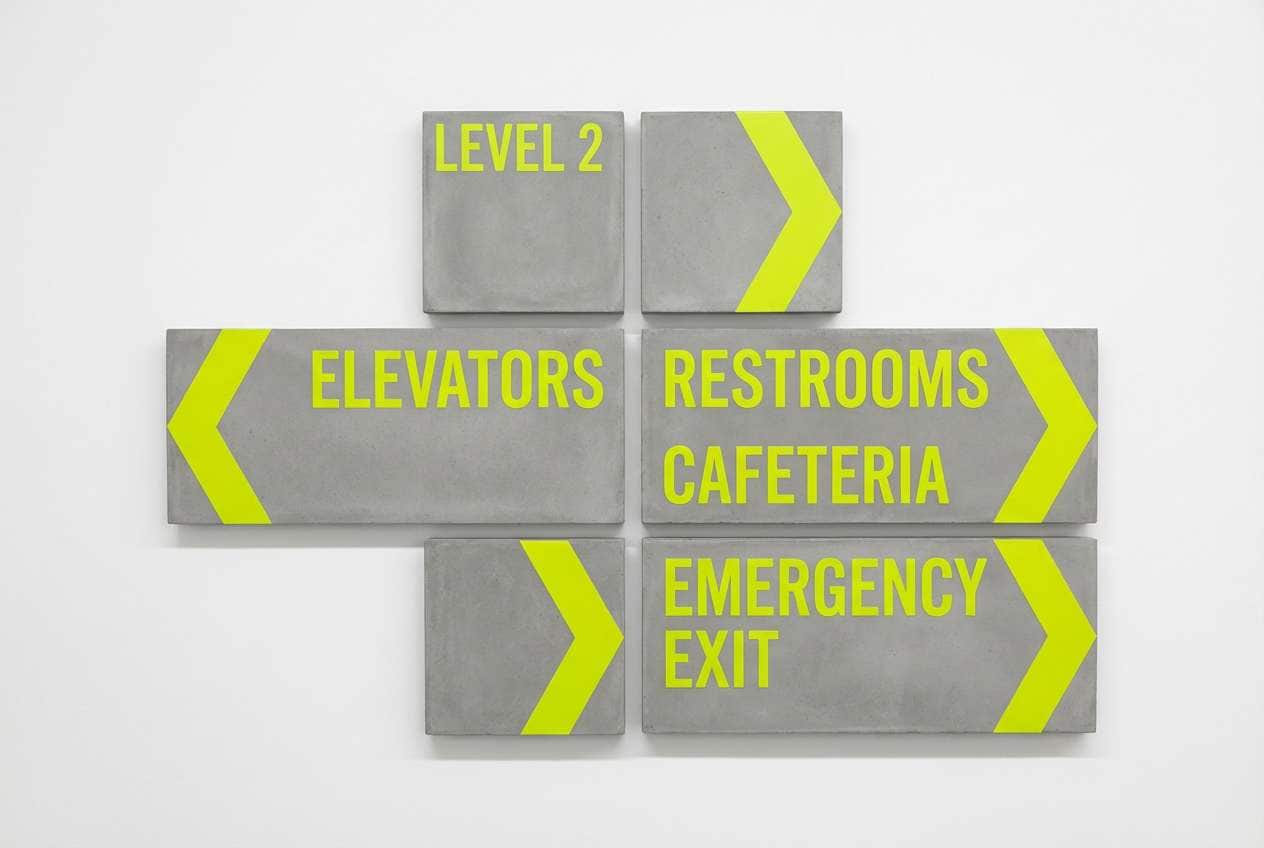
5) Safety Lime Concrete
HEX: #39FF14 #FFD400 #9AA0A6 #3C4043 #FFFFFF
Mood: bold, utilitarian, street-smart
Best for: wayfinding signage and event directionals
Safety-lime and construction yellow feel like fresh paint on concrete, instantly attention-grabbing. The grays keep everything practical and readable, making it ideal for signs, maps, and quick instructions. Use white as your main background and let lime mark the primary route or action. Tip: keep type high-contrast and avoid thin fonts so it holds up at a distance.
Image example of safety lime concrete generated using media.io
6) Highlighter Noir Interface
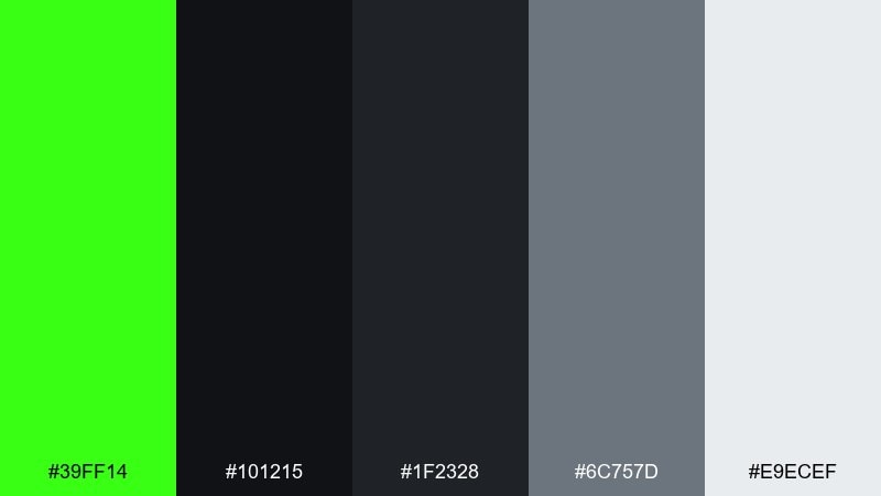
HEX: #39FF14 #101215 #1F2328 #6C757D #E9ECEF
Mood: sleek, modern, dark-mode
Best for: SaaS dashboards and dark UI themes
Sleek noir layers feel like a dim studio, with one sharp highlighter stroke cutting through the dark. As a neon green color scheme, it is best when the green signals action states like primary buttons, toggles, and success feedback. Use the light gray sparingly for text hierarchy and the mid gray for dividers. Tip: test contrast on small labels so the lime does not vibrate against near-black.
Image example of highlighter noir interface generated using media.io
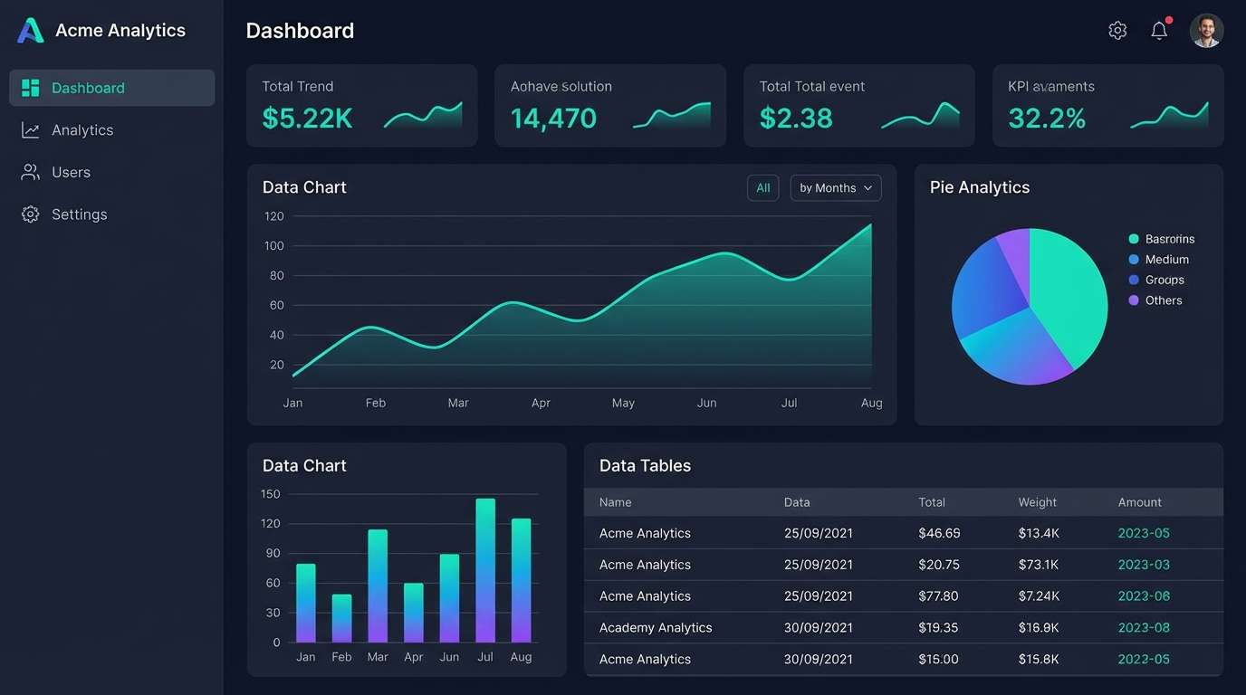
7) Citrus Tech Gradient
HEX: #39FF14 #00D1B2 #0057FF #0B1020 #F5F7FF
Mood: clean, digital, forward-looking
Best for: app landing pages and hero sections
Clean digital tones feel like a smooth gradient across a glassy display. The teal and blue give structure, while the lime adds a crisp highlight for CTAs and feature chips. Keep the dark navy for headers and the soft off-white for spacious sections. Tip: use a subtle teal-to-blue background gradient and place lime only on the focal elements.
Image example of citrus tech gradient generated using media.io
8) Neon Matcha Latte
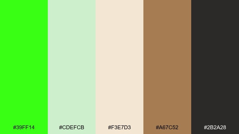
HEX: #39FF14 #CDEFCB #F3E7D3 #A67C52 #2B2A28
Mood: cozy, trendy, café modern
Best for: coffee shop menus and lifestyle branding
Cozy café neutrals meet a bright matcha hit, like a latte art swirl under a neon sign. The creams and soft greens keep it approachable, while the espresso brown adds warmth for typography. Use the lime as a small pop on prices, icons, or seasonal callouts. Tip: pair with rounded fonts and lots of whitespace to keep the vibe calm.
Image example of neon matcha latte generated using media.io
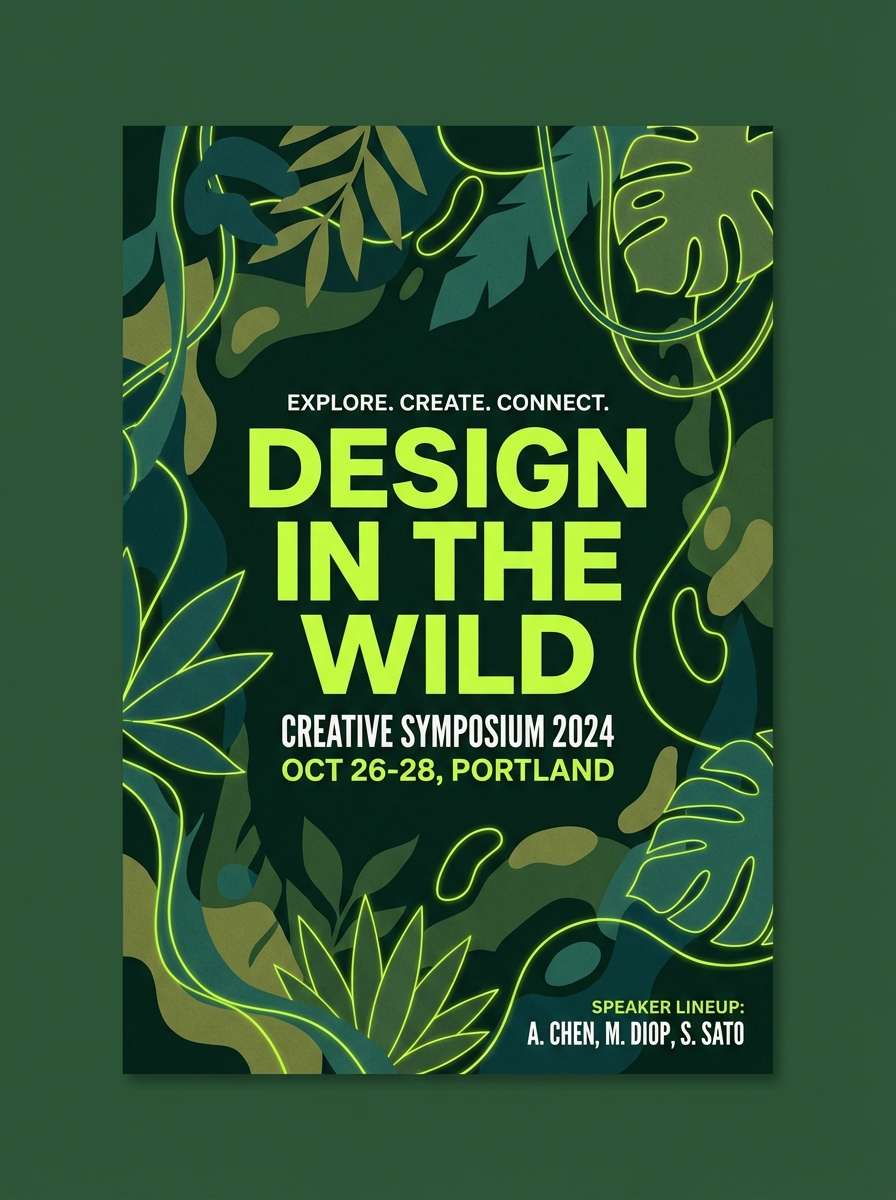
9) Midnight Jungle Glow
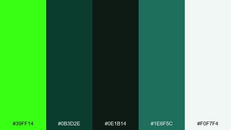
HEX: #39FF14 #0B3D2E #0E1B14 #1E6F5C #F0F7F4
Mood: mysterious, lush, botanical neon
Best for: music visuals and night event branding
Mysterious jungle greens feel damp and lush, with a sudden neon flash like fireflies in the canopy. This neon green color palette works well on dark backdrops where layered greens can build depth without needing extra colors. Pair the lime with the muted teal-green for highlights and reserve the pale mint for text blocks. Tip: add grain or subtle texture to avoid flat, overly digital greens.
Image example of midnight jungle glow generated using media.io
10) Poolside Neon Splash
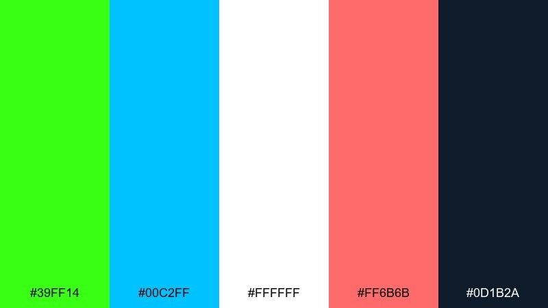
HEX: #39FF14 #00C2FF #FFFFFF #FF6B6B #0D1B2A
Mood: sunny, sporty, summer pop
Best for: swimwear ads and summer campaigns
Sunny poolside tones feel like splashes of light on water, with lime cutting through the blues. Use the navy as a strong anchor for headlines and the white for airy negative space. Coral adds a friendly accent that balances the green without turning it harsh. Tip: keep gradients gentle and let lime appear as a stripe, tag, or sticker element.
Image example of poolside neon splash generated using media.io

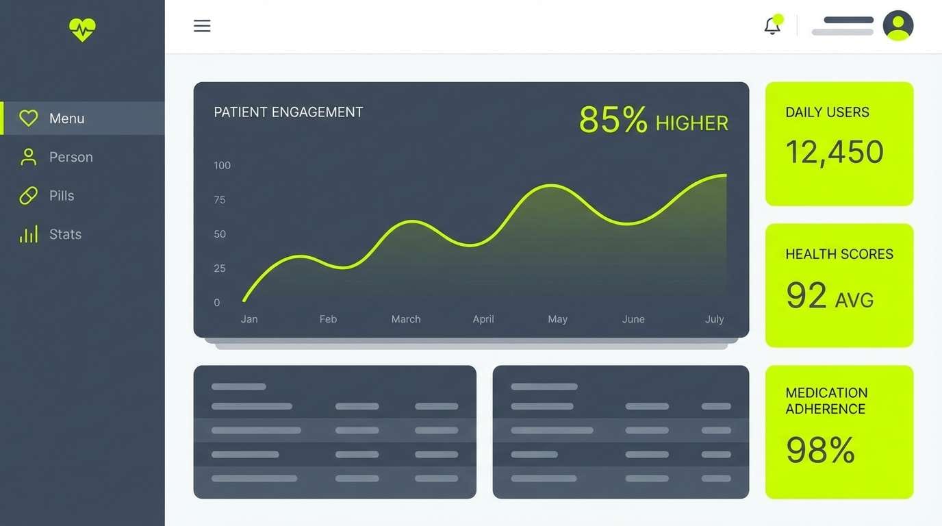
11) Cleanroom Lime White
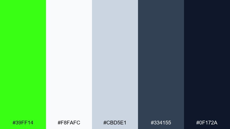
HEX: #39FF14 #F8FAFC #CBD5E1 #334155 #0F172A
Mood: clinical, precise, minimal
Best for: health tech UI and data visualizations
Clinical whites and cool slates feel like a spotless lab, with lime acting as the single signal color. The calm neutrals make charts and tables readable while still letting key metrics stand out. Use the darker navy for titles and the mid-slate for secondary labels. Tip: apply lime only to the most important data series to avoid visual fatigue.
Image example of cleanroom lime white generated using media.io
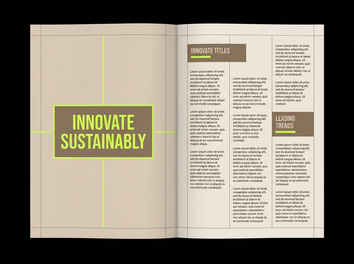
12) Beige Brown Lime Balance
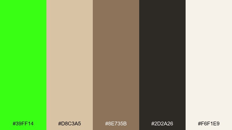
HEX: #39FF14 #D8C3A5 #8E735B #2D2A26 #F6F1E9
Mood: earthy with a shock of modern
Best for: interior mood boards and lifestyle lookbooks
Earthy beiges and browns feel like linen and leather, then the lime lands like a modern art accent. For neon green color combinations that still feel grown-up, let the warm neutrals take up most of the space and use the green like a highlight pen. The deep espresso keeps text elegant and prevents the palette from looking washed out. Tip: try lime on small decor accents or pull quotes to create a deliberate focal point.
Image example of beige brown lime balance generated using media.io
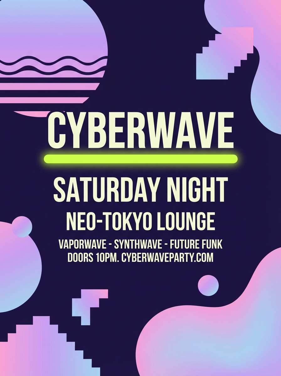
13) Vaporwave Lime Lavender
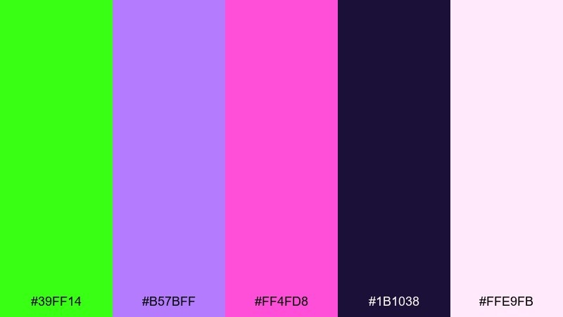
HEX: #39FF14 #B57BFF #FF4FD8 #1B1038 #FFE9FB
Mood: dreamy, retro, club-ready
Best for: album covers and nightlife flyers
Dreamy lavender and club pink set a retro mood, while lime adds a jolting highlight like a laser sweep. The deep indigo base helps the brights feel intentional and keeps text readable. Use pale blush for negative space and let lime underline the main artist name. Tip: keep effects simple, like a single gradient and crisp type, to avoid dated visuals.
Image example of vaporwave lime lavender generated using media.io
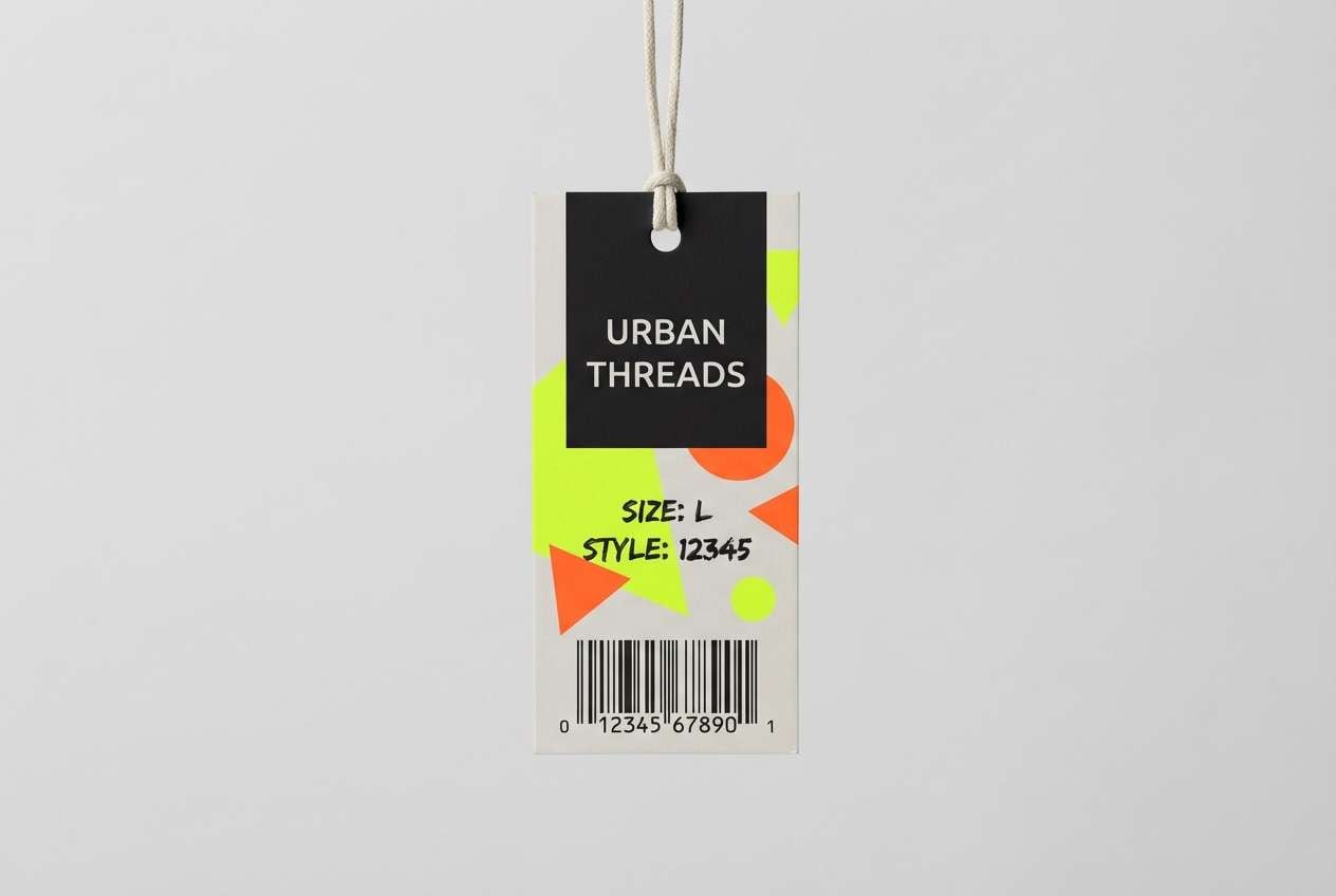
14) Streetwear Citrus Tag
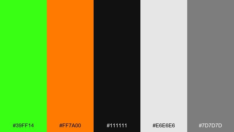
HEX: #39FF14 #FF7A00 #111111 #E6E6E6 #7D7D7D
Mood: bold, gritty, street
Best for: streetwear tags and merch graphics
Gritty street tones feel like fresh ink on a black tee, with citrus accents that demand attention. Orange adds heat next to the lime, while the grays keep layouts balanced and printable. Use black as the main field and reserve light gray for secondary copy. Tip: try oversized numbers or barcode motifs so the palette feels like real retail labeling.
Image example of streetwear citrus tag generated using media.io
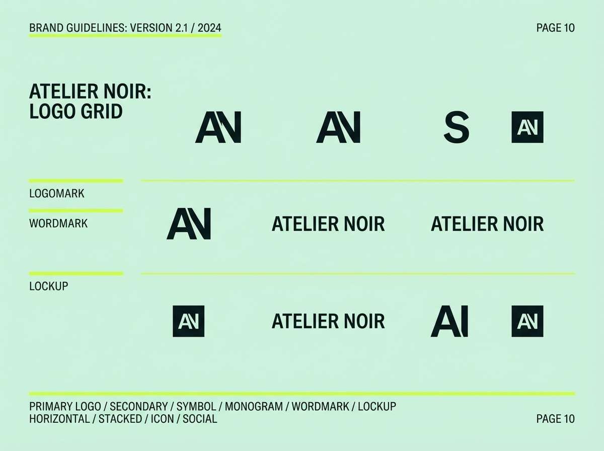
15) Mint Voltage Minimal
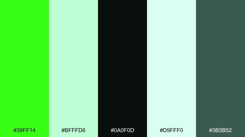
HEX: #39FF14 #BFFFD6 #0A0F0D #D9FFF0 #3B5B52
Mood: fresh, minimal, airy
Best for: modern logo systems and brand guidelines
Airy mint tones feel clean and modern, with a voltage-green jolt that sharpens the whole set. A neon green color palette like this is strongest when paired with plenty of soft tints and a single near-black for structure. Use the dark as your logo base and apply lime for highlights, badges, or link states. Tip: keep the lime as a flat color, not a gradient, to stay crisp in print.
Image example of mint voltage minimal generated using media.io
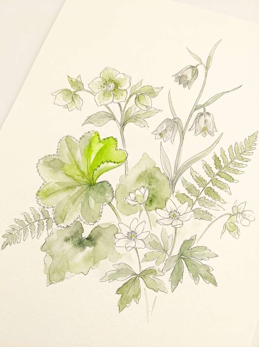
16) Botanical Neon Wash
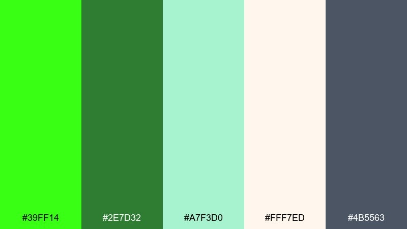
HEX: #39FF14 #2E7D32 #A7F3D0 #FFF7ED #4B5563
Mood: fresh, natural, watercolor-soft
Best for: spring botanical illustrations
Soft botanical greens feel like watercolor leaves, then a bright lime highlight makes the illustration feel alive. The warm cream keeps the page light and gives your greens room to breathe. Use the slate gray for delicate linework and captions instead of harsh black. Tip: paint the lime as a small sunlit edge on petals or stems for a realistic glow.
Image example of botanical neon wash generated using media.io
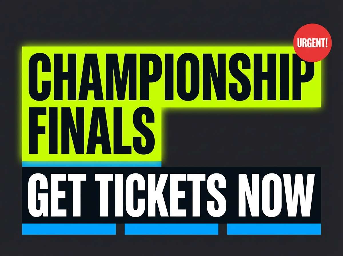
17) Stadium Neon Energy
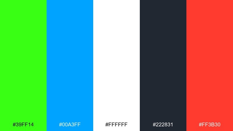
HEX: #39FF14 #00A3FF #FFFFFF #222831 #FF3B30
Mood: sporty, loud, high-impact
Best for: sports promos and scoreboard graphics
Stadium energy feels loud and fast, with lime and blue cutting through dark panels like LED signage. White keeps scores readable, while red is perfect for urgent moments like final calls or limited tickets. Use lime for the home-team highlight and blue for supporting stats. Tip: keep backgrounds simple and avoid thin outlines so it stays legible on big screens.
Image example of stadium neon energy generated using media.io
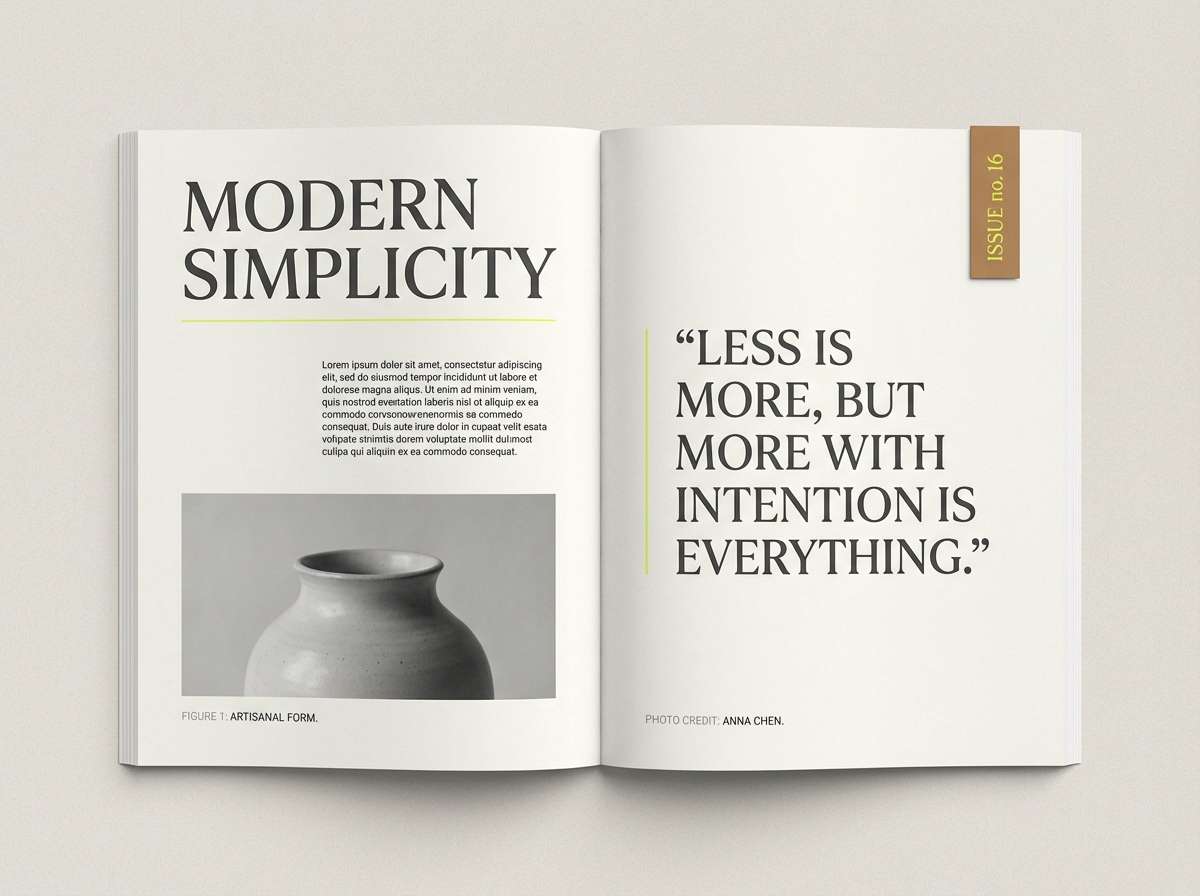
18) Editorial Lime Accent
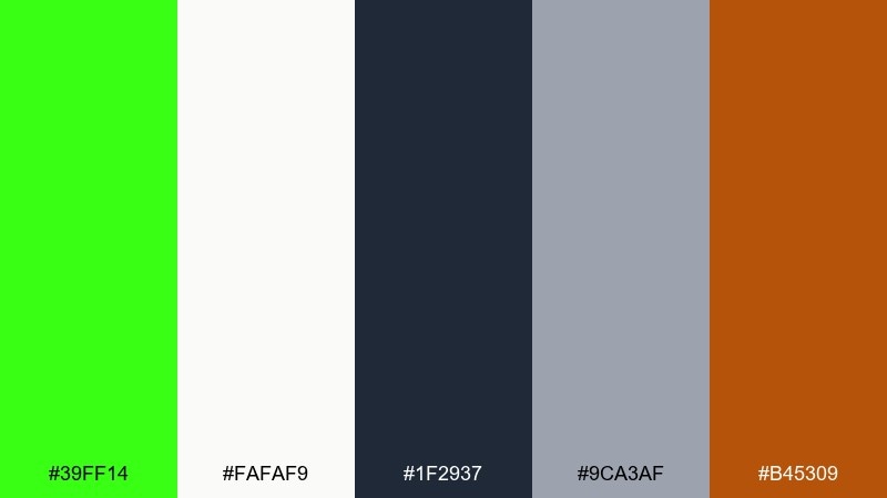
HEX: #39FF14 #FAFAF9 #1F2937 #9CA3AF #B45309
Mood: smart, contemporary, editorial
Best for: magazine features and long-read layouts
Contemporary editorial neutrals feel refined, and a single lime accent reads like a highlighted quote in a printed feature. As a neon green color scheme, it is ideal for navigation cues, section markers, and pull quotes without overwhelming the typography. Use the warm brown as a secondary accent for bylines or category tags. Tip: restrict lime to thin rules and small blocks so the page stays premium.
Image example of editorial lime accent generated using media.io
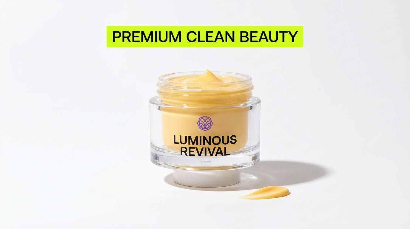
19) Product Launch Neon Pop
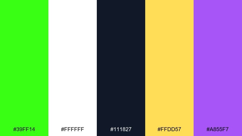
HEX: #39FF14 #FFFFFF #111827 #FFDD57 #A855F7
Mood: bold, premium, attention-grabbing
Best for: beauty product ads and hero images
Premium black and white make the lime feel like a spotlight, with yellow and violet adding a luxe pop. Keep the layout mostly monochrome and let the green drive the main CTA or product benefit. Use violet for secondary badges and yellow for limited-offer details. Tip: in ads, place lime near the product silhouette to pull the eye to the center.
Image example of product launch neon pop generated using media.io
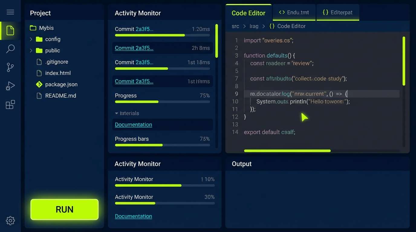
20) Dark Mode Glow Lines
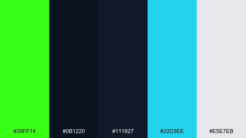
HEX: #39FF14 #0B1220 #111827 #22D3EE #E5E7EB
Mood: futuristic, crisp, night-ready
Best for: developer tools UI and terminal-inspired themes
Futuristic dark panels feel like a clean terminal, with glow-line accents that guide you through the interface. Cyan adds a second signal color for links and selected states, while soft gray keeps text comfortable. Use lime for success, run, and active indicators so users learn the pattern quickly. Tip: keep line weights consistent and avoid too many simultaneous glow effects.
Image example of dark mode glow lines generated using media.io
What Colors Go Well with Neon Green?
Neon green looks best with strong anchors: charcoal, black, and deep navy make it feel premium and keep readability high in UI, posters, and hero banners.
If you want neon green to feel more natural, pair it with warm neutrals like cream, beige, tan, and cocoa brown. Those hues “tame” the neon and make it usable for packaging, editorial, and lifestyle layouts.
For bolder color stories, try it with hot magenta, cyan, and violet—just keep one dark base in the mix so the palette doesn’t become visually exhausting.
How to Use a Neon Green Color Palette in Real Designs
Use neon green as a role-based color, not a background. It’s ideal for CTAs, active states, success indicators, highlights, tags, and small graphic accents where it can guide the eye quickly.
Balance it with whitespace or deep dark panels, then test contrast at small sizes. Neon hues can “vibrate” on screens, so clean typography weights and clear spacing help keep everything readable.
In print, consider using neon green as a spot-like accent (small blocks, rules, labels) and let neutrals carry most of the surface area for a modern, intentional look.
Create Neon Green Palette Visuals with AI
If you want to preview a neon green color scheme before committing to a full design, generating quick mockups can help you validate contrast, mood, and hierarchy in minutes.
With Media.io’s text-to-image workflow, you can turn any of the prompts above into posters, UI mockups, packaging scenes, or editorial layouts—then iterate by swapping backgrounds, lighting, or typography style.
Start with a simple prompt that mentions your use case (logo, dashboard, product label), add your HEX palette, and refine from there until the neon green accent feels controlled and purposeful.
Neon Green Color Palette FAQs
-
What is the HEX code for neon green?
The most common “neon green” reference used in modern palettes is #39FF14, often called highlighter green or electric lime. -
Is neon green good for UI design?
Yes—when used as an accent. Neon green is great for primary actions, toggles, success states, and indicators, but it’s usually too intense for large backgrounds or long text blocks. -
What colors tone down neon green?
Warm neutrals (cream, beige, tan, cocoa) and deep anchors (charcoal, black, navy) reduce harshness and make neon green feel more premium and wearable. -
What colors make neon green pop the most?
Black/charcoal and deep navy create the highest contrast, while magenta and cyan produce a bold retro-futuristic vibe—ideal for posters, gaming overlays, and nightlife graphics. -
How much neon green should I use in a palette?
A good rule is to keep neon green around 5–10% of the layout as a highlight color, letting neutrals or dark tones handle the main surfaces for readability. -
Does neon green print well?
It can, but results depend on your printing process and paper. For reliable output, use it as a smaller accent, request a proof, and consider spot/fluorescent inks if exact “neon” brightness is required. -
Can I generate neon green palette mockups with AI?
Yes. Use Media.io text-to-image to create fast posters, UI screens, packaging shots, or lookbook spreads, then iterate by adjusting the prompt and keeping the HEX colors consistent.


