

Black is one of the most flexible design foundations: it can feel minimal and modern, classic and cinematic, or bold and electric depending on your accents.
Below are 20 curated black color combinations with HEX codes for UI, branding, posters, and more—plus quick guidance on pairing and using dark tones without losing readability.
In this article
Why Black Palettes Work So Well
Black creates instant structure. It anchors layouts, increases perceived contrast, and helps you build clear hierarchy for headlines, CTAs, and imagery.
It’s also emotionally versatile: a near-black base can read luxurious with gold, calm with warm ivory, technical with steel grays, or playful with neon accents.
Practically, black tones help unify mixed content. When photos, icons, and typography share a dark foundation, the overall design feels more cohesive and intentional.
20+ Black Color Palette Ideas (with HEX Codes)
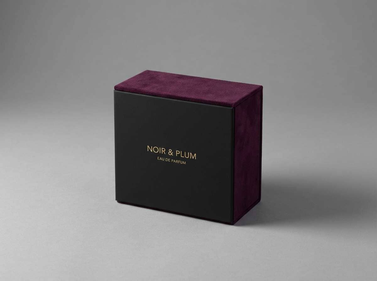
1) Midnight Velvet
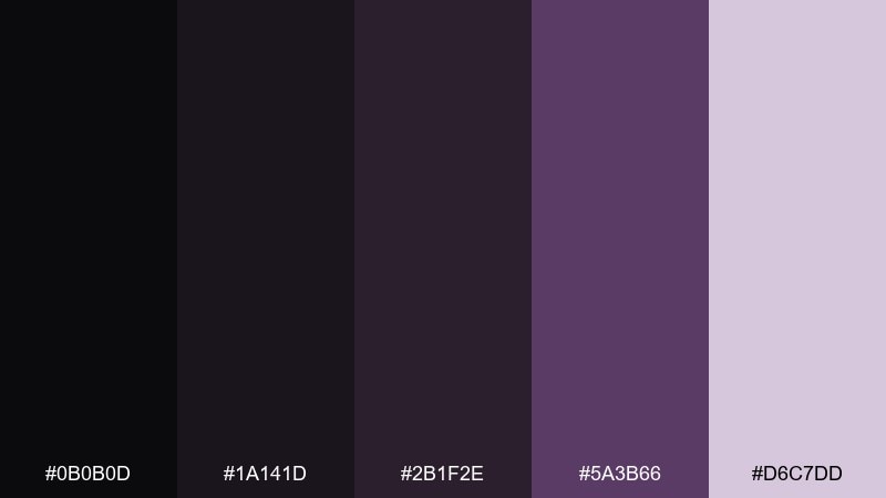
HEX: #0b0b0d #1a141d #2b1f2e #5a3b66 #d6c7dd
Mood: luxurious, moody, velvety
Best for: luxury branding and perfume packaging
Luxurious and nocturnal, it feels like velvet drapes under low gallery lights with a soft violet glow. This black color palette works beautifully for premium packaging, beauty labels, and high-end identity systems. Pair it with restrained metallics or warm off-whites to keep the dark tones refined rather than heavy. Tip: reserve the lavender tint for small highlights like seals, caps, or corner details to maintain a premium look.
Image example of midnight velvet generated using media.io
Media.io is an online AI studio for creating and editing video, image, and audio in your browser.

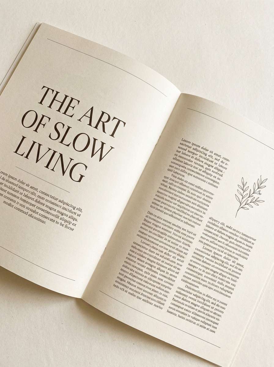
2) Ink Ivory
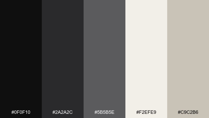
HEX: #0f0f10 #2a2a2c #5b5b5e #f2efe9 #c9c2b6
Mood: editorial, calm, balanced
Best for: magazine layouts and long-form articles
Quiet and editorial, it evokes fresh ink on warm paper with plenty of breathing room. The creamy neutrals soften the darkest tones, making headlines and pull quotes feel readable and intentional. Use it for print layouts, blog templates, and portfolios where typography is the hero. Tip: keep body text in the darkest gray, not pure black, to reduce glare on bright backgrounds.
Image example of ink ivory generated using media.io
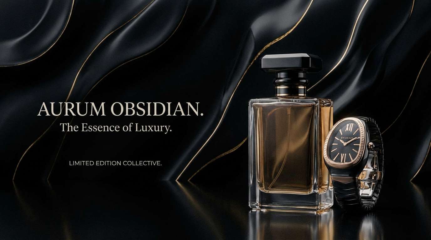
3) Obsidian Gold
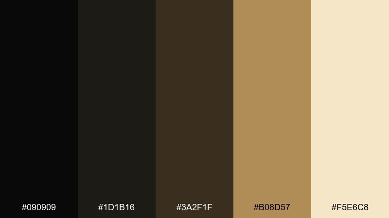
HEX: #090909 #1d1b16 #3a2f1f #b08d57 #f5e6c8
Mood: opulent, dramatic, classic
Best for: premium product ads and hero banners
Opulent and cinematic, it reads like obsidian stone lit by a warm golden spotlight. The gold and cream tones bring instant hierarchy for callouts, badges, and pricing without overpowering the base. It suits premium ads, landing page heroes, and upscale brand refreshes. Tip: apply the gold only to key edges and icons so the design stays elegant, not flashy.
Image example of obsidian gold generated using media.io
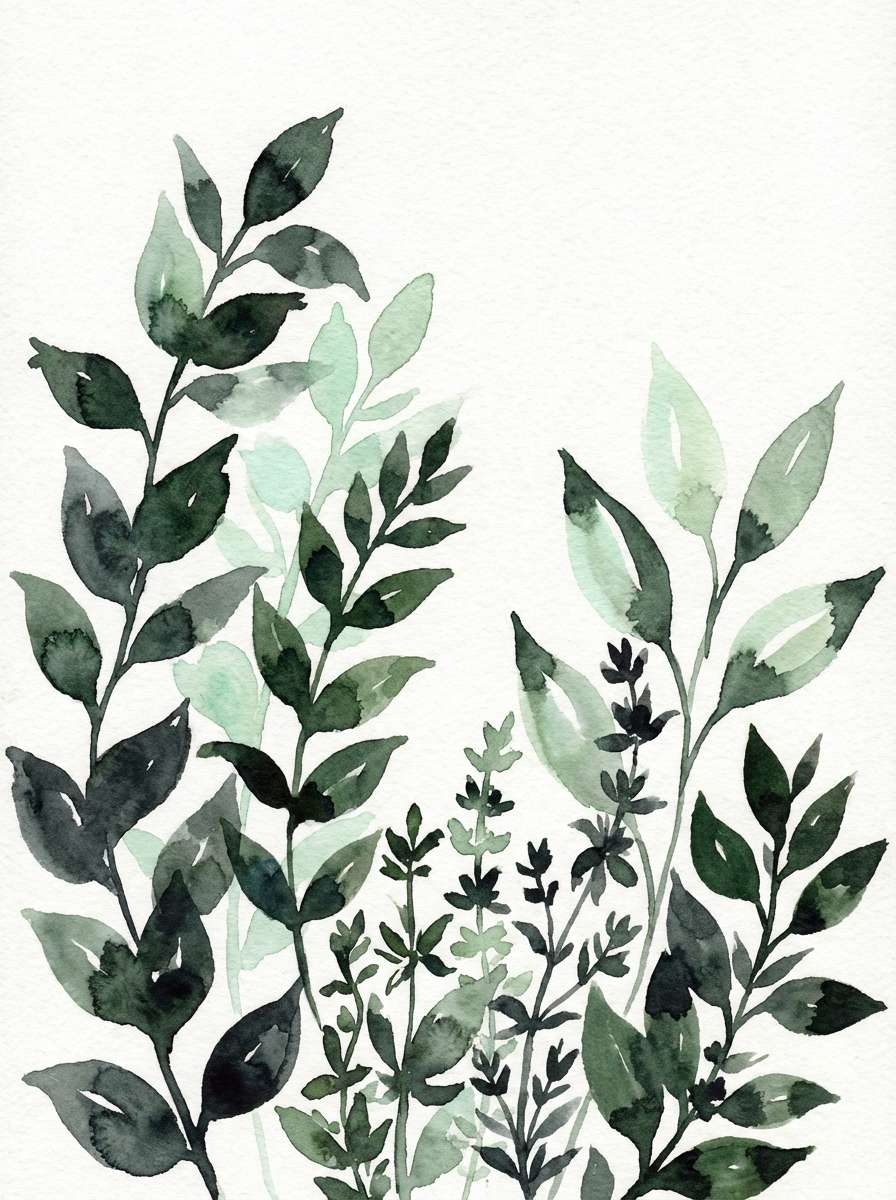
4) Noir Botanical
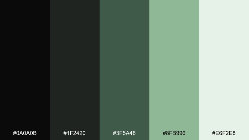
HEX: #0a0a0b #1f2420 #3f5a48 #8fb996 #e6f2e8
Mood: earthy, fresh, shadowy
Best for: eco packaging and botanical illustration
Earthy and shadowy, it feels like leaves in moonlight with dew catching on soft greens. The forest tones keep the dark base from feeling sterile, especially on wellness and sustainability projects. Pair it with recycled paper textures, thin line icons, and plenty of negative space. Tip: use the pale mint as a background wash to make green elements look more vivid.
Image example of noir botanical generated using media.io
5) Carbon Neon
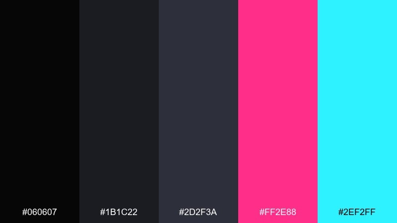
HEX: #060607 #1b1c22 #2d2f3a #ff2e88 #2ef2ff
Mood: electric, bold, nightlife
Best for: concert posters and nightlife promos
Electric and restless, it channels late-night city glow with neon signage cutting through haze. These black color combinations shine for event posters, DJ lineups, and energetic social tiles where contrast is the main hook. Pair the neon accents with simple sans-serif type and strong alignment to avoid visual noise. Tip: use one neon as the primary and the other only for micro-highlights like time and venue.
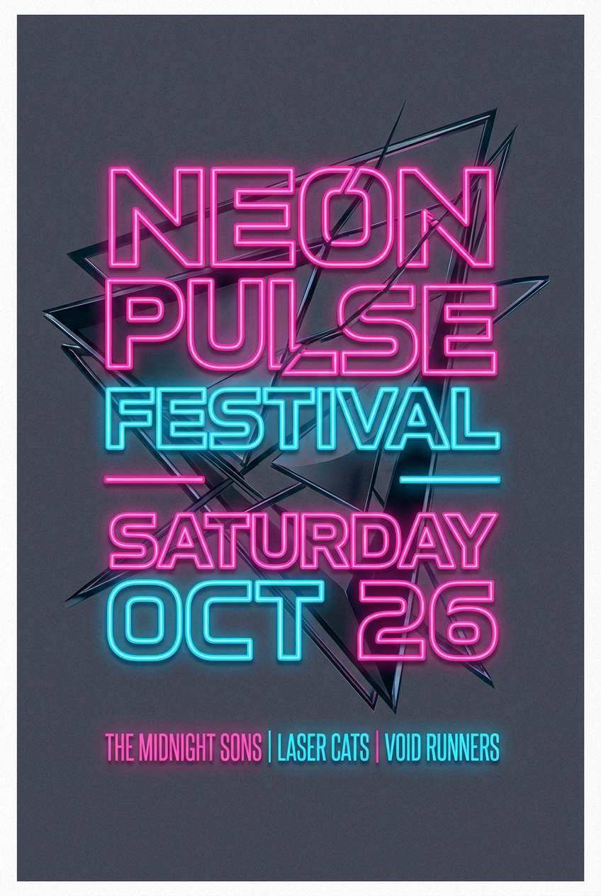
Image example of carbon neon generated using media.io
6) Slate Smoke
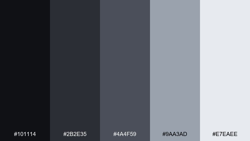
HEX: #101114 #2b2e35 #4a4f59 #9aa3ad #e7eaee
Mood: modern, muted, architectural
Best for: interior design presentations and portfolios
Muted and architectural, it suggests slate walls, soft concrete, and a slow drift of smoke. The cool grays create a professional structure for layouts without the harshness of pure black. Use it for interior decks, architecture portfolios, or product documentation where clarity matters. Tip: keep large areas in the lightest gray and use the darkest shade only for titles and dividers.
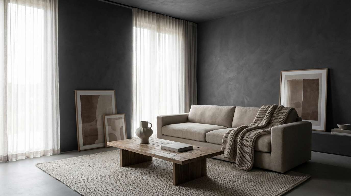
Image example of slate smoke generated using media.io
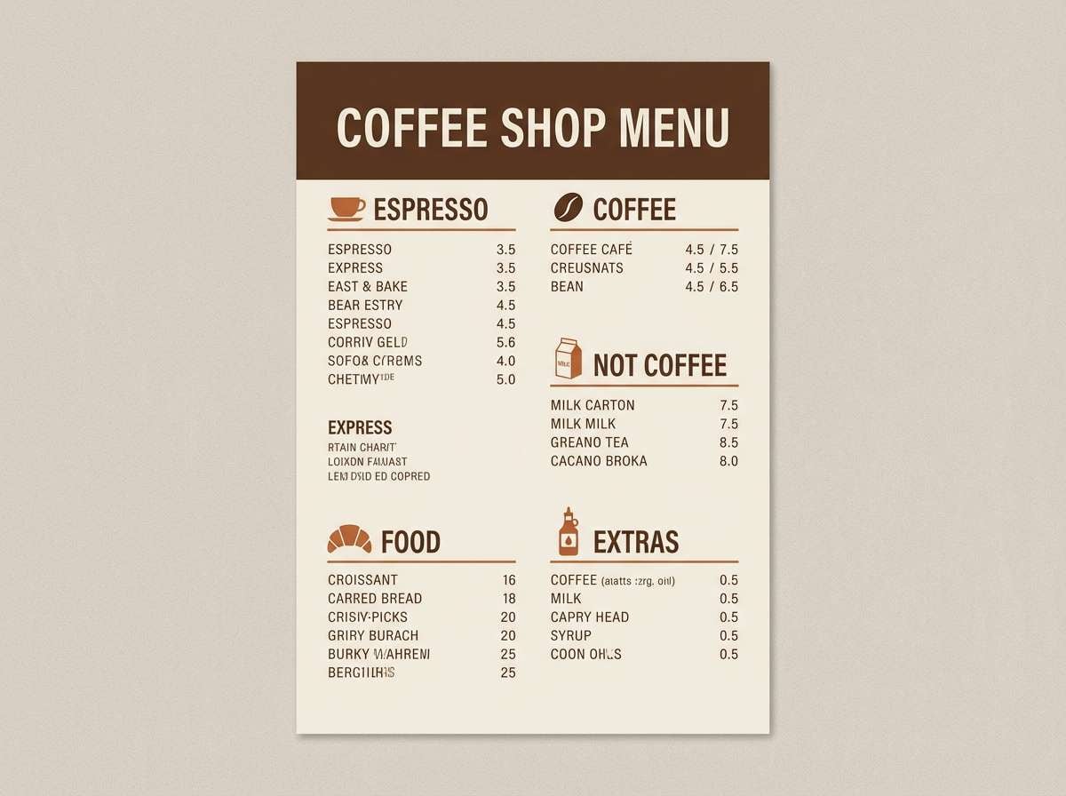
7) Espresso Charcoal
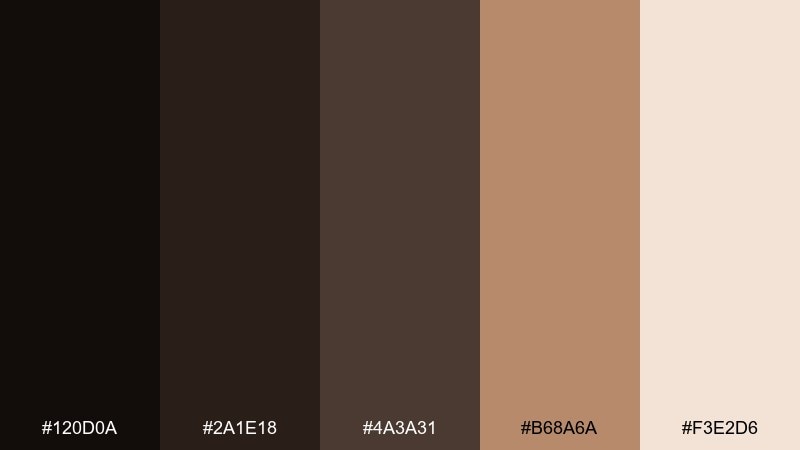
HEX: #120d0a #2a1e18 #4a3a31 #b68a6a #f3e2d6
Mood: warm, cozy, handcrafted
Best for: coffee shop branding and menu design
Warm and cozy, it recalls espresso crema, dark roasted beans, and worn wood counters. The tan and blushy cream tones add hospitality while the charcoals keep the layout grounded. It fits cafe menus, roastery labels, and artisan packaging that leans handcrafted. Tip: print the lighter shades on uncoated stock to emphasize the tactile, small-batch feel.
Image example of espresso charcoal generated using media.io
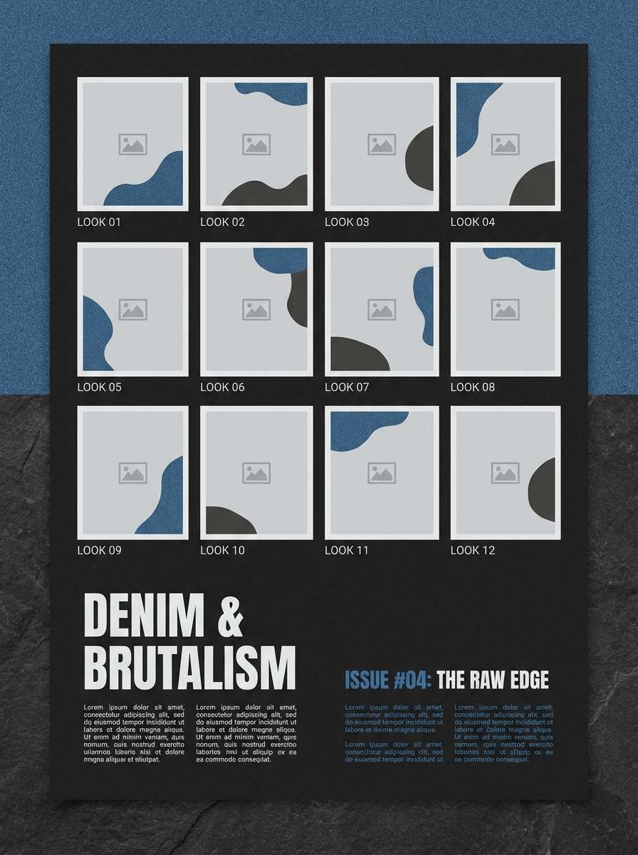
8) Graphite Denim
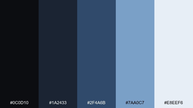
HEX: #0c0d10 #1a2433 #2f4a6b #7aa0c7 #e8eef6
Mood: cool, urban, confident
Best for: fashion lookbooks and apparel brands
Cool and urban, it feels like dark denim, crisp air, and polished street style. The blues bring an approachable edge to a deep base, perfect for apparel brands that want confidence without luxury stiffness. Use it in lookbooks, e-commerce banners, and campaign layouts with strong photography. Tip: keep the light blue for captions and sizing details so the content stays readable over images.
Image example of graphite denim generated using media.io
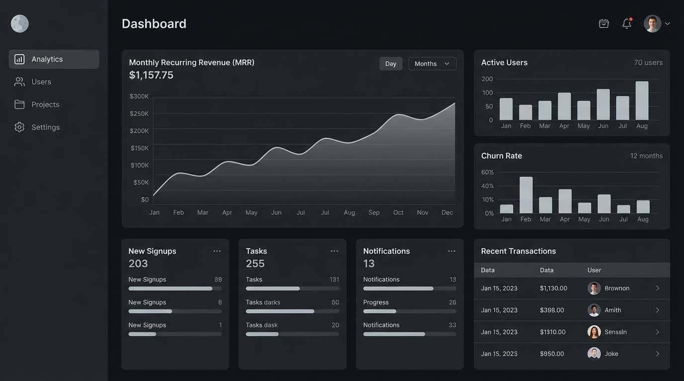
9) Lunar Steel
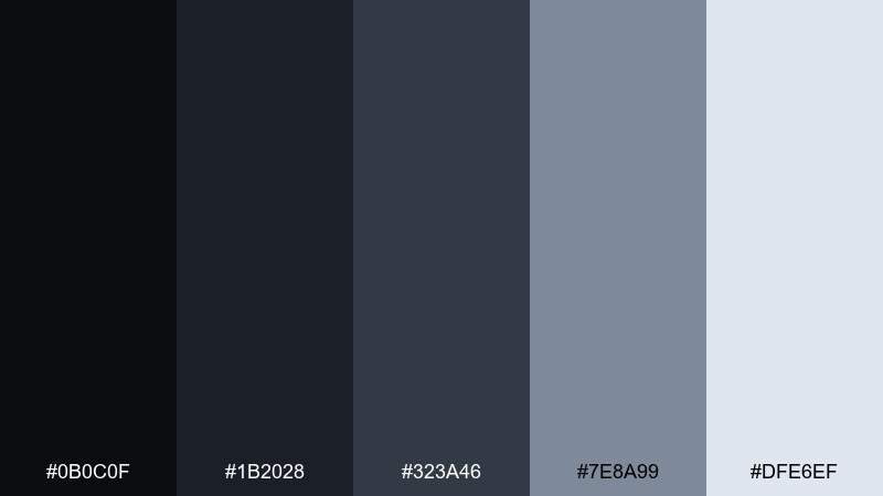
HEX: #0b0c0f #1b2028 #323a46 #7e8a99 #dfe6ef
Mood: sleek, technical, futuristic
Best for: SaaS dashboards and analytics UI
Sleek and technical, it evokes moonlit metal and quiet control rooms. The stepped grays make it easy to build depth with cards, modals, and table rows without visual clutter. It works well for analytics products, developer tools, and dark-mode UI kits. Tip: use the lightest tint for text on dark surfaces and keep borders subtle to avoid a noisy grid.
Image example of lunar steel generated using media.io
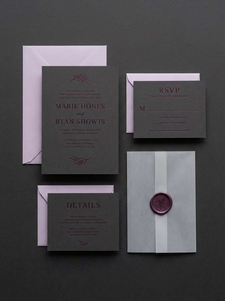
10) Raven Plum
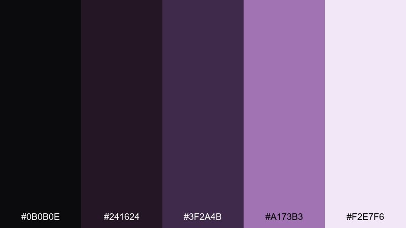
HEX: #0b0b0e #241624 #3f2a4b #a173b3 #f2e7f6
Mood: romantic, moody, elegant
Best for: wedding invitations and evening events
Romantic and moody, it brings to mind velvet ribbons, twilight florals, and candlelit ceremonies. The plum tones soften the darkness, making it ideal for formal invites, gala programs, and upscale announcements. Pair with delicate serif typography and minimal linework to keep it refined. Tip: use the pale lilac as negative space so the darker plum feels intentional, not heavy.
Image example of raven plum generated using media.io
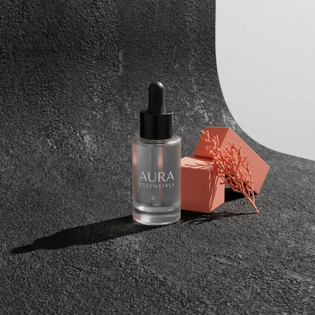
11) Asphalt Coral
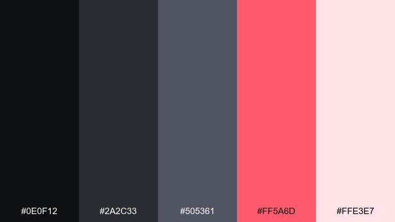
HEX: #0e0f12 #2a2c33 #505361 #ff5a6d #ffe3e7
Mood: playful, punchy, modern
Best for: cosmetics ads and social campaigns
Punchy and modern, it feels like neon lipstick against wet asphalt after rain. The coral accent adds instant energy for call-to-action buttons, sale stickers, and product feature callouts. Use it for beauty campaigns, startup ads, and bold social creatives that need fast scroll-stopping contrast. Tip: keep coral to 10 to 15 percent of the layout so the design stays chic rather than loud.
Image example of asphalt coral generated using media.io
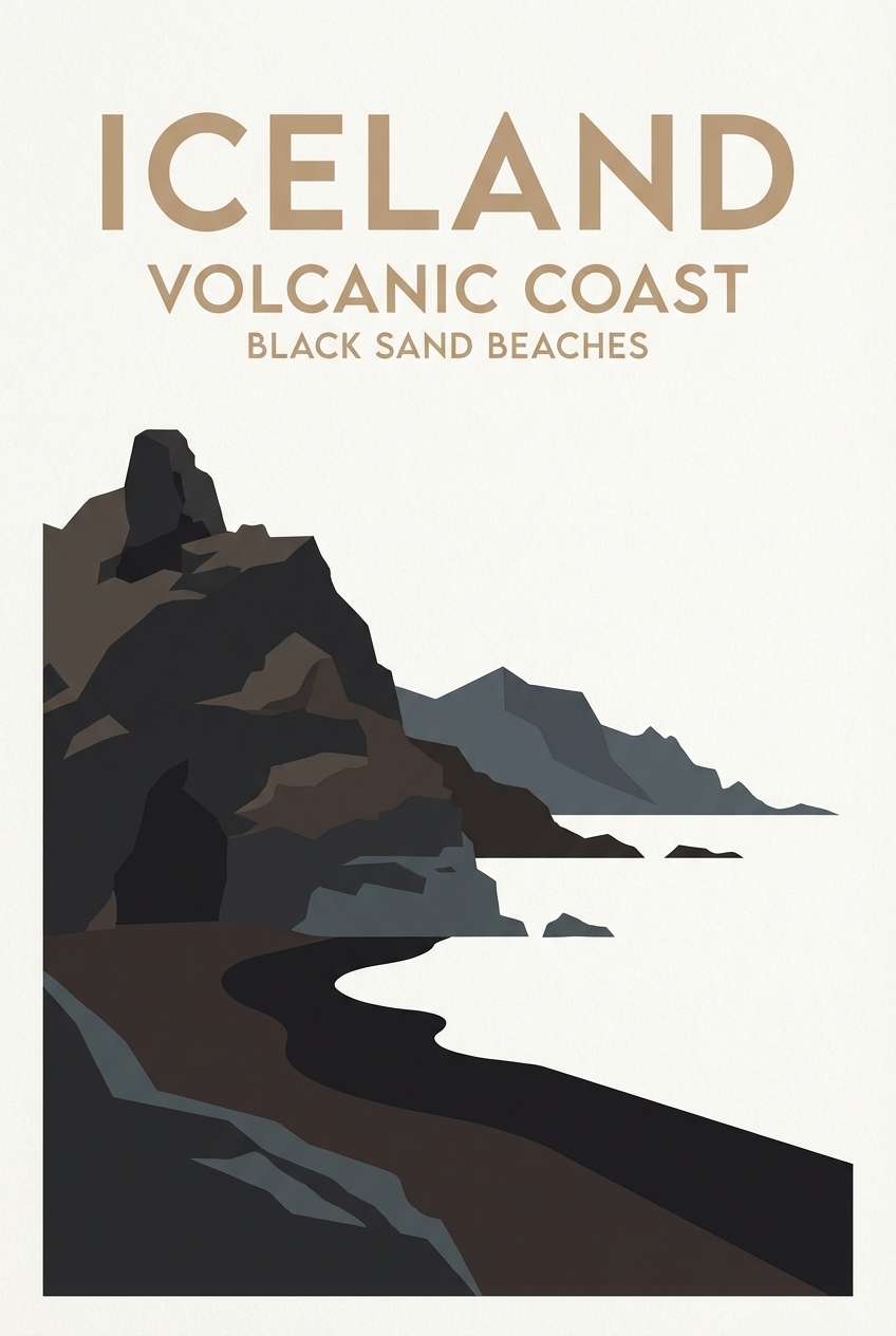
12) Black Sand Beach
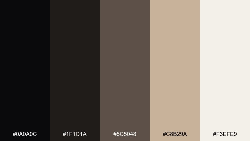
HEX: #0a0a0c #1f1c1a #5c5048 #c8b29a #f3efe9
Mood: natural, grounded, travel-ready
Best for: travel posters and destination branding
Grounded and natural, it suggests volcanic sand, driftwood, and sun-faded stone. These black color combinations feel especially convincing in travel branding where you want rugged contrast without losing warmth. Pair with textured paper effects, simple map lines, and muted photography tones. Tip: use the sandy beige for large type blocks to keep destinations readable from a distance.
Image example of black sand beach generated using media.io
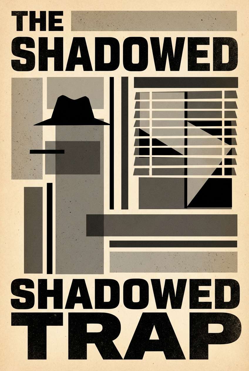
13) Vintage Film Noir
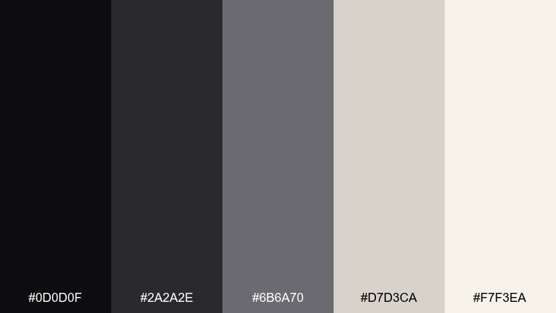
HEX: #0d0d0f #2a2a2e #6b6a70 #d7d3ca #f7f3ea
Mood: classic, smoky, retro
Best for: movie posters and retro title cards
Classic and smoky, it feels like an old cinema lobby with soft projector light and worn paper. The warm off-whites keep the grayscale from looking cold, which is great for retro-inspired typography. Use it for film posters, book covers, and brand stories that lean timeless. Tip: add subtle grain to the light tones to sell the vintage mood without sacrificing legibility.
Image example of vintage film noir generated using media.io
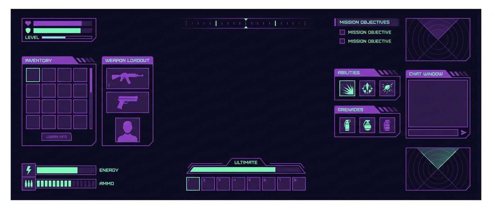
14) Cyber Shadow
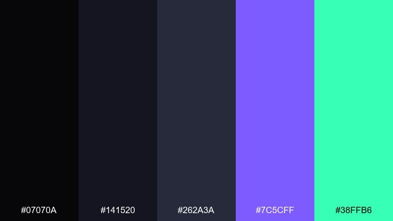
HEX: #07070a #141520 #262a3a #7c5cff #38ffb6
Mood: cyberpunk, high-contrast, energetic
Best for: gaming HUD and streaming overlays
High-contrast and cyberpunk, it reads like a glowing HUD in a dark arcade. The purple and mint accents create instant interaction states for hover, active, and alerts. Use it for game UI, streaming overlays, and esports branding where clarity under motion matters. Tip: keep text mostly in pale tones and reserve neon for status indicators and key actions.
Image example of cyber shadow generated using media.io
15) Monochrome Minimal
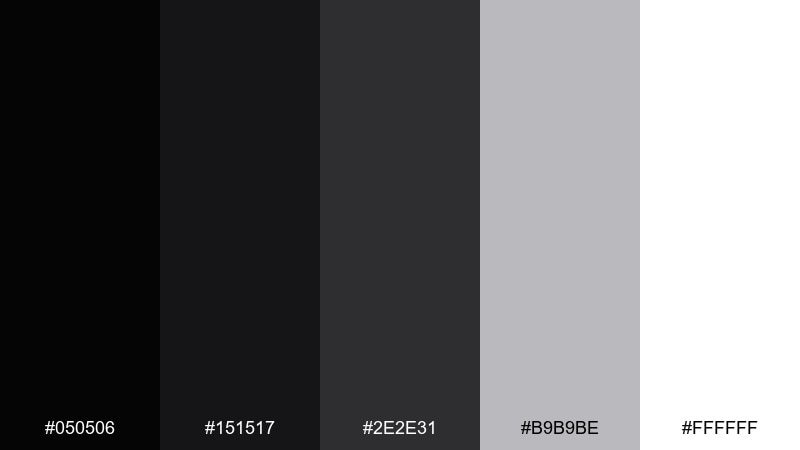
HEX: #050506 #151517 #2e2e31 #b9b9be #ffffff
Mood: minimal, crisp, timeless
Best for: logo presentations and minimalist web design
Crisp and minimal, it feels like clean gallery walls and sharp type on white paper. This black color palette is ideal for logo systems, product typography, and minimalist websites where spacing does the heavy lifting. Pair it with one accent color only if you need a single focal point, otherwise let contrast carry the hierarchy. Tip: use the mid-gray for secondary text to avoid a harsh jump between pure black and white.
Image example of monochrome minimal generated using media.io
16) Stormy Teal
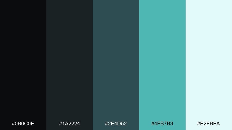
HEX: #0b0c0e #1a2224 #2e4d52 #4fb7b3 #e2fbfa
Mood: fresh, confident, professional
Best for: fintech and health tech landing pages
Fresh and confident, it evokes storm clouds breaking into a cool teal horizon. The teal ladder gives you clear states for buttons, charts, and links while the dark base keeps everything focused. It fits fintech, health tech, and data products that want modern trust without feeling sterile. Tip: keep teal gradients subtle and use flat fills for primary actions to maintain accessibility.
Image example of stormy teal generated using media.io
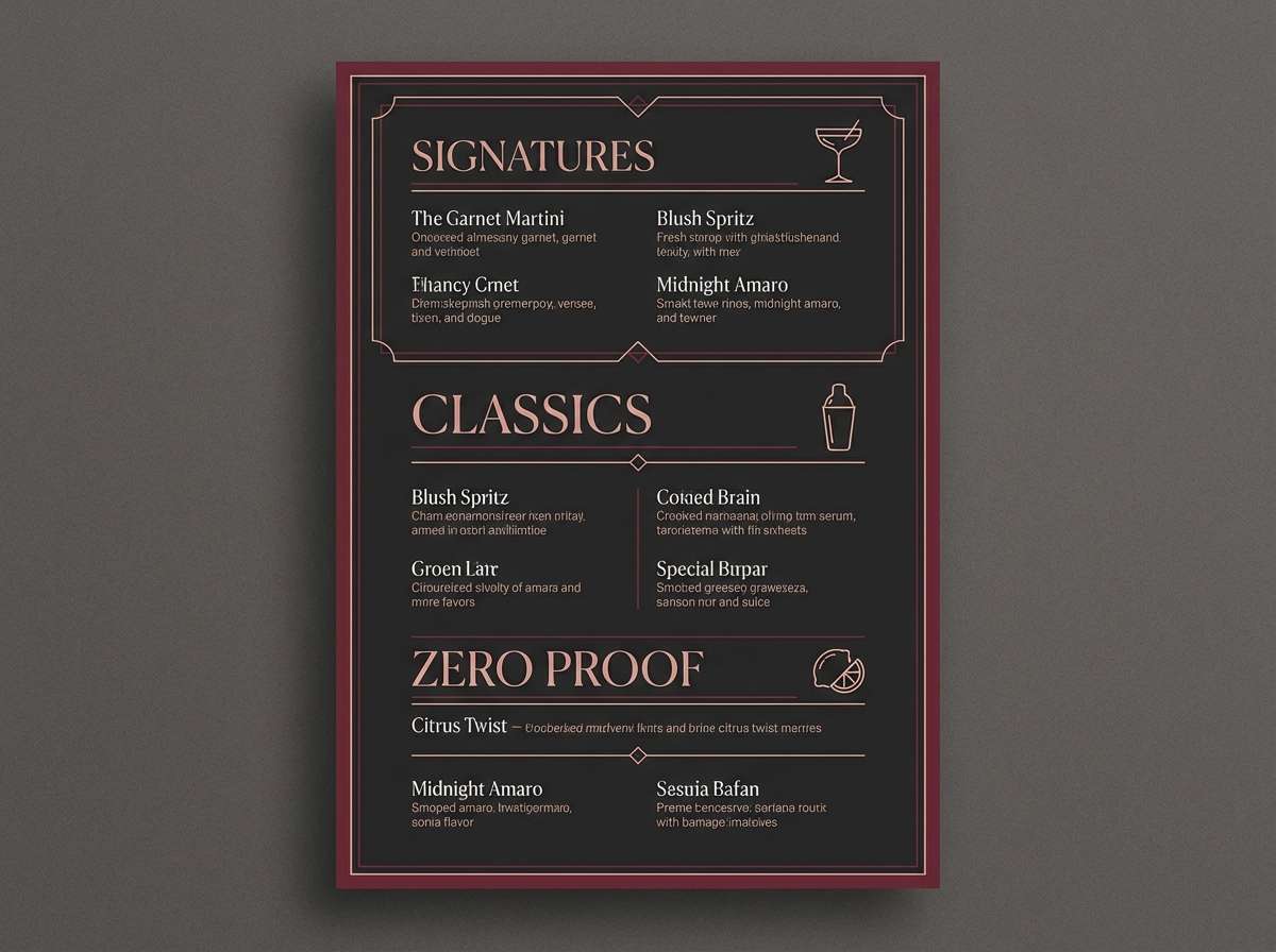
17) Garnet Ember
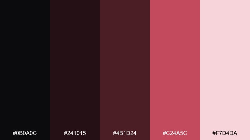
HEX: #0b0a0c #241015 #4b1d24 #c24a5c #f7d4da
Mood: rich, intimate, nightlife
Best for: cocktail menus and bar branding
Rich and intimate, it feels like candlelight reflecting through a glass of red wine. The garnet range adds depth for section headers, stamps, and signature cocktails while keeping the base sophisticated. Use it for bar menus, nightlife branding, and limited-edition labels. Tip: apply the blush tint behind featured items so they stand out without extra ornaments.
Image example of garnet ember generated using media.io
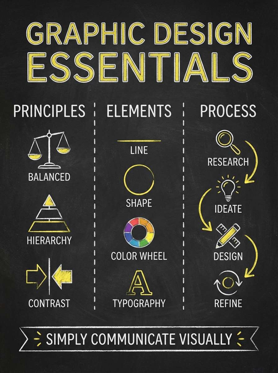
18) Chalkboard Citrus
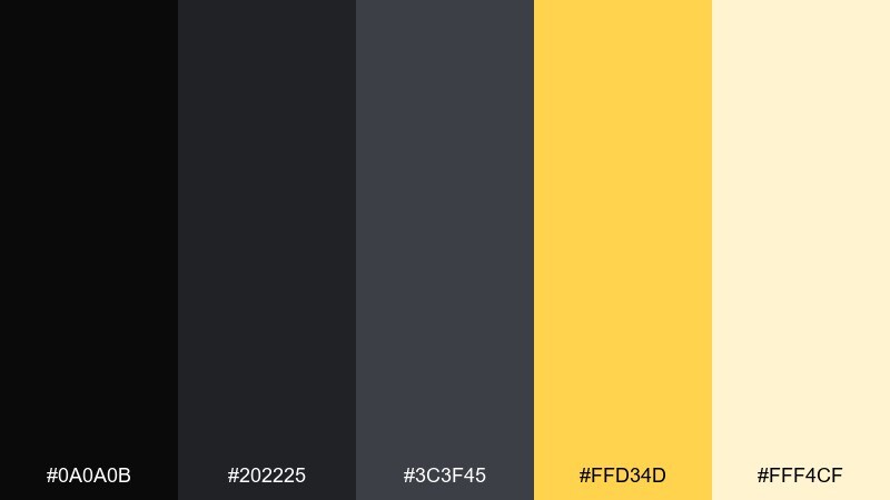
HEX: #0a0a0b #202225 #3c3f45 #ffd34d #fff4cf
Mood: friendly, high-contrast, upbeat
Best for: infographics and classroom posters
Upbeat and readable, it brings to mind chalk lettering on a board with a sunny pop of citrus. The yellow accent is perfect for labels, data highlights, and icons that need instant attention. Use it for infographics, educational posters, and presentation slides where clarity matters. Tip: keep charts in grays and reserve yellow only for key values so the message stays focused.
Image example of chalkboard citrus generated using media.io
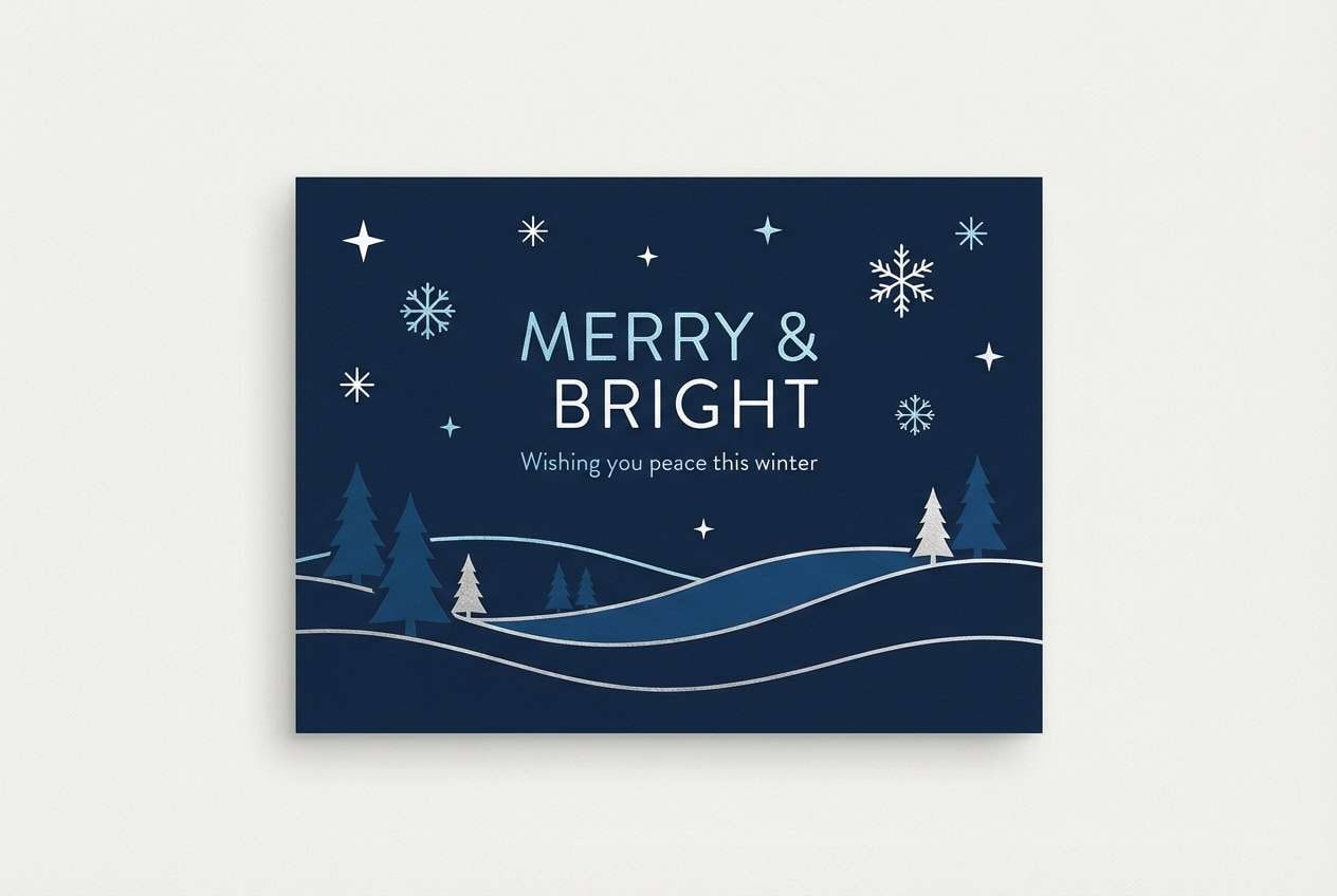
19) Winter Night
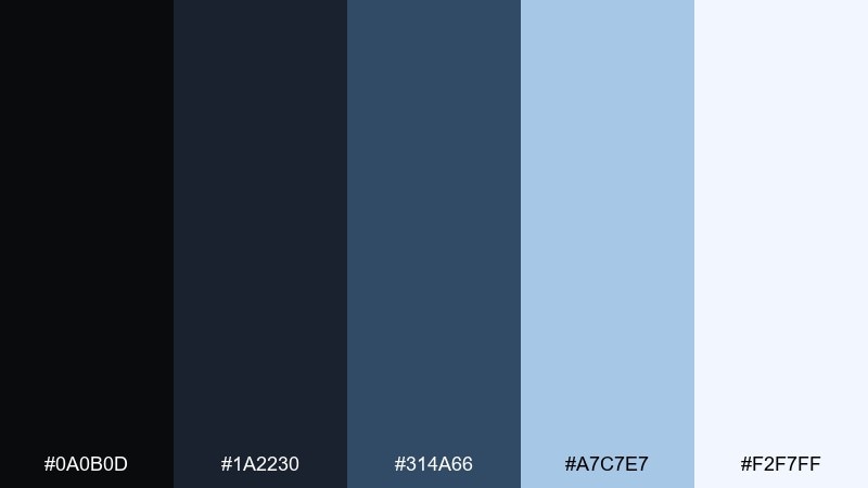
HEX: #0a0b0d #1a2230 #314a66 #a7c7e7 #f2f7ff
Mood: quiet, crisp, seasonal
Best for: holiday cards and winter campaigns
Quiet and crisp, it feels like a clear winter sky with icy reflections on snow. The blues add a seasonal calm while the dark base keeps layouts sharp and modern. Use it for holiday cards, winter sale campaigns, or event banners that need a cool, clean mood. Tip: add small star-like dots or thin lines in the palest tint to create depth without clutter.
Image example of winter night generated using media.io
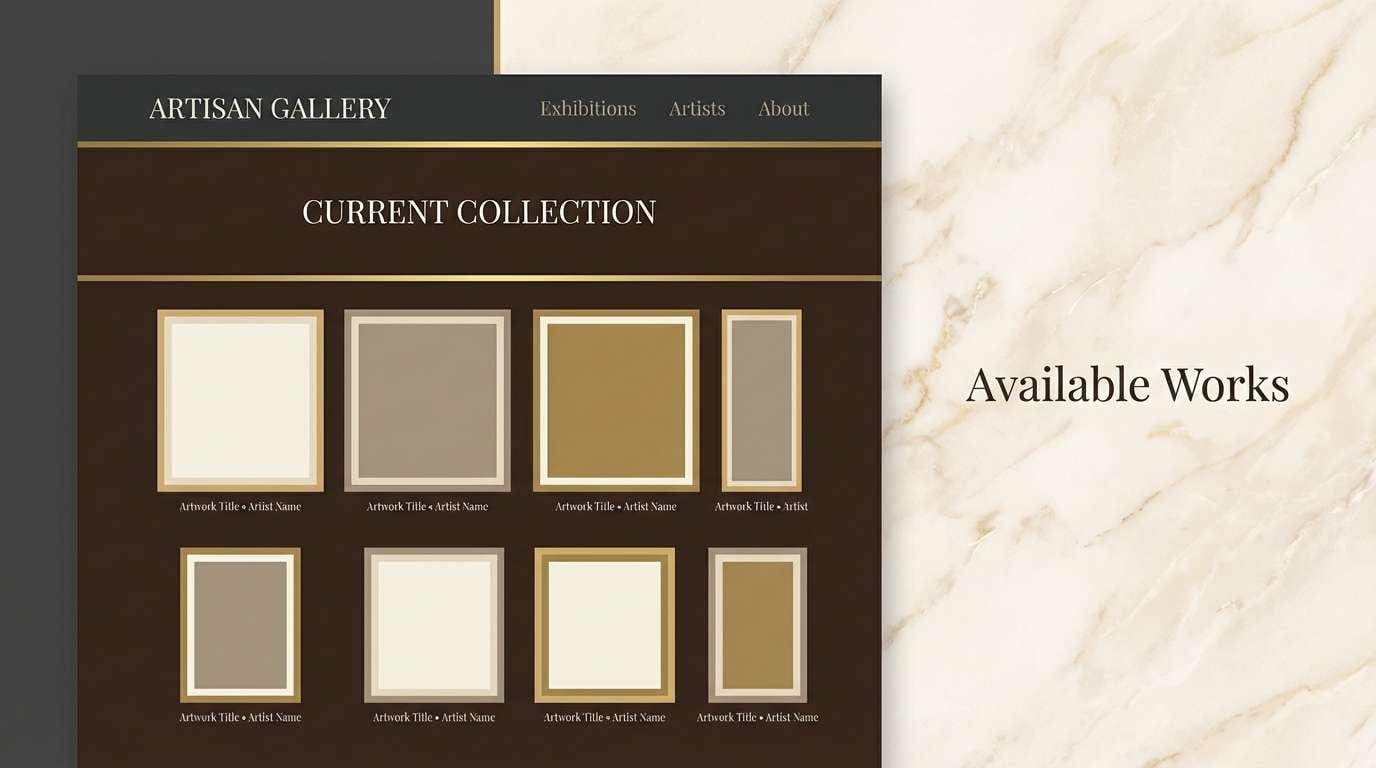
20) Museum Marble
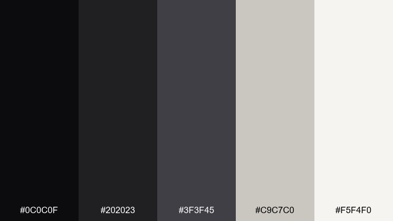
HEX: #0c0c0f #202023 #3f3f45 #c9c7c0 #f5f4f0
Mood: curated, refined, gallery-like
Best for: portfolio sites and exhibition microsites
Curated and refined, it resembles a museum interior with dark plinths and soft marble highlights. The warm light neutrals keep the contrast inviting, especially for typography-heavy pages. Use it for portfolio sites, exhibition microsites, and product pages that need an elevated tone. Tip: keep interactive elements in the mid-gray range so the brightest shade remains reserved for content emphasis.
Image example of museum marble generated using media.io
What Colors Go Well with Black?
Warm neutrals (cream, ivory, beige) make black feel softer and more editorial, which is ideal for text-heavy layouts and premium packaging that shouldn’t look harsh.
Metallic cues like gold/brass tones (or flat mustard/yellow substitutes on screens) create instant luxury and hierarchy when used sparingly for icons, borders, and key labels.
For high-energy contrast, pair black with neon accents (cyan, magenta, lime) or saturated jewel tones (plum, teal, garnet). Keep accents limited so the design stays readable and intentional.
How to Use a Black Color Palette in Real Designs
Start with near-black instead of pure black for large backgrounds. Slightly lifted blacks reduce banding and eye strain, and they give you room to create depth with cards and sections.
Build hierarchy using two to three dark steps plus one light neutral for text. Then reserve your accent color for interaction states (primary button, active tab, key highlight) rather than decorating everything.
Test contrast early. Dark themes can fail on thin fonts and low-opacity dividers—use the lightest tint for body text, and keep secondary text in a mid-gray that still passes accessibility checks.
Create Black Palette Visuals with AI
If you’re pitching a concept, it helps to show the palette in context—on a poster, product ad, invitation, or UI mockup—so stakeholders “feel” the mood immediately.
With Media.io’s text-to-image, you can generate on-brand visuals from a simple prompt, then iterate fast by swapping accents (gold vs. teal vs. neon) while keeping the black base consistent.
Use your palette HEX codes as guidance for styling, then refine typography, spacing, and contrast in your final design system.
Black Color Palette FAQs
-
What’s the difference between pure black and near-black in design?
Pure black (#000000) can look harsh and cause eye strain on screens. Near-black (like #0b0b0d or #101114) feels softer, reduces glare, and gives you more tonal steps for depth in dark UI. -
Does black always look “luxury” in branding?
No—black can signal luxury with gold/cream accents and minimal layouts, but it can also feel sporty, technical, or edgy depending on typography, spacing, and the accent color you choose. -
What accent color works best with black?
It depends on the goal: gold/cream for premium, teal/blue for trustworthy and modern, plum/garnet for romantic and moody, and neon cyan/magenta for nightlife or gaming visuals. -
How do I keep text readable on a black background?
Avoid using pure white for long paragraphs; use a soft off-white (like #dfe6ef) for body text and a mid-gray for secondary labels. Keep line-height generous and don’t rely on low-opacity thin dividers. -
How many colors should a black palette include for UI?
A practical dark UI palette often needs 3–5 neutrals (background, surface, border, muted text, bright text) plus 1–2 accent colors for actions and states like hover, active, and error. -
Can black palettes work for print projects like posters and invitations?
Yes. Use warm off-whites to keep contrast comfortable, and consider paper texture or subtle grain to prevent large dark areas from feeling flat. For invites, pair black with serif type and restrained accents. -
How can I quickly generate mockups that match a black color palette?
Use Media.io’s text-to-image to create poster, packaging, or UI visuals from prompts, then iterate by specifying your accent color (gold, teal, neon) and keeping the background as near-black for consistency.


