

Cream white is the quiet “hero neutral” that makes designs feel brighter, warmer, and more premium than pure white—without the harsh glare.
Below are modern cream white palette ideas with HEX codes, plus practical ways to use them for branding, interiors, and UI.
In this article
- Why Cream White Palettes Work So Well
-
- porcelain glow
- vanilla oat
- linen studio
- soft sandstone
- ivory ink
- buttercream blush
- cafe marble
- honeyed paper
- seashell neutral
- pearl latte
- candlelight calm
- cloud cream
- biscotti brick
- desert silk
- milk tea mocha
- garden parchment
- champagne truffle
- warm minimal ui
- stonewashed cream
- cozy cashmere
- antique lace
- What Colors Go Well with Cream White?
- How to Use a Cream White Color Palette in Real Designs
- Create Cream White Palette Visuals with AI
Why Cream White Palettes Work So Well
Cream white tones soften contrast and reduce the sterile feel that pure #FFFFFF can create, especially on large backgrounds in websites, packaging, and interiors.
Because cream white carries a warm undertone, it pairs naturally with wood, leather, gold, and earthy pigments—making “minimal” designs feel inviting rather than cold.
In UI, cream-based neutrals also help long-session comfort by lowering visual glare while still keeping plenty of clarity for hierarchy and typography.
20+ Cream White Color Palette Ideas (with HEX Codes)
1) Porcelain Glow
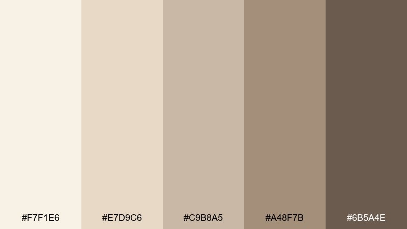
HEX: #F7F1E6 #E7D9C6 #C9B8A5 #A48F7B #6B5A4E
Mood: calm, refined, warm
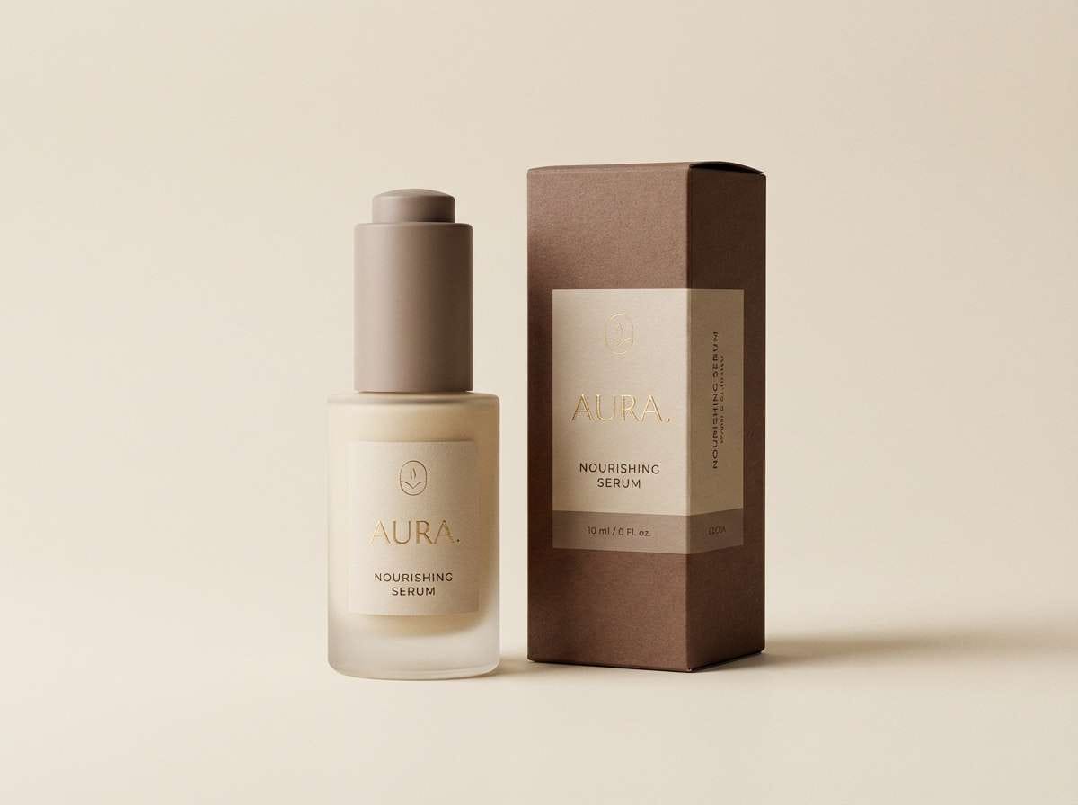
Best for: luxury skincare packaging
Calm and luminous like porcelain under soft daylight, these tones feel clean yet welcoming. Use the lightest shade for background space, then build hierarchy with warm beige and cocoa. It works beautifully on minimalist labels, premium boxes, and ingredient panels where readability matters. Tip: keep typography in the deep brown and reserve the mid taupe for subtle dividers and icons.
Image example of porcelain glow generated using media.io
Media.io is an online AI studio for creating and editing video, image, and audio in your browser.

2) Vanilla Oat
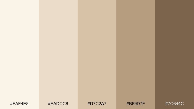
HEX: #FAF4E8 #EADCC8 #D7C2A7 #B69D7F #7C644C
Mood: cozy, friendly, earthy
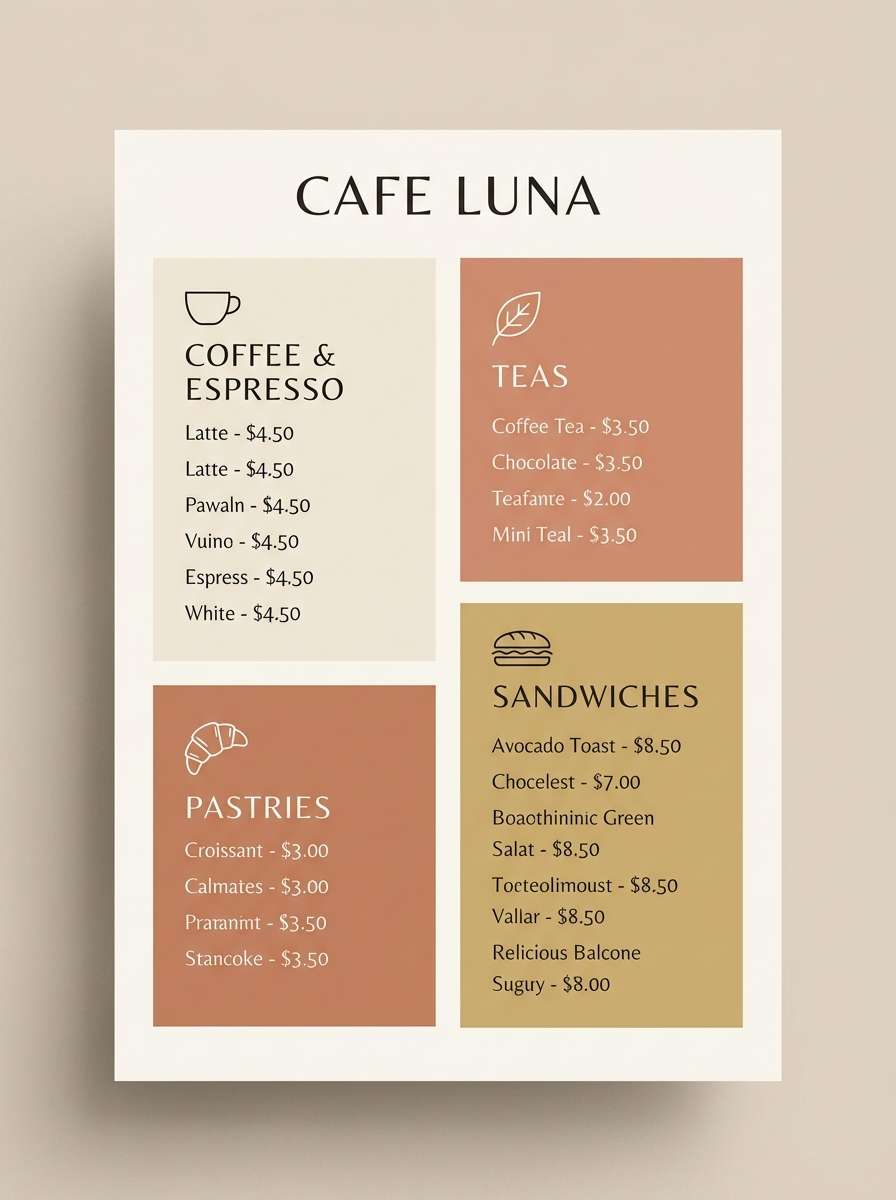
Best for: cafe menu design
Cozy and approachable like steamed oat milk and fresh pastry, this mix reads warm without feeling heavy. Use the pale vanilla as the base, then let the oat and caramel tones guide section headers and price highlights. It suits cafés, bakeries, and farmers market branding where you want a handmade feel. Tip: add plenty of whitespace so the darker mocha only appears as crisp text and small badges.
Image example of vanilla oat generated using media.io
3) Linen Studio
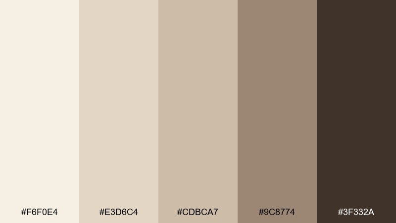
HEX: #F6F0E4 #E3D6C4 #CDBCA7 #9C8774 #3F332A
Mood: minimal, modern, grounded
Best for: interior design mood board
Minimal and tactile like sunlit linen, these shades feel balanced and quietly modern. Pair the lighter neutrals with matte black accents for contrast, or lean into warm woods for a softer look. It is ideal for interior mood boards, material selections, and client presentations. Tip: use the deep espresso tone sparingly for captions and key measurements so the board stays airy.
Image example of linen studio generated using media.io
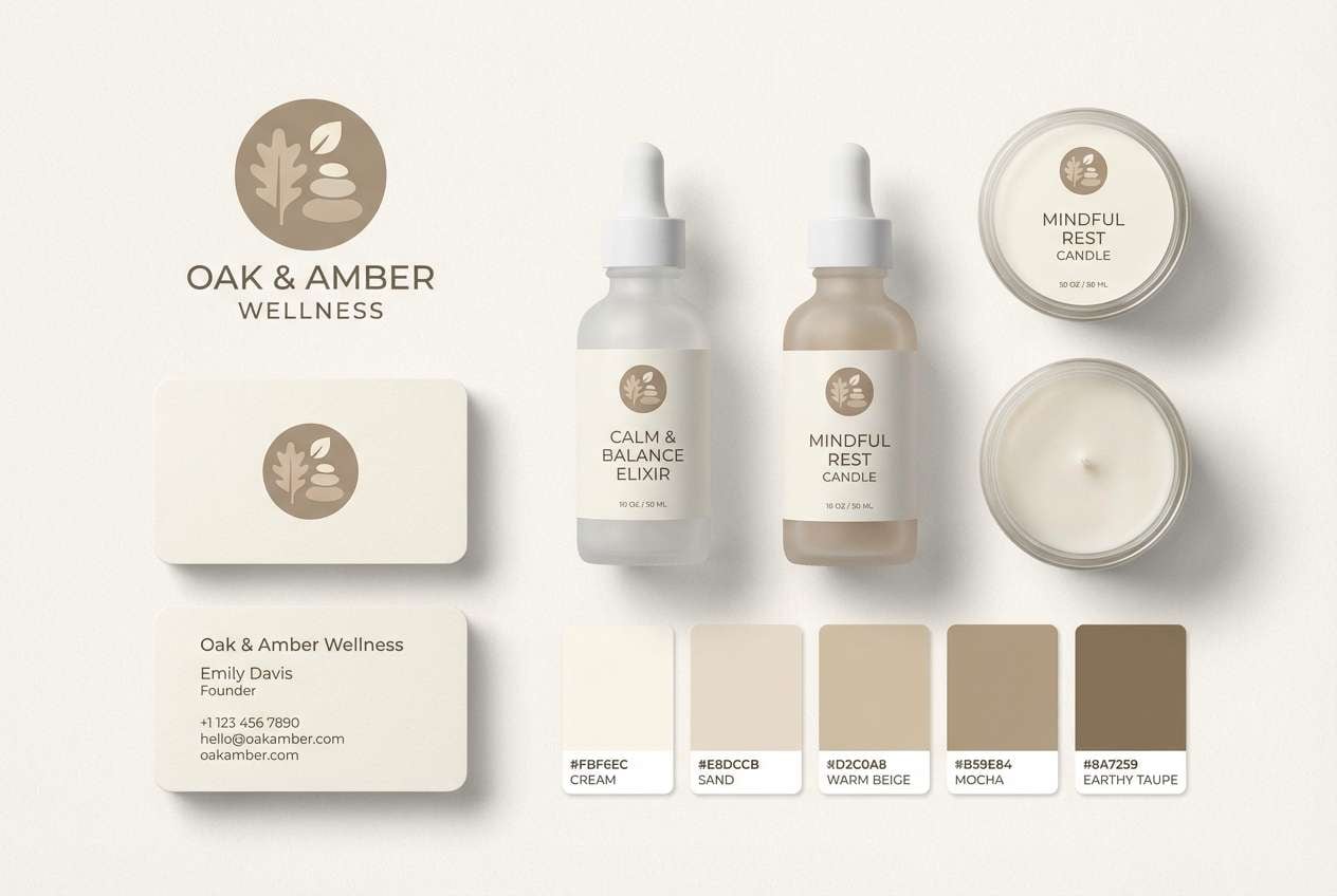
4) Soft Sandstone
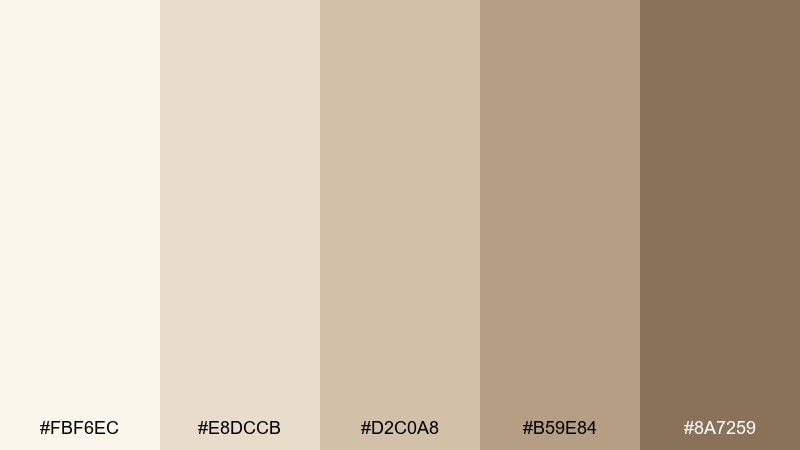
HEX: #FBF6EC #E8DCCB #D2C0A8 #B59E84 #8A7259
Mood: soft, natural, calming
Best for: wellness brand identity
Soft and natural like warm sandstone at sunset, the palette feels reassuring and steady. For a wellness identity, keep the cream base dominant and bring in the medium tan for buttons, seals, and secondary headers. This cream white color palette pairs well with muted sage, dusty rose, or charcoal for balanced contrast. Tip: choose rounded type and gentle gradients to echo the soothing, spa-like mood.
Image example of soft sandstone generated using media.io
5) Ivory Ink
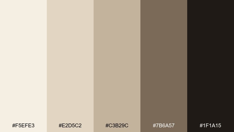
HEX: #F5EFE3 #E2D5C2 #C3B29C #7B6A57 #1F1A15
Mood: classic, high-contrast, editorial
Best for: magazine layout design
Classic and editorial like ink on textured paper, these neutrals shine with strong hierarchy. Use the near-black for headlines and body text, letting the lighter ivory tones create generous negative space. It works for magazines, lookbooks, and long-form blog visuals where readability is the priority. Tip: keep image captions in the medium taupe so they feel present without stealing focus.
Image example of ivory ink generated using media.io
6) Buttercream Blush
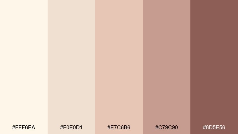
HEX: #FFF6EA #F0E0D1 #E7C6B6 #C79C90 #8D5E56
Mood: romantic, gentle, uplifting
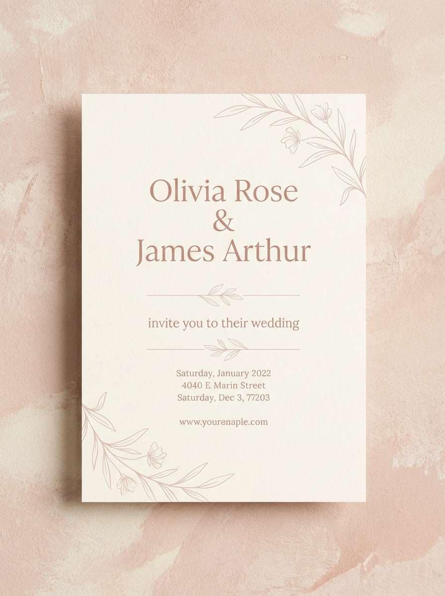
Best for: wedding invitation design
Romantic and gentle like buttercream frosting with a blush ribbon, this mix feels celebratory without being loud. These cream white color combinations look best with delicate serif type, thin line florals, and soft foil accents. Use the blush as a highlight for names and RSVP details while keeping the background creamy and clean. Tip: test print on uncoated paper so the warm undertones stay true and elegant.
Image example of buttercream blush generated using media.io
7) Cafe Marble
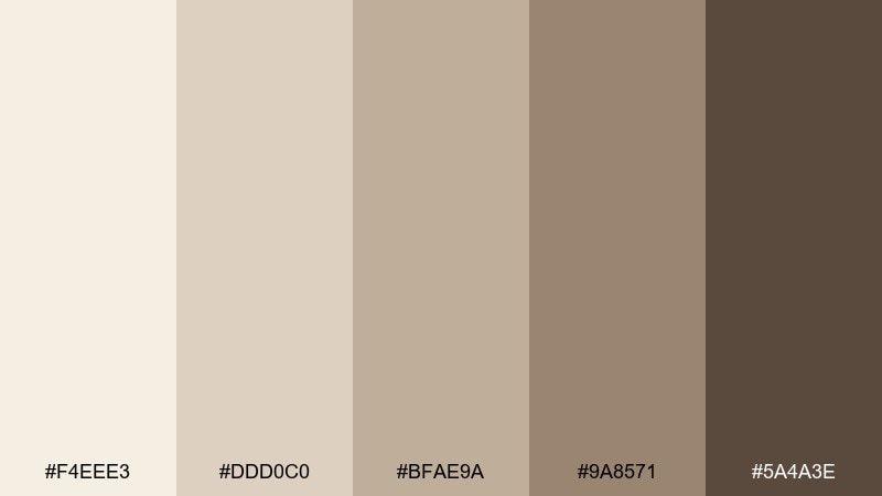
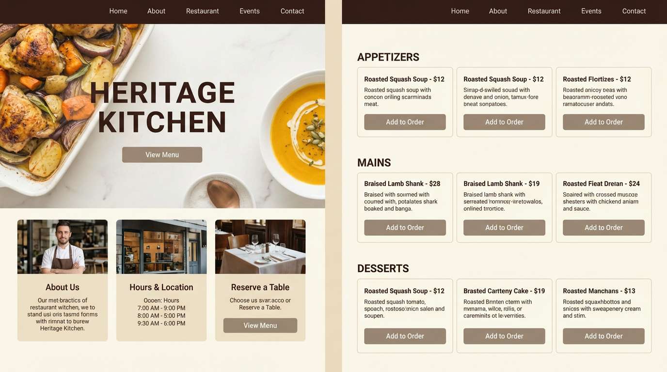
HEX: #F4EEE3 #DDD0C0 #BFAE9A #9A8571 #5A4A3E
Mood: urban, polished, welcoming
Best for: restaurant website UI
Polished and welcoming like marble counters and warm lighting, these neutrals feel upscale but relaxed. Use the light cream for page backgrounds, then anchor navigation and footers with the deeper brown. It is a strong option for restaurant sites, reservation flows, and menu pages where photos need a calm frame. Tip: keep button fills in the taupe range and use the darkest tone only for text and active states.
Image example of cafe marble generated using media.io
8) Honeyed Paper
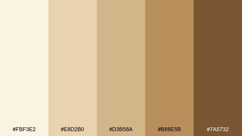
HEX: #FBF3E2 #E8D2B0 #D3B58A #B88E5B #7A5732
Mood: vintage, sunlit, optimistic
Best for: product promo poster
Vintage and sunlit like aged paper and honey, this palette brings cheerful warmth. Use the honey gold for callouts and pricing, while the deeper amber supports contrast in headlines. It is great for promo posters, seasonal sales graphics, and artisan product launches. Tip: add subtle grain or halftone texture so the tones feel intentionally retro rather than flat.
Image example of honeyed paper generated using media.io

9) Seashell Neutral
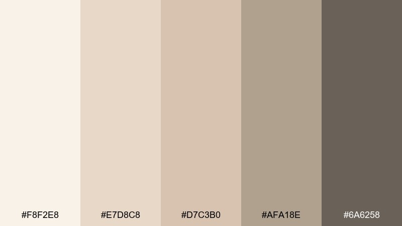
HEX: #F8F2E8 #E7D8C8 #D7C3B0 #AFA18E #6A6258
Mood: coastal, airy, understated
Best for: lifestyle blog theme
Airy and understated like seashells on pale sand, these tones keep content feeling light. Use the cool gray-brown for body text and the warm beige for dividers, tags, and subtle hover states. It fits lifestyle blogs, newsletters, and creators who want a soft, calm reading experience. Tip: pair with desaturated ocean blues in photography for a clean coastal vibe.
Image example of seashell neutral generated using media.io
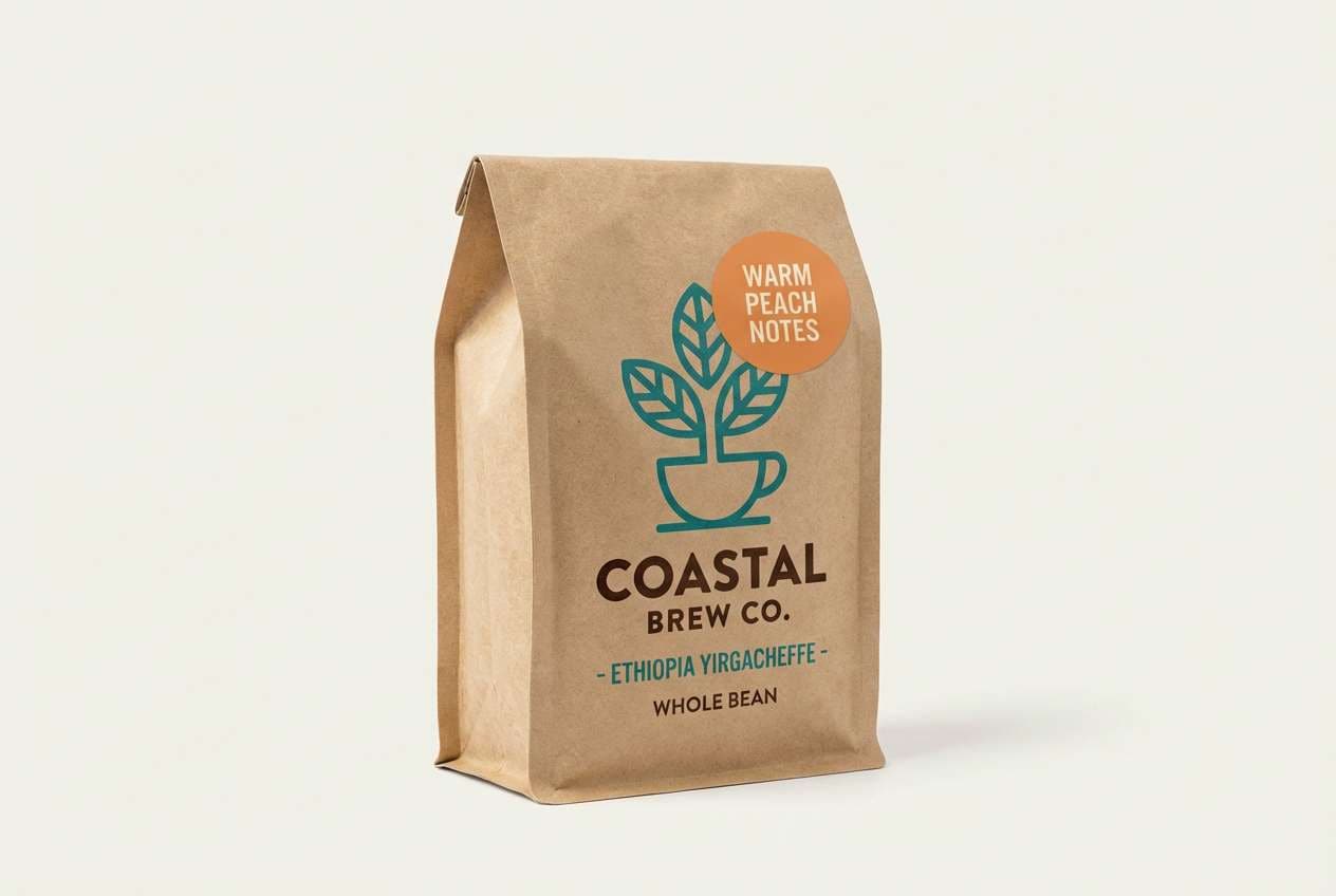
10) Pearl Latte
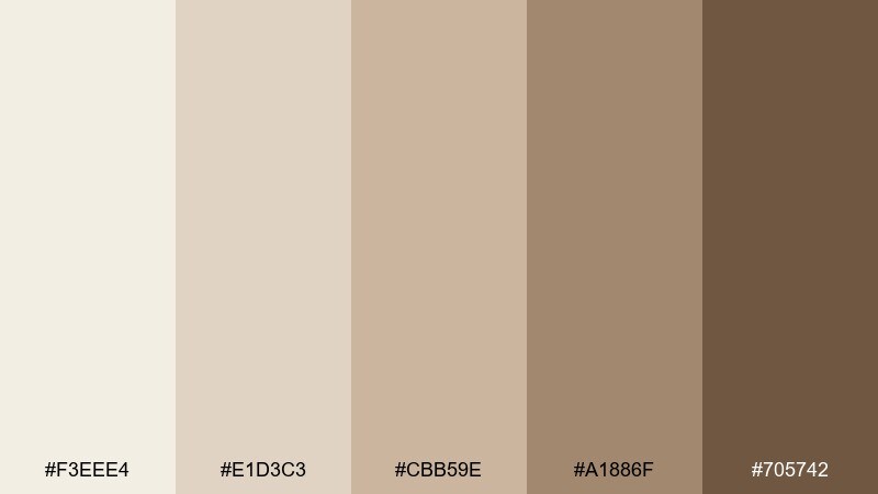
HEX: #F3EEE4 #E1D3C3 #CBB59E #A1886F #705742
Mood: smooth, balanced, everyday luxe
Best for: coffee brand packaging
Smooth and balanced like a latte with glossy foam, this set feels familiar but elevated. Let the pearl cream dominate the bag or label, then add the caramel and walnut tones for roast levels and flavor notes. It works well for coffee packaging, subscription boxes, and tasting cards. Tip: keep illustrations monochrome in the darkest brown so the palette stays cohesive and premium.
Image example of pearl latte generated using media.io
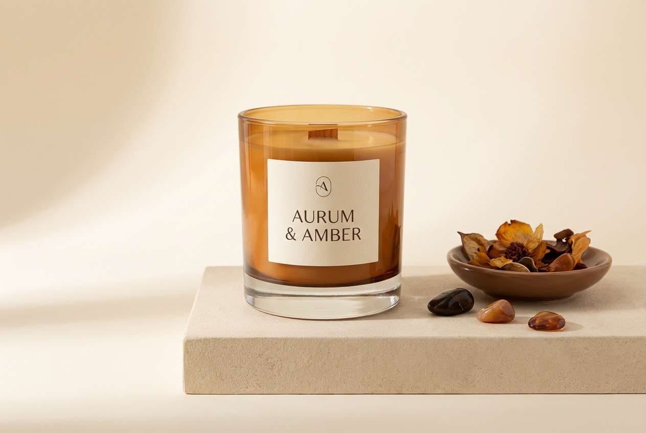
11) Candlelight Calm
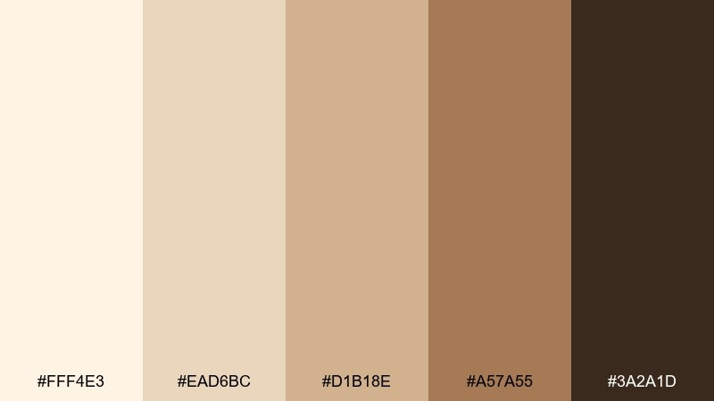
HEX: #FFF4E3 #EAD6BC #D1B18E #A57A55 #3A2A1D
Mood: warm, intimate, comforting
Best for: home fragrance product ad
Warm and intimate like candlelight on a quiet evening, these tones lean cozy and rich. Use the cream for negative space and the amber browns to frame product details and scent notes. It suits home fragrance ads, landing pages, and gift guides where you want an inviting mood. Tip: add soft gradients between the mid tones to mimic a gentle glow without losing contrast.
Image example of candlelight calm generated using media.io
12) Cloud Cream
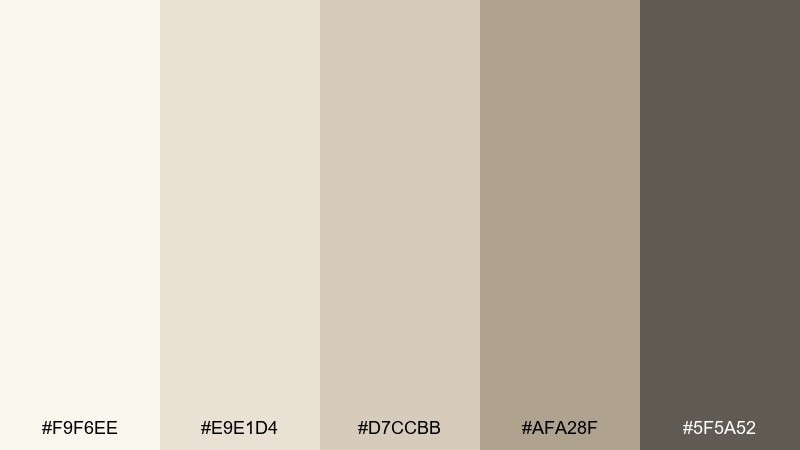
HEX: #F9F6EE #E9E1D4 #D7CCBB #AFA28F #5F5A52
Mood: soft, modern, airy
Best for: SaaS dashboard UI
Soft and airy like clouds over a bright studio, this neutral set keeps interfaces calm and clear. Use the lightest tones for surfaces, then rely on the gray-taupe for borders, cards, and inactive states. This cream white color palette is especially strong for dashboards that need long-session comfort. Tip: pair with one saturated accent color for primary actions and keep everything else quiet.
Image example of cloud cream generated using media.io

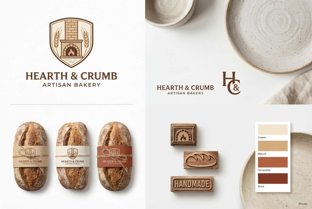
13) Biscotti Brick
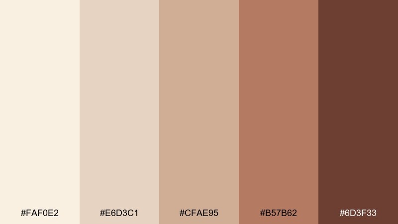
HEX: #FAF0E2 #E6D3C1 #CFAE95 #B57B62 #6D3F33
Mood: rustic, hearty, inviting
Best for: artisan bakery branding
Rustic and hearty like biscotti beside a brick oven, this set adds warmth and a hint of spice. Let the cream and biscuit shades lead, then use the terracotta and brick tones for stamps, icons, and packaging seals. It works for artisan bakery logos, bread labels, and market signage. Tip: keep photography warm and slightly desaturated so the browns do not turn overly orange.
Image example of biscotti brick generated using media.io
14) Desert Silk
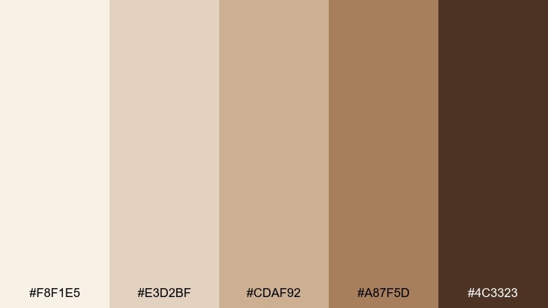
HEX: #F8F1E5 #E3D2BF #CDAF92 #A87F5D #4C3323
Mood: sun-warmed, elegant, earthy
Best for: fashion lookbook layout
Sun-warmed and elegant like desert silk, these hues feel refined with an earthy backbone. Use the cream background to give outfits and fabrics room to breathe, then pull in camel and saddle brown for section titles. It fits fashion lookbooks, line sheets, and seasonal collections that lean neutral. Tip: keep accent rules thin and consistent so the layout feels tailored.
Image example of desert silk generated using media.io
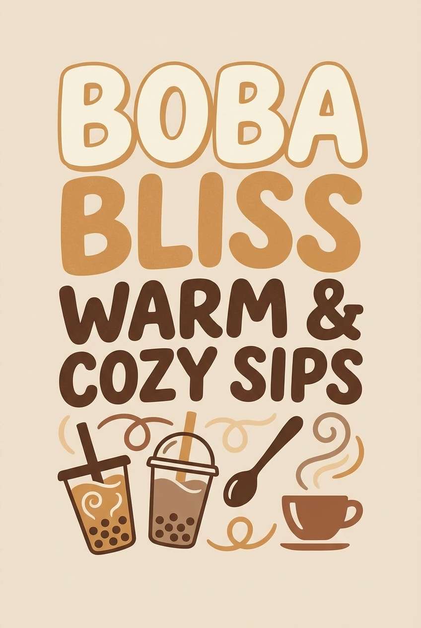
15) Milk Tea Mocha
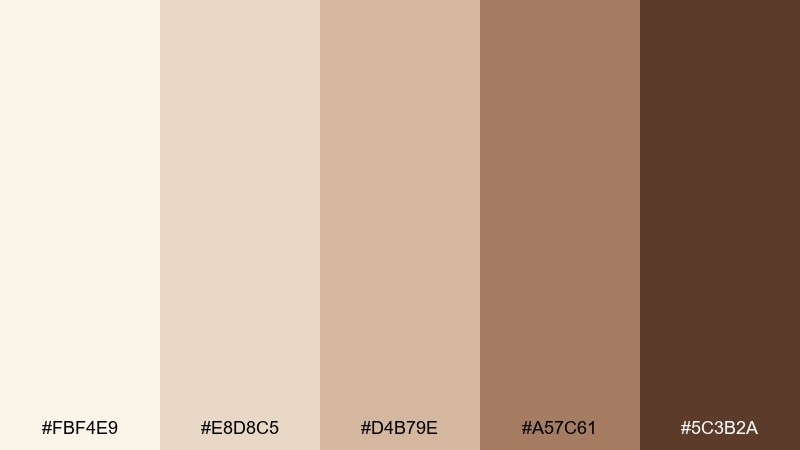
HEX: #FBF4E9 #E8D8C5 #D4B79E #A57C61 #5C3B2A
Mood: sweet, modern, comforting
Best for: bubble tea shop poster
Sweet and comforting like milk tea with a mocha swirl, these tones feel playful but polished. Use the creamy base for breathing room, then add the caramel and mocha shades for bold type and price tags. It is a great fit for shop posters, seasonal drink menus, and social promos. Tip: introduce rounded shapes and simple ingredient icons to keep the mood friendly.
Image example of milk tea mocha generated using media.io
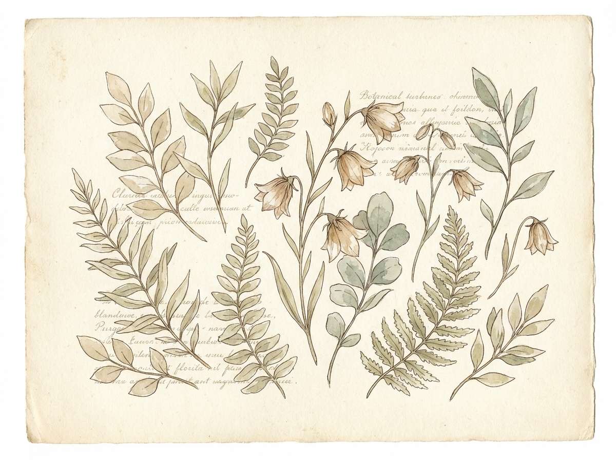
16) Garden Parchment
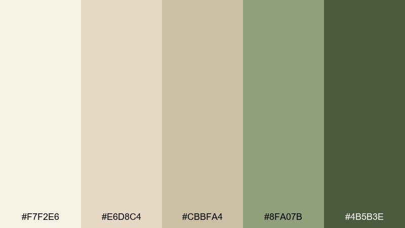
HEX: #F7F2E6 #E6D8C4 #CBBFA4 #8FA07B #4B5B3E
Mood: fresh, natural, soft
Best for: botanical watercolor illustration
Fresh and natural like pressed leaves on parchment, this mix blends gentle neutrals with grounded greens. Keep the cream and beige as paper tones, then bring in the sage and deep moss for stems, shadows, and linework. It is ideal for botanical prints, spring stationery, and nature-inspired packaging. Tip: use transparent watercolor washes so the greens sit softly over the warm base.
Image example of garden parchment generated using media.io
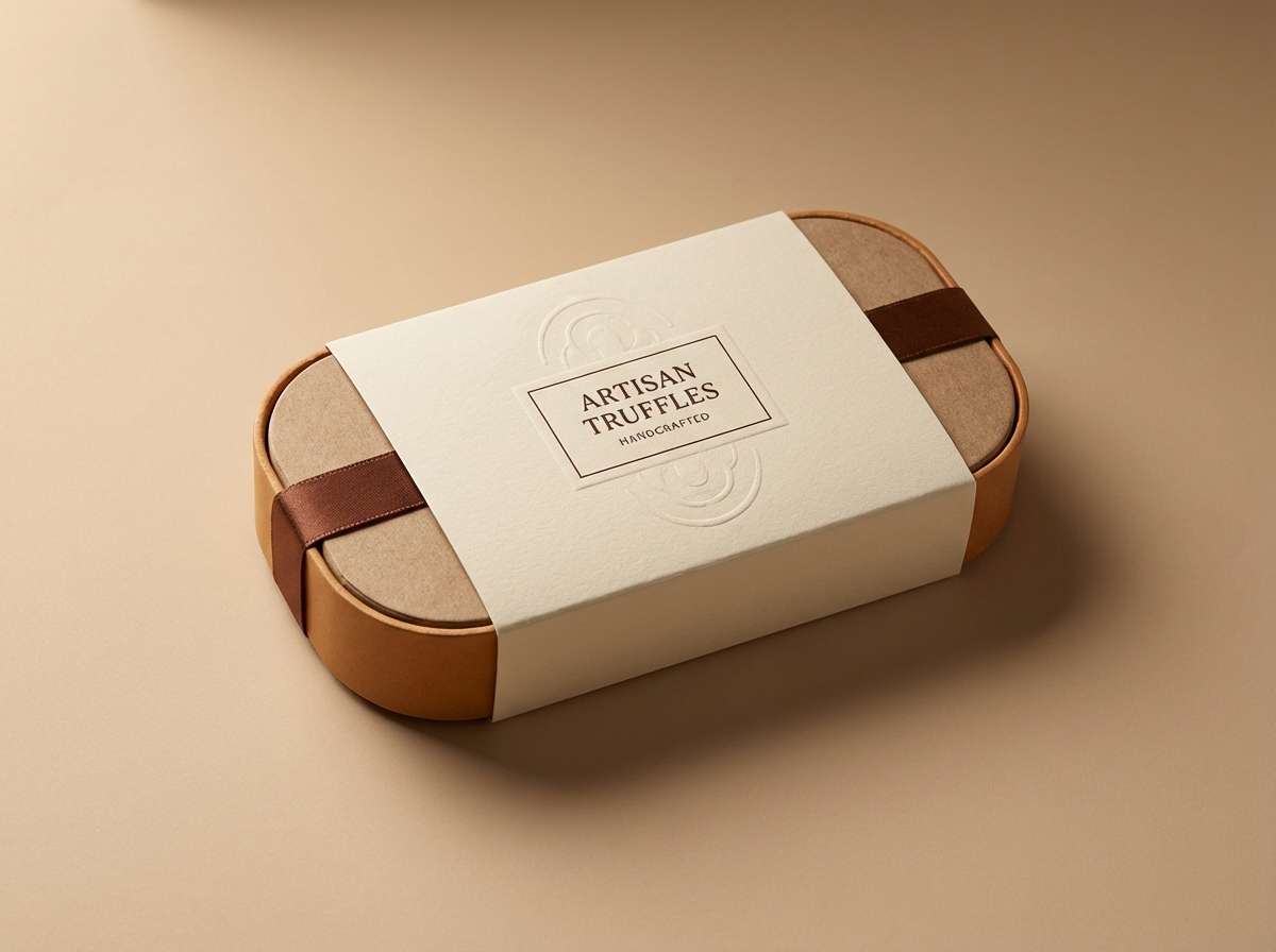
17) Champagne Truffle

HEX: #F6EFE4 #E8D6C2 #D2B59A #B08A6A #4A2F22
Mood: indulgent, elegant, evening
Best for: chocolate packaging design
Indulgent and elegant like champagne truffles at an evening event, these tones feel luxurious and rich. Use the creamy top notes for background and foil areas, then lean on the truffle brown for premium contrast. These cream white color combinations pair nicely with metallic gold details or a muted plum accent. Tip: keep the darkest shade for small type and brand marks to avoid overwhelming the lighter neutrals.
Image example of champagne truffle generated using media.io
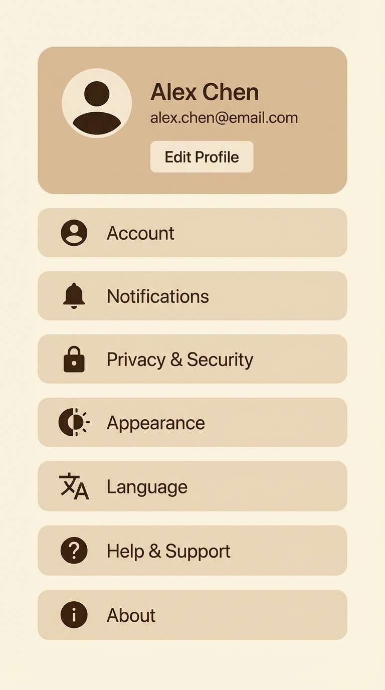
18) Warm Minimal UI
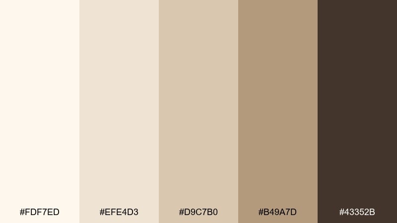
HEX: #FDF7ED #EFE4D3 #D9C7B0 #B49A7D #43352B
Mood: clean, warm, modern
Best for: mobile app settings UI
Clean and warm like a softly lit studio desk, this set makes digital screens feel less stark. Use the pale cream for surfaces and cards, while the taupe range supports separators and secondary text. It is well suited to settings screens, onboarding, and account pages where clarity wins. Tip: keep toggles and primary buttons in a single accent color so the neutrals stay consistent across states.
Image example of warm minimal ui generated using media.io
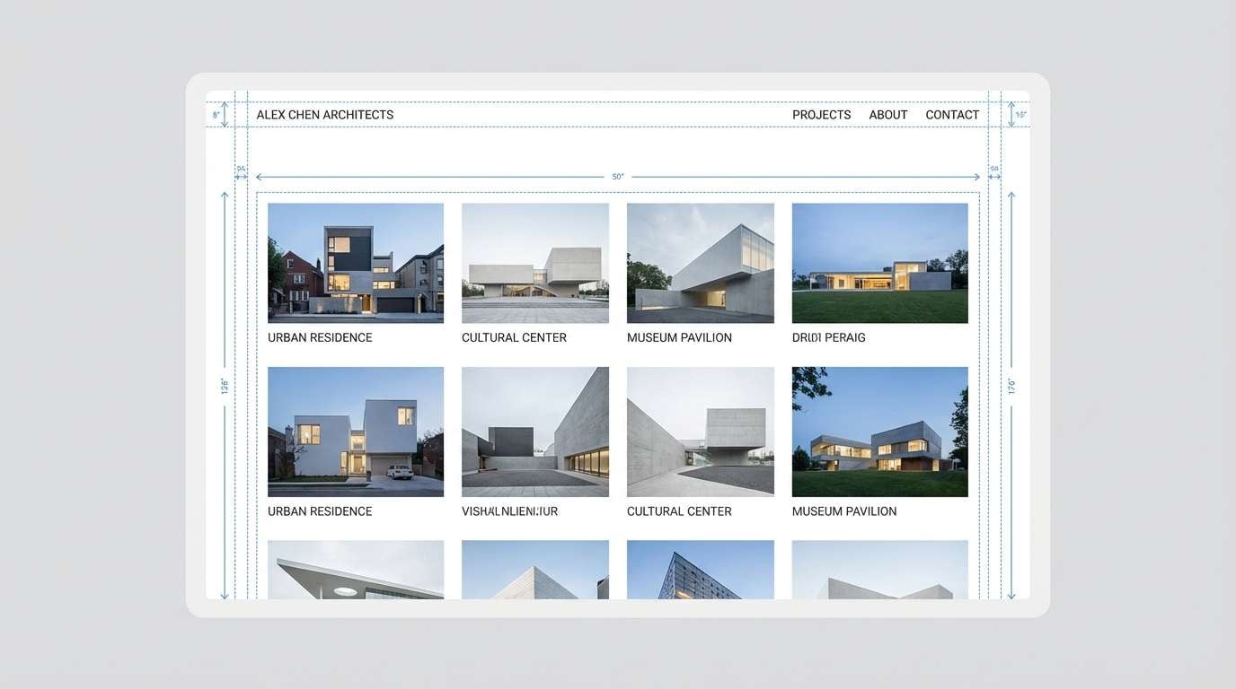
19) Stonewashed Cream
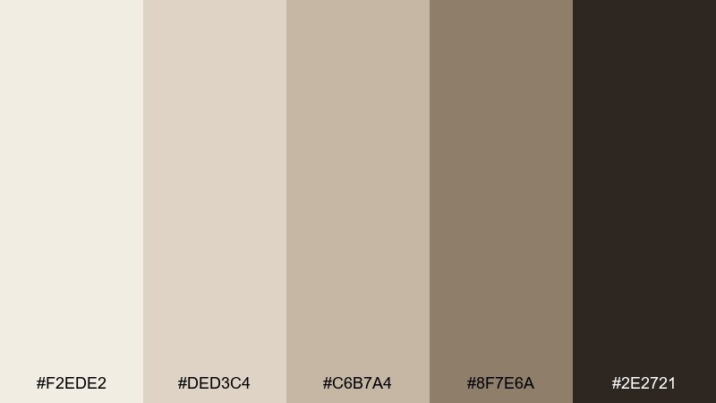
HEX: #F2EDE2 #DED3C4 #C6B7A4 #8F7E6A #2E2721
Mood: industrial, quiet, sophisticated
Best for: architecture portfolio website
Quiet and sophisticated like stonewashed concrete, these neutrals feel modern with a subtle edge. Use the cream and light greige for page backgrounds, then apply charcoal-brown for navigation and captions. It works best for architecture portfolios, case studies, and project galleries where images must lead. Tip: keep hover states understated and let spacing and typography do most of the work.
Image example of stonewashed cream generated using media.io
20) Cozy Cashmere
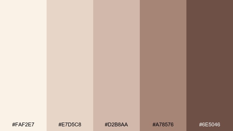
HEX: #FAF2E7 #E7D5C8 #D2B8AA #A78576 #6E5046
Mood: soft, comforting, boutique
Best for: home textile product page
Soft and comforting like cashmere throws, this mix feels boutique and inviting. Use the pale cream for product galleries and the rosy taupe for badges, swatches, and gentle emphasis. This cream white color palette can be elevated with brass accents and warm lifestyle photography. Tip: keep the deepest brown for headings only, so the page stays light and cozy.
Image example of cozy cashmere generated using media.io
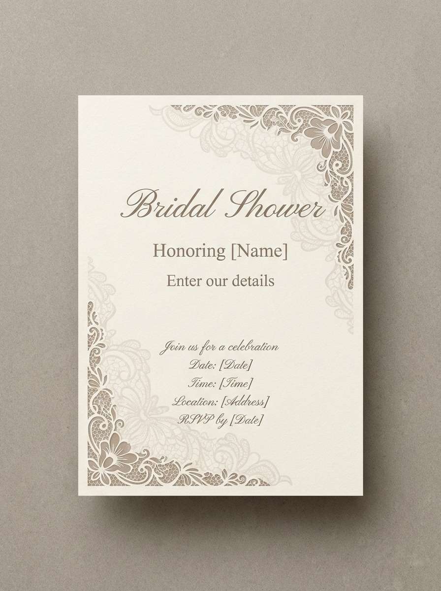
21) Antique Lace
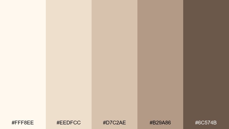
HEX: #FFF8EE #EEDFCC #D7C2AE #B29A86 #6C574B
Mood: delicate, vintage, romantic
Best for: bridal shower flyer
Delicate and vintage like antique lace, these tones feel tender and timeless. Use the light cream as the paper base, with the warm taupes for borders and typography contrast. It is perfect for bridal shower flyers, event details, and keepsake prints. Tip: add a subtle lace pattern watermark at very low opacity so it reads as texture, not clutter.
Image example of antique lace generated using media.io
What Colors Go Well with Cream White?
Cream white pairs especially well with warm neutrals (camel, tan, taupe, cocoa) because the undertones align, so the palette feels cohesive even with low contrast.
For a fresher, modern balance, add muted greens (sage, olive, moss) or dusty blues in imagery. For a more premium look, combine cream white with deep espresso/near-black and small metallic accents (gold or brass).
If you need stronger accessibility contrast, keep cream for backgrounds and use darker browns/charcoal for text, icons, and key UI states.
How to Use a Cream White Color Palette in Real Designs
Start by assigning roles: use the lightest cream as your main background, mid beiges for surfaces/cards, and the darker browns for text, navigation, and emphasis. This prevents “everything looks the same” problems.
In branding and packaging, let cream white carry most of the space, then use one mid-tone as a system color (borders, badges, dividers) and one dark tone for legibility and premium contrast.
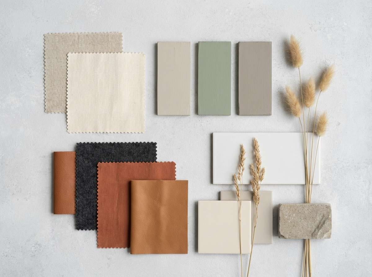
In interiors and mood boards, cream works best when you mix textures—linen, matte paper, brushed metal, warm wood—so the palette feels rich even with subtle color differences.
Create Cream White Palette Visuals with AI
Want to preview how a cream white color scheme looks on a label, website UI, poster, or invitation before you design the final layout? Generate quick concept images and style explorations from a text prompt.
With Media.io, you can iterate fast: test lighting, materials (paper, marble, linen), and typography vibes while keeping your cream-white neutrals consistent.
Cream White Color Palette FAQs
-
What is the difference between cream white and pure white?
Cream white has warm undertones (often yellow/beige), while pure white is neutral and brighter. Cream reads softer on screens and more natural in print and interiors. -
Is cream white good for website backgrounds?
Yes—cream backgrounds can reduce glare and make pages feel more welcoming. Use a dark brown/charcoal for text to keep contrast and readability strong. -
What accent colors work best with a cream white color scheme?
Muted greens (sage/olive), dusty blues, soft blush, and metallic gold/brass accents are reliable choices. Pick one accent and keep the rest neutral for a modern look. -
How do I keep a cream white palette from looking “dirty” or dull?
Increase contrast with one deeper anchor color (espresso/charcoal), add texture (grain, paper, linen), and reserve mid-tones for structure (cards, borders, dividers) instead of using them everywhere. -
Which text color is safest on cream white for accessibility?
Deep brown or charcoal is typically safer than light gray. For long paragraphs, avoid thin fonts and ensure your color contrast meets accessibility guidelines. -
Does cream white print well on different paper types?
It does, but the paper matters: uncoated stocks often amplify warmth, while glossy stocks can make cream look lighter. Always test a proof to confirm undertones. -
Can I use cream white in a modern minimal brand?
Absolutely. Use cream as the main canvas, keep typography crisp, and add one structured mid-tone plus a dark anchor for hierarchy to maintain a clean, contemporary feel.
Next: Champagne Color Palette


