

Black brown palettes bring instant depth, warmth, and a grounded feel—without the harshness that pure black can create. They’re a go-to for premium branding, cozy interiors, and modern UI that needs confidence with comfort.
Below are 20 black brown color palette ideas with HEX codes, plus practical guidance on pairing accents, keeping contrast accessible, and generating on-brand visuals faster.
In this article
- Why Black Brown Palettes Work So Well
-
- midnight walnut
- espresso linen
- charred cedar and clay
- mocha copper glow
- ink and cocoa minimal
- rustic saddle and sage
- dark chocolate blossom
- coffee shop neon
- museum leather and stone
- woodland cabin warmth
- noir terracotta studio
- vintage bookbinding
- autumn truffle kitchen
- elegant marble mocha
- smoky umber poster
- bronze night packaging
- coffee cream ui
- desert bark and sand
- chocolate mint accent
- blackened oak modern
- What Colors Go Well with Black Brown?
- How to Use a Black Brown Color Palette in Real Designs
- Create Black Brown Palette Visuals with AI
Why Black Brown Palettes Work So Well
Black brown tones sit in the “dark neutral” zone, so they feel stable and timeless while still reading warmer and more human than true black-and-white. That warmth makes them especially strong for brands that want premium confidence without cold minimalism.
They also create natural hierarchy: near-black handles legibility and structure, while browns add depth and material cues (wood, leather, coffee, clay). This makes layouts feel tactile—even when they’re flat UI elements.
Finally, black brown color schemes play nicely with both warm and cool accents. You can add copper for luxury, sage for outdoorsy calm, or icy blues for a modern twist—without fighting the base palette.
20+ Black Brown Color Palette Ideas (with HEX Codes)
1) Midnight Walnut
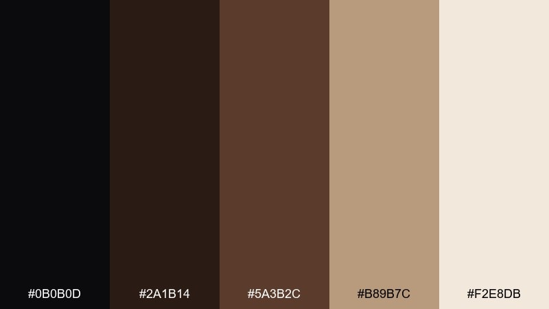
HEX: #0B0B0D #2A1B14 #5A3B2C #B89B7C #F2E8DB
Mood: moody, refined, grounded
Best for: luxury branding and editorial covers
Moody midnight shadows and polished walnut grain set a refined, grounded tone. Use it for premium branding, book covers, or boutique packaging where you want depth without harsh contrast. Pair the darker tones with warm cream space to keep typography readable. Tip: reserve the light beige for headlines or key pricing to create instant hierarchy.
Image example of midnight walnut generated using media.io
Media.io is an online AI studio for creating and editing video, image, and audio in your browser.

2) Espresso Linen
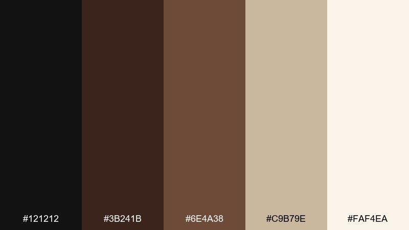
HEX: #121212 #3B241B #6E4A38 #C9B79E #FAF4EA
Mood: cozy, modern, approachable
Best for: cafe menus and lifestyle websites
Cozy espresso depth with soft linen highlights feels welcoming and modern. It works beautifully for menus, landing pages, and lifestyle blogs that need warmth without looking dated. Add texture through off-white backgrounds and keep buttons in the mid-brown for gentle contrast. Tip: use the darkest shade for body text to avoid the starkness of pure black.
Image example of espresso linen generated using media.io
3) Charred Cedar and Clay
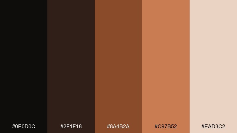
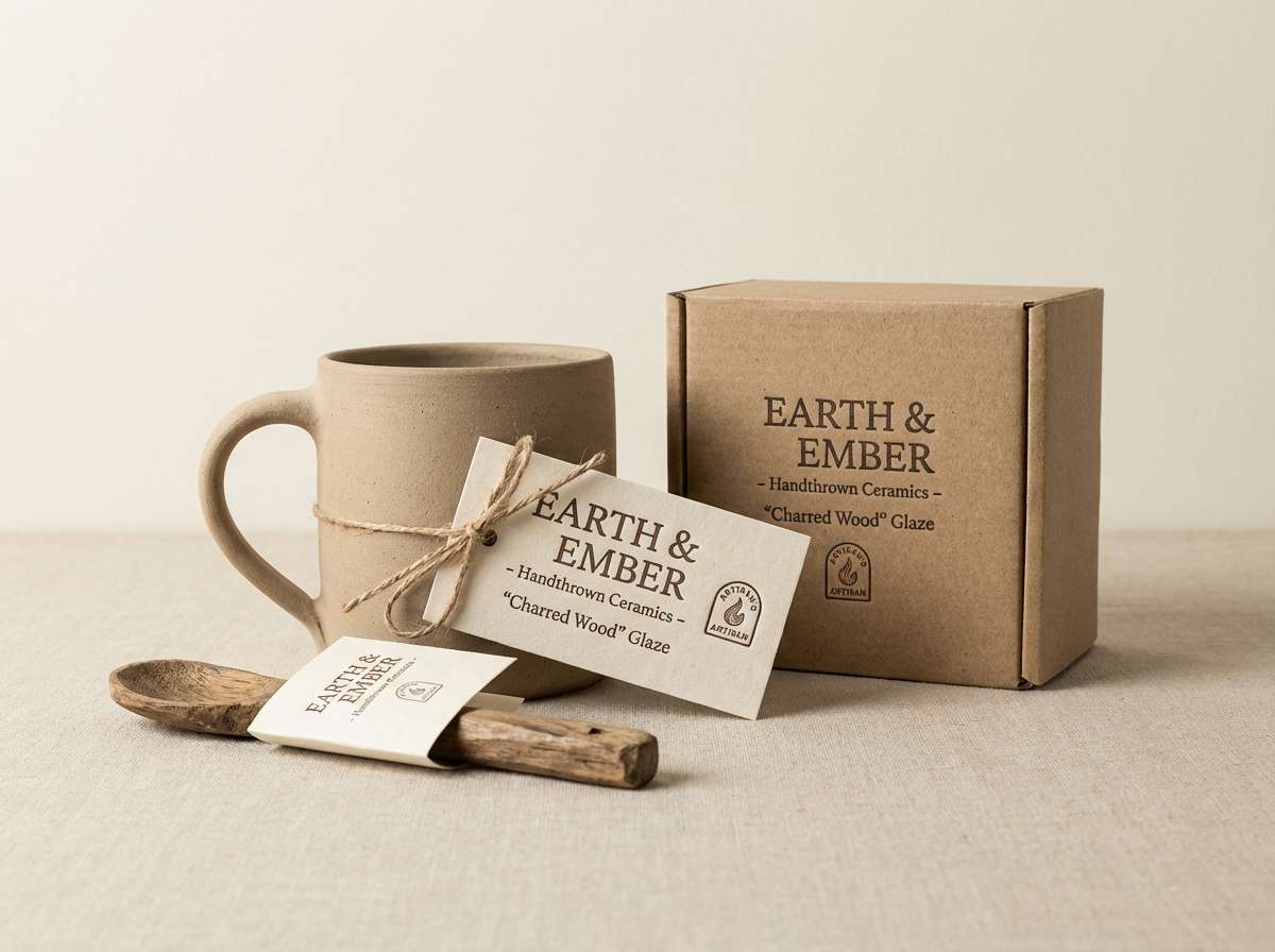
HEX: #0E0D0C #2F1F18 #8A4B2A #C97B52 #EAD3C2
Mood: earthy, artisan, bold
Best for: pottery labels and handmade product ads
Earthy charred wood and sun-baked clay evoke a workshop shelf filled with handmade pieces. These black brown color combinations shine on labels, product tags, and small-format ads where warmth sells the craft. Pair the terracotta tones with creamy negative space so designs do not feel heavy. Tip: add a thin clay-colored border to frames and badges for a handcrafted finish.
Image example of charred cedar and clay generated using media.io
4) Mocha Copper Glow

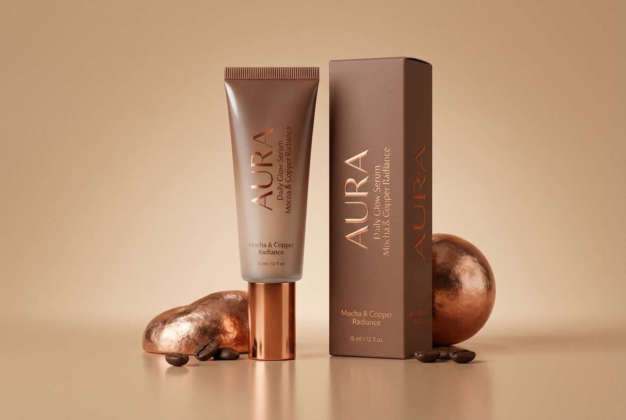
HEX: #0F0F11 #3A231A #6B3E2B #B26A3C #F1D7C3
Mood: glowing, upscale, warm
Best for: beauty packaging and promo banners
Glowing copper highlights over mocha shadows feel upscale and warm, like candlelight on metal. Use it in beauty packaging, seasonal promos, or hero banners where you want richness with a touch of shine. Pair copper as the accent against near-black to make calls to action pop. Tip: keep gradients subtle and let one copper tone do the heavy lifting.
Image example of mocha copper glow generated using media.io
5) Ink and Cocoa Minimal
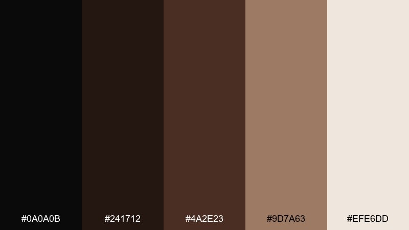
HEX: #0A0A0B #241712 #4A2E23 #9D7A63 #EFE6DD
Mood: minimal, calm, premium
Best for: portfolio sites and UI dashboards
Minimal ink-black and cocoa tones create a calm, premium feel with clean edges. It fits portfolios and dashboards where content should lead and color supports quietly. Use the light neutral for large panels and cards, then assign cocoa to secondary navigation. Tip: test contrast on charts and icons, keeping the darkest shade for text and critical states.
Image example of ink and cocoa minimal generated using media.io
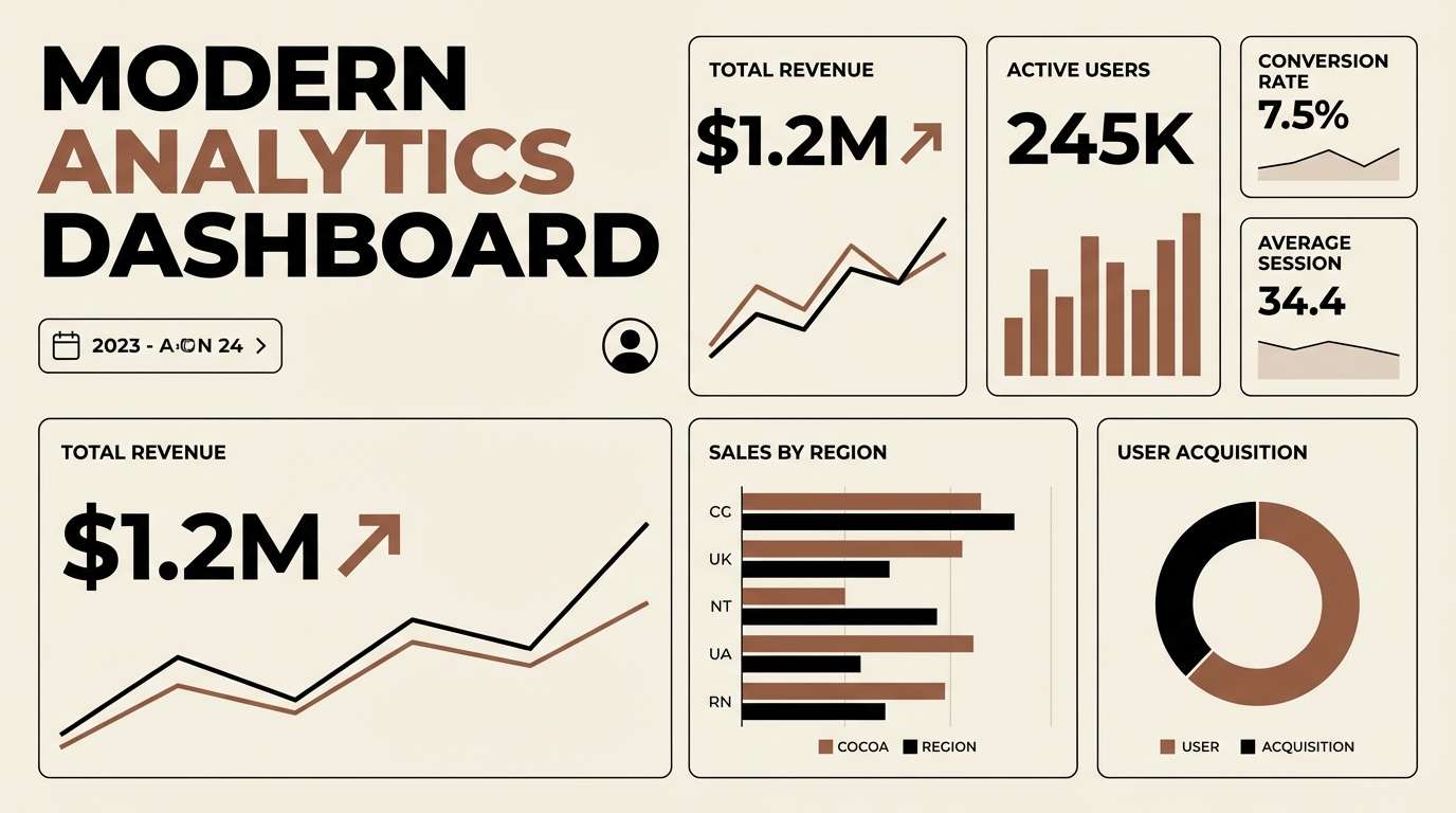
6) Rustic Saddle and Sage
HEX: #12110F #3A2519 #7A4E33 #7C8B6B #E8E1D5
Mood: outdoorsy, relaxed, natural
Best for: eco brands and outdoor newsletters
Rustic saddle browns with a muted sage accent feel outdoorsy and relaxed. This mix works for eco brands, trail guides, and newsletters that need an earthy signature without going full green. Pair sage sparingly for buttons or highlights, letting warm neutrals dominate backgrounds. Tip: combine with matte paper textures or subtle grain for an authentic look.
Image example of rustic saddle and sage generated using media.io
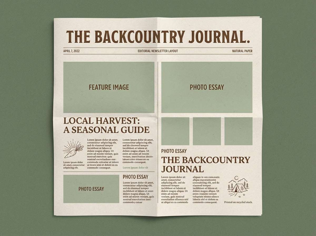
7) Dark Chocolate Blossom
HEX: #0F0C0C #2B1717 #5A2D2D #C78D8F #F6E6E7
Mood: romantic, soft, intimate
Best for: wedding invitations and beauty lookbooks
Dark chocolate depth with dusty rose blossom feels romantic and intimate. It is ideal for wedding stationery, beauty lookbooks, and elegant social posts that need softness without losing contrast. Keep the blush tones for accents like dividers and icons, and let cream handle the main background. Tip: choose a serif headline to amplify the classic, candlelit vibe.
Image example of dark chocolate blossom generated using media.io
8) Coffee Shop Neon
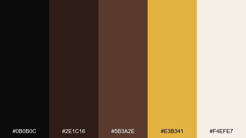
HEX: #0B0B0C #2E1C16 #5B3A2E #E3B341 #F4EFE7
Mood: urban, energetic, playful
Best for: event posters and social ads
Urban coffee tones with a neon-gold hit feel energetic, like a late-night sign glowing in the rain. Use it for event posters, social ads, or limited drops where you want warmth plus instant attention. Keep the gold to small shapes, stickers, or a single headline to avoid overpowering the browns. Tip: add generous spacing so the dark base stays clean and modern.
Image example of coffee shop neon generated using media.io
9) Museum Leather and Stone
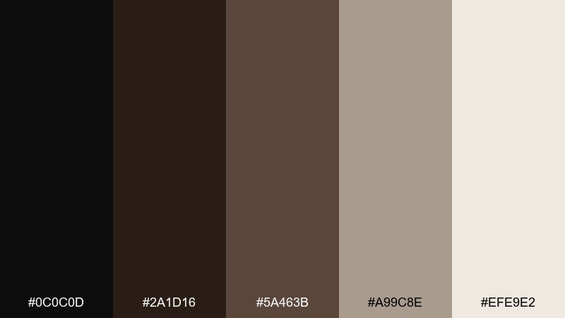
HEX: #0C0C0D #2A1D16 #5A463B #A99C8E #EFE9E2
Mood: classic, scholarly, composed
Best for: publishing, museums, and cultural brands
Classic leather and quiet stone neutrals feel scholarly and composed, like a gallery hallway. This black brown color palette suits cultural institutions, publishing marks, and long-form editorial pages. Pair stone gray-beige for backgrounds and keep black for typography to maintain readability. Tip: use the mid-brown for rules and captions to soften dense layouts.
Image example of museum leather and stone generated using media.io
10) Woodland Cabin Warmth
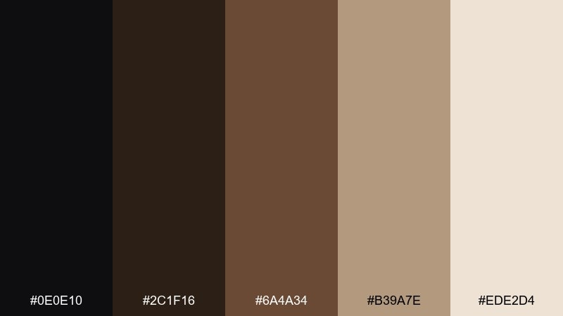
HEX: #0E0E10 #2C1F16 #6A4A34 #B39A7E #EDE2D4
Mood: warm, rustic, comforting
Best for: interior mood boards and cabin rentals
Warm cabin shadows and toasted woodgrain make everything feel comforting and lived-in. It is great for interior mood boards, hospitality listings, and rental branding where warmth builds trust. Pair the light beige with big photography and keep the darkest tone for text overlays. Tip: use the mid-brown as a consistent button color across web pages for cohesion.
Image example of woodland cabin warmth generated using media.io
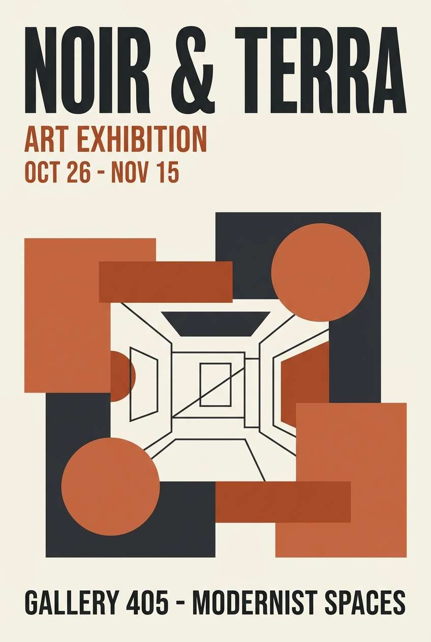
11) Noir Terracotta Studio
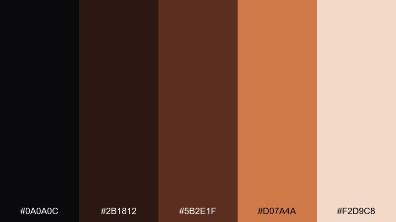
HEX: #0A0A0C #2B1812 #5B2E1F #D07A4A #F2D9C8
Mood: creative, bold, gallery-like
Best for: art portfolios and studio posters
Noir shadows with a terracotta punch feel like a modern studio wall under spotlights. Use it for art portfolios, exhibition posters, and creative landing pages that need a bold focal color. Pair terracotta with plenty of pale space so the warmth reads intentional, not noisy. Tip: set terracotta as the only saturated element for instant visual direction.
Image example of noir terracotta studio generated using media.io
12) Vintage Bookbinding
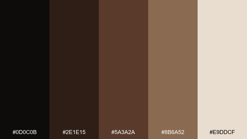
HEX: #0D0C0B #2E1E15 #5A3A2A #8B6A52 #E9DDCF
Mood: nostalgic, tactile, classic
Best for: book covers and stationery sets
Nostalgic bookbinding tones evoke worn leather spines and cream paper edges. It works well for book covers, stationery, and long-read blogs where warmth supports storytelling. Pair the lighter cream with generous margins and keep the darkest shade for titles and author names. Tip: a subtle grain or emboss effect complements the palette without adding extra colors.
Image example of vintage bookbinding generated using media.io
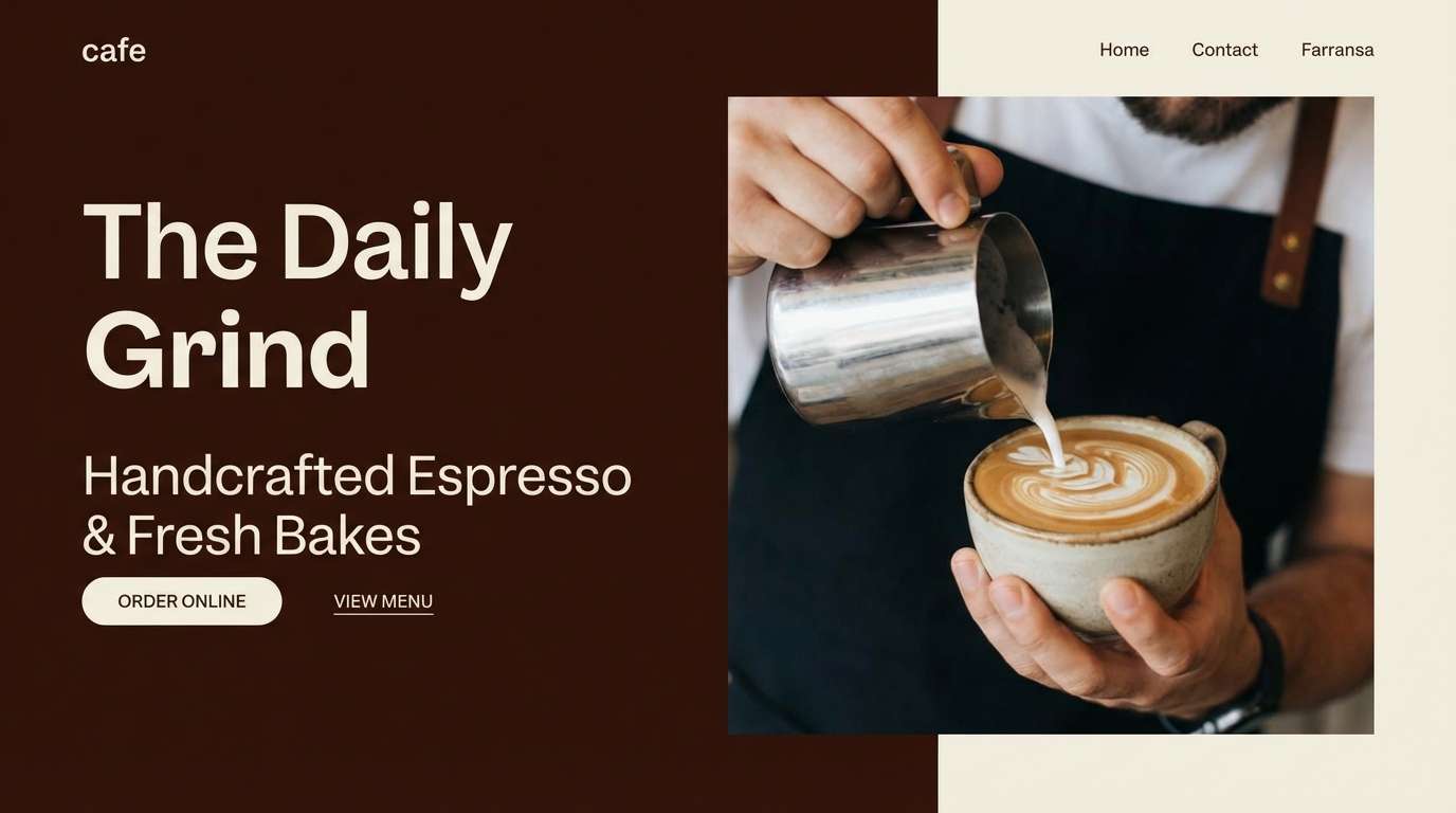
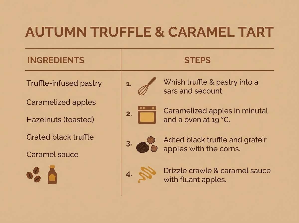
13) Autumn Truffle Kitchen
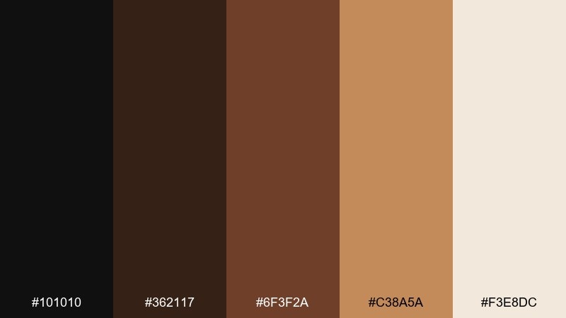
HEX: #101010 #362117 #6F3F2A #C38A5A #F3E8DC
Mood: appetizing, warm, inviting
Best for: restaurant branding and recipe cards
Autumn truffle browns and roasted caramel notes feel appetizing and inviting. Use it for restaurant identities, recipe cards, and food packaging where warmth signals flavor. Pair the caramel tone with black for strong price tags and callouts. Tip: keep backgrounds creamy so photography and typography stay crisp and clean.
Image example of autumn truffle kitchen generated using media.io
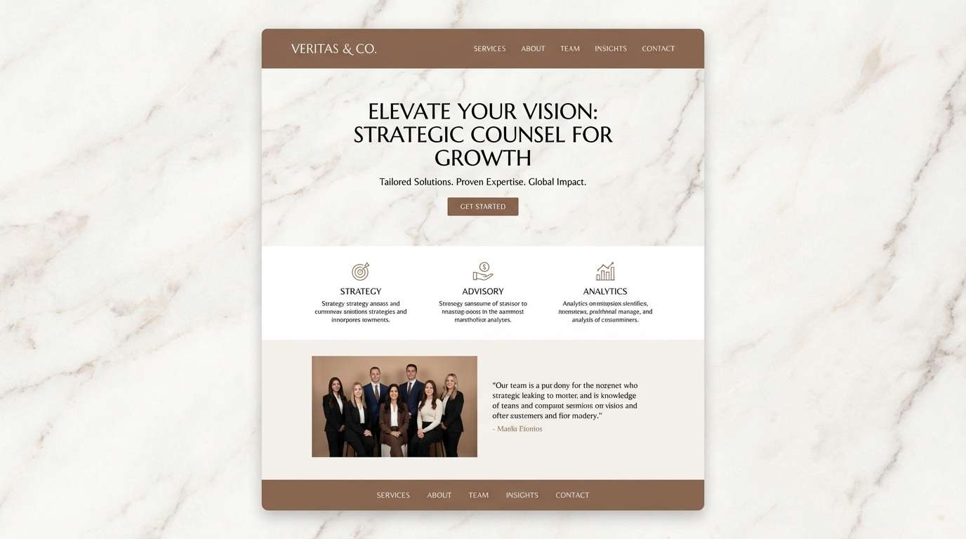
14) Elegant Marble Mocha
HEX: #0E0E0F #2A1A14 #4E3329 #B7A79A #F7F1EA
Mood: elegant, airy, timeless
Best for: law firms, consultants, and minimalist brands
Elegant marble lightness paired with mocha depth feels timeless and trustworthy. As a black brown color scheme, it is a strong choice for consultants, law firms, and minimalist brands that want warmth without casual vibes. Pair the pale ivory with clean sans-serif type and use mocha for subtle separators. Tip: set links or key highlights in the mid-tone brown to keep the look understated.
Image example of elegant marble mocha generated using media.io
15) Smoky Umber Poster
HEX: #0A0A0A #251813 #4B3026 #7A5A49 #E6D8CC
Mood: dramatic, cinematic, gritty
Best for: film posters and album artwork
Smoky umber and near-black shadows feel cinematic and gritty, like a dim theater lobby. Use it for film posters, album artwork, and gritty campaigns where a dark base makes typography stand out. Pair the pale beige for credits and small text to preserve legibility. Tip: keep imagery high-contrast so the palette does not turn muddy.
Image example of smoky umber poster generated using media.io
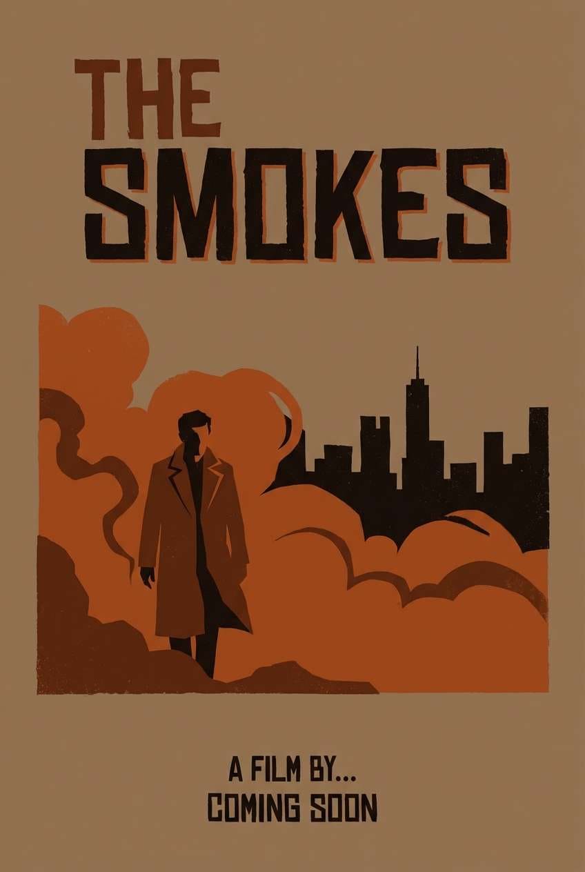
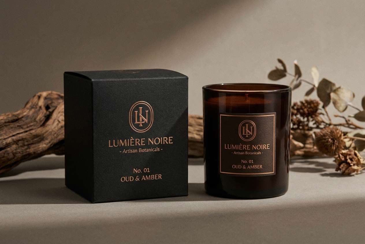
16) Bronze Night Packaging
HEX: #0B0B0D #2B1B15 #523126 #A8744B #F0E2D2
Mood: premium, warm, metallic
Best for: candles, spirits, and gift boxes
Premium bronze warmth over a night-dark base feels like metallic foil catching low light. These black brown color combinations work beautifully for candles, spirits, and gift packaging where a small accent can look expensive. Pair the bronze tone with clean black panels and keep the light neutral for labels and compliance text. Tip: use bronze sparingly on edges and logos to avoid a brassy look.
Image example of bronze night packaging generated using media.io
17) Coffee Cream UI
HEX: #0D0D0E #2A1C15 #5C3B2F #CBB7A4 #FFF7EE
Mood: clean, friendly, modern
Best for: ecommerce UI and checkout flows
Clean coffee tones with whipped-cream whites feel friendly and modern. It is a strong fit for ecommerce checkouts, subscription pages, and onboarding flows that need calm confidence. Pair the darkest shade for primary text, then use the pale cream as your main surface color. Tip: keep one mid-brown as the single primary button color to reduce decision fatigue.
Image example of coffee cream ui generated using media.io
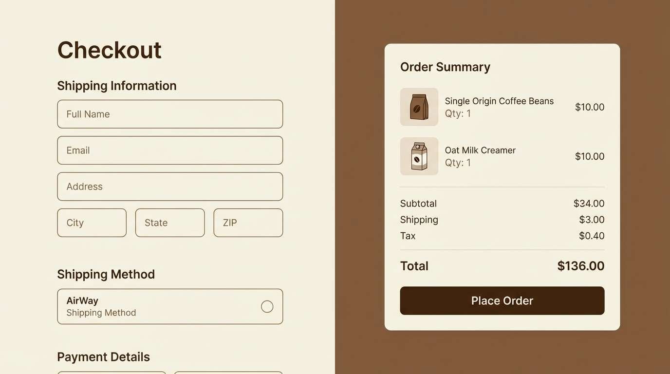
18) Desert Bark and Sand
HEX: #111112 #2C1F18 #6B4C3A #C8A88A #F5E7D6
Mood: sunbaked, calm, earthy
Best for: travel blogs and outdoor product pages
Sunbaked bark and soft sand neutrals feel calm, like a quiet desert trail at dusk. It works for travel blogs, outdoor product pages, and lookbooks that lean natural and understated. Pair sandy beige backgrounds with deep brown headings to maintain warmth without losing clarity. Tip: use the mid-brown for icons and small UI details to keep the interface cohesive.
Image example of desert bark and sand generated using media.io
19) Chocolate Mint Accent
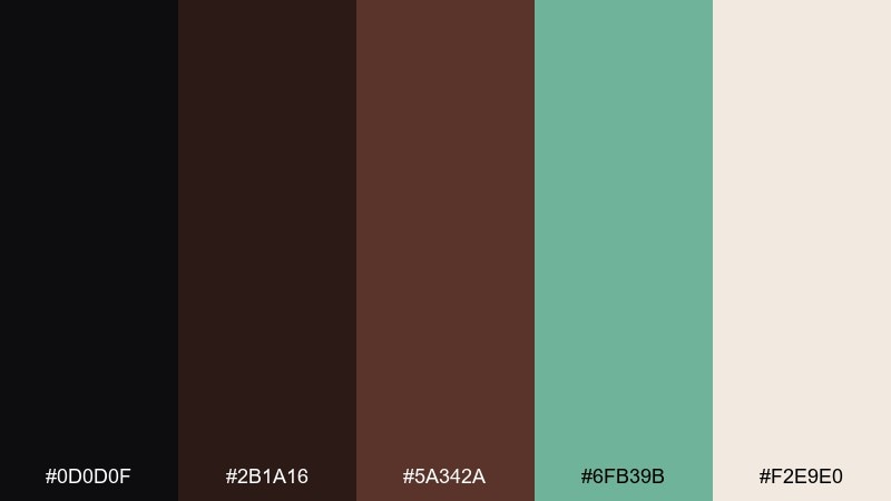
HEX: #0D0D0F #2B1A16 #5A342A #6FB39B #F2E9E0
Mood: fresh, playful, sophisticated
Best for: tech branding and modern social templates
Deep chocolate with a cool mint accent feels fresh and slightly unexpected. Use it for tech branding, modern social templates, and campaign graphics that need a clean pop against dark neutrals. Pair mint for status states, links, or micro-interactions while keeping most surfaces warm and muted. Tip: limit mint to one shade and repeat it consistently for a polished system.
Image example of chocolate mint accent generated using media.io
20) Blackened Oak Modern
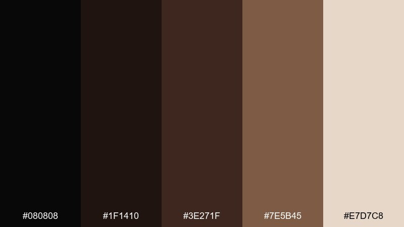
HEX: #080808 #1F1410 #3E271F #7E5B45 #E7D7C8
Mood: modern, architectural, confident
Best for: interior brands and product landing pages
Modern blackened oak tones feel architectural and confident, like clean lines in a dark-wood space. This black brown color palette is ideal for interior brands and product landing pages that want warmth with a sharp edge. Pair the light neutral with wide padding and use the mid-brown for secondary buttons or tabs. Tip: keep imagery warm-toned so the wood shades look rich, not gray.
Image example of blackened oak modern generated using media.io
What Colors Go Well with Black Brown?
Warm accents like copper, bronze, caramel, and terracotta naturally enhance black brown palettes because they share earthy undertones. They’re excellent for CTAs, badges, pricing highlights, and packaging details where you want a “premium warmth” signal.
For a calmer, more organic look, pair black brown with muted greens (sage, olive) or dusty neutrals (stone, sand, linen). These keep the palette grounded and are especially effective for outdoor brands, interiors, and editorial layouts.
If you want contrast that feels modern rather than rustic, add cool accents like silver-blue, slate, or mint. Keep the cool color limited to a single role (links, status, or highlights) so the dark browns remain the visual foundation.
How to Use a Black Brown Color Palette in Real Designs
Start with roles instead of swatches: use near-black for typography and core UI states, mid-browns for controls (buttons, tabs), and light creams for surfaces and whitespace. This keeps pages readable and prevents the design from feeling heavy.
Watch your contrast: many brown mid-tones look beautiful but can fail accessibility when used for text on dark backgrounds. Reserve lighter neutrals for small type, and use the deepest shade for body text when you want a softer alternative to pure black.
Introduce one accent maximum (copper, sage, mint, or gold) and repeat it consistently across key touchpoints. Consistency makes black brown color combinations feel intentional and brand-ready instead of “muddy.”
Create Black Brown Palette Visuals with AI
If you already have HEX codes, you can quickly generate matching brand kits, posters, UI mockups, and packaging concepts by describing the layout and materials you want. This is especially helpful for black brown themes where lighting and texture (wood, leather, paper) define the mood.
Use clear prompts like “clean studio background,” “print-ready,” “2d ui mockup only,” and specify an aspect ratio to keep outputs consistent. Then iterate by changing just one variable (accent color, typography style, or texture) to explore variations fast.
When you find a direction you like, generate a small set of visuals (hero image, social post, product mockup) in the same palette to lock in a cohesive system.
Black Brown Color Palette FAQs
-
What does a black brown color palette communicate?
It usually communicates depth, warmth, and reliability. Compared with pure black, brown undertones feel more natural and approachable, making the look premium without feeling cold. -
Is black and brown a good combination for branding?
Yes—especially for luxury, food & beverage, interiors, and craft brands. Use near-black for typography and structure, then use browns to add material warmth and a tactile, grounded identity. -
How do I keep black brown designs from looking too dark?
Increase the amount of light neutral (cream/ivory) used for backgrounds and spacing. Limit the darkest tones to text, headers, and a few anchor elements so the overall layout stays airy. -
What accent colors work best with black brown palettes?
Warm accents (copper, bronze, gold, terracotta) amplify richness, while muted greens (sage/olive) add an outdoorsy feel. For a modern contrast, try cool accents like mint or silver-blue—used sparingly. -
What’s the best text color on brown backgrounds?
For dark brown backgrounds, use a light cream/ivory for body text and check contrast before publishing. For light tan/cream backgrounds, use a very dark brown or near-black for comfortable readability. -
How many colors should I use from a black brown palette in UI?
A practical system is 3 neutrals (surface, border, text) plus 1 accent for CTAs and states. Too many similar browns can reduce clarity, so assign each shade a clear role and repeat it consistently. -
Can I mix black brown with metallics in packaging?
Absolutely. Bronze or copper details on a near-black base often look expensive and intentional. Keep metallic accents limited to logos, edges, or small highlights to avoid a brassy or cluttered result.


