

Silver blue sits in that sweet spot between airy neutral and confident blue-gray, making it easy to build modern, calming designs that still feel premium.
Below are 20+ curated silver blue palette ideas with HEX codes, plus AI image prompts you can use to visualize each look for UI, branding, print, and interiors.
In this article
- Why Silver Blue Palettes Work So Well
-
- frosted harbor
- glacier ink
- moonlit steel
- seaside chrome
- arctic mist
- denim silverline
- stormglass
- cloudbank navy
- polar pearl
- cobalt haze
- blueprint ice
- riverstone silver
- winter marina
- silverwave gradient
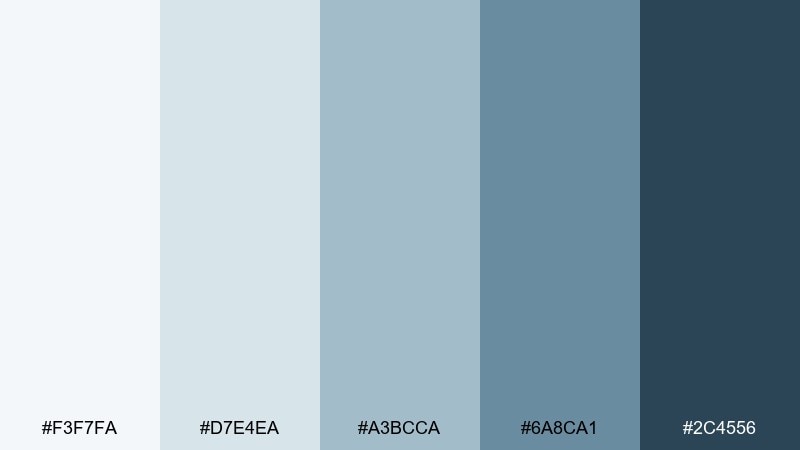
- deep current
- skylight slate
- frostline ceramic
- observatory night
- icy botanical
- silver metro
- quiet fjord
- What Colors Go Well with Silver Blue?
- How to Use a Silver Blue Color Palette in Real Designs
- Create Silver Blue Palette Visuals with AI
Why Silver Blue Palettes Work So Well
Silver blue palettes read as clean, modern, and trustworthy because they blend cool neutrals with calm blues. That makes them a reliable choice for information-heavy layouts like dashboards, decks, and product pages.
They also scale well from minimal to dramatic. You can keep things light with foggy silvers and soft blue-grays, or add weight using inky navies for navigation, headings, and premium contrast.
Because silver blue behaves like a neutral, it pairs nicely with both warm accents (champagne gold, sand, copper) and crisp cool accents (icy cyan, steel, graphite), giving you lots of flexibility without visual noise.
20+ Silver Blue Color Palette Ideas (with HEX Codes)
1) Frosted Harbor
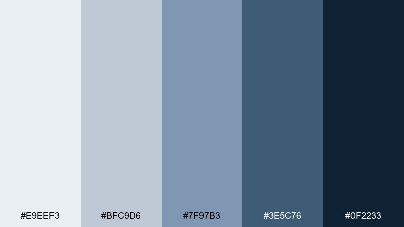
HEX: #E9EEF3 #BFC9D6 #7F97B3 #3E5C76 #0F2233
Mood: crisp, coastal, calm
Best for: saas dashboard ui
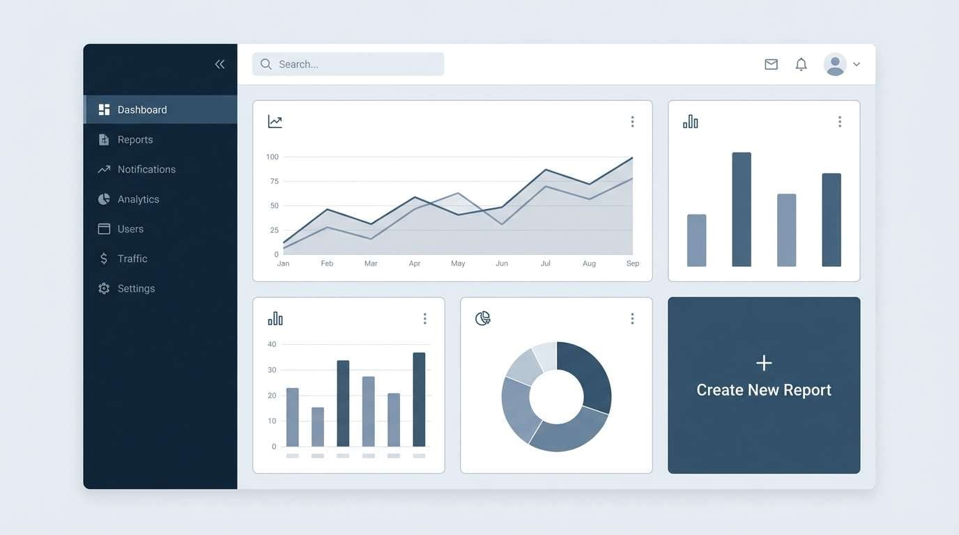
Crisp and coastal, these tones feel like morning fog lifting off a quiet harbor. The pale silver sits cleanly behind steely mid-blues and a confident deep navy for contrast. Use it for dashboards where clarity matters, and pair it with simple line icons and generous spacing. Tip: reserve the darkest tone for primary actions and key navigation to keep the layout readable.
Image example of frosted harbor generated using media.io
Media.io is an online AI studio for creating and editing video, image, and audio in your browser.

2) Glacier Ink
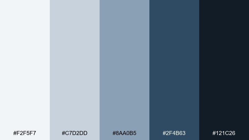
HEX: #F2F5F7 #C7D2DD #8AA0B5 #2F4B63 #121C26
Mood: sleek, focused, editorial
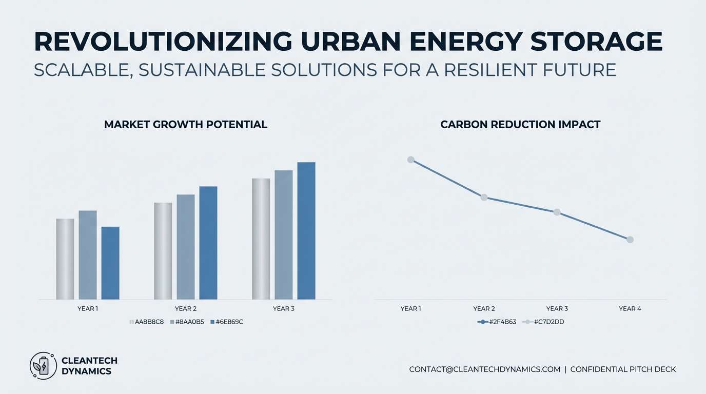
Best for: tech pitch deck slides
Sleek and focused, it reads like polished metal beside wet-ink navy. This silver blue color combination works well when you need a serious, modern tone without feeling heavy. Use the pale gray-blue as your slide canvas, then anchor headlines in the near-black shade. Tip: add one accent rule or divider line in the mid steel tone to structure dense content.
Image example of glacier ink generated using media.io
3) Moonlit Steel
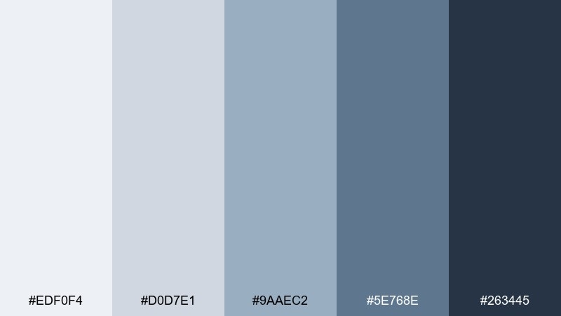
HEX: #EDF0F4 #D0D7E1 #9AAEC2 #5E768E #263445
Mood: quiet, refined, modern
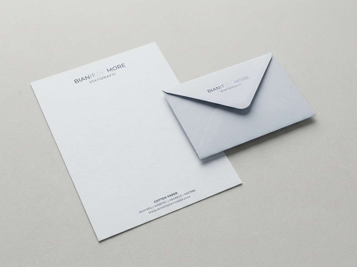
Best for: luxury stationery set
Quiet and refined, these shades feel like moonlight reflecting on brushed steel. The soft silvers keep things elegant while the deeper blue-gray adds gravity for typography. It shines on stationery, envelopes, and minimal monograms, especially with uncoated paper textures. Tip: use the darkest shade only for names and key details to keep the overall look airy.
Image example of moonlit steel generated using media.io
4) Seaside Chrome
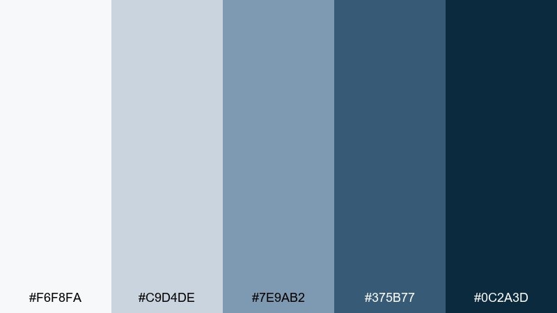
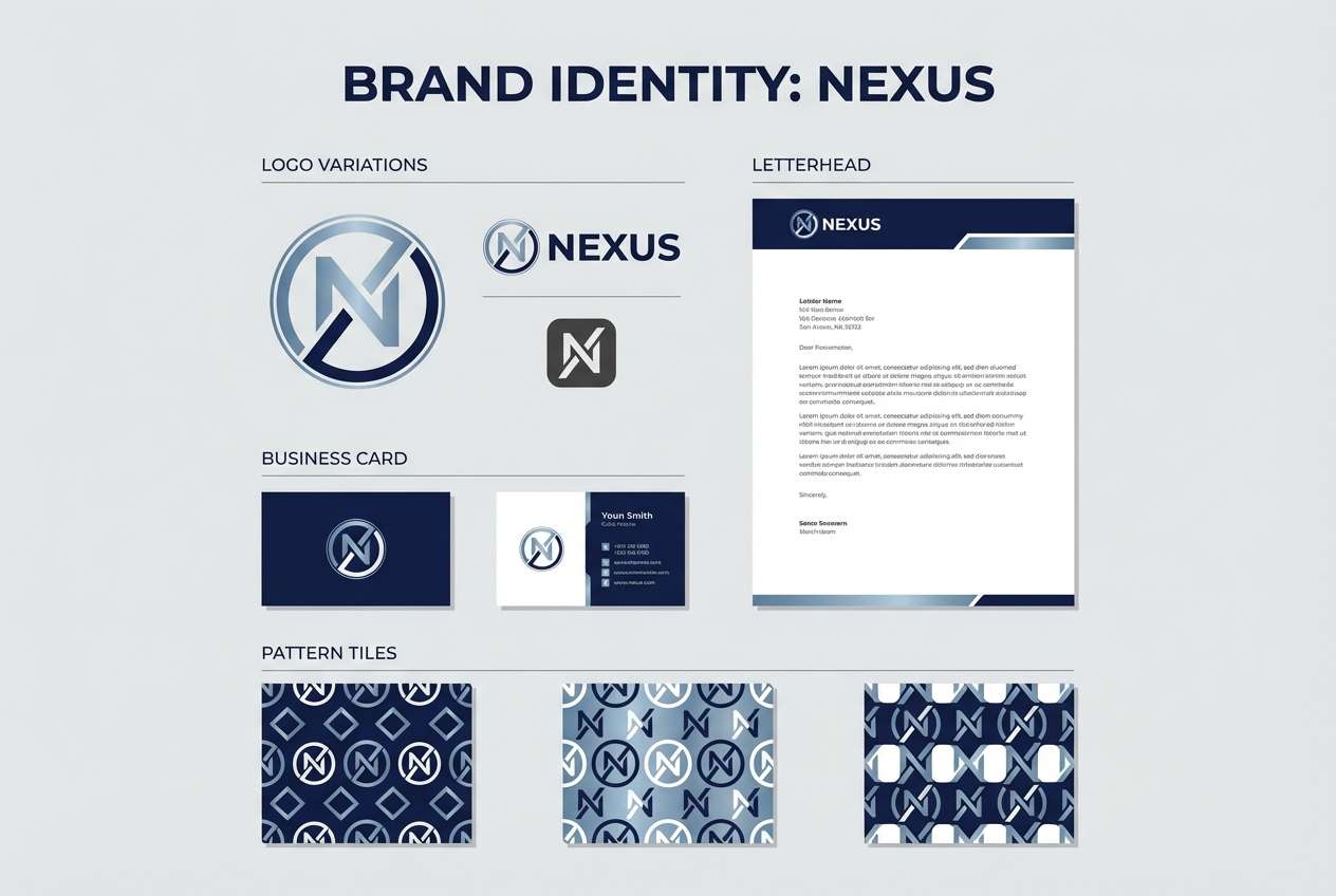
HEX: #F6F8FA #C9D4DE #7E9AB2 #375B77 #0C2A3D
Mood: fresh, breezy, confident
Best for: brand identity kit
Fresh and breezy, it brings to mind sea air, chrome details, and crisp uniforms. This silver blue color palette balances friendly light tones with a bold, dependable navy for marks and type. It fits brand systems that need to feel modern, technical, and trustworthy without going monochrome. Tip: keep logos in the navy, then use the mid blue for secondary graphics and patterns.
Image example of seaside chrome generated using media.io
5) Arctic Mist
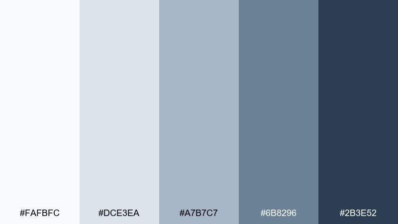
HEX: #FAFBFC #DCE3EA #A7B7C7 #6B8296 #2B3E52
Mood: light, airy, serene
Best for: wellness blog header
Light and airy, it feels like a cold breeze drifting across an open sky. The near-white and soft gray-blue make a gentle base for photos, while the deeper slate brings structure to headlines. Use it for wellness and lifestyle layouts that need calm readability. Tip: keep body text in slate, not navy, to avoid harsh contrast on bright backgrounds.
Image example of arctic mist generated using media.io
6) Denim Silverline

HEX: #F1F4F7 #CBD6E0 #8EA4BA #4E6C87 #1A2A3A
Mood: casual, smart, approachable
Best for: ecommerce product page ui
Casual and smart, it recalls worn denim stitched with a clean silver thread. Silver blue color combinations like this are great for shopping pages because they feel trustworthy without looking sterile. Use the pale tones for content blocks and the denim mid-tone for tags, ratings, and secondary buttons. Tip: introduce the near-black only for prices and primary calls to action to guide scanning.
Image example of denim silverline generated using media.io
7) Stormglass
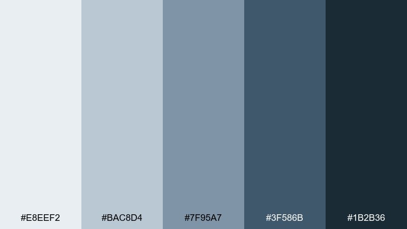
HEX: #E8EEF2 #BAC8D4 #7F95A7 #3F586B #1B2B36
Mood: moody, mature, understated
Best for: book cover design
Moody and mature, these hues suggest storm clouds viewed through glass. The cool gray-blue base supports dramatic typography, while the charcoal navy creates instant depth. It works well for nonfiction, thrillers, or minimalist fiction covers that lean cinematic. Tip: place the title in the lightest tone and add a thin border in the mid shade for a premium finish.
Image example of stormglass generated using media.io
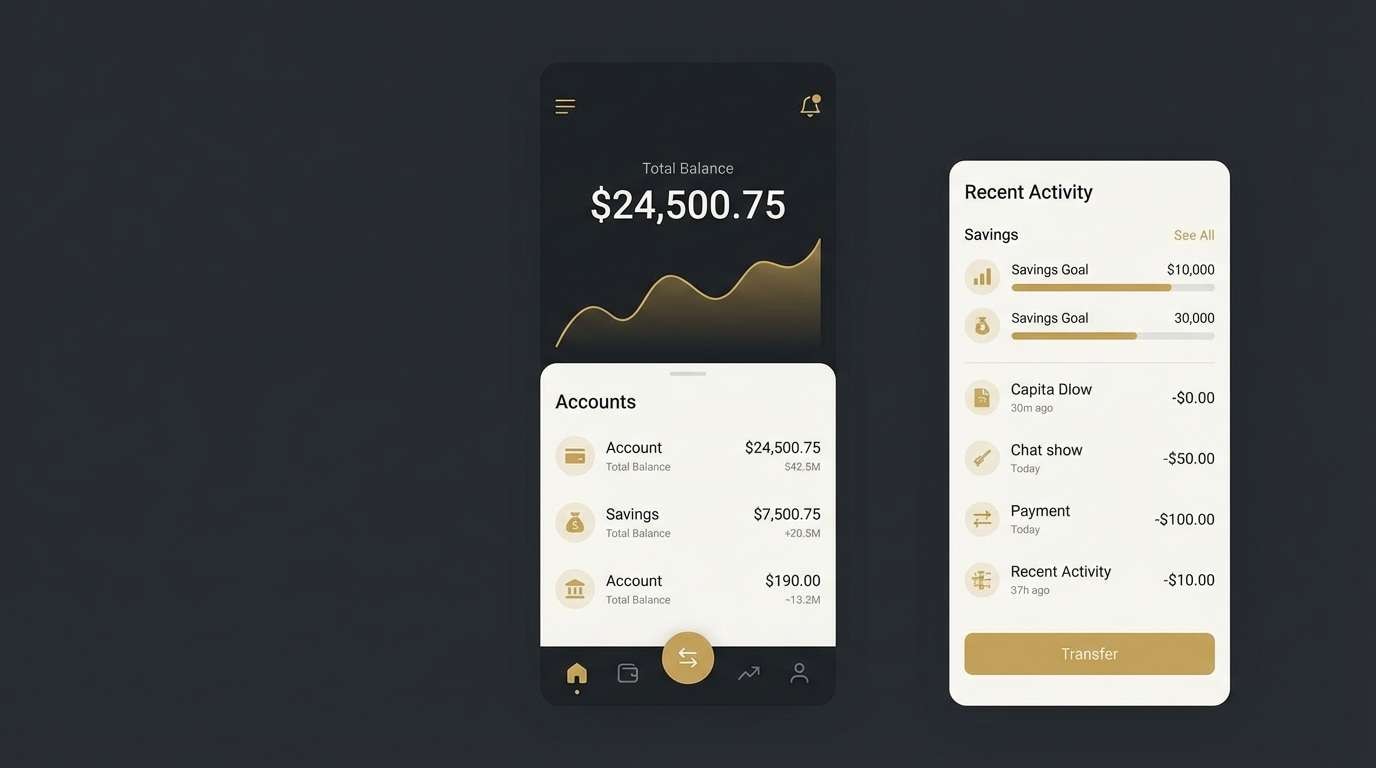
8) Cloudbank Navy
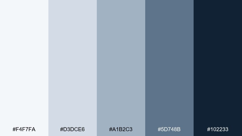
HEX: #F4F7FA #D3DCE6 #A1B2C3 #5D748B #102233
Mood: clean, structured, professional
Best for: fintech app ui
Clean and structured, it feels like a bright cloudbank framed by a sharp navy horizon. As a silver blue color scheme, it supports high information density while staying calm and credible. Use the lightest tone for screens, then assign the two mid tones to states like hover, selected, and disabled. Tip: keep error and success colors muted so they do not fight the navy anchors.
Image example of cloudbank navy generated using media.io
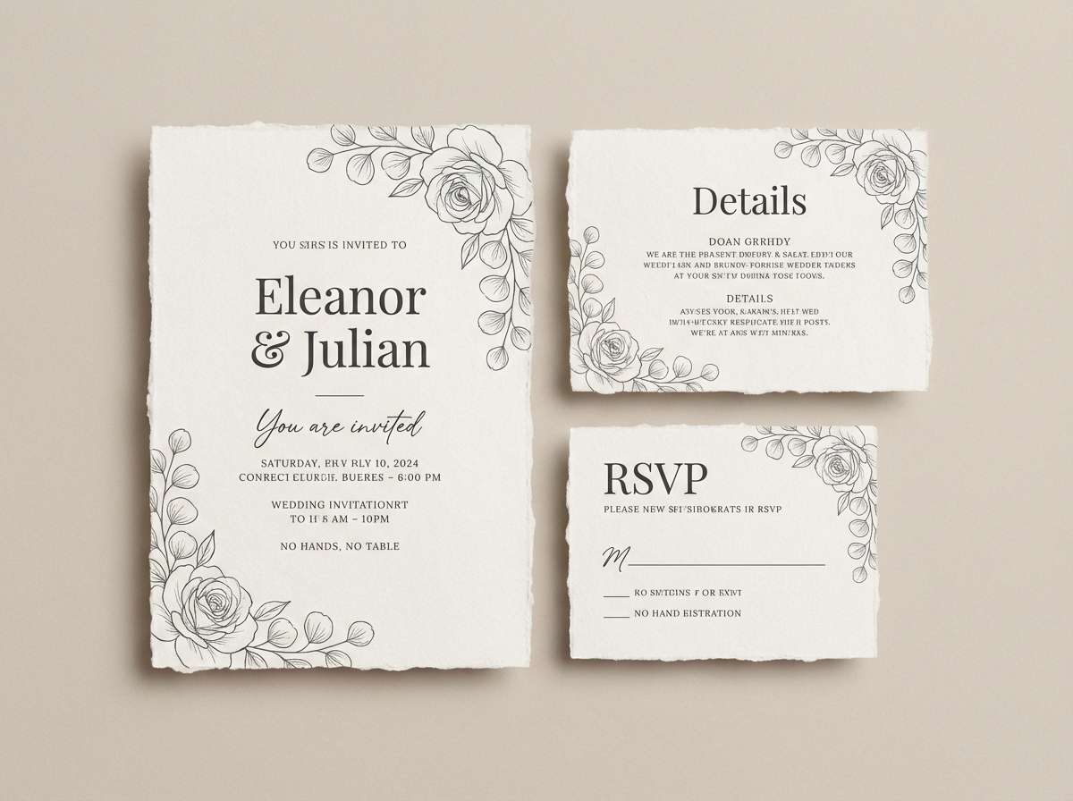
9) Polar Pearl
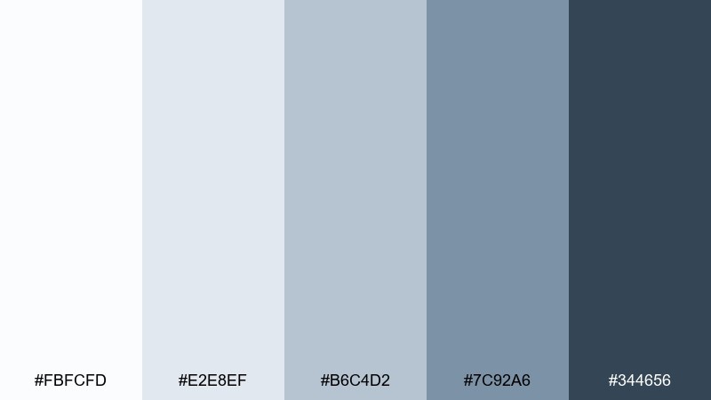
HEX: #FBFCFD #E2E8EF #B6C4D2 #7C92A6 #344656
Mood: soft, luminous, elegant
Best for: wedding invitation suite
Soft and luminous, it evokes pearl sheen on snow under a pale sky. The gentle gradient from near-white to slate gives invitations a refined, modern feel without going stark. Pair it with warm metallic foil, like champagne gold, to keep the cool tones welcoming. Tip: set body copy in the mid slate for legibility on bright paper stocks.
Image example of polar pearl generated using media.io
10) Cobalt Haze
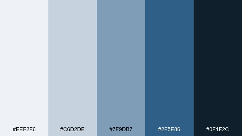
HEX: #EEF2F6 #C6D2DE #7F9DB7 #2F5E86 #0F1F2C
Mood: energetic, crisp, modern
Best for: sportswear product ad
Energetic and crisp, it looks like cobalt cutting through cool haze. The punchier mid-blue brings athletic drive, while the dark anchor keeps layouts grounded and premium. Use it for product ads where you want motion without loud neon accents. Tip: let the mid-blue carry highlights, and keep large backgrounds in the palest tone for a clean studio feel.
Image example of cobalt haze generated using media.io
11) Blueprint Ice
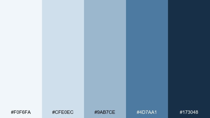
HEX: #F0F6FA #CFE0EC #9AB7CE #4D7AA1 #173048
Mood: technical, tidy, inventive
Best for: architecture portfolio
Technical and tidy, it feels like blueprint lines on frosted vellum. The light icy tones keep pages open, while the richer blue adds a precise, engineered accent. Use it for portfolio sections, diagrams, and captions where hierarchy matters. Tip: apply the medium blue to grid lines and callouts so drawings stay readable at a glance.
Image example of blueprint ice generated using media.io
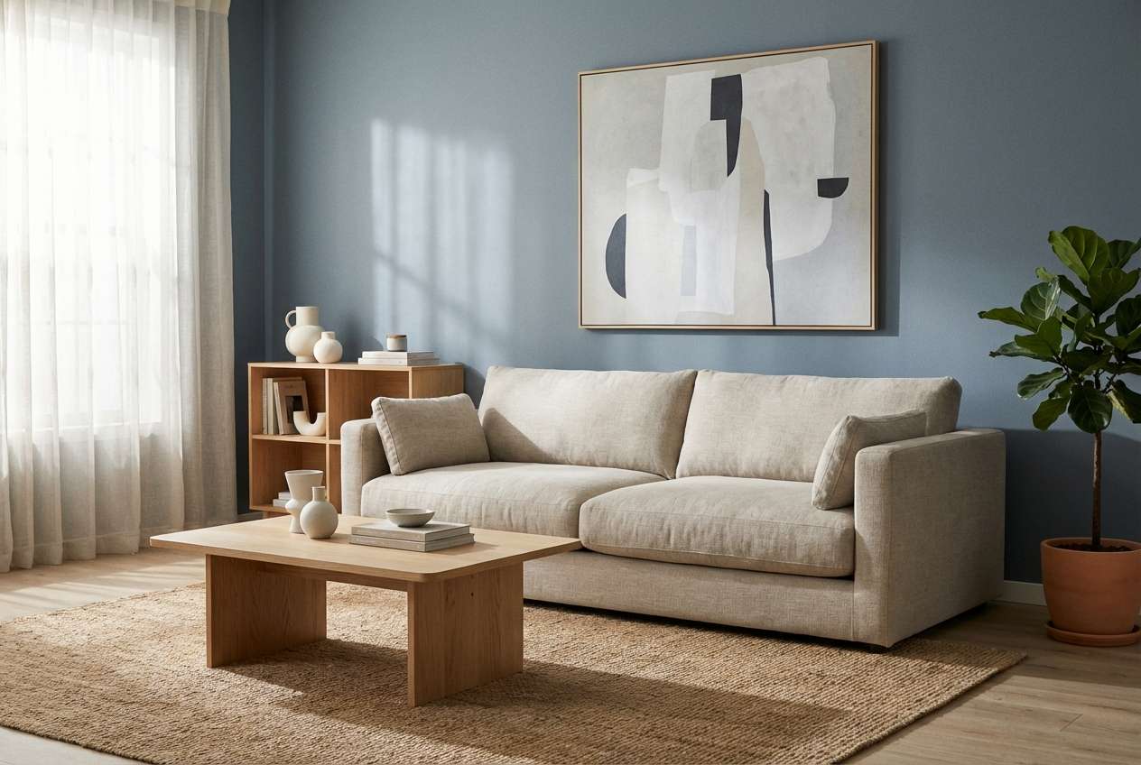
12) Riverstone Silver
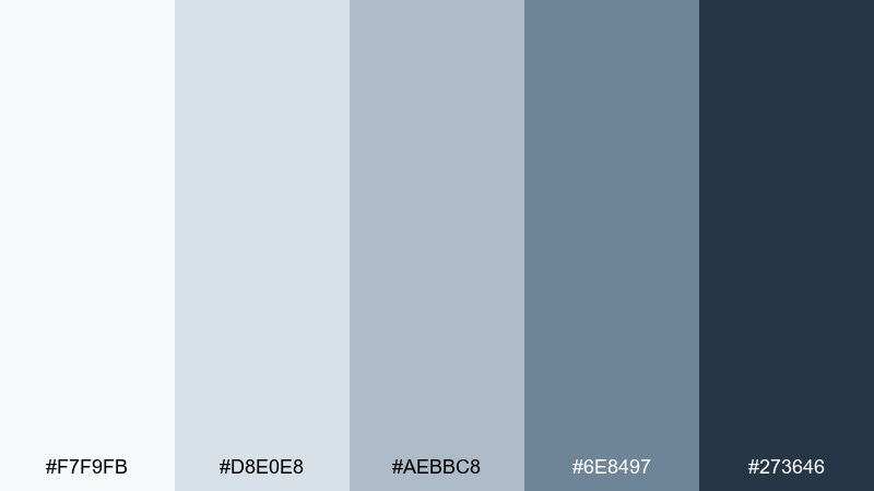
HEX: #F7F9FB #D8E0E8 #AEBBC8 #6E8497 #273646
Mood: grounded, natural, balanced
Best for: living room interior concept
Grounded and natural, it recalls riverstones with a cool, silvery wash. The mid gray-blues behave like versatile neutrals, while the deeper slate can define trim, cabinetry, or feature walls. Pair it with oak, linen, and matte black hardware for a modern organic look. Tip: test the two lightest shades under evening light to avoid a chilly cast.
Image example of riverstone silver generated using media.io
13) Winter Marina

HEX: #EFF3F7 #C8D3DD #8CA1B3 #506A80 #182733
Mood: cool, nautical, relaxed
Best for: travel brochure cover
Cool and nautical, it suggests quiet docks, winter water, and bundled-up weekends away. The light silver-blue keeps imagery bright, while the darker tones frame titles and key information. Use it for travel covers that need to feel fresh and dependable, not overly tropical. Tip: add a small warm accent, like sand or copper, for better visual balance.
Image example of winter marina generated using media.io
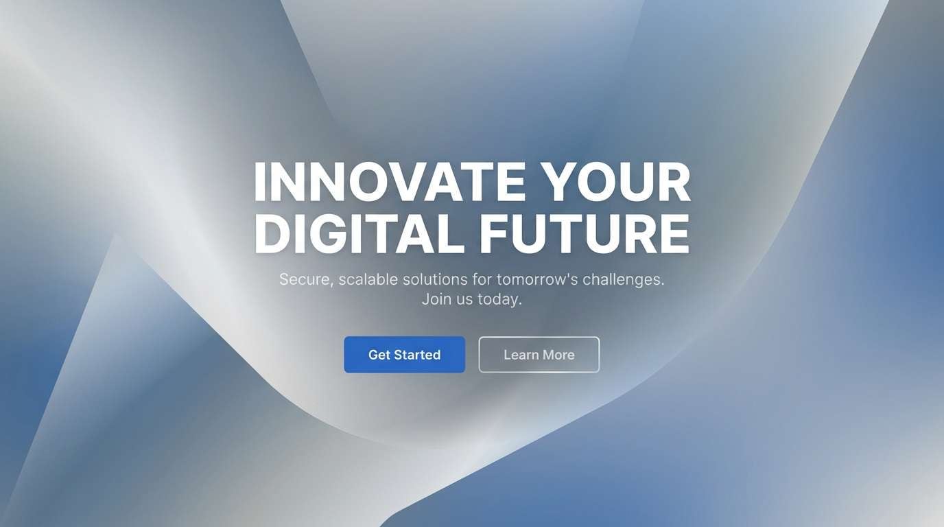
14) Silverwave Gradient
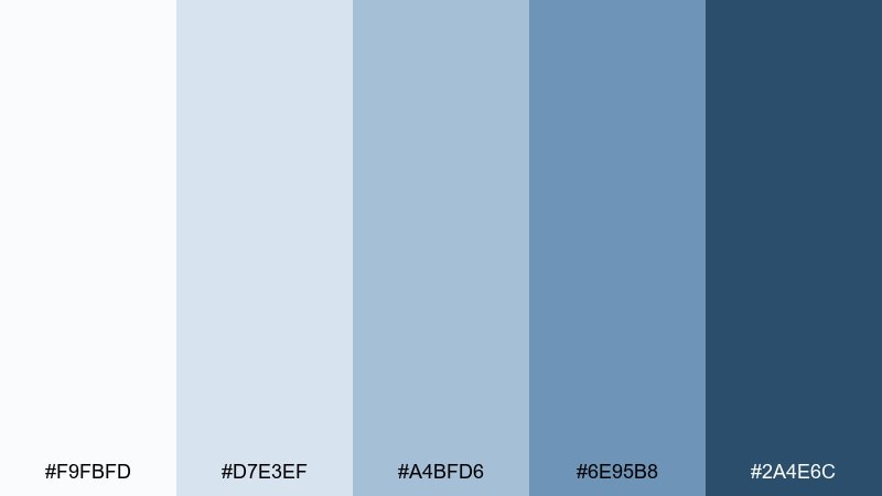
HEX: #F9FBFD #D7E3EF #A4BFD6 #6E95B8 #2A4E6C
Mood: smooth, optimistic, contemporary
Best for: landing page hero section
Smooth and optimistic, it feels like a soft wave rolling into a bright horizon. The step-down blues are ideal for gradients, buttons, and subtle depth without heavy shadows. Use it for hero sections where you want motion and clarity at once. Tip: keep gradients gentle and add solid-color components for accessibility and contrast control.
Image example of silverwave gradient generated using media.io
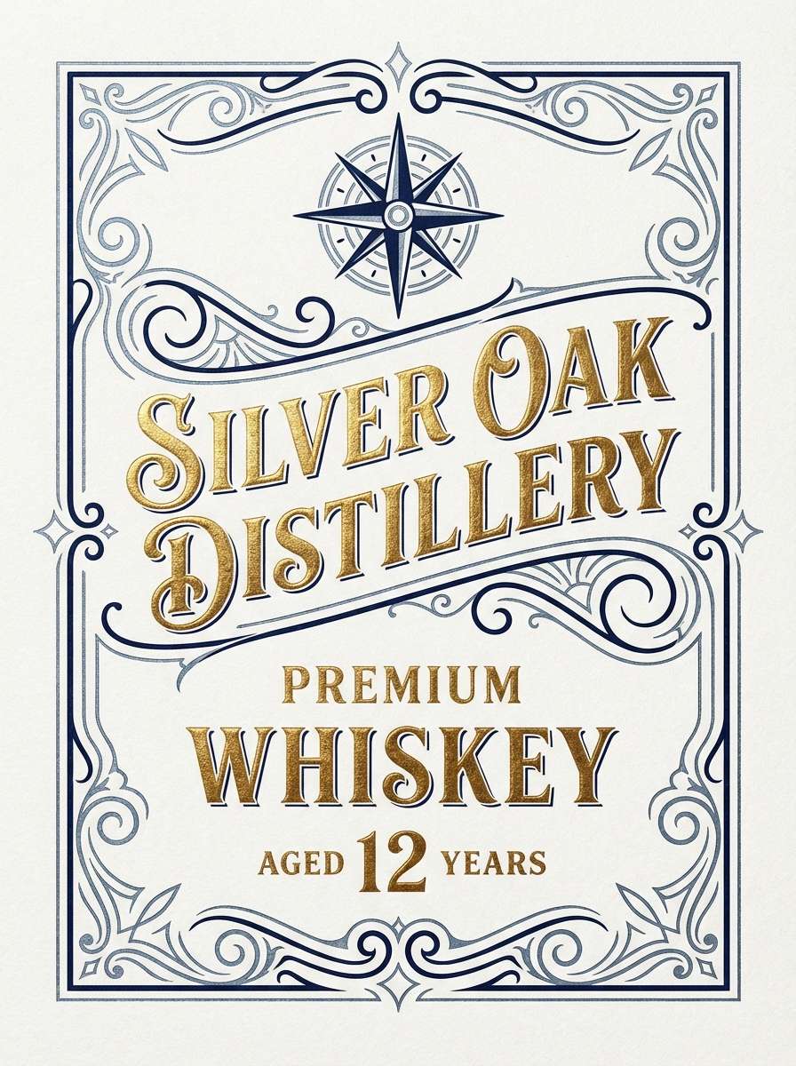
15) Deep Current

HEX: #E6EDF4 #B8C7D7 #6F8DA7 #2D4C66 #0B1A24
Mood: dramatic, confident, premium
Best for: whiskey label design
Dramatic and premium, it resembles deep water under a silver sky. The dark base adds luxury, while the lighter tones keep details crisp and legible on print. This silver blue color combination pairs beautifully with warm gold foils and textured papers for contrast. Tip: use the mid blue for ornamental lines and leave the near-black for the brand mark.
Image example of deep current generated using media.io
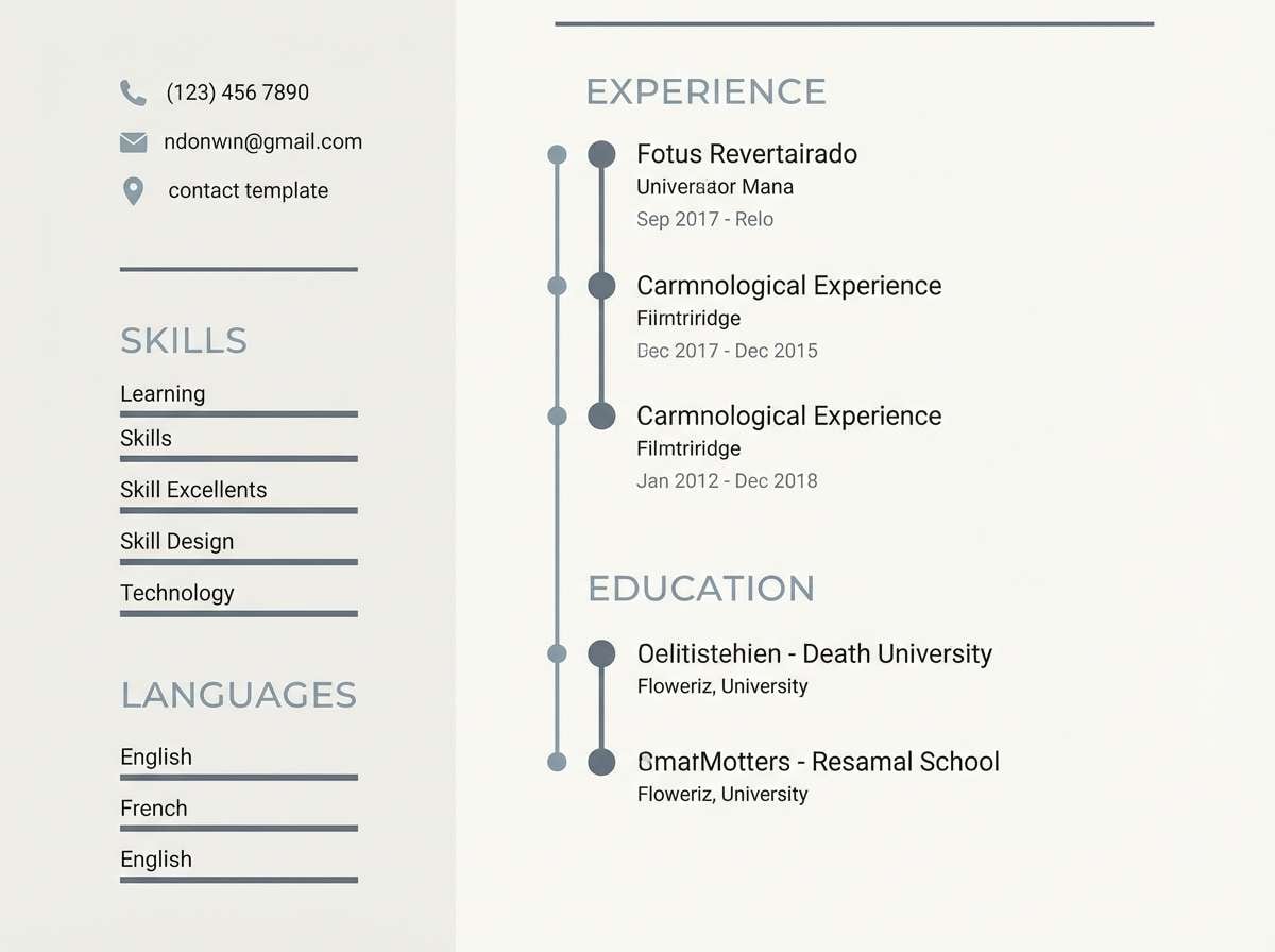
16) Skylight Slate

HEX: #F5F8FB #D6DFE8 #A9B8C7 #697D90 #2A3946
Mood: minimal, airy, practical
Best for: resume template
Minimal and practical, it looks like skylight bouncing off smooth slate. The pale background keeps pages bright, while the slate tones create clear hierarchy for headings and dividers. Use it for resumes and one-page portfolios where typography should do most of the work. Tip: set section headers in the darkest shade and keep body text one step lighter for a softer read.
Image example of skylight slate generated using media.io
17) Frostline Ceramic
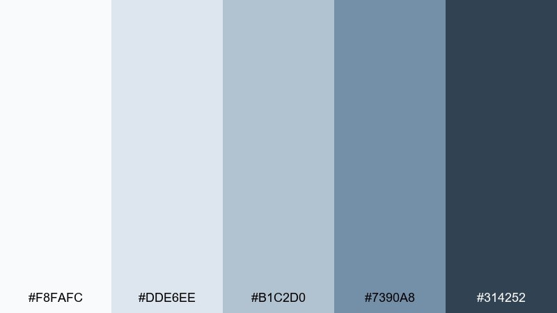
HEX: #F8FAFC #DDE6EE #B1C2D0 #7390A8 #314252
Mood: fresh, clean, spa-like
Best for: skincare packaging
Fresh and spa-like, it brings to mind glazed ceramic and cool steam. The light silvers feel hygienic, while the medium blue-gray adds a gentle clinical confidence. Use it on skincare packaging where simplicity signals quality and trust. Tip: pick one dominant label background (the lightest tone) and use the darker shades only for ingredients and small icons.
Image example of frostline ceramic generated using media.io
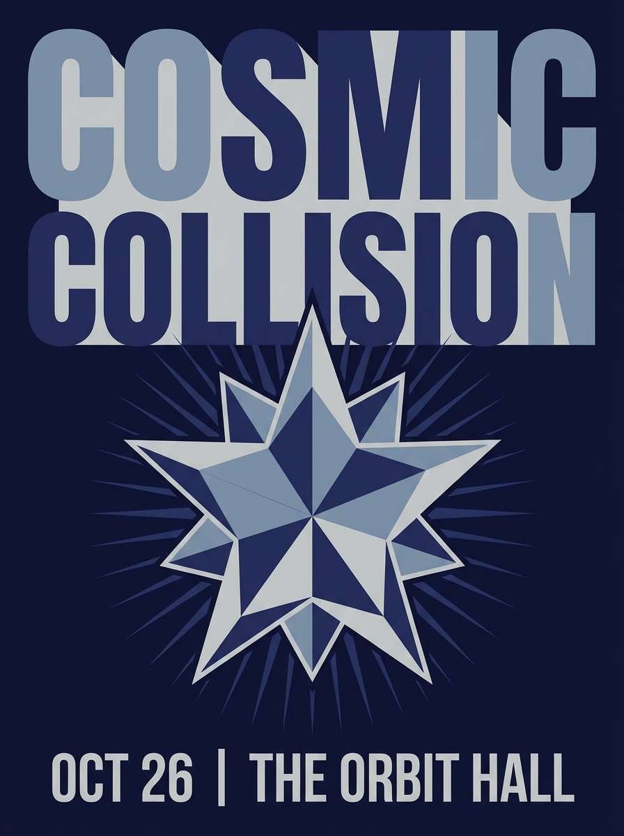
18) Observatory Night
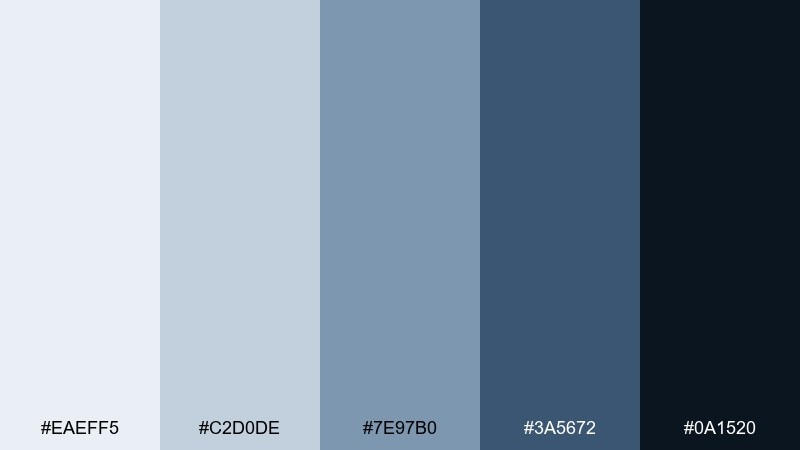
HEX: #EAEFF5 #C2D0DE #7E97B0 #3A5672 #0A1520
Mood: mysterious, crisp, high-contrast
Best for: event poster
Mysterious and crisp, it feels like starlight against a clean night sky. This silver blue color palette gives posters strong contrast without relying on harsh pure black. Use the lightest tone for type blocks and the deep night shade for bold fields and edges. Tip: keep your layout simple and let one oversized headline carry the drama.
Image example of observatory night generated using media.io
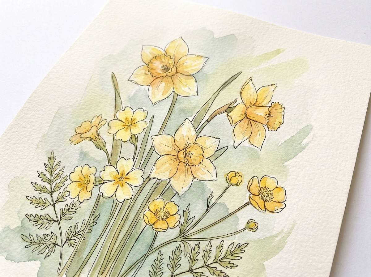
19) Icy Botanical
HEX: #F3F7FA #D7E4EA #A3BCCA #6A8CA1 #2C4556
Mood: delicate, refreshing, nature-led
Best for: botanical art print
Delicate and refreshing, it resembles pale leaves dusted with frost. The gentle silver-blue washes are perfect for illustration, letting linework stay visible and soft. Pair it with off-white paper and a thin charcoal outline for a gallery-ready print. Tip: keep the darkest tone for the smallest details, like stems and shadows, to preserve lightness.
Image example of icy botanical generated using media.io
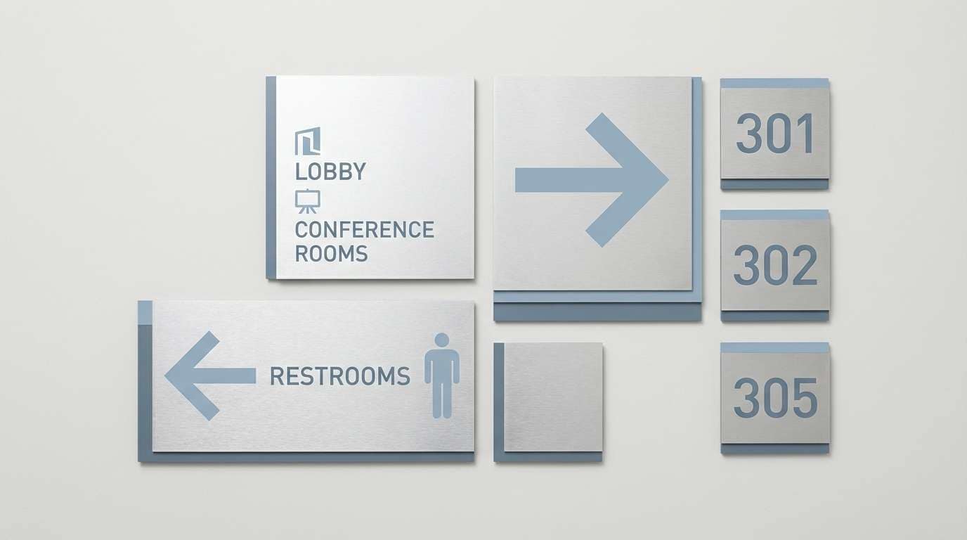
20) Silver Metro
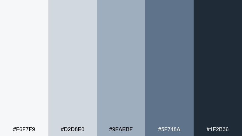
HEX: #F6F7F9 #D2D8E0 #9FAEBF #5F748A #1F2B36
Mood: urban, polished, efficient
Best for: wayfinding signage system
Urban and polished, it suggests brushed steel, subway tiles, and clean typography. The neutrals keep signage legible, while the deeper blue-gray can code routes or zones without shouting. Use it for wayfinding systems in offices, clinics, or campuses where clarity matters most. Tip: test contrast at distance and keep the lightest tone for backgrounds, not text.
Image example of silver metro generated using media.io
21) Quiet Fjord

HEX: #EEF4F8 #C7D7E2 #8FB0C4 #4B738C #162834
Mood: serene, expansive, cinematic
Best for: travel blog editorial spread
Serene and expansive, it feels like a fjord under overcast light with a calm, cinematic chill. The mid tones add atmosphere, and the deep shade frames captions and pull quotes beautifully. Use it in editorial layouts where photos need breathing room and text should stay understated. Tip: keep margins generous and use the medium blue for small section markers instead of heavy rules.
Image example of quiet fjord generated using media.io
What Colors Go Well with Silver Blue?
Silver blue pairs naturally with deep navy, charcoal, and slate for a clean tonal system. This is ideal when you want a modern monochrome feel with enough contrast for headings, navigation, and primary actions.
For warmth, add champagne gold, brass, copper, sand, or warm off-white to keep cool blue-grays from feeling icy. In interiors and packaging, wood tones (oak, walnut) and linen-like neutrals are especially effective.
If you want more energy, try controlled accents like cobalt, icy cyan, or muted teal. Keep those accents limited to highlights (icons, charts, links) so the silver-blue base stays calm and readable.
How to Use a Silver Blue Color Palette in Real Designs
Start by assigning roles: light silver for backgrounds, mid blue-gray for surfaces and secondary UI, and the darkest navy/slate for typography and key controls. This keeps hierarchy consistent across pages and components.
In branding, use the dark anchor color for the logo and core text, then bring silver blue into patterns, stationery fields, and social templates. This approach feels technical and premium without becoming cold.
For interiors, treat silver blue like a neutral paint family: use lighter tints on walls, mid tones in upholstery or cabinetry, and dark slate for trim or metal accents. Always test under different lighting to avoid a blue cast at night.
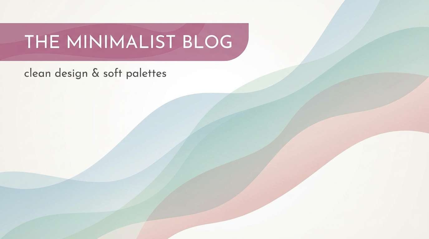
Create Silver Blue Palette Visuals with AI
If you want to see how a silver blue palette behaves in a real layout, generate quick mockups with AI. You can preview contrast, mood, and material feel (paper, metal, ceramic) before you commit to a full design system.
Use the prompts above as a starting point, then swap in your product type (app screen, poster, label, living room) and keep the palette consistent in the prompt for more controlled results.
When you find a look you like, iterate by changing only one variable at a time (lighting, texture, or typography style) so the silver blue tones stay coherent across variations.
Silver Blue Color Palette FAQs
-
What is a silver blue color?
Silver blue is a cool, desaturated blue-gray that sits between pale steel/icy gray and soft blue. It’s often used as a modern neutral because it reads clean and calm without looking flat. -
Is silver blue the same as steel blue or blue gray?
They’re related but not identical. Steel blue usually has more saturated blue, while blue gray is a broader family that can lean warmer or cooler; silver blue typically looks lighter and more “metallic”/misty. -
What accent colors work best with silver blue palettes?
Warm metallics (champagne gold, brass), sand/taupe, and soft warm whites add balance. For a cooler look, use cobalt, icy cyan, or muted teal sparingly as highlight accents. -
What text color is most readable on silver blue backgrounds?
Deep navy or charcoal usually provides the best readability while staying consistent with the palette. Avoid pure black on very light silver-blue backgrounds if it feels too harsh; test contrast for accessibility. -
Are silver blue color palettes good for UI and dashboards?
Yes—silver blue tones reduce visual fatigue and support dense layouts. Use the lightest tones for backgrounds, mid tones for surfaces/states, and the darkest tone for primary navigation and key actions. -
How do I keep silver blue from feeling cold in interiors?
Add warm materials (oak, walnut, tan leather), warm whites, and soft lighting temperatures. A small warm accent—like copper décor or beige textiles—usually makes the space feel more welcoming. -
How can I generate silver blue palette mockups quickly?
Use an AI text-to-image tool and describe the layout plus your silver blue tones (e.g., “silver and steel blue theme” with a deep navy anchor). Iterate by adjusting only one element at a time for consistent results.
Next: Taupe Color Palette


