

Beige pink is the sweet spot between calm neutrals and soft blush—warm enough to feel inviting, muted enough to stay modern. It’s a go-to for brands and designs that want elegance without looking loud.
Below are beige pink color palettes with HEX codes, mood notes, and practical ways to use them across branding, weddings, packaging, and UI.
In this article
- Why Beige Pink Palettes Work So Well
-
- rose linen whisper
- blush oat latte
- powder petal neutral
- desert blush dusk
- ballet slipper beige
- peony sandstone
- vintage makeup bag
- soft clay bouquet
- champagne rose gold
- cozy knit blush
- minimal ui nude pink
- bridal satin and sand
- cafe macaron mix
- skincare label softness
- spring botanical blush
- editorial nude rose
- warm terracotta kiss
- modern wedding suite
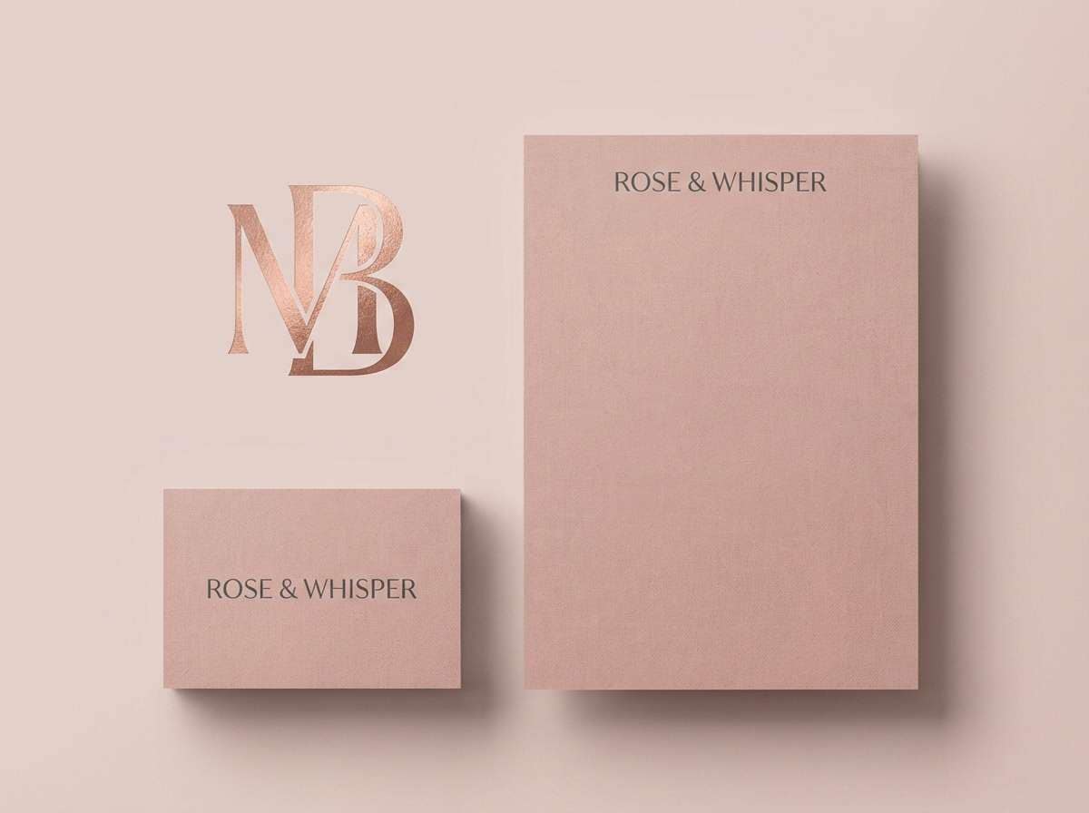
- boutique branding blush
- sunset silk neutrals
- What Colors Go Well with Beige Pink?
- How to Use a Beige Pink Color Palette in Real Designs
- Create Beige Pink Palette Visuals with AI
Why Beige Pink Palettes Work So Well
Beige pink palettes blend the reliability of neutrals with the emotional warmth of pink, so they feel approachable without becoming overly cute. That makes them especially effective for premium, wellness, and lifestyle aesthetics.
They also photograph beautifully: beige tones keep backgrounds soft and clean, while blush accents add depth and skin-friendly warmth. This is why beige and pink tones are common in packaging, wedding stationery, and editorial layouts.
In digital design, beige pink is easy to scale: light neutrals can carry large surfaces, and dusty roses can become UI states (active, hover, highlight) without overpowering content.
20+ Beige Pink Color Palette Ideas (with HEX Codes)
1) Rose Linen Whisper
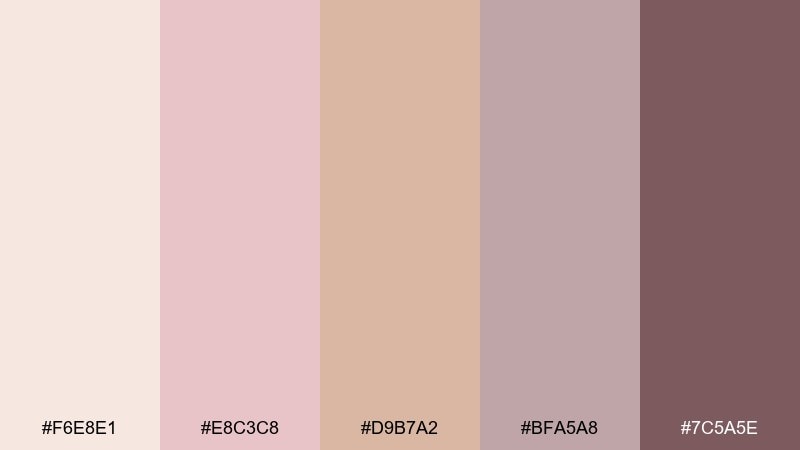
HEX: #F6E8E1 #E8C3C8 #D9B7A2 #BFA5A8 #7C5A5E
Mood: airy, refined, softly romantic
Best for: boutique branding and stationery
Airy romance with a linen-like calm, as if blush petals were pressed into warm fabric. Use it for brand marks, hang tags, and editorial-style stationery where softness still needs structure. Pair with off-white paper textures, thin serif typography, and a muted charcoal for legibility. Usage tip: keep the darkest shade for type only, and let the mid beiges carry your backgrounds.
Image example of rose linen whisper generated using media.io
Media.io is an online AI studio for creating and editing video, image, and audio in your browser.

2) Blush Oat Latte
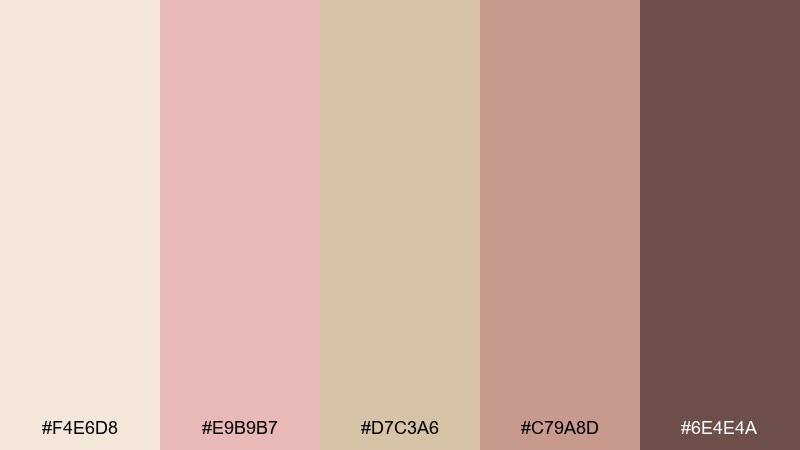
HEX: #F4E6D8 #E9B9B7 #D7C3A6 #C79A8D #6E4E4A
Mood: cozy, approachable, warm
Best for: cafe menu design and social posts
Cozy and comforting, like steamed milk swirling into an oat latte with a rosy glow. These tones work beautifully on menus, loyalty cards, and food-forward social templates where warmth matters. Pair with deep cocoa browns, simple icons, and generous whitespace to keep it modern. Usage tip: use the blush as a highlight color for prices or callouts rather than as a full background.
Image example of blush oat latte generated using media.io
3) Powder Petal Neutral
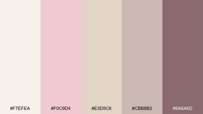
HEX: #F7EFEA #F0C9D4 #E3D5C6 #CBB8B2 #8A6A6D
Mood: gentle, clean, balanced
Best for: wellness blog headers and lifestyle graphics
Gentle and clean, like powdery petals layered over soft stone. The balance of light neutrals and muted rosy notes makes it easy to design calm, readable headers and quote cards. Pair with warm gray text, thin rules, and subtle grain to avoid a flat look. Usage tip: reserve the medium neutral for section dividers to keep layouts organized.
Image example of powder petal neutral generated using media.io
4) Desert Blush Dusk
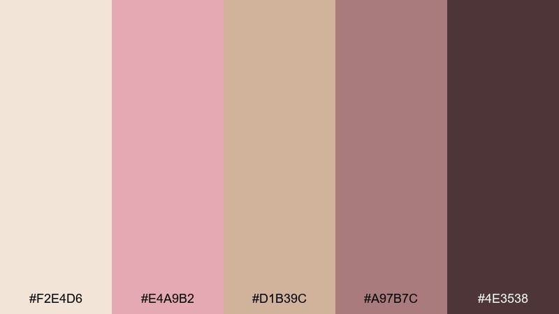
HEX: #F2E4D6 #E4A9B2 #D1B39C #A97B7C #4E3538
Mood: grounded, sun-warmed, modern
Best for: interior mood boards and home decor brands
Grounded and sun-warmed, like desert sand fading into a rosy dusk. It suits interior mood boards, catalog pages, and decor branding that wants softness without feeling sugary. Pair with walnut wood tones, matte black fixtures, and textured neutrals like boucle or linen. Usage tip: repeat the deepest shade in small touches to create rhythm across the layout.
Image example of desert blush dusk generated using media.io
5) Ballet Slipper Beige
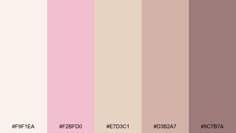
HEX: #F9F1EA #F2BFD0 #E7D3C1 #D3B2A7 #9C7B7A
Mood: delicate, graceful, sweet
Best for: dance studio branding and event flyers
Delicate and graceful, like satin slippers and soft stage lights. These colors fit dance studios, recital flyers, and small event branding where elegance is the main message. Pair with airy photography, thin sans-serif type, and a warm taupe for supporting text. Usage tip: keep blush areas slightly translucent to preserve a light, floating feel.
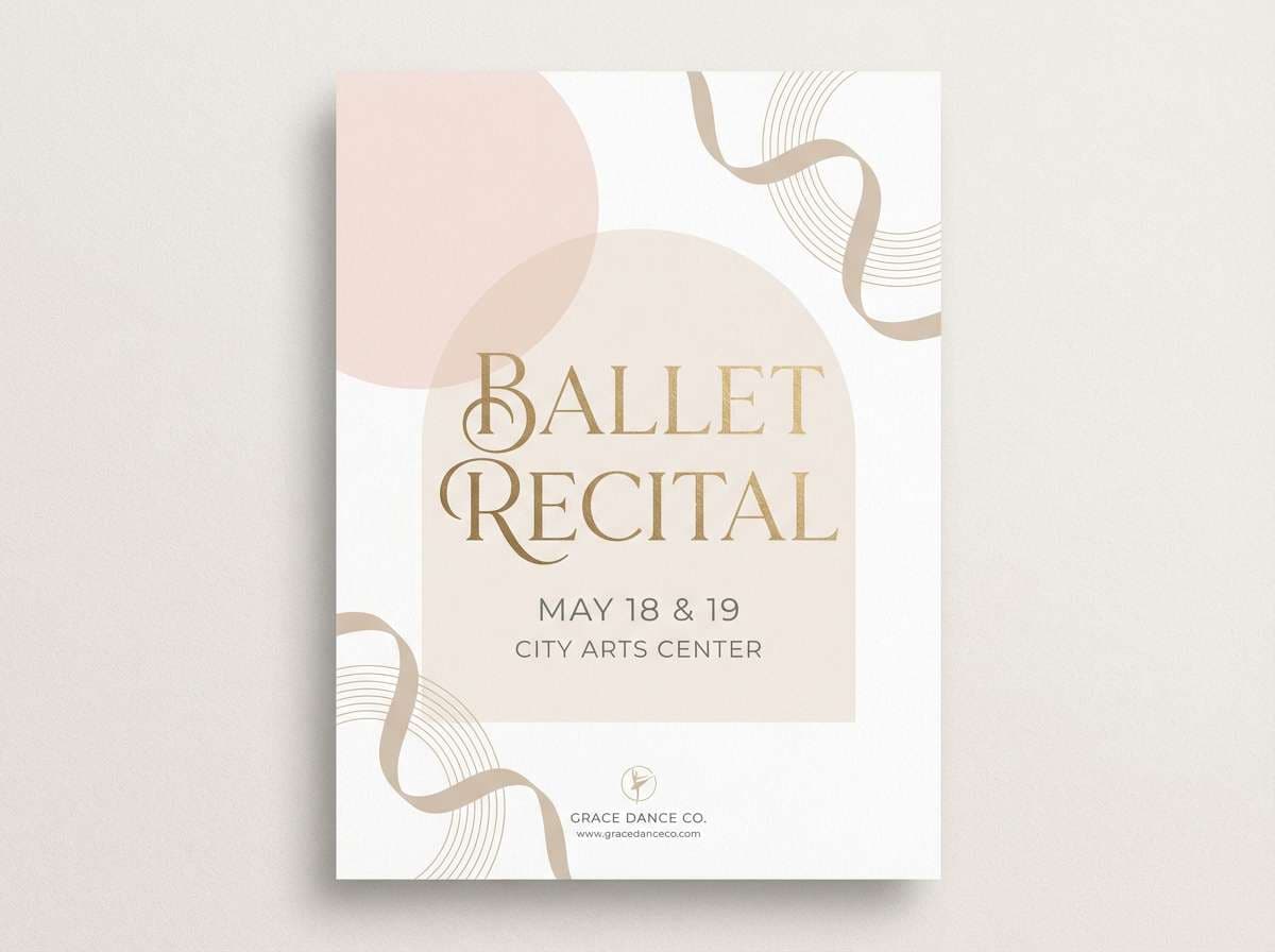
Image example of ballet slipper beige generated using media.io
6) Peony Sandstone
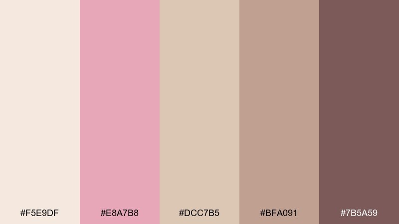
HEX: #F5E9DF #E8A7B8 #DCC7B5 #BFA091 #7B5A59
Mood: softly luxe, warm, inviting
Best for: skincare packaging and product ads
Softly luxe and inviting, like peonies against warm sandstone. The mix of creamy lights and grounded midtones feels premium on labels, boxes, and clean product ads. Pair with minimal typography, embossed details, and a touch of metallic foil for a polished finish. Usage tip: use the darkest tone only for ingredient lists to keep the front label airy.
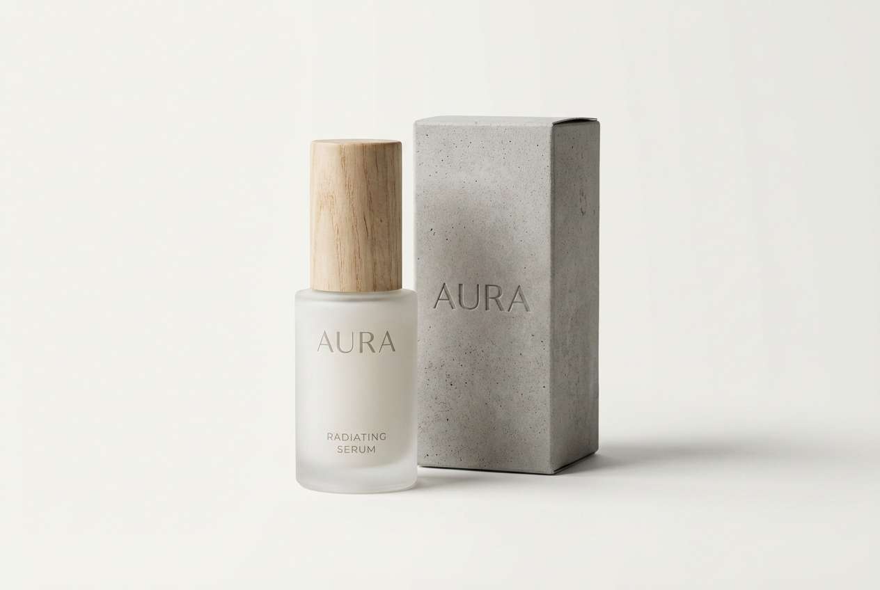
Image example of peony sandstone generated using media.io
7) Vintage Makeup Bag
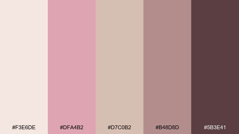
HEX: #F3E6DE #DFA4B2 #D7C0B2 #B48D8D #5B3E41
Mood: nostalgic, charming, feminine
Best for: beauty editorial graphics and lookbooks
Nostalgic and charming, like a well-loved makeup bag with satin lining and rosy powders. It makes a flattering beige pink color palette for beauty editorials, lookbooks, and creator media kits. Pair with warm brown mascara tones, soft gradients, and high-contrast typography for a retro-modern mix. Usage tip: keep background blocks pale and let the deeper mauves frame headlines.
Image example of vintage makeup bag generated using media.io
8) Soft Clay Bouquet
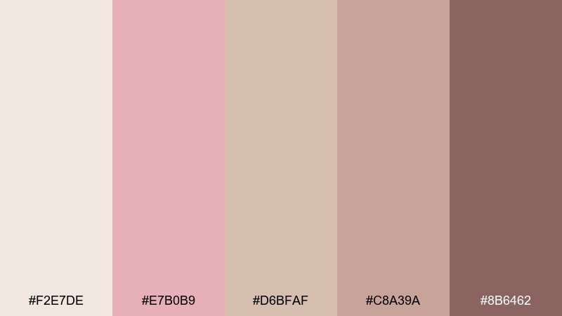
HEX: #F2E7DE #E7B0B9 #D6BFAF #C8A39A #8B6462
Mood: handmade, earthy, calm
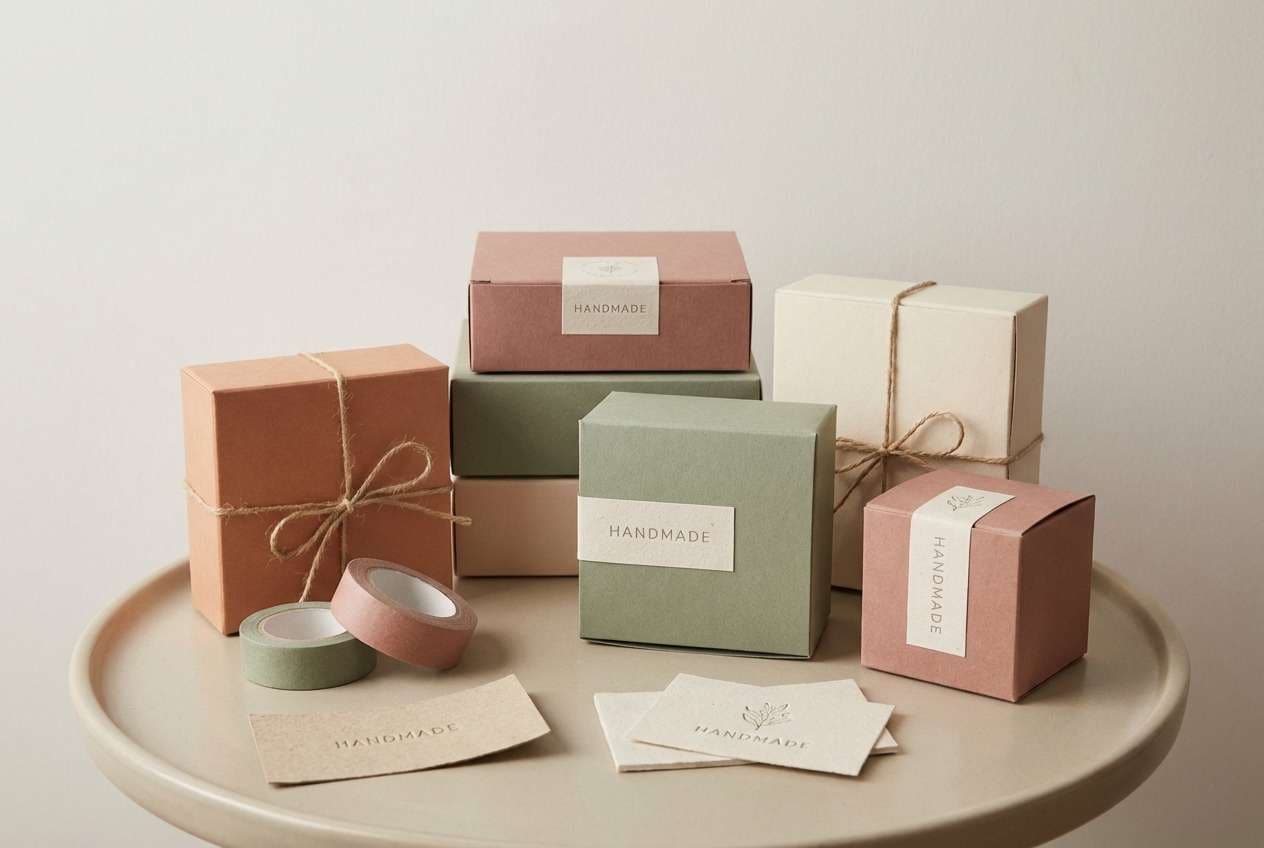
Best for: ceramics shops and craft packaging
Handmade and earthy, like air-dry clay warmed by a bouquet of blush blooms. The muted contrast feels natural on craft packaging, maker logos, and small-batch product tags. Pair with recycled paper textures, simple stamp-style marks, and one deep accent for clarity. Usage tip: keep the clay midtone as the dominant base, then add blush in small, intentional highlights.
Image example of soft clay bouquet generated using media.io
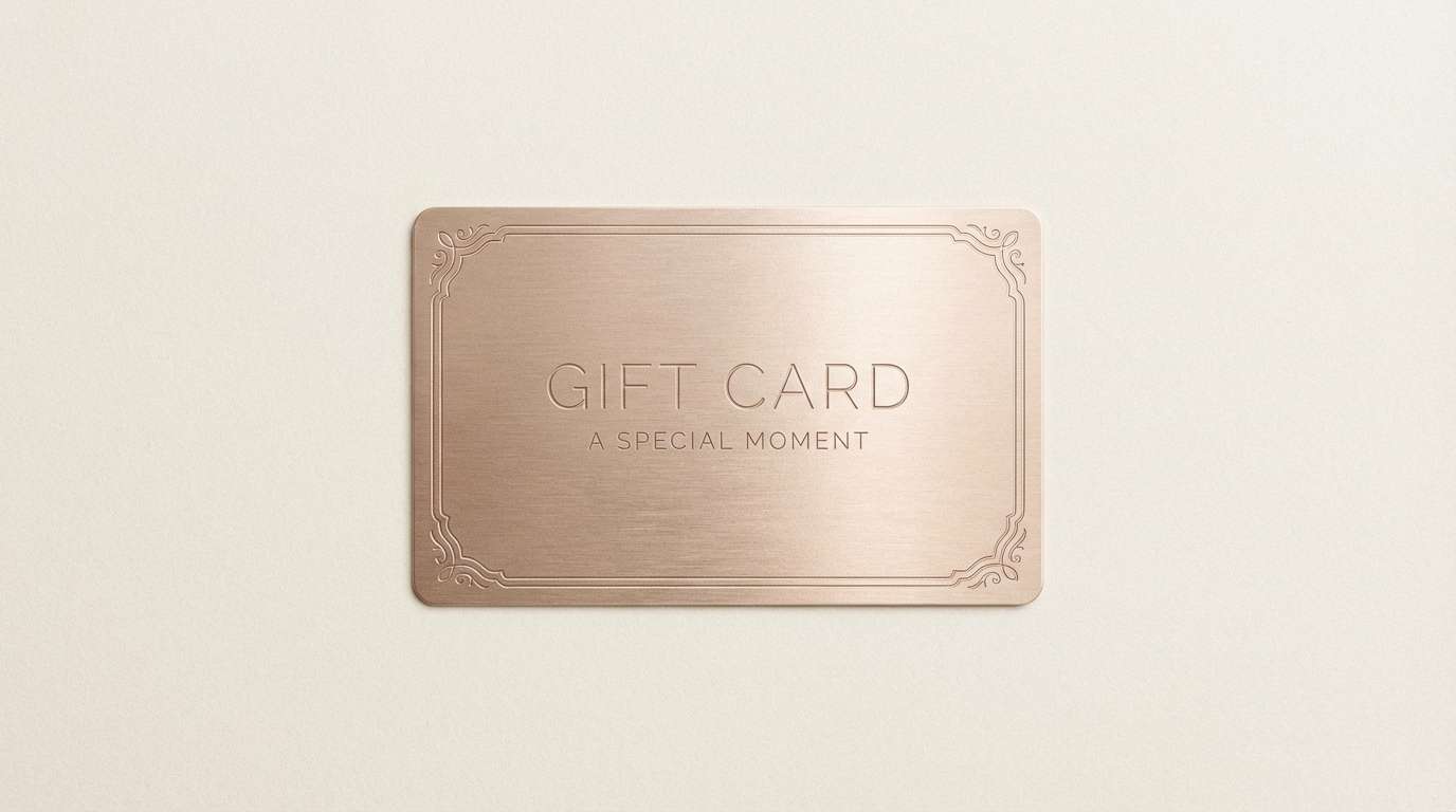
9) Champagne Rose Gold
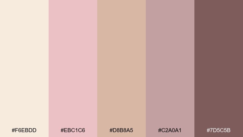
HEX: #F6EBDD #EBC1C6 #D8B8A5 #C2A0A1 #7D5C5B
Mood: celebratory, glossy, elegant
Best for: holiday promos and gift cards
Celebratory and glossy, like champagne bubbles catching a rosy metallic shine. These beige pink color combinations are a strong fit for gift cards, holiday promos, and VIP event graphics that need warmth and sparkle. Pair with subtle foil effects, clean geometric borders, and a deep cocoa for text. Usage tip: limit metallic textures to small accents so the design stays tasteful.
Image example of champagne rose gold generated using media.io
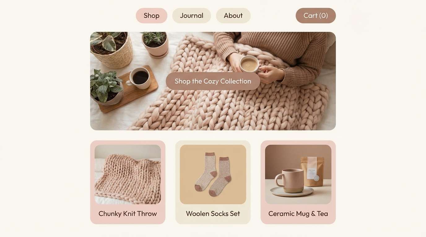
10) Cozy Knit Blush
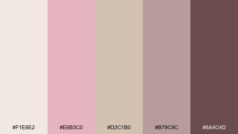
HEX: #F1E8E2 #E6B3C0 #D2C1B0 #B79C9C #6A4C4D
Mood: snug, comforting, friendly
Best for: seasonal campaigns and cozy lifestyle brands
Snug and comforting, like a soft knit throw in a warm, rosy room. The muted contrast works for seasonal campaigns where you want warmth but still need clear hierarchy. Pair with soft shadows, rounded UI shapes, and a dark warm-gray for body text. Usage tip: use the blush for primary buttons and keep backgrounds in the lightest neutral for accessibility.
Image example of cozy knit blush generated using media.io
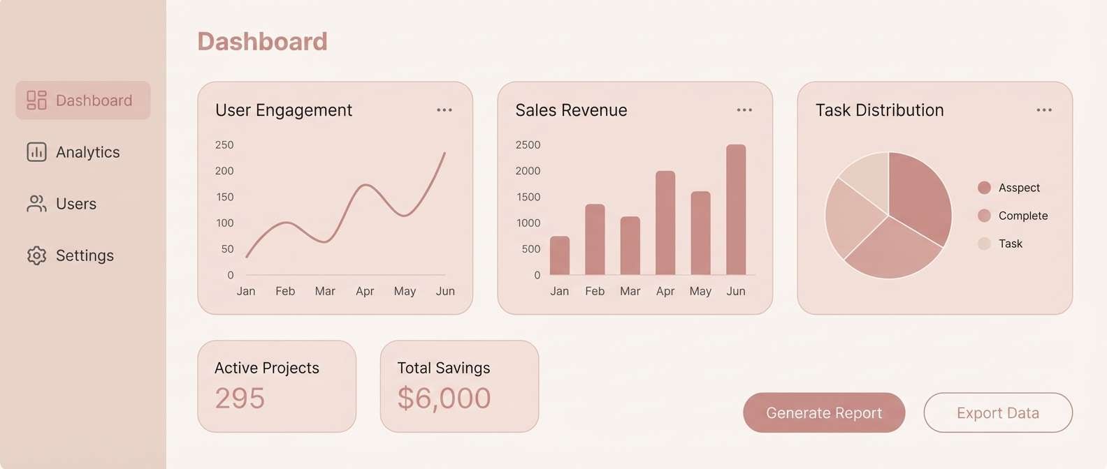
11) Minimal UI Nude Pink
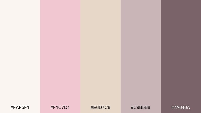
HEX: #FAF5F1 #F1C7D1 #E6D7C8 #C9B5B8 #7A646A
Mood: minimal, airy, contemporary
Best for: SaaS dashboards and mobile app UI
Minimal and airy, like frosted glass with a hint of blush. The light neutrals keep screens spacious while the dusty tones add just enough structure for cards and navigation. Pair with crisp icons, thin dividers, and a cool near-black for strong readability. Usage tip: save the muted mauve for active states so it feels intentional, not decorative.
Image example of minimal ui nude pink generated using media.io
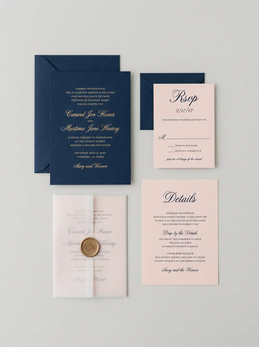
12) Bridal Satin and Sand
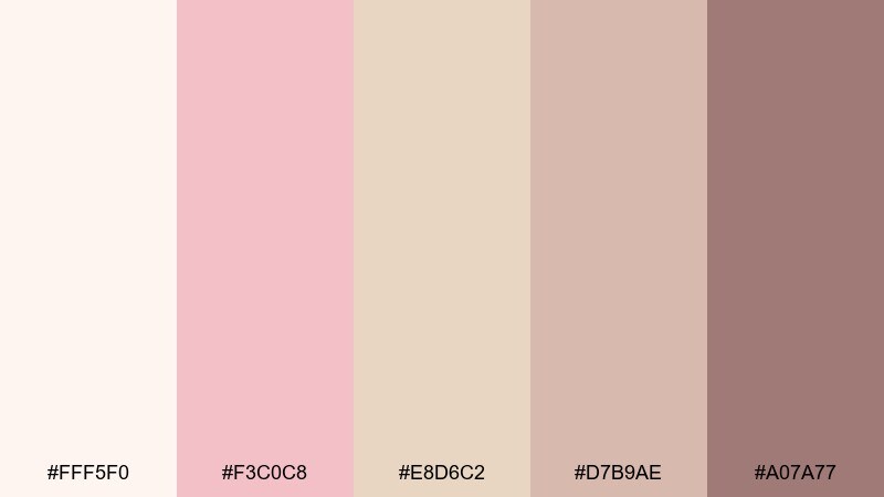
HEX: #FFF5F0 #F3C0C8 #E8D6C2 #D7B9AE #A07A77
Mood: romantic, polished, timeless
Best for: wedding invitations and ceremony programs
Romantic and polished, like satin ribbons laid over sunlit sand. These shades feel timeless on invitations, ceremony programs, and RSVP cards, especially with delicate line art. Pair with ivory stock, letterpress textures, and a refined serif to elevate the softness. Usage tip: keep the deepest tone for names and dates so the suite stays readable.
Image example of bridal satin and sand generated using media.io
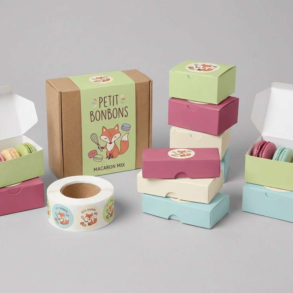
13) Cafe Macaron Mix
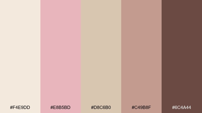
HEX: #F4E9DD #E8B5BD #D8C6B0 #C49B8F #6C4A44
Mood: playful, sweet, inviting
Best for: bakery packaging and menu boards
Playful and sweet, like a pastel macaron box with a warm café twist. It works well on bakery packaging, menu boards, and loyalty stamps where you want approachable charm. Pair with hand-drawn icons, rounded type, and one dark espresso tone for contrast. Usage tip: use the mid beige for large panels and reserve pink for flavor labels or badges.
Image example of cafe macaron mix generated using media.io
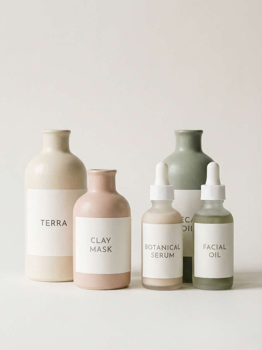
14) Skincare Label Softness
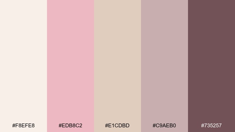
HEX: #F8EFE8 #EDB8C2 #E1CDBD #C9AEB0 #735257
Mood: clean, gentle, premium
Best for: apothecary labels and minimalist product ads
Clean and gentle, like a spa towel warmed under soft lights. The creamy base and dusty accents feel trustworthy on apothecary labels, ingredient lists, and minimalist ads. Pair with small caps typography, fine line separators, and plenty of negative space. Usage tip: keep blush limited to key claims so the overall look stays clinical-modern.
Image example of skincare label softness generated using media.io
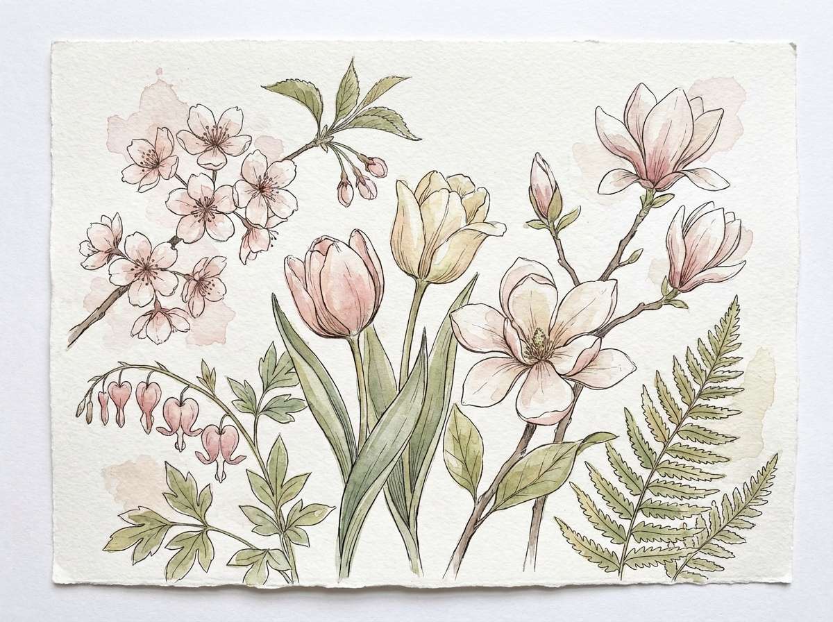
15) Spring Botanical Blush
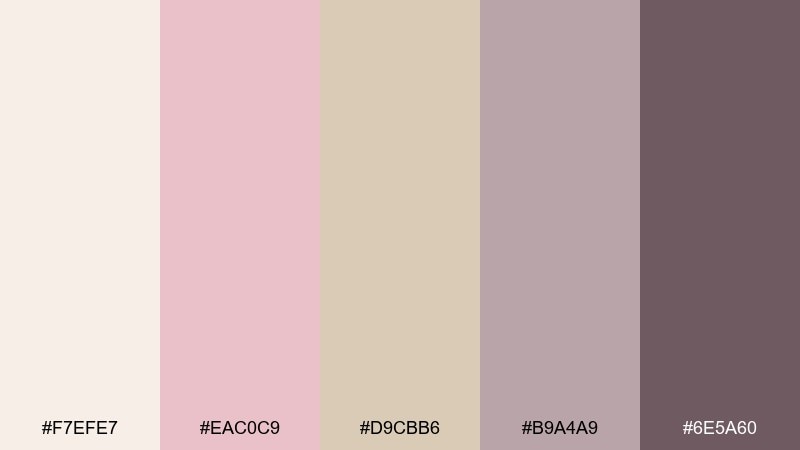
HEX: #F7EFE7 #EAC0C9 #D9CBB6 #B9A4A9 #6E5A60
Mood: fresh, floral, light
Best for: botanical illustrations and seasonal prints
Fresh and floral, like spring blossoms sketched over soft parchment. The gentle contrast suits seasonal prints, planner pages, and botanical artwork where details should feel airy. Pair with sage greens or dusty lavender if you want a garden-like extension without clashing. Usage tip: use the lightest neutral as your paper tone, then layer blush in transparent washes.
Image example of spring botanical blush generated using media.io
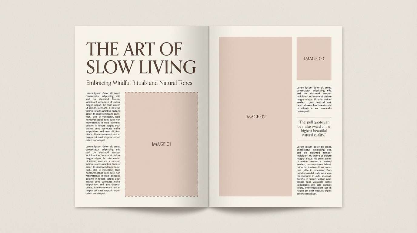
16) Editorial Nude Rose
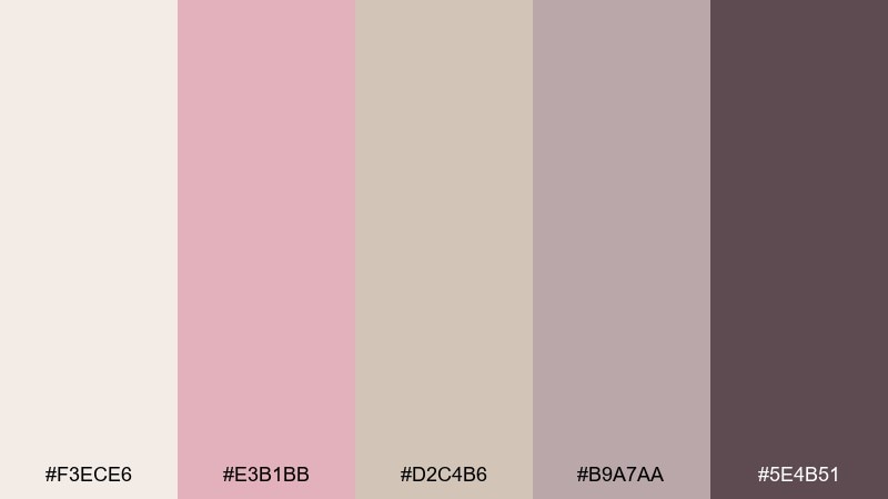
HEX: #F3ECE6 #E3B1BB #D2C4B6 #B9A7AA #5E4B51
Mood: fashion-forward, understated, chic
Best for: magazine layouts and portfolio PDFs
Fashion-forward and understated, like nude silk in a softly lit studio. A beige pink color combination like this works especially well for magazine spreads, portfolio PDFs, and case studies that need calm sophistication. Pair with crisp grids, bold headlines, and a single high-contrast photo per page for impact. Usage tip: use the mauve-gray for captions and rules to keep the layout sharp.
Image example of editorial nude rose generated using media.io
17) Warm Terracotta Kiss
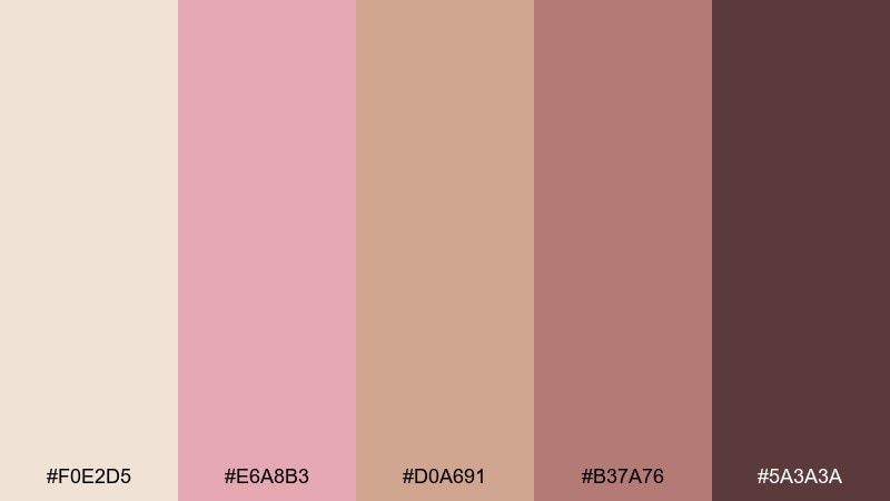
HEX: #F0E2D5 #E6A8B3 #D0A691 #B37A76 #5A3A3A
Mood: bold, warm, confident
Best for: boutique product launches and hero banners
Bold and warm, like terracotta pottery with a quick blush kiss. The deeper base gives you stronger contrast for hero banners, launch graphics, and punchy promos. Pair with creamy whites, strong photography, and slightly condensed type to amplify the confident feel. Usage tip: keep pink accents near calls to action and let terracotta lead the composition.
Image example of warm terracotta kiss generated using media.io
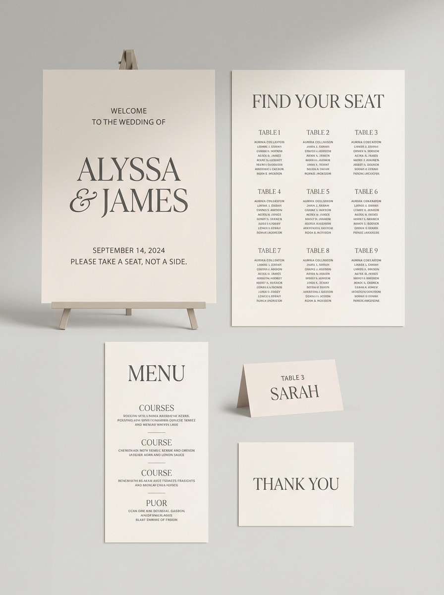
18) Modern Wedding Suite
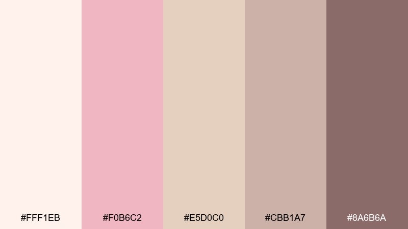
HEX: #FFF1EB #F0B6C2 #E5D0C0 #CBB1A7 #8A6B6A
Mood: modern romantic, airy, elegant
Best for: wedding signage and day-of stationery
Modern romantic and airy, like soft drapery and blush florals under morning light. This beige pink color palette shines on welcome signs, seating charts, and place cards where you want cohesive softness across sizes. Pair with warm neutrals, minimal monograms, and clean spacing so the typography stays the hero. Usage tip: choose one blush shade for all headings to keep the suite consistent.
Image example of modern wedding suite generated using media.io
19) Boutique Branding Blush
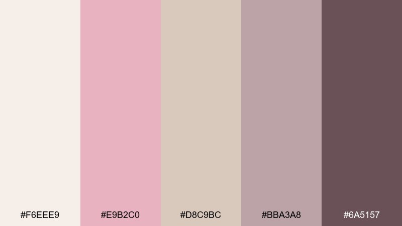
HEX: #F6EEE9 #E9B2C0 #D8C9BC #BBA3A8 #6A5157
Mood: soft luxury, curated, modern
Best for: brand kits and social media templates
Soft luxury with a curated feel, like a well-styled boutique shelf. It translates easily from brand kits to social templates thanks to the balanced neutrals and steady contrast. Pair with clean iconography, warm photography, and a deep plum-brown for headlines. Usage tip: build a simple rule that blush is for emphasis only, and everything else stays neutral.
Image example of boutique branding blush generated using media.io
20) Sunset Silk Neutrals
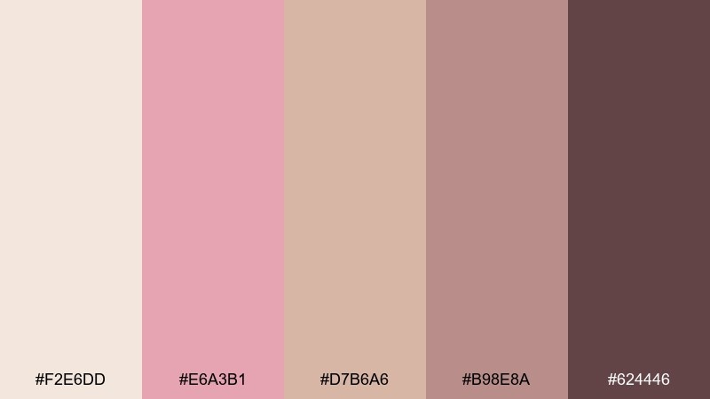
HEX: #F2E6DD #E6A3B1 #D7B6A6 #B98E8A #624446
Mood: sensual, mellow, sophisticated
Best for: lingerie branding and elegant landing pages
Sensual and mellow, like sunset light catching on silky fabric. The palette feels sophisticated on elegant landing pages and intimate product branding where you want warmth without harsh contrast. Pair with soft gradients, tasteful serif typography, and plenty of breathing room to keep it premium. Usage tip: let the light neutral dominate and use the darkest shade sparingly for buttons and key labels.
Image example of sunset silk neutrals generated using media.io
What Colors Go Well with Beige Pink?
Beige pink pairs naturally with warm neutrals like ivory, oatmeal, taupe, and cocoa—great for creating depth without introducing harsh contrast. For typography, charcoal or near-black usually reads cleaner than pure black against blush-beige backgrounds.
To expand the palette, try muted greens (sage, olive, eucalyptus) for a botanical feel, or soft blues (dusty slate, steel blue) for a modern balance. Metallic accents like champagne gold or rose gold can add a premium finish when used sparingly.
If you need stronger energy, add a grounded anchor color such as deep plum, espresso brown, or terracotta—these shades keep the overall look sophisticated and readable.
How to Use a Beige Pink Color Palette in Real Designs
Start with a light neutral as your main canvas (backgrounds, large blocks), then assign one blush tone for highlights (buttons, badges, links) and one deeper mauve/brown for text and key UI states. This keeps the design cohesive and avoids “all-over pink.”
For branding and packaging, beige pink works best with tactile choices: paper textures, subtle grain, embossing, or matte finishes. Use the darkest shade for ingredient lists, legal copy, or small labels so readability stays high.
For weddings and stationery, keep contrast intentional: names/dates in the deepest tone, supporting details in mid neutrals, and blush reserved for borders, monograms, or small illustrations.
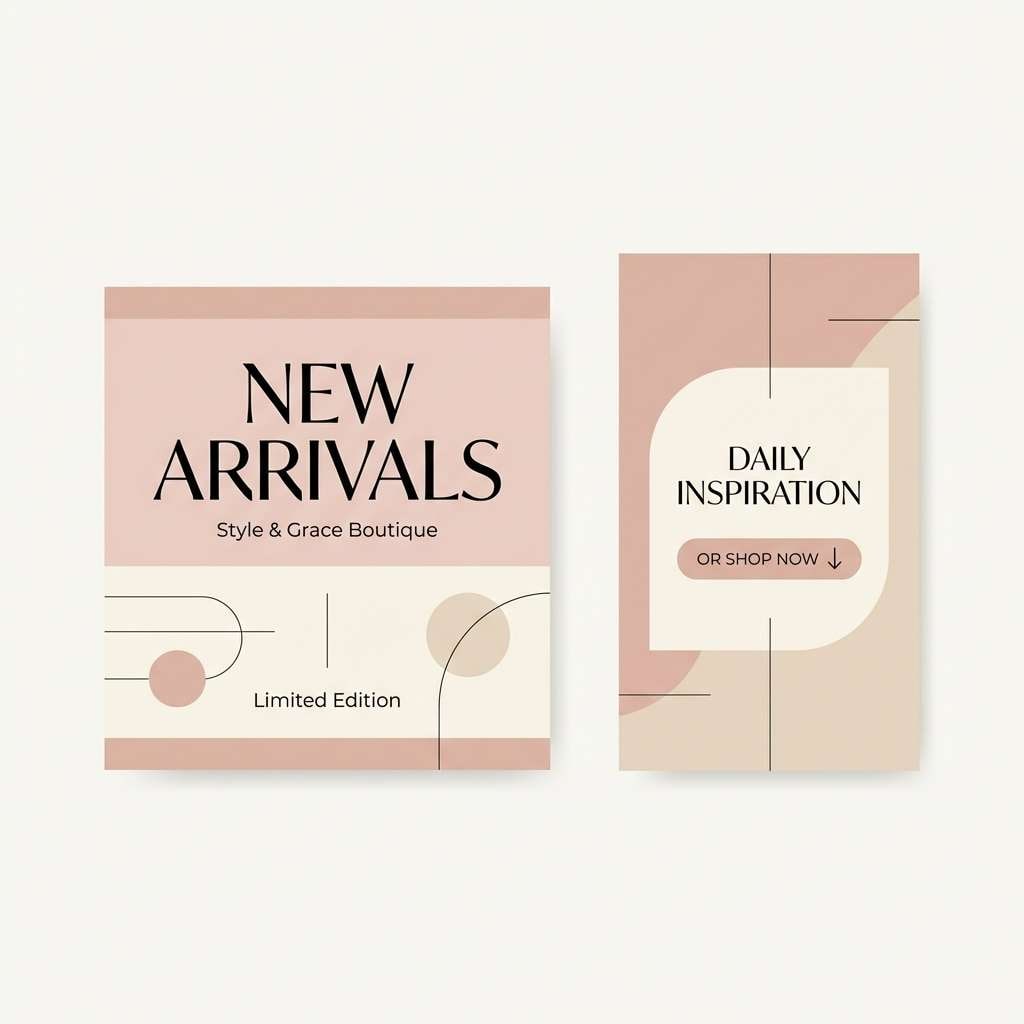
Create Beige Pink Palette Visuals with AI
If you already have HEX codes, you can turn them into real mockups fast—menus, invitation suites, label designs, UI screens, and mood boards. The key is to describe the layout (poster, landing page, packaging) and specify a clean background so the colors stay accurate.
With Media.io, you can generate consistent beige pink visuals by reusing the same palette terms and adjusting only the scene (e.g., “skincare bottle label,” “wedding seating chart,” or “minimal dashboard UI”). This helps you test multiple design directions before committing to production.
Beige Pink Color Palette FAQs
-
What is a beige pink color palette?
A beige pink palette blends warm beige neutrals with soft pink or blush accents, often including dusty rose and mauve-brown shades for contrast and typography. -
Is beige pink good for branding?
Yes—beige pink feels calm, premium, and approachable, so it’s popular for boutiques, skincare, wellness, lifestyle creators, and wedding-related brands. -
What text color works best on beige pink backgrounds?
Use deep warm grays, cocoa browns, or near-black (instead of pure black) for comfortable contrast. Save lighter midtones for secondary labels and dividers. -
What colors complement beige and pink tones?
Sage/olive greens, dusty blues, warm taupes, espresso browns, and soft metallics (champagne/rose gold) all pair well with beige pink. -
How do I keep a neutral blush palette from looking too sweet?
Let beige lead as the dominant base, limit blush to small emphasis areas, and add one grounding dark (mauve-brown, plum, or espresso) for structure and readability. -
Can I use beige pink in UI design?
Absolutely—use the lightest neutral for primary surfaces, a dusty blush for active states or primary buttons, and a dark mauve-gray for text to maintain accessibility and hierarchy. -
How can I generate beige pink design mockups quickly?
Use an AI image generator like Media.io, describe the design format (packaging, invitation suite, dashboard, menu) and include beige pink styling cues (linen, matte, minimal, editorial) to get consistent visuals.
Next: Feminine Color Palette


