

A feminine color palette usually sits in the sweet spot between softness and clarity: blush pinks, mauves, lilacs, and creamy neutrals that feel welcoming without being overpowering.
Below are 20 feminine color palette ideas with HEX codes, plus practical tips for using them in branding, UI, invitations, packaging, and more.
In this article
Why Feminine Palettes Work So Well
Feminine palettes are popular because they communicate warmth, care, and approachability at a glance. Soft pinks and purples reduce visual harshness, while creamy neutrals keep the overall look light and breathable.
They are also flexible: the same blush-and-lilac foundation can feel romantic for invitations, clean for skincare branding, or modern for UI when you control contrast and typography.
Most importantly, these color families pair naturally with premium cues like subtle gradients, paper textures, and metallic accents, helping designs feel polished without needing heavy decoration.
20+ Feminine Color Palette Ideas (with HEX Codes)
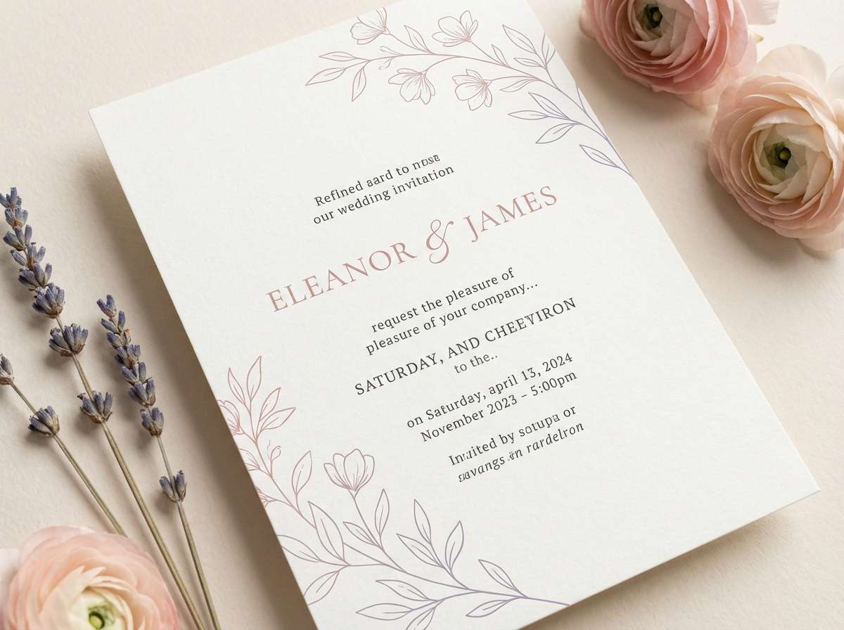
1) Blush Bouquet
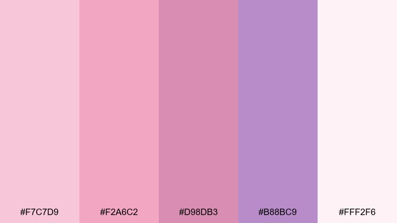
HEX: #f7c7d9 #f2a6c2 #d98db3 #b88bc9 #fff2f6
Mood: romantic, airy, polished
Best for: wedding invitations and bridal stationery
Romantic and airy like fresh petals on silk ribbon, these tones feel sweet without looking childish. Use the blush and rose as your main fields, then let the lavender act as a calm counterpoint. Pair with warm ivory paper textures and delicate script or serif typography for a refined look. Tip: keep one ink color for text, and use the deeper mauve only for small flourishes or monograms.
Image example of blush bouquet generated using media.io
Media.io is an online AI studio for creating and editing video, image, and audio in your browser.

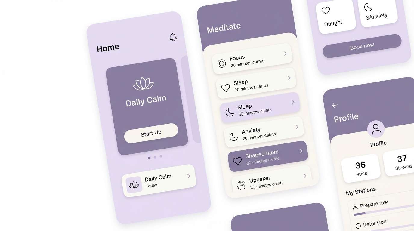
2) Lavender Milk
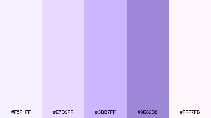
HEX: #f5f1ff #e7d9ff #cbb7ff #9e86d8 #fff7fb
Mood: calm, clean, dreamy
Best for: wellness apps and mindful UI
Calm and clean like steamed milk with a hint of lilac, this mix is gentle on the eyes. Use the near-white lavender as the base, then apply mid-lilac for cards, chips, and secondary surfaces. Pair with soft gray icons and a single bold accent for key CTAs. Tip: increase contrast by reserving the darkest purple for headings and active states only.
Image example of lavender milk generated using media.io
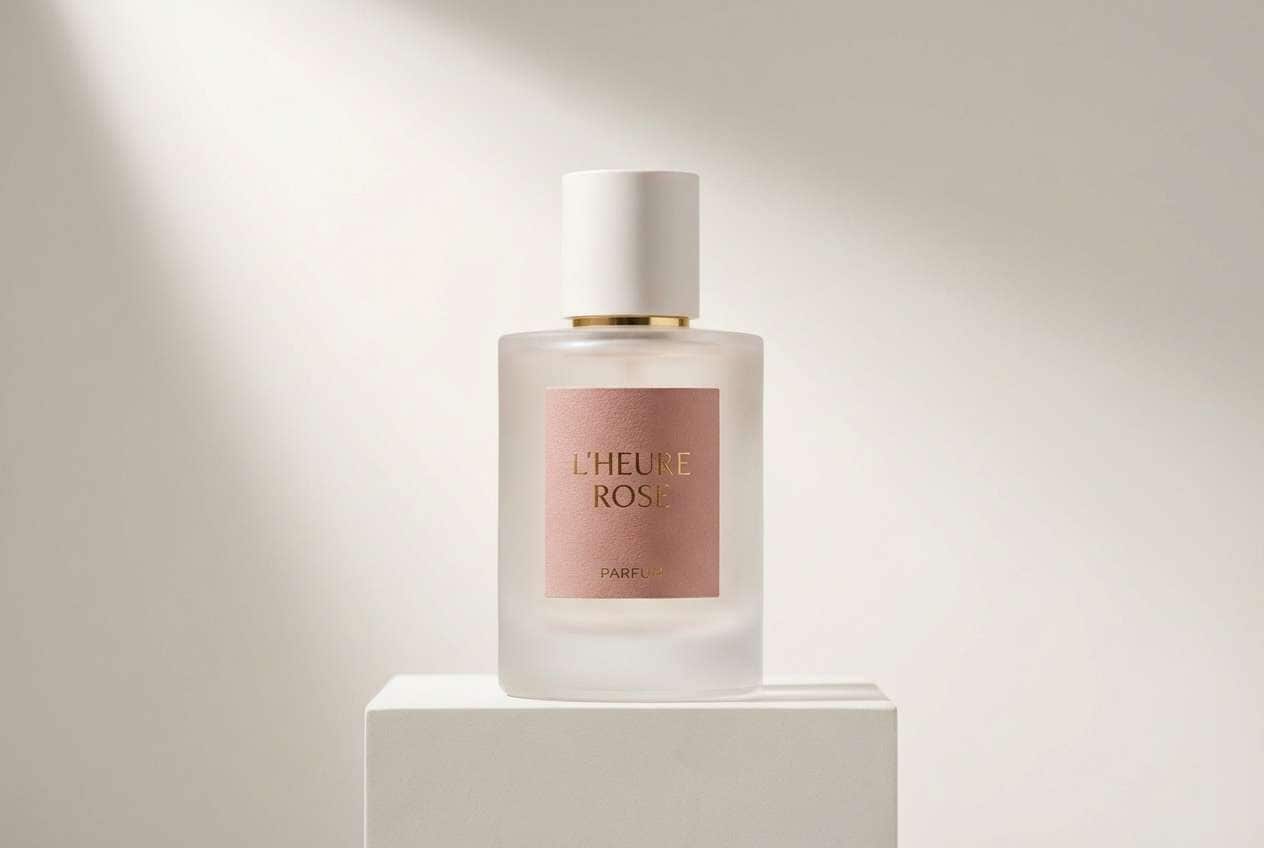
3) Rosewater Satin
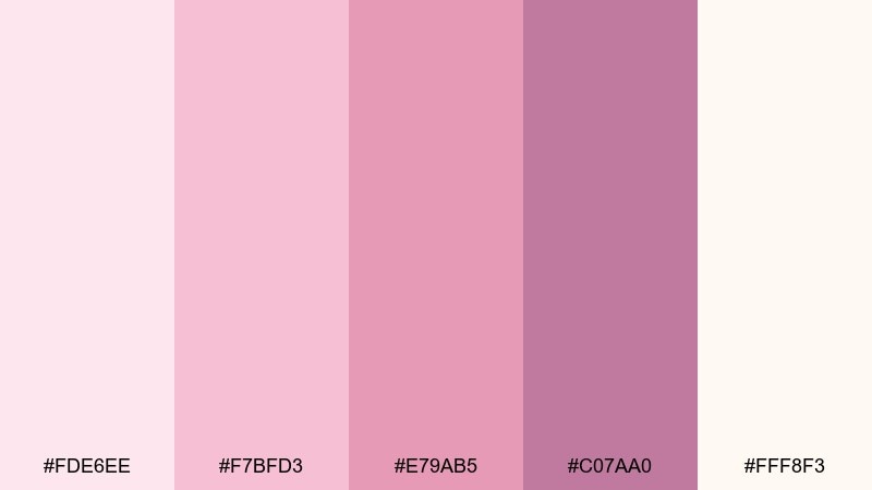
HEX: #fde6ee #f7bfd3 #e79ab5 #c07aa0 #fff8f3
Mood: luxurious, soft, romantic
Best for: perfume packaging and beauty branding
Luxurious and soft like rosewater on satin, these shades feel intimate and elevated. The blush base keeps the look airy, while the deeper rose adds a premium signal for logos and labels. Among feminine color combinations, this one shines when paired with matte ivory and subtle metallic foil. Tip: use the darkest tone sparingly on ingredient text to keep the label readable without losing the delicate vibe.
Image example of rosewater satin generated using media.io
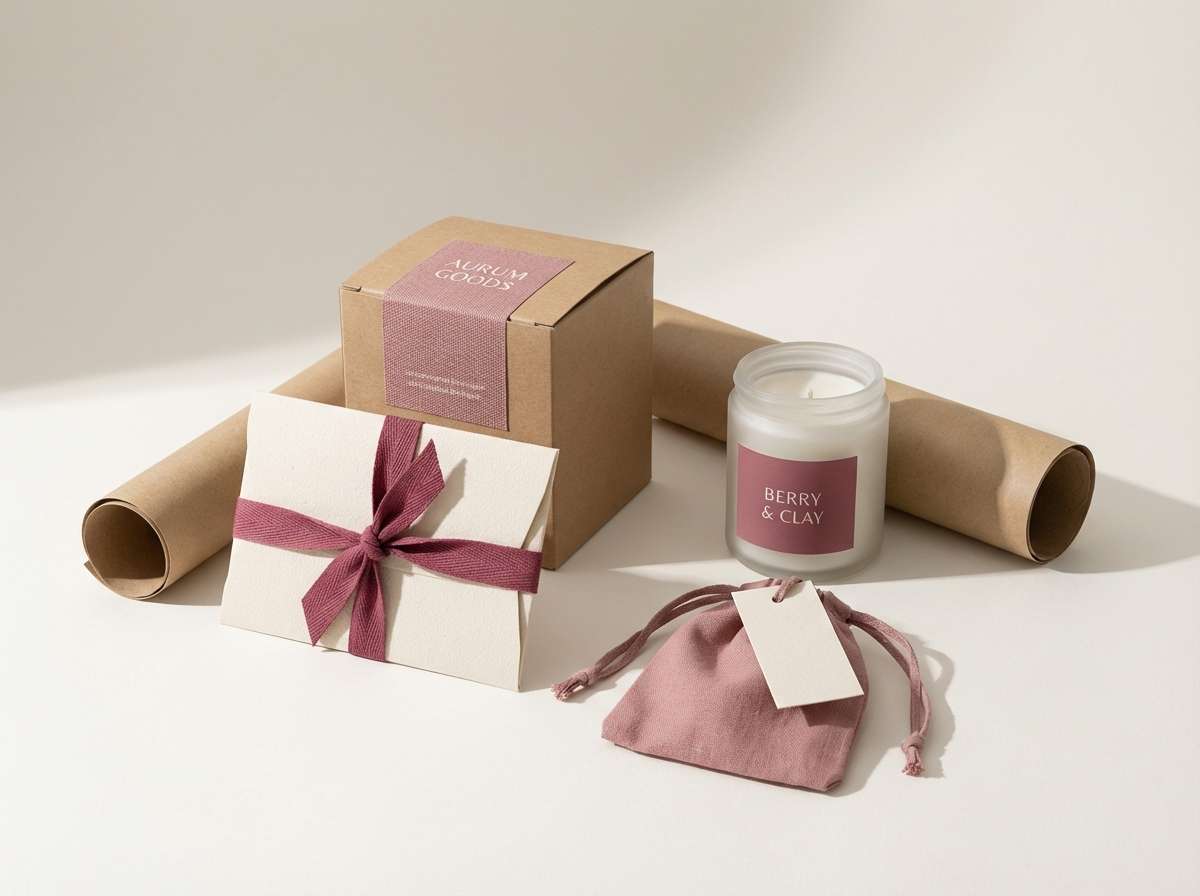
4) Peony Dust
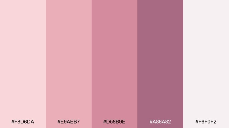
HEX: #f8d6da #e9aeb7 #d58b9e #a86a82 #f6f0f2
Mood: vintage, warm, cozy
Best for: boutique brand identity and packaging
Vintage and warm like pressed peonies in an old book, this palette reads cozy and nostalgic. Use dusty pink as your primary brand color, supported by the deeper berry for wordmarks and seals. Pair with textured paper, muted photography, and warm neutrals to keep it grounded. Tip: a thin border in the darkest tone instantly makes labels and tags feel more crafted.
Image example of peony dust generated using media.io
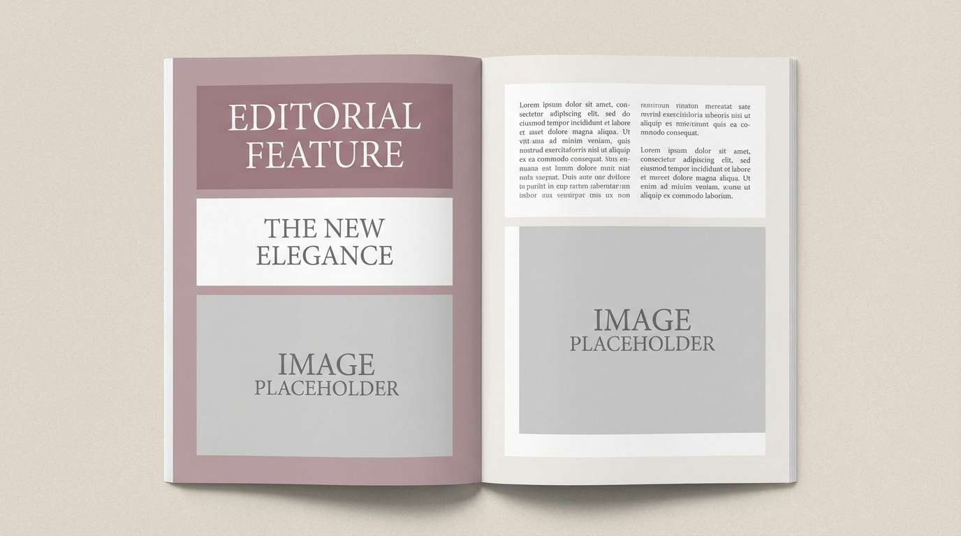
5) Mauve Whisper
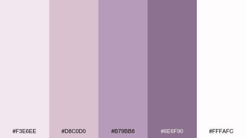
HEX: #f3e6ee #d8c0d0 #b79bb8 #8e6f90 #fffafc
Mood: quiet, modern, elegant
Best for: editorial layouts and lifestyle blogs
Quiet and modern like a cashmere wrap, these mauves feel sophisticated and understated. Build your layout on the pale mauve and white, then introduce the mid tones for section headers and pull quotes. Pair with black or charcoal type for clarity and a clean, magazine-like rhythm. Tip: keep imagery slightly desaturated so the palette stays in control of the page.
Image example of mauve whisper generated using media.io
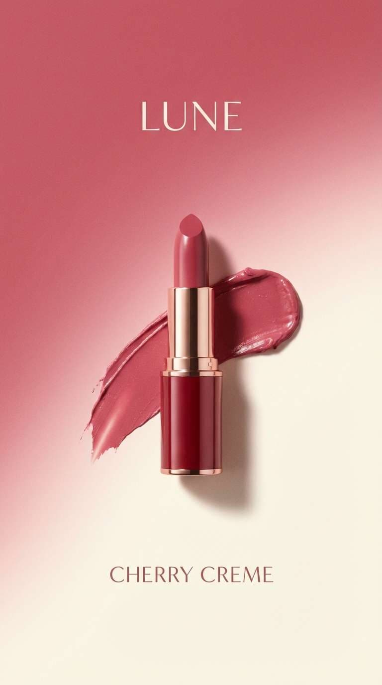
6) Cherry Cream
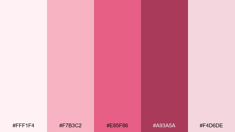
HEX: #fff1f4 #f7b3c2 #e85f86 #a93a5a #f4d6de
Mood: playful, bold, sweet
Best for: cosmetics ads and social media creatives
Playful and bold like cherry gelato, this set brings sweetness with a confident punch. Use the cherry red as the hero accent for CTAs, price points, or product names, and let the creams keep the layout breathable. Pair with crisp white space and simple sans-serif type to avoid looking overly cute. Tip: reserve the darkest cherry for small text and shadows to improve legibility.
Image example of cherry cream generated using media.io
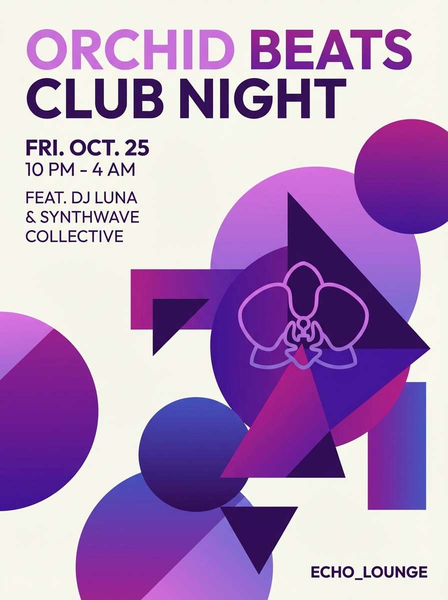
7) Orchid Glow
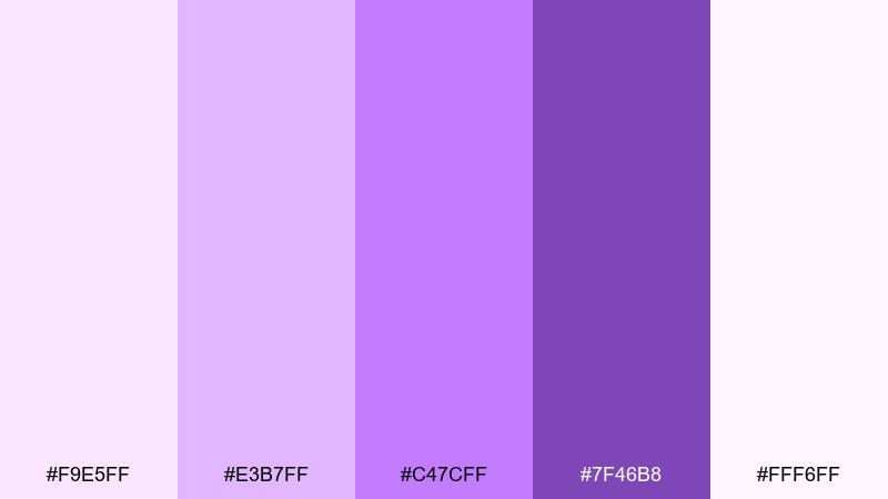
HEX: #f9e5ff #e3b7ff #c47cff #7f46b8 #fff6ff
Mood: vibrant, glossy, trendy
Best for: event posters and nightlife flyers
Vibrant and glossy like neon orchids at dusk, these purples feel energetic yet polished. Let the bright orchid drive headlines and key shapes, then soften the background with pale lilac and white. Pair with bold geometric elements and high-contrast type for instant readability. Tip: add a subtle gradient between the mid and bright purple to make the design feel more dimensional without clutter.
Image example of orchid glow generated using media.io
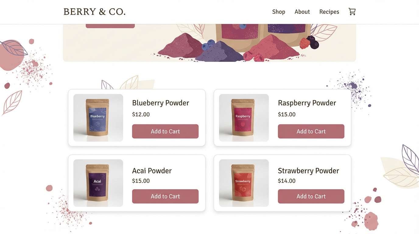
8) Powdered Berry
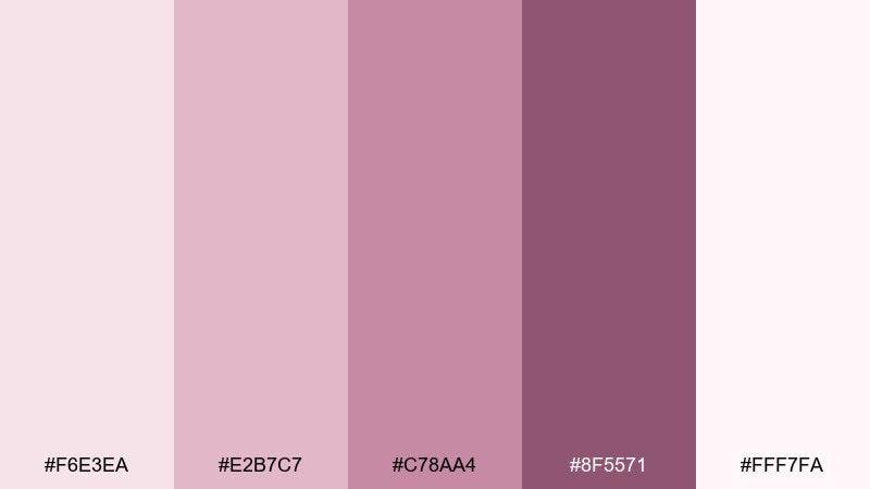
HEX: #f6e3ea #e2b7c7 #c78aa4 #8f5571 #fff7fa
Mood: soft, mature, comforting
Best for: minimal ecommerce UI and product pages
Soft and mature like berry powder in a porcelain bowl, this mix feels comforting and modern. Use the pale blush for page backgrounds, and apply the berry tones for badges, ratings, and navigation highlights. If you want feminine color combinations that still feel grown-up, pair these shades with warm gray and clean product photography. Tip: keep buttons in the deeper berry for clear hierarchy, and avoid using it for large background blocks.
Image example of powdered berry generated using media.io
9) Vintage Ballet
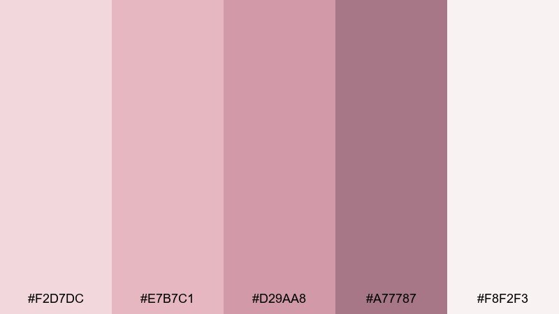
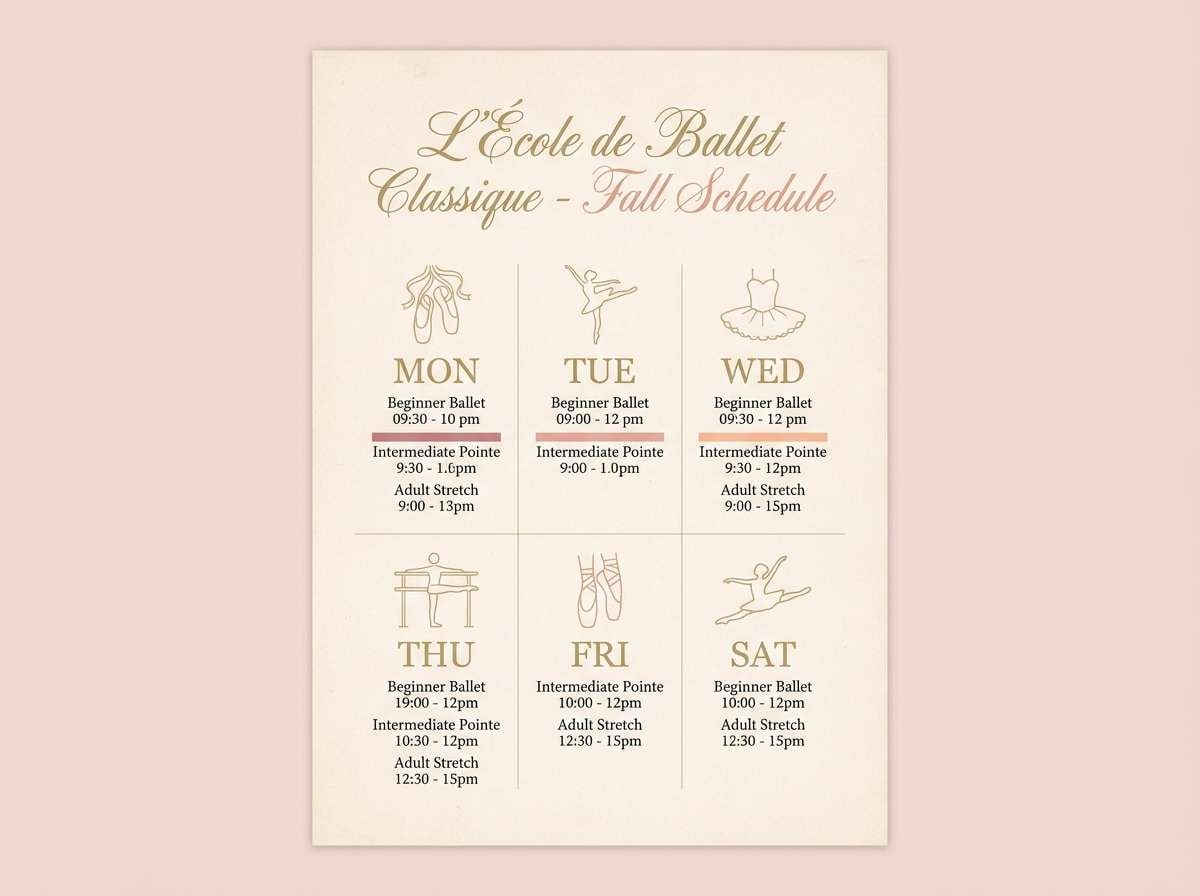
HEX: #f2d7dc #e7b7c1 #d29aa8 #a77787 #f8f2f3
Mood: classic, delicate, nostalgic
Best for: dance studio branding and class schedules
Classic and delicate like worn ballet slippers, these dusty pinks carry a nostalgic grace. Build your brand marks with the mid rose tones, and keep the background in the softest blush for an airy feel. Pair with thin line icons, cream paper textures, and a restrained serif to keep it timeless. Tip: use the deepest shade only for dates and key calls so the schedule stays easy to scan.
Image example of vintage ballet generated using media.io
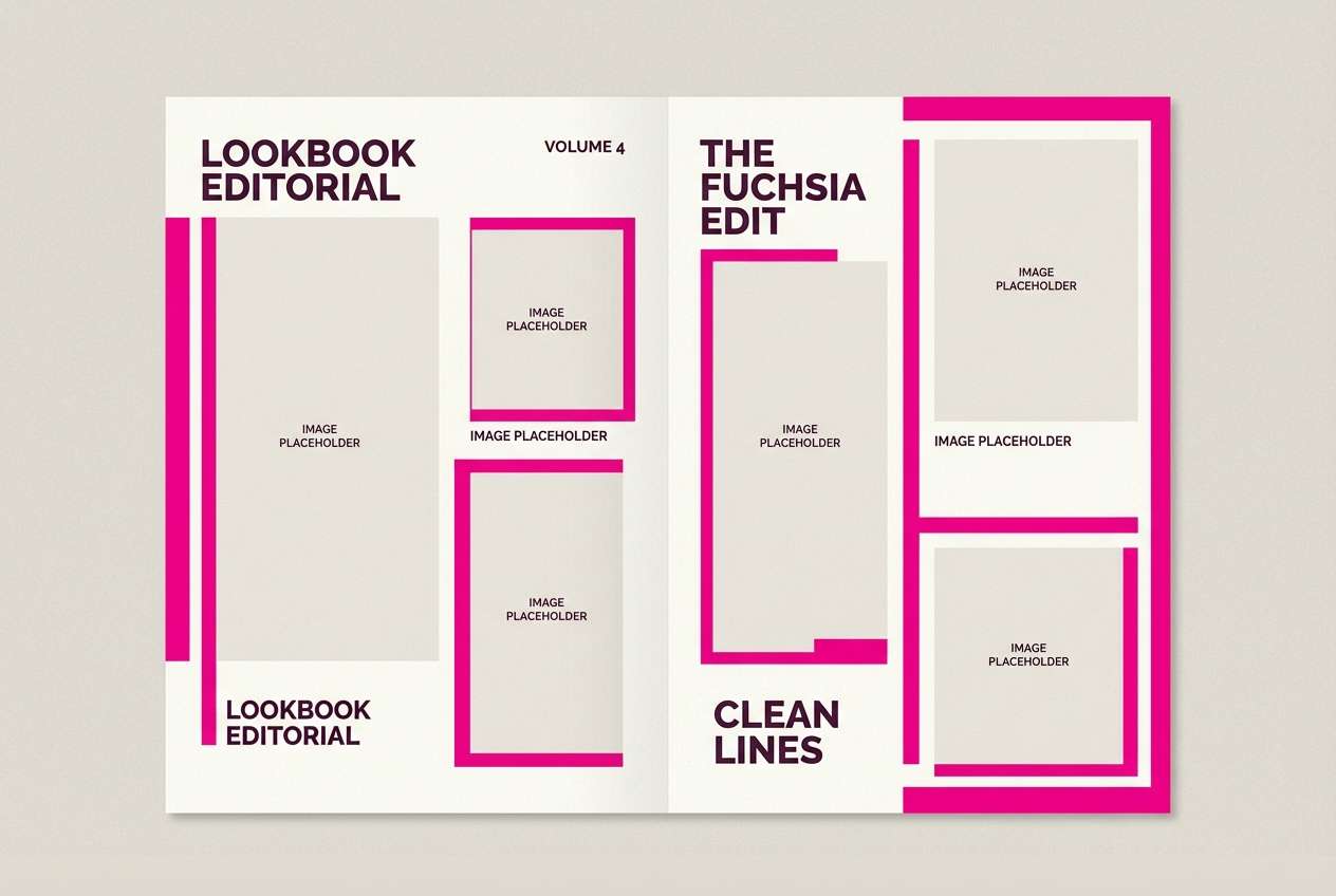
10) Cotton Candy Noir
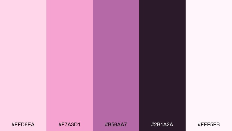
HEX: #ffd6ea #f7a3d1 #b56aa7 #2b1a2a #fff5fb
Mood: sweet, edgy, high-contrast
Best for: fashion lookbooks and bold social posts
Sweet but edgy like cotton candy under city lights, this pairing balances cute and noir drama. Use the near-black plum for text and frames, then let the pinks carry the energy in highlights and overlays. Pair with high-contrast photography and minimal copy to keep it fashion-forward. Tip: add a thin pink underline or rule to guide the eye without adding extra elements.
Image example of cotton candy noir generated using media.io
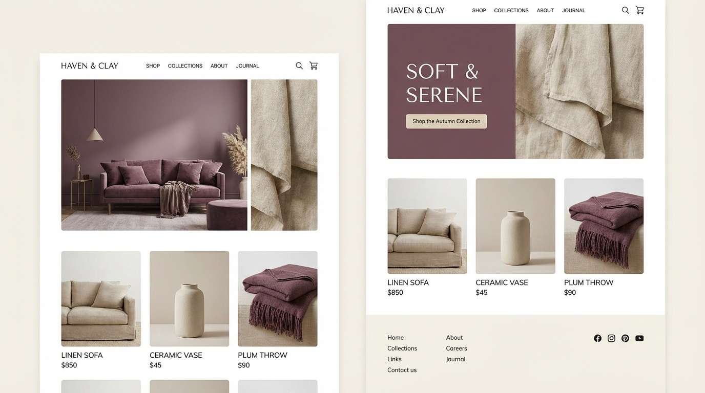
11) Soft Plum Linen
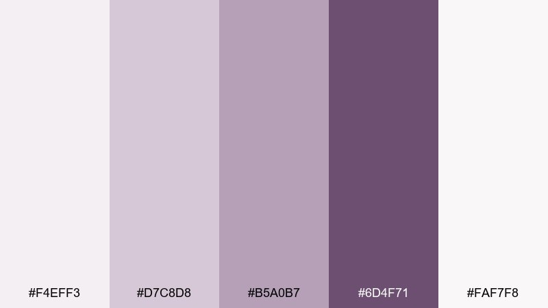
HEX: #f4eff3 #d7c8d8 #b5a0b7 #6d4f71 #faf7f8
Mood: natural, muted, cozy
Best for: home decor mood boards and small business websites
Natural and muted like linen dyed with plum skins, these tones feel cozy and lived-in. Use the pale neutrals for spacious sections and the medium mauves for navigation and dividers. Pair with warm wood photography, off-white backgrounds, and soft shadows to keep everything gentle. Tip: choose one strong plum for buttons and links, and keep other accents quiet to avoid a muddy look.
Image example of soft plum linen generated using media.io
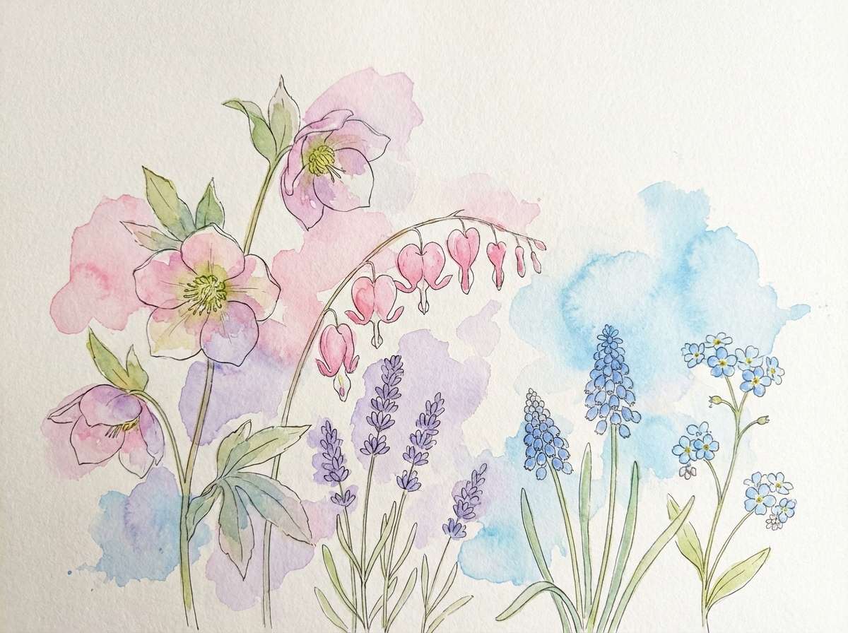
12) Pastel Petals
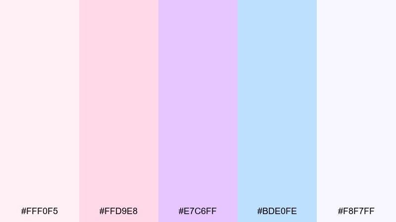
HEX: #fff0f5 #ffd9e8 #e7c6ff #bde0fe #f8f7ff
Mood: fresh, springy, light
Best for: spring botanical illustrations and prints
Fresh and springy like petals scattered in morning light, these pastels feel optimistic and airy. Use the pinks and lilac for flowers, and bring in the soft blue for sky or shadow accents. Pair with plenty of white space and gentle paper grain to keep the illustration breathable. Tip: keep outlines minimal and let watercolor blending do the work for a soft, modern finish.
Image example of pastel petals generated using media.io
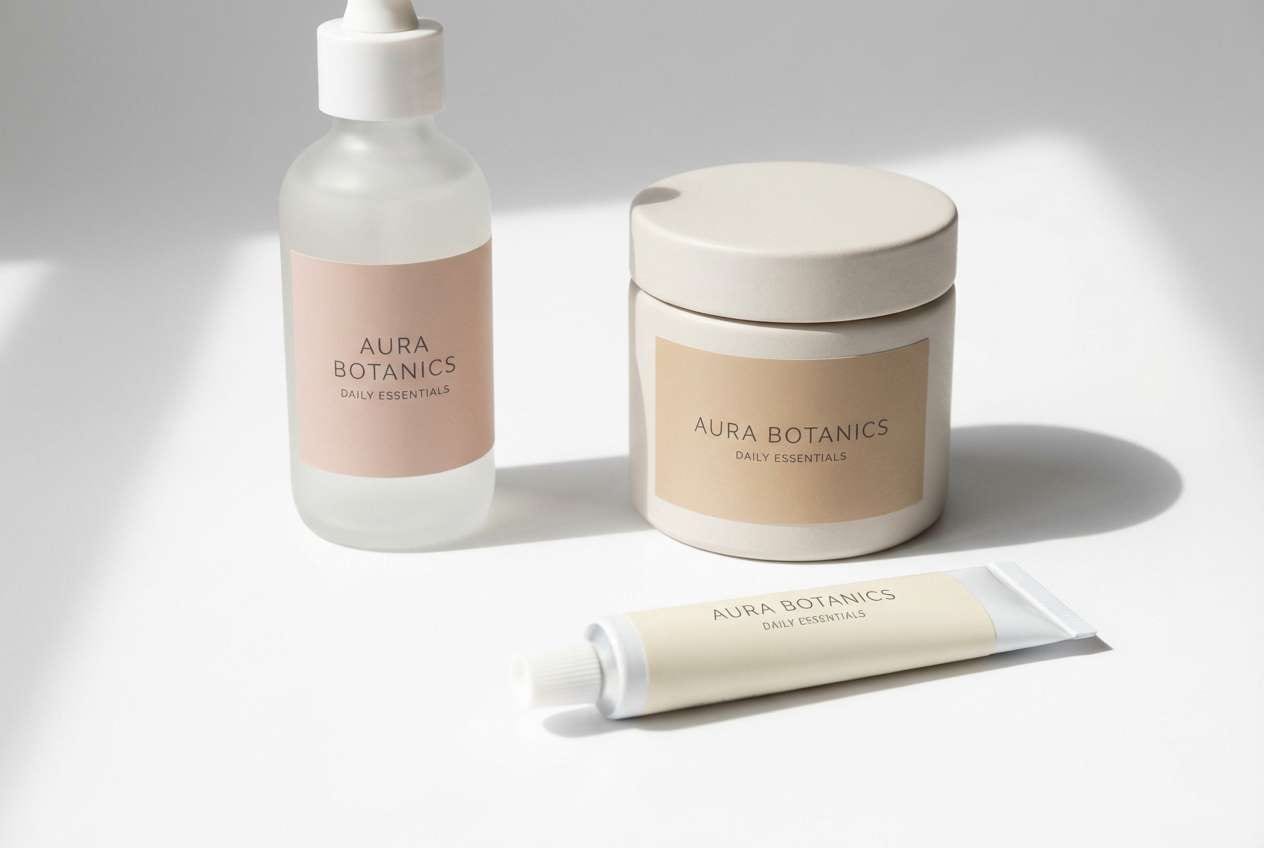
13) Nude Rose Quartz
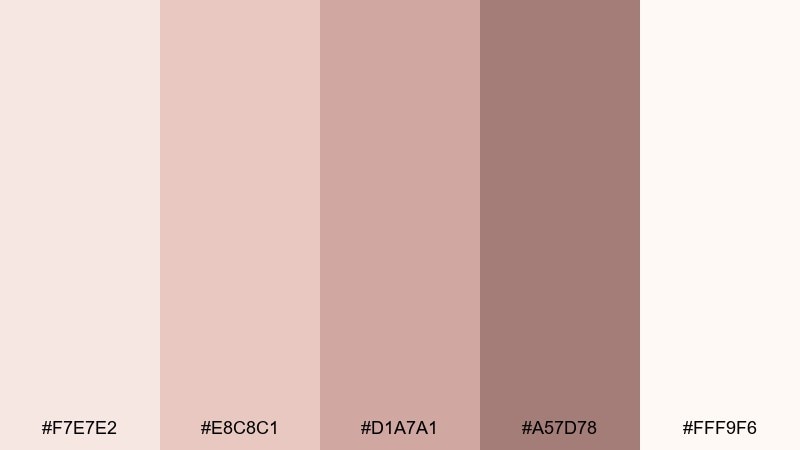
HEX: #f7e7e2 #e8c8c1 #d1a7a1 #a57d78 #fff9f6
Mood: grounded, warm, minimalist
Best for: skincare labels and clean packaging
Grounded and warm like rose quartz in sunlight, this set feels calm and trustworthy. The nude tones make a beautiful base for a feminine color palette that leans minimalist instead of sugary. Pair with black or dark taupe typography and simple line art for ingredients and icons. Tip: print the deepest shade as a spot color for caps or seals to add structure without breaking the softness.
Image example of nude rose quartz generated using media.io
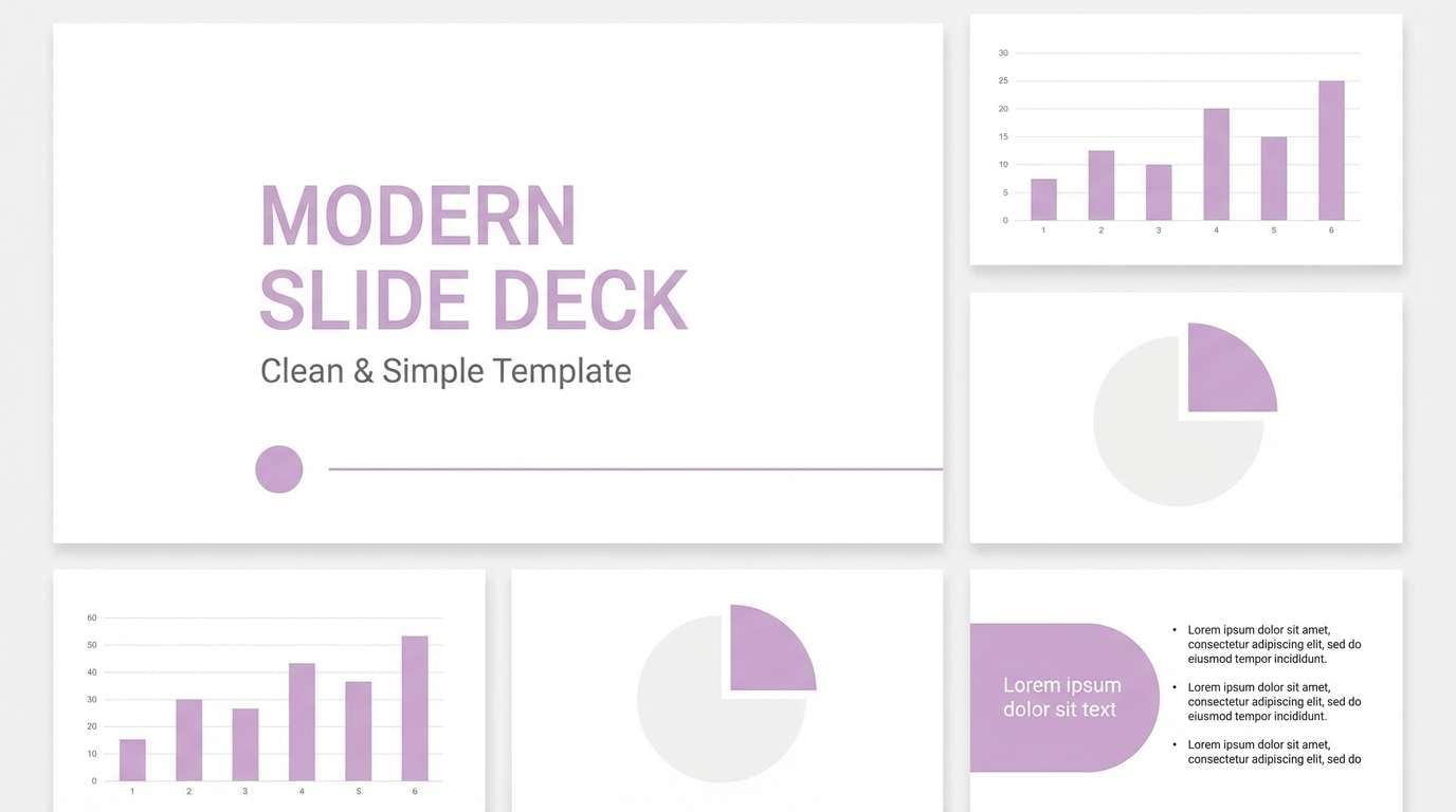
14) Lilac Mist
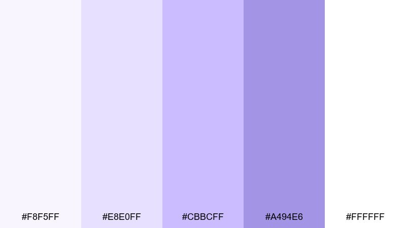
HEX: #f8f5ff #e8e0ff #cbbcff #a494e6 #ffffff
Mood: ethereal, light, serene
Best for: presentation templates and workshop decks
Ethereal and light like fog over lilac fields, these tones create a serene, professional softness. Use the whites and pale lilac for slide backgrounds, then apply mid purple for section dividers and callouts. Pair with dark gray text and simple charts to keep the content clear. Tip: keep gradients subtle and limit them to title slides so body slides stay easy to read.
Image example of lilac mist generated using media.io
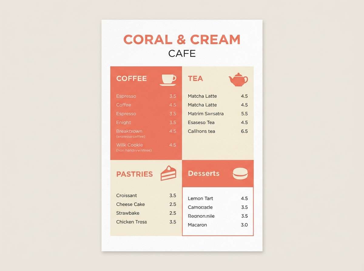
15) Coral Ballet
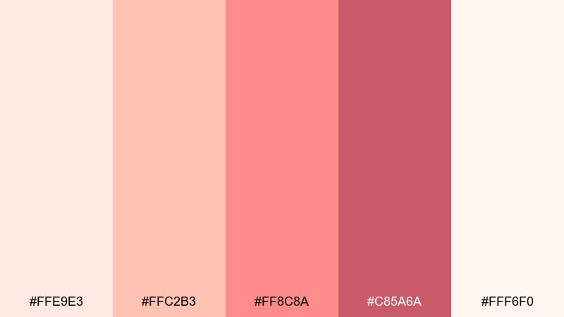
HEX: #ffe9e3 #ffc2b3 #ff8c8a #c85a6a #fff6f0
Mood: warm, lively, inviting
Best for: cafe menus and dessert branding
Warm and lively like coral pointe shoes and strawberry tea, this mix feels inviting and upbeat. Use the peachy coral as a highlight color for prices and special items, while the creamy tones keep the menu uncluttered. Pair with hand-drawn icons and warm neutrals for paper and backgrounds. Tip: avoid long blocks of coral text, and instead use it as a navigational cue for categories.
Image example of coral ballet generated using media.io
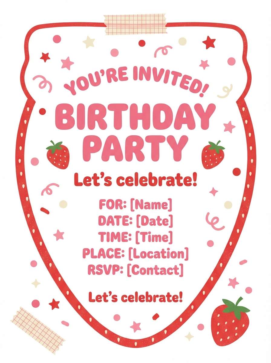
16) Strawberry Shortcake
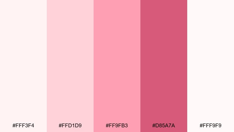
HEX: #fff3f4 #ffd1d9 #ff9fb3 #d85a7a #fff9f9
Mood: cute, cheerful, bright
Best for: birthday invitations and party graphics
Cute and cheerful like strawberry frosting, these pinks feel instantly celebratory. Use the bright berry for headlines and RSVP buttons, with the soft blushes filling the background. Pair with playful rounded type and small confetti shapes to keep it fun but not messy. Tip: keep one clean white area for essential details so the invite reads clearly at a glance.
Image example of strawberry shortcake generated using media.io
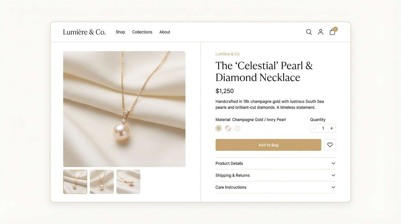
17) Silk Champagne
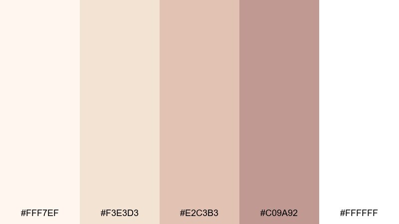
HEX: #fff7ef #f3e3d3 #e2c3b3 #c09a92 #ffffff
Mood: soft, premium, understated
Best for: jewelry product pages and luxury branding
Soft and premium like champagne silk, these neutrals bring warmth without losing elegance. Use ivory and champagne as the main canvas, then lean on the rose-tan shades for UI accents and brand details. Pair with fine-line icons, generous spacing, and high-quality product photography for a luxe feel. Tip: add contrast with dark brown or charcoal text instead of black to keep the mood gentle.
Image example of silk champagne generated using media.io
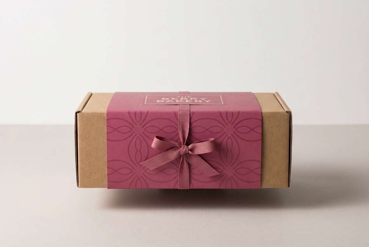
18) Berry Macaron
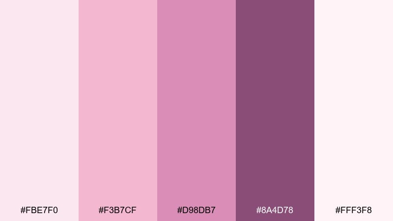
HEX: #fbe7f0 #f3b7cf #d98db7 #8a4d78 #fff3f8
Mood: sweet, chic, boutique
Best for: bakery packaging and gift boxes
Sweet and chic like berry macarons in a patisserie window, these pinks feel boutique-ready. Let the pale blush cover most of the box, then use the mid berry for patterns, ribbons, or stamp marks. It is a versatile feminine color palette when you need charm without leaning overly pastel. Tip: keep the deepest purple for small brand marks so the overall look stays light and giftable.
Image example of berry macaron generated using media.io
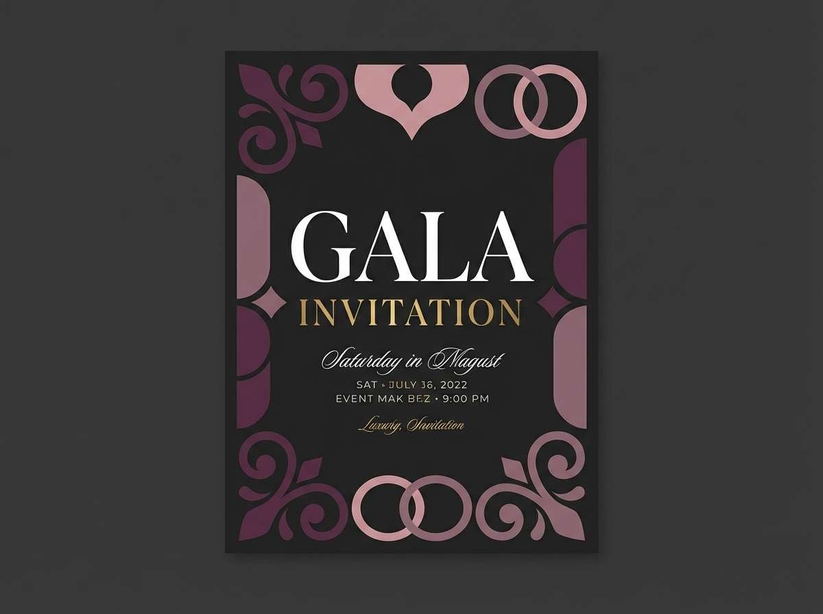
19) Plum Petal Night
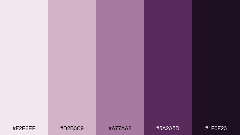
HEX: #f2e6ef #d2b3c9 #a77aa2 #5a2a5d #1f0f23
Mood: moody, elegant, dramatic
Best for: evening event invitations and gala posters
Moody and elegant like petals against a midnight sky, this set feels dramatic and refined. Use the deep plum and near-black as the foundation, then bring in mauve for highlights and ornamental elements. Pair with gold or warm metallic accents and high-contrast typography for a formal finish. Tip: keep the lightest tone for small text blocks so details stay readable on dark backgrounds.
Image example of plum petal night generated using media.io
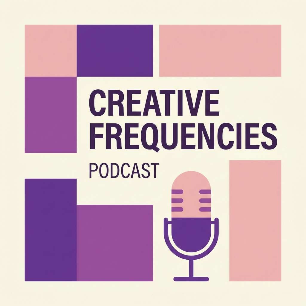
20) Amethyst Blush
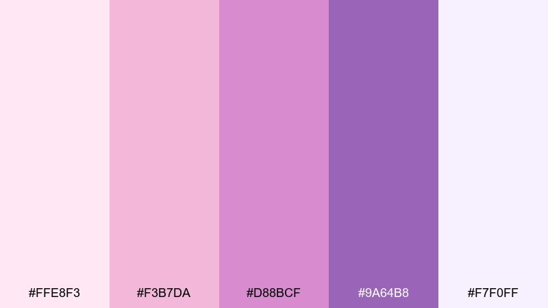
HEX: #ffe8f3 #f3b7da #d88bcf #9a64b8 #f7f0ff
Mood: creative, modern, confident
Best for: creator brands, podcast covers, and thumbnails
Creative and confident like amethyst with a blush glow, this palette feels modern and expressive. Among feminine color combinations, it works best when you keep layouts simple and let the purple carry the personality. Pair with crisp white space, bold sans-serif type, and a single graphic motif for consistency across posts. Tip: use the mid purple for backgrounds and reserve the brightest pink for highlights, not full-screen fills.
Image example of amethyst blush generated using media.io
What Colors Go Well with Feminine?
Feminine tones pair beautifully with creamy whites, warm ivories, and light beiges because they keep the palette airy and premium. These neutrals also make pink-and-purple accents feel more intentional, not overwhelming.
For contrast, add charcoal, deep plum, or espresso brown for typography and outlines. If you want a fresher, modern twist, a soft powder blue or muted sage can balance pinks and lilacs without fighting them.
Metallic accents (rose gold, champagne gold) work especially well for packaging and event designs, as long as you keep them as small highlights rather than large fills.
How to Use a Feminine Color Palette in Real Designs
Start with role assignment: pick 1 main background (usually near-white), 1 primary brand color (blush/mauve), 1 supporting tone (lavender/lilac), and 1 dark anchor for text and UI states. This keeps your feminine scheme structured and readable.
In UI and web design, reserve the strongest color for CTAs and active states, and use softer tints for surfaces (cards, sections, chips). In print (invitations, menus, packaging), introduce texture—paper grain, satin finish, or soft shadow—to add depth without adding extra colors.
Finally, watch saturation: if everything is pastel, the layout can feel flat. A single deeper berry or plum (used sparingly) creates hierarchy and makes the soft colors look even more refined.
Create Feminine Palette Visuals with AI
If you already have HEX codes, the fastest way to explore real-world looks is to generate mockups: invitations, skincare labels, UI screens, posters, and social templates. Seeing the palette applied helps you validate contrast, mood, and brand fit.
With Media.io text-to-image, you can turn a palette idea into consistent visuals by describing the design type (packaging, UI, poster), the color mood (blush, lilac, ivory), and the layout style (minimal, editorial, premium).
Once you find a direction you like, generate a few variations by changing just one element (background texture, typography style, or accent color) to keep results cohesive across a full brand system.
Feminine Color Palette FAQs
-
What is a feminine color palette?
A feminine color palette typically features soft pinks, mauves, lilacs, and warm neutrals (like ivory or champagne). It’s designed to feel gentle, caring, romantic, or elegant, depending on contrast and saturation. -
Are feminine palettes only for beauty or weddings?
No. Feminine palettes can work for wellness apps, lifestyle blogs, ecommerce UI, cafes, creator brands, and even corporate decks—especially when paired with clean typography and strong contrast for readability. -
How do I keep a pink-and-purple palette from looking childish?
Use more muted tones (dusty rose, mauve, soft plum), add a grounded neutral (ivory, warm gray), and include a darker anchor for type (charcoal or deep plum). Also limit bright pink to small accents. -
What is the best text color for feminine backgrounds?
Charcoal, deep plum, or dark taupe usually reads better than pure black on blush or ivory backgrounds. For darker backgrounds (plum/night tones), use near-white or the lightest blush for body text. -
How many colors should I use in a feminine brand palette?
A practical setup is 4–6 colors: one light base, one primary (blush/mauve), one secondary (lavender/lilac), one dark for text, and 1–2 accents for CTAs or highlights. -
What accent colors work with blush pink?
Lavender, soft purple, champagne gold, warm beige, and muted berry are reliable accents. For a modern twist, try powder blue or a gentle sage—just keep saturation controlled. -
Can I generate feminine palette mockups with AI?
Yes. Use Media.io to generate palette-based visuals by describing your design (packaging, UI, invitation, poster), your key colors (blush, lilac, ivory), and the style (minimal, premium, editorial) to quickly test how the palette looks in real layouts.


