

Teal and orange is a modern, high-impact pairing that mixes cool clarity with warm energy. It’s popular for branding, UI, posters, and social content because it reads fast and feels fresh.
Below are teal orange color palette ideas with HEX codes, plus practical tips for balancing contrast, using neutrals, and keeping your designs clean and readable.
In this article
Why Teal Orange Palettes Work So Well
Teal and orange sit in a naturally punchy relationship: teal feels calm, clean, and reliable, while orange adds warmth, urgency, and momentum. Together, they create instant visual hierarchy without needing lots of extra colors.
This combo is flexible across styles—minimal and techy, vintage and nostalgic, or bold and sporty—because teal can range from deep blue-green to bright aqua, while orange can shift from soft peach to intense safety-orange.
Most importantly, teal orange contrast is easy to manage: anchor text with a dark neutral, keep backgrounds light or deep (not both), and reserve the orange for key actions so it always signals “look here.”
20+ Teal Orange Color Palette Ideas (with HEX Codes)
1) Coastal Pop
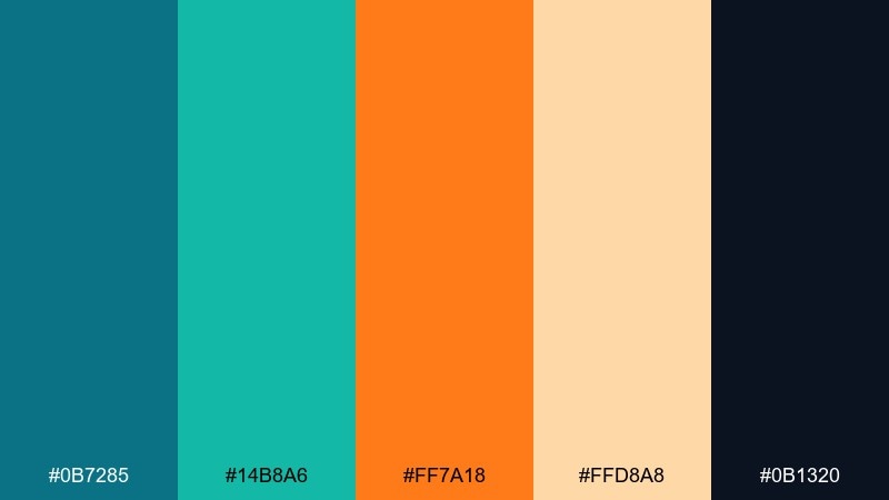
HEX: #0b7285 #14b8a6 #ff7a18 #ffd8a8 #0b1320
Mood: breezy, upbeat, summery
Best for: travel branding and social graphics
Breezy seaside energy comes through like turquoise water against a warm sunset. Use the bright orange as a headline or call-to-action, then let the teals carry backgrounds and icons. Pair with plenty of off-white space or sandy neutrals to keep it light. Usage tip: reserve the dark navy for text so the brighter hues stay clean and readable.
Image example of coastal pop generated using media.io

Media.io is an online AI studio for creating and editing video, image, and audio in your browser.

2) Desert Lagoon
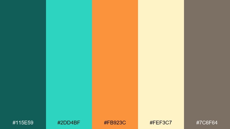
HEX: #115e59 #2dd4bf #fb923c #fef3c7 #7c6f64
Mood: earthy, calming, sun-washed
Best for: wellness websites and blog headers
Sun-washed dunes and a cool oasis feel balanced and natural here. Keep the pale sand tone as your canvas, then layer teal for navigation and section dividers. The soft orange works best as a warm accent for buttons, badges, or highlights. Usage tip: add subtle texture or a light gradient only in the beige range to avoid muddying the teal.
Image example of desert lagoon generated using media.io
3) Retro Diner Glow
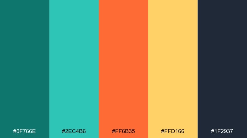
HEX: #0f766e #2ec4b6 #ff6b35 #ffd166 #1f2937
Mood: retro, playful, high-contrast
Best for: restaurant menus and food promos
Neon diner vibes and late-night cravings make this mix feel instantly fun. These teal orange color combinations shine when you push contrast: use the dark slate for text and the bright orange for price tags or special items. Yellow works as a friendly highlight for icons and dividers. Usage tip: keep teal as the dominant base so the warm colors read like appetizing accents, not noise.
Image example of retro diner glow generated using media.io
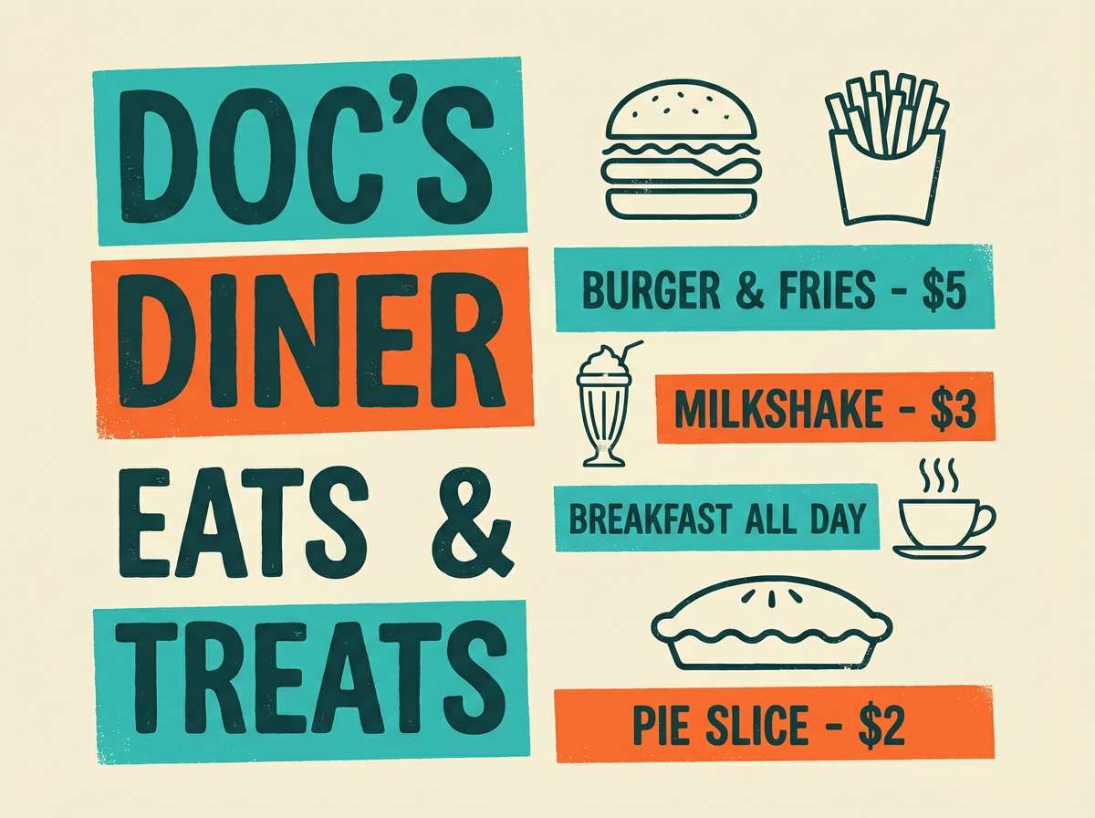
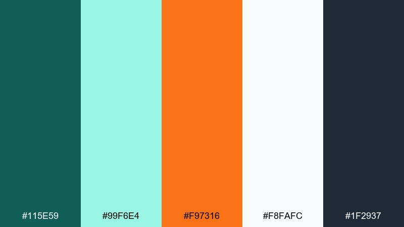
4) Minimalist Splash
HEX: #0d9488 #99f6e4 #f97316 #fff7ed #111827
Mood: clean, modern, confident
Best for: SaaS landing pages and UI systems
Crisp water tones with a single warm splash create a sleek, modern feel. A teal orange color palette like this works best with lots of off-white and strict spacing rules. Use the bright orange only for primary actions, and keep the lighter mint for panels and hover states. Usage tip: test contrast on small text and switch to the deep charcoal for all body copy.
Image example of minimalist splash generated using media.io
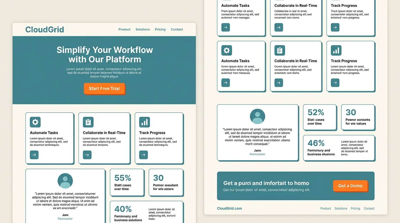
5) Autumn Harbor
HEX: #134e4a #0f766e #ea580c #fef3c7 #334155
Mood: cozy, grounded, classic
Best for: local business branding and signage
Cozy harbor evenings and fall leaves give this set a grounded, dependable tone. Use the cream as negative space for logos and storefront signs, then anchor with deep teal for stability. The burnt orange is ideal for one focal element, like a mark, underline, or badge. Usage tip: keep the slate for secondary text so the warm accent stays special.
Image example of autumn harbor generated using media.io
6) Tropical Sunset
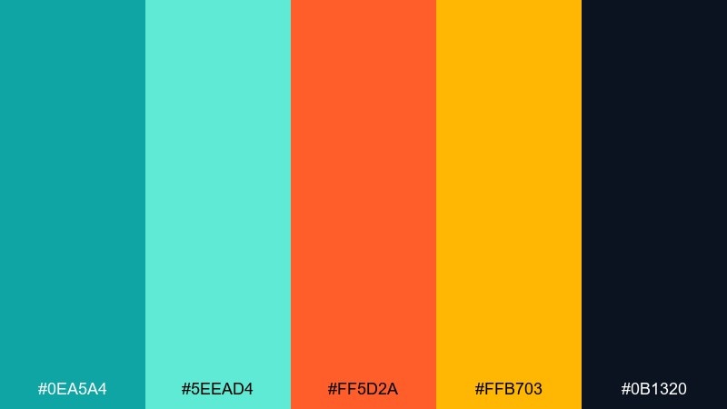
HEX: #0ea5a4 #5eead4 #ff5d2a #ffb703 #0b1320
Mood: vibrant, sunny, adventurous
Best for: event posters and summer campaigns
Hot sunset tones against bright water make everything feel energetic and alive. Let the deep navy handle typography while the saturated colors do the storytelling in shapes and gradients. Use the yellow as a small highlight for dates, tags, or icons to keep focus. Usage tip: limit gradients to two hues at a time so the poster stays bold rather than chaotic.
Image example of tropical sunset generated using media.io

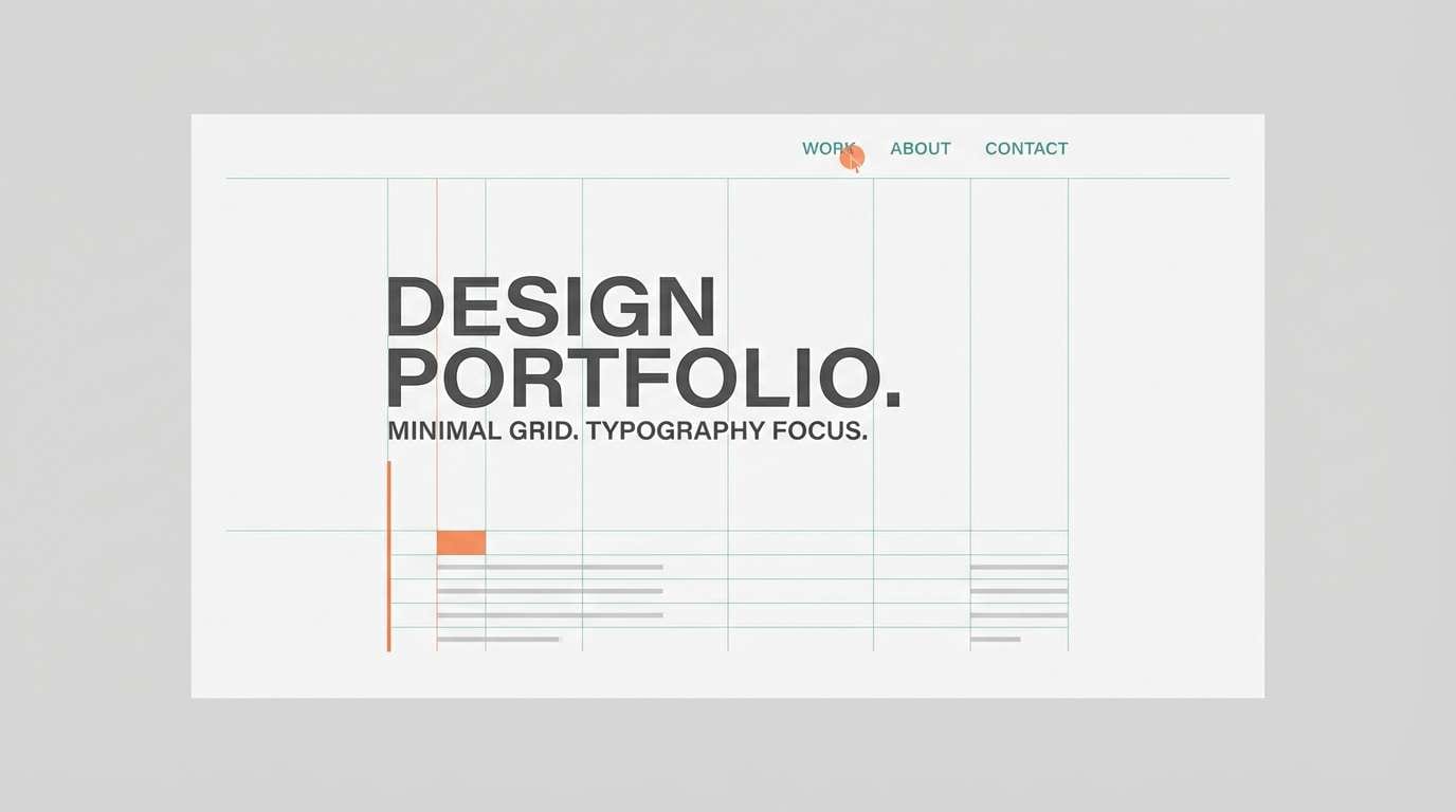
7) Nordic Contrast
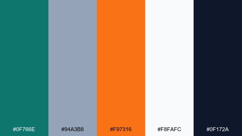
HEX: #0f766e #94a3b8 #f97316 #f8fafc #0f172a
Mood: cool, minimal, editorial
Best for: portfolio sites and case studies
Cool northern tones with a warm spark feel calm but never dull. Use the icy white and misty gray-blue for large surfaces, then place teal for structure and navigation. A single orange accent adds momentum to links, charts, or key metrics. Usage tip: keep imagery slightly desaturated so the accent color remains the hero.
Image example of nordic contrast generated using media.io
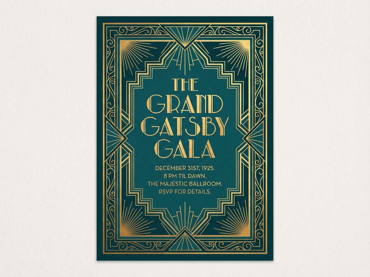
8) Art Deco Tide
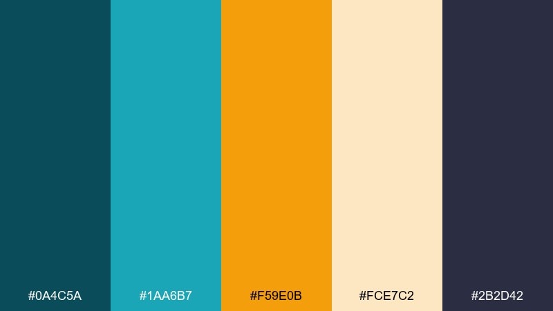
HEX: #0a4c5a #1aa6b7 #f59e0b #fce7c2 #2b2d42
Mood: glam, structured, timeless
Best for: luxury invitations and gala posters
Glamorous, geometric energy evokes art deco halls lit by warm amber. Use the deep teal and inky indigo for strong frames, lines, and borders, then bring in the gold for focal typography. The light cream keeps the look premium and airy. Usage tip: add thin linework and symmetrical layouts to reinforce the deco mood.
Image example of art deco tide generated using media.io
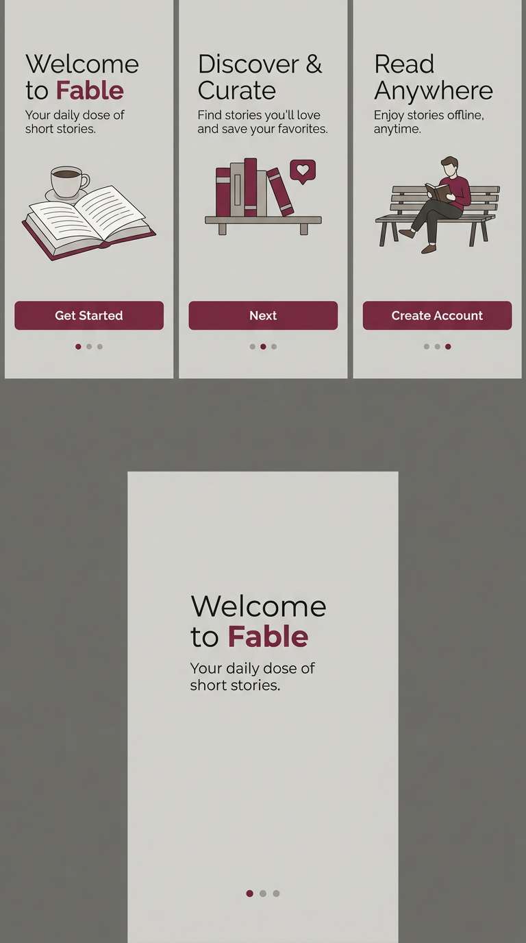
9) Citrus Punch
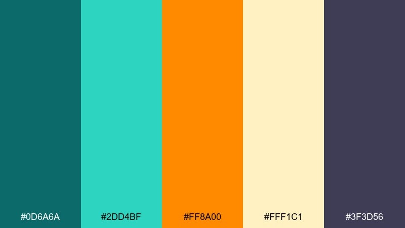
HEX: #0d6a6a #2dd4bf #ff8a00 #fff1c1 #3f3d56
Mood: fresh, punchy, friendly
Best for: app onboarding and explainer graphics
Fresh citrus energy feels friendly and motivating, like a bright morning routine. Use teal for primary UI elements and the pale lemon for background cards to keep things light. Orange makes a perfect progress indicator or highlight for key steps. Usage tip: stick to one accent per screen so onboarding remains clear and calm.
Image example of citrus punch generated using media.io
10) Vintage Travel Poster

HEX: #0b525b #1b9aaa #f26a1b #f7d08a #3a3a3a
Mood: nostalgic, sunny, storied
Best for: tourism posters and merch graphics
Nostalgic postcard charm shows up in sun-faded tones and bold shapes. These teal orange color combinations work beautifully in flat illustrations, where teal becomes sky or sea and orange becomes sun or signage. Keep the charcoal for type so the vintage warmth stays intact. Usage tip: add subtle grain and limit to two large color blocks for an authentic poster feel.
Image example of vintage travel poster generated using media.io

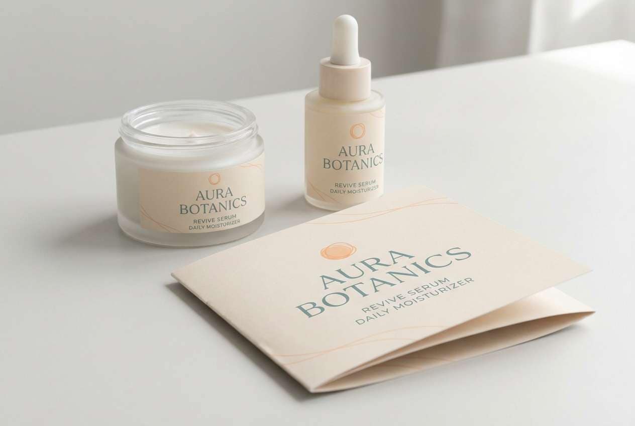
11) Spa Retreat
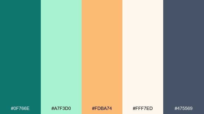
HEX: #0f766e #a7f3d0 #fdba74 #fff7ed #475569
Mood: soft, soothing, airy
Best for: skincare labels and spa brochures
Soft, soothing tones feel like warm towels and cool eucalyptus steam. Use the pale mint and creamy white as the main surfaces, keeping teal for brand marks and section headings. The gentle peach-orange is best as a small warmth cue on icons or callouts. Usage tip: choose matte finishes and thin serif type to enhance the calm, premium vibe.
Image example of spa retreat generated using media.io
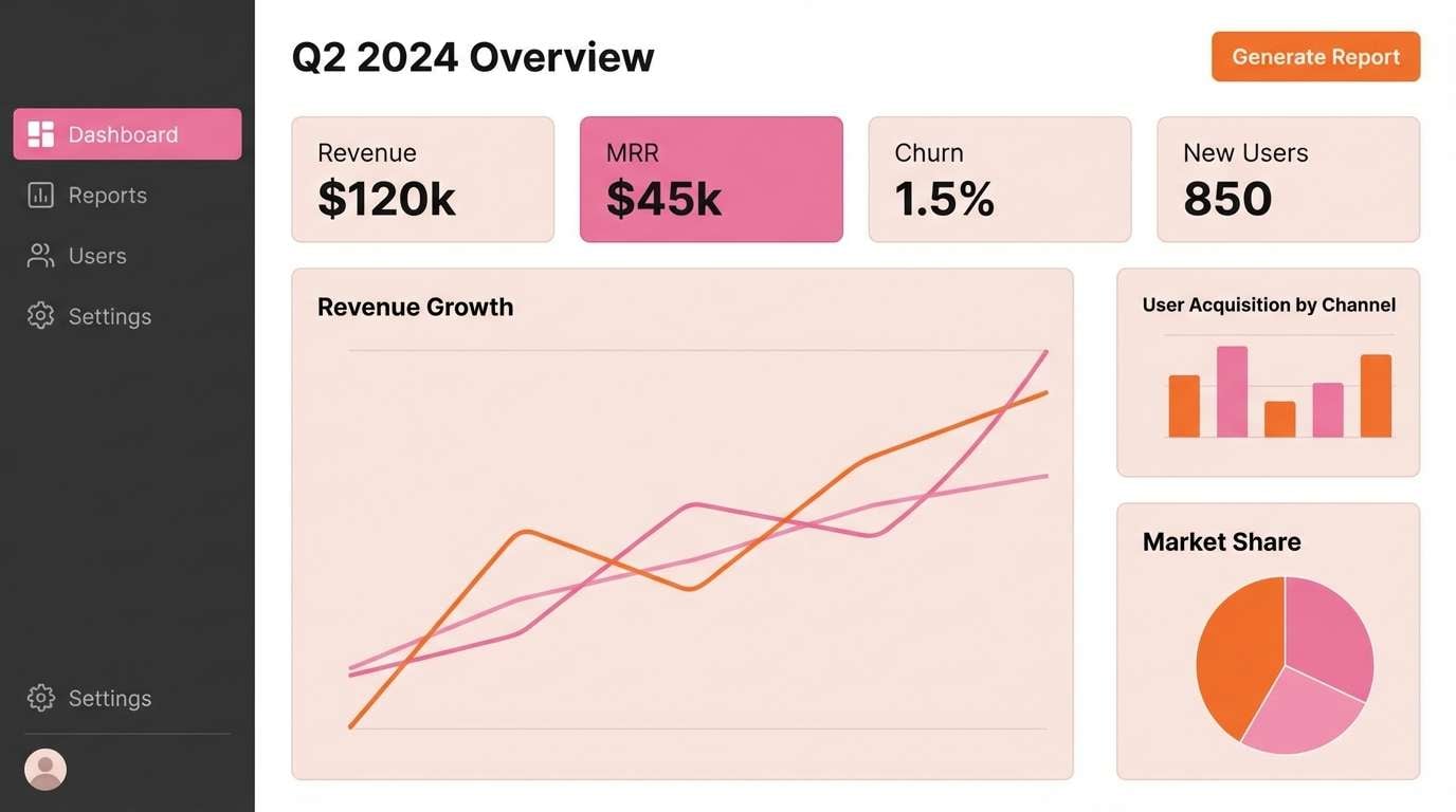
12) Tech Dashboard
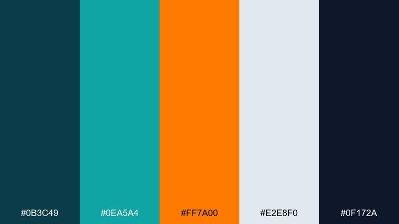
HEX: #0b3c49 #0ea5a4 #ff7a00 #e2e8f0 #0f172a
Mood: sharp, data-driven, professional
Best for: analytics dashboards and admin panels
Sharp, high-clarity tones feel like illuminated charts in a dark control room. Use the deepest shades for the shell and navigation, then bring in teal for active states and data series. Orange is perfect for alerts, KPIs, or one standout metric. Usage tip: keep orange reserved for exceptions so it always signals importance at a glance.
Image example of tech dashboard generated using media.io
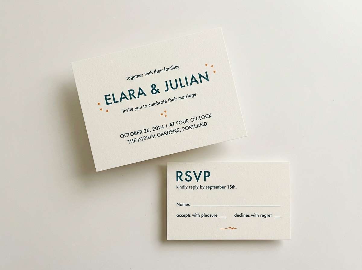
13) Modern Vows
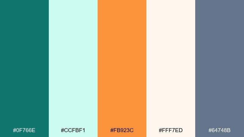
HEX: #0f766e #ccfbf1 #fb923c #fff7ed #64748b
Mood: romantic, modern, refined
Best for: wedding invitations and RSVP cards
Romantic warmth with a crisp, modern edge feels like fresh florals in a minimalist venue. Keep the creamy white as the paper base, then use teal for names and headings to look timeless. A touch of orange works best for tiny details like separators, monograms, or RSVP highlights. Usage tip: emboss teal elements and keep orange strictly as an accent to maintain elegance.
Image example of modern vows generated using media.io
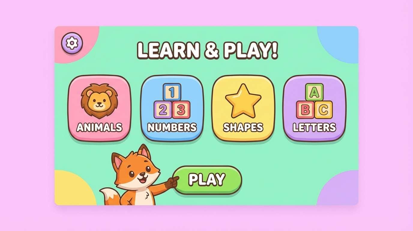
14) Playful Classroom
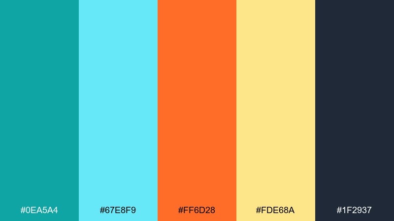
HEX: #0ea5a4 #67e8f9 #ff6d28 #fde68a #1f2937
Mood: cheerful, approachable, energetic
Best for: kids learning apps and worksheets
Cheerful, classroom-bright tones feel like sticky notes and storytime posters. Use teal as the anchor for navigation and headings, then let orange call out rewards, stars, and important prompts. The sunny yellow supports friendly backgrounds without overwhelming small text. Usage tip: apply orange to only one interactive element per screen to reduce distraction.
Image example of playful classroom generated using media.io
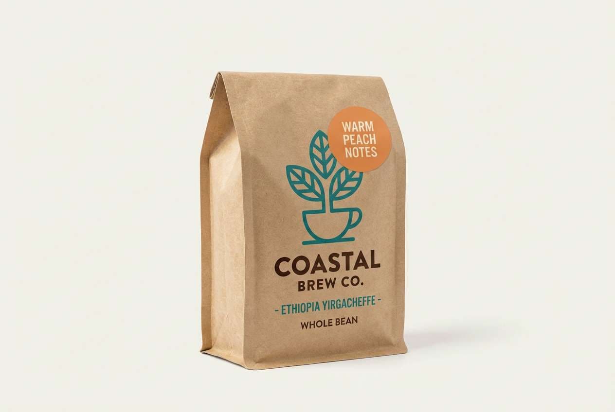
15) Roastery Mark
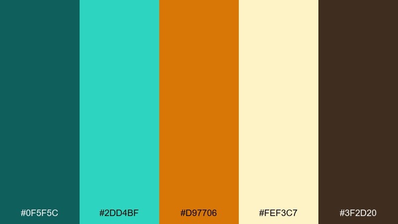
HEX: #0f5f5c #2dd4bf #d97706 #fef3c7 #3f2d20
Mood: warm, handcrafted, welcoming
Best for: coffee shop logos and packaging
Warm, handcrafted character feels like steamed mugs and roasted beans. Use the deep coffee brown for typography and outlines, while teal adds a modern, unexpected twist to the brand mark. The amber-orange can highlight roast levels, stickers, or limited releases. Usage tip: choose uncoated paper and keep teal coverage moderate so the packaging stays natural.
Image example of roastery mark generated using media.io
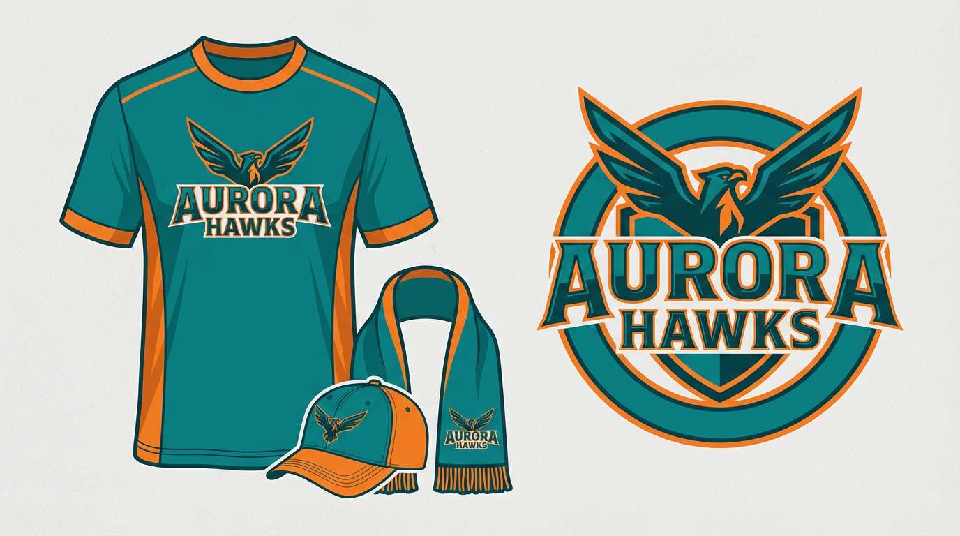
16) Stadium Spark
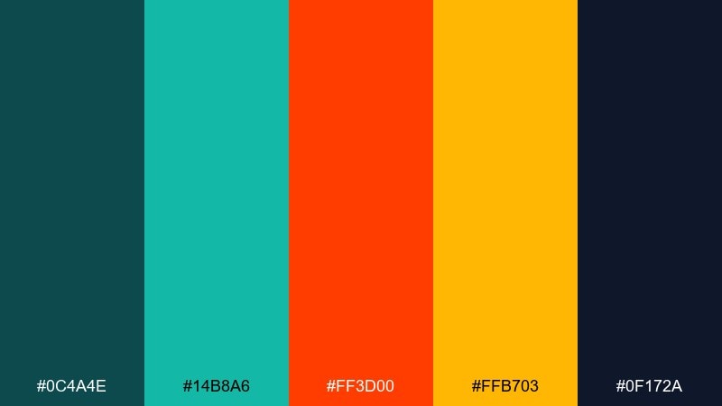
HEX: #0c4a4e #14b8a6 #ff3d00 #ffb703 #0f172a
Mood: bold, competitive, electric
Best for: sports team branding and merch
Bold stadium energy feels like floodlights, chants, and fast motion. These teal orange color combinations pop on jerseys, social posts, and score graphics when you lean into deep contrast. Use teal for the primary identity and reserve the hot orange for highlights, numbers, or calls to action. Usage tip: keep the yellow as a secondary accent only, so the main two colors stay unmistakable.
Image example of stadium spark generated using media.io
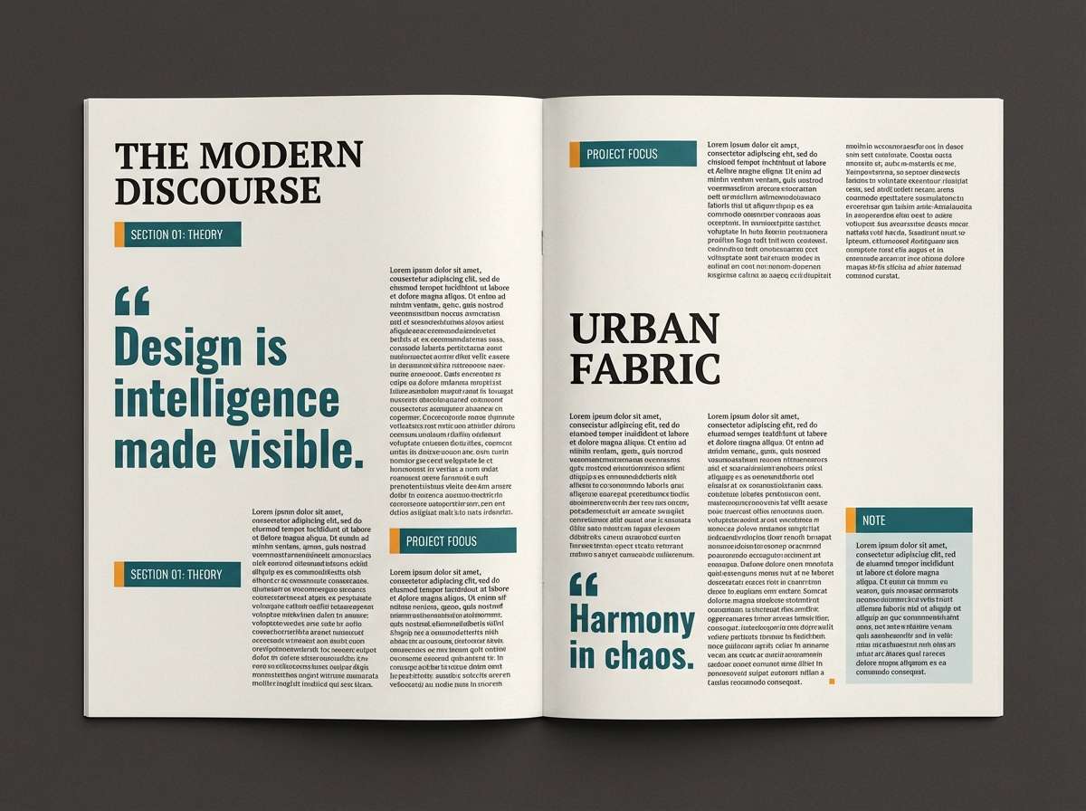
17) Magazine Calm
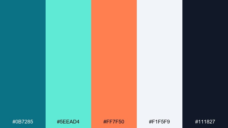
HEX: #0b7285 #5eead4 #ff7f50 #f1f5f9 #111827
Mood: fresh, editorial, balanced
Best for: magazine features and blog editorials
Fresh editorial balance feels like a clean spread with one standout accent. Use the light gray as the page base and keep charcoal for body copy to protect readability. Teal can frame pull quotes and section labels, while coral-orange highlights key data or links. Usage tip: apply orange only to one element per spread, such as a sidebar title or a single chart series.
Image example of magazine calm generated using media.io
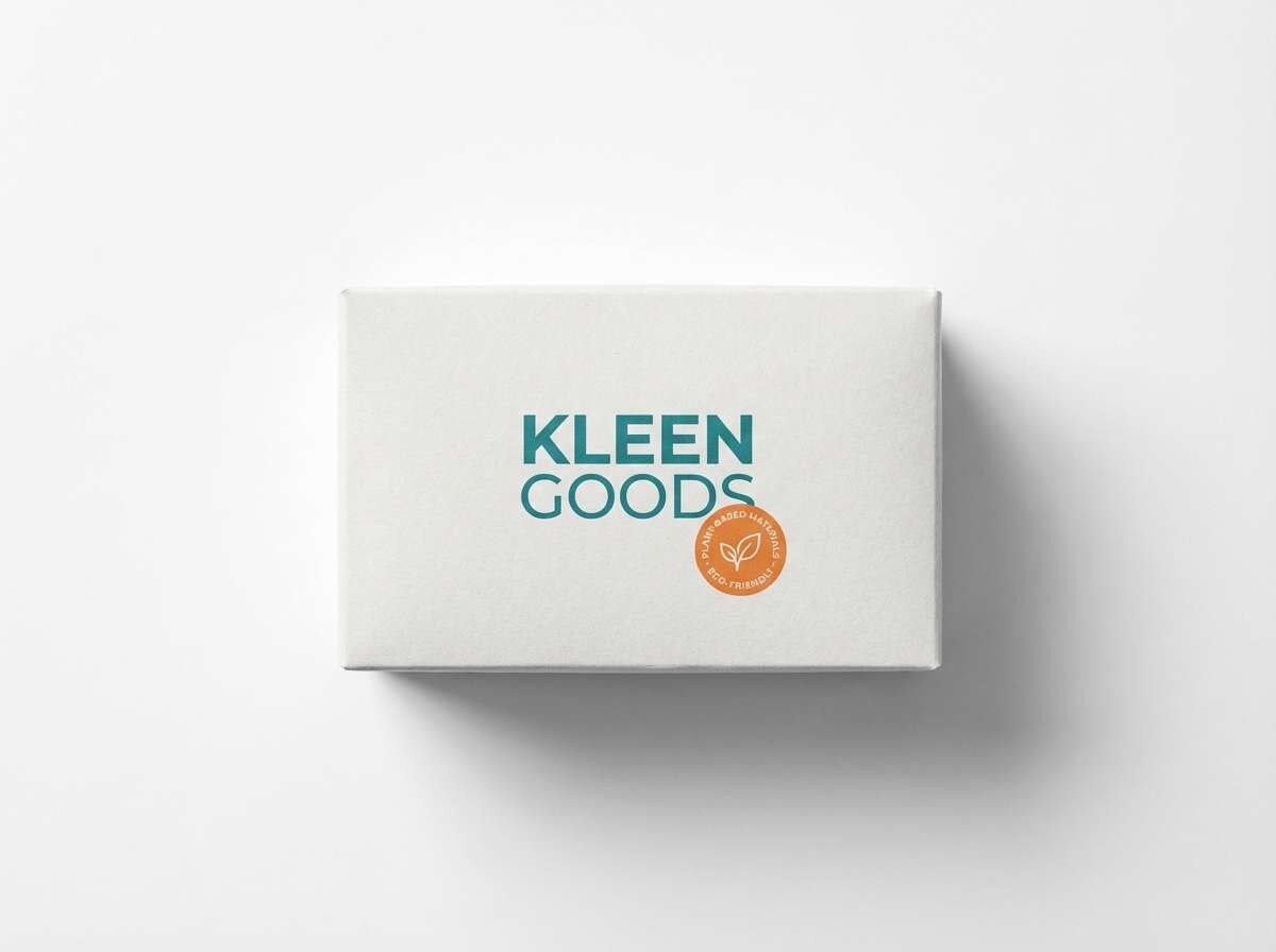
18) Clean Carton
HEX: #115e59 #99f6e4 #f97316 #f8fafc #1f2937
Mood: fresh, modern, trustworthy
Best for: product packaging and e-commerce ads
Fresh, modern clarity feels like a just-opened box with crisp printing and clean lines. A teal orange color palette like this sells well when teal leads the brand story and orange signals benefits or flavor. Keep the near-white for big, quiet surfaces and use charcoal for ingredients and fine print. Usage tip: limit orange to badges and one hero stripe so the packaging looks premium, not loud.
Image example of clean carton generated using media.io
19) Boho Market
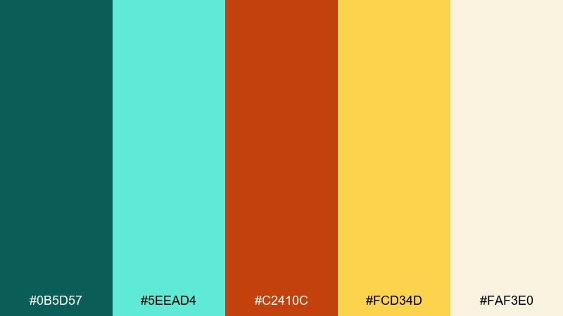
HEX: #0b5d57 #5eead4 #c2410c #fcd34d #faf3e0
Mood: artisanal, sunny, eclectic
Best for: handmade labels and craft fair signage
Artisanal market charm comes through like woven textiles and hand-painted signs. Use the warm cream as the base, then layer teal for patterns and small iconography. Burnt orange and mustard feel great for price tags, stamps, and limited-run callouts. Usage tip: try imperfect edges and organic shapes to match the handmade vibe.
Image example of boho market generated using media.io

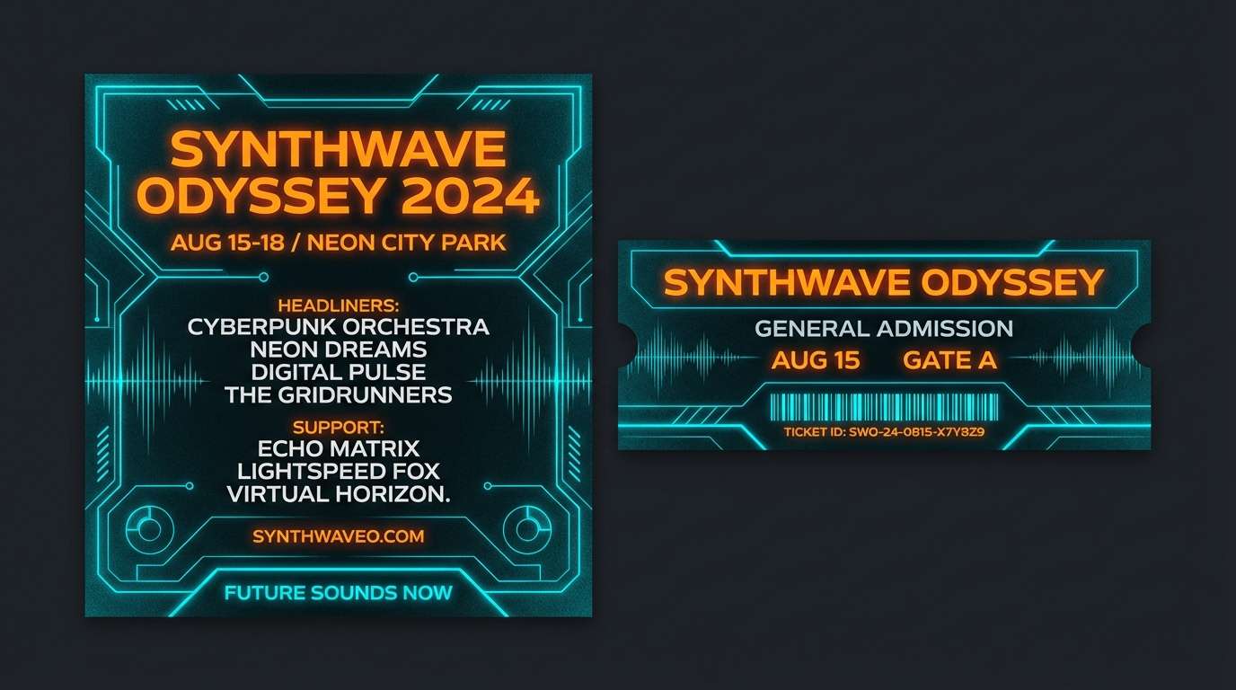
20) Night Festival Neon
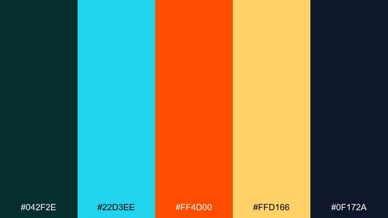
HEX: #042f2e #22d3ee #ff4d00 #ffd166 #0f172a
Mood: neon, energetic, nightlife
Best for: music festival promos and tickets
Neon nightlife energy feels like laser lights cutting through a dark crowd. Use the deepest navy-teal for the background, then bring in electric cyan for glow effects and shapes. The vivid orange reads best for ticket details, QR callouts, or a single headline. Usage tip: add a subtle outer glow to cyan only, and keep orange flat for clear hierarchy.
Image example of night festival neon generated using media.io
What Colors Go Well with Teal Orange?
Teal orange pairing works best when you add a stabilizing neutral. Crisp whites, warm creams, and light grays keep interfaces and layouts breathable, while deep navy or charcoal protects text readability.
For richer, more layered designs, try supportive hues like sand/beige, misty blue-gray, muted gold, or soft peach. These keep the teal and orange feeling intentional rather than overly saturated.
If you want more contrast, add an inky near-black or a very pale off-white—then use orange as a “signal” color and teal as the structural base. This keeps hierarchy clear across buttons, charts, and headlines.
How to Use a Teal Orange Color Palette in Real Designs
Pick a dominant color first. In most modern systems, teal works well as the primary (navigation, sections, icons), while orange is more effective as the accent for CTAs, highlights, and status markers.
Control intensity with spacing and surfaces: use off-white or light sand backgrounds for calm layouts, or go dark with navy/charcoal for high-contrast dashboards and posters. Avoid placing strong teal and strong orange in equal amounts on large areas.
Check accessibility early. Small text should sit on neutrals (charcoal on off-white, or off-white on deep navy), and your orange should usually be reserved for large type, buttons, badges, or icons where contrast stays strong.
Create Teal Orange Palette Visuals with AI
If you already have teal orange HEX codes, you can quickly turn them into real design directions—poster styles, UI mockups, brand boards, or packaging looks—by generating image concepts from prompts.
Start with one palette and one use case (like “SaaS landing hero” or “event poster”), then iterate: adjust typography style, spacing, and how much orange you allow on the canvas. This is the fastest way to test teal orange contrast before production work.
With Media.io, you can generate consistent visuals in minutes, then refine variations until the balance between cool teal and warm orange feels right for your brand.
Teal Orange Color Palette FAQs
-
What does a teal and orange color palette communicate?
Teal often signals calm, clarity, and trust, while orange signals warmth, optimism, and action. Together, they create a confident, modern look with strong visual hierarchy. -
Are teal and orange complementary colors?
They’re a near-complementary pairing in practice: teal sits between blue and green, and orange contrasts strongly against both. That’s why teal orange combinations feel punchy even with minimal elements. -
What neutral colors work best with teal orange?
Off-white, warm cream, light gray, charcoal, and deep navy are the most reliable. Neutrals help keep teal and orange from competing and make typography easier to read. -
How do I balance teal and orange in UI design?
Use teal as your primary system color (navigation, tabs, links, charts) and reserve orange for key actions (primary button, critical highlight, one KPI). A common rule is “one accent per screen” to keep focus. -
What should I use for text on teal or orange backgrounds?
For teal backgrounds, white or near-white text often works best; for orange backgrounds, deep navy or charcoal usually reads cleaner than white. Always verify contrast, especially for small labels. -
Can teal orange palettes work for luxury branding?
Yes—choose deeper teals, muted amber/gold-orange, and plenty of cream space. Add structured layouts (thin lines, symmetry) to keep the palette feeling premium rather than playful. -
How can I quickly preview teal orange palette ideas for posters or branding?
Generate mockups with an AI image tool using a clear prompt (style, layout, and where teal vs orange should appear). Iterate by changing only one variable at a time (accent strength, background tone, typography style).


