

Beige brown palettes blend warm neutrals with earthy depth, making them easy to live with and even easier to design around. They feel calm, natural, and premium without demanding attention.
Below are 20 curated beige brown color palette ideas (each with HEX codes), plus practical pairing and usage tips for interiors, branding, and UI.
In this article
Why Beige Brown Palettes Work So Well
Beige brown tones sit in a “comfort zone” of color: warm enough to feel inviting, neutral enough to stay versatile. That balance makes them ideal for backgrounds, surfaces, and long-form layouts where visual fatigue matters.
They also support strong hierarchy. Light beiges create breathable negative space, mid browns add structure, and deep espresso shades deliver dependable contrast for text, icons, and key accents.
Finally, beige brown palettes pair naturally with tactile materials and themes—wood, linen, leather, clay—so they translate beautifully across interiors, packaging, and digital UI.
20+ Beige Brown Color Palette Ideas (with HEX Codes)
1) Sandstone Latte
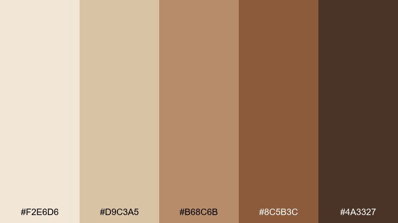
HEX: #F2E6D6 #D9C3A5 #B68C6B #8C5B3C #4A3327
Mood: calm, sun-warmed, natural
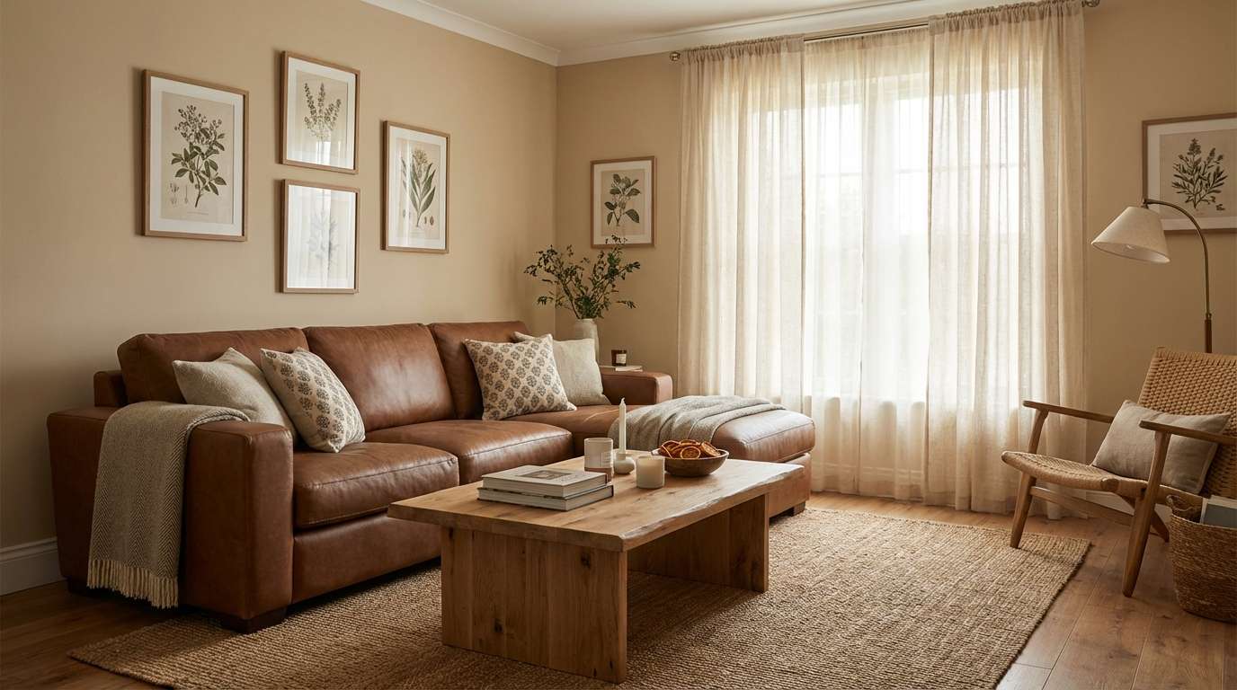
Best for: cozy living room interior styling
Calm and sun-warmed, these tones feel like sandstone walls and a milky latte in soft morning light. Use the lightest beige for large surfaces, then layer mid browns through textiles and wood. Pair with matte black hardware or brushed brass for contrast that stays understated. Tip: repeat the deepest brown in small accents like frames to keep the room grounded.
Image example of sandstone latte generated using media.io
Media.io is an online AI studio for creating and editing video, image, and audio in your browser.

2) Cocoa Linen
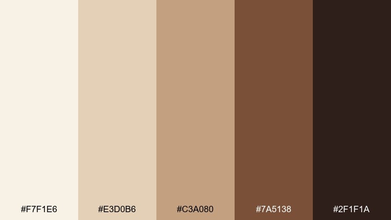
HEX: #F7F1E6 #E3D0B6 #C3A080 #7A5138 #2F1F1A
Mood: clean, comforting, timeless
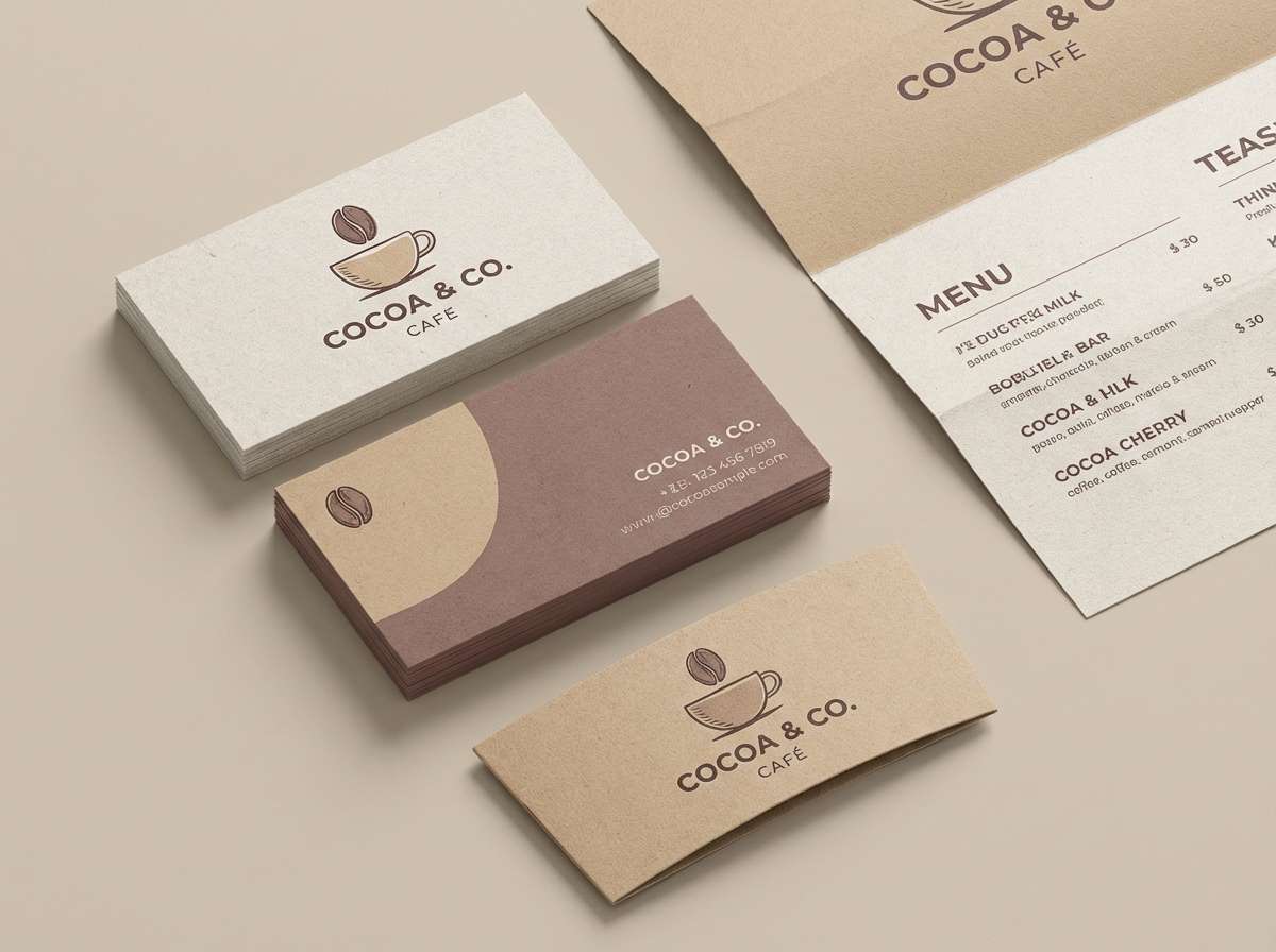
Best for: minimal brand identity for a cafe
Clean and comforting, the mix reads like crisp linen with a cocoa-rich finish. Keep the creamy off-white as the background, then use the medium tan for logos and label text. The darker browns work well for stamps, icons, and menu headers without feeling harsh. Tip: choose one accent brown for calls to action and stick to it for a consistent system.
Image example of cocoa linen generated using media.io
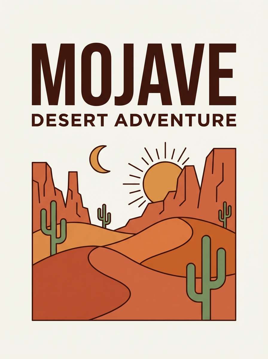
3) Desert Clay
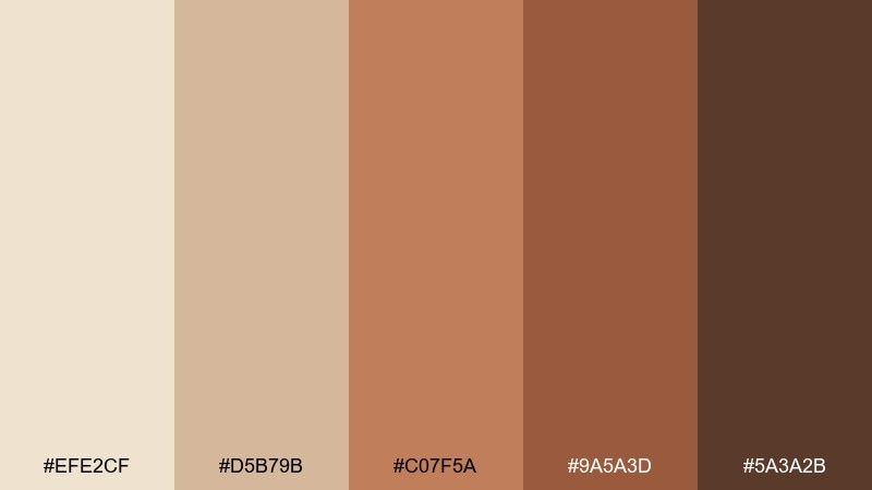
HEX: #EFE2CF #D5B79B #C07F5A #9A5A3D #5A3A2B
Mood: earthy, adventurous, grounded
Best for: travel poster graphic design
Earthy and adventurous, these shades evoke desert trails, clay pottery, and sunbaked cliffs. Use the pale sand as negative space, then let the clay and sienna tones carry illustrations and headings. Add the darkest brown for bold type or a strong border to frame the layout. Tip: keep gradients subtle so the palette stays rugged rather than glossy.
Image example of desert clay generated using media.io
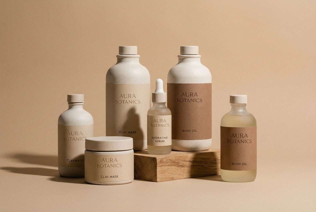
4) Almond Mocha
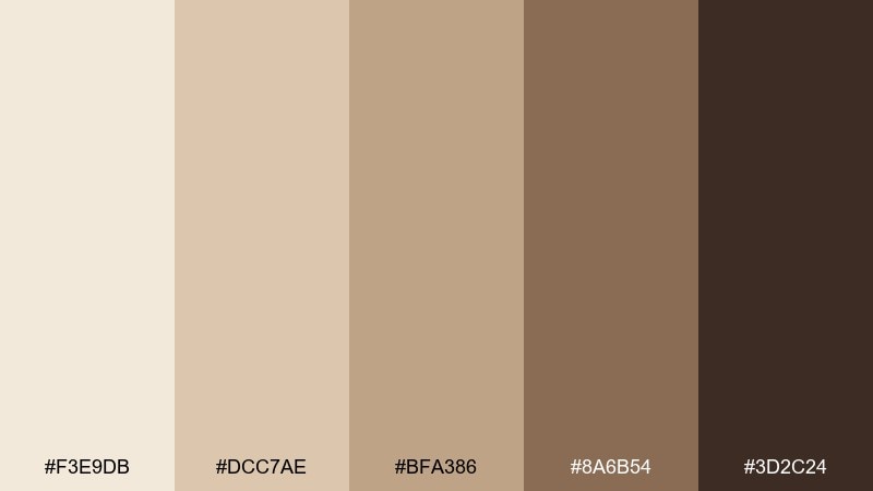
HEX: #F3E9DB #DCC7AE #BFA386 #8A6B54 #3D2C24
Mood: soft, polished, inviting
Best for: beauty product packaging and labels
Soft and polished, the tones feel like almond milk, mocha foam, and satin fabric. This beige brown color palette works beautifully on minimalist packaging where typography needs to look premium. Pair it with warm white space and a touch of metallic foil for instant elevation. Tip: print the darkest shade as a rich ink for ingredient text to avoid washed-out labels.
Image example of almond mocha generated using media.io
5) Oatmilk Walnut
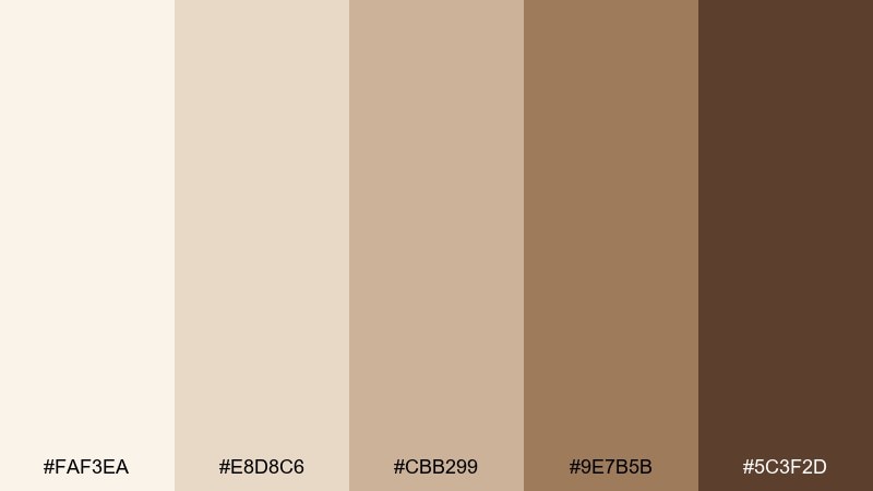
HEX: #FAF3EA #E8D8C6 #CBB299 #9E7B5B #5C3F2D
Mood: homey, gentle, approachable
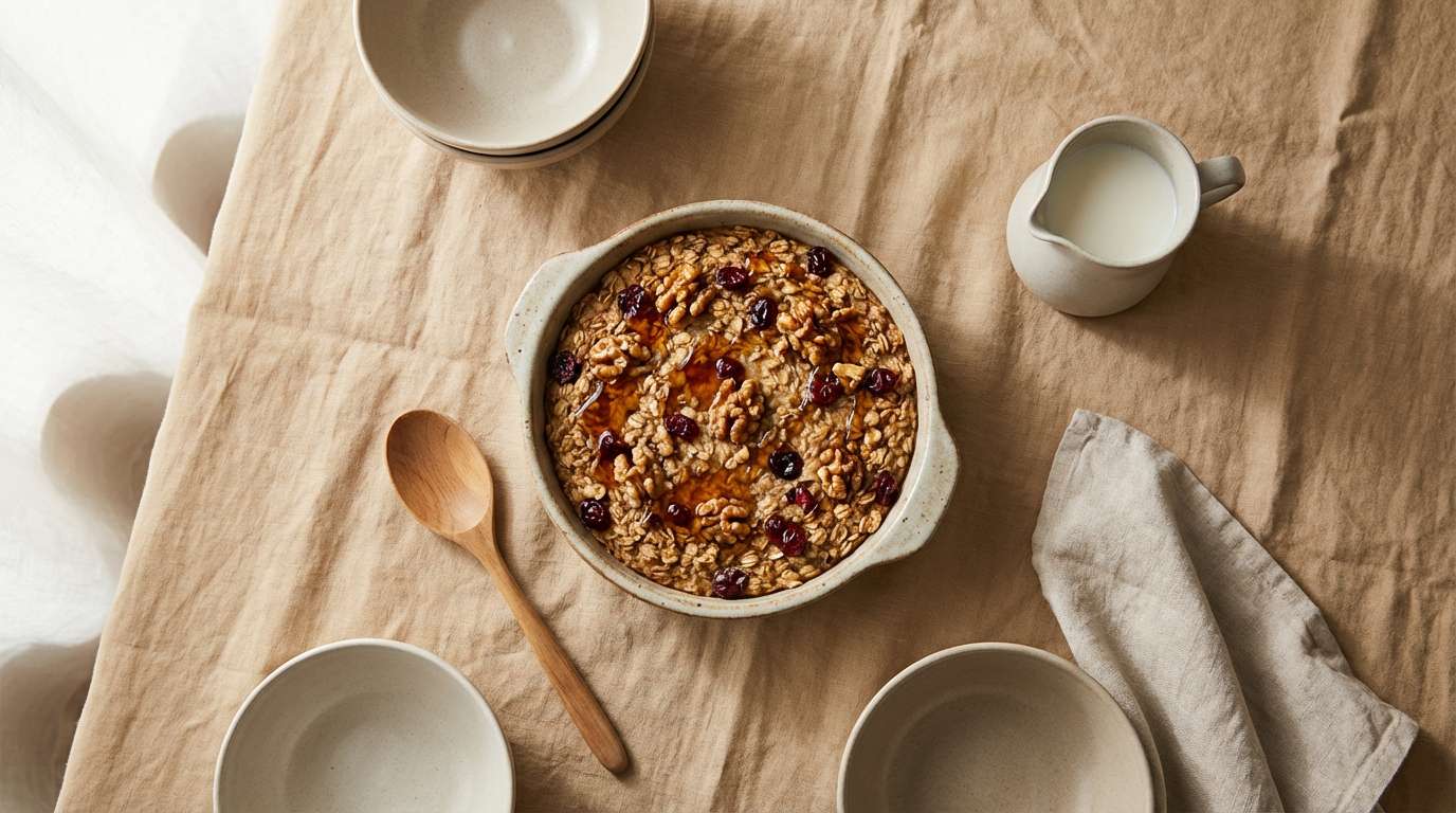
Best for: recipe blog hero image styling
Homey and gentle, this set feels like oatmilk swirls and toasted walnut crumbs. Use the creamy tones for backgrounds and cards, while the mid browns define buttons, dividers, and captions. It pairs well with muted sage or dusty blue if you want a fresh food-friendly accent. Tip: keep photography warm and slightly desaturated so the palette and images match naturally.
Image example of oatmilk walnut generated using media.io
6) Sepia Suede
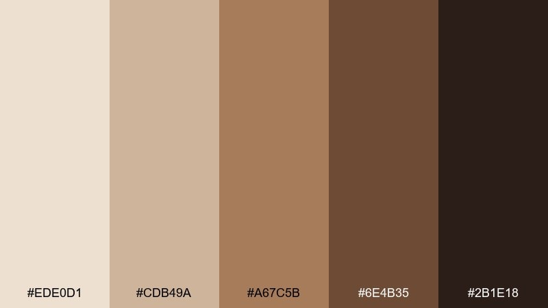
HEX: #EDE0D1 #CDB49A #A67C5B #6E4B35 #2B1E18
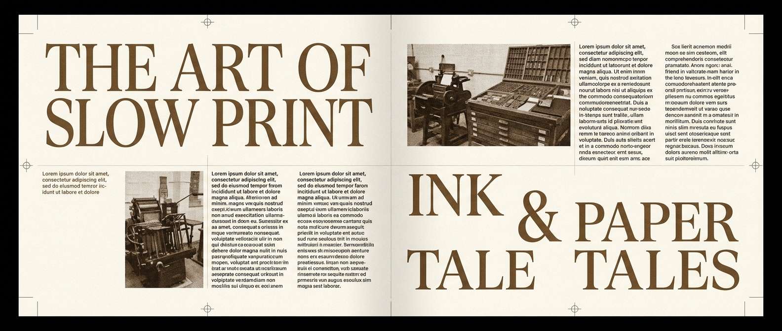
Mood: moody, tactile, vintage
Best for: editorial magazine spread layout
Moody and tactile, these shades bring sepia photography and worn suede to mind. Use the light beige as page stock, then set headlines in the deeper brown for a classic editorial hierarchy. Add the mid tone to pull quotes and section dividers so the spread feels curated rather than flat. Tip: choose a serif for titles and a clean sans for body text to balance the vintage vibe.
Image example of sepia suede generated using media.io
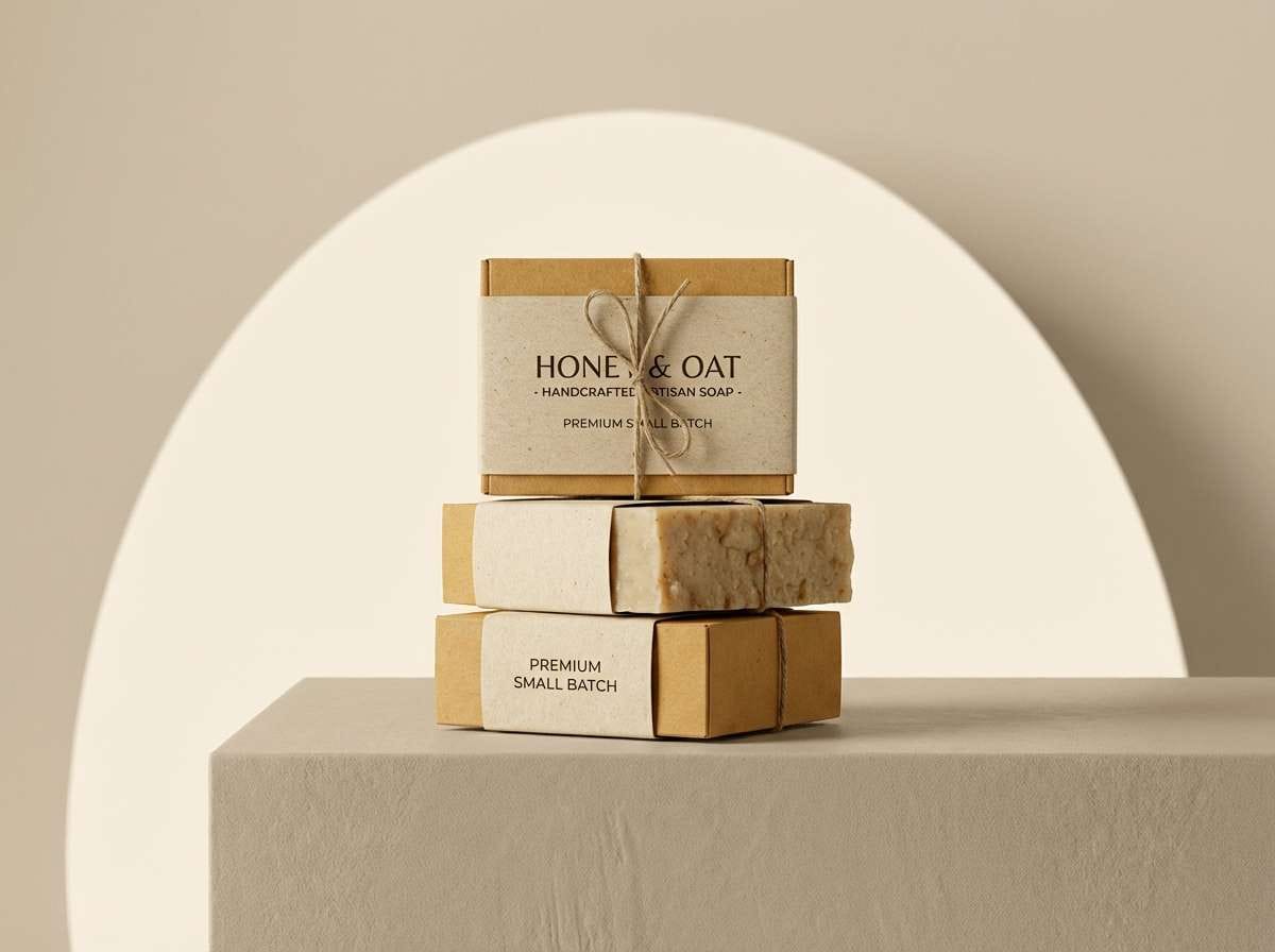
7) Honeyed Birch
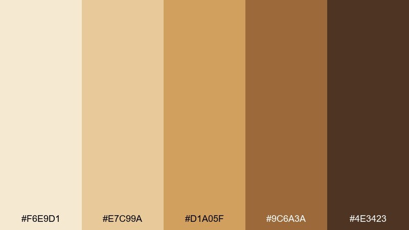
HEX: #F6E9D1 #E7C99A #D1A05F #9C6A3A #4E3423
Mood: bright, friendly, artisanal
Best for: handcrafted soap product ad
Bright and friendly, it evokes honey drizzle over pale birch wood. These beige brown color combinations shine in product ads where you want warmth without heaviness. Pair with clean white typography and a small pop of muted teal for modern contrast. Tip: keep shadows soft in your visuals so the golden tones feel natural, not orange.
Image example of honeyed birch generated using media.io
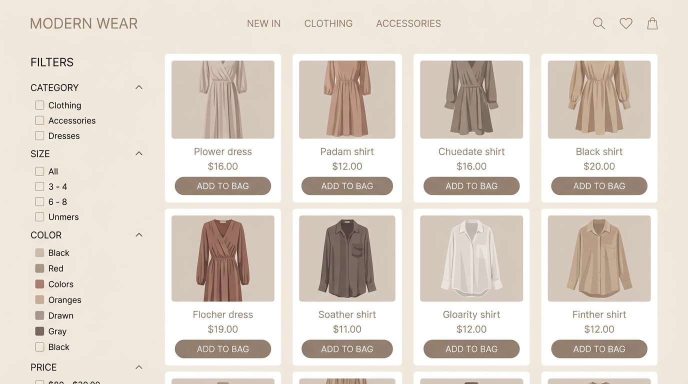
8) Taupe Truffle
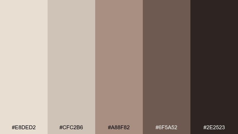
HEX: #E8DED2 #CFC2B6 #A88F82 #6F5A52 #2E2523
Mood: muted, modern, sophisticated
Best for: fashion ecommerce UI components
Muted and sophisticated, the palette feels like taupe knitwear and dark truffle chocolate. Use the pale gray-beige for cards and surfaces, then rely on the deep brown for text contrast and key UI states. A subtle rose or steel accent can add energy while keeping the overall look refined. Tip: test contrast ratios early so the mid taupes do not blur on mobile screens.
Image example of taupe truffle generated using media.io
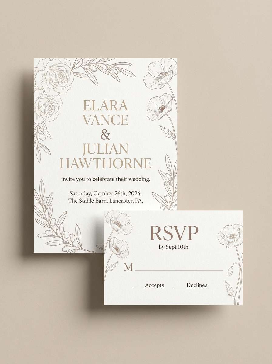
9) Dusty Fawn
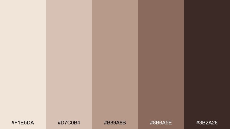
HEX: #F1E5DA #D7C0B4 #B89A8B #8B6A5E #3B2A26
Mood: romantic, muted, cozy
Best for: wedding invitation suite design
Romantic and muted, these shades resemble dusty roses, fawn suede, and soft candlelight. Use the light blush-beige as the paper tone, and bring in the deeper browns for monograms and details. Pair with delicate line art and a small gold accent to keep it elegant. Tip: limit heavy blocks of dark color so the invitation stays airy and readable.
Image example of dusty fawn generated using media.io
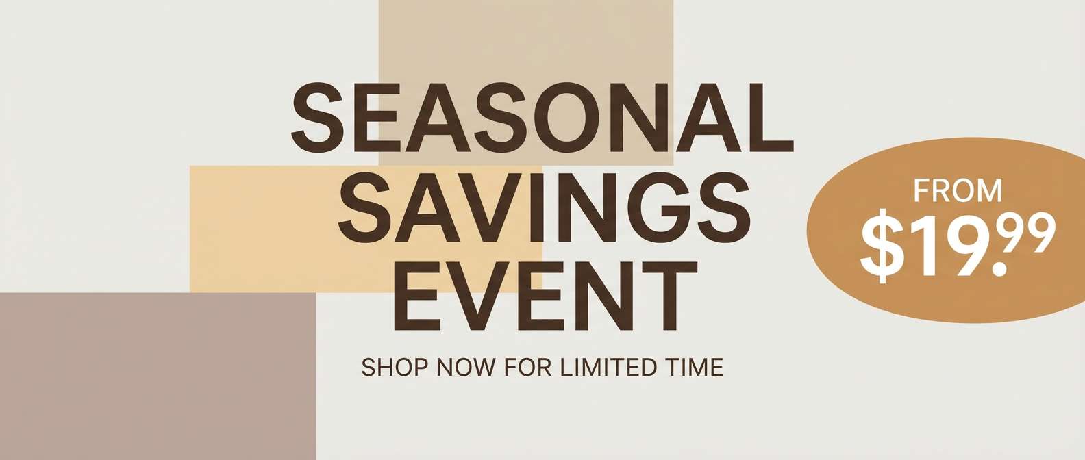
10) Caramel Drift
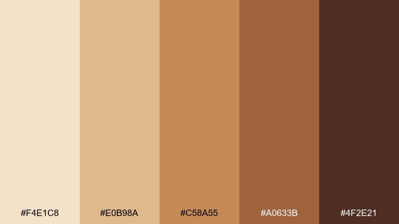
HEX: #F4E1C8 #E0B98A #C58A55 #A0633B #4F2E21
Mood: sunny, playful, bold-warm
Best for: seasonal promo banner for retail
Sunny and playful, the mix reads like caramel drizzle and toasted sugar. Let the bright tan lead for backgrounds, then use the caramel and espresso tones to create bold type contrast for promos. Pair with a soft cream and one crisp accent like navy to keep the banner sharp. Tip: reserve the darkest shade for prices and calls to action so they pop instantly.
Image example of caramel drift generated using media.io
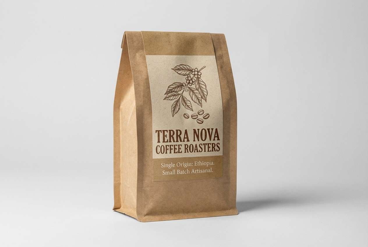
11) Rustic Parchment
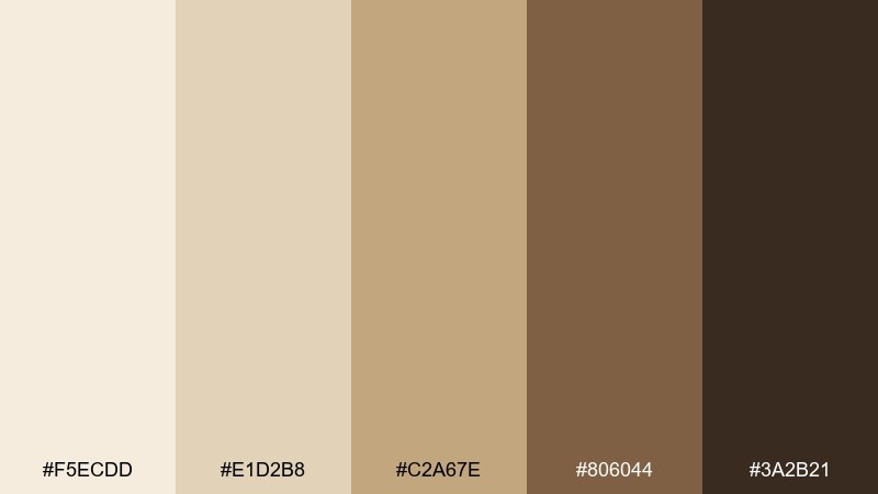
HEX: #F5ECDD #E1D2B8 #C2A67E #806044 #3A2B21
Mood: heritage, warm, handcrafted
Best for: coffee bag packaging design
Heritage and handcrafted, these tones echo aged parchment, roasted beans, and kraft paper. Use the lighter shades to mimic natural paper stock, then apply the darker brown for badges, roasts, and origin details. It pairs well with simple stamp textures and a single accent color like brick red. Tip: keep the label layout modular so new blends can swap colors without redesigning everything.
Image example of rustic parchment generated using media.io
12) Sienna Biscuit
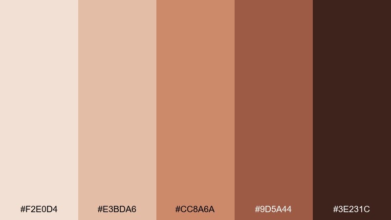
HEX: #F2E0D4 #E3BDA6 #CC8A6A #9D5A44 #3E231C
Mood: warm, cozy, slightly retro
Best for: social media quote template
Warm and slightly retro, it feels like baked biscuits with a hint of cinnamon. Use the soft peachy beige as your base, then set quotes in the darkest brown for readability. The sienna tones are great for highlight shapes, underlines, or simple icons. Tip: choose one display font and one body font to keep posts consistent across a feed.
Image example of sienna biscuit generated using media.io

13) Stonewashed Umber
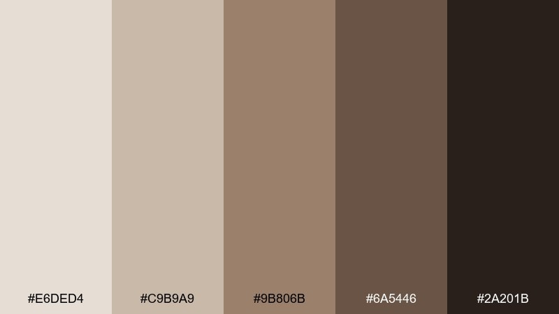
HEX: #E6DED4 #C9B9A9 #9B806B #6A5446 #2A201B
Mood: steady, rugged, minimalist
Best for: architectural portfolio website UI
Steady and rugged, these tones suggest stonewashed concrete, raw timber, and charcoal shadows. Use the pale greige as the page background and the deep umber for navigation and type. The mid browns are ideal for hover states and subtle section breaks. Tip: keep imagery neutral or black-and-white so the interface feels intentional and architectural.
Image example of stonewashed umber generated using media.io
14) Maple Toffee
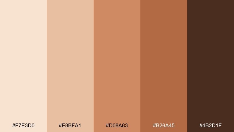
HEX: #F7E3D0 #E8BFA1 #D08A63 #B26A45 #4B2D1F
Mood: sweet, energetic, inviting
Best for: bakery menu flyer design
Sweet and energetic, the colors bring to mind maple syrup, toffee, and warm oven light. These beige brown color combinations work great for menus because they feel appetizing while staying readable. Pair with a cream background and a small dark accent for prices and section titles. Tip: use the mid toffee shade for icons so they stand out without overpowering the text.
Image example of maple toffee generated using media.io
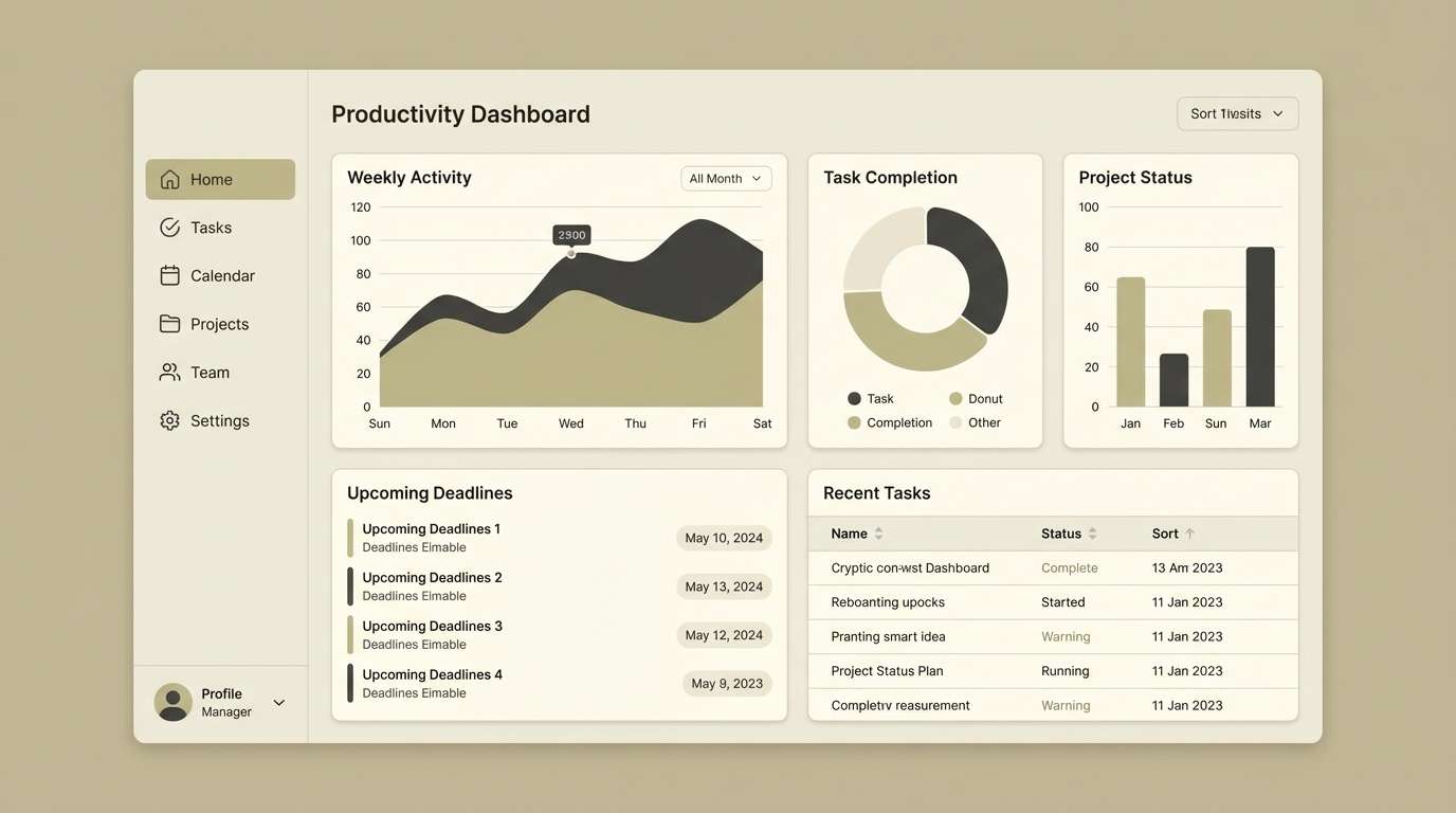
15) Minimal Khaki
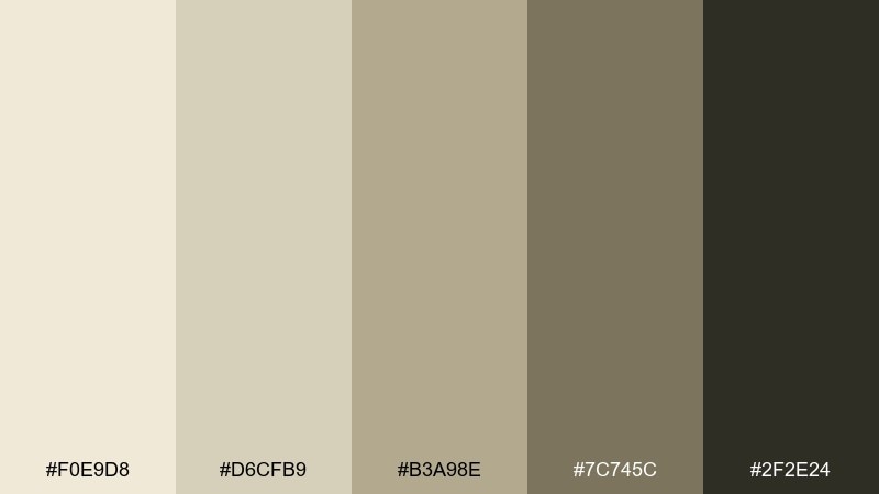
HEX: #F0E9D8 #D6CFB9 #B3A98E #7C745C #2F2E24
Mood: clean, utilitarian, modern
Best for: productivity dashboard UI theme
Clean and utilitarian, this set feels like khaki canvas and well-worn notebooks. Use this beige brown color scheme for dashboards with lots of data, keeping surfaces light and text dark. Pair with a single cool accent like slate blue for active states and links. Tip: keep charts to two neutrals plus one accent so the interface stays scannable.
Image example of minimal khaki generated using media.io
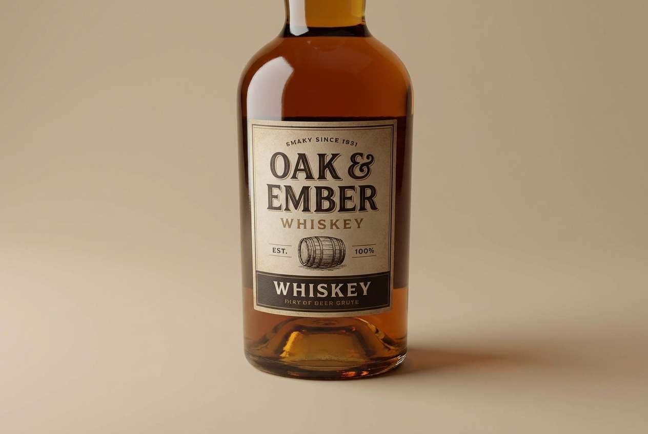
16) Vintage Leather
HEX: #EADBCB #CBAA8A #A87652 #6D452E #2B1B14
Mood: rich, classic, masculine-leaning
Best for: whiskey bottle label concept
Rich and classic, it evokes vintage leather, cedarwood, and a dimly lit bar shelf. Use the light tan as label stock, then build hierarchy with deep brown type and small badges. Pair with off-white and a restrained gold accent to keep it premium and legible. Tip: add subtle grain texture sparingly so the design feels authentic, not noisy.
Image example of vintage leather generated using media.io
17) Warm Pebble
HEX: #EEE4DA #D2C3B6 #A59689 #6E6057 #2D2623
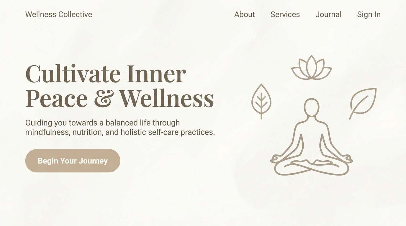
Mood: serene, balanced, spa-like
Best for: wellness landing page design
Serene and balanced, these hues resemble smooth pebbles and steamed linen towels. Use the soft beige as a calm backdrop and the deeper taupe for headings and button text. Pair with eucalyptus green or muted aqua for a wellness-forward accent that still feels natural. Tip: keep spacing generous and shadows subtle to maintain the spa-like quiet.
Image example of warm pebble generated using media.io
18) Soft Chestnut
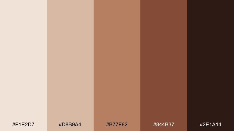
HEX: #F1E2D7 #D8B9A4 #B77F62 #844B37 #2E1A14
Mood: cozy, rustic, approachable
Best for: fall seasonal email header
Cozy and rustic, it brings chestnut shells, knit scarves, and warm woodgrain into focus. Use the pale blush-beige for the header background and chestnut tones for typography and icons. It pairs nicely with cream and a restrained forest green accent for seasonal contrast. Tip: keep your main headline in the darkest shade to ensure it reads well in inbox previews.
Image example of soft chestnut generated using media.io

19) Coffee Cream
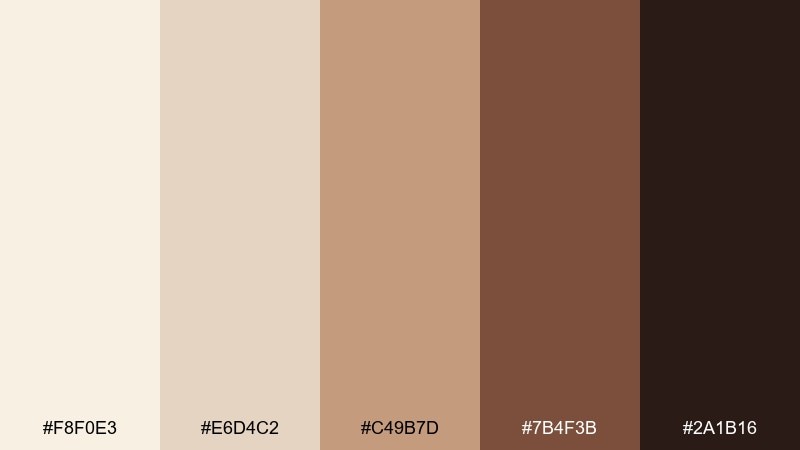
HEX: #F8F0E3 #E6D4C2 #C49B7D #7B4F3B #2A1B16
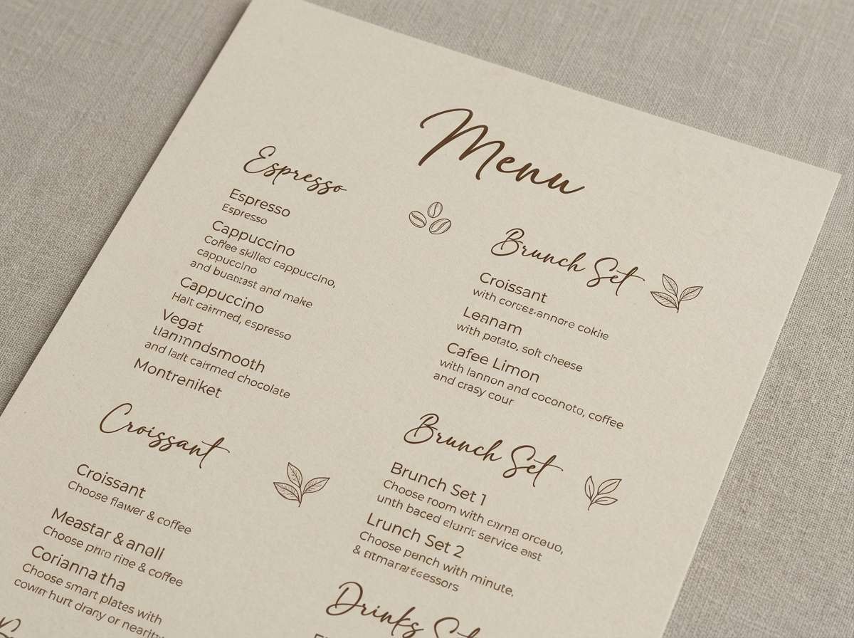
Mood: smooth, familiar, elegant
Best for: restaurant menu UI and print
Smooth and familiar, the tones recall coffee crema, warm ceramic, and dark espresso. This beige brown color palette is a safe pick for menus because it feels appetizing and upscale at once. Pair with plenty of whitespace and a crisp accent like deep green for dietary tags or highlights. Tip: use the mid caramel shade for category headers so the structure is clear without shouting.
Image example of coffee cream generated using media.io
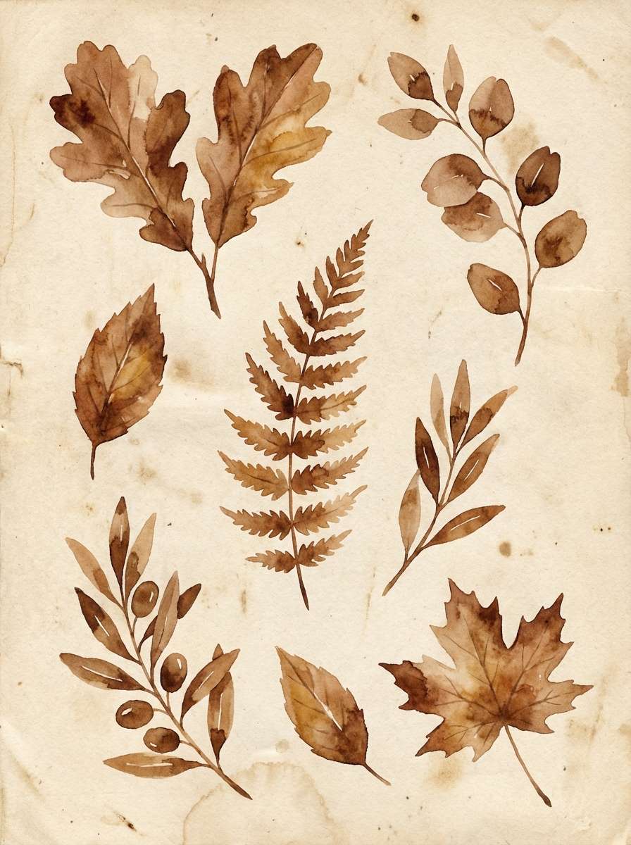
20) Earthy Canvas
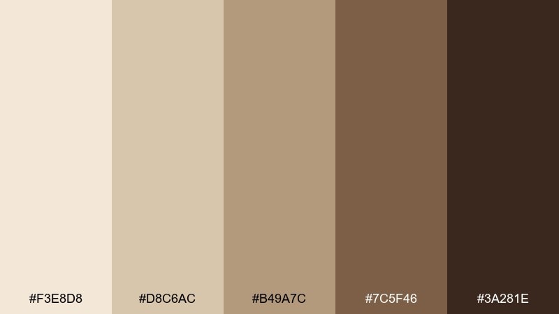
HEX: #F3E8D8 #D8C6AC #B49A7C #7C5F46 #3A281E
Mood: natural, artistic, grounded
Best for: botanical watercolor illustration set
Natural and artistic, this mix feels like raw canvas, dried leaves, and rich soil. Use the light beige as paper tone, then layer the mid browns for stems, shadows, and subtle depth. Pair with muted olive or dusty blue for a gentle botanical accent without overpowering the neutrals. Tip: keep edges soft and washes transparent so the artwork stays airy and organic.
Image example of earthy canvas generated using media.io
What Colors Go Well with Beige Brown?
Beige brown works best with accents that either cool it down (to feel modern) or deepen it (to feel richer). Great cool partners include slate blue, dusty navy, steel gray, and muted teal—these sharpen the palette without turning it stark.
For organic, nature-forward combinations, pair beige brown with sage, olive, eucalyptus, or the dark green family for contrast that still feels grounded. If you want a softer look, try warm white, blush beige, or a gentle clay/terracotta accent.
In digital design, reserve the deepest brown for text and key UI states, then use one controlled accent color (green, blue, or muted rose) to guide attention without breaking the neutral mood.
How to Use a Beige Brown Color Palette in Real Designs
Start with roles, not just colors. Assign your lightest beige to large surfaces (backgrounds, walls, page sections), mid browns to structure (cards, dividers, secondary blocks), and the darkest shade to readability (body text, navigation, primary buttons).
Keep texture and lighting consistent. Beige browns can shift quickly under different light; warm photography, matte finishes, and slightly desaturated images help the palette feel cohesive across web, print, and product visuals.
Finally, test contrast early—especially with mid taupes and tans. A palette can look beautiful in a swatch but lose clarity in small UI labels, mobile screens, or thin typography.
Create Beige Brown Palette Visuals with AI
If you want to preview these beige brown tones in real contexts—interiors, packaging, posters, or UI—generate quick mock visuals from a text prompt. This helps you validate mood, contrast, and material feel before committing to production.
On Media.io, you can iterate fast: adjust the prompt, lock in your favorite HEX-inspired look, and export variations for different layouts or aspect ratios. It’s especially useful for mood boards, client presentations, and early brand exploration.
Beige Brown Color Palette FAQs
-
What is a beige brown color palette?
A beige brown palette is a set of warm neutral colors that ranges from creamy beige and tan to deeper browns like mocha, chestnut, and espresso. It’s commonly used to create cozy, natural, and premium-looking designs. -
Are beige brown color schemes good for websites and UI?
Yes—beige browns make excellent UI foundations because they’re easy on the eyes and feel modern when paired with strong contrast. Use the darkest brown for text/buttons, and keep mid tones for surfaces and borders to avoid low-contrast screens. -
What accent colors look best with beige brown?
Muted greens (sage, olive, dark green), slate or navy blues, dusty teal, and soft terracotta are reliable accents. Choose one accent color and keep the rest neutral for a clean, intentional look. -
How do I keep beige and brown from looking “muddy”?
Increase contrast and simplify the palette roles: use a very light beige for backgrounds, a clearly dark shade for text, and limit mid browns to structural elements. Also avoid stacking similar mid tones next to each other without separators or whitespace. -
What finishes and textures pair well with beige brown palettes?
Matte finishes, paper textures, linen, woodgrain, leather, and subtle grain overlays match beige browns naturally. These textures reinforce the warm, tactile character without needing bright colors. -
Do beige brown palettes print well?
They can print beautifully, but test proofs are important because browns may shift warmer or flatter depending on paper and ink. Use rich dark browns for small text and avoid very light beige on glossy paper if readability matters. -
Can I generate beige brown palette images from prompts?
Yes. With Media.io’s text-to-image tool, you can describe the scene (e.g., “minimal packaging,” “cozy living room,” or “neutral UI mockup”) and iterate until the beige brown mood and lighting match your brand or project.
Next: Dark Green Color Palette


