

Army green is a design staple because it’s grounded, versatile, and instantly communicates durability. With the right supporting tones, it can feel premium, modern, cozy, or even playful.
Below are 20 army green color palette ideas with HEX codes, mood notes, and practical use cases for branding, UI, and print—plus AI prompts to generate matching visuals fast.
In this article
- Why Army Green Palettes Work So Well
-
- field jacket minimal
- desert patrol neutrals
- moss and copper accent
- olive and cream studio
- urban camo concrete
- botanical sage wash
- vintage barracks poster
- olive dark mode ui
- rustic cabin kitchen
- olive and gold luxe
- coastal marsh sand
- blush olive balance
- graphite pine contrast
- autumn trail mix
- concrete and lichen
- night ops neon pin
- leather workshop
- olive wedding minimal
- adventure map kids
- nature feature editorial
- What Colors Go Well with Army Green?
- How to Use a Army Green Color Palette in Real Designs
- Create Army Green Palette Visuals with AI
Why Army Green Palettes Work So Well
Army green sits in a muted, earthy range that feels stable and practical—so it naturally supports products, interfaces, and layouts where trust and reliability matter.
It’s also unusually flexible: pair it with warm neutrals for an organic look, with graphite grays for a modern edge, or with metallic/golden accents for a premium finish.
Most importantly, army green plays well with texture (paper grain, canvas, concrete, leather), so designs feel more tactile and “real,” even in clean digital UI.
20+ Army Green Color Palette Ideas (with HEX Codes)
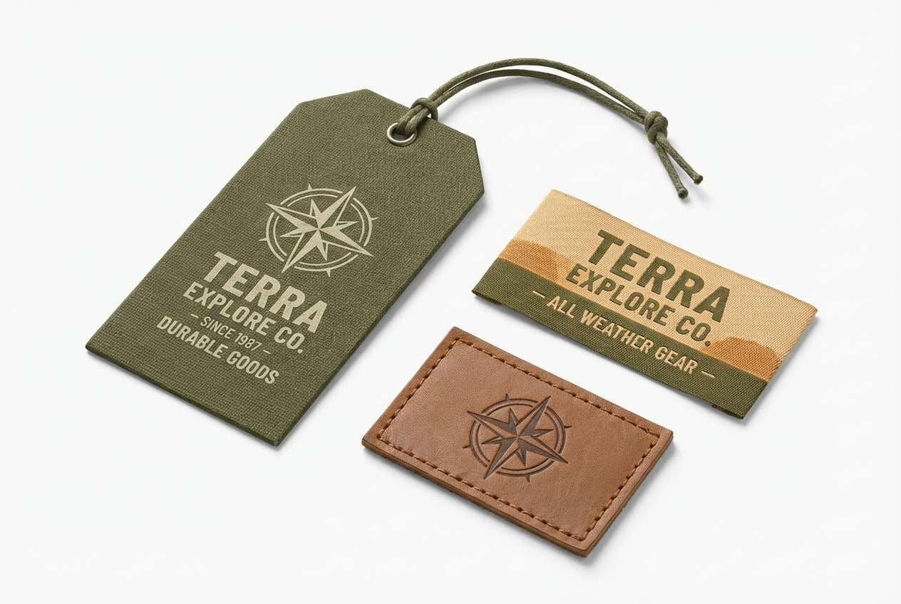
1) Field Jacket Minimal
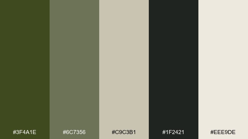
HEX: #3F4A1E #6C7356 #C9C3B1 #1F2421 #EEE9DE
Mood: grounded, utilitarian, clean
Best for: outdoor apparel branding and hangtags
Grounded and practical, like a well-worn field jacket and canvas gear. The deep olive anchors layouts, while warm stone and soft off-white keep everything readable and modern. Use the near-black for type and small details to avoid muddy contrast. For an army green color palette that feels premium, keep backgrounds light and reserve the olive for key shapes and badges.
Image example of field jacket minimal generated using media.io
Media.io is an online AI studio for creating and editing video, image, and audio in your browser.

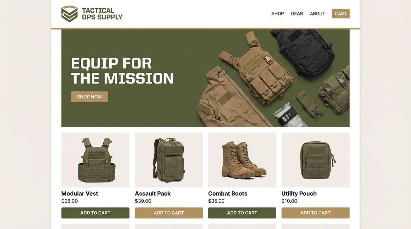
2) Desert Patrol Neutrals
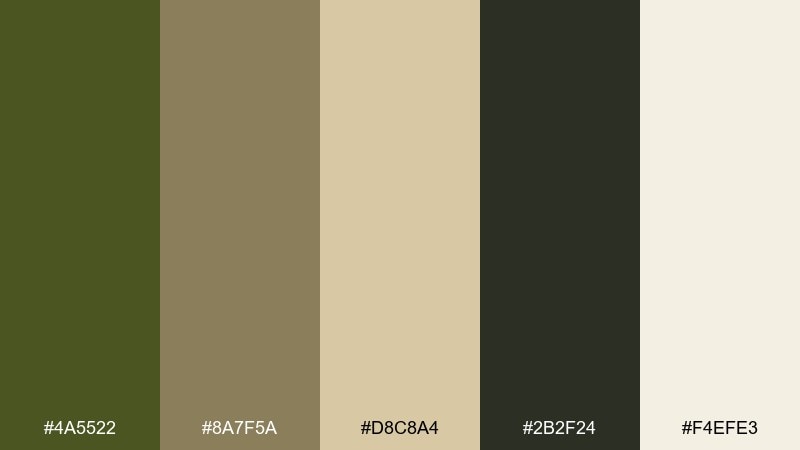
HEX: #4A5522 #8A7F5A #D8C8A4 #2B2F24 #F4EFE3
Mood: sunbaked, calm, resilient
Best for: tactical gear ecommerce and landing pages
Sunbaked tones evoke dust, canvas, and long trails under a bright sky. The olive base reads sturdy, while khaki and sand bring warmth that works well for product grids. Keep the charcoal for buttons and headings so calls to action stay crisp. Pair with subtle grain textures and plenty of spacing for a dependable, modern look.
Image example of desert patrol neutrals generated using media.io
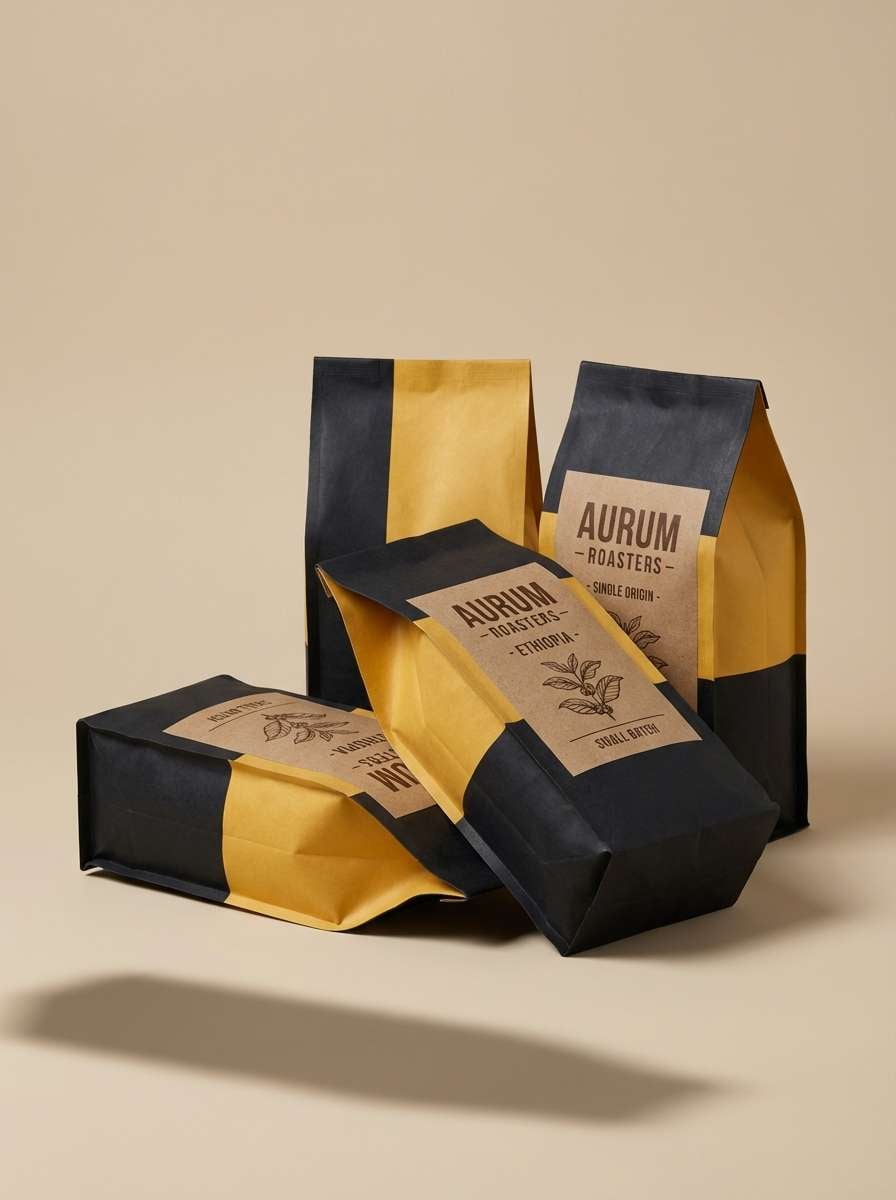
3) Moss and Copper Accent
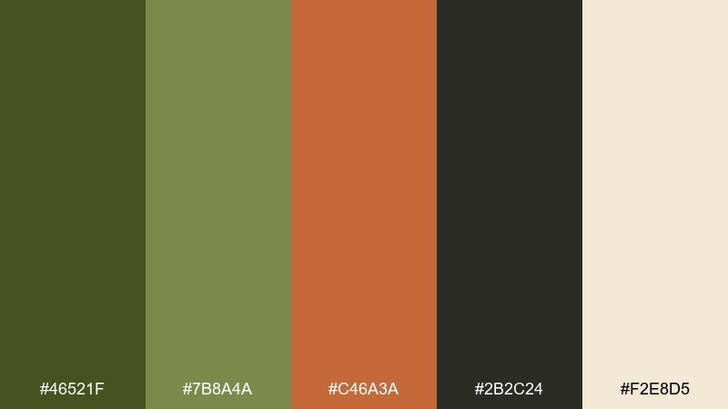
HEX: #46521F #7B8A4A #C46A3A #2B2C24 #F2E8D5
Mood: earthy, handcrafted, bold
Best for: coffee packaging and artisan product labels
Earthy and handcrafted, like mossy stone warmed by hammered copper. The copper accent instantly energizes the olive base, creating army green color combinations that feel intentional rather than purely utilitarian. Use cream for label backgrounds and keep copper limited to seals, icons, or a single headline. A matte finish helps the warm accent look richer and less orange.
Image example of moss and copper accent generated using media.io
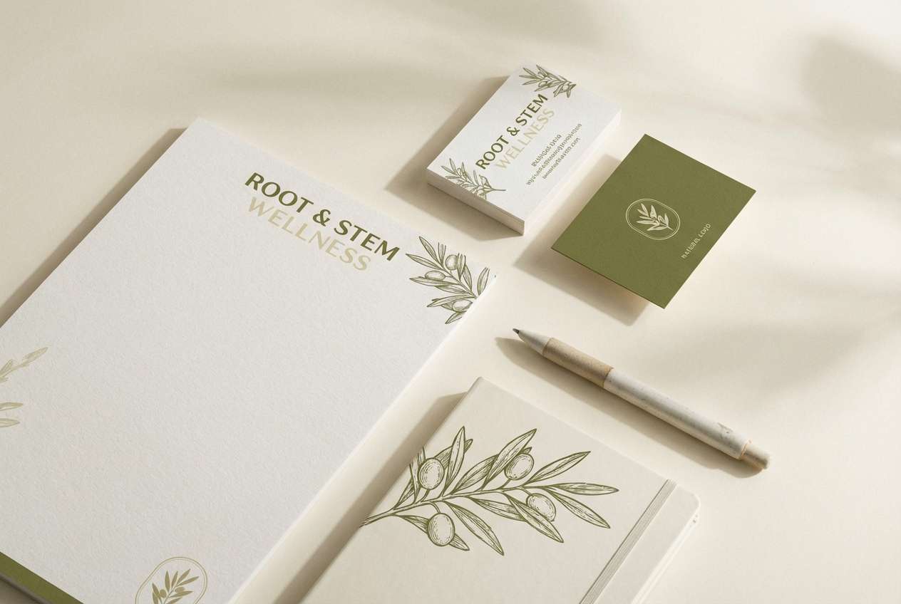
4) Olive and Cream Studio
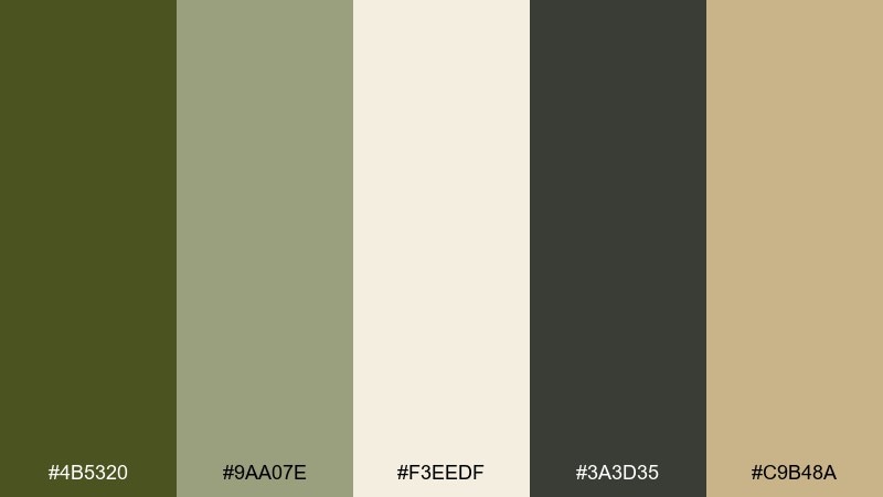
HEX: #4B5320 #9AA07E #F3EEDF #3A3D35 #C9B48A
Mood: soft, airy, contemporary
Best for: wellness brand identity and stationery
Soft and airy, like linen curtains in a sunlit studio. Cream and pale sage give the olive room to breathe, while graphite keeps typography sharp. Use the warm tan as a quiet secondary accent for dividers and icons. It works best with minimal layouts and generous margins to keep the palette feeling calm.
Image example of olive and cream studio generated using media.io
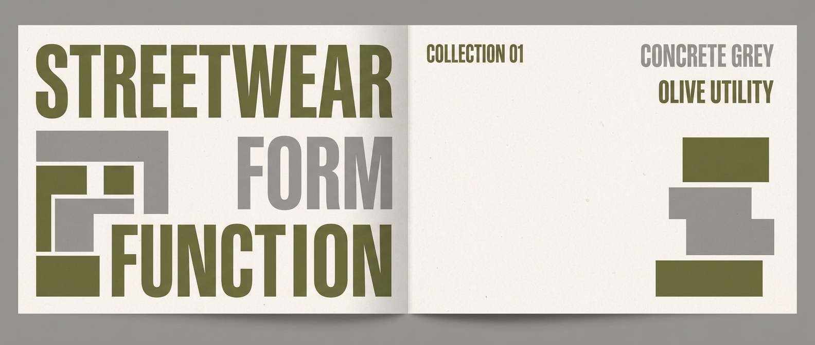
5) Urban Camo Concrete
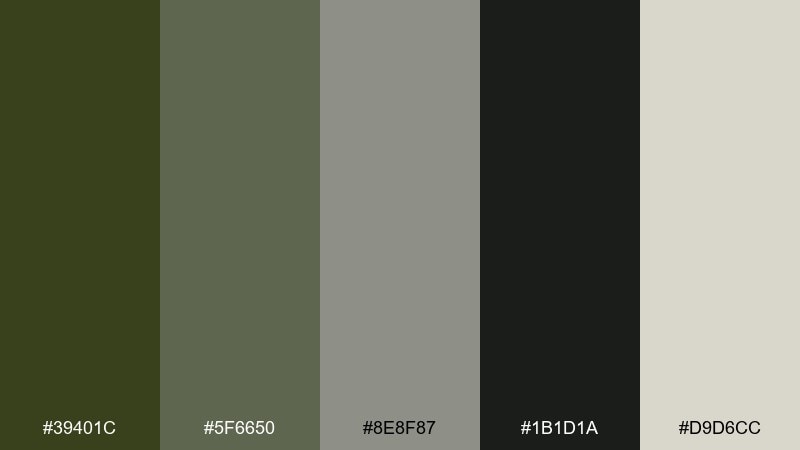
HEX: #39401C #5F6650 #8E8F87 #1B1D1A #D9D6CC
Mood: stealthy, urban, understated
Best for: streetwear lookbooks and campaign banners
Stealthy and urban, like concrete alleys and muted camo layers. The gray range keeps the olive from feeling too outdoorsy, making it easy to use for modern fashion layouts. Push contrast by setting headlines in near-black and reserving mid-gray for body text. Add subtle pattern blocks or oversized type for a stronger streetwear edge.
Image example of urban camo concrete generated using media.io
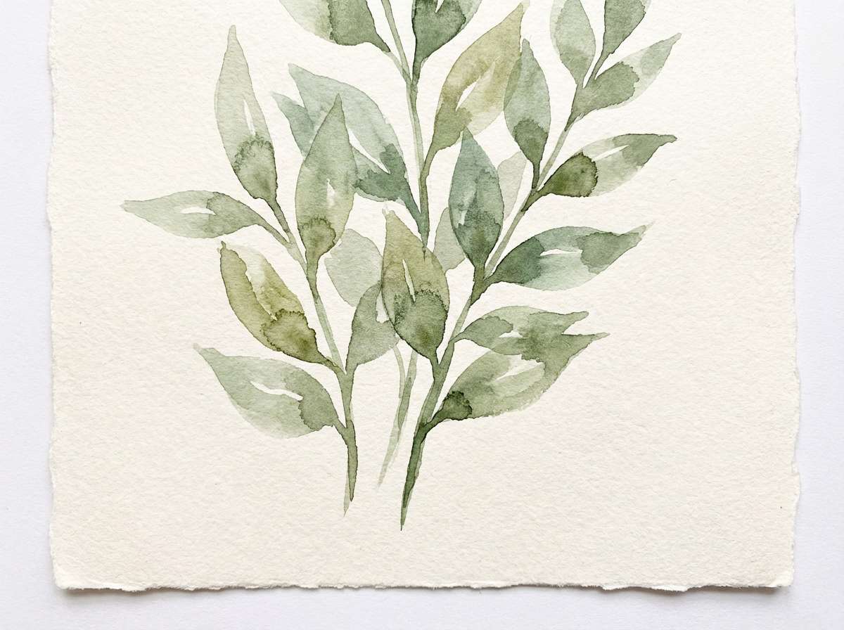
6) Botanical Sage Wash
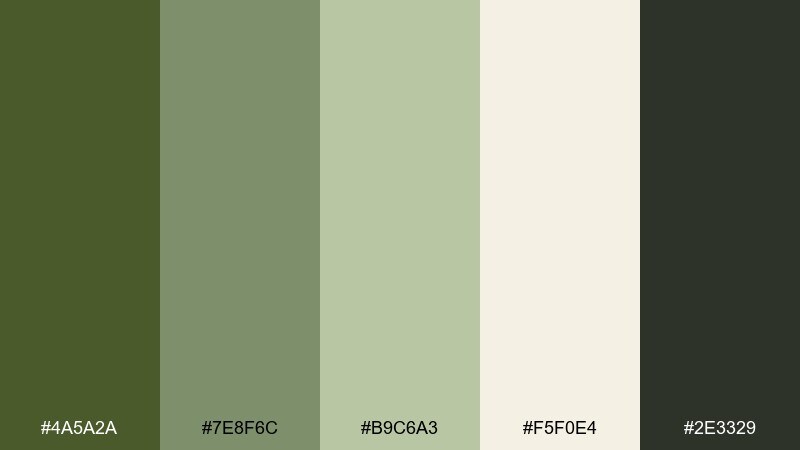
HEX: #4A5A2A #7E8F6C #B9C6A3 #F5F0E4 #2E3329
Mood: fresh, botanical, gentle
Best for: spring botanical illustrations and blog headers
Fresh and botanical, like a morning garden mist settling on leaves. The lighter sage tones make the deeper green feel friendly and natural, not heavy. Keep text in the dark olive for a softer alternative to black. This mix shines with watercolor textures, delicate line art, and wide white space.
Image example of botanical sage wash generated using media.io
7) Vintage Barracks Poster
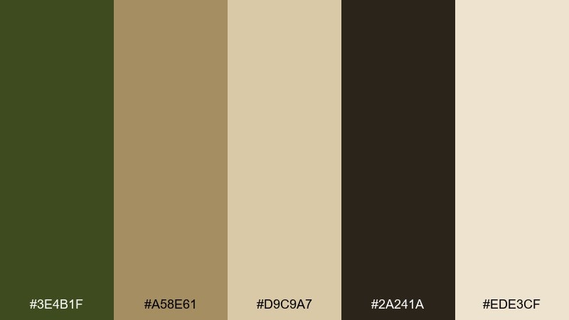
HEX: #3E4B1F #A58E61 #D9C9A7 #2A241A #EDE3CF
Mood: retro, rugged, nostalgic
Best for: event posters and retro-inspired prints
Retro and rugged, like aged paper pinned to a barracks wall. The warm tan and parchment tones give the olive a vintage cast that feels authentic in print. Use the dark brown-black for bold display type and keep the olive for large blocks and illustration fills. A slightly off-white background helps the whole design look intentionally weathered.
Image example of vintage barracks poster generated using media.io
8) Olive Dark Mode UI
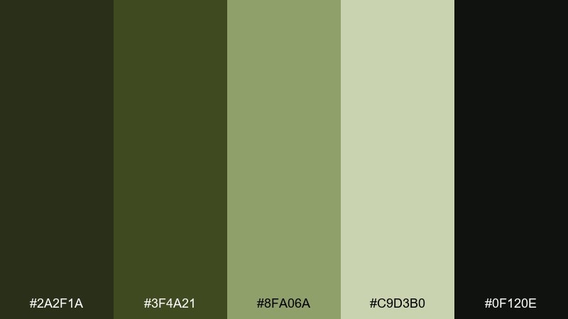
HEX: #2A2F1A #3F4A21 #8FA06A #C9D3B0 #0F120E
Mood: sleek, technical, focused
Best for: dashboard UI and data-heavy apps
Sleek and focused, like night-vision interfaces and quiet control rooms. The near-black base keeps glare low, while muted green highlights guide attention without feeling neon. Use the pale sage for selected states, charts, and micro-interactions. Keep surfaces separated with subtle elevation and avoid large areas of the brightest tint.
Image example of olive dark mode ui generated using media.io
9) Rustic Cabin Kitchen
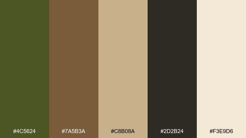
HEX: #4C5624 #7A5B3A #C8B08A #2D2B24 #F3E9D6
Mood: cozy, rustic, inviting
Best for: home decor mood boards and lifestyle blogs
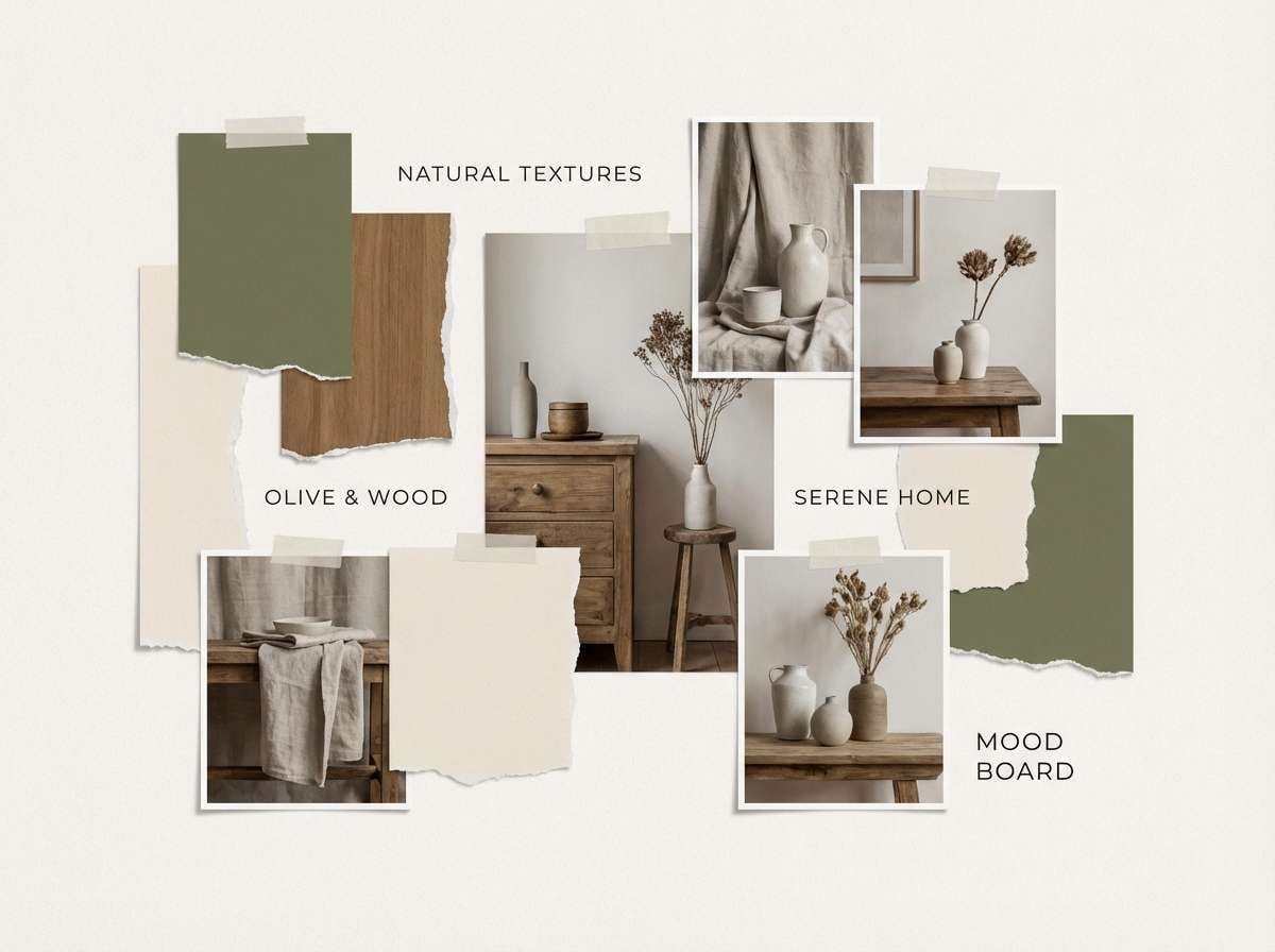
Cozy and rustic, like a cabin kitchen with wooden shelves and cast-iron pans. Olive plays well with warm brown and buttery beige, creating a welcoming, lived-in feel. Use the dark neutral for readable headlines and the cream for large background areas. A good tip is to add natural materials in imagery so the palette feels intentional, not murky.
Image example of rustic cabin kitchen generated using media.io
10) Olive and Gold Luxe
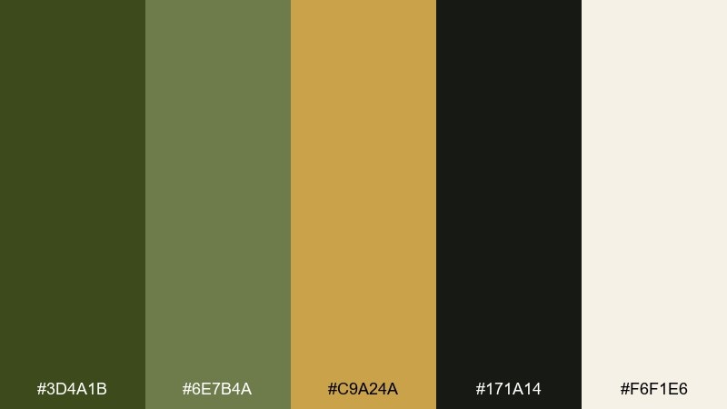
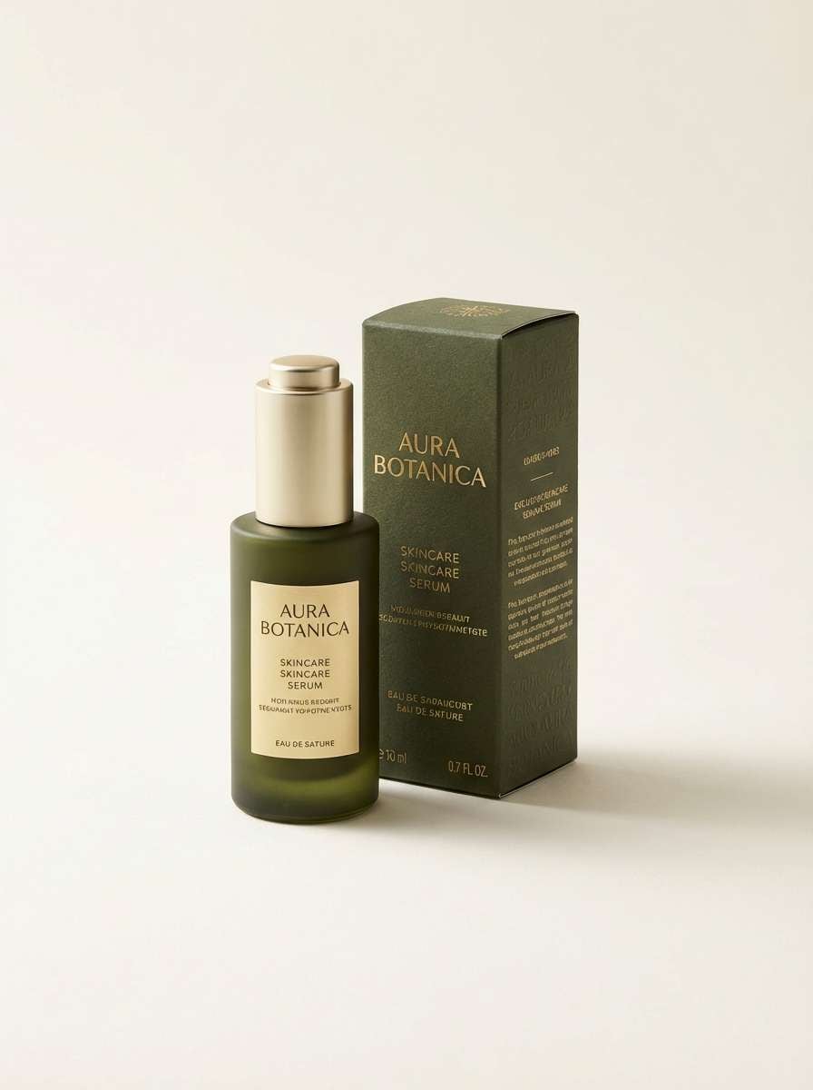
HEX: #3D4A1B #6E7B4A #C9A24A #171A14 #F6F1E6
Mood: luxurious, warm, refined
Best for: skincare packaging and premium product ads
Luxurious and warm, like olive silk with a hint of gold jewelry. The gold accent reads premium against deep green, while the soft ivory keeps the layout from feeling heavy. Use gold sparingly for foiled logos, borders, or a single highlight line. For photography, choose warm lighting so the gold stays rich instead of brassy.
Image example of olive and gold luxe generated using media.io
11) Coastal Marsh Sand
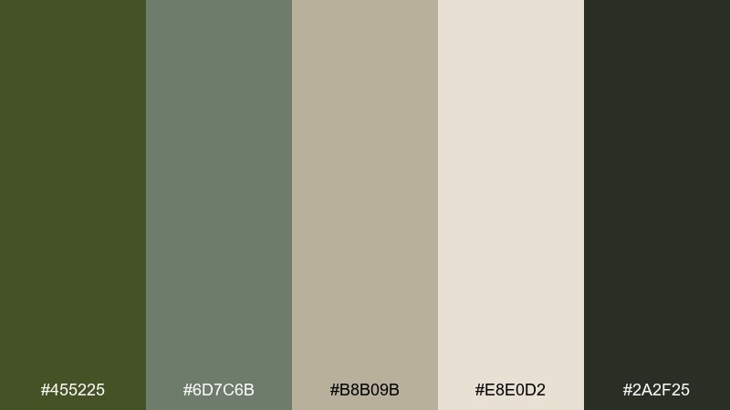
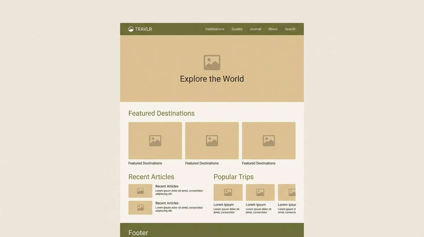
HEX: #455225 #6D7C6B #B8B09B #E8E0D2 #2A2F25
Mood: quiet, coastal, natural
Best for: travel guides and nature photography galleries
Quiet and coastal, like marsh grass bending over pale sand. The gray-green midtones soften the palette and keep it airy for content-heavy pages. Use the light sand as your primary canvas and bring in olive for navigation and section headers. It pairs especially well with misty landscape photos and minimal icon sets.
Image example of coastal marsh sand generated using media.io
12) Blush Olive Balance
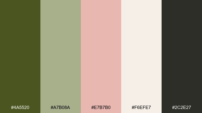
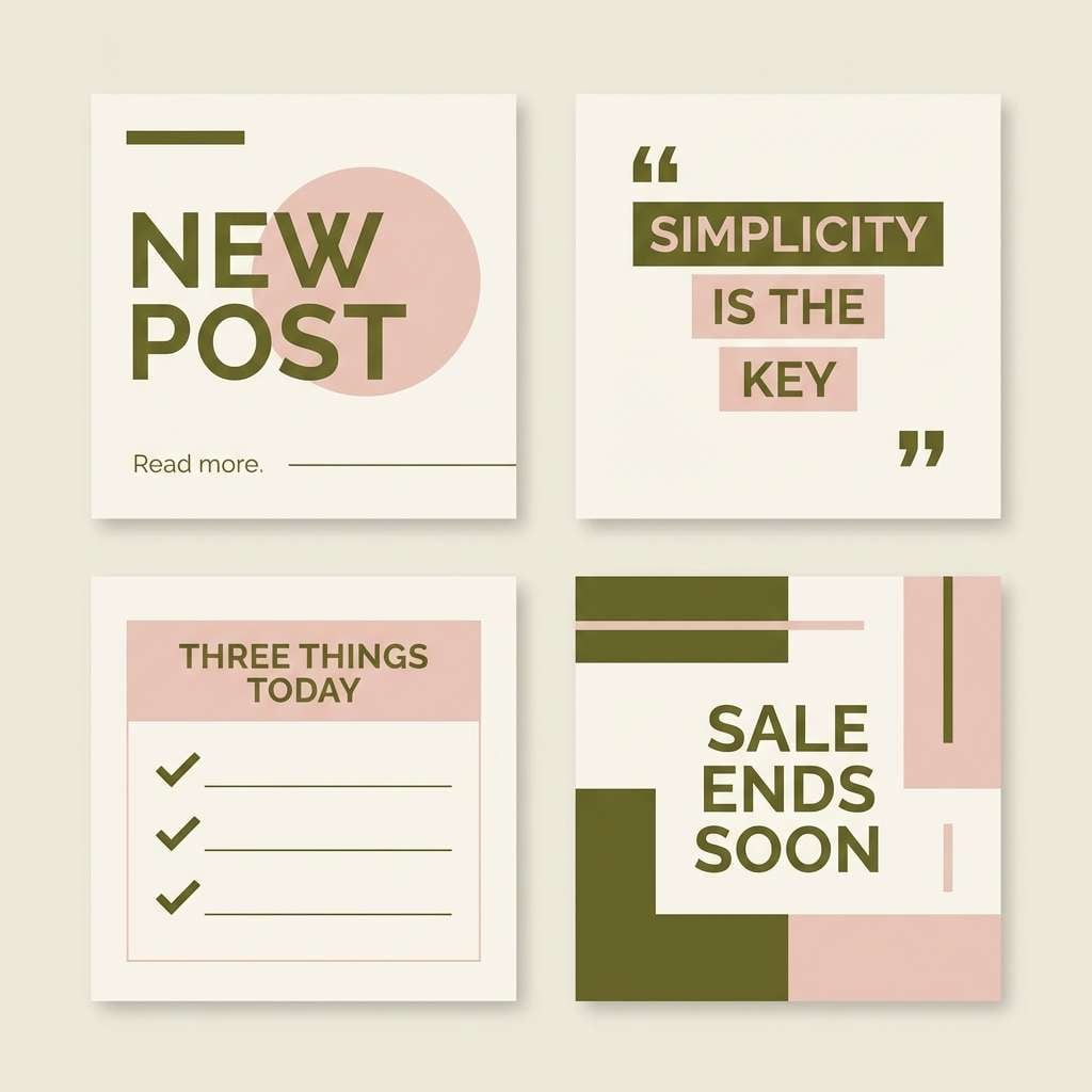
HEX: #4A5520 #A7B08A #E7B7B0 #F6EFE7 #2C2E27
Mood: soft, modern, romantic
Best for: beauty branding and social templates
Soft and modern, like blush makeup against a muted utility jacket. The blush tint lifts the green and creates an elegant contrast that still feels grown-up. Keep blush for accents and use the pale neutral as the main background for clean typography. For an army green color palette that looks fresh on social posts, stick to simple shapes and consistent spacing.
Image example of blush olive balance generated using media.io
13) Graphite Pine Contrast
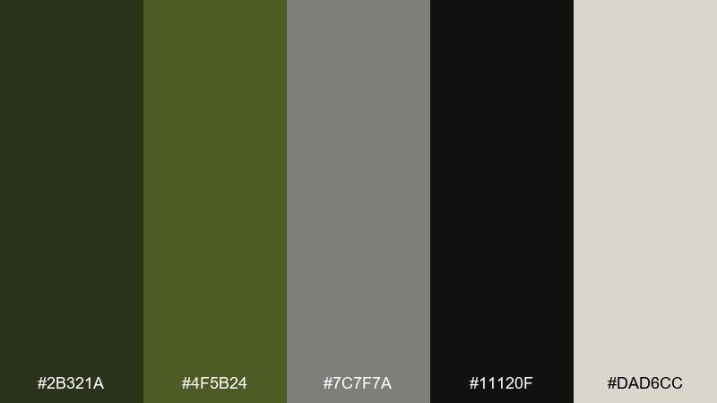
HEX: #2B321A #4F5B24 #7C7F7A #11120F #DAD6CC
Mood: sharp, modern, architectural
Best for: tech branding and minimalist websites
Sharp and architectural, like pine shadows cast on concrete. The graphite range keeps the greens looking modern, not outdoorsy, and supports strong hierarchy. This army green color combination works best with bold sans-serif type and restrained iconography. Use the light neutral for negative space so the darker tones never feel cramped.
Image example of graphite pine contrast generated using media.io
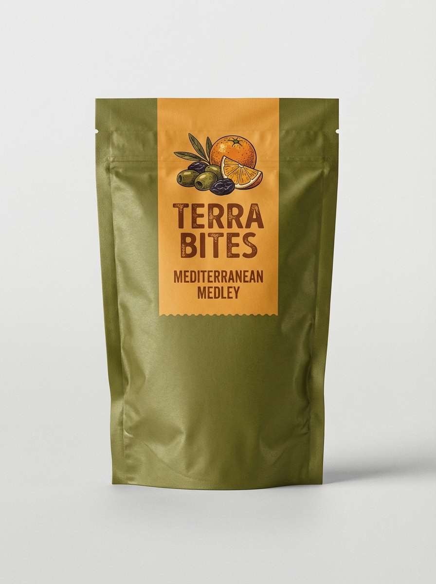
14) Autumn Trail Mix
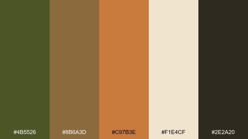
HEX: #4B5526 #8B6A3D #C97B3E #F1E4CF #2E2A20
Mood: warm, outdoorsy, energetic
Best for: snack packaging and seasonal promos
Warm and outdoorsy, like fall hikes and trail mix tossed in a canvas pouch. Cinnamon and orange bring instant energy, while the creamy base keeps the palette from turning too dark. Use the orange as a limited highlight for callouts and flavor badges. For best readability, keep body copy on the light cream and reserve the darker tones for headings.
Image example of autumn trail mix generated using media.io
15) Concrete and Lichen
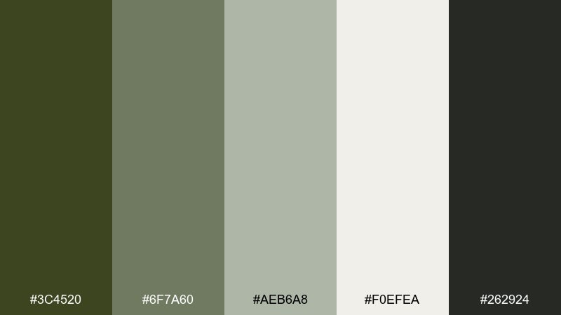
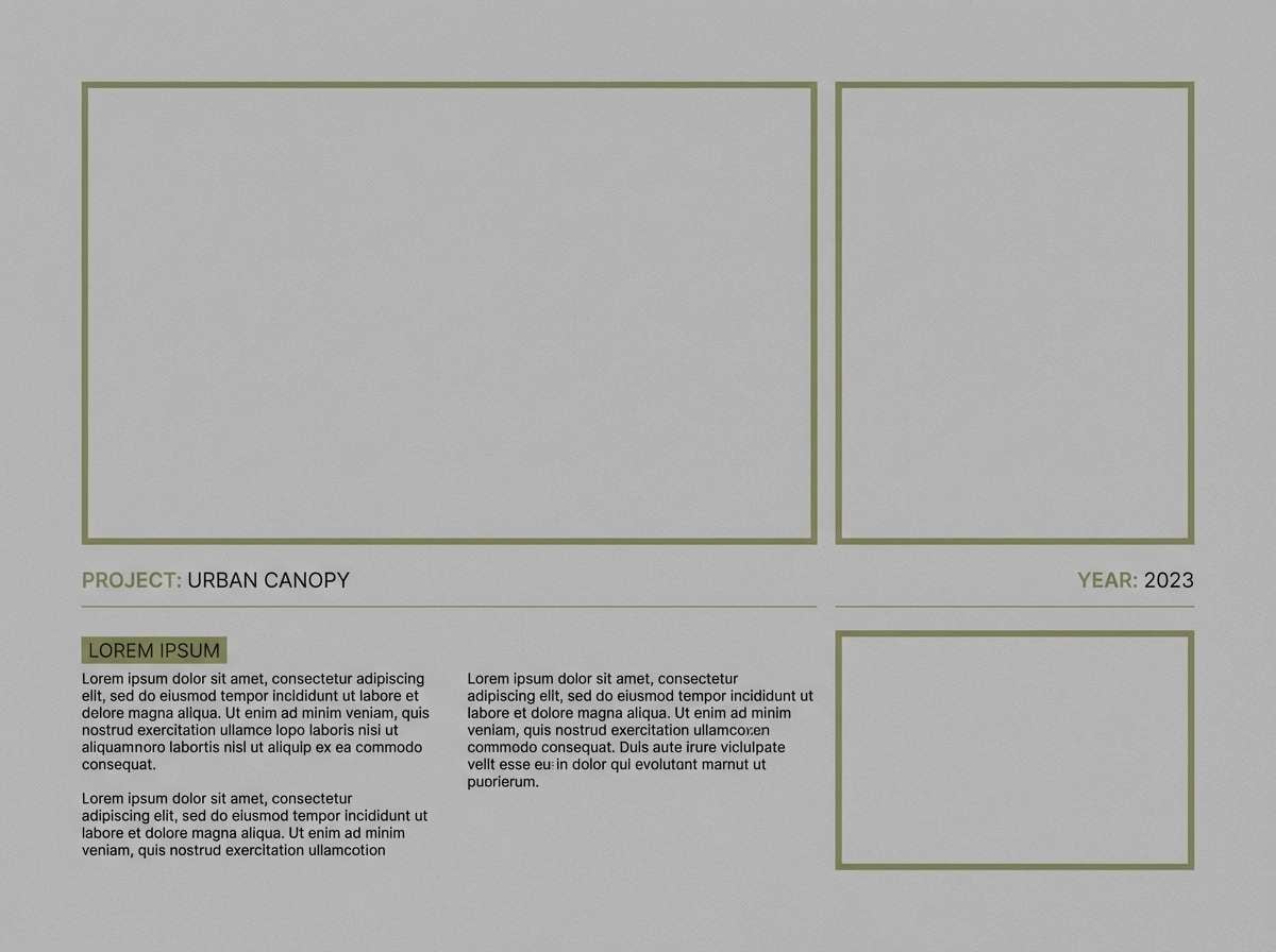
HEX: #3C4520 #6F7A60 #AEB6A8 #F0EFEA #262924
Mood: neutral, modern, calm
Best for: architecture portfolios and case studies
Neutral and calm, like lichen on stone and soft daylight on concrete. The subtle green-graze makes layouts feel organic without stealing attention from imagery. These army green color combinations are ideal for portfolios, where you want a signature tone that stays quiet. Use the light gray as your main background and let olive appear in section headers and small UI states.
Image example of concrete and lichen generated using media.io
16) Night Ops Neon Pin
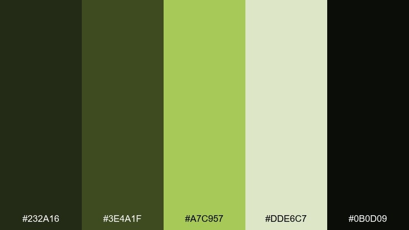
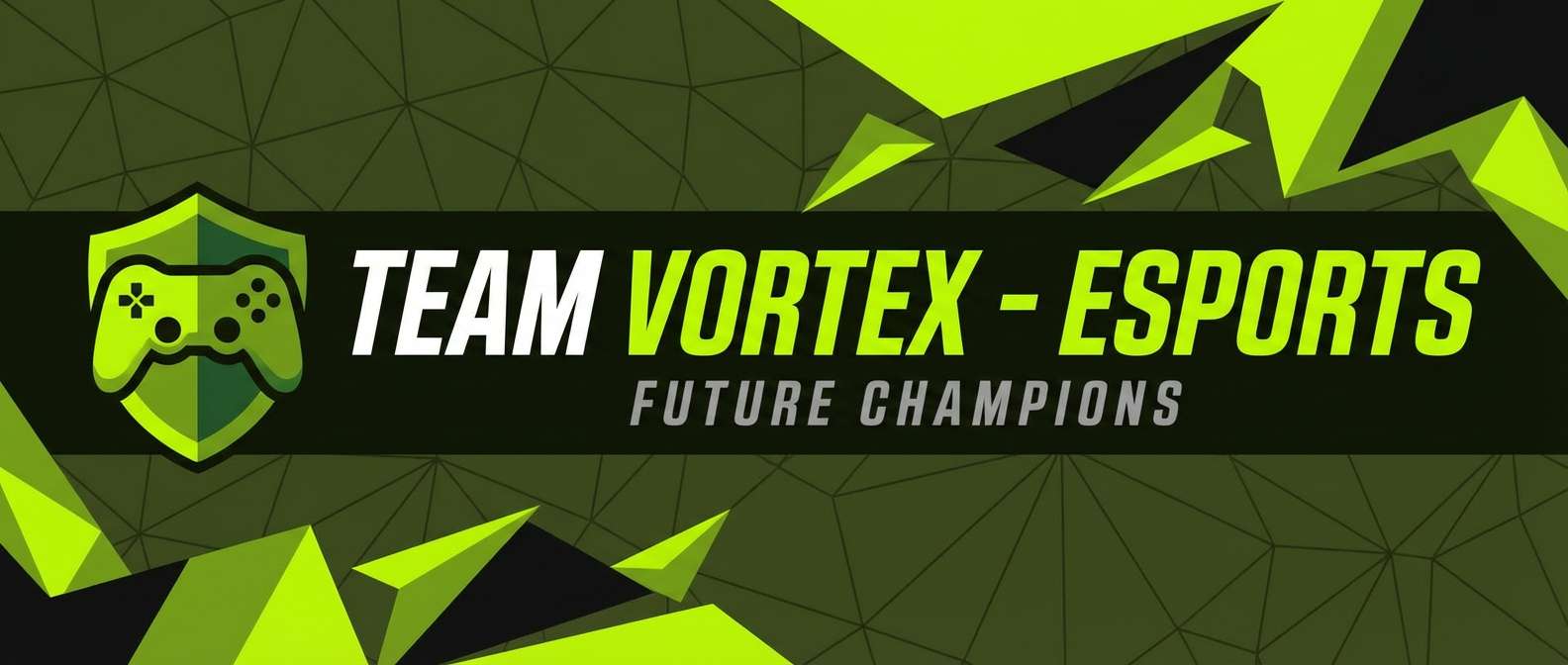
HEX: #232A16 #3E4A1F #A7C957 #DDE6C7 #0B0D09
Mood: edgy, tactical, high-contrast
Best for: gaming banners and esports graphics
Edgy and tactical, like night ops gear lit by a sharp glow stick. The lime accent punches through dark greens for attention-grabbing highlights on buttons and badges. Keep the brightest tint limited to one focal element per section to avoid a noisy look. It pairs well with condensed type, angular shapes, and subtle grid overlays.
Image example of night ops neon pin generated using media.io
17) Leather Workshop
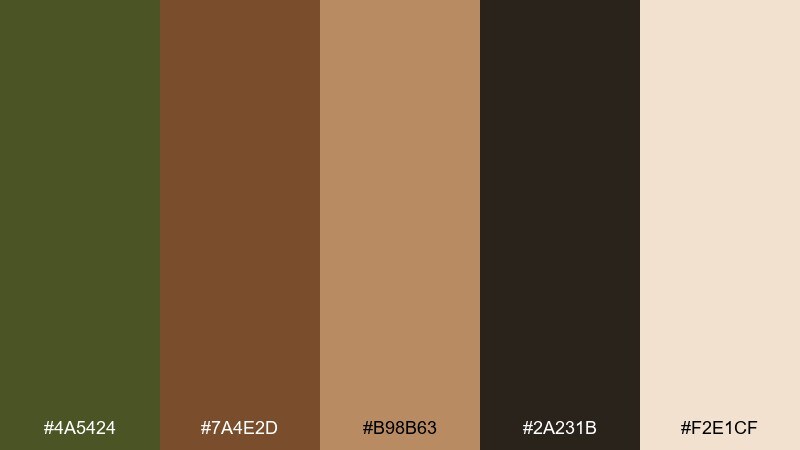
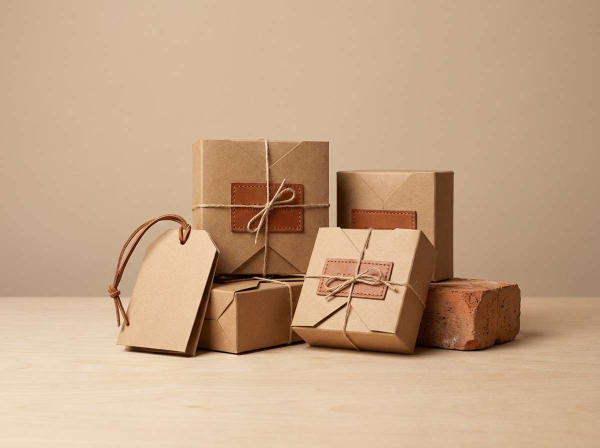
HEX: #4A5424 #7A4E2D #B98B63 #2A231B #F2E1CF
Mood: craft, heritage, warm
Best for: leather goods branding and product pages
Craft-forward and warm, like a leather workshop with oiled tools and patinaed edges. Olive becomes more refined when paired with rich browns and caramel highlights. Use the dark brown for logos and top navigation, then bring in the lighter tan for secondary buttons and icons. Product photography looks best on a creamy backdrop to keep the tones true.
Image example of leather workshop generated using media.io
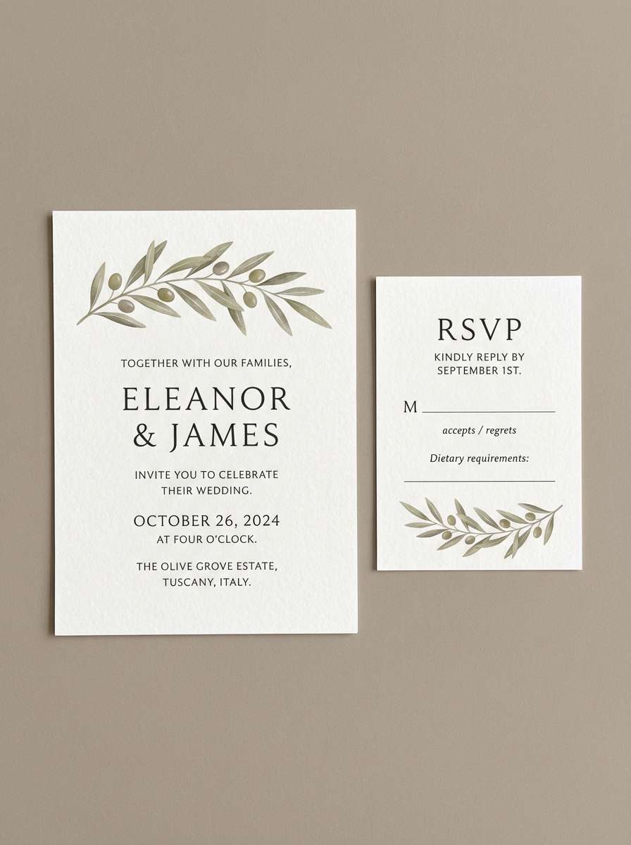
18) Olive Wedding Minimal
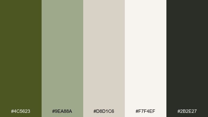
HEX: #4C5623 #9EA88A #D8D1C6 #F7F4EF #2B2E27
Mood: elegant, natural, understated
Best for: wedding invitations and RSVP cards
Elegant and natural, like olive branches pressed into handmade paper. The pale neutrals keep the green feeling airy, which is perfect for fine type and generous whitespace. Use the deepest tone for names and headings, and keep the mid-sage for borders or small motifs. A subtle deckle-edge texture or light speckle can make the design feel more tactile.
Image example of olive wedding minimal generated using media.io
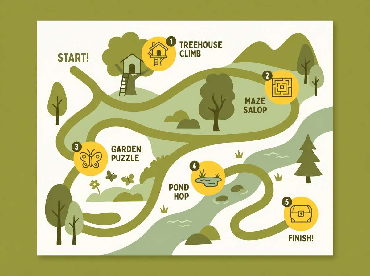
19) Adventure Map Kids
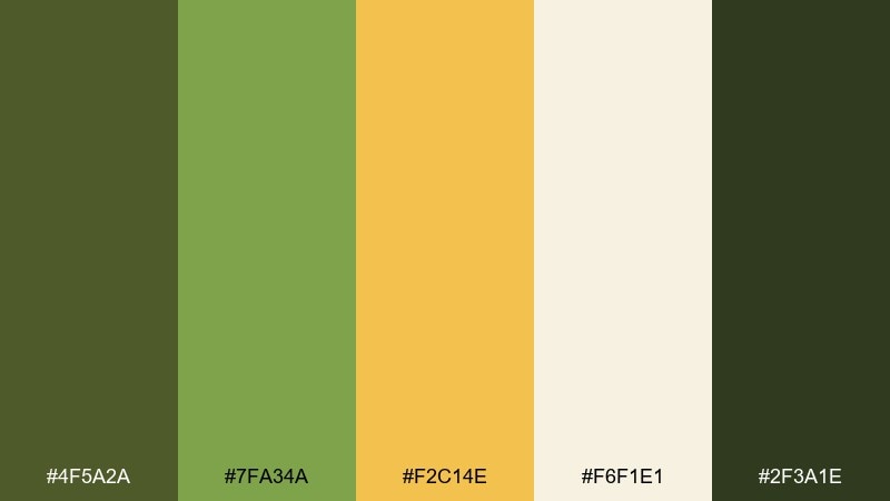
HEX: #4F5A2A #7FA34A #F2C14E #F6F1E1 #2F3A1E
Mood: playful, adventurous, bright
Best for: kids activity books and illustrated maps
Playful and adventurous, like a treasure map with sunny markers and leafy trails. The yellow brings a friendly pop while the greens keep it grounded for educational layouts. Use the light cream for page backgrounds so illustrations stay crisp. A good tip is to outline icons with the darker green to improve clarity at small sizes.
Image example of adventure map kids generated using media.io
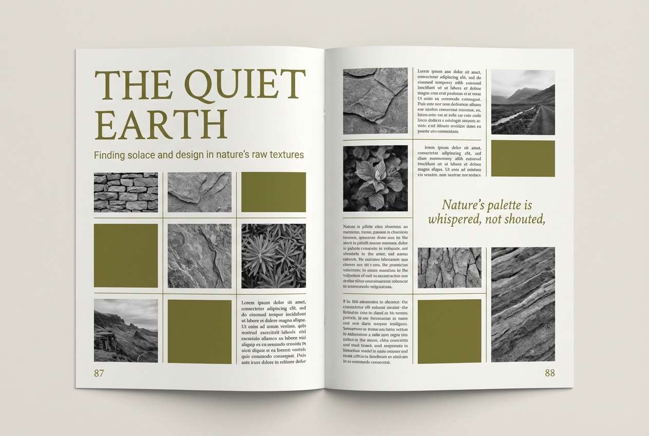
20) Nature Feature Editorial
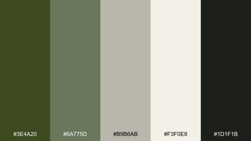
HEX: #3E4A20 #6A775D #B9B6AB #F3F0E8 #1D1F1B
Mood: editorial, thoughtful, serene
Best for: magazine spreads and long-form articles
Thoughtful and serene, like a quiet nature feature on textured paper. The soft grays give the green a sophisticated editorial tone that supports long reads. Keep body text in near-black, and use the olive for pull quotes, section numbers, and small rules. A restrained grid and consistent caption styling will make the palette feel polished.
Image example of nature feature editorial generated using media.io
What Colors Go Well with Army Green?
Army green pairs effortlessly with warm neutrals like cream, sand, tan, and parchment—these keep the palette readable and stop green from feeling heavy. For a more rugged look, add leather browns, rust, or copper.
If you want a modern or “urban” direction, combine army green with concrete grays, graphite, and near-black for clean hierarchy. For standout highlights, use small amounts of gold or a punchy lime accent.
For softer brand tones (beauty, lifestyle, weddings), muted blush or dusty rose works surprisingly well with army green, especially when balanced by light off-whites.
How to Use a Army Green Color Palette in Real Designs
Start with contrast planning: keep your primary background in a light neutral (cream/sand/light gray) and use army green for navigation, section headers, or key shapes. This prevents the “muddy” effect common with heavy greens.
Limit strong accents to a single job: gold for premium highlights, copper for handcrafted energy, lime for tactical UI emphasis, or blush for a modern soft counterpoint. Use near-black or deep charcoal for body text and buttons.
In print, lean into tactile materials—uncoated paper, subtle grain, or matte finishes—so army green reads intentional and rich. In UI, keep green highlights muted and reserve the brightest tint for selected states.
Create Army Green Palette Visuals with AI
If you already have HEX codes, you can turn them into on-brand visuals by describing the scene (product shot, UI mockup, poster, packaging) and calling out the color mood (utilitarian, luxe, editorial, playful).
To stay consistent across assets, reuse a single prompt structure and only swap the palette name, setting, and aspect ratio. Then iterate with small changes like “matte finish,” “soft shadow,” or “paper texture” to match your medium.
Media.io makes it easy to generate army green palette visuals for campaigns, mockups, and social templates—without installing anything.
Army Green Color Palette FAQs
-
What is the HEX code for army green?
Army green doesn’t have one single HEX value, but common “army/olive” anchors include #4B5320 and deeper olives like #3F4A1E. Pick your base based on whether you want a warmer (more brown) or cooler (more gray) green. -
Is army green the same as olive green?
They’re closely related, but army green typically reads more muted and utilitarian, often darker or grayer than classic olive. In palettes, “army green” is usually used as the anchor tone with neutrals and charcoal. -
What colors go with army green for a modern brand?
For a modern look, pair army green with graphite/charcoal, concrete grays, and a clean off-white. Keep accents minimal—gold for premium, or a restrained sage for UI highlights. -
What colors go with army green for a warm, rustic vibe?
Use army green with leather browns, caramel tan, butter cream, and rust/copper accents. Add natural textures (wood, paper, canvas) so the palette feels cozy rather than muddy. -
How do I make text readable on army green backgrounds?
Use light neutrals (ivory/cream) for large text on dark army green, or switch the layout so body text sits on a light background with army green used for headers and UI elements. Avoid mid-gray text on green—it often fails contrast. -
Can I use army green in dark mode UI?
Yes—army green works well in dark mode when the base is near-black and greens are used as muted highlights (selected states, charts, badges). Keep the brightest green limited to focal actions to reduce visual noise. -
What accent color makes army green look premium?
Muted gold is a classic premium accent with army green, especially when paired with ivory and near-black. Use it sparingly (logo foil, borders, small icons) to keep the look refined.
Next: Blue Green Color Palette


