

Silver is a design-friendly neutral that can look crisp and futuristic, or soft and elegant, depending on what you pair it with.
Below are 20 silver color palettes with HEX codes you can use for UI, branding, editorial layouts, and product visuals.
In this article
- Why Silver Palettes Work So Well
-
- chrome minimal silver
- pearl fog
- silver & sage
- graphite edge
- moonlit lavender silver
- steel blue silver
- rose quartz silver
- icy teal silver
- industrial concrete
- silver sand & wheat
- midnight silver
- silver citrus pop
- frosted mint silver
- silver plum ink
- glacier silver
- silver olive field
- sterling denim
- silver coral accent
- polished silver & gold
- silver charcoal mono
- What Colors Go Well with Silver?
- How to Use a Silver Color Palette in Real Designs
- Create Silver Palette Visuals with AI
Why Silver Palettes Work So Well
Silver sits in the sweet spot between bright white and deep charcoal, so it supports strong hierarchy without overwhelming the layout. It’s also naturally “premium” because it’s associated with metal, product finishes, and modern hardware.
In digital design, silver-like grays help reduce visual noise while keeping interfaces sharp and readable. They’re especially effective for dashboards, presentation decks, and editorial grids where spacing and typography matter.
In branding and packaging, silver can feel clean and clinical, or luxe and celebratory, based on the accent color you choose. That makes it a reliable base for building multiple looks from one core system.
20+ Silver Color Palette Ideas (with HEX Codes)
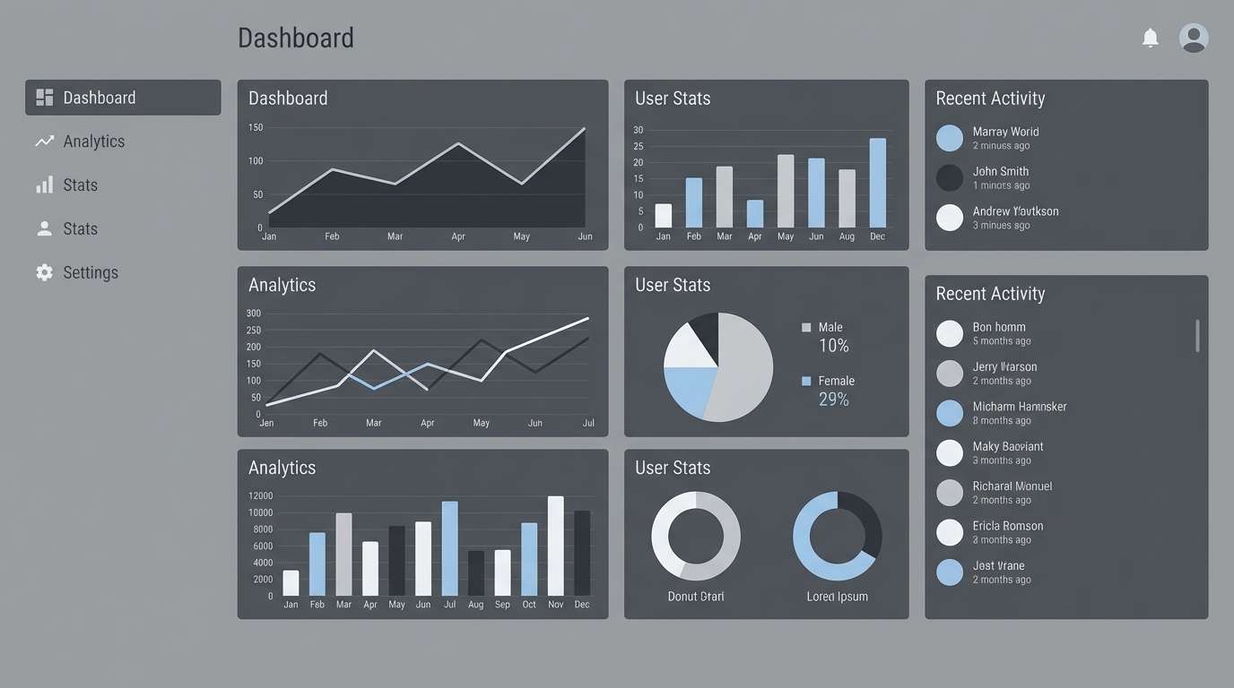
1) Chrome Minimal Silver
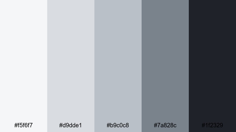
HEX: #f5f6f7 #d9dde1 #b9c0c8 #7a828c #1f2329
Mood: sleek, modern, high-contrast
Best for: UI dashboard
Use the light silvers for backgrounds and cards, mid silvers for dividers and secondary text, and the near-black for primary typography and CTAs to keep dashboards crisp and readable.
Image example of chrome minimal silver generated using media.io
Media.io is an online AI studio for creating and editing video, image, and audio in your browser.

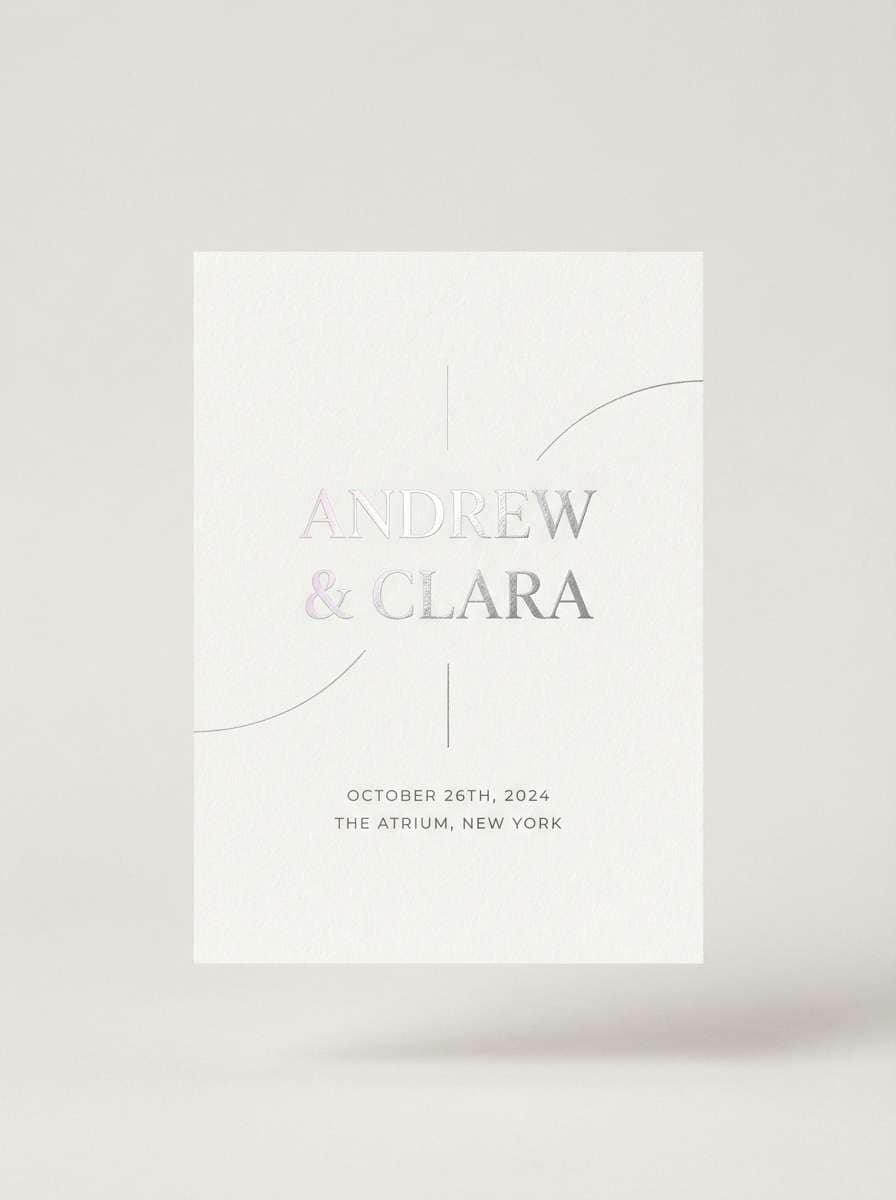
2) Pearl Fog
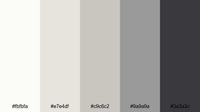
HEX: #fbfbfa #e7e4df #c9c6c2 #9a9a9a #3a3a3c
Mood: soft, airy, understated
Best for: wedding invitation
Pair the pearl white with warm fog grays for a refined invitation base, then use the darker gray sparingly for names and key details to keep the layout elegant and easy to read.
Image example of pearl fog generated using media.io
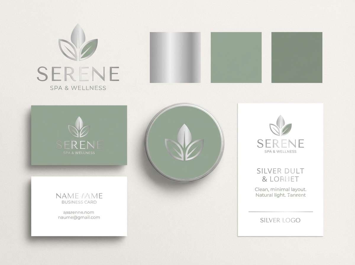
3) Silver & Sage
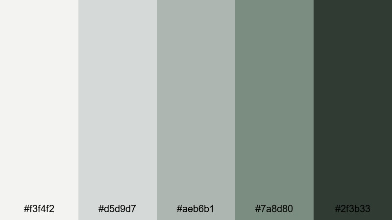
HEX: #f3f4f2 #d5d9d7 #aeb6b1 #7a8d80 #2f3b33
Mood: calm, natural, balanced
Best for: spa brand identity
Use the pale silver as negative space, sage as the signature brand accent, and the deep green-gray for logotype and headings to create a clean, restorative feel across touchpoints.
Image example of silver & sage generated using media.io
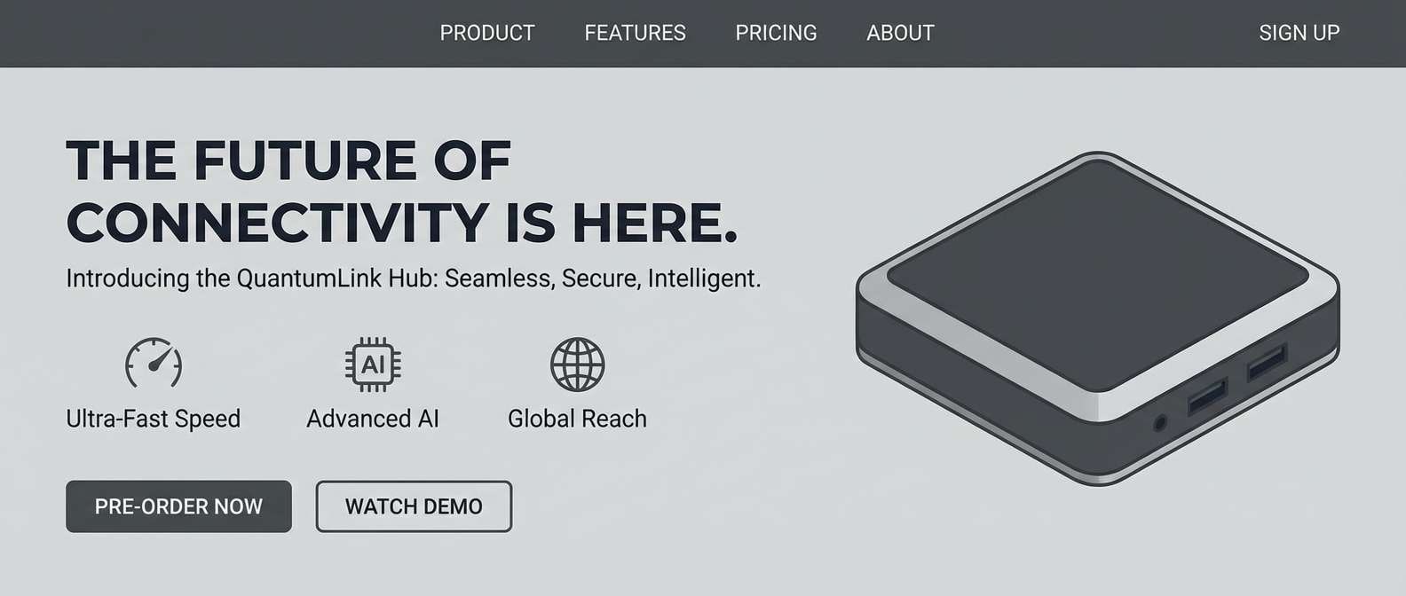
4) Graphite Edge
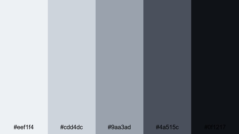
HEX: #eef1f4 #cdd4dc #9aa3ad #4a515c #0f1217
Mood: bold, technical, premium
Best for: product landing page UI
Let the cool light silver carry the page background, reserve graphite for navigation and footers, and use near-black for hero headlines to create a sharp, high-end tech look.
Image example of graphite edge generated using media.io
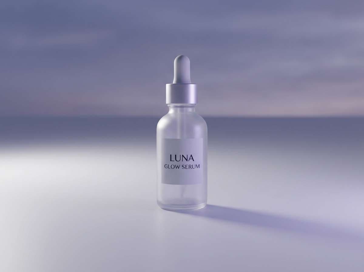
5) Moonlit Lavender Silver
HEX: #f7f5fa #ded9e6 #b8b1c4 #7b6f8e #2b2633
Mood: dreamy, elegant, modern
Best for: beauty product ad
Use the soft lavender-silver as a luminous backdrop, keep mid purples for secondary elements, and push contrast with deep plum for product name and key benefits.
Image example of moonlit lavender silver generated using media.io
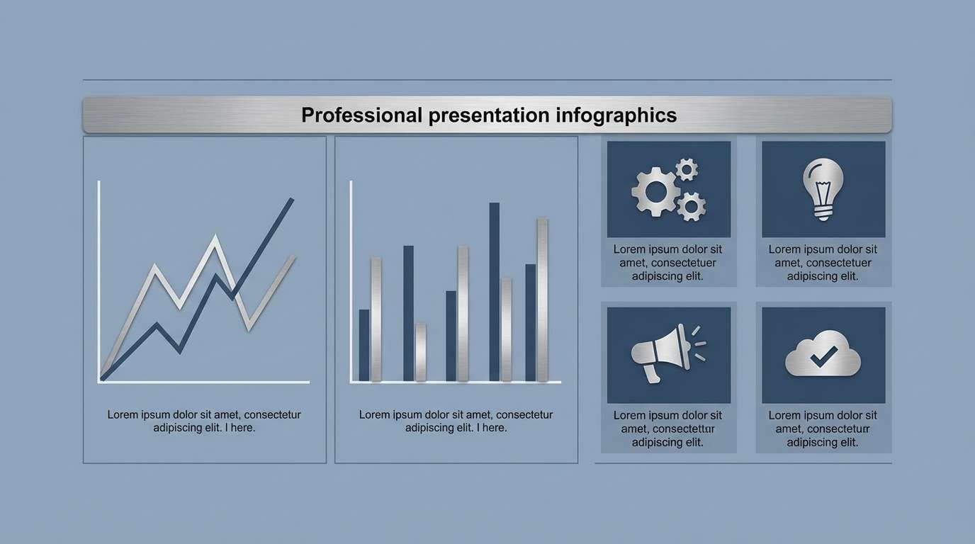
6) Steel Blue Silver
HEX: #f2f5f7 #d5dee6 #a9b6c4 #5b7a93 #1d2b36
Mood: clean, coastal, professional
Best for: corporate presentation
Use the pale steel as slide backgrounds, apply mid blues for charts and icons, and keep the deep navy-gray for titles to maintain clarity and a trustworthy tone.
Image example of steel blue silver generated using media.io
7) Rose Quartz Silver
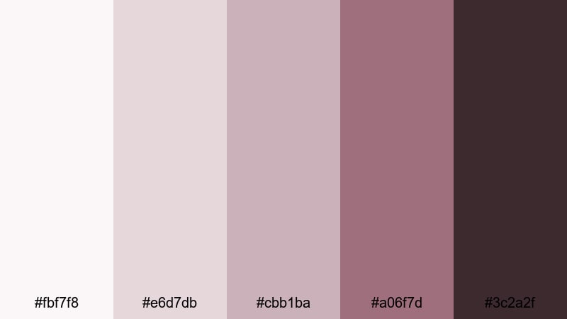
HEX: #fbf7f8 #e6d7db #cbb1ba #a06f7d #3c2a2f
Mood: romantic, soft, boutique
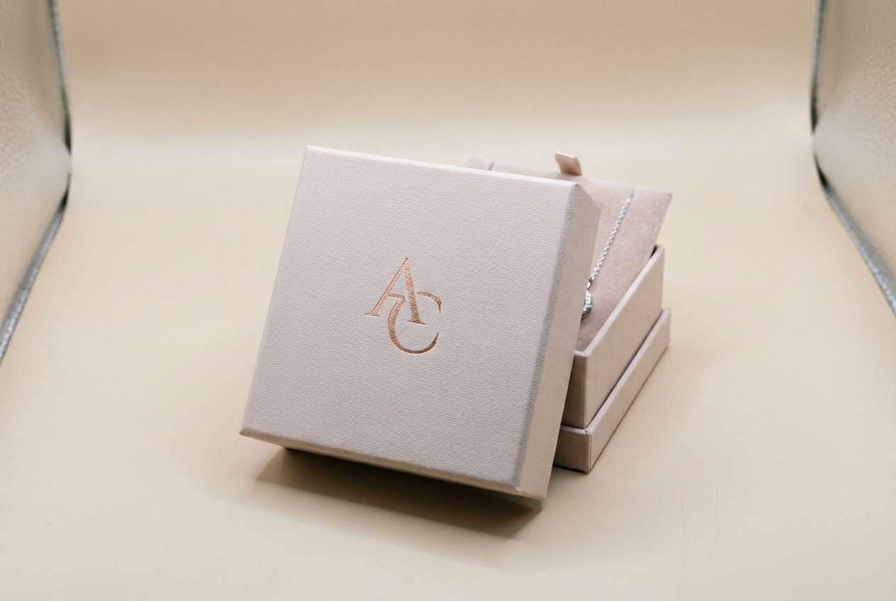
Best for: jewelry packaging
Use blush-silver for the box base and tissue paper, keep rose tones for accents like foil stamping, and ground the set with deep cocoa text for a refined unboxing.
Image example of rose quartz silver generated using media.io
8) Icy Teal Silver
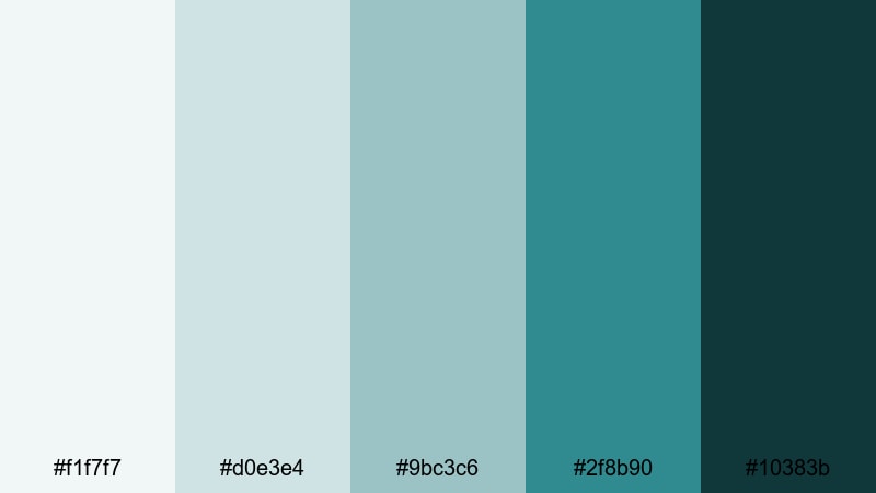
HEX: #f1f7f7 #d0e3e4 #9bc3c6 #2f8b90 #10383b
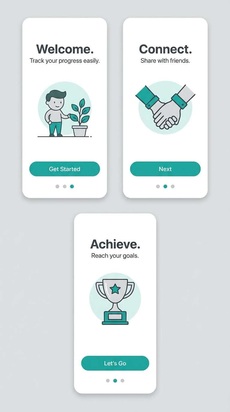
Mood: fresh, crisp, modern
Best for: app onboarding screens
Keep backgrounds icy and bright, use teal for progress indicators and primary buttons, and reserve the deep teal for headings so onboarding remains friendly but focused.
Image example of icy teal silver generated using media.io
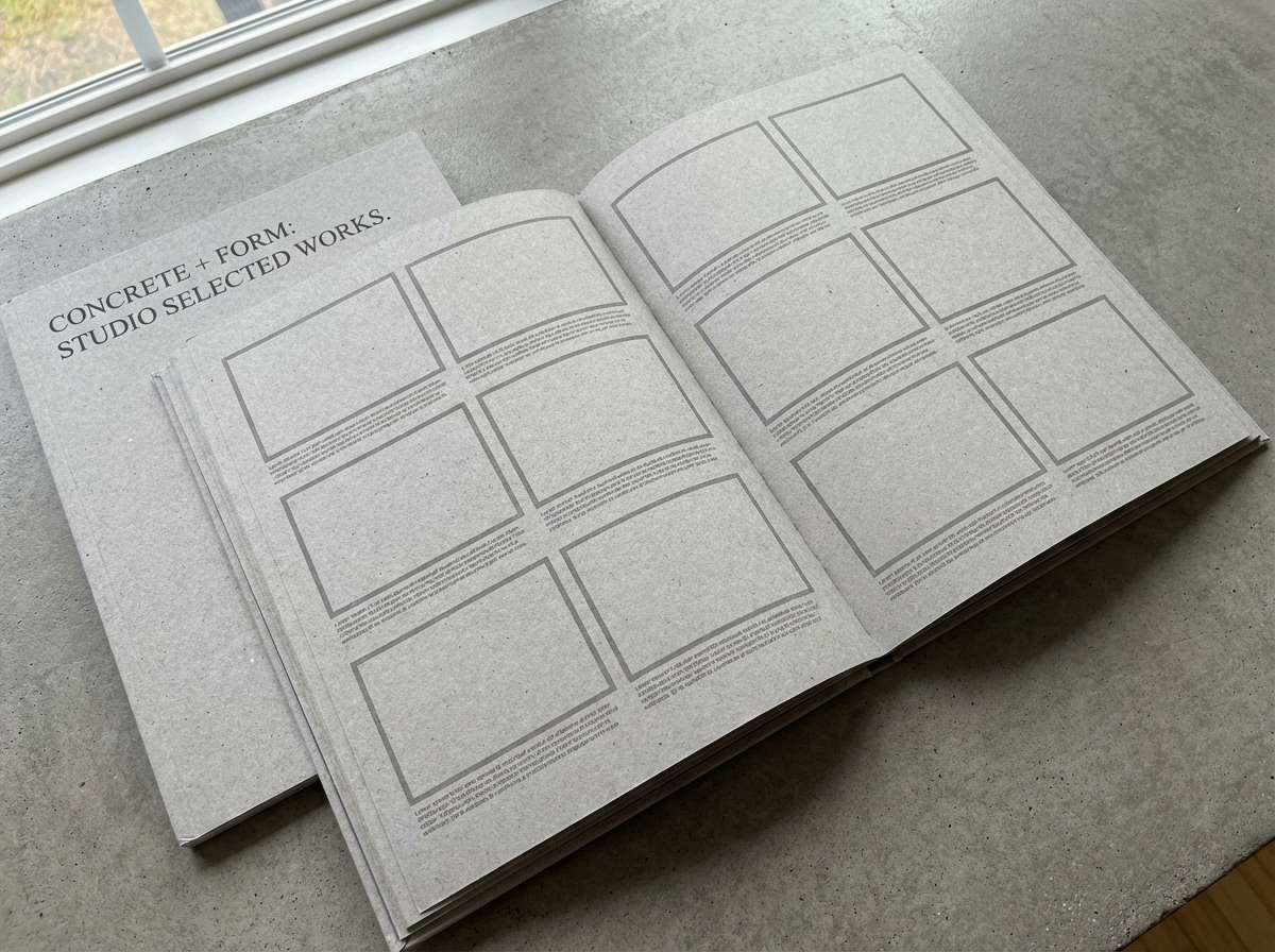
9) Industrial Concrete
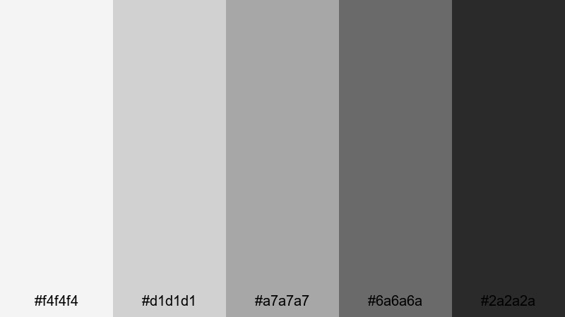
HEX: #f4f4f4 #d1d1d1 #a7a7a7 #6a6a6a #2a2a2a
Mood: industrial, utilitarian, grounded
Best for: architecture portfolio
Use light concrete grays for page sections, mid grays for captions and rules, and charcoal for headings to keep the work prominent while maintaining a professional structure.
Image example of industrial concrete generated using media.io
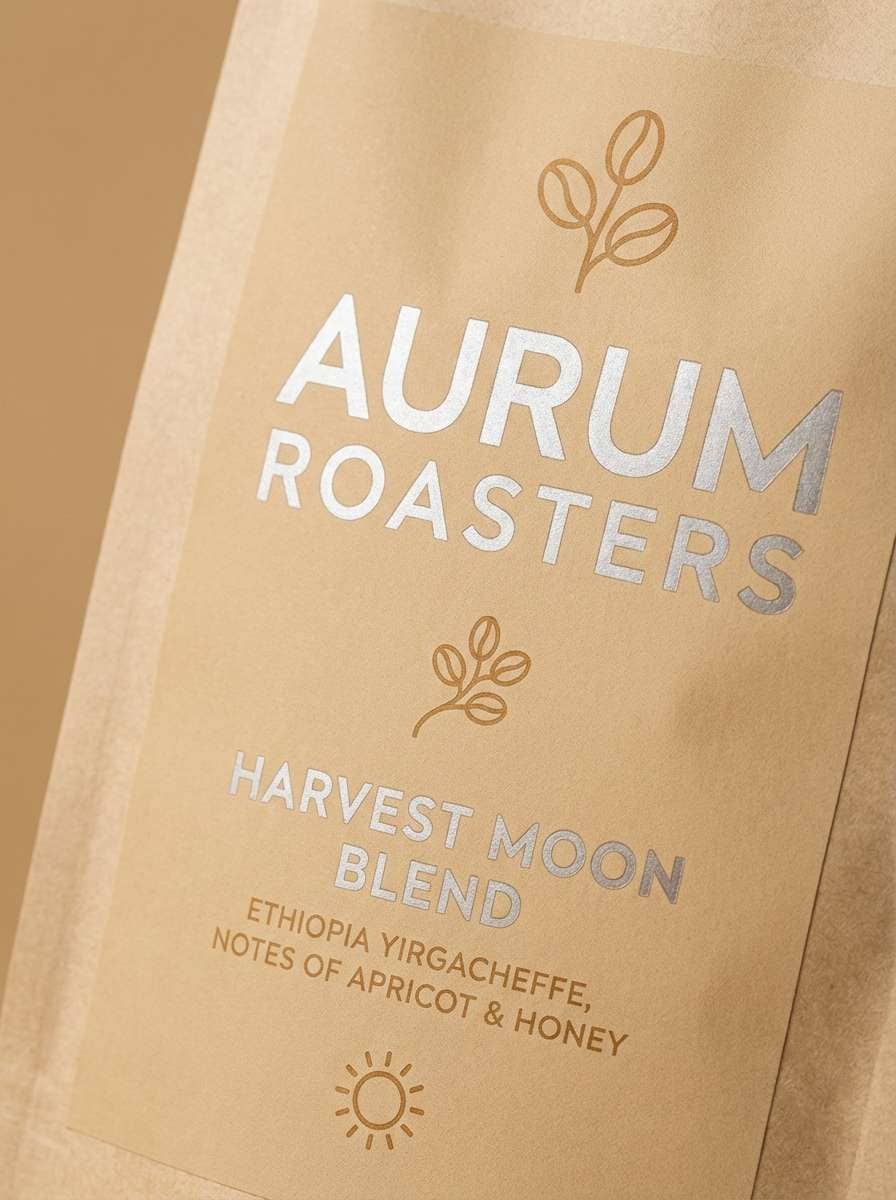
10) Silver Sand & Wheat
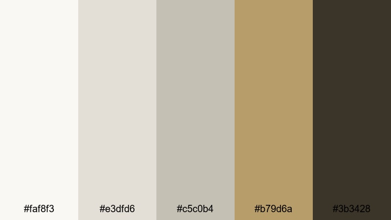
HEX: #faf8f3 #e3dfd6 #c5c0b4 #b79d6a #3b3428
Mood: warm, organic, premium
Best for: coffee label design
Pair warm silvers with wheat as the hero accent for origin or roast notes, then use deep brown for legibility; this keeps labels earthy while still polished.
Image example of silver sand & wheat generated using media.io
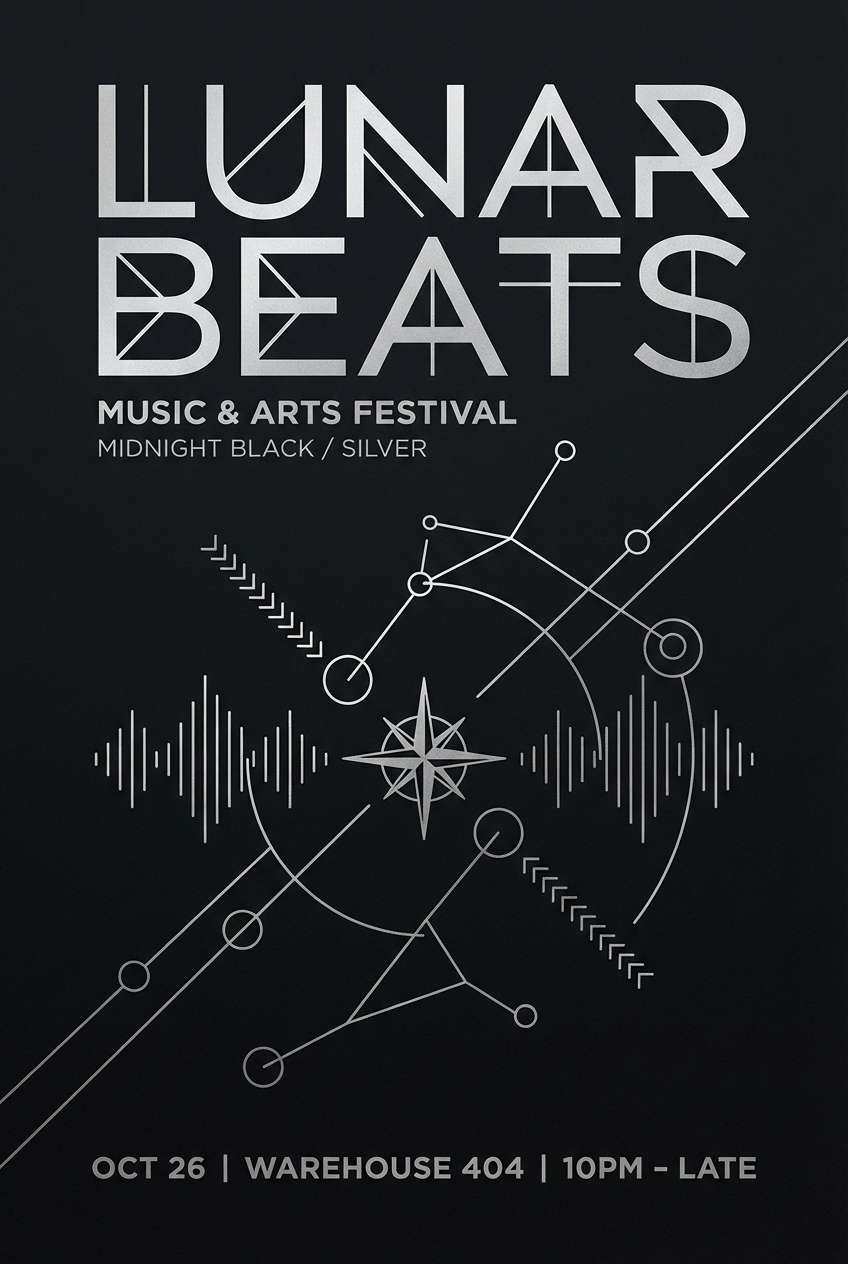
11) Midnight Silver
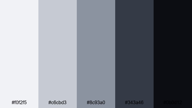
HEX: #f0f2f5 #c6cbd3 #8c93a0 #343a46 #0b0d12
Mood: dramatic, luxe, cinematic
Best for: event poster
Use pale silver for key typography, mid gray for supporting details, and near-black as the background to create strong hierarchy and an upscale night-event vibe.
Image example of midnight silver generated using media.io
12) Silver Citrus Pop
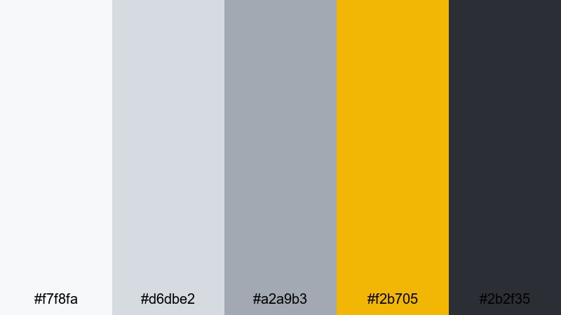
HEX: #f7f8fa #d6dbe2 #a2a9b3 #f2b705 #2b2f35
Mood: energetic, modern, attention-grabbing
Best for: product promo banner
Let silver tones keep the layout clean, then use the citrus yellow for price tags or primary CTAs; the dark slate anchors text so the accent never feels noisy.
Image example of silver citrus pop generated using media.io

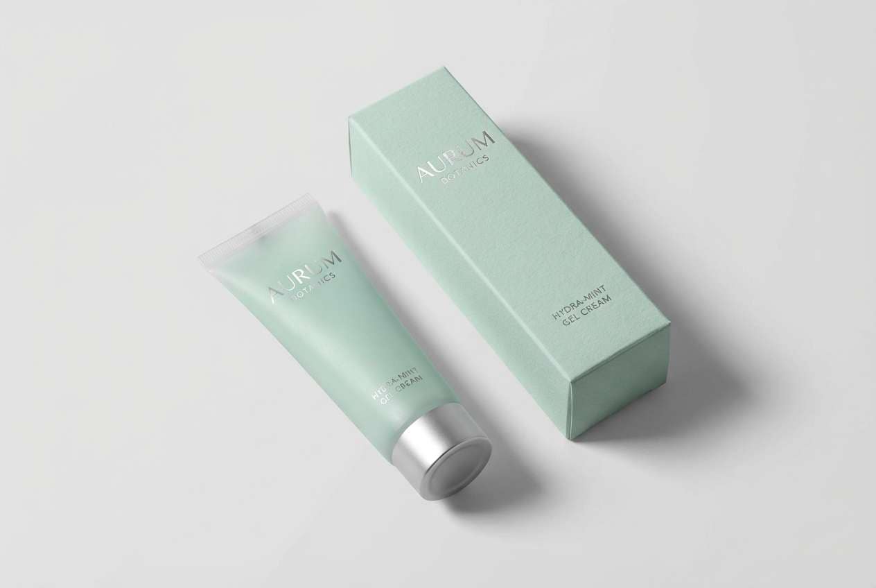
13) Frosted Mint Silver
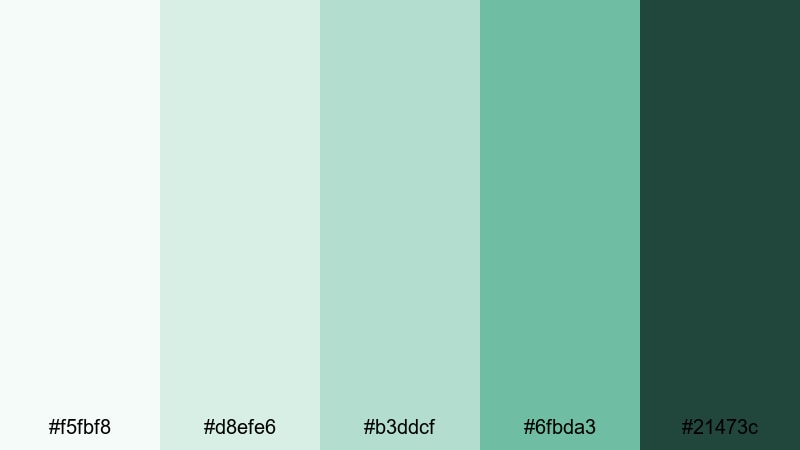
HEX: #f5fbf8 #d8efe6 #b3ddcf #6fbda3 #21473c
Mood: fresh, gentle, health-focused
Best for: skincare packaging
Use frosted silver-mint as the base to signal cleanliness, keep mint for highlight bands and icons, and use deep green for ingredients and directions for clear readability.
Image example of frosted mint silver generated using media.io
14) Silver Plum Ink
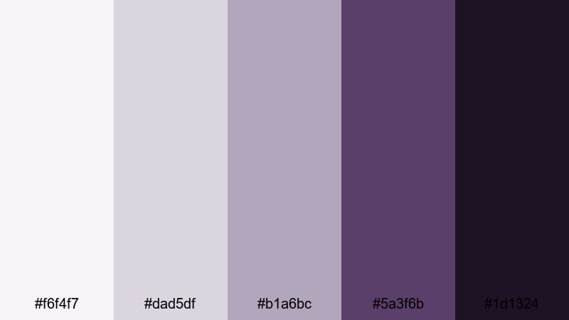
HEX: #f6f4f7 #dad5df #b1a6bc #5a3f6b #1d1324
Mood: creative, moody, sophisticated
Best for: book cover
Use pale silver-lilac for negative space, apply plum for title accents and small motifs, and keep ink-black for author name and fine text to maintain print clarity.
Image example of silver plum ink generated using media.io
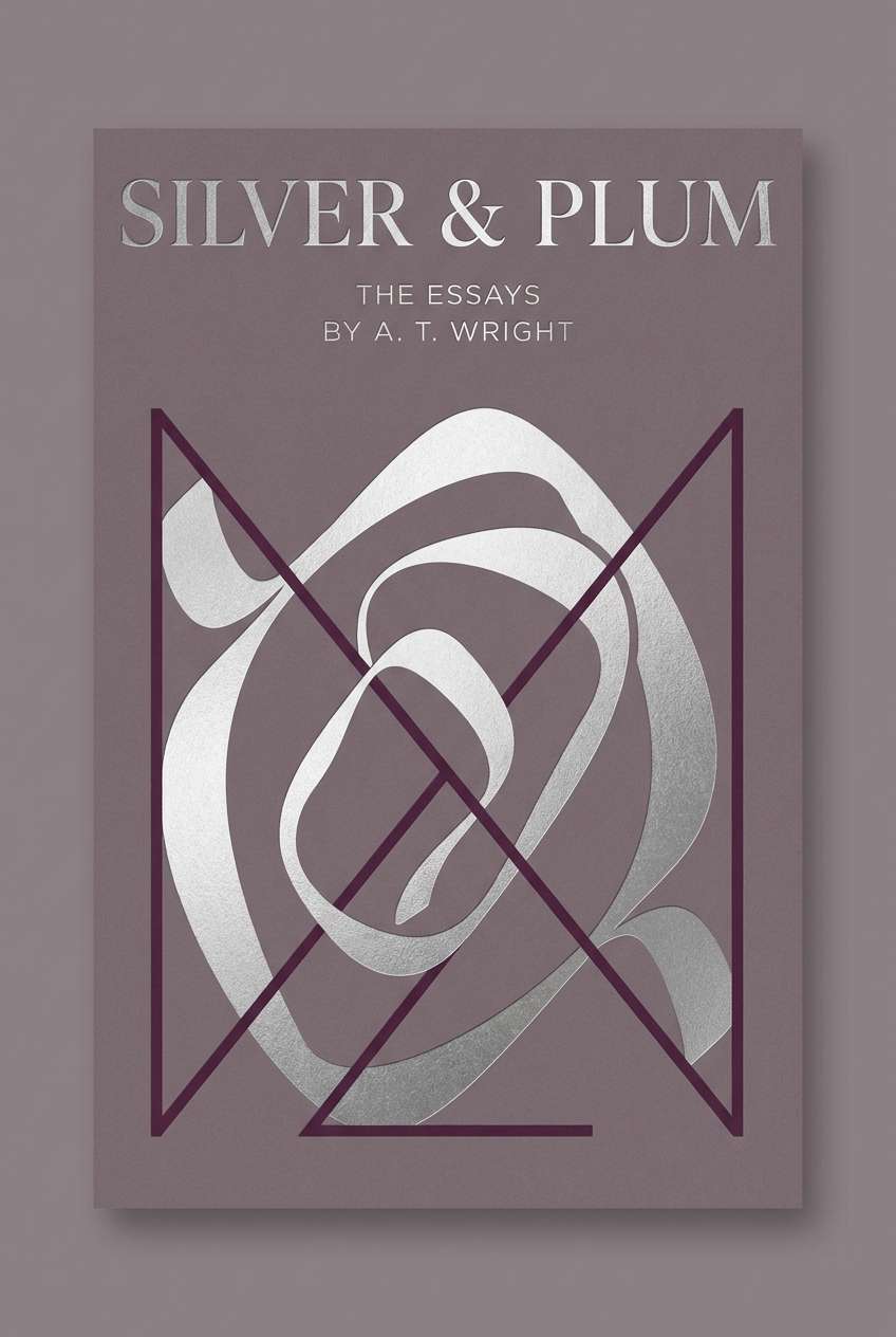
15) Glacier Silver
HEX: #f8fbff #dde7f2 #b9c9d9 #6b88a6 #203243
Mood: cool, clean, expansive
Best for: SaaS website hero
Use glacier whites for the hero background, keep cool mid-blues for illustrations and feature highlights, and ground headings with deep slate for confident readability.
Image example of glacier silver generated using media.io

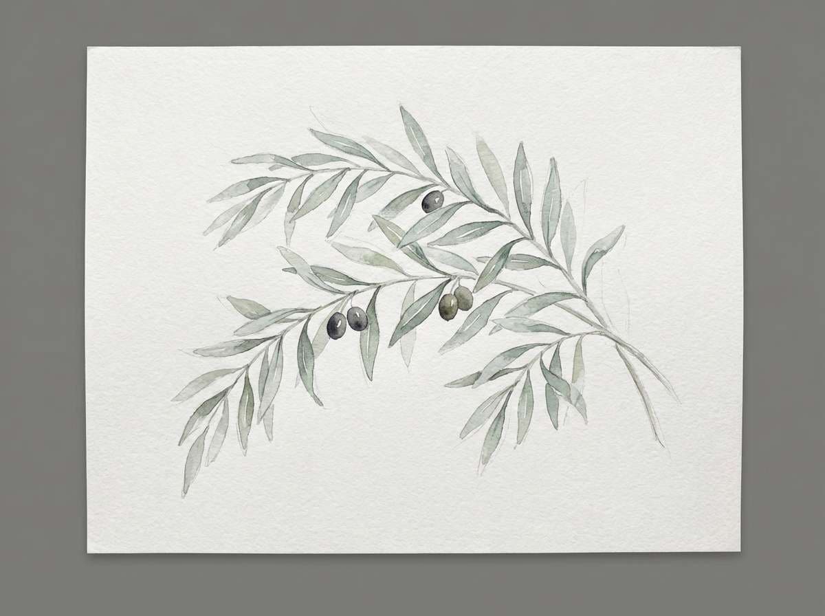
16) Silver Olive Field
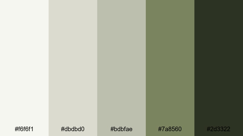
HEX: #f6f6f1 #dbdbd0 #bdbfae #7a8560 #2d3322
Mood: earthy, calm, timeless
Best for: botanical illustration
Use pale silvers as paper tone, olive for stems and leaves, and deep green-gray for outlines to keep botanical artwork natural while still airy and modern.
Image example of silver olive field generated using media.io
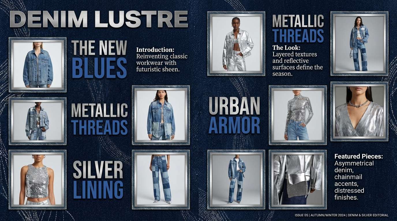
17) Sterling Denim
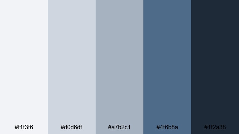
HEX: #f1f3f6 #d0d6df #a7b2c1 #4f6b8a #1f2a38
Mood: casual, dependable, modern
Best for: fashion lookbook
Keep backgrounds in soft sterling tones, use denim blues for section headers and key callouts, and rely on deep navy for body text to preserve editorial readability.
Image example of sterling denim generated using media.io
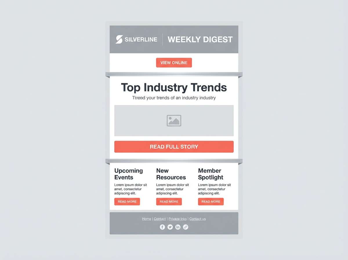
18) Silver Coral Accent
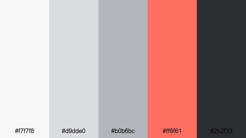
HEX: #f7f7f8 #d9dde0 #b0b6bc #ff6f61 #2b2f33
Mood: friendly, modern, upbeat
Best for: newsletter template
Use silvers to structure sections and maintain cleanliness, then use coral for buttons and links; the dark charcoal keeps headlines and body copy accessible in email clients.
Image example of silver coral accent generated using media.io
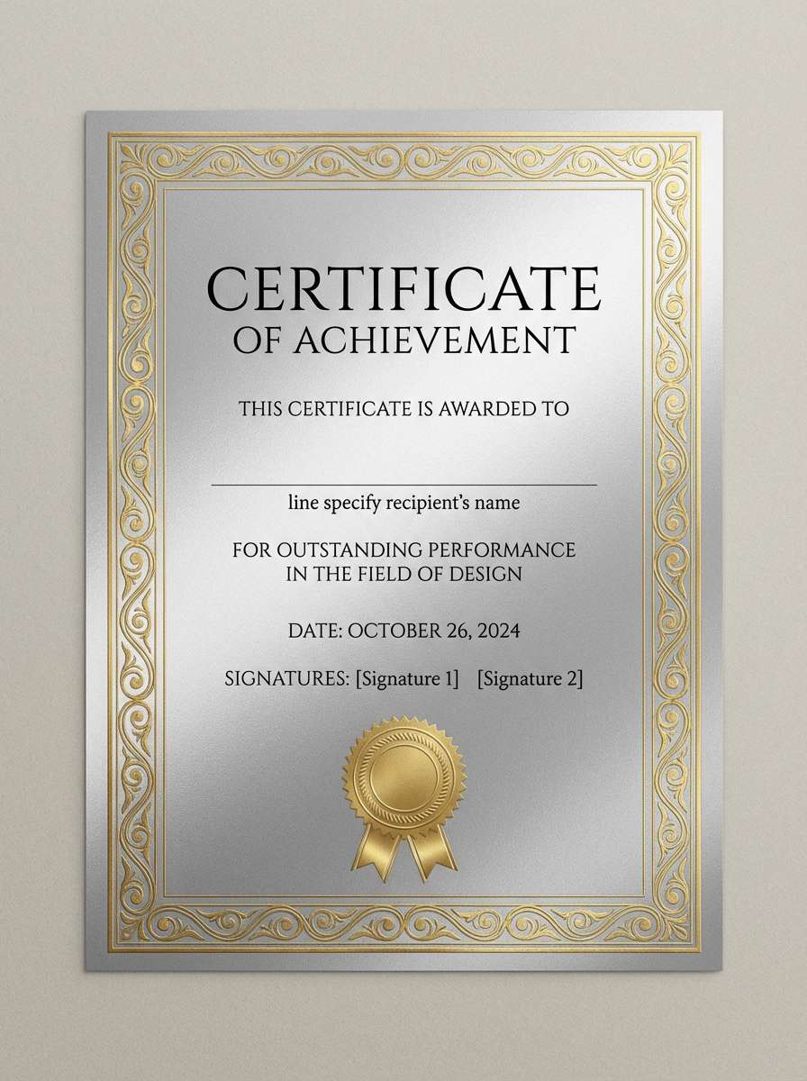
19) Polished Silver & Gold
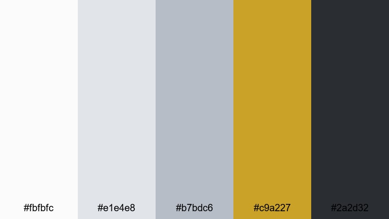
HEX: #fbfbfc #e1e4e8 #b7bdc6 #c9a227 #2a2d32
Mood: luxury, premium, celebratory
Best for: award certificate
Use pale silver as the certificate base, apply gold for seals and borders, and keep dark charcoal for names and signatures so the document feels official and upscale.
Image example of polished silver & gold generated using media.io
20) Silver Charcoal Mono
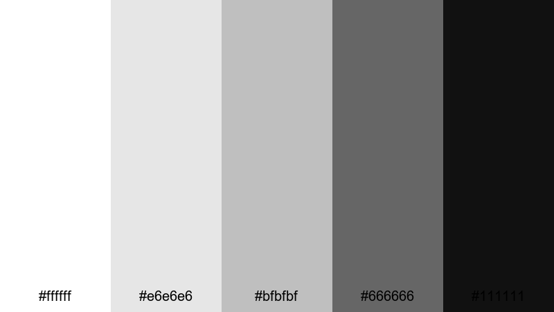
HEX: #ffffff #e6e6e6 #bfbfbf #666666 #111111
Mood: classic, minimal, timeless
Best for: logo system
Build the primary logo in charcoal or near-black, use mid grays for secondary lockups, and keep whites for negative space to ensure the mark works across print and digital.
Image example of silver charcoal mono generated using media.io
What Colors Go Well with Silver?
Silver pairs easily with other neutrals like white, charcoal, and black for clean, minimal layouts. This approach is ideal when you want typography, spacing, and content to do the heavy lifting.
For a modern pop, add a saturated accent such as citrus yellow, coral, teal, or cobalt. A single bright hue against silver reads intentional and helps guide attention to buttons, prices, or key data.
For premium or organic vibes, try warmer partners like wheat, gold, blush, or olive. These soften silver’s coolness and create a more tactile, lifestyle-oriented feel.
How to Use a Silver Color Palette in Real Designs
Start by assigning your lightest silver to backgrounds, then use mid-silvers for dividers, surfaces, and secondary UI. Reserve the darkest tone for headings and primary actions to maintain contrast and accessibility.
Keep metallic “silver” effects subtle in digital products—flat grays usually look cleaner than heavy gradients. If you do use sheen, apply it to small moments like badges, icons, or hero highlights.
In print or packaging, balance silver with either a rich dark ink (charcoal/plum) or one warm accent (gold/wheat) so the design feels deliberate rather than washed out.
Create Silver Palette Visuals with AI
If you want to preview how a silver palette feels in a real layout, generate quick mockups (posters, landing pages, packaging, or invitations) before committing to production files.
Use the prompts included under each palette as a starting point, then swap the subject (dashboard, label, certificate) to match your project. You’ll get consistent, on-theme visuals you can iterate on fast.
Silver Color Palette FAQs
-
What is the HEX code for “silver”?
In web design, “silver” is commonly represented as #C0C0C0, but many silver palettes use a range of cool grays (from near-white to charcoal) to create depth and contrast. -
Is silver a warm or cool color?
Silver is usually considered a cool neutral, especially when it leans blue-gray. It can feel warmer when paired with beige, wheat, blush, or gold accents. -
What colors pair best with silver for a modern UI?
Charcoal or near-black for text, plus one saturated accent (teal, yellow, coral, or steel blue) works well. Silver backgrounds keep screens clean while the accent guides attention to key actions. -
How do I keep silver designs from looking flat?
Use a 5-tone scale: very light silver for backgrounds, mid silvers for surfaces and borders, and a deep tone for typography. Small contrast steps create structure without needing heavy gradients. -
Does silver work for branding and packaging?
Yes—silver can signal premium quality, cleanliness, or technical precision. Pair it with gold for luxury, sage/olive for natural brands, or plum for a creative, editorial feel. -
What’s the difference between gray and silver in design?
Gray is a broad neutral family, while silver often implies a lighter, cleaner, slightly metallic feel. In practice, “silver palettes” are curated grays chosen to feel polished and modern. -
What text color is most readable on silver backgrounds?
Deep charcoal or near-black is typically the safest choice for accessibility. For lighter sections, keep body text dark and use mid-gray only for secondary labels or disabled states.


