

Orange and blue are a timeless complementary pair: warm energy meets cool confidence. When balanced well, they create punchy contrast that still feels clean and modern.
Below are 20 curated orange blue color palettes with ready-to-use HEX codes, plus practical tips for applying them to UI, branding, posters, and packaging.
In this article
- Why Orange Blue Palettes Work So Well
-
- sunset harbor
- tangerine navy
- coral coastline
- pumpkin sky
- apricot azure
- cobalt citrus
- desert deep sea
- retro surf
- midnight orange glow
- blue hour ember
- orange soda pop
- arctic orange
- terracotta blueprint
- saffron skyline
- marine traffic cone
- copper cerulean
- peach denim
- signal steel
- burnt orange lagoon
- citrus blueprint minimal
- What Colors Go Well with Orange Blue?
- How to Use a Orange Blue Color Palette in Real Designs
- Create Orange Blue Palette Visuals with AI
Why Orange Blue Palettes Work So Well
Orange and blue sit opposite each other on the color wheel, which naturally creates strong visual contrast. That makes the pairing ideal for designs that need clear hierarchy, quick scanning, and high-impact emphasis.
Orange brings warmth, momentum, and “action” energy, while blue signals stability, trust, and clarity. Together, they can feel both expressive and professional—especially when you add a soft neutral to keep the layout breathable.
This combination also adapts easily across styles: go bright for playful campaigns, lean into navy for premium branding, or shift toward teal for a modern, lifestyle-friendly tone.
20+ Orange Blue Color Palette Ideas (with HEX Codes)
1) Sunset Harbor
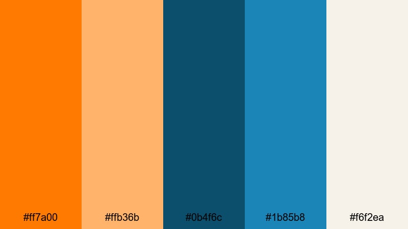
HEX: #ff7a00 #ffb36b #0b4f6c #1b85b8 #f6f2ea
Mood: bright, welcoming, coastal
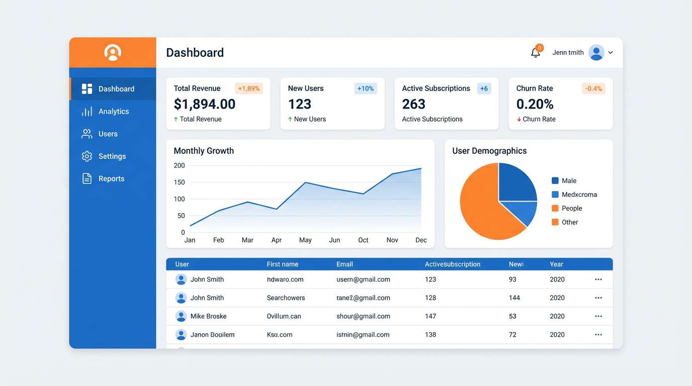
Best for: saas dashboard ui
Use the deep harbor blue for navigation and headers, then reserve vivid orange for primary CTAs and key metrics. Keep surfaces and tables on the warm off-white to prevent glare, and use the light blue for charts and hover states to maintain a calm, readable hierarchy.
Image example of sunset harbor generated using media.io
Media.io is an online AI studio for creating and editing video, image, and audio in your browser.

2) Tangerine Navy
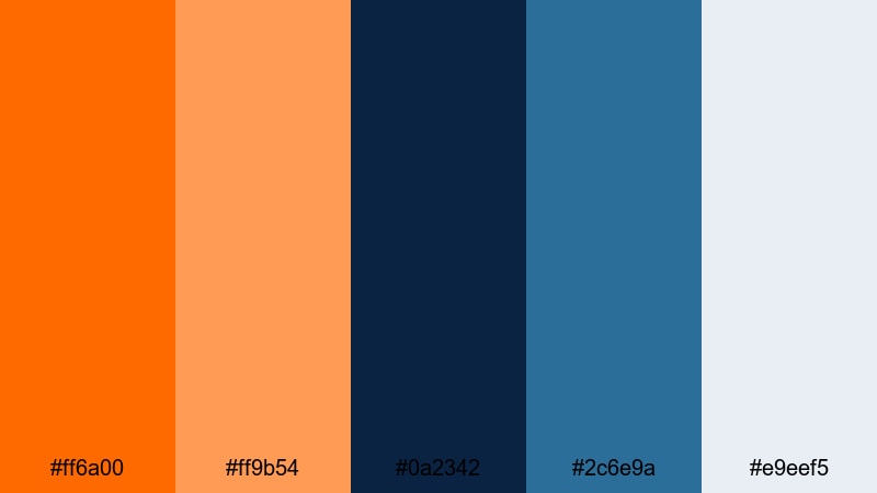
HEX: #ff6a00 #ff9b54 #0a2342 #2c6e9a #e9eef5
Mood: bold, trustworthy, modern
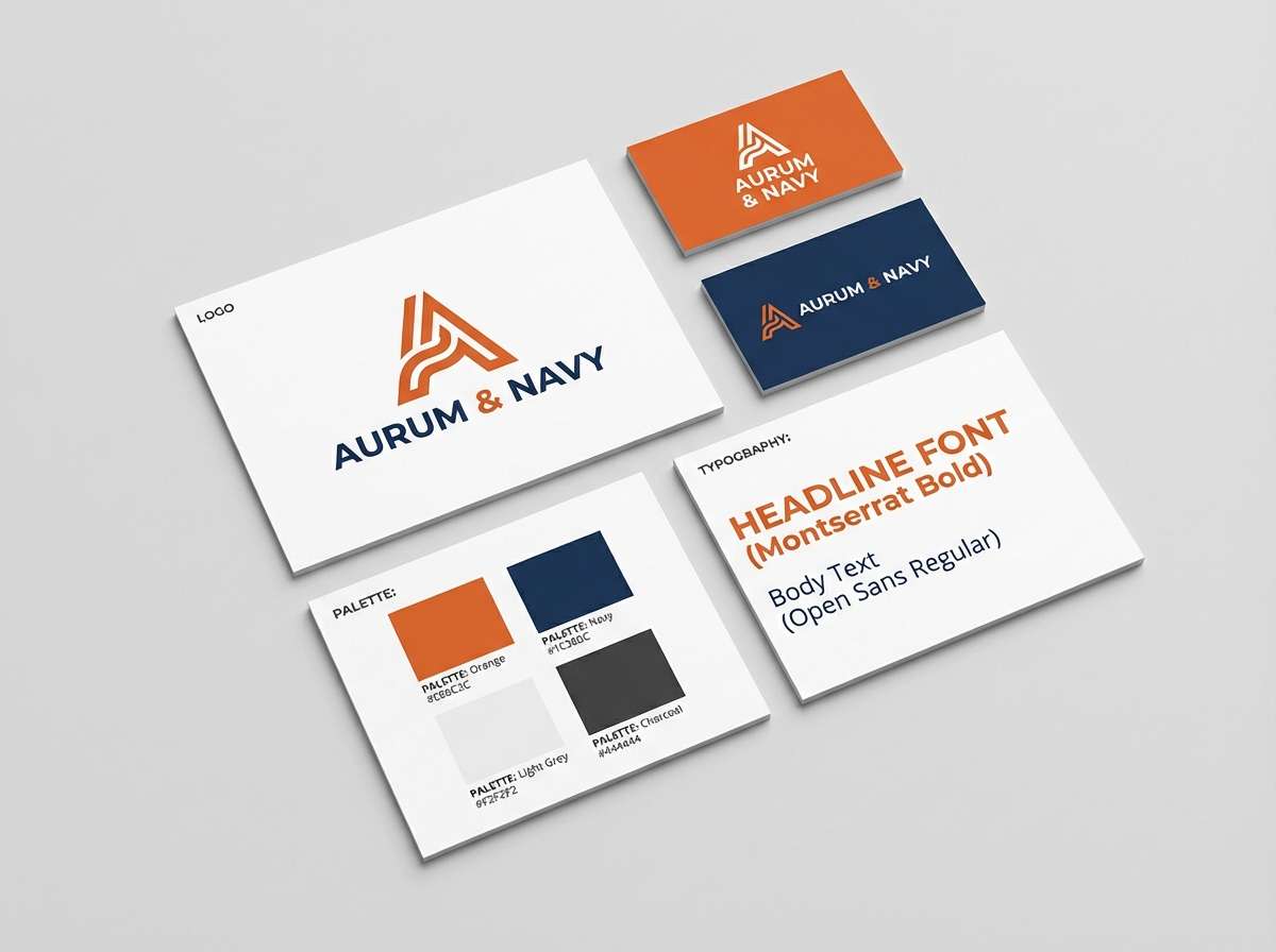
Best for: brand identity kit
Anchor the system with navy for wordmarks and body text, then apply tangerine sparingly for highlights, badges, and callouts. Pair the pale gray-blue as a background for stationery and guidelines so the orange accents stay premium instead of loud.
Image example of tangerine navy generated using media.io
3) Coral Coastline
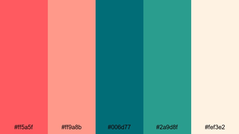
HEX: #ff5a5f #ff9a8b #006d77 #2a9d8f #fef3e2
Mood: fresh, friendly, lifestyle
Best for: travel flyer
Let teal carry the main blocks and typography for a calm travel feel, then use coral for prices, dates, and action text. The creamy sand tone is ideal for the flyer base to keep contrast comfortable and prevent the coral from overpowering photos or icons.
Image example of coral coastline generated using media.io
4) Pumpkin Sky
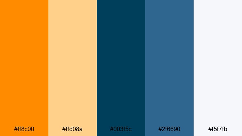
HEX: #ff8c00 #ffd08a #003f5c #2f6690 #f5f7fb
Mood: energetic, clean, corporate
Best for: pitch deck slides
Use the dark blue for slide titles and key charts to keep authority, and introduce pumpkin orange for section dividers and takeaways. The near-white background keeps slides airy; use the soft orange for secondary highlights so the main orange remains reserved for the most important points.
Image example of pumpkin sky generated using media.io
5) Apricot Azure
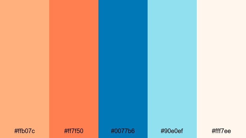
HEX: #ffb07c #ff7f50 #0077b6 #90e0ef #fff7ee
Mood: light, airy, optimistic
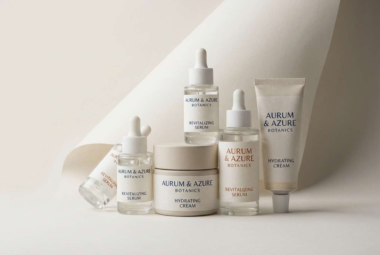
Best for: beauty product packaging
Build the packaging base with the warm cream and apricot to feel soft and approachable, then use azure for brand marks and ingredient callouts. Keep the coral tone for limited accents (like seals or small labels) to create a premium pop without making the box feel busy.
Image example of apricot azure generated using media.io
6) Cobalt Citrus
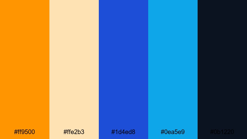
HEX: #ff9500 #ffe2b3 #1d4ed8 #0ea5e9 #0b1220
Mood: high-contrast, techy, sharp
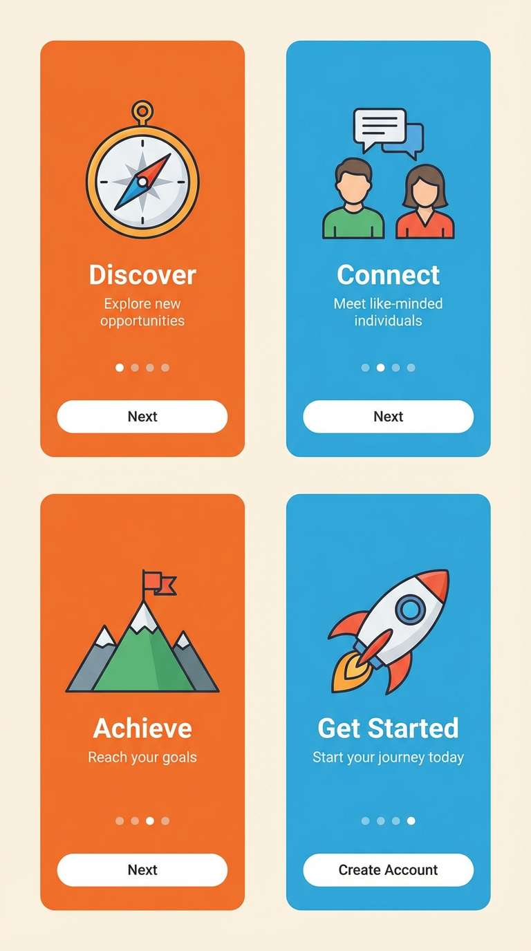
Best for: app onboarding ui
Use cobalt and dark ink for structure and legibility, then apply citrus orange to primary buttons and progress indicators. The pale orange works well for subtle onboarding illustrations or cards, keeping the experience energetic while maintaining readable contrast on dark or light sections.
Image example of cobalt citrus generated using media.io
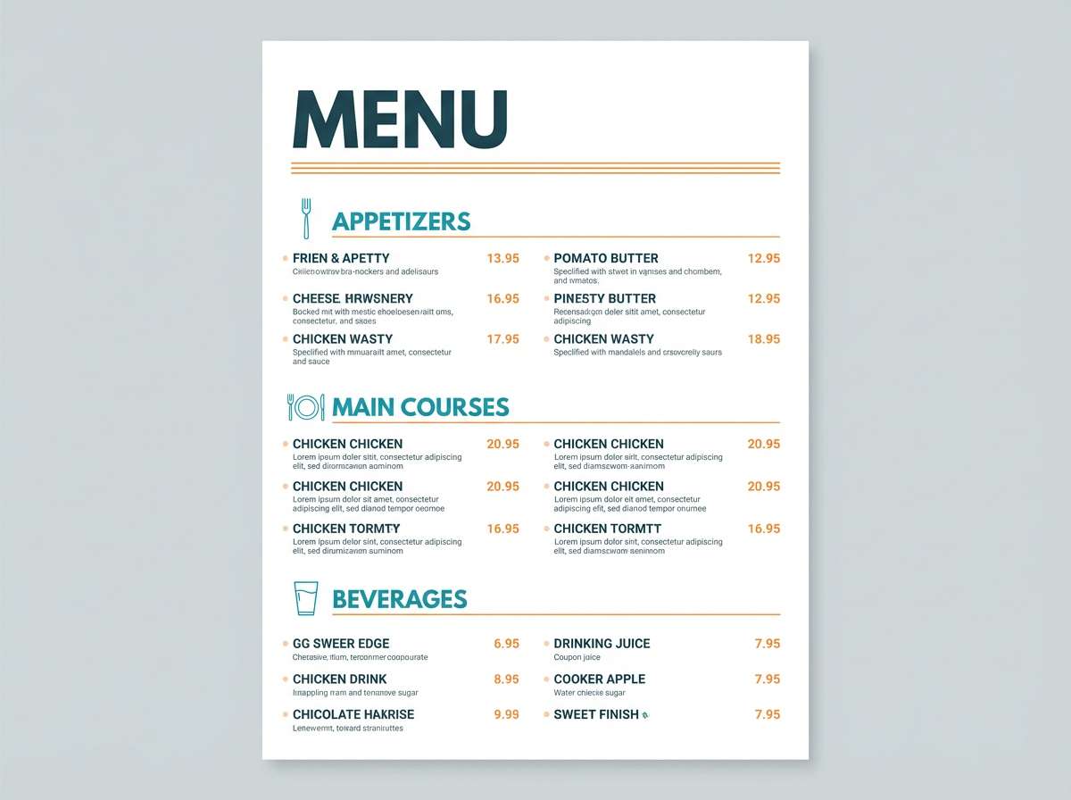
7) Desert Deep Sea
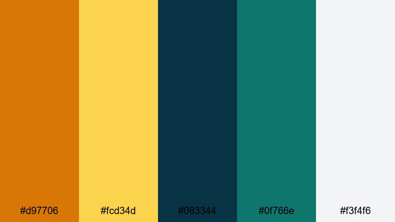
HEX: #d97706 #fcd34d #083344 #0f766e #f3f4f6
Mood: earthy, grounded, sophisticated
Best for: restaurant menu design
Set the menu background to the soft gray and use deep sea tones for headings and item names to keep it refined. Add desert amber for prices, specials, and small dividers; the golden accent is ideal for icons or spice indicators without reducing readability.
Image example of desert deep sea generated using media.io
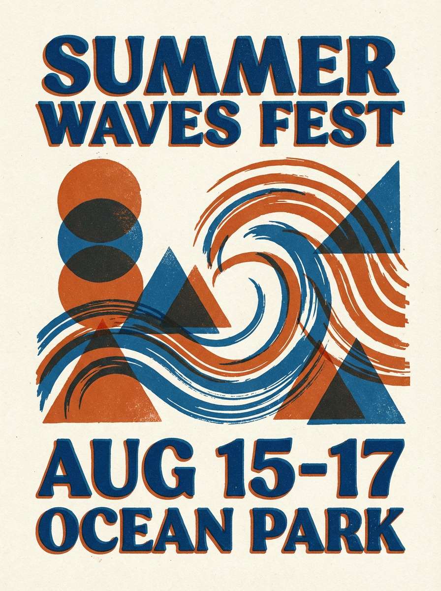
8) Retro Surf
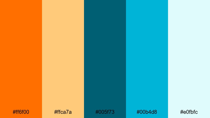
HEX: #ff6f00 #ffca7a #005f73 #00b4d8 #e0fbfc
Mood: playful, retro, summery
Best for: event poster
Pair the surf blue with light aqua for large background shapes and patterns, then use bright orange for the headline and date to create instant visibility. Keep secondary copy in dark teal for legibility, and use the pale orange to soften blocks behind text.
Image example of retro surf generated using media.io
9) Midnight Orange Glow
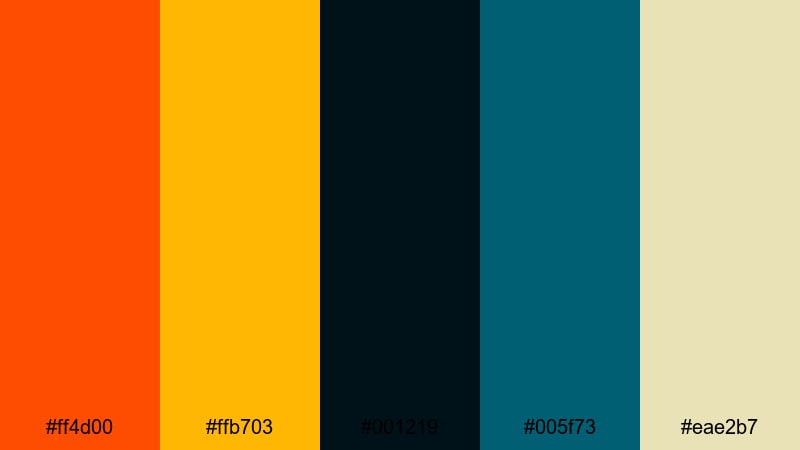
HEX: #ff4d00 #ffb703 #001219 #005f73 #eae2b7
Mood: dramatic, premium, cinematic
Best for: product ad banner
Use midnight black-blue as the dominant field to amplify contrast, then place the orange glow on the product callout and CTA. The warm beige works as a subtle text panel for specs; keep the darker teal for secondary highlights to avoid competing with the main orange.
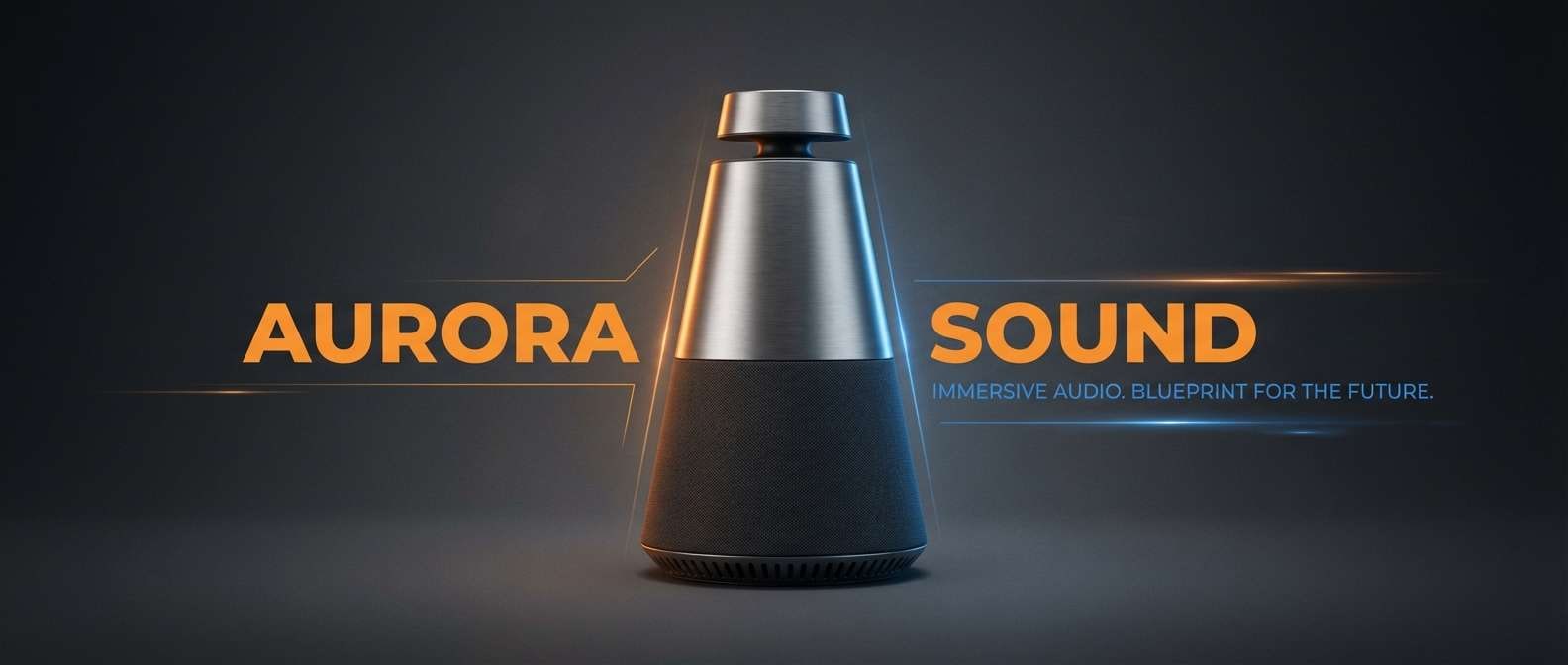
Image example of midnight orange glow generated using media.io
10) Blue Hour Ember
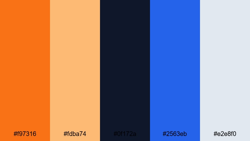
HEX: #f97316 #fdba74 #0f172a #2563eb #e2e8f0
Mood: smart, contemporary, crisp
Best for: editorial magazine spread
Use the ink blue for body text and grids, and reserve the ember orange for pull quotes and section markers. The pale slate background supports clean margins; apply the bright blue to infographics or subheads so the orange remains the primary highlight.
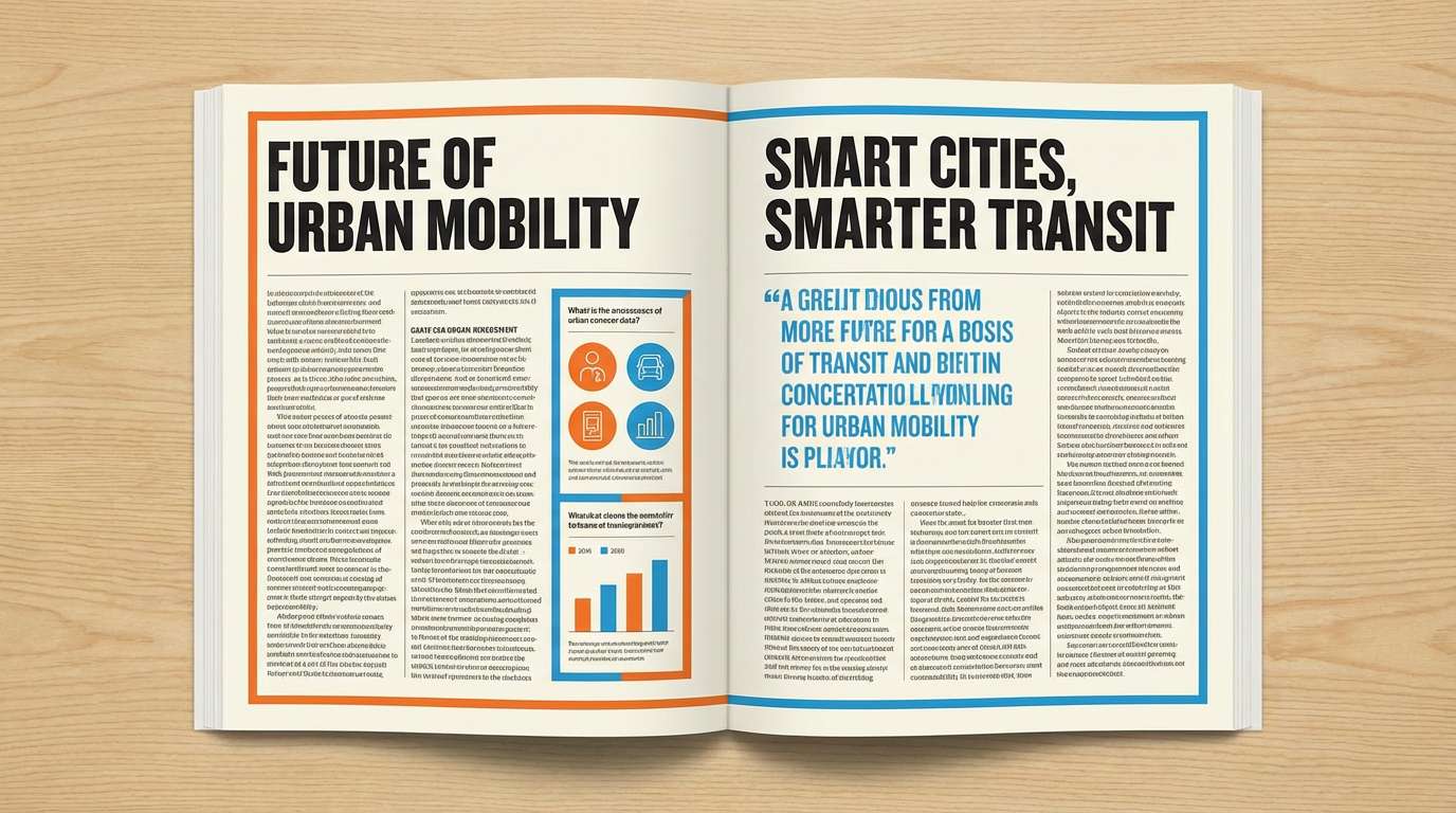
Image example of blue hour ember generated using media.io
11) Orange Soda Pop
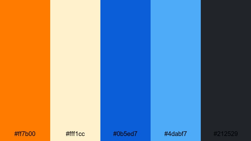
HEX: #ff7b00 #fff1cc #0b5ed7 #4dabf7 #212529
Mood: fun, punchy, youthful
Best for: social media promo post
Build the post with a bright blue frame or shapes for structure, then place orange on the offer text and CTA sticker for immediate attention. Keep the light cream as the main content area so typography stays readable, and use the charcoal for small legal lines and details.
Image example of orange soda pop generated using media.io

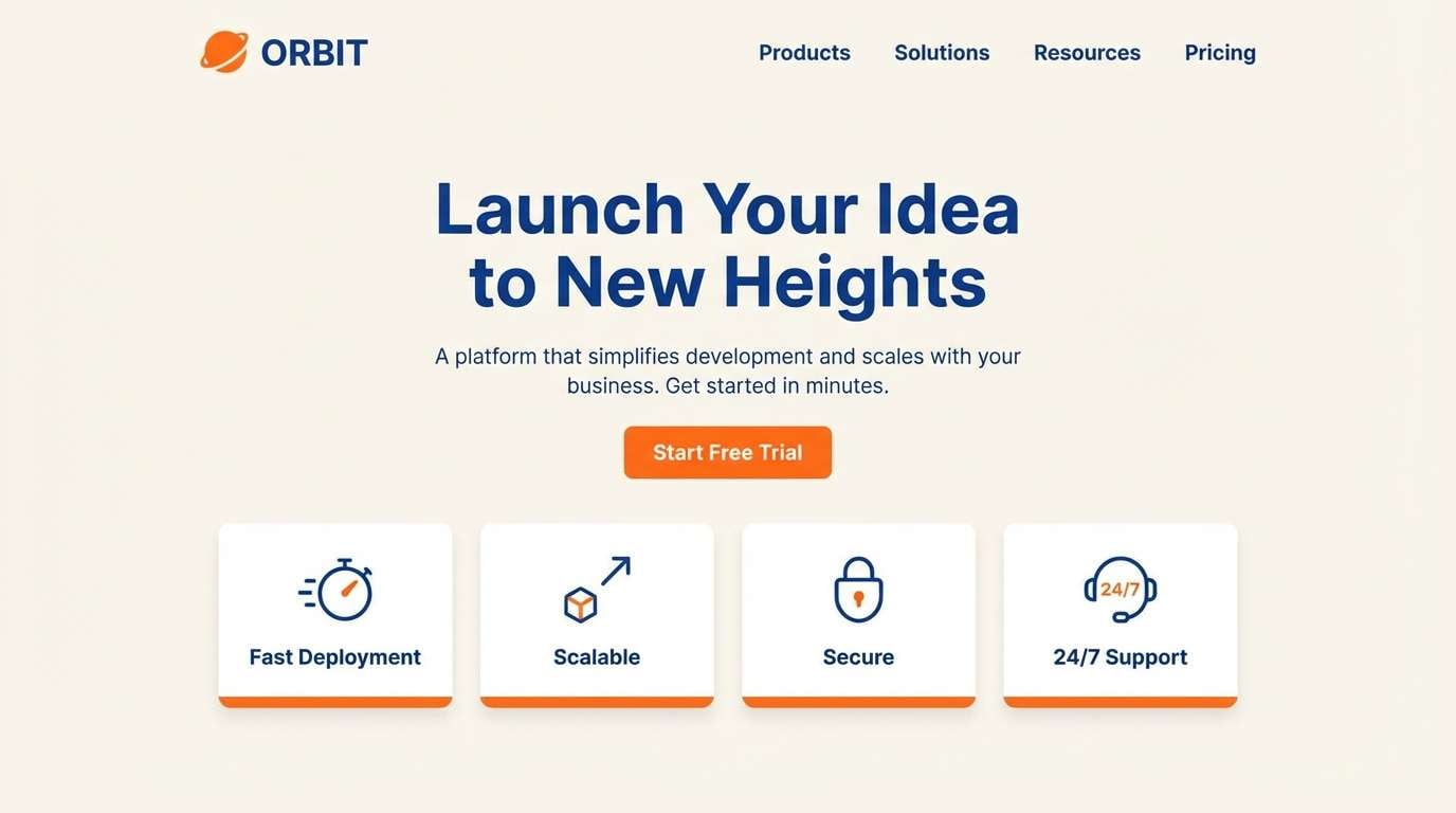
12) Arctic Orange
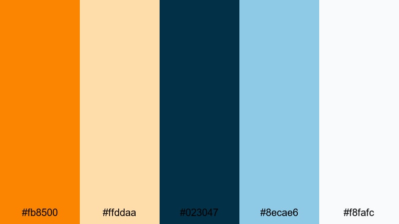
HEX: #fb8500 #ffddaa #023047 #8ecae6 #f8fafc
Mood: cool, airy, approachable
Best for: web landing page hero
Use the dark arctic blue for nav and headline text, then apply orange to the primary hero button and key feature icons. The pale blue works well for hero background gradients or cards, while the warm cream keeps the page bright and reduces harsh contrast on long reads.
Image example of arctic orange generated using media.io
13) Terracotta Blueprint
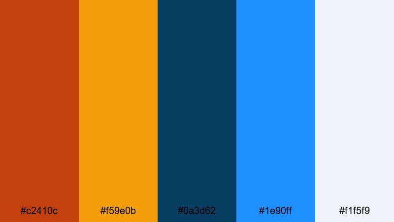
HEX: #c2410c #f59e0b #0a3d62 #1e90ff #f1f5f9
Mood: architectural, confident, structured
Best for: infographic design
Use blueprint navy for titles, axes, and labels to keep clarity, then use terracotta and amber to differentiate data series. The bright blue is perfect for callouts and emphasis boxes, while the light background ensures the chart colors remain distinguishable in print and on screens.
Image example of terracotta blueprint generated using media.io
14) Saffron Skyline
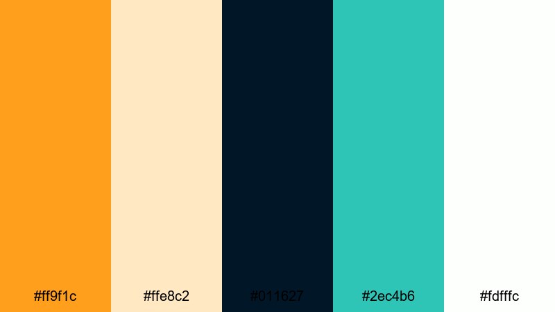
HEX: #ff9f1c #ffe8c2 #011627 #2ec4b6 #fdfffc
Mood: clean, upbeat, modern
Best for: conference badge design
Keep the badge base white for readability and use the deep navy for names and QR labels. Apply saffron to highlight roles or tracks, and use the teal as a secondary strip for day/zone cues; this makes scanning and wayfinding faster in busy venues.
Image example of saffron skyline generated using media.io
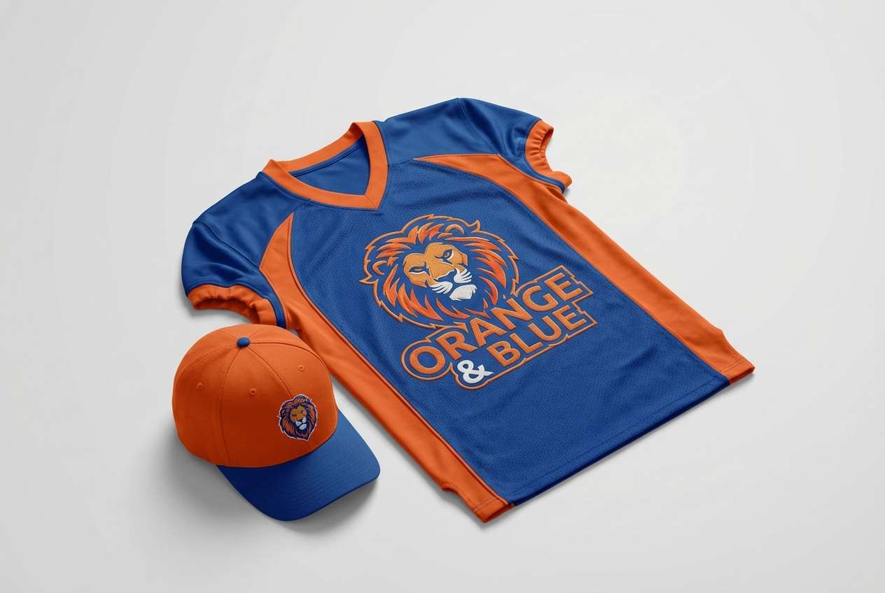
15) Marine Traffic Cone
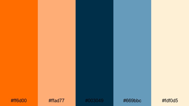
HEX: #ff6d00 #ffad77 #003049 #669bbc #fdf0d5
Mood: sporty, high-visibility, confident
Best for: sports team merch
Use the dark marine blue as the jersey base and set orange as the primary accent for numbers, trims, and logos. The lighter blue can support secondary graphics or sleeve details, while the warm cream helps with alternate light merch items without losing the brand contrast.
Image example of marine traffic cone generated using media.io
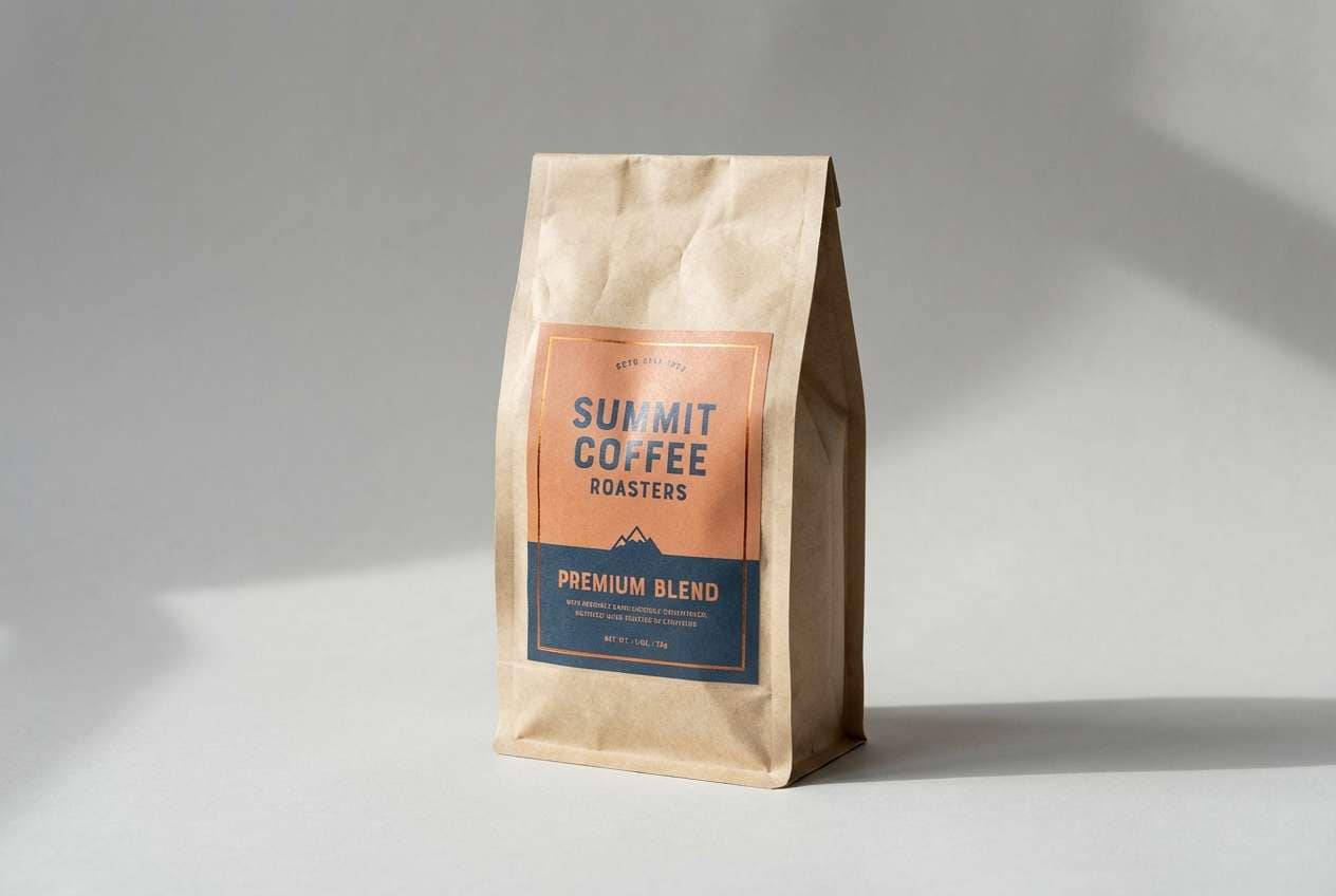
16) Copper Cerulean
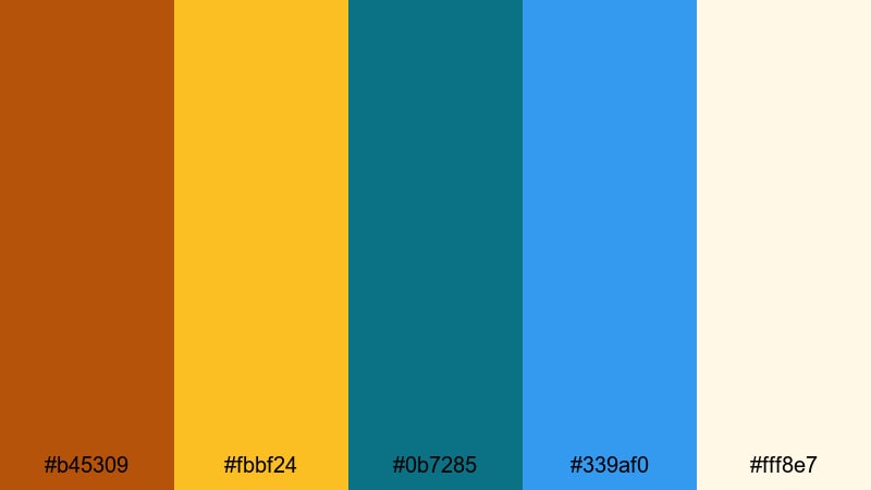
HEX: #b45309 #fbbf24 #0b7285 #339af0 #fff8e7
Mood: warm, polished, artisanal
Best for: coffee packaging
Pair copper and gold tones for the label’s main blocks and flavor notes, then use cerulean and bright blue for brand stamps, origin markers, or roast indicators. The creamy background keeps the bag looking premium, and blue accents add modern clarity without feeling industrial.
Image example of copper cerulean generated using media.io
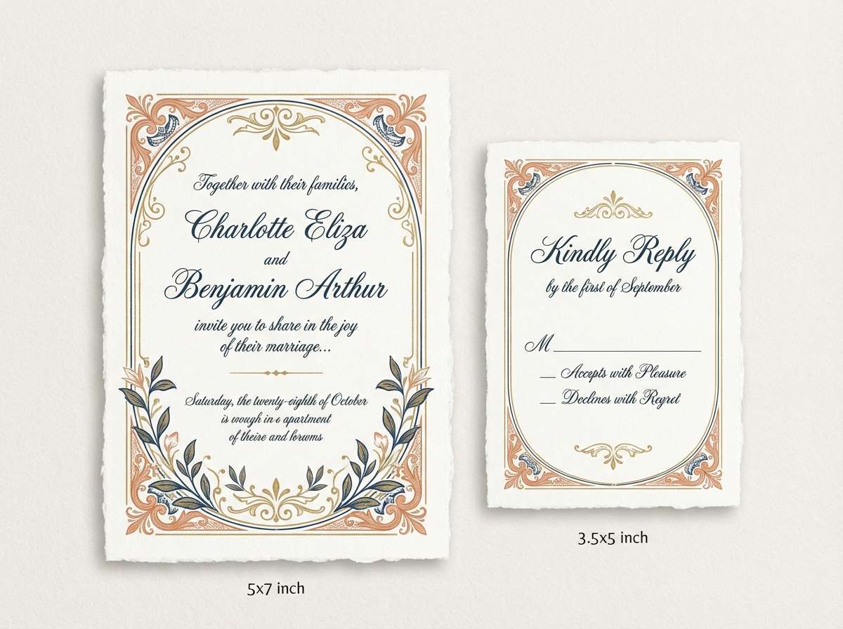
17) Peach Denim
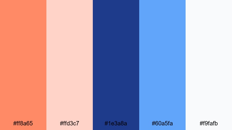
HEX: #ff8a65 #ffd3c7 #1e3a8a #60a5fa #f9fafb
Mood: soft, friendly, contemporary
Best for: wedding invitation suite
Use the denim navy for the main typography to keep the suite elegant and readable, then apply peach for monograms, borders, and RSVP highlights. The pale peach works as a gentle backdrop for details blocks, while the light blue can accent icons or small floral motifs without stealing focus.
Image example of peach denim generated using media.io
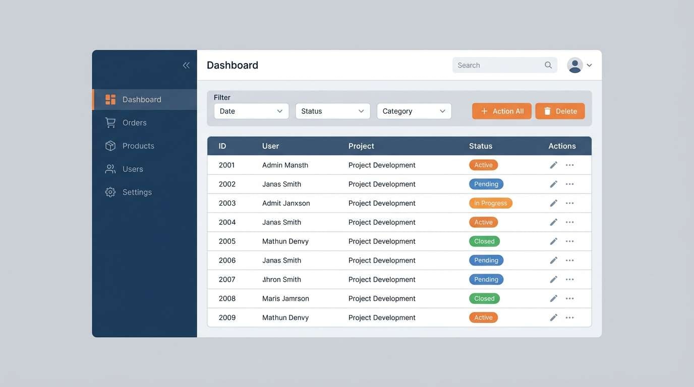
18) Signal Steel
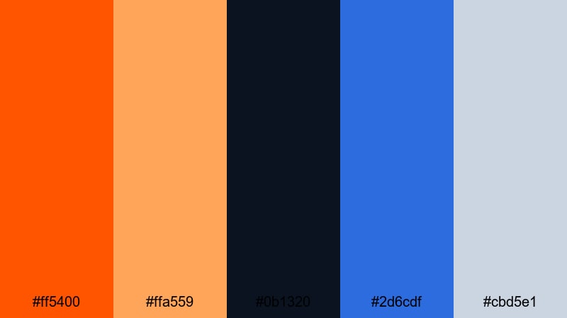
HEX: #ff5400 #ffa559 #0b1320 #2d6cdf #cbd5e1
Mood: industrial, precise, high-contrast
Best for: admin panel ui
Use steel-gray as neutral surfaces and the near-black for dense text and tables. Apply the strong orange for alerts, confirmations, and primary actions, while the blue handles links and active states; this separation makes system status clearer and reduces mistakes in busy workflows.
Image example of signal steel generated using media.io
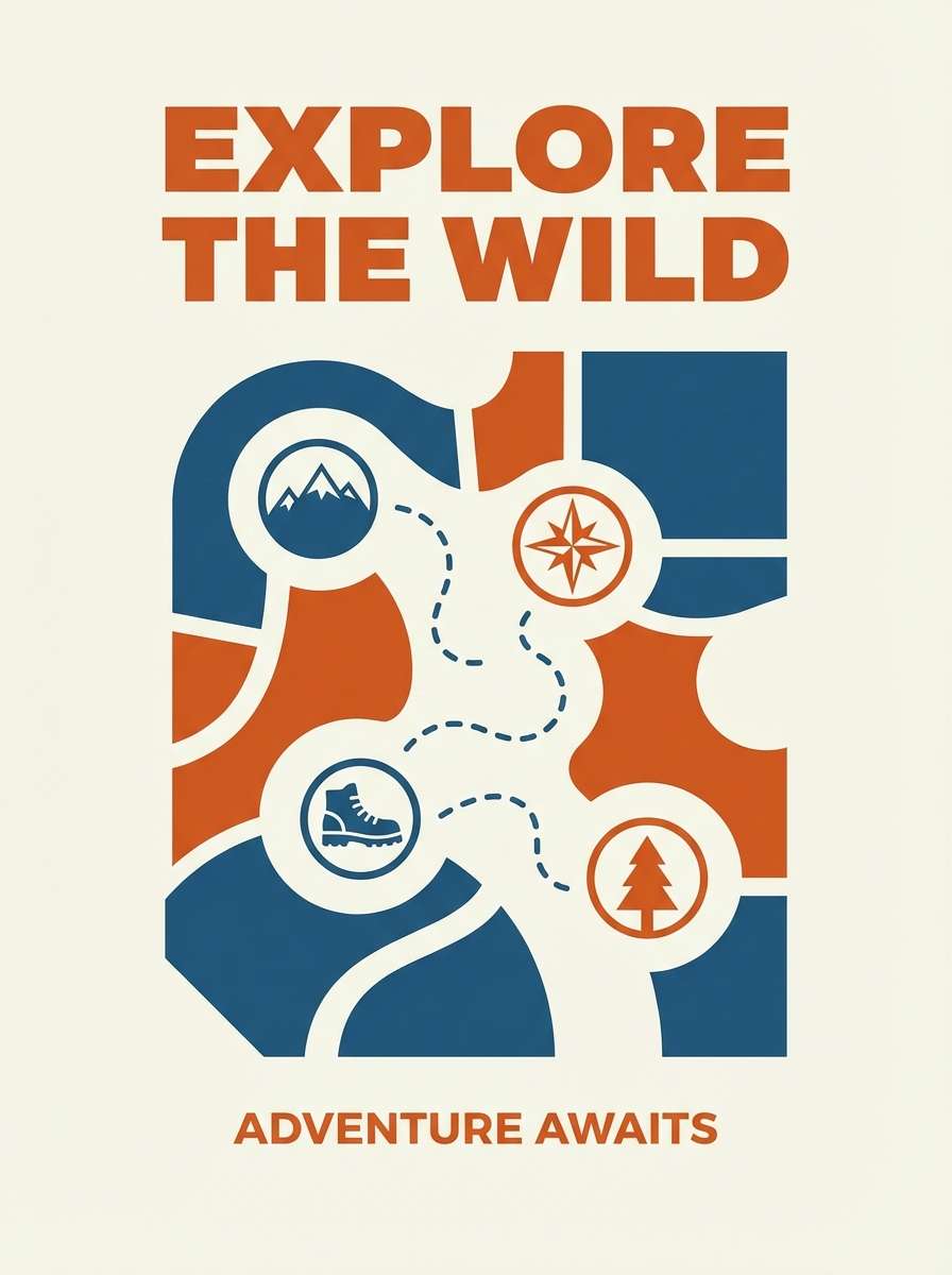
19) Burnt Orange Lagoon
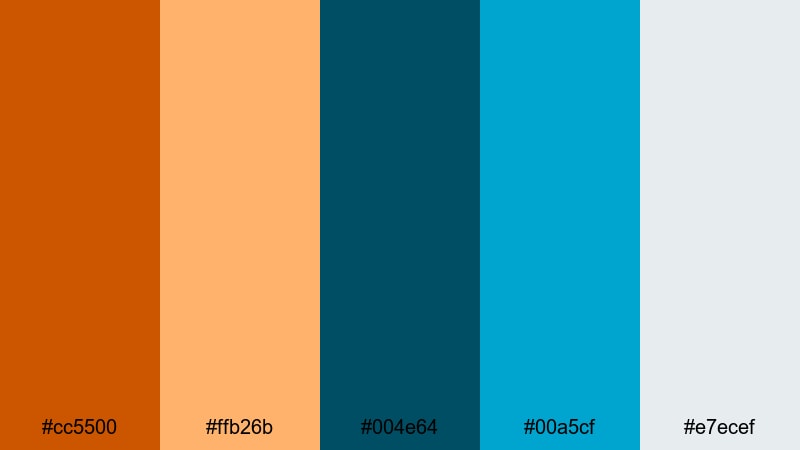
HEX: #cc5500 #ffb26b #004e64 #00a5cf #e7ecef
Mood: adventurous, outdoorsy, vibrant
Best for: outdoor brand poster
Use the lagoon blues for large shapes and supporting text, then apply burnt orange to the headline and key callouts for strong distance readability. Keep the light gray as negative space so the poster stays clean, and use the softer orange for secondary badges and map-style markers.
Image example of burnt orange lagoon generated using media.io
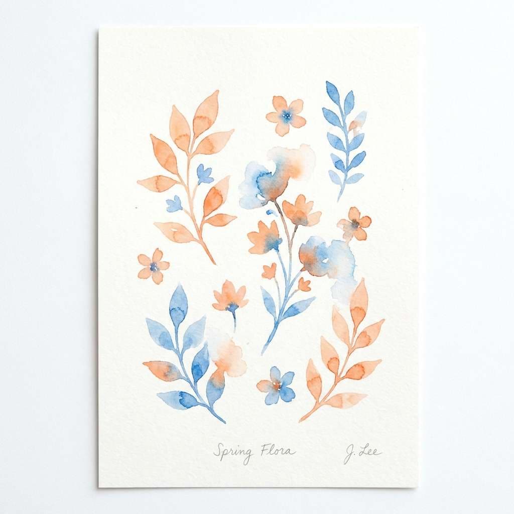
20) Citrus Blueprint Minimal
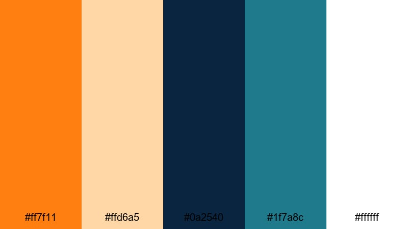
HEX: #ff7f11 #ffd6a5 #0a2540 #1f7a8c #ffffff
Mood: minimal, sharp, confident
Best for: botanical spring illustration
Use white and pale citrus as the paper base, then paint leaves and stems in the teal-blue to keep it airy and modern. Add orange as blossoms and small accents to create focal points; this palette is especially effective for labels, stationery, and seasonal hero art where simplicity matters.
Image example of citrus blueprint minimal generated using media.io
What Colors Go Well with Orange Blue?
Neutrals are the easiest win: off-white, warm cream, light gray, and charcoal help orange and blue feel intentional instead of chaotic. They also give your typography and spacing room to breathe.
For extra depth, add a darker anchor like navy, ink, or near-black to stabilize the palette—especially for UI text and headers. If you want a more lifestyle tone, introduce teal or seafoam to soften the contrast while keeping things fresh.
For premium or editorial work, muted metallics (like silver) and desaturated sandy beiges can elevate the combination and prevent the orange from feeling too loud.
How to Use a Orange Blue Color Palette in Real Designs
Decide roles first: use blue for structure (navigation, body text, charts) and orange for emphasis (CTAs, highlights, badges). This role-based approach keeps the contrast readable and reduces visual noise.
Control saturation by limiting the most vivid orange to small areas. Pair it with a lighter tint for large fills, backgrounds, or illustrations so the design stays modern and not overbearing.
Test accessibility early. Orange-on-white often needs a darker shade, and blue-on-orange can be tricky for small text. Use dark blues for text and keep high-chroma pairings for icons, buttons, and large labels.
Create Orange Blue Palette Visuals with AI
If you want to see these palettes in action, generate quick mockups for landing pages, posters, packaging, or UI cards. A fast visual pass helps you confirm contrast, mood, and hierarchy before you commit to full design production.
With Media.io’s text-to-image, you can describe the layout (e.g., “dashboard UI with sidebar, cards, and charts”) and specify your orange/blue accents to get ready-to-use inspiration in minutes.
Orange Blue Color Palette FAQs
-
Why are orange and blue a popular color combination?
Orange and blue are complementary colors, so they naturally create strong contrast. That contrast makes key elements (like CTAs, prices, or headlines) stand out while still looking balanced when paired with good neutrals. -
Which blue works best with orange: navy, cobalt, or teal?
Navy creates a premium, trustworthy look; cobalt feels modern and tech-forward; teal softens the pairing for lifestyle and travel aesthetics. The best choice depends on whether you want the design to feel formal, energetic, or relaxed. -
How do I keep an orange blue palette from looking too loud?
Use a neutral base (white, cream, light gray), keep the brightest orange for small accents, and let blue carry structure like backgrounds, headers, or typography. Reducing saturation in one of the colors also helps. -
What are common UI roles for orange and blue?
Blue is typically used for navigation, links, and informational states, while orange is best for primary actions, highlights, warnings, or key metrics. Assigning clear roles improves usability and consistency. -
Do orange and blue work for branding?
Yes—especially for brands that want to feel confident and energetic. Many identity systems use deep blue for trust and readability, then orange for memorable accents across logos, packaging, and marketing. -
What neutral colors pair well with orange and blue?
Warm off-whites, sand tones, light gray-blues, slate, and charcoal work particularly well. These neutrals prevent color fatigue and make orange/blue accents look cleaner and more intentional. -
How can I quickly preview orange blue palettes in real layouts?
Generate mockups with an AI image tool by describing the design type (e.g., “landing page hero,” “event poster,” “coffee bag label”) and specifying orange/blue accents. This helps you validate contrast and mood before designing.


