

Red is one of the most versatile brand colors: it can read romantic, premium, sporty, editorial, or cozy depending on tone and contrast.
Below are 20+ red-forward palette ideas with HEX codes, moods, and real-use tips—plus AI prompts you can reuse to generate matching visuals in minutes.
In this article
Why Red Palettes Work So Well
Red instantly communicates energy and intention—so it’s ideal for designs where you need clarity, urgency, or a memorable focal point. Even subtle reds (dusty rose, terracotta) can add warmth without overwhelming a layout.
Because red has strong emotional range, changing just the tint and contrast can shift the vibe from playful coral to cinematic merlot. That makes red palettes especially useful for branding systems where you want one core hue that can flex across use cases.
In UI and print, red also creates clear hierarchy when paired with calm neutrals. With the right background and text contrast, it becomes a reliable tool for CTAs, headings, badges, and editorial emphasis.
20+ Red Color Palette Ideas (with HEX Codes)
1) Cherry Noir
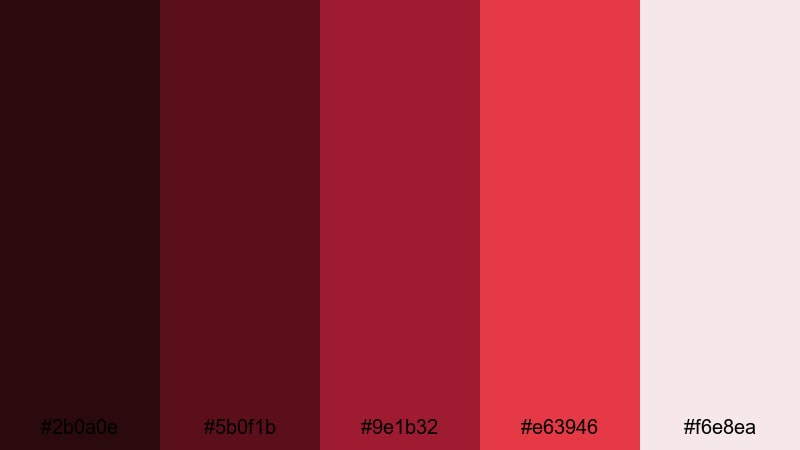
HEX: #2B0A0E #5B0F1B #9E1B32 #E63946 #F6E8EA
Mood: dramatic, luxe, high-contrast
Best for: premium branding and hero headers
Dramatic cherry tones against near-black feel like velvet curtains and neon city nights. This scheme shines on premium branding, hero banners, and product launches where contrast matters. Pair it with warm ivory typography and subtle metallic accents for a polished finish. Usage tip: keep the deepest shade for backgrounds and reserve the brightest red for one decisive call to action.
Image example of cherry noir generated using media.io
Media.io is an online AI studio for creating and editing video, image, and audio in your browser.

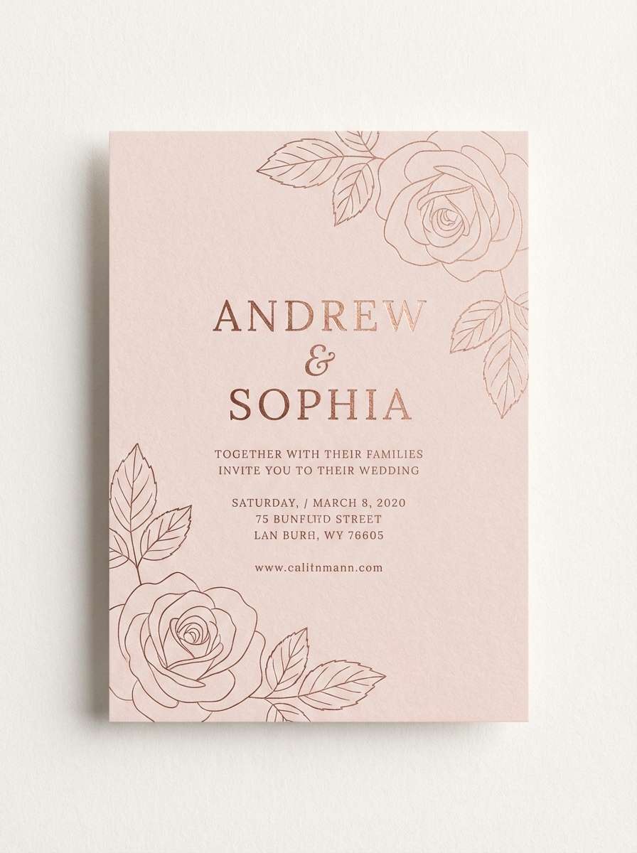
2) Rose Quartz
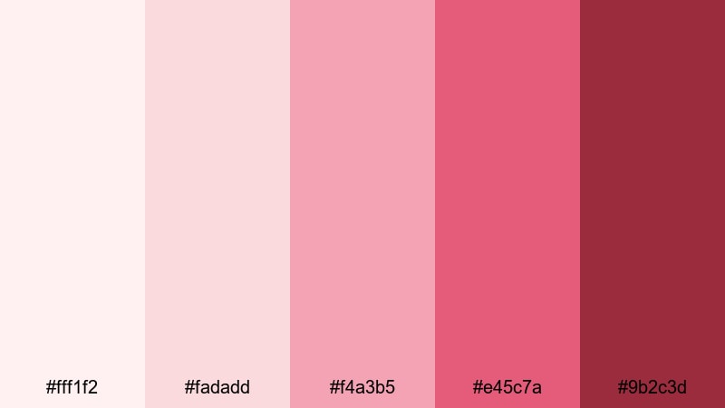
HEX: #FFF1F2 #FADADD #F4A3B5 #E45C7A #9B2C3D
Mood: soft, romantic, airy
Best for: beauty brands and wedding invitations
Soft blush and rosy mids evoke silk ribbons, peonies, and gentle morning light. It’s a natural fit for beauty packaging, wedding stationery, and calm lifestyle visuals. Combine with warm gray linework or thin serif type to keep it elegant rather than sugary. Usage tip: let the palest tint carry most of the space, then use the deeper rose only for headings and highlights.
Image example of rose quartz generated using media.io
3) Spiced Cranberry
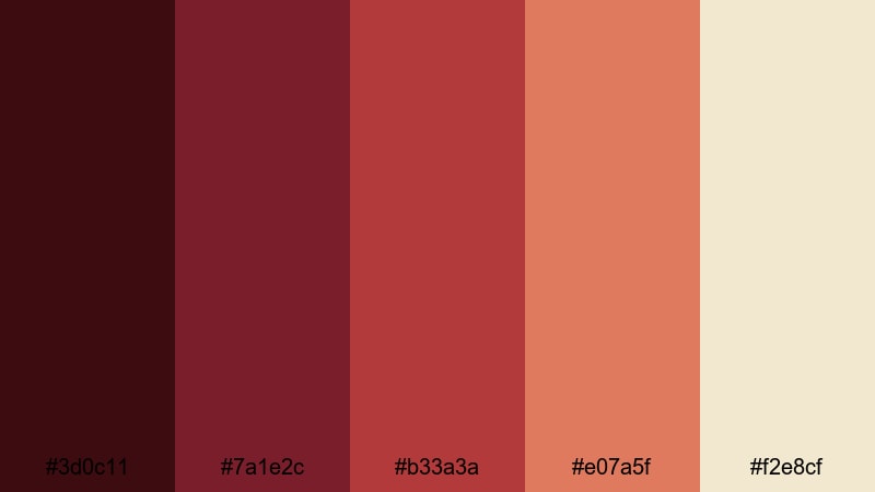
HEX: #3D0C11 #7A1E2C #B33A3A #E07A5F #F2E8CF
Mood: cozy, seasonal, inviting
Best for: holiday campaigns and food photography overlays
Cozy cranberry and spice notes feel like mulled cider, knit scarves, and candlelight. This combination works beautifully for holiday promos, café branding, and warm editorial overlays. Balance it with creamy neutrals and keep saturation controlled so it doesn’t turn loud. Usage tip: use the terracotta accent for badges or price tags to guide the eye without overpowering the layout.
Image example of spiced cranberry generated using media.io

4) Sunset Coral
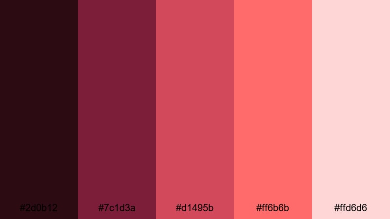
HEX: #2D0B12 #7C1D3A #D1495B #FF6B6B #FFD6D6
Mood: playful, warm, modern
Best for: social ads and lifestyle landing pages
Warm coral and berry shades bring the energy of a late-summer sunset and a breezy playlist. It’s great for social ads, lifestyle landing pages, and upbeat event graphics. Pair with charcoal text and plenty of whitespace to keep readability high. Usage tip: use the brightest coral sparingly on buttons or key numbers so the design stays tasteful.
Image example of sunset coral generated using media.io
5) Brick Cream
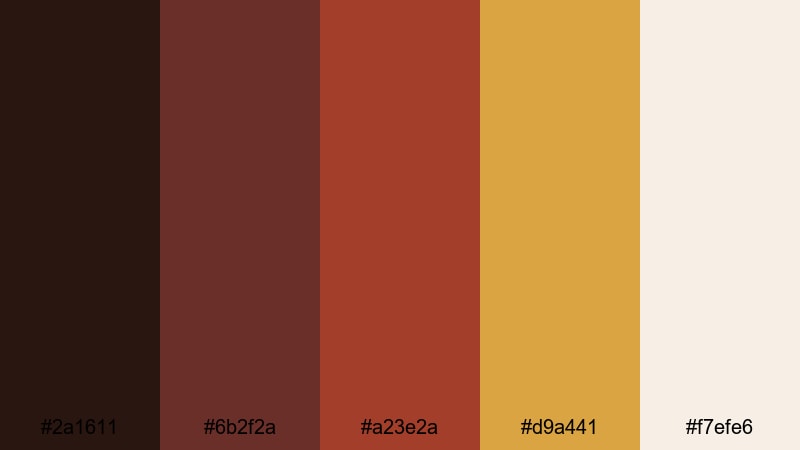
HEX: #2A1611 #6B2F2A #A23E2A #D9A441 #F7EFE6
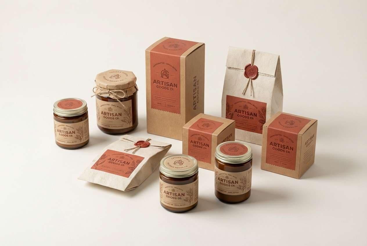
Mood: earthy, rustic, grounded
Best for: interior mood boards and artisan packaging
Earthy brick and warm cream feel like clay pots, sunlit plaster, and old storefronts. This palette mix suits interior mood boards, artisan goods, and heritage-style packaging. Pair it with textured paper stock or subtle grain for extra authenticity. Usage tip: keep the mustard-gold as a small accent for seals, icons, or edge details.
Image example of brick cream generated using media.io
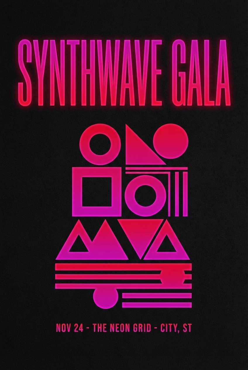
6) Ruby Neon
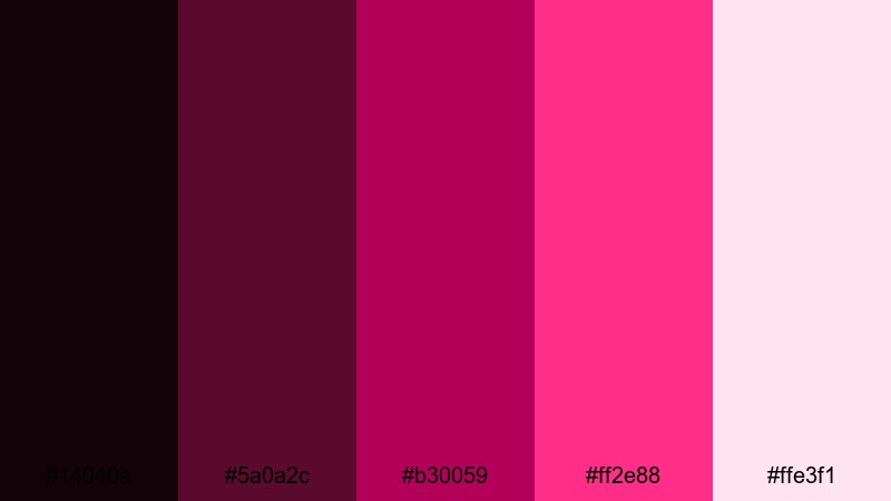
HEX: #14040A #5A0A2C #B30059 #FF2E88 #FFE3F1
Mood: bold, electric, nightlife
Best for: music posters and edgy app highlights
Electric ruby and hot magenta hit like club lights and glossy vinyl. It’s a strong pick for music posters, nightlife promos, and punchy in-app highlights. Ground the intensity with near-black and keep body text in pale pink or white for contrast. Usage tip: use neon tones for strokes, badges, and micro-interactions rather than full-page fills.
Image example of ruby neon generated using media.io
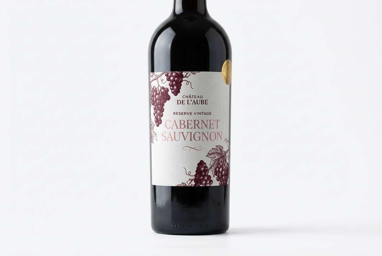
7) Cabernet Velvet
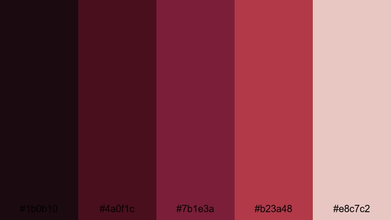
HEX: #1B0B10 #4A0F1C #7B1E3A #B23A48 #E8C7C2
Mood: moody, refined, intimate
Best for: wine labels and upscale restaurant menus
Moody cabernet shades feel like candlelit dinners and velvet banquettes. This combination is ideal for wine labels, upscale menus, and boutique hospitality branding. Pair with cream paper, thin rules, and elegant serif typography to elevate the mood. Usage tip: keep the mid-burgundy as your main brand color and reserve the soft blush for negative space.
Image example of cabernet velvet generated using media.io
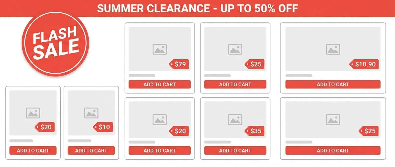
8) Poppy Field
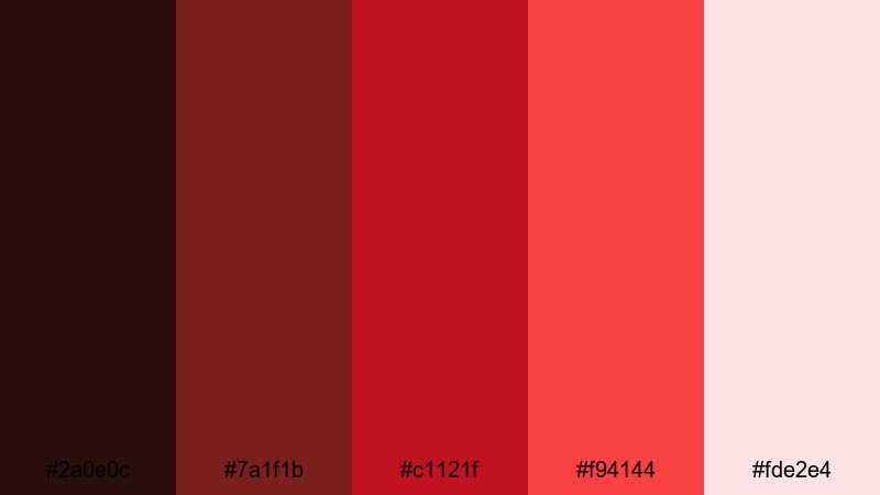
HEX: #2A0E0C #7A1F1B #C1121F #F94144 #FDE2E4
Mood: energetic, confident, outdoorsy
Best for: sports graphics and bold ecommerce promos
Vivid poppy reds and crisp tints evoke roadside wildflowers and fast motion. It works well for sports graphics, high-impact ecommerce promos, and any design that needs urgency. Pair with black type and simple shapes so the color does the heavy lifting. Usage tip: use the brightest red for limited-time offers and keep supporting UI elements in the pale tint.
Image example of poppy field generated using media.io
9) Festive Garnet
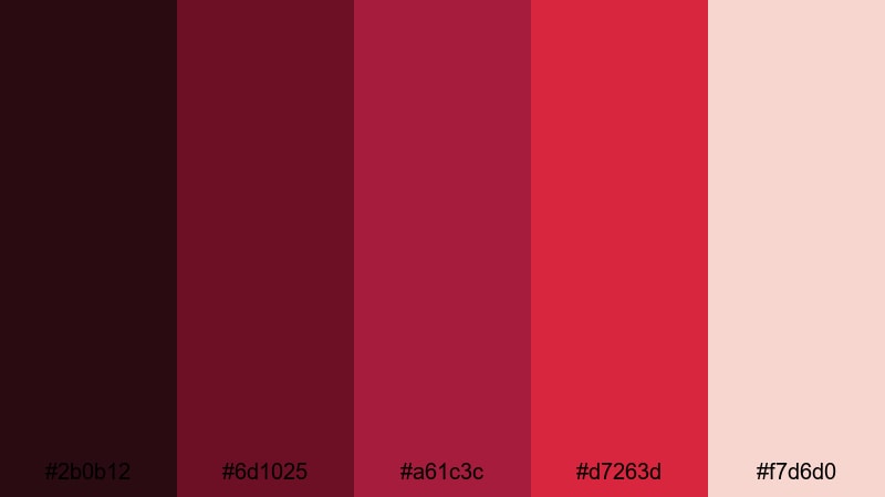
HEX: #2B0B12 #6D1025 #A61C3C #D7263D #F7D6D0
Mood: celebratory, bold, classic
Best for: seasonal branding and event flyers
Garnet and bright scarlet feel celebratory—like ribbons, confetti, and spotlight moments. It’s well-suited to seasonal branding, event flyers, and announcement graphics that need instant punch. Pair with creamy pink highlights and restrained typography for a classic look. Usage tip: keep backgrounds darker and use the pale blush for text blocks to improve legibility.
Image example of festive garnet generated using media.io
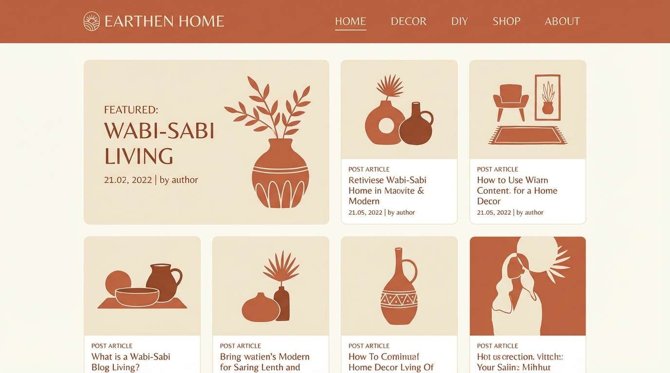
10) Terracotta Hearth
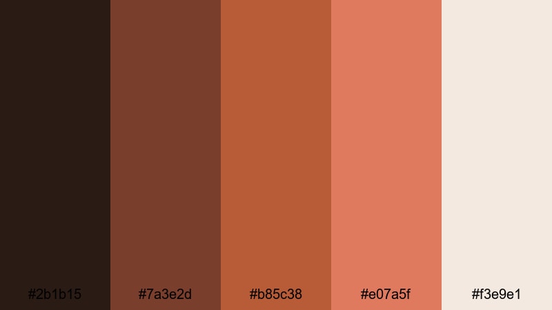
HEX: #2B1B15 #7A3E2D #B85C38 #E07A5F #F3E9E1
Mood: warm, homey, approachable
Best for: home decor brands and blog headers
Warm terracotta and clay hues evoke a cozy hearth, handmade ceramics, and slow Sundays. This pairing works for home décor brands, recipe blogs, and welcoming website headers. Combine with off-white backgrounds and natural textures like linen or paper grain. Usage tip: use the mid-terracotta for main buttons and keep text in the deep brown for a softer contrast than pure black.
Image example of terracotta hearth generated using media.io
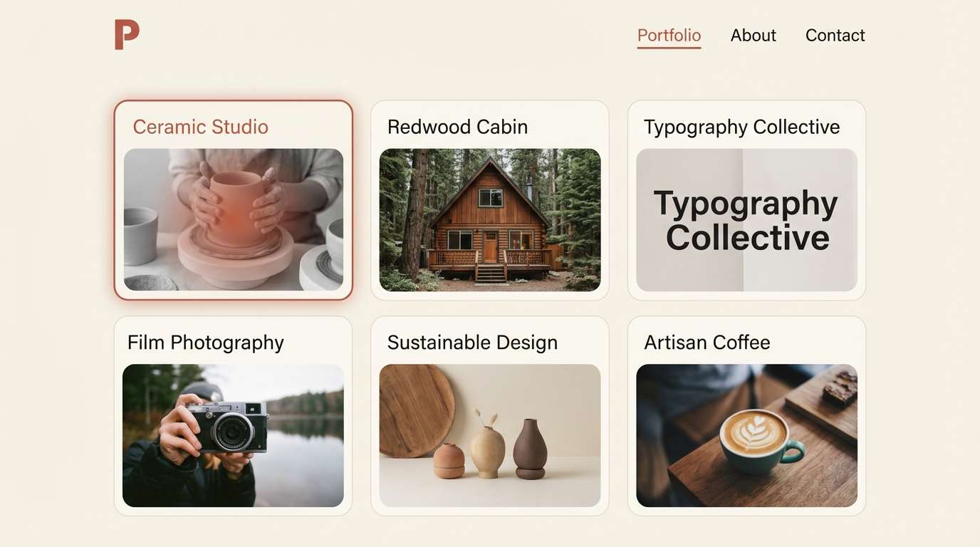
11) Redwood Minimal
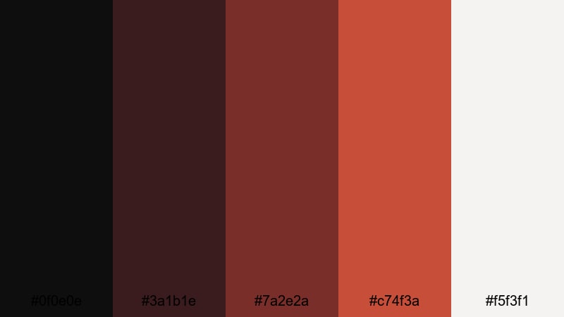
HEX: #0F0E0E #3A1B1E #7A2E2A #C74F3A #F5F3F1
Mood: minimal, architectural, calm
Best for: portfolio sites and modern product pages
Muted redwood tones feel architectural—clean lines, concrete, and warm wood grain. This scheme is excellent for minimalist portfolios and modern product pages that need a subtle signature color. Pair with lots of off-white space and neutral grays for a gallery-like vibe. Usage tip: apply the warm accent to hover states and small UI markers to keep the layout quiet but memorable.
Image example of redwood minimal generated using media.io
12) Crimson and Sage
HEX: #2A0C12 #8D1B3D #C2415B #7A9E7E #F2EFEA
Mood: balanced, sophisticated, nature-meets-city
Best for: brand systems and packaging
Crimson paired with sage green feels like a winter bouquet—bold petals against soft foliage. It’s a strong choice for brand systems and packaging where you want contrast without harshness. Pair with warm off-white and simple geometric layouts to keep it modern. Usage tip: let sage handle secondary UI elements (tabs, chips) while crimson stays reserved for primary actions.
Image example of crimson and sage generated using media.io
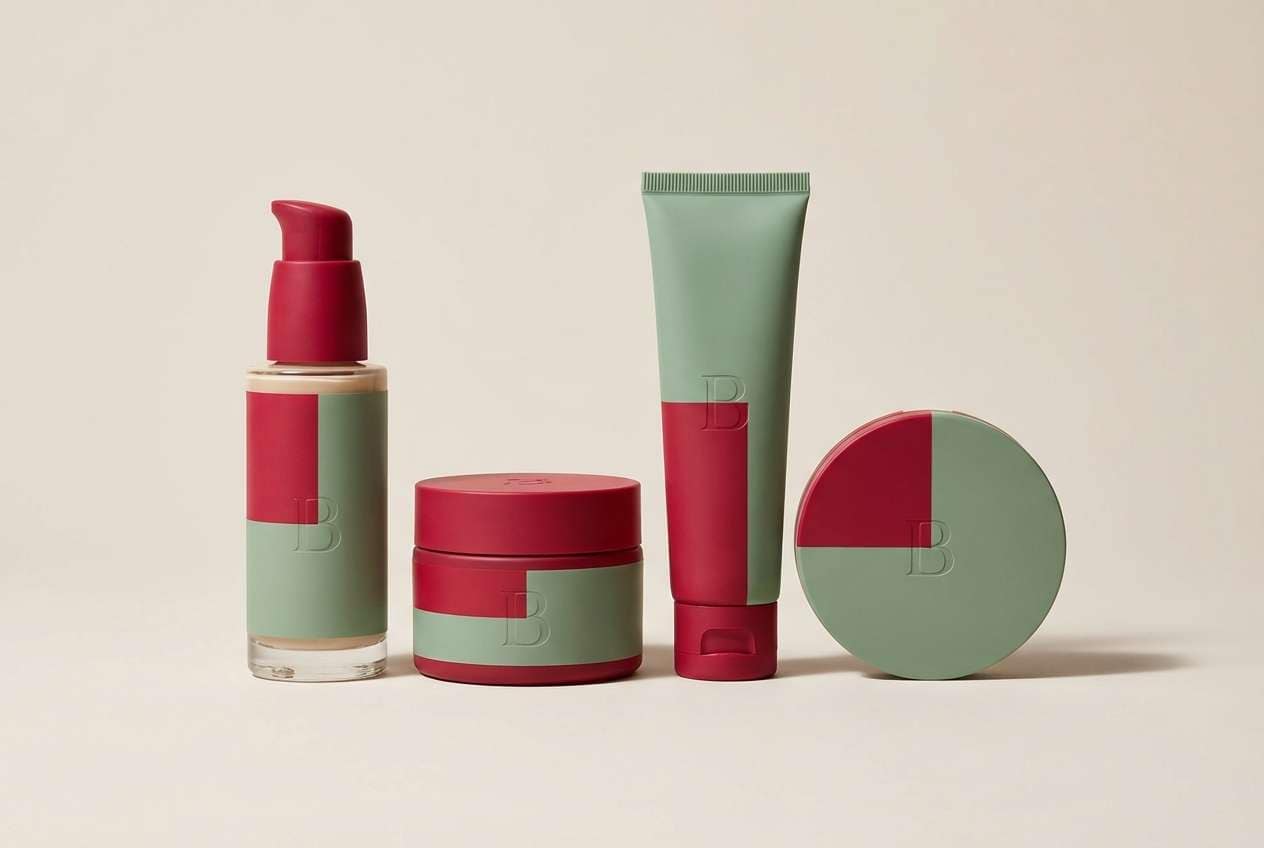
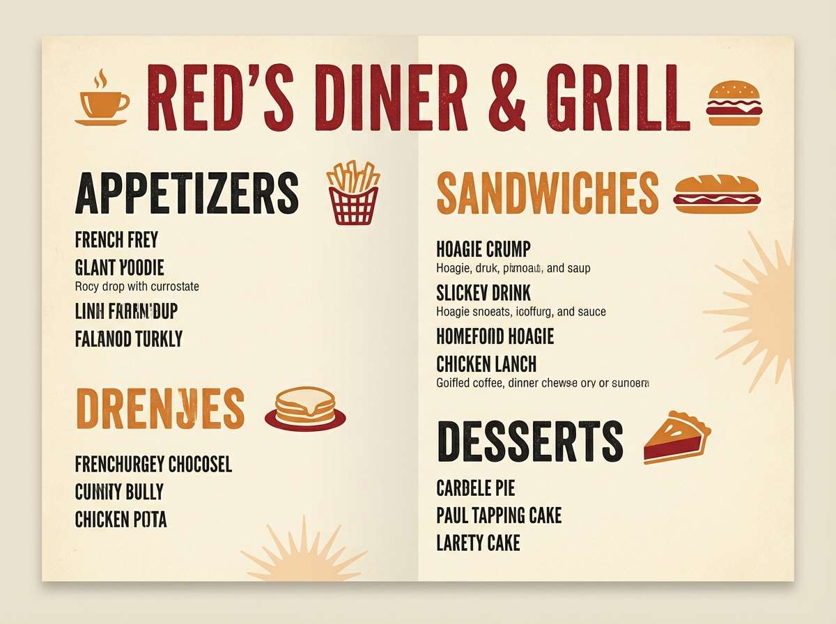
13) Retro Diner
HEX: #1E1A1A #B80C09 #E85D04 #F48C06 #F7F7F2
Mood: retro, upbeat, nostalgic
Best for: restaurant menus and vintage posters
Punchy reds with orange warmth bring back neon signs, vinyl booths, and classic diner charm. This combination is perfect for restaurant menus, retro posters, and playful merch. Pair with off-white backgrounds and bold slab-serif typography to sell the throwback feel. Usage tip: use the orange tones for highlights and keep red for headlines so the hierarchy stays clear.
Image example of retro diner generated using media.io
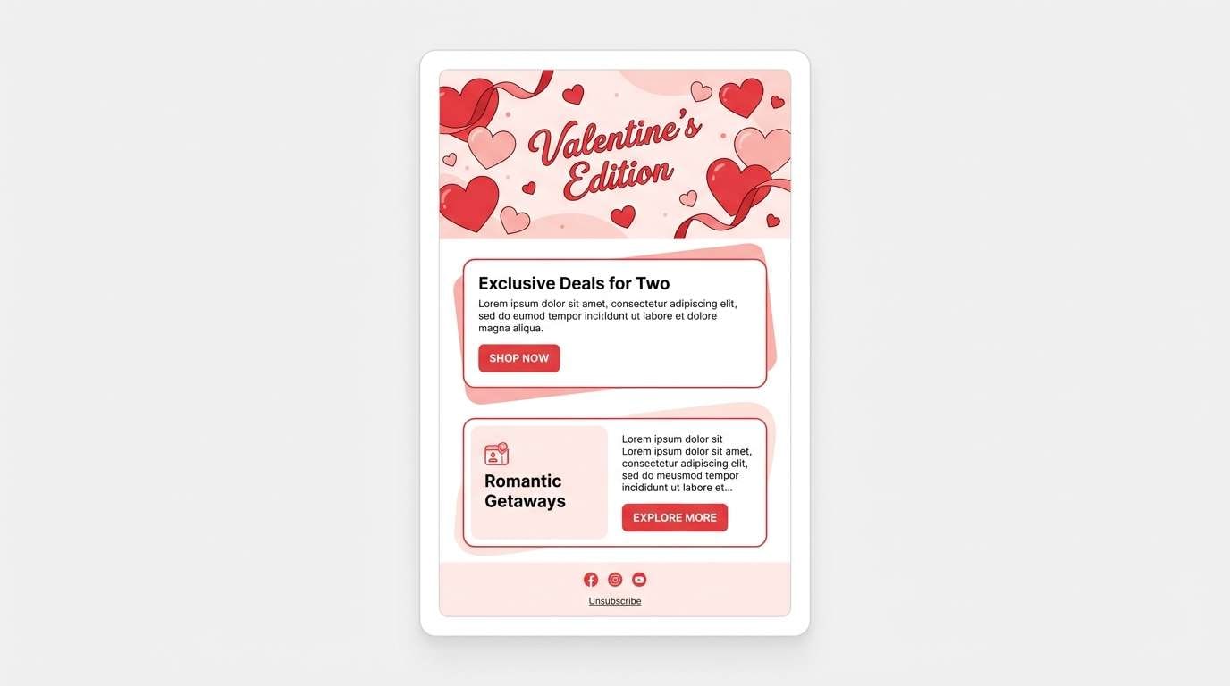
14) Valentine Blush
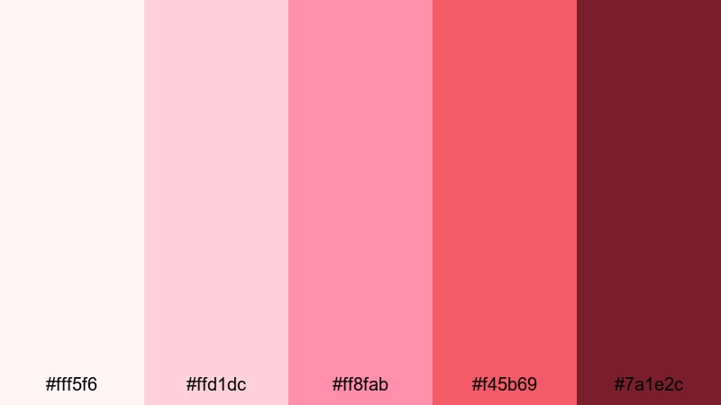
HEX: #FFF5F6 #FFD1DC #FF8FAB #F45B69 #7A1E2C
Mood: sweet, friendly, youthful
Best for: greeting cards and campaign emails
Sweet blushes and candy reds feel like handwritten notes and soft heart confetti. It’s ideal for greeting cards, campaign emails, and cheerful promo graphics. Pair with warm neutrals and rounded type to keep the tone approachable. Usage tip: make the darkest shade your text color instead of black for a softer, more cohesive look.
Image example of valentine blush generated using media.io
15) Fire Engine Pop
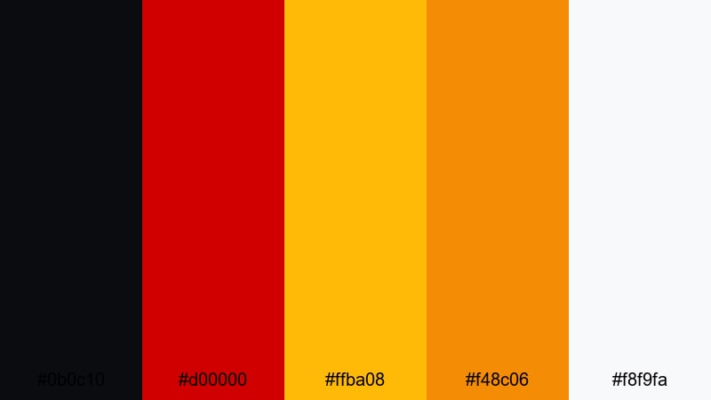
HEX: #0B0C10 #D00000 #FFBA08 #F48C06 #F8F9FA
Mood: loud, sporty, attention-grabbing
Best for: CTA buttons and performance marketing
Fire-engine red with hot yellow accents feels like speed, warning lights, and stadium energy. This scheme is built for performance marketing, CTA-heavy landing pages, and bold signage. Pair with lots of white and strong black type to maintain clarity. Usage tip: keep yellow as a small accent for icons or counters so it boosts urgency without becoming visually noisy.
Image example of fire engine pop generated using media.io

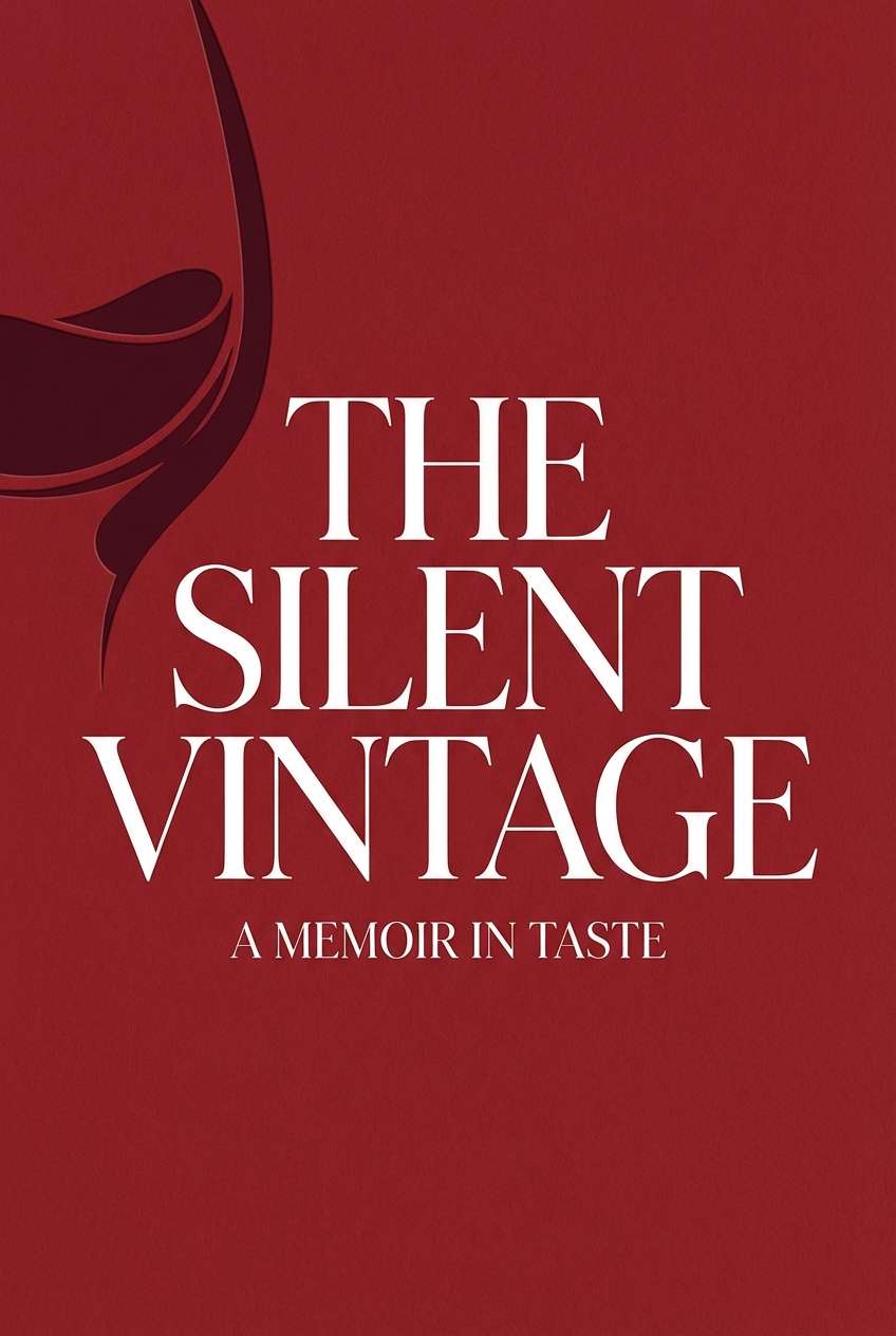
16) Moody Merlot
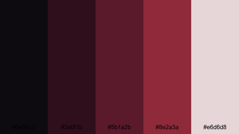
HEX: #0E0B10 #2E0F1B #5B1A2B #8E2A3A #E6D6D8
Mood: cinematic, quiet, elegant
Best for: book covers and luxury editorials
Deep merlot shades read cinematic—like dim theaters, red curtains, and moody portraits. It’s a great fit for book covers, luxury editorials, and high-end service branding. Pair with muted blush and plenty of negative space to keep it refined. Usage tip: use the darkest tones as large blocks and bring in the softest tint for pull quotes and captions.
Image example of moody merlot generated using media.io
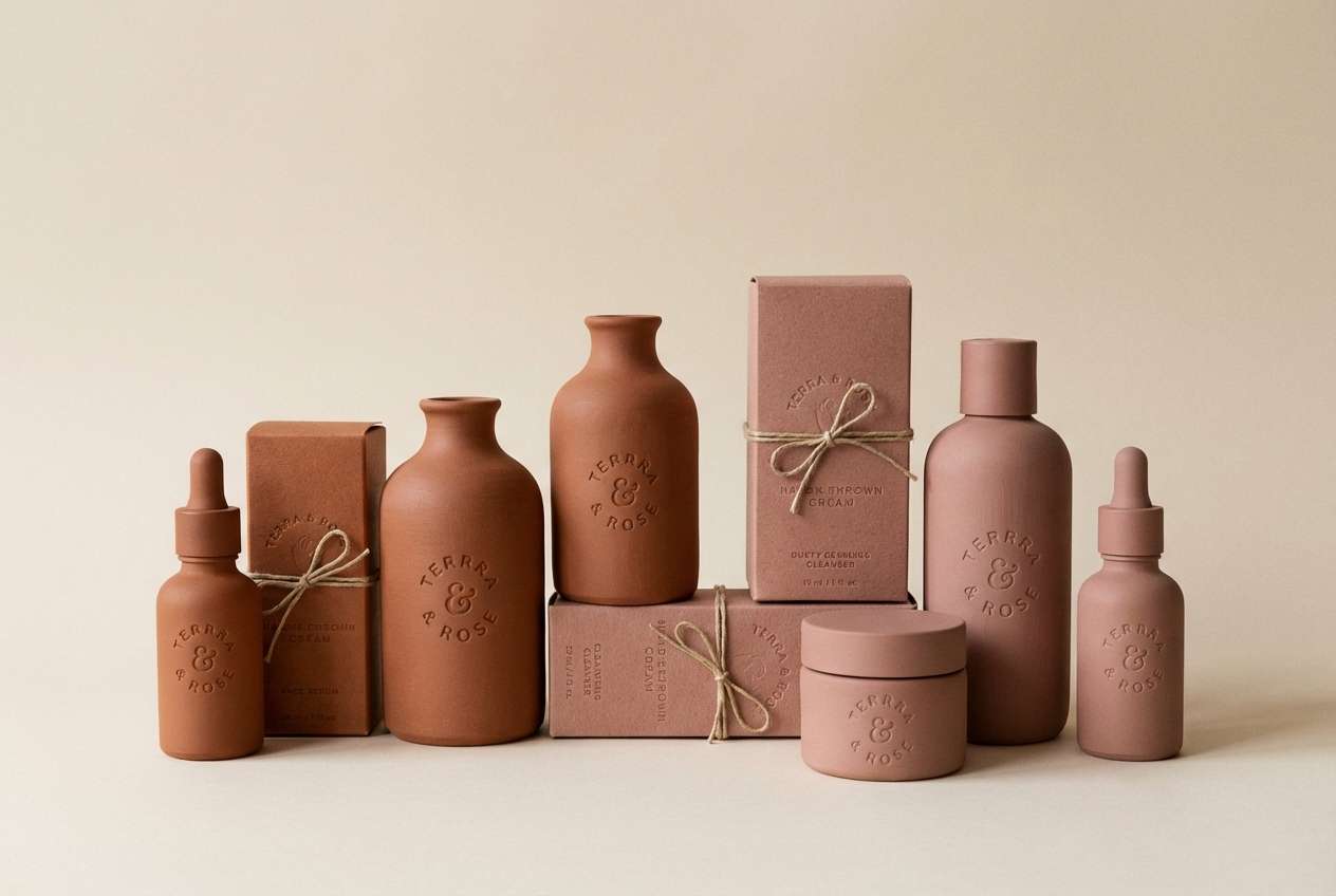
17) Cinnamon Rose
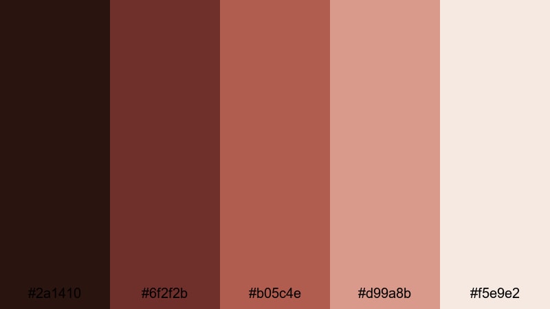
HEX: #2A1410 #6F2F2B #B05C4E #D99A8B #F5E9E2
Mood: soft, mature, comforting
Best for: wellness brands and skincare packaging
Cinnamon browns blended with dusty rose feel like warm tea, spa towels, and quiet self-care. This palette mix suits wellness branding and skincare packaging where softness matters more than intensity. Pair with minimalist sans-serif typography and subtle line icons. Usage tip: keep the lightest tint as your primary background to make the mid-tones feel premium rather than heavy.
Image example of cinnamon rose generated using media.io
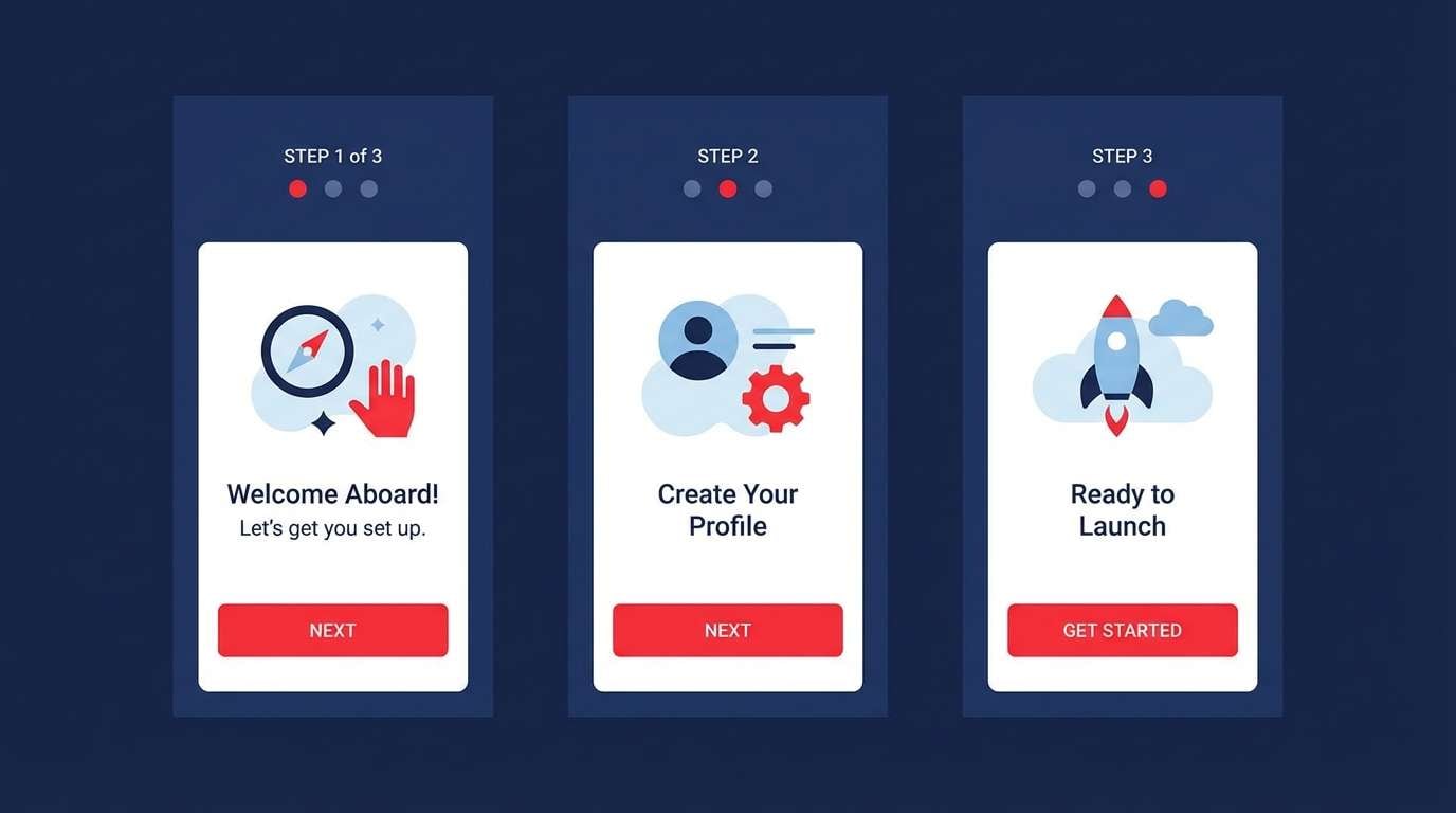
18) Red Horizon
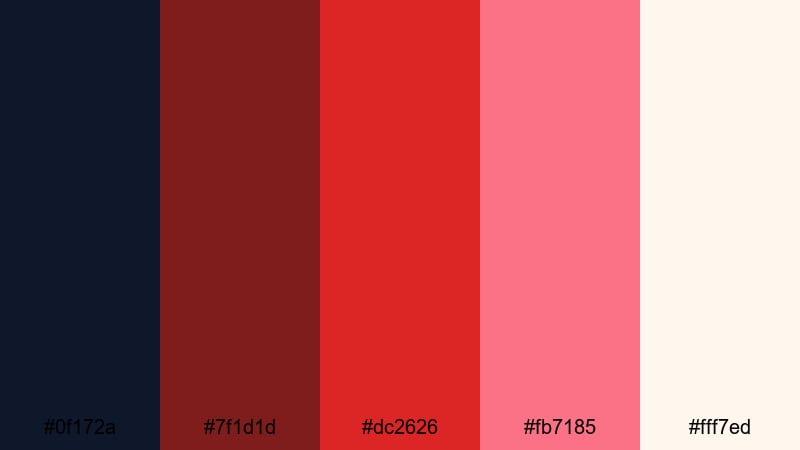
HEX: #0F172A #7F1D1D #DC2626 #FB7185 #FFF7ED
Mood: optimistic, crisp, contemporary
Best for: tech branding and onboarding screens
Crisp reds against a cool navy feel like sunrise over a clean skyline—fresh but confident. It’s well-suited for tech branding, onboarding screens, and modern dashboards. Pair with warm off-white surfaces and keep accent usage consistent across components. Usage tip: map the two reds to states (primary vs. alert) so users learn the meaning quickly.
Image example of red horizon generated using media.io
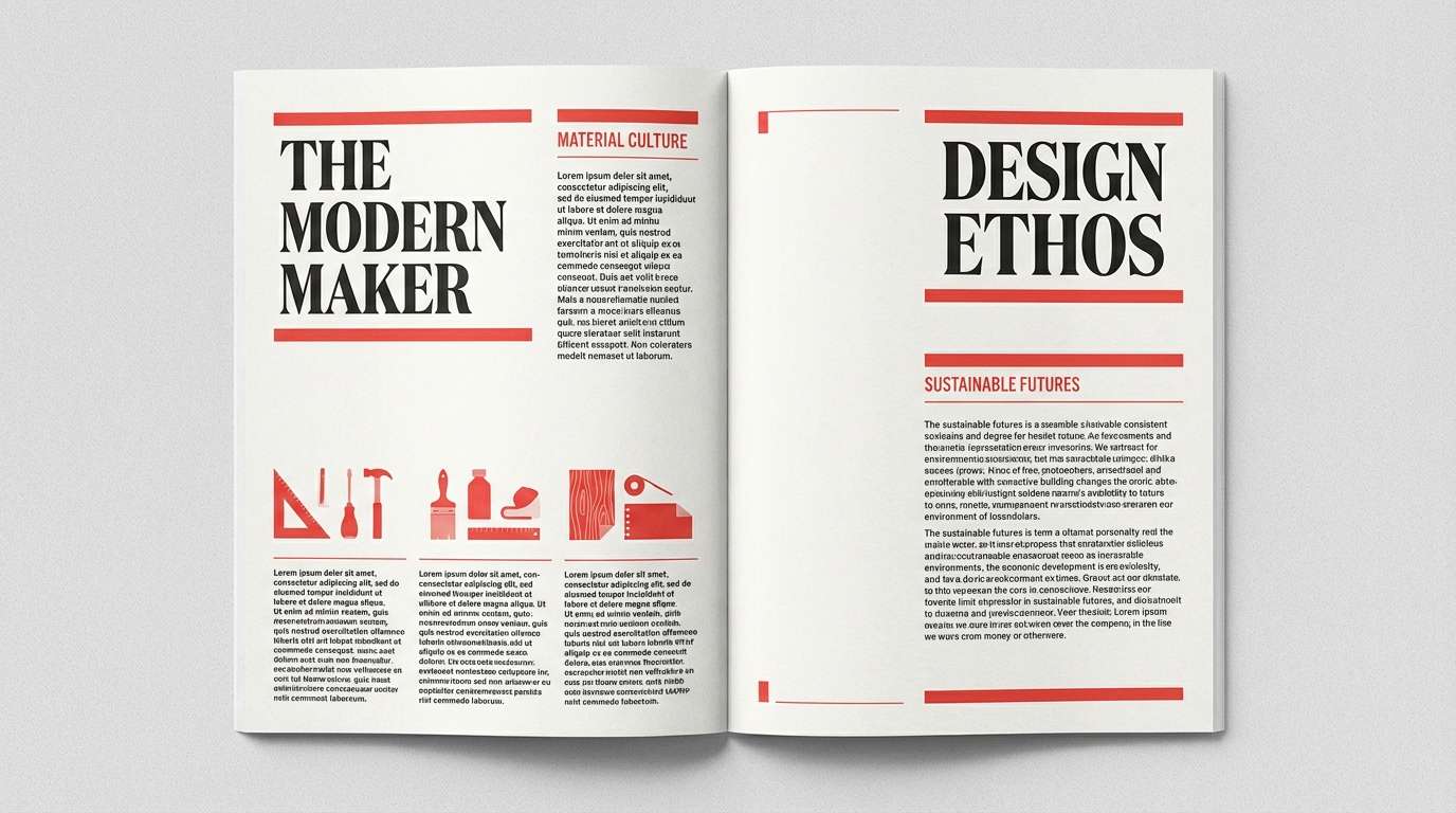
19) Red Ink Editorial
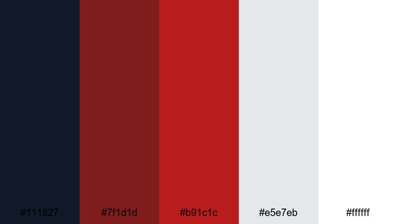
HEX: #111827 #7F1D1D #B91C1C #E5E7EB #FFFFFF
Mood: editorial, sharp, authoritative
Best for: magazine layouts and thought-leadership posts
Sharp ink-like reds on clean neutrals evoke marked-up manuscripts and decisive headlines. This scheme is ideal for magazine-style layouts, thought-leadership posts, and data-rich reports. Pair with black typography, strong grids, and restrained accent blocks for a professional rhythm. Usage tip: reserve the deepest red for section headers and pull quotes to create clear editorial hierarchy.
Image example of red ink editorial generated using media.io
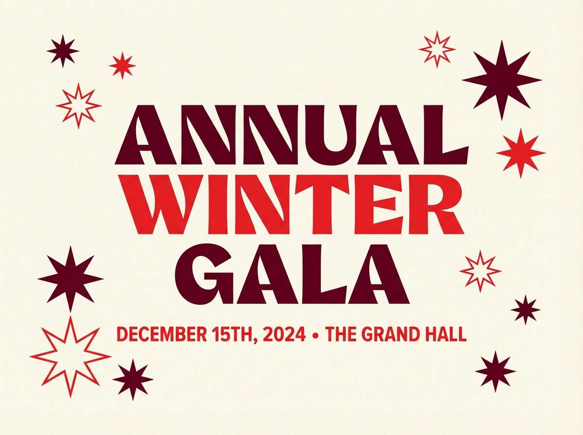
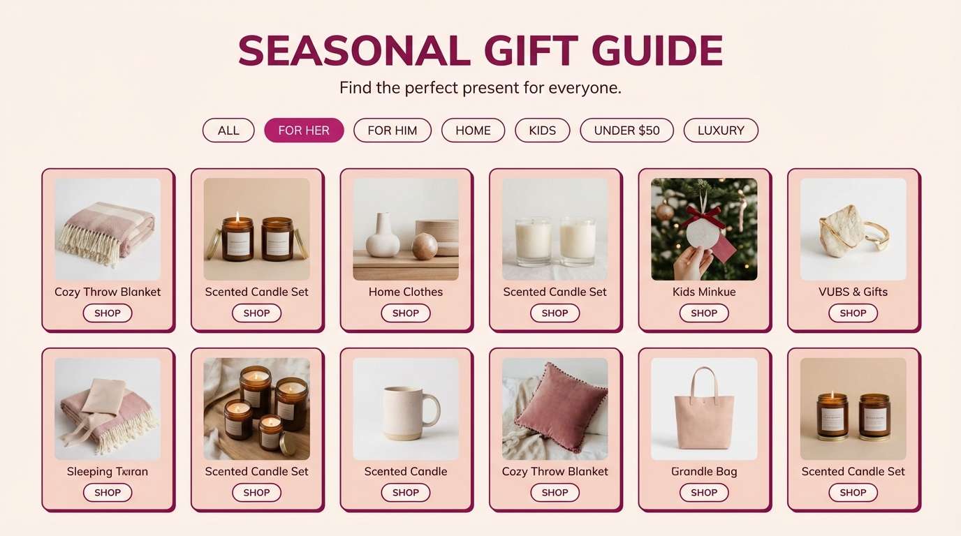
20) Winter Berry
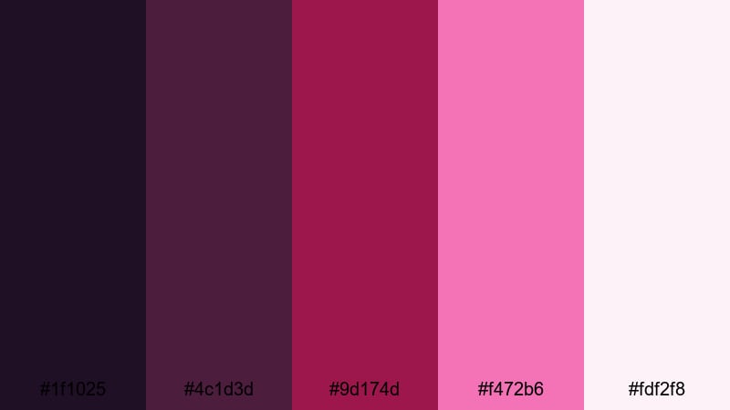
HEX: #1F1025 #4C1D3D #9D174D #F472B6 #FDF2F8
Mood: festive, cozy, modern
Best for: gift guides and seasonal landing pages
Berry purples and rosy pinks feel like frosted windows, velvet ribbons, and winter markets. It’s a great fit for gift guides, seasonal landing pages, and boutique promotions. Pair with soft blush backgrounds and clean sans-serif type to keep it modern. Usage tip: use the bright pink as an accent for tags like “new” or “limited” rather than as a full background color.
Image example of winter berry generated using media.io
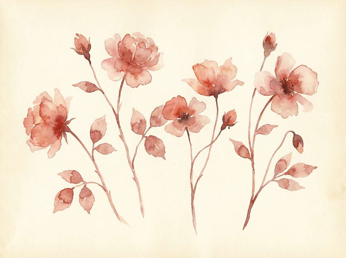
21) Botanical Rouge
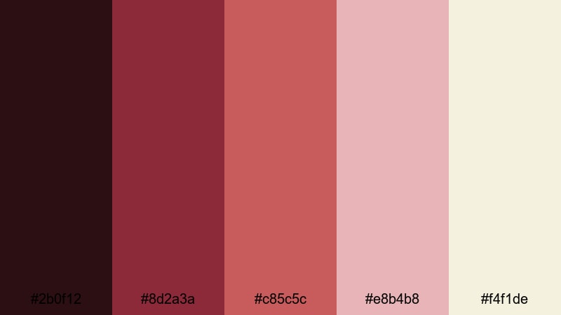
HEX: #2B0F12 #8D2A3A #C85C5C #E8B4B8 #F4F1DE
Mood: botanical, gentle, artisanal
Best for: floral illustrations and spring stationery
Gentle rouge tones look like pressed petals, watercolor washes, and hand-tinted paper. This color scheme works beautifully for spring stationery, floral branding, and artisanal labels. Pair with warm cream and fine line art to keep it airy. Usage tip: limit the darker rose to outlines and headings so the overall feel stays soft and botanical.
Image example of botanical rouge generated using media.io
What Colors Go Well with Red?
Neutrals are the easiest match: warm ivory, cream, and soft grays keep red looking intentional while maintaining readability. For high contrast, pair red with charcoal or near-black instead of pure black for a softer premium feel.
Greens (sage, olive, forest) balance red naturally and are great for packaging, seasonal themes, and brand systems. Blues (navy, ink) make red feel crisp and modern—perfect for tech UI and editorial layouts.
For extra punch, add small doses of warm accents like mustard or orange. Keep these secondary colors limited to icons, badges, or micro-highlights so red remains the hero.
How to Use a Red Color Palette in Real Designs
Start by assigning roles: one deep red for backgrounds or headers, one main red for primary actions, and a light tint for surfaces and spacing. This keeps your system consistent across pages, components, and print pieces.
Watch accessibility and print reproduction: saturated reds can vibrate on bright white and may shift in CMYK. Test contrast for text and UI states, and consider off-white backgrounds to reduce eye strain.
In branding, red works best when you give it room—strong whitespace, clean typography, and restrained accent use. Let red define hierarchy (CTA, headline, promo tag) rather than filling every block.
Create Red Palette Visuals with AI
If you already have HEX codes, you can generate matching banners, posters, UI mockups, and packaging concepts faster by reusing a consistent prompt style. The key is to specify the mood, layout type, and finish (flat graphic vs. realistic studio shot).
Try generating a few variations per palette: change aspect ratio, switch typography style, and keep backgrounds simple so the reds stay accurate. Then pick the best result and iterate on details like spacing and contrast.
Media.io makes it easy to turn red palette ideas into usable design visuals directly in your browser.
Red Color Palette FAQs
-
What does the color red communicate in design?
Red commonly signals energy, urgency, passion, and confidence. In branding and UI, it’s often used to draw attention to key actions (like primary CTAs) or to create bold, memorable identity moments. -
How do I make a red palette look premium instead of aggressive?
Use deeper reds (burgundy/merlot), lower saturation, and pair them with warm neutrals like ivory or cream. Keep layouts clean, rely on strong typography, and reserve the brightest red for small, intentional highlights. -
What are the best background colors for red text or buttons?
Off-white, cream, light gray, and very dark charcoal/near-black backgrounds usually work best. Avoid placing bright red on pure white at large areas if it feels too harsh—an ivory background often looks more refined. -
Does red pair well with green for modern branding?
Yes—especially with muted greens like sage or olive. This pairing creates natural balance and contrast without feeling overly festive, as long as you keep saturation controlled and add a neutral base color. -
How many reds should I include in a UI palette?
Typically 2–3 reds are enough: a primary red, a darker red for emphasis/headers, and a lighter tint for surfaces or subtle states. Map them to clear roles so users learn the hierarchy quickly. -
Why does red look different in print compared to screen?
Bright RGB reds can be out of gamut for CMYK printing, causing shifts toward orange or duller tones. Always soft-proof in CMYK, test on the intended paper, and consider slightly deeper or less saturated reds for reliable print results. -
Can I generate red palette images with AI if I only have HEX codes?
Yes. Add the HEX codes (or color names like burgundy, crimson, blush) into your prompt along with the design type (poster/UI/packaging), lighting/finish (flat vs. studio), and aspect ratio for consistent results.


